You can go from idea to clickable landing page with one simple flow: use GPT-4.1 for page copy, use MUI for React components, and use UXPin Merge to build a prototype that stays close to the code your team ships.
I’d sum it up like this: plan first, map copy to components, build with live MUI parts, then test the flow before handoff. That helps cut back-and-forth, keeps button labels and pricing format in sync, and makes review easier for both design and engineering.
Here’s the full idea in plain English:
- GPT-4.1 writes and structures the page
- MUI gives me parts like
Grid,Card,Button, andTypography - UXPin Merge lets me design with those same parts on canvas
- Forge can make a first draft layout from approved components
- The page usually includes 5 core sections:
- Hero
- Features
- Pricing
- Testimonials
- Final CTA
A few details matter more than people think:
- Keep headlines short so they don’t wrap badly
- Use one CTA label across the page
- Format prices the same way, like $29.00/month
- Keep testimonial quotes short, around 18–30 words
- Check mobile, tablet, and desktop before handoff
The main point: I’m not just making a mockup. I’m building a prototype from the same MUI system the team already uses, which can cut drift between copy, design, and code.
If you want a landing page process that is easier to review and easier to hand off, this is the workflow the article lays out.
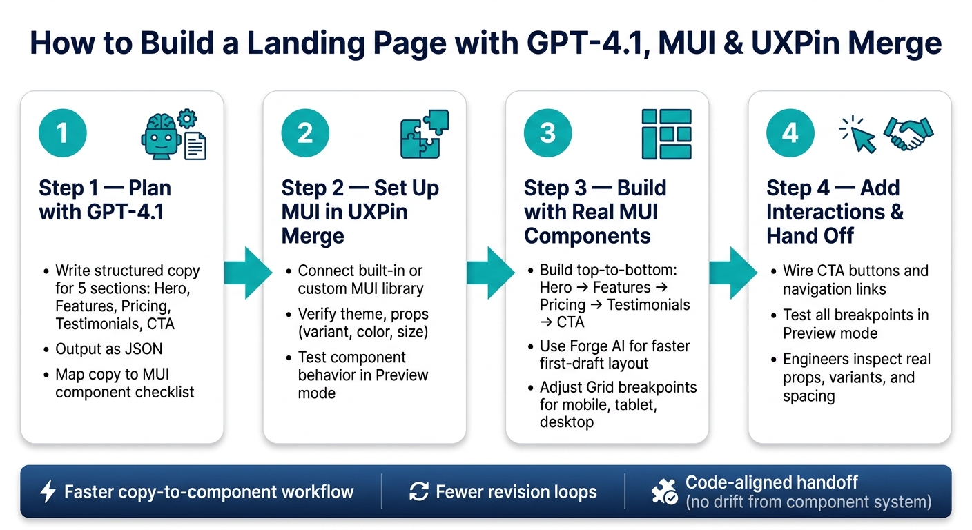
How to Build a Landing Page with GPT-4.1, MUI & UXPin Merge
1. Plan your landing page structure with GPT-4.1
Before you open UXPin, use GPT-4.1 to sketch the page first. The goal is simple: get a page plan you can map straight to MUI components.
Write prompts that produce usable landing page sections
Useful GPT-4.1 output doesn’t happen by accident. Generic prompts give you generic copy. What tends to work is a prompt built around five parts: role, audience, product goal, constraints, and output format.
Here’s a prompt template you can use as-is:
"Write hero, features, pricing, testimonials, and CTA copy for a B2B analytics SaaS targeting US-based product managers at mid-size tech companies. Goal: drive 14-day free-trial sign-ups. Use US English, benefit-focused copy, and USD pricing in the format
$29.00/month. Keep hero headlines under 10 words, subheads under 25 words, and button labels to 2–3 words. Return JSON with keys forhero,features,pricing,testimonials, andcta."
Asking for JSON makes life easier. Each field becomes much simpler to plug into a real component.
Turn AI output into a component checklist
Once GPT-4.1 gives you the five sections, go through them and match each part to the MUI pieces you’ll need. That cuts down on guesswork once you’re on the canvas.
| Section | Layout | Content | Actions |
|---|---|---|---|
| Hero | Box, Grid |
Typography (h1, body1) |
Button (contained + outlined) |
| Features | Grid |
Card, CardContent, MUI icons |
– |
| Pricing | Grid |
Paper, Typography, bullet list |
Button per tier |
| Testimonials | Grid or Box |
Card or Paper, Avatar, Typography |
– |
| CTA | Box |
Typography (h2, subtitle1) |
Button (contained) |
Count your components before you build. It sounds small, but it helps keep the canvas tidy.
Refine content before moving into UXPin
Check a few things before you start placing anything.
Headlines should fit inside h1 or h2 without ugly wrapping on a normal desktop width. If GPT-4.1 gives you something like "Transform your product decisions with AI-powered insights that everyone can understand," trim it to "Make smarter product decisions with AI insights" before dropping it into a Typography component.
CTA labels should match everywhere. Pick one label and stick with it. "Start free trial" is a good default. Use that exact text on the hero button, pricing tier cards, and the closing CTA. If one area says "Get started" and another says "Begin your trial," people can hesitate, and your layout can get messy too.
Pricing copy needs to use the same $XX.00/month format across the page. If GPT-4.1 gives you "$29/mo" in one tier and "$79 per month" in another, send a follow-up prompt like "Scan all pricing and reformat to $XX.00/month." That cleans it up fast. Make every tier match before you move into UXPin.
Testimonials should stay between 18 and 30 words per quote. If one runs too long, prompt GPT-4.1 with: "Shorten this testimonial to one sentence under 25 words without losing the key outcome."
Clean copy at this stage saves you from spacing and wrapping problems in MUI cards, buttons, and typography. Once the wording is tightened up, you’re ready to place the sections in MUI.
With the page plan and component list set, move into MUI in UXPin Merge.
sbb-itb-f6354c6
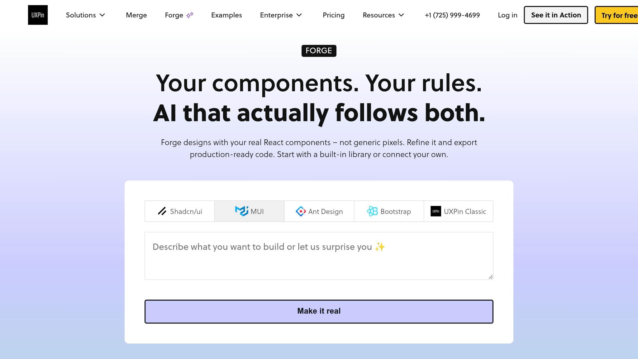
2. Set up MUI components in UXPin Merge
Start with built-in MUI libraries in UXPin
Take the section list from GPT-4.1 and match each part to an actual MUI component. Then open a new UXPin project, go to the left panel, find the built-in MUI library, and drag the live components onto the canvas.
This is where the planning step starts to pay off. That checklist of parts you made earlier turns into real coded components you can drop in, move around, and tweak right away.
If your team works from a custom library, use Merge’s connected version instead.
Connect a custom MUI library through Merge when needed
If your team has its own React component library built on top of MUI, connect that library in UXPin Merge. Merge supports custom libraries through Git or Storybook integrations.
After the connection is set, expose the props your team uses most in the property panel, such as variant, color, and size. That small setup step saves time later, because you won’t have to fight the controls while building.
Check theme, props, and component behavior before building
Before you start placing sections, do three quick checks.
First, make sure your brand theme is showing up the way it should. Check your primary colors, type scale, and spacing. You want to see your MUI theme on the canvas, not the default MUI styling.
Second, open the property panel for a few core components like Button, Card, and Typography. Confirm that contained, outlined, and text variants are there. If any of those controls are missing, fix the component setup now instead of dealing with it halfway through the page build.
Third, switch to Preview mode and test the components like a real user would. Click a Button. Toggle a Menu. Hover over a Card. If the behavior matches production, you’re in good shape. If something feels off, fix it before you build the landing page sections.
Once the theme, props, and interactions are set, start laying out the hero section.
3. Build the landing page in UXPin with real MUI components
Now that your MUI library is checked and your theme is set, you can start building the page itself. Go from top to bottom: hero, features, pricing, testimonials, then the final CTA. That flow matches how people scan a landing page, and it keeps each design choice tied to one part of the page at a time.
Build the hero and features sections
Start the hero with an MUI Grid container. Inside it, add two Grid items with xs={12} and md={6}. That gives you a stacked layout on mobile and a two-column layout on larger screens.
In the left column, add a Box to handle padding. Then stack your Typography components:
- Headline with
variant="h2" - Subheading with
variant="subtitle1" - Supporting copy with
variant="body1"
Drop the GPT-4.1 headline into the headline Typography, but keep it short enough that it doesn’t wrap inside the h2.
For the main CTA, use a Button with variant="contained" and color="primary". If GPT-4.1 gave you a second action, such as "View Pricing", place another Button next to it with variant="outlined".
For the features section, use a Grid container with spacing={4} and justifyContent="center". Each feature should live inside its own Grid item, wrapped in a Card with CardContent.
Map GPT-4.1’s feature titles to Typography with variant="h6", and map descriptions to Typography with variant="body2". Add an icon from the MUI icon set that fits each feature. For example, use a Security icon for "Enterprise-grade security." Place the icon at the top of the card with color="primary" and fontSize="large".
Keep the padding, text alignment, and icon position the same across every card. That’s what makes the section feel like one set instead of a pile of separate blocks.
Add pricing, testimonials, and the CTA section
For pricing, wrap the section in a Container with a light background so it stands apart from the features section above. Use Typography with variant="h3" for the section title, then create one Card for each plan.
Show the plan name in variant="h6" and the price in variant="h3". Format prices in USD with the dollar sign before the number, like $29.00/month.
Use List and ListItem components for each plan’s inclusions. Finish each pricing card with a Button that matches the hero CTA style. If one plan is the one you want people to notice first, mark it with a higher elevation or a Chip labeled Most Popular so US readers can spot it fast.
Testimonials usually work best as a Grid of Card components, each with a CardContent block. Put an Avatar at the top, either a photo or initials. Then add the customer’s name and role in Typography with variant="subtitle2", followed by the quote in variant="body1".
GPT-4.1 should write short testimonial quotes with a clear result, ideally one sentence each.
For the final CTA, use a full-width Box with a brand-colored background. Add a centered Typography heading with variant="h4", one line of supporting copy from GPT-4.1, and a prominent Button with variant="contained". Keep this heading below the hero’s h2 so the page keeps a clean heading order from top to bottom.
If you want a faster first draft, let Forge build the starting structure, then tune each section on the canvas.
Use Forge to generate and edit layouts faster
If you don’t want to build each section from scratch, use Forge – UXPin’s built-in AI assistant – to generate a first-pass layout right on the canvas. Give Forge a prompt like "Create a SaaS landing page with hero, features, pricing, testimonials, and a final CTA for a US audience" and feed it your finished GPT-4.1 copy.
Forge will place approved MUI components that match your theme into a rough page structure: hero on top, feature grid below, then pricing cards, testimonials, and a CTA band at the bottom.
After Forge generates the layout, edit it on the canvas. Move section groups in the layer tree to reorder them, adjust Grid breakpoints for mobile, and swap in the exact GPT-4.1 copy you finalized earlier.
Because each element is a real MUI component backed by JSX, any prop change you make in UXPin maps straight to what a developer would write in code.
Once the layout is set, wire up interactive navigation, buttons, and states.
4. Add interactions, review behavior, and prepare for handoff
A static layout shows stakeholders what the page looks like. The next step is to turn that landing page into a clickable MUI prototype people can test.
Wire navigation, buttons, and component states
Once the layout is set, connect the actions that move people toward conversion. Start with the hero CTA, the pricing link, and the footer CTA. In UXPin, link the hero "Get Started" button to the pricing section frame so reviewers can follow the path from top to bottom. Do the same for any "See Pricing" or "Book a Demo" links in the navigation.
For states, use actual MUI props and variants instead of visual tweaks. In plain English: don’t fake it. Use real MUI states like hover for buttons, selected for pricing cards, and disabled CTAs where needed. If your pricing section has a monthly/annual toggle, make sure both states show properly formatted USD values so nobody gets confused during review.
Preview the prototype and inspect component details
After the interactions are wired, go through the full page in preview mode. Click every button. Follow every anchor link. Test desktop, tablet, and mobile widths to see how the hero, feature grid, pricing cards, testimonials, and CTA section reflow at common breakpoints.
This part isn’t just about looks. It’s about behavior too. A three-column feature grid should drop to a single column on mobile. The primary CTA should stay easy to tap at every size.
Here’s a simple gut-check. Share the preview link with a stakeholder and ask them to find pricing and click the main CTA without any help. If they pause, wander, or miss the action, that points to a layout or copy problem worth fixing before handoff. If the flow breaks, fix the section or the copy before passing it along.
Engineers can inspect component hierarchy, props, and spacing – not just a screenshot. That inspection layer cuts rebuilds because the handoff shows component intent, not just visual polish.
Iterate copy and layout without breaking system consistency
Use preview feedback to tune the copy and layout without changing the component system. With GPT-4.1, you can draft copy options like "Start free trial," "Book a demo," and "See pricing" side by side, then swap the best label into the existing MUI Button in UXPin.
If a stakeholder wants sections in a different order, move the section group in the layer tree instead of rebuilding it. That keeps the changes focused on content and placement.
Conclusion: From AI-generated idea to a code-aligned landing page
GPT-4.1 maps out the page. MUI supplies production-ready components. UXPin Merge with Forge brings both together in an interactive, code-aligned prototype.
That changes the outcome in a pretty direct way: you’re not just moving faster. You’re building a prototype that matches the system developers will ship. Since Merge syncs right to your MUI component library, engineers can inspect actual props, variants, spacing, and states – not just a static screen.
Forge keeps layouts tied to approved, code-backed components. That cuts down on one-off styles and rogue patterns. So the same workflow can carry across campaigns, A/B tests, and product launch pages without drifting away from the component system.
A simple way to test this is to rebuild one real landing page from your current process using GPT-4.1 for the copy and UXPin Merge for the layout. Then compare:
- Time spent
- Handoff clarity
- Revision loops
If the process holds up, use it again for feature pages, pricing updates, onboarding flows, and campaign launches built from the same hero, features, pricing, testimonials, and CTA sections covered here.
FAQs
Do I need coding skills to use this workflow?
No. Once your MUI library is connected to UXPin Merge, you can use interactive, code-backed components right inside the visual editor.
You can change labels, states, and variants in the properties panel instead of writing code. Setting up a custom component library through Git does take technical skill, but using the standard MUI library is mainly focused on design.
How do I connect my custom MUI library in UXPin Merge?
Make sure your components use React 16.0.0 or later and are bundled with Webpack 4.6.0. You can connect your library through Git, Storybook, or an npm package.
For Git, add uxpin.config.js to the root of your project and use UXPinWrapper.js to wrap components in MuiThemeProvider. Then push the library with your UXPIN_AUTH_TOKEN by running the uxpin-merge push command.
After you publish, your components show up in the UXPin editor’s design system panel.
What should I test before handing off the landing page?
Before handoff, check the landing page’s structure and hierarchy so the hero section sits above the fold and the text scales in a clear, logical way.
In Preview Mode, test every user path, button, and form behavior. Then do one last pass for U.S. spelling, $ currency formatting, and MM/DD/YYYY date formatting. Also confirm that component props and spacing match your design system and the way the page should behave in production.

