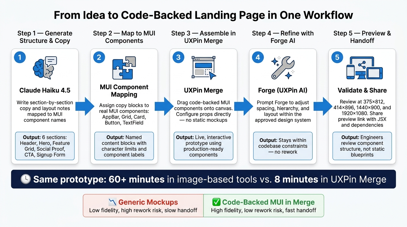
You can go from idea to a code-backed landing page in one workflow: use Claude Haiku 4.5 for page structure and copy, use MUI for the React UI parts, and use UXPin Merge to assemble and preview the page. In this setup, I’d build 6 sections: header, hero, feature grid, social proof, primary CTA, and signup form.
Here’s the short version:
- Claude Haiku 4.5 writes section-by-section copy and layout notes
- MUI provides React parts like
AppBar,Grid,Card,Button, andTextField - UXPin Merge lets me place those MUI parts on the canvas instead of drawing static screens
- Forge helps adjust spacing, hierarchy, and layout inside the same MUI system
- The page is reviewed at 375×812, 414×896, 1440×900, and 1920×1080
- The article uses U.S. formats like $29/month and 07/27/2026
What stands out is the workflow itself. I’m not starting with a flat mockup and then asking a developer to rebuild it from scratch. I’m starting with copy, mapping it to MUI parts, and then building the prototype with those same parts in Merge. That helps cut handoff work and lowers the chance of layout drift.
One stat in the article makes the point fast: in UXPin’s test, a one-page prototype took over 1 hour in an image-based tool versus 8 minutes in UXPin Merge. That’s the main takeaway. Use AI for structure, use MUI for the interface, and use Merge to put both together in a form your team can review and reuse.
Claude Haiku 4.5 + MUI + UXPin Merge: Landing Page Workflow
From Prompt to Interactive Prototype in under 90 Seconds
sbb-itb-f6354c6
Set up UXPin Merge and access the MUI library
You can use the built-in MUI library right in the browser. There’s no local install and no CLI setup to deal with.
Prerequisites for built-in MUI and custom libraries
To use the preloaded MUI library in UXPin Merge, you need an active UXPin account and Merge turned on for your workspace. Once Merge is on, the MUI library is available right away. This is the fastest way to launch a design system using production-ready components.
If your team wants to bring in a custom component library, that’s a different path. It uses a separate Git-based setup with extra tooling. For this landing page, start with the built-in MUI option.
Open a project and enable MUI
Here’s the setup flow in UXPin:
- Sign in to UXPin and go to your team dashboard.
- Click "Create new prototype" and choose a Web canvas at 1,440 px width. That’s a common desktop breakpoint for U.S. landing pages.
- Give the project a clear name, such as Claude–MUI Landing Page – US Release Q4 2026.
- Open the Design Systems panel from the bottom bar, or press Alt + 2.
- Select MUI to turn it on for the current prototype.
Once MUI is active, components like AppBar, Grid, Card, Button, and TextField show up in grouped categories and are ready to drag onto the canvas.
With MUI enabled in Merge, you’re ready to generate section-ready copy and layout in Claude Haiku 4.5.
Generate landing page structure and copy with Claude Haiku 4.5
Claude Haiku 4.5 works well as both a copy tool and a layout planner for MUI sections. The goal is simple: get section-by-section copy and layout notes that map straight to MUI component names, so you can move from AI output into the UXPin Merge canvas without stopping to reinterpret everything.
Prompt for MUI-ready sections and localized content
What Haiku gives back depends a lot on how clear your prompt is. Be specific from the start. State the tech stack, then spell out the output format you want. Here’s a prompt pattern that fits this workflow:
"You are helping design a B2B SaaS landing page to be built using MUI components inside UXPin Merge. Use MUI component names in CamelCase (e.g.,
AppBar,Grid,Card,Typography,Button,TextField,Paper) – do not invent component names. Return a section outline labeled with the MUI components and the content for each. Do not output JSX or React code. Use one H1 for the main page title mapped toTypographyvarianth1, H2 for major sections, and H3 for subsections without skipping heading levels. Use American English spelling, U.S. dollar formatting, MM/DD/YYYY dates, and comma-as-thousands-separator numbers. Specify the keyboard focus order and identify sections that map toheader,main, andfooter."
A self-check line at the end can save time. For example, add: "List three numbers, dates, and currency values to verify U.S. formatting." That gives you a quick localization check before you paste anything into a Typography or Button prop.
Request section-by-section output you can paste into components
Once the outline looks right, run a second prompt to get the actual copy. Label each line by component so you’re not left guessing while building in Merge. Ask Haiku for short, named content blocks with character limits that fit enterprise UI patterns.
"Generate content for these sections. For each, provide a label indicating the target MUI component (e.g., ‘Hero H1 – Typography’, ‘Primary CTA – Button’). Keep headings to 1 line, subheadlines to 1–2 sentences, and button labels to 2–4 words. Use a neutral, enterprise B2B tone."
This format makes it easy to drop copy right into component props:
| Content block | Target MUI component | Example copy |
|---|---|---|
hero.title |
Typography variant="h1" |
"Ship enterprise-ready UIs in days, not weeks." |
hero.subtitle |
Typography variant="subtitle1" |
"Use AI-assisted content, MUI components, and UXPin Merge to prototype landing pages that stay perfectly aligned with your production design system." |
hero.cta_primary |
Button variant="contained" |
"Request a demo" |
features.card_1.title |
Typography variant="h6" |
"Design with real MUI components" |
features.card_1.body |
Typography variant="body2" |
"Prototype using the same AppBar, Grid, Card, and Button components your developers use, so handoff stays frictionless and predictable." |
form.email.label |
TextField label |
"Work Email" |
form.email.helper |
TextField helperText |
"Use your company email so our team can route your request appropriately." |
form.submit |
Button variant="contained" |
"Contact our team" |
Treat whatever Haiku returns as a first draft. UX writers and legal/compliance reviewers should review the copy before it goes live, especially in regulated industries.
With the section map and copy blocks in place, you can start dropping them into real MUI components in UXPin Merge.
Assemble the landing page in UXPin Merge using real MUI components
Use the labeled copy blocks from Claude to fill the real MUI components. In your UXPin project, drag components from the left panel. Each one is a code-backed MUI component, so you can configure it right away.
Build the main sections with AppBar, Grid, Card, Button, and TextField
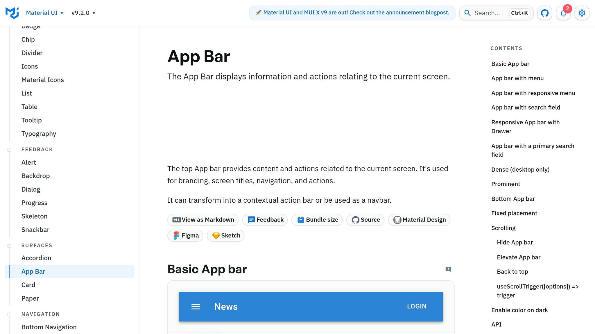
Build the page from top to bottom. Start with the header. Drag an AppBar onto the canvas, place a Toolbar inside it, then add a Typography variant="h6" for the brand name and a Button variant="contained" color="primary" for the main nav CTA. Set position="sticky" if you want it to stay in place while users scroll, or position="static" if it should sit in the normal page flow.
For the hero section, add a Container maxWidth="lg" and place a Grid container inside it with spacing={4} and alignItems="center". Then add two Grid item children with xs={12} md={6} so the text and image sit side by side on desktop and stack on smaller screens. In the text column, use a Typography variant="h2" for the headline, a Typography variant="body1" for the supporting copy, and two buttons: a primary Button variant="contained" color="primary" size="large" and a secondary Button variant="text" color="primary". Use U.S. formatting for things like pricing and dates, such as Plans starting at $49/month and MM/DD/YYYY dates. Use this same setup again for the feature grid and form.
The feature grid uses the same container-and-grid setup. Set the Grid container to spacing={3} and make each Grid item xs={12} md={4} for a three-column layout on desktop. Inside each item, add a Card with elevation={2}, then CardContent, followed by Typography variant="h6" for the feature title and Typography variant="body2" for the description. Keep the text left-aligned so it’s easy to scan.
For the form section, use a Container and Grid, then add these fields:
TextField label="Work Email" type="email" variant="outlined" fullWidthTextField label="Company Name" fullWidthFormControlwith aSelectfor role segmentation, with options like Marketing, Product, Design, and EngineeringFormControlLabelwith aCheckboxfor consent copy
Finish with a full-width Button labeled Request demo and a caption: No credit card required. Response time: 1–2 business days. After the core sections are in place, check each breakpoint.
Use responsive settings and Forge to refine the layout
Review the layout at common U.S. screen sizes: 375×812, 414×896, 1440×900, and 1920×1080. The xs, sm, md, and lg props on each Grid item control when columns stack and when they spread out. Check that CTAs stay easy to spot and that forms stay easy to use at every size.
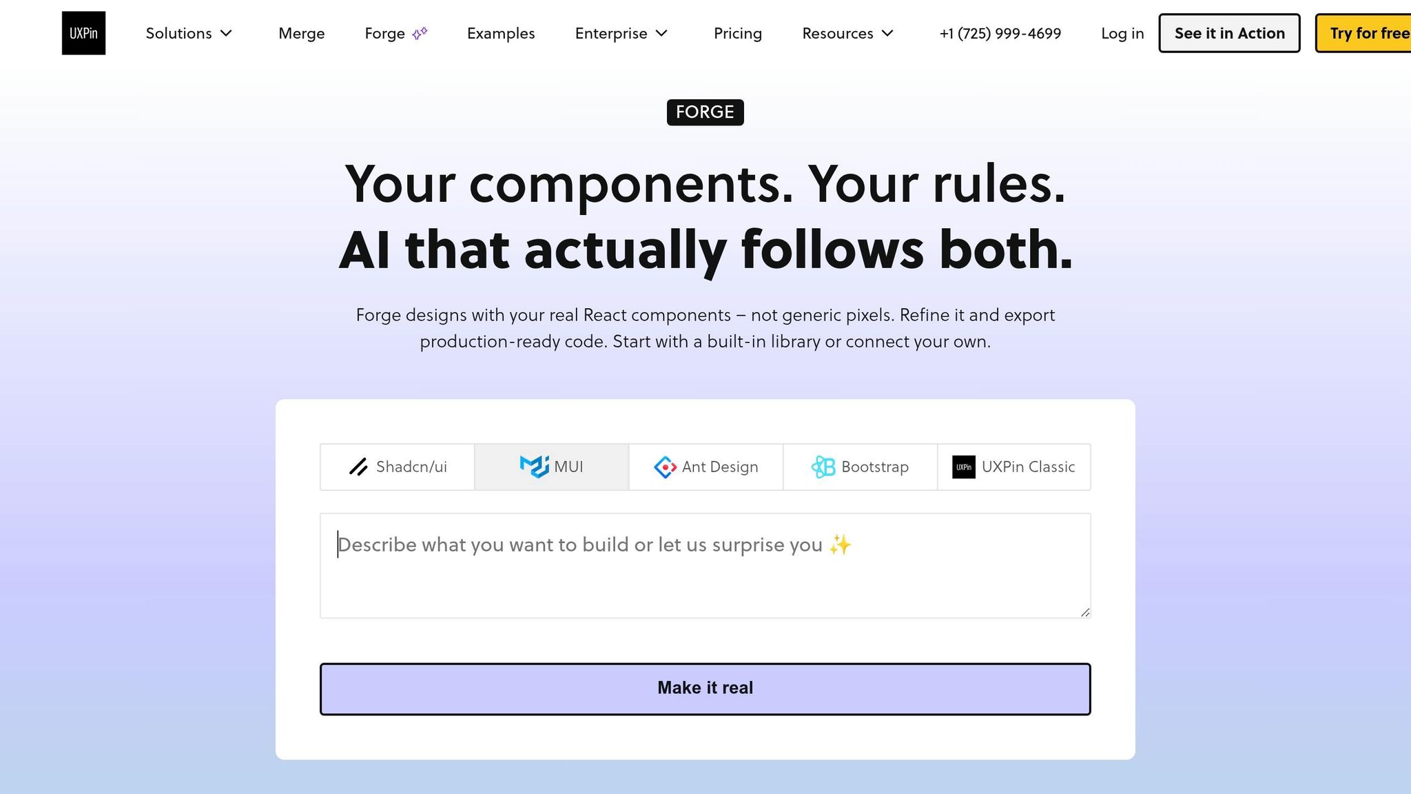
If a section looks a little off, use Forge inside UXPin. Forge is UXPin’s built-in AI assistant, and it works inside your approved design system components. You can prompt it with:
Tighten hero spacing and align the CTA buttons on one row on desktop.
Forge builds the layout using only components already in your design system. That keeps the output in line with your codebase and cuts down on rework.
Validate the prototype, review workflows, and set up reuse
Preview the page and keep design aligned with development
When the last section is done, open the page in preview and check the full experience before handoff. This is the moment to catch the stuff that often slips through: offer clarity, card scannability, mobile form behavior, and breakpoint consistency. Then go breakpoint by breakpoint and make sure the layout still holds up.
This step matters because preview stays close to what engineers will build. That makes feedback easier to act on. UXPin also lets you share preview links with JSX, dependencies, and functions, so engineers can review the same component structure instead of trying to read a static mockup like a blueprint.
Comparison table: generic mockups vs. code-backed MUI components in Merge
You can see the gap pretty fast when you put static mockups next to code-backed components.
| Generic mockups | Code-backed MUI in Merge | |
|---|---|---|
| Design-dev fidelity | Low – spacing, states, and variants are approximated | High – components match production props and structure |
| Speed to deployment | Slower – rebuilding from a mockup adds time | Faster – the prototype is already code-compatible |
| Rework risk | High – visual drift is common during handoff | Low – fewer assumptions are made between design and implementation |
| Team consistency | Inconsistent – depends on individual file discipline | Governed – shared library enforces approved patterns |
Conclusion: a repeatable workflow for faster enterprise landing pages
After preview checks out, you can run the same workflow again for the next page. Start with structured copy and layout in Claude Haiku 4.5, build the page in UXPin Merge with MUI components, then review it in preview before handoff.
The time savings can be hard to ignore. In a UXPin code-to-design experiment, the same one-page prototype took over one hour in an image-based tool versus 8 minutes in UXPin Merge. And once your team starts building page after page, that difference adds up fast.
FAQs
Do I need coding skills for this landing page workflow?
No. With UXPin Merge, you can drag and drop pre-built, code-backed MUI components and set them up in a visual properties panel instead of writing code.
You can manage layouts, interactions, and component states right in the interface. You can also use AI to make changes with natural language prompts.
The only part that calls for technical expertise is setting up a custom component library through Git. If you’re using the standard pre-integrated MUI library, you don’t need that.
Can I use my team’s custom MUI components in Merge?
Yes. You can connect your team’s custom MUI components to UXPin Merge through Git, Storybook, or an npm package.
Once connected, they sync as live, code-backed components. That means you can use your team’s props and variants right on the canvas.
Setup is pretty simple: install the UXPin CLI, create a uxpin.config.js file, and push your components with uxpin-merge push.
How do I turn Claude’s output into reusable page sections?
Ask Claude for structured JSON that maps straight to your approved MUI component props. A role-based prompt helps here. Add a component whitelist and a token dictionary so Claude stays inside the parts and values you allow, instead of drifting into components your system doesn’t support.
Then map each JSON field to the matching props in UXPin Merge. That gives you a cleaner handoff from generated content to working UI. For repeatable sections like feature grids or lead forms, save those MUI patterns as reusable templates. It keeps layouts consistent and close to what ships in production.
Related Blog Posts
- How to build a landing page using Claude Opus 4.5 + MUI – Use UXPin Merge!
- How to build a landing page using Claude Opus 4.5 + Custom Design Systems – Use UXPin Merge!
- How to build a landing page using Claude Sonnet 4.5 + MUI – Use UXPin Merge!
- How to build a landing page using Claude Sonnet 4.5 + Bootstrap – Use UXPin Merge!