If you need design and code to match, these tools are not equal. From what I see in the article, UXPin fits teams that want production code as the source of truth, Figma fits teams that run the system from design libraries and variables, and Adobe is the weakest pick for new enterprise system work because Adobe XD is deprecated as of August 8, 2026.
Here’s the short version:
- UXPin is built for code-backed workflows with React components via Git or Storybook
- Figma is built for libraries, variables, and design-led system management
- Adobe XD + Creative Cloud is better for shared brand assets than design-to-code workflows
- Enterprise teams should compare tools on:
- source of truth
- governance
- token flow
- handoff
- speed to production
- Two numbers stand out:
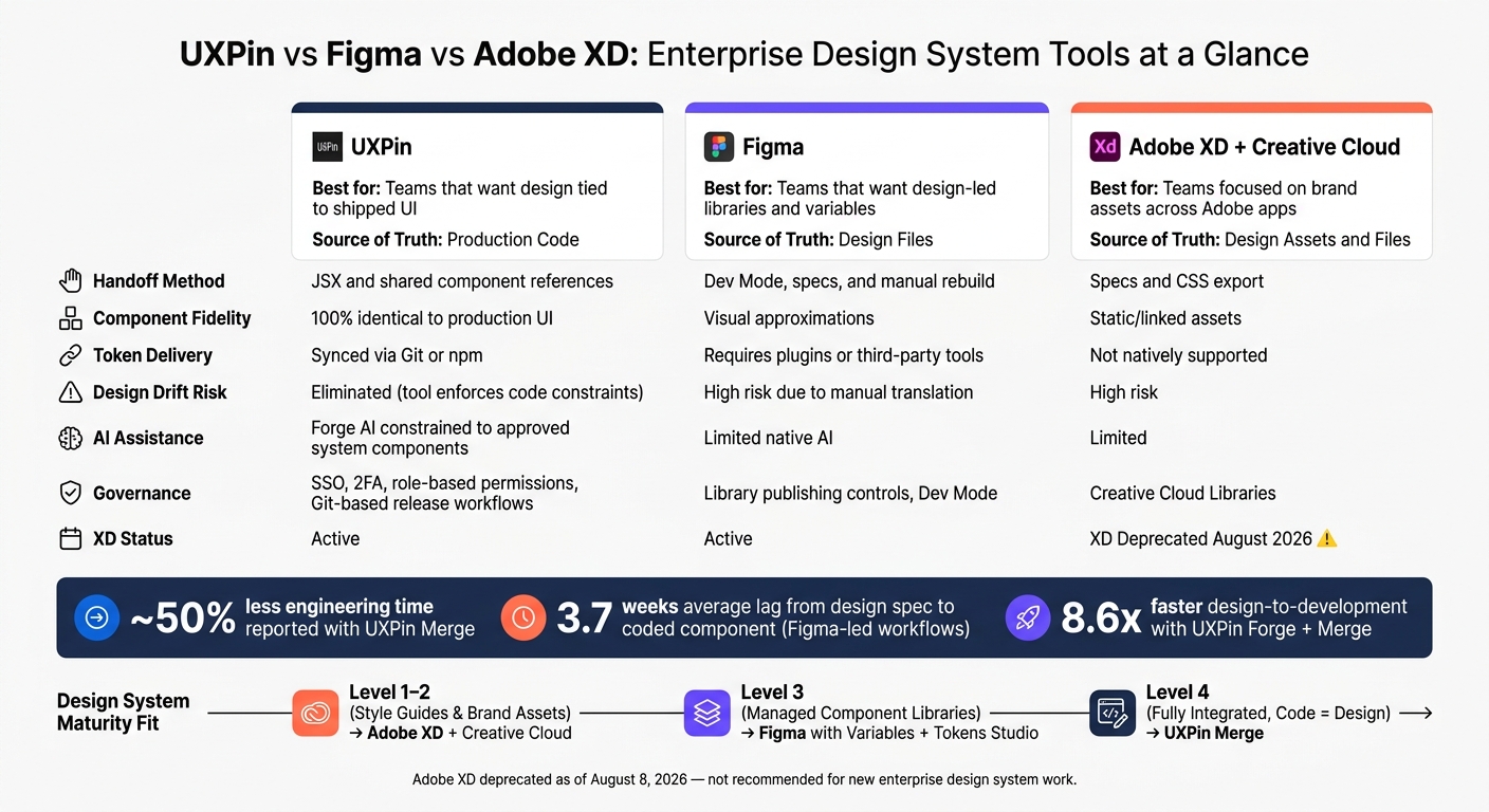
- teams reported about 50% less engineering time with UXPin Merge
- average lag from design system spec to coded component can reach 3.7 weeks
UXPin vs Figma vs Adobe: Enterprise Design System Tool Comparison
Enterprise Design System – How to Build and Scale Webinar
sbb-itb-f6354c6
Quick Comparison
| Tool | Best fit | Source of truth | Handoff | Main tradeoff |
|---|---|---|---|---|
| UXPin | Teams that want design tied to shipped UI | Production code | JSX and shared component references | Setup needs front-end work first |
| Figma | Teams that want design-led libraries and variables | Design files | Dev Mode, specs, and manual rebuild | Code sync often needs plugins or third-party tools |
| Adobe XD + Creative Cloud | Teams focused on brand assets across Adobe apps | Design assets and files | Specs and CSS export | Weak fit for new system work due to XD deprecation |
I’d frame the choice in a simple way: pick UXPin if code alignment matters most, pick Figma if design management matters most, and use Adobe mainly for asset sharing across Adobe tools. The rest of the article explains that tradeoff through governance, token management, handoff flow, and team maturity.
UXPin for code-backed design systems and developer-aligned workflows
For teams that need design work to match production code, UXPin is the code-backed option. It keeps the design canvas and handoff tied to production code, so teams design with real React components and hand off from that same source.
Here’s how UXPin lines up with common enterprise needs:
| UXPin Capability | Enterprise Benefit |
|---|---|
| Production React components via Git or Storybook | Design and code stay aligned |
| Developer-ready JSX handoff | Developers work from the same component references instead of rebuilding the UI |
| Git-based versioning, branch switching, centralized libraries | Controlled releases and consistent system usage |
| Forge AI, constrained to approved system components | AI-generated UI stays within system standards |
| SSO, 2FA, granular role-based permissions | Enterprise access control for internal and external users |
| Design tokens | Standardized token management and portability |
UXPin Merge: designing with real components from code
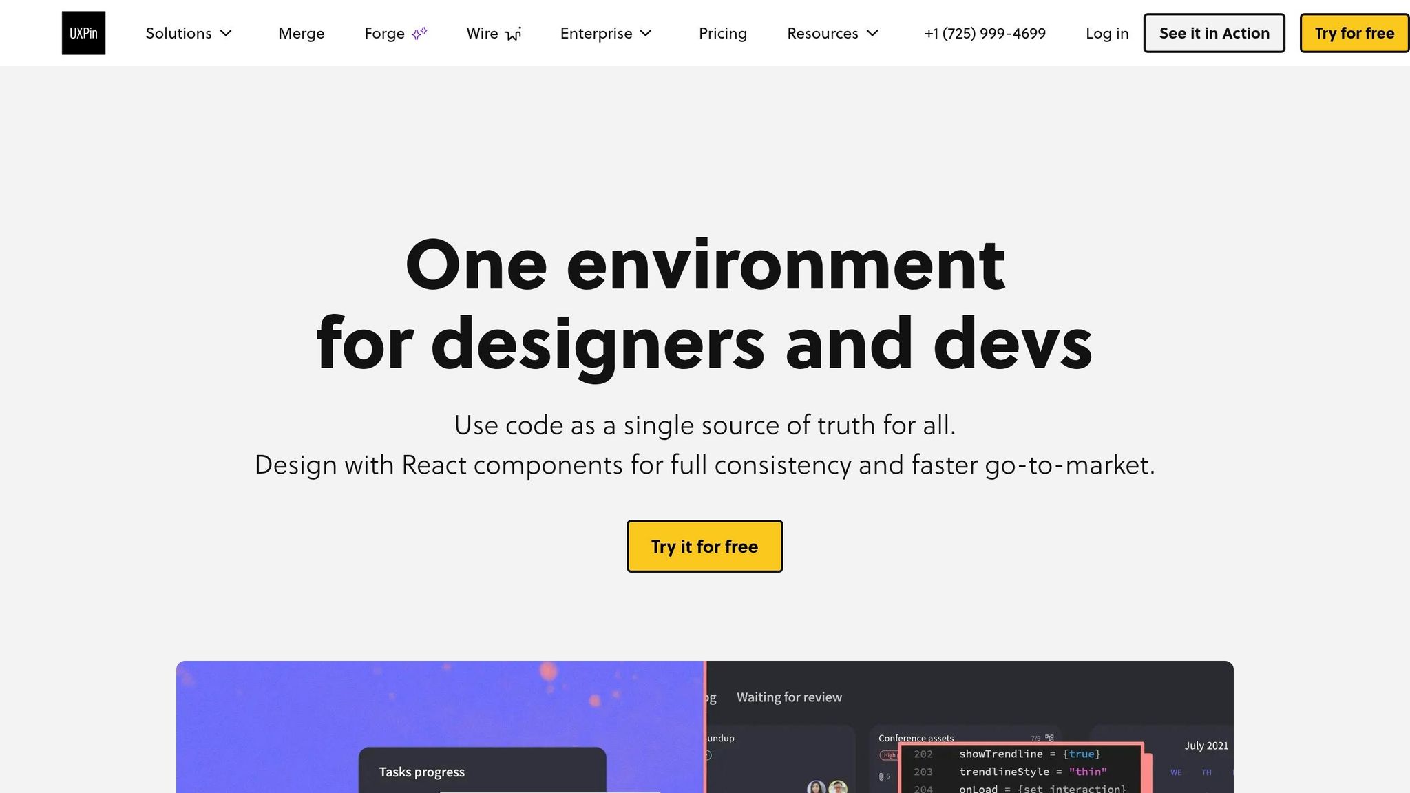
UXPin Merge syncs components from a Git repository or Storybook. When developers update the codebase, those changes sync back into the design library. That means designers work with the same components that ship in production, not lookalikes. UXPin also supports popular frameworks and custom internal libraries through Git.
In one reported case, Merge cut engineering time by about 50%. That kind of alignment matters most when one system needs to support many products without drift.
Governance, scalability, and AI constrained by the design system
UXPin supports governance through props, TypeScript interfaces, and Git-based release workflows. DesignOps teams can control what gets published and when, while version and branch switching help teams stay on the right library release. Access control includes SSO, 2FA, and role-based permissions for internal and external users.
Forge, UXPin’s built-in AI assistant, generates only from approved components, props, and variants your team already approved. So the output stays inside system standards instead of introducing new patterns. Teams using Forge and Merge together report being 8.6x faster in their design-to-development workflows.
If your team manages a design system mainly through libraries and variables, the next section covers that workflow.
Figma for libraries, variables, and design-centric system management
For teams that run a design system as the visual source of truth, Figma is the natural place to do it. It gives enterprise teams one shared workspace for component libraries, tokens, and visual consistency. Shared libraries let system teams publish reusable components and variables across the company, and updates can flow at once across synced files.
Component libraries and variables for foundations at scale
Figma Variables now map straight to design tokens, support modes like light, dark, and high-contrast, and let teams scope values to properties such as fill or stroke. In many enterprise setups, tokens are grouped into three layers:
- Primitive
- Semantic
- Component
That split helps teams keep the system flexible as it grows across many products or brands.
Governance and handoff for large product organizations
At enterprise scale, governance matters just as much as the depth of the library. To avoid drift, teams usually put strict controls around library publishing and use Dev Mode to provide the context developers need during handoff. Figma also supports documentation tied to implementation context during handoff, but it still acts as an authoring surface, not the delivery layer.
Teams that want token-to-code sync often depend on plugins like Tokens Studio or third-party platforms like Supernova to push changes into a Git repository. At scale, that gap can become hard to ignore. Research puts the average lag between a design system component being specified and actually implemented in code at 3.7 weeks.
| Feature | Figma (Design-Led) | UXPin Merge (Code-Backed) |
|---|---|---|
| Source of Truth | Design tool (requires sync to code) | Production code repository (Git/Storybook) |
| Component Fidelity | Visual approximations | 100% identical to production UI |
| Developer Handoff | Redlines, CSS snippets, manual rebuild | Production-ready JSX and prop-alignment |
| Token Delivery | Requires plugins or third-party tools | Synced via Git or npm |
| Design Drift | High risk due to manual translation | Eliminated; tool enforces code constraints |
| System Maintenance | Maintain design kit + code library separately | Maintain code library; design tool syncs automatically |
Figma works well when the main goal is visual exploration, brand theming, and standardizing patterns before anything gets built. It fits best when design owns the system and engineering syncs later. The friction shows up when the design system also needs to stay in lockstep with production code. Teams that need broader asset workflows often move next into Adobe’s ecosystem.
Adobe XD and Creative Cloud for asset sharing and shared creative workflows
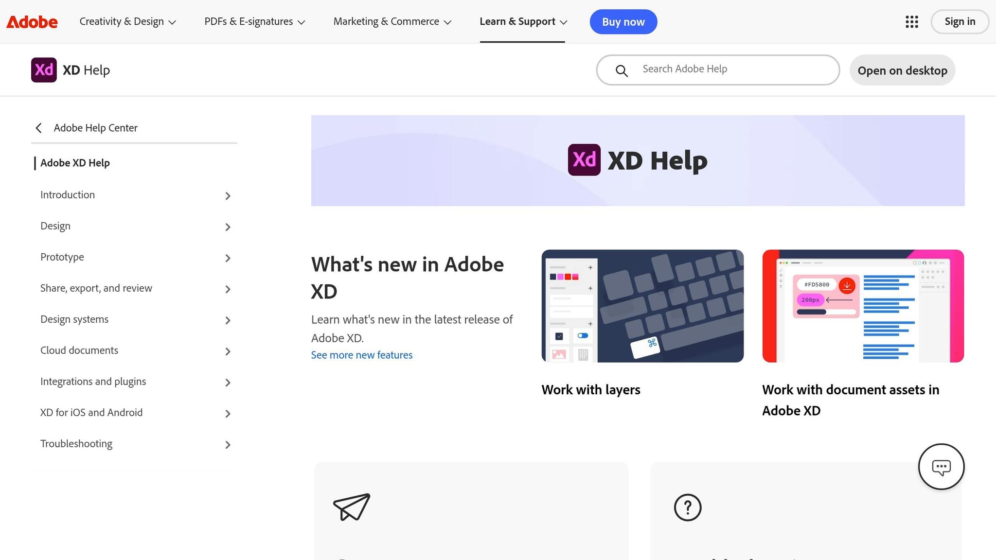
Adobe’s big strength here is Creative Cloud Libraries. They give teams one place to keep shared brand assets across Adobe apps. If an enterprise team needs the same assets used across campaigns and product work, that setup cuts down on manual copy-pasting and duplicate files.
For design systems, though, there’s a bigger issue: Is sharing assets enough? Or does the tool also need to help with implementation?
Adobe XD was deprecated as of 2026, which makes it a weak long-term base for enterprise design system work.
Linked libraries, shared assets, and cross-team consistency
Creative Cloud Libraries let teams store colors, character styles, logos, and other shared assets in one place, then reuse them across Adobe apps. Teams can also link components and push updates across files. That helps with brand control, especially when the company already works inside Adobe every day. However, maintaining scale requires following design system best practices that go beyond simple asset storage.
That said, shared assets are not the same thing as an interactive design system that connects to shipped code. You get brand consistency, but the gap between design specs and production code still stays open.
Collaboration, governance, and developer delivery
Adobe XD supports design specs and CSS export for handoff, but the handoff is still static. It doesn’t sync with production code, so developers have to rebuild interfaces from specs instead of working from a shared component reference.
That makes a big difference. For teams that want close design-to-engineering alignment, Adobe’s setup is a weaker match.
| Feature | Adobe XD + Creative Cloud | UXPin Merge |
|---|---|---|
| Source of Truth | Vector-based design files | Production code (React/Git/Storybook) |
| Component Type | Static/linked assets | Interactive code components |
| Handoff | Design specs / CSS export | Production-ready JSX / Git sync |
| Ecosystem | Deep Adobe CC integration | Developer-aligned / Git / Storybook |
Adobe works well for asset consistency across creative teams. But when the goal is a code-aligned design system and smoother developer delivery, it falls short. That’s the gap the maturity-based fit section helps clarify.
Which tool fits your enterprise design ops maturity
Pick the tool that matches your source of truth, governance model, and speed to production – not just the longest feature list. A better way to compare these tools is to run the same three checks for each one: who owns the source of truth, how changes are approved, and how fast those changes make it into production. That lens makes maturity the fastest way to choose.
Best fit by maturity level, governance needs, and delivery speed
Teams at different stages need different things. A team still putting its visual basics in place doesn’t need the same setup as one running a fully connected, code-based system.
| Maturity Level | Focus | Best Tool Fit | Design-code alignment |
|---|---|---|---|
| Level 1–2: Style Guides & Brand Assets | Visual consistency, shared colors, logos | Adobe XD and Creative Cloud | Low – best for brand asset management |
| Level 3: Managed Component Libraries | Documented component libraries, variables, and collaboration | Figma with Variables + Tokens Studio | High – native Variables, but Git sync still depends on plugins |
| Level 4: Fully Integrated | Single source of truth where code equals design | UXPin Merge | Highest – components come directly from production code |
At the lower end of maturity, the main goal is asset reuse. At the higher end, the goal shifts to production alignment.
Adobe fits organizations that care more about shared brand assets across creative teams than design-to-code alignment.
Figma fits teams that want design-led system management, native token support, and live collaboration. It works best as the design surface, not the delivery layer.
Once design has to stay synced with shipped code, the trade-off changes. UXPin fits teams at the highest maturity level, where handoff drift creates daily drag. Because Merge syncs straight from production code, there’s no translation layer between design and engineering. The setup takes engineering effort up front because the component library has to be connected first. But if handoff friction is slowing every release cycle, that early work can pay off fast.
FAQs
How much engineering work does setup require?
Setup depends on your team’s technical maturity. Code-backed systems like UXPin Merge need some engineering work up front to expose and maintain production-ready components from sources like Git, npm, or Storybook.
That early lift shifts engineering work to the start of the process. But it can cut total engineering time by up to 50% by removing manual handoff and rebuilds. Visual-first tools are easier to get going with at first, but they often create more friction later.
What maturity level is right for a code-backed system?
A code-backed design system works best for teams that already have a solid technical base, including a production-ready component library. The big idea is simple: the team is ready to use code as the single source of truth.
It makes sense when static design tools start slowing things down, especially in collaboration, scaling, or handoff. At that point, designers and engineers can work from the same working UI elements instead of translating back and forth between mockups and code.
How do design tokens reach production code?
Design tokens make it into production code by acting as a shared data layer between design and development. Most teams define them in a version-controlled JSON file, usually split into base, semantic, and component layers.
Then, transformation tools like Style Dictionary turn that JSON into platform-specific outputs, such as CSS variables, SCSS, Swift structs, or Kotlin objects. In CI/CD pipelines, token updates can flow straight into builds without extra manual work. And with UXPin Merge, those tokens can also link directly to code-backed components.