Best App Landing Page Examples and Why They Work
An app landing page is a dedicated web page designed to showcase and promote a specific application. Its primary purpose is to provide information about the app, highlight its key features and benefits, and encourage target audience to download and install the app.
App landing pages are an essential part of the marketing strategy for apps, serving as a central point for potential users to learn more about the app and decide to download it.
Are you an app developer? Create a beautiful and interactive app landing page design with UXPin Merge’s drag-and-drop features. Use React components that you can then copy to build a React-based app landing page. Try UXPin Merge for free.

What is an app landing page?
An app landing page is a special web page made to show off and promote a specific app. It’s like a virtual brochure that tells you all about the app – what it does, its cool features, and why you should get it. The main goal is to help people decide to download and install the app.
These pages are crucial for marketing mobile apps. They act as a central spot where potential customers can get all the details they need before deciding if they want to download the app to their mobile devices or computers. Essentially, it’s like a one-stop-shop to learn how the app works and make an informed choice.
In simpler terms, an app landing page is like a friendly guide that introduces you to an app, explains what it can do, and invites you to give it a try by downloading it.
Key elements of an app landing page
Most app landing page examples use similar elements. These elements matter because they contribute to a positive user experience and makes the target audience understand what the landing page is for.
Standard UI elements are commonly used across various websites and apps. When users encounter familiar elements, they feel more comfortable and can quickly grasp how to interact with the content.
Certain UI elements have become industry standards. For example, having a prominent and clear CTA button aligns with users’ expectations. Meeting these expectations helps target audience find what they’re looking for without unnecessary confusion.
What are they? Let’s explore key elements of app landing pages in layman’s terms.
- App logo: Placing the logo in the top left corner of the landing page is a common and effective practice. This aligns with the standard layout of many websites.
- Hero image or video in the header: Eye-catching visuals at the top of the page help to introduce the app and draw the users in to scroll down for more information.
- App description text: A concise and compelling overview of the app, including its value proposition, main functionalities, and high-converting benefits.
- Feature highlights: Sections showcasing the key app features and functionalities of the app, often presented with screenshots of the app or icons to enhance scannability of text and boost messaging.
- Call-to-Action (CTA) buttons: Prominent buttons encouraging users to download the app with a download link or take specific actions.
- User testimonials: User reviews or any other form of social proof that describe typical use cases and opionions. Believe it or not, testimonials truly boost your conversion goals. Sometimes a great social proof is just showing the number of app downloads.
- Social media integration: Links or feeds to the app’s social media profiles to encourage visitors to follow for updates and engage with the app community.
- Compatibility information: Information about the platforms and devices supported by the app, such as iOS, Android, smartphones, tablets, etc.
- Contact or support information: Providing ways for users to get in touch with the app’s developers or support team for inquiries or assistance.
By incorporating these elements, app landing pages create a user-friendly environment that aligns with user expectations, enhances usability, and encourages visitors to engage with the content and ultimately get the app.
Best app landing page examples
We prepared a list of high-converting landing pages for mobile apps that you can find at Google Play Store, Apple App Store, or web apps sold by popular SaaS companies. Let’s analyze what makes those landing pages effective.
Headspace
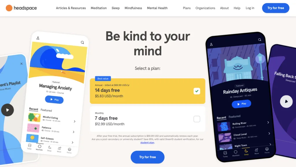
Headspace is a meditation app and a great mobile app landing page example. It has a logo in the top-left corner, colorful app screenshots, and a value proposition as a H1. Its CTA button and pricing tiers are above the fold which definitely impacts conversion rates. What is above the fold? It is any content that is immediately visible on a webpage without requiring the user to scroll down.
What’s in it for you?
- Don’t fear bold colors — Minimalist design is still on trend, but it doesn’t mean that your website should be black and white. Experiment with colors to make your site a delightful user experience.
- Test if pricing is something that converts —SaaS websites usually highlight pricing on a dedicated landing page, but why not to try it above the fold. Run an a/b test to see if it works for your target audience.
- Give users a sample of what they can expect — A couple of scrolls down and you can actually hear the recording of one of the meditations. It’s a great hook that draws people in.
MonopolyGo
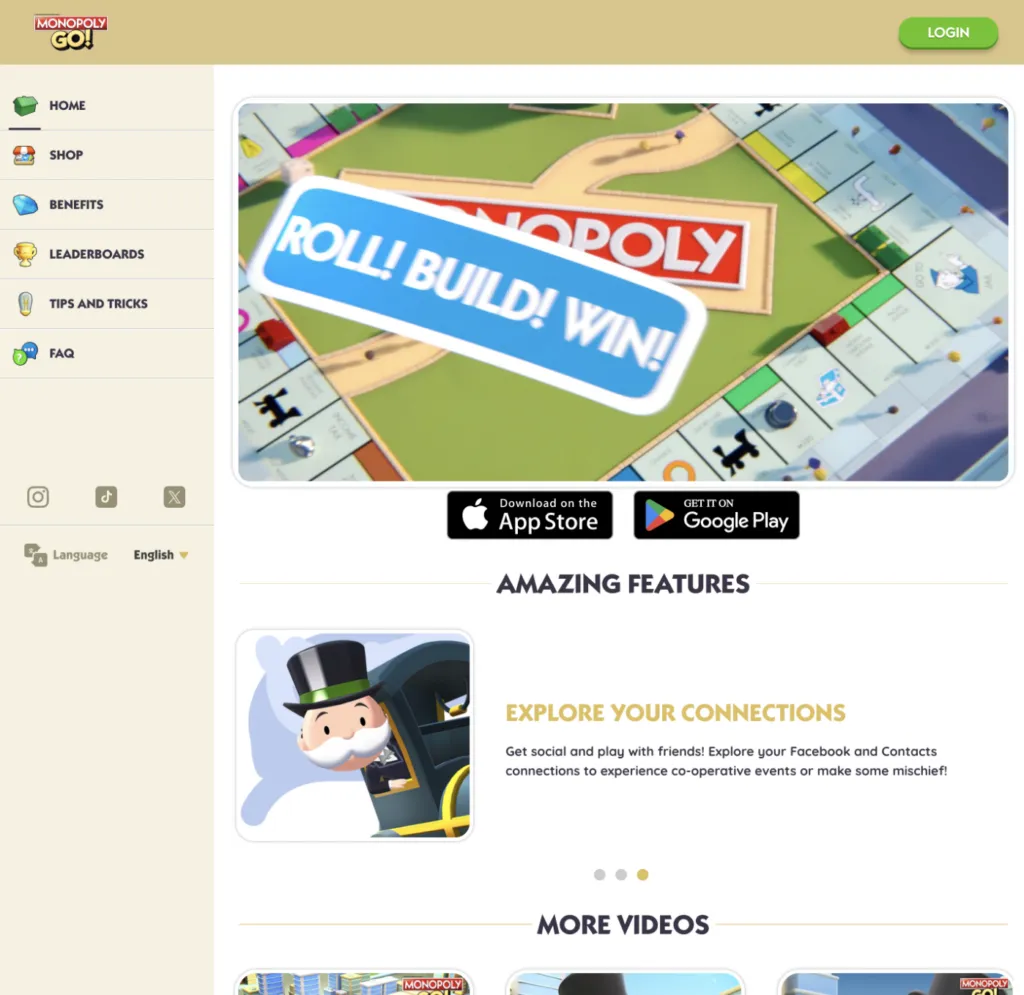
MonopolyGo is one of the best selling mobile apps. It’s landing page is simple and to the point. Even though it’s downloaded by millions of people, the landing page creators decided to feature only three testimonials. It seems that it’s not a lot, but each review has a candid photo of a smiling person and a high energy description. Way to go, isn’t it?
What’s in it for you?
- Boost excitement with an energetic animation — No header? It’s not necessary! Most people know what Monopoly is, but they don’t know how fun it is to play it. Encourage more interest with a high-energy animation of your product.
- Put links to social media — If social media marketing is important to you and your potential customers, feature the links to it in a visible spot. Notice that for MonopolyGo, it’s not the footer, it’s a left-hand side of their site.
- Chat option in the right corner —Give your target audience a possibility to reach out to your customer service. This way you’ll know what issues they have and what they expected to get from your site. Feedback matters!
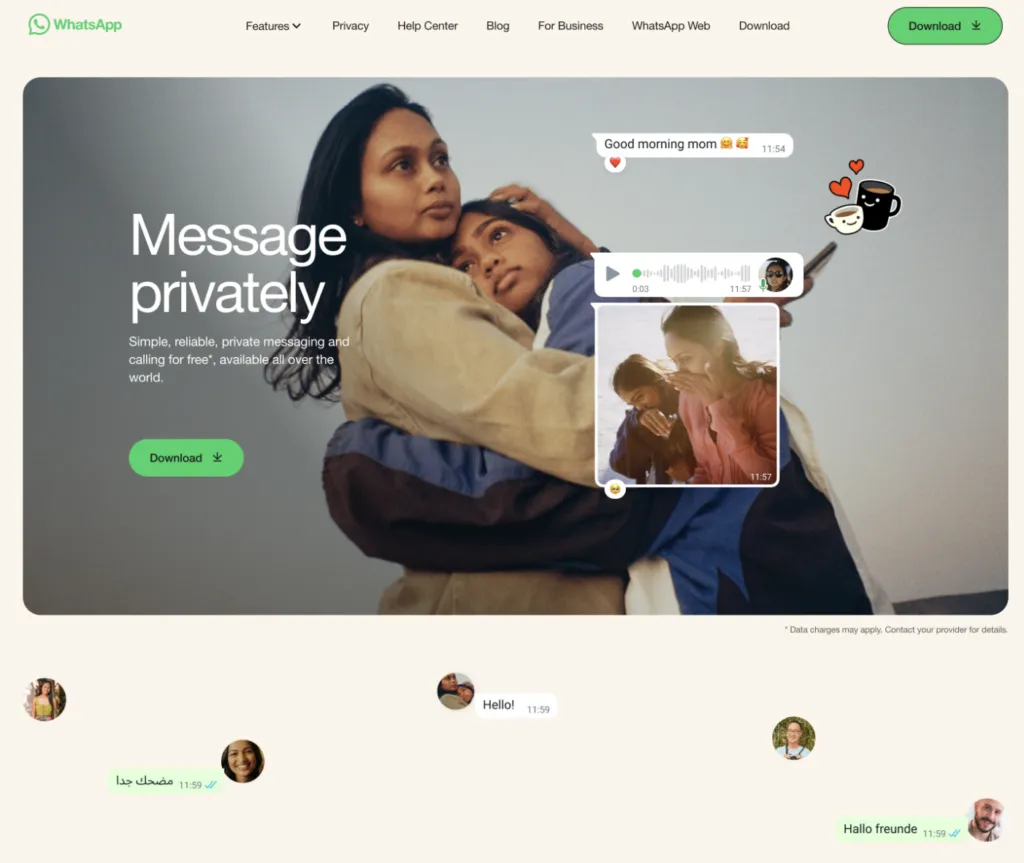
WhatsApp is a great example of website design that sells. It pairs great copy with heart-warming visuals to make you click the “Download” CTA. This is why aside from great UI design, you need to work with a copywriter who knows how to compose a high-converting copy.
What’s in it for you?
- Focus on your value proposition —WhatsApp differentiates itself from other communicators by telling their potential customers that they’re a secure app. What is your value proposition and why should it be important to your users?
- Use negative space to make copy sink in — WhatsApp makes a great use of whitespace and we think it’s because they want to make the text and visuals stand out. Let your copy breathe, so it can create the impact that you want.
- Doodles —Headspace used bold colors, MonopolyGo video, and WhatsApp uses doodles to make their landing page more unique.
Vinted
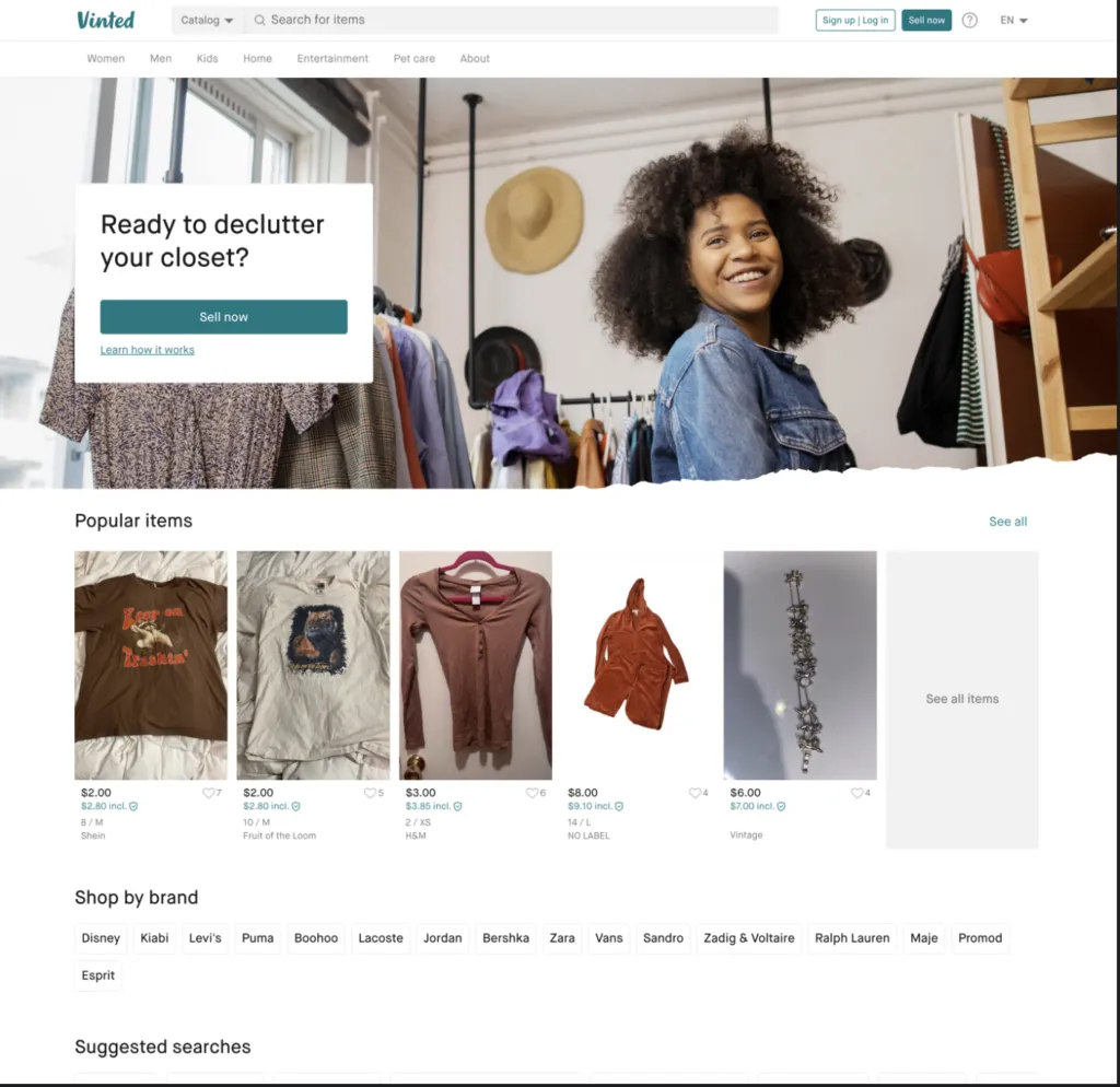
Vinted is a platform for selling and buying clothes from people. It took ecommerce space by storm. It works on a premise that when you’re using the platform you are giving clothes a new life, and it plays well with a sustainability trend so popular in 2024.
What’s in it for you?
- Candid photos — it uses photos from the platform on its landing page. Be careful with this one, because you need user consent to do it.
- Navigation with categories —Vinted is in ecommerce category and it features navigation to communicate what you can expect from the platform.
- Search bar — what happens when you type in what you’re looking for and click search? You get search results, and from this point you are one step away from buying an item and becoming a user. Since items are indexed, it boosts Vinted’s SEO rankings.
Create an app landing page design with UXPin Merge
You are one step away from creating a high-converting app landing page? Use our tips and log in to UXPin in order to use your knowledge in practice. Design a beautiful layout of your app landing page using Adalo or other no-code app builders if you want to ship your idea quickly. Soon you’ll find optimized landing page templates in our app.
And if you are new to our site, we’re creating UXPin Merge, a drag-and-drop UI builder that helps non-designers assemble landing pages, apps, websites, and more 10x faster. Try UXPin Merge.