Chat UI Design: How to Build Effective Chat Interfaces in 2026
Chat interfaces are everywhere in 2026 — from customer support widgets and team messaging apps to AI-powered assistants and conversational commerce. Designing an effective chat user interface requires balancing usability, accessibility, and the unique interaction patterns of real-time messaging.
This guide walks you through the core elements of chat UI design, best practices for AI chatbot interfaces, accessibility guidelines, popular development frameworks, and a step-by-step process for creating your own chat interface.
Need to prototype a chat UI with real interactivity — working inputs, message states, and conditional logic? UXPin lets you build fully functioning prototypes that replicate the final messaging experience. Start a free trial.

What Is a Chat UI?
A chat UI (user interface) is the visual design and interaction layer of any messaging-based application. This includes:
- Peer-to-peer messaging — Apps like WhatsApp, Slack, and Microsoft Teams where users communicate directly with each other.
- Customer support chat — Widgets from providers like Intercom and Zendesk that let users message company representatives in real time or leave messages for later response.
- AI chatbot interfaces — Conversational UIs for AI assistants, including support bots, generative AI tools, and virtual agents.
- In-app messaging — Chat features embedded within larger products, such as marketplace buyer-seller communication or collaborative tools.
The core challenge of chat UI design is creating an interface that feels natural for real-time conversation while handling the complexity of attachments, notifications, threading, error states, and accessibility across devices.
Essential Chat UI Design Elements
Every effective chat interface shares a common set of UI components. Here are the elements you need to get right:
Message Input Field
The input field is where users compose messages. Critical requirements include multi-line editing capability (so users can review their message before sending), easy access via mouse or touch, and support for rich content like emojis, mentions, and file attachments.
Send Button
A clearly visible send button or icon is essential. Additionally, support keyboard shortcuts — the “Enter” key for sending on desktop — so users don’t need to reach for their mouse. Consider “Shift + Enter” for line breaks within a message.
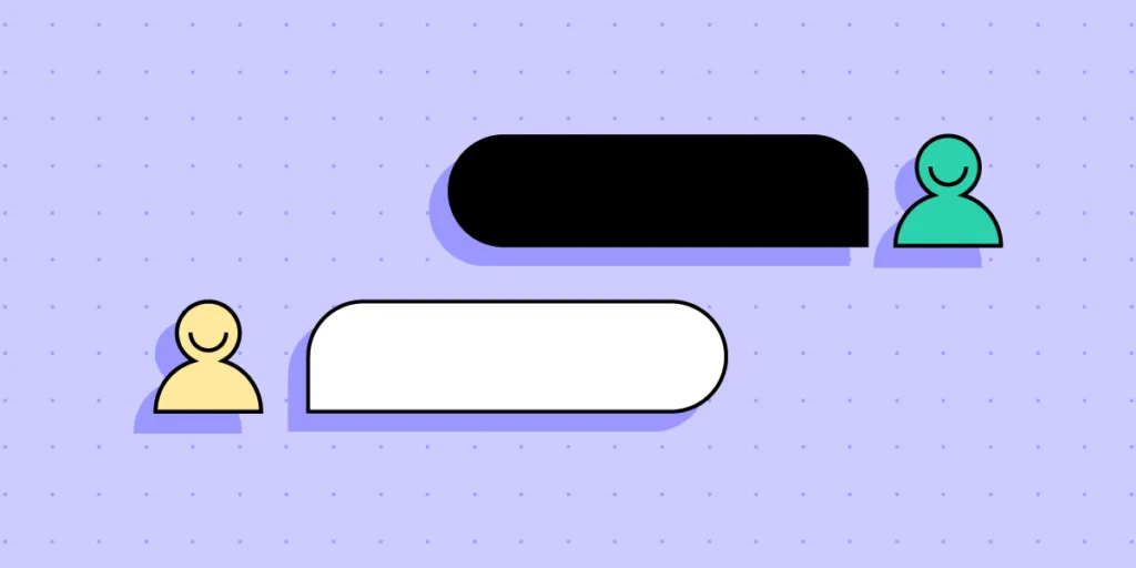
Message Bubbles
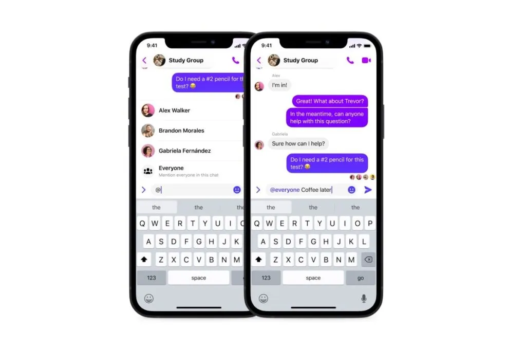
Message bubbles visually separate individual messages and distinguish senders from receivers. Use different colors or alignment (left vs. right) for each participant. In group chats, combine color coding with usernames or avatars for clarity.
Timestamps
Timestamps show when each message was sent or received, providing context and helping users track conversation timelines. Display them unobtrusively — grouped by date with relative labels (“Today,” “Yesterday”) and exact times on individual messages.
Avatars and User Presence
Profile pictures or initials humanize the chat experience and help users identify participants quickly — especially in group conversations. When users don’t have a profile photo, avatar generators create distinctive visual placeholders that let people differentiate members at a glance, making messages easier to scan. Pair avatars with presence indicators (online, away, offline) to set expectations about response times.
Typing Indicators
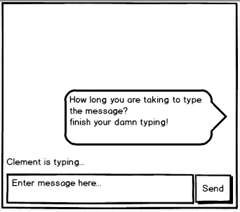
Typing indicators (the familiar “…” animation) signal that the other person is composing a reply. This reduces the anxiety of waiting and helps prevent users from sending duplicate messages.
Read Receipts and Delivery Status
Status indicators (sent, delivered, read) give users confidence that their message reached the recipient. Use subtle visual cues — checkmarks or small text — to convey status without cluttering the interface.
Error Handling in Chat UIs
Reliable error handling prevents miscommunication and builds user trust. Key principles:
- Position errors near the source — Show a red exclamation icon on the specific message bubble that failed to send, not in a generic toast notification.
- Explain the cause — Use clear microcopy like “Unable to send — check your internet connection” rather than generic “Error” messages.
- Provide retry actions — Include a “Resend” button directly on the failed message so users can recover without retyping.
- Handle offline gracefully — Queue messages locally when the user loses connectivity and send them automatically when the connection restores. Show a banner indicating offline status.
Designing Chat UIs for AI Chatbots
AI chatbots have matured significantly thanks to large language models. Designing their interfaces requires additional considerations beyond standard chat UI patterns. If you’re building AI-powered applications that need to connect to enterprise data sources, DreamFactory, a self-hosted platform providing governed API access to any data source, can help you securely expose your databases and services to your chatbot backend with role-based access controls.
Set Clear Expectations Upfront
Clearly label the conversation as AI-powered. State the bot’s capabilities and limitations so users know what to expect — there’s nothing more frustrating than typing a detailed message only to receive an irrelevant automated response.
Offer Structured Quick Actions
Instead of an open-ended “How can I help you?”, present category buttons, suggested prompts, or example queries. This reduces cognitive load and helps users leverage the bot’s capabilities efficiently.
Design for Streaming Responses
Modern LLM-based chatbots stream text token by token. Design your UI to display text as it arrives — with a smooth typing animation — rather than waiting for the complete response. Include a “Stop generating” option for long responses.
Support Rich Response Formats
AI chatbots often return formatted content: code blocks, tables, lists, images, and links. Your chat UI must render these elements cleanly within message bubbles.
Include Feedback Mechanisms
Add thumbs up/down buttons or rating prompts on AI responses. This feedback loop helps improve the AI model and gives users a sense of control over their experience.
Provide an Escalation Path
Always offer a clear way to reach a human agent when the AI can’t resolve the user’s issue. A “Talk to a person” button should be persistently accessible.
Chat UI Accessibility Best Practices

Accessibility is essential for chat interfaces, which must accommodate users with visual, auditory, cognitive, and motor impairments. Follow these guidelines:
- Screen reader compatibility — Ensure all UI elements are properly labeled for assistive technologies. Use ARIA live regions to announce new messages dynamically.
- High-contrast colors — Choose color combinations that meet WCAG AA contrast ratios. UXPin provides built-in accessibility testing tools, including contrast checkers and color blindness simulators.
- Keyboard navigation — Users must be able to compose, send, and navigate messages using only a keyboard. Support Tab navigation between input, send button, and message history.
- Legible typography — Use readable typefaces at sufficient sizes. Prefer native system fonts for optimal rendering across devices.
- ARIA attributes — Implement Accessible Rich Internet Applications attributes to provide context for assistive technologies, especially for dynamic content like typing indicators and new message notifications.
- Customization options — Allow users to adjust text size, choose between serif and sans-serif fonts, and switch between light and dark modes.
- Adequate touch targets — Ensure interactive elements like send buttons, emoji pickers, and attachment icons meet the minimum 44×44 pixel touch target size recommended by WCAG.
Frameworks for Building Chat UIs
If you’re developing a chat interface, these frameworks provide pre-built components that accelerate development:
Gifted Chat (React Native)
Gifted Chat is a comprehensive React Native UI kit for web and mobile chat apps. It includes customizable message bubbles, avatars, timestamps, and typing indicators out of the box.
Stream Chat (React, React Native, Flutter)
Stream provides a complete chat SDK with pre-built UI components, real-time messaging infrastructure, and features like threading, reactions, and file uploads. It supports React, React Native, and Flutter.
Vue Advanced Chat
Vue Advanced Chat is compatible with Vue, Angular, and React. Features include message threading, file uploads, internationalization, and emoji support.
Many of these React-based frameworks are compatible with UXPin Merge, which lets designers import code components directly into UXPin’s design editor for prototyping and usability testing — via the Git Integration or Storybook Integration.
How to Design a Chat UI: Step by Step
1. Research and Define Requirements
Start by identifying your users and their needs. Are you building a customer support widget, a team messaging tool, or an AI chatbot interface? Each has different requirements. Study competitors to understand common patterns, then list required features: text messaging, file uploads, threading, video calling, or AI responses.
Meet with your development team to determine whether you’re building from scratch, using one of the frameworks above, or leveraging an open-source component library like MUI.
2. Sketch and Wireframe
Explore layout options with quick paper prototypes, then build digital wireframes to test the structure and user flows. Focus on conversation layout, input positioning, navigation between chat threads, and notification placement.
3. Design High-Fidelity Mockups
Add typography, colors, and detailed styling to your wireframes. Test light and dark modes, validate color contrast for accessibility, and ensure emojis, GIFs, and other rich content render cleanly within message bubbles.
4. Build an Interactive Prototype
Chat UIs are inherently interactive — they need working inputs, state changes, and data flow. UXPin’s code-based design engine lets you build prototypes where users can actually type messages, trigger send actions, and see dynamic responses using States, Variables, and Expressions.
Alternatively, use Forge to generate a chat UI layout from a text description using your production components. Describe the interface — “Create a chat window with a message list, input field, send button, and typing indicator using our design system” — and Forge assembles it with real React components.
5. Test with Real Users
Run usability tests with your interactive prototype. Verify that participants can compose and send messages, navigate threads, handle error states, and find key features like attachments or search. Test with assistive technologies to validate accessibility compliance.
6. Hand Off to Development
Use UXPin’s Spec Mode to share design specs, CSS properties, spacing measurements, and downloadable assets with developers. If you’re using Merge, the components in your prototype are the same ones in your codebase — eliminating translation errors and reducing development time by up to 50% for enterprise teams.
Frequently Asked Questions
What is chat UI design?
Chat UI design is the process of creating the visual layout, interaction patterns, and user experience for messaging-based applications — including peer-to-peer chat, customer support widgets, and AI chatbot interfaces.
What are the key elements of a chat user interface?
Essential elements include a message input field, send button, message bubbles with sender identification, timestamps, avatars or user presence indicators, typing indicators, read receipts, and error handling for failed messages.
How do you design a chatbot UI?
Start by setting clear expectations that the user is interacting with AI. Offer structured quick actions and suggested prompts instead of only open-ended input. Design for streaming text responses, support rich content formats (code, tables, images), include feedback mechanisms, and always provide an escalation path to a human agent.
What accessibility standards apply to chat UIs?
Chat interfaces should follow WCAG guidelines, including screen reader compatibility via ARIA attributes and live regions, sufficient color contrast (minimum 4.5:1 for text), full keyboard navigation, adequate touch target sizes (44×44px minimum), and user customization options for text size and color scheme.
What frameworks can I use to build a chat UI?
Popular options include Gifted Chat for React Native, Stream Chat for React and Flutter, and Vue Advanced Chat for Vue/Angular/React. Many React-based chat frameworks are compatible with UXPin Merge, letting designers import the components for prototyping and testing.
How do I prototype a chat interface with UXPin?
UXPin’s code-based design engine supports working inputs, states, variables, and conditional logic — allowing you to build a prototype where users can actually type and send messages. You can also use Forge to generate a chat layout from a text prompt using your production components, then refine it conversationally.


