9 Best Design System Examples in 2024
Design system is a set of components, rules, style guides, and documentation used to build a coherent and on-brand interface of a product. Most brands create their own design system and we prepared a list of nine most popular design systems that you can learn a lot from. Those and other design systems can be found in our design system repository called Adele.
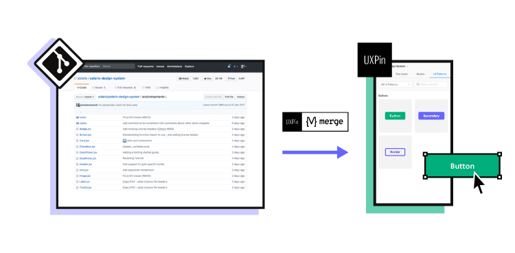
Boost design system adoption and governance with UXPin Merge. Bring all interactive components from your design system to the editor, build fully interactive prototypes, and keep your designs consistent. Read more about UXPin Merge.

What is a Design System?
A design system is a collection of all design resources that a product team may use to build user interface of their app, website, eCommerce store or any other UI design they need to develop.
Design systems aren’t only for designers. They are also for developers, as they contain all code snippets and development resources with necessary front-end code together with documentation as well as design guidelines, relevant plugins, design patterns, style guides, reusable components, rules plus guidelines, and all other building blocks useful for web design and development workflow.
These design systems are then hosted as websites online and can be publicly available (they are open-source design systems) or internal, whatever the brand decides.
We can think of a design system as a vast data library that acts as a valuable document with applicable instructions and examples, product design and coding guidelines, and a part of the UI kit all at the same time.
As you can see, there are many product design concepts related to design systems. If you want to learn to differentiate design systems from pattern libraries, component libraries, and UI kits, read our previous article on the topic: The difference between design system, pattern libraries, style guides, and component libraries.
Why Are Companies Building Unique Design Systems?
Companies like Shopify, Google, AirBnB, and other are building their own unique design systems because they want:
- Consistency – design systems act as a single source of truth for design and development.
- Transparency – developers can use the design system components directly, without needing to interpret design decisions.
- Scale – designers are able to build prototypes faster and streamline developer handoff.
- Reusability – design systems facilitate the creation of prototypes with consistent components that can be shared within the organization.
- Clarity – design systems help ensure that design decisions are based on shared knowledge, making it easier for team members to understand and contribute effectively.
What is There to Learn from Design Systems?
The majority of design systems follow rather general setup patterns.
The system often features its top navigation with the main categories: Design, Code, Language, Components, etc.
Each of these main categories has its subcategories that discuss things in more detail, making the most out of the atomic design structure. For instance, these subcategories could be something like Typography, Color, Forms, Banners, etc.
Following this intuitive navigation can get you valuable information about best practices in terms of design.
The Benefits of Creating a Design System
With a well-built design system in place, businesses can considerably improve their teamwork and streamline decision-making process, but that’s not all that you can get from creating a design system.
Such collection of guidelines, elements, and data minimizes communication issues between designers and developers and minimizes the room for potential UX design bugs or acquiring UX debt.
What’s more, having such a reference-rich library significantly reduces the necessary time to go from a prototype to an actual product.
For example, PayPal uses Fluent UI together with Merge technology. This allows them to incorporate the interactive components to the UXPin library. That way, both designers and product team members alike can easily access these components and design with them over and over again.
Design systems are a great way to minimize the disconnect between designers and developers but are still not the ideal solution on their own. Thanks to the Merge technology revolution, product team members can easily use the same tools and improve their DesignOps workflow processes. This means that both developers and designers can access and use the same UI elements from one single source.
Design System Challenges and Solution
Even when companies try to create their design system, specific issues and consistency disconnects can still happen, especially when maintaining all the elements, documentation and code.
Learn more about design system challenges and solutions from one of the top design leaders – Johnson & Johnson. During our webinar, the J&J team shared all their best practices.
Example 1: Porsche Design System
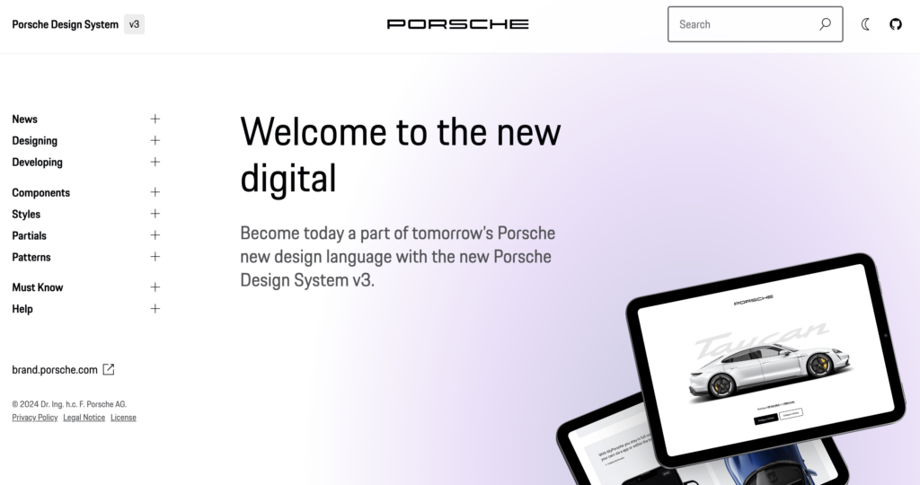
The Porsche Design System is an exemplary model due to its comprehensive, well-documented, and high-standard approach to design and implementation, making it a valuable reference for anyone looking to create top-tier web applications.
The Porsche Design System stands out because it provides the essential design fundamentals and elements required for creating visually appealing and high-quality web applications. One of its key strengths lies in its pixel-based libraries for Figma and then coded ones in UXPin, which streamline the design process for digital creators. Additionally, it includes coded Web Components and detailed usage guidelines, ensuring that the implementation is as smooth and consistent as the design.
What truly sets this system apart is its adherence to the rigorous Porsche quality standards and corporate design principles. Every component is meticulously built and tested, guaranteeing not only aesthetic excellence but also functional reliability. This holistic approach ensures that the final products are both beautiful and robust, reflecting the esteemed Porsche brand.
Example 2: Google Material Design System
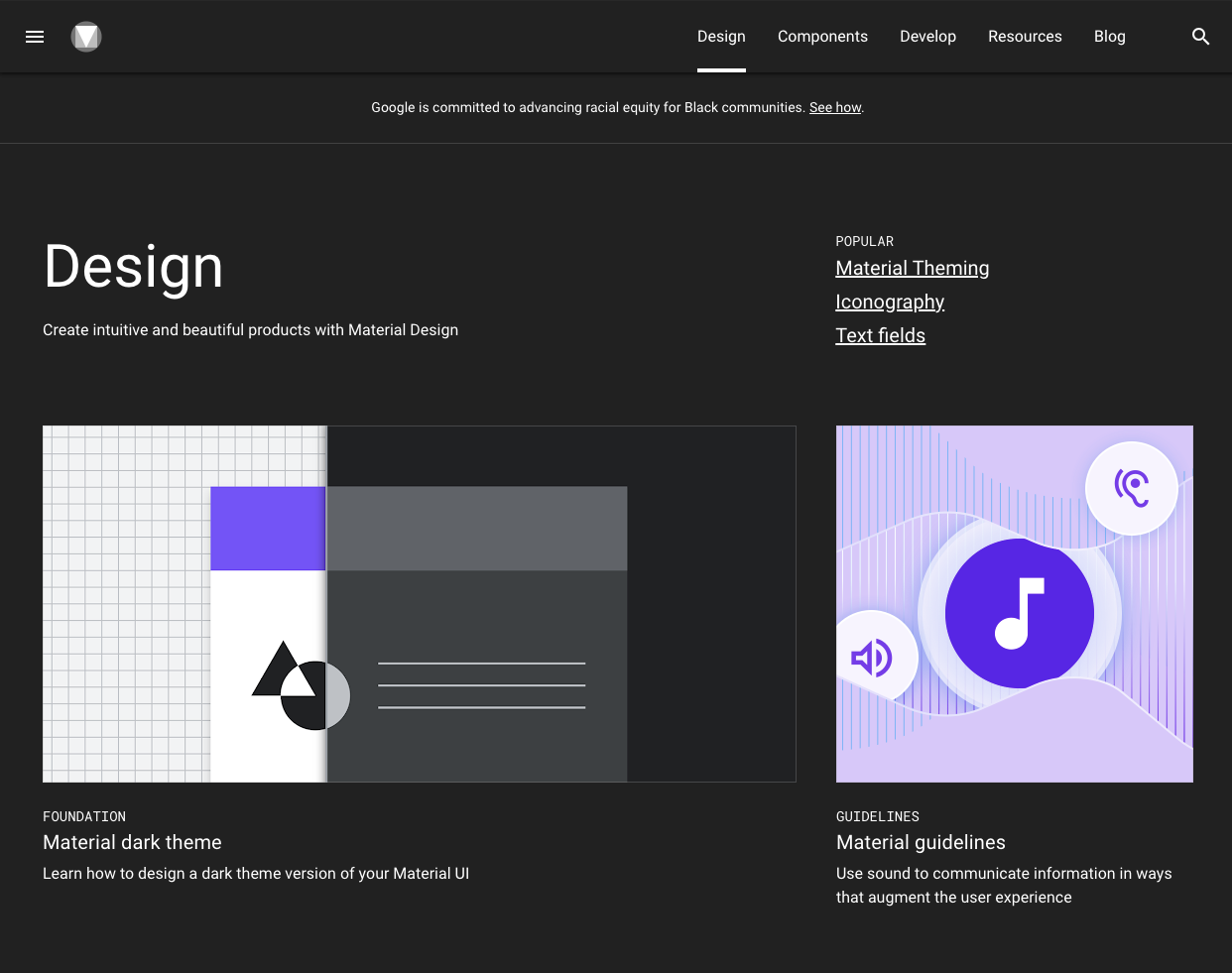
One of the most popular design system is Google’s Material Design. Google created and publicly shared their Material Design System that goes into the tiniest details regarding everything there is to know about the design and design principles. Every UXPin user can easily use the Material Design components as they are one of the UXPin libraries.
Thanks to this system, users can get valuable information that perfectly unifies UI and UX across different devices, platforms and input methods.
Material Design allows other brands and individuals to have a strong foundation for building upon when it comes to their own approach to atomic design, industry innovation and unique brand expression.
The main features of the Google Material Design System include:
- Starter Kits
- Design Source Files
- Material Theming
- Layout
- Typography
- Color
- Components
- Mobile Guidelines
Google’s Material Design System looks very mature. It has a lot of design guidelines, but it also contains documentation about UI components that are used in development. Did you know that such components can be used in design? Bring your developers’ components to design with UXPin’s Merge technology. Request access to UXPin Merge.
Example 3: Apple Human Interface Guidelines
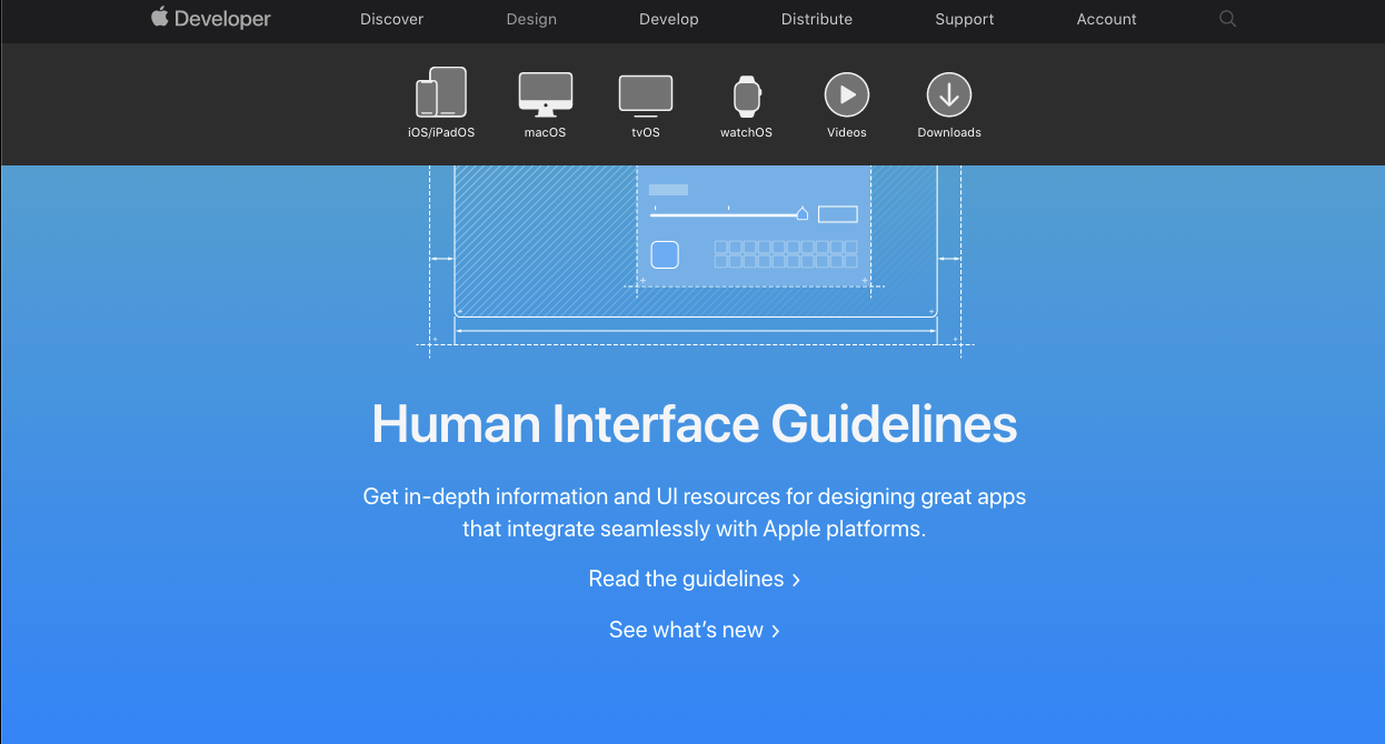
Apple has one of the top design system. It is called Apple Human Interface Guidelines and it presents a vast and rather valuable design system resource for the web design essentials and pattern libraries but downloadable templates. The iOS UI kit library is also available with a UXPin account.
The system follows Steve Job’s design principles:
- Craft with great precision and attention to detail
- Emphasize user experience and connection with the users
- Focus on what’s truly important on a larger scale
- Generate wanted user reactions thanks to the specific design language and practices
- Utilize the friendly aspect of high tech for both novice and advanced users
- Simplify everything
Features of Apple Design System
Apple Human Interface Guidelines consist of practical resources, visual guidelines and style guides for both designers and developers for iOS, macOS, vOS and watchOS.
Its includes design system documentation about using:
- Menus
- Buttons
- Icons and Images
- Fields and Labels
- Window and View
- Touch Bar
- Indicators
- Selectors
- Extensions
- Visual Design
- Visual Index
- App Architecture
- System Capabilities
- User Interaction
- Themes
Example 4: Atlassian Design System
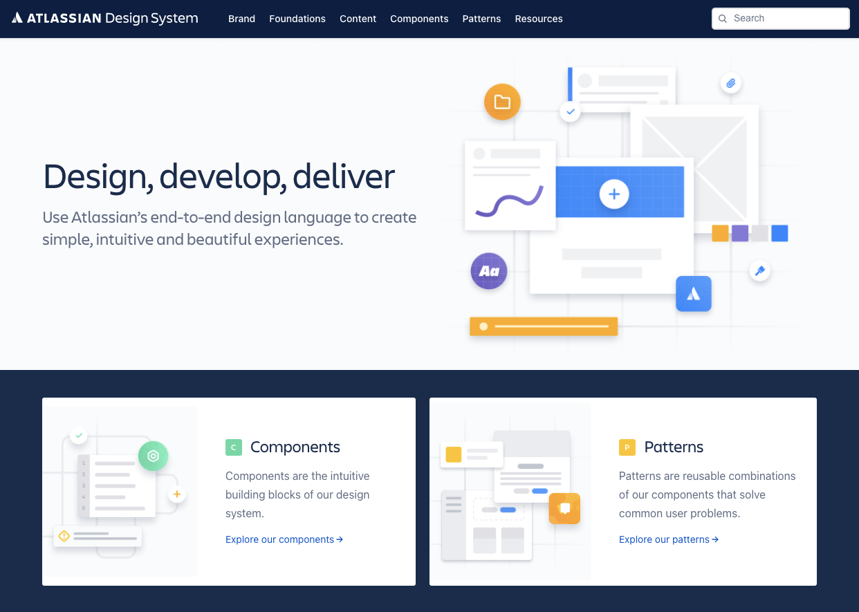
Atlassian Design System is one of the best out there. Atlassian Design System focuses on providing valuable assistance to teams from all over the world by making their collaboration seamless and easy. Atlassian Design Guidelines are also a part of UXPin’s library collection.
Atlassian design philosophy is all about utilizing the digital experience to improve the productivity and overall potential of teams and individual team members, perfectly reflected in their globally used collaboration tools Trello and Jira.
That said, Atlassian Design System features agile practices and efficient tracking of every single step within a project that ultimately yields valuable results in terms of product delivery and development.
Features of Atlassian’s design system
Atlassian’s design system includes
- UI components
- brand values
- UI kit
- UI patterns
- design tokens
- illustration library
- content guidelines
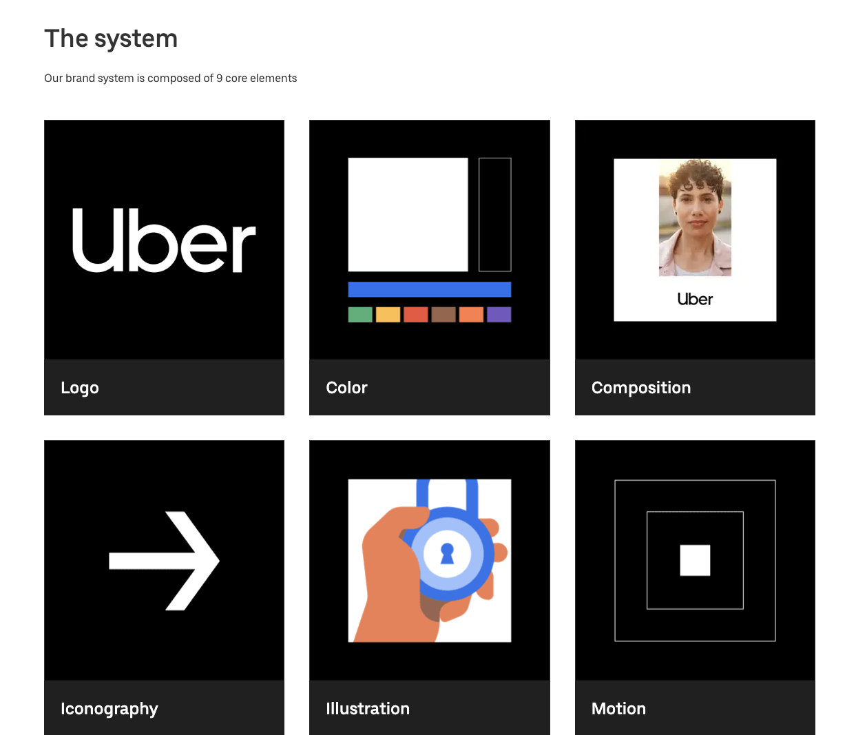
Example 5: Uber Design System
According to Uber, movement ignites opportunity and that’s how they structured their design system.
After all, Uber service bases on movement with ride-hailing, peer-to-peer ridesharing, food delivery and micro-mobility involving scooters and electric bikes.
For this type of service to work impeccably, from sub-brands to internal ones and products to programs, Uber requires an effective design system that the company shares with the rest of the world.
Features of Uber Design System
Main features of Uber Design System:
- Brand Architecture
- Composition
- Tone of Voice
- Motion
- Illustration
- Photography
- Iconography
- Color
- Logo
- Typography
Example 6: Shopify Design System Polaris
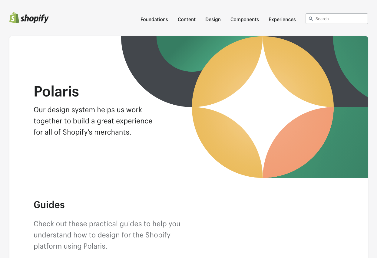
Shopify is a global eCommerce platform that provides everything a brand may need to run and grow its business in one place.
It’s no wonder that their design principles focus on creating a better and more accessible commerce experience.
Shopify’s public design system called Polaris encompasses the company’s core values:
- Be caring and considerate to the users
- Provide people with the right tools to accomplish whatever they set out to do
- Enjoy the top level of craftsmanship that matches the brand image
- Minimize the hustle by providing accurate and quick solutions
- Always build upon users’ trust
- Make the users feel comfortable with using the products
Polaris Design System provides an easy-to-follow and practical style guide for designing for the Shopify platform. It offers a vast knowledge base on utilizing UI components, visual elements, content, and design language for creating a better user experience and product in general.
Features of Shopify’s Design System
Shopify Design System Polaris includes main features that follow the practices mentioned above to a tee:
- Data Visualization
- Accessibility
- Interaction States
- Colors
- Typography
- Icons
- Illustrations
- Spacing
- Sounds
- Resources
Example 7: IBM Carbon Design System
IBM operates on a global scale by meeting large enterprise IT needs.
Their services range from business consulting and financing, software development and IT hosting/management to software-to-hardware products.
IBM’s core belief revolves around making constant progress, be that human condition, society or a brand, by utilizing science, reason and intelligence.
According to IBM, a good design is not only a mere requirement but an actual responsibility to the users.
Features of IBM’s Design System
This is where their Carbon Design System shines with its main features, offering plenty of tools and visual resources for Adobe, Axure and Sketch designers as well as developers:
- Data Visualization
- Patterns
- Components
- Guidelines
- Tutorials
UXPin users can conveniently find everything they need from Carbon in their account as well.
Example 8: Mailchimp Design System
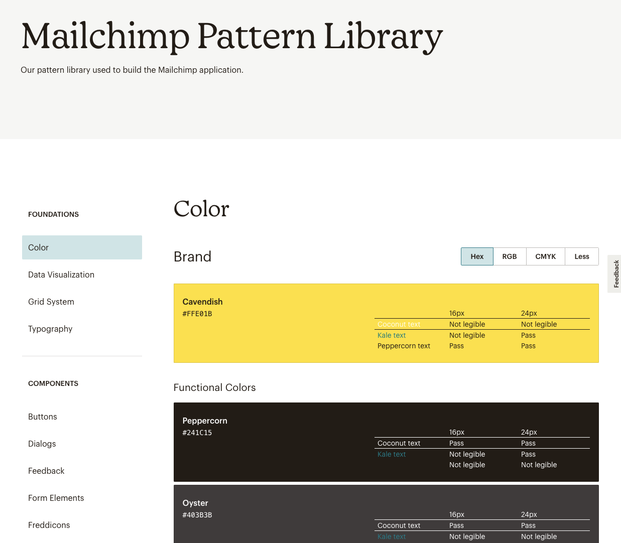
Mailchimp has come a long way from being a renowned email marketing leader to providing an all-in-one marketing platform that goes beyond email only.
Mailchimp has one clear goal: to help small businesses grow while remaining true to their brand identity and image.
Features of Mailchimpr’s Design System
That is also one of the many reasons behind creating the Mailchimp Design System and its main features that focus on creative expression, better user experience and top quality:
- Data Visualization
- Grid System
- Color
- Typography
- Components
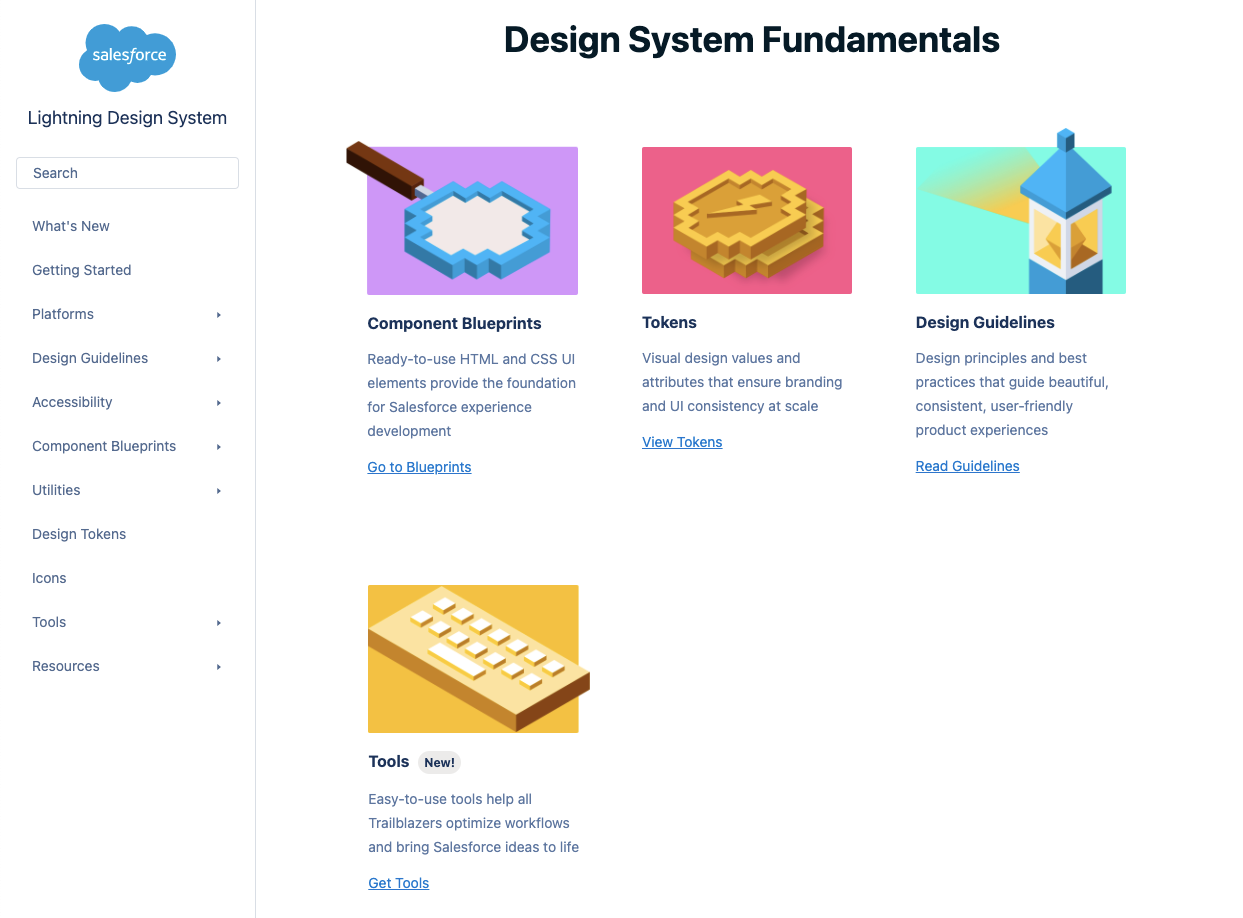
Example 9: Salesforce Lightning Design System
Salesforce goes above and beyond to deliver a personalized experience to its users through the integrated cloud-based CRM software.
The purpose of the Salesforce CRM is to improve marketing, commerce, IT, service and sales efforts – and allows their users to do the same with their users.
Their design philosophy is reflected in the Hawaiian word for intentional family, Ohana, with four core values that drive their company actions and overall culture:
- Innovation
- Equality
- Trust
- Customer Success
Features of Salesforce Design System
Salesforce has put out their own Lightning Design System that allows everyone working with content management systems to learn and benefit from its main features:
- Design Guidelines
- Platforms
- Accessibility
- Components (and a lot of them)
Lightning components are a part of the UXPin account libraries as well.
Make the Most of Design System: the UXPin Merge Way
Merge tech is created as an adequate solution to common challenges that often happen when there’s a communication gap between design and development teams. So, various UI components, coding and documentation inconsistencies can arise, affecting the product’s efficiency and maintenance.
With the design system that organizes all of the necessary components as a first step in the right direction, Merge will then take all those UI elements right to the design editor.
You’ll save time and money by avoiding inconsistencies, not to mention the joy of seeing an end product that’s exactly the same as what you originally envisioned!
Merge tech focuses on design with code components, that is converting a code component into the design. In that respect, designers don’t simply create prototypes based solely on the visual aspect of the final product (while only faking the necessary interactions); instead, designers use already coded components to design the prototype image.
There’s no need to go back and forth between the design and dev team since the design team can take the already existing coded components, synchronize them with UXPin’s editor, and drag and drop the components they need to create new designs.
Essentially, designers don’t have to create fake interactions, add them or search for the right colors.
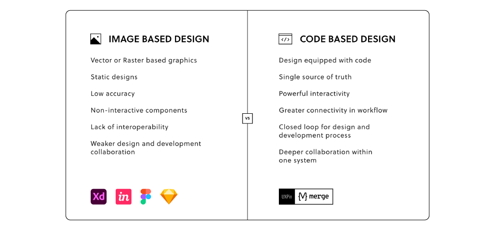
On the other end, developers get the prototype preview and continue to work with the available production-ready elements.
Which Design System Example is Your Favorite?
Design systems consist of tons of UI components and guidelines that are meant to optimize and improve the design efforts and promote consistency among the teams.
However, if the design system is poorly maintained and implemented, the said system can turn into nothing more than many clunky and confusing code snippets, libraries and components.
A design system can quickly help team members to promote consistency while also allowing designers to deal with more complex UX issues. And when you add revolutionary Merge tech to the mix, you can truly take your design system organization to the next level. Learn more about UXPin Merge.


