People Will Forge Their Own User Flows — and Design Should Follow Suit

Users’ interactions with your digital products can travel down bumpy roads. People may encounter obstacles to finding the information they want, sometimes driving them to your competition. Design can help. Solid user flows are the key.

Mapping a typical user flow shows how people move from one touchpoint — a moment in their interactions with your brand — to another. They also describe how they feel at any given moment, and where people are likely to leave. These insights are great for improving how people feel about your organization. What makes them happy, and how can you keep them that way? When do they get confused, and how can you prevent it?

Here are four tips to improve your user flow.

Follow known paths, not ideal ones

Especially when your site or app already exists, use analytics to figure out the routes customers are taking. When you match your workflow to what comes naturally to them, they’re more likely to stick around.

User flows in Google Analytics

User flows like this example from Google Analytics visually represent how users navigate through your site, where they come from, and at what points they leave.

Determining where users enter and leave is harder to do when you’re starting a project, and easier to track if you prepare from the start. But in both cases, it means collecting data — the more, the better. The sooner you start tracking how customers navigate a site or app, the sooner you can start tweaking your ideal user flows to match reality. User flow diagrams are useful for examining your project, noticing where people leave, and fixing problems as you go.

Bear in mind that your project is likely to change as you learn how users want to navigate it. In fact, it should. You can’t ask users to change their preferences or points of view. They’re going to behave as they would naturally. It’s up to you to fit your site or app to their ways of thinking.

Use different maps for different customers

Your user flow maps — plural — should be as diverse as your ideal customers. Not that you can follow every individual, but you can look for trends.

For example, you may discover that many people visit your site via social media, avoiding the home page altogether. That would put the burden of introducing your brand on pages beyond the home page. Can people glean what your organization is about from any given page? Or they might depart after reading a blog post on your site. If so, would stronger calls to action help them see the benefit of continuing to interact with your brand?

The answers vary per project; the point is to determine if different people have different goals, and how you can adapt to serve various needs.

Don’t treat every touchpoint as an equal

Touchpoints occur when people interact with your site, app, or brand in general. But not every touch carries the same weight. Reading a tweet is different than clicking a link within it. Deciding to buy a product is more of a commitment than adding items to a shopping cart.

The differences often lie in the customers’ emotional states. Whether they’re frustrated or curious, intense feelings determine their next moves more than passive feelings. If a user is frustrated, they’re more likely to leave; excited customers are more likely to proceed. In both cases, they’re active participants in the journey and will steer a course you need to pay attention to.

Don’t use Keynote or PowerPoint

Distilling an entire user flow into a few slides doesn’t do it justice. Instead, illustrate the maps as if they were infographics or flowcharts — which, in fact, they are.

From discovery to action, detailed maps give you a bird’s-eye view of what people experience when interacting with your brand. It’s more than mapping pages or views; it’s the moment-to-moment stories of how people think, what they feel, and the actions they take. User flows are timelines, not bullet points.

Driving to success

Users ride along roads in your product — and not always in ways you intend. Matching your site to the ways you intend is key to meeting your business goals.

How to Make a Select List Interactive

Select lists, also called drop-down menus, are common web form elements that let people choose one item from a set. They’re handy for letting users choose, say, a method of shipping. But with a quick interaction, they can also reveal additional information.

For example, if someone chooses an option for “PayPal” during the checkout phase of an e-commerce flow, the form might display a PayPal login. And if they choose “credit card,” a long number field and short CVV field might appear instead.

Same for shipping. Not every delivery method will take the same number of days. Giving people an estimate will help them choose the best option for their needs.

Choose a shipping message

Building your own options

UXPin has a HTML-like select or “drop-down” element — just search for “selectlist”. But it’s a little-known fact that you can create actions based on which item the user selects. You can use this to hide or reveal information and other form elements as required. Here’s how it works.

  • Create a multistate element whose states hold the various types of information you want to show.
  • Create a select list by searching for “selectlist”.
  • Add a new interaction to that select list.
    • Trigger: Option select
    • Action: Set state

Shipping with dates

Other ideas

You can apply this to many other use cases depending on what your users want to accomplish. For example:

  • How long will it take? The user chooses expedited shipping, and a time estimate appears.
  • PayPal or credit card? Make additional fields appear if the user opts to pay with Visa or Mastercard.
  • Do you have a promo code? Make a form field appear to accept the discount.
  • Shipping overseas? Hide domestic U.S. shipping options if the user’s sending a package to, say, Poland.

Build interactive forms today.

Join the world's best designers who use UXPin.

Sign up for a free trial.

Sticky Design Consistency Isn’t as Awful as It Sounds

People trust the familiar. Knowing that, many designers strive to keep their work as simple as possible. It’s also practical: once you design, say, a navigation bar, then duplicating it to every page or view is easy.

But standards change over time. New designers with fresh ideas inherit old projects. New code techniques replace last year’s bleeding edge. The result is a mishmash of inconsistencies in both the visuals and underlying code. And that leads to trouble.

What is design consistency?

Design consistency is the practice of keeping a product looking and acting like a cohesive unit — as if it was planned from the start, even after changes occur. It’s an exercise in branding that helps users find their way around, especially in large sites.

In principle a consistent design is also easier to create and maintain. There’s no time spent inventing new elements that might not fit the established look. From a development standpoint, drawing from a library of pre-built components can make code copy/paste simple while creating fewer chances for bugs. Reusing well-tested code isn’t a bad idea.

Inventing standards is relatively easy. But enforcing them isn’t.

Design system documents keeps projects in line

The best way to maintain consistency is with a document that spells out how — and why — the brand looks and functions.

A design system doc does just that. Providing guidelines, design systems keep everyone in line with the tone, look, and behavior to which a project should adhere. Good docs also explain use cases and best practice, contain code snippets, and show practical, visual examples complete with source files like Photoshop and Sketch files.

That’s a lot of responsibility for a single document. But there are ways to make it work.

Get high-level approval. Designers who implement the work — the folks who push pixels daily — should get their product manager’s approval to keep things official. Many times, explaining that a design system document will help prevent future cost overruns will get their attention faster than “I read it on a blog.” Ahem.

Make it part of the contract. Whether you’re designing for an outside client or an in-house department, a formal agreement of deliverables and responsibilities will help define the project, alleviating scope-creep and declare who’s in charge of what. The final product is often the main deliverable, but to make the product last beyond launch, you should make the design system doc just as important.

Get everyone’s sign-off. From the PM to the dev intern, everyone it affects should know about the design system document. This is especially true when it’s in development. Keep everyone informed and keep stakeholders, like the art director, lead developers, and project managers, involved. Then — and this is key — get their official approval for the final doc. Hold them accountable for their buy-in. Knowing a signature is required makes people take a doc more seriously.

Make it available. Don’t lock the design document away. Whether it’s a file in Dropbox, an internal website, or a Google Doc, tell everyone where it is so they know where to go when design and development questions arise.

Make it practical. The ultimate design system doc isn’t just a doc; it’s a collection of resources or a pattern library from which people can grab ready-to-go resources. In particular, templates and code snippets will help design teams knock out new work quickly.

Keep it fresh. Review the doc every six months or so to make sure it still fits the organization’s goals and user’s needs. For example, do users still understand iconography? Has customer service or user testing unveiled that users respond better to a friendlier tone? Does the business still want to emphasize a certain call to action? Have visual trends changed? Schedule a time for design system stakeholders to discuss changes, if any. As designer Brad Frost put it, “Once the pattern library ceases to reflect the current state of the products it serves, it becomes obsolete.”

A sample design system

Above, a design system document includes typography, color, styles, and notes on use cases.

What needs to stay consistent?

Depending on the project, many things. On the visual side, color, typography, iconography, and placement of site-wide elements are important to help users recognize what means what.

But don’t neglect behaviors. From modal boxes to drop-down lists to colored links, the way a site works is as important as how it looks. For example, think of icons as promises. Everywhere you see a given symbol, users should know what to expect. And when users know what to expect, they’re more likely to feel comfortable with your brand.

Tone and voice are important too. When a project, especially a large one, needs to tell users many things, having a consistent message will help reassure the users that they’re still interacting with the same brand. Not only does MailChimp do a great job of defining their voice, they also publish it for everyone to read. This should also apply to microcopy, from form labels to submit buttons.

Finally, the code. Few things drive developers crazy like having to relearn six-month-old code while hunting for that one missing semicolon. The more consistent code is, the easier it is to adapt and troubleshoot. Love ’em or hate ’em, frameworks like Bootstrap and Foundation are excellent examples of how a common codebase makes debugging code easier, especially between different developers.

How to test your own consistency

How consistent is your project? Here are a few ways to find out.

Audit your interface. Take screenshots of every element you can get your hands on, and list them by type. Don’t assume they’re all the same, or that you already know what they look like; get everything in a single view for comparison.

Audit your code. Most digital products are based on a core set of code. List exceptions to the rule.

Ask users for their workarounds. Would people rather use your search tool than the navigation bar? Discover how people actually use your product, rather than how you wish they would.

Share your findings. Show the results with your team or project manager. Surprisingly, having to explain inconsistencies often reveals one-off solutions and ill-informed assumptions.

Going forward

Consistency in design keeps a product looking and working as if it was planned — not just on paper and prototype, but all the way through the user experience. People tend to trust brands more that they can figure out, without having to relearn its UI conventions.

After the initial investment, consistency can make future design and development faster, easier, and more cost effective by removing guesswork. And they do so from a single source: a design system document, whether it’s a pattern library or a single PDF, that provides best-practice guidelines and tangible source files.

Remember that design inconsistency occurs when new team members replace old ones, or current designers and developers try to improve upon their old work. While neither is unavoidable, designing and developing from a common template is the key to consistency.

Inventing standards is easy compared to enforcing them. But both are important to keep a project in shape. Let the doc inform the product, not vice versa.

Listen Up: Boost Your Interview Skills for Better User Testing

User testing is a tricky area of expertise. It requires a lot of empathy, thinking on the fly, preparation, and the ability to extract yourself from bias. You may want users to behave a certain way, with user testing you’ll get the truth.

“Truth” is also tricky. Because it’s subjective, different people have different approaches to using a product. Designers “know” how a product should work, giving them a certain bias towards how people should behave. But people may disagree, taking unexpected paths that make perfect sense to them. And if that path isn’t friction-free, they’re less inclined to use your product.

For example, users who visit an insurance site might want to review their benefits. Or maybe they want to find a provider. Or to look up symptoms of a particular ailment. Each represents a different user flow with multiple routes. They could search. They could click icons. They could fill a the contact form. They might ignore the login link. There’s no way to know … until you test with real people.

User testing uncovers assumptions, helping you tailor user flows to how people behave. The result is a more intuitive product with less friction. But getting there requires UX designers to learn some new skills.

Listening is a skill you can practice

Listen: Start by talking less and asking open-ended questions. Initial questions help define “what’s up.” Follow-up questions should focus on “why” and “how.” And always follow up with more questions. If a person shows enthusiasm for a topic, follow it to understand their passions.

Timing: Agree upon a time limit with your interviewee, and don’t go past. Your own attention span is limited, and interviews take concentration. 45 minutes is usually enough, though some can go as long as an hour and a half. If an interview starts to run long, then set up a follow-up meeting.

Team up: If you can, bring in a co-worker to take notes while you talk to the interviewee. That frees you to keep up a casual chat — and maintain eye contact — to keep the conversation real.

Say it back: Repeat and paraphrase what the interviewee says so they know you’re paying attention. This both builds trust and helps you confirm that you understand them. It also gives you an opportunity to follow up if you want more information on a vague or interesting answer.

Come prepared: Have questions ready, but be ready to abandon them if the conversation takes an interesting turn. Questions provide a framework for talks, not hard-and-fast goals. For example, relevant stories are often the most interesting points in conversations. They can reveal how a person feels about the topic on hand.

Stay on track, mostly: While people tend to stray from the questions you ask, especially during follow-ups, that’s not always bad. Dig deeper if people start to tell stories.

Encourage them to think aloud: You want that narrative of the interviewee’s thoughts. What someone says, and what they do, aren’t always consistent. Understanding what they want to accomplish and how they assume is the best way to do that will help you find your own assumptions.

Share control: Conversations are interactive. If you keep directing the conversation — say, by prompting them with questions — then you’re probably asking closed-ended questions. Always ask open-ended questions.

Asking smart, open-ended questions

Open-ended questions are those that lead to more conversation, which is the goal of any user interview.

Ask yourself or a coworker each question. Scrap anything that can be answered with a yes or no. “How would you log in to this service?” is better than “Do you see the login link?”

Ask specific questions. “Based on this site’s appearance, would you trust the organization with your money?” is better than “What do you think of this site?”

Ask “why” and “how” several times. For example, follow up “Why did you avoid that button?” with “Why doesn’t its offer sound appealing?” And ask for examples. “When would you want to do that?”

Phrase questions to elicit emotional responses. “How do you feel about …?” or “Tell me about ….” For example, “What happened at your job today?” is less powerful than “Tell me about the projects you’re working on.”

Don’t lead them on. “Isn’t this design powerful?” will earn a yes-or-no answer partially based on what they think of your own bias.

Where to from here?

You’ve interviewed someone about your product. You took a ton of notes. What comes next? Start by organizing your notes, clarifying your thoughts as you go.

Look for follow-up questions. What doesn’t make sense, or might lead to more insight about the project? This is where lo-fi prototypes shine: you can use a mockup of your product to refresh your interviewee’s memory.

Don’t keep insights to yourself. If you work on a team, share your findings with everyone who needs to know what users actually do with your product. Since the point of user testing is to discover assumptions and problems in user flow, fixing those problems is equally important for everyone involved.

User testing will uncover your assumptions about how a product should work. You can use that knowledge to tailor user flows to how people behave, not how you want them to behave. The result is a more intuitive product with less friction.

Why Design Mentorships Lead to Success for Everyone Involved

In 2016, UX Designer Pia Klancar began to mentor a new designer. Enthusiasm was high, but the project involved was challenging.

“When we had our first meeting I saw that he already had a lot of background knowledge and that we shared a common passion for changing the school system,” said Pia (@piaklancar), a Senior UX Design Mentor at CareerFoundry. “He is on a fast track in the program, which means a lot of work without even thinking of doing a project that is incredibly exciting, but also a bit crazy.”

Not every mentorship is a success story. But most people who stick with it tend to create their own successes. A study by The National Mentoring Partnership showed that 55% of people who received mentorship are more likely to pursue higher education to advance their careers.

But what makes a good mentorship? Success varies per case, although signs of a good program include:

  • When the mentee finds a job that matches their interests and challenges them professionally.
  • The mentor also gains new insight into his or her work.
  • Occasionally when the sponsoring organization retains the mentee as a valued employee or leader.
  • The mentor provides guidance and, sometimes without knowing, inspiration.

About her mentee, Pia said, “I usually wouldn’t encourage just anyone to go this way, but he was passionate and I had the feeling he could do it. The decision was still his, though. He chose to work on a project that he can make into a real project after the program. Until this day his assignments are one of the best I’ve seen. I’m looking forward to more.”

Great mentorships are a team effort

Unlike internships, in which young designers are often assigned to teams, mentorships pair up a veteran with a newcomer to build a close relationship.

“(Mentoring) is ideally a mutually beneficial relationship where the mentor benefits and gains from imparting their experience and knowledge and being challenged by the mentee’s questions. The mentee gains sense of value from learning from the successes and lessons learned of their mentor, and have them as a trusted advisor,” said Nathalie Crosbie (@ncrosbie), Professional Coach and AD of Experience Design at Myplanet.

A mentor’s job is more than demonstrating practical techniques. In fact, that’s rarely their primary role. Good mentors give constructive feedback, letting the mentee know what works in their designs and what doesn’t. They’re also expected to share their skills and expertise, and to help their mentee develop a professional network — without leading the mentee to answers. It’s a tall order that requires a senior designer to know when to step in, and when to back off.

“Mentors are more like teachers. They support and lead mentees to learn. They might address more than just issues connected to professional life,” Pia said.

Most of all, mentors are available to provide constructive criticism — which isn’t necessarily negative. A good mentor tells mentees what they’re doing right as well as wrong, encouraging them to follow a path that works for the mentee. This is tricky because not everyone has the same style or mentality. Mentorship is about helping mentees find their own way.

But the responsibility isn’t entirely on the mentor. A good mentee will bring more than good intentions to the relationship; they will also bring clear expectations that help mentors frame the type and manner of feedback they provide. For example, a mentee who wants to improve their presentation skills is better served with face-to-face meetings than phone or Skype calls.

“In my experience, what makes it works is a mentee who takes initiative,” Nathalie said. “They should be clear about what they want out of mentorship so the mentor knows what to bring to relationship. When mentees are clear, they empower mentors to provide what they need.”

How mentorships use timing and trust

Like any relationship, each mentorship is a unique story that unfolds over time. Some begin with a formal assignment and end with lifelong friendship; others begin among acquaintances and end when a project reaches deadline.

But there are some commonalities. Staying available is critical to a mentorship’s success. A regular meeting schedule helps both parties, although one should expect on-the-fly requests for feedback.

“Whenever I talked with (mentees), they gave me feedback that they expected me to be there for them, and to guide them to reach higher,” Pia said.

Many do so by “actively listening,” the art of framing replies in ways that encourage further thought. For example, instead of telling someone to use a warmer color palette, a mentor might ask what would make the composition warmer, and why warmth is a priority. Such questions encourage creative learning, without treating the mentee as an underling responsible for a specific task.

“(Mentors) should ask questions before they give answers. The easiest to guide mentees is to ask questions that lead them to the final answer, but for that you need to be good at asking the right questions,” Pia said. “A good technique is also giving mentees time and space to present their own work. Presenting sometimes uncovers little flaws that they see for themselves. This way they are taught to do things on their own and you just let them learn.”

Another key element of mentorships is trust.

As with many professional relationships, trust between both parties means believing the other has their best interests at heart, and knowing that their feedback and ideas won’t get dismissed without consideration. Without trust, Nathalie said, there’s no free flow of information between the people involved.

“A mentee should trust her or his mentor to listen with empathy and caring. It’s hard to be someone without much experience. So it’s good to know you won’t be judged as a person and that your mentor genuinely cares about you,” Nathalie said. “For example, a mentee might come to me with an issue they had working with clients. If I judged them as a person for their difficulties in presenting to clients for example, rather than listen with empathy, and support them by sharing potential strategies, the mentee could understandably hesitate to trust discussing performance topics that feel vulnerable. And if these are the topics on which they most need support, it’s critical to the success of our mentor/mentee relationship that they feel able to speak freely.”

WIth trust, availability, and expectations established, many mentorships are on the way to success. Then surprises emerge.

Unexpected benefits

The mentor/mentee relationship isn’t one-sided. Having to articulate design principles and techniques forces mentors to think critically about their own work, questioning assumptions and filling holes in their own knowledge. Many mentees don’t think they offer much value to their mentors, but that’s not always the case.

“It’s very common for mentees to feel some imposter syndrome,” Nathalie said. “To ask themselves ‘Why should a more experienced person want to help me?’ But in such cases mentees are overlooking some of the benefits for mentors of working with mentees who have less experience in their field. For example, mentees who come from another line of work, or are a recent grad,can bring with them new ideas and techniques. They’re not necessarily relying on old patterns and systems. They challenge established ways of doing things. Questions they ask will challenge mentors to provide rationale for previously established ways of doing things.”

Pia offered similar insight. “No matter if mentees go through the same program, (mentees) bring into the program very different experiences, and can teach you as much as you can teach them. If you push them to reach higher, you need to push yourself as well.”

And then there are the credentials. Having a mentorship on your resumé doesn’t hurt your professional standing. “Being a mentor has a good reputation, and being a good mentor will not only boost your career, but will also make you feel like you did something that matters,” Pia said.

Businesses have also benefitted from having senior designers guide younger ones. When DHL began a pilot mentorship program, “60% of its participants moved into higher positions” after completing their program.

Sun Microsystems saw similar benefits. “25% of mentees got a raise, while 28% of mentors did (vs. just 5% of managers who were not mentors),” wrote Anne Fisher of Fortune Magazine.

In the end, though, mentorships are most positive at the personal level that affects designers at any stage of their career. “For me, the question isn’t how junior does a designer need to be to require mentoring,” Pia said, “but how senior must a designer be to not need one.”

Between ‘Wireframe’ and ‘Mockup’ Lies a World of Nomenclature

Product managers who build prototypes have many choices. They can give hand-drawn sketches to their design team. They can draft rough visuals in Photoshop or Sketch. Or they write exhaustive documentation to describe their vision.

All share one thing in common: They start a series of steps that leads from an idea or problem to a finished product. Too bad no one can agree names in that process. One person’s lo-fi is another person’s wireframe. Thumbnails run the gamut from doodled to digital. And at what point do you call a design high-fidelity?

Lo-fi. Hi-fi. Mockup. Wireframe. People define each term differently, but most agree that they’re different levels of detail, and one leads into the other. If only design teams could agree on the nomenclature, the design process would start on better footing.

In this article we’ll explore one set of definitions that most design teams agree upon.

Wireframes

The word “wireframe” is tricky: people often use it interchangeably with “mockups” and “prototypes.” Whatever you call them, at their essence, designs begin as a series of plain boxes that denote how elements might get arranged on a page or view.

Rather than represent real content, these boxes approximate how much attention each design element should have in proportion to its neighbors. Wireframes are static low-fidelity designs — the “skeleton” of your product.

Design wireframe

Product Managers use wireframes both to explore priorities and to express their ideas visually. It’s one thing to say “hero photo spans the whole page,” and another to see it in action — and potentially to realize it detracts from the rest of the design.

It also leads to interesting questions. What information should users see first? Would they get more out of the view if that photo was on the left? Do we need three teasers instead of four? Wireframes let PMs quickly answer these questions with their team at the web page or app view level.

Mockups

More for visual designers than project managers, mockups are high-fidelity static designs that represent the “skin” of the product.

Like wireframes, they must suggest how the design will meet the project’s goals. Unlike wireframes, mockups often take real content into account. Can we really work with a photo that measures 700 by 200 pixels, or microcopy that’s only 12 characters long? Time to ask the UX  and content folks.

Confusingly, people also use the term “mock-up” as a verb at any level of fidelity, as in “to mock up a lo-fi.” But a mockup, the noun, has its place in the design process. Several, in fact, depending on fidelity.

Lo-fi mockup: an approximation, sans-content

Lo-fi mockups turn wireframes or sketches into designs that approximate the finished product. Although they still use plain boxes and shapes, lo-fis solidify the arrangement of information and visuals. They’re an official blueprint for an app or site. Digital lo-fis sometimes includes links to each other, simulating a product’s flow.

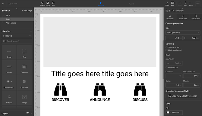
Lofi design mockup

Lo-fis mockups are also great for getting feedback from stakeholders. Ideally you’ve gathered feedback at each stage of the design process — even with sketches — but it’s with lo-fis that most non-designers seem to “get” how the final product will work. Sometimes lo-fis include real content to test how well they’ll hold up under real-world situations — but often that’s left to the hi-fi stage.

Often, lo-fis and higher are best left to designers to figure out. But that shouldn’t stop product managers from knowing a hi-fi when they see one.

Hi-fi mockup: design for content

It’s time to get visual. Hi-fi mockups are where your aesthetics and design systems come into play. It’s also where your team starts applying real or close-to-real content.

Applying content is a critical test of your design, because content varies. Sometimes it’s short, other times it’s long. Photos may not fit the orientation you intended. Buttons may say “submit,” or they might need to fit “sign up to get 30% off.” With content-rich hi-fis you’ll discover how well the previous steps hold up to the real world.

Hi-fi design mockup

Prototypes

A prototype (also called an “interactive mockup”) is a working simulation of the final product.

It usually includes interactions, animations, and links to different pages or views. It will often react to varying screen sizes and browser configurations on the fly. Product managers use them as proofs of concept before asking the team to formally code things up.

While lo-fi prototypes help you quickly validate user flows, hi-fi prototypes help you validate that the visual and interaction designs are cohesive.

Prototypes may include visuals from Photoshop, Illustrator, Sketch, or other app that produces visuals. They sometimes incorporate real, if not final, code.

What makes a prototype a prototype is that stakeholders can play with them in the platform on which the final product will run. Building a website? That prototype had better work in a variety of browsers. Creating a smartphone app? Those touch targets had better work.

Level-up your design process

Like most rules of design, these … aren’t rules. They’re guidelines through which you can personalize your workflow and communicate with your team. You might disagree with someone else’s idea of a “mockup,” but as long as your team agrees, productivity will run that much smoother.

That also means you and your team can start with any level, skipping any level that doesn’t make sense to your workflow. Don’t like to draw? Go straight to wireframes. Want to call everything a wireframe? Go for it.

The idea behind advancing from sketch to wireframe to prototypes and mockups is to add levels of detail only as your ideas solidify. Start fast. Then refine. Then polish. Then build. Then learn more with our free ebook: Prototyping for Product Managers.

Effective Code Conventions Don’t Rely on Effects

Our new Spec Mode feature gives designers and front-end developers control over the final code. But as the saying goes, with power comes responsibility.

In this case, it means writing smart, reusable code that your team can get behind. Here are some helpful guidelines to follow when writing HTML in Spec Mode.

On naming conventions for the “prototype” stage

Prototypes, especially lo-fis, are prone to change. That’s their job: to help explore ideas. So when adding code to design elements in early work, we need to take change into account.

You don’t want to chase down code just because you move a column from the right to the left. For example:

  • Color, e.g. .red or .purple
  • Location, e.g. .top or .left-col
  • Size, e.g. .large, .xx-small
  • Time, e.g. .yesterday, .future, .to-do

You’ll quickly discover if your code uses naming conventions that don’t change well because you’ll find yourself having to rewrite them. To prevent that, we suggest naming things based on their purpose.

  • Priority, e.g. .secondary or .principle
  • Use case, e.g. .supplemental or .main
  • Specificity, e.g. .container
  • Audience, e.g. .user or .admin or .guest or .member
  • Media, e.g. .video or .photo or .feed (but use with caution — this can still change!)

Efficient code saves precious time

Browsers have to parse a ton of code when rendering a page. These days they’re pretty quick … but when milliseconds matter, we want the fastest HTML and CSS possible. The key is efficient selectors.

Most browsers render different selectors with more efficiency. From fastest to slowest:

  • ID, as in #name
  • Class, like .name
  • Tag name, such as div
  • Adjacent siblings, like article + aside
  • Children, e.g. section > h2

That’s great in principle, but how do we apply it to real-world design?

Practical guidelines

If certain selectors are inefficient, then writing smart selectors is critical.

Let IDs be IDs: If you’re using an ID, don’t also specify the HTML element. For example, #call-to-action, not button#call-to-action. The latter is redundant since the former is unique on the page.

Don’t pair tags and classes unnecessarily: li.primary {…} is less efficient than .primary-item {…} since browsers look for “.primary”, then re-scan those for instances of “li” within that list.

Avoid descendent selectors: header > .main > h2 is inefficient. Instead we recommend using something like “.main” on the h2 itself.

Avoid verbose selectors: div ul li a span is terrible for efficiency. Give that span a class!

Use native elements when possible: Check caniuse.com for supported native tags, like figure and article.

Use CSS shorthand whenever possible: “Shorthand” combines many properties in one. For example:

background: #fff url(…) top center no-repeat;

instead of:

background-color: #fff;

background-image: url(…);

background-position: top center;

background-repeat: no-repeat;

Varying schools of thought

While there’s no single “right” way to write code, there are many strategies.

  • BEM notation: Block-Element-Modifier style is verbose and tricky to grasp at first. But it’s also modular, efficient, and not bad for semantics.
  • OOCSS: While this approach isn’t semantic and is prone to class-itis, it’s reputedly good for developers and render speed. The idea is to write very reusable classes that describe their function within the page.
  • SMACSS: Naming elements with Scalable Modular Architecture for CSS makes code super-readable — once you get used to its rules.
  • Foundation or Bootstrap: If you want someone else to do the heavy lifting, you might consider a framework with pre-built (and well-tested) class names and JS widgets.
  • Roll your own: Nothing’s stopping you or your team from developing a naming convention. In some cases, it’s better than any other approach: your team would understand it because you wrote it together; it would be tailor-made for your workflow; and it would only include the code you need.

Going forward

Should designers learn to write code? That’s up for debate. But Spec Mode makes it possible. Anyone on a design team have the authority — and responsibility — for the HTML, CSS, and more. Let’s name elements intelligently.

Use This Checklist to Prevent Pre-launch Trouble

If the design process is about solving UX problems, then the pre-launch routine is about preventing them.

Let’s speak plainly: digital products are complicated. Even the simplest app or a single-page website can involve thousands of lines of code. Talk to any developer and you’ll likely hear about that one misplaced semicolon which borked a whole project.

Just as user testing is important, so is technical testing. Here we provide a checklist of common gotchas to check before, during, and after launch.

One week before launch

  • Test usability without CSS or images: Removing CSS and images often reveals problems with the structure of data. This is how screen readers, search engines and bots view your site. A design rule of thumb: If the page is still usable, albeit clunky, then it’s a good page.
  • Add a copyright statement to the footer or “about us” page: US copyright law states that “Your work is under copyright protection the moment it is created and fixed in a tangible form…” Assert your rights with a copyright statement on your site or a Creative Commons license.
  • Run spell check on all content: Online services exist to check spelling in either pasted content or in a given URL. Is the text not in English? Multi-language spellcheckers are available as well.
  • Create a helpful 404 page: A helpful 404 page tells people that they reached an invalid page and offers other links to follow. It may include a search tool to help them find what they’re looking for, and might automatically notify the site’s owner that someone had a problem.
  • Send a test message through the contact page’s form: Make sure the contact form works and the domain hasn’t been blacklisted.
  • Ensure that the home page states the site’s goals, or what visitors can expect: The site’s purpose may be obvious to people involved in making it. Don’t assume it’s obvious to newcomers.
  • Check for trademark violations: “It’s been done” may have legal consequences if you infringe on a trademark. The US trademark office or the Creative Commons search tool to see if your idea, name or content already belongs to someone else.
  • Create a favicon: Favicons are graphics, starting at 16×16 pixels, associated with a domain. Saved as either a .ico or .png image, favicons appear to the left of a URL in most browser address bars.

48 hours before launch

  • Redirect sitename.com to www.sitename.com (or vice versa) for SEO: Search engines like Google and Bing frown on duplicate content, which they sometimes perceive if both yoursitename.com and www.yoursitename.com are active.
  • Send a test message to the email address(es) associated with the domain: Email is fine when it works — and terrible when it doesn’t. Making sure that messages can be sent will only take a moment.
  • Reply to the test message: Ensure that your site’s emails can be received as well as send.
  • Make a robots.txt file: This enables site owners to prevent certain directories, such as a site’s CMS, cgi-bin or members-only sections, from appearing in public searches.
  • Check all links: Broken, outdated or mistyped URLs can be checked by hand or automatically.
  • Validate the HTML: Look for HTML errors that may cause display hiccups in various browsers.
  • Search for & remove all greeked text and testing data: Handy tip — Use an easy-to-search-for nonsense keyword like five a’s, “aaaaa” in all place-holder content. When the site is ready for launch, a quick search for that keyword will reveal bits that should be removed.
  • Give each page an appropriate HTML title and meta description: Google Webmaster tools can help after launch.
  • Give alt attributes to all images: Alt attributes tell search engines what an image is about, give something for screen readers to describe and help remind designers what an image’s purpose is.
  • Make the CMS password hard to guess: Punctuation, numbers and plenty of characters make a password difficult to crack. If your password is obvious, why use one at all?
  • Validate the XML sitemap: XML sitemaps must be formatted correctly. Errors may prevent search engines from using them at all.
  • Make a XML sitemap: As XML files, users can create sitemaps with any text editor and determination. But it’s less tedious to let a machine write it.

Immediately after launch

  • Sign up for webmaster tools: Webmaster tools help you see how search engines are or aren’t indexing your site. They also offer information about with which search terms your site is discovered.
  • Apply an analytics package: Analytics packages add a piece of code to your pages that tracks who, when and how people visit your site with. These data are handy for determining who’s visiting, what they’re looking at, and if traffic is improving.
  • Register the site with search engines: To notify search engines that your site needs indexing, send them the URL.
  • Sign up for monitoring: If you’re worried about the host having trouble, sign up for a service like Are My Sites Up and get notified when problems arise.
  • Submit the XML site map to search engines: Expedite search engines’ indexing of your site by telling them what’s where.

Three to six months after launch

  • Check that the contact details haven’t changed: Does everyone listed on the “about us” or “our staff” page still work there? Have the phone number, fax number, email address or postal address changed?
  • Change your CMS password: Occasionally changing your password is a good way to keep people from gaining access to your account or, if they already have, kicking them out.
  • Back up everything: If backing up the site or service isn’t part of its regular maintenance routine, do so now.
  • Check for spam sent through forms: Ask if the site still answers all its visitors’ needs. Is the content relevant?
  • Check feature relevance: What features of the site are not getting used? What can be removed?
  • Check the users’ browsers: What browsers are most people using to visit the site or web app? It may not match your expectations.
  • Check inbound links: Inbound or “back links” are one indication of how popular your site is. Use your favorite analytics package to figure out who’s sending traffic your way.
  • Check for invalid links: As sites evolve, content may move or get deleted. But links to outdated content don’t reflect the change in status. It’s best to check for, then remove or correct links whenever possible.

Launch your own list

This isn’t an exhaustive list, but it covers enough to help you push the “launch” button with a degree of confidence. Use it as a basis in your team’s workflow and to make for a happier launch party.

January 2017 Reader Survey

Hello designers and product teams! In our ongoing efforts to provide relevant and useful content, we’re conducting a survey to find out what interests our blog readers.

Please take a minute — seriously, it’s only six questions — to tell us what you’d like to learn about so we can research and provide material that will boost your skills.

How Far We’ve Come: Looking at the Past to Consider the Future

CEO of UXPin Marcin Treder is no stranger to UX design, having worked in the industry for many years. He’s seen drastic changes, predictions gone wrong — and right.

What’s changed? Have we advanced? Recently I talked to him about the state of design over the past decade.

BG: What has changed most in design thinking over the past decade?

MT: “Design Thinking” or design thinking? (laughs) The core of the design process remains exactly the same. It is simply timeless. Design understood as creative problem solving, creating and meeting needs, finally embracing opportunities on the market through a human-centric set of activities, remains as true as 10, 20, 30 or even hundreds years ago.

Sure. But something’s changed in the last 10 years — business-wise, technologically, and culturally. What’s had the greatest impact on the design industry?

In terms of culture, the Western world took a turn towards the simplicity of form, function and “aesthetization” of everything. Compare the design of first mobile phones to what’s dominant today, or even compare new cars to cars from the beginning of the century. Differences are so drastic.

Simple object design

Objects have to be beautiful in order to generate economical value and beauty. They got defined by simplicity. This a huge cultural drive towards aesthetics and functionality is changing everything and of course it also elevates the position of design.

Good design became inclusive. Especially in the last couple of years good design became ubiquitous. Well designed objects are often very accessible to the general public. The virtual world started to be decently designed all around. People definitely have greater access to good design than in the past.

And then there’s business. Companies realized that good design is not an option, it’s a necessity. Design progressed from an afterthought to the heart of the product strategy. The success of Apple probably had a lot to do with this trend.

In the digital world, research and analysis became very accessible (thanks to Google Analytics!), and business owners started to understand that design can directly affect financial results. This trend definitely elevates the importance of design. Back in the day I’d never be promoted to management, if not for a series of successful multivariable tests that led the company significantly grow the revenue.

Digital outran physical. Out of five most valuable companies on the planet, four are mainly making money in the digital space (Alphabet, Microsoft, Facebook), or are heavily related to the digital world (Apple). Four out of five! That means that products of the most valuable companies on Earth are very visual and very interactive. They have to have great design! Long gone are the days where the value had been hidden in factories, mines or on oil platforms. The age of digital requires presence of great design.

“Long gone are the days where the value had been hidden in factories, mines or on oil platforms. The age of digital requires presence of great design.”

Finally, there’s technology. Technology became much more democratic. Before the twenty-first century, technology was something to be mastered by engineers and hardly understandable to everybody else. Today servers are very cheap. You can learn programming in a relatively short time without going to a university. And you can build your products really fast.

That means two things: First, there are more digital entities than ever. Second, more people participate in the digital economy. With that in mind no wonder there’s more designers than ever, more design education and more design job opportunities. Our industry is booming!

Don’t forget our tools. Ten years ago design was often an afterthought. We had a limited number of useful tools. Photoshop, Paintshop Pro, Gimp, Axure, OmniGraffle — that was really the entire market. Today tools are much better, more accessible and adjusted to our use case.

So more tools and more available technology are opportunities for designers to grow. Do modern technologies make designers more creative today, or did the restraints of older technologies force them to think more creatively?

Designers have way more possibilities to express themselves these days. Ten years ago constraints were often suffocating. Often we would end up with ideas that were simply impossible to pursue. With modern technologies, “impossible” disappeared. Everything is just a question of cost.

Ten years ago, people looked ahead to the future and saw … what?

The year of mobile! Every year in the past decade was “the year of mobile.” While mobile is definitely changed the way we see the digital space, the one big year for mobile never happened. It was a gradual launch. We’re somehow experiencing the same situation with AR/VR today. People expect to have a breakthrough year. I think we’ll just realize in 10 years that we can’t imagine the world without virtual and augmented reality.

“Every year in the past decade was ‘the year of mobile.’ ”

A more specific example: 10 years ago people still believed in total replacement of front end coding with some sort of WYSIWYG editor. I think today we know that this is not going to happen. We’ve definitely learned a lot about tech and design debts.

10 years ago the user experience world was full of hope for the future importance of our field — but also constantly troubled by the lack of it. In Poland we had just a handful of UX practitioners, and we were all focused on selling UX to companies. People did not see UX as important at all. The entire industry was getting ready for the future revolution though (laughs).

Here’s another more specific trend. People believed in a way more scientific form of user research. Eye tracking was a hottie in 2006. For couple of years it seemed that if you didn’t learn how to use an eye-tracker, then you’re finished! Obviously that never happened.

Design for mobile devices, UX, eye tracking — sounds like people in the mid-naughts had big aspirations for 2016. Which of those predictions came true?

UX definitely became very important!

What advancements in UX and UI design did people not see coming 10 years ago?

I don’t anybody could predict the aesthetization of the digital world. Minimalism killed all the other trends really quickly.

“Minimalism killed all the other trends really quickly.”

It’s said that hindsight is 20/20. Knowing what you know today, what would you have done differently 10 years ago?

I would started to work on UXPin earlier (laughs).

Where do you see UXPin in 10 years — or is it possible to look that far ahead?

[Over the next 10 years] UXPin is going to streamline product development across different platforms including AR/VR, holograms … and all these devices that we can’t even imagine today. It will bridge design and development forever!

What advice would you give entrepreneurs who want to plan a business to stand the test of time?

Never stop talking to customers and always think about the revenue.

Thanks for your insight, Marcin. Here’s to another 10 years of advancements in design.

Bring Your Sketch Files to Life, Iteration After Iteration

Batman-like, designers have many tools to carry out their missions. Among them is Sketch by Bohemian Coding: a powerful vector-based tool that’s risen to fame in recent years. But for all its pomp and power, Sketch lacks interactions and collaboration. That’s where UXPin steps in.

Our newest free plugin for Sketch empowers you to work in Sketch and UXPin simultaneously. Specifically, you can upload Sketch files into UXPin, turn them into interactive prototypes, iterate on them and, most importantly, upload a new version without losing your interactions in UXPin. It’s like a design superpower.

Plugin changes and improvements

There’s more. You can now export all pages in a Sketch file, including their artboards, at once. Uploading those Sketch pages is now up to 10 times faster than before. Refreshing projects and previews is automatic. And elements and groups of elements marked as exportable in Sketch are now supported in Spec Mode, making it possible to download all visual assets.

How it works

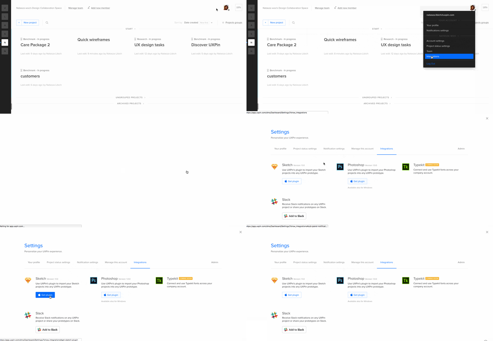
You’ll need the free plugin, which you can find under your account icon (look for “integrations). Install the plugin into Sketch, then use it to log in to your UXPin account.

Sketch upload process

After you get set up, the rest is easy.

  • Export your projects to UXPin.
  • Add interactions to select elements, like animations and page/view links.
  • Realize something’s not quite right.
  • Edit your design elements in Sketch.
  • See your changes take effect in UXPin — on elements you didn’t delete, of course.

Get all heroic on us

If you want to be a UX hero — and who doesn’t? — then grab a copy of Sketch, add our plugin, and bring static mockups to life. If you don’t have a UXPin account, you can still make your Sketch files interactive with a free trial.

Join the world's best designers who use UXPin.

Sign up for a free trial.

Finding Common Ground Between Designers and Developers

Designers and developers

Design and development are two different states of mind. To get a project out the door, however, they must overlap. We found this truism while developing our new Spec Mode feature, which allows designers to assign code to different elements in their UXPin prototypes.

Both designers and developers have key differences — and understanding these differences is the first step to bridging the gap between worlds.

(Note: this list applies to designers and developers in general based on our experience talking to both camps, and is not intended as a hiring guide or career affirmation.)

  • Designers design for the majority of users. Developers sweat over edge cases.
  • Designers rely on experience to guide their intuition. Developers rely on experience to avoid repeating mistakes.
  • Male designers’ beards imply “trendy.” Male developers’ beards imply “long hours.”
  • Designers tend to avoid object-oriented code. Developers tend to avoid color theory.
  • Designers inspect each other’s work. Developers inspect with the browser.
  • Designers know enough code “to be dangerous.” Developers agree on the last phrase.
  • Designers translate their ideas for clients before designing. Developers showcase their work after developing.
  • Designers seek solutions on Dribbble. Developers seek solutions on Stack Overflow.
  • Designers see PHP as the means to an end. Developers see PHP as the end of their means.
  • Designers use bold colors to express emotion and mood. Developers use bold colors to highlight syntax.
  • Designers debate Wacom tablets vs. mice. Developers debate keyboard brands.
  • Designers strive for pixel-perfect visuals that only they will notice. Developers strive to eliminate bugs that only they will notice.
  • Designers redesign parameters. Developers redefine parameters.

But it’s not all divisive. Both groups have a few things in common. They:

  • Try to speak each other’s language, with varying degrees of “huh?”
  • Sacrifice their wish list to the altar of impending deadlines.
  • Balance gut feelings with logical decisions.
  • Glad that Rogue One doesn’t disappoint.
  • Swear by their favorite tools.
  • Swear to finish on deadline and under budget.
  • Swear at iTunes’ user interface.
  • Read Smashing Magazine.
  • Balance desire with practicality.
  • Mentor their peers, interns, and recent grads.
  • View “inbox zero” as a nigh-unreachable state of zen.

They have their differences, but they also have their similarities — most notably, a common desire to do great work on time and under budget. The more they acknowledge their differences, no matter how small, the sooner they can learn to work together more efficiently, eliminate guesswork, and build great products together.

So where does your team overlap?

Illustrations by Trevor Halligan, @TrevorHalligan

Agency Designers: Diplomatic Questions for Insightful UX Briefs

There’s no shortage of getting-started advice for designers and project managers. Even clients have their lists of things to know before hiring design agencies.

But those are often formal. Polite, even. And many dance around uncomfortable issues that come up during development.

To understand the requirements and set proper expectations, you want to strike the right balance between setting boundaries and asking for candid feedback.

Project details

Each pair here contains the actual question you ask and the bottom line behind why.

  • 1. What is your business model? Which products and/or services are currently most valuable?
  • The bottom line: What the heck do you do?
  • 2. What are your goals and metrics? What would your “dream scenario” look like? Be as specific as possible. For example, “reduce churn by 10% within 90 days of launch”.
  • The bottom line: What would make you satisfied with our work?
  • 3. Who are the daily members of your team? Who are the key stakeholders? Who are the secondary stakeholders?
  • The bottom line: Are we missing anyone important?
  • 4. What are the project’s technical requirements?
  • The bottom line: Will we need to hire outside technical expertise, or is this something we’re qualified to handle?
  • 5. What existing content is available to work with?
  • The bottom line: When’s the last time you audited your own content?
  • 6. What is your budget? When should the project go live?
  • The bottom line: Have you thoroughly considered the resources for this project?
  • 7. In case of any contingencies, is there any flexibility in terms of budget and timing?
  • The bottom line: Will you freak out if the project goes over time or budget?
  • 8. What are your user groups and personas? Who are the most valuable to the business?
  • The bottom line: Who cares about your products or services?
  • 9. What are your strengths and weaknesses compared to the competition?
  • The bottom line: Why do people use your products?
  • 10. Can you give us some background on this project? How did the idea come to fruition?
  • The bottom line: So is this a passion/vanity project, or actually part of your core business?
  • 11. In your experience, what issues (if any) have caused delays in the past?
  • The bottom line: Is your procrastination going to be our emergency?

The relationship

The best projects are honest partnerships. Keeping each other in the loop about progress, issues that arise, and keeping work aligned with goals best established up-front.

  • 12. Do you approve of the timeline and review schedule?
  • The bottom line: Will you micromanage our work?
  • 13. Will anyone on your team be responsible for post-launch updates? As the project progresses, we may suggest improvements to the roadmap.
  • The bottom line: How do we make sure our efforts aren’t wasted after launch? Will we want to work together six months down the road?

Nuts and bolts

Now we’re down to brass tacks. Stuff that impacts designers’ and developers’ time is critical to meeting budget and deadlines. The rephrased questions here probe how you’ll carry out day-to-day operations before you get started.

  • 14. How important is consistency to your brand?
  • The bottom line: Do you know what a style guide is?
  • 15. What security requirements should we be aware of? We have some best practices in mind, but want to make sure we’re as comprehensive as possible.
  • The bottom line: What happens if the site/app/service gets hacked?
  • 16. What design, communication, and collaboration tools does your team prefer to use?
  • The bottom line: Does the format of deliverables and assets matter?
  • 17. What amendments to our contract will you (or your attorney) require?
  • (Actually, stick with that one)

Going forward

Working with clients requires a certain professionalism and mutual respect. Framing creative briefs with real meaning requires us to know exactly what’s going on. Let’s be honest. Then actionable.

For a thorough list of requirements for client or in-house UX projects, download our free Product Requirements Document Template.

Up Your Typography Game with Typekit in UXPin

Typophiles rejoice: we’re pleased to announce that we’re among the first in a new partnership with Adobe Typekit that brings hundreds of web fonts into UXPin, depending on their paid Typekit plan. Now you can integrate your account with our prototyping tool to create typographically great designs.

Using Typekit fonts in UXPin

It’s said that typography is the “voice” of content, and choosing the right type family is just as critical to conveying a message as the text itself. Many designers, both in print and in web sites — and web apps — rely on font services to make their text more clear or more expressive. Why should that skip between high-res Photoshop comps and final production? We don’t think it should.

We recently integrated Google Fonts into the Editor. Now designers will have access to their Typekit web fonts within the UXPin Editor, bringing consistency across an entire workflow. That includes text added to designs started in Photoshop or Sketch and import into UXPin, as well as those you start with our Editor’s built-in element libraries. Now you can choose from both libraries to make your UXPin prototypes more closely match the finished products.

Choosing Typekit fonts

Your entire Typekit web font library is available — if you choose. After you link your UXPin and Typekit accounts together, you can decide which font families you want, and prune out the ones you don’t through our Typography panel.

Learn more about how it works, then get access to your entire Typekit library of web fonts with UXPin’s integration and use them in any prototype.

Join the world's best designers who use UXPin.

Sign up for a free trial.

A Developer’s Tale: of Design Education and Interactive SEALs

No one said enterprise-level design was easy. But few realize how much of a difference good collaboration and communication can make — especially between designers and developers. While sometimes they seem to live in different worlds, their common goals put them firmly on the same team.

We talked with web developer Chad Wooten of GDC Marketing and Ideation about working with designers in an enterprise environment. With more than 20 years of experience in web development, systems administration, and graphic design, Chad approaches projects with careful attention to both technical development and creative execution.

Because of his hybrid background in front-end and back-end development, he has wide-ranging and valuable insight in regards to UI/UX testing, responsive design, and digital best practices.

How is developing for enterprise customers different than smaller companies?

There are more layers for approval so you have to be very conscientious about timelines. Testing takes longer in some circumstances because of an overzealous IT guy.

What information is often missed at the beginning of a project with a major client? What do you wish you’d known later in the development cycle?

In my experience, the little things get overlooked. The client loves the design on paper and they don’t think about hover states or the interactivity. It is also hard to communicate the subtle differences in UX/UI on a mobile device for responsive sites. Like the lack of hover states, etc …

What miscommunications have you encountered when working with a design team?

Because I work in a traditional advertising agency, most of the designers I work with are used to print design or broadcast. This leads to missing interactive function in the design. Animations are hard to convey on a print out. Sometimes little changes in the visual design are huge changes in the code and sometimes the opposite is true. Communicating the differences can be a challenge and may lead to designer shell shock if you are an aggressive developer.

I have a background in IT so I am used to many questions that I consider to be trivial but the user is truely clueless. You can either get annoyed by this or you can embrace their curiosity and use it as a teaching opportunity. The same holds true with development. Questions that seem simple to the developer may be completely Greek to a designer.

“You can either get annoyed by this or you can embrace their curiosity and use it as a teaching opportunity.”

One time I developed a site that needed a “simple” webform. They just wanted to collect a user’s information with four basic questions: name, phone, email and zip code. By their answers, specifically the zipcode, they would receive information that was geographically based.

The simple change they requested was stated, “Can we have them fill in their zip code first and, based on this information, have a form that routes to a specific person?” Uh, yes, that can be done, but it is more complex than a “simple” webform.

How early do you think developers should get involved in the design process?

Developers should be involved from the brainstorming on and there should be regular check-ins to ensure the designers or the client aren’t encouraging scope creep.

What advice would you give developers about making design decisions? How about clients or managers?

Keep the budget in mind and know how long it will take to achieve the client’s goals. Don’t be afraid to give your opinion on the design but remember the designer and the client are in charge if the design. Like it or not, we are in a service industry and we are here to develop, not to design.

What should developers know about design?

This is a tough question. Developers should have an open mind about design. I think they should have a basic concept of good design. They should be able to spot good composition, know about the “rule of threes” and understand the concept of negative space.

On the other hand, designers should know basic programming concepts. On the favorite team I was ever on, we liked to think of ourselves as interactive SEALs. We all had our specialty, but we knew enough about each other’s jobs that we could do it if that person was missing in action. That is an effective team model.

What do you find rewarding about working in an enterprise environment?

The larger and more recognizable the brand, the better your resume will look. The code isn’t always more challenging but there is almost always more of it, haha. I thrive on working under pressure and large clients love last-minute changes.

And, above all, when your friends and family say, “I just went on so-and-so’s website and it was so easy to use” and you say, “I developed that @&#! site!” Well … yeah, that’s awesome.

If you were in charge of an enterprise-level project, what would you like to change?

I would have an initial meeting with the client that involved everyone on the team. I would make sure there was complete agreement on the intent and scope of the project before it started on all sides. I would make sure there were regular team check-ins to ensure the project was on track and within scope.

I would also make sure that once the mobile and desktop design was complete, the developer and designer hashed out all of the interactive elements before client approval. Finally, I would make sure to hold regular developer/designer check-ins during the programming to ensure creative integrity.

How do you work with team members in different disciplines? Have your say in our community.