4 Easy Steps to Using UI Patterns

The more people use the web, and the more designers figure out what works, the more refined design solutions become. Far from being trends, these design patterns are proven jumping-off points for your design work.

Some solutions work so well that most designers use them repeatedly. And through familiarity, users have come to expect them. As explained in Web UI Design Best Practices, this was the beginning of web design patterns: a common visual language that both designers and end users understand.

Here’s how to use patterns as a place to start without having your work look like a carbon copy.

1. Select a pattern based on your priorities

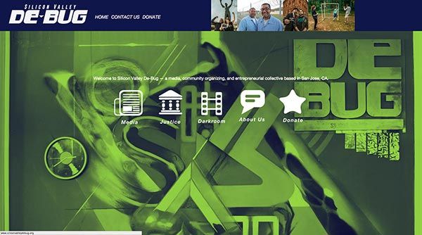
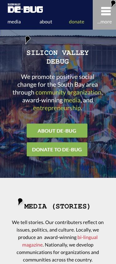
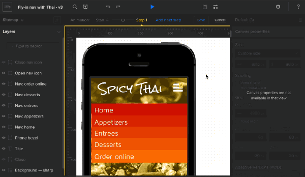
Start by choosing a pre-built look or theme that matches what you want to accomplish. In this case we’re building a simple, mobile-friendly profile page for a hypothetical social media app.
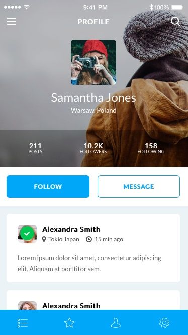
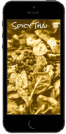
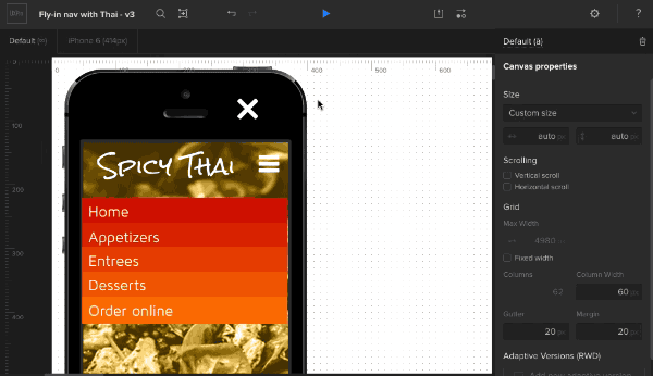
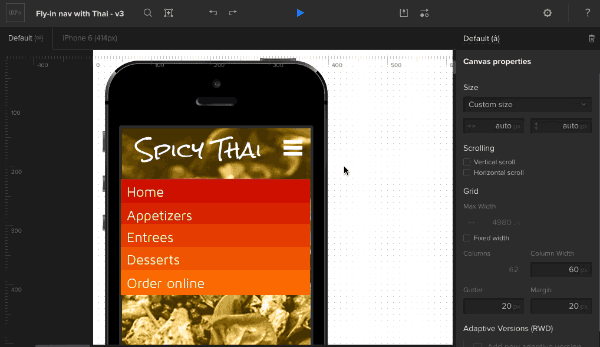
image01

Photo Credit: UXPin

2. Break it down

The first step in applying a pattern to your project is to understand what makes it work. So what makes this pattern successful? Many factors make it work, and we’ll highlight a few big ones:

Style: Trendy flat colors, a ghost button to create action hierarchy, full-width graphics (when appropriate) and light backgrounds make for easy reading with minimal clutter.

Format & Hierarchy: Identity takes priority on this page. The purpose of this profile page is clear because, before messaging the person, we first must learn about the person herself. The visual hierarchy of this pattern is therefore:

  1. Profile
  2. Calls to action (Follow or Message)
  3. Activity feed

Size: This design’s mobile optimization goes beyond simply using one column for content. Touch targets, like the buttons and icons, use the right amount of space for users’ fingertips to tap on the first try.

3. Apply your own thinking

Colors and typography, two staples of branding in design, will make most any interface stand out from its original pattern. But the customization doesn’t stop there.

  • Change out the content. Even if you don’t have real information to work with, you can experiment with rough ideas. Talk to whoever will provide content (e.g. the copywriter) to start filling in rough content. It will give you a better feel for the true size of interface objects in relation to each other.
  • Test varying amounts and sizes of content. Websites and apps are rarely static, permanent products. Try adding too much or too little content. That’s right, deliberately break the design to find out how it reacts to “real-world” situations.
  • Make sure it achieves its goals. Does the design fit the business goals? The user needs?
  • Test under varying conditions. Are you sure that the design presents its content well on mobile devices? Are its links easy to tap or swipe? For that matter, are they easy to distinguish from other non-tappable design elements?

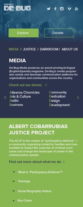
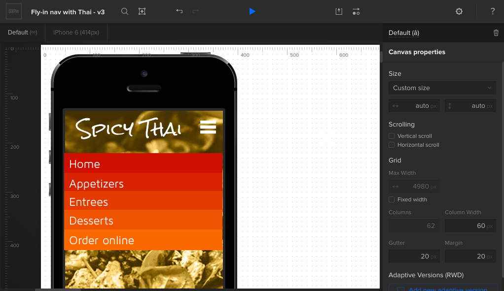
Take this application, for example:
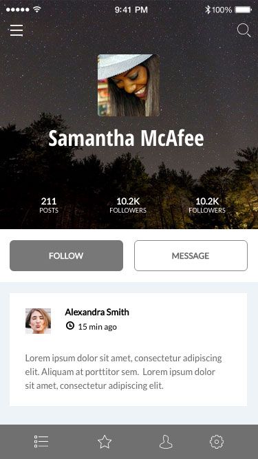
image03

Photo Credit: UXPin

The design above follows the pattern’s sensibilities, but applies different styles and experiments with varying amounts of text. Specifically, it uses a longer name and friend’s message to test varying content lengths. It also tests what happens if a user chooses a dark background. Result: the name and user photo come into sharp relief, and it still keeps the same ideas that made the first pattern work.

4. Share with the team

At this point you should show the work to stakeholders and collaborate with developers to make sure everything’s possible and on target, priority-wise. The mockup should be sufficiently low-fi enough to explain “this is a work in progress” — although you can underscore that by asking specific questions such as:

  • Does this layout reflect the order in which we want to reach users?
  • What elements can we remove and still have the design compel users to act? Is everything here necessary?
  • Is it technically feasible in terms of HTML/CSS and back-end code like Ruby or PHP?

And most of all, does it need to change? Patterns are starting points for your work — established conventions that users have come to expect. But they don’t dictate the final product. Use them to get started, test them in real-world conditions (or as real as you can figure) and build products that users will know how to use intuitively.

Going forward

Soon we’ll be relaunching our UI pattern library with all the hottest patterns used in today’s apps, which you can use for your design work in UXPin. If you’d like to be informed of when we launch, sign up below.

image02

The Judges Have Spoken — We Have A Winner in Our First Design Challenge!

We’re pleased to announce the winners of our first Design Challenge. Congratulations to Alina Kononenko for her redesign of the De-bug website! She’s won an Apple Watch Sport, the competition’s grand prize.

Second place goes to Suganya Yuvaraj. In third place is Liz Coppinger.

The designers had to redesign Silicon Valley De-bug’s website, using current brand assets, content and organization in UXPin. The catch: it had to be done with a mobile-friendly slant!

As a tech-savvy community organization and entrepreneurial collective, De-bug needs a responsive website to better serve their community. We’re thrilled with the design community’s response and dedication in helping the organization achieve their goals in social justice and rights for youth, workers, immigrants and those impacted by the criminal justice system.

The winners were chosen by a panel of judges, which included our own CEO Marcin Treder, True Ventures Design Partner and UXPin advisor Jeff Veen, and name of debug Adrian Avila. So without further ado, let’s take a look at the winning designs.

Before:

image02

The First-Place Winner: Alina

First-place winner

While learning to program, Alina realized that design part of any program gave her much more pleasure than coding.

She began to study anew, and every small success pushed her to move forward. The more about design she learned, the more excited she became about designing user interfaces. The constant search of beauty, discovering something new and upgrading my skills, inspires her in her daily work.

She explains her rationale behind her design choices:

The main idea of my design was to make it dynamic and balanced at the same time.

From the side of UX, I wanted to make informational structure more clear to allow users to have fast access to all Silicon Valley De-bug projects and its main information. Also, another task was to make this design mobile-friendly, so current layout can be easily adopted for all the possible devices.

Big attention also was given to call to donate, there is separate section on the site that explains the purpose of donation and engages potential donors. From the side of UI, I decided to make clean and encouraging design that will be consistent with existing style guide and will inspire people to collaborate with Silicon Valley De-bug.

Congratulations to Alina, who took the Apple Watch in the contest. But hers wasn’t the only design that resonated with our panel of judges.

Second Place Runner-Up: Suganya

2nd place runner-up Suganya shared her insight:

I wanted to present the maximum content in my single page design because user may find it difficult to coordinate and understand the info if there are too many redirects(links which open in separate page/browser tab).

Information grouping was not much difficult to me because in Silicon Valley Debug’s ‘About Us’ web page information was well grouped but the design was not pleasing enough for an end user. I just conveyed the same info with latest 3 grid design.

Silicon Valley Debug is a non-profit organization and so it requires Donate feature to be highlighted and given more significance to. So i embedded it in the banner as a button ‘Join us for a Cause’ and also dedicated a space in layout for donate and fund-raising.

In a nutshell, I just thought as an end-user, whatever I felt less pleasing in the existing Silicon Valley De-bug page, I changed them as user friendly design and incorporated latest design trend in it.

Third Place Runner-Up: Liz

Third-place winner

And 3rd place runner-up Liz, who’s written on her design process before. A Business Analyst with Lucid Agency, Liz started wireframing and learning about UX design four years ago. She’s driven the UX design for major corporate intranets, email templates, front-end websites, and strategic landing pages.

She said she’s inspired by the nature of digital work itself. Over the short span of four years, she’s seen many things change, not the least of which is the introduction of responsive design.

I thought the biggest issue with the existing [De-bug] site was the information architecture. My main goal for the design was to create a layout that clearly outlined the three main sections of SVDB before calling out specific successes.

Because SVDB was seeking higher conversion rates for donations, I highlighted ‘donation’ calls to action with design and placement. I also wanted to try adding a suggested amount below the donation button.

The First of Many Design Challenges!

Thanks to everyone who entered our first Design Challenge. We look forward to conducting more competitions, seeing what the creative design community invents, and handing out more prizes.

If you found this post interesting, check out our free e-book Timeless UX Trends: Responsive & Adaptive Design. We describe in step-by-step detail how to follow a mobile-first design approach with analysis of examples from Hulu, Change.org, and others. It’s written for everyday design, so you won’t find any dry theory.

Download a free e-book

5 Reasons to Use UI Patterns in Your Design Work

Patterns can seem like the easy way out when it comes to design. But they’re not. They’re very useful in helping you guide users through the experiences you’ve created. And they’re something that you can use to your advantage.

In this post, we’ll show you why UI patterns are important and how they can actually make you a better designer.

Continue reading 5 Reasons to Use UI Patterns in Your Design Work

Animations & Interactions in Design: Creating a Fading Navigation Menu

Arguably the most popular type of mobile navigation is the type that appears on demand: Tap an icon and site-wide links appear. But just making them suddenly appear is boring. It lacks panache. Great navigation has a hint of animation that gives the links context — they’re not just things that appear out of nowhere. They’re hidden just out of sight, ready to help users get around when the need arises.

Fly-in navigation demo

Today we’re going to show you how to build a fading navigation that flies in and out on mobile without writing a single line of code that’s sure to wow stakeholders.

1. Build the framework

Log in to your UXPin account (or start a free trial) and let’s get started. Then find and drag out the following elements:

  • iPhone bezel, black
  • FontAwesome “reorder” icon
  • FontAwesome “remove” icon
  • Page title (36pt Rock Salt)
  • Background image (in focus)
  • Background image (blurred)

We suggest you name each element as you create it — you’ll thank yourself later. To do so, tap the “i” icon at the top of the options menu whenever you tap an icon.

2. Create the background

This prototype uses the background images in smart elements so we can reuse them later. Whether you choose to follow suit or not, drag in two versions of the background image: one in focus, and one blurred. Arrange them in the canvas so the in-focus image is on top of the blurred one. Finally, select the phone bezel and move it to the front.

Set up background

3. Create the navigation links

Add navigation links (home, appetizers, entrees, etc). To add text to a box, double-click on its center and start typing.

Create nav item

Color each box and add a little padding. Change the typeface and size as you see fit — in this demo we used 24px Maven Pro. You can make each link the same color, but in this demo we used:

  • #cf1000
  • #d82300
  • #e43b00
  • #f05301
  • #fa6801

4. Finish the interface

Add the title (36pt Rock Salt, in this case) and the open-navigation “hamburger” icon.

Set up the rest

Place the close-nav icon on top of the open-nav icon, then hide it with the layers palette.

Add and hide the close icon

Shrink the navigation links to fit under the phone bezel’s right edge, and use the “eye” icons in the layers palette to hide them.

Shrink the nav items

5. Create an advanced animation

The fun begins with the custom animations editor. Add an action to the navigation trigger: advanced animation. “Step 1” represents the state that the animation will reach upon completion. This is the point at which the navigation should be fully revealed, the background blurry, and the “hamburger” icon changed to a “X”. To start all that, reveal and expand the navigation.

Animate the open-nav action

Set each navigation link to appear 50ms after the last. For example, “Appetizers” begins at 50ms and “Entrees” begins at 100ms.

Set nav item timing

Now for a little switcheroo. Hide the open-nav icon and show the close-nav icon. Then hide the focused background and show the blurred background.

Change background and icons

6. Fix the order

Finally, make sure the phone bezel is the above the navigation links, but below the open/close icons. This ensures that the navigation links only appear in the app’s working area, not over the phone itself.

Move the bezel up

Then try it out! Advanced animations are a powerful way to give interactions a little pizzazz. To set yourself up for success, though, we suggest that you name elements as you go, pay attention to their layer orders, and don’t be afraid to experiment. Hope you enjoyed this tutorial. Now play with UXPin on your own!

Level Up Your Design Skills & Win an Apple Watch

There’s reading about UX/UI technique, and there’s putting it into practice. As part of our initiative to help designers learn — really learn — we’re creating a series of Design Challenges.

From basic visual skills to advanced interactions, each Challenge will test your ability to solve design problems in creative ways. And we’re going to kick things off with a big one.

Today we’re pleased to announce the first UXPin Design Challenge: Redesign a nonprofit’s home page to improve donations and encourage new memberships. To do the challenge, you’ll need a free UXPin account

Continue reading Level Up Your Design Skills & Win an Apple Watch

Exporting Prototypes to HTML or PDF Couldn’t Be Easier

Iterating through design doesn’t stop with prototypes. Many people find the ability to share PNGs, PDFs and HTML/CSS handy to have. Such versions are great for archiving drafts, printing out for whiteboard discussions, or testing in real browsers on mobile devices.

In this tutorial we’ll explain how to quickly export a prototype. If you want to follow along, get a free trial to UXPin.

Continue reading Exporting Prototypes to HTML or PDF Couldn’t Be Easier

Are You Suffering From Design Tool Overload?

If you design websites, chances are you rely on a few tools: a code editor, a graphics editor, a web browser. In most cases, one of each does fine.

Unless you need both Photoshop and Illustrator. Or you decide to test on more than one browser. In this piece, we’ll explore the symptoms of tool overload and how to cure the ailment. 

Continue reading Are You Suffering From Design Tool Overload?

Responsive Web Design Cheat Sheet

How to set up breakpoints in this design? You probably ask yourselves this question a lot.

Responsive design breakpoints are no rocket science and you don’t need to search the web for the proper breakpoint dimensions every time you design for responsive. As a matter of fact, the ultimate design aid in this matter would be a simple graph with all the breakpoint dimensions visualised.

And that’s what we give you.

In UXPin, you can use the various breakpoints. If you want to play around with them, start a free trial

UXPin - responsive web design cheat sheet

Using the responsive web design cheat sheet is very simple. Find the device you’re designing for on the chart and read what breakpoint dimensions it should have – and there you have it.

The poster is print-ready so you can even put it on your wall and never lose track of responsive dimensions again (or hang it in your office and make your teammates stop haunting you with questions about breakpoints).

Download the responsive web design cheat sheet (102 kB).

Join the world's best designers who use UXPin.

Sign up for a free trial.

Components – new JustProto feature!

Here’s another great news for JustProto users. Long-awaited feature is now done and ready to be used.

Easily created components are a great tool for everyone who have problem with applying the same, multiple elements on various pages of prototype. They’re piece of cake to use – just click Add like you do it adding pages, and tick the Component option. Now create your Component with elements and when you’re done – drag&drop it on your pages. It’s that simple.

All changes that you apply on Components are automaticly shown on all your pages, so you don’t need to worry about changing properites of similar elements on every single page. That’s gonna significantly speed up the work, especially while making advanced prototypes.

See for yourself how easy is creating, using and changing Components and then try it on your prototype!