If your team ships from a shared React component library, UXPin is often the better pick. It helps you design with the same components engineers use, which can cut handoff work, lower rebuild time, and catch logic issues before development.
Here’s the short version:
- Use UXPin when you need high-fidelity prototypes with live states, props, validation, tables, filters, and flow logic.
- Use mockup-first tools when you’re still testing visual direction, brand ideas, or early concepts with no fixed component system.
- UXPin Merge connects React libraries like MUI, Ant Design, and custom components through Git or Storybook.
- UXPin Forge keeps generated layouts inside design system rules, so teams stay within approved components.
- This matters most for forms, dashboards, admin panels, internal tools, and B2B products where behavior drives the experience.
- Fixing issues earlier usually costs less than fixing them in build or QA. That’s the core reason teams move to code-first design.
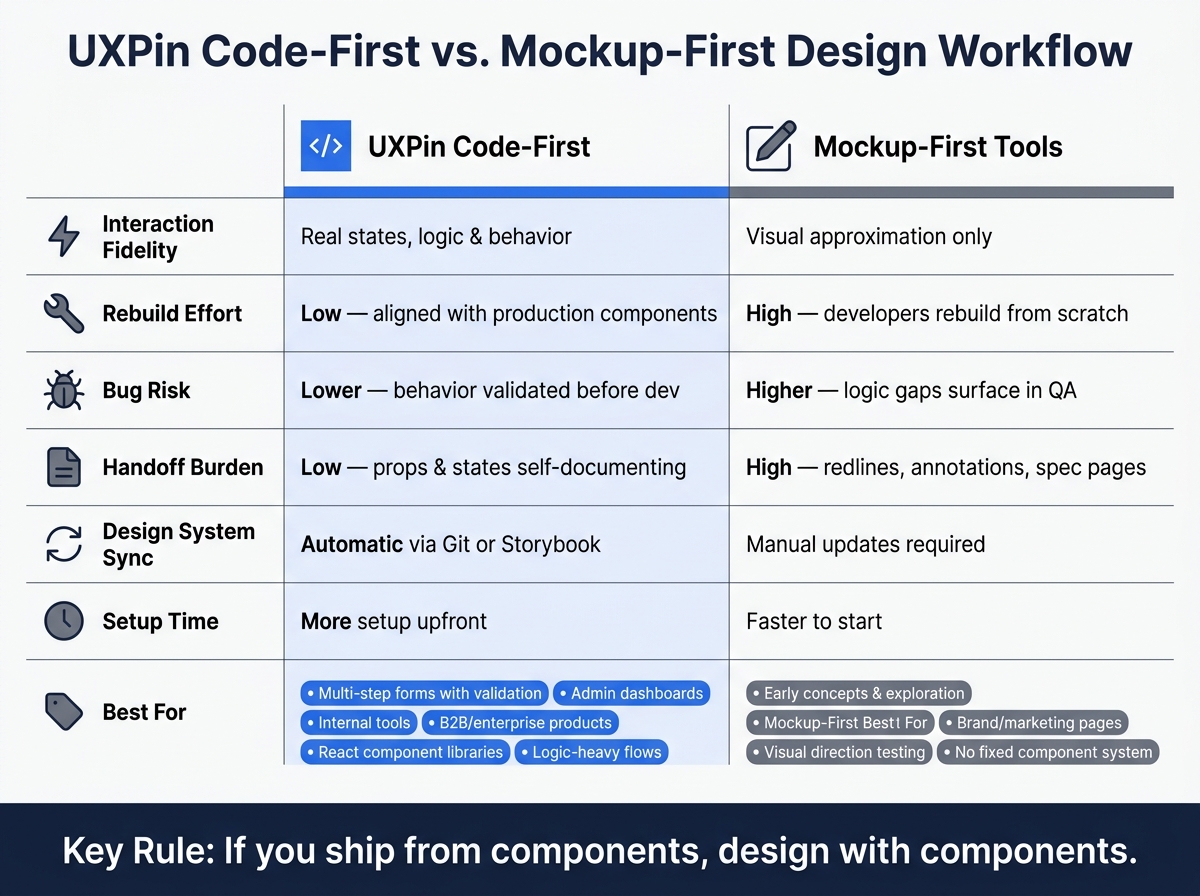
UXPin Code-First vs. Mockup-First Design: Which Workflow Fits Your Team?
UXPin Merge Tutorial: Intro (1/5)
This series explores the power of front-end prototyping using code-backed components.
sbb-itb-f6354c6
Quick comparison
| Workflow | Best for | Main strength | Main limit |
|---|---|---|---|
| UXPin code-first | React-based products, governed design systems, logic-heavy flows | Design and code stay closer together | More setup at the start |
| Mockup-first tools | Early ideas, marketing pages, visual concepts | Fast for visual work | More translation during handoff |
I’d sum it up like this: if the product depends on behavior, not just layout, UXPin makes more sense. If the work is still loose and visual, static design tools are often enough.
Code-Backed Prototypes vs. Static Mockups
The main difference comes down to behavior, not looks.
A static mockup shows the layout. A UXPin code-backed prototype shows how the product actually behaves. That gap becomes a big deal when teams need prototypes that line up with the same components they ship in production.
In a static mockup process, developers get screens and then rebuild the missing behavior later. That’s usually where things start to drift. With UXPin, the prototype uses real components with actual states, props, and interaction logic. So the team reviews something much closer to the final product, not just a visual stand-in.
| UXPin Code-Backed Prototype | Static Mockup Workflow | |
|---|---|---|
| Interaction Fidelity | Real states, logic, and behavior | Visual approximation or limited click-through flows |
| Feasibility Validation | Earlier, using real or reusable coded components | Later, during engineering review or implementation |
| Rebuild Effort | Lower – aligned with production components | Higher – developers recreate the interface from scratch |
| Bug Risk | Lower – more behavior is validated before development | Higher – logic gaps surface during QA |
| Delivery Cycle Time | Shorter when rework and redesign are reduced | Longer due to translation and iteration cycles |
This gap gets bigger when the product depends on logic, not just layout.
Where Real Interaction Fidelity Changes the Outcome
For simple static pages, the difference may be small. But in multistep forms, sortable tables, conditional validation, and role-based internal tools, it can get expensive fast.
Why? Because these flows depend on logic. Not just screens.
A static mockup can show what an error state looks like. But it can’t show when that error appears, what clears it, or how it affects nearby fields. That’s the part teams still have to guess, explain in docs, or sort out later in development.
In UXPin, a team building a multi-step onboarding form can set up steps, disabled states, validation, and conditional fields with real logic. Developers aren’t left reading a rough description of behavior. They can see the exact interaction. And that level of detail helps avoid rework that never needed to happen.
How Early Feasibility Checks Cut Rework
Because UXPin prototypes use coded components, engineering can review whether a proposed interaction can actually be built before design sign-off. That’s the sweet spot for changes, when fixes are cheaper and far less disruptive.
This matters most in regulated or logic-heavy enterprise products, like finance platforms, healthcare tools, or internal operations software. In those cases, state accuracy, permissions, and validation logic matter just as much as visual polish.
When teams catch feasibility issues at the prototype stage, they avoid late-stage rework, scope changes, and release delays.
That becomes even more important when prototypes need to stay aligned with a governed design system.
Using UXPin with React Components and Governed Design Systems
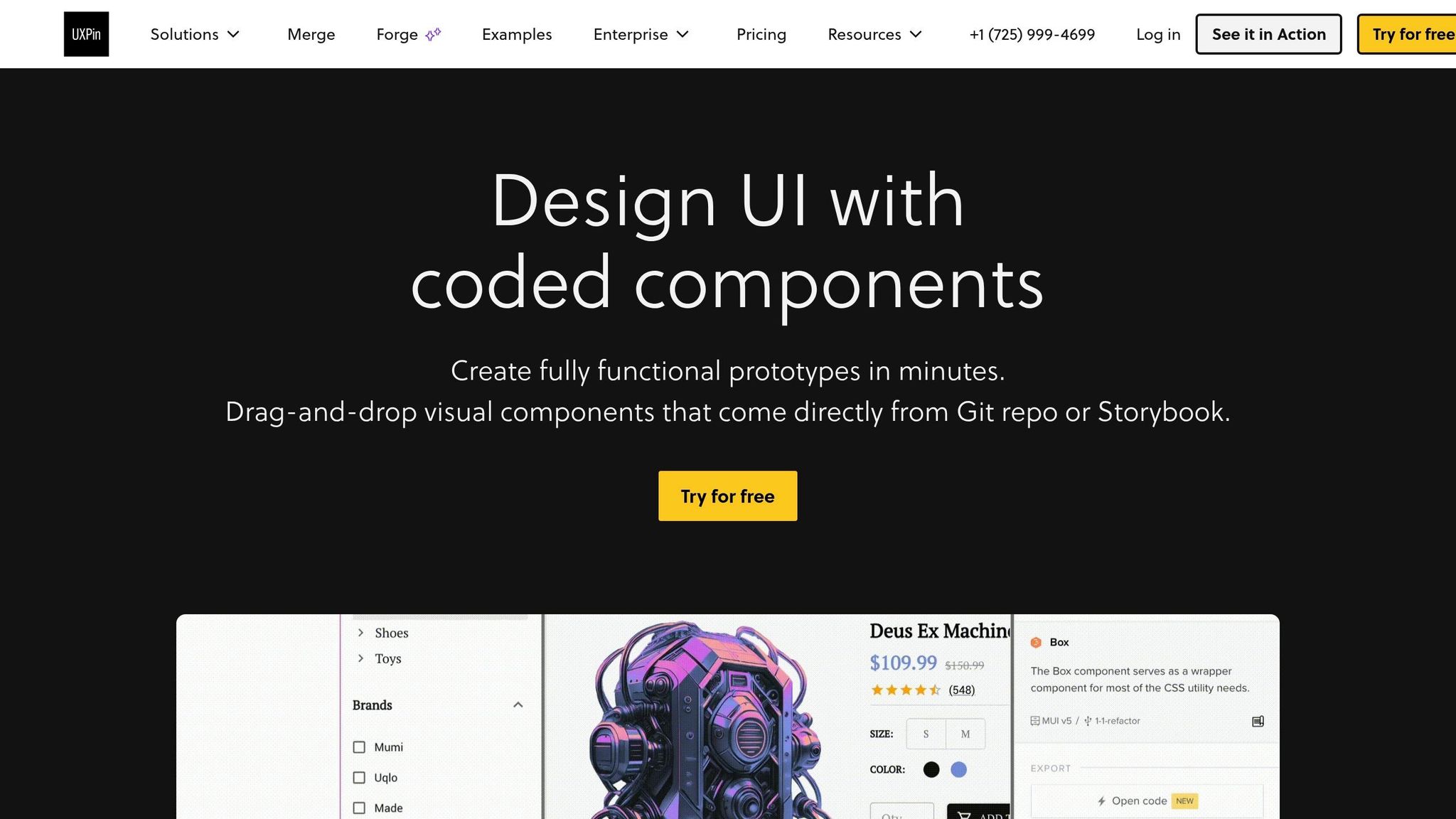
For teams already building in React, Merge brings that same code-based approach into the design canvas. If your team already has a React component library, UXPin cuts out the usual back-and-forth between design and development. The canvas stays connected to the codebase, so when components change, design stays in sync.
Designing with MUI, Ant Design, and Custom React Libraries
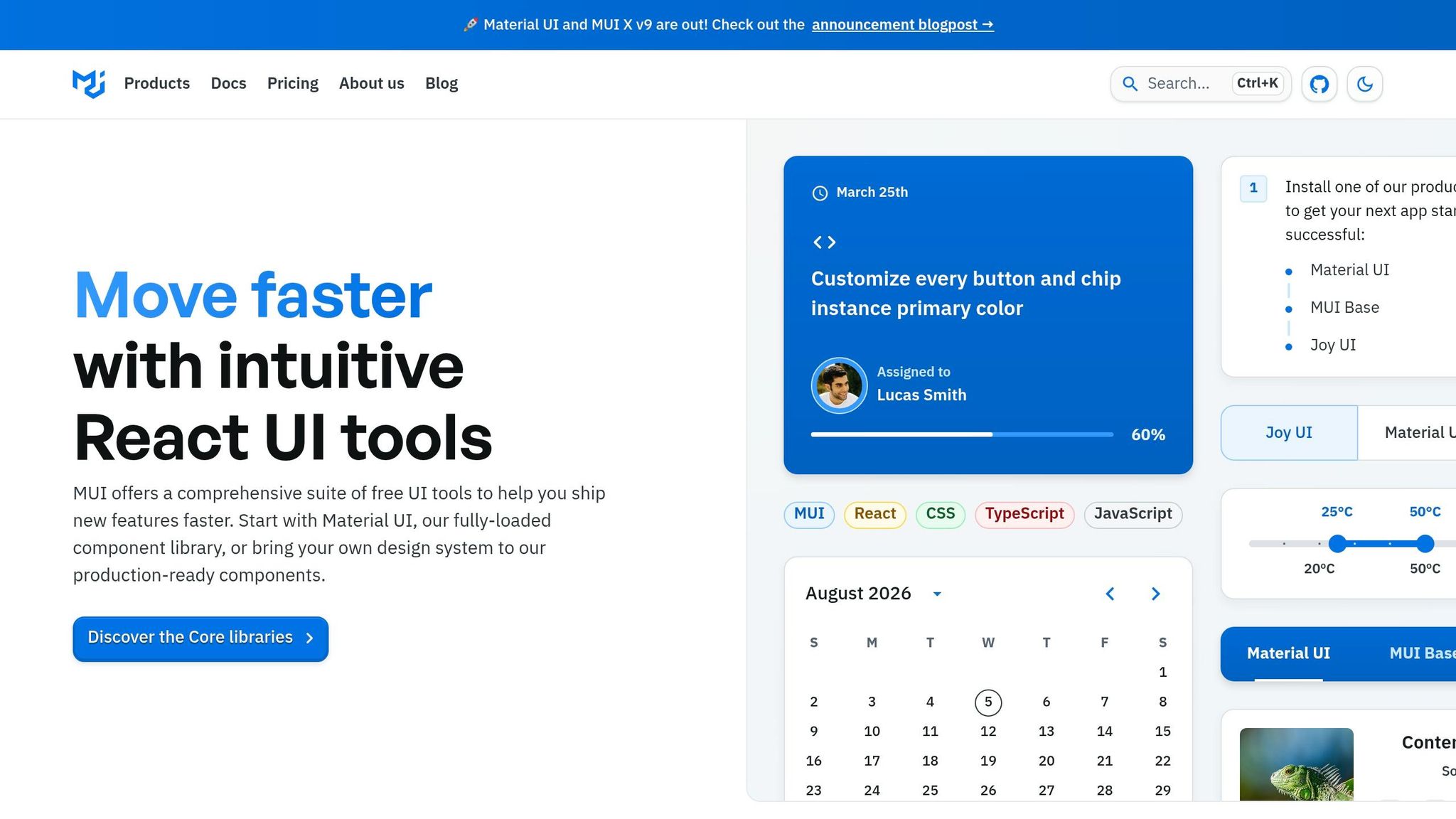
With Merge, components from MUI, Ant Design, or your own React library show up in UXPin’s panel as drag-and-drop building blocks. Designers can set the same props developers work with, including variants, states, sizes, and behaviors. MUI and Ant Design connect to UXPin directly, so teams using those libraries don’t need to import anything. If you have a custom enterprise library, you can connect it through Git or a Storybook integration. This Storybook integration allows designers to use the same production components as developers.
This is especially useful for enterprise dashboards, admin panels, and B2B workflows, where things can get messy fast. Say your team is building an admin panel with Ant Design’s Form, Table, and Menu components. In UXPin, you can prototype that interface with realistic validation, bulk actions, and navigation by using the actual components instead of lookalike mockups. That gives teams room to test empty states, restricted views, and confirmation flows before implementation begins. And that’s where code-first design helps avoid late-stage rework.
It also means less cleanup during handoff.
How Merge and Forge Support Design system consistency at scale
Merge builds governance into the process. Designers can only set what the coded component supports, which means off-system patterns don’t slip into the prototype. When the repository changes, those updates flow into UXPin automatically. Forge creates layouts using approved library components only. No made-up patterns. No unsupported components.
| UXPin Code-First Design System Workflow | Visual Design System Workflow | |
|---|---|---|
| Source of Truth | Production code repository (Git or Storybook) | Static UI kit maintained separately from code |
| Component Enforcement | Strict – designers configure only what the React props allow | Loose – designers can detach or modify vector elements |
| Update Propagation | Automatic sync when the repository is updated | Manual updates required across the UI kit and design files |
| Auditability | High – traceable to specific components and version history | Low – relies on manual design audits across files |
| Cross-Team Consistency | High – design and engineering share the same coded assets | Variable – depends on how well the UI kit is maintained |
For organizations with multiple product teams, this change matters. Design reviews can stay centered on flow and behavior instead of pixel cleanup, because the system already handles that control in the background.
Design-to-Development Handoff in UXPin vs. Mockup-Based Workflows
Handoff matters most when a prototype needs to match how the product works, not just how it looks. This is usually the point where rework begins. In mockup-based workflows, engineers have to translate static screens into working UI. With UXPin, handoff starts from the same components, states, and props the team already ships. That’s a big reason teams pick UXPin for enterprise flows with heavy logic, shared components, and strict review cycles.
Because the prototype already uses governed components, handoff becomes translation instead of reconstruction.
| UXPin Code-Backed Handoff | Mockup-Based Handoff | |
|---|---|---|
| Documentation burden | Low – component props and states are self-documenting | High – requires redlines, annotations, and separate spec pages |
| Clarification cycles | Minimal – interactive prototypes answer most state and behavior questions upfront | Frequent – developers ask about edge cases, responsive behavior, and missing states |
| Rework rate | Low – the shipped UI closely matches the prototype by default | High – the UI often needs visual cleanup or component fixes after the initial build |
| Implementation speed | Fast – developers reuse the same components already in the prototype | Slow – developers reconstruct layout and interactions from visual reference |
| Shipped UI alignment | High – design and code share the same component source | Variable – depends on developer interpretation and time pressure |
Fixing defects during implementation costs far more than catching them in design, and the gap widens after release.
Why Front-End Engineers Spend Less Time Cleaning Up Designs
When prototypes use the same component constraints as production, engineers spend less time fixing mismatches. In mockup-based workflows, part of engineering time gets spent reconciling design decisions with technical reality. That can mean adjusting spacing that doesn’t match design tokens or adding states that were never spelled out in static screens.
With UXPin, designers work inside the rules of the actual component library. So if a design system includes a standard input field with focus, error, and disabled states, those states are already part of the component in the prototype. Engineers don’t have to guess, fill in gaps, or make up behavior on the fly.
What Better Handoff Looks Like for DesignOps and UX Managers
For DesignOps and UX managers, the upside is a more predictable workflow. Instead of juggling static mocks, design specs, documentation pages, and meeting notes, the UXPin project becomes the single source of truth for each feature or flow.
Cross-functional work also gets smoother. Product managers can review flows with realistic interactions, and engineers can step in earlier to flag feasibility issues before the design drifts too far from technical limits. Since UXPin prototypes are built with coded components, teams can also trace which components show up in which flows. That gives DesignOps a clearer picture of component reuse and design system adoption across squads.
That difference often shapes the decision: when the team needs a workflow that stays close to production, the extra setup can be worth it.
When to Choose UXPin and When a Mockup-First Workflow Is Enough
Not every project needs a code-first workflow. The right pick depends on what your team is making, how realistic the prototype needs to be, and how closely the work connects to a governed design system.
Best-Fit Scenarios for Product, UX, and Engineering Teams
Once your team agrees on production components and handoff, the choice mostly comes down to project type. At that point, the main question is simple: when is that extra fidelity worth the setup?
UXPin works best when your team builds from a shared React component library. If engineers work from Storybook while designers redraw those same components in a visual tool, that mismatch creates rework. It’s the classic “looks right in design, works differently in code” problem.
Choose UXPin when flow logic and component states shape the experience. Multi-step forms with conditional fields and validation, data-heavy dashboards, and internal tools like HR portals or CRM interfaces all depend on states and behavior that static mockups can’t show well. In those cases, a code-backed prototype helps surface edge cases before engineering begins, not after.
A mockup-first workflow makes more sense for early exploration, brand direction, or marketing concepts that don’t use a component system. If the main question is visual direction rather than behavior, static tools are often the better fit. A lot of teams split the difference: mockups for discovery, then UXPin for flows that need to be closer to build-ready.
Use the examples below to map project type to workflow.
| Project scenario | Is UXPin the better choice? | Rationale |
|---|---|---|
| Multi-step forms with validation | Yes | Real form components capture precise states and error handling that static screens miss |
| Internal admin dashboard built from a shared React library | Yes | Designers use the same coded components as engineers, reducing handoff friction |
| Multi-product design system with multiple consuming teams | Yes | Merge enforces a single source of truth; system updates flow into prototypes automatically |
| Data-heavy apps with sorting and filtering | Yes | Component behaviors can be tied to realistic sample data for early usability validation |
| Early concepts without a defined system | No | Use static tools first; move to UXPin once a component library and delivery model are established |
| Brand campaign landing page with bespoke visual layout | No | Mockup-first tools are faster for visual exploration and custom layouts not tied to a component system |
Key Takeaway: Match Your Workflow to Your Delivery Model
If you ship from components, design with components. When your delivery model runs on a governed React library and design tokens, UXPin reflects that setup and cuts down the translation work between design and code. When the work is still exploratory or driven by brand direction, and not tied to a stable system yet, a mockup-first workflow is faster. Use static tools to explore direction, then switch to UXPin when the work needs to match how the product will actually ship.
FAQs
Does UXPin require a React component library?
No. UXPin does not require your team to build or maintain a custom React component library to get started.
If you don’t have your own design system, you can use built-in libraries like MUI, Ant Design, Bootstrap, or ShadCN.
If you already have one, UXPin lets you connect your existing React components through Git, npm, or Storybook.
Can teams use UXPin for early-stage design exploration?
Yes. Teams can use UXPin for early-stage design work, but it starts to shine even more as projects move into high-fidelity, production-aligned prototyping.
It handles the full range, from low-fidelity wireframes to interactive prototypes. And its code-first setup is especially useful when teams rely on established component libraries like MUI or Ant Design. That lets them check feasibility early using the same components developers will later ship.
How much setup does UXPin need before teams can use it?
It depends on whether teams use built-in libraries or custom components. Built-in libraries like MUI, Ant Design, and Bootstrap need no setup because they’re already integrated.
Custom components take a bit more work. Teams need to configure uxpin.config.js, set up Webpack, and add a wrapper component that links the repository.
A full integration can take 2 hours to 4 days. That said, many teams get up and running in under 30 minutes with the UXPin boilerplate repository.