Anything you can create in code, you can design with UXPin powered by Merge technology. Designing with code components can cut down your time to market and simplify the handoff between designers and devs. It’s all thanks to using the single source of truth and designing with production-ready components.
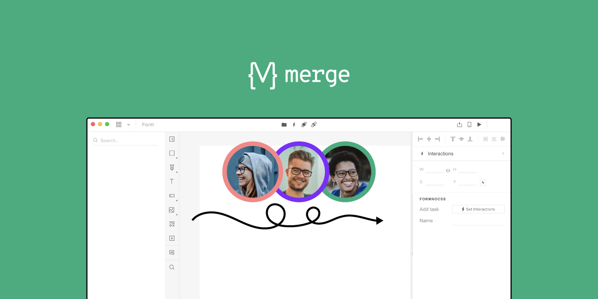
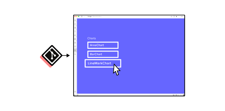
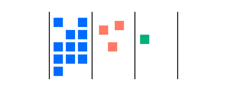
Device Viewer
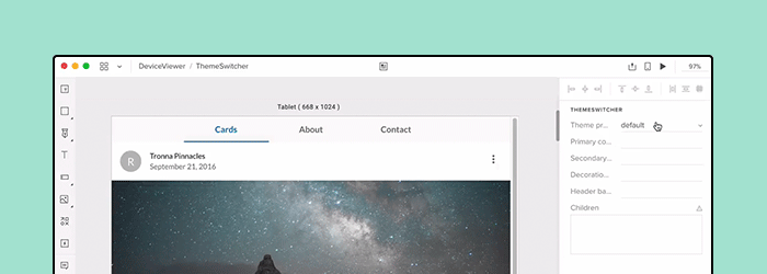
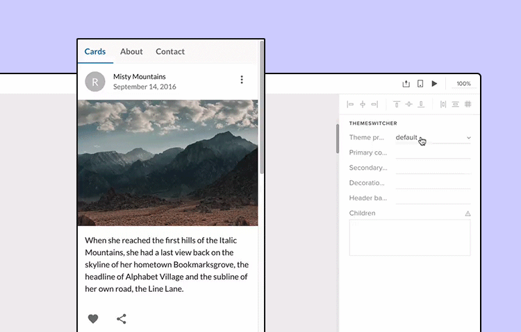
Theme Switcher
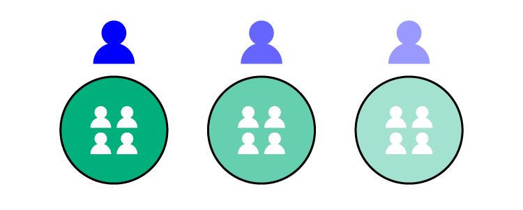
We’ve recently featured two really cool React components that you can use with UXPin Merge; the responsive design Device Viewer and Theme Switcher. You might think that UXPin’s technology is only useful for companies with a single design system, but we’ll show you how a large web agency, spanning several smaller portfolio teams, used these two components in an environment built around white labeling.
The troublesome design process in agency
Design agencies can come in all shapes and sizes. Individual small or large agencies or even portfolio companies constantly acquiring smaller teams, each using different technologies. But what does stay the same, are the issues faced when managing branding and creating future-proof, scalable, and efficient design systems.
The software and tools these companies use are incredibly important for solving these issues. Imagine how much time and money is wasted on back-and-forth communication due to using and maintaining multiple design systems and sources of documentation over several technologies and how much more rewarding it would be if you could simplify and improve this.
Agencies using the power of Merge technology
As mentioned in the Theme Switcher and Device Viewer articles, you see what amazing components you can create and how Merge can make complex design ideas easy; all thanks to designing with ready code components. Using your imagination, the possibilities of prototypes you can create seem endless.
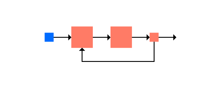
Focusing on the Theme Switcher, you can see that it’s just a React component. It shows that anything you can imagine and code can be designed within Merge. It shows how agencies that use Merge can work efficiently with any number of clients, switching between clients’ brands with a click of a button. It’s also an incredibly powerful tool when it comes to requests for proposals (RFPs) and quick-turnaround demos. Imagine if all you had to do to create a new styled prototype to impress potential clients was to edit a simple style file, while your competitors had to create a new prototype from scratch. But, how is this different from using another piece of software and their theming tool?
Theme switching is not specific to UXPin Merge, some design tools have it, but how it’s implemented here is what makes it special, incredibly efficient, and design consistent.
Unlike other design tools, Merge’s variable values are all predefined in the code and can be done at a component or layout level. Everyone, who uses the components, is designing with the same properties and values, hence everyone has the same tools. Consistency is created from the code itself – a single source of truth, meaning no more errors in branding and future proofs the design system. The library in the editor is also syncing with the Git repo, so there’s no need to remember about updating the components in two separate places.
Imagine having a design system with a single source of truth. How easy it would be to maintain documentation or have a playground where anyone, be it a designer, developer, or account manager can go and test component props and create prototype presentations. Merge can provide this and it’s only getting better.
As we keep mentioning, anything you can code you can design with. This means you don’t have to install a 3rd party plugin to enable theme switching. Why go through all the complicated steps of adding theme switching to your vector-based design system when you can do everything you need in UXPin powered by Merge technology alone.
Summary
Changing design tools can be a daunting task with lots of worry and problems. There’s currently a very rigid design process that people like to follow and it can be very difficult to step out of that comfort zone and try something new, even if they believe it will be better in the long run.
But there’s no need to worry as the UXPin team is with you every step of the way helping with any integration questions and issues.
Want to find out more about Merge technology or would like to try it for yourself?
Managers have developed dozens—at least—of processes that they believe improve efficiency and get better results. Those series of steps, however, may not match the needs of your design team. You might also find that some projects don’t fit into the restrictions of established stages of design? Who says you can’t make a design process of your own?
Start by learning popular approaches to project management
You may want to establish your own design process, but you should still take some time to learn from established project management methodologies. They may offer steps and concepts that you want to incorporate into your process.
Agile
With Agile, you create an iterative process that includes steps for:
Planning the design process and defining goals.
Creating the product design according to your established guidelines.
Testing your design to find opportunities for improvement—UXPin works well during this step because it lets you create fully functional prototypes with interactive features and real data.
Finalizing the first version of your product and releasing it to consumers.
Using feedback from users to make additional product improvements.
Continue the cycle until you retire the project and decide to use the current version of the product.
Scrum
Scrum creates results quickly by planning ahead and relying on design sprints.
Choosing someone who will direct the design project’s vision.
Putting together a team of designers and developers with skills the project needs for success.
Selecting a “scrum master” who can run daily meetings.
Creating a list of the goals you need to meet during the design process.
Planning your design sprints.
Following a transparent workflow that lets everyone on the team see each person’s progress.
Meeting daily to discuss successes, failures, and barriers.
Making a prototype of the product to show the client – it’s very easy with a UXPin preview and share feature.
Incorporating feedback into your plan and beginning the next design sprint.
Continuing until you finalize the product.
Kanban
Kanban gives you an extremely easy way to track a design project’s progress. You can use it successfully by:
Visualizing and planning your workflow—this usually involves making columns for tasks that have been “not started,” are “in progress,” and have been “finished.”
Determining all of the tasks that you need to accomplish during the design project.
Establishing rules like deadlines and task assignments.
Moving tasks through the categories until you have completed them all.
Lean
As the name suggests, Lean gives you a streamlined approach to managing design processes. Key concepts of Lean include:
Setting specific goals and breaking them down into the tasks your team must complete reaching those goals.
Spending more time working on the design project instead of planning the project.
(User) testing designs for functionality and aesthetics before giving a prototype to the client.
Making any necessary changes to satisfy the client’s needs.
Waterfall
Waterfall design processes recognize that you must finish some tasks before you can move on to others. Project managers commonly approach this by:
Establishing the design project’s requirements.
Working on all of the tasks required to complete the design.
Bringing the designs together to create a prototype.
Verifying that every feature in the prototype works.
Regardless of the design process you decide to follow, you need to create user personas that help your team understand its target market. When you develop a user persona, think about features like:
Pain points the user wants your product to solve.
The user’s age, level of education, income, etc.
Interests and values that will appeal to the ideal user.
The devices that your user persona likely owns.
At the end of the process, you should have a concrete description of your user persona. It might say something like:
“23-year-old woman who recently graduated from college, wants to find ways to move her job forward, volunteers at a local animal shelter, and owns the latest iPhone.”
From this point, you can start to think about how your design makes it easier for her to reach the goals in her life. Perhaps you decide to build a career-oriented app that posts job openings and offers tips for getting a new position. Depending on whether you want to focus on a smaller niche, you might even create a product that helps animal-lovers find jobs.
Every person has numerous problems to solve. Just make sure that solving those problems becomes a part of your design process.
Many designers have big ideas in their heads that they can’t wait to create in software. You want passion in your designers. Those are the people that do amazing work and push boundaries!
At the same time, you might want to slow them down to make your design process more manageable.
Requiring wireframes might accomplish that goal for your design team. Even as your expert designers roll their eyes at the rather boring process of making wireframes, you must admit that they have advantages like:
Centralizing the team’s vision instead of letting each person pursue their own creative ideas.
Improving development by ensuring that you have a sturdy structure before you add cool features.
Saving money by shortening the design process and avoiding errors.
Easier handoffs when one person can’t complete a task—perhaps she calls in sick—and someone else has to do the work.
Improving the user’s experience by forcing your designs to think about the project from multiple perspectives instead of just making the product look amazing.
Build a library of approved assets
Early in the design process, you should build a system design that creates guardrails for your designers. The design system can include approved:
Colors
Typography
Assets
Components
UXPin lets you add descriptions within your system design. Hopefully, the descriptions will prevent designers from barging into your office to ask why they can’t [insert interesting but unrealistic idea here].
Without a design system, some designers will take paths that don’t lead to your desired result. Stop that impulse by restricting them to the project’s approved options.
You and the rest of your design team might feel a lot of enthusiasm for your work. You might even think that this project is the best thing you’ve ever done.
Get feedback from as many people as possible so you can get an outsider’s perspective. What seems amazing to the people working on a project could look odd to those outside of the team.
UXPin lets you get feedback from anyone, regardless of whether or not they have a UXPin account. When you send a link to your prototype, people with the link can interact with your design and leave comments. Hopefully, they will love your work as much as you do. If they find issues, though, take them seriously. There’s a good chance that other people will also dislike how the feature works.
Decide what steps do and do not work for your team’s design process
Experiment with design processes to identify steps that work for your team. If you find something that doesn’t get positive results, discard it. If you feel like your process misses something, brainstorm to find a new step that will improve your process.
You don’t have to follow someone else’s rules. You can make your own design process that helps your team get the best results.
Sign Up for a Free Trial With UXPin
UXPin has several features that will support your own design process. Start your free trial today to see how it can contribute to the evolution of your design process.
Today’s designs often require the work of multiple professionals who have experience in areas like graphic design, animation, and coding. Whether you have two people or two dozen people working on a project, perfecting your approach to team design will streamline your processes and lead to better results.
The talents and personalities of your colleagues may influence how your team design projects, but you can typically rely on the following steps to make your work more effective.
Ready to start your next design team project? There’s no better tool than UXPin, an end-to-end advanced prototyping solution for making collaboration easier. UXPin allows you to build interactive prototypes, share them with others, and ship them to development. Start a free trial.
Build advanced prototypes
Design better products with States, Variables, Auto Layout and more.
Select design team members wisely
Effective design teamwork starts with having a team with the skills you need to complete the project. Team composition is crucial, so make sure you choose members for the team design who can work together. That doesn’t necessarily mean selecting people who get along well—although that could play a role, too.
Things to consider when selecting design team members include:
Whether they work during the same hours as other people.
The skills they bring to the team.
How well they follow guidelines to keep the project on track.
You may have talented designers in your agency that don’t fit some projects. You don’t always need the best of the best. You need a team that can work toward a common goal.
Make an inventory of everyone’s skills
Don’t assume that everyone will fill a specific role during the team design project. As you move through design phases, it helps to know everyone’s skills so you can assign them tasks instead of forcing them to sit idle.
Your illustrator might have experience with animation. In today’s workplace, your illustrator might even have experience with development. They might not have the skills to develop a website or app, but they could have enough basic front-end knowledge to move the first stage of the project along. That will speed things up for the team and boost your illustrator job satisfaction.
Choose a management methodology that fits your design team
Every design team needs to use a design project management methodology that fits their needs. Popular methodologies include Agile, Scrum, and Kanban.
Agile
Agile prefers vague outlines and goals that make design projects more flexible. It also puts an emphasis on adapting to feedback for ongoing improvement.
Here are some of resources for designers interested in Agile:
Scrum is a version of Agile that uses design sprints that typically end with one or two weeks.
Kanban
Kanban uses a visualized workflow that shows the status of tasks within the project. As tasks move toward the “completed” category, the project draws closer to a conclusion.
Explore those and other project management workflows:
During a team design, some people have to complete tasks before others can move forward. For example, the developer responsible for finalizing a website’s homepage can’t reach that goal until the graphic designer finishes creating all of the icons and other assets that will appear on the page.
You can integrate setting clear tasks and deadlines into any management methodology. Of course, unexpected things can happen during a project. The animator left a thumb drive at home, so you have to wait an hour while she retrieves it.
Since you know that delays will occur, give team members some flexibility with their deadlines. Make it clear, though, that they must communicate the delay to everyone. Accepting responsibility and solving the problem is good behavior. Sneaking away to fix a problem before others notice is unhelpful behavior that will get noticed eventually.
If you need a project management app to encourage communication, consider popular options like:
You may already use one of these apps for team design projects. If not, try their free trial versions before you commit to an option.
Celebrate the achievements of your team members
Team design can make some people feel anonymous. Eventually, they might start to neglect their work, show up a little late to meetings, or fail to check their messages.
A traditional approach to project management would use negative feedback to hold team members accountable. As a project lead, you may need to pull some people aside to point out their failures. Really, that should be your last option, though. Before you go negative, use positive reinforcement to keep team members encouraged and recognized.
It doesn’t take much to celebrate someone’s achievements. At the end of a mid-day meeting, you might say, “Great work on that layout, Anne. I really like it!” Everyone will hear the praise, which will make “Anne” feel included and responsible in a good way.
You can also celebrate team design accomplishments. Maybe you take a long lunch after meeting a milestone, or you have a pizza party when you send your first prototype off for approval. Gauge your team to choose a reward that they will appreciate.
It doesn’t take long before design teams can become blind to the problems in their products. When you work on something long enough, cognitive dissonance can make you see what you want to see instead of what’s in front of you.
You can fight cognitive dissonance by asking people outside of your team design project to give you feedback. Fresh eyes might notice irregularities immediately. That interactive arrow that the design team thought users would intuitively swipe might baffle a new person who picks up the product.
UXPin makes it easy for you to get feedback from as many people as possible. Once you make a prototype of your product, you can send a link to anyone and request feedback. They don’t need UXPin accounts to view your work and leave comments. By removing barriers, UXPin makes it more likely that colleagues and testers will take a few minutes to explore your product and give you feedback.
Use tools that offer features for real-time collaboration
As more companies move employees and freelancers to remote positions, you may not always have chances to gather your team in one place. Some people will miss the camaraderie of in-person collaboration. Remote work, however, has become increasingly normal. About 70% of business founders expect that they will let at least some of their employees work remotely even after the coronavirus pandemic ends.
UXPin makes it easier for design teams to adjust to remote collaboration by giving everyone a virtual environment where they can work together in real-time. If you can use Google Docs, you can use UXPin’s collaborative features. When one person changes the design, everyone sees the change happen simultaneously. It doesn’t matter whether your teammates are across the hall or on the other side of the world.
Try UXPin to improve team design projects
Most design teams find that they get terrific results when they choose UXPin because the tool gives them features for real-time collaboration, creating design systems, and making prototypes easily.
What’s the biggest difference between your designs and a $20 template?
Companies ask themselves this every time they enter the market. With the widespread advertising from website builder tools, it’s an entirely rational question to ask.
What do you have that they don’t? Turns out, there’s one subtle detail that gives design its entire personality… that extra “oomph” that no template or builder could ever hope to provide.
In this post we’ll unpack what that subtle detail is, and why it matters so much. This will help us to better appreciate the skills offered by designers and give us language to articulate this value.
Let’s go on a little journey through how successful websites are designed:
1. Reading the story
The design process starts with the copy being written and handed to the designer. This copy contains the story. As designers, it is our duty to bring it to life by giving it a visual form.
It’s essential we understand the value of the story being told before we begin.
This is why we read with the mindset of a designer. We engage our mind’s eye to seek out the narrative, the journey, and the key messages. The narrative is the thread that runs through the text and ties the events together. The journey is layered on top of and responds to the narrative. It can be emotional or factual. The key messages are the most important points in the narrative or the journey that we can take from the copy.
Identifying these elements is imperative to understanding why this page exists and what is happening in the overall story.
At this stage, we only have words on a page. There are no visuals, no fonts, or anything else. The visual story will come later.
Focus on the words. That is to say that we shouldn’t get too far ahead of ourselves and begin imagining what the design may look like, yet. The temptation may be there but resist it till the next stage. For the time being, we’ll give our all to studying the words and their meaning.
Embrace and experience the story from a designer’s perspective. Designers have a special ability to feel what a story is telling us. This is what separates quality designers from the rest of the pack. Use this ability to see beyond the words and understand the story and its constituent parts.
Use your intuition to delve into the details. As you read, think through what’s being said underneath the words. What isn’t written, but shows through in the copy anyhow? What has the writer hinted at without saying explicitly?
2. Asking “What did I just see?”
After a thorough read through, it’s time to dig deeper into the story. This can be done by asking questions like:
What big feelings did the copy leave me with?
What did I see with my mind’s eye?
What texture did the story have?
Were some sections of the story particularly dramatic?
Did any patterns or colors come to mind?
This step seems abstract at first, but building an initial rich mental picture of the story is key to the success of the final design. After all, it’s our responsibility as designers to bring that story to life.
The best designers do this. They’re able to say “look at this” rather than “look at me”. How? They’re adept at creating a very rich and developed understanding of the stories they work with.
When we understand the story entirely – its tone, background, and key messages, etc. – we can convey it to readers who aren’t designers and don’t have that gift of expression.
After asking questions about the story, it’s essential to sum up the key emotions we’re left with. Listing a range of emotions felt can help us in the design phase. We need to reflect those emotions through design. Pinning them down will ensure our final design captures the story fully.
3. Checking that perceptions are aligned
Now that we have a fleshed out idea of the story we’re working with, it’s time to confirm how accurate our interpretation is.
Did we see what the target audience will see? Did we see what the project owner wants them to see?
If our interpretation is different, the copy gave us the wrong impression and it will have to be adapted and refined before the design process goes ahead. It will make the story clearer going forward.
Once our understanding of the story is aligned, it’s time to look at it from the perspective of our target audience.
We should ask questions about our audience to better understand how the story will be framed in their minds:
Who are they? Consider putting together personas (or using existing ones related to the project) to segregate your audience and understand each individual group on a deeper level. Think of things like age, profession and interests.
What’s their experience? After understanding the personas that’ll interact with your story, ask how their unique experiences will affect their view of it. Are they related to the story somehow? Will this help or hinder them when it comes to understanding it?
What are their needs, hopes, desires, dreams and fears? There are no more powerful motivators than these. Put yourself in the shoes of your audience and consider each of the above to gain a deeper perspective of how they’ll approach the story. Their needs are especially important here – what can’t they live without?
4. Bringing it to life
At this point, you’re probably wondering, “Jeez, we have done a lot of work, but only have text on a page.” However, we now also have a totally developed understanding of the story, and it’s time to breathe life into it with the design.
Promoting story through design
Every choice that we make – font, color, size, composition, motion graphics, etc. – should reveal and promote the story. We must use our designer’s mind to make sure the story is brought to life.
Begin by gathering images based on what we saw in our mind’s eye. Did we see any faces, objects, scenes or other elements?
Illustrations, with their ability to unpack and simplify abstract concepts, will probably play a part too.
Think about the hierarchy of information and how it’ll be organized. There may be core pieces of information and more supplementary pieces – how will these be presented and differentiated?
All of these decisions will help tell the story. Some people see design as the decoration of a page before putting words onto it. But as this process reveals, it is far more:
It’s inevitable that we’ll think ahead. We may begin to blend form and function. For example, we might wonder how sticky navigation could be used. Could a carousel work with the images we’re envisioning?
Abandon those ideas for now. They’ll have their time to shine.
Of course, our page has to function properly and have a focus on conversions. However, none of that matters if our design doesn’t first connect with our audience.
And this, folks, is the subtle difference that we have been alluding to throughout this entire post: connection.
The importance of connection
By connection I mean an empathic, deep, visceral appreciation and understanding between the story being told and the person hearing it.
With a finite number of options and restrictive choices, no template or theme can hope to achieve this. This is what makes designers unique and valuable – we breathe life into stories and build strong bonds.
Picture a children’s book…
To better understand this idea, imagine the process of creating a children’s book.
It’s impossible to illustrate one before knowing the story. And to write the story first and then find a template with illustrations that fit perfectly? Unheard of.
In both scenarios, there would be no cohesion and the story would be lost.
Conclusion
To sum it up, themes, templates, and “done-for-you” tools can’t offer the subtle difference that gives design its personality. The elements that make up these tools have not been designed to champion the story from the very beginning. Frankly, they suffer for it.
This is exactly the point where our designs differ from the $20 template: we have a capacity to infuse meaning through deliberate design choices. The story is more effectively communicated because of them.
Learning to articulate this value is both a very important skill and a vital tool to counter the prevalent advertising from website builder tools. As designers, our work has irreplaceable value. If we communicate it effectively, our clients will not only appreciate it, they’ll crave it.
What do you think of faster project turnarounds? How about consistency in all of your products? Does better UX and customer satisfaction sound good to you? This isn’t some new miracle product that’s available to buy — but you can build it yourself.
Designs systems are sweeping the tech world right now, with advocates like Trello, Atlassian, Stacks, and Shopify (Check out a complete list of companies with links to their design systems here at Adele). This wave of popularity explains why 69% of designers surveyed in the 2017–2018 Enterprise UX Industry Report said that they either already had a design system or were currently planning on building one.
And why are design systems suddenly so popular, you ask? Because they’re exactly as effective as everyone says. The hype is real. Incorporating a design system in your company brings a variety of benefits:
Faster time to market. By breaking design elements into homogenized components, design systems make the whole process more efficient. Planning, designing, testing and coding are all streamlined to reduce wasting time.
Improved UX and customer satisfaction. They make it easy to keep track of what your users like and dislike, retaining the former and disregarding the latter. They ensure all your products use only the UX elements your customers prefer.
Better internal communication. As a standardized document, design systems minimize the amount of miscommunication. They keep everyone on the same page to avoid confusion.
Consistency across all products. Your loyal customers expect a certain level of excellence on all the products, apps, and sites you launch. Deliver consistent quality and familiar usability on every single product by using identical components.
Less version control issues. Updating the same bug on different products can get annoying, not to mention time consuming. With design systems, you update once and it populates all occurrences.
Design systems are a clear advantage to companies that have already implemented them, and in a few years they’ll be the norm. So how can you build a design system now to utilize their benefits yourself? We’ll explain how in just 7 easy steps… but first, let’s talk a little about what they are.
What’s a Design System?
Formally, a design system is a master collection of the key standardized documentation every company needs to, in the words of AirBnB Principal Designer Karri Saarinen, “define the overall design of the product.” This includes your usual documents like pattern libraries, guideline texts and styles guide, but also more technical aids like reusable codes for common components and other time-saving design assets.
The true beauty of design systems, though, is that all of the components in these areas are already optimized and coded. That means whenever you’re designing a new project or updating an old one, all the pieces you need are already ready — you just have to put them into place.
Textual documents like the style guide and rule guidelines are not exactly coded components, but we still recommend them. Including these documents creates an all-inclusive reference guide that covers every roadblock your designers might have. Whenever someone has a question, they can always refer to the design system.
Now, chances are you won’t have all these documents lying around already. Most companies compile these only as needed, so it’s common to have gaps and oversights. That provides one more advantage of creating a design system: an excuse to gather and formalize these materials for your company once and for all.
In this article, we’ll assume you need to create all of these areas — after all, this is a guide on building a design system from scratch. Startups especially have to tackle all these issues all at once, but even long-established companies may have ignored one or two (or ten) of these areas in their focus on fast growth. Either way, the 7 steps below can lead you to a fully functional design system, even if you’re starting from nothing.
7 Steps to Building a Design System
1. Evaluate your current UI inventory and note inconsistencies
The best place to start is evaluating what you already have. Which elements do you like? Which do you want to replace? Where are there inconsistencies between products or pages?
You’ll want to review every digital asset and all pre-existing reference materials. The end goal is to create a universal guidebook and resource library, so everything that can be included, should be included. Specifically, take a good look at:
Color schemes and how each color is used
Stylistic text choices, like specialized grammar selections, voice, etc. — choices that would be outlined in a style guide
Icon libraries
Photo libraries, both stock and custom
Other graphics, especially your logo — now is a good time to reevaluate your logo and make a new one if you were planning to
UI patterns (note which ones need to be updated)
Page templates
If you’re a new startup and don’t have any finalized design elements to review, think critically on each of these areas to determine the choices that best fit your brand. Later, you’ll have to create a master list anyway, so it’s never too soon to start deciding on these.
2. Get the entire team on board
True, you could do this step first before evaluating your UI inventory; however, we recommend looking for inconsistencies first to give your argument leverage if you’re met with resistance. Nothing like a laundry list of design inconsistencies to get naysayers on board.
Regardless of how many errors you collect, you should highlight to the team the efficiency bonuses of using a centralized design system. Repeat everything mentioned above in the introduction, and accent the amount of time and work a design system saves by streamlining the entire design process beginning to end.
A common complaint about design systems is that the company doesn’t have time to set aside on a side project, but the truth is design systems make up that time — and much, much more — in the long run.
3. Color palette
Now we get into the nitty-gritty of design systems: creating a master list of all your design choices, whether you’re choosing among existing elements or creating them from scratch. It goes without saying that you should rectify the inconsistencies from the first step before adding them in the master.
Your color palette is a good place to start. Maybe you’ve noticed the company uses more than a hundred different shades of gray. How much easier would it be if everyone just used one shade, and that one could be grabbed in a readily available design system?
Identify your chosen shades and hues for every color you use repeatedly, and write definitive guidelines for how to use them. Of course this includes your primary branding colors, but also pay attention to your secondary colors. For example, what color is your text? Your links? Special buttons? Backgrounds?
Remember to include HEX, RGBA, or HSL codes to be as precise as possible.
4. Typographic elements guide
Next, you want to review and finalize your typographic choices. If you already have a style guide, most of the work is done for you. If not, this free style guide eBook will tell you what you need.
Design systems can be more technical than static style guides, so take advantage of this. Note your preferred text sizes, spaces, fonts, etc., as well as any rules on where and when to use them. For example, how big are section headings in your blog articles? What font do you use for on-site calls-to-action?
Don’t neglect the fine details, like font weights, line heights, or custom kerning rules if applicable.
5. Graphic design assets
A well-made design system allows you to simply drag and drop visual components right into your new prototype. The more graphic design assets you collect in a design system, the faster your workflow for future projects.
Don’t forget to include the proper code snippets or any other documentation developers may need. This small inclusion is an enormous help during the development stage.
Among your graphic design assets, you’ll need libraries for
Icons — All the icons your products, apps, or sites use. Having a standardized icon library ensures consistency across your entire brand.
Photography — A single go-to reference for all your company photography, both custom images and purchased stock photos. Not only is it easier to pull these from a design system, it also allows workers to browse the selection for ideas and inspiration.
Illustrations — Likewise, compile all the custom illustrations you’ve commissioned, including page flourishes or border designs.
Branding images — This is a place for your standardized logos and other branding images, like mascots. Rules for logo usage can get strict, so it’s better to pull pre-approved images to ensure compliance.
Moreover, you may want to include a list of design principles for everyone to follow if they’re creating a new graphic asset. Sizes, colors, compatibilities, preferred file formats — having a rulebook helps ensure your company’s style remains intact in the future.
6. Pattern library
Finally, include a pattern library of all your common design elements, especially interactive ones. There may be some overlap between UI patterns and graphic assets. On the whole, your UI patterns are more advanced than stagnant visuals.
To be clear, UI patterns are any design elements you use consistently for the interface of your site, app, or product. For example, how you treat your search function is a UI pattern, including how the magnifying glass icon looks, whether the input window expands or remains open, where it’s located on the screen, and if you include placeholder text or not.
Don’t forget, once again, to include code snippets and other development documentation. This is even more significant for UI patterns, as they tend to be more technical.
When organizing your UI patterns, include usage notes to clarify the specifics of how to use it. It also helps to use screenshots or visual cues to make searching for them easier.
It also helps to organize your pattern library into subsections. Try categorizing them by function, such as “navigation,” or by type, such as “drop-down menus.”
7. Upload the select UI elements in a design system document
Lastly, you need to house your design system somewhere that’s convenient and easily accessible. The UXPin Design Systems platform was created for this in particular, with a template-like format where all you have to do is input your components in the appropriate space or upload them from Sketch.
You also have the options of dragging and dropping your elements into the prototyping software, which means easy, DIY designing and a fully-coded handoff to developers with complete documentation (full markup, information about imports, and names of javascript components, etc.). If you want to optimize your time-to-market, this all-inclusive solution is the way to go.
Conclusion
Design systems are a relatively new addition to the world of digital design, but they’re already changing the game. Given the depth of what they’re capable of, we can’t fully explain their usage here; this is just an introduction on how to get started.
UXPin is the design process tool that helps product teams around the world turn ideas into products faster.
With Merge, UXPin’s revolutionary technology, companies like PayPal can easily solve DesignOps challenges. UXPin Merge allows you to design with React components to achieve full consistency with the final product.
We use cookies to improve performance and enhance your experience. By using our website you agree to our use of cookies in accordance with our cookie policy.