Breaking Down Silos to Improve Digital Product Development

Understanding DesignOps and Its Role in Design Teams copy

Breaking down silos makes it easier for everyone involved in a project to work together towards a common goal. Unfortunately, traditional working environments make cross-team collaboration different.

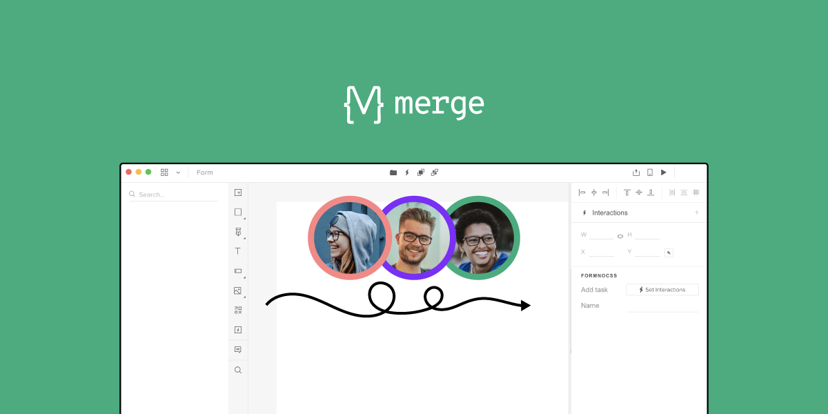
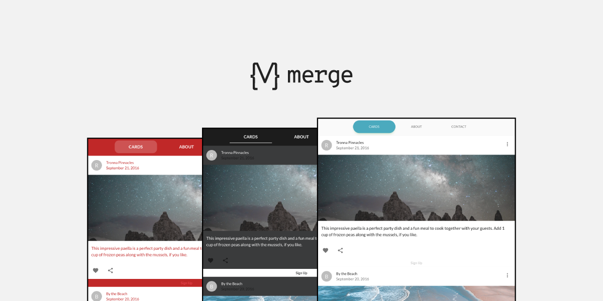
Newer tools with a code approach can give you an easier way to eliminate organizational silos. Explore one of them – UXPin Merge. UXPin powered with Merge technology help to break the silos between design, development, and product teams at your organization. It allows you to build prototypes with a single source of truth – coded components. Discover UXPin Merge.

Reach a new level of prototyping

Design with interactive components coming from your team’s design system.

Why Do You Need to Break the Silo Mentality?

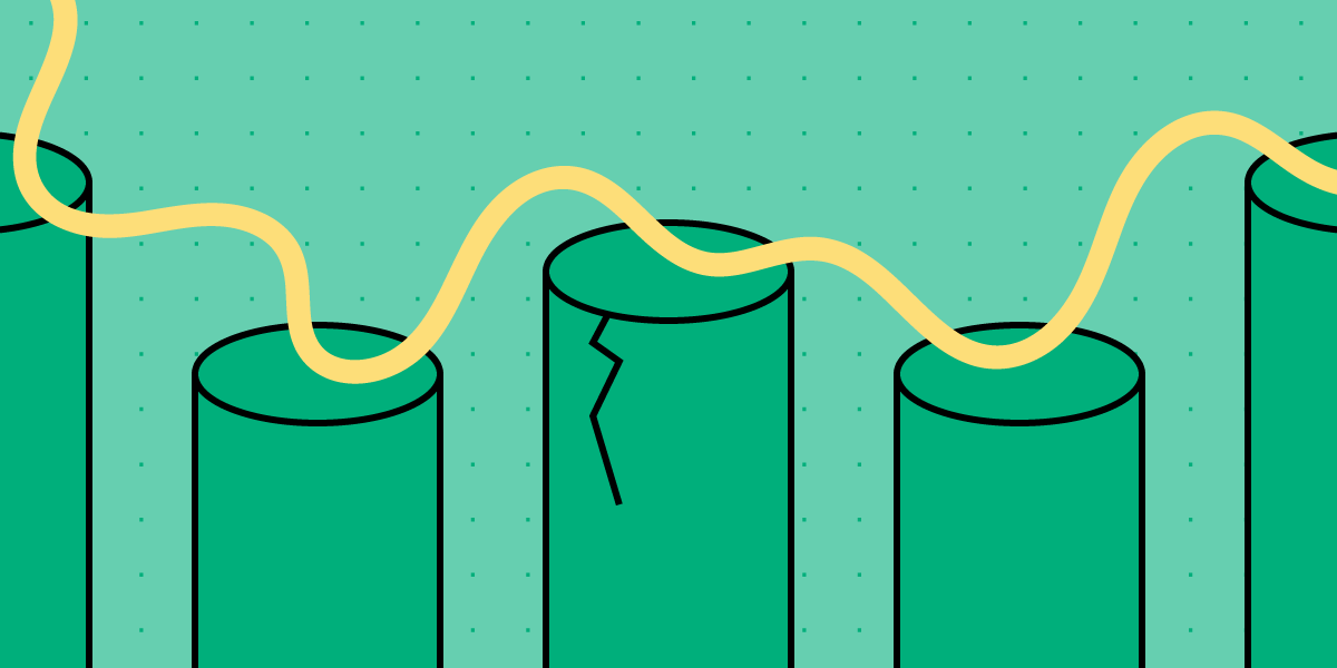
Silos create inefficiencies that can adversely affect your teams. You might not even know that silos exist within your organization. Once you learn to notice their effects, though, you will likely spot departmental silos everywhere and see how they interfere with your company achieving a common goal.

Here are 5 common problems created by silos:

  • A narrow focus on individual tasks that do not contribute to the bigger picture.
  • Continued functionality issues that no one within the design team knows how to solve.
  • Longer product development, testing, and release timelines.
  • Lack of insight into how the company could improve its product development process.
  • Inefficiencies that add to project expenses and disappoint stakeholders.

6 Practical Tips to Break Down Silos

image 1

With these issues in mind, consider how the following steps could break down silos and build a better company culture.

Tip #1: Form a leadership team that includes a representative from every department

You can build trust and improve communication by creating a leadership team that includes at least one representative from every department. The leadership team can keep the big picture in mind while steering the project toward its final goal.

Tip #2: Establish a unified vision before breaking the common goal into individual tasks

Communication doesn’t always trickle down to every member of a team. You can eliminate this problem by creating a unified vision and breaking the common goal into individual tasks. The tasks can get assigned to teams.

If you start with small tasks and hope that they come together in the end, you will likely find disappointment.

Tip #3: Invite team members from different departments to meetings

The pandemic forced companies to adopt remote working environments. Luckily, videoconferencing apps stepped up to help colleagues and freelancers from all over the world engage with each other in virtual environments.

Since you might need to invite marketers, developers, designers, and other colleagues, you should choose a videoconferencing service that can accommodate several people. You can even get marketing teams engaged to learn from their insights and help them plan for how they will sell the finished product.

Some of the top options include:

If you expect fewer or more participants, you can usually choose plans that match your unique needs. Choosing the right plan helps ensure that you get input from different teams without spending more money than necessary.

Many teleconferencing apps will also let you track metrics and record your meetings so you can focus on interacting with colleagues instead of taking notes. You should notice improved employee engagement when people can talk to each other without writing down their thoughts. You have to put a premium on engagement when working with remote teams.

Tip #4: Choose collaboration tools that appeal to all departments

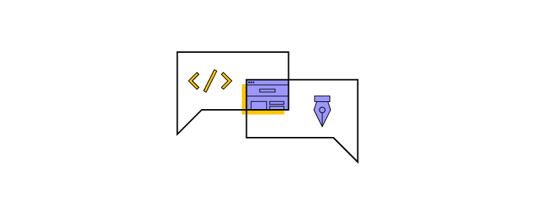
Until recently, designers and developers often found themselves at odds when creating digital products. Even when they share long-term goals, their specializations encourage them to think about creating products in different ways.

That’s why there’s drift when it comes to the handoff process. It’s best to use a tool that will allow both devs and designers to collaborate without getting in each other’s ways. A solution with code-powered technology can help with that. 

When designers use already-coded components that can be easily reused, there’s no room for a disconnect between what is designed and what can be coded. Not to mention the time efficiency that tools like that offer – both with designing and coding the final product based on the prototype. 

Create a design system that contains all approved assets

Every team working on a product should have access to a design system that contains all approved assets and components. A design system ensures that diverse teams work toward a shared aesthetic and function even when they do not spend much time talking to each other.

When you go for a code-to-design approach in design on top of that, you don’t have to worry about syncing the changes in the code with the design components as that can be done automatically. Thanks to that you have all the approved assets up to date. 

Share information between teams as you make progress

Regular updates can incentivize developers, designers, and team members of other departments to stay focused on their projects.

Working in a vacuum often feels like a thankless—or even pointless—task. Someone designing icons might lose inspiration because they do not see what role the icons will play in the product. Similarly, a developer tweaking interactive forms might not see the point of their work until they witness it in action.

When you reach a milestone, celebrate by showing how everyone’s cumulative efforts have taken you closer to your ultimate goal. If possible, you might enjoy lunch or a drink together. If you work remotely, you can still enjoy a fun meeting that focuses more on building excitement and trust than working on the project.

Eliminate organizational silos with UXPin Merge

UXPin has always been a code-based tool for digital design. UXPin Merge takes the technology a step further by letting designers design with production-ready components That means developers get the opportunity to review designs from the perspective of fully functional code and quickly implement it

UXPin Merge also works in conjunction with several systems, including Material UI, CA Technologies Mineral UI, and IBM Carbon. This approach makes it even easier for engineers to participate in prototype development and making sure designers use components that have already been coded.

Discover more effective, collaborative ways to solve DesignOps challenges. UXPin Merge can help break down silos, reduce design inefficiency, and improve customer experience to meet your company’s goals better than ever.


How to Make Design Process Simple for Agencies and White Labeling

How to Make Design Process Simple for Agencies and White Labeling

Anything you can create in code, you can design with UXPin powered by Merge technology. Designing with code components can cut down your time to market and simplify the handoff between designers and devs. It’s all thanks to using the single source of truth and designing with production-ready components. 

Device Viewer
Theme Switcher

We’ve recently featured two really cool React components that you can use with UXPin Merge; the responsive design Device Viewer and Theme Switcher. You might think that UXPin’s technology is only useful for companies with a single design system, but we’ll show you how a large web agency, spanning several smaller portfolio teams, used these two components in an environment built around white labeling.

The troublesome design process in agency

Design agencies can come in all shapes and sizes. Individual small or large agencies or even portfolio companies constantly acquiring smaller teams, each using different technologies. But what does stay the same, are the issues faced when managing branding and creating future-proof, scalable, and efficient design systems.

The software and tools these companies use are incredibly important for solving these issues. Imagine how much time and money is wasted on back-and-forth communication due to using and maintaining multiple design systems and sources of documentation over several technologies and how much more rewarding it would be if you could simplify and improve this.

Agencies using the power of Merge technology

As mentioned in the Theme Switcher and Device Viewer articles, you see what amazing components you can create and how Merge can make complex design ideas easy; all thanks to designing with ready code components. Using your imagination, the possibilities of prototypes you can create seem endless.

Focusing on the Theme Switcher, you can see that it’s just a React component. It shows that anything you can imagine and code can be designed within Merge. It shows how agencies that use Merge can work efficiently with any number of clients, switching between clients’ brands with a click of a button. It’s also an incredibly powerful tool when it comes to requests for proposals (RFPs) and quick-turnaround demos. Imagine if all you had to do to create a new styled prototype to impress potential clients was to edit a simple style file, while your competitors had to create a new prototype from scratch. But, how is this different from using another piece of software and their theming tool?

Theme switching is not specific to UXPin Merge, some design tools have it, but how it’s implemented here is what makes it special, incredibly efficient, and design consistent. 

Unlike other design tools, Merge’s variable values are all predefined in the code and can be done at a component or layout level. Everyone, who uses the components, is designing with the same properties and values, hence everyone has the same tools. Consistency is created from the code itself – a single source of truth, meaning no more errors in branding and future proofs the design system. The library in the editor is also syncing with the Git repo, so there’s no need to remember about updating the components in two separate places. 

Imagine having a design system with a single source of truth. How easy it would be to maintain documentation or have a playground where anyone, be it a designer, developer, or account manager can go and test component props and create prototype presentations. Merge can provide this and it’s only getting better.

As we keep mentioning, anything you can code you can design with. This means you don’t have to install a 3rd party plugin to enable theme switching. Why go through all the complicated steps of adding theme switching to your vector-based design system when you can do everything you need in UXPin powered by Merge technology alone.

Summary

Changing design tools can be a daunting task with lots of worry and problems. There’s currently a very rigid design process that people like to follow and it can be very difficult to step out of that comfort zone and try something new, even if they believe it will be better in the long run. 

But there’s no need to worry as the UXPin team is with you every step of the way helping with any integration questions and issues. 

Want to find out more about Merge technology or would like to try it for yourself?

Make Theme Switching Easy with UXPin Merge

Theme switching is an essential part of designing prototypes. Whether that be changing between a simple light and dark mode or testing several client’s themes on a single prototype, it is something that all designers need to consider and have a well-thought-out process for.

Furthermore, this need has become increasingly important with the adoption of open-source Design Systems, such as Material-UI, which have become a valid choice for projects.

So, theme switching functionality – such an integral part of the design process, enables to dynamically test themes on-the-fly without using multiple design systems or layouts. It is an amazingly efficient and powerful feature to have at your disposal.

With the importance of this feature, we want to show how this can be done in UXPin, thanks to the power of Merge and designing with code.

Want to use the power of Merge yourself? – Get access to UXPin Merge.

Reach a new level of prototyping

Design with interactive components coming from your team’s design system.

Why do we need a Theme Switcher?

You don’t have to be a white labeling web design agency or a large-scale company with several brands to make use of a theme switcher, you could be a sole developer wanting to quickly test a new color scheme. But, switching themes is sometimes no easy task.

You don’t want to be making multiple layouts of a single prototype just with different themes – that’s an incredibly tedious process just so you can test something. 

Using the Material UI library, we can explain this limitation. Material UI has themes already built into their components but UXPin (and many other prototyping tools) don’t have a unified dynamic way to switch between themes that can be used by both developers and designers.

The power of Merge – designing with code solution

Merge gives you the freedom to design with ‘real’ production React code and vector-based tools together, breaking free of previous limitations. That’s why Merge is powerful.

You can make use of Styled-components. Styled components are the perfect solution to our problem as you can inject Javascript into the CSS to create editable theming capabilities.

So, creating themes is easy.

For each theme, create a file containing css values you want to inject into your styled components as properties. Then, from the list of imported themes, you can simply select the one you want and the styling of that theme will be passed as props to the html elements.

So, what if you just created files for each theme you wanted, import them into a wrapping theme switcher styled-component, and then pass those values down into each nested child component. Then, all you need to do is change the theme at the top-level component using the Javascript props injected into the Styled Components CSS.

Creating a Theme Switcher Component

First, we create a component named ThemeSwitcher, that functions as a top-level wrapper component, passing a selected theme’s styles to all nested components. When components are nested in the ThemeSwitcher, you can dynamically switch between any imported themes – themes, which can completely change the look and feel of components, while keeping all their functionality.

The code below shows the simplified structure of ThemeSwitcher and a breakdown of how it works will follow.

import blue from "./themes/blue";
import red from "./themes/red";
import dark from "./themes/dark";
import light from "./themes/light";
 
 
function ThemeSwitcher(props) {
 let selectedTheme;
 
 function getTheme(themeProfile) {
   switch (themeProfile) {
     ...
   }
   return selectedTheme;
 }
 
 function makeCustomTheme() {
   const customTheme = createMuiTheme({
     ...
   });
   return customTheme;
 }
 
 return (
   <MuiThemeProvider theme={getTheme(props.themeProfile)}>
     {props.children}
   </MuiThemeProvider>
 );
}

As you can see, it’s a simple React component using the Material UI’s imported hooks, only two functions, and a return statement to pass the theme down as props.

Inside the return statement, we have the MuiThemeProvider component. This is used as a wrapper component that passes the selected theme as props down to the child components.

getTheme()

We created themes using Material UI’s styling guidelines, then imported them into the Theme Switcher component.

import blue from "./themes/blue";
import red from "./themes/red";
import dark from "./themes/dark";
import light from "./themes/light";

To keep track of which theme is selected, we pass a drop-down target value into the getTheme function and pass the result as a theme prop in the MuiThemeProvider component in the return statement.

function getTheme(themeProfile) {
   switch (themeProfile) {
    // _.merge combines two themes together
     case "light":
       selectedTheme = _.merge({}, igloo, light);
       break;
     case "red":
       selectedTheme = _.merge({}, igloo, red);
       break;
     case "dark":
     selectedTheme = dark;
     break;
     case "custom":
       selectedTheme = makeCustomTheme();
       break;
     case "blue":
       selectedTheme = selectedTheme;
       break;
     default:
       selectedTheme = selectedTheme;
   }
   console.log(selectedTheme)
   return selectedTheme;
 }

return (
   <MuiThemeProvider theme={getTheme(props.themeProfile)}>

When in the  UXPin editor, this is what the theme selector menu populated from the getTheme function would look like.

makeCustomTheme()

Not only do you have the option to import completed themes, but you can also create custom temporary themes within the UXPin editor. We’ve only included a few properties such as primary and secondary colors for simplicity but you go into as much detail as you need.

Below is the code of the makeCustomTheme function. This makes use of Material UI’s built-in core function of createMuiTheme, which creates a theme based on options received. 

function makeCustomTheme() {
   const customTheme = createMuiTheme({
     ...selectedTheme,
     palette: {
       primary: {
         main: props.primaryColor
           ? props.primaryColor
           : selectedTheme.palette.primary.main,
       },
       secondary: {
         main: props.secondaryColor
           ? props.secondaryColor
           : selectedTheme.palette.secondary.main,
       },
       decoration: {
         main: props.decorationColor
           ? props.decorationColor
           : selectedTheme.palette.decoration.main,
       },
       headerBadges: {
         main: props.headerBadgesColor
           ? props.headerBadgesColor
           : selectedTheme.palette.headerBadges.main,
       },
     },
   });
   return customTheme;
 }

That concludes one way to include a dynamic Theme Switcher in your design system. Just a wrapper component (Theme Switcher) passing properties to nested child components, allowing you to dynamically change the theme without creating a new design system, page or layout.

Try Theme Switching in UXPin Merge

Using UXPin Merge gives you so much flexibility and creativity when comparing it with other design tools on the market.

Focusing on a code-based, single source of truth for styling and functionality creates an interconnected system, bridging the gap between designer developer handoffs. Anything you can create in a React component, you can bring to life in your design system. You don’t have to rely on 3rd party plugins or APIs to add important features to your design system. You’re free to create dynamic and interactive prototypes while changing styles with a single command. 

Want to find out more about Merge or would like to try it for yourself?