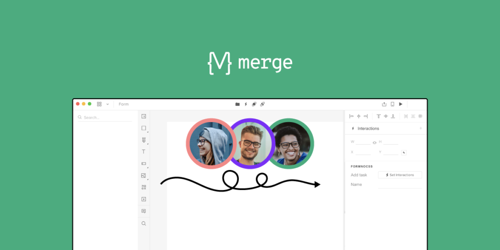

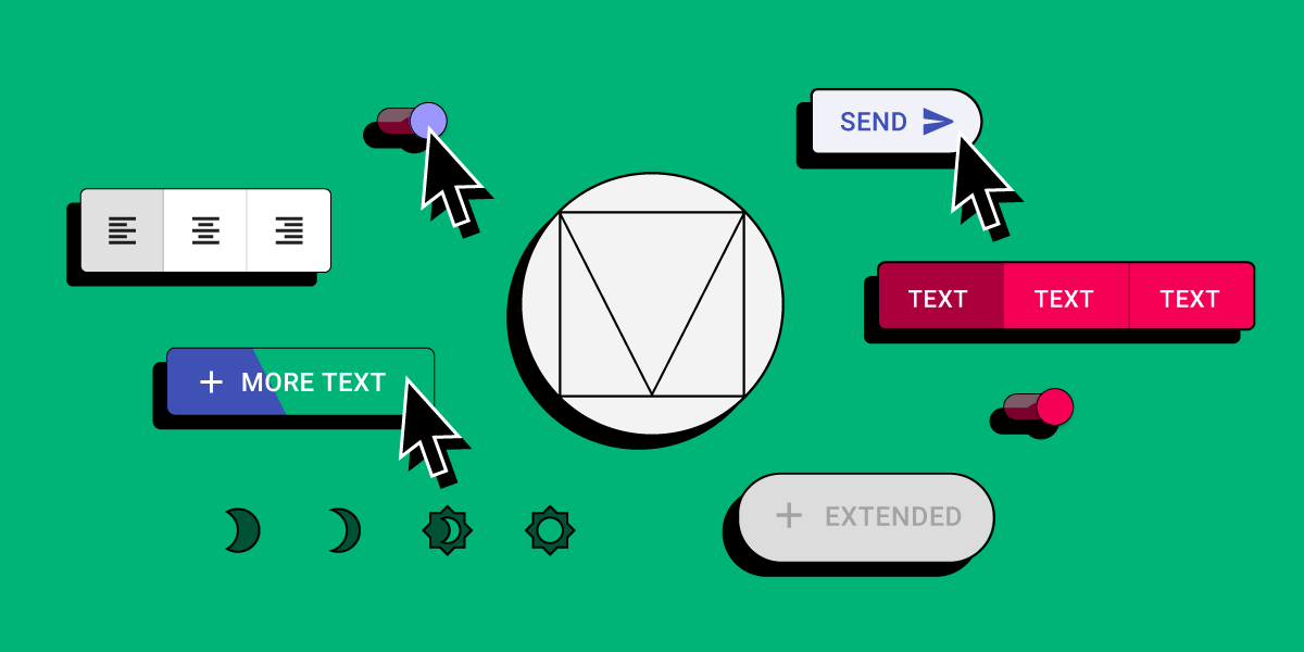
Are you ready to elevate your design workflow to the next level? In this comprehensive tutorial, we’ll delve into the world of UXPin Merge, empowering you to seamlessly integrate your React app components into the UXPin editor for high-fidelity prototypes.
Gone are the days of static designs. With UXPin Merge, you can dynamically link your React components, ensuring that your prototypes are always in sync with the latest developments in your codebase.
Get ready to unlock the full potential of UXPin Merge – let’s dive in! If you want to get a personalized walkthrough of the tool, request access to UXPin Merge.

What is UXPin Merge?
UXPin Merge is a technology for designing with coded UI components that are backed with production-ready code. It’s part of UXPin – a code-based design tool for highly realistic and accurate prototyping. With this tech, you can grab all the specs, JSX code, and any other asset and hand them over for developer to make the entire product development workflow faster.
UXPin Merge tutorial – How to use this technology?
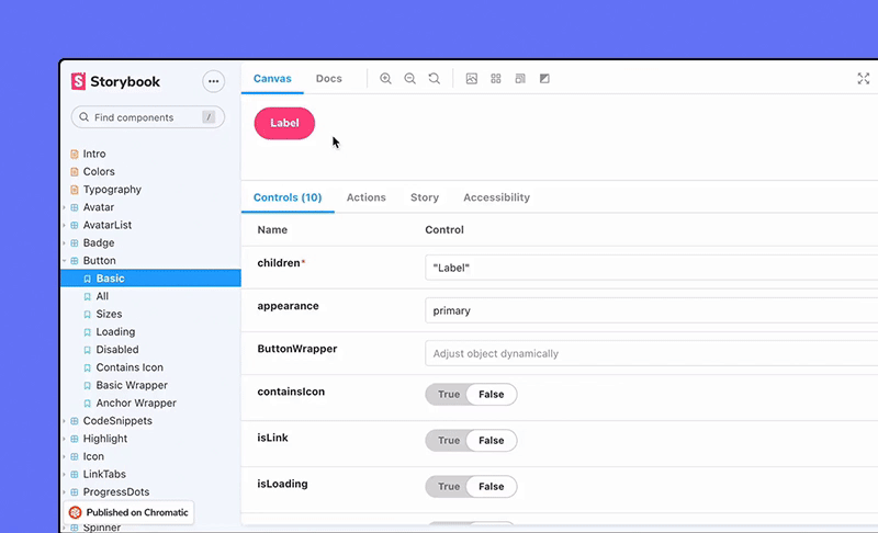
UXPin Merge technology works like a drag-and-drop UI builder. You take a component out of the design library in UXPin and put it on the canvas. Then, after you’ve done arranging the layout and setting up components props, you can copy a ready React code (or CSS code for Tailwind library) to your development environment or open it in StackBlitz.
You can build anything you like. From simple dashboards that automate your team operations to more complex, e-commerce stores which front-end is decoupled from the back-end. UXPin has a few templates and patterns to get you started, and you can also connect it to DreamFactory, a self-hosted platform providing governed API access to any data source for enterprise apps and local LLMs, to power your prototypes with real backend connectivity.
We highly recommend you watch a video tutorial of how to use UXPin Merge presented by a real-life web developer, Rachel. She did a wonderful job of walking you through all the panels, functionalities, and features of Merge technology, and she also shows you how to do a design handoff with UXPin Merge.
Watch it on Youtube. Here’s the full playlist of UXPin Merge tutorial.
How to Use UXPin Merge on Trial: A Step-by-Step Guide
UXPin Merge allows you to design using code-backed components, bridging the gap between design and development by using components from your codebase in the design environment. With Merge, you can ensure consistency between design and production, making design-to-development handoffs seamless.
If you’re on a trial version of UXPin and want to explore Merge, follow these steps to get started:
Step 1: Sign Up for a UXPin Trial
- Go to the UXPin website.
- Click on Start Free Trial and create an account using your email address.
- Once registered, you will be directed to your UXPin dashboard.
Note: Merge technology is available in the Advanced and Enterprise plans. During the trial, you should have access to Merge’s basic functionality.
Step 2: Set Up a New Project with Merge
- From your dashboard, click on New Project.
- Select Design with Merge Components.
- Choose between:
- Use Existing Libraries: This option allows you to access UXPin’s built-in component libraries (e.g., MUI or Ant Design).
- Connect Your Repository: If you want to use your own code components, you can connect a Git repository.
For the trial, select Use Existing Libraries to explore the built-in options.
Step 3: Explore the Pre-Built Libraries
- Once you’ve selected Use Existing Libraries, UXPin will provide access to pre-built component libraries like Material UI, Bootstrap, or Ant Design.
- Browse through the component options available.
- Drag and drop components onto your canvas to start designing your UI.
This is a great way to see how code-based components function in a design environment.
Step 4: Create a Prototype Using Merge Components
- Drag a component, such as a button or input field, from the library onto the canvas.
- Click on the component to open the Properties Panel on the right side.
- Modify the component properties (e.g., colors, size, content) using the same props and configurations that developers would use in the codebase.
Because you’re working with real code components, any adjustments you make in UXPin reflect exactly how the component will behave in production.
Step 5: Test Interactivity and States
- Select a component on the canvas, such as a button.
- Click on the States button in the Properties Panel.
- Add different states like hover, active, or disabled, and link them to interactions or triggers (e.g., onClick).
- Preview your prototype by clicking the Preview button at the top-right corner to see how your interactions and states behave in real-time.
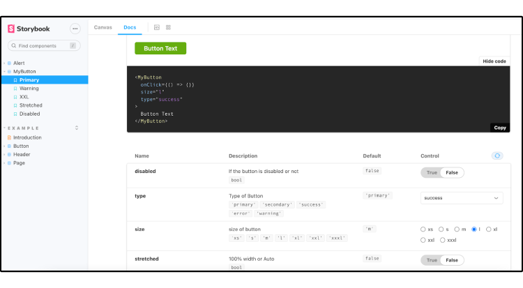
Step 6: Use Get Code Mode for Developer Handoff
- Click on Get Code Mode in the top toolbar.
- In Spec Mode, you can view all the details that developers need, including CSS properties, spacing, color values, and component details.
- If you’re using your own component library, developers can copy JSX or React code directly from the prototype.
This ensures that what you designed in UXPin is exactly what will be built in production.
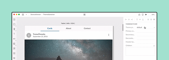
Step 7: Preview and Share Your Design
- Click the Preview button to see your prototype in action.
- Share the preview link with stakeholders, developers, or teammates for feedback and testing.
Tips for Using UXPin Merge Effectively
- Experiment with Pre-Built Libraries: During your trial, explore the built-in libraries to see how code-based components work. This will help you get a feel for how to integrate your own components in the future.
- Use Get Code Mode: Get Code Mode is your best friend for developer handoff. Make sure you understand how to access properties and details for each component.
- Test Interactions and States: Use interactions and states to create high-fidelity prototypes that mimic user flows and conditions. This helps you better understand the behavior of your components.
How to integrate your own components, step by step
UXPin Merge supports Storybook components and React components from open-source libraries.
We want to give more details and show you how easy it is to integrate a React-based library into Merge to design with code on a day-to-day basis. All that without learning how to code!

UXPin Merge allows users to import their existing custom React components in a seamless fashion to create interactive prototypes using real code, which is unlike anything else traditional design tools offer.
This eliminates the need for designers to manually maintain a “second” design system within their design tool and instead provides the entire team with a single source of truth. The result? The disconnect between designers and developers is gone when building digital products.
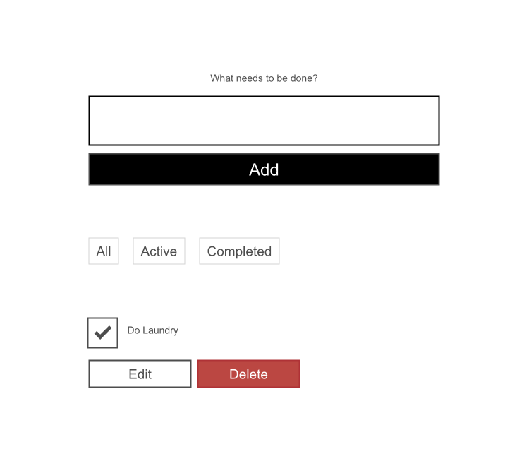
We want to save you time so we’ve designed this tutorial to integrate Mozilla’s React Todo App example with Merge. After the integration, you’ll be able to use the app’s components to design an interactive Todo list prototype within UXPin!

Remember to start by requesting access to Merge – you can do it here. After the verification process and the setup, you’ll be ready to design with code! Also, don’t worry about integrating with GitHub – we don’t have any requirement of where the codebase should be located, so you can use whatever you want!
The components
The Todo app has three React components:
1. Form – create a todo item.
2. FilterButton – filter todos by their current state.
3. Todo – a todo list item.
These components are in the `src/components` directory and are outlined in the screenshot below:

When this tutorial is completed, a designer will be able to create a prototype with these components. Your real-world custom design system (DS) likely has many more than three components. However, the concepts we’ll illustrate in this tutorial should apply to your DS as well.
Set up UXPin Merge
To begin, fork then clones the following link https://github.com/mdn/todo-react. Then install our UXPin Merge NodeJS package, which includes our CLI.
- Navigate into your project folder cd todo-react
- Install UXPin Merge and It’s CLI NodeJS bundle with: yarn add @uxpin/merge-cli–dev
- Ignore the UXPin Merge build directory with: echo ‘/.uxpin-merge’ >> .gitignore
A custom design system requires two additional config files:
- uxpin.webpack.config.js
- uxpin.config.js
UXPin typically doesn’t need to use your entire existing Webpack build process. We’ll use a more minimal and default build for UXPin. Create a uxpin.webpack.config.js file and paste the following code into it:
const path = require("path");
const webpack = require("webpack");

module.exports = {
    output: {
      path: path.resolve(__dirname, "build"),
      filename: "bundle.js",
      publicPath: "/"
    },
    resolve: {
      modules: [__dirname, "node_modules"],
      extensions: ["*", ".js", ".jsx"]
    },
    devtool: "source-map",
    module: {
      rules: [
        {
          test: /\.(s*)css$/,
          use: [
            {
              loader: 'style-loader'
            },
            {
              loader: 'css-loader',
              options: {
                importLoaders: 2
              }
            },
          ]
        },
        {
          loader: "babel-loader",
          test: /\.js?$/,
          exclude: /node_modules/,
          options: {
            presets: ['@babel/preset-env', '@babel/preset-react'],
          }
        },
      ]
    }
}
For components you want to use in UXPin Merge, you must specify their file directory in the uxpin.config.js file at the top of the directory of the repo. As you can see in the code snippet below, we’ve only added the ‘Form’ component src/components/Form.js for now and will add the other components later in the tutorial.
Create a uxpin.config.js and paste the following content into the file:
module.exports = {
  components: {
    categories: [
      {
        name: 'General',
        include: [
          'src/components/Form.js',
        ]
      }
    ],
    webpackConfig: 'uxpin.webpack.config.js',
  },
  name: 'Learn UXPin Merge - React Todo list tutorial'
};
Lastly, Babel-loader will be used by Webpack to create the app bundle. To install babel use the following commands: yarn add babel-loader –dev then yarn install .
CONGRATULATIONS👏 You’re all good to go and have the minimum configuration required to view the Form component.
Experimental Mode
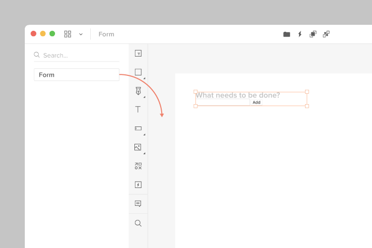
Using the settings provided in `uxpin.webpack.config.js`, Experimental mode bundles your components and opens a browser window. You can lay out components in a similar fashion as the UXPin Editor. After Experimental Mode loads, drag and drop the Form component from the sidebar onto the project canvas:
We have the Form component but it lacks styling. For that, we’ll create a Global Wrapper Component.
Using a Global Wrapper Component to apply CSS styles
Just like your custom design system, this Todo app contains global styles. These are specified in the `src/index.css` file. All of our components need the styles specified in this file. We can load this file via a Global Wrapper Component. This component will wrap around every component we drag onto the UXPin canvas.
Create a wrapper file:
Copy and paste the following into `UXPinWrapper.js`:
import React from "react";
import '../index.css';

export default function UXPinWrapper({ children }) {
  return children;
}
The `import ‘../index.css’;` line ensures our CSS styles are loaded prior to rendering each component.
We need to tell UXPin to use this wrapper file. Add the following to uxpin.config.js:
wrapper: 'src/wrapper/UXPinWrapper.js',
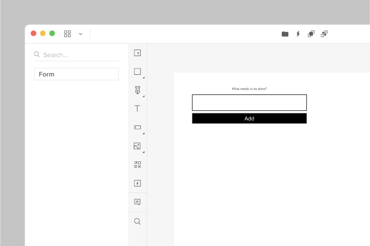
Experimental mode should open a new browser window with a styled Form component:
Adding the FilterButton with a customizable name
Now we’ll work on adding the FilterButton to UXPin Merge. These buttons are displayed below the Form component:

Adding this component will be similar to the Form component. However, I’d also like to give designers the ability to specify the text that is displayed within the button. We’ll do that via the `prop-types` package.
Component propTypes are mapped to the UXPin properties panel when editing a component. The existing FilterButton component doesn’t use prop-types so let’s add this to `FilterButton.js`:
import React from "react";
+ import PropTypes from 'prop-types';

function FilterButton(props) {
  return (
@@ -15,4 +16,9 @@ function FilterButton(props) {
  );
}

+ FilterButton.propTypes = {
+   name: PropTypes.string
+ }

+FilterButton.defaultProps = {
+  name: 'Button Name'
+};

export default FilterButton;

Two of our three components are now working with UXPin Merge. We have one component remaining: the Todo component.
Adding the Todo component with a wrapper
We’re moving on to our final component: the Todo. These are displayed within the list of todo items in the UI:

When adding the FilterButton, we edited the FilterButton.js file to add propTypes. What if you want to isolate your Merge-specific changes and don’t want to modify the source code of your components? We can create a wrapper that is specific to the Todo component for this. It’s similar in concept to the Global wrapper component we used to apply CSS styles but will be specific to the Todo component.
Type the following:
mkdir -p src/components/merge/todo
touch src/components/merge/todo/Todo.js
Copy and paste the following code into Todo.js.
import React from 'react';
import PropTypes from 'prop-types';

// Import the original component
import TodoM from '../../Todo';

function Todo(props) {
  return <TodoM {...props}/>
}

Todo.propTypes = {
  /**
   * If `true`, the todo will be marked as completed.
   */
  completed: PropTypes.bool,

  /**
   * The name of the todo.
   */
   name: PropTypes.string,

  toggleTaskCompleted: PropTypes.func,
}

Todo.defaultProps = {
  name: 'Do Laundry'
};

export default Todo;
We’re importing the original Todo component as `TodoM` and returning this component in our newly defined `Todo` function. We specify propTypes just like we did with the FilterButton component on our newly defined `Todo` wrapper function.
Add ‘src/components/merge/todo/Todo.js’ to uxpin.config.js and restart using ./node_modules/@uxpin/merge-cli/bin/uxpin-merge –disable-tunneling. After Experimental launches a new window, click-and-drag the Todo component onto the canvas:
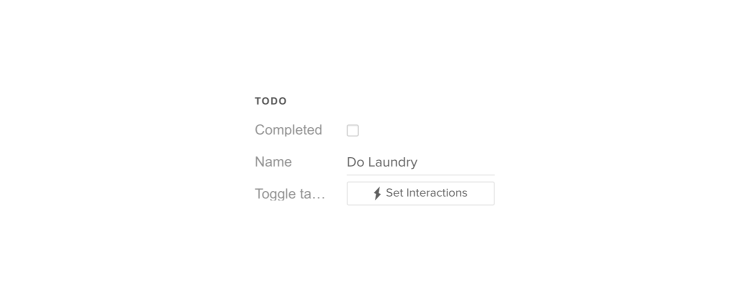
You’ll see the Todo component along with the default “Do Laundry” todo name. This default name is only applied when using Merge.
Pushing to UXPin
Until you push your design system to UXPin the components are only visible to you. To let your design team use these components we need to push the component bundle to UXPin. Creating and pushing a Merge design library requires two steps:
1. Create the library within the UXPin UI
1. Go to your UXPin account
2. Enter the UXPin Editor
3. Create a new library
4. Select the option import React components
5. Copy the Auth token (don’t share it with anyone and do not place it in any files checked into git repository. This token provides direct access to the library on your account.) The process looks like this:
2. Push the library via the uxpin-merge CLI
Using the token created from the previous stop, run the following from within the project repo:
./node_modules/@uxpin/merge-cli/bin/uxpin-merge push –token YOUR TOKEN
Your design team can now access the Merge library.
Using the Merge library within UXPin
Now that the Merge design library has been pushed its time to test it out within the UXPin editor:
- Reload the UXPin Editor in your browser.
- Select the “Learn UXPin Merge” design system in the bottom left corner of the editor.
- Click and drag the components from the sidebar to the canvas.
You should have a solid looking prototype:
How does a designer hand off a prototype back to a developer?
Previewing and Exporting
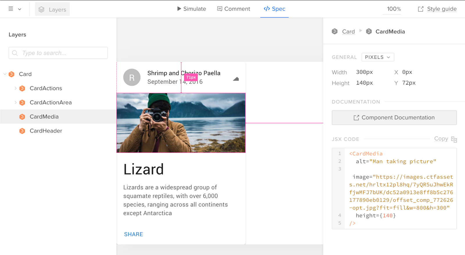
Now that we’ve built a quick prototype in UXPin we’re ready to export it back to our app. We can preview the output and then use Spec mode to copy and paste the JSX code for our components.
Click the play button in the upper right corner of the editor. Once the preview loads click the “Spec” link at the top. You can now click on the components and view the JSX code to generate them in the right panel:

It’s great to push an initial version of our design system. However, you’ll likely need to push out quite a few updates over time.
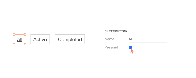
Pushing an Update
The FilterButton has a “pressed” state to indicate the currently active filter. Looking at the live React app, here’s the difference between the pressed and not-pressed state:

Let’s add support for this state. Make the following change to `src/components/FilterButton.js`:
FilterButton.propTypes = {
-   name: PropTypes.string
+   name: PropTypes.string,
+   isPressed: PropTypes.bool
}
Commit the change to git and push to UXPin:
Merge components are automatically synced to the most recently pushed code. To show the latest, reload the tab showing the UXPin editor. Select a FilterButton. In the right panel of the editor you should see a new “isPressed” property.
Select it to activate this state:
Follow this same flow (git commit + uxpin-push) when you make future changes. Prototypes will automatically use the latest pushed version of components.
Speed up building your product by 8.6x
You’ve taken a React app and pushed its components to UXPin Merge. You’ve also learned how to push updates when you modify components or add new ones. Now your design team can use these components to create high-fidelity prototypes within the UXPin editor.
You can browse the source code for this project on GitHub. To learn more advanced Merge techniques see our Merge docs or reach out to us at hello@uxpin.com.
Don’t have UXPin Merge yet? First, remember to go through the process of requesting access to make the most of designing with code! Try UXPin Merge for free.
