The United States of UXPin

Introduction

The creation of advanced designs and prototypes can be tricky these days. At some point, you’ll end up with dozens of artboards or pages that look nearly identical. As a designer, you know that these details are essential for the end product to be presented to your users.

But does every small detail need to be created like this? Is it the only way to design dynamic components with different content?

The problem with any image-based design tool is that they must design static version of key screens. So this is what designers try to prepare – flow, key screens and key components from use cases. It’s time-consuming, but does it have everything developers need to implement it?

Nope.

Developers need to know every state of every component used on the project. Components are dynamic and reactive. If a designer locks all this energy into a static set of artboards, it will blow up in her face. Imagine a simple design with a dropdown and a button. That’s it! The button needs to have a default, hover, active and, probably, disabled state. Dropdown has a hover and active state on the selector, and hover/active/disabled states on every option on the dropdown menu list. That gives you over 15 static artboards to represent all the states. And what if something changes? How do you keep it up to date?

This is a difference between Design and Development theses day – different levels of efficiency.

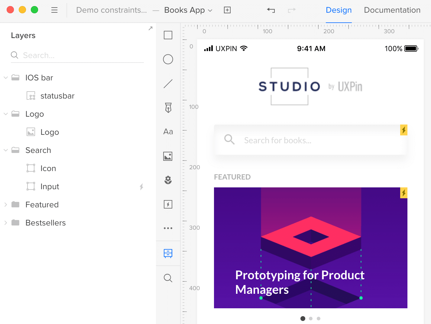
In UXPin, we introduced Multistates elements back in 2015 to address some of these problems. And we can say it loud and proud: this is a totally unique concept in the design tools landscape. In many cases, it’s why our users choose UXPin. Still, the design and prototype world is rapidly evolving and it requires increasingly sophisticated methods and tools to cover all fields.

More animation. More mobile. More code-based tools. So, we reevaluated all use cases and granted this concept a second life. And now we are happy to introduce our shiny new States feature! Here’s what you need to know to get started.

States by UXPin


Focus on user feedback

First, we had to gather feedback about Multistates. Our users have given plenty of feedback since its introduction three years ago. After a tremendous effort from our research team, we finally found a simple way to understand the issues and categorized them as:

  • Usability improvements
  • Product requests

Our first thought was to simply improve the UI for Multistates. However, soon we found that this would only solve some of the usability issues.
What about the ability to propagate style and content between states of an element?
What about an animation created “out of the box” based on the changes?
Or the possibility to nest an element with states inside another element with states?
When these questions came up, we knew we had to go deeper.

Inspired by nature – states of matter

That brought us back to the core question – what ARE the states?
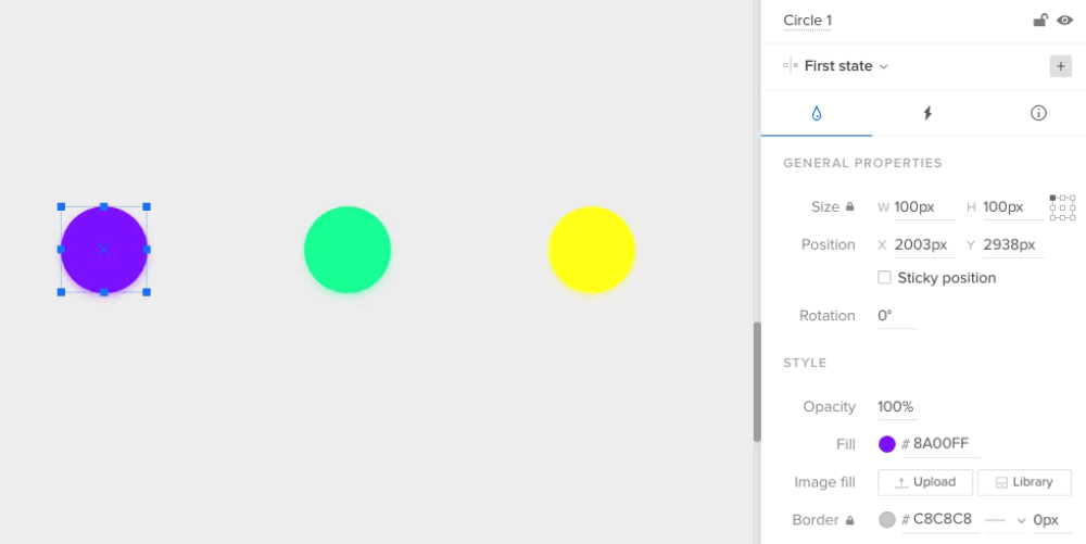
After a few brainstorming sessions, one direction especially attracted us – the idea of transformation of the elements. The main idea was that EVERY element should have the possibility to have a different set of properties (styles) stored as states and that these states can be switched to generate element transformation.
Sounds lovely, doesn’t it?

Then we started to look for more general rules (is the number of elements stable between states? Is the number of states in symbols the same?, etc.) Diving deeper into this app architecture question led us to a great analogy for what we are building, which is the states of matter. So any matter, for example water, can transform between states (solid, liquid, gas and plasma) but the number of particles in the environment remain constant.

The same goes for elements in UXPin. You can now build advanced components with different states and transform between the states of elements, but the number of elements will always stay the same. They just change their state – style, position, size, interactions, etc.


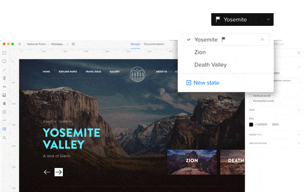
Different states of the same element

different states of applications with UXPin

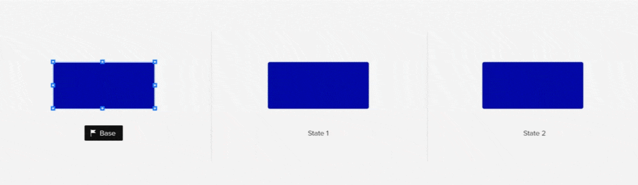
The biggest challenge, and the biggest opportunity, for us was the question – how should States be built from the perspective of the app architecture? The easiest way to understand the change is to compare it with the older concept, Multistates.
Creating another state of a Multistate was basically duplicating all the elements from a previous state. After the duplication, those were different – disconnected elements.

In the new concept of States, adding the another state of the element creates another alternative set of properties of the same element. It does not duplicate the same element again. It gives the element another alternative appearance, another level of existence. 

You can edit the style and content of states, but it still will be the same element—with states. Also, if you remove the element on one state, it will be removed across all states. This approach gives us the possibility not only to transform elements with animation, but also greatly reduces impact on browser performance.

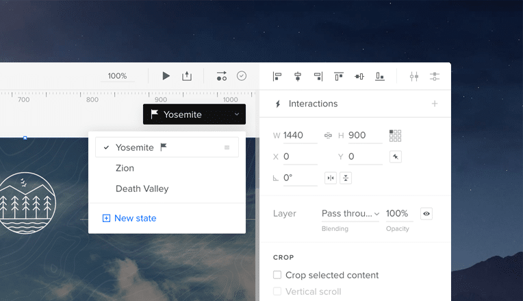
States on states on states…

One of the most powerful things you can build in UXPin using States is… another state.
Imagine building simple elements with states (buttons, headers, etc.) and using them in more complicated elements with states (login forms, dashboards, use panels, etc.).
From the interviews with our customers, we know that a lot of designers try to build that and end up with a lot of symbols and artboards.

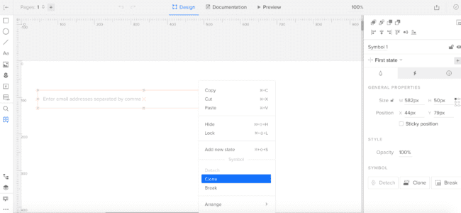
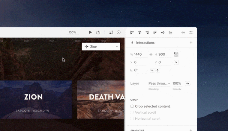
Thus, States were developed to nest states within states and to manipulate the active state beyond that. To support this process, we’ve added the ability to manage states from the layers panel. It helps not only to change the states but also to see, understand and redesign the hierarchy of elements in any component.


Push changes to other states

One of the biggest limitations with the old Multistates was the difficulty in updating already created elements with different states. As mentioned above, this happened because we were duplicating elements. With the new approach to the architecture, we finally solved this problem.

This was one of the biggest design and development challenges for the team. We had to cover two use cases that are quite tricky:

  • Push changes in style/content to other states
  • Have the ability to reset changes added to a state

Keeping in mind these two use cases, we came up with the concept of the base state.

drop down menu design with states

A base state is one with a bit different power than the other states. As its name suggests, it acts like a base/foundation on top of which other states are built. When you update the base, you update it for all states. That is to say that the change will appear in all other states too (unless the change of the same property of an element is overridden in another state). For those in software development: inheritance and overriding—sounds familiar? :)  

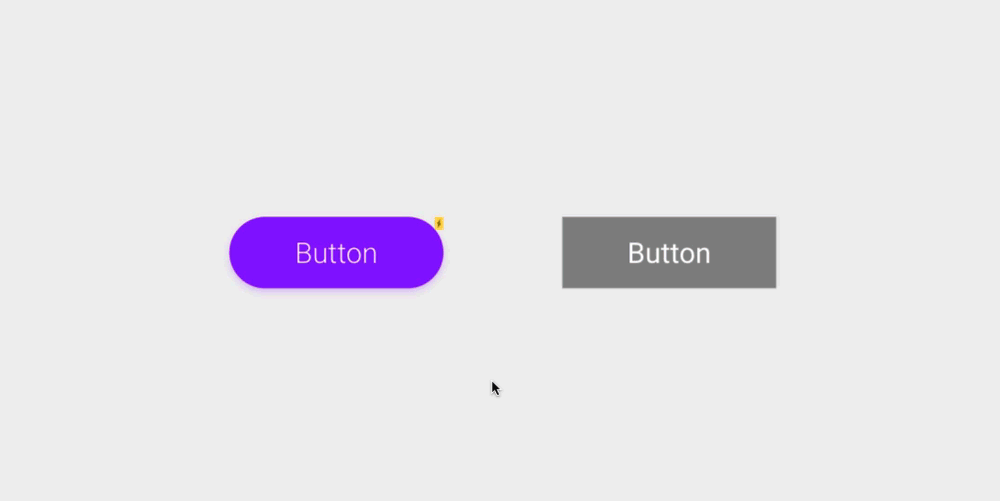
Here’s an example. You designed a “Send message” button and built it in three states: default, hover and active. Then you have the shape of the button, dimensions, style and “Send message” text on it. After a few tests, you decide you want to remove the word message , so the button just reads “Send”. The base state lets you change that text just in one place and it applies automatically to other states!

Some of you might be wondering, “Ok, but what about when I want different text in some specific state?” For example “Sent!” in an active button state from the example above. You can set an override on any other state other than the base. Simply edit the button text in the chosen state to override the text of the base state. After that, changing this specific property of the base won’t affect the edited state, because the override is still there. But don’t worry, you can always reset the property override and it’ll restore the style or content from the base state.

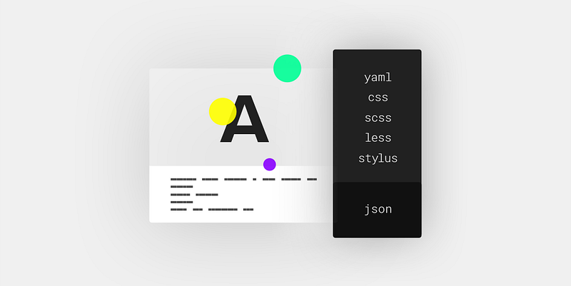
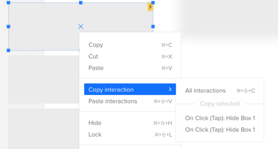
What can you override in states, you ask? Almost everything – size, position, rotation, radius, color fill, border, content of the element and even interactions!

setting interactions in a product UXPins


Out of the box animations

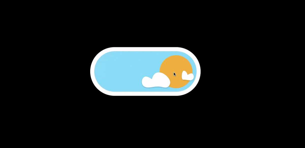
Last but not least, States provides big value for designers looking to easily create more robust animations in their prototypes. Again, this value comes from the fact that states are basically different appearances of the same element/s.

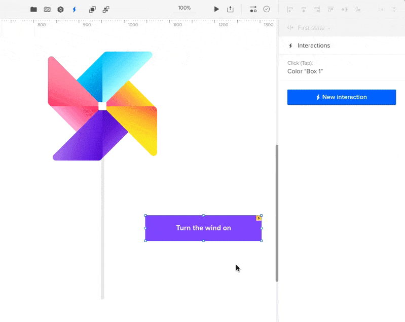
Here’s how it works. If you have two states of the same element with a different style (position, size, color), all you have to do to get animation is to create a simple interaction to change the state of the element. Once you create the interaction between them, the magic is already there! Of course you can change the timing or easing of the animation between states.

Remember states within states? You can even build the animation on the highest level of the nested states and it will animate every change of the nested states. Pretty cool, huh?

Toggle states simple


What can you use States for?

  • Create a simple element like a button with the different states: active, hover, disabled, etc.
  • Design complex patterns like a form that has an input field with different states: empty input, data provided, error state
  • Components like carousels and accordion menus

Join the world's best designers who use UXPin.

Sign up for a free trial.

UXPin Changelog July 2018 #10

In July, we’ve added a few features that allow building better high fidelity prototypes: new curve types for pen tool, loop for interactions, flipping elements. Also, we’ve released some enhancements to the UXPin Editor to improve the workflow. Details below.

Editor and Preview

  • [New] Asymmetric and disjointed curve types for pen tool.   Pen Tool Points with UXPin
  • [New] Possibility to switch elements height/width from the properties panel. Switch alt
  • [New] Possibility to flip elements horizontally/vertically. Flipping elements with UXPin
  • [New] Possibility to loop interactions.Looping interactions
  • [Improved] Updated icons for common elements on the layers list.layers list common elements
  • [Improved] Improved performance when dragging layers on the layers list.
  • [Improved] Elements added with shortcuts are placed so that their top left corner matches the cursor position.
  • [Improved] Moved distribute controls to alignment sections.
  • [Improved] Moved front/back controls to the top bar.
  • [Improved] More coherent shadows for all elements.

Desktop App 1.1.2

  • [New] More actions in the top bar menu.
  • Small bug fixes and visual improvements.

If you’re interested what we released in June, please check out Changelog 2018 #9.

Join the world's best designers who use UXPin.

Sign up for a free trial.

UXPin Changelog June 2018 #9

In June, we’ve released many features to improve the workflow in UXPin Editor and build better high fidelity prototypes. Details below.

Editor and Preview

  • [New] Redesigned properties panel split into separate styling sections.
  • [New] Context top bar menu – allows to group and ungroup the  elements, turn them into symbols and open the interactions panel quickly.Context top menu bar 
  • [New] Blending modes – allow to determine how two layers are interacting with each other.
  • [New] Spread support for shadows – helps control shadow contour.Spread support for shadows UXPin
  • [New]  Shortcuts for elements distribution: vertical (cmd/ctrl+alt+Y) and horizontal(cmd/ctrl+alt+X).
  • [Improved] Show/hide elements is now available in the layers section in properties panel. 
  • [Improved] Improved way of managing elements in layers depending if you click or double-click on the element.
  • [Improved] Dragging with cmd/ctrl pressed selects only elements entirely in selection bounds.
  • [Improved] Disable snapping with a key (cmd) modificator.
  • [Improved] Reorganised and shrank right-click menu in the Editor.
  • [Improved] Zoom control has been moved back to the top bar.
  • [Improved] Locked elements are selectable from the layers panel only.

Pen tool improvements

  • [New] Added 10 different types of endpoints for a path to create different arrows.Different paths for arrows
  • [New] Set the shape of ends and joins for any path.set shape fo ends and joints
  • [New] Set dashed line – allows to decide whether a path should be solid, dashed or dotted with precise control of each dash and gap length.Set dashed line UXPin
  • [New] Added start/stop options for stroke.
  • [New] Set the position of each path node directly from properties panel.

Design Systems

  • [Improved] Select the whole image and then delete it with backspace
  • Small bug fixes and visual improvements.

If you’re interested what we released in May, please check out Changelog 2018 #8.

Join the world's best designers who use UXPin.

Sign up for a free trial.

UXPin Changelog May 2018 #8

In May, we’ve focused on the improvements for Design Systems and UXPin Editor. We’ve also released a new version of a Desktop App (1.1). Details below.

Editor and Preview

  • [New] Line element.Line element UXPin
  • [new] Pen Tool – drag with Shift locks x/y axis. Pen tool used for shifting
  • [new] Pen Tool – pressing Shift adds a node in the middle of the path. Pen tool other actions UXPin
  • [new] Pen Tool – double-clicking on nodes creates a circle. Pen tool double clicking
  • [new] Set element rotation to any angle (including negative and > 360° values).  
  • [new] Possibility to group a single element and a single group to organize all layers typesGrouping layers
  • [fixed] Pasting elements multiple times using shortcuts wasn’t working.
  • [fixed] Symbols were refreshed on Preview inconsistently.
  • [fixed] Incorrect position of the element pasted inside a symbol.

Design Systems

  • [new] Support for emojis in DS documentation.
  • [fixed] Design System tile on Dashboard wasn’t refreshed after updating colors.
  • [fixed] JSON wasn’t generated for some Design Systems.

Desktop App v1.1

  • [new] Option to copy a Preview link from the top bar menu (Windows/Copy Link to Preview).
  • [new] Manage application windows from the dock/taskbar.
  • [new] More options added to the top bar menu.
  • [new] Options in the top bar menu are displayed depending on the area of UXPin (Editor/Preview/Dashboard/Design Systems).
  • [new] Minimal initial size of the window based on the screen resolution.
  • Other bug fixes and small visual improvements.

If you’re interested what we released in April, please check out Changelog 2018 #7.

Join the world's best designers who use UXPin.

Sign up for a free trial.

10 UXPin Product Updates You Might Have Missed

And now they’re here! From user requests to new features, big and small, we’ve shared some of UXPin’s updates from the last twelve months in one concise form.


1. Shadows

You can easily add shadows to the elements and customize their color, opacity, and relative position. It’s possible to combine multiple shadows together or create only inner ones. This heavily requested feature is available to all users.

2. Pen Tool

Use Pen Tool to draw shapes and icons directly in UXPin. Any drawn element can be viewed in spec mode and downloaded as an SVG. Creating custom icons and adding them to your design library has never been easier!

3. Tokens for Design Systems

Imagine this: your developers can have access to rich information with just one URL, opening possibilities for ultimate design consistency.

Now you can easily export your color and typography styles, as well as their full documentation, to JSON. For quicker exporting, you can use other popular formats including YAML, CSS, SCSS, LESS, and STYLUS, but without documentation.

4. Copy-pasting styles and interactions

Say no to tediously re-making interactions. You can now copy-paste them to elements with just a few clicks! You can also quickly apply entire styles (including color and typography) from one element to another, saving you so much time.

5. New pricing

We are excited to share that we now offer four different plans (starting from $9/month) with a variety of features tailored to your needs. Whether you’re working on a small project or with a complex design systems, we’re confident you’ll find the right fit among our new plans.

6. Resizing panels and UI redesign

Our UI has seen numerous iterations, but after our latest redesign we’re really proud of it. Not only is it slicker and more intuitive, but also it freed up a lot of screen space. We’ve also given you the freedom of customization — it’s possible to resize panels and toggle UI theme from light to dark. Great for contrasting your prototypes!

7. Performance updates

2017 was a year of constant performance improvements. Team dove into javascript and made dozens of micro-optimisations. Overall, we’ve decreased loading times by 30%, preview has become significantly stable, and complex design systems are scrolling smoothly. 2018 is no different and further upgrades are planned and scheduled.

8. In-app changelog

It was easy to lose track of our constant updates. Not a week passed without a deploy that addressed requests we heard or fulfilled our roadmap. With our in-app changelog, you will be notified every time an important feature or update is released.

9. Pasting from clipboard

The ability to paste an image directly from your clipboard into UXPin allows you to save precious time and makes prototyping even faster. Copy the image, paste it to UXPin, add interactions, send it to a client — a mockup is born!

10. Math operations

You can use basic math operations to determine the size or position of your elements. It’s also excellent when calculating proportions on the fly.

One more thing…

Last but not least, we’ve just launched our brand new desktop application. It has all the tools from the original browser version, in addition to some added improvements. Because it’s right on your desktop it’s always at hand — just one click away from your Dock or Taskbar. Having dedicated processes makes it faster and more reliable as well as uninterrupted from plugins and browser distractions.

You can get the latest versions here: MacOSWindows.


Join the world's best designers who use UXPin.

Sign up for a free trial.

UXPin Changelog May 2018 #7

In April, we’ve released a Desktop App, a few enhancements to the UXPin Editor and Design Systems, and new versions of the Sketch plugin. Details below.

Desktop App

UXPin desktop app update and changelog

That month marked the release of our brand new desktop application that has all the tools you know and love from the original browser version. Download here for Mac or Windows.

Editor

  • [Fixed] Shadows for symbols not saving in the Design System Library.
  • [Fixed] Removed shadow and blur options for the hotspot element.
  • [Fixed] Editor freezing while using history (undo/redo) with Pen Tool.

Design Systems

  • [Fixed] Issues with selecting hex value from a Design System to copy it.

Sketch Plugin

  • [New] Support for masks created in Sketch (version 4.11.1).
  • [Fixed] Design System Library was not opening in some cases (version 4.11.2).
  • [Fixed] Plugin crashing without warning when users checked exportable options on some groups (version 4.11.3).

10 UXPin Updates You Might Have Missed

In case you missed it, we want to show you 10 UXPin updates we’ve released recently.

Join the world's best designers who use UXPin.

Sign up for a free trial.

UXPin Changelog April 2018 #6

In the past two weeks, we’ve released a few enhancements to the Design Systems (restricted access, export Design Systems in new formats), Editor (Pen Tool, resizable left panel), and in-app changelog in the Editor. Details below.

Design Systems

  • [New] Restrict access to Design Systems only to your team in UXPin. Restricting access to design systems
  • [New] Export Design Systems with documentation in JSON format.
  • [New] Export tokens in YAML, CSS, SCSS, LESS, and STYLUS formats. Export tokens
  • [Improvement] Create symbols with CMD + K shortcut (Alt+S also works).
  • [Fixed] Losing connection between symbols when pasting a symbol into a different project.

Editor

  • [New] Create any shape you want using Pen Tool. Pen tool
  • [New] Resize left panel, and its content will adjust accordingly.
  • [New] In-app changelog also available in the Editor.In-app changelog
  • [Improvement] Click on the changelog orange dot to get the “What’s new?”modal immediately.
  • [Fixed] Canvas was jumping after entering symbols or multistates edit mode.
  • [Fixed] Unwanted transparency after fill color was changed for a SVG element.
  • [Fixed] Stroke width was not copied correctly.

If you’re interested what we released in March, please check out Changelog 2018 #5.

Join the world's best designers who use UXPin.

Sign up for a free trial.

UXPin Changelog March 2018 #5

In the past two weeks, we’ve released a few enhancements to the symbols, new version of the Sketch plugin, visual improvements in the Editor, and new features in the Dashboard (iterations from iterations, in-app changelog). Details below.

Design Systems

  • [Improvement] Handling local and master symbols’ relations while using undo/redo.
  • [Improvement] Changes in nested symbols are synced across all parent symbols when pushed to the library.
  • [Improvement] Removing symbol when all elements inside were deleted.
  • [Improvement] Symbols keep connection to the Design System Library after duplicating the prototype.

Sketch plugin 4.11

  • [New] Exporting shapes as SVGs.
  • [New] Design System Library redesign.
  • [New] Exporting opacity as property which can be changed in the UXPin Editor.
  • [Fixed] Upon exporting from Sketch, additional export sizes are no longer added.  
  • [Fixed] Plugin supports the newest version of Sketch app (version 49).

Visual changes in the Editor

  • Added the Hamburger menu in the top left corner.
  • Moved Preview mode to the right (marked with Play icon).
  • Moved Zoom settings to the bottom left corner.
  • Added prototype name and active page.
  • Bottom left corner menu (Log out, Integrations, Shortcuts, Help&Tutorial, Add user) moved to the Hamburger menu in the top left.
  • Moved View options to the Hamburger menu.
  • Added Simple/Advanced mode to the View Options modal.
  • Redesigned tabs in the properties panel (Properties, Interactions, Specification).

Dashboard

  • [New] Creating iteration from iteration.
  • [New] In-app changelog notification with information about fixes or new features.

If you’re interested what we released in February, please check out Changelog 2018 #3 and Changelog 2018 #4.

Join the world's best designers who use UXPin.

Sign up for a free trial.

UXPin Changelog February 2018 #4

In the past two weeks, we’ve released a few enhancements to the Design Systems (redesigned Design System Libraries panel and improved notifications about updated/outdated symbols) and to the Editor (introduced copying and pasting styles, layers and search improvements). Details below.

Design Systems

  • Redesigned Design System Libraries panel in UXPin Editor Redesigned Design System Libraries panel in UXPin
  • Notification about outdated symbol appears only when there’s a newer version in the Design System Library.
  • Any updates to symbols in Design System Library will be visible immediately for all users in the account.
  • Improved undo/redo for symbols based on their content.
  • Small bug fixes and visual improvements.

Editor

  • Possibility to copy and paste styles across elements copy and paste styles
  • Elements and icons are separated in the search results 
  • Layer dragged to the group lands at the top of the list instead of the bottom.
  • Extended areas for dragging and dropping layers.

If you’re interested what we’ve released inFebruary, please check out Changelog 2018 #3.

Join the world's best designers who use UXPin.

Sign up for a free trial.

UXPin Changelog February 2018 #3

In the first part of February 2018, we’ve released a few improvements to Design Systems (renaming main categories, notification about changed symbols, and improved ghost elements), and the Editor (added lazy loading to the icon section in the properties panel). Details below.

Design Systems

  • Rename the main categories in the Design Systems documentation. 
  • Added a notification about changes between symbols on canvas and corresponding ones in the Design System Library.
  • Improved ghost elements while dragging symbols from the Design System Library. 
  • Clicking on an element in the DS Library drops it in the centre of the visible canvas.
  • Small bug fixes and visual improvements.

Editor

  • Optimized rendering and lazy loading of icons in the properties panel.
  • Confirming input values on “Enter” for blur and colours.
  • Small bug fixes and visual improvements

If you’re interested what we’ve released in January, please check out Changelog 2018 #1 and Changelog 2018 #2.

Join the world's best designers who use UXPin.

Sign up for a free trial.

UXPin Changelog January 2018 #2

In the second part of January 2018, we’ve released many improvements to Design Systems (subpages in custom pages, protection from losing documentation, table element), the Editor (copy-paste of interactions, manual distance measurement, blur, and more), and also a new version of Sketch plugin 4.10.4 with small bug fixes and improvements.

Design Systems

  • Add and manage subpages for custom pages in the Design System documentation. 
  • Protection from losing changes in the Design System documentation when the user is logged out. 
  • Add a table element to the Design System documentation.

Sketch plugin 4.10.4

  • Small fixes and improvements.

Editor

  • Clone/detach/break symbol and clear overrides from right-click menu in the UXPin Editor.
  • Copy and paste of interactions across all elements. 
  • Manual measurement of distances between two elements on the canvas. 
  • Blur for elements on the canvas. 
  • Smoother repositioning of a layer into a group of layers. 

If you’re interested what we’ve released in January, please check Changelog 2018 #1.

Join the world's best designers who use UXPin.

Sign up for a free trial.

UXPin Changelog January 2018 #1

In the first week of 2018, we’ve introduced: enhancements to Design Systems, improvements to shortcuts in UXPin Editor, and released new Sketch plugin v.4.10.3.

Design Systems

  • New: Colorize stroke for SVG assets. 
  • Fixed: Issue with uploading big packs of assets to the Design System Library or Design System documentation.
  • Small bug fixes and visual improvements.

Sketch plugin 4.10.3

  • New: Dark background for white SVG assets in the Design System Library.Dark background for white SVG assets
  • Fixed: Issue with overridden elements after uploading a single artboard to UXPin.
  • Small fixes and improvements.

Editor

  • New: Improvements to shortcuts in the UXPin editor.
    If you’re interested what we’ve released in December, please check Changelog #20 and Changelog #21.

    Join the world's best designers who use UXPin.

    Sign up for a free trial.

UXPin Changelog December 2017 #21

Recently, we’ve released new features in Design Systems: search in the documentation, dark background for light assets and text styles, possibility to add colors from any website to a Design System. In the Editor, we’ve: added a possibility to break a symbol, improved copying and pasting, and enabled aligning single elements to the canvas.

Design Systems

  • New: Break symbol – revert the symbol content back to regular elements.
  • New: Dark background for white text styles and SVG assets in Design System Library and documentation.

Dark background for white svg UXPin

  • New: Search in Design System documentation. 
  • New: Cancel upload of multiple assets in DS Library and DS documentation. 
  • New: Add colors from any website when creating Design System from scratch.Add colors from any website to UXPin
  • Small bugfixes and visual improvements.

Sketch plugin

  • [Fixed] Squeezing Symbols after changing their size in Sketch and reimporting them into UXPin.

Editor

  • New: Align single element to the canvas. 
  • Copy/paste improvements. 

If you’re interested what we’ve released in December please, check Changelog #20.

Join the world's best designers who use UXPin.

Sign up for a free trial.

UXPin Changelog December 2017 #20

This week we’ve welcomed December with the brand-new Shadows feature, a new version of the plugin compatible with the newest Sketch 48, and several improvements to the Design Systems.

Design Systems

  • New: Renaming the Design System from the Dashboard by clicking on its name. 
  • New: Replacing the Design Systems name within the logotype. 
  • New: Adding line separator in the Design System documentation. 

Sketch plugin 4.10.2

  • Plugin update to the newest version of Sketch 48 app (plugin is compatible with Sketch 47 as well).

Editor

  • New: Adding shadows and inner shadows using controls in Properties panel. 

If you’re interested what we’ve released in November please, check Changelog #16, Changelog #17Changelog#18, and Changelog #19.

Join the world's best designers who use UXPin.

Sign up for a free trial.

UXPin Changelog November 2017 #19

In the last week of November we’ve released several improvements to Design Systems, Editor, as well as a new version of the Sketch plugin.

Design Systems

  • Optimized lazy loading for the Assets section in Design Systems documentation.
  • Fixed: Disappearing documentation for the Text styles after adding any elements to Design System Library in Sketch.

Sketch plugin 4.10.1

  • Fixed: Decreased Sketch performance while using the UXPin plugin.
  • Minor bug fixes and improvements.

Editor

  • New: Completely new PDF exports that make documents scalable and allow to select text inside them.
  • New: Adjustments to the recently released layers improvements.
  • New: Changing opacity of an active element with the keyboard by hitting 0-9* (1 = 10% opacity, 0 = 100 or 0% opacity, depending on the current value).

If you’re interested in other November improvements, check Changelog #16, Changelog #17, and Changelog#18

Join the world's best designers who use UXPin.

Sign up for a free trial.