7 Best Practices for Design System Documentation

Want to keep your design and development teams aligned? Start with great design system documentation.

Here’s how you can create documentation that’s clear, consistent, and easy to use:

  1. Set Clear Goals: Know your audience (designers, developers, etc.) and tailor content to their needs.
  2. Use a Consistent Structure: Organize sections like design guidelines, technical details, and accessibility requirements uniformly.
  3. Detail Components Thoroughly: Include usage examples, props, states, and accessibility info for every component.
  4. Add Visuals and Interactive Demos: Show components in action to improve understanding and usability.
  5. Manage Versions: Use tools and changelogs to keep documentation up-to-date as your design system evolves.
  6. Encourage Collaboration: Involve designers, developers, and writers to ensure accuracy and relevance.
  7. Review and Update Regularly: Schedule reviews and use automation to maintain quality.

Why it matters: Clear documentation reduces errors, speeds up onboarding, and ensures consistent product development. Follow these steps to make your design system a reliable resource for your team.

Managing Design System Documentation

1. Set Clear Documentation Goals and Audience

Creating effective documentation begins with defining clear goals that align with your audience’s needs. Each team member has unique requirements – developers might need detailed technical specs and code examples, while designers often look for visual guidelines and component usage instructions. Recognizing these differences ensures your documentation works well for everyone.

For example, Razorpay improved their documentation by using focus groups and hosting office hours to gather feedback. This approach helped them create resources tailored to their diverse teams’ needs.

Here’s how you can approach it:

  • Identify your users: Understand their skill levels and how they’ll interact with your documentation.
  • Use straightforward language: Write in a way that matches your audience’s expertise.
  • Make it easy to navigate: Ensure information is simple to find.
  • Plan for upkeep: Set up processes to keep your documentation up to date.

To measure success, consider tools like:

  • User surveys
  • Usage data
  • Feedback from your team

These insights will help you refine and improve over time. Regularly reviewing these metrics ensures your documentation stays useful and relevant for everyone involved.

Once you’ve nailed down your objectives and audience, you can move on to building a consistent structure that supports these goals.

2. Use a Consistent Structure and Format

A clear and organized documentation format is key to building an effective design system. eBay found that adopting a consistent structure greatly boosted both work quality and team collaboration.

Creating this structure means organizing your documentation thoughtfully across various types. Here’s how some companies tackle it:

Component Documentation Structure
Eventbrite organizes its documentation by meaning rather than function. This ensures that terminology is consistent and accessible to every team member. Their documentation typically includes:

Pinterest takes a different approach by using standardized templates in JIRA. This keeps documentation updates consistent and encourages team involvement.

Tools and Implementation
Popular tools for documentation include:

Documentation Management
To keep things streamlined, use templates, version control, and clear contribution guidelines. This helps maintain a centralized and easily searchable documentation hub.

Once you have a consistent structure, the next step is making sure every component is documented with clear, actionable details.

3. Detail Components Thoroughly

"Documenting the usage and guidelines of a component is crucial." – Geri Reid, former NewsKit Design and Accessibility Lead

When documenting a component, it’s essential to cover the following areas to ensure clarity and usability:

Component Anatomy & Technical Details
Break down the component into its HTML structure, visual hierarchy, and how its elements interact. For developers, include:

  • Props: List all types, required or optional parameters, and default values.
  • State Management: Explain how the component handles internal states.
  • Event Handling: Specify events the component listens to and their triggers.

Usage Guidelines
Define when and how to use the component. For example, Material Design recommends using a Floating Action Button (FAB) only for a screen’s primary action to maintain consistency across platforms.

Accessibility Requirements
Ensure your documentation includes information about accessibility, such as:

  • How the component behaves with screen readers and keyboard navigation.
  • Guidelines for color contrast.
  • Specifications for touch target sizes.

"High-quality documentation requires planning, effort, and process to make examples and guidelines that make a difference." – Nathan Curtis, EightShapes

Component States
List and describe all possible states of the component, such as default, hover, active, disabled, error, or loading. eBay uses interactive demos to showcase these states, helping teams avoid confusion and misunderstandings.

By thoroughly documenting components, you create a strong foundation for your design system. This approach ensures teams work with clear, consistent guidelines. For example, Figma combines usage instructions with interactive prototypes, making it easier for teams to implement components accurately.

Once your components are well-documented, you can take it a step further by using visuals and interactive demos to deepen understanding.

4. Include Visuals and Interactive Demos

Visuals and interactive demos can make design system documentation more engaging and easier to grasp. By showcasing components in action, they help users understand and implement them effectively. In fact, TrustRadius research shows that interactive demos influence buyer decisions by 88%.

Interactive Demo Best Practices

Companies like Digital Ocean and IBM Instana set great examples in this area. Digital Ocean offers step-by-step guides, while IBM Instana integrates practical scenarios, helping users see how components work in real-world contexts.

Tools for Interactive Documentation

Tools like Figma, Storybook, and UXPin are widely used to create interactive and accessible documentation. These platforms make it easier for teams to build and maintain demos that align with their design systems.

The Impact of Interactive Demos

Interactive demos have driven a 90% increase in adoption, highlighting their importance in modern documentation. Companies like Maxio and Lattice use them effectively to cater to specific use cases. For example, Lattice employs click-through demos and customized product tours, improving how users engage with their components.

Key Tips for Implementation

When adding interactive demos to your documentation, consider the following:

  • Ensure compatibility across various devices and browsers.
  • Provide clear and concise instructions alongside the demos.
  • Regularly update demos to reflect any changes in the design system.
  • Include feedback options to gather user input.

For instance, Maxio and Lattice use interactive tooltips to add context to their demos, tailoring them to different user roles. This approach not only enhances usability but also boosts component adoption rates.

With visuals and interactive demos in place, the next step is ensuring your documentation evolves alongside your design system.

sbb-itb-f6354c6

5. Manage Versions and Changes

Keeping your documentation up-to-date is crucial as your design system evolves. Without proper version control, teams can face confusion and inconsistencies across projects.

Semantic Versioning

Semantic versioning (major.minor.patch) is a straightforward way to track updates. Major versions signal breaking changes, while minor and patch versions cover smaller updates and fixes.

Tools and Platforms

Tools like Figma, Supernova, and UXPin come with built-in version control features. These include branching, release notes, and file history, making it easier to track and manage changes over time.

"Maintaining a changelog for a design system is an essential practice that promotes collaboration, transparency, and effective communication." – Zeroheight Team

Change Management and Documentation

eBay’s team takes a structured approach to maintain consistency. They use a custom linter to catch errors, host office hours and focus groups for feedback, and rely on automation to identify outdated documentation. This method ensures their design system evolves in a controlled and efficient manner.

Razorpay uses detailed changelogs, regular feedback sessions, and clear migration paths to manage updates. This approach keeps stakeholders informed and ensures smooth transitions while maintaining accurate documentation.

Best Practices for Version Control

  • Use automated validation checks to catch errors early.
  • Keep a detailed changelog to document all updates.
  • Provide clear migration paths for breaking changes.
  • Collect regular feedback from users and stakeholders.
  • Automate the process of flagging outdated content.

6. Encourage Team Collaboration

Great design system documentation thrives when the whole team gets involved. By bringing in different perspectives, you keep your documentation relevant, accurate, and useful for everyone.

Set Clear Contribution Guidelines

Use tools like Notion or Confluence to make collaboration simple. These platforms allow real-time editing, version control, and centralized storage, helping your team stay consistent while making it easier for everyone to pitch in.

Build Feedback Loops

Schedule regular team reviews and send out surveys to spot gaps or areas for improvement. This keeps your documentation evolving and ensures it stays aligned with your team’s needs.

Define Team Roles and Responsibilities

Each team member brings something different to the table:

  • Designers handle visual guidelines.
  • Developers focus on technical details.
  • Content writers refine structure and terminology.
  • Product managers offer business insights and set priorities.

This mix ensures the documentation is helpful for everyone involved.

Promote Cross-functional Collaboration

Encourage designers and developers to work together. This ensures the documentation meets both technical and visual requirements. Regular cross-team reviews are a great way to keep everything accurate and relevant.

Use Documentation Champions and Tools

Assign documentation champions to oversee updates, ensure accuracy, and train team members on processes. Tools like Zeroheight and Frontify make collaboration smoother by offering:

These tools help streamline the process and keep everyone on the same page.

7. Update Documentation Regularly

Keeping documentation up-to-date is crucial for ensuring it stays relevant and usable for your team.

Use a Version Control System

Set up workflows that automatically sync documentation updates with changelogs. This helps track changes and keeps everyone informed. Pairing this with design tools can make updates seamless when designs evolve.

Plan Routine Reviews

Organize quarterly reviews to check for accuracy and completeness.

"Regular reviews ensure documentation remains accurate and useful for teams."

Keep an Eye on Documentation Health

Focus on these areas to maintain quality:

  • Component updates and new features
  • Usage instructions and practical examples
  • Technical details and API modifications
  • Design token revisions

Simplify Updates with Automation

Leverage tools like Storybook and Supernova to make updates easier and more consistent. Create a clear process for documenting changes, reviewing them for accuracy, notifying relevant teams, and testing updates to ensure everything works as intended.

Measure the Effectiveness of Your Documentation

Track these metrics to gauge success:

  • Reduction in support tickets related to design system questions
  • Improved team adoption and smoother onboarding
  • Increased engagement and usage of the documentation

Conclusion

Design system documentation plays a key role in connecting design and development teams. By following these seven practices, organizations can create documentation that meets the needs of their teams and stays relevant over time.

Using structured methods, such as eBay’s component status tables, helps keep documentation accurate and adaptable. A good balance between centralized management and team involvement ensures quality while encouraging collaboration across teams.

Strong documentation can lead to fewer support tickets, better team adoption, consistent designs, and faster onboarding. Looking ahead, integrating documentation directly into workflows can make it easier to adopt and keep updated, ensuring it remains useful for everyone involved.

To achieve this, teams should make updating documentation a standard part of the component development process. Regular reviews and feedback loops are also essential to keep it reliable and up to date. These steps help ensure that documentation stays a practical and dynamic resource for all stakeholders.

FAQs

Here are answers to some common questions teams encounter when working on design system documentation.

How should you approach writing documentation for a design system?

Clear and practical design system documentation is key. As Lukas Oppermann from GitHub explains:

"Designers and developers speak a little bit of a different language"

This underscores the need to bridge communication gaps. Use examples and straightforward guidelines to explain core design elements like typography and color. Tools like Zeroheight can help keep everything consistent and allow for collaborative editing.

What steps help in documenting and maintaining design systems over time?

Keeping design system documentation up-to-date is an ongoing task. Regular updates, informed by team feedback, are crucial. Here’s how you can manage it:

  • Use version control and specialized tools to track changes.
  • Schedule regular reviews to ensure accuracy and relevance.
  • Create open feedback channels to gather insights and improve documentation.

For more complex systems, tracking how the design is implemented across platforms ensures consistency and scalability.

Why does design system documentation matter?

Good documentation is the backbone of consistent product development and smoother team collaboration. It minimizes errors and ensures uniformity, as demonstrated by Razorpay’s Blade system.

Related posts

2019’s Greatest Web Design Hits – Free eBook

From layering with interactivity to bright colors, know the trends that will influence 2019… and beyond.

Is orange the new black? How much animation is too much animation? Will 2019 be the year of Euclid? Whether you want to follow the trends or stand out in the crowd, this web design eBook will give you an idea of what to expect in 2019.

Written practically for designers of every level, this hot off the press guide includes 60+ pages of solid advice and 60+ current examples. Think of it as equal parts look book and instruction manual.

For each trend, the guide explains:

  • What does the trend look and feel like?
  • Why is this trend useful?
  • How can you adapt it to your own work?

web design trends for 2019

Join the world's best designers who use UXPin.

Sign up for a free trial.

UI Walkthroughs: yes or no?

By Cesare Rocchi

Walkthroughs - still needed?

Photo Credit

The short answer, the one we all use, is: it depends. But the smart guy doesn’t stop there and asks: it depends on what? Here is my answer to that.

Introduction

I have built an app, should I put in a walkthrough? Probably many of you had to answer these questions. In my experience the sooner you address it (even at design phase) the better because it will inform other choices you’ll make along the path to shipping. Like many other debates (e.g. skeuo vs flat) it’s easy to fall in theoretical discussions and semantics. Here, I promise, I’ll stick to the pragmatic side of things, taking inspiration from other products, not necessarily software products. So, it depends on what?

Walkthough as a kind of manual

Shipping an application with a guided walkthrough is like selling a product with a manual. Think of the last time you have checked a manual bundled with a product. My answer is “around 10 years ago”. There is a reason for that: as a user, I am an explorer, and I will explain that later. Even Apple, known to be pretty minimal when it comes to manuals, ships the iDevices with a little booklet. I see it as a sort of “placeholder”, something to avoid the complaint: “why there is no manual?” You see where we are going: if you don’t provide instructions people will ask for them if you do – people won’t look at them. So the manual for products like TVs, fridges or cars has become an object, ignored by default, but with the function to reassure customers: if I need it, it’s there.

Things are a bit different when we talk about software. Those of you over thirty might remember the big manuals bundled with Microsoft Office, but we are talking about ages ago. In 2008 the introduction of mobile applications as we know them today was disruptive in many ways: the SDK, the distribution system and also the manuals. Has any of the apps bundled in iOS a walkthrough? No. Apple provides a support website where you can find all the manuals. This is a big switch with respect to bundled-with-huge-manuals desktop apps we were used to: the manual is online, check it if you need it and nobody shoves in your face a walkthrough when you start an application for the first time. When I started developing and doing research on mobile applications (it’s was 2003) there was a term that implicitly expressed the lack of a manual: “wake up and use”. The rationale behind this expression is: “the application is so intuitive that there is no need for a walkthrough”. Bullshit. I am afraid I have used the adjective “intuitive” in previous writings (even academic papers) but now I think it is too generic and pointless. Not to mention that people are so different at many levels (cognitive, social, cultural) that a universally intuitive UI is like a unicorn. So you don’t want your walkthrough to be considered as the manual of the fridge. What are the options?

Standing on the giant’s shoulders

You can build on previous knowledge or well-known patterns. There’s a treasure out there, use it. Let’s put aside walkthroughs for a second and talk a bit about icons of visual cues. For example, the “sandwich” icon, adopted by the Facebook app and many others, is so widespread and adopted in a mobile application that you can safely assume almost everybody would know the meaning of that and would expect a panel with sections to open up when you tap it.

Is it intuitive? No. It might stand for a pile of paper, a cake, a sandwich, and many more meanings. But so many applications use it that it has just become a sort of convention, much like the floppy disk icon was (and probably still is) a symbol to convey the “save” meaning. So if you build an application inspired to the UX patterns and icons of famous and well-known applications it is very likely you don’t need a walkthrough. Just be aware it is not about intuitiveness, it is just “standing on the giant’s shoulders”. People are used to it much like they are used to hold a fork because they have learned it from someone else. Intuitive encompasses way more wizardry. Something intuitive does not require conscious reasoning, you just use it as if you had always known how to use it, though in software intuitive is usually synonymous of easy to use. For example, the switch component in iOS is not intuitive, though people use it as if it were intuitive, because it resembles a real-world switch and they already know how it works. Paraphrasing: some components in iOS are “standing on real world’s shoulders”, that is exploiting a metaphor.

If the UX of your application builds on top of well-known patterns and visual cues, it is likely you do not need a walkthrough. But don’t take my word for it, if you want to be sure, test it.

The power of testing

This is the leitmotiv of any good UX designer: test it. You are not building an app for you, you are building that for people. Then why don’t you let people use it and collect some feedback? If you are an indie developer you can ask a few friends of yours to use it. Just don’t tell them anything, otherwise, you blow the test off. Think-aloud techniques are good to spot macro issues, e.g. something does not look “tappable”. If you have a budget you can even try A/B testing, showing two of a more alternative version of your UI and measuring which one is the most “successful”. In both cases you collect data, evidence to inform your design choices. Any opinion on UX out there is questionable, so – if you can afford it – I really encourage you to validate decisions with tests. To test something you need at least a beta version, with no data available. Instead of building something “in the dark” you can create something based on two common-sense properties: the type of customers and the nature of your app.

Types of Customers

As I have mentioned before, customers can be very different by culture, society, and personal traits. A broad distinction to start with is the following: explorers and by-the-book guys.

Who is the user?Photo Credit 1, 2

The Explorer is the guy that opens the box of the TV and does not even touch the manual. You can expect this guy to complain if forced to view a walkthrough. Your only escape, in this case, is to offer the possibility to skip the walkthrough at any time.

The by-the-book guy is the one that follows the manual slavishly. In this case, a walkthrough is needed, or a one-star review will pop soon.
These are not two mutually exclusive sets but the extremes of a spectrum. Just think where the majority of your customers are placed along the spectrum. You might have no idea, and that’s fine, but if you do try to exploit this information.

Nature of the app

Types of customers is a subjective trait but there is also a more objective side of things. Is your application disruptive? Are you “standing on the giants’ shoulders”? When the Clear app was released there was nothing like that and customers, used to buttons, would have felt lost. That’s why a walkthrough was needed. Sure, they could have run tests, come up with something more inspired to the real world and hope people to get it. But I think the essence of the app was also to be different, to show something new and that generated good traction. So, if you build something so disruptive that is inspired to neither the real world (like the switch component) nor to well-known applications (like the sandwich icon/panel of the Facebook app) you’ll probably need some walkthrough.

You have two options here: instructions-along-the-way, like flipboard, or instructions-at-first, using static screenshots and labels to explain. This is very specific to your application and it’s hard to provide general rules about that. One tricky thing to explain is gestures.

If buttons are a hack then gestures are… hidden!

There is a famous piece by Josh Clark advocating the usage of gestures instead of buttons. If you show me a globe on an iPad I will be tempted to spin it and if it does not I’ll think it’s a bug. This is due to the “affordance” of the globe as we know it in the real world: it is meant to be explored by spinning it. But what about direct manipulation of an items’ list in iOS? Is the swipe-to-delete action intuitive? Absolutely not. Come see my father using that. If I hadn’t told him, he would have never discovered the archive/delete option in the Mail application. Why? Because the affordance of an item in a list does not tell me it is meant to be swiped. This means that either I discover it somehow (accidentally or somebody teaches me) or I’ll never get it because there is no hint. Nowadays swipe-to-delete is probably so common on iOS that you could avoid to explain it, but that really depends on your target. When it comes to gestures, either your metaphor is very adherent to reality (as in the globe example) or you’ll need to provide some clues to the customer: you can do it along the way or provide all the instructions at the beginning. The point is: you are building a “realm” which is potentially new and unfamiliar to the user and you want to avoid him to get lost.

Author:
Cesare Rocchi is a speaker, writer, UX designer and developer specializing in web and mobile applications. He began working on interactive applications while he was a researcher in the academia. He runs Studio Magnolia, an interactive studio that creates compelling web and mobile applications. He blogs at upbeat.it. You can find him on Twitter or app.net. When off duty he enjoys snowboard and beach tennis. Now he is busy working on Neater.

UXPin invites to guestblogging

Priority Matrix: The value of a unique UX

By Pablo Diaz-Gutierrez

Priority matrix - plan differently

President Dwight D. Eisenhower once said

“What is important is seldom urgent, and what is urgent is seldom important.”

It seems obvious if you think about it. And yet, in this age of information overflow, I bet you are also guilty of task management by email: A new message from a customer, your boss or a coworker often makes you turn your priorities on their head. That little red number telling you how many unread messages you have is so hard to ignore. It’s just human nature, we are wired to pay attention to things that change unexpectedly. We don’t even realize that we are trapped in multi-tasking and the illusion of work.

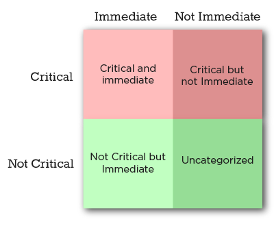
This problem is so common that several authors have built successful careers on helping people deal with it. Many of them draw, with credit for it or not, from the so-called Eisenhower Matrix. The goal of this method (described in his diaries) is to classify everything you have to do into a 2×2 matrix, where critical (important) things go on the top half, and immediate (urgent) things go on the left side. This way, everything we have to do falls into one of four categories:

  • Critical AND Immediate: Do this now, it’s an emergency
  • Critical: Spend most of your time and effort on these tasks
  • Immediate (but not critical): If you can delegate this to someone else, do so
  • Everything else: Stuff that falls here doesn’t deserve your time

Priority Matrix - four quadrants

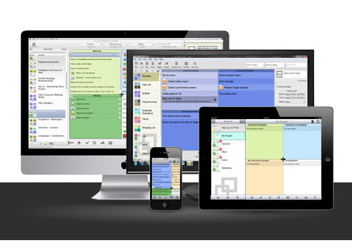
At Appfluence, we develop a suite of tools called Priority Matrix. This post describes the design decisions we made early in the development process when we were still trying to figure things out. It used to be that developers working on a new tool would have to start from the bottom up, developing low-level UI elements that, when put together, would bring their products to life. Today, modern development tools and powerful frameworks have come a long way. Creating a full, polished product is now easier and faster than it ever was. But this convenience came at the cost of suffocating nearly all originality in user interfaces. When presented with the task of designing the Priority Matrix, we decided to do the right thing and deliver a pleasant, unique experience that serves our users well.

One way to think about design choices is in terms of a spectrum of possibilities that ranges from hastily putting off-the-shelf components together, all the way to developing complete UI elements from scratch. The former has been done time and time again, and the results are invariably unsurprising. Software outsourcing houses churn examples by the dozen, and they don’t make a blip on anyone’s radar because they’re more of the same. The latter, on the other hand, requires a lot more effort, dedication, and frustration until you get it right, if you ever do. But if you succeed, the result is a unique, well-fitting UX that your users will hopefully love. We went that way, and after iterating several times, we settled on a design that made us happy.

The first and most obvious decision to make was how to implement the four quadrants. Our original constraints were the following:

  1. Each version had to feel native to the platform, to differentiate from quick ports
  2. The UI had to be touch-friendly since our first release was for the iPad
  3. The quadrants had to be resizable by the user to focus on one section, or else we would waste a lot of screen real estate

Given the task to design a 2×2 matrix, the quick, first approach would be to show some buttons to maximize each quadrant, to reassign items across quadrants, and to change projects. We did this as a proof of concept, and it felt clunky. As it didn’t fit our requirements, we moved on. The next iteration would allow the user to drag the edges between each quadrant in order to resize them as needed, horizontally or vertically. This was an improvement over the first attempt, but it still didn’t feel native on the iPad: It was like a Windows app ported to a tablet interface. Also, in order to be usable at all, the edges had to be pretty wide, in order to allow the user to drag correctly. This would also have made us waste a lot of space, which we couldn’t afford on a smartphone or tablet version.

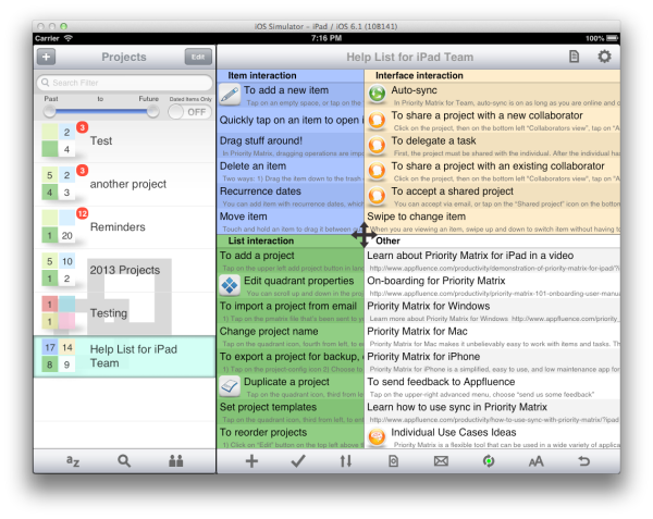
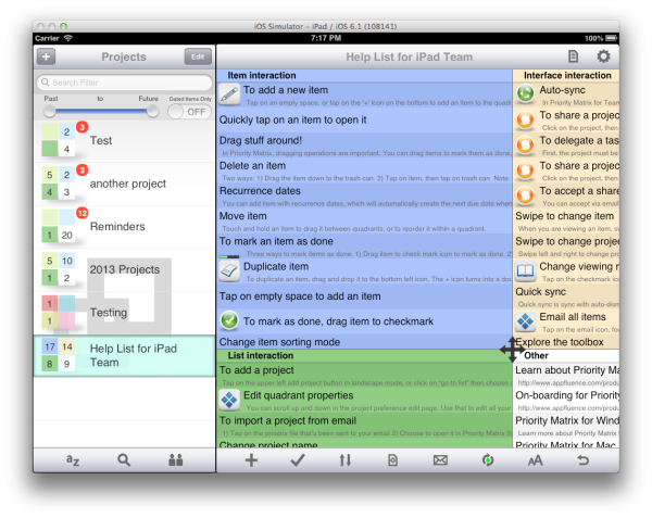
After much sketching, head-scratching and contemplation, one of us (I can’t remember exactly who) proposed having a central button that users could drag to resize the four quadrants at once. That was just right. Even though this was a non-standard UI element, users were able to identify the functionality at first sight (the icon helps with that). Because it’s just one button, we could easily afford to give it sufficient space to be easy to drag. And best of all, it is just fun to use. Even this long after we first released the app (it came out on day 1 of the iPad era), we still turn heads when we demo this particular feature. In retrospect, we wouldn’t do it all the time, but the effort we put into carefully designing from scratch paid off in scores.

Priority matrix screenshot

Priority matrix screenshot 2

The resizable quadrants are the signature element of the Priority Matrix interface. But the same careful, iterative design process was used to come up with other interactive elements. For example, items can be rearranged (re-prioritized) by holding a finger on the item and dragging it from one quadrant to another. We did this because we felt that the default iOS table reordering gestures were a bit clunky when working with multiple tables side by side. In addition, the iPad version of the app exploits the device’s multi-touch capability beyond the standard pinch and swipe operations. When dragging an item with one finger, a second finger can be used to change projects, reassigning the item to a different context. Little things like these makeup complete user experience. It pays off to step back and think through every now and then.

The design approach we propose here is not for everyone, every time. It is time-consuming, demanding and uncertain. However, as we said before when it works, the results speak for themselves. As mobile, tablet and web development frameworks evolve, it will become increasingly clear which UI and UX conventions stick and which ones are phased out. Until then, I recommend that you set clear goals and take a chance to explore the possibilities that your platform offers. Just don’t be a copycat.

Author:
Pablo Diaz-Gutierrez is a co-founder at Appfluence. They make Priority Matrix, a simple and effective task management software tool for busy people. Pablo is interested in all things productivity, and he would love helping you go home on time to enjoy the simple pleasures in life.