Accessible documentation ensures everyone, including users with disabilities, can easily understand and interact with content. This article highlights tools and practices for creating and maintaining such documentation. Key takeaways:
- Why Accessibility Matters: It’s ethical, reduces confusion, improves consistency, and avoids legal risks (e.g., ADA, Section 508 compliance).
- Common Accessibility Features: Semantic HTML, keyboard navigation, color contrast checks, ARIA attributes, and screen reader compatibility.
- Top Tools: Platforms like UXPin, Confluence, and Docusaurus integrate accessibility into workflows with features like versioning, collaboration, and live code examples.
- Validation Practices: Use tools like axe, WAVE, and Lighthouse for automated checks and manual testing with screen readers (e.g., NVDA, JAWS).
- Choosing the Right Tool: Focus on accessibility features, collaboration support, and ease of adoption. Test platforms with real-world tasks.
Quick Comparison:
| Tool Type | Accessibility Features | Collaboration Support | Ease of Adoption |
|---|---|---|---|
| Knowledge Base Platforms | Strong semantic support | Inline comments, changelogs | User-friendly templates |
| Static Site Generators | Full markup control | Git-based versioning | Requires setup effort |
| Developer Wikis | Markdown-based structure | Git integration | Basic, straightforward UI |
| UXPin | Code-backed components | Shared libraries, real-time | Streamlined for teams |
Accessible documentation benefits everyone while meeting legal standards. Start by auditing your current tools and processes, and integrate accessibility into your workflows.
A Designer’s Guide to Documenting Accessibility & User Interactions – axe-con 2022
How to Choose Accessible Documentation Tools
Picking the right documentation tool can be the difference between creating accessibility resources that teams actually use and having guidance that collects dust. A great platform does more than just store information – it helps teams actively design, maintain, and implement accessible practices across their products.
When evaluating tools, focus on three key aspects: core accessibility features, collaboration support, and ease of adoption. These factors are essential for ensuring your documentation remains effective and sustainable over time.
Core Accessibility Features
Start by checking whether the platform itself aligns with accessibility principles. A good documentation tool should support features like semantic headings, properly structured lists and tables, and landmarks to ensure content works seamlessly with screen readers and other assistive technologies. If the tool can’t generate well-structured HTML, your documentation might fail users relying on assistive tech right from the start.
Keyboard accessibility is another must. The platform should allow users to navigate entirely via keyboard, with visible focus indicators and fully functional controls. This ensures inclusivity for users who can’t rely on a mouse.
Built-in color contrast checking is a huge plus. Look for tools that validate contrast in real time, offer flexible typography, and adapt spacing to user scaling preferences. These features help ensure compliance with WCAG guidelines without requiring constant manual checks.
Some platforms go even further, prompting for alt text, flagging skipped heading levels, and warning when tables are misused for layout purposes. These built-in checks can catch common accessibility issues before content goes live.
For example, certain tools validate components against WCAG and Section 508 standards, while supporting ARIA attributes, customizable headings, and accessible templates. These features make it easier for teams to consistently produce compliant documentation.
Collaboration and Workflow Support
Accessibility is a team effort, and the right tools make collaboration seamless. Look for features like version control, audit logs, and changelogs, which help track how accessibility guidance evolves over time. This is especially important for organizations that need to demonstrate compliance with ADA or Section 508 regulations.
Inline comments, tagging, and review workflows are also key. These features let designers, developers, and accessibility specialists discuss specific decisions – like keyboard navigation or ARIA roles – right within the documentation. Integration with tools like version control systems, issue trackers, and prototyping platforms ensures that accessibility requirements flow naturally from design to implementation.
Take UXPin, for instance. It allows teams to create prototypes using React components that already include accessibility features like keyboard interactions, ARIA roles, and focus management. By documenting these components and referencing them in guidelines, teams can ensure that code snippets and examples match real-world behavior. Shared component libraries and the ability to attach accessibility checklists or notes directly to components further support accessible practices at every stage of development.
Ease of Adoption for Teams
Even the most advanced tool won’t help if your team doesn’t use it. Look for platforms that make it easy for new users to create, structure, and publish accessible content using pre-built templates. Accessibility-related options – like headings, alt text, and link descriptions – should be clearly labeled so authors know exactly what they’re building.
Training resources are crucial for adoption. Short, role-specific guides – like quick-start tutorials for designers, checklists for developers, and writing tips for technical communicators – help teams incorporate accessibility into their daily workflows. Accessible onboarding materials aligned with WCAG and guidelines like those from USWDS provide reliable reference points and reinforce best practices.
Embedded prompts and examples can also make a big difference. Tools that offer built-in documentation, quick training modules, and contextual help on accessibility concepts reduce the learning curve and keep teams focused on their work.
When testing tools, try real-world tasks like documenting a complex component with keyboard behavior, ARIA attributes, and usage guidelines. Evaluate each platform based on its accessibility features, collaboration tools, workflow integration, and ease of adoption. This hands-on approach will help you choose the tool that fits your team’s needs now and in the future.
The right documentation tool doesn’t just help teams meet accessibility standards – it makes accessibility the easiest and most natural path forward. By integrating with existing workflows and guiding teams toward inclusive outcomes, these tools become an essential part of creating accessible products.
Documentation Platforms with Accessibility Features
When choosing a documentation platform, it’s essential to consider how well it integrates accessibility into its core functions. Modern platforms are designed to streamline accessibility by incorporating features like semantic structure, keyboard navigation, and compatibility with assistive devices.
Platforms that generate clean HTML with proper heading hierarchies and landmarks make it easier for screen readers to navigate. Features like keyboard-only navigation with visible focus indicators allow users to interact with documentation without encountering barriers. This creates an environment where accessibility guidance can be seamlessly integrated alongside component details.
Embedding accessibility details directly into component pages and pattern libraries ensures documentation stays in sync with the actual components. With these tools, teams can document key aspects like keyboard behavior, ARIA attributes, focus management, and color contrast requirements right next to code examples and component specifications. This approach keeps accessibility guidance actionable and visible throughout both the design and development stages.
Versioning and workflow features are another critical consideration. These tools help maintain up-to-date accessibility documentation over time. Features like change history, approval workflows, and rollback capabilities ensure that guidance evolves accurately while providing traceability for compliance with ADA and Section 508 requirements.
Integration capabilities are also key. Platforms that connect with design systems, version control, issue trackers, and prototyping tools allow accessibility requirements to flow naturally from design to implementation. Linking written guidelines to live, accessible examples reduces confusion and improves consistency across teams.
Some design systems already include detailed accessibility reports. For instance, the U.S. Web Design System (USWDS) evaluated 44 components and published an accessibility conformance report using the VPAT 2.5 template, outlining how each component meets WCAG and related standards.
Search and navigation features are another area where accessibility matters. Robust search tools, clear information architecture, breadcrumb navigation, and effective tagging help all users – especially those relying on assistive devices – quickly locate the information they need, saving time and effort.
Analytics and feedback tools can also highlight how well accessibility documentation is working. Features like search logs, built-in analytics, and user feedback mechanisms reveal which pages are most visited, which terms are commonly searched, and where users might be running into dead ends.
Platform Feature Comparison
Here’s a breakdown of how different documentation platforms handle accessibility features:
| Platform Type | Semantic Structure Support | Keyboard & Screen Reader | Alt Text & Media | Versioning & Audit Trails | Integration with Design/Code |
|---|---|---|---|---|---|
| Knowledge Base Platforms (e.g., Confluence, Notion) |
Strong support for headings, lists, and tables with templates for consistency | Generally good keyboard navigation; screen reader compatibility can vary | Built-in alt text fields; some platforms prompt for captions and descriptions | Version history, page-level rollback, and change tracking | API integrations with tools like Jira and Slack; limited direct component linking |
| Static Site Generators (e.g., Docusaurus, Read the Docs) |
Excellent semantic HTML output with complete control over markup and structure | Customizable keyboard behavior and focus management | Requires manual implementation but supports all accessibility features | Git-based versioning provides complete change history and branching | Direct integration with code repositories; can parse code comments and specs |
| Developer-Focused Wikis (e.g., GitHub/GitLab wikis) |
Good heading and list support; relies on Markdown for structure | Basic keyboard navigation; overall accessibility depends on the platform’s implementation | Manual alt text in Markdown; no built-in prompts or validation | Full Git history with blame, diffs, and rollback capabilities | Native integration with repositories, issues, and pull requests |
| Specialized Documentation Tools (e.g., Document360) |
Strong content modeling with categories, tags, and structured templates | Generally accessible authoring and reading interfaces | Dedicated fields for alt text and media descriptions within the editor | Version control, approval workflows, and detailed analytics | Integrations via API and webhooks; some support for embedding code examples |
Knowledge base platforms are ideal for user-facing help centers and internal wikis, offering intuitive editors and robust content management features. However, the level of control over HTML structure and accessibility implementation may vary.
Static site generators, on the other hand, provide complete control over markup and accessibility. These platforms are perfect for developer-focused documentation, as they generate content directly from code and configuration files. While the setup may require more effort, the result is highly tailored documentation that meets WCAG and Section 508 standards.
Developer-focused wikis strike a balance between simplicity and technical functionality. They use straightforward Markdown editing and Git-based versioning, making it easy to align documentation with code changes. However, accessibility features often depend on the platform’s capabilities, so teams may need to add custom templates and guidelines for consistency.
Before committing to a platform, consider running a pilot project. Document a complex component, including its keyboard behavior, ARIA attributes, focus management, and color contrast requirements, to see how well the platform supports your workflow. Evaluate how accessible the platform’s interface is, how easily team members can find and use accessibility guidance, and how well it integrates with your existing tools.
Ultimately, the right platform does more than just store information – it actively supports your team in building and maintaining accessible practices. By choosing a platform that aligns with your workflow and accessibility goals, you create a foundation where accessibility becomes a natural part of the process.
sbb-itb-f6354c6
Tools for Accessible Design System Documentation
When it comes to design system documentation, the goal isn’t just to describe how components look – it’s about capturing how they function for all users, including those relying on assistive technologies like keyboards and screen readers. Tools designed specifically for design systems tackle this challenge by connecting reusable components, design tokens, and interaction patterns directly with accessibility standards such as WCAG mappings, ARIA roles, and keyboard behaviors.
Unlike generic documentation platforms that often treat accessibility as an afterthought, these tools are built around structured, component-based content models. They provide live or coded examples and integrate accessibility guidance right next to interactive previews. This setup makes it easier for teams to apply accessibility standards consistently across their system.
The most effective tools document ARIA roles, keyboard interactions, focus management, and semantic structures in reusable templates. They also display visual elements like color contrast and responsive behaviors for assistive technologies. This approach helps U.S.-based teams meet WCAG and ADA guidelines in a way that’s clear and audit-ready.
By using the same React components or design tokens for both the UI and documentation, these tools ensure that roles, focus order, and labels stay in sync. This minimizes the risk of discrepancies between what’s documented and what’s delivered to end users. Tools that integrate with source control can pull in real code, props, and states, displaying them alongside documentation so any updates to accessibility behaviors automatically reflect in the documentation.
Large systems like USWDS and Atlassian’s design system set strong examples by explicitly documenting accessibility expectations for each component. Embedding accessibility guidance directly into design tools and code-backed components – not separate static documents – helps teams apply standards consistently and closes the gap between design and development.
Each component should include details about input methods, keyboard flows, focus order, ARIA roles, color contrast, error messaging, and any limitations. This information must be accessible to designers and developers at the moment they’re making decisions, not buried in separate guides.
Sustainable workflows often include regular documentation reviews, versioning strategies for components and guidelines, and clear accountability for accessibility content within the design system team. Tools can track changes, flag when accessibility notes need updates, and create feedback loops where designers, engineers, and users with disabilities can report issues or request clarifications. For instance, Pinterest’s Gestalt design system uses surveys and feedback mechanisms to continually refine its accessibility documentation and training. This approach treats documentation as an evolving product, not a one-time task.
Using UXPin for Accessible Design Documentation
Specialized tools like UXPin take accessibility integration a step further by embedding it directly into the design process. UXPin allows teams to create documentation and prototypes using reusable React components. This ensures that accessibility attributes, keyboard interactions, and semantic structures defined in code are preserved throughout the design process. Designers can showcase accessible flows – such as focus states, error messaging, and alternative interaction paths – through interactive examples, giving stakeholders a realistic view of how users with disabilities will navigate the interface. This also keeps documentation and implementation tightly aligned.
UXPin establishes a single source of truth by using code as the foundation for both design and development. Teams can build reusable UI components from popular React libraries like MUI, Tailwind UI, and Ant Design, or sync custom Git repositories. This speeds up design system creation and ensures accessible elements are applied consistently across projects. By working directly with code-backed components, designers aren’t just creating mockups – they’re working with the exact elements that will go into production, complete with all accessibility behaviors.
With shared libraries and collaboration features, UXPin allows designers, engineers, and accessibility experts to refine patterns together. This helps establish a culture where accessibility isn’t treated as an optional extra but as a baseline requirement.
Advanced prototyping features like interactions, variables, and conditional logic let designers create high-fidelity prototypes that mimic the final product. This is especially useful for testing complex accessible user experiences, such as keyboard navigation, focus management, and dynamic content changes. Teams can validate whether a modal traps focus correctly, error messages are announced properly, or a multi-step form maintains logical tab order – all before writing production code.
UXPin even generates production-ready React code and design specs directly from prototypes, simplifying handoffs to developers. This ensures that the implemented components match the documented design system and its accessibility requirements. By streamlining the handoff process, teams can focus more resources on accessibility testing and refinement, rather than reconciling design and code.
AAA Digital & Creative Services, a full-stack design team, has fully embraced UXPin Merge for designing user experiences. They’ve integrated their custom-built React Design System, allowing them to design directly with coded components. Brian Demchak, Sr. UX Designer at AAA Digital & Creative Services, shared:
"As a full stack design team, UXPin Merge is our primary tool when designing user experiences. We have fully integrated our custom-built React Design System and can design with our coded components. It has increased our productivity, quality, and consistency, streamlining our testing of layouts and the developer handoff process."
The efficiency gains are striking. Larry Sawyer, Lead UX Designer, noted:
"When I used UXPin Merge, our engineering time was reduced by around 50%. Imagine how much money that saves across an enterprise-level organization with dozens of designers and hundreds of engineers."
This time savings means more resources can be allocated toward accessibility testing and refinement. By spending less time reconciling design and code, teams can ensure their design systems meet WCAG targets and effectively serve all users.
For teams operating under U.S. regulations like Section 508 and ADA, documenting accessibility at the component level is critical. Linking keyboard behaviors, ARIA attributes, focus rules, and contrast guidance to working examples provides a transparent, reviewable source of truth. Teams can establish WCAG targets (such as level AA compliance), map components to specific success criteria, and include any additional internal rules or U.S.-specific legal considerations that go beyond minimum standards.
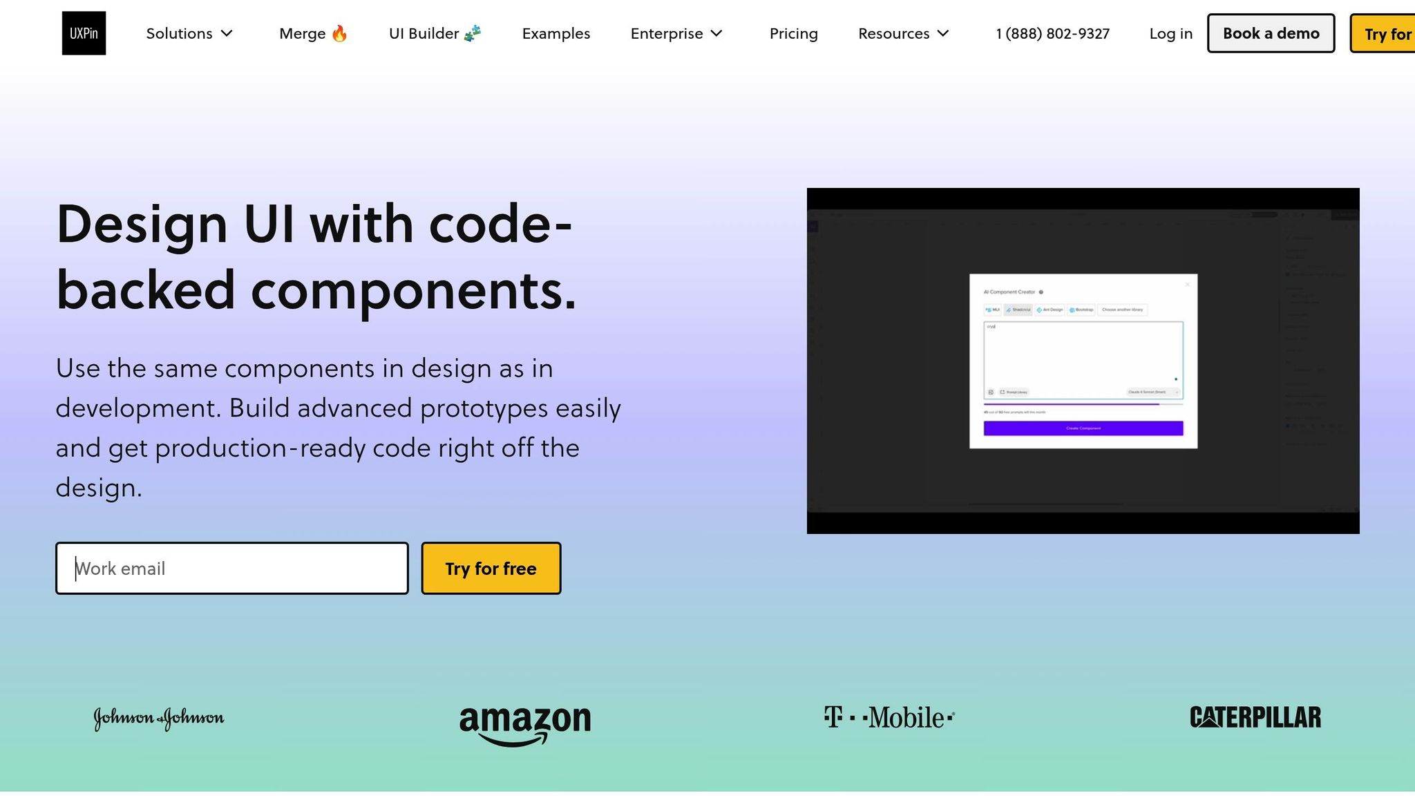
UXPin’s AI Component Creator further accelerates this process by auto-generating code-backed layouts like tables and forms from prompts. These components come with semantic HTML and accessible defaults, which can then be refined and incorporated into the design system. This helps teams build accessible design elements faster while maintaining high standards for usability and inclusivity.
Accessibility Validation Tools and Practices
Creating accessible documentation is only part of the process; ensuring it remains usable and compliant requires thorough validation. This involves a combination of automated testing tools, manual reviews, and hands-on testing using assistive technologies. Together, these methods can uncover issues like unclear link text or poor keyboard navigation that automated tools might overlook. The goal is to align with WCAG principles by ensuring content is perceivable (e.g., providing text alternatives for images and maintaining proper color contrast), operable (e.g., keyboard-friendly navigation and focus indicators), understandable (e.g., consistent headings and navigation), and robust (e.g., semantic support for assistive technologies).
In the U.S., teams should aim for compliance with WCAG 2.1 Level AA, as well as Section 508 and ADA standards.
Interestingly, a large number of accessibility issues arise from prototypes. This highlights the importance of validating documentation and design artifacts early in the process, which can prevent problems before they escalate.
Common Accessibility Testing Tools
Automated tools like axe, WAVE, and Lighthouse are invaluable for scanning pages for common issues such as missing alt text, low contrast, ARIA errors, and structural problems. These tools can be integrated into CI pipelines to ensure routine checks. For example, WAVE visually overlays indicators on web pages to pinpoint where documentation fails WCAG criteria and explains the reasons behind those failures. Similarly, Accessibility Insights and browser DevTools’ accessibility panels guide users through audits, checking for keyboard access, landmarks, and logical tab order.
For design validation, tools like Stark are useful. They can test color contrast, simulate various types of color blindness, and evaluate typography legibility in mockups. While automated tools are excellent for detecting technical issues, they can’t assess contextual clarity, such as whether link texts are meaningful or if keyboard navigation flows logically. This is where manual testing becomes essential.
Using screen readers like NVDA, JAWS, and VoiceOver is another critical step. These tools help validate how users relying on assistive technologies navigate and interact with documentation. For example, they ensure that headings form a logical outline, landmarks guide navigation, and interactive elements announce state changes correctly. Additionally, keyboard-only testing ensures all features – like search functions, navigation menus, collapsible sections, and code playgrounds – are fully functional without a mouse.
Here’s a quick comparison of validation tools and their roles:
| Tool / Practice Type | Primary Use in Documentation Validation | Notable Capabilities & Notes |
|---|---|---|
| axe, WAVE, Pa11y, Lighthouse | Automated scanning of documentation pages and live examples | Detects missing alt text, contrast issues, structural problems, and ARIA errors; integrates into CI pipelines. |
| Accessibility Insights, browser DevTools | Guided audits | Provides step-by-step checks for keyboard access, landmarks, and tab order on docs pages. |
| Stark | Design validation | Tests contrast, simulates color blindness, and checks typography in component mockups. |
| Screen readers (NVDA, JAWS, VoiceOver) | Manual assistive technology testing | Validates reading order, link clarity, and announcements for interactive examples. |
| Internal checklists | Process standardization | Ensures every documentation update verifies proper heading hierarchy, contrast, alt text, and keyboard behavior. |
These tools and practices form the foundation for integrating accessibility into review workflows.
Adding Accessibility to Review Workflows
Incorporating accessibility checks into documentation workflows ensures issues are identified and resolved systematically. By making accessibility part of the "definition of done", no update is complete until it passes both automated and, when necessary, manual accessibility reviews.
Automated checks can be added to CI/CD pipelines or documentation build processes, triggering scans for key pages and components with every pull request. This helps catch regressions early and ensures new content meets established standards.
During content and design reviews, checklists based on WCAG guidelines and internal standards provide a structured way to evaluate elements like headings, link text, tables, media, and interactive examples. For instance, reviewers might confirm that heading hierarchies are logical, link text is descriptive, code examples meet contrast requirements, and interactive elements are fully keyboard accessible.
Accessibility issues should be logged with clear labels (e.g., "a11y-docs") and linked to specific WCAG criteria to streamline resolution. Grouping issues by component or content type can also help teams address root causes and update shared templates efficiently.
Quarterly audits of key documentation sections and component libraries are another important practice. These reviews are especially critical after changes like redesigns, theme updates, navigation restructuring, or large content migrations, as such changes can introduce new accessibility problems that automated tools might not catch.
Some design systems take accessibility validation a step further by publishing conformance reports. For example, the U.S. Web Design System produces an accessibility conformance report using the VPAT 2.5 template, providing transparency and a model for others to follow.
Feedback channels embedded directly into documentation – via issue links, feedback forms, or dedicated Slack channels – allow users, including those with disabilities, to report accessibility problems. Routing this feedback into the review workflow ensures accessibility remains a priority and evolves with user needs.
Finally, providing training sessions, such as bootcamps or office hours, equips documentation maintainers with the knowledge to interpret tool reports and address issues effectively. This ongoing education helps teams make informed decisions and maintain high accessibility standards as documentation evolves.
Conclusion and Key Takeaways
Creating accessible documentation is a cornerstone of effective design systems. The right tools and workflows can help reduce legal risks, cut down on rework costs, and ensure your designs reach a wider audience.
Good documentation tools should prioritize semantic structure, keyboard navigation, and built-in color contrast checks. They should also promote collaborative authoring, enabling designers, developers, and content teams to work together seamlessly. By integrating accessibility checks directly into the design and review process – rather than saving validation for the end – teams can catch issues early and avoid costly corrections later.
Solutions that centralize design, code, and documentation – like UXPin – are particularly helpful. These tools allow teams to document and validate accessibility as they design. When accessibility guidance is embedded in real, code-backed components, it bridges the gap between design intent and implementation. Engineers can see ARIA roles, keyboard interactions, and visual states all in one place, leading to fewer miscommunications and quicker handoffs.
Once the right tools are in place, the next step is to implement a straightforward evaluation process. Start small: use a checklist to verify headings, landmarks, role-based permissions, and connections to your issue-tracking system. Test one or two platforms with a real component – such as documenting a button’s keyboard behavior and focus states – and gather feedback from your team on the process’s usability and maintainability.
Automated tools like axe, WAVE, and Lighthouse are great for catching common accessibility issues quickly. However, they should be paired with manual testing, like hands-on keyboard navigation and screen reader validation. Make accessibility criteria a standard part of pull requests, design reviews, and content approvals to ensure testing is continuous, not a one-time task.
To keep your documentation up-to-date, schedule regular accessibility reviews – quarterly is a good starting point. Use these reviews to audit existing guidance, retire outdated patterns, and introduce new ones based on user feedback and updates to WCAG standards. Assign clear ownership, whether to an accessibility lead or a small team, to maintain guidelines, address issues, and support contributors.
A great way to begin is with a quick audit of your current documentation. Check if accessibility guidance exists for all key components, if it’s easy to locate, and if it aligns with WCAG 2.1 Level AA standards. Trial one or two tools for 30–60 days, set measurable goals – like reducing late-stage accessibility bugs – and collect feedback from your team on the documentation’s usability.
Accessible documentation doesn’t just meet legal requirements like the Americans with Disabilities Act (ADA) and Section 508; it also builds trust and improves efficiency. Beyond compliance, it shows your organization values inclusivity and systematically accounts for diverse needs. When accessibility becomes an integral part of your design system, it shifts from being an afterthought to a natural part of everyday decision-making – and that’s when it has the greatest impact.
FAQs
What key accessibility features should you consider when selecting a tool for documentation?
When selecting a documentation tool, prioritizing accessibility features is key to ensuring inclusivity for all users. Opt for tools that support screen readers, enable keyboard navigation, and offer options to customize text sizes and contrast settings. These features cater to a wide range of accessibility needs. Also, make sure the tool aligns with WCAG (Web Content Accessibility Guidelines) to ensure usability for individuals with disabilities.
It’s also worth exploring tools with collaborative capabilities. These allow teams to review and update content seamlessly while keeping accessibility in mind. By focusing on these features, you can create documentation that’s inclusive and user-friendly for everyone.
What are the best ways to include accessibility checks in your documentation process?
Teams can make accessibility checks more efficient by incorporating tools that align with accessible design workflows. Platforms that offer reusable components and interactive prototypes help maintain consistent accessibility standards throughout the documentation process.
Using software with built-in accessibility features allows teams to spot and resolve potential issues early on. This approach not only saves time but also ensures the documentation is user-friendly for everyone.
How do collaboration and streamlined workflows support accessible documentation?
Collaboration and smooth workflows play a key role in keeping documentation accessible. They make it easier for team members to work together effectively and stay on the same page. When designers and developers communicate effortlessly, accessibility needs can be tackled early and consistently throughout the project.
Tools like DreamFactory, which provide governed API access to data sources, can help streamline backend connectivity for documentation systems. Similarly, Sendspark can support outreach when sharing documentation updates with teams. More directly, UXPin helps streamline this process by enabling teams to craft interactive, code-based prototypes using shared component libraries. This approach integrates accessibility standards directly into both design and development, cutting down on mistakes, saving time, and ensuring a more inclusive experience for users.

