Free e-book: Visual Consistency in Web UI Design

This free e-book explores how the importance of visual consistency in making interface design intuitive yet interesting. Let’s take a look inside.

What’s in the free e-book

Web Design for the Human Eye: Principles of Visual Consistency explains how to design interfaces that match users’ prior experience without being boring. Consistent interfaces, after all, and easier to learn, which makes them easier to use.

Consistency in Web UI Design

This e-book includes:

  • Topics such as the elements of visual consistency, how to uncover user expectations before design, how to master web design through smart use of UI patterns, and more.
  • Thorough analysis of visual examples from Squarespace, Wunderlist, Redhat, and others.
  • Highly practical format that relies on case studies over just design theory

Download free ebook now

Free e-book: Minimalist Web UI Design Trends

This free e-book explores the techniques behind some of the most stunning minimalist designs we’ve seen to date. Take a look!

What’s in the free e-book

One of the hottest design trends today, minimalism remains a timeless design philosophy due to its emphasis on content. Because minimalism forces designers to say more with less, it’s one of the most difficult methods considering all the interactive, visual, and UI design nuances.

Minimalist Web UI Design Trends

Our free e-book includes:

  • The evolution of minimalism in design, how to create visual balance with less elements, what UI design trends complement minimalism, the different forms of symmetry in minimalism, and more.
  • 28 beautiful examples to illustrate all the best practices
  • Tips on simplifying your UI designs without sacrificing essential features
  • A fast but rich format that only focuses on everyday design advice

Download free ebook now

Important Considerations for Responsive Design Performance & UX

As you know, UX is not a new discipline. But given the rise of responsive design, mobile design, and adaptive design in past years, the question of compromising between performance and experience still seeks a clear answer.

In this piece, we’ll dive into some of the important criteria for responsive performance and the overall mobile experience.

A mobile-only site renders faster but costs more to develop and maintain. On the other hand, responsive design is simpler to create upfront but must be implemented carefully since a smartphone and laptop receives the same amount of code (which can obviously slow down performance).

To further complicate things, a fast site that renders correctly and creates a good experience will be the one that’s ranked better. In fact, Google itself even recommends responsive design.

So what are some important considerations to keep in mind when designing for mobile? Let’s take a look.

Performance

Performance is one of the biggest problems that many sites experience.

Not only does it affect SEO, but it also impacts traffic, usability and ultimately, conversions. Since the latter is the one that most businesses care about, it’s worth noting that a Kissmetrics study found that most mobile users (30%) wait between 6 and 10 seconds before abandoning a site. That’s a fairly long load time and not very difficult to achieve – but every second that you can shave offload times counts and you should aim for much less than that.

After all, like we stated in Interaction Design Best Practices, digital time and real time are not the same.

Interaction Design Best Practices

Photo credit: KISSMetrics

The study found that there was a strong correlation between page load times and customer behavior. 79% of shoppers said that they would be less likely to buy from a site with poor performance again, whilst a 1-second delay was found to decrease customer satisfaction by 16%.

So, this shows that site performance is an important factor to UX, SEO and to customer behavior and conversions.

delay in page response results in reduced conversions

Photo credits: KISSMetrics

Performance issues can be caused by all kinds of things, including:

  • Bloated, untidy code
  • Plugins
  • Themes
  • Under-optimized images
  • Poorly constructed responsive design
  • Render-blocking JavaScript and CSS
  • Lack of GZIP compression
  • Poor server setup

Of the above, poor server setup is likely to be the one that most businesses have the least control over. Cheap or free hosting tends to come with its own issues and should be avoided for business sites.

In the past, I moved two of my responsive sites across to a managed WordPress service and this fixed a lot of the performance issues overnight. It wasn’t a cheap or free host that I was using previously, but it was affecting site speed. It’s not always simple to diagnose server issues though. The first step would to run a speed test using Google Page Speed Insights and/or GT Metrix to see if it picks up a poor server response time. If this is the case, then you can perform a Trace Route test and then use an online service to help you to understand the results if necessary.

This should help you to pick up server errors but bear in mind that they can be tricky to pin down.

Responsive Web Design

Issues only arise from responsive sites that haven’t been correctly built in the first place. For example, broken layouts may be caused by things such as dropping in a viewport meta tag without using media queries to make it properly responsive. This results in a chunk of the page being cut off and other elements – such as navigation – being displayed incorrectly.

Responsive web design is sometimes blamed for offering poor performance, yet it’s not the fault of the technique, but its implementation, as set out by Tim Kadlec.

responsive design cheatsheet

Photo credit: UXPin

Responsive web projects – and any web project that you begin – should always take a mobile-first approach. The problem that many have with RWD sites is in conditional or lazy loading, or rather in the fact that they don’t use it. This results in a full desktop model being delivered to mobile devices, which of course slows down the site.

This issue was made somewhat famous a few years ago in a study carried out by Guy Podjarny. He found that the majority of the responsive sites that he tested for speed performed poorly due to the loading of full desktop sites, as opposed to a pared-down version.

The problem remains now that it’s fairly complex to build a responsive site that performs well. Not only do you have to reduce the large HTML file that’s initially called for a mobile site, you also must ensure that you avoid running certain scripts, load certain CSS and download specific images. A responsive site is never going to be as fast as a dedicated mobile site, the latter of which usually has small HTML and very few scripts.

responsive design alone not mobile seo

Photo credit: Search Engine Land

However, from a business standpoint, supporting mobile and the main site means twice the maintenance, and therefore twice the cost. It’s no wonder that many people want the convenience and lower cost of responsive design.

If you’d like to learn more about improving the performance (and therefore the UX) of responsive sites, check out these tips from CrazyEgg. For a quick reference guide on breakpoints, check out our free Responsive Design Cheatsheet.

Mobile UX

The basic principles of mobile UX are not really very different from desktop UX. However, mobile is still a rapidly developing medium and as such, this means that best practices are still emerging. As Steve Krug points out in the 2014 edition of his UX classic Don’t Make Me Think: A Common Sense Approach to Web and Mobile Usability, “Web and app design for mobile devices is still in its formative “Wild West” days in many ways.”

Mobile UX is all about trade-offs. Once you’ve decided what belongs on the home page, you then have to decide how to prioritize the rest of the content. It’s also necessary when designing for mobile to ensure that you provide strong visual cues that show the user how to use the site.

For example, clickable areas in purely flat designs can create usability issues since the signifier (what visually defines a button) may not be as clear. Without clearly defined buttons, the design will require other distinguishing elements.

Color is a great choice for this, as you can see in the image below for SitePoint. The navigation is clearly sectioned using strong colors to ensure that on mobile, these areas are obvious and more importantly, large enough so that a user won’t accidentally click on a link next to the one that they want (unless they have exceptionally large hands).

color for buttons UI examples

Photo credit: Sitepoint

Best practice for mobile UX dictates that you should then pay attention to the following:

  • Clarity – How can you ensure that the user knows how to use the site? Consider the use of strong visual cues such as the use of color and drop shadows on buttons to prompt the desired user action.
  • Navigation – Again, you consider if flat design adds anything or if it creates confusion in the user and how you can overcome this. You should also consider if it’s worth having a dropdown menu or a standard, traditional top menu.
  • Gestures – As designer Thomas Joos suggests, you must think in terms of time, dimension, and animation. How will your interface respond when it’s swiped or pulled from the top? Interactions and animations require even more care with regards to visual refinement and response times.
  • Forms – Input forms need to be short and concise, not ask the user to enter all kinds of details from their age to the name of their dog. Limit forms to one or two fields and ensure that they are big enough to click into. Also, take care with form labels as these can easily be thrown off on mobile devices.
  • Touch – As discussed earlier, clickable areas should follow the fat finger rule and not encroach on surrounding areas.

When it comes to designing for a smaller screen, prototyping and wireframing tools are also helpful once you outgrow the low fidelity of sketching by hand. The sooner you can get your design onto real-world devices the better, but it’s incredibly helpful to have tools at your disposal that can effectively help with layouts.

Final Thoughts

Mobile UX is a sum of its parts.

It’s not just about performance, nor is it all about how the site and its content are presented. For the designer, it’s become necessary to look at a web project much more holistically than we’ve seen in the past.

On the small screen, good UX is essential to the success of every site. Consider every navigation element alongside your design choices and how these will work on real-world devices. As championed by Steve Krug, the user should not have to think about what they have to do next, it should be immediately clear to them.

If you’d like to learn more about mobile design, check out our free ebook Mobile UI Patterns. We include over 46 of some of the best UI patterns for mobile UX and performance.

Mobile UI Patterns

Free e-book: Consistency in UI Design

There’s a fine line between consistency and uniformity in web design. If your designs aren’t consistent, then users will be confused. If your designs are too consistent, then users will be bored.

Take a look inside this free e-book to see how to strike the right balance.

What’s in the free e-book?

Consistency in UI Design: Creativity Without Confusion only includes practical advice accompanied with real-world examples.

As with all our e-books, we’ve trimmed the fat so the book is as actionable as possible.

SConsistency in UI Design

The free e-book features:

  • Practical exploration of when to be consistent and when to be inconsistent in UI design
  • Examples from Adobe, Reddit, Amazon, Jawbone, Xfinity, and others teach you the do’s and don’ts of consistency
  • See the criteria for ensuring your design is consistent across all pages while feeling familiar to users

Download free ebook now

Free e-book: The Evolution of Flat Design

While subtle, flat design has evolved from its color-block and pure grid formats of the mid and late 2000s to an “almost flat” style that embraces color and realistic touches. Check out this free e-book to see how flat design has changed, and which elements prevail.

What’s in the free e-book?

Web UI Trends Present & Future: Evolution of Flat Design includes plenty of visual examples, analysis, and predictions for flat design as it passes its first decade. The book is designed as a quick yet practical read.

Flat Design Trends

The free e-book features: 

  • Topics including trends and techniques popularized by flat design, the intersection of flat and material design, the pros and cons of flat design, and more.
  • 18 of the best examples of flat design we’ve seen this year.
  • Quick and straightforward format that tells you just what you need to know to apply best practices to your own design.

Download free ebook now

Free e-book: Design Collaboration in the Enterprise

Design collaboration shouldn’t be painful. This free e-book includes realistic advice and design exercises to help you involve everyone without just bending to their will.

Read on to take a look inside the free e-book.

What’s in the e-book 

Design Collaboration Enterprise

The design collaboration book features:

  • Topics such as how to involve the team to prioritize features, design based on data, give better feedback, empathize with users, kick-off design projects, and more.
  • See how to encourage design thinking without completely disrupt existing processes
  • Examples included from Venmo, Hubspot, Amazon, and Vice.
  • Written in a practical format that focuses on the reality of design teams in large organizations

Download free ebook now

Free Apple Watch UI Kit (30+ elements)

It’s finally here! Our entire design team spent the last 2 weeks hard at work finishing this free handcrafted UI kit for Apple Watch.

Read on to get a peek of all the design elements.

What’s in the Apple Watch UI Kit

The free UI kitfeatures:

  • 30+ custom elements created by our team of UI and graphic designers
  • Compatibility with Photoshop, AI, Sketch, and UXPin
  • Elements available in both 38 and 42mm size

Apple Watch UI

Download the free UI kit now

New pocket guide: Web UI Trends 2015 (Dramatic Typography)

Our latest free pocket guide examines some of the most timeless examples of bold and beautiful typography. Read on for a sneak peek.

What’s in the free pocket guide

When it comes to web UI design, how you present your message is just as important as what you say. Good typography conveys the right feeling and tempts users to continue reading the content.

Whether it’s small typography or bold oversized lettering, breathtaking typography is a web UI trend that will never die out.

Typography 101 ebook by UXPin

Our free guide includes:

  • 21 hand-picked examples of websites with the best typography we’ve seen to date
  • Quick “pro tips” for topics ranging from artistic typography, small text, large text, custom lettering, overlaying text, and more.
  • Straightforward format that focuses on practicality and visual learning
  • List of some of our favorite typography resources

Head on over to our design library and check out the free book.

Download free pocket guide

Moderated vs. Unmoderated Usability Testing: Which is Better?

When it comes to usability testing, one of the most important decisions you’ll make is whether someone should moderate the session.

So which one should you choose? Read on to learn the pros and cons of each.

If natural user behavior generates the most accurate usability data, then of course testing should be unmoderated, right? But if that data is unfocused and misdirected, then won’t you want to moderate the tests? In that case, aren’t you then biasing the results with someone else in the room?

You’ve probably heard of the observer effect, even if you don’t know it by name. It’s the idea that people being observed act differently than when they’re alone. While this is a highly documented phenomenon, this should not be the only influence on whether or not to use a moderator.

Budgets, schedules, manpower, the types of tests, the necessary data — these are the more important considerations we discussed in the Guide to Usability Testing.

Let’s dive deeper so you can make the most informed decision.

Moderated Usability Tests

It’s true, moderated tests give you more control. Moderators can answer any immediate questions posed by the user, and guide the test to meet the goals of the study.

Of course, moderated tests require a moderator — someone with people skills and knowledge of the product to keeps things running smoothly. This also means more difficulty in scheduling with the user and restricting at what they take the test. If you’re conducting the test on-site, this will require even more resources, and make it harder to recruit participants willing to go out of their way.

On the plus side, many of these difficulties are eliminated through remote testing. This tactic allows users to take the test where they want, and gives them some leeway with scheduling, while still giving you some of the control.

Because moderated testing requires more effort, it is highly recommended in the earlier stages of design. When you’re working with concepts and prototypes, you definitely want to be able to ask the follow-up questions to your users.

We agree with this advice from UserTesting:

1. Incomplete or buggy interfaces — In other words, early-stage prototypes. If you’re testing a product that risks confusing the user, you need a moderator to help answer questions and guide them through. While this may seem uncommon, starting a usability test as early as possible is always a good idea.

2. Complex interfaces — If your product has a high learning curve, a moderator can salvage a test that might otherwise yield no useful results. For example, a moderated test makes sense for products that don’t always have a linear sequence of steps to accomplish tasks.

3. Products with security concerns — While rare occurrences, if you’re testing a product with access to data that you don’t want public, a moderator will keep the user where they belong — although there are other ways to restrict access in this scenario.

Remember that moderated and unmoderated testing are complementary, not competing. For example, you can run a moderated test on your prototype, then iron out any major usability issues. As you finalize your product, you can then run an unmoderated test to gauge how it performs “in the wild”.

When you’re ready to get started, make sure you follow Jeff Sauro’s 20 tips for moderated usability testing.

Unmoderated Usability Tests

Unmoderated tests are cheaper and easier to quickly recruit more users. Let’s take a practical look at the pros and cons.

Unmoderated Usability Tests

Source: UserZoom

Benefits

  • Less time — Free from scheduling concerns and limited manpower, unmoderated tests allow you to test users simultaneously and at all hours. This means more data in a quicker time. As we described in the Guide to Usability
  • Less chance of bias — While the observer effect shouldn’t be the only factor, it — and several other types of social and technical biases — are still relevant factors. The absence of a moderator will alleviate many of these, giving you more natural and reliable results.
  • Cheaper — If you need to hire an outside user research company, then the cost will certainly exceed unmoderated tests. Unmoderated tests don’t require a reserved location, and all the equipment can be provided by any number of usability tools (see below). In fact, the cost of these tools is scalable, so you can pay whatever amount you deem appropriate.
  • Easier recruitment — The relaxed environment for unmoderated tests creates a larger pool of willing candidates. Unmoderated tests can be done virtually anywhere at any time, by anyone who meets your criteria.

Of course, unmoderated testing, with its lesser degree of control, has its drawbacks as well.

Downsides

  • No follow up questions — While you can include forms for open-ended questions to users, nothing beats the conversation between moderator and user. The back-and-forth of moderated testing gives you a rare peek inside why users behave the way they do. If time and scheduling permits, we recommend following up with users either in email or Skype to for a post-test discussion.
  • Less forgiving tasks — Because it’s up to the user to decide when a task is complete (and not a moderator), users may move onto the next task prematurely. That’s why you must write clear tasks with an easily defined state of success or failure.
  • More time spent filtering for quality — While moderated testing may introduce some bias, unmoderated testing runs the risk of users motivated purely by the compensation. While you’ll spend less time recruiting people, you’ll need to spend more time setting up filters to qualify responses.

If you’re interested in unmoderated tests, we can recommend these tools to help you along.

LookbackFree beta. Compatible with Mac, Android, and iOS, this is one of the most promising tools we’ve seen to date. It simultaneously records facial reactions, mobile screens, and gestures at 60fps. The video is then played in a sleek storytelling fashion, which you can see for in this actual recording.

UserTesting$39 per user, per test. Known for its quick feedback, UserTesting allows you to test anything from websites (yours or your competitors), apps, prototypes, Facebook games, or Google ads.

Userlytics$49 per user, per test. After setting the parameters, Userlytics will recruit participants and conduct the tests on their own, with a similar spectrum to UserTesting.

Solidify$19 per month (basic), $49 per month (plus). Solidify allows you to test interfaces for desktop or mobile devices at any stage of development, even sketches and wireframes. The plus membership gives you demographics, logo customization, and report customization.

UserZoom — $1,000 per month. UserZoom operates a little differently, offering its suite of utilities for a monthly fee. Members can use a variety of tests, including click tests, card sorts, tree tests, and surveys.

Conclusion

Unmoderated tests provide statistically significant usability results in a short period of time. However, there is far less room for error since you can’t revise the tasks or questions once the test has started (unless you don’t mind wasting all the money you’ve spent).

Remember that you’ll also need to sift back through the data for a full analysis since you’ll lack the insights possible from the dialogue of a moderated session. For polished products, however, unmoderated testing is a serious force multiplier when it comes to scaling up your usability research.

The answer as to which is better is what you’d expect for most design questions: it depends. Are you testing early in the process, or later? Is there a shortage of time and money?

Each type of test has its place and purpose, and the best advice we can offer is to treat usability testing as an iterative exercise. Different stages of design benefit from moderated vs. unmoderated testing, so don’t be afraid to mix it up.

If you’d like to get additional practical advice on usability testing, feel free to download our free Guide to Usability Testing. We explore over 30 different types of usability tests, providing tips and examples for each.

Guide to Usability Testing

New e-book: Web UI Design for the Human Eye (Layout & Typography)

In our latest free e-book, we examine how to prioritize visual and text content in your UI design. Our goal is to show you how to design for what users care about most, even if your content isn’t finalized.

Take a peek inside the book!

No matter how beautiful your site looks, users come to your site for the content. Unless the design frames the content in a visually digestible manner, studies show that your users will probably leave within 10 seconds.

In this free e-book, we take a practical approach to content-first design, typography, and scannable UI layouts. We favor real-world application over dry theory, so we’ve provided only the most straightforward and actionable tips.

content patternts and typography ebook

You’ll find 5 chapters of practical advice in the e-book discussing:

  • Different tactics of including real content in your UI design even if your content is still rough
  • The pros and cons of the F versus Z pattern for designing easily scannable web interfaces
  • Visual best practices based on UI designs from almost 30 companies including Design Milk, Hulu, The New Yorker, and AirBnB. 
  • How to structure your typography to enhance your overall UI and specific sections of content

So take a look, and feel free to share if you find it helpful!

Download free e-book

Why Designers Shouldn’t Neglect Mockups

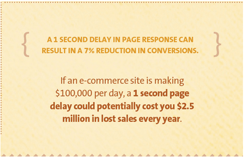
This post is an overview of why we recommend mockups, covering some of the points in our free pocket guide Web UI Design Process: The Visual Power of Mockups.

We’ll start by explaining what they are, then why they’re useful, and finally where they can fit into your design process.

What is a Mockup?

Before we get into what a mockup is, let’s talk about what it isn’t. A mockup is not a wireframe and it’s not a prototype.

Wireframes are a low-fidelity blueprint represented with gray boxes and placeholders for detailed content. A skeleton of the design to come, wireframes act mainly as a placeholder for structure and layout but can be shown to stakeholders for early feedback.

Prototypes, on the other hand, demonstrate how the design works. Their role in the design process is more complex: they help refine usability, explore combinations of interactions, and reveal any inconsistencies in the overall experience.

High fidelity prototype

Source: UXPin

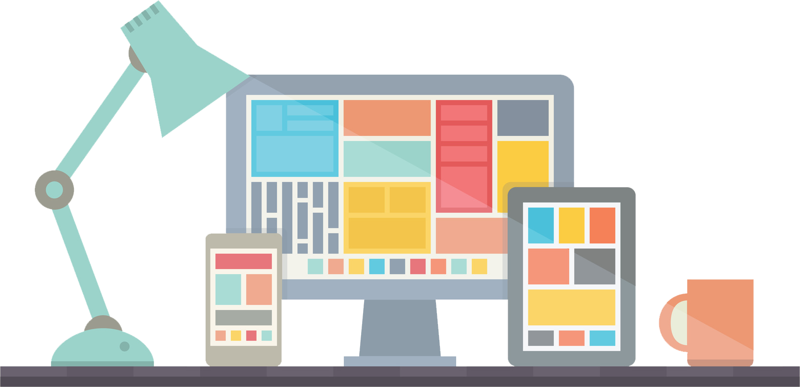
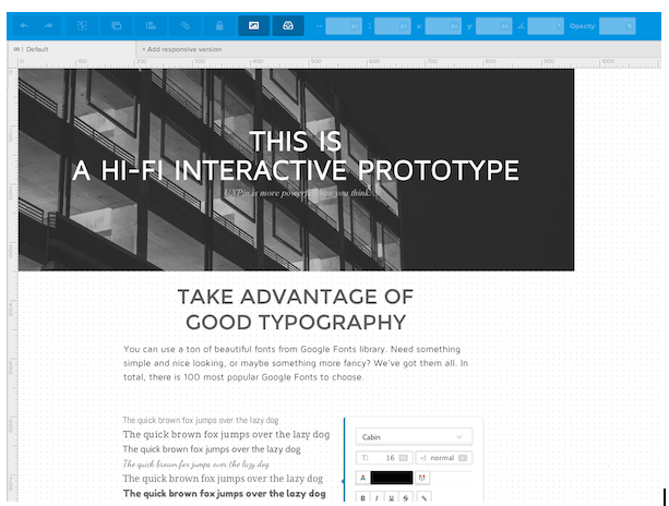
Typically a mid- to high-fidelity representation of the product’s visual appearance, mockups focus mainly on the visual look of the product but also hint at the basics of its functionality. The main role of mockups is the visual design — this phase solidifies the product’s color schemes, typography, iconography, and the atmosphere created from its appearance.

Mockups give viewers an idea of how the final product will appear, and the implementation of interactive elements like buttons and icons also hints at the function. Of course, mockups don’t actually represent the functionality like a prototype.

As such, mockups have an advantage lower-fidelity wireframes and prototypes lack: mockups are more digestible to clients stakeholders. With a well-made sample in front of their eyes, stakeholders don’t have to rely so much on their imaginations.

More complex than a wireframe but less functional than a prototype, a mockup fits perfectly as a transitional step between the two.

Why Do Mockups Matter for UX Design?

As we mentioned before, the mockup phase is often tossed aside, especially if designers prefer the Lean UX rapid prototyping method. But if you have the time and resources, mockups are the best way to explore visual design decisions before you need to live with the consequences of code.

Avoid mockups, and you risk visual quality falling through the cracks.

In his brief overview of mockups, the freelance web designer and design author Bima Arafah elaborates on why mockups are worth the effort:

  • Analysis — Mockups can help reveal any clashing visual elements while it’s still easy to change them. Moreover, by dedicating an entire phase to visuals, you’re able to fully flesh out your ideas and choose the best possible options.
  • Editing before code — Furthering the point made above, these critical visual decisions are best answered at this point in the process before coding begins. Edits made at this point at far easier than later in CSS or HTML.
  • Design implementation — How does your initial design perform? From a usability perspective, a mockup lets you test the visual details and change them before it’s committed to code.

A lot of the criticism against mockups comes from the time and energy it takes to create something that eventually needs to be rebuilt in HTML or CSS. And unless you’re using a prototyping tool, you’ll likely need to start all over again with your prototype (since you probably created your mockup in Photoshop or Sketch).

How Do Mockups Fit Into the UX Design Process?

While everyone enjoys the freedom to alter their design process to suit them, in general we’ve experienced two main strategies for how mockups can fit into the design process.

The first is the standard process that you might have already guessed:

1. Wireframe => Mockup => Prototype

This is the common point A to point B format.

First, your basic layout and “content buckets” are determined in the wireframing phase. Once you have a basic idea of where everything goes, you can dive into the visual details.

As you move from wireframe to mockup, you finalize graphics, color schemes, and the general visual atmosphere of your site or app. At the same time, you’re able to start planning the functionality and interface. Once the mockup is finished, you’re able to start developing the first interactive prototypes (either in code or much faster with a prototyping tool).

The fidelity of this process is no set in stone. Most wireframes will be low fidelity, but your mockup could be mid- to high-fidelity, depending on your time and constraints. Likewise, the prototype’s fidelity could be as low or as high as you’d like.

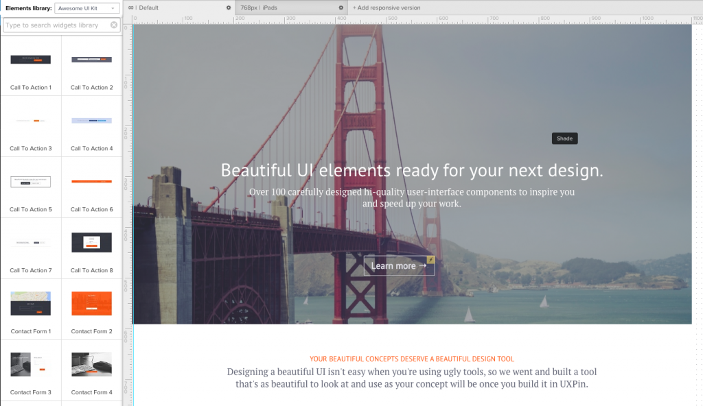
Part of the reason we created UXPin was to help adapt to the fluctuations of fidelity and functionality. For example, you could start with a wireframe in UXPin. Then, as you progress to mockups, you can either create the visual design in Photoshop or Sketch or add fidelity to your wireframe with our element libraries.

High fidelity UX Mockup

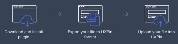
Once you start creating your prototype, you could then import your Photoshop or Sketch file into UXPin, or just add interactions to your existing design in UXPin with a couple of clicks.

Photoshop Sketch Prototyping 

However, it’s always a good idea to test the functionality with a prototype as early as possible.

So, how do we modify our process to prioritize usability and interaction design?

2. Wireframe => Lo-fi Prototype => Hi-fi Mockup => Hi-fi Prototype

In this method, you begin prototyping immediately after wireframing.

This lets you run usability tests and fix functionality issues before the design risks going off track. From the testable prototype (or simultaneously, in some cases), you’ll have a more usable foundation from which to layer the visual design. Once the visual details are finalized and the mockup finished, you can either implement them into the prototype or jump straight to developing the final product.

This early integration with functionality works well for projects with experimental or potentially complex functionality. This method can also use a coded version of the mockup, which we discuss in the The Guide to Mockups.

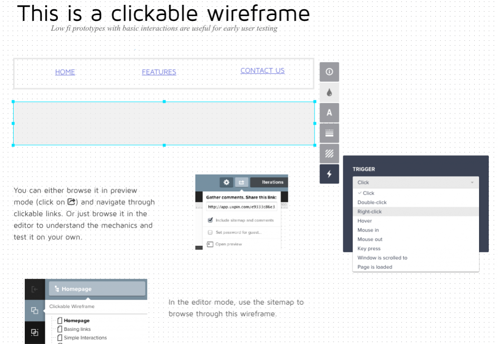
Let’s examine how you could follow the usability-first design process. You can start by creating your wireframe in UXPin. Then, add interactions by clicking on each element. You could then test this prototype, or continue towards the visual design by adding more elements from the libraries or move to Photoshop and Sketch.

Low fidelity clickable wireframe prototype

Once you’re done with the visual design, you’re ready to create a high fidelity prototype.

If you used Photoshop or Sketch, just import your file into UXPin (all layers are preserved). If you worked in UXPin the whole time, then all you need to do is add more elements from our libraries to create the high-fidelity prototype.

Photoshop Sketch Prototypes

Alternatively, you can also complete this entire process with a mixture of Photoshop/Sketch and your coding language of choice, but we wouldn’t recommend that unless you’re extremely technically proficient. When in doubt, always ask yourself how many designs you could explore and perfect with 30 minutes of code versus a design tool.

Conclusion

As a transitional phase between wireframes and prototypes, mockups help designers by allocating time strictly to visuals. As mid- to high-fidelity representations of the final product, mockups help stakeholders immediately understand the final form of the product.

Of course, this is just a general introduction to mockups. For additional practical advice on mockup process and best practices, download the free pocket guide Web UI Design Process: The Visual Power of Mockups.

Web UI Design Process: The Visual Power of Mockups

New Pocket Guide: Web UI Design Process (The Visual Power of Mockups)

Designed as a quick read, our first pocket guide explores different approaches to creating mockups in the design process.

Some are traditional, others are unorthodox. All are practical. Get a sneak peek!

What’s inside the e-book

The pocket guide is designed as a hyper-focused version of our much more robust e-books.

In this case, we dive into the role of mockups in the UX design process (which we first described in The Guide to Mockups). 

Web Design UI Process ebook

This pocket guide will help you: 

  • Understand how to use mockups compared to low-fidelity wireframes and UX prototypes 
  • Explore traditional UX design processes, and more efficient hybrid processes adapted for Agile
  • See the full range of fidelity in the UX design process

So go ahead and check it out, and feel free to share with anyone who might find it useful.

Download the free pocket guide

New e-book: Web UI Design for the Human Eye (Colors, Space, Contrast)

Did you know that sight is the strongest of the human senses? In this free e-book, we explain how to harness the power of sight to make the best first impression on your users.

What’s in the e-book

We cover topics spanning UX design, UI design, human psychology, and interaction design.

You’ll find just enough discussion of theory to get the point across, then a smooth transition to visual case studies so you can learn by example. We don’t want to bore you with lectures. We want to explain why it works, then deconstruct the design examples.

free Visual Web UI Design ebook

In this e-book, you’ll find:

  • 5 chapters discussing Gestalt principles, negative space as a design tool, the emotions of color choices, and the delicate balance between similarity and contrast.
  • 33 real-life design examples from companies like Tumblr, Bose, Intercom, Facebook, and Google.
  • Quick-reading practical format that’s hyper-focused on actionable advice

So go ahead and take a look, and feel free to share with anyone who might find it useful.

Download the free ebook

How to Use the Best UI Design Patterns

For many, UI design patterns can be difficult to implement correctly since the concept is so simple: collections of patterns that are aesthetically pleasing and functional. But if you treat them as just patterns, your sites can start to feel cookie cutter.

We’ll explain the different classifications of UI patterns and describe how to choose the right ones based on your needs. Read on to learn more.

Continue reading How to Use the Best UI Design Patterns