Heatmaps Guide: What Hot Spots Indicate About How Users Experience Your Site

No matter how tight your design is, users may interact with it in a different way than you intended. Heatmaps give you a visual picture of how users are experiencing your site which then gives you the information you need to optimize your site. This article will explain how to use heatmaps effectively. 

What is a heatmap?

A heatmap analyzes data on how site visitors browse a web page and then presents this data visually using color. Warmer colors indicate web page areas that get more attention (hot spots) while cooler colors indicate areas that get less attention. 

The results from a heatmap are easy to understand, which makes them a very useful decision-making tool. You can create a heatmap by using software tools such as CrazyEgg or Hotjar. The process is fairly simple: specify the page you want to track, set up the tracking parameters, and then check back for the heatmaps. 

Types of heatmaps 

There are several types of heatmaps that display information about different types of user behavior.

Hover (move) maps 

Hover maps show you where site visitors moved or hoovered their cursors on your web page. Areas with bright colors (hot spots) show that users were paying a lot of attention to the design elements there. 

Example of a hover map (Source)

Scroll maps

Scroll maps show you how far visitors scroll down a page and the percentage of visitors that scroll to the end. These maps are useful in sites that have a lot of content because they can help you optimize the length of your content. 

Example of a scroll map (Source)

Click maps 

These show you the exact elements that your visitors click on your site plus the number of clicks that each element gets. Elements that get more clicks have warmer colors than those that get few clicks. 

Example of a click map (Source)

What Hot Spots Indicate About How Users Experience Your Site

Hot spots on a heatmap tell a visual story of how visitors are experiencing your site. They can indicate distraction, confusion, or interest.  Here is how to interpret heat map data and use it to improve your site’s UX. 

Distracting elements 

Too many hot spots on elements around your main Call to Action (CTA) button indicates that your site users might be distracted from the main CTA by other UI elements. For instance, if your site has a cluttered sidebar next to the CTA button or a form, the sidebar might distract the users and prevent them from taking action.

If your heatmap indicates that your users are distracted, you can increase conversions by removing the distracting elements. Ensure that the attention ratio (ratio of actions that users can take to the actions that they should take) of your page is low. Additionally, you can make your CTA more prominent by using white space, increasing button size, and improving color contrast. 

Confusing elements 

Often, click maps show that users click on unclickable elements such as images a lot. If you see a lot of hotspots on unclickable elements, it means that your CTA buttons are not prominent enough and your users want to take action but they don’t know how to. This frustration might cause high bounce rates and poor conversion rates because users leave when they are frustrated. 

To fix this, ensure that your CTA buttons, forms, and other interactive UI elements look like the function that they are supposed to serve. As a designer, some design elements such as ghost buttons might look fairly straightforward and easy to understand but that may not be the case for your users. Alternatively, you can modify some of these confusing elements and make them clickable if you find that users click on them a lot. 

Scroll maps can also indicate confusion if a large number of users drop off your page at the same point. There might be a design element such a page break that confuses users and makes them think that that’s where the page ends. Look at the drop off point carefully and fix any confusing elements that you might find there. 

Poor page layout

A scroll map shows you how far down a user scrolls and you might find that your CTA button is placed too far down the page. If your visitors don’t see your CTA buttons then they can’t take action. You can fix this and improve conversions by moving your CTA buttons above the fold and into the hot spots where more users will see them. 

A flawed user journey

A click map can help you understand where users are getting stuck in their journey. You might find that many users in an e-commerce store are unable to check out their carts after shopping or that users get stuck on one particular step when signing up for software. This indicates that there is some friction in that step of the user journey and you should explore why this is happening.

If they are clicking on other non-CTA elements, it might indicate distraction and if they click on unclickable elements it might indicate confusion. Either way, a heat map will help you diagnose the problem and test possible solutions. 

UI elements that are working very well

Heatmap hot spots also indicate design elements that are usable and provide a good user experience. If users click on a CTA button often or scroll to the end of a page, it shows that these elements or copy are working well. 

Positive feedback is important because it helps you know what you are doing right and thus use that information to improve other pages on your site that might not be performing very well. 

Want To Improve How Users Experience Your Site?

Heatmaps are an excellent way of finding out how users experience your site. They let you know what’s working and what’s not working so that you can fix the problems and increase conversions while improving user experience. UXPin offers an all in one platform where you can design, prototype, and develop sites that convert users. 

Atomic Design Systems: A Checklist for Each Individual Design Component

Are you following every step that leads to success? Use this checklist to make sure that your atomic design system includes all of the individual design components that you need to build amazing UIs.

What is Atomic Design?

Atomic design is a design system created by Brad Frost in 2016. Frost wanted to create a design system that made it easy for him to focus on essential elements like color, typography, and texture. While exploring his ideas, Frost kept returning to the connections he found between design processes and chemistry. Naturally, he decided to call his approach “atomic design.”

Frost’s original approach included five categories:

  • Atoms
  • Molecules
  • Organisms
  • Templates
  • Pages

The farther you move up the chain, the more complex the design becomes. At the Atoms level, you work with the basic building blocks of a design, such as color palettes and fonts. At the Molecules level, multiple atoms work together. For example, you might pair a specific color with a particular font.

By the time you reach the Pages level, you have a fully developed design. The design has opportunities to evolve in the future. For now, though, you have a design that meets your goals.

Frost calls this approach “atomic design” because it begins with the smallest element. 

In chemistry, atoms are the smallest things to work with. In design, the smallest factors might include colors and buttons. Also like chemistry, the more atoms you put together, the more complex the project becomes.

Eventually, you have a functional creature built on the smallest elements possible.

When you design from this perspective, you should find that you create more consistent, simple, effective products that users will enjoy.

Atomic Design System Checklist

  • Design Language
  • Design Tokens
  • Core Components
  • Tooling
  • Project Management

Design Language

A design language defines a project-wide style that guides teams toward a common goal. When done well, the design language helps products stand out from competitors. Some developers create design languages that guide product lines. When this happens, an app released today will share similarities with a website released two months later.

Developing a “Brand”

Designers successfully develop a brand when they create design languages that consumers recognize across products. When the average person knows that product A and product B comes from the same company, a brand has been established.

Developing a brand takes time as well as design skills. As a company releases more products, it has more opportunities to solidify its brand.

Copy and Content Requirements

Design language also includes copy and content requirements. Copy requirements may force writers to use a slogan on each page. Writers may also need to follow the same style guide to make sure they create a cohesive experience for users.

Content requirements can refer to any visual element. For example, the design language may require that the company logo appears at the same place on every web page.

Industry-Leading Examples

Industry-leading examples of design language mastery include Apple and Volkswagen.

Apple maintains a sleek aesthetic for every product, including its hardware, websites, and applications. 

Any tech-savvy consumer will recognize an Apple product immediately.

Volkswagen built an alluring design language with its VW Beetle and Bug revival. The cars have a friendly design that welcomes drivers and promotes positive feelings.

Design Tokens

Design tokens make it easy for teams to maintain cohesive aesthetics while collaborating. Design tokens can include a color, font, or icon. Frost actually thinks of design tokens as sub-atomic particles. They’re more like quarks than atoms. When you put several design tokens together, you get an atom. When you start your design here, you ensure consistency throughout your project.

Color Palettes

A color palette includes all of the colors that your design team will use in a project. You can include dozens of colors to the palette. You shouldn’t add too many colors in a palette, though. Doing so will make it harder for designers to understand the intended aesthetic.

Typography

Many people think of typography and font as the same thing. There are small differences, but you don’t need to worry about them unless you design your own type.

Layout

A layout defines where items sit on a page. For example, a website may have a menu that stays on the left side of the screen, or a collapsible search bar that disappears when not in use.

Iconography

Iconography includes small images that digital designers use. You may use icons as guides for navigation or choosing features on a page.

Industry-Leading Examples

Many companies succeed because their designers know how to use design tokens extremely well. 

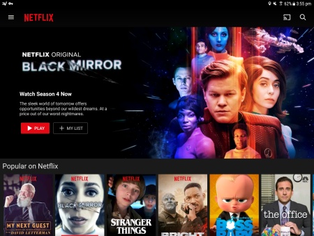
Netflix stands out as a fairly recent example of a company that has mastered design tokens. The Netflix website follows a simple grid layout that helps users navigate their options. 

Each page includes the Netflix logo. The company further emphasizes its understanding of design tokens by using white and red letters wherever possible. 
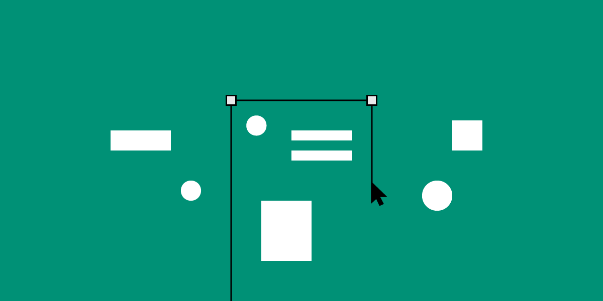
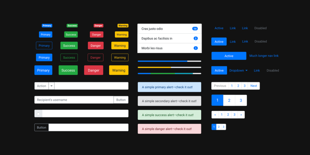
Core Components

Core components occupy the atomic level in Frost’s atomic design schema. A web page or app needs several core components that users interact with. Core components can include buttons, search forms, and tabs.

What Makes for Effective UI Components?

Effective UI components need to work harmoniously together to give the user an intuitive experience. Ideally, new users can look at their screens and know what component they should touch to launch a feature.

The design of each component can contribute to a UI’s overall success. A green sign that says “Go” makes an extremely simple component that nearly everyone will understand.

As you add components to your UI, you need to think about how they work together. Does opening a hamburger menu push the search bar out of the way? Some users may find that frustrating. Are the icons so small that people can’t tap them without launching other features? You will lose users quickly when they find that the UI fails them.

Industry-Leading Examples

Source

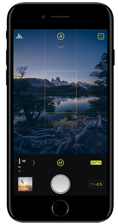
The smartphone photography app Halide excels at using UI components effectively. When users open the app, they see a small section of their screens that control the camera. The large circle clearly indicates that pressing the element will snap a photograph. 

The app improves the user experience even more by displaying a small version of the previous photo. Users do not have to navigate away from their cameras to see what image they just took.
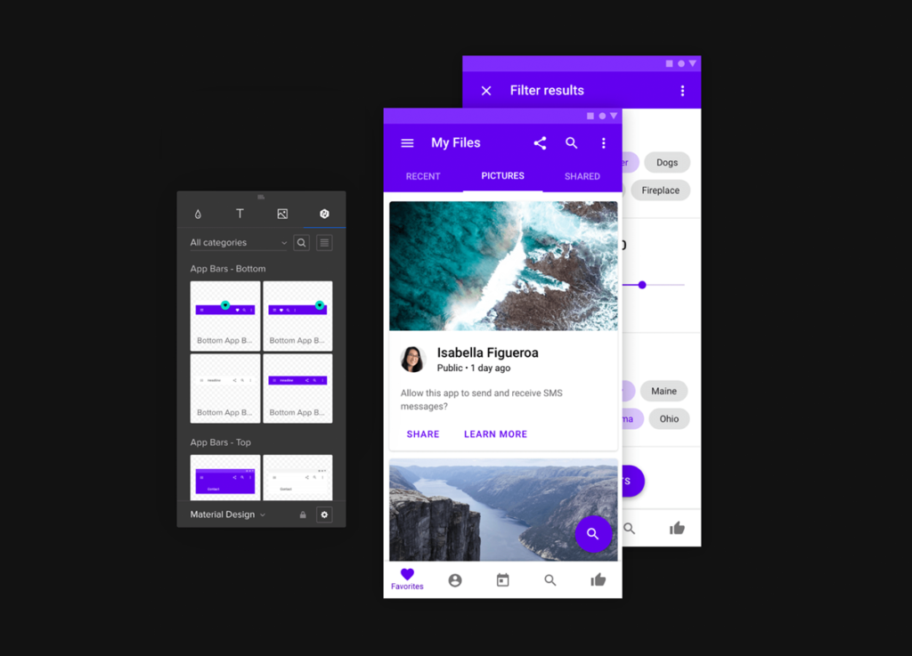
Tools and Platforms

UXPin’s platform offers several features that can help designers follow atomic design principles. Some of the most useful features include:

  • Design systems
  • Libraries
  • Interactive elements
  • Data inputs

Project Management

Project management involves making sure every step happens on time. Design collaboration only works well when someone manages the project. Without strong management, members of the team might find themselves waiting for someone to finish a job before they can contribute.

Project Management Tools

Some of the most popular project management tools include:

These project management tools work well because they let administrators assign tasks, set deadlines, and adapt to schedule changes.

Collaboration and Communication

Some of the best project management tools can also help your team collaborate and communicate. Asana, for example, lets users update each other on project milestones.

You don’t need independent collaboration and communication tools when you choose a UI design platform that offers real-time collaboration features. UXPin has seamless collaboration that works like Google Docs. You can watch your colleagues move elements across the screen.

UXPin will also let unofficial users provide feedback. Send a link to a trusted colleague or stakeholder to get meaningful feedback that contributes to your project’s success.

Create Your Own Design Systems

UI designs want to create intuitive environments that show off a brand’s personality and help users get the services they need. Many of those goals start with creating your own design system. Once you establish your design standards, everyone on your team will know how to stay within the guidelines.

UXPin makes it simple for you to create your own design systems. When making a design system, you can:

  • Create a UI inventory with a list of accepted patterns, colors, icons, and copy.
  • Establish design principles that will direct other team members.
  • Build a color palette that prevents other designers from straying.
  • Build a typographic scale that includes type fonts, weights, line-heights, and other features.
  • Provide examples of designs that you would like to see other team members imitate so they can create a cohesive UI experience.

Now that you have a checklist of design components that will lead you to success, put it to practice by starting your free trial with UXPin. UXPin has all of the features that you need for atomic design. Come experience how simple designing and prototyping become when you have a platform that can do it all.

UXPin is the design process tool that helps product teams around the world turn ideas into products faster.

With Merge, UXPin’s revolutionary technology, companies like PayPal can easily solve DesignOps challenges. UXPin Merge allows you to design with React components to achieve full consistency with the final product.

MergeAccess Blog 11

User Story Mapping: 4 Effective Examples That Create a Better User Experience

BlogHeader UserMapping 1200x600

“User story mapping is a facilitated, curated conversation that brings everyone along for the journey.” — Nick Muldoon, Co-CEO, Easy Agile

Allowing development teams and product managers to better understand the customer journey and prioritize their work, user story mapping will allow you to optimize a product or service. In doing so, this allows teams to design and build a better product based on the customer’s desired outcomes.

The ultimate goal is to create a positive user experience.

01 UserMapping

This holistic visual view of a product often requires an all hands on deck approach. From engineering and design teams to legal and marketing teams — and everyone in between, user story mapping may be a simple concept, but the payoffs are immense.

Once you have your user story, create interactive prototypes of the solutions in UXPin, an end-to-end design tool for advanced prototypes that not only look professional, but are also fully interactive. Sign up for a free trial.

Build advanced prototypes

Design better products with States, Variables, Auto Layout and more.

Try UXPin

Why Should You Map Your User Story? 

The benefits of user story mapping are vast, including:

  • The ability to visualize a product from a user’s perspective. More specifically, a user story will keep your user front and center.
  • Being able to better prioritize the necessary work in order to complete the product as anticipated — both in terms of the desired timelines and overall outcome.
  • Your ability to achieve cross-team clarity. Knowing what to build for who, why, and when will help guide the process, allowing everyone to communicate in a way that supports the overall product journey.

Bottom line: When you’re working with multiple teams, most teams will focus on their specific tasks, missing the mark in terms of the big picture. When the entire user journey is mapped out, this can also help identify any potential holes in functionality. Current and subsequent releases can also be better prioritized.

The User Story Mapping Process 

A user story map can be completed using either physical or digital mediums and resources. Think whiteboards and sticky notes vs software tools.

The goal is to create a story arranged on a horizontal axis, showcasing the customer journey. Once complete, you can visualize all of the ways in which a user may interact with a single product

02 UserMapping

Consider Your Products or Services 

To begin, not only should your team(s) be defined but also all of your product or service requirements. Then, your main objective should be bringing a minimal viable product (MVP) to life.

This is essentially the earliest version, which will include the most critical features only. Think about your desired outcomes and create a solution.

Read more: How to Write a Painless User Story

Please note: When considering your product or service, leverage all of the data you have on user personas. This information will serve as the core basis of your user mapping story.

Develop a Story Map or Multiple Maps 

Once you have a clear understanding of what will be involved, it’ll be time to build the actual map.

  1. Write user activities. Once again, these are based on your personas. These activities are the backbone of your story and will support the development of future development. Activities are broken down based on core “epics” — these are the fundamental steps of the customer journey, often represented as “high-level features.” For example, Organize email — Manage email — Manage calendar.
  2. Develop user stories. At first, these stories will be fairly minimal, expanding based on the phase of the project. Remember, the goal here is to add value and meet the users’ needs. User stories are built in a grid, under epics and user activities. Based on the example above, for Organize email, user stories may include Search email — File email — Compose email. In comparison, Manage calendar may involve stories such as View calendar — Create appointment — Update appointment — View appointment.
  3. Prioritize user tasks, focusing on the tasks that are most important, this will allow you more effective plan releases. Tasks will be organized based on their releases, adapting and evolving with the product or service.

Revising Your User Story Map 

It’s important to remember that user story maps are a continual process. As steps are completed, new ones are added based on analytics and user feedback. For example, you’ll want to remain mindful of changing technologies, user behavior, and consumer trends.

4 Effective Ways to Visualize & Conceptualize a User Story 

Whenever you’re creating a user story, think of the following formats in terms of user stories.

  • As [a persona], I can [select a need or goal], so that [I can accomplish this].
  • As a [class of user], I want to [be able to do this] so that [I can gain some form of benefit].

Example 1: E-commerce site

Although not everything is necessarily linear, a user story is arranged in chronological order. Here is a fairly straightforward example in terms of an e-commerce site.

Search for an item –> View product –> View photo to better analyze product –> Select the item for purchase –> Enter payment info –> Enter shipping address –> Confirm order

In the example above, these can be grouped into the following activities:

  • Find product [Search for item]
  • Product details [View product + View photo]
  • Shopping cart [Select item for purchase]
  • Checkout [Payment info + Shipping info + Confirmation]

To tackle a user story, activities, tasks, and sub-tasks are clearly defined, which are then prioritized.

Example 2: Book a flight

Online flight booking system.

Search for flight –> View flight info –> Confirm

Depending on the complexity of this user story, there will be numerous releases, which are then prioritized. For example:

  • Search for flight
  • Release 1 — Select by flight type – By availability – By location
  • Release 2 — Integrate with 3rd party
  • View flight info
  • Release 1 — Display times and layover airports
  • Release 2 — View additional flight options and details
  • Release 3 — Make flight info available via API
  • Confirm
  • Release 1 — Fill in payment and contact info
  • Release 2 — Incorporate PayPal
  • Release 3 — Incorporate Google Checkout

Example 3: Change a reservation

If a user wanted to alter their reservation.

View reservation –> Change reservation –> Cancel the reservation

  • View reservation
  • Release 1 — Search by reservation number
  • Release 2 — Search by username
  • Change the reservation
  • Release 1 — Change the date and time
  • Release 2 — Change reservation type/add additional details (customizable field)
  • Cancel the reservation
  • Release 1 — Provide contact info to cancel
  • Release 2 — Cancel online

Example 4

If a user wants to purchase a pair of shoes.

Find a shoe retailer –> Find shoes –> Choose shoes –> Purchase

In this case, depending on the specific user and their goals, these activities could be further broken down into “find running shoes” or “purchase a select style for the least amount of money.”

  • Find a shoe retailer [Open search engine and visit the retailer’s site].
  • Release 1 — Create keywords (SEO)
  • Release 1 — Display special deals and discounts on site
  • Release 2 — Website homepage
  • Find shoes [Open search bar]
  • Release 1 — Search by style (i.e. running shoes)
  • Release 1 — Search by size
  • Release 2 — Search by gender
  • Release 2 — Search by brand
  • Choose shoes [Consider shoe details and compare shoes based on preferences]
  • Release 1 — User reviews
  • Release 1 — Compare offers
  • Release 2 — Shoe details (i.e. material, technology, etc.)
  • Purchase [Select shoes and pay for shoes]
  • Release 1 — Color
  • Release 1 — Pay with gift cards or credit
  • Release 2 — Size
  • Release 2 — Pay with Apple Pay, PayPal, etc.

Ready to build a prototype to test the solution you came up with? Try UXPin for free and build a fully interactive prototype that looks and behaves like an end-product. Sign up for free.

Landing Pages: The Complete Guide to Effective UX Design

BlogHeader LandingPages 1200x600

What do Landing Pages do? 

All online experiences should end in action, and landing pages are the moment the excitement your campaign generated crystallizes into a leap of faith. From simple ‘buy now’ buttons to more complex experiences, landing pages represent a commitment or decision from the visitor. 

It is where people “land”. They are excited and curious, but are they willing to take the next step? This consideration makes landing page design a top priority when designing any kind of campaign or online experience. Sometimes it takes a little experimentation to get it right.  

Motivating users to click, buy a product, fill out a form, or any other action means creating trust and confidence. The choice or commitment the user is making and the reward they get should be clear, and they should be able to take the action easily, on any screen or environment. 

The success of the page depends entirely on people taking action, which will drive the strategy. Each landing page has its own purpose, function and audience, which constrains your design, depending on what the landing page is used for. These choices call for bursts of creativity but also intuitive design. Here are some best practices in building engines of action.

How to Ideate, Prototype, and Design Effective Landing Pages 

One of the most evocative concepts in conversion design is the idea of a “information scent.” That’s the idea that site visitors follow a scent of the information they want as they navigate through the pages of a website’s landing pages. 

At the ideation stage of creating a new landing page, designers should lay out the trail that they want visitors to follow. Then, during prototyping, you can assemble the most effective elements to engage conversion kicks at turning points.

  1.  Focus on your core services and products 

It’s a different world than it was even a few weeks ago and the user has changed. Make sure your offerings are evolving with them. Before you begin the design process, the team has to come together around a coordinated vision. Landing pages can help you continually articulate the core value prop in your service and product statements and to test it fast and often with your target audience. The landing page is the fast way to convey that message without requiring a full site redesign. Can you encapsulate your offering in a short headline, brief description and clear, unambiguous call to action? 

  1.  Consider your customer journey

A landing page may be the final destination of a campaign or online experience, but it may represent any number of inflection points in the customer journey. When the customer is ready to take action to learn more, take the next step or join a newsletter list, the landing page should facilitate their action with the least possible friction or difficulty. When they are ready to take action it should be immediately apparent how to do so and what the result will be. 

How Effective UX and UI Elements Can Move Customers Along Their Journey 

The customer journey is not a straight line. Viewers drop off, come back, bounce around from page to page and often seek outside input before taking the next step. The more effective your UX and UI elements are, the less they will need assurance from online reviews or friends and relatives. Apply design elements that reduce friction and guide users along to the next step. 

  1.  Practice Effective Page Layout and Design 

Visuals go directly to the emotional core of the buying decision in a microsecond. The best  landing page is simple and clean, providing a clear path to the visitor. While it has to communicate a simple message, it must also strike the right tone and mood to appeal to the user without overwhelming them. An effective layout is visually appealing without being too busy. Users seek familiarity, so small departures from the norm can make a big difference, and A/B testing will help you learn what visual vocabulary appeal to the audience you are trying to reach. The core benefit should be clear to the user and clearly linked to the action.

  1. Plot Out Your Copy and CTA Placement 

What copy and language are you using? What is your offer? These will drive  

All of your design choices, so lay down the basic formula and then choose the elements that support the language and intent. For example, a warm invitation requires a different style then a more formal offer.  The purpose of copy and CTA is to reinforce the decision they have made when they landed on the page, and drive them to take action.  

  1.  Don’t Forget About Mobile Responsive Design

Mobile access to the web passed laptop and desktop browser access several years ago. Still many designers tend to start with a wide screen format and then subtract elements to make it work on mobile. We strongly recommend the opposite approach – starting from a mobile responsive design template and then building progressive enhancement for the larger screens. Mobile first design prioritizes the mobile user, which ensures the page is viewable in any environment. It’s best to consider the customer journey and what kind of device the user is likely to be using. Testing can ensure that the experience is appealing and functional on any device.  

  1.  Enable Users to Navigate Among Your Landing Pages 

In a recent survey by Google-partner Wordstream, 40 percent of landing pages contain 1-3 links that lead viewers off the page. The number one destination for that link is the company homepage, connected to a logo. The problem is that once they hit the home page, you have lost the primary value of the landing page, which is to tell you where the viewer came from. There are arguments for and against additional links, but make sure that your primary focus is a link to another landing page that keeps your origin data clean. 

5 Examples of Landing Pages That Convert Users 

The landing pages with the best conversion rates balance five design elements for maximum impact: emotional images, appealing typography, strategic white spaces, motivational colors and relevant CTAs. Take a look at some of the best in the field. 

  1. Emotional Images 

Some images are purely functional while others pack an emotional punch. Landing pages from Apple are designed to focus your attention on the devices using repetition and stark background color differentiation. You can do more with less when you start from the emotion you want to convey, and when you have a beautiful product. 

  1. Appealing Typography

Even a small family business can become a major player on the web by mastering the art of typography. Busy Beaver Button Co. shows how many different font and style choices can coexist  on a tiny landing page without being distracting.  

  1. Strategic White Spaces

White space, or in this case gradient space, can make all the difference in the world. The BorderBuddy landing page demonstrates how to eliminate the hassles of transporting goods across international borders with a clean line of white text, two CTA buttons and a thumbnail. Not only is it mobile friendly for people on the move, it is as simple as the product promise. 

  1. Motivational Colors

There’s a lot going on in the landing page for Gift Rocket, a site for sending cash gifts online. Instead of boring the viewer with details, this landing page conveys the core concept in a strong, central image of a rocket, surrounded by color-coded gifts. The colors are soft enough to not distract from the CTA, but dynamic enough to grab the viewer’s attention and stand out from the crowd. The range of colors suggests there’s something for everyone here. 

  1. Relevant CTAs 

The evolution of Dropbox landing pages is a lesson in how to deploy CTAs that drive action while occupying minimal screen real estate. Software for storing documents in the cloud could be a bit complex to explain, but they do it in three words: Your Stuff, Anywhere. With the extra space they can add two CTAs. See how Dropbox CTAs have changed over time to attract more enterprise clients. 

Use the Best Tools for Prototyping and Design 

You don’t have to reinvent the wheel to excel at building landing pages. The best tools on the market for prototyping and design give you the initial framework for your landing page and bring your team together around a clear vision of the goal. 

Rely on UXPin for real-life prototyping tools and show your team how your landing pages will come to life. If a picture is worth a thousand words, an advanced collaboration tool like UXPin is worth a thousand pictures. Sign up for a free trial today and start building website landing pages that drive action. . 

Essential Microcopy Guide: How to Write Microcopy That Converts Users

Users have many fears and uncertainties that can hurt conversions. They might be afraid of being lied to, losing their money or they might not understand what they need to do. Microcopy irons out these kinks and empowers users to take action. 

What is Microcopy? 

Microcopy is the short words and phrases that are used in user interfaces to help users take the right action and interact with the product. Great microcopy converts users by: 

  • Motivating them to take an action
  • Contextualizing their experiences
  • Anticipating and addressing their issues 
  • Creating a delightful brand narrative 

Microcopy is copy that is found in:

  • Form fields and labels 
  • Error messages 
  • Confirmation messages 
  • Button copy 

How Effective is Good Microcopy? 

From microcopy’s definition (small bits of short copy), one might think that it has a small impact. Nothing could be further from the truth, good microcopy has a positive effect on conversions and positive user behavior. 

In a case study by Yoast, an SEO optimization site, there was an 11.30% increase in conversions after revising microcopy. They added “there will be no additional costs” and a ‘continue shopping’ text link to the checkout form. They also did away with the ‘remove’ microcopy and replaced it with an ‘x.’

Yoast’s microcopy changes (source)

In another case study, a Danish e-commerce site increased its conversions by 17.18% by simply adding the words “view bundle” above its CTA button. 

Where to Leverage Microcopy on Your Site or App 

CTAs

Calls to Action (CTAs) ask users to take a very specific task such as signing up, buying a product, or starting a free trial. The microcopy in the CTA button and around it is very useful in getting users to take the desired action. 

Within the CTA, the microcopy should be short, action-oriented, and descriptive. Around the CTA button, microcopy should anticipate and reduce any friction or barriers that the buyer might have towards taking action. Microcopy should be tailored according to context and customer data. Here are some tips to reduce friction:

Reduce fears the users might have: Users fear being spammed, losing their data, hidden charges, and their information being misused or sold. You alleviate these fears by using microcopy such as ‘no spam,’ ‘your data will not be sold,’ ‘free forever’, or explaining why you need their information. 

For example, Facebook alleviates its users’ fears by assuring them that the service is “free and will always be” and by explaining why they need to know the user’s birthday. 

Facebook’s signup microcopy (Source)

Have useful error states: Errors are a significant barrier to conversion and many new users just give up. To prevent this, write error state microcopy that helps users correct their errors and move to the next stage of the customer journey. It’s not enough to just define the error, explain how users can solve it. 

In the example below, the error is explained and alternative solutions are provided. 

Helpful error state copy  W3C

Use benefit-driven copy: Your CTA buttons will convert better if you show your users the benefits of taking the next action. In the example below, the benefit of convenience (many  book formats and free reading apps and trials) is emphasized. 

Benefit driven microcopy (Source)

Use social proof: Tip over unsure users by reassuring them that their friends or other people have already taken the action that you want them to take. Basecamp used social proof to convince people to sign up for their software. 

Social proof microcopy (Source)

Menu Copy 

Menu copy is very prominent on websites and it pays to optimize it. The best practice is to use short phrases preferably a single command (verb like ‘save’ or ‘download’) or descriptive word (noun like ‘home’ or ‘about’) to reduce confusion. 

Buttons

Button copy helps move users to take actions such as moving forward (‘next’, ‘save’) or moving backward (‘previous’, ‘cancel’). Optimize button microcopy by:

  • Using short commanding phrases (‘create account’)
  • Using descriptive and unambiguous copy (‘delete’ instead of ‘remove’)
  • Using sentence case because it is easy to read
  • Customizing microcopy according to context 

Text Links

For text links use short descriptive microcopy that explains what users are going to get or do when they click on the link. This reduces anxiety and inertia. 

Icons 

Just like button microcopy, icon microcopy should use action verbs, describe the action being taken, and be short. 

Writing Effective Microcopy 

Understand Your “Voice” and “Tone” 

Understanding your voice and tone is the first step in writing effective microcopy. They will determine what you will write and how you will write it. 

For clarity, your brand voice is the unique way in which your company communicates. It might be cheeky, fun, or abrasive. Tone changes depending on the situation and your users’ needs. 

Here’s how to find your tone and voice:

  • Go through your company’s branding information to find out your voice together with the marketing department. 
  • Interview key leaders to find out your mission, vision, and brand personality.
  • Research your target market so that you can understand their wants and needs. 
  • Do Voice of Customer research to understand how your users actually talk and use their language in your microcopy. 

These steps will help you create a voice and tone guide that you can use as a point of reference every time you write microcopy. 

Test Your CTAs 

The only way to know if your CTAs and microcopy are converting is by testing them on real users. Do A/B testing to find out the winning CTAs and microcopy and then keep iterating it. The truth is that CTA and microcopy testing and optimization is a continuous process because the user’s needs change often. 

Microcopy in UX and UI Design 

Choosing the right font, size, and weight 

Fonts determine the legibility of your microcopy. Users can’t act on it if they can’t see it! Here are some tips to improve the legibility of your microcopy:

  • Don’t use too many font types. Use a style guide to maintain consistency between your microcopy and other UI elements
  • Use a legible font size, don’t make it too small that readers can’t see it. 
  • Use bolding sparingly 
  • Increase font size and padding to emphasize text without bolding. 
  • Ensure that there is enough white space around your microcopy to make it stand out. 

Choosing the right text color 

You can use color to increase the conversion capabilities of your microcopy. Color contrast helps to draw attention to your microcopy. Ensure that the color contrast is high enough and it conforms to web accessibility guidelines. 

You can use color language to nudge users towards or away from certain actions. The color green is associated with progress while the color red is associated with danger. Use green when you want to encourage users to take an action and use red when you want to discourage them from taking an action like canceling. 

Write, Prototype, and Design With the Best Tools 

Use UXPin to create microcopy that converts users. Use our color contrast checker to check for accessibility and out style guides and design patterns to ensure that your microcopy is consistent. 

2020 Design Trends

The Most Interesting Design Trends To Watch in 2020

The year 2020 marks the start of a new decade which is bound to bring new and interesting trends to the design world. 2020 design trends will be a mixture of the past, the present, and the future. The 80’s retro era design trends will make a comeback, the flat design trend will maintain its reign, and the motion and animation trend will explode in 2020. In the next year, brands will use design to solidify their brand identity and stand out. Watch out for trends that promote customized brand experiences such as custom fonts, bold colors, and motion graphics.

While the flat design trend will continue to dominate in 2020 especially in web design, many brands will try to refresh it through the re-introduction of patterns and textures as they try to give life and depth to this nearly overused trend. In 2020, design trends will be very human-centered and ethical, this focus will change how design teams work with an increased emphasis on cross-team collaboration and holistic education.

Here are the most interesting design trends to watch out for in 2020 plus examples of how trendsetting brands are already using them for inspiration.

The State of Website Design in 2020

While 2020 might not be the year were AR or VR influence the design world, we’re going to see a comeback of the retro vibe and the growth of motion graphics in logo design and graphic design. Typography will be bigger, bolder, and customized to help brands differentiate themselves. 2020 color scheme trends will be a mixed bag, both muted and loud with lots of gradients and monochromes.

Patterns and textures will be big in 2020 using 3D designs while user experience will be human-centered with an increased focus on usability and inclusivity plus the use of illustrations to tell stories.

Product design will be more personalized, ethical, and involve multiple teams in 2020. While minimalist designs will still be huge in 2020, there will be an increased focus on breaking the monotony through isometric illustrations and type only designs.

Here is a breakdown of all the 2020 design trends to inspire your next design project.

Logo & Graphic Design Trends

In 2020, logo design and graphic design will be a mish-mash of the past and the future. Retro logo designs will be hot again while motion graphics will take center stage.

Retro Designs

The 80’s retro vibe will make a comeback in 2020 because of the nostalgia movement. With the success of TV shows from that era such as Stranger Things and Dark, there will be an increase in neon, fluorescent, and pixelated logo and web designs. Expect to see styles that are reminiscent of early PCs, space themes, and old video games with a modern twist.

Motion Graphics

As more people relate with brands solely via their screens, motion will become a key way for brands to interact with their audience in 2020. Animated logos will help brands stand out and be memorable. More graphic designers will create animated posters to bring life to their creations.

Typography Trends

Typography is one of the most important design elements because when used intentionally, it can be a powerful way of expressing brand identity. Fonts will be customized, bigger, bolder, and retro in 2020.

Custom Fonts

The popularity of custom fonts will continue to grow in 2020 as more brands look for distinctive and unique ways to express their brand identity. Keep an eye out for hand-drawn fonts, branded typography, and lettering that symbolizes what it portrays especially on logos and posters.

Bold Typography

Fonts with heavy weights and bold typefaces will be commonplace because they create a lot of contrast and have a modern feel. While most of the bold typography will continue to use sans-serif, heavy serif fonts will become more popular in 2020.

Maxi Typography

As the name suggests, maxi fonts are big fonts that often use bold typography. They replace images as the main element in logos and posters creating a type only design trend that will grow in 2020.

Retro Typography

Pixelated fonts and old-world typefaces will be big in 2020 as more designers look to create modern designs with a retro feel.

Kinetic Fonts

We’ll continue to see animated fonts or moving fonts in 2020 to make designs lively.

Color Schemes

The color schemes of 2020 will be those that make a strong first impression. From bold and vibrant hues to soft and muted palettes, color gradients, and monochromatic hues.

Monochromes

Monochromes will trend in 2020 because they create a strong brand identity that is both elegant and minimalist. Look out for monochromatic hues in product packaging, logos, landing pages, and websites.

Bold Colors

Bold, vibrant, and luminous colors will still be fashionable in 2020. Reason? Bold colors pop and attract attention. Continuing with the retro theme, glowing neon colors will be in 2020. The futuristic color scheme that includes rich and saturated pinks, blues, and purples will also be popular.

Muted Colors

On the other end of the color spectrum, muted color palettes will be huge in 2020 as some brands look to stand out by avoiding the bold color trend.

Color Gradients

Color gradients have been on the scene for a while and they are definitely not going away in 2020. Gradients will be seen on backgrounds, illustrations, fonts, and filters.

Patterns & Textures

After the strong dominance of flat design, patterns and textures will make a reappearance in the upcoming year. 3D designs and geometric patterns are going to be the new trend in 2020, but with a modern twist.

3D Designs

3D designs that create effects such as bevels and chisels that are similar to real-life objects and look tactile will be the norm in 2020. As Millennials get too accustomed to flat design, brands are gravitating toward textures that look raised, carved, or engraved on buttons, logos, and icons.

Geometric Patterns

Patterns made by repeating geometric shapes will be a trend in 2020. These patterns can be used to create typefaces or backgrounds. We will also see ultra-thin geometric lines on backgrounds and logos. While before patterns were used extensively, in 2020, they will be used on a specific part of a composition and different patterns will be used in one composition.

User Experience

In 2020, user experience trends will be those that improve the usability and accessibility of design. The focus will be on making things easier for users and making design more inclusive and empathetic.

Usability and Accessibility

In the new decade, UX designers will focus on making design more accessible to users who need screen readers or those who have other health challenges such as color blindness. This will be achieved by reducing contrast and motion. The use of simple, everyday language that users can understand easily will be more common in 2020.

Dark Mode

This trend has gained traction in recent years and it will continue to grow in 2020. Dark mode reduces eye strain and makes it easier to use screens in low-light or dark conditions.

Illustrations

The use of both simple and isometric illustrations will be another huge trend in 2020. Illustrations are used to tell stories and communicate messages easily. Expect to see simple almost child-like illustration, complex 3D illustrations, and animated illustrations.

Micro-interactions

Another user experience trend in 2020 is the use of animated graphics and micro-interactions to guide users

Product Design

2020 product design trends will lean towards creating an ethical and personalized experience for users. Additionally, the goals of product design will expand to include meeting business needs such as revenue growth.

Ethical Design

As more users become aware of the dirty tricks and dark patterns used in product design, ethical design will continue to be a trend in 2020. There will be a stronger push to protect the privacy of the user’s data from sale or misuse. More brands will avoid using dark patterns that trick users into making purchases and encourage users to use their products responsibly.

Personalization

Personalization creates a seamless experience for users by remembering their details and patterns of usage. This will be a trend in 2020 because it reduces churn and creates an intimate experience for users which increases conversions.

Cross-team Collaboration

The product design processes will include more teams in 2020. This trend is growing because of the need to integrate product design goals with overall business goals.

Minimalism

The minimalist trend has dominated the design industry for years and its reign is not going to end in 2020. Creative designers love minimalism because it combines functionality with beautiful aesthetics. In 2020 minimalism will be brightened up by isometric illustrations and type only compositions.

Isometric Illustrations

The trend of using isometric projection to cast 3D objects onto flat 2D surfaces will continue to grow in 2020. Product designers are increasingly using isometric illustrations because they create depth and reduce monotony. Since motion and animation are also going to be big in 2020, look out for animated isometric illustrations on websites and apps.

Type-only Design

The type-only design trend where typography is the main design element will be huge in 2020. Combined with the trend of using bold typography and maxi typography plus bold colors or gradients, this type of design can stand out and send a strong message.

Examples of 2020 Design Trends in The Wild

It’s one thing to predict that something will trend but it’s another thing to see the trends being used by trendsetting companies that we love and admire. Here are examples of 2020 design trends and design systems in action from Apple, Grammarly, and Uber.

Apple Using 2020 Design Trends

Apple Card uses color gradients in its typography, backgrounds, and even on its images. This color gradient element is done using another 2020 design trend: muted colors. Instead of using bright and bold colors, Apple uses muted pinks, blues, greens, and yellows. The use of gradients plus muted colors creates a cool, elegant, and polished feel to this webpage.

Source: Apple

Apple is also using the type only design trend with heavy, bold, and big typography which is another 2020 typography trend. A beveled texture is used to bring a real-life 3D feel to the dollar sign in the card below.

Source: Apple

Motion and animation is another 2020 design trend that Apple uses on this page. Kinetic text is used and some of the graphics are also animated which brings life to the page and helps in visualizing data.

Grammarly Using 2020 Design Trends

Grammarly uses a minimalist approach, which is still trending in 2020, in its website with flat design, easy to read fonts and lots of white space. The use of animated text and micro-interactions on its hero page brings life to an otherwise static page.

Source: Grammarly

This website also uses the 2020 design trend of using muted colors, mostly greens, blues, and purples. Just as in Apple’s case, this muted color palette creates a cool, sleek, modern, and professional feel on this website. Color gradients are also used as backgrounds and on the opt-in box to create a subtle feeling of depth.

Source: Grammarly

On its blog page, Grammarly uses simple illustrations that almost look child-like, as thumbnails. A subtle 3D effect is also created on the illustrations using layers, colors, and shadows. Isometric illustrations are used to create a 3D effect on an otherwise flat design.

Source: Grammarly

Uber Using 2020 Design Trends

Uber’s website also uses a minimalist approach to design with flat design, simple fonts, and a lot of white space. Uber’s logo also adheres to the minimalist principles as it is text-only and uses only two colors. The 2020 trend of using muted colors is also used by Uber with a soft yellow on its hero page.

Source: Uber

Uber uses simple 2D illustrations extensively to explain complex concepts such as how Uber helps businesses. The illustrations on the Uber Eats homepage are given life by warm but muted yellows, greens, pinks, and browns. This shows that the muted colors trend does not have to be boring, it can be used to create a cool but lively effect.

Source: Uber


The color gradients trend is used on the backgrounds of Uber’s blog thumbnails to create depth and contrast.

How Does All This Change How Design Teams Work?

For designers and design teams, these 2020 trends mean that there will be an increased focus on human-centered design. This is design that meets the needs of users, speaks their language, and is inclusive to all. These changes will affect design education because it will have to include non-technical aspects such as inclusivity and content creation to create a holistic designer.

Ethics and inclusivity in design will move from being an afterthought for design teams to being an important aspect of the design process. Another big change for design teams in 2020 will be the need for them to collaborate not only with developers but with the business strategy and revenue teams. Luckily for design teams, UX Pin is a powerful tool that will help them create trendy designs while also collaborating with each other and with developers.

UXPin on YouTube

UXPin 2.0 initiative is in full swing and we thought it’s a good time our CEO spoke about the process. That’s why we decided to host a live webinar with Marcin Treder on YouTube to discover what he found most exciting about our road so far. You can watch the video in full below:

UXPin’s presence on YouTube will be growing more and more with each coming month. Not only have we decided to open up our library of fantastic webinars with top experts from the industry, but also decided that we want to communicate with you more often Live in a very visual way.

Virtual Summit 2019

The next step we want to take in our journey is to invite you to our Virtual Summit that will take place on November 19th on our YouTube channel. If you want to secure your spot and be notified about the event you can subscribe by navigating to our dedicated page:

“A good product isn’t just about features” – the motto behind the conference is not just an empty phrase for us. We have dedicated ourselves to improve how you experience our tool, as an addition to how feature-rich it is.

If you want to learn more about why we decided to embark on the UXPin 2.0 journey and what has happened so far, you can take a look at our list of posts that will explain everything in more detail:

UXPin is not your average prototyping tool for linking static screens or artboards with transitions. It gives you everything needed to design prototypes that work as if they were the finished product. Give us a try:

UXPin sign up

Why using a UI Kit in UXPin will make your life easier

Bootstrap UI Kit in UXPin

When designing apps or websites the quality of the final product very often depends on the tools at your disposal. Using available resources with a comprehensive design tool will make your life easier.

That is our goal here at UXPin. We strive to deliver the best product we can to make your workflow as streamlined and uninterrupted as possible. One of the ways to do that is to give you the resources you need to make your work easier.

That is the underlying thought behind our UI Kit libraries that we have impemented straight into our tool. By simply choosing the library you are interested in, you’ll have easy access to components, elements and styles, which will help you with the projects you are currently working on.

Within UXPin, you’ll find five UI Kits that are ready made for you to start your project immidiately. iOS, Foundation, Material Design, Bootstrap, and User Flows are the choices we are betting on and we are certain that you will find them useful.

Material UI in UXPin

Save time

When designing for a well known platform – like Android with Material UI Kit – you can make easier estimations as to how long the whole process will take. Ready made elements give you a realistic outlook on what a project might involve and can help you narrow down the timeframe.

UXPin offers its UI Kits for free with the added benefit of including them with the app once you sign up and start using it. There’s no additional installation process so you can just get down to designing.

Do you need some additional information about our UI Kits?

We decided to prepare dedicated pages that will guide you through what each of them offers.

Bootstrap

Bootstrap will let you design web pages with the most popular framework in mind with a complete set of elements, components with built-in interaction, color themes and more.

iOS

Our iOS UI Kit is a great start for poeple who want to design for the iPhone and iPad. Our elements are in line with Apple guidlines and our canvas comes with predefined selectable settings for different devices and their respective sizes.

Material UI

Similarly to our iOS Kit the Material UI Kit adheres to Google guidelines so that you can start designing apps for Android designs in no time. Starting with the interface and finishing up with interactions and dependencies spanning multiple screens and pages.

Foundation

Foundation UI kit is a complete collection of UI elements allowing you to build responsive, mobile-first websites and products. Combined with the prototyping power of UXPin, you can quickly create fully interactive designs to share with your team.

User Flows

User Flows UI kit is a complete collection of elements that you can use to outline your vision with diagrams – for free in UXPin. Share your work with your team and move to creating a simple prototype.


Showing the hidden treasures of UXPin 2.0 – LIVE!

Our CEO, Marcin Treder will be talking live on YouTube on October 24 and showing you his favorite little usability and performance improvements we’ve released in the past few weeks. Subscribe to our YouTube channel to get notified when the time comes!

Just so you know, we’re planning a re-launch of our app this November. It’s called UXPin 2.0 because not only the tool itself is changing, but our approach to product development is somewhat new. Or to be honest, back to where we started.

We’ve decided to forget the competitive race, stop hustling over new big features for a while, and focus on the UX. You can read the detailed UXPin 2.0 release note on our blog.

Because our CEO, Marcin Treder, is a designer too and he uses the UXPin app to design stuff on a daily basis, obviously he’s got his own top improvements from our roadmap that he has been eager to check out. He’s already shared his story behind the UXPin 2.0 idea on Medium. However, the latest product changes are all about the user experience and thus, some of them are very subtle. So now it’s “show, don’t tell” time!

Make sure you didn’t miss anything – watch Marcin sharing the highlights live on October 24!

New Layers in UXPin – as fast as they come

Staying in line with our UXPin 2.0 initiative our dev team is heavily focusing on delivering a better user experience to all UXPin users. One thing we decided to look through and improve is speed – and our New Layers exemplify this perfectly.

The code behind Layers has been rewritten to ensure that whatever the asset and element load is, your work experience in UXPin does not suffer from stutters or delays. With that said, let us take you on a more detailed, technical journey to exemplify what has exactly changed and how it influences your work.

A detailed performance comparison

Our dev team took the time to run a series of tests on both versions of layers, the old one and the new one. These tests aimed to clearly show what has changed, since visually in the editor it might be unnoticed.

The comparison was done manually using Chrome DevTools with 774 layers in the layers panel – all visible without nesting. On the canvas there were 1482 elements (as counted using document.querySelectorAll(‘.ng-element’).

Drag and Drop

[videojs_video url=”https://www.uxpin.com/studio/wp-content/uploads/2019/09/DragAndDrop_UXPin2-0.mp4″ controls=”false” autoplay=”true” loop=”true” muted=”true”]

In the Old Layers, the LayersTree component had to be refreshed with every drag of an element on the canvas. Because of the already complicated structure of layers, it could take about 250ms to 500ms to update depending on the position of an element in the layers tree.

On the other hand, New Layers take a more streamlined approach and due to the simplified structure of the component and a flat structure in redux, the update takes much less time – down to about 60ms. It is also worth considering that much of this time is spent rendering the view.

Scrolling to the end of the layers list

[videojs_video url=”https://www.uxpin.com/studio/wp-content/uploads/2019/09/LayersScroll@60fps.mp4″ controls=”false” autoplay=”true” loop=”true” muted=”true”]

With the Old Layers, this action within the parameters of our test took about 15s, with rendering taking a large portion of that time (4s). This was due to lazy-loading, which meant that layers created elements with every scroll.

The New Layers take much less time to scroll through (about 10s), saving you time. The implementation of New Layers assumes that single elements are updated as you scroll and their quantity stays the same.

Selecting the last element in the layers list

UXPin Layers Performance upgrade
Selecting the last element in the layers list

Before the change, selecting the last element on the list was very time-consuming as all elements from the layers list would load. As you can see on the screen, this action used to take 1.45s – and this surely got noticed by many of our users. 

New Layers render only visible elements. As a result, selecting the last element is simply much faster. The action itself lasts about 70ms, most of which is rendering.

Comparing Old Layers and New Layers using performance tests

With dragging and dropping elements on the canvas, we also wanted to measure how the frame rate was influenced when working on a large project. With the test parameters described above, the average framerate went up significantly with the New Layers implemented.

The difference is akin to what might be the case of switching off the layers panel with the old system. So the difference when working on large and lengthy projects is clearly visible and it benefits the user experience immensely.

Other improvements that have seen a significant decrease in time are opening the layers panel (a gain of at least 60ms) and selecting elements on the canvas.

With the latter, the time of selecting an element on canvas has also improved. Choosing a group (i.e. an element that is directly on canvas) takes about 300ms less (429ms vs 733ms) and is only 100ms longer than with a closed layers panel. Selecting the input (i.e. the element which is nested) takes around 300ms less (586ms vs 864ms) and is only around 100ms longer than with closed layers panel.

This change signifies what we consider to be UXPin 2.0 – a long hard look at what we can improve to make your experience better. If you want to learn more leave an email and we’ll keep you up to date.

Why UXPin 2.0 will be more than a collection of features

UXPin feature relaunch

UXPin 2.0 is coming on November 19, 2019. This is a marking moment for UXPin product design. The time has come for us to change our approach to how we develop the tool. Because a product is not just a collection of features. We decided to stop adding heavy-duty features and focus on making what we already have more user-friendly and faster. How did we get here? We’ve been adding feature after feature. It’s been a fun ride and we’re super excited to see the effects. But the high-paced competitive race is making companies take shortcuts. When you’re busy building, sometimes you miss the details. That’s why we decided to draw a line under our product roadmap, rally the troops and put all efforts into improving the user experience. And as a final result, give you the new UXPin 2.0 – fast and smooth this time. Sign up for updates if you’re curious about the specifics.


We protect your data with care – just as described in Privacy Policy.


Becoming the design tool that cares about UX

UXPin has changed a lot. From a lo-fi mockup and wireframing tool to the all-in-one collaborative design tool. You can prototype the life-like interactive projects in our tool now. So what is our mission in the home stretch of the UXPin 2.0 project, is to fix all the niggly things to make your work more efficient. After all, you’re spending long hours creating absolutely astonishing things in the tool. We wouldn’t like to be a pain in the… erm… neck. The ambition is to let you create prototypes a thousand times faster. We’ve spotted a few usability improvements our devs are sooooo happy to add! Right now, as you’re reading this text, they are looking for more details to polish in UXPin.


“The biggest lie of product development is that a great product is a collection of features. It’s easy to believe in this lie when the competition on the market is fierce. The promise of the next big thing is a thought that brings comfort. But this comfort is a trap. Today we’re putting a stop to it. Instead of focusing on competitors, we’re going to focus on you.”

Marcin Treder, CEO at UXPin

Marcin Treder, CEO of UXPin


Along with many feature additions and updates we’ve done so far, we’re introducing all the little changes that make a hell of a difference. In the next few weeks, we’re about to release the app performance and usability fixes like improvements to zoom, layers, quick tools, moving elements on the canvas, and so on. This will hopefully make your work easier. Some of the changes have already been seen and appreciated but there’s still a lot to come!


What UXPin 2.0 is made of

We’re going to update this article to let you know what exactly is changing because some of the improvements are not that visible right away. Take a look at UXpin 2.0 flag features and keep up to date with what we’re about to do as there are pure wonders to come, we promise!

Better Quick Tools

[videojs_video url=”https://www.uxpin.com/studio/wp-content/uploads/2019/09/1_QuickTools-1.mp4″ controls=”false” autoplay=”true” loop=”true” muted=”true”]

Among many other changes, we’ve done a lot of work to improve the left-hand toolbar, which we call Quick Tools, by rearranging elements and adding new ones to it. Learn more.

  • New shapes and expandable menu,
  • Box and rectangle changes,
  • Easier access to elements.

The Strikingly Precise Zoom

[videojs_video url=”https://www.uxpin.com/studio/wp-content/uploads/2019/09/UXPin2-0_ZOOM_1c.mp4″ controls=”false” autoplay=”true” loop=”true” muted=”true”]

Our zoom, which we’ve recently improved to be more precise, works in a lot more predictable way. Learn more.

  • Zoom centers on cursor for striking precision,
  • Zoom to element,
  • Pixel Grid.

New Layers

[videojs_video url=”https://www.uxpin.com/studio/wp-content/uploads/2019/09/DragAndDrop_UXPin2-0.mp4″ controls=”false” autoplay=”true” loop=”true” muted=”true”]

One thing we decided to look through and improve is speed – and our New Layers exemplify this perfectly. Learn more.

  • Faster drag and drop functionality,
  • Better scrolling and management of layers,
  • Faster app performance.

Conditional Interactions

[videojs_video url=”https://www.uxpin.com/studio/wp-content/uploads/2019/08/2-0_ConditionalInteractions_700x420.mp4″ controls=”false” autoplay=”true” loop=”true” muted=”true”]

Conditional interactions give your prototypes a layer of logic and a set of rules that make your everyday work easier. Learn more on docs.

  • Collect data and pass it to the next page of your prototype,
  • Store and re-use user entered data,
  • Tailor your prototypes for user testing.

States

[videojs_video url=”https://www.uxpin.com/studio/wp-content/uploads/2019/09/2-0_States_700x420-1.mp4″ controls=”false” autoplay=”true” loop=”true” muted=”true”]

In UXPin each element can have several states with a different set of properties and interaction. Learn more on docs.

  • Define an alternative set of properties for every state,
  • Use states to create animated components,
  • Easily track changes and vartiation between states.

Power Duplicate

[videojs_video url=”https://www.uxpin.com/studio/wp-content/uploads/2019/08/Powerduplicate_Tutorial_1000x600.mp4″ controls=”false” autoplay=”true” loop=”true” muted=”true”]

Select an element on the canvas and drag to duplicate the selection. It works with elements filled with data. Learn more on docs.

  • Duplicate based on adjustable grid,
  • Fill elements with data automatically,
  • Speed up prototyping by cutting down on repetitive work.
Tweet: Impressed by the quality and quantity of uxpin's product updates

Be the first to know

As we’re adding the finishing touches to UXPin 2.0 we’re open to your feedback more than ever. Feel free to run tests, check the performance of our app and compare it soon. Feel free to let us know in comments if you see any possible improvements. But most of all, subscribe for updates!

We protect your data with care – just as described in Privacy Policy.


The UX of a smart home

Internet of People, Places, and Things

History of IoT Devices

The Internet of Things (IoT) can be defined as “the concept of connecting any device with an on and off switch to the Internet (and/or to each other).” Nowadays we are seeing IoT devices in the form of headphones, speakers, thermostats, light bulbs and more, but this has been a long time in the making. The phrase “Internet of Things” was coined by Kevin Ashton in 1999, but the idea of connecting devices had already been percolating for some time. While technology has drastically improved, the underlying motivation remains the same: connecting physical objects to the Internet can simplify our everyday tasks.

The first recognized IoT device was a Coke machine at Carnegie Mellon University. In the early 1980s, a group of graduate students realized that if they attached a sensor to the machine, they could determine how many cold coke bottles were left before actually walking to the machine. A few years later, John Romkey proved that he could turn on a toaster with the Internet. Other early IoT inventions took the form of wearable and tracking technology.

The Adoption of IoT

Many of the early IoT pioneers were ahead of their time and the initial growth of these IoT devices was slow due to limitations in technology. When the technology finally caught up, the adoption rate of IoT devices skyrocketed. The figure below demonstrates this massive growth, with the number of connected devices expected to grow to 75.44 billion by the year 2025.

Devices connected to the internet chart

“Anything that can be connected, will be connected.” – Jacob Morgan

IoT technology was initially used to satisfy business needs but in the years since it has expanded to satisfying personal needs (in the form of consumer products) as well. This transition made IoT devices relevant to a much larger market and truly allowed the IoT marketplace to grow into the giant it is today. As technology advances and more devices are made available, the connectedness of our world will only continue to grow.

“A decade ago, the idea of controlling your home’s thermostat, lights and security systems remotely via smartphone would have seemed like futuristic science fiction.” – Forbes Technology Council

The IoT has been silently growing over the past three decades but now it has been thrust into the spotlight through the growth of consumer products, many of which are common household items. Consumers can purchase IoT devices in the form of thermostats, security systems, refrigerators and more. These products work together to create what is now being called the “smart home.”

A Glimpse into a Smart Home

Amazon smart home
Photo source

A smart home can be defined as a home that is equipped with network-connected products for controlling functions such as temperature, lighting, security, safety or entertainment, by a phone, tablet or computer. It is estimated that in 2019, 42.25 million homes will be considered “smart homes.” As technology advances and the list of IoT gadgets grows, we may begin seeing houses where everything is controlled by a system of connected devices.

The adoption of these IoT devices in the home is creating a more holistic user experience than we’ve ever seen before by connecting multiple devices into one overall experience. IoT devices allow us to use our mobile devices and mobile apps as a control center for almost everything in our home, and the possibilities are endless.

Consider this scenario:

Your IoT alarm clock wakes you up at 6 am and you walk downstairs to your IoT coffee maker that has already brewed a hot cup of coffee, based on the set schedule you created in the app. You shout out to your IoT speaker to begin playing your favorite song and then you head over to your smart refrigerator to check your schedule for the day. Then you go upstairs and tell your shower to turn on and heat to your desired temperature. You’re running late to work and leave the house without turning the heat down so you open your thermostat app and change it to ‘Away’ mode to conserve energy. You also realize that after leaving in a hurry, you forgot to lock the front door but you can open the app for your security system and make sure everything is all locked up. Now you can continue your day with the peace of mind that everything at home is in check.

Amazon smart home screenshot
Amazon Smart Home

Personalization of IoT Interactions

The presence of these IoT devices makes every aspect of your daily routine easier while serving as a remedy for small mistakes, such as leaving the lights on. These devices simplify our lives and as we use these products, they learn more about our daily routines and personal preferences. Users generate 2.5 quintillion bytes of data every day. In comparison, 3.5 billion Google searches are conducted every day. If you’re wondering how those relate, there are 9 zeros in a billion and there are 18 zeros in a quintillion. In much simpler terms, we generate a lot of data.

The process of gathering and analyzing data is a cycle that when done correctly results in improved user experience. After we add these IoT devices in our homes, they can incorporate machine-learning algorithms to recognize user trends and behavior. Access to this amount of information can be used to further personalize our next interaction with the device.

For example, let’s say you just installed an IoT lighting system. If you work every day from 9 am to 5 pm, your lighting system could program itself to turn off 15 minutes after you leave in the morning and to turn back on 15 minutes before you return at night. Customizing a consumer’s interaction with the IoT device in this way improves their experience and encourages future product use. Creating a positive experience is crucial to the success of IoT connectedness.

A “one size fits all” methodology no longer fits in our digitally connected world. Digital agencies need to take the time to better understand their users in order to create a successful product. Companies can perfect their user experience design through user data, user testing, beta tests, and continuous user feedback.

A Consumer in Control

The impact of IoT is impressive but above all else, it is drastically changing our perception of user experience and it shifts a lot of control to the consumer. These connected devices give us the ability to control physical products regardless of where we are. The more connected we are, the more control we’ll want to have.

There is an increased expectation with IoT devices that the transition between a product and its corresponding mobile app will be seamless and consistent each time. Connected IoT devices add pressure on digital agencies to implement a device-agnostic design, which means a single design style works across multiple devices. Research shows that the average 4-person US household has 19 connected devices. To ensure your product has a great user experience, the experience should be the same across all devices. Failure to create this seamless experience can discourage users from using the IoT device and your accompanying app.

The average consumer likely does not know what the Internet of Things is or understand its true value. In order for consumers to realize the benefits of the IoT and connected devices, they need to be used on a regular basis. A strong user experience design encourages continued use and improves the overall impact of the IoT.

UXPin Merge Friday

On July 12, at the UXPin HQ in Gdańsk, we celebrated an event that surpassed all expectations. And by that, we mean that everyone at the company got involved and we are all more than aboard for what our future is about – Merge. Everyone at the company got to test Merge for a couple of hours.

Also, everyone certainly agrees that Merge Friday was a huge success as we continue the project of providing one source of truth for both designers and developers (hell, even marketing teams if we’re at it). Design components rooted in code are really the thing that is going to bridge (merge) the gap between groups of professionals.

Merge Friday event at UXPin
{\/} Merge Friday in full swing

If you’re interested in a more technical look at what Merge really is, then we’re more than happy to share our Docs section with you where you can find useful information to get you started. And if you’re interested in what it does at a more human level, then let’s take a look.

Why should I care?

If you wonder why you should care what happens at an event in a company that, while trying to provide the best possible product, is also obviously interested in selling that product. Is it just a marketing ploy than to get you invested in one of our new products? Yeah, we want to get you invested but not just wallet wise.

For a designer, code-based prototyping is a godsend. It’s the future and you know it. When all your components are ready and waiting for you within a design system that is focused on a specific product, it’s an easy road to take when you redesign. Or create something new. All you’re doing is using fully customizable code components that you already have and still, you’re leaving the development team with a clear and easy coded version of each component that you have used in your design.

Merge Friday event at UXPin

Those of us who aren’t React.js experts had a seemingly easy task. Just install the experimental version of UXPin. Then, get ready, set, and go with Merge. And indeed, it was easy! We did a deep dive into how and why repositories are used and how the changes we make influence the whole development process.

It was a valuable lesson to go through as it helped merge the gap (pun intended) between the insufficient experience in software development and the expectations that you have when sending your design to be “magically” transformed into code.

It’s not magic though. It’s a simple (well, not that simple) use of git version control that for years has been a staple in the software development world and is one of the things that the “outside” world should be ready to jump to adopt. It is important in the sense that we arrive at what we call “one source of truth”.

One source of truth – code

Choosing code as the absolute source of truth is only natural when the end product you’re designing is in fact based on code. One thing that was striking is that the use of coded components cuts the time spent on designing by a mile. For example, once you notice that interactions that have previously been a pain to design are now automatically included within the component, you’re using and are generated from production code, you just can’t be anything but impressed.

The takeaway and word of mouth within the non-technical part of our team was that automatization works. While we knew that beforehand, it’s eye-opening when you see that your day to day tasks are being revolutionized the same way the rest of the world is. It’s nice to go forward quicker and in a streamlined fashion. To have “one source of truth”.

The meat of the Merge

The other part of that story is our dev team’s engagement in creating components to work with. But not just buttons, menus, appbars or any of the necessary, but maybe less appealing, elements of design. No, we wanted them to just go out and show the rest of us what they can do. And they can do a lot.

Everything was top notch – from integrating Google Maps straight into your prototype with working props and editable elements to a first foray into React Native. The thought in the back of everyone’s head was how much we can do to be sure that the prototypes our customers make will not be placeholders but living, working pieces of tech, that thanks to Merge, will have a shorter time-to-market frame.

The developers’ task during the Merge Friday meeting was to push the boundaries of what you can do with our technology. How far can we go with the prototypes and components you can create using UXPin and Merge? In other words, can we go where the documentation has not yet taken us?

So armed with a list of libraries, their own abilities and the creativity behind each member of our “technical” team, the guys let their imagination go wild.

One such idea was to utilize the capabilities of the browser. Using the API to switch on the camera all within a React.js component in UXPin. It is doable, just take a look.

So having the above interactive components, without the need to understand code or how to program you can easily set on to discover the next Instagram. Imagine the power of your prototype when you have a real-time image taken from the system’s camera instead of just a placeholder. We are sure your stakeholders will be impressed. We were!

Merge is cool that way. Just look at what we did with Google Maps and how easily our editor allows to manage properties of the component.

[videojs_video url=”https://www.uxpin.com/studio/wp-content/uploads/2019/07/googleMaps.mp4″ controls=”false” autoplay=”true” loop=”true” muted=”true”]

When the devs prepare a component and the designer works within the agreed properties it is a simple process of producing a marketable product. If the component does not work from the designer’s point of view, it just means that it has to be coded with more elasticity and the software team has to add some more properties for it to work. It’s as simple as that.

A staple of {\/} Merge is the involvement of some of our clients in the process of creation and iteration. This is because we believe that the best products are built with customers in mind. Merge Friday was capped with a short video from Jack Behar of Taylor Digital, one of the beta participants, where he described how Merge changed prototyping within their organization. The conclusion was inspiring to us seeing as the solutions we prepare change how people go about their work. How coded components streamline the design and product creation processes.

What’s next for Merge

UXPin is the design process tool that helps product teams around the world turn ideas into products faster.

With Merge, UXPin’s revolutionary technology, companies like PayPal can easily solve DesignOps challenges. UXPin Merge allows you to design with React components to achieve full consistency with the final product.

MergeAccess Blog 2