Website Structure: A Complete Guide to the 4 Types (With Examples) in 2026

Website structure types and examples

Website structure is how a site’s pages, content, and navigation are organized and linked together. It determines how visitors find information, how search engines crawl and index your content, and how easily the site scales as it grows. A poorly planned structure frustrates users and buries pages from Google. A well-planned one creates a seamless experience that serves both audiences.

Getting structure right is not optional — it is foundational. Research on web credibility shows that 94% of first impressions are design-related, and navigation is the single biggest factor in whether visitors stay or bounce. If visitors cannot find what they need within seconds, they leave for a competitor that invested in clear information architecture.

This guide covers the four main types of website structure, when to use each one, the key structural elements every site needs, how to plan and validate your structure before development, and the SEO implications of every architectural decision you make.

Key takeaways:

  • Website structure is the hierarchical arrangement of pages and the relationships between them — it directly impacts both UX and SEO performance.
  • The four primary structure types are hierarchical (tree), sequential (linear), matrix (network), and database-driven (dynamic).
  • A flat hierarchy — every important page within 3 clicks of the homepage — is the gold standard for most sites.
  • Information Architecture (IA) is the discipline that governs how content is organized, labeled, and connected.
  • Prototyping site structure before development catches navigation problems early, saves engineering time, and improves search rankings from launch.
  • Tools like UXPin Merge let teams prototype site navigation with real production components, ensuring prototypes match the final shipped experience.

Design and prototype your website’s structure before writing a single line of production code. Try UXPin free — build interactive site prototypes with real components and validate your information architecture with stakeholders and users.

Build advanced prototypes

Design better products with States, Variables, Auto Layout and more.


Try UXPin

What Is Website Structure?

Website structure is the organization of all pages within a site — how they relate to each other, how they are grouped into categories, and how users and search engine crawlers navigate between them. Think of it as a building’s floor plan: it determines how people move through digital space, which rooms (pages) connect, and how quickly someone can get from the entrance (homepage) to any destination.

A solid website structure accomplishes four things:

  • Findability: Users can locate the page they need within 2–3 clicks, without relying on search.
  • Crawlability: Search engines can discover, crawl, and index every important page through internal links and logical hierarchy.
  • Scalability: New pages, sections, and content categories can be added without reorganizing the entire site.
  • Clarity: The purpose and scope of the site are immediately apparent to first-time visitors.

Why Website Structure Matters for UX and SEO

Website structure sits at the intersection of two critical disciplines: user experience and search engine optimization. Decisions you make about structure ripple through every other layer of the site.

Impact on User Experience

  • Navigation clarity: A logical structure translates directly into intuitive navigation menus, sidebars, and breadcrumbs.
  • Reduced cognitive load: When pages are grouped sensibly, users don’t have to guess where to find information.
  • Faster task completion: Clear paths from landing page to target page reduce time-on-task and improve conversion rates.
  • Accessibility: Well-structured sites with semantic HTML and clear hierarchy are easier to navigate with assistive technologies. See our web accessibility checklist for more.

Impact on SEO Performance

  • Crawl efficiency: Search engines allocate a crawl budget to each site. A flat, well-linked structure ensures every important page gets crawled.
  • Internal link equity: Pages that are well-connected through internal links accumulate more authority and rank higher.
  • Sitelinks: Google generates sitelinks (the sub-links that appear beneath your main search result) from your site’s structure. Poor structure means no sitelinks.
  • Content grouping: Topical clusters — pillar pages linked to supporting content — signal expertise to search engines and build topical authority.

4 Types of Website Structure

There are four foundational website structure models. Most real-world sites combine elements from multiple models, but understanding each one helps you make intentional architectural decisions.

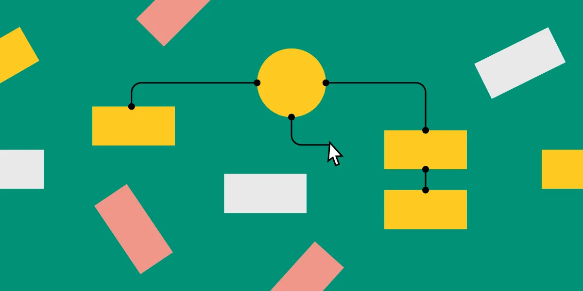
1. Hierarchical Structure (Tree Model)

Hierarchical website structure diagram

The hierarchical (or tree) structure is the most common model for websites. Pages are organized in a parent-child relationship, branching from a single homepage down through categories, subcategories, and individual pages.

How it works: The homepage sits at the top. It links to main category pages (e.g., Products, Blog, About). Each category links to subcategory or detail pages. The result is a tree-shaped architecture where every page has a clear “address” in the hierarchy.

Best for: Corporate websites, e-commerce sites, documentation portals, SaaS marketing sites, and news publishers. Any site with a clear content taxonomy benefits from hierarchical structure.

Real-world examples:

  • Amazon: Homepage → Department → Subcategory → Product page. Each level narrows the user’s scope.
  • Apple: Homepage → Product line (Mac, iPhone, iPad) → Specific model → Configuration.
  • UXPin: Homepage → Product pages (Merge, Forge) → Feature details → Documentation.

Design tips:

  • Keep the hierarchy flat — no more than 3–4 levels deep. Deep hierarchies bury content and waste crawl budget.
  • Use breadcrumbs to show users their location within the hierarchy.
  • Cross-link related pages at the same level to prevent siloed sections.

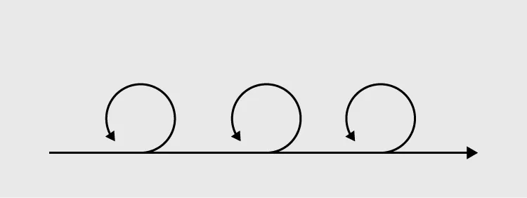
2. Sequential Structure (Linear Model)

Sequential website structure diagram

A sequential structure guides users through content in a fixed, step-by-step order. Each page leads to exactly one next page, with optional back navigation. There are no branches — just a defined path from start to finish.

How it works: Users enter at step 1 and proceed linearly: Step 1 → Step 2 → Step 3 → Completion. Navigation is limited to forward/back controls and a progress indicator.

Best for: Onboarding flows, checkout processes, multi-step forms, tutorials, course content, and installation wizards.

Real-world examples:

  • Checkout flows: Cart → Shipping → Payment → Confirmation.
  • Online courses: Lesson 1 → Lesson 2 → Quiz → Certificate.
  • Setup wizards: Account creation → Profile setup → Preferences → Dashboard.

Design tips:

  • Always show a progress indicator so users know where they are and how many steps remain.
  • Allow users to go back without losing their input.
  • Keep each step focused on a single task or decision.

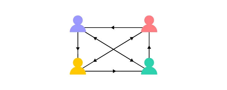
3. Matrix Structure (Network Model)

Matrix website structure diagram

A matrix structure gives users multiple navigation paths to the same content. Instead of a single parent-child hierarchy, pages are connected through tags, categories, filters, and cross-links — allowing users to explore content by topic, format, date, difficulty, or any other dimension.

How it works: Users can reach the same page through multiple paths. A blog post might be findable by category, tag, author, date, or related-content links. The structure resembles a web rather than a tree.

Best for: Knowledge bases, wikis, resource libraries, recipe sites, and content-heavy platforms where users have varied information needs.

Real-world examples:

  • Wikipedia: Articles link extensively to related articles. Users navigate by interest, not by hierarchy.
  • Stack Overflow: Questions are findable by tag, search, related questions, and user profiles.
  • Spotify: Music is accessible through playlists, genres, artists, search, and algorithmic recommendations.

Design tips:

  • Provide strong search and filtering capabilities to prevent users from feeling lost.
  • Use breadcrumbs or “you are here” indicators even in non-hierarchical structures.
  • Be cautious about creating too many paths — matrix structures can become overwhelming without clear signposting.

4. Database Structure (Dynamic Model)

Database website structure diagram

A database structure generates pages dynamically based on user input, queries, and stored data. The “pages” don’t exist as static files — they are assembled on demand from a database using templates and parameters.

How it works: Users interact through search queries, filters, and form inputs. The system retrieves matching records and renders them into page templates. Each user sees a different version of the site based on their query.

Best for: E-commerce product catalogs, real estate listings, job boards, social media platforms, CRM dashboards, and any site where content is user-generated or frequently updated.

Real-world examples:

  • Airbnb: Listings are database records filtered by location, dates, price, amenities, and ratings.
  • LinkedIn: Profiles, job listings, and feed content are all dynamically generated from database records.
  • Shopify stores: Product pages are generated from product database entries using template themes.

Design tips:

  • Invest heavily in search UX — faceted search, auto-complete, and intelligent filters are critical.
  • Design empty states for searches that return no results. Provide actionable suggestions.
  • Ensure dynamically generated pages are crawlable by search engines (avoid client-side-only rendering for SEO-critical content).

How to Choose the Right Website Structure

Choosing a structure is not an either/or decision. Most production sites combine elements from multiple models. The key is identifying which model dominates your primary user flows, then layering in elements from others where needed.

Decision framework:

  • Content is organized by category and rarely changes? → Hierarchical structure as the foundation.
  • Users must complete tasks in a specific order? → Sequential structure for those flows.
  • Users explore content by multiple dimensions? → Add matrix navigation (tags, filters, cross-links) on top of your hierarchy.
  • Content is dynamic and user-generated? → Database structure with strong search and filtering.

Practical steps to plan your structure:

  1. Audit existing content. List every page and categorize by topic, purpose, and audience segment.
  2. Conduct card sorting. Ask representative users to group content into categories. Open card sorts (users create categories) work best for new sites; closed sorts (predefined categories) work best for redesigns.
  3. Run tree tests. Test your proposed hierarchy by asking users to find specific content. Measure success rate and directness.
  4. Map the hierarchy. Use a sitemap diagram to visualize page relationships and identify orphaned or deeply buried pages.
  5. Prototype and validate. Build an interactive prototype of the navigation and structure, then test with real users before development.

Key Structural Elements Every Site Needs

Regardless of which structure model you choose, every well-designed site needs these structural elements:

Homepage Hierarchy

The homepage is the root of your structure. It should clearly communicate the site’s purpose, provide navigation to all major sections, and surface the most important content or actions. Avoid the temptation to put everything on the homepage — it should be a wayfinding hub, not a content dump.

Global Navigation

Primary navigation should be consistent across every page and include 5–7 top-level items at most. More items create decision paralysis. Use mega menus or dropdowns for subcategories, and ensure the navigation is keyboard-accessible and mobile-responsive.

Breadcrumbs

Breadcrumbs show users their current location within the hierarchy and provide one-click access to parent pages. They also generate breadcrumb rich snippets in search results, improving CTR. Every site deeper than two levels should include breadcrumbs.

Internal Linking

Internal links are the connective tissue of your structure. They distribute page authority for SEO, help users discover related content, and give search engines pathways to crawl your site. Use descriptive anchor text (not “click here”) and link contextually within body content.

URL Architecture

URLs should mirror your content hierarchy: /category/subcategory/page-name/. Keep URLs short, descriptive, and keyword-relevant. Avoid query parameters, session IDs, and deeply nested paths.

Footer Navigation

The footer serves as a secondary navigation system — a “safety net” for users who scroll to the bottom without finding what they need. Include links to important pages (privacy policy, contact, sitemap) and secondary content categories.

Structuring Individual Pages for SEO and Readability

Site-level structure gets users to the right page. Page-level structure helps them find what they need within that page.

Effective page structure follows these principles:

  • One H1 per page that clearly describes the page’s topic and matches the user’s search intent.
  • Logical heading hierarchy (H1 → H2 → H3) that creates a scannable outline. Users and screen readers both rely on heading structure.
  • Above-the-fold priority: Place the most important content and primary CTA visible without scrolling.
  • Chunked content: Break long content into sections with clear headings, short paragraphs, and visual separators.
  • Related content: Link to related pages at the bottom or in a sidebar to keep users engaged within your site.

For a deeper dive into how page structure impacts search performance, see our complete guide to web design and SEO.

Prototyping Website Structure with UXPin

The most expensive structural mistakes are the ones discovered after development. Prototyping your site’s structure before coding lets you test navigation patterns, validate information architecture, and get stakeholder buy-in on a tangible artifact rather than abstract wireframes.

UXPin is particularly effective for structural prototyping because:

  • Interactive components: Build clickable navigation menus, breadcrumbs, dropdowns, and multi-level sidebars that behave like the real thing.
  • Real component libraries: With UXPin Merge, teams can prototype using production React, Vue, or Angular components — including navigation bars, sidebars, and footer components from libraries like MUI or shadcn/ui.
  • AI-assisted generation: UXPin Forge can generate page layouts from a text prompt or uploaded wireframe, using your team’s actual component library — so prototype fidelity matches production fidelity from the start.
  • Stakeholder sharing: Share interactive prototypes with a link. Stakeholders can click through the navigation without installing anything.

Start a free UXPin trial to prototype your next website’s structure with production components.

Frequently Asked Questions About Website Structure

What is website structure?

Website structure is the way a site’s pages and content are organized, connected, and presented to users. It includes the page hierarchy, navigation system, categories, internal links, and URL architecture. A well-planned structure helps visitors find information quickly and helps search engines understand and index the site effectively.

What are the four types of website structure?

The four main types are: hierarchical (tree structure with parent-child page relationships), sequential (linear step-by-step flow), matrix (multi-dimensional navigation by topics, tags, or facets), and database (dynamic pages generated from queries and stored data). Most production sites combine elements from multiple models.

Why does website structure matter for SEO?

Website structure determines how search engines crawl and understand your content. A clear hierarchy with strong internal linking helps Google discover all your pages, understand their relationships, and distribute authority between them. Poor structure can prevent important pages from being indexed and waste your site’s crawl budget.

How do I plan a website structure?

Start with a content audit to understand what exists. Conduct card sorting exercises with representative users to test category groupings. Map the hierarchy in a sitemap diagram. Run tree tests to validate findability. Then prototype the navigation in an interactive tool like UXPin and test with real users before development begins.

What is the best website structure for most sites?

A hierarchical structure is the most widely applicable and works well for most websites, from corporate sites to e-commerce stores. The key is keeping the hierarchy flat (no more than 3–4 levels deep) and ensuring strong internal linking between related pages at every level.

What is the difference between website structure and information architecture?

Website structure refers to the specific arrangement of pages and their connections. Information architecture (IA) is the broader discipline that governs how content is organized, labeled, and made findable across any information system — not just websites. IA principles inform structural decisions, but also cover labeling systems, search design, and content strategy.

Design Decisions: 10 Examples & How to Make Better Ones (2026)

Design decisions framework for UX designers

Design decisions define the direction and outcome of every product. Designers use research, data, and tested frameworks to validate assumptions, eliminate biases, and choose between competing options.

But making the decision is only half the job. Design teams must also document their reasoning and articulate the “why” to stakeholders, engineers, and product owners — getting everyone aligned on a shared direction.

This guide covers 10 common types of design decisions, four proven decision-making approaches, practical frameworks for better decisions, and how to communicate your choices effectively.

Key takeaways:

  • Design decisions span everything from color palettes and typography to interaction patterns, accessibility, and content strategy.
  • Designers make decisions through four lenses: experience, intuition, imitation, and reference.
  • Good decisions are grounded in user research, data, and business context — not just aesthetic preference.
  • Documenting every decision (including failed approaches) prevents duplicated work and preserves institutional knowledge.
  • Articulating decisions through prototypes, user stories, and data is the most effective way to get stakeholder buy-in.
  • Design systems reduce the number of low-level decisions, freeing designers to focus on solving user problems.

Articulate decisions with interactive prototypes

UXPin Merge lets you build high-fidelity prototypes with real code components — show stakeholders how your design decision works, not just how it looks.

Try UXPin Merge

10 Examples of Common Design Decisions

The types of decisions designers make depend on the organization’s size and the product’s maturity. Teams with a mature design system make fewer low-level decisions — the system’s style guide, component library, and guidelines handle many choices automatically, freeing designers to focus on higher-order problem-solving.

Here are ten common categories of design decisions:

  1. Color palette selection — Choosing brand colors, semantic colors (success, warning, error), and accessible contrast ratios.
  2. Typography selection — Selecting typefaces, font scales, line heights, and responsive type rules.
  3. Layout and grid structure — Defining column grids, spacing systems, breakpoints, and content regions. (See our complete guide to UI grids.)
  4. Visual hierarchy — Determining how size, color, contrast, and position guide the user’s eye through the interface.
  5. Media selection — Choosing between photography, illustration, video, icons, or data visualizations for different contexts.
  6. Interaction design — Defining how elements respond to user input: hover states, click behaviors, transitions, and gestures.
  7. Microinteractions and motion — Designing subtle animations that provide feedback, guide attention, or add personality.
  8. Accessibility considerations — Ensuring WCAG compliance through contrast, keyboard navigation, screen reader support, and focus management.
  9. Content design — Writing microcopy, defining information architecture, and structuring content for scannability.
  10. Iconography and graphics — Choosing icon styles (outlined, filled, rounded), creating a consistent visual language, and ensuring icons are universally understood.

In isolation, each decision may seem straightforward. But zoom out and the complexity emerges: a trendy color palette might look striking but fail accessibility contrast requirements. A bold typeface choice might not render well at small sizes on mobile. Every design decision creates ripple effects across performance, accessibility, and cross-platform consistency.

4 Ways Designers Make Decisions

color sample library for design decisions

Designers draw on four decision-making approaches, often blending them depending on the situation:

1. Experience

Experienced designers make many decisions unconsciously — layouts, alignment, spacing, and interaction patterns become second nature over time. This “muscle memory” provides a strong starting point, but it can also introduce blind spots. Experience alone becomes unreliable when the context changes (new platform, new audience, new technology).

2. Intuition

Intuition is valuable early in the design process, when the team needs to explore broadly and make rapid decisions. Gut feeling, informed by years of practice, can spark creative directions that pure data analysis would miss. The key is to validate intuitive decisions with research and testing rather than shipping on instinct alone.

3. Imitation

Much of design is built on established conventions. Designers rely on universally recognized design patterns — navigation drawers, form layouts, card components — to solve fundamental usability problems. Imitation also plays a competitive role: products adopt successful patterns from market leaders to meet user expectations.

4. Reference

Reference is similar to imitation but more analytical. Designers study competitors, industry standards, accessibility guidelines, and academic research to inform their decisions. Competitive analysis and design audits fall into this category — they provide evidence-based context rather than direct copying.

How to Make Good Design Decisions

user review satisfaction opinion for design decisions

Start with Research

UX designers cannot make decisions in a vacuum. They rely on research methods to identify problems and generate solutions aligned with user needs:

  • User research — interviews, surveys, contextual inquiry
  • Market research — industry trends, audience segmentation
  • Competitive analysis — benchmarking against other products

Of these, user research is the most critical. Designers reference personas, customer journeys, empathy maps, and problem statements throughout the design process to keep users at the center of every decision.

Use Data and Analytics

Data eliminates guesswork and validates decisions with evidence:

  • Product analytics — tools like Google Analytics help identify bottlenecks, drop-offs, and opportunities. They also define a baseline before a redesign and measure success after delivery.
  • A/B testing — compares two variants to determine which performs better for a specific metric. Best for testing subtle differences like color, copy, or CTA placement.
  • Heatmaps — reveal how users interact with interfaces — where they click, how far they scroll, and which elements capture attention.

Incorporate Business Needs

Designers must balance user needs with organizational goals. Meeting with stakeholders helps prioritize features and align design decisions with business outcomes. Delivering a positive return on investment is critical — it determines future buy-in and resource allocation for design initiatives.

Test Early, Test Often

User testing drives decisions at every stage:

  • Early stage: Paper sketches and low-fidelity wireframes test layout, flow, and information architecture. Fast iteration, fast learning.
  • Mid stage: Interactive wireframe prototypes validate user flows and navigation patterns.
  • Late stage: High-fidelity interactive prototypes test the near-final experience with real users and stakeholders.
testing user behavior with prototype interaction

Document Every Decision

Document both successful and unsuccessful approaches. Many teams only record what works and discard what didn’t — this means future team members may repeat failed experiments. A good decision log captures:

  • The problem or question being addressed
  • Options considered (with pros and cons)
  • The chosen option and rationale
  • Test results or data that supported the choice
  • What didn’t work and why

How to Articulate Design Decisions

team collaboration for communicating design decisions

Articulating your design decisions is just as important as making them. If you cannot explain the “why” behind a solution, you risk having decisions overturned by stakeholders who don’t understand the reasoning.

Tell User Stories

UX artifacts like personas, journey maps, and storyboards help non-designers empathize with users. When you frame a design decision as a solution to a specific user’s problem, stakeholders understand the reasoning intuitively — even without a UX background.

Show, Don’t Tell — Use Prototypes

The most powerful way to articulate a design decision is to show it in action. When stakeholders interact with a prototype and experience how a design solves a problem, they are far more likely to trust the decision than if they’re looking at a static mockup.

This is where UXPin Merge excels. Because Merge prototypes use real, code-backed components, stakeholders experience the actual interactions, states, and behaviors — not a rough approximation. Create two prototypes: one reflecting the stakeholder’s suggestion, another based on your user research. Let them experience both and the data will speak for itself.

Lead with Data

Whenever possible, anchor your decisions in quantitative evidence. “Users completed the task 40% faster in variant B” is more compelling than “I think this layout works better.” Combine A/B test results, usability metrics, and analytics data to build an evidence-based case.

How Design Systems Reduce Decision Fatigue

A mature design system pre-makes hundreds of lower-level design decisions — color tokens, typography scales, spacing rules, component behaviors, accessibility standards — so designers can focus on higher-order problems like user flows, content strategy, and business alignment.

UXPin Merge takes this further by bringing the production design system directly into the design canvas. Designers work with the same code-backed components that developers ship, which means design system constraints are enforced automatically — no manual checking required.

With UXPin Forge, AI-generated layouts also respect these constraints. Forge’s Design System Guidelines feature ensures that every AI-generated screen follows your brand rules, color tokens, and component usage patterns. The result: fewer low-level decisions, faster iteration, and consistent output across the team.

At PayPal, a 5-person UX team uses UXPin with Merge to support 60+ products and 1,000+ developers. As PayPal’s UX Lead Erica Rider describes it: “Now that we’re using UXPin with Merge, my design philosophy and productivity have gone way up. I’m confident that I can implement a prototype in 30 minutes or less.”

Make better design decisions, faster

Build prototypes with real code components. Test with users. Articulate decisions with confidence.

Try UXPin Free

Frequently Asked Questions

What are design decisions in UX?

Design decisions are the choices designers make about visual, structural, and interactive elements of a product — including color, typography, layout, interaction patterns, accessibility, and content strategy. These decisions shape the user experience and are ideally grounded in research, data, and tested assumptions.

What are examples of design decisions?

Common examples include selecting a color palette, choosing typography, defining a grid layout, establishing visual hierarchy, designing interaction patterns, setting accessibility standards, and deciding on microinteractions and motion. Each decision affects usability, brand perception, and development implementation.

How do you make better design decisions?

Start with user research to understand the problem. Use data and analytics to validate assumptions. Balance user needs with business goals. Test prototypes early and often. Document every decision — including what didn’t work — to build institutional knowledge.

Why is it important to document design decisions?

Documentation preserves the reasoning behind each choice, preventing future team members from repeating failed experiments or undoing effective solutions. It also creates accountability and provides an evidence trail for stakeholders who want to understand why the product looks and works the way it does.

How do you articulate design decisions to stakeholders?

The most effective approach is showing, not telling. Build interactive prototypes that let stakeholders experience the design decision in action. Supplement with user stories, personas, and data (A/B test results, usability metrics) to anchor the decision in evidence rather than opinion.

How do design systems help with design decisions?

Design systems pre-make hundreds of lower-level decisions — colors, typography, spacing, component behavior — so designers can focus on higher-order problems. Tools like UXPin Merge bring the production design system into the design canvas, enforcing constraints automatically. UXPin Forge extends this to AI-generated layouts, ensuring every output follows the system’s rules.


Basic Design Elements and Principles of Design: A Complete Guide [2026]

Basic design elements and principles of design — complete guide

Good design isn’t about years of practice or thousands of hours in graphic editors. The beauty of the craft is that it’s accessible to anyone who understands its fundamental building blocks: the basic design elements and the principles that govern how they work together.

Centuries of work with paintings, typography, and graphics have distilled a set of vital rules that guide designers to this day — from print layout to modern UI/UX design. In this guide, we’ll explore each element and principle with practical examples, so you can create better products regardless of your experience level.

Key takeaways:

  • The basic design elements are lines, shapes, color, and typography — the raw building blocks of every visual composition.
  • Design principles — unity, contrast, balance, hierarchy, rhythm, white space, and variety — govern how elements relate to each other.
  • These elements and principles are timeless; they apply equally to print, web, and modern UI/UX design.
  • Mastering these fundamentals helps designers create more effective prototypes and user interfaces.

Apply these principles in practice with UXPin — an end-to-end design tool for interactive prototyping. Test not just the visual design, but interactions, states, and user flows. Try UXPin for free.

Build advanced prototypes

Design better products with States, Variables, Auto Layout and more.


Try UXPin

What Is Design?

Before diving into elements and principles, it’s worth clarifying what design actually is. We often assume design has a decorative function — making things look pretty and appealing. But its purpose is far more pragmatic.

Design isn’t art per se. While there’s overlap, the primary purpose of design is to solve problems. A design’s end goal is to find an innovative, functional solution; visual beauty is important but secondary to that goal.

Design is the arrangement of visual elements that aims to solve a real-world problem. As designs become more complex, they evoke feelings that form experiences. Fundamentally, design helps us shape the world we live in and influences how we perceive reality — from the layout of a city to the interface of a mobile app.

Basic Design Elements

Every visual composition — whether a painting, a poster, or a mobile UI — is built from four foundational elements. Understanding these building blocks is the first step toward effective design.

Lines

Lines are the most fundamental and versatile elements of design. They have a vast spectrum of functions: we use them to separate and organize space, outline and contour objects, emphasize certain elements, draw attention, and create movement.

Lines as basic design elements — examples of line types

Because lines are fundamentally simple, we can curve and combine them to create rich meaning through different shapes and patterns. Lines can be thin or thick, horizontal, vertical, or diagonal, curved or zigzagged, dashed or dotted — and each variation conveys different meaning and emotion.

In UI design, lines appear everywhere: as dividers between content sections, as borders around input fields, as underlines on active navigation tabs, and as the strokes that form icons. Thoughtful line use is what separates a clean, professional interface from a cluttered one.

Shapes

Everything is made of shapes which, in turn, are made of lines. We can deconstruct the visual world into a series of basic geometric and organic forms.

Human cognition has a powerful relationship with shapes. Their effect on our psyche is partly due to our evolutionary background — some shapes instill comfort, others make us cautious. Rounder shapes like circles and ovals are generally associated with safety and harmony. Pointier shapes, on the other hand, signal danger and command attention.

Shapes as basic design elements — geometric forms

Here’s how common shapes are perceived in design:

  • Squares and rectangles — convey stability, reliability, and order. They’re the backbone of most UI layouts (cards, buttons, input fields).
  • Triangles — associated with power, energy, and action. Often used in play buttons, directional arrows, and warning icons.
  • Circles and ovals — associated with harmony, completeness, and continuity. Common in avatars, progress indicators, and logos.
  • Spirals — associated with growth, evolution, and natural processes.

Color

Colors are electromagnetic radiation at different frequencies — yet they have a powerful effect on the human mind. It’s important to note that color perception is partly subjective, influenced by cultural, religious, geographical, and personal factors.

Color as a basic design element — warm and cool colors

Broad color groups affect most people in predictable ways:

  • Warm colors (red, yellow, orange) typically evoke emotions ranging from warmth and energy to urgency and aggression.
  • Cool colors (blue, green, purple) can instill feelings ranging from calm and trust to sadness and detachment.

The most commonly used colors in modern digital design:

  • Blue — extremely popular in web design and digital interfaces. It’s the predominant color on the web’s most trafficked sites and conveys trust and reliability.
  • Red — has a clear function: pushing users toward action. This is why it’s widely used in calls to action, error states, and notifications.
  • Yellow — can be perceived as cheerful or cautionary, depending on tone and context.
  • Green — associated with nature, success, and affirmation. Widely used in success messages, confirmation buttons, and environmental branding.

In design systems, color is formalized through design tokens — named color values (like primary-500 or error-100) that ensure consistency across every screen and component. Tools like UXPin Merge let designers work with these exact production tokens, so the colors in prototypes match the final product precisely.

Typography

Typography as a basic design element — font characteristics

Fonts are multifaceted. They communicate meaning through words and a mood through their characteristics — size, weight, kerning, letter-spacing, and line-height.

When we speak, we use rhythm, pitch, tone, and gestures to convey how we feel. Typography has its own set of characteristics that modulate the feelings a text evokes. We use typographic differences to establish visual hierarchy and distinguish between types of information in a design.

Larger, heavier fonts are typically used for headlines. They set the tone and entice the reader with a glimpse of the content below. Given that headlines should be kept short, the fonts used for them can afford more personality. Body text should be simpler and more legible.

Choosing the right typeface

Your choice of typeface should be guided by three factors: the message, the medium, and the audience. Start with minimal diversity and gradually introduce the smallest amount of typographic contrast necessary to guide a person through the information hierarchy.

Excessive complexity makes designs illegible. Too little contrast makes them dull. Your goal is to find the golden mean between consistency and emphasis.

The Central Principles of Design

Now that we’ve covered the basic elements, let’s look at the principles that govern how those elements relate to each other within a composition.

These principles serve different purposes. Contrast, repetition, and rhythm help draw attention to specific elements. Balance and variety are essential for creating designs that appeal to our senses. All of these principles are tightly interconnected — your goal as a designer is to achieve their harmonious coexistence.

You don’t need to incorporate every principle in every design. However, applying at least a few will guide you toward a more coherent and effective end product.

Unity

Unity is the overarching quality that makes a design feel complete and coherent. There are two kinds: conceptual unity and visual unity.

Conceptual unity is critical during wireframing. It’s about combining information for the user’s comfort and ensuring they can accomplish goals with minimal friction.

Visual unity has to do with how things look. The idea is to ensure harmonious use of elements, colors, shapes, and sizes. Equally important design elements should share visual characteristics, and a unified design establishes consistency and a clear visual hierarchy.

Design systems are, in essence, formalized unity. When your entire product uses the same component library with consistent spacing, color tokens, and typography scales, visual and conceptual unity happen by default.

Contrast and Similarity

Designers use contrast and similarity to guide attention. Similarity creates relationships between elements. According to the Gestalt principles, we tend to group things together based on their appearance — we perceive similar shapes, colors, or sizes as belonging together.

Contrast, on the other hand, makes things stand out. Our brains are hardwired to notice visual outliers — elements that differ from their surroundings. In a deliberate design, contrast signals importance.

Common ways to create contrast:

  • Texture — rough vs. smooth surfaces
  • Shapes — organic vs. geometric, rounded vs. sharp edges
  • Colors — differences in warmth, hue, and intensity
  • Scale and size — large elements next to small ones

Balance

Balance creates a sense of stability and composure — it just “feels right.” Designers use several types of balance: symmetrical, asymmetrical, mosaic, and radial. Each has its own subtypes and applications.

Balance in design — symmetrical and asymmetrical examples

A lack of balance can misguide users, create disorientation, or trigger visual discomfort. An unbalanced composition creates unnecessary friction, causing information to go unnoticed.

Hierarchy and Emphasis

Hierarchy ensures users process information in the right order. Its purpose is to structure elements rationally, allowing users to reach their goals efficiently.

Hierarchy can be established through:

  • Size — larger elements are noticed first and perceived as more important
  • Color — brighter or more saturated colors stand out against paler ones
  • Contrast — contrasting elements are more captivating
  • Alignment — misaligned elements draw more attention than aligned ones
  • Repetition — similar features signal that elements are related
  • Proximity — elements placed close together appear related
  • White space — isolated elements draw more attention
  • Texture — complex textures draw more attention than simple ones

Too many accents create a chaotic, frustrating experience. Too few make a design seem dull. Effective hierarchy finds the balance between the two.

Rhythm and Flow

Compositional flow determines how the eye moves through a design: where it looks first, where it goes next, where it pauses, and how long it stays.

Interaction Layouts

Several established reading patterns help designers create coherent layouts:

Gutenberg diagram reading pattern
  • The Gutenberg diagram — applies to cultures that read left to right. Reading gravity moves attention from the top-left corner toward the lower-right corner, with the other two corners (called fallow areas) receiving less attention.
F-pattern reading layout
  • The F-pattern — widely used for text-heavy digital interfaces. Eye movement starts at the top-left and moves right, then scans down with shorter horizontal sweeps. Because modern users skim, the lower lines vary in length, creating an F-shaped pattern.
Z-pattern reading layout
  • The Z-pattern — the eye sweeps from top-left to top-right, makes a diagonal transition to bottom-left, and finishes at bottom-right. Common in landing pages and marketing layouts where content is less dense.

Note that these patterns apply mostly to text-heavy designs. Once you add various graphical elements, the patterns may be overridden by visual hierarchy and emphasis cues.

Compositional Flow

When a layout doesn’t follow the standard reading patterns above, designers use directional cues to guide users:

  • Repetition of elements
  • Rhythm and pacing
  • Implied action and movement
  • Diagonal and gestural lines
  • Directional lines and arrows
  • Perspective and depth
  • Subject matter of visual elements
  • Gradation (gradual transitions in color, size, or shape)

Rhythm and Repetition

Without repetition, there is no rhythm. Our brains are hardwired to seek patterns and similarities. In design, rhythm provides predictability and flow.

Three types of rhythm:

  • Regular — elements and spacing are consistent and predictable (like items in a grid layout).
  • Flowing — similar to regular rhythm but without strict uniformity. The pattern feels organic and natural.
  • Progressive — continuous change in shape, color, or size represents progression or evolution (like steps in a progress indicator).

White Space

White space isn’t necessarily white — it’s the empty area surrounding and separating design elements. It can be any color, texture, or pattern. White space is one of the most important and often underused design tools.

It’s a vital component for enhancing legibility and reducing cognitive fatigue and friction between the user and your design.

White space has become especially important in modern digital design as designers have moved away from the cluttered interfaces of earlier decades. Compare any early web portal’s cramped layout with Apple’s current homepage — the difference in readability, focus, and perceived quality is dramatic.

Why use white space?

  • Directs attention — isolated elements draw the eye, helping establish visual hierarchy and guide users to key content.
  • Increases interaction — well-spaced elements are easier to notice and act on, improving conversion and usability.
  • Reduces cognitive load — generous spacing prevents visual fatigue and makes interfaces feel calmer and more professional.
  • Improves legibility — adequate spacing between lines, paragraphs, and sections makes text significantly easier to read.

Variety

Variety arouses visual interest and prevents designs from becoming monotonous. Designers use it to counteract excessive unity — when things are too uniform and bland, users lose engagement.

Ways to introduce variety:

  • Lines — varying weight, angle, or length
  • Shapes — changing shape type (organic vs. geometric), size, color, or orientation
  • Colors — diversity in hue, value, or saturation
  • Values — varying lightness or darkness
  • Textures — mixing rough and smooth surfaces

Applying Design Elements and Principles in Prototyping

On the surface, design trends come and go. But the underlying elements and principles are timeless — they apply as much to a 2026 mobile app as they did to a Renaissance painting.

The key insight is that these principles form a system. Improving variety might affect balance. Making a design too unified might make it dull. The craft lies in understanding the interplay and finding the right balance for each project.

Modern design tools make it easier to apply these principles. With UXPin Merge, designers work with real, production-grade components from libraries like MUI or shadcn/ui that already encode many of these principles — consistent spacing, harmonious color tokens, typographic hierarchy, and balanced layouts are built into the components themselves.

For even faster exploration, UXPin Forge generates layouts from text descriptions using your production component library. Describe a layout — its structure, emphasis, and flow — and Forge produces a working prototype. Because output is constrained to your design system’s components, the fundamental design principles are maintained automatically.

Create prototypes that are as interactive as the final product. No code required. Try UXPin for free.

Frequently Asked Questions About Design Elements and Principles

What are the basic elements of design?

The basic elements of design are lines, shapes, color, and typography. Lines organize space and draw attention. Shapes create meaning through geometric and organic forms. Color evokes emotions and guides user focus. Typography communicates information through words while conveying mood through font characteristics like weight, size, and spacing.

What are the principles of design?

The core principles of design include unity, contrast, similarity, balance, hierarchy, emphasis, rhythm, repetition, white space, and variety. These principles govern how basic design elements relate to each other and work together to create effective, coherent visual compositions.

What is the difference between design elements and design principles?

Design elements are the building blocks — the raw visual components like lines, shapes, colors, and type. Design principles are the rules that govern how those elements are arranged and relate to each other within a composition. Elements are the what; principles are the how.

Why is white space important in design?

White space (also called negative space) reduces cognitive fatigue, improves legibility, directs attention to key elements, and establishes visual hierarchy. It doesn’t have to be literally white — it’s simply the empty area around and between design elements. Effective use of white space is one of the clearest markers of professional, polished design.

How do design elements apply to UI and UX design?

In UI/UX design, elements and principles are applied through component design, layout systems, color palettes, typography scales, and interaction patterns. Design systems formalize these decisions into reusable components. Tools like UXPin let designers apply these principles while prototyping with real, interactive components — ensuring visual design decisions translate directly to production code.

What are the F-pattern and Z-pattern reading layouts?

The F-pattern describes how users scan text-heavy pages — reading across the top, then scanning down the left side with shorter horizontal sweeps, forming an F shape. The Z-pattern applies to pages with less text — the eye moves from top-left to top-right, diagonally to bottom-left, then across to bottom-right. Understanding these patterns helps designers place important elements where users naturally look.

What Is React? A Complete Introduction for Designers and Developers (2026)

React is a JavaScript library for building user interfaces, created by Meta (formerly Facebook) and maintained as an open-source project. It is the most widely used front-end library in 2026, powering interfaces at companies like PayPal, Netflix, Airbnb, and Shopify.

What makes React different from earlier approaches is its component-based architecture: you build UIs out of self-contained, reusable pieces (components) that each manage their own logic and rendering. This makes complex interfaces manageable, testable, and scalable.

This guide explains React from the ground up — what it is, how it works, and why it matters to both developers and designers in 2026.

Design with real React components

UXPin Merge lets you drag and drop production React components into your design — what you design is what developers ship.

Try UXPin Merge

What Is React?

React (also called React.js or ReactJS) is a declarative, component-based JavaScript library for building user interfaces. Unlike full frameworks (Angular, for example), React focuses specifically on the view layer — how things look and respond to user interaction.

Key characteristics:

  • Declarative — You describe what the UI should look like for a given state. React figures out how to update the DOM efficiently.
  • Component-based — Every piece of the interface is a component: a button, a card, a navigation bar, an entire page. Components are composable — you nest small components inside larger ones.
  • Learn once, write anywhere — React’s concepts apply across platforms: React DOM for web, React Native for mobile, and React for server-side rendering with frameworks like Next.js.

Is React a Framework or a Library?

React is technically a library, not a framework. A framework (like Angular or Vue) provides opinions and tooling for routing, state management, build processes, and more. React handles only UI rendering; you choose separate libraries for everything else (React Router for routing, Zustand or Redux for state management, etc.).

That said, meta-frameworks built on React — particularly Next.js and Remix — do provide the full framework experience: routing, server rendering, data loading, and deployment tooling, all running on React components underneath.

Is React Front-End or Back-End?

React is primarily a front-end library, but modern React blurs this line. With React Server Components (introduced in React 18 and expanded in React 19), components can run on the server and stream HTML to the client. Next.js uses this extensively — some components run server-side, others client-side, all written in React.

How React Works

Components and JSX

In React, every UI element is a component — a JavaScript function that returns JSX (JavaScript XML), a syntax extension that looks like HTML but compiles to JavaScript:

function Greeting({ name }) {
  return <h1>Hello, {name}!</h1>;
}

JSX makes component templates readable. Under the hood, the JSX above compiles to React.createElement('h1', null, 'Hello, ', name, '!').

Props and State

Components receive data through props (read-only inputs passed from a parent) and manage internal data through state (mutable values that trigger re-renders when updated):

import { useState } from 'react';

function Counter() {
  const [count, setCount] = useState(0);
  return (
    <div>
      <p>Count: {count}</p>
      <button onClick={() => setCount(count + 1)}>
        Increment
      </button>
    </div>
  );
}

The Virtual DOM

React maintains a lightweight, in-memory copy of the real DOM called the virtual DOM. When state changes, React:

  1. Renders a new virtual DOM tree.
  2. Compares (diffs) the new tree against the previous one.
  3. Calculates the minimum set of actual DOM changes needed.
  4. Applies only those changes to the real DOM.

This “reconciliation” process makes React fast — it avoids expensive full-page re-renders by updating only what changed.

React Server Components

React 19 (stable since 2024) introduced Server Components as a first-class feature. Server Components run on the server and send rendered HTML to the client — they have zero JavaScript bundle cost. Client Components continue to run in the browser for interactive elements. This hybrid model lets teams build faster, lighter applications while keeping React’s component model.

Why React Dominates in 2026

  • Massive ecosystem — Thousands of libraries, tools, and tutorials. Whatever problem you face, someone has likely solved it in React.
  • Component libraries — Production-ready UI kits like MUI (Material UI), shadcn/ui, Ant Design, and Radix provide battle-tested components that save weeks of development.
  • Meta-framework maturity — Next.js, Remix, and Gatsby offer server rendering, static generation, and edge deployment built on React.
  • Hiring advantage — React has the largest developer community. Finding React developers is easier than finding specialists for less popular libraries.
  • Cross-platform potential — React Native lets teams share component logic between web and mobile apps.
  • Enterprise adoption — Companies like PayPal, Salesforce, Shopify, and Netflix have built their core products on React, creating deep enterprise trust.

React for Designers: Why It Matters

Even if you never write React code yourself, understanding React’s component model makes you a better UI designer:

  • Think in components — Design systems naturally map to React components. A Button, a Card, a Modal — each becomes a reusable piece in both Figma and code.
  • Understand props — When you design a button with variants (primary, secondary, disabled), you are designing the props API that developers will implement.
  • Prototype with real components — Tools like UXPin Merge let designers drag and drop production React components directly onto a design canvas. The prototype uses the same code that ships to production, so there is zero gap between design and development.
  • AI-assisted designUXPin Forge generates entire page layouts using your team’s React component library. You describe what you need in plain language, and Forge builds it from real components — output is exportable as production-ready JSX.

Design UIs 8.6x faster with real React components

UXPin Forge generates layouts from your production React library. Merge lets you refine them with professional design tools. Try it free.

Try UXPin Free

How to Get Started with React

Prerequisites

  • HTML and CSS — Comfortable with semantic markup and modern CSS (flexbox, grid, variables).
  • JavaScript fundamentals — Variables, functions, arrays, objects, destructuring, arrow functions, template literals, and async/await.
  • ES modules — Understanding import and export syntax.

Key Concepts to Learn

  1. Components and JSX — Learn to create function components and write JSX.
  2. Props — Pass data between components.
  3. State and HooksuseState, useEffect, useRef, useContext.
  4. Conditional rendering — Show/hide UI based on state.
  5. Lists and keys — Render arrays of data efficiently.
  6. Event handling — Respond to clicks, form submissions, keyboard events.
  7. Side effects — Fetch data, set up subscriptions, interact with browser APIs.

Recommended Learning Path

Start with the official React documentation (react.dev) — it was rewritten in 2023 and is widely considered the best React learning resource available. Build small projects (a to-do list, a weather app, a product catalog) to reinforce concepts. Once comfortable, explore Next.js for full-stack React development. If you prefer structured learning, Treehouse offers browser-based coding courses including React fundamentals with live instructor support and portfolio-building projects.

Designing with React Components in UXPin

Traditional design tools create pixel-based representations of interfaces that developers must recreate from scratch. UXPin Merge takes a different approach: it brings your production React components into the design tool so designers work with the actual code.

Here is how it works:

  1. Import your library — Connect your React component library via Git integration or the Merge CLI tool. Components appear in UXPin’s design panel.
  2. Design visually — Drag components onto the canvas, configure props via the properties panel, and arrange layouts. Everything you build uses real code.
  3. Use Forge for speedForge generates complete page layouts from text prompts using your component library. Describe “a settings page with a sidebar navigation and a form for user preferences” and Forge builds it from your production components.
  4. Export production JSX — When the design is approved, export the layout as clean JSX that developers can drop directly into the codebase. No redline specs, no handoff document, no interpretation gaps.

This workflow is why enterprise teams report up to a 50% reduction in engineering time when using Merge — the “translation” step between design and code simply disappears.

Frequently Asked Questions

What is React used for?

React is used for building user interfaces — primarily for web applications, but also for mobile apps (via React Native), desktop apps (via Electron), and even server-rendered pages (via Next.js). It is especially well-suited for complex, interactive applications with frequently changing data, such as dashboards, social platforms, and e-commerce sites.

Is React hard to learn?

React’s core concepts (components, props, state, JSX) can be learned in a few weeks if you already know HTML, CSS, and JavaScript. The broader ecosystem (routing, state management, server rendering) takes longer to master. The official React documentation at react.dev is the best starting point.

What is JSX in React?

JSX (JavaScript XML) is a syntax extension that lets you write HTML-like markup inside JavaScript. It makes component templates more readable and is the standard way to define UI in React. JSX is not valid JavaScript — it is compiled to React.createElement() calls by build tools like Babel or the TypeScript compiler.

What is the virtual DOM and why does React use it?

The virtual DOM is a lightweight, in-memory representation of the actual browser DOM. When state changes, React creates a new virtual DOM tree, compares it with the previous one, calculates the minimum necessary changes, and applies only those changes to the real DOM. This makes updates fast because React avoids re-rendering the entire page.

Can designers use React components without writing code?

Yes. UXPin Merge lets designers drag and drop production React components onto a visual canvas, configure props through a properties panel, and arrange layouts — all without writing code. The output is production-ready JSX that developers can use directly. Forge takes this further by generating complete layouts from text prompts.

What are React Server Components?

React Server Components (RSC) are components that run on the server and send rendered HTML to the client. They have zero JavaScript bundle cost, which makes applications faster. RSC was introduced in React 18 and became a stable feature in React 19. Next.js is the primary framework that uses RSC in production.


14 Essential UI Design Principles Every Designer Should Follow (2026)

14 essential UI design principles for better interfaces

A well-designed user interface is the difference between a product people enjoy using and one they abandon. UI design isn’t cosmetic — it directly impacts task completion rates, user satisfaction, error rates, and ultimately business metrics like conversion and retention.

These 14 principles of user interface design provide a practical framework for creating interfaces that are clear, usable, and effective. They apply whether you’re designing a SaaS dashboard, an e-commerce site, or a mobile app.

Apply these principles in practice — use UXPin for advanced prototyping that lets you build fully interactive, testable interfaces in minutes. Try UXPin for free.

Build advanced prototypes

Design better products with States, Variables, Auto Layout and more.


Try UXPin

What Are UI Design Principles?

UI design principles are foundational guidelines that help designers create interfaces that are intuitive, effective, and enjoyable to use. They provide a decision-making framework — when you’re unsure whether a design choice is right, these principles help you evaluate it against what works for users.

These principles aren’t rules to follow rigidly. They’re heuristics — tested patterns that, when applied thoughtfully, consistently produce better outcomes. The best interfaces apply these principles so naturally that users never notice them.

Why UI Design Principles Matter

UI design principles matter because they bridge the gap between what designers intend and what users actually experience. Without them, design decisions become arbitrary — driven by aesthetics or assumptions rather than evidence.

When these principles are applied consistently:

  • Users complete tasks faster and with fewer errors
  • Cognitive load decreases, making interfaces feel effortless
  • Accessibility improves, expanding your audience
  • Development is smoother because design intent is clear and systematic
  • Products maintain quality as teams scale and features multiply

The business impact is real: better UI design correlates with higher conversion rates, lower support costs, improved retention, and stronger brand perception.

The 14 UI Design Principles

Principle #1: Clarity

The interface should communicate clearly. Every element — label, icon, button, heading — should tell the user what it is and what it does without ambiguity.

Clarity means:

  • Button labels describe their action (“Save draft” not “Submit”)
  • Icons are universally recognized or paired with text labels
  • Form fields have visible labels (not just placeholder text that disappears)
  • Error messages explain what went wrong and how to fix it

If a user has to guess what something does, clarity has failed. When in doubt, use plain language and test with real users.

Principle #2: Consistency

Consistent interfaces are predictable interfaces. When buttons, colors, typography, spacing, and interactions follow the same patterns throughout a product, users build mental models that let them navigate without thinking.

Consistency operates on three levels:

  • Internal consistency — elements behave the same way within your product
  • External consistency — your product follows conventions users know from other apps
  • Design system consistency — a shared component library ensures every team member uses the same building blocks

This is where design systems and component libraries become essential. When every designer and developer works from the same source of truth, consistency is built into the process — not layered on afterward.

Principle #3: Visual Hierarchy

Visual hierarchy controls what users see first, second, and third. It uses size, color, contrast, spacing, and position to establish the relative importance of elements on a page.

A strong hierarchy means users can scan a page and immediately understand its structure — the primary action stands out, supporting content is accessible but not distracting, and the eye flows naturally through the layout.

Key techniques: make primary CTAs larger and more colorful, use consistent heading sizes (H1 > H2 > H3), and give the most important content the most visual weight.

Principle #4: Feedback

Every user action should produce a visible response. Feedback confirms that the system received the user’s input and communicates the outcome.

  • Button clicks → visual state change (pressed, loading, complete)
  • Form submission → success message or error details
  • Drag and drop → visual indicators showing valid drop zones
  • System processing → progress indicators or skeleton screens

Without feedback, users are left wondering “Did that work?” — leading to repeated clicks, frustration, and errors. Even small feedback (a button color change, a subtle animation) makes a significant difference.

Principle #5: Accessibility

An accessible interface works for everyone — including users with visual, motor, auditory, or cognitive disabilities. Accessibility isn’t an afterthought; it’s a fundamental design requirement.

Essential accessibility practices:

  • Meet WCAG color contrast ratios (4.5:1 for normal text, 3:1 for large text)
  • Ensure all interactive elements are keyboard-navigable
  • Provide alt text for images and ARIA labels for custom components
  • Don’t rely on color alone to convey information
  • Support screen readers with semantic HTML structure

Designing with real UI components — as opposed to static mockups — makes accessibility easier to validate early. When your prototype uses the same HTML and ARIA attributes as the production code, accessibility issues surface during design rather than after launch.

Principle #6: Simplicity

Simplicity means removing everything that doesn’t serve the user’s goal. Every extra element, option, or decoration adds cognitive load. The best interfaces feel effortless because they’ve been ruthlessly edited.

Simplicity doesn’t mean minimalism for its own sake. A complex dashboard with 50 data points can still feel simple if the information is well-organized and the user can find what they need quickly. The measure of simplicity is task completion — can the user accomplish their goal without confusion or unnecessary steps?

Principle #7: Flexibility

A flexible interface accommodates users with different skill levels, preferences, and contexts. It provides multiple paths to the same outcome.

Examples of flexibility:

  • Keyboard shortcuts for power users alongside point-and-click for beginners
  • Search and browse navigation for content discovery
  • Customizable dashboards that let users prioritize what matters to them
  • Responsive layouts that adapt to screen sizes and input methods

Principle #8: Error Prevention

The best error handling is preventing errors in the first place. Design interfaces that make it difficult for users to make mistakes.

  • Use inline validation to catch form errors before submission
  • Disable buttons when required fields are empty
  • Show confirmation dialogs for destructive actions (“Delete this item?”)
  • Use sensible defaults so users start from a reasonable state
  • Constrain inputs — date pickers instead of free text, dropdowns instead of open fields

When errors do occur, messages should be specific, human-readable, and actionable: “Email address must include an @ symbol” is far better than “Invalid input.”

Principle #9: Affordance

Affordance means an element’s appearance suggests how to interact with it. Buttons should look clickable. Links should look different from regular text. Drag handles should look grabbable.

Good affordance reduces the need for instructions. Users should be able to look at a component and understand what it does. When affordances are ambiguous (Is that a button or a label? Is that text editable?), users hesitate — and hesitation means friction.

Principle #10: User Control

Users should feel in control of the interface, not controlled by it. This means:

  • Providing undo/redo for significant actions
  • Letting users cancel operations in progress
  • Avoiding unexpected changes to the page (no auto-redirects, no surprise modals)
  • Giving users control over notification frequency and preferences

An interface that forces users down a single path — or makes irreversible changes without warning — creates anxiety. Control creates confidence.

Principle #11: Efficiency

Efficient interfaces minimize the steps, clicks, and cognitive effort required to complete a task. This is especially important for frequently used features and high-volume workflows.

Efficiency techniques:

  • Remember user preferences and recent selections
  • Provide keyboard shortcuts for common actions
  • Use progressive disclosure to show advanced options only when needed
  • Reduce form fields to the absolute minimum required

Principle #12: Familiarity

Leverage conventions users already know. A shopping cart icon, a hamburger menu, a magnifying glass for search — these patterns are deeply ingrained. Using established conventions means users spend zero cognitive effort learning your navigation.

Familiarity extends to layout patterns too. Users expect primary navigation at the top or left, content in the center, and actions at logical endpoints. Novelty is welcome in branding and visual design; in navigation and interaction patterns, predictability wins.

Principle #13: Closure — Sequences Should Have Clear Endpoints

Every user journey should have a clear beginning, middle, and end. When a user completes a task (submitting a form, making a purchase, finishing onboarding), the interface should confirm completion and suggest the next step.

Without closure, users feel uncertain: “Did my order go through?” “Is my account set up?” Success states, confirmation screens, and completion summaries provide the psychological closure users need to move forward confidently.

Principle #14: Progressive Disclosure

Show users only what they need at each step. Advanced options, detailed settings, and edge-case features can be hidden behind expandable sections, “Advanced” links, or secondary screens.

Progressive disclosure keeps the interface simple for most users while still providing power and flexibility for those who need it. It’s a practical application of the simplicity principle — you’re not removing features, you’re organizing them by frequency of use.

Applying UI Design Principles in Practice

These principles should inform every stage of the design process:

  • During planning: Prioritize clarity and accessibility from the start. Establish a component-based design system to enforce consistency.
  • During wireframing: Focus on hierarchy and feedback patterns. Ensure the most important actions are visually prominent and every interaction produces a response.
  • During prototyping: Test flexibility and efficiency with interactive prototypes. Validate that users can complete tasks without confusion or unnecessary steps.
  • During handoff: Verify consistency across every screen. Clear design documentation helps developers maintain principles during implementation.
  • After launch: Monitor user behavior to identify where principles break down. Use analytics and feedback to iterate continuously.

Tools for Implementing UI Design Principles

The right tooling makes it easier to uphold these principles at scale. UXPin is particularly well-suited because it combines design and code:

  • Merge brings your team’s real production components into the design canvas. Consistency is guaranteed because designers and developers work from the same component library.
  • Interactive states let you build feedback patterns (hover, active, disabled, error) directly in your prototype — so you can test them with users before writing production code.
  • Conditional logic enables error prevention and validation patterns in prototypes, giving you realistic testing scenarios.
  • Forge generates interfaces that already follow your design system’s rules — spacing, hierarchy, component usage, and accessibility standards are built into every AI-generated screen.

Work inside a browser, get real-time feedback, and collaborate with your entire team. Try UXPin for free.

Frequently Asked Questions

What are UI design principles?

UI design principles are foundational guidelines for creating intuitive, usable, and effective interfaces. They cover clarity, consistency, feedback, accessibility, visual hierarchy, and more — providing a framework for user-centered design decisions.

What is the most important UI design principle?

Clarity is arguably the most critical principle. If users can’t understand the interface, no amount of visual polish will compensate. Every element should communicate its purpose clearly and unambiguously.

How do UI principles differ from UX principles?

UI principles focus on the visual and interactive layer — how elements look and respond. UX principles are broader, encompassing research, information architecture, content strategy, and service design. UI is a subset of the larger UX discipline.

How do I apply UI design principles in my workflow?

Apply them at every stage: clarity and accessibility during planning, hierarchy and feedback during wireframing, consistency during component design, and usability testing to validate decisions. Using a design system and code-backed tools like UXPin helps enforce these principles systematically.

What tools support UI design principles?

UXPin supports UI principles through design system libraries, Auto Layout, interactive states, and conditional logic. UXPin Merge ensures consistency by using real production components, and Forge generates interfaces that already follow your design system’s rules.

How many UI design principles are there?

There is no single definitive count. Most frameworks identify 10-20 core principles. This guide covers 14 essential principles encompassing clarity, consistency, hierarchy, feedback, accessibility, simplicity, flexibility, error prevention, affordance, user control, efficiency, familiarity, closure, and progressive disclosure.

How To Run A Successful Design Thinking Workshop

BlogHeader DesignThinkingWorkshop 1200x600

Running a design thinking workshop is one of the best ways to spark creativity and nurture a user-centric mindset within your design team. As a designer, you will encounter situations where you need to run design thinking workshops either with your team, your stakeholders, or other departments in your organization.

UXPin is an end-to-end design tool that will support you throughout the full human-centered design process, from creating basic user flows, through prototyping, and up to design handoff. Create a strong, transparent, and quality design process with UXPin. Enjoy a free trial.

Build advanced prototypes

Design better products with States, Variables, Auto Layout and more.

Try UXPin

What is a Design Thinking Workshop? 

A design thinking workshop is a creative problem-solving session that is based on the principles of design thinking. These workshops are activity-based and they involve real-time collaboration. For that, they are often done in person but they can also be done remotely.

The activities of a design thinking workshop are organized according to the three phases of the design thinking process: empathy, ideation, and prototyping.

  • Empathy: Developing a deep understanding of the problem that end-users face and empathizing with them.
  • Ideation: Coming up with many ideas on how the user problem can be solved. 
  • Prototyping: Creating a prototype of potential solutions and then testing it with real users.
design thinking workshop triangle

A workshop can last for a few hours long, a whole day, or even a week.

7 Goals of a Design Thinking Workshop

Design thinking workshops help design teams to create feasible and user-focused solutions to complex problems in design. This helps the team to design better products faster, reduce costs, and increase profits.

Design Thinking Workshops typically have several key goals:

  1. Problem Understanding: The primary goal of a Design Thinking Workshop is to deeply understand the problem or challenge at hand. This involves empathizing with the users or stakeholders, defining the problem from their perspective, and gaining insights into their needs, desires, and pain points.
  2. Creative Ideation: Another key goal is to generate a wide range of creative ideas and solutions to address the identified problem. Through brainstorming sessions and other ideation techniques, participants are encouraged to think outside the box and explore unconventional approaches.
  3. Collaboration and Team Building: Design Thinking Workshops often involve interdisciplinary teams working together collaboratively. A goal is to foster teamwork, encourage diverse perspectives, and leverage the collective intelligence of the group to generate innovative solutions.
  4. Prototyping and Iteration: Participants in a Design Thinking Workshop create prototypes or mock-ups of their ideas to quickly test and iterate upon them. The goal is to rapidly learn from feedback, refine ideas, and improve upon them iteratively.
  5. User-Centric Solutions: Design Thinking emphasizes a human-centered approach to problem-solving. Therefore, a key goal of the workshop is to develop solutions that are deeply rooted in the needs and experiences of the end-users.
  6. Actionable Insights: By the end of the workshop, participants should have gained actionable insights into the problem space and potential solutions. These insights can inform future decision-making and guide further development efforts.
  7. Empowerment and Ownership: Design Thinking Workshops aim to empower participants to take ownership of the problem-solving process and feel confident in their ability to innovate. This can lead to a culture of creativity and innovation within an organization.

Who should run a Design Thinking Workshop? 

who is responsible for design thinking workshop

A design thinking workshop should be run by a facilitator, that is a person who understands the design thinking process and guides the participants throughout the workshop. The facilitator should have presentation skills and the ability to keep the group engaged. It would also be great if facilitator had a hands-on experience with running workshops.

If you need tips on facilitation, see our other article: How to be a facilitator.

How many people should be in a design thinking workshop?

The ideal number of participants for a Design Thinking Workshop can vary depending on factors such as the complexity of the problem, the scope of the workshop, and the resources available. However, a common range is typically between 6 to 12 participants.

Here are some considerations to help determine the appropriate number of participants:

  1. Diversity of Perspectives: It’s essential to have a diverse group of participants representing different backgrounds, expertise, and perspectives. This diversity fosters creativity and ensures that various viewpoints are considered during the workshop.
  2. Effective Collaboration: A smaller group size facilitates more effective collaboration and communication among participants. Larger groups may become unwieldy and make it challenging for everyone to actively contribute and engage in the process.
  3. Resource Constraints: Consider the resources available, such as facilitators, materials, and space. Ensure that the workshop can be adequately managed and supported with the available resources.
  4. Time Constraints: The duration of the workshop can influence the number of participants. With a larger group, it may take more time to ensure everyone’s voice is heard and to reach consensus on ideas and solutions.
  5. Scalability: If the workshop is part of a larger innovation initiative or project, consider whether the outcomes need to be scalable across different teams or departments. A manageable group size makes it easier to replicate the workshop format if needed.

Ultimately, the goal is to strike a balance between having enough participants to generate diverse ideas and perspectives while maintaining a manageable group size for effective collaboration and decision-making. Flexibility is key, and adjustments may be necessary based on the specific context and objectives of the workshop.

How to run a Design Thinking Workshop

The design thinking process is made up of activities that are done before the workshop and during the workshop. Here is a step-by-step plan of a design thinking workshop.

Step 1: Plan your workshop

Before you can run a design thinking workshop, there are some things that need to be in place first, they include:

  • Workshop objectives: This is a clear definition of the goals that the workshop should achieve. Is it to generate new ideas or to improve on an existing design product? This is also a good time to define the challenge or question that the workshop will answer. It might be “how can we improve the user experience of our website users?”
  • Workshop location: Choose a suitable location for your design thinking workshop. If the workshop is happening physically, choose a location that has enough space for your design team. If the workshop is happening online, decide on the meeting and presentation tools that you are going to use. 
  • Workshop agenda: This is a plan of how and when the different activities are going to happen. Do not make the workshop too long and be sure to include a lot of activities in your design thinking workshop agenda. 
  • Workshop toolkit: Ensure that all the necessary design thinking workshop materials such as paper, marker pens, post-it notes, whiteboards, and props are in place. 

After making all the necessary preparations as outlined above, the next steps will be the execution of your workshop agenda.

Step 2: Introduce participants to the idea

Welcome all the participants to the workshop and brief them on what they should expect during the workshop. Share the following information:

  • The main objective of the workshop and the problem that it is going to solve.
  • A schedule of the workshop activities. 

Step 3: Kick off the meeting using an icebreaker

Use fun icebreaker activities to help your team warm up before the workshop begins. This will make it easy for them to collaborate and share their ideas with team members.

Step 4: Begin design thinking session

Make a brief presentation on what design thinking is, the phases of design thinking, and its benefits. This presentation is useful even for designers who are already familiar with the design thinking philosophy because it brings everyone up to speed and ensures that you are all on the same page. 

Step 5: Empathize with the user

This is the first step in the design thinking process where you encourage the workshop participants to put themselves in the shoes of the user. This will help them to start generating ideas on what the user needs from the product. 

What can help you empathize with the end-user? You can use activities such as role-playing and creating an empathy map to help the participants really understand the needs, wants, feelings, and language of the user. After these activities, give the participants a chance to share their findings and ask questions, if any.

The output of this step could be creating user personas. Read more about it here: Personas in UX.

Step 6: Get more specific on the problem 

After the empathy exercise, participants are better placed to really narrow down on the problem that the user faces. Ask your team to create a problem statement that will guide the rest of the design thinking workshop.

Step 7: Come up with ideas and possible solutions

The next design thinking step is ideation where your team suggests possible solutions to the problem that they identified in step 6. Use techniques such as brainstorming to come up with a list of potential solutions. 

Give the participants a chance to discuss their solutions and then come up with one refined solution. 

Step 8: Create a user journey map

After settling on one solution, get your team to map out the steps that users will take so that they can solve the problem. These steps can be downloading an application, setting up an account, adding their bank details, and then sending money.  Give them enough space and sticky notes to create a step by step representation of the user journey. 

Step 9: Create prototype and test it

This is the final step in the design thinking process where participants will create low fidelity prototypes of their solution. Ask the users to create screens for each step of the user journey and then ask them to add functionality to their screens in the form of buttons. 

Once again, give your team some time to compare their prototypes and then ask them to vote for the best prototype. 

Step 10: Describe the next steps and close the workshop

Close the workshop by explaining to your team the next steps such as turning their prototypes into wireframes, high fidelity prototypes, and actual user testing.

This is also a good time to ask your design team what they learned from the design thinking workshop. Don’t forget to ask for feedback so that you can improve your design thinking workshop facilitation skills. 

How Do You Structure a Design Workshop?

A design workshop typically has three main parts: an Introduction, a Main Activity, and a Summary.

  1. Introduction: This is where the facilitator welcomes participants, sets the context for the workshop, and reviews the agenda. It often includes an icebreaker to make everyone comfortable and a clear definition of the workshop goals.
  2. Main Activity: This core part focuses on interactive exercises. Participants brainstorm ideas, discuss solutions, sketch, or create prototypes based on the workshop’s objectives. It’s often structured with smaller activities, like group discussions or hands-on exercises, and may include feedback sessions to refine ideas.
  3. Summary and Wrap-Up: In the final section, the facilitator recaps the key takeaways, insights, and any decisions made. Action items are assigned, and next steps are clarified to ensure the workshop’s output is ready for implementation or further development.

This structure provides a clear flow, guiding participants from orientation through active collaboration and closing with a sense of direction.

Solve design challenges with the best design tools

Design thinking workshops help your design team to come up with innovative and user-centered solutions to design problems. Use UXPin to design, wireframe, and prototype the innovative ideas that you come up with during your design thinking workshop. Sign up for a free trial of UXPin and turn your ideas into wonderful designs.

What Actually Constitutes Design Language?

What Actually Constitutes Design Language

Visual communication is exceptionally complicated. It’s diverse, boundless, and relentless. A design language establishes principles and constraints that induce the clarity, consistency, and cohesion necessary for designers to communicate with end users.

Developing this design language is a time-consuming undertaking requiring feedback and collaboration from multiple departments and stakeholders.

The final result will allow an organization to create convergent and coherent experiences, significantly decrease spending, and set a high design standard that’s easy to follow.

Bake your design language into your component library with a single source of truth from UXPin Merge. Visit our Merge page for more details and how to request access to this revolutionary technology.

Reach a new level of prototyping

Design with interactive components coming from your team’s design system.

What is design language?

Design language is the collection of visual and interactive elements designers use to communicate with users. It ensures that designers create cohesive and consistent user experiences across platforms, products, user interfaces, and features.

The design language typically relates to the company’s brand values and identity–allowing people to recognize a brand through its designs and content.

There are two perspectives of design language: internal and external.

  • Internal: ensures that every team follows the same rules and methodologies using a set of reference points and coordinates, making the design process efficient and free of confusion.
  • External: facilitates familiar, intuitive user experiences for customers across multiple platforms and products.

By blending these two perspectives, companies create more efficient design processes, craft a memorable brand identity, and enhance usability.

What goes into a design language?

A design language covers many facets of a product, such as

  • Colors
  • Fonts
  • Icons
  • Sounds
  • Spacing and layouts
  • Copy
  • Graphic design and illustrations
  • Data visualizations
  • States

What’s the difference between design language and design system?

A design language typically exists within a design system or style guide, providing product teams with guidelines, usage, and instructions. In a 2017 article, UXPin founder Marcin Treder made the argument that design systems are a language:

“A design system is a dynamic dictionary that describes the ever-changing current state of the language, prescribes the proper usage of it, and invites all the users of the language to extend it.” Marcin Treder.

If you aim to build a design system, defining your visual language first will help guide the development of your UI components and pattern library.

Why is having a design language important?

A design language is a set of rules and principles that guide an organization’s visual identity, ensuring designs have a sense of continuity.

design system abstract

A well-defined design language offers many benefits, including:

  • Ensuring design teams deliver consistent and coherent results, no matter who works on the project
  • Streamlines onboarding and handovers by providing new team members with instructions and guidelines
  • Creates brand consistency which helps develop a strong brand identity and trust
  • Makes digital products more intuitive by providing users with a familiar and consistent user experience
  • Provides a foundation for scalability because product teams make fewer design decisions, increasing efficiency and productivity

Design Language Examples

There are two organizations many designers use as models for developing their design language and building a design system:

  • IBM
  • Airbnb
color sample library

IBM Design Language

Part of IBM’s design philosophy is to create instantly recognizable designs. Users must be able to identify an IBM product by its design characteristics rather than the logo itself.

A distinguishable visual identity is vital for building brand recall and user fidelity. One of the ways IBM achieves that is by engineering its grid systems like the 2x Grid.

Precise use of the grid, along with consistent shapes, angles, and radii, help define a particular aesthetic that’s critical in expressing the “IBMness” of our illustrations and reveals a well-considered and systematic approach” – IBM.

Airbnb’s Visual Language

Airbnb’s Visual Language aims to achieve similar results but with the flexibility to scale. The company’s design language prioritizes speed and growth while preserving Airbnb’s strong brand identity.

“Here’s the simple truth: you can’t innovate on products without first innovating the way you build them.” – Alex Schleifer, VP of Design at Airbnb.

Airbnb’s language makes communication between designers and stakeholders much easier and standardizes practices across platforms and devices.

How to Create a Design Language

Developing a design language is arduous and time-consuming but well worth the effort. The earlier you start, the less work you’ll have, and the sooner your teams will start reaping the rewards.

designops efficiency arrow

Start with UI audit

It’s often best to complete a UI audit before developing your design language. An audit will allow you to identify issues, inconsistencies, or design decisions that don’t align with your principles or values.

Create a vocabulary

A vocabulary should contain and clearly define a product’s visual elements. The aim is to include a systematized pattern library and UI components accompanied by a style guide.

Your style guide must provide directions for each element’s purpose and how they promote consistency and clarity–for example:

“This [design element] from the [library] allows us to express [purpose].”

Keeping these directions (principles) succinct, easy to understand, and implement is crucial. For example, Shopify Polaris, used by thousands of designers worldwide, articulates its design principles in fewer than 100 words:

  • Fresh visual style: A clean, simple style makes things feel approachable and efficient.
  • Faster performance: Elegant code and lightweight assets means pages load more quickly.
  • Future-friendliness: Built for flexibility, design tokens and new infrastructure let us iterate easily across experiences.
  • Purposeful brand presence: Being intentional about when the Shopify brand comes forward, and when it takes a backseat, directs the focus to where it matters most.
  • Familiarity across experiences: Defined patterns and guidelines help us design a wide variety of experiences that still always feel like Shopify.”

Polaris uses this simplified approach across its documentation.

This simplification enables organizations to establish the meaningful constraints mentioned above while allowing designers to streamline decision-making. For example, here’s how Atlassian explains the logic behind their color palettes:

“Our primary palette is comprised of neutrals, white, and blue to bring boldness to our brand and is used in logical ways throughout product and marketing to guide the eye and highlight the important bits. We pepper warmer, secondary palette colors throughout to soften the experience and to impart confidence and optimism.” – Atlassian Design System.

Defining your design principles

The principles behind a product’s design philosophy are a litmus test for evaluating a design’s quality and purpose. It allows an organization to assess whether prototypes adhere to its general guidelines.

Some key points to consider include:

  • Consistency
  • Clarity
  • Simplicity
  • Usability
  • Accessibility

For example, Airbnb’s design principles prioritize accessibility and functionality. They aim to create “unified, universal, iconic, and conversational” designs.

IBM’s principles aim to create “carefully considered, uniquely unified, expertly executed, and positively progressive” designs.

Set the rules

Principles define what your organization’s values are, while the rules guide teams on how to achieve them. These rules are essential for creating consistent workflows and outcomes to deliver great user experiences.

The rigidity of your rules will vary–some will be strict, while others will promote creativity and flexibility to innovate. You might not recognize these differences from the beginning, so it is crucial to encourage feedback from team members.

Facilitate growth

Your design language and system are ever-evolving organisms adapting to product, market, and technological changes. The design system team must adjust to these changes while encouraging users to contribute.

“A unified design language shouldn’t be just a set of static rules and individual atoms; it should be an evolving ecosystem.” – Karri Saarinen, Principal Designer at Airbnb.

Here are three ways to remain flexible and update your design language:

  • Follow market trends and adjust to ensure your design language stays relevant to users.
  • Keep personas up-to-date so that your design language aligns with the people your products serve.
  • Monitor your competitive landscape to explore strategic design opportunities and create a distinct visual identity.

Who’s Responsible for Creating a Design Language?

While designers are responsible for developing an organization’s design language, it’s a collaborative effort requiring input from multiple departments and stakeholders. This collaboration increases adoption and ownership across the organization.

Here are some key departments and specialists you’ll want to include when developing a design language:

  • UX/UI Designers: responsible for the visual components of the language.
  • Accessibility specialists: ensure that the language abides by accessibility standards.
  • UX writers or Content strategists: responsible for the tone of voice guidelines and brand spokesperson parameters.
  • Researchers: provide valuable insight into the needs of the end-users.
  • Front-end developers: instrumental in writing efficient programming syntax and assisting with documentation.
  • Stakeholders: ensure that the language aligns with the organization’s goals and identity.

Unify Design Language With UXPin Merge

UXPin Merge is a technology for syncing a product’s UI library with UXPin’s design editor. By bridging the gap, Merge enables designers to use the same components during the UX design process as engineers use to develop the final product.

This single source of truth eliminates design drift and enhances designer/developer collaboration with built-in properties, principles, and constraints.

Instead of designing from scratch, designers use these components like building blocks and create prototypes for user testing. Because engineers already have the same UI library, design handoffs are smoother, almost non-existent, thus reducing time-to-market with minimal errors and debt.

Unify your product development process with a single source of truth from UXPin Merge. Visit our Merge page for more details and how to request access.

What Should You Expect From a UX Developer?

BlogHeader WhatExpectUXDev 1200x600

UX developers can play critical roles in product development. Oddly enough, some people in the industry don’t know what UX developers do. Many others confuse them with front-end developers and UI designers. The following article will give you a deeper understanding of what UX developers do and how they can help you build great products.

Key takeaways:

  • UX developers help to build user-friendly interfaces for digital products.
  • It’s a cross-functional role that focuses on making features with users in mind.
  • UX developers’ skills combine prototyping, thinking about user needs, considering technical requirements, etc.

Try the simplest way of building code-based UIs. Import UI components from Git repo, Storybook, or through NPM to UXPin and assemble production-ready designs on the fly. Discover UXPin Merge.

Design UI with code-backed components.

Use the same components in design as in development. Keep UI consistency at scale.


What is a UX Developer?

UX developers often fill a variety of roles in prototyping and product development. They have excellent communication and critical thinking skills that lead to better, faster product development. They also have the ability to think from multiple perspectives, so they can get inside the head of your target market to anticipate needs. When building custom applications, tools like Adalo enable UX developers to prototype database-driven apps without waiting for full development cycles, allowing them to test ideas quickly across iOS, Android, and web platforms.

You can think of UX developers as coaches that help your team members reach their goals by anticipating problems and predicting how the other team will respond.

Essential UX Developer Skills

Many people get confused about the skills that UX developers need to do their jobs successfully. Some don’t understand the difference between a UI and UX developer. Others don’t know how to differentiate between the skills of a front-end developer vs. a UX developer.

Some of the most essential skills required from UX developers include:

  • Wireframing that creates a blueprint of the product.
  • Prototyping that tests whether products will work correctly before releasing them.
  • Information architecture that helps them create intuitive navigation and other features.
  • Research to understand consumer needs and how to discover ways that a product can solve problems.
  • Visual communication that includes an understanding of layout, color, icons, typography, and other aspects of design theory.

UX Developers vs. UI Developers

UX developers and UI developers often work together to reach a common goal. They do, however, play different roles in product development.

UX developers focus on features that will affect the user’s experience. The UX developer has to get inside the user’s head to understand consumer needs and preferences. They think about questions like:

  • Would an auto-complete form benefit users here?
  • Should modal pop-ups interrupt the user’s experience to make a task easier?
  • Will this landing page convert visitors?
  • Do this product’s users prefer horizontal or vertical layouts?
  • Will this feature decrease the amount of time clients need to fulfill a task?

UI developers may ask themselves some of the same questions, but they usually think about their work from a design perspective. More importantly, they try to do things like:

  • Selecting the colors that guide users through the product.
  • Choosing icons that intuitively express an action.
  • Keeping designs clean and simple so users don’t feel overwhelmed.

The difference can seem subtle at times, and there is some crossover. When you built a team, though, you will see the differences between UX developers vs. UI developers.

Front-End Developers vs. UX Developers

A common misconception is that UX developers have similar skills as front-end developers. Many UX developers find it helpful to learn some front-end developing skills, but they can do their jobs without spending too much time with technical details.

At the most basic level, UX developers help think of features and designs that make products appealing to consumers. The UX developer does not necessarily need to know how to make these features function, though. 

That job falls on front-end developers who need skills like using:

  • HTML and CSS
  • JavaScript
  • JQuery
  • Content management systems (CMS)
  • E-commerce platforms
  • RESTful APIs

In other words, front-end developers have much more technical roles than UX developers. While UX developers try to imagine how a product will fill consumer needs, front-end developers find ways to make those features function. 

How a UX Developer Fits Into Your Team

More often than not, several team members fulfill multiple roles. Few members, however, do more than your UX developer. A UX developer has some knowledge about designing and coding. That makes the person an excellent communicator between your artistic and technical teams. You need someone to translate. A UX developer gets the job done.

UX developers also do a lot of research with potential users. The research can involve surveys and interviews. It can also involve thinking from the perspective of a potential user. Ideally, the UX developer identities problems and recommends improvements before your team spends too much time developing a product.

Your UX developer can also provide a fresh perspective on your team’s work. People often get emotionally attached to ideas when they work on them for weeks. The UX developer can step in and question whether an approach truly works as intended, especially when confronted by a new user.

A UX developer may upset some of your employees. The person isn’t there to massage egos. The UX developer’s work helps ensure that users will have an excellent experience that will make the product successful. 

When Should You Hire a User Experience Developer?

There isn’t a perfect time to hire a user experience developer. Some companies get UX developers involved at the beginning of a project. Others give their technical and design teams some time to work before they bring in a UX developer to review the progress. 

Either approach can work well, depending on the project. Just remember why you hired the UX developer. If you want to identify a product’s user, you probably want to get the UX developer involved as soon as possible.

If you want a UX developer to organize a website, it could make more sense to bring the person in half-way through the project. That way, the person can get a lay of the land and start organizing pages.

You have two basic choices:

  • Get the UX developer involved early to avoid mistakes.
  • Get the UX developer involved after the project has started to find mistakes and recommended corrections.

Benefits of Using UXPin With a UX Developer

Your team members will need to share a lot of information with the UX developer. UXPin, a collaborative prototyping tool, makes working with your team very simple. With UXPin, you get real-time collaboration that works similarly to Google Docs. When someone makes a change to the prototype, everyone sees it happen.

Plus, it lets you design with real coded components. Use integrations with Storybook and Git, or bring a component library through an npm and build interactive designs that are ready for development. Discover UXPin Merge.

Lean UX: Expert Tips to Maximize Efficiency in UX

Lean UX

Everything is about lean these days. The lean startup, lean manufacturing, lean software development, lean UX, and the list goes on! The goal with all of these lean processes is to trim the fat. Remove the systems and processes that slow or disrupt productivity.

Key takeaways:

  • Lean UX is a collaborative approach to UX design that incorporates principles from Lean and Agile methodologies.
  • It is an off-shoot of a book in early 2000s about Lean software development.
  • It has 15 principles such as prioritizing learning, placing importance on outcomes, continuous discovery, and more.

Choosing the right design tool can help streamline UX workflows and processes. UXPin is a collaborative design tool built to increase speed, consistency, and efficiency. Sign up for a 14-day free trial.

Build advanced prototypes

Design better products with States, Variables, Auto Layout and more.


Try UXPin

What is Lean UX?

Lean UX is an outcome-based design process that promotes collaboration and encourages lots of testing and experiments on minimum viable products (MVP).

Lean UX prioritizes outcomes over deliverables. Instead of asking “what are we designing,” lean UX asks, “why are we designing?” By replacing what with why designers must find reasons and supporting data to do design—rather than building something because someone thinks it’s a good idea!

In this way, lean UX design is more of a thought process than a workflow concept. Designers must formulate and validate a hypothesis before they commit to building it. This thinking process is why testing and experiments on MVP concepts are a significant part of a lean UX workflow.

The History of Lean UX

Lean UX is an off-shoot of the 2003 book Lean Software Development and the Agile methodology. Janice Fraser, an internationally recognized design and business expert, coined the term lean UX in the late 2000s stating, “Lean UX is UX practice adapted for Lean Startups…”

Janice used her knowledge and experience of innovation and scaling several Silicon Valley startups to apply lean concepts to UX design.

Agile UX vs. Lean UX

Agile UX and lean UX are similar concepts; however, Agile UX is effective for teams using Agile, while the lean UX process is suitable for any startup or organization.

The Lean UX Process

It’s important to note that the lean UX process still involves all of the traditional UX design thinking phases, just in a different protocol.

The five stages of the design thinking process include:

  1. Empathize: Discover what your users need
  2. Define: Determine the problem you want to solve
  3. Ideate: Develop possible solutions to users’ problems
  4. Prototype: Create prototypes
  5. Test: Test your prototypes with users & stakeholders

While lean UX breaks the process into three stages:

  1. Think: Outcomes, assumptions, user research, ideate, mental models, sketches, storyboards
  2. Make: Wireframes, prototypes (minimum viable products), value propositions, hypotheses
  3. Check: Analyze data & analytics, usability testing, stakeholder and user feedback

As you can see, both processes include the same elements; only the methodology differs.

Lean UX Principles

In an informative article, Ben Ralph outlines 15 core lean UX principles:

  1. Cross-functional teams—build teams with members from several departments working on the same project.
  2. Small, dedicated, co-located—keep teams small (5-9), focused on a single problem, and in the same workspace (or the same timezone for remote teams).
  3. Progress = outcomes, not output—achieving business goals are outcomes, features and services are output.
  4. Problem-focused teams—teams must focus on solving problems, not designing new features.
  5. Removing waste—remove work and processes that don’t get you to your business goals. Does your team attend meetings or generate reports without explicit reasoning?
  6. Small batch size—teams must focus on completing one task or objective at a time.
  7. Continuous discovery—engage with customers, end-users, and stakeholders regularly.
  8. Get out of the building (GOOB)—don’t debate assumptions internally. Test ideas with real users.
  9. Shared understanding—collaborate and share ideas so that the entire team learns and grows together.
  10. Anti-pattern rockstars, gurus, and ninjas—every team member is valued the same. 
  11. Externalizing your work—create an environment where people are free to share ideas. There are no right or wrong ideas!
  12. Making over analysis—don’t waste time debating whether something will work. Try it and learn from the experience.
  13. Learning over growth—make the right thing first, then scale.
  14. Permission to fail—experiment and take risks! As Mark Zuckerberg famously said, “move fast and break things.” Prioritize speed to market over perfection.
  15. Getting out of the deliverables business—keep UX documentation to a minimum. Prioritize the outcome.

There are two common themes across all of these 15 lean UX principles:

  1. Take action—turn ideas into minimum viable products and prototypes. Test, and test again!
  2. Teamwork—share, communicate, collaborate.

Benefits of Lean UX

Traditional UX design processes involve time-wasting roadblocks like oversight meetings, unnecessary documentation and deliverables, department/team silos, and poor communication.

Lean UX optimizes the UX workflow by encouraging inter-departmental collaboration and avoiding protocols that don’t add business value. 

Lean UX’s outcomes-based means that UX designers focus intensely on solving user problems and testing ideas rather than meeting to discuss the color of the CTA button.

Building cross-functional teams with representatives from multiple departments means that designers can draw from diverse ideas, experiences, and perspectives. With this wealth of knowledge, teams can build better MVPs and test more ideas faster. 

We can summarize Lean UX benefits in five bullet points:

  • Eliminates waste
  • Fosters collaboration
  • Fast
  • Efficient
  • User-centered

The Lean UX Methodology

There are three main principles central to the lean UX methodology:

  • Assumptions
  • Hypotheses
  • Minimum viable products (MVP)

Assumptions

Assumptions are just ideas. But the beauty of an assumption is that you’re allowed to be wrong—which complements the lean UX philosophy of experimenting and taking risks.

To make an assumption, you must have the research knowledge and a problem statement you acquire during the think phase. With this knowledge, you can make assumptions about:

  • Business outcomes—what is a successful outcome?
  • Users—be specific about the people you’re helping (user personas).
  • User outcomes—what is a user pain point, and how can your product solve it?
  • Product features—product improvements required to solve the problem.

Armed with a set of assumptions, you can begin making hypotheses for solving your problems.

Hypothesis

A UX hypothesis is a testable assumption with three variables:

  1. What you’re going to do
  2. To solve a problem for (users)
  3. To achieve a desired outcome

You can write a hypothesis statement as follows:

We believe [doing this] for [these users] will achieve [this outcome].

A theory must be tested, not debated. Team members must avoid getting into debates over opinions on how a hypothesis will turn out. Let the test results determine what to do next!

Minimum Viable Product (MVP)

Instead of designing an entire product, teams create the bare minimum (MVP) to test their hypothesis. 

If your hypothesis works, you have a small functional product to expand on. If the hypothesis is incorrect, you can ditch the idea and move on with minimal time wasted.

Designers can build an MVP using wireframes, mockups, and prototypes to test anything and everything. Teams may even create a paper MVP during early testing to flush out many ideas quickly before committing to a slower digital design process.

The MVP must be able to test the hypothesis. For example, if you want to test a button interaction, a paper prototype will not give you a meaningful result. It would be better to use a high-fidelity prototype with color and content to test the interaction in the context of the digital product.

Conversely, you don’t need to spend hours or days building a fully functioning high-fidelity product prototype to test a signup form. A simple wireframe will get the job done faster.

Minimum Viable Products in UXPin

With UXPin’s built-in design libraries, designers can drag-and-drop components to build minimal viable products quickly. You can also add advanced interactions, so prototypes look and feel like the final product.

Need more fidelity for better accuracy during testing?

Take your MVPs to the next level with UXPin Merge—a technology that bridges the gap between design and development. Sync UXPin’s design editor to your company’s design system via a repository (Git and Storybook integrations available) so designers can build prototypes using fully functioning code components.

A fantastic case study of how Merge optimizes the lean UX process was PayPal’s experiment when they first adopted the technology. A designer made two one-page prototypes (or MVPs)—the first with a traditional design tool and the second using UXPin Merge. Using the traditional design tool, the designer created an MVP in a little over an hour. With UXPin Merge: eight minutes. And, the Merge prototype had higher fidelity and functionality.

Read more about UXPin Merge and how it solves DesignOps challenges with sophisticated code-based design technology.

Once you designers complete building a minimum viable product, it’s time for testing!

testing compare data 1

Testing

Finally, teams get to test their hypothesis and MVP. Testing prototypes don’t only help validate ideas, but researchers can also gather valuable insights from observing user behavior and how they interact with a prototype.

Usability testing can also expose usability issues and business opportunities, which designers can add to the next iteration.

With test results, lean design teams can return to the think stage with new insights to start the process again.

Summary

The Lean UX process reorganizes a traditional design process to optimize workflows and enhance collaboration. Your teams don’t have to learn new skills, but rather the organization needs a mindset shift to a new methodology of designing products.

As we’ve highlighted throughout this article, UXPin can help foster lean UX tenets and workflows. Using comments, teams can communicate, assign tasks and mark them as resolved once completed.

With built-in design libraries, designers can skip low-fidelity prototyping and go straight to high-fidelity minimum viable products that deliver meaningful, actionable feedback from usability participants and stakeholders.

Best of all, UXPin also minimizes deliverables with built-in documentation so designers can annotate and create instructions on user interfaces for developers during design handoffs. For teams managing complex data integrations between design systems and backend services, DreamFactory provides a self-hosted API solution for governed access to enterprise data sources, enabling seamless backend integration when scaling your design operations.

Ready to try UXPin to optimize your lean UX process? Experience the power of the world’s most advanced code-based design tool. Sign up for a 14-day free trial.

Web Accessibility Guide – Everything Designers Should Consider and Implement

Web Accessibility Guide for 2023

Billions of people visit websites every day, some are able-bodied and others are not. How does a designer ensure that everyone can access and use their website? The answer is web accessibility.

Build accessible prototypes with UXPin, a design tool that has a built-in contrast checker and more. Explore all the features during a free trial. Sign up for a free UXPin’s trial.

Build advanced prototypes

Design better products with States, Variables, Auto Layout and more.

Try UXPin

Why is Web Accessibility Important?

Web accessibility is designing websites that can be used by people who have disabilities like low vision, color blindness, blindness, cognitive disabilities, deafness or hearing impairment, and mobility impairments. 

Web Accessibility with UXPin

Web accessibility is important because it makes websites responsive to the needs of all users.  At the moment, there are more than 1 billion people who have disabilities in the world while in the United States, 61 million people live with disabilities. When you design websites with accessibility in mind, you make your creations available to people who have disabilities. 

Accessible web design is not just a ‘nice to have’ it is required by law in countries such as the US, Israel, Canada, the United Kingdom among others. In fact, 2,000 website accessibility lawsuits were filed in the United States in 2019 alone. 

Research has shown that there is a strong business case for accessible website design because it improves SEO rankings, increases customer satisfaction, improves usability, and increases the reach of a website.  

POUR – The 4 Web Accessibility Standards

According to the Web Content Accessibility Guidelines (WCAG) put forward by the Website Accessibility Initiative (WAI) of the World Wide Web Consortium (W3C), web content must be POUR. 

This means it has to fulfill the following principles: 

  • Perceivable Information
  • Operable UI and Navigation 
  • Understandable Information and UI
  • Robust Content and Reliable Interpretation 

Perceivable Information Principles

All the Information and UI components must be presented in a way that all users can understand in different ways. There should be no invisible or difficult to understand information or UI elements

Here are the guidelines that your design must follow to fulfill this principle:

  • Alternative text for all content that is not text such as pictures and graphics. This ensures that non-text content can be transformed into other forms like speech, braille, or larger fonts.
  • Give alternatives such as subtitles and closed captions for all time-based media such as videos and animations
  • Create adaptable content that can be presented in a variety of ways such as a simple layout without interfering with its structure. 
  • Make it simple for users to see and hear your content by differentiating between your foreground and background. 

Operable UI and Navigation Principles  

This principle requires that your website’s UI components and navigation can be operated easily without a mouse and it should not require interactions that a user cannot do. 

Here’s how to make your web design operable:

  • Make all functionalities keyboard accessible. 
  • Give your users ample time to interact with your content. 
  • Avoid designing content (flashing elements) that can cause seizures.
  • Give users ways to find out where they are, navigate your site, and find the content that they are looking for. 

Understandable Information and UI Principles

You should ensure that users can understand how your site’s user interface works and the information presented on your site. 

Here’s how to accomplish that:

  • Ensure that the text on your site is easy to read and understand
  • Create and present web pages that work in predictable ways. 
  • Make it easy for users to avoid and correct input mistakes on your website. 

Robust Content and Reliable Interpretation Principles 

Robust content is content that can be interpreted accurately by assistive technologies such as screen readers. Your content should continue being accessible to and compatible with these assistive devices even as their technologies evolve. 

For each of the WCGA principles, there is a success rating of either A (minimum rating), AA (good), and AAA (gold standard). 

What Makes Websites Accessible? Use Cases and Examples

Here are some changes that you can make to your web designs to make them accessible. 

Color Contrast 

When designing your website ensure that there is enough contrast between the background color and the foreground text. The principles of color contrast also apply to buttons, the text that’s on images, and other UI elements. 

Color contrast has a significant impact on how easy it is for users to read the content on your website. Low contrast makes it difficult for people with low vision to read. According to the WCAG, the minimum acceptable contrast ratio is 3:1 while the gold standard is 7:1. 

UXPin has a color contrast checker that helps you ensure that your designs are up to WCAG standards. The tool also lets you view your design the way people with the eight different types of color blindness would. 

Color contrast - web accessibility

An example of the difference that color contrast makes from W3C.

Alternative text

For each image and graphic, provide descriptive alternative text that passes on the same meaning as seeing the text. Screen readers read this alternative text for visually impaired people so avoid using numeric descriptors or those that do not convey any meaning.

Additionally, for time-based media such as video or audio recordings, provide closed captions and transcripts that have visible links. This also applies to icons, buttons, tables, and graphs. 

You can present alternative text using the <alt> tag or use captions to provide context. 

Easy to read content

Users interact with websites primarily through text content. This makes it important to use simple language that is free of jargon and uncommon words, WCAG requires that websites use language that is at a “lower secondary level” to make it as accessible as possible. 

You can use tools such as the Hemmingway App to determine the readability level of your website copy. 

Use header tags appropriately 

Header tags make it easy for users to skim through web content and they give screen readers signals about the importance, relationship, and hierarchy of different pieces of information.

Start with the <h1> and use the tags consistently and in the correct order. 

Header tags - web accessibility

How to use header tags correctly from W3C.

Design clear focus states 

Focus states make it easy for people navigating your website using the tab key to know where they are when using your site. They are used by screen readers, people with limited mobility, and power users. 

Ensure that your menu items, forms, links, and buttons have clear, high contrast focus indicators that help them stand out. 

Focus states - web accessibility

An example of clear focus states from W3C

Design helpful error states

Provide helpful and contextual information to users when they make errors. Also, explain to them how they can fix the errors and give them a chance to reverse their submissions. 

Present instructions clearly and instances where user action is required should be displayed prominently. 

An example of easily identifiable error states from W3C

Label all form fields  

Make sure that you have descriptive labels next to every form field. Additionally, avoid using placeholder text as the form label because it is often low contrast making it hard to read. Placeholder text also creates confusion because users can’t tell what to do after the text disappears. 

Form labels are also useful for people using screen readers to understand your form, screen readers only read the information that is tagged as <label> and skip over placeholder text. 

A form with clear labels from W3C

Don’t use flashing UI animations

UI animations that flash more than 3 times per second can trigger seizures or physical reactions for some people. So it’s best to avoid them. 

Avoid using only color to pass a message

Color is a good way to pass on a message but it should not be the only way as some people are color blind. Instead, use color plus other elements such as asterisks. For graphs and other charts, use labels plus color. 

Color and message - Web Accessibility

Using color plus other elements to pass on a message from W3C

Use easy to read fonts 

Use a font size and style that is easy to read. The readability of a font is often determined by its style rather than its type. As a rule, cursive or decorative fonts are hard to read. Use large text, with short line lengths, tall line heights, and more space between letters for improved readability. 

New Accessibility Considerations for 2020 and Beyond

WCAG 2.2 to Be Released in 2020 

The World Wide Web Consortium (W3C) released the first draft of WCAG 2.2 on the 27th of February 2020. This update aims to further improve web accessibility for disabled persons, especially on mobile devices. 

Here’s what you need to know about WCAG 2.2:

  • It is backward compliant with WCAG 2.0 and 2.1 meaning that if your website meets the criteria of 2.2 it also meets the criteria of the previous versions.
  • It includes new criteria for focus visible states such as the size of focus area and color contrast. 

Growing Importance of VUI and Voice Interface Design 

With more people using voice-controlled devices like Alexa, Siri, and Amazon Echo for their search needs, there is a growing need for voice interface design. 

Here’s how designers can make their voice interface designs more accessible:

  • Tell users what they can do.
  • Let users know the functionality that they are using.
  • Don’t give too many options.
  • Give visual feedback whenever possible

Don’t Over-Promise on “Full” or “100%” ADA Compliance 

The Americans with Disability Act (1990) was signed into law to prevent discrimination against people with disabilities. However, this law does not explicitly mention web accessibility and is therefore open to different interpretations. This means that as a designer you should not over-promise on full ADA compliance because it is not clear how ADA applies to web accessibility. 

Prototyping, Designing and Developing With Accessibility in Mind

To fully comply with accessibility web design, you need the best tools to help you with prototyping, design, and development. UXPin offers an all in one platform where you can check your designs for WCAG compliance and handoff your designs smoothly. Try UXPin for free.

Agile vs. Scrum vs. Kanban – Comparing Top 3 Project Management Methodologies

Blog Header Agile Scrum Kanban

Choosing the ideal project management methodology enables users to optimize results by identifying and handling the critical components of their projects. This ensures that teams are able to manage deadlines and budgets by leveraging specific processes. 

For example, agile methodologies (as the term suggests), focus on dynamic communication and constant feedback among cross-functional teams and end-users. 

A project management method provides your team with a consistent reference point toward success, however, there is no one-size-fits-all choice. As such, it is vital that project management teams identify the advantages of a method before making a decision.

When using any of those methods, you need a fast and reliable prototyping tool to bring your ideas to life. UXPin is such a tool. It will cover every part of design process, so it makes collaboration easy. Experience product design with UXPin. Sign up for a free trial.

Build advanced prototypes

Design better products with States, Variables, Auto Layout and more.


Try UXPin

Comparing Agile vs. Scrum vs. Kanban at a Glance

Agile Methodology

01 Agile

The Agile methodology focuses on an incremental and iterative approach that caters to the changing landscape of a project. Generally, agile methods apply to any process that is tied to the concepts contained in the Agile Manifesto drafted in 2001.

Scrum Methodology

02 Scrum

Scrum is one of the most widely applied implementations of the agile methodology. The methodology utilizes a consistent and specific set of roles, meetings, and responsibilities that are maintained throughout the project. Scrum was created in 1993 by software developer Jeff Sutherland and remains a popular methodology.

Kanban Methodology

03 Kanban

Kanban approaches are visual implementations of the agile methodology. It provides users with a comprehensive breakdown of project details at a glance, which minimizes cycle time while optimizing the overall workflow.  

Here is a breakdown of the main features of each methodology:

Agile 

  • Agile features a 12-point manifesto that guides teams toward more agile communication practices. 
  • Encourage continuous improvement through dynamic communication between teams and end-user customers.
  • Supports projects with vaguely outlined end goals, i.e. work-in-progress shaped by feedback.
  • Focuses on the adaptation to change. Shorter planning cycles pave the way for convenient editing and optimization of backlogs.

Scrum

  • Scrum is a subset of the Agile method.
  • Ideal for projects that focus on transparency and user visibility. 
  • It collectively handles coding and related processes in small quantities, which improves accountability. 
  • Reduces the risks of misunderstandings through improved teamwork while facilitating changes. 
  • Functions through uniform iterations known as sprints that last between 1-2 weeks, which enables project teams to ship software with uninterrupted consistency.

Kanban

  • Kanban is a highly visual framework that presents project details in a concise manner.
  • It sorts workflow management through online Kanban boards that are easily customized.  
  • Kanban Boards apply multiple swimlanes categorized by key details such as project status and roles.
  • Boards are color-coded for easy referencing at a glance, i.e. grouping all completed tasks in purple and work-in-progress in green.

Choosing The Right Methodology

What is the Project’s Goal? 

The project’s goal will determine the ideal approach by narrowing down on the processes prioritized by a team or organization. As such, it is important for users to identify the type of project and its involved processes before settling on a project management methodology. 

This means examining the critical criteria that drive a project, some of which include: its budget, complexity(based on the timeline and number of people involved), scalability (the targeted outreach, long-term business plans), role specializations, availability of resources, industry practices, and timeline. 

Upon assessing the criteria, project managers will be able to seek a methodology that enhances the structure of their project. This involves comparing the pros and cons of each methodology and determining the choice that will deliver maximum impact while eliminating those that carry the most risks. 

Who Needs to Be Involved in the Project? 

Customer Involvement 

It is essential to establish the customer’s role in project management. Project managers should seek to provide seamless communication channels between customers and the development team. This may include the facilitation of interactions such as real-time updates between customer user responses and backend data management.

Kanban and Scrum differ in a way that the feedback will be presented to the rest of the team. While in Kanban, they will end up on the backlog board, in Scrum, they will be carefully considered.

Team and Stakeholders

Project managers should determine the size of each team and the best method of communication among various roles. The selected methodology should support teams in achieving individual deliverables while maintaining efficient collaboration.

Project managers should also work closely with major stakeholders who are responsible for high-level planning such as budget approval. A best-fit methodology should optimize connections among every tier within project management.

Scrum is praised for its efficiency. A sprint lasts two weeks, while Kanban doesn’t have such rules.

Role Specialization 

The roles involved in a project will determine the type and frequency of communication in project management. Additionally, it is essential to identify various role specializations to ensure that each stakeholder is provided relevant support and privileges. 

When comparing Scrum vs Kanban vs Agile, only Scrum has clearly specialized roles that you need to adhere to. In Kanban, every team member is the owner of the board. Choose this method if role assignment is something that will improve project flow for your team.

What Is Your Timeline? 

Timelines will help project managers determine realistic targets. Timeline planning should include budget considerations, the estimated response rates of the various roles involved, and leeway for technical error and other potential setbacks. 

What is Your Budget? 

Project managers should establish the budget for the project by considering its processes, roles, and timeline. Complex projects may require a combination of various project management methodologies. 

Budget tracking should be available to stakeholders in a transparent and consistent manner. A project’s budget is a major factor in assessing the preferred methodology since it serves as the baseline in estimating the variance of a project. 

How Complex is Your Project? 

A project involving multiple roles and procedures might require a combination of methodologies for the most successful results. Complexity is assessed based on requirements such as the roles involved, time and cost.

How Scalable is Your Project? 

Determine the long-term targets of the project, which include the scope and timelines for expansion. Project managers should check if their programs are equipped to scale-up according to set goals. Scalability might include additional processes and roles among other variables. Project managers must decide how these changes are implemented in the quickest, most effective, and affordable manner.

Use the Best Possible Tools 

Project management can be simplified with excellent results by applying the most suitable methodology. The selection of an effective project management software is equally critical to the success of projects.

UXPin is a leading project management solution that supports every  methodology. The platform utilizes a massive range of dynamic features, which include:

  • Neat and structured dashboards for highly visual Kanban-style projects, where the permissions and statuses of members are clearly displayed for easy reference. Additionally, each uploaded design is encrypted and backed up for added security. 
  • Built-in notifications, task assignments, and approval requests ensure that projects are carefully handled under the Scrum framework for maximum accountability. 
  • Optimizes user accessibility of agile methods through a dynamic and cohesive system that connects people in a project with simple push and pull changes. Users may easily share project specifications with developers through password-protected links, or integrate with DreamFactory for secured API access to backend data sources. 

Additionally, UXPin enhances project management with a vast range of design and prototyping elements which include unlimited prototypes and reviewers, stakeholder approval, conditional logic and contextual documentation. 

UXPin is your one-stop design tool for your project needs, suitable for all methodologies. We are here to help you bring your greatest ideas to life. From prototyping, collaboration to design handoff. Sign up for a UXPin’s trial.

Powerful Microinteractions to Improve Your Prototypes

Powerful microinteractions to improve your prototypes

Well-designed microinteractions enhance the user experience by providing reinforcement and feedback. Without microinteractions, user interfaces would be dull and lifeless.

Like it or not, digital products play on human psychology. When you see the flashing “typing…” in chat or social media apps, you want to stick around to see what the person’s going to say.

These microinteractions keep users engaged, so they’re more likely to continue using the product, make a purchase, or share a positive brand experience.

Microinteractions can also distract or impede the user from completing user flows, resulting in a negative experience.

Finding the right balance comes down to UX teams testing high-fidelity prototypes with end-users through usability studies and feedback from stakeholders.

If you want to speed up the process of adding interactions, use UXPin Merge to have UX designers create high-fidelity prototypes using fully interactive components from a Git repository or Storybook. By using code-based prototypes, UX teams can test the exact microinteractions used in the final product. Get started with a free trial to experience advanced prototyping with UXPin today!

Build advanced prototypes

Design better products with States, Variables, Auto Layout and more.


Try UXPin

What Are Microinteractions?

Microinteractions provide feedback based on triggers from the system (system-initiated triggers) or end-user (user-initiated triggers). This feedback helps users know when a task is completed or alerts them when action is required.

Microinteractions work in trigger-feedback pairs. First the trigger, then the feedback in acknowledgment:

  • Trigger: user action or system state change
  • Feedback: visual, audio, haptic changes to the user interface

An excellent example of a microinteraction we mindlessly use every day is swiping away preview notifications. If you receive a notification while using your mobile, you often swipe it, and the notification popup slides off the screen.

In the above example, we can define the microinteraction trigger-feedback as:

  • Trigger: user swipes the notification popup
  • Feedback: notification slides off the screen

The notification appearing in a popup is also a microinteraction.

  • Trigger: system receives a notification
  • Feedback: notification popup animation

The notification popup is a fantastic example of a microinteraction serving more than one purpose:

  • Helpful: notifies the user of a new message
  • Marketing: encourages the user to use the product that sent the notification

The Four Stages of Microinteractions

To the user, microinteractions happen as trigger-feedback. But as product design teams and engineers know, there’s more happening behind the scenes.

There are four stages or parts of a microinteraction:

  • Trigger: user action or system state change
  • Conditions: system rules that define what microinteraction is triggered
  • Feedback: visual, audio, haptic changes to the user interface
  • Loops & Modes: those are the meta-rules of the microinteraction and determine what happens once the microinteraction is complete—state or UI changes (modes) and how long it will last (loops)

UXPin provides UX designers with various user-initiated triggers, including click/tap, mouse actions, and gestures. You can also set “if-then” conditions for the prototype’s next actions (including microinteractions)—similar to running a Javascript function.

Try it for yourself. Sign up for a free UXPin trial to play with the world’s most advanced prototyping tool.

Why Are Microinteractions Important?

Microinteractions allow a brand to communicate with the user—providing clarity, validation, brand engagement, and more.

Provide Clarity & System Feedback

For example, when you pull down on your Instagram feed (or most apps), a loading animation appears at the top to indicate that the system is working to refresh the feed.

Without that microinteraction, the user wouldn’t know if the system had A, complied with their action, or B, completed the task.

Take Action

Microinteractions also help guide users to take action. The most common of which is a call to action, such as the “add to cart” microinteraction that we see in eCommerce.

When a shopper adds a product to their cart, the cart icon jiggles or changes color in the header. In some cases, the cart might slide in from the side of the screen—prompting the user to checkout.

Branding

Microinteractions also enhance the brand experience. Those small moments provide the user with positive reinforcement or they are a fun animation.

A great use case for this is DuckDuckGo’s app experience. If you’ve ever used DuckDuckGo’s app, when you click Clear All Tabs And Data, a flame appears to indicate that the browser has erased your browsing history.

This microinteraction affirms DuckDuckGo’s commitment to providing users with browsing privacy and blocking tracking cookies.

More Examples of the Importance of Microinteractions

  • Improve navigation and user flows
  • Provide prompts and direction—especially during the onboarding stage
  • Indicate or prevent user errors—a red highlight around a required incomplete form field
  • Encourage engagement and sharing

Types of Microinteractions

The possibilities are endless when it comes to microinteractions. UX designers often have fun showcasing their creativity while designing microinteractions.

These are some of the most common examples of microinteractions and how they enhance the user experience.

Mouse Hover Effects

Mouse hover effects are some of the most common microinteractions for desktop users. These microinteractions can provide clarity through tooltips or change the cursor to indicate a clickable element.

Hover microinteractions can also initiate or stop image carousels or preview a video, so the user can “browse” across the screen before deciding where they want to click.

Click/Tap Effects

Most interactions occur when a user clicks or taps an element on the screen. There are endless microinteractions and possibilities for click/tap interactions, but most of the time, they provide a way to navigate through a product or website.

Click/tap actions might trigger a microinteraction on the element, like a button press effect, triggering a page slide transition to show the user they’ve navigated to another screen—typical microinteractions for an eCommerce checkout flow.

Tap/Click and Hold Effects

Tap and hold microinteractions are fantastic alternatives to dropdown menus, especially for mobile devices with limited screen space. Users can tap and hold an element to get more options—usually activating a popup with some sort of microinteraction.

A perfect example is Facebook’s like button. On desktop, you can hover over the like button for more post reactions. You don’t have a mouse cursor on mobile, so you must tap and hold the thumbs up button to get the same functionality.

Haptic Feedback

Apart from visual feedback that we discussed, mobile apps and gaming controllers feature haptic feedback—vibrations that correspond to a user or system action.

Games often use haptic feedback for action sequences, like when you’re getting shot or punched. These vibrations create an immersive experience where the user hears, sees, and feels what’s happening on screen.

If you use thumbprint biometrics on your smartphone, you’ll feel a slight vibration under your thumb if the authentication fails. This haptic microinteraction lets you know that you must reposition your thumb and try again.

Data Input & Progress Microinteractions

Microinteractions are highly effective for data input and progress. Often when you create a new password, a progress bar will appear starting from “weak” and progressing to “strong” or “very strong” as you go.

The Signup or Confirm button might also remain shaded dark/unclickable and illuminate once you have created a strong enough password to proceed.

Progress bars at the top of a flow can tell users how far they still have to go to the confirmation page. The bar might animate or change a different shade as they progress to encourage completion.

Swipe/Slide Microinteractions

UX designers often use slide microinteractions, such as scroll bar, to indicate movement or navigation. These microinteractions are most effective on mobile but also work well on desktop screens for image carousels, sales funnels, and checkout flows.

On mobile devices, swiping can replace tapping for smoother, faster navigation. Slide microinteractions work well with swipes because they correspond to the action.

An excellent example of slide microinteractions is the swipe left or right on dating apps. As the user swipes, the potential match slides off-screen. If it’s a match, the app rewards the user with “It’s a Match” microinteraction and a button or link to start chatting.

System Feedback

Microinteractions play a crucial role in communicating system feedback to the user. Spinning loading icons are the most common system microinteractions. These microinteractions let the user know to wait while the app or website is loading.

Without the spinning icon, the user might think the app has crashed, or they might keep clicking or tapping, resulting in multiple server requests.

Message notifications are also great examples of system feedback. The app receives a new message (from another user) and alerts you to open the app.

Effective Microinteractions Enhance UX

We’ve demonstrated the importance of microinteractions and how to use them to enhance the user experience. Like anything, less is more. Don’t overuse microinteractions or create long, unnecessary animations that slow user progress or derail users’ attention.

UX designers must use feedback from usability studies to determine where users might need microinteractions to help with navigation or if they’re missing vital instructions—like creating a strong password.

Creating Microinteractions for Your UXPin Prototypes

UXPin provides UX designers with Triggers, Conditions, and Interactions to create immersive user experiences for their high-fidelity prototypes.

You can also create variables to personalize microinteractions. For example, capturing a user’s name from a signup form to personalize a welcome animation when the user signs in successfully. If you’re building apps from scratch, Adalo’s no-code app builder also allows you to design and publish custom apps with interactive microinteractions across iOS, Android, and web platforms.

You can also activate page transitions, show/hide elements, toggle, set state, create an API request, and much more. UXPin provides the tools and flexibility for UX teams to exercise their creativity by building fully functioning high-fidelity prototypes.

Get started designing your next prototype with UXPin. We offer a 14-day free trial to let you experience the power of prototyping with the world’s most advanced code-based design tool.

How to Create a Wireframe: Step-by-Step Guide + Examples (2025)

Wireframing is a foundational step in the UX design process. It’s how designers map out a product’s information architecture, layout, and user flows before committing to visual design or development. Whether you’re designing a website, mobile app, or enterprise dashboard, creating a wireframe early saves time, reduces rework, and keeps stakeholders aligned.

In this guide, you’ll learn exactly what wireframes are, why they matter, and how to create one step by step — with practical examples and tool recommendations. We’ll also show how UXPin makes wireframing faster with built-in UI elements, interactive states, and code-backed components via UXPin Merge.

What Is a Wireframe in UX Design?

A wireframe is a low-fidelity visual representation of a user interface. Think of it as the blueprint for a digital product — it shows the structure, layout, and placement of elements without focusing on colors, typography, or visual styling.

Wireframes typically include:

  • Layout structure — content blocks, columns, and grid alignment
  • Navigation elements — menus, tabs, breadcrumbs, and links
  • Content placement — headings, body text, images, and CTAs
  • Functional elements — forms, buttons, search bars, and modals

Wireframes are intentionally simple. Their purpose is to validate structure and user flow before investing in high-fidelity design.

Wireframe vs. Mockup vs. Prototype — What’s the Difference?

These terms are often confused, but each serves a distinct role in the design process:

Deliverable Fidelity Interactivity Purpose
Wireframe Low None or minimal Define layout, structure, and content hierarchy
Mockup High None (static) Show visual design — colors, typography, imagery
Prototype Low to high Interactive Simulate user flows and test usability

In UXPin, you can transition seamlessly from wireframe to interactive prototype within the same project — no switching tools required.

Why Create Wireframes? 5 Key Benefits

Wireframing isn’t just a design exercise. It’s a communication and validation tool that benefits the entire product team.

1. Establish Information Architecture Early

Wireframes force you to think about how content is organized and how users will navigate between screens. This is where you define the hierarchy of information — what’s most important, what’s secondary, and what can be hidden behind interactions.

2. Align Stakeholders Before Visual Design

Wireframes strip away visual opinions and keep the conversation focused on structure and functionality. Showing a wireframe to stakeholders early avoids costly design pivots later when high-fidelity mockups are already complete.

3. Speed Up the Design Process

Because wireframes are low-fidelity, they’re fast to create and iterate on. You can explore multiple layout options in the time it would take to produce a single mockup.

4. Reduce Development Rework

When developers receive a wireframe-validated design, they have confidence that the layout and user flows have been tested. This reduces the back-and-forth that often plagues design-to-development handoffs.

5. Enable Early Usability Testing

With tools like UXPin, you can turn wireframes into interactive low-fidelity prototypes and test them with real users — before a single line of production code is written.

How to Create a Wireframe: Step-by-Step Process

Follow these five steps to go from concept to validated wireframe.

Step 1: Define Your User Flow

Before opening any design tool, map out the user journey. Identify:

  • The entry point (e.g., landing page, login screen)
  • Key tasks the user needs to complete
  • Decision points and branches
  • The desired end state (e.g., purchase confirmation, dashboard view)

Use a simple flowchart or UXPin’s User Flows feature to visualize screen-to-screen navigation before wireframing individual screens.

Step 2: Sketch on Paper First

Start with rough pencil sketches. Paper wireframing is the fastest way to explore layout ideas without getting distracted by pixel-perfect alignment. Sketch 3–5 variations of your most important screens to compare approaches.

Step 3: Create Digital Wireframes

Translate your best paper sketches into digital wireframes using a tool like Adalo or UXPin. Digital wireframes give you precise control over spacing, alignment, and component sizing. If you’re building a custom app rather than just designing, Adalo’s no-code app builder lets you wireframe while simultaneously creating a functional prototype that’s ready to deploy to the Apple App Store, Google Play Store, or web.

In UXPin, you can use:

  • Built-in UI elements — forms, buttons, icons, text fields, and shapes
  • Pre-built design libraries — wireframe kits with placeholder components
  • Responsive breakpoints — design for desktop, tablet, and mobile in the same project
  • Grid and layout tools — snap-to-grid alignment for consistent spacing

Step 4: Add Interactivity for Testing

Static wireframes are useful, but interactive wireframes are far more effective for usability testing. UXPin lets you add:

  • Click interactions — link screens together to simulate navigation
  • Conditional logic — show or hide elements based on user input
  • States — define hover, active, and disabled states for interactive elements
  • Variables — pass data between screens for realistic form flows

Step 5: Test and Iterate

Share your wireframe prototype with team members and test users. Use UXPin’s built-in commenting and review tools to collect feedback directly on the design. Iterate based on findings before moving to high-fidelity mockups.

Wireframe Examples: What Good Wireframes Look Like

Homepage Wireframe

A homepage wireframe typically includes a hero section, value proposition, feature highlights, social proof (testimonials or logos), and a footer with navigation links. The focus is on visual hierarchy — what draws the user’s eye first and what action you want them to take.

Dashboard Wireframe

Dashboard wireframes prioritize data layout — card components, charts, tables, and key metrics. The wireframe should show how data is grouped and how users filter or drill into specific views.

Mobile App Wireframe

Mobile wireframes need to account for smaller screens, thumb-friendly tap targets, and simplified navigation (e.g., bottom tab bars, hamburger menus). Use UXPin’s responsive design features to test your wireframe across breakpoints.

Best Wireframing Tools in 2025

Here’s how the most popular wireframing tools compare:

Tool Best For Interactive Prototyping Code-Backed Components
UXPin End-to-end design — wireframe to code ✅ Advanced (conditional logic, states, variables) ✅ Yes (Merge)
Figma Collaborative visual design ⚠️ Basic ❌ No
Balsamiq Quick low-fidelity sketching ⚠️ Basic linking ❌ No
Sketch macOS visual design ⚠️ Requires plugins ❌ No
Whimsical Flowcharts and simple wireframes ❌ No ❌ No

UXPin stands out because you can start with a low-fidelity wireframe and progressively enhance it into a fully interactive, high-fidelity prototype — all in one tool. With UXPin Merge, you can even wireframe using real production-ready React, Storybook, or npm components, ensuring your wireframes are always aligned with what developers will build.

UXPin: From Wireframe to Production-Ready Prototype

UXPin is designed for teams that want to go beyond static wireframes. Here’s what makes it the most advanced wireframing and prototyping tool available:

Built-in Design Elements

UXPin includes a comprehensive library of UI elements — buttons, form fields, icons, text blocks, and containers — so you can start wireframing immediately without importing assets.

Interactive States and Conditional Logic

Unlike most wireframing tools, UXPin lets you add real interactivity to your wireframes. Define hover states, toggle visibility, create multi-step forms, and build conditional navigation — all without code.

UXPin Merge: Design with Real Components

With Merge, you can import your team’s production React, Storybook, or npm components directly into UXPin’s design editor. This means your wireframes use the exact same components that developers will ship — eliminating design drift and speeding up handoff.

Collaboration and Design Reviews

Share wireframes with stakeholders via a preview link, collect comments in context, and run design reviews — all within UXPin. No exports or screenshots needed.

Try UXPin Merge for free and see how code-backed wireframing accelerates your design process.

Frequently Asked Questions

What is a wireframe in UX design?

A wireframe is a low-fidelity visual blueprint of a user interface. It defines the layout, content placement, and navigation structure of a screen without including visual design details like colors or typography.

What tools do I need to create a wireframe?

You can start with pencil and paper for initial sketches. For digital wireframes, use a tool like UXPin, which includes built-in UI elements, interactive prototyping, and code-backed components via Merge.

How detailed should a wireframe be?

Wireframes should be detailed enough to communicate layout, content hierarchy, and user flow — but not so detailed that they look like finished designs. Use placeholder text and simple shapes to keep the focus on structure.

What is the difference between a wireframe and a prototype?

A wireframe is a static layout showing structure and content placement. A prototype adds interactivity — clickable links, transitions, and simulated user flows — to test usability. In UXPin, you can turn any wireframe into an interactive prototype with a few clicks.

Should wireframes be responsive?

Yes. Modern digital products must work across devices. Creating wireframes for desktop, tablet, and mobile breakpoints helps you identify layout issues early. UXPin supports responsive design within the same project file.

How long does it take to create a wireframe?

Simple wireframes can be created in 30 minutes to a few hours. Complex multi-screen wireframes for enterprise applications may take several days. Starting with paper sketches and using pre-built UI elements in UXPin significantly speeds up the process.

UX Team Structure — How to Plan Your Career in Product Design?

ux team structure

User experience design projects often require multiple UX professionals, each with a different function and responsibilities. Understanding a UX team structure and each individual’s responsibility helps organizations hire the right people, and UX designers develop the necessary skillset for their desired career path.

This article explores the different UX roles, skillsets, and team structures organizations and startups use for product development. We also look at how UX teams work together throughout the design process to deliver products successfully.

UXPin is a collaborative design tool with features for every UX role and task. From simple wireframes to complex high-fidelity prototypes, UXPin’s code-based design tool empowers UX teams to deliver exceptional user experiences to their customers. Sign up for a free trial to explore all of UXPin’s advanced features.

Understanding UX Roles and Their Skillsets

Modern product development teams include many UX specialists, each responsible for different elements of the design process. Here are nine UX roles and their skillsets:

  • UX designer
  • UI designer
  • UX researcher
  • UX architect
  • UX writer
  • Content strategist
  • UX engineer
  • DesignOps practitioner
  • Product designer

UX Designer

Most UX experts start as UX designers. UX designers are responsible for the end-to-end UX process in small companies, including research, UI design, prototyping, testing, documentation, and handoff.

In large organizations and enterprise product development, the UX designer role is more focused on user experience, usability, and accessibility.

UX designers spend a lot of time understanding behavior, pain points, emotions, and other human factors to deliver products that meet user needs.

UI Designer

UI designers focus on a product’s visual design and interaction design. It’s their job to ensure a product looks aesthetically pleasing while remaining functional and cohesive–essentially balancing form and function.

UI designers work with visual elements like buttons, color, icons, typography, images, forms, components, UI patterns, etc., to design user interfaces. They must rely on UX research to create interfaces that meet users’ needs.

UI designers often collaborate with front-end developers or UX engineers to understand technical constraints and provide adequate documentation for development.

UX Researcher

search observe user centered

UX researchers are responsible for collecting and analyzing user, competitor, and market research. They use qualitative and quantitative research methods to create a holistic understanding of these three segments.

UI designers also conduct face-to-face interviews and usability testing on prototypes with end-users. They may also do field research to understand a specific industry and its target demographics.

UI designers must compile this data into various UX artifacts, including user personas, customer journey maps, empathy maps, etc., for the rest of the team to understand users and guide design decisions. They’re also responsible for managing and updating research, so UX teams always have the latest insights to make decisions.

UX Architect

UX architects are responsible for a digital product’s structure, information architecture, and navigation. They must understand every user flow to prioritize links, screens, and navigation accordingly.

UX architects spend a lot of time analyzing heat maps, analytics, screen recordings, eye tracking, and other data related to navigation to design a product’s architecture that meets business goals and user needs.

A UX architect’s primary deliverables are wireframes that UI designers and content strategists use as the foundation for their work.

UX Writer

UX writers focus on language and phrasing for user interfaces. This crucial role ensures that UIs, form labels, components, navigation, CTAs, and other user-facing touchpoints, have consistent and coherent language.

UX writers also ensure system messages (error, success, informational, etc.) and emails have clear, actionable language for users.

UX writing extends to product documentation, policies, disclaimers, and other long-form content. UX writers don’t always create this content, but they will collaborate with legal, technical writers, etc., to ensure language is uniform and consistent across all touchpoints.

Content Strategist

It’s a content strategist’s job to ensure a product’s content (text, images, video, etc.) meets user needs and business goals. They’re also responsible for managing and updating content so that it’s always relevant.

Like any UX professional, content strategists rely on user research. They must understand users and their needs to ensure a product’s content is relevant to the target demographic.

Content strategists are not confined to UX. They work closely with several departments, including marketing, customer support, business, and product teams, to source, edit, and publish content.

UX Engineer

UX engineers are front-end developers who understand user experience design and design thinking principles. This hybrid role works in both the UX design process and front-end development.

UX engineers collaborate with design teams throughout the design process, providing technical advice and assistance. They also help designers develop high-fidelity code prototypes using HTML, CSS, and Javascript to test complex functionality.

UX engineers work with UI designers to convert designs into functioning code. They also act as a bridge between designers and engineers to ensure the final product meets design specifications.

DesignOps Practitioner

DesignOps practitioners work on the operational side of UX design. It’s their job to optimize UX workflows by removing inefficiencies and bottlenecks. They also help motivate teams and reinforce company culture to keep everyone working as a cohesive unit. 

There are three primary DesignOps roles:

  • DesignOps Leader: A high-level position focused on creating the operational vision and roadmap
  • Design Program Manager (DPM): Responsible for executing the DesignOps Leader’s strategy and roadmap
  • Design Producer: Works directly with team members at the project level to manage daily administrative and operational tasks

Get our free eBook: DesignOps 101: Guide to Design Operations.

Product Designer

Product designers have a similar function to UX/UI designers, but they work with existing products rather than designing from scratch. It’s their job to manage the product’s user experience for the remainder of its life cycle.

Product designers focus on designing new product experiences and typically use an existing design system or component library to build user interfaces.

While product designers remain focused on user experience, they’re also responsible for increasing business value and ROI on new product releases.

What is the Best UX Team Structure?

designops increasing collaboration group

There are three primary UX design team structures:

  • Centralized design team structure
  • Embedded/decentralized design team structure
  • Flexible design team structure 

Centralized Design Team Structure

In the centralized design team structure, the UX team works from a single location under a UX leader and UX managers. This UX team structure works best for medium-sized organizations where it’s relatively easy for designers to share knowledge and give each other feedback.

Embedded/Decentralized Design Team Structure

The embedded or decentralized design team is a cross-functional structure best for small businesses, agencies, and startups. This cross-functional team model includes UX experts, developers, marketers, a product manager/owner, and a project leader. When building applications, teams in this structure often benefit from tools like Adalo, a no-code app builder that enables rapid prototyping and development without requiring specialized development resources.

Flexible design team structure

The flexible design team structure is a hybrid centralized/decentralized model. The UX team report to a design leader for high-level UX strategy and a team leader for day-to-day tasks. The flexible design team structure works best for enterprise organizations or companies with high design maturity.

How UX Teams Collaborate using UXPin

UXPin’s end-to-end design tool allows UX teams to collaborate with each other, stakeholders, and other departments throughout the design process.

Early Stage

During the early stages of the design process, UX researchers can build quick prototypes using UXPin’s built-in design libraries or the product’s design system to demonstrate user pain points to the rest of the team.

Ideation & Low-Fidelity Prototyping

lo fi pencil

Once the UX team has defined users’ problems, they can ideate and build prototypes to test ideas. The UX architect will create the prototype’s screens and build wireframes to link them.

The UX researchers and UX designers can use UXPin’s Preview and Share feature to conduct tests on user flows and navigation to ensure they meet user needs. They can leave comments and insights via UXPin’s Comments feature and assign them to relevant team members–like UX writers and UI designers.

Mockups and High-Fidelity Prototyping

UI designers can use assigned comments and other documentation to build high-fidelity mockups complete with color, typography, and other visual elements. They can use UXPin’s Content and Data feature to fill components with dummy data while they focus on designing the user interface.

UI Designers can use UXPin’s code-based features like Interactions, States, Variables, Expressions, Animations, and more to accurately represent the final product experience.

UX writers will ensure the UI’s language aligns with product guidelines and meets users’ needs. At the same time, content strategists can replace dummy data with real content to give users an accurate user experience during testing.

User Testing

Using Preview and Share, UX researchers can test prototype iterations and share insights with the rest of the UX team to make tweaks and adjustments. They can pinpoint usability issues and assign these to relevant team members via UXPin’s Comments.

The team can also present high-fidelity prototypes to stakeholders via the Preview and Share link. Stakeholders can review the designs and assign comments to relevant team members.

Design Handoff

UX engineers can work with the UX team to prepare for the final design handoff. They’ll convert UI elements to code or grab snippets from the design system for front-end development.

DesignOps assists the UX team with operational issues and onboarding new team members during this entire design process. They’re checking UXPin’s comments to add these to the backlog and ensuring team members complete each task.

Try UXPin and Prototype 10x Faster

Ready to discover how code-based design can enhance your UX team’s productivity and deliver better user experiences to your customers? Sign up for a free trial to explore UXPin’s advanced features today!

Who is a UX Engineer Specifically?

ux engineer 1

UX engineers play a crucial role in modern software development teams. These tech generalists have the skills and language to enhance collaboration between design and development.

Key takeaways:

  • A UX engineer is hybrid role that connects design with development skills. They know how to code but they also know a lot about designing user-friendly interfaces.
  • UX engineers often work on cross-functional teams, providing clarity and support between designers and engineers.
  • There are a few paths of becoming a UX engineer, depending on the expertise they want to have.

Build interactive and user-friendly interfaces in seconds. Bring coded components to our design editor and assemble layouts that are production-ready from the start. Discover UXPin Merge.

Design UI with code-backed components.

Use the same components in design as in development. Keep UI consistency at scale.


What is a UX Engineer?

code design developer

A UX engineer (user experience engineer), also called a UI engineer or UI or UX engineer, is a hybrid UX designer-developer position. They’re generally front-end developers who understand design thinking and design principles.

UX engineers work with design teams, engineering teams, or somewhere between, acting as a bridge between design and development. They usually specialize in front-end development building and optimizing UI elements like layouts, buttons, links, and other interactive components.

UX engineers often work with design systems–transforming static design elements into interactive code components.

UX Engineer’s Skills & Responsibilities

In UX Engineers: What We Are, UX engineer Briley Sandlin uses a graphic to represent a UX engineer’s responsibilities.

UX Designer:

  • UX research
  • Asset creation and management
  • Wireframing

UX Engineer/UX Designer overlap:

  • Ideation
  • Design testing
  • Redesigning

UX Engineer:

  • Prototyping
  • UI component development
  • UI maintenance
  • Styling architecture

UX Engineer/Front-End Engineer Overlap:

  • Implementation
  • Technical feasibility
  • Backlog management

Front-End Engineer:

  • Performance
  • Query architecture
  • Search engine optimization

UX engineers must be highly competent at front-end programming with knowledge and understanding of design processes and principles. Here is a walkthrough of how a UI/UX engineer’s skills and responsibilities fit in the software development process.

Does UX Engineer Need Code?

Yes, UX engineers must know how to code. At a bare minimum, they must be highly competent with primary front-end programming languages like HTML, CSS, and Javascript.

Front-end Development – HTML, CSS, Javascript

A UX engineer’s primary role is front-end development. Like any front-end development, they must be highly competent and experienced with HTML, CSS, and Javascript. 

Depending on the product, some companies might require experience with a specific front-end framework like React, Angular, Vue, etc.

Package Managers

Depending on the programming language, UI/UX engineers must know how to work with package managers like NPM or Yarn used with Node.js projects.

Version Control (Git)

Front-end development is ever-changing and evolving. UX engineers use version control systems like Git to manage changes and updates. Version control also allows UX engineers to work on a project simultaneously with other programmers.

Design Thinking

Understanding the design thinking process is crucial for UX engineers to collaborate with designers. They must have empathy for end-users and understand user experience design principles.

User Interface Design & Interaction Design

UI design and interaction design are crucial skills for a UX engineer. They work with designers to brainstorm ideas and turn prototypes into functioning code. While UX engineers don’t design user interfaces, they convert design files into code and must understand UI design principles.

Human Computer Interaction (HCI)

Human computer interaction (HCI) is similar to interaction design but focuses on code rather than design principles. The UX engineer’s job is to build an intuitive front-end experience based on the designer’s prototypes.

Design Systems

UX engineers often work on design systems with a cross-functional team of designers, researchers, and other engineers. The UXE is responsible for building new components from design files

Debugging & Testing

Debugging and testing are a crucial part of a UX engineer’s job because they’re responsible for catching and fixing front-end bugs before release. UX engineers build code prototypes which they present to designers and engineers.

Designers ensure the prototype matches the design while the UXE’s fellow developers review the code for best practices, naming conventions, etc.

By building these code prototypes, UXEs streamline the design handoff process while creating the foundation for engineers to develop the final product. 

Navigation and Information Architecture

UX engineers must understand navigation and information architecture because they’re responsible for connecting screens, modals, and pages.

Responsive Design

Responsive design is crucial for front-end development. UX engineers must use CSS media queries to set breakpoints for multiple screen sizes and devices, including mobile, tablet, and desktop.

Wireframes & Mockups

While UX engineers don’t necessarily build wireframes and mockups, they must turn these designs into code.

Aside from the essential skills we list above, UX engineers must also understand the following basic design principles to collaborate with design teams:

What Does a UX Engineer Do?

A UX engineer’s (UXE) responsibilities vary depending on the organization and product, but they usually work across design and engineering processes. We can define the UXE process in four stages:

  1. Ideation
  2. Design
  3. Build
  4. Test

Ideation

process brainstorm ideas

UXEs partner with user researchers and designers to define usability goals, brainstorm solutions and advise on the technical feasibility of early designs. 

Brainstorming and sketching ideas are crucial during the ideation phase. UXEs provide technical insights about how an idea might work and if it’s within the product’s technical constraints.

Having a UXE during the ideation phase can save organizations valuable time because they can steer designers and researchers away from solutions beyond engineering capabilities.

Design

prototyping design drawing pencil tool

UXEs take an active role in the design process–from wireframing and low-fidelity prototyping to mockups and high-fidelity prototyping. If the UX engineer is working with a design system, they collaborate with designers to design a library of components in tools like UXPin.

A UX engineer is responsible for assisting designers in preparing design files, documentation, and prototypes for the design handoff. They ensure that developers understand the language and instructions and facilitate communication between designers and engineers.

Build

settings

A UXE is responsible for converting static designs into code. Their role extends to layouts and UI elements, while the engineering team handles other front-end development like API integration, data integration, performance, and analytics.

UX engineers work with the engineering team throughout the development phase to execute designs as intended.

Test

testing observing user behavior 2

UX engineers work closely with designers to test ideas and develop solutions during the design process. UXEs also work with engineers to identify and fix bugs in code.

How to Become a UX Engineer

If you want to get a job as a UX engineer at a major tech company, they usually require a degree in Computer Science, human computer interaction (HCI), or UX design. Alternatively, you can build a portfolio through online coding education—Treehouse and similar platforms offer browser-based learning environments where you can develop job-ready coding skills and establish a portfolio of work.

Here is your career path map to becoming a UX engineer:

  • UX designer: Must learn programming languages like HTML, CSS, and Javascript, plus other front-end skills like Git, Chrome Developer Tools, NPM/package managers, and working with the command line.
  • Front-end developer: The most common route to becoming a UX engineer is transitioning from front-end development. Front-end devs already have most skills a UXE requires but must learn UX design processes and principles.
  • Product designer: The path from product designer to UX engineer is also straightforward. Product designers apply design thinking to their work, and most have basic programming skills to build prototypes.

UX engineers also work with a diverse toolkit. They must be competent with design tools, DevOps, and developer toolkits because they wear both designer and developer hats. Check out UX engineer’s tools.

Many UX engineer positions work with design systems, so design system knowledge and experience are crucial if you want to land a high-paying UX engineer role.

UX Engineer Salary

According to Glassdoor, the average salary for a UX engineer in the United States in 2022 is $116,625.

Optimizing UX Engineering Workflows With UXPin Merge

UXPin Merge allows UX engineers to collaborate with designers and developers through one tool. Sync components from a repository to UXPin’s design editor, so designers and engineers work with the same UI elements.

Instead of creating UIs in code, teams can drag and drop UI components to assemble layouts. Build designs that are production-ready 10x faster. Request access to UXPin Merge.