The Basic Principles of User Interface Design

A good user interface is critical to a good user experience. If the interface doesn’t allow people to easily use the website or app, they won’t use the product or they’ll overwhelm tech support with costs, ballooning costs.
UI has real, tangible business impacts. Paying attention to it isn’t window dressing, it’s crucial to a business’s success.
Many of these principles boil down to “make life easy for the user”.
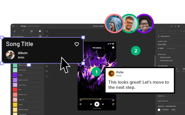
These 14 principles of user interface design will improve your users’ usability, so make them enjoy your product while using it. Apply this principles in practice. Use UXPin for advanced prototyping that makes you create beautiful and fully interactive prototypes in minutes. Try UXPin for free.
Place Users at the Center
As always, the first UI design principle is to focus on people (or, the “user” as we all say). A good user interface is easy and natural to use, avoids confusing the user, and does what the user needs.

You need to understand who your users are as well as understand what they want to do. Are they experts? The best way to do this is to talk to them.
Creating and structuring interviews is beyond the scope of this post, but interview your audience, learn who they are, and develop UI designs for them. Learning about human-centered design will help you achieve the right mindset for best interfaces and focus on people first, design second.
Strive for Clarity
The purpose of the user interface is to allow the user to interact with the website or application (or, more generally in broader design, any product). Avoid anything that confuses people or doesn’t help them interact.
Minimize Actions and Steps Per Screen
Streamline tasks and actions so they can be done in as few steps as possible. Each screen should have one primary focus. For example, the purpose of this blog is for you to read and, hopefully, enjoy it and learn from it. It’s not to share it on Twitter or email a colleague (though please do if you find it valuable enough to share).

Keep the primary action front and center and move secondary actions to deeper on a page or give them lighter visual weight and the right typography.
Aim for Simplicity
Classics exist for a reason; they’re timeless and never go out of style, though they do benefit from modern touches. Think of the little black cocktail dress or the tuxedo; each are fashion style staples. They’re simple, elegant, and add a touch of class to the wearer.
A user interface should be simple and elegant. Read more about simplicity here: Design Simplicity.
Be Consistent
Consistency creates familiarity, and familiar interfaces are naturally more usable. How frustrating would it be to get behind the wheel of a car and the brake is on the right and the accelerator on the left? Or filling in a Web form with the “Submit” button in red and the “Delete” button in green.

Consistent design reduces friction for the user. A consistent design is predictable. Predictable design means it’s easy to understand how to use functions without instruction. Not only should UI design be consistent internally, but externally as well.
General conventions across websites and apps that work identically or nearly so make your site easy to navigate and use. Apple’s Human Interface Guidelines provide a fantastic example of consistency across apps. The guidelines detail how functions should work across apps and on all Apple devices so that a user of any Apple product can pick up any other and easily use it.
This also means don’t invent or reinvent common patterns. Many patterns already exist for design problems (patterns also reduce cognitive load, principle 9 below, because users already know how they work). Putting the search bar at the bottom of the page wouldn’t be revolutionary to design, it would just be confusing.
A design system is a great way to ensure consistency in UI design.
Make Your User Interface Design Invisible
Don’t draw attention to your user interface. A great UI allows people to use the product without friction, not spend time figuring out how to interact with the interface.
Provide Useful Feedback
Feedback can be visual, audio (the ding of a new message alert), or sense of touch (useful in gaming or the “buzz” alert for a new email or phone call when your phone is set to “silent”). Every action should have feedback to indicate that the action was successful or not.
Feedback helps to answer questions in four areas:
- Location: You are here.
- Status: What’s going on? Is it still going on?
- Future status: What’s next?
- Outcomes & Results: Hey, what happened?

Hovering over a navigation item that then changes color indicates an item is clickable. Buttons should look like buttons. Feedback lets the user know if they’re doing the right thing (or the wrong thing).
Reduce Cognitive Load
Many of these UI design principles serve to reduce cognitive load for users. Basically, don’t make users think (also a useful UX design principle as well). There are a few common ways to reduce cognitive load and make using your website or app easier:
- Chunk actions and information – Most people can handle seven-plus-or-minus two chunks of information when processing it. For instance, breaking up telephone numbers in the usual 3-3-4 way rather than a 10 digit sequence results in fewer errors.
- Apply 3-click rule – it shouldn’t take more than three clicks to find any information.
- Minimize recall in favor of recognition – common images and icons in context help users identify functionality, think of the trash can and the bell icons (commonly used for notifications) and other commonly used icons that trigger pre-existing memory. This also means don’t take a commonly used icon that most people understand and then use it to represent something else, you’ll just confuse people.
Make It Accessible
UI designs need to take into account accessibility issues. Online, this often means ensuring the visibly impaired can access and use the product. Don’t forget about color blindness as well.
Roughly 1 in 12 males (that’s about 8%) and 1 in 200 females (about .5%) are color blind to some degree. Use color to accentuate and emphasize, but don’t rely entirely on color to communicate information.
Include User Feedback in the UI
Don’t design in a vacuum. Test and validate design choices by gathering user feedback. Watch users attempt to use your design (without coaching them). Are they confused? Can they achieve the desired outcome easily?
Do this in both the design process and continually evaluate after launch (heat maps are one way to track how effective a UI is; another one is A/B testing).
Flexibility
Create a UI that will work and look great across multiple platforms. Of course, it may have to be tweaked depending on the form factor of a device and its operating system (Android and iOS, for example), but it should be flexible enough to work on anything.
Visual Structure
Keep a consistent visual structure to create familiarity and relieve user anxiety by making them feel at home. A few elements to focus on include a visual hierarchy with the most important things made obvious, color scheme, consistent navigation, re-use elements, and create a visual order using grids.

Dialogs Should Result in Closure
Actions should have a beginning, middle, and end (with feedback at each step). For example, when making an online purchase we move from browsing and product selection to the checkout and then finally confirmed that the purchase is completed.
Provide a Clear Next Step
Include a clear next step a user can take after an interaction. That could be as simple as a “back to top” click at the end of a long blog post or a pointer to more information. Help the user achieve their goals with the next step.
One final thought to remember when designing a user interface, you will never successfully appeal to everyone. You can do your best to appeal to most. You can also do your best to personalize based on personas and well-defined users.
Even so, you’ll never appease everyone. However, keeping all fourteen of these UI design principles in mind as you decide what to include and exclude in your user interface design will help you keep the user front and center in your decision-making.
Creating a user interface is simple in UXPin. Work inside of a browser, get real-time feedback and collaborate with your entire team all online. You’ll create, test, and iterate your UI designs faster than ever with UXPin. Discover the power of UXPin for UI design. Try UXPin for free.


