Want faster prototypes that developers can directly use? Combine Claude Haiku 4.5, Ant Design, and UXPin Merge to design with production-ready React components.
Here’s why this matters:
- Save Time: Skip the back-and-forth between design and development. Use the same components developers work with.
- AI-Powered Design: Claude Haiku 4.5 generates layouts from simple text or images, speeding up the process.
- Ant Design Integration: Access a library of pre-built, responsive components that behave exactly as they will in production.
How it works:
- Use Claude Haiku 4.5 to create layouts with text prompts or images.
- Customize Ant Design components directly in UXPin Merge.
- Add interactions and logic to build functional, code-based prototypes.
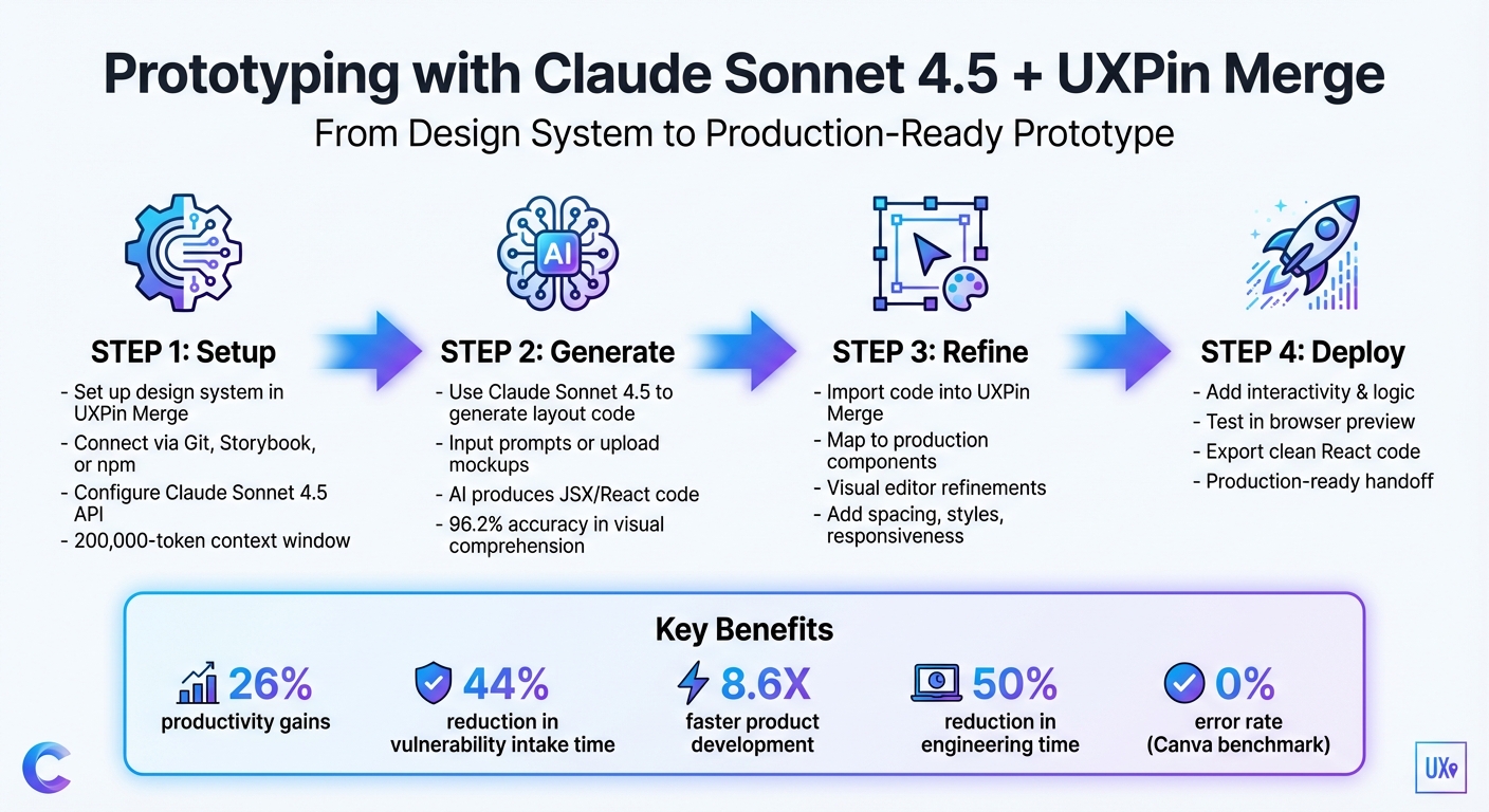
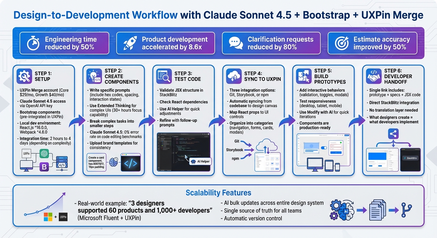
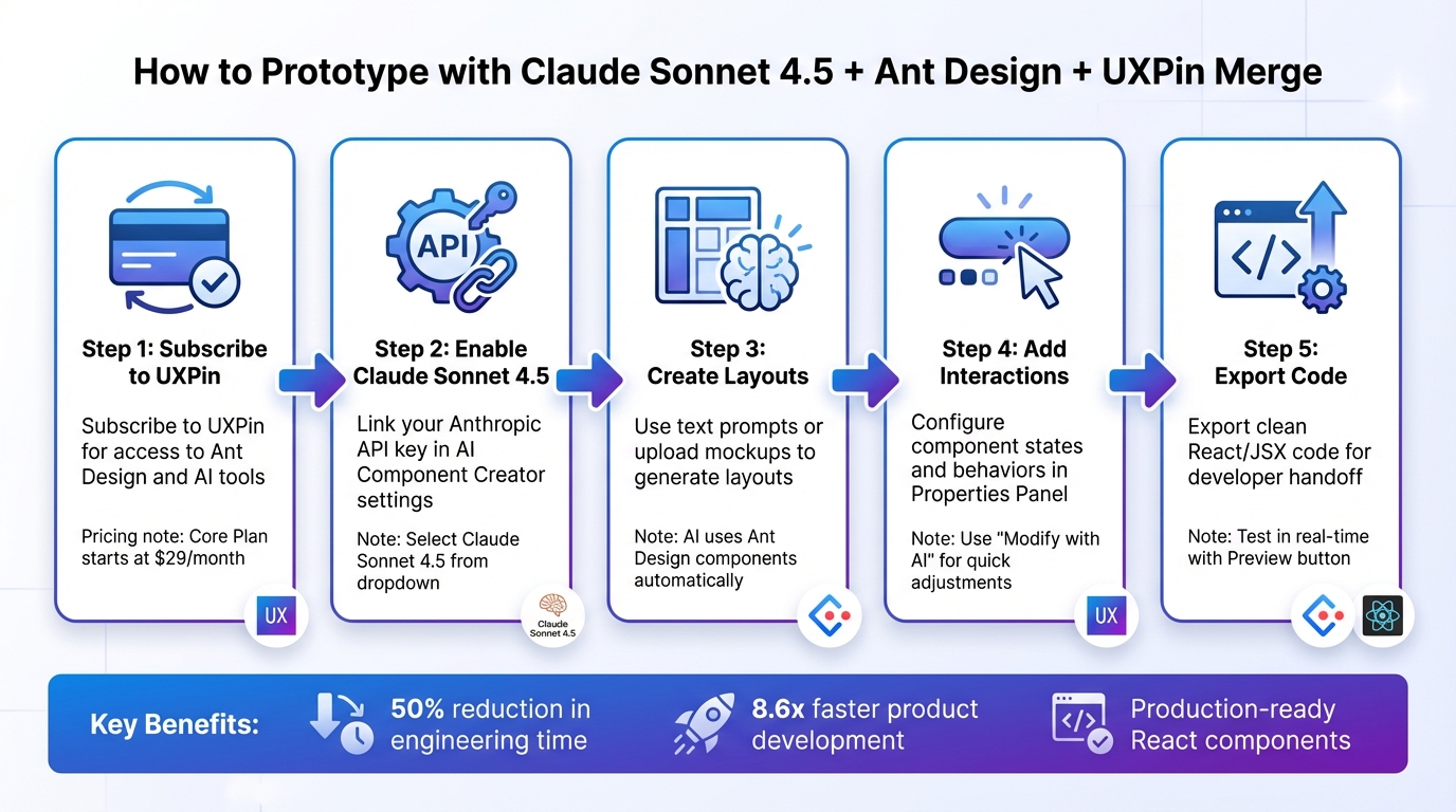
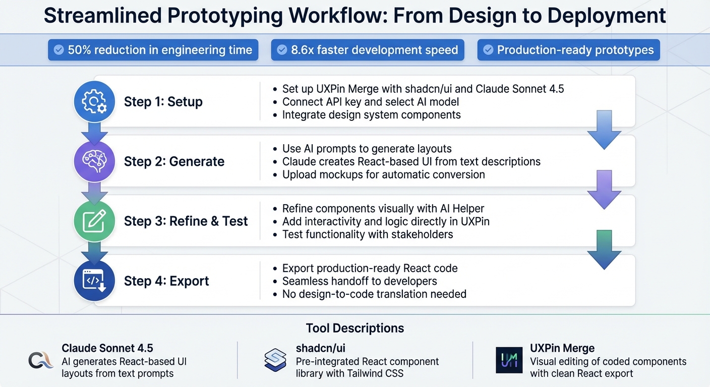
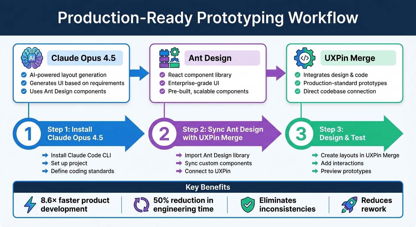
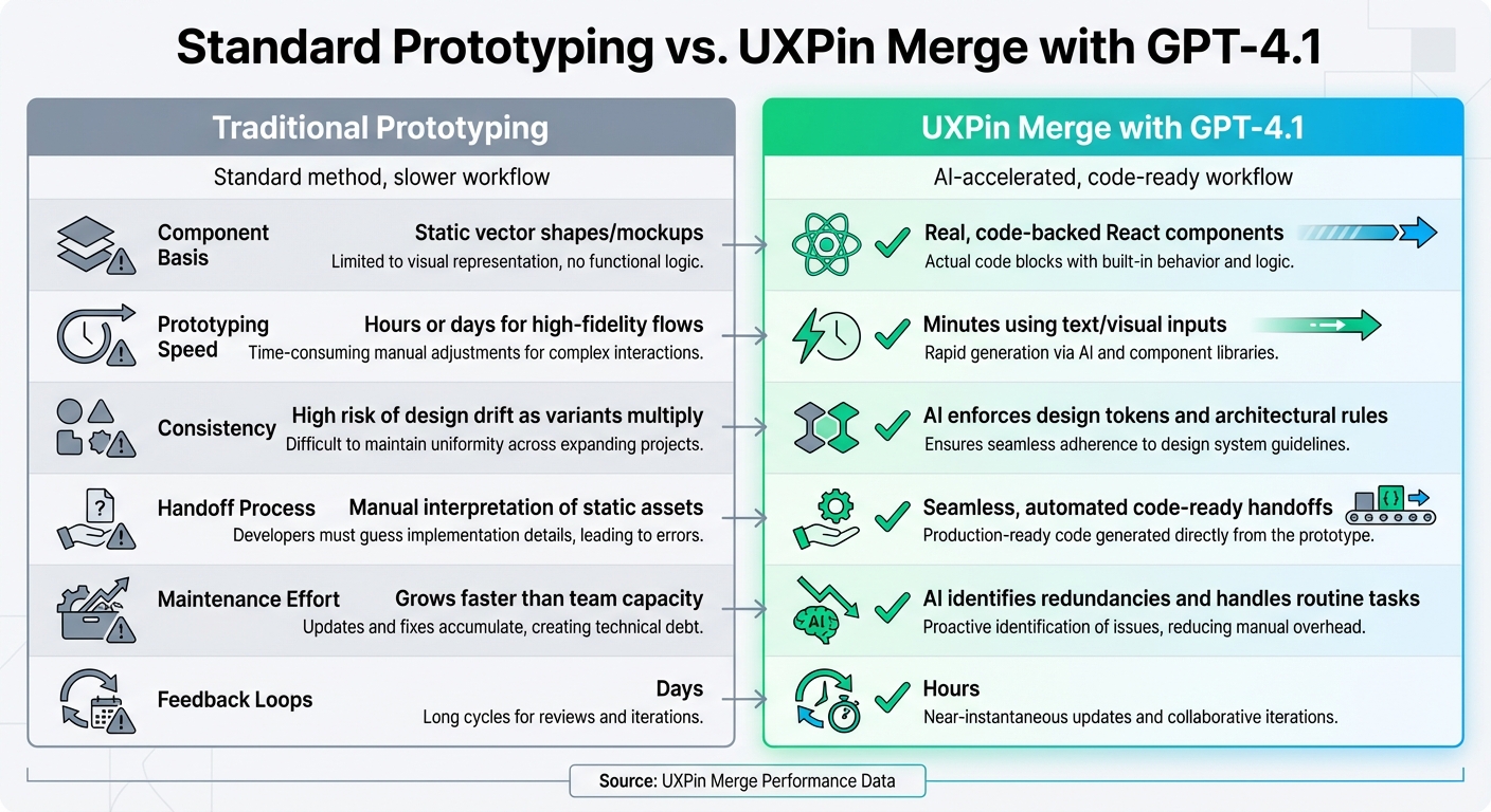
Start by setting up a UXPin Merge account, linking your Anthropic API key, and integrating Ant Design. This workflow bridges design and development, ensuring your prototypes are ready for production and saving teams up to 8.6× development time.
Key takeaway: Design smarter, faster, and closer to the final product.
UXPin Merge AI: Smarter UI Generation That Follows Your Design System

sbb-itb-f6354c6
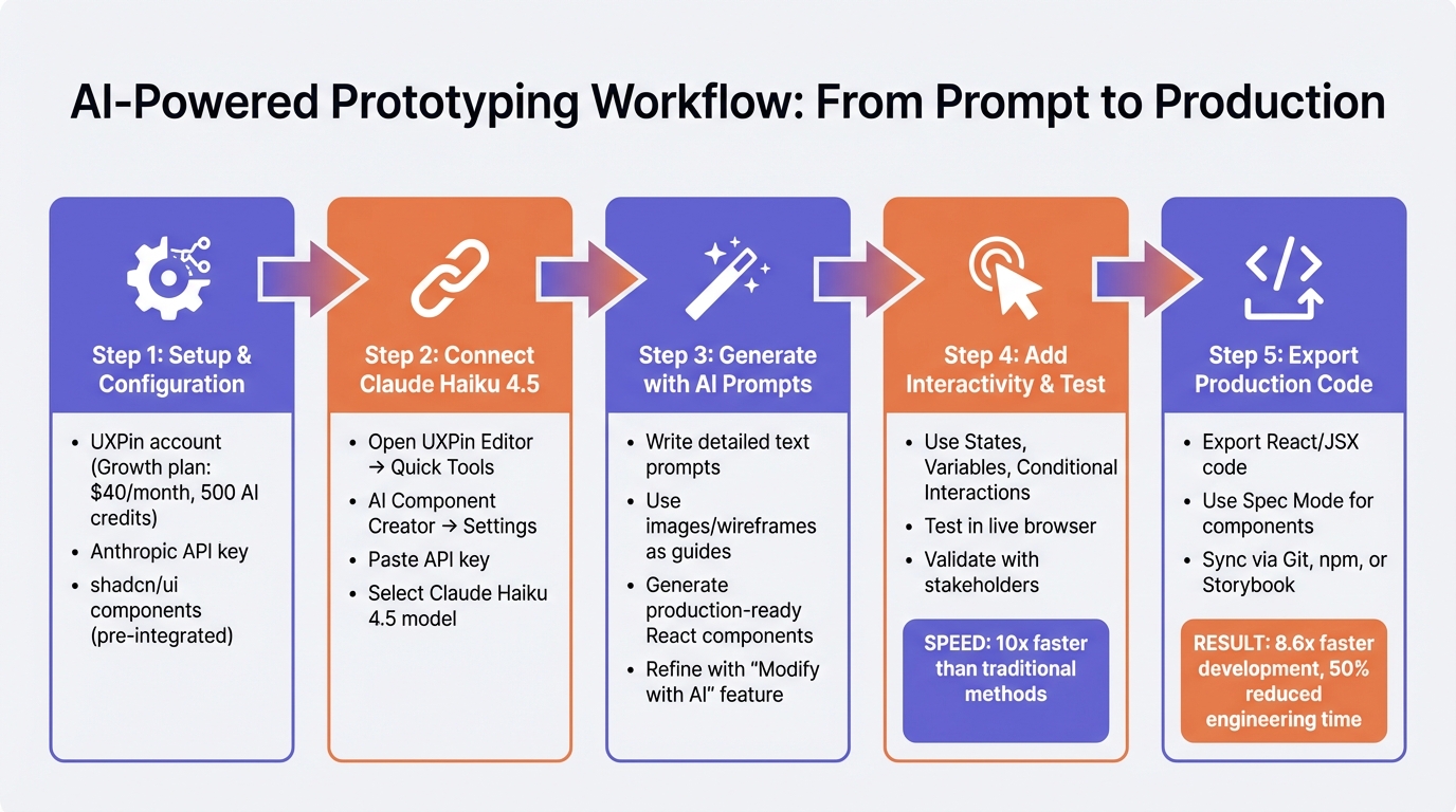
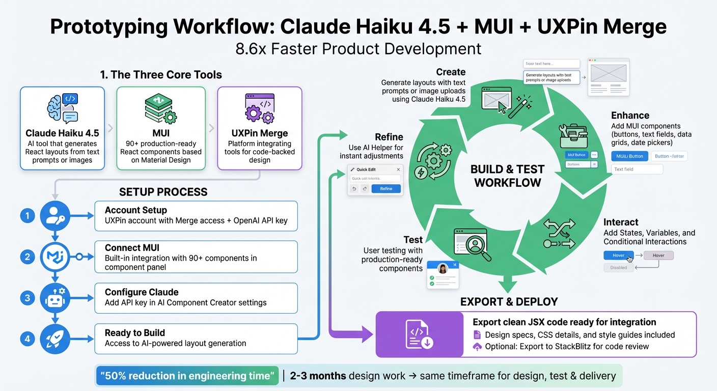
What You Need to Get Started
To begin, you’ll need three essentials: a UXPin Merge account, an Anthropic API key for Claude Haiku 4.5, and Ant Design integrated into your workspace. UXPin simplifies the process by natively supporting Ant Design, so there’s no need for manual imports unless you’re working with a custom library.
Setting Up Your UXPin Merge Account

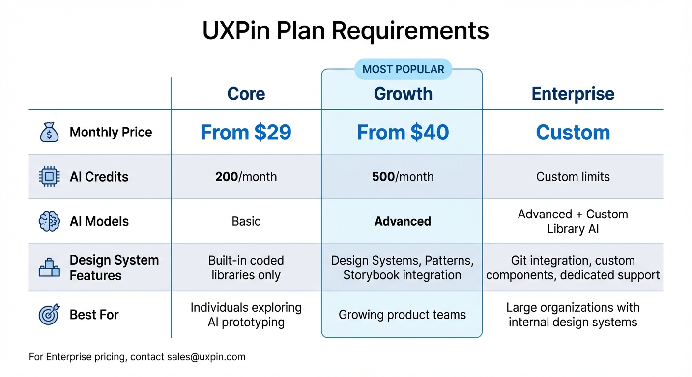
Start by signing up for a free UXPin Merge account on the UXPin website. After logging in, head to your dashboard, click "New Project," and choose "New prototype" to open the design canvas. Merge technology is included across all pricing tiers, meaning even free accounts have access to code-based components.
To enable AI features, locate the AI Component Creator in the Quick Tools panel within the Editor. Then, navigate to the Settings tab, where you’ll input your Anthropic API key. UXPin’s Core plan, starting at $29/month, includes 200 AI credits per month, while the Growth plan, starting at $40/month, provides 500 monthly credits.
Setting Up Claude Haiku 4.5

Generate your API key by visiting the Anthropic API console. Released on October 15, 2025, Claude Haiku 4.5 offers a 200,000-token context window and supports a 64,000-token maximum output, making it ideal for handling intricate design systems. The pricing is straightforward: $1 per 1 million input tokens and $5 per 1 million output tokens.
Once you generate your API key, make sure to store it securely, as Anthropic only displays it once. Next, return to UXPin’s AI Component Creator, paste your key into the Settings tab, and select Claude Haiku 4.5 from the model dropdown. This enables you to start creating layouts using text prompts or uploaded images. With the API key set up, you’re ready to incorporate Ant Design components into your designs.
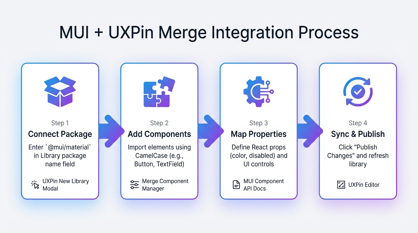
Connecting Ant Design to UXPin Merge
If you’re using a custom library, go to the Design System Libraries tab in UXPin, create a new library, and select "Import React Components." Enter the package name antd and the CSS path antd/dist/antd.css. After selecting the components you want in the Merge Component Manager, click "Publish Library Changes" and refresh your browser to sync everything.
For standard use, Ant Design components are already integrated and ready to go. Simply open your design canvas and find them in your library panel for immediate access.
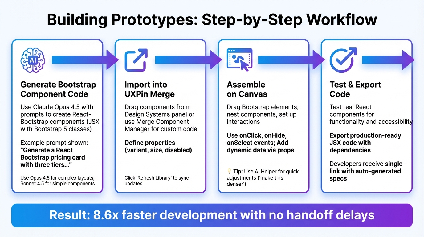
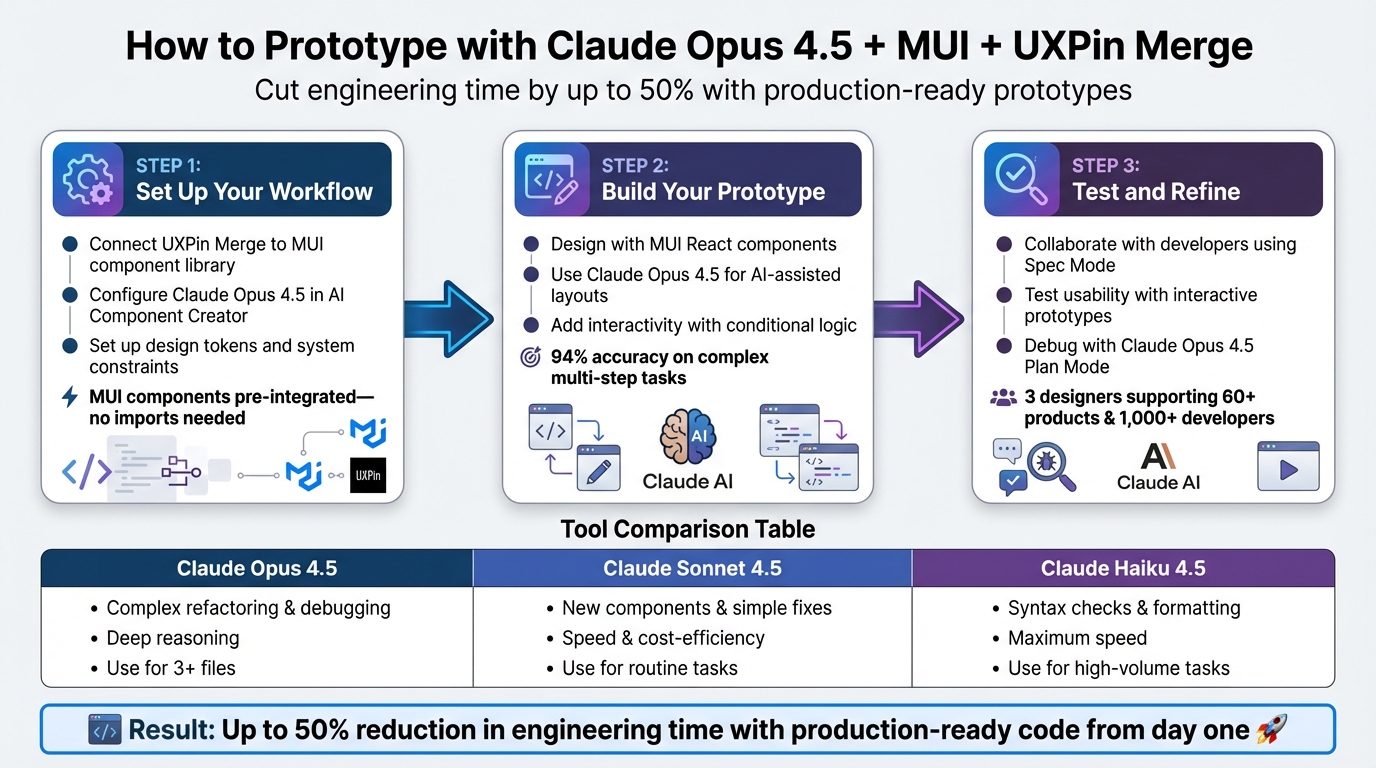
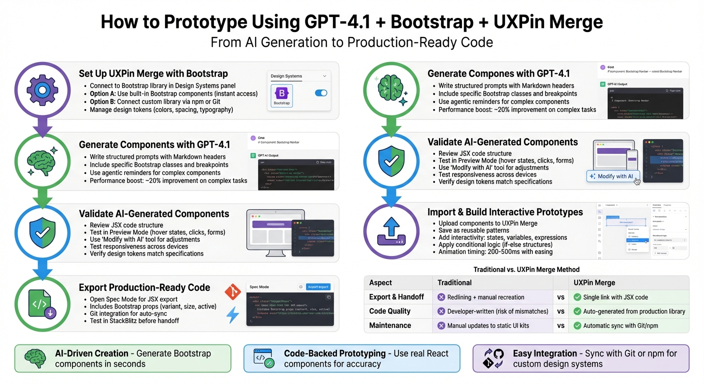
How to Create Prototypes with Claude Haiku 4.5 and Ant Design
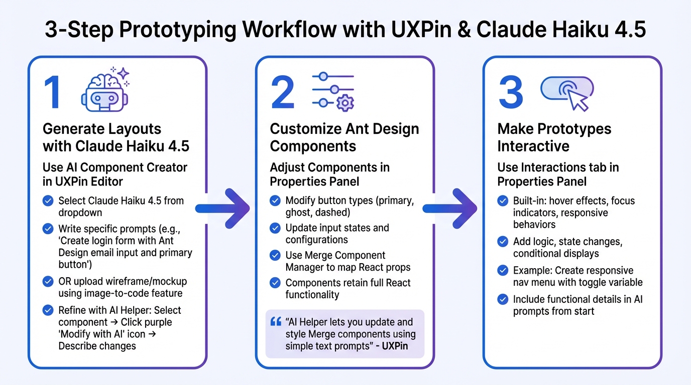
3-Step Workflow for Prototyping with Claude Haiku 4.5, Ant Design, and UXPin Merge
This section walks you through using connected tools to build prototypes that closely resemble production-ready designs. By combining AI-generated layouts with Ant Design’s ready-to-use components, you can create prototypes in three key steps: generating layouts with prompts, customizing components to fit your design needs, and adding interactive features to make your prototype functional.
Creating Layouts with Claude Haiku 4.5
To get started, open the AI Component Creator in the Quick Tools panel of your UXPin Editor and select Claude Haiku 4.5 from the AI Models dropdown. When using prompts, be as specific as possible to get precise results. For instance, instead of saying, "Create a login form", try something like, "Create a login form with an Ant Design email input field and a primary button, centered on the page."
You can also upload a wireframe or mockup using the image-to-code feature, which allows Claude to analyze your image and generate a layout using Ant Design components. If your design is complex, break it into smaller sections and provide detailed instructions for each part to maintain accuracy.
Once the layout is generated, refine it using the AI Helper. Select any component, click the purple "Modify with AI" icon, and describe the changes you need – for example, "Set spacing to 24px" or "Change the button color to blue." This iterative process lets you fine-tune your design without manual adjustments. After refining the layout, you’re ready to customize the Ant Design components.
Adjusting Ant Design Components
Since UXPin Merge uses actual React code, Ant Design components retain their full functionality. You can modify attributes like button types (e.g., primary, ghost, dashed), input states, or table configurations via the Properties Panel on the right side of your canvas. To make updates to multiple components quickly, use the Merge Component Manager to map React props directly to the UXPin interface.
"AI Helper lets you update and style Merge components using simple text prompts. Instead of adjusting properties manually, you can describe what you want to change, and AI will apply the update for you." – UXPin
Once your components are styled and configured, you can move on to adding interactions for a more dynamic prototype.
Making Prototypes Interactive
To bring your prototype to life, use the Interactions tab in the Properties Panel. Ant Design components come with built-in interactions like hover effects, focus indicators, and responsive behaviors. You can take this further by adding logic, state changes, and conditional displays.
For example, to create a responsive navigation menu, define a variable to track whether the menu is open or closed. Then, set up a click interaction on an Ant Design button to toggle that variable. Finally, link the menu’s visibility to the variable using conditional logic. This approach gives you a fully functional prototype that mimics the behavior of the final product – all without writing code.
For even better results, include functional details in your AI prompts from the start. For instance, specify, "The input field should display a blue border when focused", so interactivity is built into the AI-generated layout from the beginning.
Tips for Better Prototyping Workflows
Speed up your prototyping process without compromising quality by applying these practical strategies using Claude Haiku 4.5 and Ant Design in UXPin Merge.
Keeping Components Consistent
Consistency is key when building prototypes, and the AI Helper can make this easier. For example, if you need to update multiple Ant Design components, use the "Modify with AI" tool. By applying the same prompt across all components, you ensure uniformity without having to tweak properties manually.
To maintain alignment with your design system, include specific constraints in your AI prompts. Vague instructions won’t cut it – be precise. For instance, instead of saying, “Make a text field,” try: “Create an input field labeled ‘Email’ with the label positioned above it. Use 16px bold font for the label.”
If you’re working with a custom library, you can import it via Git, Storybook (compatible with over 15 frameworks), or npm. Use the uxpin-merge sync command to keep everything up-to-date and consistent across your projects.
These approaches ensure seamless collaboration between design and development teams, and tools that support no-code and low-code development can further streamline the handoff process by enabling teams to build and iterate faster.
How Designers and Developers Can Work Together
Breaking down complex interfaces into smaller, manageable components makes design handoffs more precise and easier for developers to follow. This method helps developers grasp the reasoning behind design choices.
With Claude Haiku 4.5, the process becomes even smoother. It generates code-backed components instead of static visuals, allowing developers to export clean JSX directly from prototypes. This eliminates the need for rebuilding – what you design is what gets shipped.
Another way to stay aligned is by syncing design tokens. This ensures that AI-generated components adhere to your established themes, creating a shared reference point for both designers and developers throughout the project.
Using AI Within Your Design System
Once you’ve built a foundation of consistent components and streamlined collaboration, integrating AI into your design system can take things to the next level.
Start by crafting detailed prompts that align with your design system guidelines. For example, you might specify: “Generate an Ant Design button with primary styling, 16px padding, and a hover state that changes to #096dd9.” With these details, the AI can create components ready for production that seamlessly fit into your codebase.
When you need to make adjustments, focus on refining existing components instead of starting from scratch. Select an Ant Design component, use the purple AI icon, and describe the updates you want. This method keeps everything within your design system’s rules while letting you experiment quickly. The AI Helper works with popular React libraries like Ant Design, MUI, Bootstrap, and Tailwind.
"Adding a layer of AI really levels the playing field between design & dev teams" – Ljupco Stojanovski
Conclusion
Bringing together Claude Haiku 4.5, Ant Design, and UXPin Merge creates a seamless connection between design and development. Instead of relying on static mockups that developers have to recreate, you’re designing directly with production-ready React components. What you design is exactly what gets shipped, streamlining the process and closing the gap between design and development.
With UXPin Merge, teams have reported delivering products up to 8.6× faster. Claude Haiku 4.5 speeds up layout creation by transforming simple text prompts into detailed layouts in seconds. Meanwhile, Ant Design ensures your design system stays consistent with code-backed components.
The result? Prototypes that look and function like the final product, eliminating the usual handoff challenges. Whether you’re a designer eager to work closer to the code or a developer tired of duplicating designs, this approach ensures everyone is working with the exact components that will make it to production. It’s a game-changer for creating polished, production-ready products.
FAQs
How do I avoid leaking my Anthropic API key in UXPin?
To protect your Anthropic API key in UXPin, never hardcode it directly into prototypes or code. Instead, store it in environment variables or use a secure storage solution to keep it safe and restrict access to your development environment. Make it a habit to rotate your keys regularly and avoid sharing them publicly or committing them to version control systems. Whenever possible, rely on secure configuration files rather than embedding the keys in your code or design files.
Can I apply my design tokens to Ant Design components in Merge?
Design tokens, such as those for colors, spacing, and typography, can be applied to Ant Design components within UXPin Merge. These tokens are a powerful way to maintain a consistent visual style throughout your project. By using them, you can ensure uniformity while still customizing Ant Design components to fit your specific design needs – all seamlessly integrated into your Merge workflows.
What’s the best prompt format for complex screens and interactions?
When working with AI tools to generate complex screens or interactions, using detailed, natural language prompts is key. These prompts should clearly outline the layout, components, and expected interactions.
For instance, a prompt like, "Create a dashboard with a data table, filter bar, and action buttons" gives the AI specific instructions to produce a functional and visually cohesive design. Similarly, something like, "Design a testimonial section with three cards" ensures the AI understands the structure and purpose of the section.
By crafting clear and descriptive prompts, you can guide AI tools to deliver accurate, production-ready components that align seamlessly with your design system. This approach maximizes efficiency and precision in the design process.