Andrew is the CEO of UXPin, leading its product vision for design-to-code workflows used by product and engineering teams worldwide. He writes about responsive design, design systems, and prototyping with real components to help teams ship consistent, performant interfaces faster.
Most AI design tools have a fundamental problem: they generate pixels, not components.
You describe a UI, AI draws rectangles that look like buttons and cards and inputs. It’s impressive in demos. Then your engineers rebuild everything from scratch because none of it is connected to your actual component library.
We built something different. Forge is an AI assistant that works with real, production React components — the same ones your engineers ship with. Designers work visually, but the output is exportable as production-ready React code.
The problem with AI-generated UI
Here’s what typically happens:
Designer uses AI tool to generate a dashboard
AI produces a static mockup — shapes, colors, text
Designer hands off to engineering
Engineer looks at it, opens the codebase, rebuilds it using actual components
Designer notices differences, files tickets
Repeat
The AI-generated design was never real. It was a picture of a UI, not a UI.
This isn’t a minor inefficiency. It’s the entire design-to-dev handoff problem that AI was supposed to solve — except most AI tools just moved the problem earlier in the process.
What if AI worked with real components?
UXPin Merge syncs your production React component library directly into the design tool. Not recreations. Not imported SVGs. The actual components, rendered in the browser.
Designers drag in real <Button>, <Card>, <DataTable> components. They configure real props. They see real states — hover, disabled, loading, error. What’s on canvas is what exists in your codebase.
Forge builds on this. When you ask Forge to generate or edit UI, it’s not drawing shapes — it’s placing and configuring actual components from your library.
How it works technically
Component sync
Merge connects to your production React component library via CLI or CI integration. Components render in an iframe inside the editor — designers see and use your actual code running in the browser.
We support:
React (primary focus)
Storybook integration
npm packages
Git sync for continuous updates
When your library updates, the design tool updates. No manual re-sync. No version drift.
Visual editing, real components
Designers work visually — dragging components onto a canvas, not writing code. But what they’re placing are real React components with full fidelity:
All props are exposed and configurable in the UI
Component states (hover, active, disabled, loading) are built-in
Variants work exactly as defined in your library
Responsive behavior matches production
When a designer configures a <Button variant="primary" disabled>, that’s not a style applied to a rectangle. It’s the actual prop being set on your actual component.
AI generation with Forge
When Forge generates or modifies UI, it works with these real components. It knows what’s available in your library, what props each component accepts, and what variants exist.
The output is a visual design on canvas — but every element is a real component with real configuration. No fake buttons. No approximated cards. No “objects that kind of look like your design system.”
Forge also maintains conversation context. You can iterate:
“Add a cancel button next to save”
“Make this the compact variant”
“Switch to a horizontal layout”
Each prompt modifies the existing design rather than regenerating from scratch. When you want to switch to manual editing, you just do — there’s no mode switch, no export. You’re already working with the real thing.
UXP mailing animated asset GS 02 launch
Export as code
When you’re ready to hand off, export the design as React code. The export reflects exactly what’s on canvas — same components, same props, same structure.
jsx
// Exported from UXPin<Cardpadding="lg"><Form><TextFieldlabel="Email"type="email"/><Buttonvariant="primary"size="lg">Save</Button></Form></Card>
Engineers receive code that uses their own component library. Nothing to translate. Nothing to rebuild.
API access
Component data is also available via API — props, states, variants, structure. This opens up integrations with documentation tools, testing pipelines, or other parts of your workflow.
What this changes
For designers:
Work visually, but with real components — not approximations
All states and variants are built-in, not simulated with overlays
Prototypes actually work — real interactions, real responsive behavior
No learning a new tool; it’s still a design canvas
For engineers:
Export gives you production-ready React code
Uses your actual component library — nothing to translate or rebuild
Props and structure match what was designed
No more “that’s not how the component works” conversations
For teams:
Single source of truth between design and code
Design system adoption is enforced by the tool — designers can only use what exists
AI can’t go off-brand if it only has access to your components
Faster iteration because there’s no translation step
Limitations and trade-offs
Being honest about where this doesn’t work:
You need a component library (with a caveat). If your team isn’t working with coded React components yet, Forge doesn’t help much. It’s built for teams that have already invested in a design system. If you’re still in Figma pushing pixels without a coded library, this isn’t your tool — yet.
Caveat: Lucky for you, UXPin Merge has already natively integrated a number of Global component libraries such as MUI, ShadCN, Bootstrap and more. This is a great starting place for those without a custom component library.
React-first. Merge has strong support for React. Vue, Angular, and Svelte support is limited or nonexistent. If your stack isn’t React, the value proposition breaks down.
AI is still AI. Complex layouts sometimes need manual adjustment. Forge is faster than starting from scratch, but it’s not a replacement for design judgment. It gets you 80% of the way quickly; you refine the rest with UXPin’s manual designs tools – all in one place.
Learning curve. Designers working with Merge need to understand props, variants, and component composition. It’s more technical than pushing pixels in traditional design tools. Not every designer wants this. For the ones who do — design engineers, technical designers, systems-thinkers — it’s a better way to work.
Why we built this
UXPin has been working on code-backed design tools for years. Merge launched in 2019. The hypothesis was always that the design-to-dev gap exists because designers and developers work in different mediums — pixels vs. code.
Most design tools try to bridge this with better handoff specs, more detailed exports, tighter integrations. But they’re still generating static artifacts that engineers have to translate.
AI made this worse before it made it better. Every AI design tool we saw was generating more static pixels for engineers to rebuild. Faster mockups, same translation problem.
Forge is our attempt to make AI useful for teams that have already solved the medium problem. If designers are already working with real components, AI should too. The output should be shippable, not just presentable.
The name
We called it Forge because a forge doesn’t replace the blacksmith — it gives them heat and speed. The craft still requires human judgment.
AI should work the same way. It accelerates the work without replacing the worker.
Try Forge AI Today
Forge is live now in UXPin. Available to all accounts with AI enabled and free trials.
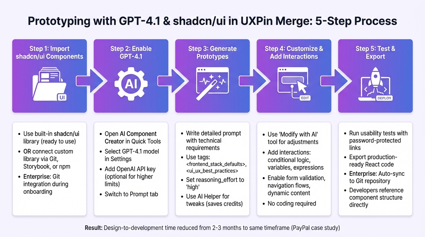
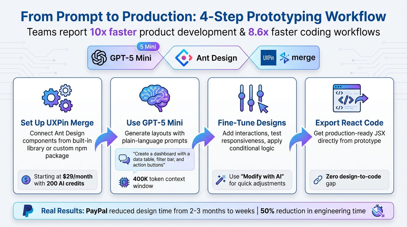
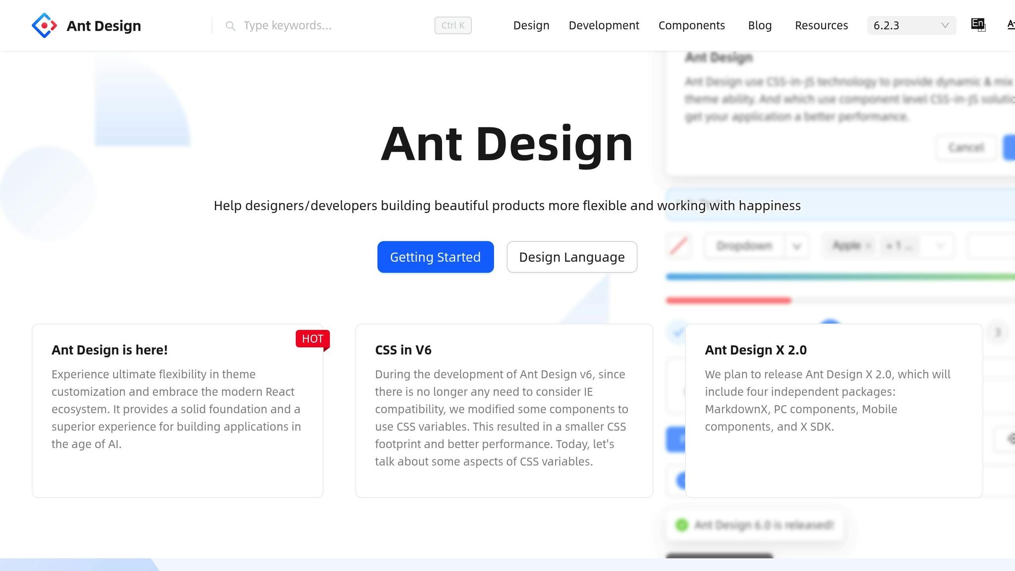
Prototyping is faster and more precise with GPT-4.1, Ant Design, and UXPin Merge. These tools allow you to create production-ready prototypes in minutes using React components. Here’s how it works:
GPT-4.1 generates layouts based on text prompts, combining logic, visuals, and interactivity.
Ant Design provides a library of React components with built-in functionality like validation, sorting, and responsive behavior.
UXPin Merge integrates these components directly into your design, syncing with live code for seamless collaboration between designers and developers.
Key Benefits:
Describe your needs (e.g., "Create a dashboard with filters"), and GPT-4.1 generates a layout instantly.
Prototypes include real interactions and states, mirroring the final product.
Sign up for a UXPin account (plans start at $29/month; free trial available).
Obtain an OpenAI API key to enable GPT-4.1 functionality.
Use the AI Component Creator in UXPin to craft detailed prompts and generate layouts.
By combining these tools, you can streamline workflows, reduce rework, and deliver functional prototypes that developers can use immediately.
UXPin Merge AI: Smarter UI Generation That Follows Your Design System
sbb-itb-f6354c6
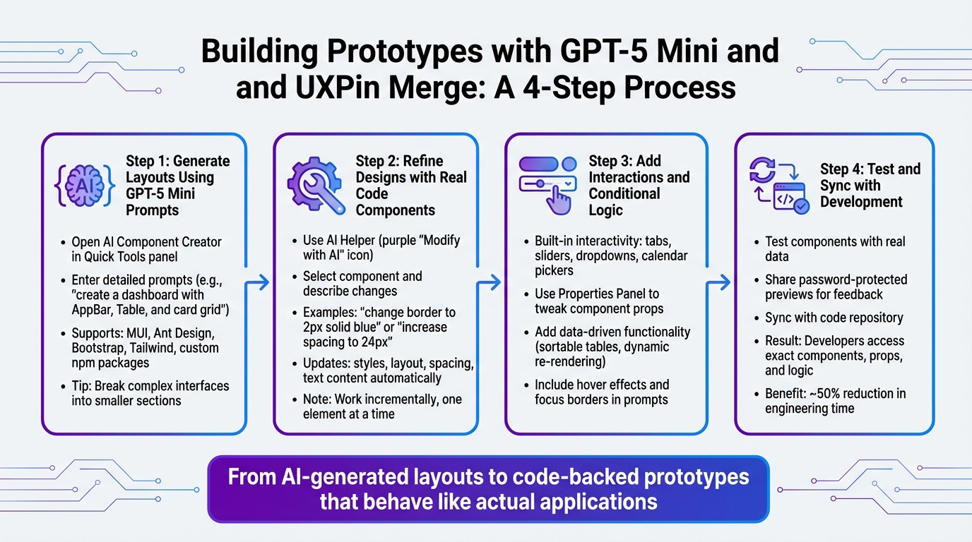
What You Need to Get Started
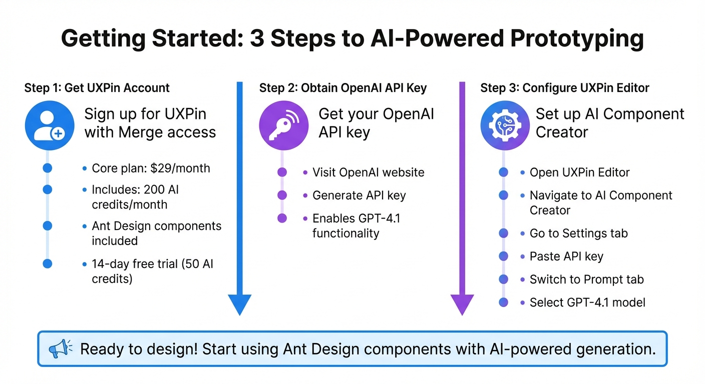
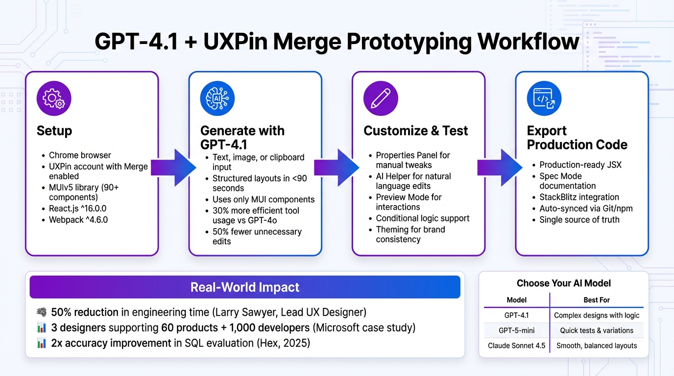
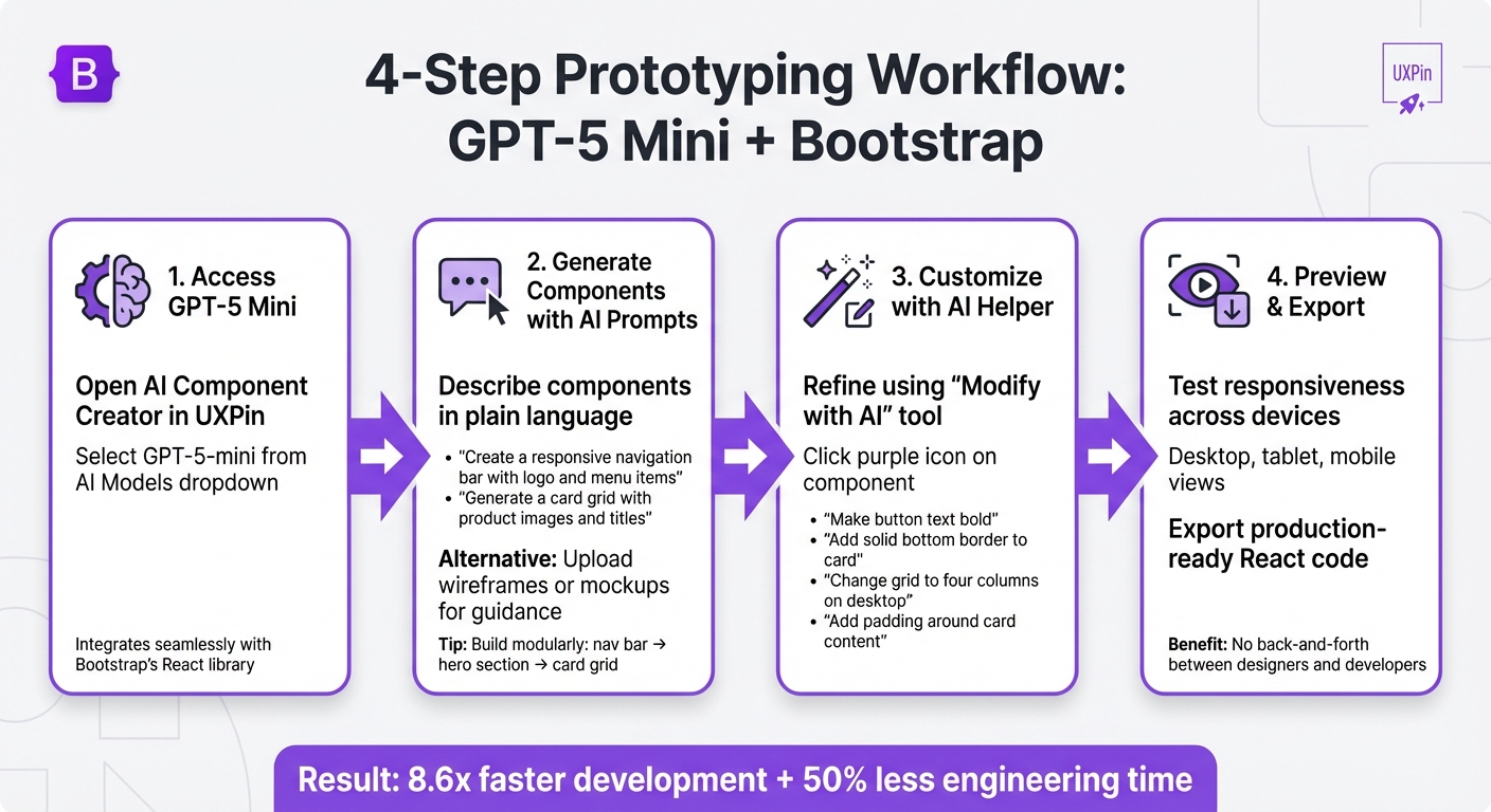
Getting Started with GPT-4.1, Ant Design, and UXPin Merge: 3-Step Setup Process
Before diving into prototype creation with GPT-4.1 and Ant Design, there are a few steps to set up your workspace.
First, you’ll need a UXPin account with Merge access. The Core plan, starting at $29/month, includes Ant Design components, 200 AI credits per month, and access to GPT-4.1. For those needing more, Growth and Enterprise plans offer additional AI credits and advanced models. Not ready to commit? Try the 14-day free trial, which includes 50 AI credits to explore the workflow before subscribing.
Next, get an OpenAI API key from their website. This key enables GPT-4.1 functionality. Open the UXPin Editor, navigate to the AI Component Creator, go to Settings, and paste your API key. Then, switch to the Prompt tab and select GPT-4.1 from the list of available models.
Once these steps are complete, you’re ready to set up UXPin Merge and start designing.
UXPin Merge runs directly in your browser through the UXPin Editor. Once your account is active and your API key is set, you can start using Ant Design components right away. Unlike static images, these are fully functional React components that behave exactly as they would in a live application.
To get started with Ant Design, open a new project in the UXPin Editor. The Ant Design library is integrated into the component panel, offering a variety of options like buttons, forms, tables, and navigation elements. Simply drag components onto your canvas or use GPT-4.1 to generate entire layouts based on text prompts. Since Ant Design is built into UXPin Merge, there’s no need to import libraries or manage npm packages unless you’re working with custom components.
Within the AI Component Creator (found in the Quick Tools panel), you’ll find two main tabs:
Settings: Configure your API key and select your AI model.
Prompt: Describe the components or layouts you want to build.
For complex designs that combine visual elements, logic, and text, GPT-4.1 is the recommended model. It handles structured layouts more effectively than simpler models like GPT-4o-mini, which is better suited for basic tasks.
Once GPT-4.1 is selected, you can use the AI Helper to modify existing components. Simply select an Ant Design component on your canvas, click the purple "Modify with AI" icon, and enter a prompt. This tool supports other React libraries too, like MUI, Bootstrap, and Tailwind.
Now that your workspace is ready, you can start exploring the vast array of Ant Design components.
Ant Design, developed by Alibaba, is a React UI library with over 50 ready-to-use components tailored for enterprise applications. These include everything from buttons and inputs to advanced features like data tables and dashboards. In UXPin Merge, these components aren’t just visual placeholders – they’re the actual code your developers will use.
This approach eliminates the gap between design and development. When prototyping with Ant Design in UXPin Merge, you’re working with components that already include built-in interactions, states, and responsive behavior. For example, dropdown menus will open, forms will validate inputs, and data tables can sort and filter automatically – saving time during development.
Ant Design follows a consistent design system, ensuring a cohesive look across your prototypes. The library comes with a default theme that includes predefined colors, typography, spacing, and styles. You can further customize these components using UXPin settings or AI prompts.
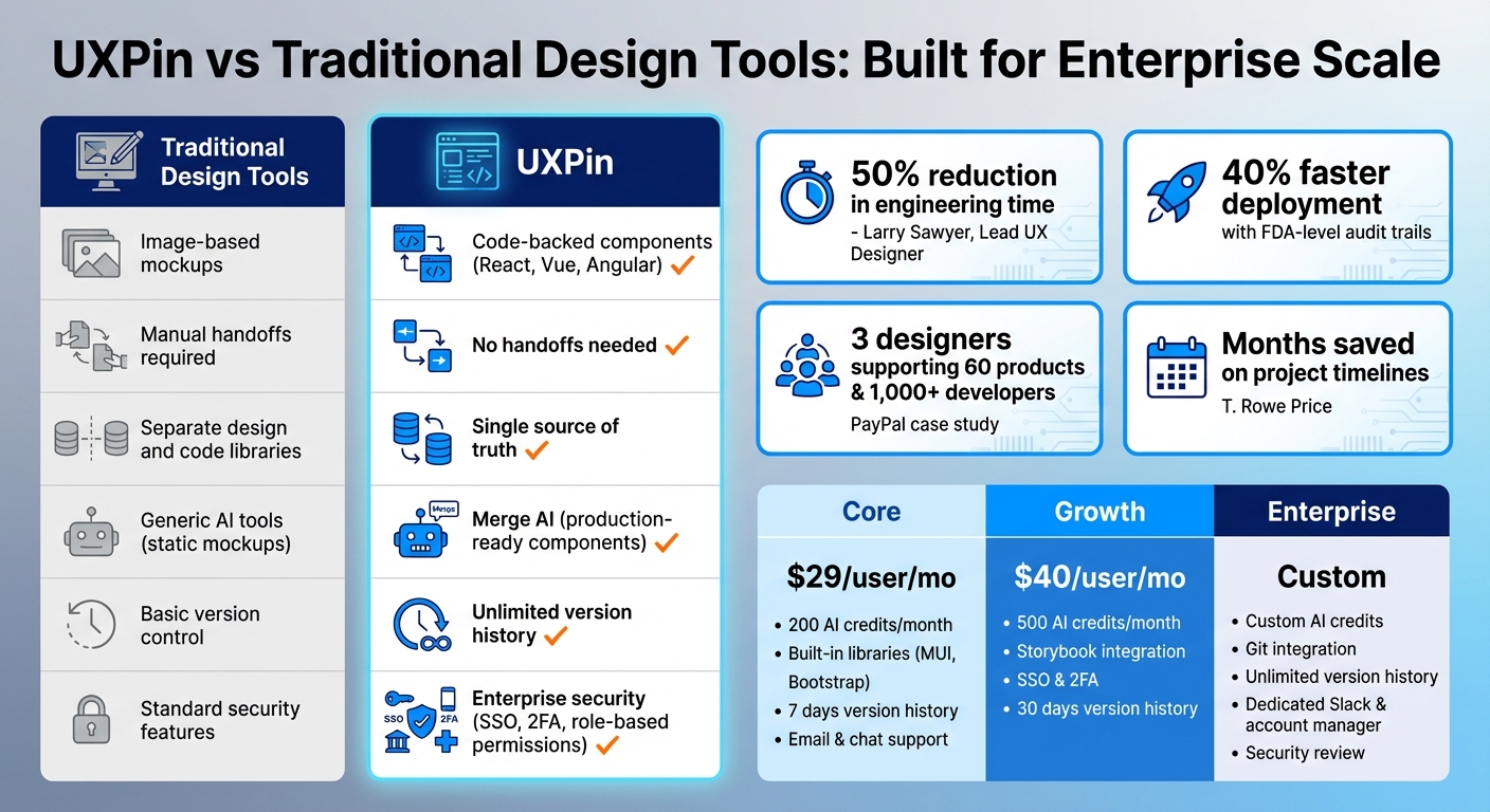
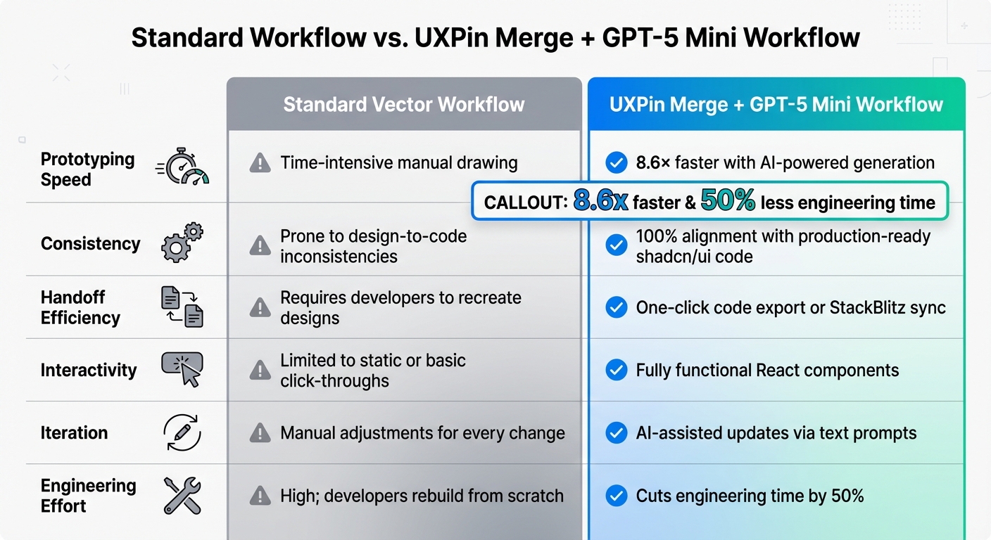
As Larry Sawyer, Lead UX Designer, shared, "When I used UXPin Merge, our engineering time was reduced by around 50%".
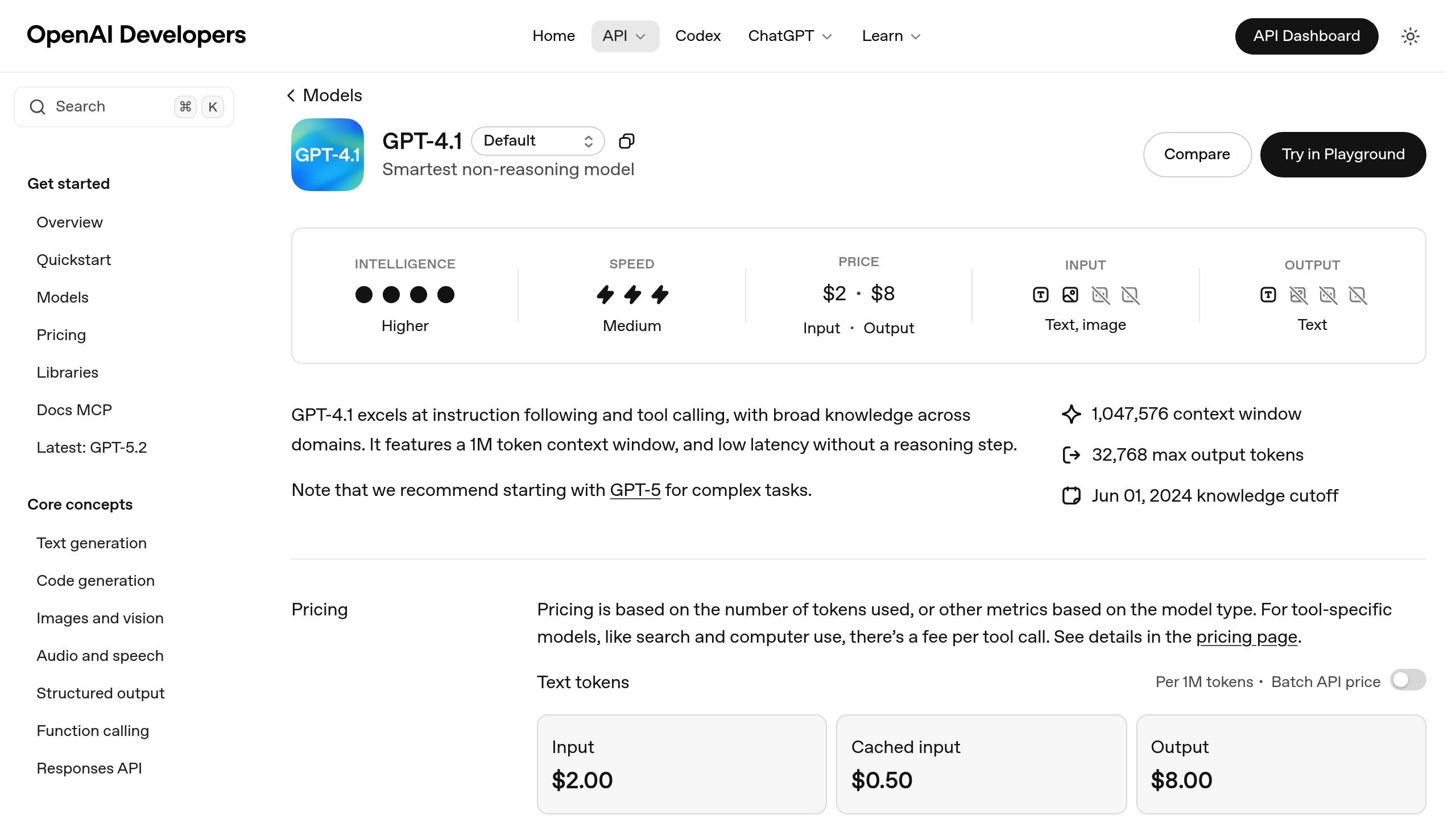
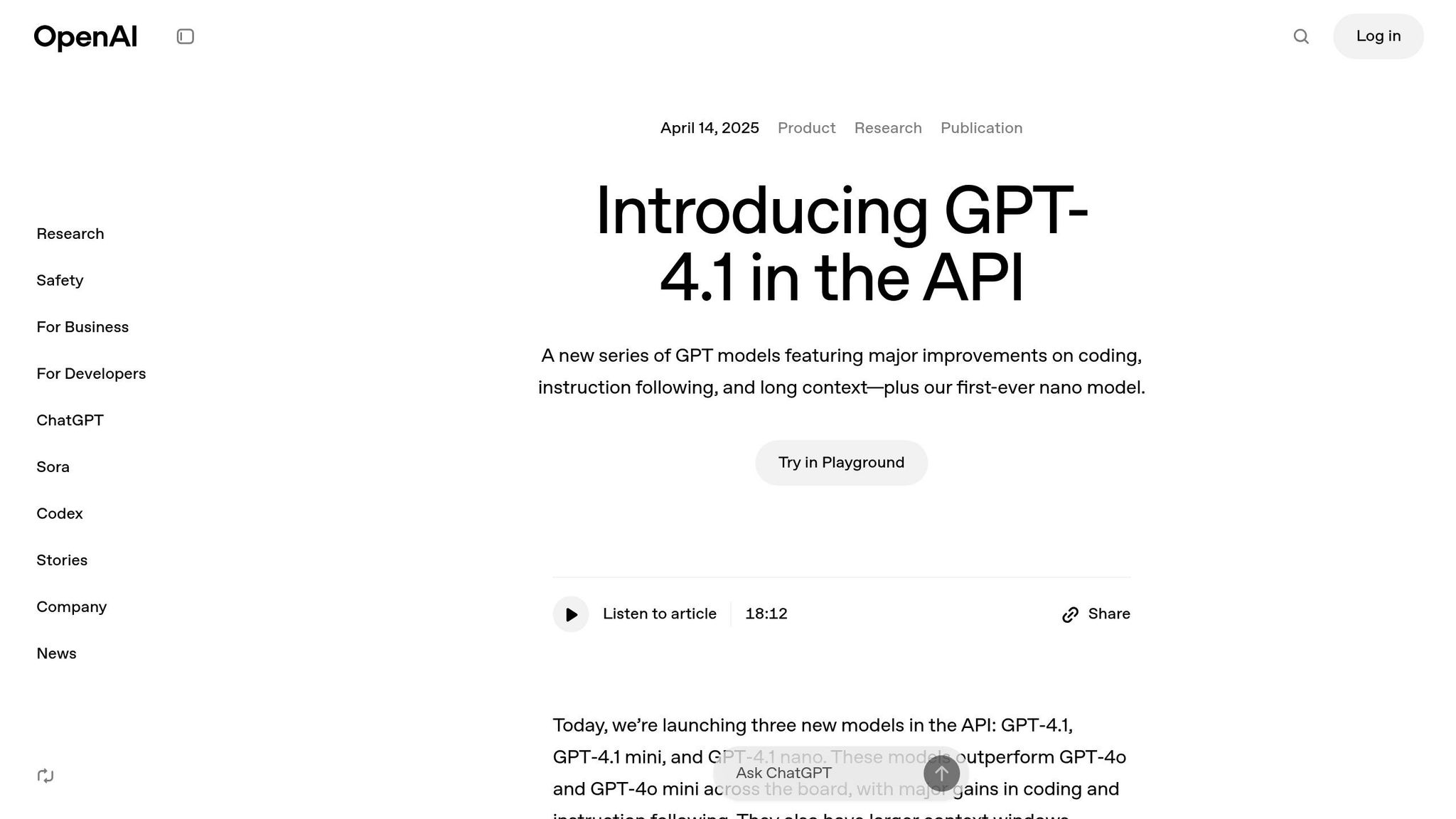
GPT-4.1 powers UXPin Merge’s component generation. Released by OpenAI on April 14, 2025, it features a 1 million token context window, making it ideal for handling complex prototyping tasks that require detailed instructions.
For example, if you prompt GPT-4.1 with "create a dashboard with a sortable data table and filters", it will generate a layout using Ant Design components. The AI doesn’t invent new UI patterns or random designs – it works within your design system’s guidelines. Every component it suggests is pre-approved, tested, and ready for production.
The AI understands how components relate to each other, as well as layout hierarchies and common UI patterns. Ask for a form, and it will include labels, input fields, validation states, and a submit button. Request a navigation bar, and it will structure menu items, dropdowns, and responsive elements. You can refine these outputs with follow-up prompts to adjust colors, spacing, typography, or other properties – all without writing code. This ensures that your prototypes closely match production-ready code, streamlining collaboration between design and development teams.
For the best results, use detailed prompts. Include specifics like hex color codes, font sizes, and padding. For example, asking for "an Ant Design card component with a 24px title in #262626, 16px body text in #595959, and 16px padding" will produce a more precise result than a vague request like "make a card."
Using UXPin Merge to create functional layouts and generate code can reportedly speed up product development by 8.6 times.
As Donal Tobin remarked, "The AI component creator is a favorite!", highlighting the efficiency and accuracy GPT-4.1 brings to the design process.
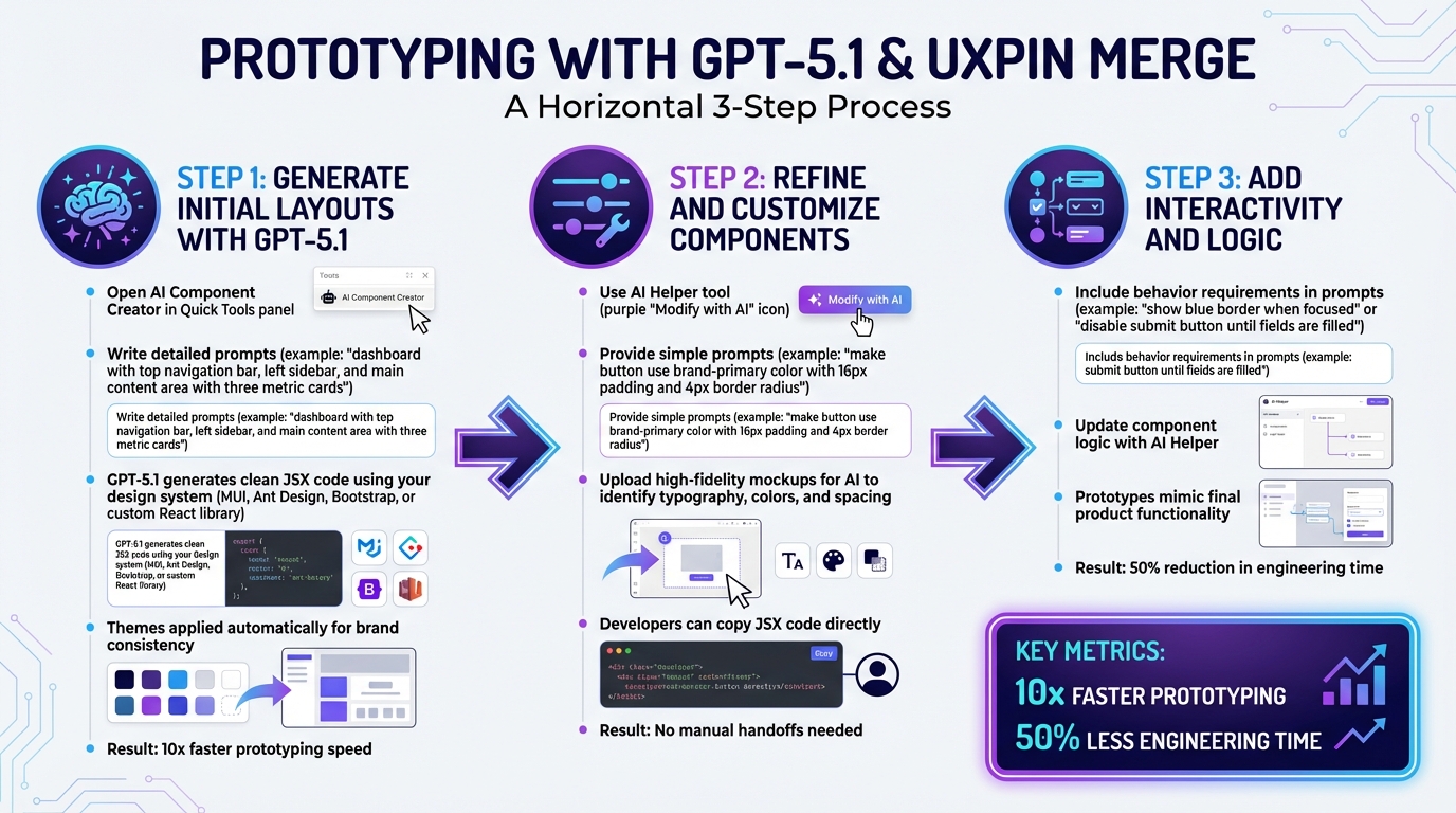
Generating Prototypes with GPT-4.1
Once your workspace is ready, you can dive into the AI Component Creator, craft a detailed prompt, and let GPT-4.1 generate a functional React prototype using Ant Design components. The AI creates a live, interactive prototype that includes built-in interactions and responsive behavior.
The secret to getting great results lies in writing clear and specific prompts. For example, instead of saying, "Create a login form", try something like: "Create a login form using Ant Design components with email and password fields, validation states for both fields, and a primary submit button." This level of detail ensures GPT-4.1 selects the right components from the Ant Design library.
Once the initial layout is generated, you can tweak it directly on the UXPin canvas. Use the property panel to adjust Ant Design-specific properties like "size", "type", or "status" without writing code. For more extensive changes, select the component, click the purple "Modify with AI" button, and provide a new prompt, such as: "Change the button color to #1890ff and increase padding to 24px."
As Allison Barkley, Director of Operations at Baremetrics, shared: "Being able to jump straight from design to having code ready is going to be a huge time-saver for our team".
For immediate testing, you can open your prototype in StackBlitz, where you can view and edit the React code in real-time. This smooth workflow bridges the gap between concept and production-ready code.
Writing Clear AI Prompts for Ant Design
The accuracy of your prototype depends on how well you craft your prompts. GPT-4.1 performs best when you provide specific instructions that include component names, visual details, and layout structure. Always mention "Ant Design" in your prompt to ensure the AI uses the correct library.
A good prompt should include:
Component type: Specify the exact component you need.
Visual details: Include colors, sizes, and spacing.
Functional requirements: Mention features like validation, sorting, or pagination.
For example, instead of saying "make a header", try: "Create a dashboard header using Ant Design with a logo on the left, a navigation menu in the center featuring Home, Products, and Settings links, and a user avatar dropdown on the right. Use #001529 for the background and set the height to 64px." This approach leaves little room for misinterpretation.
If you’re working on complex interfaces, break them into smaller sections. For instance, start with: "Create an Ant Design card component for a product listing with an image placeholder, product title in 18px bold text, price in #52c41a, and an Add to Cart button." Once the smaller components are ready, you can combine them into a full layout.
Refining your prompts is part of the process. If the output isn’t what you envisioned, add more details or adjust your instructions. These well-structured prompts are the foundation for generating accurate and functional layouts.
Creating Initial Layouts with AI
Start by defining the main structure of your prototype. Open the AI Component Creator, select GPT-4.1, and describe your layout in the prompt field. For example: "Create a dashboard layout using Ant Design with a fixed sidebar navigation on the left (200px wide, #001529 background), a top header bar (64px height, #ffffff background), and a main content area with 24px padding."
GPT-4.1 will generate a layout using Ant Design components like Sider, Header, and Content, matching your specifications. These components are the same ones developers use in production, ensuring consistency. The sidebar will contain navigation items, the header will include space for branding and user controls, and the content area will be ready for additional elements.
Once the structure is in place, you can add functional sections. For example: "Add an Ant Design table component with columns for Name, Email, Status, and Actions, including sortable headers and pagination displaying 10 rows per page." The AI will insert a fully functional table with these features.
For forms, be explicit about the fields and their behavior: "Create a user registration form using Ant Design with input fields for First Name, Last Name, Email (with email validation), Password (with a strength indicator), and a checkbox for Terms of Service. Include a primary Submit button and a secondary Cancel button." The generated form will include proper labels, validation states, and the requested functionality.
You can also refine layouts using image-to-UI conversion. Upload a high-fidelity mockup to the AI Component Creator, and the AI will analyze the typography, colors, and spacing to generate an initial structure. You can then refine this structure further through text prompts.
This initial layout acts as the starting point for developing a fully interactive prototype.
Editing AI-Generated Prototypes
After generating your prototype, you can refine it directly on the canvas. Use the property panel for quick adjustments, or for more complex edits, click the purple "Modify with AI" button and describe the changes. For instance: "Change this button to danger type, make it large, and update the text to Delete Account."
When working on multiple elements, it’s best to refine them one at a time. For example, to edit a form, you could start by prompting: "Add helper text below the email field that says ‘We’ll never share your email.’" Then move on to another field and request: "Change the password field to include a visibility toggle icon."
Be patient during the refinement process. Avoid deselecting a component while the AI is processing a request, as this may cancel the operation. If the result isn’t quite right, adjust your prompt with more details and try again.
You can also make broader changes using prompts like: "Align all form labels to the left, increase spacing between fields to 16px, and change the submit button background to #52c41a." This iterative approach allows you to fine-tune the prototype until it meets your exact requirements.
Once your prototype is polished, you’ll be ready to move on to building fully interactive experiences.
Building Interactive Prototypes
Once your layout is ready, you can start adding interactions to make your prototype function like a real application. UXPin Merge offers tools like states, variables, expressions, and conditional logic, all of which integrate perfectly with Ant Design components. These features allow you to simulate hover effects, loading states, validation, and dynamic content – all without writing a single line of code.
Feature
Function in UXPin Merge
Benefit for Ant Design Prototypes
States
Multiple variations for one element
Mimics hover, active, and loading states
Variables
Stores user input data
Enables personalized and dynamic experiences
Expressions
Logic-based functions
Handles complex calculations or behaviors
Conditional Logic
If-then/If-else triggers
Simulates application validation
Spec Mode
Developer inspection tool
Provides production-ready JSX for engineers
For example, you can create a login form where the submit button stays disabled until both the email and password fields are filled. Using conditional logic, you can check whether the input fields contain values and trigger a state change to enable the button. This setup closely mirrors how the final product will behave, offering stakeholders a realistic preview.
Since UXPin prototypes use production-ready Ant Design React components, they behave just like the finished product. Interactive elements such as tabs, calendar pickers, and ripple effects work seamlessly without additional setup.
As Edward Nguyen, UX Architect, shared: "UXPin prototypes gave our developers enough confidence to build our designs straight in code. If we had to code every prototype and they didn’t test well, I can only imagine the waste of time and money".
Adding Interactions to Ant Design Components
To begin, select the component you want to make interactive. Open the Interactions panel on the right and click Add Interaction. You’ll find triggers like "On Click", "On Change", or "On Hover", paired with actions such as "Set Variable Value", "Toggle State", or "Navigate to Page."
For instance, to validate an email field, create a variable called emailValid and set its initial value to false. Add an interaction to the email input field with the trigger "On Change" and the action "Set Variable Value." Use an expression to check if the entered text matches an email format. If it does, update emailValid to true. Then, apply conditional logic to the submit button to keep it disabled unless emailValid is true.
You can also use states to show different versions of components. For example, when a button is clicked, change its state to "loading" to display a spinner and disable further clicks. This replicates the behavior of an application waiting for a server response.
For more advanced interactions, combine variables and expressions. Imagine a shopping cart where changing the product quantity updates a totalPrice variable in real time. You can display the updated total in a text field that adjusts dynamically as the user modifies the quantity. These kinds of interactions make your prototype feel like a functional product.
Testing Your Prototypes
After setting up interactions, click the Preview button in the top-right corner to test your prototype in full-screen mode. Use it as a user would – check that buttons respond, forms validate input, and dynamic content updates correctly. Since UXPin Merge uses code-backed components, you’re testing real Ant Design behavior, not just a visual mockup.
Plan your testing sessions with clear goals. For example:
Use one session to focus on design details like spacing, colors, and alignment.
Dedicate another session to ensure interactions work as expected, such as verifying that the loading state appears when a button is clicked or that error messages display when validation fails.
It’s also important to test with people outside your project team.
As RevPart suggests: "Be sure to test your prototype with those unfamiliar with the product – within or outside of your organization – to reap the benefits of those different ways of viewing and interacting with your product".
This fresh perspective helps uncover usability issues your team might miss.
Finally, use Spec Mode to bridge the gap between design and development. Developers can inspect your prototype, view JSX code for each component, and copy production-ready snippets directly into their codebase. This eliminates the need for lengthy handoff meetings and ensures your design is implemented accurately. These steps guarantee your prototype is as realistic and functional as possible, setting the stage for further refinement.
Tips for Using GPT-4.1 and Ant Design in UXPin Merge
Improving Design and Development Collaboration
When creating interactive prototypes, integrating code-backed components streamlines the collaboration between design and development. With Ant Design in UXPin Merge, developers can directly use production-ready JSX generated from the prototypes. This skips the traditional handoff process where designers create mockups that developers need to rebuild from scratch.
As UXPin explains: "Merge hands your devs something they recognize – and can ship".
To enhance this workflow, make use of Spec Mode. It allows quick inspection of component properties, spacing values, and JSX code. Sharing your prompts alongside Spec Mode insights ensures everyone stays on the same page. This level of transparency helps maintain alignment on the product vision across teams.
Once collaboration is running smoothly, the next step is ensuring design consistency.
Maintaining Consistency with Ant Design
Ant Design offers detailed guidelines for spacing, typography, and component behavior. Sticking to these standards ensures your prototypes work seamlessly across various screens and scenarios. When crafting prompts for GPT-4.1, be specific about Ant Design component names and properties to guarantee the AI selects the correct elements from the library.
For example, specifying details like "Ant Design Primary button with 16px padding" ensures precise results. UXPin’s Prompt Library is a helpful resource for accessing pre-written, optimized prompts tailored for Ant Design layouts. This reduces the need for manual adjustments and speeds up the design process.
Using AI Within Your Design System
To build on consistent design practices, integrating AI into your design system can further standardize your prototypes. GPT-4.1 performs best when it operates within clear design system guidelines. If your team uses a custom design system, the Custom Library AI feature in UXPin Merge Enterprise can be a game-changer. It connects to your Git repository, exposing your custom tokens and components to the AI. This ensures the AI generates layouts that align with your established standards.
As UXPin notes: "AI should create interfaces you can actually ship – not just pretty pictures".
When fine-tuning AI-generated layouts, leverage the AI Helper for iterative adjustments. Instead of starting from scratch, use commands like "make this denser" or "swap primary to tertiary" to refine designs efficiently. This approach saves time while ensuring consistency and adherence to your design system.
Conclusion
Integrating AI-powered design tools with production-ready components transforms your workflow into something faster, more cohesive, and dependable.
By leveraging GPT-4.1, Ant Design, and UXPin Merge, digital prototyping takes on a whole new dimension. Instead of relying on static mockups that require redevelopment, you’re using the exact same React components that will eventually ship to production. This not only removes typical design handoff bottlenecks but also guarantees complete alignment between design and the final product.
With GPT-4.1, you can create functional layouts from simple text prompts, while Ant Design provides components equipped with built-in states, interactions, and accessibility. This means you’re generating high-fidelity, code-backed prototypes that stakeholders can interact with and test right away.
Allison Barkley, Director of Operations, highlights: “The ability to jump straight from design to production-ready code significantly speeds up front-end development”.
This approach doesn’t just save time – it also brings teams together. UXPin keeps everyone on the same page by syncing library updates automatically, ensuring every team member works with the latest components. The result? Faster iteration cycles, fewer misunderstandings, and products that hit the market in days instead of months.
Whether you’re crafting your first prototype or scaling operations for a large organization, this workflow equips your team to deliver production-ready interfaces – helping you move efficiently from design to launch.
FAQs
What plan do I need to use GPT-4.1 with Ant Design in UXPin Merge?
To integrate GPT-4.1 with Ant Design in UXPin Merge, you’ll need a subscription plan that includes both Merge and AI features. These options are generally part of professional or enterprise-level plans. The plan must also provide access to the AI Component Creator, which allows you to create and fine-tune Ant Design components for your prototyping needs. A sign-up or active subscription is typically required to unlock these features.
How do I write prompts that reliably generate Ant Design layouts?
To create dependable Ant Design layouts using GPT-4.1 in UXPin, the key lies in crafting clear and detailed prompts. For instance, if you need a specific section, like a testimonial layout, your prompt should be something like: "Create a testimonial section with three cards."
But don’t stop there – add explicit details about the structure, functionality, and design. For example, specify if the cards should include an image, title, description, and call-to-action button. Mention any layout preferences, like spacing, alignment, or color schemes, to ensure the AI delivers results that align with your vision.
The more precise your instructions, the more consistent and accurate the layouts will be. This approach not only saves time but also simplifies the process of integrating Ant Design components into your UXPin workflow.
Can developers copy production-ready JSX from my UXPin prototypes?
Developers can directly extract production-ready JSX from UXPin prototypes when using UXPin Merge. This tool integrates coded React components with design prototypes, enabling the creation of precise, interactive mockups. These prototypes can then be exported as JSX, streamlining the handoff process and fostering smooth collaboration between design and development teams.
Static mockups don’t cut it anymore. They often fail to match the final product, leading to wasted time, endless revisions, and misaligned outcomes. That’s where code-based prototyping comes in.
This approach uses production-ready code components – the same ones developers use – ensuring prototypes behave like the final product. Tools like UXPin, powered by its Merge technology, let designers sync directly with code repositories like Git or Storybook. The results? Teams report cutting engineering time by 50% and launching products up to 10x faster.
Key Benefits:
No handoffs: Designers and developers work from a single source of truth.
Scalability: Small teams support large organizations seamlessly.
Companies like PayPal have seen massive efficiency gains, with just 3 designers supporting 60 products and over 1,000 developers. Ready to streamline your design process? Code-based prototyping might be your answer.
What Is Code-Based Prototyping?
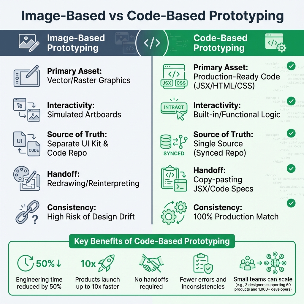
Image-Based vs Code-Based Prototyping: Key Differences and Benefits
Definition and How It Works
Code-based prototyping takes design to a whole new level by using production-ready code components instead of static mockups. These components come straight from Git repositories, Storybook, or npm packages, ensuring they are the exact React, Vue, or Angular elements developers will use in the final product. This approach bridges the gap between design and development, making prototypes not just look like the real thing but act like it too.
In traditional prototyping, designers create visual placeholders – shapes, icons, and buttons – that mimic functionality through linked artboards. Code-based prototyping eliminates this mimicry. For instance, dragging a button into the design brings in the actual coded element, complete with its real behavior and logic. It’s no longer just a visual approximation but a functional piece of the final product.
"Image and vector-based design tools are really too limited for effective product design. With the code-to-design approach, you’re designing with the same UI components your developers use to build the final product." – UXPin
One of the standout features is how updates in the code repository automatically sync with the design environment. This ensures that everyone – designers and developers alike – is working from the same source of truth, reducing errors and aligning the entire team.
Problems Code-Based Prototyping Solves
Code-based prototyping isn’t just about cool tech; it solves some of the biggest headaches in the design-to-development workflow. Traditional methods often suffer from friction at every handoff. Designers create mockups in one tool, and developers then have to interpret those mockups to write code. This back-and-forth can lead to errors, inconsistencies, and endless review cycles.
By using production-ready code, code-based prototyping eliminates this translation layer completely. Developers can copy JSX directly from the prototype or reference specs that perfectly match the codebase. This streamlined process can cut engineering time by about 50%.
Another major win is tackling the design drift problem. In large organizations, design systems often live separately from code repositories, which can lead to inconsistencies over time. Code-based workflows solve this by keeping both teams synced to the same components in real time, ensuring designs and implementations stay perfectly aligned.
"When I used UXPin Merge, our engineering time was reduced by around 50%. Imagine how much money that saves across an enterprise-level organization with dozens of designers and hundreds of engineers." – Larry Sawyer, Lead UX Designer
sbb-itb-f6354c6
The Business Case for Code-Based Prototyping
Faster Time-to-Market and Better Collaboration
When production-ready components are used, the need for a separate translation phase disappears. This means products can go from concept to launch up to 10x faster. Instead of waiting months to ship, teams can bring designs to life in weeks – or even days. That’s not just speeding things up; it’s reshaping how quickly ideas become reality.
Collaboration also gets a major boost. With everyone working from a shared source of truth, miscommunication becomes far less common. Designers and developers stay in sync, avoiding the endless back-and-forth revisions that often bog down traditional workflows. This streamlined process not only saves time but also cuts costs in a big way.
Cost Savings Through Less Rework
Rebuilding designs from static mockups eats up time and money. Code-based prototyping eliminates this inefficiency by ensuring that the design is the code. Teams using this approach report cutting engineering hours by nearly 50%. For enterprises with large teams, this can mean saving hundreds – or even thousands – of hours.
But the savings don’t stop there. This workflow also reduces technical debt. Designers can’t accidentally create components that break design system accessibility rules or conflict with the existing codebase because they’re working directly with the same components developers will use. That means fewer bugs, fewer rewrites, and no need to maintain separate UI kits or code libraries. The result? Lower costs and a smoother process that scales effortlessly for larger teams.
Scalability and Consistency for Enterprise Teams
For big organizations juggling multiple products and platforms, keeping things consistent can feel like an uphill battle. Code-based prototyping simplifies this by creating a single source of truth that syncs automatically across the organization. When developers update a component in the Git repository, the changes instantly reflect in the design tool – no manual updates needed.
The impact of this approach is huge. Take PayPal, for example. A team of just three designers managed to support 60 internal products and over 1,000 developers using this workflow. With a library of pre-coded, interactive components, even non-designers – like product managers or developers – can quickly build interfaces. This makes it possible for small teams to drive big results across an enterprise.
UXPin takes design-to-development workflows to a whole new level, offering tools that ensure precision and efficiency for teams.
Design With Real, Production-Ready Code Components
Unlike traditional design tools that rely on shapes and static elements, UXPin lets teams design with production-ready code components. Thanks to its Merge technology, UXPin allows seamless syncing of React.js components directly from Git repositories, Storybook, or npm packages. This ensures designs always align with the actual production environment – a single source of truth that eliminates inconsistencies.
UXPin also comes preloaded with libraries like MUI, Ant Design, Bootstrap, and ShadCN, ready to use right out of the box. For teams with custom design systems, UXPin makes it simple to connect their own libraries, enabling designers to work with the exact interactive components that will be used in production.
Merge AI: AI Built for Enterprise Teams
UXPin’s Merge AI stands apart from generic AI design tools. Instead of generating layouts with random components, it works exclusively within your approved design system. This means the AI uses only pre-tested, accessible, and production-ready components, ensuring every design meets your standards.
Merge AI integrates effortlessly with built-in libraries like MUI and Ant Design or adapts to custom systems, delivering layouts that fit seamlessly into your workflow. This eliminates the common bottlenecks of traditional design-to-development processes and tools.
No Handoff Required and Faster Time-to-Production
One of the biggest challenges in traditional workflows is the handoff phase, where developers recreate static mockups – often leading to delays and errors. With UXPin, this step becomes unnecessary. Code-backed prototypes ensure designs are ready for production without the need for translation, saving both time and effort.
"When I used UXPin Merge, our engineering time was reduced by around 50%. Imagine how much money that saves across an enterprise-level organization with dozens of designers and hundreds of engineers."
Larry Sawyer, Lead UX Designer
The results speak for themselves. Teams using code-backed components report development cycles that are 8.6x faster. Allison Barkley, Director of Operations at Baremetrics, highlights the benefit:
"Being able to jump straight from design to having code ready to be a huge time-saver for our team".
How to Implement Code-Based Prototyping in Your Organization
Making the move to code-based prototyping requires careful planning, proper integration, and tracking results. Here’s how to ensure the process runs smoothly.
Assessing Team Readiness
Before diving into UXPin, it’s important to check if your team is equipped with the right tools and knowledge. Designers and developers need access to Git repositories or Storybook instances to sync components with the UXPin Editor. Designers should be familiar with code components, while developers need to understand version control for design. UXPin’s Merge technology helps by keeping design system versions synced through GitHub.
If your design system is missing pieces, UXPin’s AI component creator can fill the gaps by generating Tailwind CSS components in no time. Once your team is prepared, the next step is integrating these tools into your workflow.
Integrating UXPin With Your Existing Design Systems
UXPin offers flexible integration options tailored to your tech stack. For custom internal design systems built in React, Git Integration is ideal. If your team uses React, Vue, Angular, Web Components, or Ember and maintains Storybook documentation, Storybook Integration is the way to go. For open-source libraries like MUI or Ant Design, npm Integration allows you to import them without needing developer input.
A smart strategy is starting with a pilot project. Test the integration with one product team, collect feedback, and fine-tune the process before rolling it out across your organization. Once integrated, the focus shifts to evaluating the long-term impact.
Measuring ROI and Long-Term Impact
To understand the return on investment, track metrics like prototyping speed, engineering efficiency, and design drift. Prototyping speed measures how quickly high-fidelity prototypes are created compared to traditional tools. Engineering efficiency reflects reductions in front-end development time – some teams have reported building prototypes up to 10 times faster. Design drift tracking helps identify usability issues or inconsistencies between design and code during QA, both before and after implementation.
Additionally, code-based workflows can change how resources are allocated. For instance, when routine UI tasks can be handled by product managers or engineers, senior designers are freed up to focus on broader UX strategy. Over time, this shift adds even more value to your team’s efforts.
Advanced Workflows: Scaling With Code-Based Design Systems
Scaling code-based prototyping across teams and products requires balancing consistency with oversight. UXPin makes this possible by ensuring design consistency and maintaining governance as systems grow. This is achieved through efficient component reuse and centralized management of design tokens.
Component Reusability and Design Tokens
UXPin’s approach to reusing components begins with direct synchronization between your code repository and the design editor. By connecting UXPin Merge to your Git repository, Storybook, or npm packages, designers work with the exact production-ready components used by developers. This eliminates the need for manual recreation, ensuring complete alignment between design and code.
The platform supports atomic design principles, allowing teams to build from the smallest elements – such as buttons and inputs – up to larger, more complex structures like templates. By syncing components directly from your codebase and managing design tokens (like colors, typography, and spacing) from a central location, teams maintain a seamless connection between design and production.
UXPin also includes version control for design systems, enabling teams to manage multiple branches or themes. This allows for testing experimental versions or maintaining variations across products without disrupting established workflows. By reinforcing a single source of truth, all teams stay aligned and consistent.
Governance and Auditability for Complex Ecosystems
As systems scale, governance becomes increasingly important. For enterprise organizations, controlling who can modify design system components is critical. UXPin addresses this with granular roles that regulate access to design system libraries. Design Ops teams can also enforce governance by defining and restricting React properties (using tools like prop-types or TypeScript interfaces). This ensures designers stay within approved configurations, reducing the risk of design drift – the gradual misalignment between design and development.
Security features like Single Sign-On (SSO) and password-protected previews ensure that prototypes remain accessible only to authorized stakeholders. Additionally, team-specific comments provide a documented trail of decisions, which is especially valuable in complex organizations.
"When I used UXPin Merge, our engineering time was reduced by around 50%. Imagine how much money that saves across an enterprise-level organization with dozens of designers and hundreds of engineers."
Larry Sawyer, Lead UX Designer
UXPin also streamlines documentation by automatically generating guidance for design system libraries. This includes usage tips and code examples in JSX, CSS, and HTML, ensuring the documentation is always current and actionable.
Conclusion
Code-based prototyping is changing the way enterprise teams tackle product design. By using production-ready components instead of static mockups, teams bridge the often frustrating gap between design and development. This approach not only cuts down on delays but also reduces costs by streamlining workflows.
The advantages go beyond just speed. Some teams have reported building products up to 10 times faster by using shared components for both design and development. This rapid pace doesn’t come at the expense of quality. Features like granular permissions, version control, and automated documentation ensure that teams can iterate quickly while maintaining consistency and compliance.
Platforms like UXPin take these benefits even further by creating a seamless connection between design and development. Whether you’re just starting to integrate a design system or managing a complex suite of products, UXPin provides the tools to scale efficiently. It supports both immediate productivity boosts and a longer-term alignment between design and development efforts.
Adopting code-based prototyping goes beyond just picking up new tools – it’s about removing the barriers that keep design ideas from becoming polished, shippable products.
FAQs
Do designers need to know how to code?
Designers don’t need to know how to code to work with code-based prototyping tools like UXPin. With features like drag-and-drop components and Merge technology, these tools make it simple to build interactive prototypes without touching a single line of code. This approach simplifies the workflow, letting teams concentrate on design and functionality rather than technical details.
How do we connect UXPin to our Git or Storybook?
You can use Merge technology in UXPin to integrate with Git or Storybook for a seamless design-to-development workflow.
Git Integration: Pull React or Web Components directly from repositories like GitHub, Bitbucket, or GitLab. This allows you to design with the exact components your developers use.
Storybook Integration: Connect your existing Storybook library to maintain consistency by designing with the same components already in use.
Both options help you create high-fidelity prototypes that align perfectly with your codebase, saving time and reducing errors.
What should we measure to prove ROI?
To show the ROI of using UXPin, focus on tracking a few important metrics: how much time you save from design to development, the improvement in design consistency, and how accurate your prototypes are. These metrics emphasize increased efficiency, stronger team alignment, and more dependable results in your processes.
Struggling with design-to-development gaps? UXPin offers a better way.
Unlike traditional design tools like Figma, UXPin uses code-backed design systems that let designers and developers work with the same production-ready components. This eliminates the need for handoffs, reduces engineering time by up to 50%, and ensures designs are implemented exactly as intended.
Key takeaways:
Code-backed design: Designers use live React, Vue, or Angular components directly from the codebase.
Efficiency: PayPal saw 3 designers support 60 products and 1,000+ developers with UXPin.
AI-powered tools: Merge AI creates layouts with approved components, saving time and ensuring consistency.
Enterprise-ready: Git and Storybook integrations, role-based permissions, and advanced security features cater to large teams and regulated industries.
UXPin vs Traditional Design Tools: Feature Comparison for Enterprise Teams
Code-Backed Design Systems for Consistency
What sets UXPin apart is its use of production-ready components in the design process. Thanks to its Merge technology, teams can directly import live React components from their codebase into the design environment, creating a single source of truth for both designers and developers.
Take PayPal as an example. When they integrated their Microsoft Fluent design system with UXPin Merge, the results were transformative. Erica Rider, UX Architect and Design Leader at PayPal, shared:
We synced our Microsoft Fluent design system with UXPin’s design editor via Merge technology. It was so efficient that our 3 designers were able to support 60 internal products and over 1,000 developers.
By bridging the gap between design and code, UXPin allowed PayPal to streamline their workflow. Designs were implemented exactly as they were created, enabling scalability across 60 products and 1,000 developers. Whether teams rely on built-in libraries or custom repositories, this foundation ensures efficiency and consistency.
Built-In Libraries for Production Components
For teams without custom component libraries, UXPin offers built-in production-ready libraries to get started right away. These libraries integrate seamlessly with MUI (offering over 90 interactive components), Ant Design, Bootstrap, and ShadCN.
For organizations with proprietary systems, UXPin Merge connects directly to custom repositories via Git or Storybook. Designers always work with components that are pre-approved and match the production codebase precisely. Any updates to the repository are automatically synced with the design environment, ensuring that the design process remains aligned with development, while also cutting down on rework.
Component-Driven Design Reduces Rework
Using real, production-ready components eliminates repetitive design adjustments. Developers receive designs that already include proper props, states, and logic, reducing both engineering time and costs – especially for enterprises managing large teams of designers and engineers.
This approach also prevents "design drift", a common issue where the final product deviates from the original design. By sticking to code-verified components, every design remains deployable, allowing teams to focus on improving the user experience. This method ensures consistency, saves time, and enhances efficiency, especially for large-scale operations.
sbb-itb-f6354c6
Merge AI: Speed with Design System Constraints
Unlike other AI tools that generate static mockups requiring redevelopment, UXPin’s Merge AI – introduced in December 2025 – takes a different approach. It creates layouts using production-ready components directly from your design system. Whether you’re working with built-in libraries like MUI, Ant Design, Bootstrap, or Shadcn/UI, or even a custom Git repository, Merge AI ensures consistency with your established standards. Companies like Amazon, AAA, and T. Rowe Price rely on custom library integrations with Merge AI to maintain their design system integrity. Here’s how this tool sets itself apart.
AI Layouts Built from Approved Components
Merge AI’s AI Helper feature allows designers to refine layouts effortlessly using natural language commands. For example, you can say, "make this denser" or "swap primary to tertiary", and the AI will apply the changes seamlessly to the design. Designers can also upload visual references, and Merge AI will analyze them to recreate the structure using components from the chosen library.
For enterprise teams, the ability to connect a custom React component library via Git is a game-changer. Merge AI uses the organization’s specific components instead of generic, open-source ones. This ensures every AI-generated design aligns with brand standards, accessibility requirements, and technical constraints.
How Constrained AI Prevents Invalid Designs
Merge AI operates within strict design system rules by leveraging coded components with defined prop-types and TypeScript interfaces. This ensures that every design adheres to the connected system’s guidelines and component structures. The result? Layouts that function like real product UIs from the start.
This approach eliminates errors like impossible states, missing properties, or components that don’t exist in the codebase. For large enterprises, this means avoiding costly design mistakes and ensuring smooth collaboration between design and development teams.
Larry Sawyer, Lead UX Designer, highlighted the benefits:
When I used UXPin Merge, our engineering time was reduced by around 50%. Imagine how much money that saves across an enterprise-level organization with dozens of designers and hundreds of engineers.
Additionally, every design generated by Merge AI can be exported as production-ready React code, enabling developers to jump straight into implementation without needing to translate designs.
Enterprise Features for Large-Scale Design Operations
UXPin’s Enterprise plan is designed to handle the demands of large-scale design teams, building on its AI-powered design tools to offer solutions tailored for design system governance, security, and scalability. When you’re managing hundreds of designers and thousands of developers, Figma and other standard tools just don’t cut it. UXPin’s Enterprise features provide the structure and tools needed to keep everything running smoothly at an organizational level.
Repository Integrations and Design System Management
With UXPin, integrations with Git (GitHub, Bitbucket, GitLab), Storybook (supporting over 15 frameworks), and npm ensure that any updates to your codebase automatically sync with design components. This creates a unified system where designers and developers use the same components, eliminating the need for separate UI kits and code libraries. For teams that need to access and manage data across multiple systems, integrating DreamFactory can further streamline workflows by providing secure, governed API access to backend data sources, enabling designers and developers to prototype with real data structures.
This unified approach reduces redundant work, making it possible for smaller teams to manage large product portfolios more effectively.
Version control is another critical feature. Enterprise teams can manage multiple branches of a design system, giving designers the flexibility to upgrade to the latest version or roll back to older ones as needed. Unlike traditional design tools where components can be detached and altered freely, UXPin’s Merge components come with built-in properties (like React props or Storybook Args), ensuring that designs stay consistent with the production codebase. This prevents design drift and keeps everything aligned.
In addition to these integrations, UXPin also provides advanced security measures to protect design system governance.
Security and Role-Based Permissions
UXPin takes security seriously, offering features like Single Sign-On (SSO), two-factor authentication (2FA), and password-protected previews. These tools are especially critical for industries like banking, fintech, and other regulated sectors. Role-based permissions further enhance control by limiting who can view or modify projects, ensuring global components stay secure and unchanged by unauthorized users.
Enterprise teams using these security features report faster feedback cycles and more efficient collaboration. By protecting files and maintaining strict access controls, UXPin helps distributed teams save months on project timelines while ensuring sensitive data remains secure. For organizations with strict compliance needs, these features make it possible to collaborate effectively without sacrificing security.
No-Handoff Workflows Reduce Time-to-Deployment
The traditional design handoff process often creates unnecessary delays. Designers typically produce non-interactive prototypes and share specs manually through documents, meetings, or exports. This extra step leads to miscommunication, rework, and slower progress. UXPin simplifies this by offering code-compatible prototypes that developers can directly work with, skipping the need for handoffs.
Closing the Design-to-Development Gap
With UXPin’s Merge technology, live React components are imported straight from your codebase. This means the prototypes use the same components that will ultimately be shipped to production. No guesswork required – what designers create is exactly what developers build.
This approach has proven to save time and resources. For instance, enterprise teams have cut engineering time by up to 50%, even in organizations with dozens of designers and hundreds of engineers. PayPal’s teams managed to compress their entire design, testing, and delivery process into the time it used to take just to complete the design phase. Similarly, at Microsoft, three designers integrated the Fluent design system into UXPin, supporting 60 internal products and over 1,000 developers.
Developers can also access clean JSX code through Spec Mode, eliminating the need for redlining or extensive documentation. Instead, they get fully interactive, production-ready prototypes, making the entire workflow faster and more efficient.
This streamlined process not only accelerates production but also supports the traceability and compliance needs of regulated industries.
Traceability and Compliance for Regulated Industries
For sectors like banking, fintech, healthcare, and others with strict regulations, UXPin provides tools like version histories, audit logs, and direct links between prototypes and source code commits. These features help teams comply with standards such as GDPR and CCPA by enabling data export, deletion, and role-based access controls.
By using Merge components, teams can maintain a clear connection between design decisions and the final production code. This has been especially useful for industries like automotive and aerospace. For example, one product team reduced deployment time by 40% while maintaining FDA-level audit trails.
What used to take days to gather feedback now takes hours. Add in the time we’ve saved from not emailing back-and-forth and manually redlining, and we’ve probably shaved months off timelines. – Mark Figueiredo, Senior UX Team Lead at T. Rowe Price
Pricing Plans for Teams at Scale
UXPin provides three tiered pricing plans designed to grow with your team’s needs. Each plan includes access to Merge technology, regardless of team size.
Core, Growth, and Enterprise Plan Features
The Core plan is priced at $29 per user per month (billed annually). It’s a great starting point for small teams interested in code-based prototyping. This plan includes 200 AI credits each month, built-in libraries like MUI and Bootstrap, basic AI models (GPT 4.1 and Claude Sonnet 3.7), seven days of version history, and support via email and chat.
For teams managing shared design systems, the Growth plan is available at $40 per user per month (billed annually). It offers 500 monthly AI credits and upgraded AI models (GPT 5.1 and Claude 4.5). Additional features include Storybook integration for syncing components from frameworks like Vue and Angular, SSO, two-factor authentication, and 30 days of version history.
The Enterprise plan is tailored for organizations requiring advanced capabilities and is priced based on custom quotes. This tier is the only one that supports Git integration for React components, allowing direct repository sync into UXPin. It also includes custom Library AI integration, custom AI credit limits, and unlimited version history. Enterprise users benefit from detailed security reviews, a dedicated account manager, and real-time support through a dedicated Slack channel.
Feature
Core ($29/mo)
Growth ($40/mo)
Enterprise (Custom)
AI Credits
200/month
500/month
Custom
AI Models
Basic (GPT 4.1, Claude Sonnet 3.7)
Advanced (GPT 5.1, Claude 4.5)
Advanced + Custom Library AI Integration
Merge Integration
Built-in Libraries only
Storybook Integration
Git, Storybook, & npm Integrations
Security
Password-protected preview
SSO & 2FA
Security Review, SSO, 2FA
Version History
7 Days
30 Days
Unlimited
Support
Email & Chat
Email & Chat
Dedicated Slack & Account Manager
Custom Enterprise Solutions and Support
The Enterprise plan offers a highly personalized experience. UXPin’s team works closely with your organization to integrate existing component libraries and design systems seamlessly. With custom Library AI integration, your AI assistant will only use components approved by your developers, ensuring consistency and trust.
For industries with strict regulations, such as banking and fintech, UXPin provides an in-depth security review to ensure compliance with industry standards. As UXPin Enterprise highlights:
Our high-profile tailored security meets the requirements of banks, fintech, and top enterprise companies.
Enterprise customers also benefit from a dedicated Slack channel and account manager, ensuring swift and prioritized support whenever needed. For pricing details and tailored solutions, contact sales@uxpin.com.
These pricing plans are crafted to help large-scale design teams streamline their workflows and maintain consistency through every stage of development.
Conclusion
UXPin takes enterprise design workflows to a new level by moving beyond traditional methods. Instead of relying on image-based mockups, teams can create prototypes using production-ready components. This approach eliminates the common bottlenecks caused by miscommunication, delays, and inconsistencies during the design-to-development process.
With code-backed design systems and AI-powered tools, UXPin tackles the challenges of scaling design operations. Merge AI ensures that layouts are built exclusively from approved components, making designs instantly ready for developers. This streamlined method guarantees precision and uniformity across projects.
Key enterprise features like Git integration, role-based permissions, and unlimited version history provide the essential compliance and control required for industries such as fintech, banking, and other highly regulated sectors.
For teams looking to move beyond the traditional handoff process, UXPin offers a robust infrastructure, smart AI tools, and a component-driven workflow. This combination empowers organizations to achieve faster, more consistent, and scalable design operations – bridging the gap between design and code for long-term success.
FAQs
How hard is it to connect my component library to UXPin Merge?
Connecting your component library to UXPin Merge is straightforward. You can bring in and manage React UI components using npm packages, which ensures seamless synchronization and easy updates. The best part? You don’t need to be a coding expert – this process is designed to be accessible for teams with varying levels of experience.
What do developers actually receive from a UXPin prototype?
Developers get fully interactive prototypes that come with production-ready code. These prototypes include components that are synced directly from design systems or Git repositories, making them ready for immediate use or easy integration into projects. This approach helps maintain consistency across designs and significantly speeds up the implementation process.
How does Merge AI stay within our design system rules?
Merge AI works within your design system by creating layouts and UI components that follow your predefined structures and style rules. It uses actual, code-backed components from your system, ensuring the output stays aligned with your established standards. This method removes any guesswork, keeps designs consistent, and allows for scalability by delivering production-ready UI elements that integrate smoothly into your design framework.
UXPin Merge redefines how design and development teams work together. Instead of relying on static visuals, UXPin uses real, production-ready code components, ensuring that what you design is exactly what gets delivered. This approach eliminates the need for manual handoffs, reduces design inconsistencies, and streamlines workflows.
Key takeaways:
Code-based design: UXPin leverages HTML, CSS, and JavaScript components, syncing directly with libraries like MUI, Ant Design, or custom repositories.
Efficiency: Teams save time by working with pre-coded components, reducing errors and speeding up production.
Enterprise scalability: A single source of truth ensures designs stay aligned with production, even as systems grow.
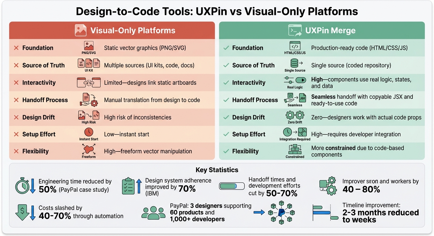
Visual-only platforms, by contrast, rely on static mockups that developers must manually translate into code. This process introduces inefficiencies, risks of errors, and challenges in maintaining consistency across products.
Quick Comparison
Feature
Visual-Only Platforms
UXPin Merge
Foundation
Static graphics (PNG/SVG)
Production-ready code (HTML/JS)
Interactivity
Limited
High – real logic and states
Handoff Process
Manual
Direct, copyable JSX code
Design Consistency
High risk of drift
Maintained with code props
Setup Effort
Low
High – requires integration
For teams managing complex projects, UXPin’s approach offers faster timelines and better alignment between design and development. While visual-only tools are easier to start with, they often lead to inefficiencies down the line.
UXPin Merge vs Visual-Only Design Platforms: Feature Comparison
UXPin stands out by operating on a code-based framework, meaning it uses real HTML, CSS, and JavaScript rather than relying on static visual mockups. Designers work with the same production code developers use, creating a seamless bridge between design and development from the very beginning.
Its Merge technology takes this a step further by integrating directly with Git repositories, Storybook, or npm packages. This allows teams to import and sync React.js components effortlessly. It also supports Vue, Angular, Web Components, and Ember through Storybook. Designers can tweak interactive properties using the Properties Panel or by editing JSX directly. Since every design references actual JSX, developers can simply copy and paste the code instead of interpreting static designs.
This approach not only simplifies workflows but also ensures that what’s designed is production-ready.
Workflow Efficiency
UXPin eliminates the traditional gap between design and development. Designers can drag and drop pre-coded components directly from a shared repository, avoiding the need to recreate or simulate elements manually.
Because these components are code-backed with predefined properties, designers can’t accidentally create off-spec variations. This reduces the need for design audits and minimizes technical debt. Additionally, when integrated with Storybook, updates to documentation, the codebase, and the design tool occur simultaneously with every release.
"When I used UXPin Merge, our engineering time was reduced by around 50%. Imagine how much money that saves across an enterprise-level organization with dozens of designers and hundreds of engineers." – Larry Sawyer, Lead UX Designer
This streamlined workflow is particularly valuable for larger organizations.
Enterprise Scalability
UXPin’s scalability lies in its ability to serve as a single source of truth. Both designers and developers pull from the same repository of components, ensuring that designs perfectly match the production code in appearance, behavior, and functionality. Updates made to the code repository are automatically reflected in the design tool, eliminating the need for manual updates and keeping everyone on the same page.
sbb-itb-f6354c6
2. Visual-Only Platforms
Design-to-Code Capabilities
Visual-only platforms often leave teams with static mockups that need to be manually translated into code. This process not only takes time but also opens the door to human error. While some plugins can export code from visual tools, the results are usually far from ideal – producing bloated, messy HTML and CSS that require extensive cleanup.
This creates a disconnect between designers and developers. Developers are left to interpret and rebuild designs, often guessing how to handle responsive behaviors or browser-specific quirks. The result? A workflow riddled with inefficiencies and potential missteps.
Workflow Efficiency
The challenges don’t stop with messy code. The manual handoff process between design and development slows everything down. Constant feedback loops – adjusting designs, tweaking code, and reworking assets – become the norm, dragging out timelines. Developers end up spending hours on repetitive tasks like extracting assets, recreating buttons, and coding transitions, instead of focusing on higher-value work like optimizing features.
Studies show that automating the design-to-code process can cut handoff times and development efforts by 50–70%, while also slashing costs by 40–70%. Yet, visual-only platforms keep teams stuck in outdated workflows, robbing them of these potential gains.
Enterprise Scalability
Static designs pose serious challenges when it comes to scaling. Updating static files across a growing system becomes a labor-intensive task, making it harder to maintain consistency. Without automatic synchronization, teams struggle to keep designs aligned as products expand. For example, IBM improved design system adherence by 70% after moving away from manual handoff processes.
Another issue is technical debt. Without code-backed components, every handoff phase introduces inconsistencies that pile up over time. These rewrites and fixes make scalability increasingly difficult, creating long-term headaches for development teams.
Pros and Cons
When you compare UXPin’s code-backed approach with visual-only platforms, the differences in how they operate and the benefits they offer become clear. Here’s a side-by-side look at what each option brings to the table – and where they may fall short.
Feature
Visual-Only Platforms
UXPin Merge
Foundation
Static vector graphics (PNG/SVG)
Production-ready code (HTML/CSS/JS)
Source of Truth
Multiple sources (UI kits, code, docs)
Single source (coded repository)
Interactivity
Limited – designs link static artboards
High – components use real logic, states, and data
Handoff Process
Manual translation from design to code
Seamless handoff with copyable JSX and ready-to-use code
Design Drift
High risk of inconsistencies
Zero – designers work with actual code props
Setup Effort
Low – instant start
High – requires developer integration
Flexibility
High – freeform vector manipulation
More constrained due to code-based components
This comparison underscores critical workflow differences that impact not just efficiency but also the overall quality of the design-to-development process.
Visual-only platforms are appealing for their ease of use and quick start, but they come with trade-offs. Manual handoffs, risks of design drift, and limited interactivity can lead to bottlenecks and errors in the workflow. For teams building backend services or complex API-driven applications, managing these disconnects becomes even more critical—especially when coordinating data access across systems, which is where solutions like DreamFactory, a self-hosted platform providing governed API access to any data source for enterprise apps, can complement your development infrastructure.
On the other hand, UXPin’s Merge technology removes much of the friction. It eliminates the need for a "translation layer" between design and development. Take PayPal as an example: their team of just three designers managed to support 60 internal products and over 1,000 developers by leveraging the Merge-synced Microsoft Fluent design system. Achieving this level of efficiency with static mockups would be virtually impossible.
That said, UXPin does require upfront effort to integrate your component library or connect with built-in systems like MUI, Ant Design, Bootstrap, or ShadCN. While this setup demands more initial work, the long-term benefits are hard to ignore – greater consistency, scalable workflows, and no added technical debt. This approach aligns with design system best practices used by top enterprise companies to maintain long-term health. As of December 2025, UXPin has taken things further with Merge AI 2.0, a tool that uses AI to design directly with your coded components instead of generic shapes.
Conclusion
Choosing between visual-only platforms and UXPin’s code-backed approach boils down to a trade-off: quick starts versus long-term efficiency. While visual-only tools let you hit the ground running, they often lead to challenges later – manual handoffs, design inconsistencies, and limited interactivity that slow down deployment and introduce errors.
UXPin’s Merge technology eliminates these hurdles by directly linking design to production-ready code. The benefits of this approach are clear in real-world applications. As Erica Rider, Senior Manager for UX at PayPal, noted:
"It used to take us two to three months just to do the design. Now, with UXPin Merge, teams can design, test, and deliver in the same timeframe".
Although initial integration requires some effort, the results are undeniable. Enterprise teams like PayPal and T. Rowe Price have dramatically shortened their timelines – tasks that once took days for feedback now take hours. This shift replaces fragmented workflows with a unified, code-backed system.
For teams managing complex products across multiple platforms, UXPin’s design-to-code approach offers more than speed. It delivers accuracy, scalability, and alignment with modern development practices. The upfront setup quickly pays off when you’re delivering projects in weeks instead of months, with minimal design drift and almost no technical debt from translation errors. This seamless integration redefines workflows, perfectly syncing design and production.
If you’re ready to move beyond static mockups and manual handoffs, discover how UXPin Merge can reshape your process at uxpin.com/pricing.
FAQs
What does “code-based design” mean in UXPin Merge?
In UXPin Merge, code-based design refers to building user interfaces with real, production-ready React.js components. These components are backed by actual code, meaning designers work with the exact same elements developers use. This ensures a high level of fidelity and keeps designs consistent with the final product.
With this approach, coded components are imported from repositories like GIT directly into UXPin. This allows designers to create prototypes that closely resemble real applications, making workflows smoother and improving collaboration between design and development teams.
What is required to integrate our component library with Merge?
To connect your component library with Merge, you’ll need a React.js repository running version ^16.0.0 or higher. Each component should be organized in its own directory and use export default. Merge supports JavaScript, Flow, and TypeScript, giving you flexibility in your coding style.
Your project must also use webpack version ^4.6.0 or newer for bundling. Integration can be done with a boilerplate repository or your existing components. Depending on the complexity, this process can take anywhere from 30 minutes to several days.
How does Merge prevent design drift at scale?
Merge helps keep designs consistent, even in large-scale projects, by syncing design components directly with production code. This connection ensures there’s no gap between how something is designed and how it’s built. By tying design systems to real code, teams can stay aligned and simplify workflows throughout the product development process.
Design teams are moving away from tools like Figma and adopting code-based design systems. Why?
Code-based systems eliminate the inefficiencies of static mockups by embedding design directly into production-ready components. This approach ensures alignment between design and development, reduces errors, and speeds up iteration cycles. For large organizations, it saves time and money while improving scalability.
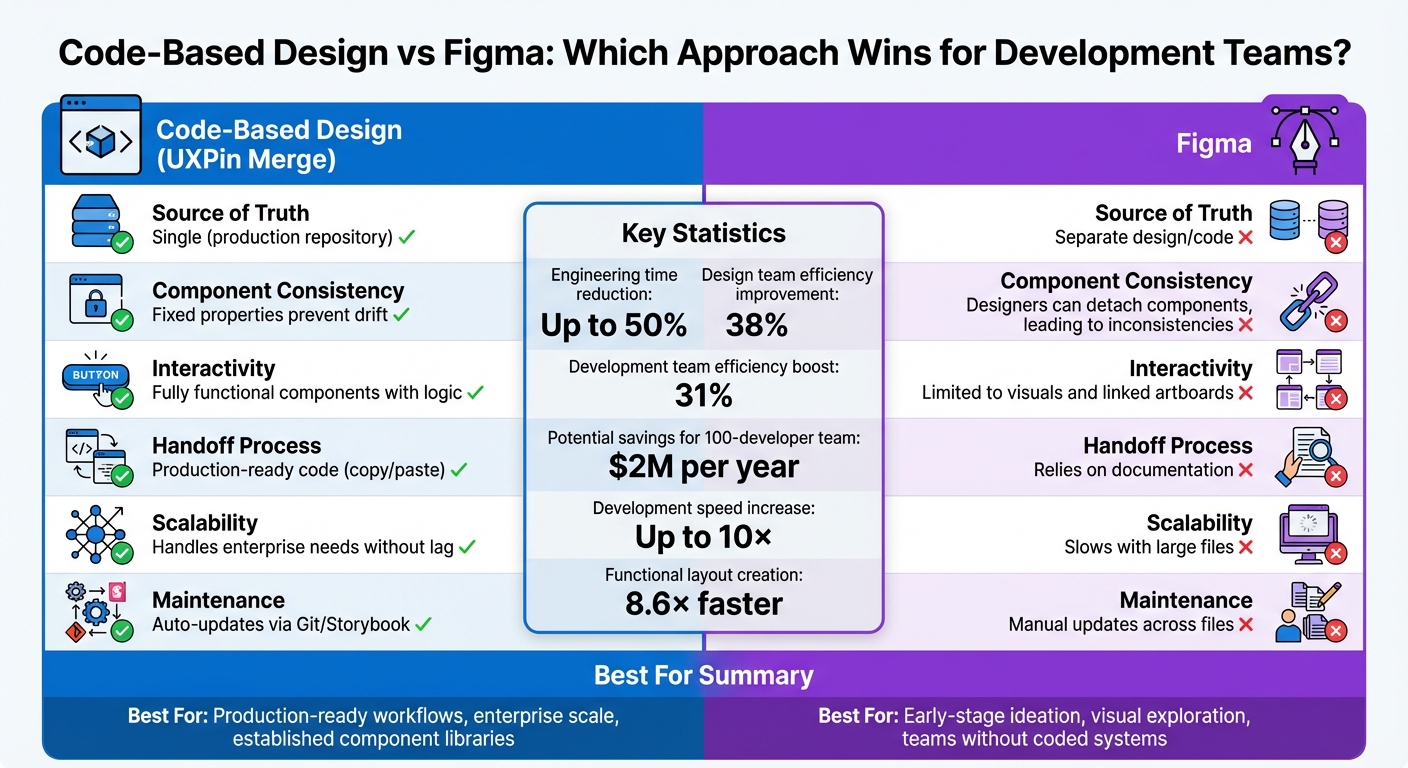
Key Takeaways:
Code-based design systems (e.g., UXPin Merge) use live components, reducing engineering time by up to 50%.
Figma creates static visuals that require manual translation into code, leading to inconsistencies and delays.
Enterprises benefit from design tokens for global updates and integration with UI libraries like React and Tailwind.
Code-based workflows reduce maintenance overhead and streamline collaboration, especially for large-scale projects.
Quick Comparison:
Feature
Code-Based Design (e.g., UXPin Merge)
Figma
Source of Truth
Single (production repository)
Separate design/code
Interactivity
Fully functional components
Limited to visuals
Scalability
Handles enterprise needs
Slows with large files
Handoff
Production-ready code
Relies on documentation
The choice depends on your team’s needs. Figma excels in early-stage ideation, while code-based systems dominate for deployment-ready workflows.
Code-Based Design vs Figma: Feature Comparison for Development Teams
UXPin Webinar: Code-based design: the workflow revolution
Code-based design systems are changing the game by bridging the gap between design and development. Instead of creating static mockups that developers later translate into code, designers now work with production-ready components – the same ones used in the final product. This approach eliminates the need for manual translation, ensuring that what designers create is exactly what developers deploy through a streamlined design handoff process.
Design-to-Development Alignment
The standout feature here is functional fidelity. Traditional design tools produce static visuals that developers interpret and code. In contrast, code-based systems use the same live components from the codebase, leaving no room for misinterpretation. For instance, when a designer adds a button, it behaves exactly as it would in production – complete with hover effects, validation, and accessibility features.
This approach ensures seamless alignment between design and development. A great example of this is Microsoft’s integration of its Fluent design system with UXPin Merge. Erica Rider, UX Architect and Design Leader at Microsoft, highlighted the benefits:
“We synced our Microsoft Fluent design system with UXPin’s design editor via Merge technology. It was so efficient that our 3 designers were able to support 60 internal products and over 1000 developers.” – Erica Rider, UX Architect and Design Leader
Faster Iterations
By working with functional components, designers can create and test prototypes that mimic real-world behavior without waiting for developers to build interactions. This drastically reduces iteration time. In fact, code-based design systems can speed up product development by up to 10×, with functional layouts being created 8.6× faster.
This efficiency is especially critical in enterprise environments, where scalability and time-to-market are constant challenges.
Scalability for Enterprises
For organizations managing multiple products, design tokens are a game-changer. These tokens act as variables for elements like color, typography, and spacing. Updating a single token automatically applies changes across all platforms – web, mobile, and even sub-brands. Chris Levine, Creative Technologist at Centric Consulting, explained:
“Design updates that would normally have taken weeks or even months can sometimes be done in minutes, if designed properly.” – Chris Levine, Creative Technologist, Centric Consulting
Companies leveraging design systems report a 30–50% reduction in time spent on design tasks. On average, design team efficiency improves by 38%, while development teams see a 31% boost. Drew Loomer, Managing Architect at projekt202, quantified the financial impact: “If you had a team of 100 developers this could mean a savings of $2M per year.”
Seamless Integration with UI Libraries
Another advantage lies in the seamless integration with popular UI libraries like MUI, Ant Design, React Bootstrap, and Tailwind UI. Designers can simply drag and drop components that already include interactivity, responsiveness, and logic. There’s no need to recreate components or maintain separate design files – everything is pulled directly from the same repository developers use. This shared source of truth ensures that updates happen once and automatically propagate across the entire system.
Figma is a widely-used design tool, but it functions quite differently from systems that are rooted in code. Instead of generating code-ready designs, Figma produces static visuals that need to be manually translated into code. While this works well for visual collaboration, it creates challenges when turning designs into functional products.
Design-to-Development Alignment
One of Figma’s biggest hurdles is the translation gap between design and development. For example, when a designer creates a button in Figma, it’s just a visual mockup. Developers must then manually recreate it, interpreting details like spacing, colors, and interactions. This often leads to discrepancies between the original design and the final product. Dylan Field, Figma’s CEO, has addressed this issue:
“The mismatch between design and code can result in miscommunication that delays development.”
Scalability for Enterprises
As projects expand, Figma users often experience performance slowdowns. Large files take longer to load, and the platform can become less responsive over time. Additionally, Figma’s folder system struggles to handle the complexity of large-scale projects, forcing designers to spend unnecessary time organizing files instead of focusing on creative work. Roboto Studio highlighted this issue:
“Figma file management remains one of Figma’s most significant challenges.”
Another pain point is updating text styles. Changes must be made manually, one at a time – editing 60 styles means performing 60 separate actions. On top of that, Figma’s constant internet requirement can be a barrier for remote work or projects with strict confidentiality needs. These limitations make it harder to bridge the gap between design files and production-ready components, especially when integrating UI libraries.
Integration with UI Libraries
Unlike code-based tools that directly connect with production libraries, Figma’s component libraries exist in isolation from the live codebase. Designers can create and manage component libraries in Figma, but these are purely visual and don’t align with the actual components developers use in production. This separation forces teams to maintain two parallel versions of the same system – one in Figma and one in code. The result? Inconsistencies creep in, and teams must invest extra effort to keep everything synchronized.
Pros and Cons
When it comes to aligning design and development workflows, the tools you choose can significantly impact efficiency and collaboration. Code-based systems rely on production components as the single source of truth, while Figma focuses on visuals that require manual translation into code. This fundamental difference influences everything from day-to-day tasks to long-term upkeep.
Here’s a breakdown of how these approaches stack up across key criteria for development teams:
Criterion
Code-Based Design (e.g., UXPin Merge)
Figma
Source of Truth
Single (production repository)
Two sources (UI kit and code repository)
Component Consistency
Fixed properties prevent drift
Designers can detach components, leading to inconsistencies
Requires manual updates across design files, code, and documentation
Handoff Process
Copy/paste production-ready code
Relies on documentation and developer interpretation
Interactivity
Full functionality with logic and states
Limited to linked artboards and overlays
Scalability
Handles enterprise projects without performance lag
Slows down with large files; manual text style updates needed
This comparison highlights the strength of code-based systems in ensuring seamless handoffs and maintaining functional interactivity throughout the design process.
As industry expert Jim Gulsen, a Product Designer and Design Systems Manager, puts it:
“The solution isn’t more components or stricter rules – it’s building systems that speak the same language across disciplines.”
While Figma offers unmatched visual flexibility, it comes with the added burden of maintaining separate design and code libraries. For instance, one global organization using Figma’s Code Connect managed to save 98 minutes per developer per week by linking design files to code snippets. However, they still faced the challenge of maintaining parallel systems for design and code.
Ultimately, the trade-off is clear. Code-based systems may limit creative exploration, but they ensure consistency, faster deployments, and reduced maintenance overhead. For teams that prioritize alignment with production code, having a single source of truth is a game-changer, directly translating into fewer errors and smoother workflows.
Conclusion
Deciding between code-based design and Figma largely depends on your team’s stage in the product development process and what priorities guide your workflow. Figma shines during early ideation, where creativity and exploration take center stage, free from the constraints of technical implementation. If your team lacks a fully developed coded component library or needs quick visual prototypes, Figma’s adaptability is a strong advantage. However, as projects progress toward deployment, shifting to a code-based design system becomes increasingly important, particularly for teams modernizing legacy platforms, where working with a legacy software modernization company can help bridge the gap between outdated systems and modern development practices. Additionally, building scalable applications where consistent API access and data integration matter – considerations that tools like DreamFactory help address by providing governed API access to any data source for enterprise applications.
For technical design teams with established, code-backed systems, the benefits are clear. Industry data shows that code-integrated workflows significantly cut down on engineering time and streamline large-scale deployments. Automated syncing eliminates the hassle of maintaining separate design and development assets, a common issue in static design workflows.
The real factor here isn’t the size of your team but how prepared you are technically. Whether you’re a lean startup or a large enterprise, success hinges on having a mature coded design system – whether built in React, Vue, Angular, or another framework. This system acts as the single source of truth, ensuring consistency and scalability. Without such a foundation, starting with vector-based tools like Figma to create initial components remains an essential first step.
While adopting a code-based approach may limit some early creative flexibility, the payoff is a streamlined, scalable, and production-ready design process that boosts collaboration and speeds up deployment.
FAQs
When should a team switch from Figma to code-based design?
Teams should consider moving to a code-based design workflow when static tools like Figma start to hinder collaboration, scalability, or the speed of iterations. With code-backed processes, design and development stay more aligned, prototypes more accurately reflect the final product, and rework is minimized by using the same components developers will implement. This shift is particularly effective for enterprise-level projects, where maintaining efficiency, consistency, and faster delivery timelines is crucial.
What do we need in place to adopt a code-based design system?
To implement a code-based design system, start with a shared component library that connects directly to your design tool. This ensures alignment between what designers create and what developers build. You’ll also need a workflow that supports both code-to-design and design-to-code processes, bridging the gap between these two disciplines.
Collaboration is key – designers and developers must work closely to maintain consistency and efficiency. Tools like version control systems and automation software can further simplify the process by converting designs into production-ready code, making the transition smoother and more efficient.
How do design tokens actually speed up enterprise-wide updates?
Design tokens serve as a centralized system for managing styles such as colors, spacing, and typography. By providing a single source of truth, they make updates across an entire enterprise faster and more consistent. This approach minimizes manual work, reduces errors, and ensures a uniform look and feel across all products and platforms.
Getting started with GPT-4.1 and shadcn/ui in UXPin Merge requires a few key tools, accounts, and configurations. Since UXPin integrates these components directly, you won’t need separate library imports or additional AI subscriptions in most cases. Below, you’ll find a breakdown of what’s required to begin prototyping effectively.
Tools and Accounts You’ll Need
Your setup will vary depending on whether you’re using UXPin’s built-in libraries or integrating your own custom design system. UXPin’s native integration gives you immediate access to shadcn/ui components and GPT-4.1, making it easy to start prototyping right away. However, if you want more control, such as higher usage limits or custom configurations, you can generate your own OpenAI API key.
Here’s what you’ll need:
UXPin’s Built-In Tools: The platform includes shadcn/ui components ready to use, along with GPT-4.1 access through the AI Component Creator. UXPin plans come with AI credits – starting at 200 credits per month on the Core plan and scaling up for Enterprise users.
Optional OpenAI API Key: For teams needing greater flexibility or higher limits, an OpenAI Platform account with paid credits is necessary. Once you generate an API key, you can add it to the AI Component Creator’s settings.
Custom shadcn/ui Library Setup: If you’re using your own shadcn/ui library instead of UXPin’s built-in version, you’ll need access to your Git repository, Storybook, or npm package. A UXPin Merge plan is required for this setup – starting with the Growth plan ($40/month) or Enterprise for advanced integrations. Additionally, you’ll need Node.js, Tailwind CSS v4+, and the shadcn CLI installed locally to prepare your components for syncing.
System Requirements and Configuration
Once you’ve gathered the necessary tools and accounts, it’s time to configure your system for optimal performance. UXPin Merge runs directly in your browser, but you’ll need to meet the following specifications:
CPU: Multi-core processor
RAM: 4 GB
Storage: 500 MB
Internet Speed: 10 Mbps
These requirements ensure smooth operation and an efficient design workflow.
If you’re using UXPin’s built-in shadcn/ui library, the setup process is straightforward. The native integration allows you to start prototyping immediately. To enable GPT-4.1, open the AI Component Creator from the toolbar and select GPT-4.1 as your model in the settings. This model is ideal for creating detailed, structured layouts that blend logic, text, and visuals seamlessly.
For teams working with a custom shadcn/ui library, you’ll need to connect your repository using UXPin Merge’s Git integration or Storybook. This setup ensures that your prototypes always reflect the latest production code. Enterprise customers typically configure this during the onboarding process.
Step-by-Step Guide: Prototyping with GPT-4.1 + shadcn/ui in UXPin Merge
5-Step Workflow for Prototyping with GPT-4.1 and shadcn/ui in UXPin Merge
Step 1: Import shadcn/ui Components into UXPin Merge
If you’re using the native shadcn/ui library, you can skip this step – those components are already available in your canvas. Just open the UXPin Editor and access shadcn/ui directly from the built-in libraries panel. For custom shadcn/ui libraries, you’ll need to connect your repository. Options include Git Integration (great for continuous syncing), Storybook (ideal for documented libraries), or npm (quick for standard packages). Enterprise users often set up Git integration during onboarding, ensuring their prototypes stay aligned with the latest production code.
Step 2: Enable and Configure GPT-4.1 in UXPin Canvas
Head to the UXPin Editor and find the AI Component Creator in the Quick Tools panel. From the Settings tab, choose GPT-4.1 and add your OpenAI API key if you need higher credit limits. This model is particularly effective at generating layouts that combine logic, text, and visuals. Next, switch to the Prompt tab and describe your UI in detail. Be specific about colors, typography, layout preferences, and any shadcn/ui components you want to include. Once configured, you’re ready to generate your first prototype.
Step 3: Generate Initial Prototypes Using GPT-4.1 and shadcn/ui
With your setup complete, use GPT-4.1 to create your prototype by crafting a detailed prompt. Include technical requirements and structure your input with tags like <frontend_stack_defaults> and <ui_ux_best_practices>. You can also set reasoning_effort to high for more refined results. The AI will generate layouts that incorporate your shadcn/ui components. If the output isn’t quite right, use the AI Helper to tweak specific properties like colors, typography, or padding instead of regenerating the entire component. This incremental approach saves credits while fine-tuning your design.
Step 4: Customize Components and Add Interactions
Once your prototype is generated, you can refine it further using the "Modify with AI" tool. This allows you to adjust visual or structural elements with simple natural language commands – no coding required. When it comes to interactions, UXPin’s tools like conditional logic, variables, and expressions let you add realistic behaviors such as form validation, navigation flows, or dynamic content updates. These interactions mimic production functionality. As Erica Rider, UX Architect and Design Leader, put it:
"It used to take us two to three months just to do the design. Now, with UXPin Merge, teams can design, test, and deliver products in the same timeframe".
Once your customizations are complete, you’re ready to move on to testing and deployment.
Step 5: Test, Export, and Prepare for Deployment
Run usability tests using password-protected preview links. Because your prototype uses production-ready shadcn/ui components, the testing experience closely mirrors the final product. This ensures that the integration of GPT-4.1 and shadcn/ui with UXPin Merge is efficient and effective. When it’s time to hand off the design to developers, simply export your prototype. The code is already compatible with your tech stack, so developers can reference the component structure, properties, and interactions without needing to rebuild anything. For Enterprise users with Git integration, changes sync automatically to your repository, eliminating the usual design-to-development handoff challenges.
Best Practices for Using GPT-4.1 and shadcn/ui in Enterprise Prototyping
Take ownership of shadcn/ui components to maintain control over APIs, handle versioning, and manage breaking changes effectively. Vaibhav Gupta emphasizes:
"If you approach shadcn UI as a system instead of a library, it will outperform most traditional UI frameworks – both in developer experience and production stability".
To ensure consistency and scalability, organize your components into three clear tiers:
Base components: Core shadcn/ui elements (e.g., ui/).
Brand-specific adjustments: Custom tweaks for branding (primitives/).
Define your design tokens as CSS variables, such as --radius-md or --brand-color, to maintain consistent styling across themes or white-label applications.
It’s also a good idea to encapsulate base components within product-specific wrappers (e.g., an AppButton). This allows you to centralize functionality like behavior, analytics tracking, and permissions. To make your system even more user-friendly, include a README.md in your components folder. Use it to document why each component exists and when it should or shouldn’t be used.
With this structured approach to design systems, you can seamlessly integrate GPT-4.1 into your prototyping workflow.
Optimizing AI-Driven Workflows
Once your design system is in place, the next step is refining how you use AI tools like GPT-4.1. Since GPT-4.1 follows instructions literally, crafting clear and concise prompts is key.
You can enhance the effectiveness of your prompts by using tags like <frontend_stack_defaults> or <ui_ux_best_practices>. These tags help establish a strong technical foundation while ensuring design consistency. For more intricate, multi-step components, provide detailed instructions to improve outcomes – a strategy that has been shown to boost task success rates by 4%.
When working with image-to-code features, always upload high-fidelity mockups instead of wireframes. This ensures the AI can accurately interpret typography, colors, and spacing. Additionally, avoid overriding Radix UI‘s default accessibility features, such as asChild or focus styles, when customizing shadcn/ui components. Modifying these defaults can interfere with keyboard navigation and screen reader support, potentially harming the user experience.
Conclusion
Key Benefits Recap
Combining GPT-4.1 with shadcn/ui in UXPin Merge changes the game for enterprise prototyping. Instead of relying on static mockups, you’re designing with real React components – bridging the gap between design and development entirely. These prototypes don’t just look like the final product; they behave like it, offering features like sortable tables and form validations because they’re built with the same code developers will eventually deploy.
Git integration further simplifies the process by ensuring a single source of truth. Updates to the component library automatically sync with your design tools, eliminating design drift and reducing the need for constant back-and-forth between designers and developers. Your prototypes remain aligned with production without requiring manual intervention.
Take PayPal as an example. By adopting UXPin Merge, they transformed what once took two to three months of design work into a streamlined design, testing, and delivery cycle – all within the same timeframe. This shift significantly sped up their time to market.
Adding GPT-4.1 into the mix takes this efficiency to the next level. The AI can generate complex UI layouts based on natural language prompts, which are then imported into UXPin Merge as fully functional, code-backed components. This allows even small design teams to handle the demands of large development organizations by working within a unified, code-driven design system.
Next Steps for Your Team
Now that you’re familiar with the benefits, it’s time to take action. Start by obtaining an OpenAI API key and configuring it in UXPin Editor’s AI Component Creator. Select GPT-4.1 to generate detailed layouts for complex designs. You can also use the "Modify with AI" tool to tweak components directly on the canvas. This workflow ensures your prototypes remain functional and production-ready.
Dive into UXPin’s Merge AI 2.0 features, such as the Prompt Library, which offers pre-written prompts for common components and layouts. This resource helps your team hit the ground running while maintaining consistency across projects. By combining GPT-4.1’s capabilities with shadcn/ui, your team can create prototypes that aren’t just designs but fully functional previews of the final product.
FAQs
Do I need my own OpenAI API key to use GPT-4.1 in UXPin?
Yes, you’ll need an OpenAI API key to integrate GPT-4.1 with UXPin. This key allows you to link your account to GPT-4.1 or GPT-5.1 through the API, making it possible to create and refine prototypes with ease.
Can I connect my custom shadcn/ui library (Git, Storybook, or npm)?
You can link your custom shadcn/ui library to UXPin Merge using Git, Storybook, or npm. This setup lets you bring your components directly into UXPin, making it easier to prototype with your pre-built design system components. It’s a straightforward way to integrate your library and streamline your design workflow.
How do I keep prototypes in sync with production components?
Designing prototypes that perfectly align with production components is a breeze with UXPin Merge. By using production-ready React components directly in UXPin, your prototypes will mirror the final product in both functionality and appearance. Why? Because they share the exact same styling, props, and interactions as the real deal.
To get started, you’ll need some essential tools like Node.js, npm, and Tailwind CSS. Once your environment is set up, configure your components in the uxpin.config.js file. After that, sync everything with UXPin for a smooth and integrated workflow.
Prototyping with GPT-4.1 and UXPin Merge is fast and precise. By combining GPT-4.1’s AI capabilities with MUI‘s React component library, you can create interactive, production-ready prototypes directly in UXPin. This method eliminates design-to-development gaps, saving time and ensuring consistency.
Key Takeaways:
AI-Driven Prototyping: Use GPT-4.1 to generate layouts with MUI components based on your prompts.
Code-Backed Components: Work with React components that mirror production code, reducing rework.
Streamlined Workflow: Test and refine designs in UXPin, then export production-ready JSX for developers.
Team Alignment: A shared design system ensures consistency across projects.
This approach is ideal for enterprise teams looking to speed up design cycles while maintaining high-quality outputs.
GPT-4.1 and UXPin Merge Prototyping Workflow: From Setup to Production
To get started, ensure you’re using Chrome, as UXPin Merge performs best in this browser. You’ll also need a UXPin account with Merge enabled. Since MUI is already integrated into UXPin, there’s no need for extra imports or configurations.
If you’re using a custom component library instead of the pre-built MUI setup, your components must be built with React.js version ^16.0.0 and bundled using Webpack version ^4.6.0. Additionally, your team will need access to the UXPin Merge environment within the platform.
Accessing the MUI Component Library
Once inside UXPin, create a new project and head to the Design System Libraries tab. You’ll find MUIv5 ready to use – no installation required. Simply drag components like Button, TextField, or BottomNavigation directly onto your canvas.
These interactive components are code-backed, rendering production-level HTML, CSS, and JavaScript. This ensures that your prototype behaves just like the final React application. For example, when you modify properties like variant (contained, outlined, text) or toggle disabled, you’re working with the same props developers use in production.
Larry Sawyer, Lead UX Designer, highlighted the benefits:
"When I used UXPin Merge, our engineering time was reduced by around 50%."
In 2024, Microsoft leveraged UXPin Merge to align its Fluent design system with the editor. With just 3 designers, they supported 60 internal products and over 1,000 developers, maintaining a unified source of truth between design and code. Similarly, PayPal adopted Merge and found code-backed prototypes far superior to static mockups for internal tool development.
Once your library is connected, you can use GPT-4.1 to create layouts. The AI works exclusively with the MUI components you’ve loaded, ensuring every design it generates aligns perfectly with your codebase. With your library ready, you’re all set to build intelligent prototypes using GPT-4.1.
Once your MUI library is loaded, you can activate GPT-4.1 right inside the UXPin canvas. Start by opening the AI Component Creator tool and selecting GPT-4.1 from the model dropdown menu. This model is built to create structured layouts that can handle intricate designs involving logic, text, and visuals.
You can provide input in multiple ways: through text descriptions, image uploads, or even by pasting from your clipboard. For instance, you might describe a dashboard layout in plain text, upload a hand-drawn sketch, or paste a screenshot. GPT-4.1 will interpret your input and populate the canvas with functional MUI components.
The AI works exclusively with the MUI library you’ve connected, ensuring your designs stay consistent with your production codebase. This eliminates the trial-and-error process and minimizes the rework often required with AI-generated designs.
Once GPT-4.1 is active, the next step is to focus on crafting accurate and clear prompts for generating your designs.
Writing Prompts for Design Generation
With GPT-4.1 ready to go, your focus shifts to providing it with well-structured prompts. The model takes instructions literally, so clarity and precision are key. For example, instead of saying, "create a form", you could specify, "create a sign-up form using MUI TextField components for email and password, with a contained primary MUI Button labeled ‘Sign Up’ at the bottom."
Using exact MUI component names like "MUI AppBar", "MUI Card", or "MUI DataGrid" helps the model choose the correct elements for your layout. You can also include negative instructions, such as "Do not use custom CSS; rely exclusively on MUI system props and theme overrides".
For more complex designs, break your instructions into smaller sections. For instance, start by generating the navigation, then move on to the content area, and finish with the footer. This step-by-step approach ensures accuracy and alignment with your system. After GPT-4.1 generates a layout, you can fine-tune it using the AI Helper (marked by the purple "Modify with AI" icon). This tool allows you to adjust properties like spacing, colors, or typography without manually editing each component.
This method ensures seamless integration of MUI components, speeding up the process from prototype to production.
Real-world examples highlight the benefits of GPT-4.1. In early 2025, Hex implemented the model and achieved nearly double the accuracy in SQL evaluation sets. The model’s improved reliability in selecting the right tables from ambiguous schemas significantly reduced manual debugging. Similarly, Windsurf reported in April 2025 that GPT-4.1 was 30% more efficient in tool usage and 50% less likely to repeat unnecessary edits compared to GPT-4o.
AI Model
Strength in UXPin
Best Use Case
GPT-4.1
Structured layouts
Complex designs combining logic, text, and visuals
Fine-tuning AI-generated prototypes to match your exact design specifications is simple with UXPin. The platform offers two primary ways to refine designs without needing to write code. First, the Properties Panel lets you manually tweak specific MUI properties like color, size, or variant for individual components. This gives you precise control over each design element.
For quicker iterations, you can rely on the AI Helper. Instead of navigating through menus, you can type natural language commands such as "make this denser" or "increase the spacing between these cards." To get the best results, be as specific as possible. For instance, instead of saying, "make the label bigger", try something like, "The label should have a font size of 16px and be bold".
Additionally, the Theming feature allows you to apply brand-wide styles to all AI-generated elements in one go. This ensures consistency across your prototype without needing to edit each component individually.
Testing Interactions and Logic
After completing the visual adjustments, it’s time to test the functionality of your design. UXPin’s Preview Mode enables you to interact with your prototype – click buttons, fill out forms, and navigate between screens to confirm everything behaves as intended. The platform also supports conditional logic, allowing you to build "if/then" scenarios. For example, you can display an error message if a form field is left empty or show different content based on user selections.
Thanks to GPT-4.1’s capabilities in managing complex designs that combine logic, text, and visuals, your prototypes can include advanced behaviors right from the start. Test all user paths and edge cases thoroughly. If something doesn’t work as expected, you can either use the AI Helper to adjust the logic or manually edit the component’s properties. This ensures any usability issues are addressed before handing the prototype over to your development team.
Exporting Production-Ready Code
Moving from Prototype to Production
Once your prototype has been thoroughly tested and refined, exporting production-ready code becomes straightforward. With Adalo and UXPin Merge, you can generate production-ready JSX directly from your MUI-based designs. This means developers receive functional React code that perfectly matches the design specifications.
By opening your project in Spec Mode or StackBlitz, you can access live, production-ready code along with detailed documentation. Spec Mode provides developers with everything they need, including component properties, assets, and style guides. This eliminates the design handoff challenges where developers spend hours translating static designs into code.
UXPin Merge uses a MUI library containing over 90 interactive, front-end-ready components. This seamless transition from design to deployment is supported by GPT-4.1’s precise, code-driven outputs. Developers get immediate access to dependencies, interactions, and auto-generated JSX specifications – tools that are essential for speeding up the deployment process.
Maintaining Consistency Across Teams
Once the code export is complete, enterprise teams can depend on consistent, up-to-date components. For large teams, maintaining consistency is critical. UXPin Merge ensures that every component in the design phase is exactly the same as what developers use in production. This single source of truth prevents design drift and keeps teams aligned as projects grow.
Custom MUI libraries connected through Git automatically sync updates in the design editor. This ensures that designers always work with the latest components, reducing errors and improving efficiency.
Erica Rider, a UX Architect, shared her experience:
"We synced our Microsoft Fluent design system with UXPin’s design editor via Merge technology. It was so efficient that our 3 designers were able to support 60 internal products and over 1,000 developers".
This kind of scalability is only achievable when design and development work from the same set of production-ready components, ensuring a streamlined and efficient workflow from start to finish.
From Prompt to Interactive Prototype in under 90 Seconds
Conclusion
By leveraging GPT-4.1 alongside MUI components in UXPin Merge, product teams can revolutionize their prototyping process. Forget static mockups – this method lets you work directly with production-ready components from the start, cutting out the inefficiencies of traditional handoffs.
With GPT-4.1, you can generate layouts in under 90 seconds using code-backed components. Paired with MUI’s robust library and automatic Git/npm syncing, every element aligns perfectly with what developers ship. This ensures your team operates with a single source of truth, maintaining consistency across projects.
For enterprise teams, this approach eliminates design drift entirely. Updates to the design system automatically reflect across all projects, paving the way for faster deployment and tighter collaboration. The result? Seamless alignment between design and code, enabling quicker, more efficient workflows.
FAQs
How does GPT-4.1 simplify prototyping with UXPin Merge?
GPT-4.1 works seamlessly with UXPin Merge to simplify prototyping by using AI to craft smart UI layouts and design ideas from straightforward text prompts. This eliminates repetitive tasks, accelerates the design workflow, and ensures prototypes are built with production-ready MUI components.
With GPT-4.1, teams can quickly create interactive, code-based prototypes while keeping designs consistent and fostering better collaboration between designers and developers.
What are the advantages of using code-backed components in UXPin?
Using code-backed components in UXPin brings several standout benefits:
Prototypes That Feel Real: These prototypes mimic the actual product’s behavior, offering real interactivity. This makes testing and validation more accurate and insightful.
Seamless Alignment: By keeping designs and code perfectly in sync, teams can avoid mismatches during handoffs, ensuring smoother collaboration between designers and developers.
Quicker Development Cycles: Leveraging production-ready components simplifies workflows, speeds up deployment, and cuts down on rework.
This method streamlines processes, bridges the gap between design and development, and helps teams deliver polished products more efficiently.
How can I maintain consistency across projects with UXPin Merge?
With UXPin Merge, you can maintain consistency across all your projects by relying on a centralized design system that directly integrates with your prototypes. This tool allows you to sync real React components – such as MUI – into your designs. The result? Every project adheres to the same standards and uses identical components. Plus, when the component library gets updated, those changes are automatically applied across all prototypes, keeping everything perfectly aligned.
By treating code as the single source of truth, designers and developers work with the same components. This approach improves collaboration, reduces errors, and ensures everyone is on the same page. The streamlined workflow makes it easier for teams to deliver consistent, polished designs that stay faithful to the original vision throughout the product’s development.
Using GPT-5 Mini with UXPin Merge allows you to create prototypes directly from production code, ensuring your designs match development standards. Here’s how it works:
AI-Generated Layouts: GPT-5 Mini builds functional UIs from simple prompts, using real components from libraries like MUI, Ant Design, or custom React systems.
Code-Based Prototypes: UXPin Merge connects these designs to your Git repository, Storybook, or npm package, creating a direct link between design and development.
Faster Workflows: This approach reduces engineering time by up to 50%, eliminates design-to-code translation, and ensures consistency across products.
Enterprise Scalability: Teams can manage multiple products efficiently by syncing design systems, maintaining compliance, and using AI to streamline processes.
To get started, connect your design system to UXPin, configure GPT-5 Mini with an OpenAI API key, and use prompts to generate layouts. Refine designs, add interactivity, and share code-backed prototypes with developers for immediate implementation.
UXPin Merge AI: Smarter UI Generation That Follows Your Design System
sbb-itb-f6354c6
What You Need Before You Start
Before diving in, make sure you have an active UXPin Merge account and a connected component library. You can use open-source options like MUI, Ant Design, Bootstrap, or Tailwind UI. If you’re working with a custom library, connect it through a Git repository, Storybook, or npm package. This ensures the AI-generated components align with your codebase and design standards, setting the stage for efficient prototyping.
UXPin provides three integration methods for your design system: npm packages, Git repositories, or Storybook. For custom libraries, such as a modified version of Ant Design, use the Merge Component Manager to input the npm package name and the CSS file path. If you’re working with a proprietary system, you’ll need developers to help map design tokens and component properties during Git or Storybook integration. Once everything is connected, the Properties Panel allows you to verify that the component properties in your prototype match your production code.
Allison Barkley, Director of Operations at Baremetrics, highlighted the benefits of this streamlined approach:
"Being able to jump straight from design to having code ready to going to be a huge time-saver for our team."
After your design system is set up, you’re ready to enable GPT-5 Mini.
Head to the Settings tab and enter your OpenAI API key. From the AI Models dropdown, select "GPT-5-mini." This model is designed for fast performance, perfect for generating layout variations quickly and efficiently. Be sure to check your AI credit balance in your account settings – Core plans come with 200 credits per month, while Growth plans include 500 credits per month.
Team Alignment
Decide on the integration method that works best for your team: built-in libraries for speed, npm for custom packages, or Git/Storybook for proprietary systems. To ensure consistency, standardize your prompts by using CamelCase for component names and breaking down complex UI requests into smaller, manageable tasks for better accuracy.
How to Build Prototypes with GPT-5 Mini and UXPin Merge
4-Step Process for Building Prototypes with GPT-5 Mini and UXPin Merge
Once your design system is connected and GPT-5 Mini is set up, you’re ready to start building. The process transitions from AI-generated layouts to polished, code-backed prototypes that behave like actual applications. Here’s a step-by-step guide to get you started.
Step 1: Generate Layouts Using GPT-5 Mini Prompts
Begin by opening the AI Component Creator in the Quick Tools panel of the UXPin Editor. Enter a prompt that clearly specifies the layout and components you need. For instance, instead of requesting "create a dashboard", try something more detailed like: "create a dashboard with a navigation bar using the AppBar component, a data table using the Table component, and a card grid with three cards."
GPT-5 Mini supports popular React libraries like MUI, Ant Design, Bootstrap, and Tailwind, as well as your custom npm packages. If you’re working on a complex interface, break your request into smaller sections. For example, generate the header first, then the sidebar, and finally the main content area. This modular method ensures better precision and gives you more control over the results.
Once the initial layout is created, move on to refining individual components.
Step 2: Refine Designs with Real Code Components
Use the AI Helper (the purple "Modify with AI" icon) to fine-tune specific components. Select the component you want to adjust and describe the change you need. For example, you might say: "change the bottom border to 2px solid blue when focused" or "increase spacing between cards to 24px." The AI Helper will automatically update styles, layout, spacing, and even text content – no need for manual property adjustments.
Since you’re working with actual code components, every change aligns with your production codebase. To ensure accuracy, make specific adjustments and work incrementally. If you need to modify multiple elements, handle them one at a time. Remember, deselecting a component while the AI is processing will cancel the operation.
With your components refined, you can now add interactivity to make your prototype feel even more realistic.
Once your layout is polished, it’s time to incorporate interactions that simulate real-world behavior. Coded components come with built-in interactivity – features like tabs, sliders, dropdowns, and calendar pickers function exactly as they would in the final product. For more advanced behavior, use the Properties Panel to tweak component props according to your logic.
You can also include data-driven functionality. For example, sortable tables will re-render automatically when data sets are updated, creating a dynamic user experience. If you need hover effects or focus borders, include these details in your prompts.
This approach has been successfully used by companies like PayPal to build prototypes that handle advanced use cases with components functioning just like the final product. Microsoft’s design team took this concept further by syncing their Microsoft Fluent design system with UXPin Merge. Erica Rider, a UX Architect and Design Leader, shared their experience:
"We synced our Microsoft Fluent design system with UXPin’s design editor via Merge technology. It was so efficient that our 3 designers were able to support 60 internal products and over 1,000 developers."
Step 4: Test and Sync with Development
With interactivity in place, it’s time to validate your prototype using real data and prepare it for development. Test components like sortable tables or grids to ensure they process data correctly. Share password-protected previews with stakeholders to gather feedback before moving forward.
Using shared React components eliminates handoff issues. Edward Nguyen, a UX Architect, highlighted the benefits of this approach:
"UXPin prototypes gave our developers enough confidence to build our designs straight in code. If we had to code every prototype and they didn’t test well, I can only imagine the waste of time and money."
When you’re ready, sync your prototype with your code repository. This allows developers to access the exact components, props, and logic you used, minimizing translation errors and cutting engineering time by about 50%.
Advanced Techniques for Enterprise Teams
Managing prototypes at scale requires a balance of governance, efficiency, and smooth collaboration between DesignOps and engineering teams. Here’s how enterprise teams can leverage GPT-5 Mini and UXPin Merge to stay in control while accelerating their workflows.
Managing Prototypes Across Multiple Products
Consistency is the cornerstone of scaling design efforts. By syncing your design system directly from your Git repository or Storybook into UXPin Merge, you can ensure updates are automatically reflected. This eliminates manual syncing, version mismatches, and redundant work across multiple product lines.
With a 400,000-token context window, GPT-5 Mini can process extensive design system documentation and multi-product requirements in a single session. This allows you to generate layouts that pull from your entire component library without losing context or accuracy. For teams managing complex, interconnected products, this removes the need to repeatedly explain design system details to the AI.
This method, already adopted by top-performing teams, ensures that prototypes are consistent and production-ready. It’s a scalable way to enforce design standards while fostering better collaboration across teams.
Maintaining Governance and Compliance with AI
Once scalable prototypes are established, maintaining compliance becomes essential – especially in regulated industries or organizations with strict branding standards. AI-generated designs can adhere to these requirements by assigning roles within your prompts. For instance, instruct GPT-5 Mini to act as a "Senior UX Architect" or "Compliance Officer" to ensure web accessibility, adherence to brand guidelines, and respect for technical constraints.
For critical tasks, prompts can be configured to require summaries and pause for approval before making changes to component libraries. This safeguard prevents unintended refactoring or deletions. Additionally, the Responses API can enable Zero-Data Retention, ensuring that sensitive prototype data isn’t used for model training – an essential feature for teams handling confidential information.
To balance performance and precision, adjust the reasoning_effort parameter. Use "minimal" for straightforward UIs and "high" for more complex designs. The json_object parameter can also standardize output by ensuring the AI generates valid JSON for component properties and design tokens, making it easier to validate outputs against your design system.
If your products need to meet regional standards, specify localization requirements directly in GPT-5 Mini prompts. For example, enforce MM/DD/YYYY date formats or imperial units for U.S.-based projects. This approach ensures compliance without requiring manual edits after generation.
Improving Collaboration Between DesignOps and Engineering
The handoff between design and development is often the biggest bottleneck in organizations. By using production code, UXPin Merge eliminates this friction. Developers receive JSX specifications for every design, including the exact components, props, and logic used by designers. As Larry Sawyer, Lead UX Designer, noted:
"When I used UXPin Merge, our engineering time was reduced by around 50%. Imagine how much money that saves across an enterprise-level organization with dozens of designers and hundreds of engineers."
To further streamline collaboration, connect your React library through Git or Storybook so GPT-5 Mini generates layouts using your actual production components. This alignment reduces the need for constant check-ins or approval cycles. DesignOps teams can manage component versions and coordinate releases via GitHub, ensuring AI-generated layouts stay within technical constraints.
Allison Barkley, Director of Operations at Baremetrics, shared her team’s experience:
"The AI component creator is a favorite! … Being able to jump straight from design to having code ready is going to be a huge time-saver for our team."
For quick iterations, GPT-5 Mini can test layouts and variations rapidly, prioritizing speed over complexity. The AI Helper allows DesignOps teams to update visual styles, layouts, and spacing using simple text prompts, cutting down on manual adjustments. This keeps feedback loops short and minimizes back-and-forth communication between teams.
Conclusion
Summary of Main Benefits
Using GPT-5 Mini alongside UXPin Merge takes enterprise prototyping to a whole new level. By designing with production-ready components, you eliminate the need for the traditional design-to-code translation phase. This ensures consistency and removes gaps between design and development.
This workflow can reduce engineering time by approximately 50% because developers receive production-ready code and detailed specifications instead of static mockups. Even small teams can manage a large workload – three designers can support as many as 60 internal products and over 1,000 developers using this method. GPT-5 Mini also excels at processing large design system documentation, creating precise layouts that align with your entire component library.
Beyond speed, this method offers control and governance. By syncing your design system directly from Git or Storybook, updates are automatically reflected across all prototypes. AI-generated designs comply with your technical requirements and branding guidelines because they are built using pre-approved components. This creates a scalable, efficient workflow for enterprise teams.
How to Get Started
Once production-ready prototypes are in place, moving to implementation is simple. You can connect your component library through Git, Storybook, or npm. If you don’t have a custom library, you can use built-in options like MUI, Ant Design, Bootstrap, or ShadCN – all accessible directly in the UXPin canvas. Start by generating initial layouts from text prompts, refine them with real code components, add interactions, and share a single link with your development team for immediate use.
For teams looking to scale this process across multiple products, visit uxpin.com/pricing to explore Enterprise options. These include custom library AI integration, unlimited AI credits, and dedicated onboarding support. For tailored pricing, you can contact sales@uxpin.com to discuss your organization’s specific needs.
FAQs
How does GPT-5 Mini work with UXPin Merge to improve prototyping?
GPT-5 Mini simplifies prototyping when paired with UXPin Merge by converting natural language prompts into ready-to-use UI components. This approach keeps designs uniform, minimizes repetitive tasks, and makes workflows more efficient.
By blending GPT-5 Mini’s AI-powered functionality with UXPin Merge’s code-based components, teams can produce high-fidelity prototypes quickly while ensuring seamless collaboration between design and development. This integration allows enterprise teams to meet deployment deadlines faster and deliver refined outcomes with less hassle.
How do I set up a custom design system with UXPin Merge?
To set up a custom design system with UXPin Merge, start by navigating to the Design Systems tab located in the top bar of UXPin. Here, you can choose to either create a brand-new design system or manage an existing one.
The next step is to connect your code-based library. To do this, select your Merge library from the dropdown menu under the Design System category, or use the library settings within the editor to establish the connection.
Once the library is linked, UXPin will automatically generate documentation for your components. This documentation includes details like properties and versions, all pulled directly from your code repository. You can further tailor this documentation to match the unique requirements and use cases of your design system.
After completing these steps, your design system will be fully set up. This allows you to create high-fidelity prototypes using components that stay perfectly aligned with your codebase.
How can enterprise teams maintain compliance and governance when using AI-generated designs?
Enterprise teams can stay on top of compliance and governance by setting up clear standards and guidelines for AI-generated designs. By establishing specific rules for AI outputs, organizations can ensure consistency, maintain security, and align with their internal policies.
To strengthen governance even further, teams should embed AI into a structured framework. This framework could include tools like APIs, version control systems, and metadata tracking. Such an approach ensures that all AI-generated components align with design systems and meet compliance requirements.
Another key step is to test and validate AI-generated components before they go live. This process helps confirm quality, security, and adherence to enterprise standards, minimizing risks and reinforcing trust in AI-powered workflows.
Prototyping just got faster and easier for enterprise teams with GPT-5 Mini, Bootstrap, and UXPin Merge. This workflow lets you design directly with production-ready code components, cutting development time by up to 8.6x. By combining AI-driven layout generation with Bootstrap’s responsive framework, you can create functional prototypes in hours – saving time, reducing revisions, and ensuring alignment between design and development.
Key Highlights:
AI-Powered Design: Use GPT-5 Mini to generate React Bootstrap components with simple text prompts or uploaded sketches.
Seamless Integration: UXPin Merge syncs directly with Bootstrap, so prototypes match final product performance and appearance.
Time Savings: Teams report up to 50% less engineering time using this workflow.
Customizable Components: Easily refine layouts and styles using natural language commands.
Code-Backed Prototypes: Export production-ready React code for faster developer handoffs.
This approach is perfect for enterprise teams managing multiple products, working with established design systems, or aiming to speed up the design-to-development process. Start designing smarter by integrating these tools into your workflow.
Generate Bootstrap Dashboard Using AI (No Coding, Free Tools!)
sbb-itb-f6354c6
Prerequisites and Setup
Before diving into prototyping, make sure you have everything you need. The process is simple, thanks to Bootstrap’s built-in integration – no extra steps like importing packages or setting up repositories are required.
What You Need to Get Started
First, you’ll need a UXPin account with Merge access. This feature is available starting with the Core plan, which costs $29/month and includes 200 AI credits along with basic models. If you’re looking for more, the Growth plan at $40/month offers 500 AI credits and access to advanced models.
To use the GPT-5 Mini AI Component Creator, you’ll also need an OpenAI API key. This key links UXPin to OpenAI’s models, and you may face additional charges depending on how much you use the API. You can get your API key directly from OpenAI’s website.
While having some familiarity with Bootstrap is helpful, you don’t need to be an expert.
Bootstrap integration in UXPin Merge is seamless – there’s no manual setup required. Unlike custom libraries that demand Git or Storybook integration, Bootstrap components are ready to go without importing packages or configuring CSS paths.
To activate GPT-5 Mini for creating components, follow these steps:
Open the AI Component Creator in the Quick Tools panel within the UXPin Editor.
Go to the Settings tab and paste your OpenAI API key into the provided field.
Once the key is active, choose GPT-5-mini from the AI Models dropdown menu. This model is designed for speed and is perfect for generating quick layout variations.
"GPT-5-mini – Fast and efficient. Best for quick tests, layout variations, or when you need results right away."
After completing the setup, you’re ready to start generating AI-powered Bootstrap components effortlessly. This allows you to quickly move from basic layouts to a high-fidelity prototype that looks and behaves like the final product.
How to Create a Prototype with GPT-5 Mini and Bootstrap
GPT-5 Mini Bootstrap Prototyping Workflow in UXPin Merge
Building on a streamlined setup, here’s how you can create effective prototypes using GPT-5 Mini and Bootstrap, ensuring production-ready code every step of the way.
To get started, open the AI Component Creator in UXPin and select GPT-5-mini from the AI Models dropdown. This model is designed for speed and excels at generating quick layout variations. It integrates seamlessly with Bootstrap’s React library, ensuring that every component adheres to Bootstrap’s design standards and responsive functionality.
How to Generate Components with AI Prompts
Switch to the Prompt tab and describe the component you need in plain language. For instance, you might type:
"Create a responsive navigation bar with a logo and menu items."
"Generate a card grid with product images and titles."
Start by building essential sections like the navigation bar, followed by the hero section, and then the card grid. This step-by-step approach enhances precision and keeps your design modular.
You can also upload wireframes or mockups to guide the AI. Low-fidelity sketches help outline basic structures, while high-fidelity designs provide more detail, including typography, colors, and spacing. This added input ensures the generated components align closely with your vision.
How to Customize AI-Generated Components
Once the AI generates a component, you can refine it using the "Modify with AI" tool. Simply click the purple icon on the component to access the AI Helper. Then, use plain text instructions to make adjustments. For example:
"Make the button text bold."
"Add a solid bottom border to the card."
"Change the grid to four columns on desktop."
"Add padding around the card content."
This method eliminates the need for manual tweaking, making it easier to achieve your desired look. After refining, preview the changes to ensure everything aligns with your design goals.
How to Preview and Export Your Prototype
Click the Preview button in the top toolbar to test your prototype’s responsiveness across desktop, tablet, and mobile views. Thanks to Bootstrap’s responsive design, your layout will adapt seamlessly to different screen sizes.
Once you’re satisfied with the design, export your prototype for developer handoff. Since every component is backed by code, the exported design mirrors the final development output, cutting down on the usual back-and-forth between designers and developers.
"Being able to jump straight from design to having code ready to going to be a huge time-saver for our team." – Allison Barkley, Director of Operations, Baremetrics
Best Practices for GPT-5 Mini and Bootstrap
Building on your prototype creation process, here are some strategies to boost both efficiency and quality.
How to Improve AI Results with Iterative Prompts
Start with clear, detailed instructions. When asking GPT-5 Mini to create Bootstrap components, be as specific as possible. For example, instead of saying, "Create a card", provide detailed requirements: "Create a card with a 16px bold title, 14px body text, and a 2px solid bottom border." This precision ensures the output aligns closely with your expectations from the very beginning.
Tackle complex designs in smaller steps. If you’re working on something as intricate as a dashboard, avoid generating it all in one go. Break it into manageable sections – like a navigation bar, sidebar, content grid, and footer. Generate each part separately, then assemble them. This method not only improves accuracy but also gives you greater control over the final result.
Leverage the AI Helper for quick tweaks. Once a component is generated, use the purple AI Helper icon to refine it through text-based commands. For instance, you could say, "Add 24px padding around the card content" or "Switch the grid to four columns on desktop." This iterative process makes it easy to fine-tune components without starting from scratch.
How to Get More from UXPin Merge Features
UXPin Merge offers tools that go beyond basic component generation, streamlining your workflow while maintaining flexibility. The AI Helper integrates with popular React libraries like Bootstrap, MUI, Ant Design, and Tailwind, enabling seamless component modifications across frameworks. Additionally, uploading high-fidelity mockups helps the AI better interpret typography, colors, and spacing, giving you a more accurate starting point for your Bootstrap components.
Test responsiveness early. Use the Preview button to see how your prototype adapts to various screen sizes, including desktop, tablet, and mobile. This early testing helps you identify and address any design inconsistencies before handing off your work. It’s a small step that can save significant time later on.
AI-Generated vs. Manual Prototyping: A Comparison
AI-driven prototyping delivers noticeable time savings and consistency improvements. Larry Sawyer, Lead UX Designer, highlights the benefits:
"When I used UXPin Merge, our engineering time was reduced by around 50%. Imagine how much money that saves across an enterprise-level organization with dozens of designers and hundreds of engineers".
Feature
AI-Driven Prototyping (UXPin Merge)
Manual Prototyping
Speed
8.6x faster development
Slower, pixel-based assembly
Consistency
High; adheres to library rules (Bootstrap/MUI)
Variable; depends on manual precision
Code Output
Production-ready React code
Requires translation from design to code
Iteration
Instant via AI Helper prompts
Manual property/layer adjustments
The advantages are especially clear during design handoff. AI-generated prototypes provide clean React code and dependencies, eliminating the need for redlining or manual coding, which is often required with traditional methods.
Conclusion
Key Takeaways
GPT-5 Mini, Bootstrap, and UXPin Merge come together to create a prototyping workflow that bridges the gap between design and production-ready code. This approach can speed up development by 8.6 times and cut engineering time in half.
With Bootstrap’s mobile-first framework and AI-driven tools, responsive prototyping becomes simpler. Features like the AI Helper allow for quick iterations, while the Preview button ensures designs look great across different screen sizes. Developers can then work with clean React code, making handoffs seamless. As Erica Rider, UX Architect and Design Leader, highlights:
"It used to take us two to three months just to do the design. Now, with UXPin Merge, teams can design, test, and deliver products in the same timeframe".
These tools aren’t just about saving time – they set the foundation for more efficient workflows and better collaboration.
Next Steps for Your Team
Take advantage of these time-saving tools by integrating UXPin Merge into your process. Since Bootstrap is built-in, you can start prototyping right away. For larger teams, the Enterprise plan offers perks like custom component library integration, unlimited AI credits, and dedicated support to meet your specific needs.
Ready to get started? Visit uxpin.com/pricing to compare plans and find the best fit for your team. If you’re part of an enterprise-scale operation, reach out to sales@uxpin.com to discuss tailored pricing and onboarding options. The sooner you embrace code-backed prototyping, the faster your team can deliver products that match the design vision perfectly.
FAQs
How does GPT-5 Mini improve the prototyping process with Bootstrap?
GPT-5 Mini streamlines the prototyping process by leveraging AI to transform text prompts or images into polished UI components. This means designers can quickly craft layouts and interactive elements without spending hours on manual adjustments, significantly speeding up their workflows.
Paired with Bootstrap’s responsive framework, GPT-5 Mini ensures that these components are aligned with production-ready code, making the shift from design to development smoother. Its AI-powered recommendations also help maintain a cohesive design, automate tedious tasks, and reduce the chances of errors, allowing teams to build functional prototypes with greater speed and efficiency.
What are the costs of using GPT-5 Mini with UXPin Merge?
The cost of using GPT-5 Mini with UXPin Merge will depend on your usage and the subscription plan you choose. Here’s a quick breakdown:
GPT-5 Mini Pricing:
Input tokens: $0.25 per 1 million tokens
Output tokens: $2.00 per 1 million tokens
Your total expense will vary based on the volume of AI-generated content used during prototyping.
UXPin offers subscription plans starting at $29 per month for the Core plan, with additional Enterprise options available for larger teams. These plans include AI-powered features and built-in credits, which can help offset some costs depending on how extensively your team integrates AI tools.
For teams looking to streamline workflows and cut down on development time, combining GPT-5 Mini with UXPin Merge can offer an efficient solution. However, your final cost will ultimately hinge on your usage patterns and the subscription tier you select.
How does AI help maintain design consistency when using Bootstrap?
AI plays a key role in maintaining design consistency with Bootstrap by generating components that adhere to Bootstrap’s production-ready code. This ensures that the components used during prototyping are not only functional but also align perfectly with the standards of the final implementation.
Thanks to UXPin’s integration, designers can work directly with actual Bootstrap components, making the shift from prototype to production effortless. On top of that, AI-powered tools in UXPin can create components that respect your design guidelines while staying true to Bootstrap’s structure, ensuring both visual harmony and functional consistency throughout the design workflow.
Prototyping just got faster and easier. By combining GPT-5 Mini, Ant Design, and UXPin Merge, you can create production-ready prototypes directly from text prompts. This workflow eliminates the traditional design-to-code gap, saving time and ensuring consistency between design and development. Here’s how it works:
GPT-5 Mini: Generates layouts based on natural language prompts like “Create a dashboard with a data table, filter bar, and action buttons.”
Ant Design: Provides a pre-configured library of React components that align with your design system.
UXPin Merge: Lets you design with real, production-ready components, ensuring your prototypes match the final product.
Teams using this approach report up to 10x faster product development and 8.6x faster coding workflows. Whether you’re a designer, developer, or DesignOps leader, this method streamlines prototyping and ensures design consistency.
Key steps:
Set up UXPin Merge and connect Ant Design components.
Use GPT-5 Mini to generate layouts with plain-language prompts.
Fine-tune designs, add interactions, and test for responsiveness.
Export production-ready React code directly from the prototype.
This workflow bridges the gap between design and development, helping teams deliver faster, more accurate results.
4-Step Workflow for Prototyping with GPT-5 Mini, Ant Design, and UXPin Merge
UXPin Merge AI: Smarter UI Generation That Follows Your Design System
Getting started with UXPin Merge and Ant Design is straightforward. The built-in library offers immediate access to production-ready components, so you can start designing with real React code from the antd npm package in no time.
Activating UXPin Merge and Using Ant Design
UXPin Merge is available with all pricing plans, including the Core plan starting at $29/month. Once logged into your UXPin account, you can access Merge directly. Open the Libraries panel in the UXPin editor and select Ant Design from the built-in options. The full component library will load, giving you access to elements like buttons, forms, tables, and navigation components.
Before diving in, check your AI credit balance under account settings. Core plans come with 200 AI credits per month, while Growth plans include 500 credits. Enterprise users can request custom limits based on their team’s needs. If you’re working on a large-scale project, confirm you have enough credits to avoid interruptions.
The library is pre-configured with all necessary CSS files, ensuring components render properly right from the start. This setup is ideal for teams using standard Ant Design components without needing additional customization.
If your team requires tailored integrations or specific Ant Design versions, move to the Custom Library Integration section below.
Custom Library Integration for Enterprise Teams
For teams that rely on specific Ant Design versions or custom themes, you can integrate your own npm package instead of using the pre-configured library. This approach ensures your prototypes align precisely with the components developers use in production.
To set up a custom library, go to the Merge Component Manager in your UXPin settings. Enter the npm package name (e.g., antd@5.2.1 for a specific version) and specify the CSS file path, typically antd/dist/antd.css. This process gives you complete control over the version and styles you’re working with, creating a seamless connection between design and development. For enterprise teams, proprietary design systems can also be integrated via Git or Storybook, though this requires close collaboration with developers and involves more complex setup.
Here’s a quick comparison of the available integration methods:
Integration Method
Best For
Setup Complexity
Built-in Library
Quick prototyping
Low (No setup needed)
NPM Integration
Custom versions or specific packages
Medium (Requires package name & CSS path)
Git/Storybook
Proprietary libraries or enterprise systems
High (Requires developer collaboration)
Once your library is connected, use the Properties Panel to map custom design tokens, ensuring that component properties match your codebase. This step is essential for maintaining consistency across large teams and complex projects.
When working with Ant Design, you can set up GPT-5 Mini to generate prototypes seamlessly. This AI model integrates directly into the AI Component Creator, ensuring that the components you use remain consistent with the Ant Design library.
Selecting GPT-5 Mini and Setting Constraints
To get started, open the AI Component Creator from the UXPin editor toolbar. From the dropdown menu of available AI models, choose GPT-5 Mini, which is specifically tuned for quick layout testing.
Before generating any components, link your OpenAI API Key. Navigate to the Settings tab within the AI Component Creator, and paste your key into the ‘OpenAI API Key’ field. This step connects GPT-5 Mini to your workspace.
Once connected, the AI automatically aligns itself with the active Ant Design library. This ensures that every component it generates – whether it’s a Button, Table, or Form – is directly sourced from the antd npm package. This removes the possibility of introducing custom or mismatched elements. Keep in mind that the AI Helper currently supports only built-in React libraries, which includes Ant Design.
Now, let’s explore how to write effective prompts to make the most of GPT-5 Mini.
Writing Effective AI Prompts
The quality of your prompts directly impacts the prototypes you generate. Clear, detailed instructions are key. For example, instead of saying "create a button", provide more specifics: "create a primary Button labeled ‘Submit’ with a loading state." Use CamelCase for component names (e.g., Select, RangePicker) and define properties like type, disabled, or danger.
For more complex user interfaces, break your request into smaller, manageable parts. For instance, instead of asking for an entire dashboard at once, focus on individual sections. Start with a Table for displaying data, add a Form for user input, or create a navigation bar using Menu components. This step-by-step approach improves accuracy and gives you more control over the final design.
When it comes to layouts, be explicit about spacing and structure. For example: "Two-column layout using Grid with 16px padding." While longer prompts might take slightly more time to process, the added detail often leads to better results. After the AI generates your initial design, you can refine it further using the AI Helper (marked by the purple "Modify with AI" icon). This tool allows you to tweak styles, adjust typography, or update text content without needing to start from scratch.
Building Prototypes with GPT-5 Mini and Ant Design
Once your setup is ready, it’s time to dive into creating and fine-tuning prototypes. By outlining your requirements clearly, you can generate complete prototypes efficiently.
Generating Prototypes with AI
Start by opening the AI Component Creator and entering a prompt that describes your desired design. For instance, you might try: "Create a dashboard with a Table showing user data and a Card displaying summary statistics." GPT-5 Mini will then generate Ant Design components that align with your request.
The AI directly integrates components from the antd npm package, ensuring you receive authentic elements like Table, Card, and Button that function just as they would in a production environment. By crafting detailed prompts, you can achieve highly specific component results. To further refine your design, use the "Modify with AI" icon. For example, you could input, "Add three more columns to the table" or "Change the card background to light gray."
Adding Interactions and Conditional Logic
Bring your prototype to life by adding interactive features. Use the Interactions panel to define actions such as click events or state changes. You can also refine these behaviors with the "Modify with AI" tool.
For example, you might configure a Button to open a modal when clicked or set up a Form to validate user input before submission. With UXPin’s support for variables and expressions, you can incorporate conditional logic to simulate real-world application behavior. Prompts like "Make this button show a loading spinner when clicked" or "Update the dropdown to filter the table results" allow the AI Helper to handle these adjustments, saving you from manually tweaking properties.
Once you’ve set up interactions, test them to ensure everything works as expected.
Previewing and Testing Prototypes
Thorough testing is essential before moving forward. Use the Preview feature to test interactive elements in action.
Check for responsiveness by resizing your browser window to see how components adapt to various screen sizes. Ant Design components are designed with responsive behavior in mind, but it’s still important to confirm that your layout functions well across mobile, tablet, and desktop views. If you notice any issues, return to the editor and make the necessary fixes. This step is especially critical for enterprise teams that need prototypes to meet high-quality and compliance standards before advancing to production.
Once your prototype passes testing, you’re ready to export and scale it for production use.
sbb-itb-f6354c6
Exporting and Scaling Prototypes for Production
Once your prototype has been tested, you can export it as production-ready code. UXPin Merge simplifies this process by exporting React code that aligns seamlessly with the Ant Design library. Every component, interaction, and dependency is translated into code that developers can immediately use. Using Spec Mode, you can access JSX, CSS, and design tokens, and even launch directly in StackBlitz for live editing. PayPal adopted this method to ensure their prototypes matched the final product perfectly, establishing code as the single source of truth between design and development.
Scaling with UXPin Merge for Enterprise Teams
With production-ready prototypes, you can scale your workflow to handle the demands of enterprise-level projects. These teams often need tools for governance, version control, and maintaining component consistency.
UXPin Merge integrates with Git and Storybook, enabling teams to import and manage proprietary components. When developers make updates to components in the codebase, those changes are automatically reflected in the design tool, keeping everything synchronized as a single source of truth. For enterprise teams needing to streamline data access across backend systems, DreamFactory provides a self-hosted platform for governed API access to any data source, which can complement your prototyping workflow by enabling rapid integration testing with real backend environments.
For large-scale operations, you can manage component properties through GitHub using prop-types and TypeScript interfaces. This setup ensures that designers stick to approved styles and configurations, reducing the risk of design inconsistencies across teams.
"We synced our Microsoft Fluent design system with UXPin’s design editor via Merge technology. It was so efficient that our 3 designers were able to support 60 internal products and over 1,000 developers" – Erica Rider, UX Architect at Microsoft.
Strategically manage token consumption: use GPT-5 Mini for high-volume, low-latency tasks, while reserving full GPT-5 for critical analysis. Establish feedback loops to capture failed queries and refine your prompt templates as needed, ensuring your AI-driven workflow becomes more effective as your team scales.
Advanced Tips for Enterprise Prototyping with GPT-5 Mini
Building on earlier discussions about setup and workflows, these advanced strategies can help you get the most out of GPT-5 Mini while ensuring compliance for enterprise-scale projects.
Optimizing AI Performance for Large-Scale Projects
To fine-tune GPT-5 Mini for specific tasks, adjust the reasoning_effort parameter. For straightforward tasks like generating simple Ant Design button layouts, set it to minimal or low to cut down on latency and token consumption. For more complex tasks – like managing intricate state logic or handling multi-step processes – switch it to high for deeper reasoning capabilities.
The verbosity parameter is another useful tool, allowing you to control the length of the AI’s output. Use low for concise responses and high when detailed documentation or explanations are needed.
GPT-5 Mini stands out with its ability to handle a 400,000-token context (equivalent to about 300,000 words per session). It also boasts a reduced likelihood of factual errors, with a hallucination rate of just 4.8%.
"The Responses API is the path forward for new reasoning capabilities. Building here keeps you off legacy APIs when the most powerful features ship." – OpenAI Practical Guide
To further enhance performance, consider metaprompting, where GPT-5 Mini refines its own instructions. Short, clear prompts tend to yield better results than those overloaded with excessive scaffolding. Additionally, using the json_object parameter ensures the extraction of valid JSON for defining component properties.
These optimizations not only improve AI efficiency but also set the stage for robust compliance measures.
Meeting Enterprise Compliance Standards
Once performance is optimized, it’s critical to implement strong compliance measures to meet enterprise requirements.
Using the Responses API with UXPin Merge enables Zero-Data Retention, ensuring that prototype data isn’t stored or used for model training.
To align with regulatory standards, assign specific roles in prompts, such as Senior UX Architect or Compliance Officer. You can also use the allowed_tools parameter to restrict the model to a predefined set of tools, which enhances security and predictability in complex workflows.
For high-stakes tasks, build explicit validation steps into your prompts. For example, you can instruct the model to pause and provide summaries before making significant changes to component libraries or design tokens. Additionally, define "escape hatches" that require user confirmation before executing critical actions like deletions or major refactoring.
GPT-5 Mini is also cost-effective for enterprise use, with pricing set at $0.25 per 1M input tokens and $2.00 per 1M output tokens. You can ensure prototypes follow US formatting standards – like MM/DD/YYYY for dates, imperial units, and dollar signs – by specifying localization requirements in your prompts.
Conclusion
Bringing together GPT-5 Mini, Ant Design, and UXPin Merge is changing how enterprise teams handle prototyping. With production-ready components available right from the start, AI-generated layouts strictly adhere to your design system’s guidelines, ensuring accuracy and consistency through to development. These tools have already made a measurable impact for teams at major companies.
At PayPal, Erica Rider shared how her small team of three designers was able to support 60 internal products and over 1,000 developers using UXPin Merge with Microsoft Fluent. She explained:
"It used to take us two to three months just to do the design. Now, with UXPin Merge, teams can design, test, and deliver products in the same timeframe".
Larry Sawyer, Lead UX Designer, highlighted the efficiency gains:
"When I used UXPin Merge, our engineering time was reduced by around 50%. Imagine how much money that saves across an enterprise-level organization with dozens of designers and hundreds of engineers".
This approach not only speeds up prototyping but also streamlines code integration. UXPin Merge connects directly to your codebase via Git, Storybook, or npm, ensuring that updates sync automatically between design and development. Developers can even pull production-ready JSX code directly from Spec Mode, cutting out manual rebuilds and guaranteeing precise implementation.
Whether you’re overseeing a small design team or coordinating efforts across hundreds of developers, this method scales effortlessly. By combining AI-driven, component-based prototyping with tools like UXPin Merge, teams can stay aligned, deliver faster, and ensure every design is technically sound from the start. Together, these tools create a seamless pipeline from concept to production.
FAQs
How does GPT-5 Mini improve prototyping with UXPin Merge?
GPT-5 Mini makes prototyping in UXPin Merge faster and easier by using AI to create and refine UI components from simple, natural language prompts. Designers can simply explain what they need in plain English, and GPT-5 Mini generates functional, code-backed components in no time – cutting down on manual work and saving valuable time.
Beyond that, it can turn static images into interactive, coded UI elements. It also works seamlessly with libraries like Ant Design, allowing teams to build scalable, production-ready prototypes. This tool helps close the gap between design and development, speeds up iteration cycles, and eliminates repetitive tasks, making workflows more efficient and consistent across projects.
What are the advantages of using Ant Design components with UXPin Merge?
Using Ant Design components in UXPin Merge brings a range of benefits for design and development teams. By utilizing actual, production-ready React components, you can build prototypes that closely resemble the final product. These components come with built-in interactivity and behaviors, which minimizes the chances of errors during handoff and ensures a smoother transition into development.
Ant Design tokens for elements like colors, spacing, and typography help maintain a cohesive and polished visual style across your project. The drag-and-drop functionality for components such as buttons, tables, and date pickers makes the design process quicker and more efficient. Since these components are fully functional, they also allow for more precise testing and validation, ensuring your designs are development-ready with minimal tweaks.
This integration bridges the gap between design and development, boosting efficiency, maintaining consistency, and aligning teams for faster project completion and higher-quality results.
How can I create production-ready prototypes using GPT-5 Mini and Ant Design in UXPin Merge?
To build prototypes that are ready for production, try combining UXPin Merge, GPT-5 Mini, and Ant Design for a streamlined process. UXPin Merge allows you to work with actual React components directly in your prototypes, so they behave just like they will in the final product. This approach eliminates any mismatch between design and development.
With GPT-5 Mini, you can quickly create or tweak UI components using simple natural language prompts. This speeds up the design process and helps reduce manual errors. Meanwhile, Ant Design offers a solid library of components that are consistent, scalable, and come with built-in interactivity and responsiveness. This ensures your prototypes are not only visually accurate but also functional and ready for deployment.
By combining these tools, you can work faster without sacrificing accuracy, ensuring your prototypes align perfectly with production requirements.
UXPin Merge lets teams design and prototype with the same production React components used in their products—whether from standard libraries (MUI, shadcn/ui) or an internal design system—so UI stays consistent, governed, and ready to ship without redesign-to-dev rebuilds. Teams can compose screens manually or use Merge AI to generate layouts with approved components, accelerating iteration while maintaining design-system compliance.
TL;DR
Design drift is the slow divergence between your design system’s intended patterns and what ships in production.
Drift is usually caused by translation steps (static mockups → rebuild), uncontrolled variants, and token overrides.
Governance prevents drift when it includes clear decision rights, a component lifecycle, an exception path, and metrics that surface non-compliance early.
The fastest way to reduce drift is system-first prototyping: prototype using the same components engineers ship, so reviews happen against reality.
Design drift is the gap between the UI your design system intends and the UI that actually ships across teams and products. It often starts as “small inconsistencies”—spacing, type, component states—and becomes fragmentation that users notice and teams pay for.
You can have a design system and still have drift if teams can’t (or don’t) use the real system in their day-to-day workflow.
How design drift shows up in real products
If you’re DesignOps or running an enterprise system, drift usually looks like:
“Last-mile substitutions” (engineering swaps components late to ship)
Why design drift happens
Design drift is usually a workflow problem, not a taste problem.
1) Static mockups don’t carry real constraints
Vector-based mockups can’t naturally express production constraints: props, responsive behavior, edge states, content bounds, and system tokens. Teams review something that cannot be reproduced exactly—so drift becomes inevitable.
2) Rebuild handoffs introduce interpretation
When engineers rebuild UI from scratch based on mockups, interpretation creeps in (especially under time pressure). That “translation layer” is where drift grows fastest.
3) Variant sprawl becomes permanent
Teams create “just one more” variant to solve a real use case. Without a gate and lifecycle, variants multiply and the system stops standardizing anything.
4) Token overrides normalize
Overrides are sometimes necessary—but without explicit policy and measurement, overrides become the default. Over time, teams stop trusting the system and treat it as optional.
5) Ownership and decision rights are unclear
If nobody can approve new components/variants quickly, teams route around governance. If too many people can approve changes, the system fragments anyway.
The governance playbook that prevents drift
Governance isn’t “policing.” It’s the operating model that makes consistency the easiest path.
A) Decision rights (RACI) that teams actually follow
Define who can approve:
new components
new variants
token changes
exceptions (“one-offs”)
deprecations and migrations
Practical rule: if nobody can say “yes” quickly, teams will bypass governance.
B) A component lifecycle that stops chaos
Use a lightweight lifecycle so changes are intentional, traceable, and reusable:
Exceptions will happen. The key is: explicit, temporary, measurable.
log each exception
require an expiry date or migration plan
review exceptions monthly (promote to system vs sunset)
D) Monthly rituals that keep drift from hiding
A simple cadence prevents “silent fragmentation”:
review adoption metrics + exception volume
review drift incidents surfaced in QA
identify system gaps that caused workarounds
decide: add to system, document guidance, or deprecate duplicates
The most effective drift-killer: prototype with real components
Drift collapses when the prototype behaves like production.
When prototypes are built from the same components engineering ships, you reduce the biggest drift driver: translation. This is also why teams use workflows that keep design artifacts synced with code-driven components (for example via Storybook syncing or Git-based component sourcing).
Why this changes governance outcomes
When prototypes use real components:
reviews evaluate system compliance, not visual interpretation
feasibility is validated early (states, props, constraints are real)
drift is easier to detect because artifacts match production behavior
engineers spend less time rebuilding UI from mockups
Implementation checklist: prevent drift in 30–60 days
Use this as a minimum viable rollout:
Define your approved component sources (internal library + any approved external libraries).
Publish governance decision rights (who approves what).
Implement a component lifecycle with visible ownership.
Introduce an exception path with expiry dates and review.
Lock down variant creation rules (what requires approval).
Define token override policy (allowed vs forbidden, with examples).
Require system-first prototyping for key flows and new surfaces.
Add system compliance checks to design reviews and UI QA.
Release system changes with versioning + changelog + migration guidance.
Run a monthly drift review ritual (exceptions, QA findings, adoption).
Metrics DesignOps should track to spot drift early
Pick a few you can measure consistently:
System usage rate: % of shipped UI built from approved components
Variant sprawl rate: variants created per month + duplication rate
Exception volume + aging: number of active exceptions and time-to-close
Drift incidents: QA bugs tied to inconsistent components/states/tokens
Rebuild / rework time: time spent translating designs into production UI
Simple north star:% of shipped UI built from approved components without exception.
How UXPin Merge helps prevent drift in practice
1) Keep design and production aligned on the same components
With component-driven workflows, teams can keep prototypes aligned to the same components used in production—especially when components are synced from a shared source like Storybook or sourced from a Git repository.
2) Governed AI: generate layouts using approved components
If AI invents off-system UI, it can increase drift. The safe enterprise approach is AI constrained to approved components, so generation accelerates iteration without breaking your system.
3) Reduce the “translation tax” that creates drift
The less you rebuild, the less you reinterpret. Prototypes built from production components reduce the handoff gap that causes drift.
A practical playbook: how to stop drift across multiple teams
Step 1: Standardize inputs
define an “approved libraries list”
enforce versioning and change visibility (release notes)
Step 2: Make prototyping governance-ready
critical flows must be prototyped using approved components
exceptions must be logged, reviewed, and time-boxed
Step 3: Make drift visible
review adoption + exceptions monthly
connect QA drift findings to a system backlog item (“fix the system, not the symptom”)
Step 4: Close the loop
promote repeated exceptions into the system
deprecate duplicates and migrate teams off legacy variants
FAQ
What is design drift in UI design?
Design drift is when shipped UI diverges from your design system’s intended patterns—often due to rebuild handoffs, uncontrolled variants, and token overrides.
Why does design drift happen between design and production?
Because static prototypes don’t carry production constraints, and engineering must rebuild and interpret them—introducing inconsistencies under real-world constraints and deadlines.
How do you prevent design drift across multiple teams?
Combine governance (decision rights, lifecycle, exceptions) with system-first prototyping using approved components and metrics that reveal drift early.
How do you stop variant sprawl in a component library?
Require approvals for new variants, measure duplicates, and deprecate or merge near-duplicates with clear migration guidance.
What metrics should DesignOps track to measure drift?
System usage rate, variant sprawl, override rate, exception volume/aging, drift incidents found in QA, and rebuild/rework time.
Can AI generate UI layouts that follow a design system?
Yes—if AI is constrained to approved components rather than inventing new UI. That’s the difference between “fast mockups” and “governed generation.”
What’s the most effective way to keep prototypes aligned with production UI?
Prototype using the same components engineering ships, so reviews happen against real constraints and states—not approximations.
Where can I learn about design system governance models?
Design faster and smarter with GPT-5 Mini, shadcn/ui, and UXPin Merge. This trio allows you to create functional prototypes directly from production-ready React components, eliminating design-to-development inconsistencies. Here’s how it works:
GPT-5 Mini: Generates layouts and components based on your prompts or uploaded mockups.
shadcn/ui: Provides a React component library with theming support for consistency.
UXPin Merge: Brings it all together, allowing you to design with real code components, add interactivity, and export production-ready React code.
With this setup, you can cut prototyping time by over 8x and reduce engineering effort by 50%. Whether you’re a designer or developer, this workflow simplifies collaboration and speeds up delivery without compromising quality.
Ready to transform your prototyping process? Let’s dive in.
From Prompt to Interactive Prototype in under 90 Seconds
What You Need to Get Started
To dive in, you’ll need a few key tools and some basic understanding of how they work together. UXPin brings these elements together effortlessly. Let’s break down what’s required.
Tools and Accounts You’ll Need
First, you’ll need a UXPin account with access to its Merge technology. UXPin offers three paid plans:
Core: Around $29/month, includes 200 AI credits.
Growth: Around $40/month, includes 500 AI credits.
Enterprise: Custom pricing tailored to your needs.
To work with shadcn/ui and GPT-5 Mini in UXPin, you’ll use the AI Component Creator tool. To enable AI features, you’ll need an OpenAI API key. This key links your UXPin account to OpenAI’s models, including GPT-5 Mini.
You don’t need coding experience, but crafting effective AI prompts can make all the difference. GPT-5 Mini is known for being “fast and efficient” in UXPin, making it perfect for testing ideas or generating layout variations quickly. For better results, include detailed instructions in your prompts, like specific color codes, typography choices, and layout details.
You can refine outputs by adjusting your prompts or breaking down complex components into smaller, manageable tasks. Another option? Upload low-fidelity wireframes or high-fidelity mockups to guide the AI in understanding structure, typography, and spacing. Familiarity with UXPin’s interface will also be helpful, especially when switching between the AI Component Creator and the AI Helper tool. The latter allows you to update components using straightforward text commands.
Setting Up Your Design System
For seamless integration, select shadcn/ui as your design library. This ensures that AI-generated components adhere to its design standards. If you’re using a custom version, you can sync it through Git, Storybook, or npm.
When using the AI Component Creator, choose GPT-5 Mini for quick prototyping. The generated components will automatically align with your design system’s tokens, spacing, and styles. This keeps everything consistent and on-brand.
How to Create Prototypes with GPT-5 Mini + shadcn/ui
Jump straight into prototype creation by setting up a project, generating AI-driven components, and tailoring them to your needs. This process seamlessly connects setup with creation, paving the way for rapid prototype development.
Start by opening the UXPin Editor and selecting shadcn/ui from the available React component libraries. This ensures that the AI works with the correct design system components. From there, choose the components you’ll need for your project. Next, access the AI Component Creator from the Quick Tools panel. In the Settings tab, paste your OpenAI API key to enable AI-powered features. Then, select GPT-5-mini from the model dropdown to prioritize speed during generation. Once this setup is complete, your project is ready for prototype creation.
Generating Prototypes with GPT-5 Mini
Navigate to the Prompt tab and provide clear, specific instructions. For example, you could write: "Create a responsive dashboard header with a search bar and user profile icon using shadcn/ui." The more details you include – like color codes, typography preferences, or layout specifics – the better the results. You can also upload wireframes or mockups directly from your clipboard. The AI will analyze elements such as structure, typography, and spacing to generate components that align with your design system. If the output isn’t quite right, tweak your prompt or break down complex elements into smaller tasks instead of starting over.
Editing and Customizing Generated Prototypes
Once the AI generates your prototype, you can fine-tune it directly in the UXPin canvas. Use the AI Helper (the purple icon in the component info section) to make quick edits with text commands. For example, type something like "increase padding to 16px" or "change button label to ‘Submit’." Everything – from visual styles to layout and content – remains fully adjustable. This blend of AI automation and manual editing gives you both speed and control, ensuring your final prototype meets your exact needs.
Adding Interactivity to Your Prototypes
Taking AI-generated designs to the next level means adding interactivity. This step transforms static prototypes into dynamic, testable experiences that closely mimic real-world product behavior. Static prototypes are limited – they can’t validate design decisions effectively. But with interactive prototypes, you can simulate functionality, making it easier for stakeholders and users to engage with and evaluate your designs. UXPin’s prototyping engine equips you with tools like conditional logic, variables, and expressions to turn AI-generated components into fully interactive experiences.
Using Conditional Logic and Variables
Variables are the backbone of dynamic prototypes. They store data like usernames, cart totals, or menu states, allowing you to create more personalized and responsive interactions. In UXPin, you can set up variables in the Variables panel, assigning them initial values to get started. Once configured, these variables can be linked to components using "if-then" rules. For example, you can trigger an error state for a shadcn/ui input field when required fields are left blank.
"UXPin is packed with advanced features like states, variables, and expressions, making it ideal for designers looking for powerful design and prototyping tools."
States add depth and realism to your prototypes. By selecting a shadcn/ui component on your canvas and using the "States" button in the Properties Panel, you can define states like hover, active, disabled, or error. These states can then be tied to user actions, such as clicks or focus events. For even more complex interactions, Expressions come into play. They enable you to perform calculations (like adding tax to a total) or manipulate strings, giving your prototype a level of functionality that feels like the real thing. Once your interactions are set up, you can test everything in Preview mode to ensure it works as intended.
Testing and Previewing Your Prototype
After configuring variables and states, it’s time to test your prototype. Click Preview to interact with your design and confirm that all states and conditional flows behave as expected. If something isn’t working, you can easily return to the editor to tweak your configurations without starting from scratch.
For an in-depth look at your design’s technical details, switch to Spec Mode in the preview window. Here, you’ll find JSX code, CSS properties, spacing measurements, and component specifications – everything developers need to bring your prototype to life. You can also generate a shareable preview link, making it simple for stakeholders and team members to explore your high-fidelity design and provide feedback before moving to production.
sbb-itb-f6354c6
Exporting and Syncing Code
Once your prototype has been tested, the next step is to connect it to your development workflow. UXPin Merge simplifies the design-to-development process by using code as the single source of truth. The components you create are exported as production-ready React code, complete with all necessary dependencies and interactions. This approach is at the heart of UXPin Merge’s mission to close the gap between design and development.
Syncing Prototypes with Your Code Repository
UXPin Merge works seamlessly with platforms like GitHub, GitLab, and Bitbucket, ensuring that both designers and developers are working with the same components. Any updates to components are automatically synced to the UXPin Editor. For teams using CI/CD pipelines, you can automate syncing by setting the UXPIN_AUTH_TOKEN variable. Additionally, version control is easy to manage with Git branches and tags, allowing teams to test new component updates in UXPin without interfering with the main design library. This integration ensures a smooth and efficient handoff process.
"We synced our Microsoft Fluent design system with UXPin’s design editor via Merge technology. It was so efficient that our 3 designers were able to support 60 internal products and over 1,000 developers."
Once your prototypes are synced with your code repository, you can export production-ready code for developers. UXPin generates complete React (JSX) code, including CSS and detailed component specifications, directly in Spec Mode. The "Copy to StackBlitz" feature makes it even easier by exporting your design to a live, browser-based IDE in just one click. Developers can then view, edit, and test the code without needing to switch tools.
"Your design IS code! It works as simple as Google Translator and you don’t need to double-check anything."
UXPin
This workflow has had a major impact on product teams. Larry Sawyer, Lead UX Designer, shared that using UXPin Merge helped reduce engineering time by approximately 50%.
Benefits of Using GPT-5 Mini + shadcn/ui in UXPin Merge
Standard Workflow vs UXPin Merge Workflow Comparison
Integrating GPT-5 Mini with shadcn/ui in UXPin Merge transforms the way design teams tackle common challenges like handoff inefficiencies and the dreaded "blank canvas" problem. With AI-generated, production-ready components created from simple text prompts or images, teams can skip tedious setup and dive straight into building. The use of real React code ensures that prototypes aren’t just static mockups – they’re fully interactive and responsive.
Prototyping with Merge is 8.6 times faster than traditional vector-based design tools, giving teams more time to focus on delivering features instead of reworking designs.
Another game-changer? Designing with the same shadcn/ui components used in production eliminates the dreaded design-to-code drift. Erica Rider, UX Architect and Design Leader, highlighted this efficiency when her team seamlessly synced the Microsoft Fluent design system with UXPin Merge:
"It was so efficient that our 3 designers were able to support 60 internal products and over 1,000 developers."
The AI Helper further streamlines the process by refining colors, spacing, and layouts instantly, making iterations faster and smoother. GPT-5 Mini’s optimization for speed and precision makes it perfect for quick tests and layout tweaks.
Standard Workflow vs. UXPin Merge Workflow
Here’s a clear comparison of how UXPin Merge + GPT-5 Mini stacks up against traditional workflows:
Feature
Standard Vector Workflow
UXPin Merge + GPT-5 Mini Workflow
Prototyping Speed
Time-intensive manual drawing
8.6x faster with AI-powered generation
Consistency
Prone to design-to-code inconsistencies
100% alignment with production-ready shadcn/ui code
Handoff Efficiency
Requires developers to recreate designs
One-click code export or StackBlitz sync
Interactivity
Limited to static or basic click-throughs
Fully functional React components
Iteration
Manual adjustments for every change
AI-assisted updates via text prompts
Engineering Effort
High; developers rebuild from scratch
Cuts engineering time by 50%
"Being able to jump straight from design to having code ready is going to be a huge time-saver for our team."
Allison Barkley, Director of Operations at Baremetrics
Conclusion
The combination of GPT-5 Mini, shadcn/ui, and UXPin Merge transforms prototyping from a tedious process into a streamlined workflow. By using the same React components developers rely on, this approach removes the typical handoff challenges that slow teams down.
With AI-powered tools, prompts turn into prototypes in minutes, and real code ensures a smooth transition from design to deployment. This eliminates design drift and keeps design and development perfectly aligned.
"Designers who can think in components and contribute to the codebase are becoming 10x more valuable. Code-based design isn’t just a workflow shift – it’s a career advantage." – Andrew Martin, CEO, UXPin
Teams adopting this method have reported cutting engineering time by 50%, enabling them to manage extensive product portfolios even with limited design resources. This efficiency underscores UXPin Merge’s ability to bridge the gap between design and development.
Want to take your prototyping to the next level? Start using UXPin Merge today and experience a faster, AI-driven workflow that keeps your design and development teams in sync.
FAQs
How does GPT-5 Mini enhance prototyping with UXPin Merge?
GPT-5 Mini revolutionizes how designers approach prototyping in UXPin Merge. With just natural language prompts, it enables the creation of functional, interactive UI components. This means designers can skip much of the manual effort traditionally required for design and coding, producing detailed, production-ready React components that mimic the behavior of the final product.
By blending AI-driven tools with a component-based design approach, GPT-5 Mini helps teams streamline workflows, improve precision, and cut engineering time by as much as 50%. The result? Faster, more consistent prototypes that are simpler to refine and align seamlessly with development efforts – speeding up the entire product development cycle.
What are the advantages of combining GPT-5 Mini with shadcn/ui for prototyping?
Combining GPT-5 Mini with shadcn/ui creates a powerful setup for prototyping in UXPin. By leveraging fully functional React components, your prototypes not only look like the final product but also behave like it, offering a higher level of precision in both design and functionality. This minimizes discrepancies between the prototype and the actual application.
What’s more, shadcn/ui components simplify workflows by cutting down on manual handoffs. Developers can work with auto-generated JSX and access detailed specs, making development faster and collaboration smoother. With GPT-5 Mini, you can quickly generate, tweak, and test components directly in UXPin, saving time while keeping designs consistent. Together, these tools boost efficiency, precision, and teamwork, helping you build better products faster.
How do I make sure AI-generated components fit my design system?
To make sure AI-generated components match your design system, it’s crucial to use production-ready components that mirror the final implementation. By combining tools like GPT-5 Mini with the shadcn/ui library through UXPin Merge, you can work directly with real React components. These components maintain their styling, props, and interactions exactly as they would function in production, ensuring a seamless connection between design and development.
Start by setting up your project with tools like Tailwind CSS, React, and the UXPin Merge CLI. Then, configure your components in the uxpin.config.js file. This setup ensures your components are synced, fully customizable, and testable within the prototyping environment. Using these components streamlines the design process, reduces manual handoffs, and keeps your AI-driven prototypes aligned with your design system’s standards.
Prototyping tools like GPT-5 Mini, MUI, and UXPin Merge are changing how teams design products. They help you create interactive, production-ready prototypes faster by combining AI-driven layouts, code-backed components, and seamless design-to-development workflows.
Here’s what you’ll learn:
Set up MUI with UXPin Merge to access 90+ React components that work exactly like in production.
Use GPT-5 Mini for AI-driven layouts, tweaking designs with simple prompts.
Bridge design and development by eliminating handoff issues – your prototypes are ready-to-code.
This guide walks you through the setup, tips for writing AI prompts, and how these tools save time while keeping designs consistent across teams. By the end, you’ll know how to cut engineering time by 50% and simplify your workflow.
From Prompt to Interactive Prototype in under 90 Seconds
Setting Up Your Prototyping Environment
Complete Setup Guide for GPT-5 Mini, MUI, and UXPin Merge Prototyping Workflow
MUI integrates seamlessly with UXPin, and GPT-5 Mini becomes accessible after a straightforward setup. Here’s how you can configure both tools to create a streamlined prototyping workflow.
In UXPin, you can access over 90 interactive MUI components directly in the editor. These are fully functional React components that behave exactly as they would in a live environment.
To get started, open the UXPin editor, create a new project, and select the MUI library. This gives you immediate access to components like data grids, date pickers, buttons, and more. Since these components are code-backed, developers can implement your designs without needing to recreate or translate them.
This approach has proven to save significant time. Larry Sawyer, a Lead UX Designer, shared:
"When I used UXPin Merge, our engineering time was reduced by around 50%."
Similarly, Erica Rider, a UX Architect and Design Leader, highlighted the efficiency gained in her organization:
"We synced our Microsoft Fluent design system with UXPin’s design editor via Merge technology. It was so efficient that our 3 designers were able to support 60 internal products and over 1000 developers."
To use GPT-5 Mini, you’ll need an OpenAI API key. Once you have it, go to the AI Component Creator in UXPin, open the Settings tab, and paste your API key. This enables you to generate layouts using natural language prompts.
After setup, select GPT-5 Mini as the model in the AI Component Creator. The AI will generate designs using the MUI components already configured, ensuring everything stays code-backed and ready for production. You can also refine existing components using the AI Helper tool. Just select any MUI element on your canvas, click the purple "Modify with AI" icon, and adjust styles or spacing through conversational prompts.
Setup Tips for a Smooth Workflow
To maximize efficiency, take some time to organize your component library after configuring MUI and GPT-5 Mini. Familiarizing yourself with the available components and their properties will help you write better prompts for GPT-5 Mini.
When crafting prompts for the AI Component Creator, be specific. Mention details like colors, typography, and layout preferences. For complex UI requests, break them into smaller, more manageable instructions to ensure clearer results. The system automatically handles dependencies between components, so you don’t have to worry about managing those relationships manually.
Lastly, all generated designs export as clean React code that matches the MUI library. This ensures developers can implement your designs directly, reducing handoff issues and maintaining a unified source of truth between design and code.
How to Create Prototypes with GPT-5 Mini, MUI, and UXPin Merge
Once your environment is set up, you can combine code-backed components with AI-generated layouts to create production-ready prototypes more efficiently.
Designing with MUI Components
Start by dragging MUI components directly onto your design canvas. With over 90 interactive elements available – like data grids, date pickers, buttons, and text fields – these React components work exactly as they would in production. When you select a component, the properties panel shows all available React props, making it easy to adjust variants, colors, sizes, and states without writing a single line of code. Since these components are sourced from the same library your developers use, there’s no need for additional translation during the handoff process.
Once you’ve placed your MUI components, you can use GPT-5 Mini to generate layouts that complement your design.
Using GPT-5 Mini for AI-Generated Designs
With GPT-5 Mini enabled, open the AI Component Creator and describe your design requirements in detail. For example, you might prompt: "Create a login form with email and password fields, a primary ‘Sign In’ button, and a right-aligned ‘Forgot Password’ link." If you need to tweak the design, simply click the purple "Modify with AI" icon and describe the changes you want.
Adding Interactivity and Logic
To incorporate interactivity, include functional details directly in your GPT-5 Mini prompts. For instance, you could specify: "Input field shows a blue border on focus" or "Disable the submit button until both fields are filled." The AI processes these instructions and generates components with the correct states and logic. Meanwhile, UXPin Merge simplifies managing these component interactions, ensuring everything works seamlessly.
This blend of AI-powered design and production-ready components is changing the game. As Ljupco Stojanovski put it:
"Adding a layer of AI really levels the playing field between design & dev teams."
sbb-itb-f6354c6
Practical Use Cases for Enterprise Teams
GPT-5 Mini, MUI, and UXPin Merge address some of the most common development hurdles faced by enterprise teams. By enhancing workflows and simplifying transitions between design and development, these tools provide practical solutions to streamline processes.
Reducing Handoff Friction Between Design and Development
One of the biggest challenges in enterprise workflows is the gap between design and development. When designers rely on vector-based tools, developers often have to rebuild components from scratch, which can lead to misinterpretations and inconsistencies. UXPin Merge solves this issue by allowing designers and developers to work with the exact same MUI React components, both in design and production.
With code-backed prototypes, the guesswork is eliminated. Developers receive components that are production-ready, complete with accurate props, states, and accessibility features. This ensures that the final product matches the original design intent without unnecessary back-and-forth.
Faster Design Iterations with AI
The GPT-5 Mini tool speeds up the design exploration phase, allowing teams to test multiple layout ideas in minutes instead of hours. Within the AI Component Creator, designers can quickly generate components and experiment with simple UI patterns, making it an ideal solution for early-stage design iterations.
The AI Helper feature takes this a step further by enabling teams to modify existing MUI components with simple text prompts. Whether adjusting spacing, colors, or text, these changes can be made instantly – no need for manual property adjustments. This flexibility is especially helpful when experimenting with different design system structures before committing to a final approach.
What sets this workflow apart is that GPT-5 Mini generates components directly from your MUI library, ensuring that every element aligns with your developers’ existing codebase. This approach allows teams to iterate quickly while maintaining consistency with established design patterns, creating a seamless and efficient process.
Building Scalable Design Systems
For enterprise organizations managing multiple teams and products, maintaining consistency is critical. UXPin Merge simplifies this by syncing your component library directly with the design editor. Any updates made to the repository are automatically reflected in UXPin, ensuring that everyone works with the most up-to-date components.
Using code-backed components ensures scalability. As Erica Rider noted:
"It used to take us two to three months just to do the design. Now, with UXPin Merge, teams can design, test, and deliver products in the same timeframe."
This workflow is built for scale. Designers can access over 90 interactive MUI components to create complex enterprise applications without needing developer assistance. Global themes ensure consistent styling, and React props allow for full customization without additional coding.
For organizations overseeing multiple products, this centralized system ensures that all teams use approved, tested components. By pulling from the same code-based library, design drift is eliminated, and consistency is maintained across every project.
Conclusion
Main Benefits of This Workflow
Using GPT-5 Mini, MUI, and UXPin Merge reshapes the way enterprise teams handle prototyping. By bridging the gap between design and development, teams can work with identical React components from the prototype stage all the way to production.
The results speak for themselves. Larry Sawyer, Lead UX Designer, shared:
"When I used UXPin Merge, our engineering time was reduced by around 50%."
This streamlined process allows teams to design, test, and deliver products in just two to three months – timeframes that previously only covered the design phase.
AI-powered tools like GPT-5 Mini speed up iterations by generating production-ready layouts with real MUI components that align perfectly with your existing codebase. Developers receive fully detailed specifications, complete with JSX code that’s ready for production – no manual translation needed.
The workflow also scales effortlessly. For instance, at Microsoft, a team of just three designers managed to support 60 internal products and over 1,000 developers by syncing their Fluent design system with UXPin Merge. This approach eliminates inconsistencies across teams, ensuring everyone uses pre-approved, thoroughly tested components.
How to Get Started
To take advantage of this workflow, you can begin integrating it right away. This setup not only reduces handoff challenges but also speeds up design iterations. For teams looking to build internal apps or require custom backend connectivity, consider pairing this workflow with a self-hosted data access platform like DreamFactory, which provides governed API access to your enterprise data sources and can seamlessly integrate with your application layer.
Start by connecting your component library to UXPin. If you’re working with MUI, you’ll gain immediate access to over 90 interactive components with no additional setup. For teams using custom React libraries, you can integrate them via Git, Storybook, or npm to bring your proprietary components directly into the design environment.
From there, create a prototype using MUI components and experiment with GPT-5 Mini to generate layouts or tweak designs using text-based prompts. Link your components to documentation to maintain a consistent design system that effectively serves both designers and engineers. For more advanced enterprise needs, including custom library integration and AI control, explore pricing options at uxpin.com/pricing or contact sales@uxpin.com to discuss tailored solutions.
FAQs
How does GPT-5 Mini make prototyping with UXPin Merge faster and smarter?
GPT-5 Mini transforms the prototyping process when paired with UXPin Merge. It uses AI to generate and customize UI components based on simple text prompts or even images. This makes it easier and faster to create interactive, code-backed prototypes that stay true to your design system.
By automating repetitive tasks and reducing the need for manual coding, GPT-5 Mini can save teams a significant amount of time – cutting engineering efforts by as much as 50%. This allows for quicker design iterations and smoother collaboration between design and development, helping teams work more effectively.
What are the advantages of using MUI components in UXPin for consistent design?
Using MUI components in UXPin helps ensure design consistency by utilizing pre-built, customizable elements that follow Material Design principles. These components not only create a unified visual style but also enable prototypes that closely match the final product, cutting down on errors and reducing the need for rework during development.
Integrating MUI components allows teams to work from a shared source of truth, making collaboration between designers and developers much smoother. This setup accelerates workflows, ensures a consistent user experience across projects, and simplifies updates with reusable, standardized components. The outcome? Faster iterations, clearer communication, and a more streamlined design-to-development process.
How can I optimize GPT-5 Mini prompts for better design results?
To get better design results from GPT-5 Mini, focus on creating precise and detailed prompts. The clearer your instructions, the less room there is for confusion, which helps ensure the AI delivers accurate and relevant outputs. For example, if you’re aiming to generate UI components, layouts, or production-ready code snippets, your prompts should explicitly reflect those goals.
Another way to enhance results is by specifying the desired output format. Including examples can also guide the AI more effectively. Additionally, using tools like prompt optimization features available in some AI platforms can refine your instructions further. By applying these strategies, you can achieve more reliable and polished design outputs.
Want to create prototypes that look and function like the final product? Combining GPT-5.1 with UXPin Merge lets you build production-ready prototypes directly from your design system. This method eliminates the gap between design and development, saving time and ensuring consistency.
Key Takeaways:
Prototypes with production-level fidelity: Use real React components (e.g., MUI, Ant Design) synced via Git, Storybook, or npm.
Faster prototyping: Generate layouts up to 10x faster and reduce engineering time by 50%.
AI-powered customization: GPT-5.1 creates layouts and refines components using simple text prompts.
Enterprise-ready: Ideal for design teams managing multiple products and large-scale systems.
Getting Started:
Connect your design system to UXPin Merge via Git, Storybook, or npm.
Use the AI Component Creator to generate layouts and refine them with prompts.
Add interactivity and logic to match real-world use cases.
This approach ensures your prototypes are ready for user testing and design-developer handoff, cutting down inefficiencies and improving collaboration.
UXPin Merge AI: Smarter UI Generation That Follows Your Design System
Prerequisites for Prototyping With GPT-5.1 and UXPin Merge
Before diving into prototyping, you’ll need a few key tools to get started. The setup process is straightforward, but each element plays a crucial role.
To begin, you’ll need a UXPin account with access to Merge technology, an OpenAI API key, and a design system or component library. This library can be a custom React library or one of the built-in options, such as MUI, Ant Design, Bootstrap, or Tailwind CSS. These tools form the backbone for integrating AI-driven prototyping into your design workflow.
Setting Up UXPin Merge
UXPin Merge allows you to link your component library directly to the design editor. Depending on your team’s needs, there are three ways to integrate:
Git Integration: Perfect for teams that require real-time Git synchronization. It supports React and Web Components, ensuring any changes pushed to your Git repository automatically reflect in the UXPin editor.
Storybook Integration: Connects to public or private Storybooks and supports 15 frameworks, including Vue and Angular.
npm Integration: Enables quick importing of React or Web component packages, eliminating the need for developer assistance.
Once your library is connected, these coded components become the building blocks for all AI-generated layouts. This ensures GPT-5.1 works exclusively with trusted, well-maintained components.
Configuring GPT-5.1 for Prototyping
To enable GPT-5.1 in UXPin, you’ll need to acquire an OpenAI API key from the OpenAI website. Once you have it, paste the key into the Settings tab of the AI Component Creator tool, located in the Quick Tools panel within the UXPin Editor.
The AI Component Creator offers flexibility by letting you choose between different GPT models based on your needs. For quick layout variations, GPT-5-mini is an excellent choice, while GPT-4.1 is better suited for more complex and detailed structures. These models ensure smooth performance, even during high-demand periods.
After configuration, you can also take advantage of the AI Helper feature. This purple icon appears on supported components, allowing you to adjust visual styles, layouts, or text content using simple text prompts – no manual tweaking required.
With GPT-5.1 set up, the next step is to ensure your design system is ready for seamless AI integration.
Preparing Your Custom Design System
Having a well-organized design system is crucial for maximizing the potential of GPT-5.1. When your component library includes clear naming conventions, documented properties, and consistent theming, the AI can generate layouts that are both accurate and practical.
For custom libraries connected via Git, ensure your components follow standard React patterns and are thoroughly documented. This helps GPT-5.1 interpret and use each component correctly, aligning with your organization’s specific rules, structures, and branding. A well-structured design system ensures that AI-generated layouts match your production code, strengthening collaboration between design and development.
If you’re using built-in libraries, these come pre-configured with documentation, so GPT-5.1 already understands how to work with them effectively.
GPT-5.1 and UXPin Merge Prototyping Workflow – 3 Step Process
Want to combine the speed of AI with production-ready code? With GPT-5.1 and UXPin Merge, you can create prototypes that are not only visually polished but also functional enough for high-fidelity user testing or developer handoff. The process is simple: generate layouts, refine components to meet your design standards, and add interactivity. Here’s a step-by-step guide to get started.
Step 1: Generate Initial Layouts With GPT-5.1
First, open the AI Component Creator in the Quick Tools panel of the UXPin Editor. Go to the Prompt tab and describe your desired layout in as much detail as possible. Instead of a vague request like "create a dashboard", try something more specific: "a dashboard with a top navigation bar, a left-hand sidebar, and a main content area featuring three metric cards in a row." The more detailed your prompt, the better the results.
GPT-5.1 uses your linked design system – whether it’s MUI, Ant Design, Bootstrap, or your custom React library – to generate clean JSX code for your UI. You can also convert static assets into functional components by right-clicking them and selecting the AI option.
"UXPin Merge lets teams design and prototype with the same production React components used in their products… Teams can compose screens manually or use Merge AI to generate layouts with approved components." – UXPin
Your design system’s predefined themes are applied automatically, ensuring consistency with your brand guidelines right from the start. Rachel, a React Developer, notes that this method allows teams to "build projects at a speed that’s 10x faster than usual." Once your layout is ready, it’s time to refine and customize.
Step 2: Refine and Customize Components
After generating your layout, use the AI Helper tool to fine-tune components. Select a component, click the purple "Modify with AI" icon, and provide simple prompts to adjust styles, spacing, or text. For example, instead of manually tweaking settings, you could type, "make the button use the brand-primary color with 16px side padding and a 4px border radius."
For more complex adjustments, break your instructions into smaller steps to ensure precision. If you have a high-fidelity mockup of your design system, upload it via the AI Image Upload feature. This allows GPT-5.1 to identify your typography, colors, and spacing patterns for even greater accuracy.
One tip: don’t deselect a component while AI processes your request – it will cancel the operation. Once you’re happy with the results, developers can copy the JSX code directly from the design interface. This eliminates the need for manual handoffs, speeding up implementation.
Step 3: Add Interactivity and Logic
To make your prototype interactive, include behavior requirements in your prompts. For instance, you could specify, "make the input field show a blue border when focused" or "disable the submit button until all required fields are filled." Use the AI Helper to update the component logic accordingly.
This method is particularly useful for enterprise teams, enabling small design teams to manage large-scale projects efficiently. By incorporating interactivity, your prototypes will closely mimic the final product, allowing for meaningful user testing. This means you can gather feedback on functionality, not just aesthetics, making the entire process more effective.
sbb-itb-f6354c6
Example: Prototyping an Enterprise Dashboard
Common Design Challenges in Enterprise Dashboards
Designing enterprise dashboards comes with its own set of hurdles. These tools need to handle intricate logic, pull data from multiple sources, and adapt to various screen sizes. Traditional vector-based design tools often fall short because they can’t simulate how a dashboard will function when loaded with actual JSON or CSV data. Enterprise organizations increasingly turn to solutions like DreamFactory, which provides governed API access to any data source, making it easier for design systems to work with real backend integration during the prototyping phase. This limitation often leads to time-consuming iterations between designers and developers as static visuals are translated into working code.
This back-and-forth creates inefficiencies. Developers are stuck recreating static mockups, which not only wastes time but can also lead to inconsistencies in the final product. Larry Sawyer, Lead UX Designer, shared his experience:
"When I used UXPin Merge, our engineering time was reduced by around 50%. Imagine how much money that saves across an enterprise-level organization with dozens of designers and hundreds of engineers."
These challenges make it clear why a more efficient prototyping workflow is essential.
Workflow: From Layout to Production
Imagine building a fully functional enterprise dashboard in just 15 minutes. Start by using the AI Component Creator and prompt GPT-5.1 with instructions like: "Create a dashboard with an App Bar at the top, a left sidebar with navigation links, and a main content area containing three metric cards in a row above a sortable data table." The AI instantly generates production-ready React code, leveraging your MUI components.
This approach eliminates the disconnect between design and development, ensuring the final product stays true to the original vision. Once the layout is generated, you can fine-tune it further. Place the ThemeCustomizer outside the canvas for quick global style adjustments, and use the AI Helper to refine specific elements. For example, you can instruct it to "adjust the data table to display 10 rows per page with pagination controls at the bottom." Populate the data table with actual JSON or CSV data for a realistic preview. To ensure the dashboard works seamlessly across devices, wrap elements like the App Bar and data tables in responsive containers.
When the design is complete, developers can copy the JSX code directly – no manual rebuilding required. This guarantees that what you design is exactly what gets implemented. By working with real React components from the start, you eliminate the risk of design inconsistencies. This streamlined process not only accelerates the workflow but also ensures teams can deliver high-quality dashboards in record time.
Wrapping It All Up
The strategies discussed above are reshaping how enterprise prototyping is done. By combining GPT-5.1 with UXPin Merge, you’re no longer stuck with static mockups that require developers to start from scratch. Instead, you’re designing with production-ready React components right from the beginning. This eliminates the usual back-and-forth between design and development, ensuring your vision translates seamlessly into the final product.
The results? A massive boost in efficiency. Syncing your design system with UXPin Merge allows small design teams to manage dozens of internal products and support hundreds of developers. This level of productivity is something traditional prototyping methods just can’t compete with.
Why This Matters for Enterprise Teams
This unified workflow doesn’t just streamline processes – it ensures your designs are consistent, accurate, and fast to implement. Here are the standout benefits:
Consistency at every level: Production-ready components eliminate design drift and reduce front-end technical debt.
One source of truth: Designers and developers work with identical components, keeping stakeholder-approved designs perfectly aligned with what users experience.
Speed and savings: Prototyping becomes up to 10x faster, with engineering time slashed by 50%, saving both time and money.
This approach bridges the gap between creative ideas and functional code, making prototyping faster, smoother, and error-free.
Ready to Start With UXPin Merge?
Getting started is simple. Dive into prototyping with built-in libraries like MUI, Ant Design, Bootstrap, or ShadCN – no setup needed. Have a custom design system? Integrate it via Git, Storybook, or npm to ensure components align with your brand guidelines.
Plans start at just $29/month, or you can reach out to sales@uxpin.com for Enterprise options. Visit uxpin.com/pricing to take the first step toward transforming your prototyping workflow.
FAQs
How can GPT-5.1 improve prototyping with UXPin Merge?
GPT-5.1 takes prototyping in UXPin Merge to a new level by using AI to simplify the creation of functional, code-backed prototypes. With this tool, you can generate production-ready UI components from simple text prompts or even images. This eliminates much of the manual coding and repetitive design adjustments, making the workflow faster and more efficient while ensuring designs stay consistent with production standards.
By incorporating GPT-5.1, teams can quickly prototype even the most complex interfaces while keeping everything accurate and aligned between design and code. This not only speeds up the prototyping process but also enhances collaboration between designers and developers. The result? A smoother transition from concept to deployment. With GPT-5.1 integrated into UXPin Merge, enterprise teams can deliver polished results faster and with less effort.
How can I connect my design system to UXPin Merge?
You can integrate your design system with UXPin Merge by connecting production-ready components using a few different methods.
One popular method is importing React UI components via npm packages. This approach makes updates straightforward and ensures your prototypes remain consistent with the actual development components – without the need for constant developer involvement.
Another way is to link components directly from repositories such as Git or Storybook. This method allows you to integrate code-backed components seamlessly into your prototypes, keeping everything aligned with your development workflow.
Additionally, AI tools like GPT-5.1 can generate UI components based on text prompts. These components can then be added to UXPin Merge through npm, Git, or Storybook.
By using these methods, teams can ensure their prototypes are always in sync with production-ready components, making updates smoother and maintaining consistency across design and development.
How can I use AI prompts to customize components in UXPin Merge?
AI prompts make it easy to create and customize components in UXPin Merge using simple, natural language descriptions. For example, you can type something like "design a pricing table with three columns and a CTA button," and the AI will generate components that meet your requirements while staying true to your design system.
These prompts aren’t just for building new components – they can also modify existing ones or turn static designs into fully functional, code-based elements. This approach simplifies workflows, cuts down on manual tasks, and ensures your designs stay consistent with your standards, enabling faster and more efficient prototyping.
We use cookies to improve performance and enhance your experience. By using our website you agree to our use of cookies in accordance with our cookie policy.