71% of users with disabilities leave websites that aren’t accessible. Accessible forms are essential for creating inclusive digital experiences and ensuring compliance with accessibility standards like WCAG. Here’s what you need to know:
- Why Accessibility Matters: Over 1 billion people globally live with disabilities, including 18.7% of the U.S. population. Accessible forms improve usability for everyone and reduce legal risks.
- Key Benefits: Better user experience, broader reach, legal compliance, and avoiding costly redesigns (e.g., Target‘s $6M settlement).
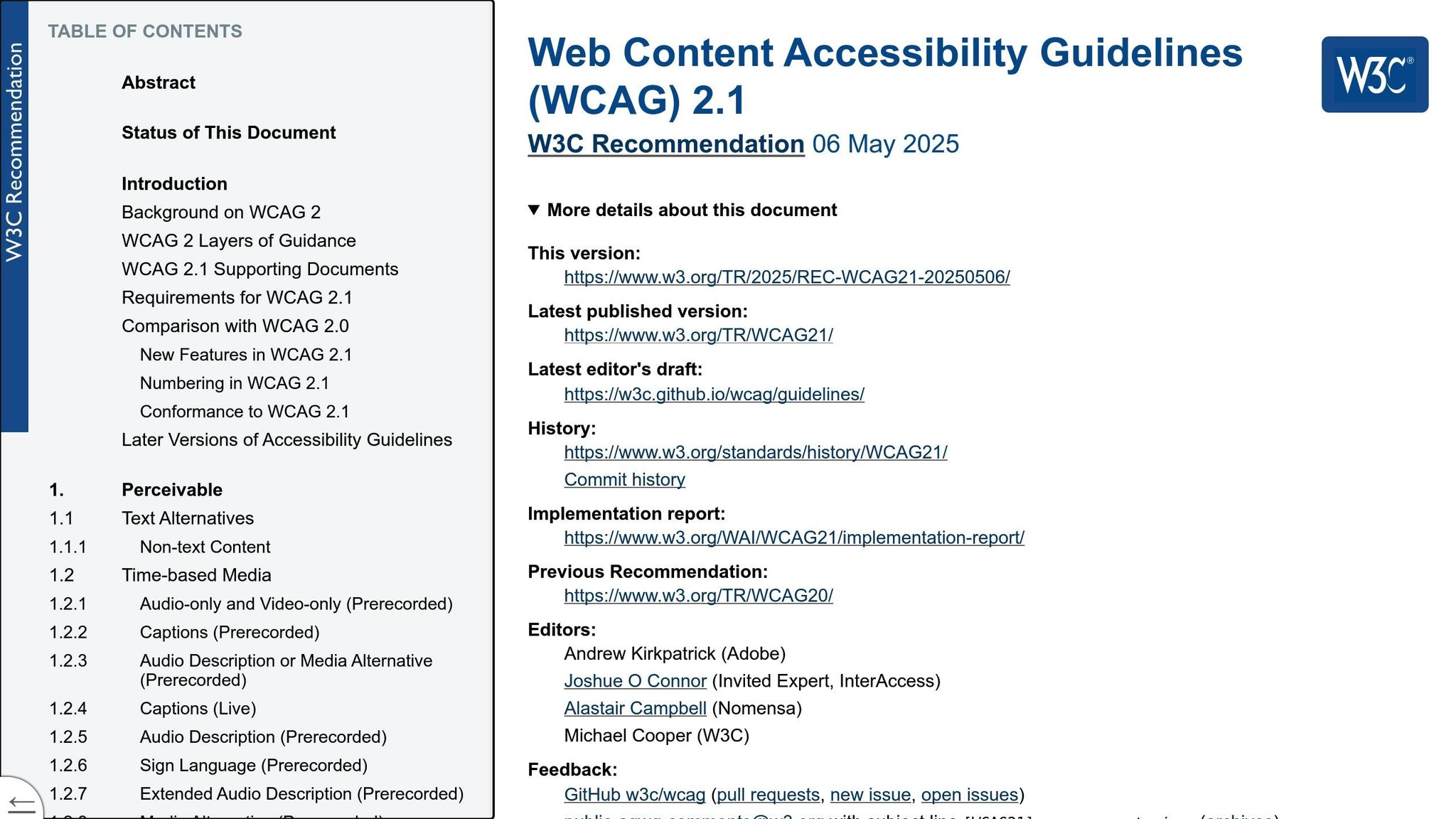
- Core Principles: Follow WCAG guidelines: Perceivable, Operable, Understandable, and Robust.
- Best Practices:
- Use clear labels linked to input fields with
<label>andid. - Ensure keyboard navigation and screen reader compatibility.
- Provide visible error messages and real-time validation.
- Maintain strong color contrast and clear focus indicators.
- Use clear labels linked to input fields with
- Testing: Combine automated tools (axe, WAVE) with manual testing (keyboard navigation, screen readers) to catch all issues.
How to make accessible forms – with lots of examples!
Basic Rules for Accessible Forms
Designing accessible forms involves focusing on three key aspects: clear labeling, seamless keyboard navigation, and effective error handling. These principles form the backbone of user-friendly and inclusive form design, ensuring compliance with HTML and ARIA standards.
Clear Labels and Input Fields
Labels play a vital role in making forms usable, especially for individuals with disabilities. As Uday Shetty, Senior Accessibility Consultant at Deque Systems, explains, "Without visible labels, form controls are not usable to any user, let alone a person with a disability".
Here’s how to design effective form labels:
- Use the HTML
<label>element with matchingforandidattributes to link labels to their respective input fields. - Place labels close to the associated form controls for easy identification.
- Avoid relying solely on placeholder text as a substitute for labels – it’s not a reliable alternative.
- Use
<fieldset>and<legend>elements to group related fields, providing clear context for users.
"The first rule for creating a truly accessible form is to use native HTML form controls as much as possible. Most of them are accessible by default with all assistive technologies, and they are semantically correct." – Uday Shetty
Keyboard and Screen Reader Support
Ensuring keyboard accessibility is critical for users who do not rely on a mouse. Forms should be designed to allow smooth navigation and interaction using only a keyboard. Key features to include are:
| Requirement | Implementation |
|---|---|
| Tab Navigation | Ensure logical movement between form fields. |
| Focus Indicators | Provide visible outlines for the active elements. |
| Avoid Keyboard Traps | Prevent users from getting stuck in a loop within form sections. |
| Screen Reader Compatibility | Use semantic HTML and ARIA attributes for clear communication. |
For example, the General Services Administration found that poorly designed forms can trap users in endless navigation loops, rendering them unusable.
Error Handling
Good error handling ensures users can quickly identify and fix mistakes. The Web Accessibility Initiative highlights that error messages should be:
- Clearly visible and positioned close to the relevant field.
- Written in straightforward, easy-to-understand language.
- Programmatically linked to form controls for accessibility.
- Read aloud by screen readers to assist visually impaired users.
Here’s how to improve error handling in your forms:
- Use ARIA attributes: Implement
aria-invalid="true"for fields with errors and usearia-describedbyto link error messages to the corresponding input field. - Provide clear instructions: Replace vague error messages like "invalid input" with specific guidance on how to fix the issue.
- Enable real-time validation: Validate user input as they type, minimizing interruptions and making corrections easier.
"To err is human. To prevent, suggest, and correct are divine." – Raghavendra Peri
HTML and ARIA Best Practices
Combining semantic HTML with thoughtful ARIA usage is key to creating forms that are accessible to all users.
HTML Form Elements
Native HTML form elements come with built-in accessibility features, making them the best starting point. Here’s how to use some of the most common elements effectively:
| Element Type | Purpose | Best Practice |
|---|---|---|
<input> |
Form fields | Use specific type attributes (e.g., text, email, number) |
<textarea> |
Multi-line text | Define rows and cols attributes for better usability |
<select> |
Dropdown menus | Group related options with <optgroup> for clarity |
<button> |
Form actions | Use clear, action-focused text for buttons |
When working with form controls, keep these tips in mind:
- Set the
autocompleteattribute to make it easier for users to fill out forms. - Use the
requiredattribute for fields that must be completed. - Provide meaningful
nameattributes to ensure proper form processing. - Use
idattributes to link labels to their corresponding fields.
ARIA Implementation
When HTML alone can’t meet accessibility needs, ARIA attributes can fill the gaps. However, it’s important to use them wisely:
- Use ARIA Sparingly Always prioritize native HTML elements. ARIA should only be added when no native solution exists.
"No ARIA is better than bad ARIA"
- Communicate Status Updates ARIA attributes can help convey changes in form status. Here are some key attributes and their uses:
ARIA Attribute Purpose Example aria-invalidHighlights validation errors For fields with incorrect input aria-requiredMarks fields as mandatory Alternative to the HTML requiredattributearia-describedbyLinks fields to error messages Connects input fields to descriptive error text aria-expandedIndicates dropdown state Useful for custom dropdown menus - Support Dynamic Content For forms with JavaScript-powered features, ARIA can ensure accessibility remains intact:
- Use
aria-liveregions to announce updates dynamically. - Apply
aria-busyto indicate loading states. - Implement
aria-controlsto manage relationships between elements.
- Use
"ARIA attributes bridge the gap to address accessibility issues that cannot be managed with native HTML"
Up next, learn how design elements like color contrast and focus indicators play a role in making forms even more accessible.
Design and Interaction Guidelines
Creating accessible forms requires careful attention to both visual and interactive design.
Color Contrast Standards
Color contrast plays a key role in making forms accessible, especially for individuals with visual impairments. Ensuring proper contrast ratios helps users perceive content effectively in different viewing conditions.
| Element Type | WCAG Level AA | WCAG Level AAA |
|---|---|---|
| Regular Text | 4.5:1 | 7:1 |
| Large Text (18pt/14pt bold) | 3:1 | 4.5:1 |
| UI Components | 3:1 | 3:1 |
To meet these standards when designing form elements:
- Form fields should have a minimum contrast ratio of 3:1 between the border and background.
- Error messages and key text need a contrast ratio of at least 4.5:1 for clear readability.
- Interactive elements must include distinct visual states with sufficient contrast.
Since about 1 in 12 men and 1 in 200 women experience some degree of color vision deficiency, it’s important to:
- Use tools to check color contrast and ensure compliance with WCAG standards.
- Include secondary indicators like symbols or patterns and test contrast on both light and dark backgrounds.
Once contrast is addressed, the next step is ensuring interactive elements have clear focus indicators.
Focus States and Interactions
Focus indicators are essential for guiding users through form interactions, particularly for those relying on keyboards or assistive technologies. These indicators show which element is active, making navigation easier and more intuitive.
Here are some best practices:
- Touch-Friendly Design
Make touch controls large enough and spaced properly for easy use. - Keyboard Navigation
All form elements should be fully accessible via keyboard, following a logical tab order that matches the visual layout. This is critical for the 25% of U.S. adults with disabilities who depend on keyboard navigation. - Real-Time Feedback
Provide immediate visual and programmatic feedback during form interactions. For example, Venture Harbour‘s four-step form saw a 53% conversion rate by incorporating real-time validation feedback.
To implement effective focus states:
- Ensure focus indicators are highly visible on all backgrounds.
- Design focus styles that work consistently across different browsers.
- Use animations sparingly to help users follow focus movement without causing distractions.
- Maintain consistent focus indicators throughout the form for a unified experience.
sbb-itb-f6354c6
Testing Methods
Effective testing is crucial to ensure accessible forms, especially when you consider that 95.9% of business homepages still have accessibility errors. This highlights just how important thorough testing is in creating inclusive digital experiences.
Automated Testing Tools
Automated tools are a great starting point, capable of detecting 20–40% of accessibility issues. Here are a few tools worth considering:
| Tool | Key Features | Best For |
|---|---|---|
| axe DevTools | Zero false positives, detailed analysis | Development teams |
| WAVE | Clear issue descriptions, API access | Content creators |
| Accessibility Insights | Comprehensive checks | Designers & developers |
To get the most out of automated testing:
- Integrate checks into your development workflow.
- Use tools that provide clear remediation guidance.
- Track and document issues for accountability.
- Regularly monitor test coverage and prioritize issue severity.
Manual Testing Steps
While automated tools are helpful, manual testing uncovers deeper issues. Here are some key steps:
Keyboard Navigation
Ensure users can navigate the form with a keyboard. Check that the tab order makes sense, focus indicators are visible, and there are no keyboard traps.
Screen Reader Verification
Manually test with a screen reader to confirm:
- Form control labels are clear and descriptive.
- Error messages are announced properly.
- Dynamic content updates are communicated effectively.
- Instructions for form fields are easy to understand.
Content and Visual Review
Evaluate the visual and content elements by checking:
- Compatibility with 200% zoom.
- Proper use of heading levels.
- Clear and visible error messages.
- Compliance with color contrast standards.
These manual steps complement automated testing and ensure a more thorough review of your forms.
Testing and Updates
"Automated accessibility testing streamlines your path to accessibility, enabling you to create more inclusive online spaces as well as comply with accessibility regulations."
- Jeff Curtis, Sr. Content Manager
To maintain high accessibility standards:
- Conduct regular accessibility audits.
- Update your testing process as WCAG guidelines evolve.
- Keep a record of testing results and improvements.
Managing Form Accessibility
Effectively managing form accessibility in large-scale projects requires a solid design system and well-coordinated teamwork. Research indicates that accessibility technology improves navigation for 57% of computer users.
Design System Integration
A well-structured design system ensures uniformity and reduces repetitive efforts.
Your design system should include comprehensive accessibility documentation, such as:
- Accessibility requirements for specific components
- WCAG 2.2 compliance checklists
- Detailed development notes, covering:
- Accessible names
- Keyboard focus order
- HEX codes
- Landmark roles
For instance, Pinterest’s Gestalt design system incorporated accessibility documentation directly into their design assets in March 2024.
Component Architecture
Design system components should be structured with accessibility in mind:
| Element | Integration Details |
|---|---|
| Base Elements | ARIA attributes, semantic HTML |
| Form Controls | Built-in validation, error states |
| Pattern Library | Keyboard navigation flows |
| Documentation | Implementation guidelines, testing criteria |
Once the design system is established, maintaining consistent adherence to these standards requires collaboration across teams.
Team Coordination
Clear roles and teamwork are essential for managing accessibility effectively.
Role-Based Responsibilities
- Project Managers
They should embed accessibility into project requirements, schedule regular audits, and document testing outcomes. - Designers
Designers must apply universal design principles from the beginning, ensuring accessibility is baked into design files and style guides. - Developers
Developers play a key role by:- Integrating accessibility linters into their workflow
- Adding automated testing to CI/CD pipelines
- Performing regular component-level testing
- Documenting accessibility features within the code
- QA Testers
QA testers should develop thorough testing plans that combine automated and manual methods, while documenting and prioritizing any accessibility issues.
Maintenance Strategy
To sustain high accessibility standards over time:
- Conduct regular accessibility audits
- Update documentation to align with international standards
- Maintain open communication channels
- Track user feedback and address accessibility concerns
- Organize periodic team training sessions
Tools like UXPin simplify these efforts by offering built-in accessibility features and seamless design-to-code collaboration.
Summary
Over a billion people worldwide live with disabilities, highlighting the importance of designing accessible forms for inclusive digital experiences. When forms lack accessibility, a staggering 71% of users with disabilities abandon websites, cutting off access to a market with over $13 trillion in annual disposable income.
This underscores two key areas to focus on for accessible form design:
Technical Implementation
- Use semantic HTML and ARIA attributes.
- Ensure all form elements have proper labels.
- Implement effective error handling.
- Support seamless keyboard navigation.
Design Considerations
- Use fonts that are at least 16px for readability.
- Design touch targets to be at least 44x44px.
- Provide clear visual feedback for interactions.
- Maintain strong color contrast for visibility.
"Following the best practices above will enable you to create a form that is usable and accessible to all users. And remember, native HTML is the key to creating positive user experiences!" – Uday Shetty, Senior Accessibility Consultant and Coach at Deque Systems
To sustain accessibility, it’s essential to:
- Conduct regular audits.
- Train your team on accessibility principles.
- Gather and act on user feedback.
- Keep documentation up to date.
- Continuously monitor compliance.
Beyond meeting compliance standards, accessibility also makes good business sense – 81% of customers are more likely to support companies that prioritize accessibility. By following these guidelines, you can create forms that enhance both inclusivity and business outcomes.
UXPin’s accessibility tools simplify this process, helping you ensure your forms remain inclusive throughout the design and development lifecycle.
FAQs
How can I make my forms accessible and compliant with WCAG guidelines?
To design forms that align with WCAG guidelines, start by ensuring every form field has clear, descriptive labels. Place these labels directly above or near the fields so users can quickly grasp what’s required. Use semantic HTML to properly link labels with their respective fields, making the form more accessible.
It’s also crucial to make all form elements keyboard-friendly. This means users should be able to navigate through the form smoothly using only a keyboard or assistive tools. Avoid creating navigation traps, and include visible focus indicators to show exactly where the user is within the form.
When handling errors, provide straightforward and helpful error messages. These messages should be easy to understand, accessible to screen readers, and guide users on how to correct the issue without adding frustration.
Lastly, ensure the form has a consistent and intuitive design. This enhances usability for everyone, including individuals with disabilities, and creates a more seamless and inclusive experience.
What are the best ways to test forms for accessibility to ensure they work for all users?
To make your forms usable for everyone, it’s important to combine automated tools with manual testing. Automated tools are great for catching common problems like missing labels, incorrect HTML setup, or contrast issues. They offer a strong foundation for ensuring accessibility.
That said, manual testing plays a key role in catching things automated tools might overlook. This involves testing real-life scenarios, like navigating forms using just a keyboard or interacting with them through assistive technologies such as screen readers. By blending these two approaches, you can ensure your forms meet accessibility standards while being genuinely user-friendly for all.
Why should you prioritize native HTML elements instead of ARIA attributes for accessible forms?
Using native HTML elements is key to building accessible forms. These elements come equipped with built-in accessibility features, such as keyboard navigation and semantic roles, which are automatically recognized by assistive technologies. This not only simplifies your coding efforts but also lowers the chances of introducing accessibility issues.
When it comes to ARIA attributes, they should be a fallback option – used only when native elements can’t deliver the required functionality. Improper use of ARIA can create confusion for assistive technologies, potentially making things worse. Sticking to native HTML elements whenever feasible ensures a more seamless and inclusive experience for all users.