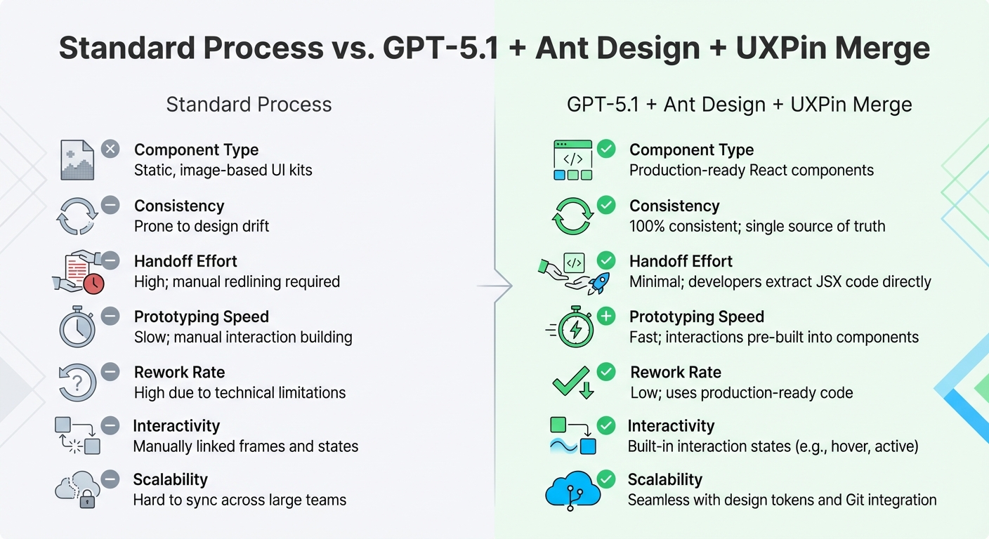
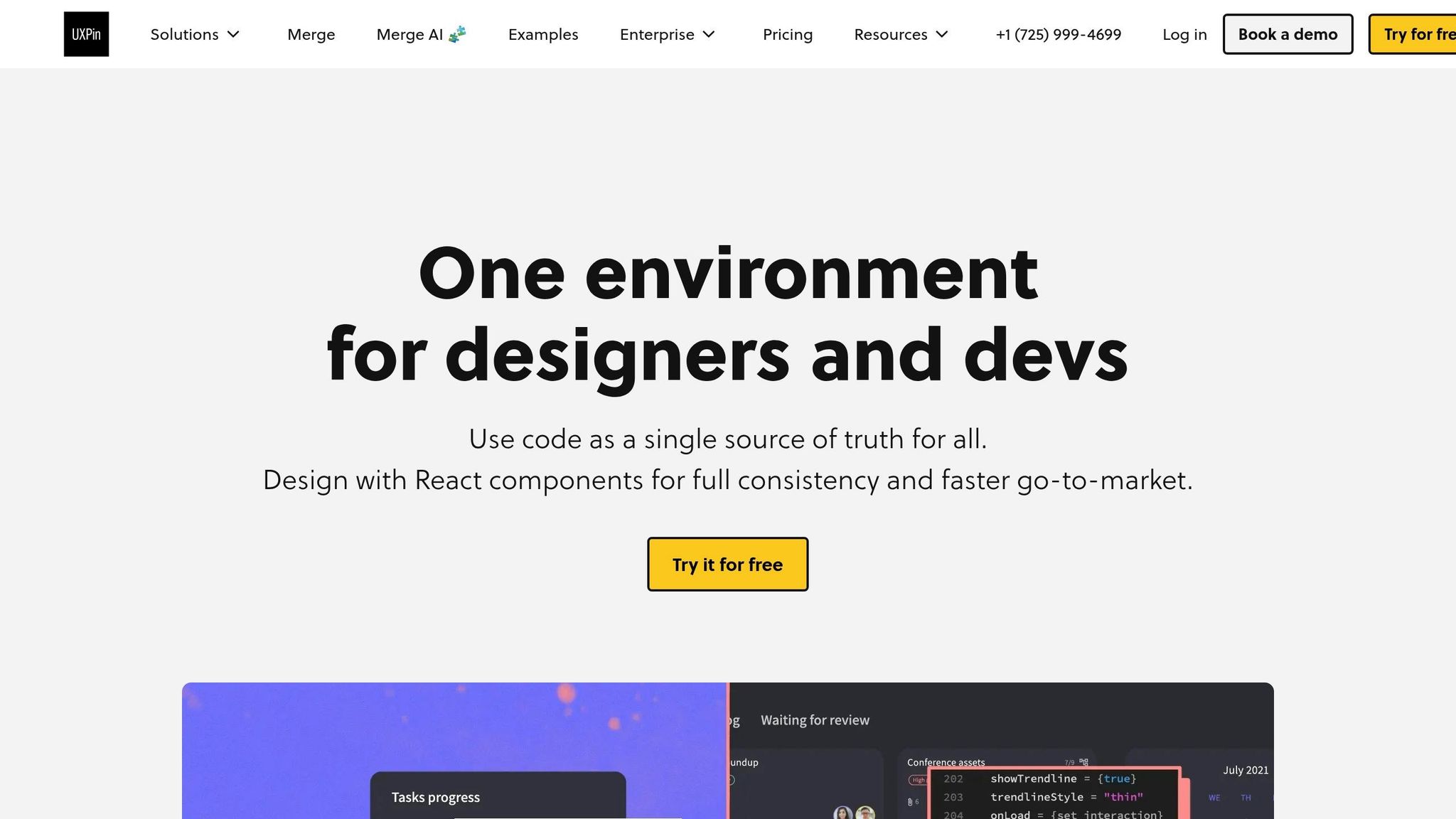
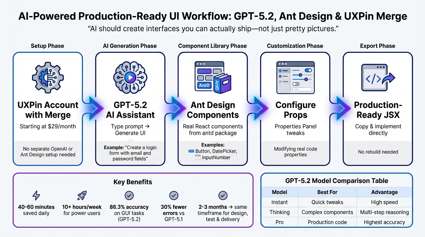
Want to speed up UI design without losing quality? With GPT-5.1, Bootstrap, and UXPin Merge, you can create production-ready UIs directly from prompts – no static mockups or endless handoffs. Here’s the process in a nutshell:
- Bootstrap: Provides a pre-built library of components like buttons, forms, and grids.
- GPT-5.1: Generates UI layouts using Bootstrap’s actual code.
- UXPin Merge: Combines design and development, letting you design with real code components.
This workflow eliminates repetitive back-and-forth between designers and developers. You design, test, and export React code that’s ready to ship – all in one platform. Whether you’re a designer or developer, this approach saves time and ensures consistency.
Key Steps:
- Set up UXPin Merge with Bootstrap.
- Use GPT-5.1 to generate components with prompts.
- Customize and test designs in UXPin.
- Export clean, production-ready React code.
This method is faster and keeps your designs aligned with your codebase, making it ideal for modern teams.
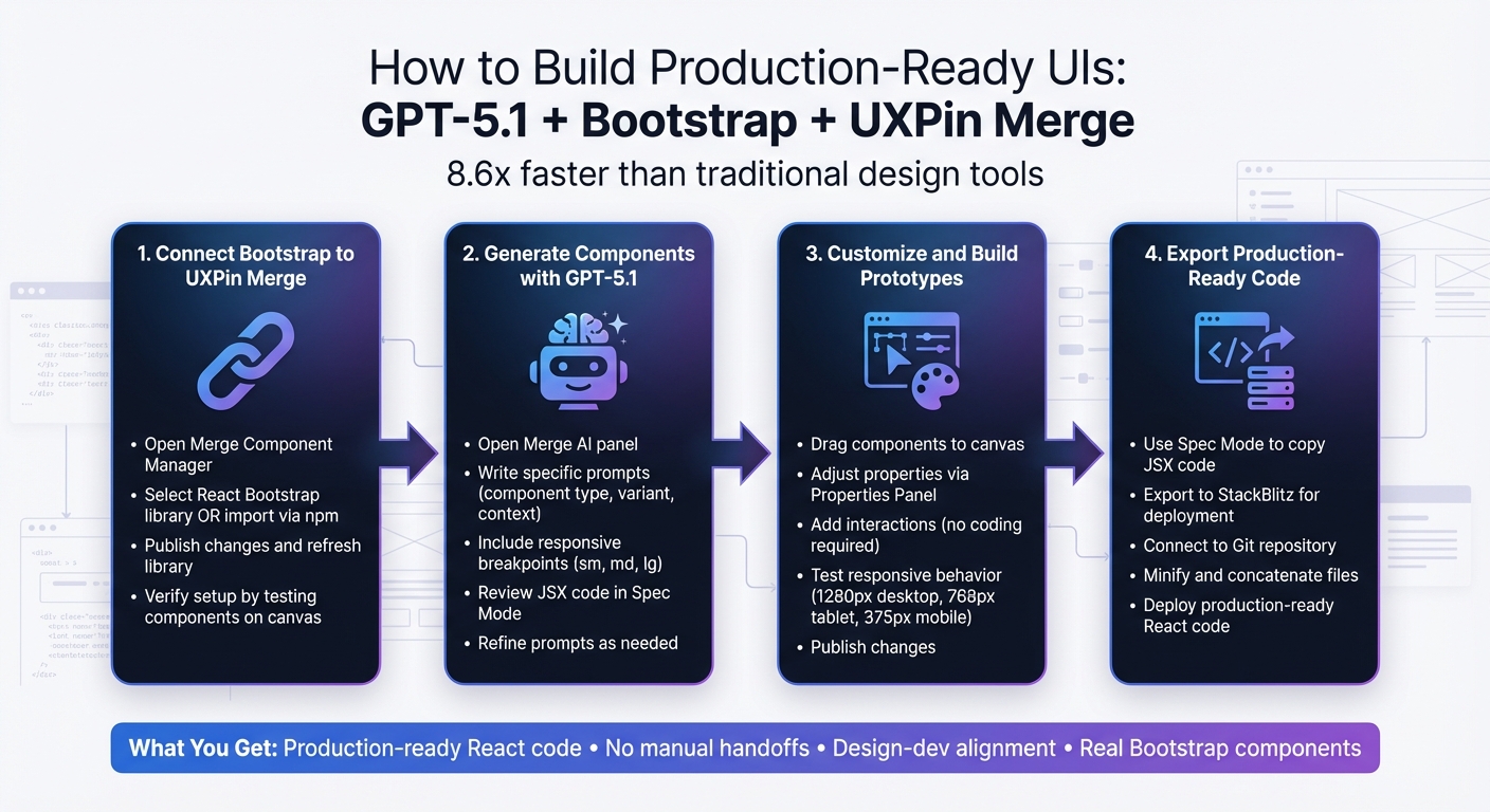
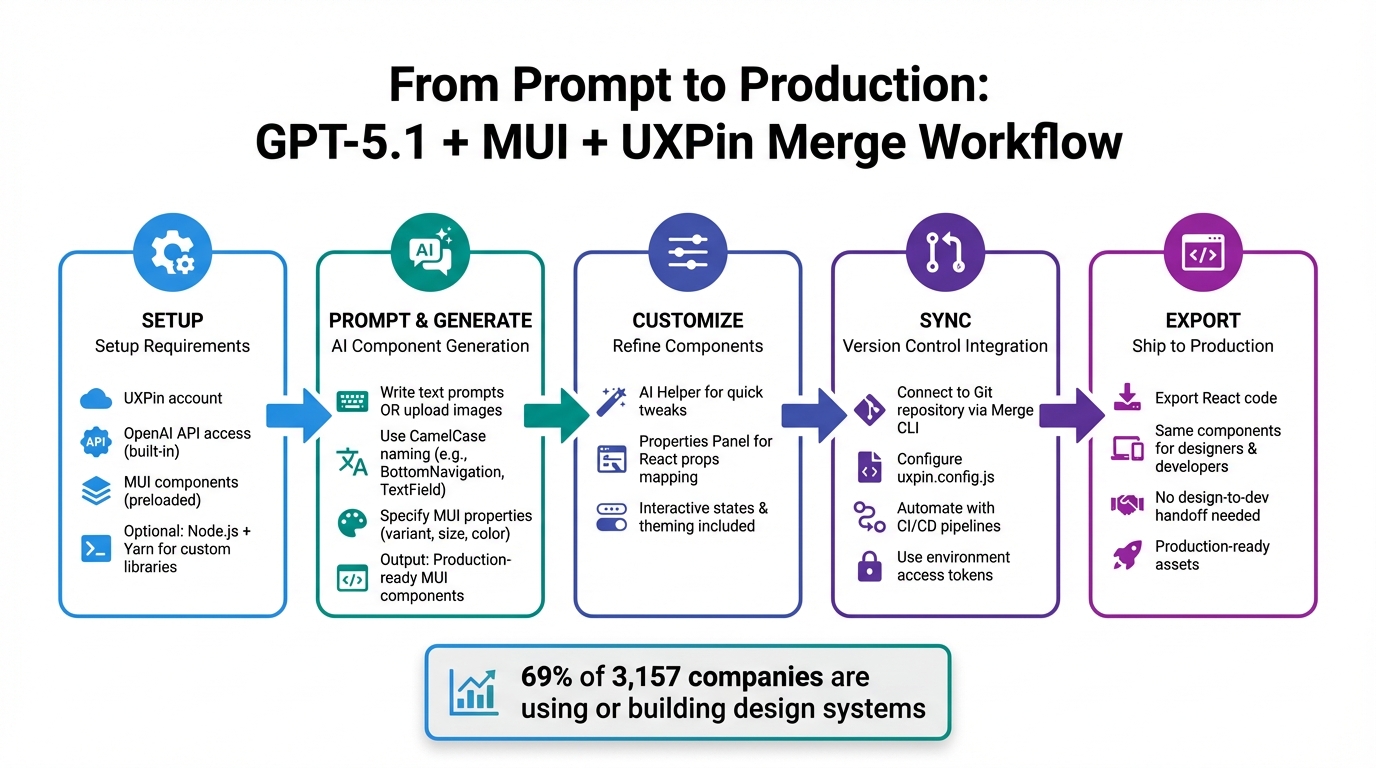
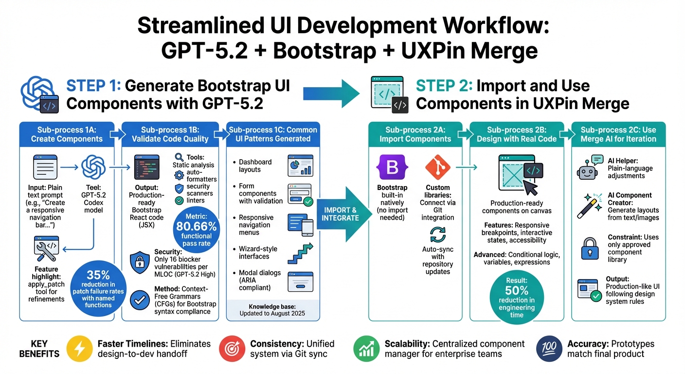
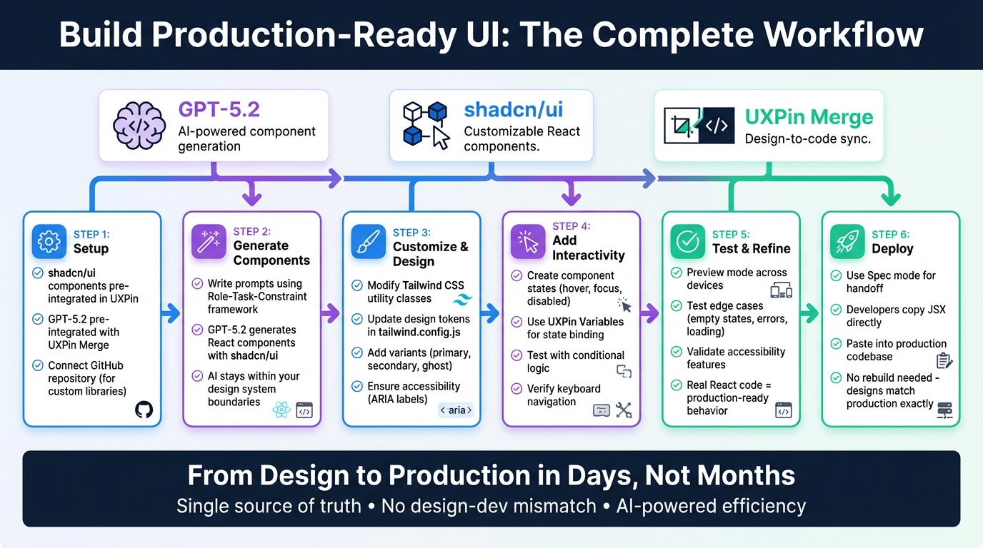
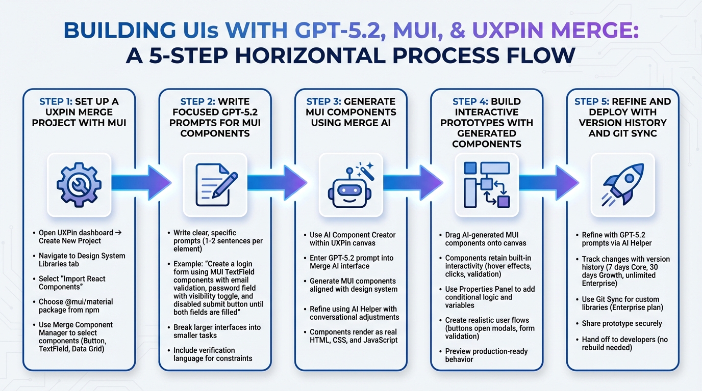
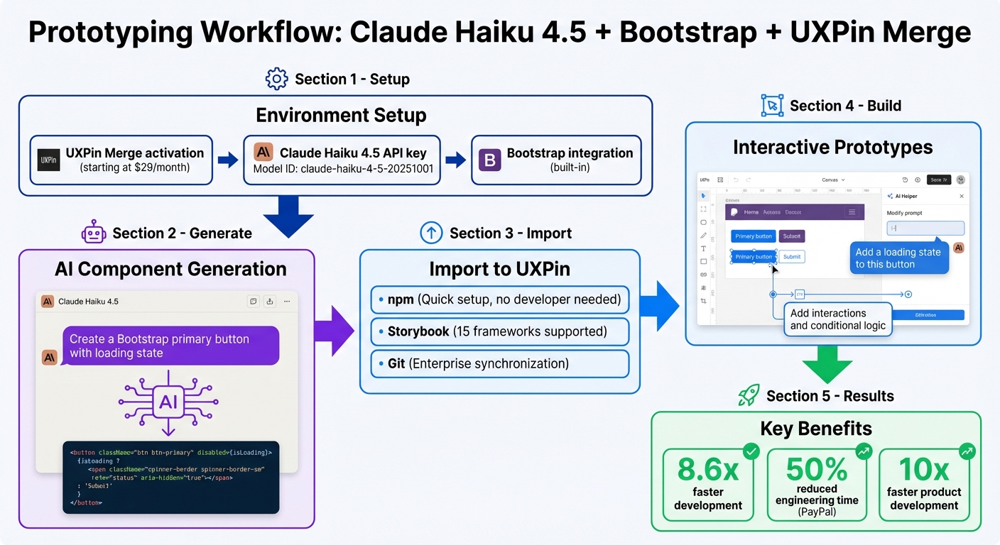
4-Step Workflow: Building Production-Ready UIs with GPT-5.1, Bootstrap, and UXPin Merge
UXPin Merge AI: Smarter UI Generation That Follows Your Design System

sbb-itb-f6354c6
What You Need to Get Started
To begin creating UIs with GPT-5.1 and Bootstrap, you’ll need a UXPin account with Merge technology enabled. Merge is included in all pricing tiers, so you can even use the free version to explore its features.
The setup is straightforward. UXPin has native Bootstrap integration, which means you can start designing with Bootstrap components right away – no need for manual imports or CSS configuration. Simply open UXPin, select Bootstrap from the available design libraries, and you’re good to go. Custom imports are only necessary for proprietary libraries. Having a basic understanding of Bootstrap’s structure (like .container, .table, and the grid system) will help you write better prompts. Bootstrap’s mobile-first framework includes component variants – such as Primary, Secondary, Success, and Danger – which appear as dropdown options in UXPin’s Properties Panel when you’re designing.
GPT-5.1 works exclusively with the Bootstrap components loaded in UXPin Merge. Instead of offering generic wireframes or inventing new patterns, it generates production-ready UI elements that align with your design system. This approach was introduced with the launch of Merge AI 2.0 in December 2025.
To get started quickly, you can use the Bootstrap trial kit in UXPin Merge. This allows you to experiment with the workflow before diving into custom npm integrations. Now, let’s walk through setting up your UXPin account to use Merge.
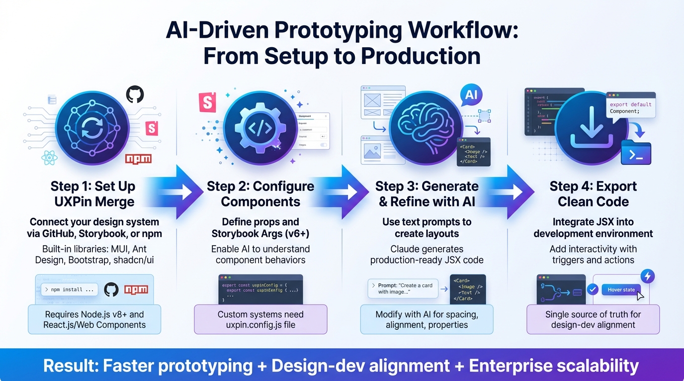
Set Up Your UXPin Account and Enable Merge
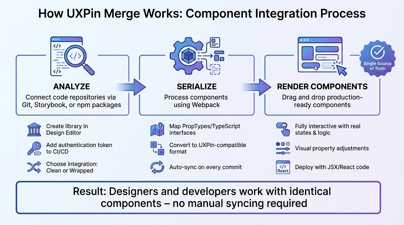
Log in to your UXPin dashboard and create a new project. Choose the "Design with Merge components" option. Since Bootstrap is integrated natively, it will appear in the list of available design libraries – just click to activate it.
UXPin automatically manages dependencies for you. Once Bootstrap is activated, you’ll gain access to the Merge Component Manager. This tool helps you organize UI elements, manage React props, and publish updates to your component library. To maintain consistency, organize your components into categories that match Bootstrap’s official documentation, such as "Components", "Forms", and "Layout." This setup ensures a seamless connection between your design canvas and the code your developers will use.
With the account configured, it’s time to familiarize yourself with some Bootstrap basics to streamline your design process.
Learn Basic Bootstrap Concepts
Bootstrap operates on a 12-column grid system designed for responsive layouts. This grid adapts to different screen sizes, making it easier to create interfaces that work seamlessly across mobile, tablet, and desktop devices. Understanding how columns stack and adjust will help you design prototypes that behave predictably during testing.
Component variants are another key concept. For instance, Bootstrap buttons come in styles like Primary, Secondary, Success, and Danger. These styles aren’t just aesthetic – they carry semantic meaning and influence accessibility and user expectations. When you import Bootstrap components into UXPin Merge, these variants show up as dropdown options in the Properties Panel. You can switch styles without touching any code.
It’s important to follow Bootstrap’s official naming conventions for accurate code generation. GPT-5.1 and Merge rely on precise component names, so using "Button" instead of custom names like "Btn" or "PrimaryButton" ensures the AI generates the correct code. This precision is especially useful when managing properties like "children" in the Merge Component Manager, which define labels for elements like buttons or navigation links. Mastering these basics will help you craft precise prompts for GPT-5.1.
How GPT-5.1 Works in UXPin Merge
Once your setup is complete and you’re comfortable with Bootstrap, GPT-5.1 takes over to generate production-ready components. For example, if you prompt it with "Create a pricing table with three columns", the AI will use the actual Bootstrap components available in your UXPin canvas. It doesn’t invent new patterns or pull in elements outside your library, ensuring that every suggestion aligns with your design system.
This constraint-based approach minimizes errors and reduces rework. Instead of static mockups, GPT-5.1 generates production-ready React code. The JSX it produces can be directly copied into your development environment or tools like StackBlitz. Developers receive complete code, including dependencies and functions, eliminating the translation step that often causes delays.
Simply describe your requirements, let GPT-5.1 assemble the components using Bootstrap, and review the generated code. If you need adjustments, refine your prompt or tweak the properties directly in UXPin. The result? A UI that perfectly matches your design system and is ready to ship – no need for manual rebuilding.
Step 1: Connect Bootstrap to UXPin Merge
It’s time to link Bootstrap with your UXPin workspace using UXPin’s built-in integration.
Select the Bootstrap Design Library
Start by opening the Merge Component Manager from the left sidebar. This will bring up the management dashboard in a new tab.
Using the built-in Bootstrap library:
- Navigate to "Open-Source React UI Libraries" and select React Bootstrap. This provides instant access to standard Bootstrap components without requiring npm setup.
For a custom library setup:
- Click "+ Add new Library" and choose "Import React Components with npm integration".
- Name your library (for example, "Bootstrap UI").
- Add the necessary packages:
react-bootstrapandbootstrap. - Specify the CSS path:
bootstrap/dist/css/bootstrap.min.css. - Ensure every component name aligns with the React Bootstrap documentation.
- Organize components into categories like Components, Forms, and Layout for easy navigation.
- Click "Publish Changes" to finalize and initialize your library.
Once done, return to the UXPin editor and click "Refresh Library" to load your components. After publishing, you can immediately begin testing the library’s functionality on the canvas.
Verify Your Bootstrap Setup
Testing the Bootstrap integration is crucial to ensure a smooth transition into prototyping.
Drag a component, such as a Button or Navbar, onto the canvas. If it appears styled and interactive, your setup is good to go. Select the component and check its variant options (like Primary, Secondary, Success, or Danger) in the Properties Panel.
To confirm code integration, click the Spec Mode icon in the top toolbar. This mode reveals the JSX code, functions, and dependencies for the selected component, including Bootstrap imports and React dependencies. As Rachel Johnson from Treehouse explains:
"Spec mode is where we’ll find all the developer-related information about this design".
You can go a step further by using the "Open in StackBlitz" option. This launches a live React project in your browser, letting you see the Bootstrap components in action. If everything works as expected, your setup is ready for production. You can also download the project as a React app to double-check that the index.html file includes the necessary viewport settings and that Bootstrap’s CSS is properly linked.
Step 2: Generate Bootstrap Components with GPT-5.1
With Bootstrap integrated, GPT-5.1 allows you to create components directly within the canvas. The AI works within the constraints of your UI design system, ensuring the components it generates align with Bootstrap’s actual code structure – no random or unusable code.
Write Prompts for Component Generation
To get started, open the Merge AI panel from the left sidebar in UXPin. The effectiveness of your prompts depends on how specific you are about the component type, variant, and context. For instance, if you need a navigation bar, you might say: "Create a responsive Bootstrap navbar with a brand logo on the left, three navigation links in the center, and a primary button on the right." Or, for a table: "Generate a Bootstrap table with striped rows showing user data, including columns for name, email, role, and status."
When requesting buttons, include the contextual class you need – Primary, Secondary, Success, Danger, Warning, or Info. The AI will apply the appropriate base and modifier classes.
If your design requires responsiveness, include breakpoints like sm, md, or lg in your prompt. For example: "Create a card grid that displays 1 column on mobile, 2 columns on tablets, and 4 columns on desktop." This ensures the correct responsive utility classes are added.
Once you’ve written your prompt, review and refine the generated code as needed.
Review and Refine AI-Generated Code
After generating a component, use Spec Mode to evaluate the output. Check the JSX to ensure all necessary classes and attributes are included. For example, a success button should include both .btn and .btn-success. Also, verify that the HTML5 doctype and responsive viewport meta tag (<meta name="viewport" content="width=device-width, initial-scale=1">) are present, as these are essential for mobile rendering.
For components like Navbars, Modals, or Carousels, confirm the presence of required data attributes such as data-bs-toggle and data-bs-target. These attributes are critical for Bootstrap’s JavaScript functionality. If you’re working with interactive elements like dropdowns or Collapse components, ensure Popper.js dependencies are included – these are necessary for proper behavior.
If something doesn’t look right, revisit the AI panel and refine your prompt with more detailed class names or layout adjustments. The more precise your instructions, the closer the output will match your expectations.
Step 3: Customize and Build Prototypes in UXPin Merge
Once your AI-generated components are ready, the next step is to refine and integrate them into your prototypes. With UXPin Merge, you can tweak component properties and behaviors – all without touching a single line of code.
Add Components to the Canvas and Adjust Properties
Start by dragging your generated component onto the canvas. Open the Properties Panel to fine-tune settings like color variants, labels, and sizes. These adjustments are straightforward, often done through dropdown menus or text fields. For instance, if you’re working with a button, you can switch its style from Primary to Danger by selecting the appropriate option from the dropdown. Need to adjust spacing? Use Bootstrap utility classes like p-3 for padding or mb-4 for margins.
The best part? Each property ties directly to React props, ensuring your customizations are ready for production. For consistency across multiple components, you can define reusable values in the Component Manager and apply them throughout your design. Once you’re satisfied with the changes, hit Publish Changes and then Refresh Library to update your design library with the latest tweaks.
With your components set, it’s time to add interactivity and test their responsiveness.
Add Interactions and Test Responsive Behavior
After customizing your components, you can easily add dynamic behaviors – again, no coding required. UXPin Merge uses production-ready code to handle built-in interactivity for Bootstrap UI Kit components, so hover states, dropdowns, and modals work out of the box. For additional interactions, select a component and open the Interactions Panel. Here, you can configure actions like navigating to another screen, toggling visibility, or updating a component’s state.
To ensure your design adapts well across devices, test its responsive behavior by switching viewport sizes in the toolbar. Recommended widths include 1,280px for desktop, 768px for tablet portrait, and 375px for mobile portrait. Thanks to Bootstrap’s grid system and responsive utilities, layouts automatically adjust based on the breakpoints you defined in your GPT-5.1 prompts. If something doesn’t look right, revisit the Properties Panel to confirm that responsive classes like col-md-6 or d-none d-lg-block are applied correctly.
Once you’ve verified responsiveness, you’ll be ready to move on to exporting your production-ready code in the next step.
Step 4: Export Production-Ready Code from UXPin Merge
Your prototype has been tested and is now ready for the production handoff. UXPin Merge simplifies this process by removing the usual design-to-development translation step. What you create on the canvas directly aligns with your codebase.
Export UI Code and Connect to Repositories
UXPin Merge generates code that perfectly matches your Bootstrap components. By using real React components, you get production-ready code without needing extra adjustments.
To ensure smooth collaboration, connect UXPin Merge to your version control system and implement a clear Git branching strategy – for example, creating separate branches for features and bug fixes. Writing clear and descriptive commit messages can also make code reviews more efficient. When working with Bootstrap, integrate it via npm for easier updates and greater flexibility. Avoid directly editing Bootstrap’s source files; instead, use separate CSS or SCSS files for overrides. This approach simplifies maintenance and ensures future upgrades are hassle-free.
"Bootstrap’s strength lies in its versatility… Avoid changes to the Bootstrap source files. Instead, write new styles in separate CSS files, making maintenance and upgrades easier." – Alexander Obregon
To automate repetitive tasks – like compiling Sass to CSS or minifying files – tools like Gulp or Grunt can save time and reduce errors. Before deploying, always minify and concatenate your CSS and JavaScript files to boost page loading speeds.
For teams managing large-scale design systems, additional tools and features can further enhance collaboration.
Use Advanced Features for Enterprise Teams
For larger teams, UXPin’s Growth and Enterprise plans offer tools to scale design systems efficiently. Features like robust roles and permissions let you control who can edit, review, or publish designs—essential for design system governance – especially critical for industries with strict regulations.
Enterprise plans also include direct Git integration, syncing design updates automatically with your repository to reduce manual handoffs. With unlimited version history and dedicated support, your team can work faster without compromising quality or compliance. For tailored pricing and onboarding options, visit uxpin.com/pricing or reach out to sales@uxpin.com.
Conclusion
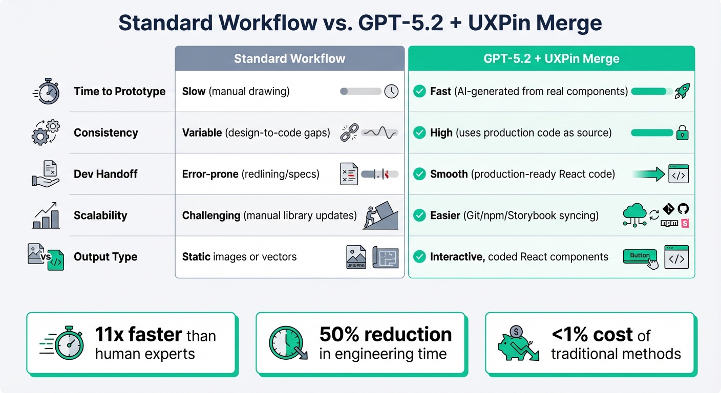
Creating production-ready UIs with GPT-5.1, Bootstrap, and UXPin Merge transforms the traditional design-to-development workflow. By removing the need for manual handoffs, this process allows teams to move from concept to deployment much faster and with fewer obstacles.
Here’s how it works: integrate Bootstrap with UXPin Merge, use GPT-5.1 to generate components via text prompts, customize fully interactive prototypes, and export production-ready code. This method is 8.6 times faster than using traditional design tools. The result? Designers and developers stay perfectly aligned, speaking the same "language" throughout the process.
What sets this approach apart is the use of real production components. As UXPin explains:
"Anything you build in UXPin is your creation and belongs to you. Since you are using popular open-source libraries, such as MUI or Bootstrap, you’re the owner of the code".
This eliminates common pain points like handoff friction, unnecessary rebuilds, and design inconsistencies.
Once your design is finalized, you can generate ready-to-launch code. Use Spec Mode to copy the code or export directly to Stackblitz for immediate deployment. For enterprise teams managing complex design systems, syncing UXPin Merge with your Git repository ensures your design system and production code remain aligned at all times.
FAQs
Do I need to know Bootstrap to write good GPT-5.1 prompts?
No, you don’t need to be familiar with Bootstrap to create effective GPT-5.1 prompts. GPT-5.1 can produce UI components and layouts directly from plain text descriptions. It takes care of generating production-ready code or designs based on what you provide. So, understanding Bootstrap isn’t a requirement for writing great prompts.
How do I ensure GPT-5.1 only uses my Bootstrap components in UXPin Merge?
To make sure GPT-5.1 sticks to using only your Bootstrap components in UXPin Merge, start by enabling Bootstrap in the UXPin editor settings. Next, open the AI Component Creator from the Quick Tools panel and head over to the Settings tab. This configuration ensures that any layouts generated by GPT-5.1 will exclusively use your Bootstrap components, giving you full control and consistency in your prototypes.
What should I check in Spec Mode before exporting React code?
Before exporting React code in Spec Mode, double-check that all design properties are correctly set and up to date. Pay extra attention to critical details like dimensions, grid configurations (including columns, gutter, and margin), and color values (whether in HEX or RGBA format). Ensuring these elements are accurate guarantees more precise and consistent code output. Taking the time to prepare thoroughly will simplify your workflow and help prevent issues in the exported code.