UI Design Style Guides & Companies Doing It Right

Creating a UI style guide requires focused answers to seemingly simple questions.

How big do we make our headers? What hue of blue is our logo? Where’s the reusable code base for new pages?

Website and app building is full of minutiae that even Rainman couldn’t keep track of, and for designers it gives new meaning to the phrase “the devil is in the details.” Thankfully, style guides can keep track of this data for you, so that when you need it, it’s just a few clicks away.

Switch style guide

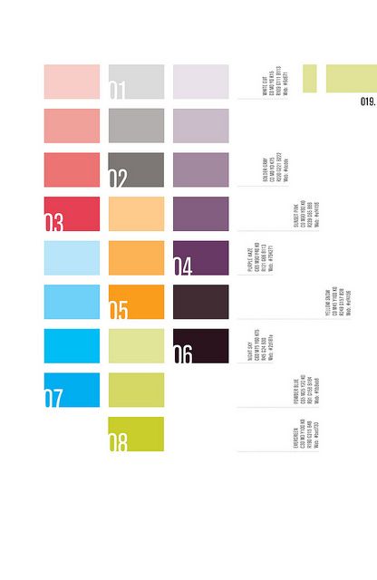
Photo Credit: “Switch.” VFS Digital Design.Creative Commons.

Here we’ll talk a little about style guides: what they are, and how they can help.

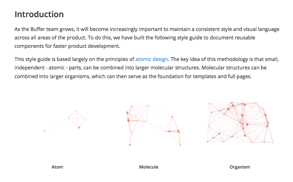
What is a Style Guide?

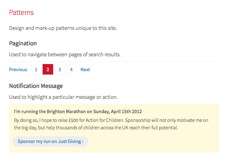
A style guide is a comprehensive “living document” that keeps track of all the repeating elements for a project, from branding rules down to the amount of beveling for call-to-action buttons.

Style guides should also impart rules and suggested practices, including dos and don’ts. On a more holistic level, they’re a great place to define the design philosophy for a company.

Economist style guide

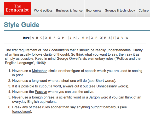
Photo Credit: The Economist

True, style guides require extra work to create — especially at the beginning, when you’re busy enough already. But in the long run, that extra work early saves time later: it makes referencing a lot smoother, and prevents confusion and misunderstanding among teams.

Don’t think of style guides as an academic PDF for onboarding new hires. When used properly, they’re collaborative tools that complement aspects of the design and add the following advantages.

Style Guide Advantages

  • Visual consistency – As explained in Web UI Design Best Practices, style guides help you create a cohesive design that reflects a common visual language. Elements like color palettes, typefaces, animations, and navigation menus all contribute towards a unified user experience.
  • Context – Great style guides account for explaining the reasoning behind design decisions. For example, in addition to explaining the technical details for pages with scrolling navigation and those with tab navigation, you should also explain that scrolling are used for storytelling, while tabs are used for product displays.
  • Collaboration – Having a set reference manual for each member of the team will ensure that everyone’s on the same page. Collaboration is easier, with less repeated questions and back-and-forth emailing.
  • Singular vocabulary — Another collaborative trait is streamlining communication through a singular vocabulary (i.e., defining what a “widget” or a “module” might be). Nailing down proper naming conventions can spare a lot of unnecessary miscommunication.
  • Code standardization – Front-end style guides help standardize the (X)HTML, CSS, or Javascript, so designers and developers can see if a new design deviates from established standards. They also help you discover if existing markup easily expanded.
  • Consolidation – Designers only need to look one place to reference all components, as opposed to losing time sifting through different notes and questioning which documents say what.
  • New employee orientation – Rather than repeatedly teaching new hires the standards, you can send them a style guide for reference as they ramp up. With the style guide as an anchoring document, follow-up conversations will be more meaningful.
  • Helps with design decisions — Don’t overlook that the process of making the style guide can draw your attention to some crucial design decisions that you may have otherwise forgotten.

Most relevant to web and mobile UI designers, the front-end style guide is what most people think of when they hear the term “style guide.” These are much more detailed than rougher style guides (like mood boards and style tiles).

These robust manuals usually live as a section on a company’s internal or public website, including snippets of code alongside more common guidelines about typography and branding, etc.

Front-end style guides are useful because they help connect design with development. Just iterate and include any reusable code and UI patterns.

If this is your first encounter with style guides, it helps to take a look at some effective examples to see how it’s done. Below are five examples from some recognizable brands.

5 Examples of Style Guides Done Right

1. BBC GEL

BBC style guide

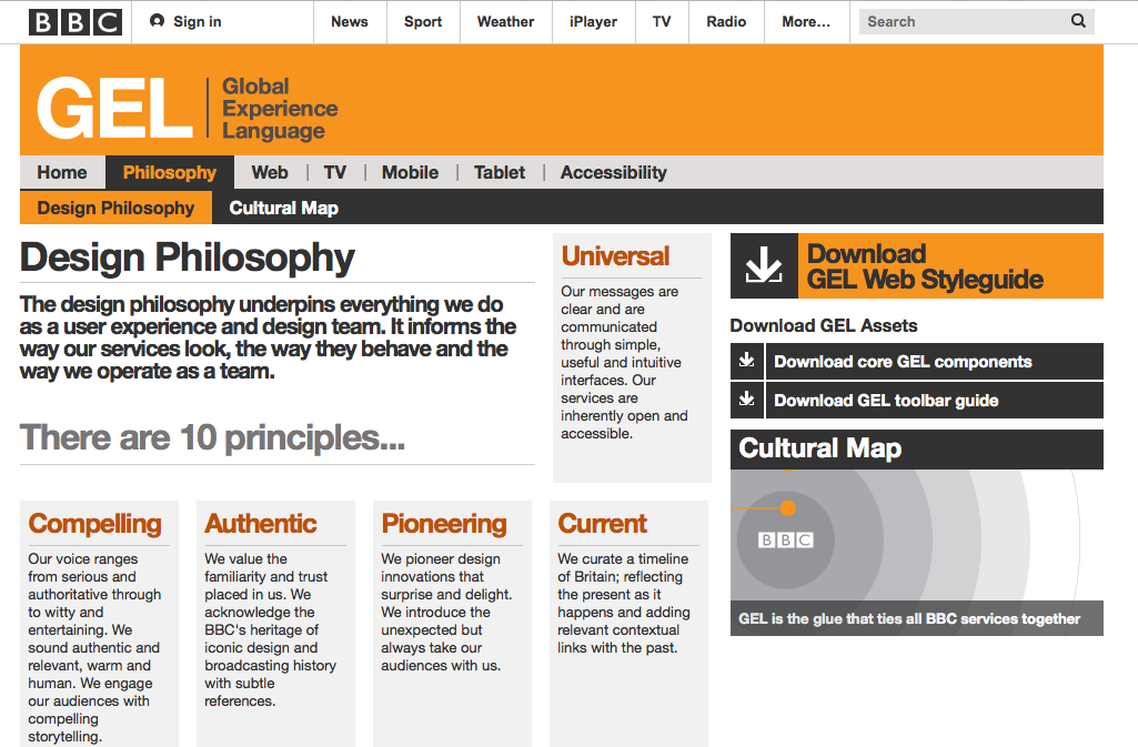
Photo Credit: BBC GEL

While currently being updated, the BBC GEL style guide lists more than just technical details. Their design philosophies are outlined in the beginning to create the proper context for the described tactics. Each platform section even contains subsections for discussing a more specific philosophy, technical details, and downloadable assets for that platform.

2. Yelp

Yelp style guide

Photo Credit: Yelp

Of course, style guides can also be purely technical reference guides. Yelp’s style guide, for example, systematically lists out black-and-white details with the corresponding HTML coding.

Their style guide is a good example to follow for teams on a time crunch – they outline all the relevant information they need, whether typographical to stylistic, and accompany each with the proper coding. To ensure proper implementation, always address developer needs in your style guide. .

3. Ubuntu

Ubuntu style guide

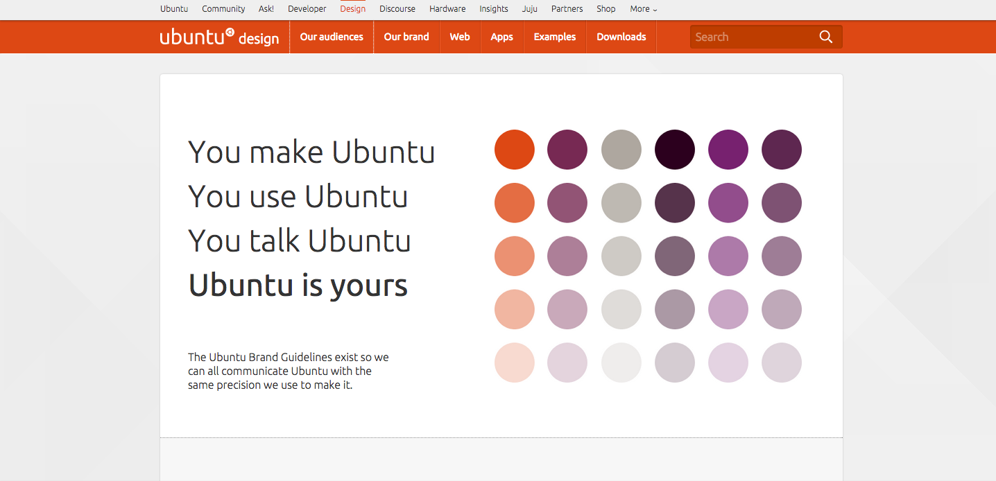
Photo Credit: Ubuntu

The style guide for Ubuntu includes everything from a slider that determines tone based on audience, to reusable sections of Javascript code. It also divides itself into several smaller guides — for the brand, web, apps, etc. — a structural choice that improves searchability.

4. Atlassian Design

Atlassian style guide

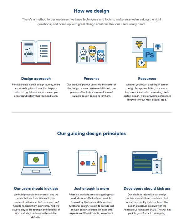
Photo Credit: Atlassian Design

The Atlassian Design style guide is beautifully organized while still functional. Aside from technical details for product design, user interface, and branding, they provide extra information such as their step-by-step approach to design, core personas, and additional resources for visual design. As if that weren’t enough, they also include basic descriptions of their design principles to give their style guide a philosophical edge.

5. Lonely Planet

Lonely Planet style guide

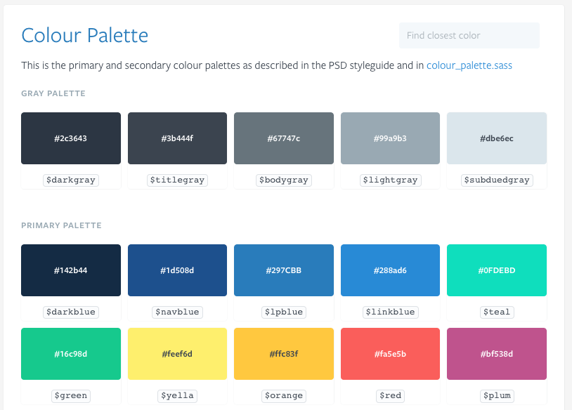
Photo Credit: Lonely Planet

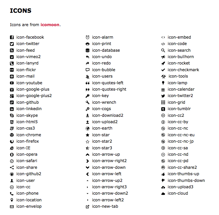
Like Yelp, the style guide for Lonely Planet sticks just to the facts. Their section on color above leaves no room for error, with coding-specific hues. Each page of their elaborate style guide is equally detailed, including several pages listing out all of their icons.

Takeaways For Creating UI Style Guides

At heart, style guides are design and development aids meant to make the lives of you and your team easier. With that in mind, don’t do more work than necessary. Browsing through example style guides, it’s normal to feel overwhelmed by the wealth of detail some companies include.

But you don’t need to include everything, especially if you’re a smaller company. Ask around with your team, so you know what’s helpful and what’s unnecessary — shorter style guides make it easier to find what you’re looking for.

This article is just an overview, but we dive into the more practical tips and analysis for creating style guides in our free e-book, the Critical Components of Web UI Style Guides. Learn from examples from 22 companies such as Yelp, Starbucks, Facebook and Mailchimp.

blog-book-1

Practical Collaboration: Tackling UX Feedback With Developers & Users

Giving and receiving feedback is the proving ground for how well you’re working with your developers.

First off, how you communicate criticisms to each other, and to what degree these criticisms are implemented, is right away a marker of how well you collaborate together. On top of that you have feedback from others – most importantly the user. How you work together to prepare, conduct, and then analyze your usability tests is also telling of your compatibility. Luckily, neither of these aspects of feedback are set in stone, and you can make large leaps forward by using the best practices we’ll list in this piece.

Let’s begin by discussing feedback within the team, then explore receiving feedback from users.

Sharing Feedback With Developers

Ideally, because of the same business goals, a designer and developer should be able to share and incorporate critique without incident, just another mechanism of a well-oiled machine. However, the reality is that we’re all only human, and feelings and egos make sharing feedback a little messier. On the bright side, there are some simple strategies you can follow to ease communication and achieve the best results, all while remaining human.

1. Treat Developers Like Stakeholders

Apply the same principles of collaborating with stakeholders to your developers. For starters, this means treating them – and their opinions – with respect. You may not always see eye-to-eye, but you have to at least recognize that they may know things you don’t.

Take this a step further and apply the same strategies to developer interviews as you would if they were stakeholders. This means eliciting their “gut feelings” – What are the real opinions and thoughts on a project? How do they feel about it deep down? Pushing this line of questioning will yield a lot of usable criticism and maybe even inspire some creative solutions.

image03

Photo Credit: “VFS Digital Design Mexico Intensive.” Vancouver Film School. Creative Commons.

Another shortcut to building trust is to assure them some answers are off the record. Feedback is only as useful as it is honest. Alleviating the pressure of repercussions will allow your developer to speak candidly. This will open up a lot of doors about potential risks and genuine criticisms, both of which, while unpleasant, are what’s best for the project.

For more details on how to gather the best feedback from stakeholders – and by extension, developers – read Kim Goodwin’s insightful checklist of interview questions, especially her recommendations for interviewing engineering stakeholders.

As Goodwin suggests, you might find that some developers treat designers cautiously due to their previous experience of implementing near-impossible designs purely for the sake of originality. She makes an excellent point in recommending that instead of asking what’s doable and what isn’t, ask what is difficult and why. That slight tweaking of language can ease the minds of developers who might otherwise feel pressured to committing so early in the product development process.

2. Encourage Proper Communication Skills

Don’t take smooth communication for granted. Expressing oneself to others is a skill that not everyone has, in which case it must be learned. We discuss this aspect of collaboration in detail in our Design Collaboration for Enterprises: Book I, but we’ll reiterate some key communication tactics here:

  • Critiquing is a conversation, not a command – Critiques should be the start, not the end. Good feedback inspires conversations and possibly enables brainstorming. Allow both sides to exchange their opinions, and look for a common middle ground, if it’s available.
  • Phrase feedback as a problem, not a solution – For example, “The ease-in animation doesn’t feel as smooth as it should, which can impact conversion rates since it detracts from the feeling of sophistication,” is a lot more constructive than something like, “Make the animation ease in at 400 ms, and use the exact colors in the prototype.” Perhaps there’s a technically nuanced issue that just arose during implementation, and phrasing feedback as a problem opens up a discussion that may satisfy design sensibility and feasibility.
  • Probe with follow-up questions – To help developers articulate their feedback or pushback, try asking additional questions. The end goal is to hear honest opinions, but this doesn’t come naturally to some speakers. Dustin Curtis suggests asking three questions to accurately isolate the heart of the criticism. We’ve found his advice to be pretty realistic, since you don’t want to start playing the question game and just keep asking “Why?”

Feedback sessions should feel casual, not like an interrogation or a court hearing. The same people skills apply at a product team meeting as they do at a cocktail party.

3. Express Ideas in a Practical Way

How you explain your feedback – not just in phrasing, but in context – will affect how it’s received. One basic rule is to avoid too many details or lingo that may confuse each other. Designers and developers oftentimes speak different languages, so try to express your ideas in layman’s terms so everyone can understand.

image01

Photo Credit: “VFS Digital Design Mexico Intensive.” Vancouver Film School. Creative Commons.

Another rule that’s always helpful is to explain a point in the context of its implications on the user.

For example, you could waste your breath talking about how vertical alignment is off by a few pixels, but you’d just risk having the gravity of the point being misunderstood. However, if you explain the same point as misalignment of content affecting readability (which affects time on site and therefore conversions), other stakeholders will start to pay attention. You’ll find people’s ears perk up once you connect design reasoning with business implications.

Collaborating with User Feedback

Each member of the team brings their own specific expertise, which means each member can provide feedback vital to the entire project. However, one person’s feedback is by far more valuable than the rest: the user.

Collecting user feedback through usability testing and research is essential for the success of your product, no matter what you’re building. The internal team members could sit and theorize about the best methodology all day, but none of it matters until it’s verified by actual users. Whether for validation or new insights, it’s best to get your answers straight from the source.

1. The Usability Testing Process

Collaboration must begin before the tests even start. As soon the plan for the test is completed, you should share it with your developer for their personal feedback. You’re looking for their input in two areas:

  • Suggestions on the existing plan – Have them review the plan for any potential improvements, especially in the phrasing of the tasks. At the very least, showing them the test beforehand will give them a deeper understanding of the core tasks the system must support.
  • Target data previously missed – Developers may bring to light areas in which they need data, or at least would like some questions answered. Give them the opportunity to request certain data from the test before it’s already over.

Once it’s time for the actual testing, why not invite the developer to join in (if the tests are moderated)?

This first-hand observation will help them understand the user more fully, and give them the chance to pose questions directly. Just remember to select a single “leader” beforehand, so you don’t confuse the user with two competing authority figures.

Startup Stock Photos

If you’re on a budget or strict timeline and can’t do onsite tests, we’ve compiled this list of our favorite usability testing tools for conducting remote user tests with multiple users simultaneously:

For more usability testing resources, check out this list on Crazy Egg, and this general guide from Mashable.

2. Collaborative Testing Activity: Rainbow Spreadsheet

As a way to strengthen team bonds and produce better feedback, Google UX Researcher Tomer Sharon recommends creating a Rainbow Spreadsheet, an observational sheet that lets multiple team-members record their interpretations of the test in real time.

Starting with a Google Docs spreadsheet listing each user, encourage your team (our yourself, if they’re too busy) to write observations in the left hand side. As your team notices these concerns in your user, they need only to fill in the colors accordingly.

image00

Photo Credit: UXPin for Yelp design usability testing based on exercise suggested by Tomer Sharon

The colors make the results more comprehensible, especially to non-designers. The downside, though, is finding a time in which everyone can participate. If your company prefers a more formal report, you can always create one afterwards, using this as a summary document.

3. After the Testing

Once the testing is completed, properly collaborating on the results will allow everyone to process them more accurately.

The first step is allowing everyone access to the results. This means uploading all relevant documents – reports, graphs & figures, media such as videos of the tests, etc. – into a shared cloud folder if that’s available. If not, a mass email or even photocopies will do.

The more differentiation in the viewpoints and expertise areas of those analyzing the data, the less bias the interpretation will have. As Alla Kholmatova explains, one study of 44 usability practitioners showed how the presence of a second evaluator increased problem detection by 30-43%.

4. “Cheese Day”

Collaboration doesn’t end once the usability test results are compiled and analyzed. In an article for UXmatters, Roy Man explains the practice of “Cheese Day,” inspired by gaming leaders Blizzard.

“Cheese,” by his definition, is any UX annoyance that’s not quite a bug. Bugs are dealt with swiftly and without debate, whereas cheese is a little trickier and requires some thought. That’s why he suggests holding a cheese day, where designers, developers, and everyone else on the product team gets together to take care of these outstanding issues.

image04

Photo Credit: “Team Building & Leadership w LawNY…Rochester, NY. Canandaigua, NY (16).” Michael Cardus. Creative Commons.

A month before the scheduled Cheese Day, create a open document in which anyone can record potential usability issues. On the actual cheese day, gather everyone and set to work correcting each item on the list. Since solutions aren’t so black-and-white as they are with bugs, varying perspectives across the team will be most beneficial.

Remember to uphold the same feedback guidelines while discussing and critiquing potential solutions.

Takeaway

Collaboration extends beyond a mere division of labor.

Everyone doing their individual jobs may be the bare minimum, but the real benefits of collaboration appear when the team improves how they socialize together. In this sense, people skills may be just as helpful on the final product as technical skills.

Be respectful of others feelings when giving and receiving feedback, and work together when conducting usability research and beyond. Having the same goal isn’t enough: collaborating to meet that goal will give you the best chance for success.

If you found this article useful, check out the free e-book UX Design Process Best Practices. Learn the most useful UX processes and documents. Written based on our own experience in planning, designing, and testing UXPin in the past few years.

blog-book

Web Design Trends Analyzed: 8 Effective Types of Animation

Animations are no longer the delightful surprises they once were — now, they’re expected.

That’s not necessarily a bad thing, since animations bring both practical and enjoyable benefits to a design.

This article outlines the 8 types of web animation that make a site more effective, and the best practices for applying each.

1. Loading Animations

One of the oldest uses of animation for the web is to distract the user from loading times. As stated in Interaction Design Best Practices:

“Best case scenario, the animation influences your users’ perception of your product’s technology, making it seem better than it actually is. Worst case scenario, your users have something fun to watch while they wait, improving the overall experience.”

Animation of a web app user interaction

As shown in the above example created with the animation editor in UXPin, even short loading animations still add a little sophistication or at least entertainment during the dead time. Loading animations are popular for flat design, minimalism, portfolios, and one-page sites — all of which are inherently simple.

Animation of Tom Cole’s animated user interface

Photo credit: https://tomcolearchitect.com/

Visiting Tom Cole Architecture’s site, the user lands on a black screen and, in a moment, multiple white lines start to move and “write” the logo and brand name. After another moment, the background photo comes into view and the user is free to navigate. The site itself is simple and doesn’t necessitate a loading animation. However, these quick opening moments make a clean first impression and entice the user to interact further.

Remember that loading animations are best when simple. Forget extraneous effects like sound or outlandish designs. Animations should match the personality of the site itself, whether fun and cartoony, or professional and elegant.

Join the world's best designers who use UXPin.

Sign up for a free trial.

2. Navigation and Menus (Nonscrolling)

In order to save screen space, a recent trend is hidden navigation menus that are revealed by clicking on buttons (like the hamburger icon). For these, animation is essential for visually connecting the two elements and preventing a jarring transition.

Click on the circular arrow button in the below prototype created with UXPin (tutorial here)and an oversized menu box pops out from the left. The “pop out” animation makes the menu appear as if it slides in from offscreen and makes the whole interaction run smoothly.

Animation of a mobile website’s off-canvas navigation drawer

Hamburger animations aren’t the only option, though — creative designers are applying navigational elements like sliders and sticky bars to make transitional animations fresh yet familiar.

3. Hover

Hover animations are very practical for conveying that an element is interactive. In some cases, this might be the only sign that a button or piece of text is clickable. When a user is in doubt over how an element functions, they tend to move the mouse over it anyway, making hover animations fairly intuitive.

Animation of an interactive app

Photo credit: https://www.niras.com/

Hovering over any card on the Niras site above triggers an animation within that card. The animation is small — the title text slides out and identical text slides in to replace it (and the same happens with the “read more” arrow) — however it is enough to show the card’s function.

Animation of a mouse hover effect

Source: UXPin

We use this ourselves for our free ebook library, where a hover triggers the download image falling from the top and the “get it for free” text rising from the bottom. This serves several functions — it shows you only need to click the card to initiate the download process, it acts as an attention-grabbing call-to-action, and it creates a snappiness that feels fun.

4. Galleries and Slideshows

Animated galleries and slideshows showcase multiple images without distracting the user.

Animation of an image gallery

Photo credit: https://www.bigactive.com/

How fast and how many images cycle are up to the designer, but these decisions should not be taken lightly — even slightly quickening the rate at which images change could give the site an unwanted “rushed” feel.

Galleries and slideshows are easy to use because they naturally mimic real-life photo album functionality. However, we wouldn’t advise that you take that metaphor too far with a skeuomorphic visual treatment. Minimize the actual design of the slider or gallery, then ensure you show each image for 5-9 seconds.

5. Attracting Attention

Any biologist will tell you that the human eye is attracted to motion. This makes animation the perfect tool for controlling your visual hierarchy, especially as part of a site with mostly static images.

Animations are a great way to add intrigue to forms, calls-to-action, or even menu items. To see its potential, look at John Iacoviello’s MY/STATIC/SELF:

Animation of an interactive website

Photo credit: https://mystaticself.com/

The cube in the center softly bounces and flickers, clearly the most interesting item on the grayscale screen. Each of the layers of the centerpiece represent a link to the different pages — the same pages displayed in the top navigation menu. Considering that John Iacoviello is an interactive developer, the game-like design is a great way to show rather than just tell us about his skills.

The clever animation intrigues first time users, while the standard navigation still hangs around in case users prefer a more traditional experience. In this case, the best of both worlds is not out of reach.

6. Scrolling

The success of a long-scrolling navigation — another trend discussed in the free e-book Web Design Trends 2015-2016 — relies on the quality of its animation. A site simply can’t scroll smoothly without it. One of the main advantages of scrolling is the control it gives to the user, and for that, animation dictates the pace.

Animation of an intricate website user interface

Photo credit: https://forbetter.coffee/

The webgraphic site For Better Coffee uses long scrolling to list out advice for making better coffee while simultaneously entertaining the user with an interactive visual journey of a bean being made into coffee (in a pleasing flat design style).

The best part about the site isn’t the coffee advice, it’s watching the animations that bring the bean from one stage to another. As the user who controls the scroll, you feel a part of the process.

7. Page Motion

Minor page motions, from AJAX loading options to simple shakes, add a little something extra to your site’s delightful design. These rarely have any practical benefits, but do well in making the site more enjoyable.

On the site for Hunger Crunch, each tiny movement of the mouse shifts the image, and when combined with the separation of layers creates a fun effect.

When applying this captivating tactic, be careful of using too many loading items — they may cause the site to render slowly.

8. Backgrounds

While distracting if excessive, a modest animated background can add a certain vitality to a website. The key is moderation — individual sections at a time, or perhaps a gentle movement of the entire image.

The site for Terna maintains the right balance. Choosing an animated background to showcase the urban bustle that’s their business, sections throughout the image move at different intervals. This creates that “busy” atmosphere without overstimulating the user.

As with other areas of animation, simplicity is advised. Remember that every motion on the screen attracts attention, so too much animation at the same time creates chaos.

Takeaway

By now, animation has proven its staying power in mediums far older than web design. Due to its permanence, it will continue to ingrain itself into the design industry — the only difference is whatever new opportunities the future technologies will bring.

For more analysis of the web animations — as well as 9 other current web design trends — check out the free ebook Web Design Trends 2015-2016. You’ll find 166 hand-picked examples from companies like Adidas, Intercom, Apple, Google, Versace, and others. To help speed up the design process, there’s also a curated list of 100 free resources.

Join the world's best designers who use UXPin.

Sign up for a free trial.

Interaction Design Trends: 11 Microinteractions Deconstructed

The direction UX design is moving is in the details, and that means more attention on microinteractions. These miniscule moments may be negligible on their own, but they add up to make huge impacts on the user’s mood and opinion.

Duolingo signin screenshot

Source: Duolingo

So what exactly is a microinteraction?

Imagine a login, a basic interaction found on most sites.

Is the “login” button grayed out until the user inputs their screen name? How does the UI respond if the screen name or password don’t work? Is the copy requesting the login casual or formal? These are all examples of microinteraction choices that exist within a single login interaction.

Below, we talk about 11 of the best examples of microinteraction, to demonstrate how useful they are, and maybe inspire your own interaction design.

Translate this page — Google

Our first microinteraction is a small feature that goes a long way: Google’s Translate this page.

Screenshot of a Google result in Polish

This small option tucked into the second line of a Google search essentially opens up the possibility to read every website from all over the world, regardless of language. Which a simple click, Google Translate automatically translates the entire page, without losing fundamentals in the layout.

Before:

Website design in Polish

After:

Website design translated to English

Of course the translation isn’t exact — but no online translator is perfect. The translation is good enough to glean the meaning and read a foreign page in as close to one’s native language as possible.

Furthermore, notice how the microinteraction goes beyond simply the body text. Titles, subtitles, by-lines, captions, dates, and sidebar text are all translated. Even more useful is that the format remains almost identical to the original. This makes the microinteraction seem like magic, fostering the illusion that the foreign site isn’t foreign at all.

The feature exemplifies how powerful microinteractions can be. Such a tiny interaction — a small amount of text, a simple click — leads to such a huge gain in allowing access to sites previously thought unattainable. All microinteractions should follow this lead, offering more for less.

Swiping Actions — Tinder

Screenshot of Tinder

Source: Tinder

One of the most easily recognizable microinteractions is Tinder’s swiping actions. As explained in UX Trends 2015 & 2016, this interface choice is about as good as it gets — simple and easy to understand, fun, quick, and original (they were the first to create the dating service in this format). It’s even becoming part of our culture with opinion articles and even songs dedicated to the action.

Moreover, their looping capabilities are phenomenal — using Tinder becomes addictively fun, with rewarding habit loops in place that keep users on the app “for just five more minutes.”

Customized Like — Facebook Messenger

Screenshot of Facebook Messenger

Source: Facebook Messenger

Facebook’s free texting service Messenger demonstrates how good microinteractions have a sense of fun and wonder along with their utility. Holding the Like button down for longer increases the size of the stamp, allowing creative customization for the user.

This detail may be superfluous, but it makes using the app more fun and gives it a personalized magic. Additionally, the animation mimics a balloon inflating, and holding down the emoji for too long negates it, making it almost a game.

Hemingway Mode — Draft

Screenshot of the Draft app user interface

Source: Draft

Chances are, users of the online word document maker Draft will appreciate this Hemingway reference: Hemingway Mode disables editing and deleting, which encourages a brisk, stream-of-consciousness style in your writing (you can turn it off an edit later).

This microinteraction is a good example of knowing your user. An option like this — especially with its clever name — would be out of place for an email service targeting a broad audience. However, the site is targeting literary writers who find this option not only an enjoyable novelty, but actually quite useful in improving their writing process.

Hover Animations — Path

Screenshot of the Path app user interface

Source: Path

Some microinteractions are just for fun. When hovering over the entrance button on Path’s landing page, a cute animation of icons pop out from behind the button. On a useful level this signifies clickability and provides feedback, but really it’s there as just a source of delight.

Hover animations are one of the most popular microinteractions. On sites like Path they may be just for fun, but on sites that intermix interactive and non-interactive elements, this type of microinteraction can go a long way in communicating usability.

Customized Header Background and Icon — Reddit

Screenshot of Reddit background and icons

Source: Reddit

The header background and Reddit mascot change depending on which subreddit (category) users visit. It’s a small touch, but creates a more unique identity for each subreddit (which deepens the feeling of community).

Themed Captcha — Letterboxd

Screenshot of Letterboxd user interface

Source: Letterboxd

In keeping with their site’s movie theme, Letterboxd illustrates a good point with their captchas from famous movie quotes. The clever microinteraction transforms an otherwise annoying task into a task that feels a little more fun.

Real Time — iOS Clock App

Screenshot of Real Time App’s user interface

A quick time-saver, the iOS Clock App shows the real time right in the display. While not necessary, it’s certainly more useful than a static image that could confuse users if it doesn’t match the actual time.

Unexpectedly Useful Feedback — Geeklist

Screenshot of Geeklist’s user interface

Source: Geeklist

Geeklist goes above and beyond the common “password strength” to calculate how long the password will take to hack. Interesting, original, and keeping on the site’s geek theme. It’s also quite useful since it communicates password strength in terms that a user instantly understands.

Sensitive Profile Options — Instructables

Screenshot of Instructables’ user interface

With information like age and gender somewhat sensitive, Instructables relieves the tension by offering several options for gender, and the option to hide one’s age on the profile.

Quirky Format Changes — IMDb

Screenshot of IMDB’s user interface

Source: IMDb: This Is Spinal Tap
An in-movie reference, the rating for This Is Spinal Tap on IMDb breaks form and goes up to 11 instead of 10. This subtle joke within the interface will, when discovered, endear the site to the movie’s die-hard fans, and make an experience they’ll better remember.

Conclusion: Humanizing a Computerized System

Microinteractions, at their best, provide a utility as good as their enjoyment factor. But, when you view all successful microinteractions together, the one thing they all have in common is that they add a little personality to the site or app. This of course changes depending on the personality of the site itself — microinteractions can be cartoony, or strictly business in streamlining a task.

But in every case, microinteractions are a way to take a dull, negligible aspect of an interface and make it enjoyable and memorable. This is their greatest impact on the UX.

If you’ve found this article helpful, go ahead and download the free guide UX Design Trends 2015 & 2016. We deconstruct 71 examples of great UX design into techniques for everyday design.

blog-book

Feature image credit: Fast Co. Design.

UX Design Best Practices: Refined Microinteractions

If individual interactions are the cells that make up the UX, then microinteractions are the atoms within the cells. As technology continues to develop, designers are able to delve deeper into the tinier interactions of a UI, and so microinteractions are the new frontier.

While miniscule on their own, these tiny moments add up to substantial enhancements to your UX. Microinteractions provide delightful visual feedback, making the interface feel weightless thanks to the smooth transitions. In this chapter, we’ll explain useful techniques for microinteractions and dissect some great examples.

Defining Microinteractions

Microinteractions might be easily overlooked in the greater design scheme, but they actually hold the entire experience together. They are single moments of communication that help users flow through your design.

What Microinteractions Do

As first described in Dan Saffer’s fantastic book Microinteractions, these tiny details typically serve these essential functions:

  • Communicating feedback or the result of an action
  • Accomplishing an isolated, individual task (i.e., connecting one device to another, liking a friend’s post)
  • Manipulating a setting
  • Preventing user error

Some examples of specific microinteractions include:

  • The vibration notification when you switch an iPhone to mute.
  • A warm greeting before diving into more straightforward copy
  • The pull-to-refresh UI pattern
  • Interface animation that either shows clickability (a card that changes color when hovered over) or confirms an action (an icon that changes after clicking)
  • An animation confirming an item is added to cart, like with “+1” from Photojojo below.

Screenshot of the Photojojo app user interface

Photo credit: Photojojo

However, the most well-known example of a microinteraction, and a good standard to base all others on, has existed long before the Internet was ever invented. The best microinteraction is pushing a button: gratifying in completing the action, and irreplaceable in activating a function.

For more microinteraction examples, read this Econsultancy piece on 15 mobile microinteractions (some of which we mentioned above).

Why Microinteractions Work

In a nutshell, microinteractions work because they appeal to the user’s natural desire for acknowledgement. Microinteractions fine-tune human-centered design by:

  • More control through immediate feedback — The user instantly knows their action was accepted, giving them more confidence in further usability.
  • Instructions — Whether blatant or subtle, microinteractions can guide users in how to work the system.
  • Visual rewards — Small but satisfying effects enhance the UX, and can facilitate a habit loop.
  • Meeting expectations — In today’s web design landscape, microinteractions are the norm — their absence makes a site seem bland.

In short, microinteractions improve the UX by making the UI less machine and more human. As a result, the design is more usable and enjoyable.

Identifying Opportunities

Part of the beauty of microinteractions is that, because they’re brief, they can be inserted in a variety of places, around any potential action, really. In general, though, they tend to come up in the following areas:

  • Switching on/off (features, functions, or the entire UI itself)
  • Adjusting setting preferences or continual elements (i.e., volume)
  • Viewing or writing a small piece of content (i.e., status message, comment)
  • Connecting one device to another (i.e., computer to phone)
  • Uploading and downloading
  • Notifications
  • Social media sharing
  • Pull-down and hidden menus
  • Showing changes (i.e., an animation to show the Play button changed to a Pause)
  • Highlighting calls-to-action

Of course, there are a lot of potential opportunities for microinteractions. Where and how you implement them should be determined by the specific needs of your interface.

In the below example created in UXPin, we’ve prototyped a hypothetical model talent website. Each model is represented by a card, which overlays metric measurements and contact information upon hover. In this case, the microinteraction helps reveal information. The animation, however, adds a level of discoverability, making the otherwise mundane task feel a bit more fun.

Animation of an app user interface that changes on hover

4 Steps of Microinteractions

No discussion about microinteractions would be complete without mentioning Dan Saffer, the interaction designer who literally wrote the book on the subject. He explains that an effective microinteraction follows a four-step process, described with an elevator example:

  • Trigger — The visual cue or impetus that initiates the action. The numbered floor button is a clear visual signifier. Pushing the button is the trigger.
  • Rules — The parameters the microinteraction follows — basically, what it does. In this case, when you push the button, the elevator will move to that floor.
  • Feedback — Verification for the user about the result of the microinteraction. When the button lights up, people know the elevator will respond accordingly.
  • Loops & Modes — Considerations about how the microinteraction is reused, including how long it lasts and how it changes for subsequent uses, as well as if the user can change aspects of it in the settings/preferences. For an elevator, the loop is that the button is recognizable enough that the user will understand the function immediately for different elevators, and that the pushing process is not very difficult. Because microinteractions are brief in nature, they must be designed for repeated use. Modes might be the color of the feedback light, or the typography of the number, all subject to variation.

Illustration of the number two, for some reason

Deconstructing the 4 Steps of Microinteractions

Now, let’s see how these four factors work together in a digital microinteraction, the browser refresh button.

Screenshot of Firefox’s refresh button and location/search bar

Source: Mozilla Firefox

Let’s say you’re browsing Facebook and you want to see if anything new was posted since you first opened the site. Naturally, you refresh.

  • First, you locate the familiar arrow-in-a-circle icon, the trigger of the microinteraction.
  • Clicking on the icon starts the action. The loading of the new page is the microinteraction’s rule: that’s what it does and why you engaged it.
  • After clicking, the icon turn to an X. This is one of the key elements of the microinteraction, as it provides the user with feedback that their action is being performed. That extra acknowledgement makes performing the refresh function more assuring. Imagine if such feedback were not there: the user might mistake the computer screen for being frozen, and click needlessly over and over.

Screenshot of Firefox’s refresh button and location/search bar

Source: Mozilla Firefox

Once the new page is loaded, this is the validation for using the microinteraction in the first place. If this action is rewarding enough (in this case, with something as useful as a refresh function, it is), then this incentivizes the user to continue exploiting the microinteraction in the future. This microinteraction is so useful, it’s become a UI pattern. Safari does the exact same thing. However, they add a blue loading bar at the bottom for even more feedback in case the page takes longer than usual to load.

Screenshot of a browser loading bar

Best Practices for Microinteractions

Here, we’ve collected the top expert advice about using microinteractions:

  • Fast response time — A near-immediate response time, within 0.1 second ideally, keeps the user feeling in control.
  • Keep the user informed — A loading bar or status icon engages the user and prevents confusion.
  • Unify in a single theme — If you can, create a unifying theme to tie together all interactions, micro or otherwise. In the site for the movie Amy (below), the pink line, which every time is animated to “grow,” is used in a variety of different microinteractions

Screenshots of the movie site for ‘Amy’

Source: Amy – Movie

  • Draw from context and user research — Knowing your users and the context behind the microinteractions will make them more precise and effective. Make sure the visual cues and animations are appropriate.
  • Use what’s available — Don’t add more than necessary: use existing elements to deliver feedback if you can.
  • Design for repeated use — Keep longevity in mind. Will the microinteraction get annoying on the 100th use, or is it universally clear and unobtrusive?
  • Use a human voice — A quick way to make your UI warmer and less mechanical is a human tone in the copy, especially for microinteractions with their emphasis on feedback and need-to-know information.
  • Keep It simple, stupid — Don’t turn your microinteraction into a macrointeraction. It’s supposed to be small and simple, so don’t get too clever.
  • Follow the rules of animations — Although a key component of microinteractions, animation is still a field with its own set of rules. Because the two often go together, brush up on the best practices for animation before incorporating them. Disney’s classic 12 rules are a good place to start, which we explain in terms of web design in our Interaction Design Best Practices: Book II.

You can learn more about the principles of interaction design (which apply to all microinteractions) in the free Interaction Design Best Practices: Books I and II.

Takeaway

Remember what we discussed above about why microinteractions are significant and how to apply them:

  • Microinteractions act as facilitators for interactions, with feedback, notifications, instructions, and sometimes even a little entertainment.
  • They save time by instantly communicating information in a way that doesn’t bore or distract the user.
  • According to Dan Saffer, all microinteractions should have a trigger, rules, feedback, and loops/modes.

If you’ve found this article helpful, go ahead and download the free guide UX Design Trends 2015 & 2016. We deconstruct 71 examples of great UX design into techniques for everyday design.

Join the world's best designers who use UXPin.

Sign up for a free trial.

How to Design Web UX Beyond the Surface

Great web UX isn’t about designing beautiful pages (although aesthetics certainly matter). Great web UX is about context – how do we deliver the right experience to the right person at the right time?

It requires much more to design a fulfilling web experience. You must regularly iterate with other departments, understand the customer journey across all devices, and master the skills of service design for the web.

In this piece, we’ll explain tactics to avoid the trap of compartmentalized web UX design.

1. Obsess over the user

UX is about understanding your user: what they want, what they know, and what they don’t know they want. Pinpoint their shared frustrations, behaviors, and modes of thinking.

image00

Source: “User Experience Treasure Map.” Peter Morville. Creative Commons.

But don’t just guess. Follow these user research methods described in the Guide to Usability Testing:

  • User interviews – What pains your user, and how are they currently trying to relieve that pain? Pay attention to how they describe when and where certain devices come into play.
  • Personas – Once you’ve finished your interviews (we recommend at least 5), plot out all the characteristics on a spectrum graph to reveal patterns. Combine people with similar characteristics into the same persona. Just like your user interviews, focus on their psychology, behavior, and current devices/tools used.
  • User stories and scenarios – Develop common use cases of your product and add context with backstories (scenarios) for each one. Of course, the scenarios should account for devices. Here’s an example: It’s 9PM and Tom is checking his Domino’s order on his phone 30 minutes after ordering on the site. He’s hungry and tired from a full day, and wants to know if he can finish the latest House of Cards episode before the food arrives.
  • Customer journey – A customer journey map can be simple or complex, as long as it hits all the major touchpoints before, during, and after the service. This gives you a stronger idea of user expectations (and emotions) as they engage with the company across multiple devices and scenarios.

2. Collaborate (carefully)

As we explained in UX Design Trends 2015 & 2016, you must build off the perspectives of your team to design a memorable web experience.

  • Avoid committees — The first rule of collaboration is to collaborate in the right way. Giving everyone an equal say — committee — creates an environment where some people think their opinions outweigh others, even experts. The surest way to kill the committee is to instill a clear leader, one whom everyone respects. Everyone still has equal say, but the leader inevitably decides what stays or goes, and settles all disputes.
  • Phrase feedback as problems, not solutions — For example, saying “I don’t think the background color fits the brand” is a lot more useful than “I think the background color should be green.” 
  • Treat feedback as dialogue — Dustin Curtis suggests asking three follow-up questions to whoever posed the feedback. This forces them to elaborate and challenges their claims, and also gives the receiver time to overcome their preliminary aversion and process the actual validity and usefulness of the comment.
  • Use workshops — Collaborative activities like workshops, design studios, or the KJ technique break the ice, get the creative juices flowing, and generate a pool of ideas to draw from. Whether at a kickoff meeting or a meeting you called yourself, if everyone is together, run some sketching exercises to elicit the opinions and perspectives of those not usually involved in creative design.

image02

Source: “Booksprint Futurish ‘14.” Time’s Up. Creative Commons.

3. See beyond the page

Web design was never purely aesthetic, but nowadays it’s requiring an even broader skillset as UX techniques mature.

Here’s a few checkpoints to keep you on track:

  • Does the information architecture make sense? For example, consistency is required in labeling for top-level and secondary navigation items.
  • Does the website elicit an emotional response? The colors, visuals, and interaction design must all add up to hook the user into exploring the site deeper.
  • Is accessibility addressed correctly? Even though it might seem like a nice-to-have, accessible sites have real business value: they rank better in Google, access larger audiences, and require less maintenance cost. Check out this helpful accessibility resource center.
  • Is there harmony between text and visual content? A site’s design includes all content. If the tone of the copy doesn’t match the visual style, the entire experience starts to dissolve.

All parts of a design act together, and none exist in isolation.

4. Understand that interactions are the root of all UX

Interactions don’t just happen when a user clicks something on your site. From the moment a user sees your design, their brain is processing visual interactions. Here are some quick basic tips for interaction design:

  • Create flows before pages Flows refer to the different paths users take to accomplish their goals. Your interface might be beautiful and usable on a page level, but it doesn’t matter unless the path created by pages is efficient. To optimize a site for flow, follow either the writing-first approach or Ryan Singer’s shorthand approach.

Sketch signup flow

Photo credit: User flows in UXPin

  • Design an ongoing conversation – Your interface needs to speak to users and react in a way that feels human. Visual feedback must be prompt (ideally within 0.1 seconds of user actions) and text feedback must be friendly, helpful, and sometimes even humorous. Doing so adds a layer of delight to the experience, which makes the design much more memorable.
  • Sweat the details – Even if you’re not an interaction designer, know the power of microinteractions as a design tool. Microinteractions occur whenever a user interacts with a design to accomplish a single task, like how the heart button fills with color and bounces when someone favorites a post on Instagram. Well-crafted microinteractions don’t just provide instant feedback, they also make a design feel more alive and enticing.

fade-in navigation menu

Photo credit: Fade-in navigation created in UXPin

  • Minimize friction – Friction weighs down interactions, making even the most beautiful interfaces a nightmare to use. Inconsistency, clutter, and confusing functionalities all create friction. Luckily, creating user flows minimizes friction since you’re smoothing out each step of the experience and reducing the number of steps. On a visual level, chunk out content and use familiar UI patterns to make the design digestible.
  • Know persuasive design – Tactics like salience (highlighting objects to appear more important than others), anchoring (placing higher price items first so others feel more affordable), and loss aversion (emphasizing savings and time limits) all improve the business value of your designs.

5. Prototype early and often

UX is not an exact science.

Sometimes the users respond well to certain site elements with no real discernible reason at first. Prototyping is the only way to uncover the truth.

image04

Use rapid prototyping to better design through the eyes of the user. Our risk of designing for ourselves reduces dramatically. Try these tips:

  • Prototype your site design quick and rough, focusing on content structure and user flow more than visual details.
  • Test your digital prototype with at least five users. Record the testing sessions and send them to the team for shared understanding and analysis.
  • Refine the visuals with a mid-fi or hi-fi mockup, then create a hi-fi prototype and repeat the test. It’s worth mentioning that UXPin integrates with Photoshop and Sketch so you can import mockups for prototyping (no layers flattened).

Conclusion: Design the Ecosystem

Websites are not machines. They can’t be built as a collection of individual parts.

Understand where the website fits within the context of the entire customer journey, then design for the most immediate user needs. Websites are more than just an organized array of pages. They provide service, and must be designed within your entire UX ecosystem.

Otherwise, you might be obsessed over growing the perfect tree when the rest of the forest is rotting.

If you found this post helpful, check out our free e-book UX Design 2015 & 2016. We explain the design techniques behind some of today’s most successful products by analyzing 71 examples.

fb-promo

7 Essential Website Style Guide Sections (With 9 Effective Examples)

When someone mentions style guides, people usually think of typography, grid layouts, color palette, and enough numbers to give you a headache. That’s because style guides’ primary purpose is to consolidate and even officialize the tiny details of a web project that can lead to confusion and inconsistency if not pinned down.

But style guides can be much more than a data sheet. As a company-wide reference guide, they provide the chance to communicate the brand’s personality to all employees, or tackle the data that not as memorable but still as useful.

That’s why we’ve compiled these 7 style guide sections — with real examples — that might have slipped your mind. Pick and choose which would make a useful addition your style guide.

1. Overview

Every important work needs an introduction.

Before diving into the facts and figures, the first section(s) of a web design style guide are a great place to summarize your goals and design direction. Remember that style guides must unify the team, so try presenting your philosophy right from the onset.

Some topics to discuss here might include the site/app/company’s:

  • Personality
  • Content strategy
  • Design language and philosophy

Furthermore, if you choose to bypass the later branding section, this would be a good place to at least mention your target audience, the style of the design, or the tone of the copy.
image08

Source: Buffer

The style guide for Buffer introduces and explains the thinking behind the style guide itself. They describe their style guide through the lens of an atomic analogy – the organism is made up of tinier atoms. In this way, atomic design systems encourage each individual component of a site to work intuitively with one another throughout the site.

image00

Source: Atlassian Design

Atlassian Design goes deeper into their philosophy and personalities at the start of their style guide. The three “guiding design principles” at the bottom infuse the style guide with the brand’s personality and maybe even inspire some of its workers.

2. Media Treatments

Each company and site will want to deal with their images and videos a certain way. The most common topic in this section is the proportions and ratios for your media, divided based on type (such as graphics within banners instead of those within content).

You could get further detailed and include specific practices, such as alignment, the surrounding spacing (if not discussed in the layout section), notes on captions, and the use of icons if necessary (such as a play button for video or an enlarge button for images). If your concerns are more technical, you could even outline the specific cache settings, in case your CMS might make this confusing.

Sometimes it might be necessary to discuss the kind of content used in media. Is it important that your content is children-friendly? How children-friendly?

image02

Source: South Tees Hospital

In the above screenshot from the style guide for the South Tees Hospital NHS Foundation Trust, you can see they list the proper procedure for captioned images, plus basic information, ending with the HTML code for direct implementation.

image09

Source: Neue

The style guide for Neue explains the logic behind their animations, and lists examples. For something like animation that can’t be captured in a document, they include playable previews.

3. Navigation

This section covers all rules related to navigation, such as the use of search boxes, sidebars, links, and menus and drop-downs (for example, a minimum/maximum items per list).

image03

Source: Homify Living

Rather than wasting time describing their practices with words, the Homify Living Style Guide features a visual example and the corresponding code. Developers need look no further when building their navigation guidelines.

image05

Source: MailChimp

On the other hand, the style guide for MailChimp goes into a little more detail. In addition to the visual example and coding, they give a few notes on how the navigation system operates, and clarifies some key points, such as the procedure for linking to secondary pages.

4. Iconography

Even if you don’t feature a wide variety of icons, you still want to clearly define them since they are a recurring design element. To avoid inconsistency, the iconography section can show all available icons for easy selection, the rules governing them (i.e., size, placement, etc.), and even include the markup for quick reference.

image07

Source: Code for America

The Code for America style guide displays all their icons in an alphabetized list.

5. Naming Conventions & File Directories

In this section you can outline the proper directory structure for your files and folders, as well as a standardized naming convention (especially for versioning).

image06

The Code for America style guide goes a step further and explains how they name their layout classes: they use musical notes to avoid listing the number of columns in a grid.

6. UI Patterns

Show your chosen UI patterns and mention any customized variations for each. This can also help you determine if any patterns overlap or contradict.

image04

Source: Lonely Planet

In many ways, style guides are detailed lists of the brand’s UI patterns. You can tell by the above navigation menu for the Lonely Planet style guide: each entry is an existing UI pattern, where the style guide acts as a manual for defining how each one is modified specifically for the site.

image11

Source: Paul Robert Lloyd

Sometimes there’s more to mention about patterns. Paul Robert Lloyd concludes the style guide for his website with a small section describing the patterns he created. This is a great way to set the standard: since these patterns are original to him, there would be no where else to look except this site.

This level of specificity demonstrates how you should not assume your reader has any existing knowledge. You might know that certain patterns are unique to the design, but a new designer (or a non-designer) probably wouldn’t.

To learn more about how to create pattern libraries for your style guide, check out this practical piece by designer Paul Boag. In fact, if you include enough detail in your pattern library, it will usually suffice as a standalone lightweight style guide. The pattern library for DoSomething.Org is a great example – it provides the design reasoning, implementation notes, and markup code for UI patterns.

7. UX Writing Guidelines

This section deals with the content of the writing, not the typography. In essence, there are a few fields to this section, though you could choose any or all, depending on your needs:

  • Subjective Guidelines – These cover the tone and voice (casual versus professional), as well as the target audience.
  • Objective Guidelines – These cover specific language and grammar choices (such as the inclusion of the oxford comma, or customized spellings of words), when to write out numbers, or the preferred system for writing dates.
  • Suggested/Prohibited Language – Some brands choose to either identify themselves with or avoid particular words or phrases. We’ve found it especially helpful to highlight prohibited words (e.g. “myriad”, “plethora”, and any empty buzzwords).
  • Appropriate Language – These guidelines state what is and is not an appropriate language, including writing levels and even profanity.

In circumstances where copy must be added or revised in a pinch, it’s helpful to have these formalized guidelines, especially for non-writers.

image10

Source: MailChimp

Both beautiful and practical, MailChimp’s editorial style guide is the best example we’ve found of the perfect editorial guidelines. Separated from the main style guide as its own microsite, the highly interactive guide feels immersive and fluid. Most importantly, the guide forces marketers to think about the user experience, outlining the emotions users feel upon encountering each design pattern.

Creating Effective Web Design Style Guides

Web design style guides are most effective when they’re succinct since shoveling in extra sections just makes it harder to find the essential ones.

To find out what your style guide needs and what it doesn’t, don’t guess. Ask around the entire team to see which sections could make their lives easier. Don’t forget that the real power of documentation are the insights gained in the collaborative creation process, not in the documents themselves.

For more best practices on writing style guides, including more sections and examples, download the free ebook, the Critical Component of Web UI Style Guides. Practical lessons are included based on analyzing style guides from 22 of today’s top companies.

blog-book-1

3 Useful Ways to Create Web UI Mockups

There’s lots of ways to create a mockup. It’s true there is no “best” way, but depending on certain UI and UX designer’s styles and preferences (and the design process), some will work better than others.

In this piece, we’ll look at the pros and cons of mockup tools, graphic design tools, as well as coded mockups that start to blur the lines with prototyping.

Continue reading 3 Useful Ways to Create Web UI Mockups

3 Powerful Ways to Design HD Website Backgrounds

The days of 72 pixels per inch being enough are coming to an end.

With the dominance of Apple’s retina displays, and the technology war that ignited with the competition, before long high-definition visuals won’t be so much of a special bonus as a basic requirement.

This article aims to close some of that gap and show you how to use the benefits of HD backgrounds while minimizing their drawbacks.

Continue reading 3 Powerful Ways to Design HD Website Backgrounds

Free e-book: The Visual Storyteller’s Guide to Web Design

Good UIs take care of usability, but great ones tell a story. Visual storytelling is one of the most effective ways to create an emotional connection with your user, and the website is a perfect medium for this — the problem is that most designers aren’t trained in storytelling.

The newest edition to our free design library changes that. The Visual Storyteller’s Guide to Web UI Design explains the art of visual storytelling specifically for web design.

Continue reading Free e-book: The Visual Storyteller’s Guide to Web Design

UXPin Design Challenge #1: Silicon Valley De-Bug Redesign Project

The design industry is more than a business. Sometimes we give to good causes that help improve our communities at large. We’re partnering with a nonprofit to improve donations on their website — and we need your help to make it happen. Designers are encouraged to lend their prototyping skills to help Silicon Valley De-Bug, a nonprofit entrepreneurial community organization.

This design challenge will enable the nonprofit to see how design can help their cause while giving designers a chance to stretch their skills based on a real-world design problem.

The Award

The winning entry will win an 38mm black Apple Watch Sport valued at $349.

The Challenge

The nonprofit’s website is due for an updated new look that still adheres to their brand guidelines, provided below. Specifically, the new website should feature:

  • A mobile-first or mobile-friendly design
  • A clear call to donate to their cause, including reasons to do so
  • Links to their projects as viewed on the current home page
  • Clear distinctions between major sections: media, justice, about the organization, and entrepreneurial endeavors
  • Projects must be created in UXPin — we’re pleased to offer designers free UXPin accounts.

The Guidelines

SV De-Bug has provided their brand guidelines and a vector copy of their logo.

Deadline

All entries are due Sept. 1. Limit one entry per person.

Judging

Our judges, Jeff Veen, Marcin Treder and Adrian Avila will critique each entry based on concept and execution within UXPin. Winning entries will show great attention to detail and technical feasibility.

About the Nonprofit

Silicon Valley De-Bug is a media, community organization and entrepreneurial collective out of San Jose, California.

In the past they’ve initiated and lead successful social justice campaigns to advance the rights of youth, workers, immigrants and those impacted by the criminal justice system. Through De-Bug’s organizing model, the organization also launched the Albert Cobarrubias Justice Project, an innovative program to enable families to have an impact on their local criminal justice system, and the Darkroom@De-Bug, a comprehensive set of services and classes for film photographers, as well as clients who need their film processed.

Next steps

Do you have what it takes to improve this site’s design and win an Apple Watch? Enter the challenge today.

We are no longer accepting entries for this challenge

How to get your Link to Entry

A UXPin “live link” lets you share your work with anyone on your team — or even the whole world. There are two ways to get your prototype’s live link:

1. Tap the share button and copy the provided URL.

How-to-share-a-live-link-1

2. Preview the project and copy the URL from your browser window.

How-to-share-a-live-link-2


Previewing the Awwwards 2016 Web Design Conference

Designers from all over the world are gathering in Amsterdam this winter for three days of talks, workshops, and networking, all culminating in a massive cocktail party in one of the city’s historic church venues.

Awwwards has been a partner of ours for years, and their conference is one of our favorites in web design. Let’s explore what they have in store this year. 

Continue reading Previewing the Awwwards 2016 Web Design Conference

The Evolution of the Flat Design Revolution

Photo credit: Square Cash

One of the biggest trends of the 2010s is still evolving today. Flat design, which started to gain momentum in 2013, is still currently one of the most used – and talked about – techniques in web design.

But how has it sustained itself for so long? What is it about flat design that attracts designers and developers? And how has it dominated the industry in so short a time?

Continue reading The Evolution of the Flat Design Revolution