All shipped: The 20 improvements that make UXPin 2.0

A lot has happened over the last few months. We’ve shipped a total of 20 improvements and features that mark UXPin 2.0 – from rebuilt Layers and Pages to enhancements to Guides, and more. And since most of them had been requested by you, delivering it all makes us incredibly proud! Let us guide you through.

What does UXPin 2.0 mean?

In fact, we’ve already shipped all the improvements, new features, and bug fixes that were planned for UXPin 2.0 – and chances are you have heard of some (if not all) of them.

There will be no grand product release, but since UXPin now performs better and works faster than ever, we’re having a launch on Product Hunt where you can ask questions, give feedback, and give us a shout out.
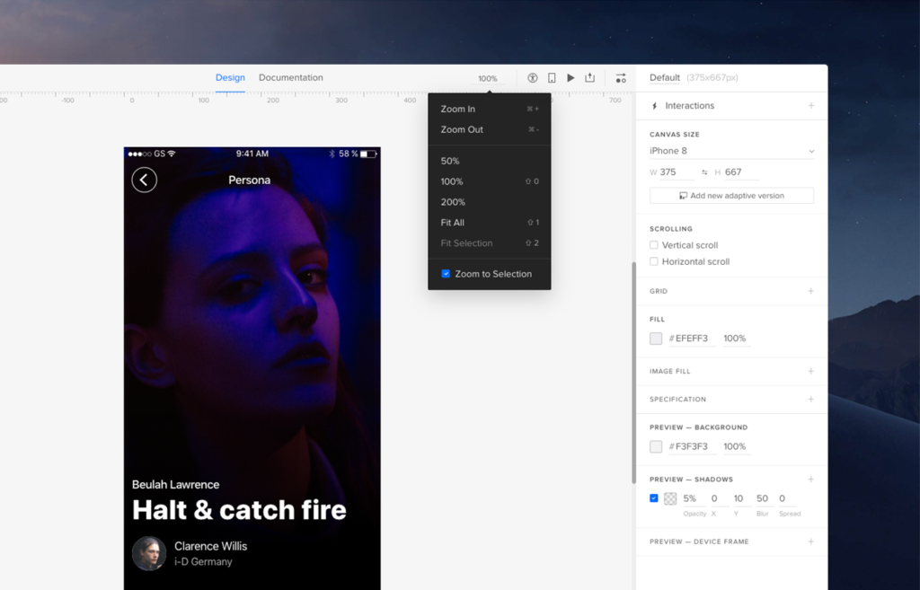
Precise Zoom

One of the highlights of the past months were improvements to Zoom, including new zoom options and what we call the Zoom mode. We have also expanded the zoom levels from 2% all the way up to 25600%. Try zooming in with a mouse scroll and you’ll see that the trackpad focuses on where your cursor is.

[videojs_video url=”https://www.uxpin.com/studio/wp-content/uploads/2019/11/zoom.mp4″ controls=”false” autoplay=”true” loop=”true” muted=”true”]

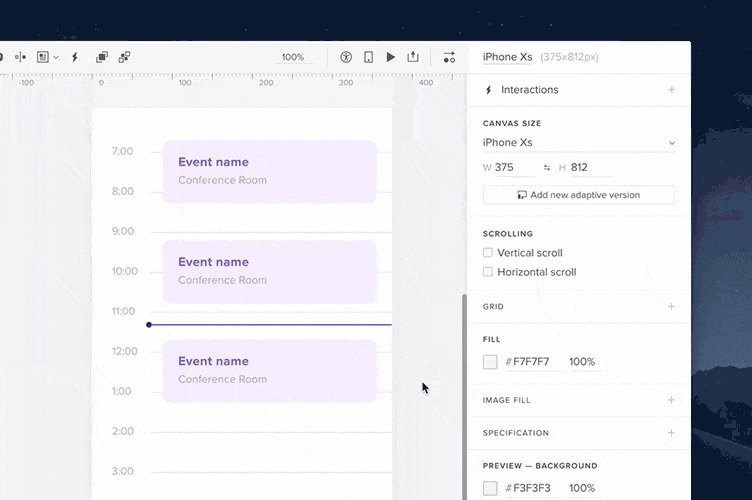
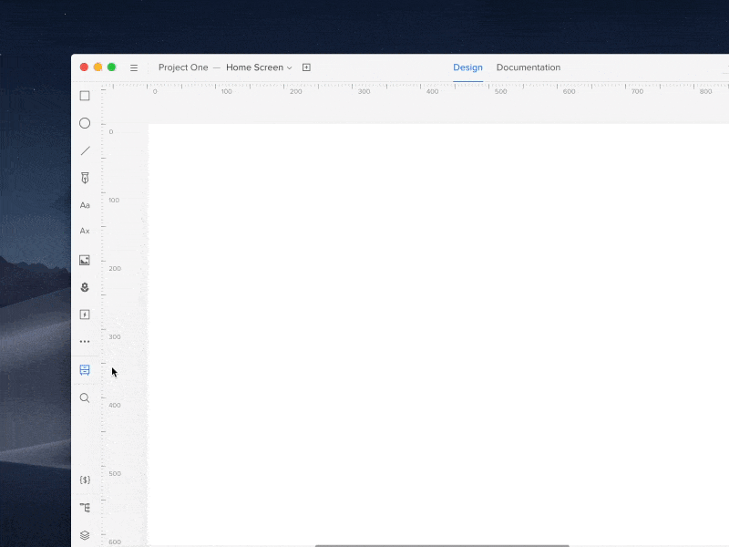
Get every pixel right with the pixel grid

Also, with the newly added pixel grid, it’s easier than ever to get every pixel just right. The pixel grid is available at zoom levels from 800% and higher. To find out more, read our blog post about the Strikingly Precise Zoom.

[videojs_video url=”https://www.uxpin.com/studio/wp-content/uploads/2019/10/Zoom_Changelog_800x600_v3.mp4″ controls=”false” autoplay=”true” loop=”true” muted=”true”]

Hi, Smart Grid

In May, we released the Smart Grid which makes rearranging and adjusting the spacing between selected elements so much easier. It’s also super helpful when checking the distance between elements.

[videojs_video url=”https://www.uxpin.com/studio/wp-content/uploads/2019/11/Smart_Grid.mp4″ controls=”false” autoplay=”true” loop=”true” muted=”true”]

Hello, Power Duplicate

Shortly after that, we took things one step further and shipped what we call the Power Duplicate. It’s a major time saver if you want to quickly create a list of elements with various data – so look no further. See how it exactly works in the tutorial.

[videojs_video url=”https://www.uxpin.com/studio/wp-content/uploads/2019/11/Powerduplicate_TW_800x600.mp4″ controls=”false” autoplay=”true” loop=”true” muted=”true”]

Guides got better

Somewhere along the way we’ve decided to tweak up our guides. For the sake of less clicking around, you can now remove all guides at once or choose to remove only the horizontal or vertical guides. So you’ve got more time to spend on things that actually matter. Read more about guides in Docs.

[videojs_video url=”https://www.uxpin.com/studio/wp-content/uploads/2019/11/RemovingGuides_changelog_800x600_v3.mp4″ controls=”false” autoplay=”true” loop=”true” muted=”true”]

Smart guides got smarter

Smart Guides are one of those features that should be barely noticeable if they work properly. Often when you want to be more precise when moving or resizing elements, you’ll use the keyboard arrows to do that. And that’s when smart guides also started to show! You can read more about these updates here.

[videojs_video url=”https://www.uxpin.com/studio/wp-content/uploads/2019/11/SnapGuide.mp4″ controls=”false” autoplay=”true” loop=”true” muted=”true”]

Any shape you draw – Pencil tool’s here

Sketching ideas and drawing virtually any shape you can think of has never been easier! With our mighty Pencil tool, you can draw any shapes freehand. Then, fine-tune them the way you want. Plus, everything gets magically smoothed out once you’re done drawing as UXPin simplifies the path.

[videojs_video url=”https://www.uxpin.com/studio/wp-content/uploads/2019/11/PencilTool-Changelog-800×600.mp4″ controls=”false” autoplay=”true” loop=”true” muted=”true”]

Add images in bulk

Gone are the days when you had to place images repetitively one by one. You can now add images in bulk and choose exactly where you want to place each image, one after another.

[videojs_video url=”https://www.uxpin.com/studio/wp-content/uploads/2019/11/NewAddingImages_ChangelogSM_v2_800x600_1.mp4″ controls=”false” autoplay=”true” loop=”true” muted=”true”]

New text element for happier typing

A few months ago our new text element came with plenty of new options, such as the new auto-size, vertical align, paragraph spacing and an improved auto line-height. And that’s not it – you can enable ligatures, fractions, as well as subscript and superscript.

[videojs_video url=”https://www.uxpin.com/studio/wp-content/uploads/2019/11/newtextelement_800x600.mp4″ controls=”false” autoplay=”true” loop=”true” muted=”true”]
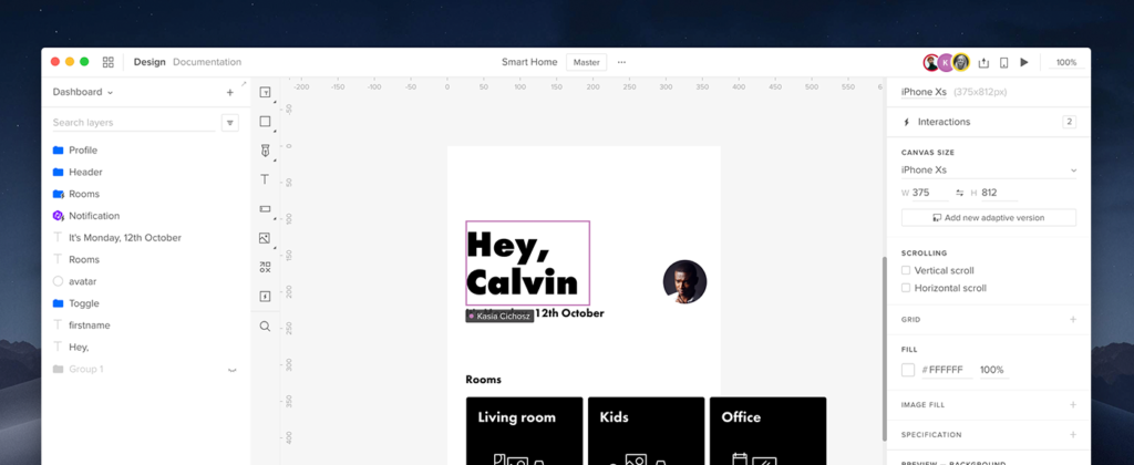
UI changes

Over the last few months, we have done some major changes to the UI. When you open UXPin, you’ll see that the Top Bar has been reorganized – relevant features, such as Prototype Actions are now together. You’ll also see that there’s generally more space in the Top bar. Plus, the Missing fonts toast now shows in the bottom bar. And if you’re looking for Accessibility Features, go to the bottom right corner.

[videojs_video url=”https://www.uxpin.com/studio/wp-content/uploads/2019/11/ui-changes-1.mp4″ controls=”false” autoplay=”true” loop=”true” muted=”true”]

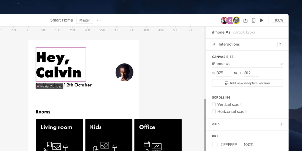
Project team avatars for better collaboration

In addition to more space and grouped features, we’ve made our collaboration even better. Whenever someone starts working with you on the same prototype, you’ll see their avatar in the Top bar. Just like in Google Docs.

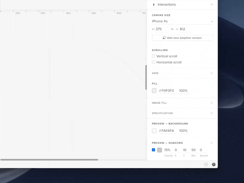
All View Settings in one place

Much like the Top bar, View settings have also gotten an overhaul. We moved them to the bottom right corner of the app and added some new options, including toggles for rules, pixel grid, and hotspots. You can also switch between light, dark, and the auto mode which follows your system settings.

[videojs_video url=”https://www.uxpin.com/studio/wp-content/uploads/2019/10/NewMenu_800x600_changelog_v2.mp4″ controls=”false” autoplay=”true” loop=”true” muted=”true”]

Keep your tools handy in Quick Tools

Making Quick Tools faster to work with and easier to get used to, took us some time to rearrange them. The Shapes that you use most often are in one section, including two new shapes, the Start and Polygon. Also, Libraries, such as Bootstrap and Foundation are now in Design System Libraries under UXPin Libraries along with Material Design, iOS, and User Flows.

[videojs_video url=”https://www.uxpin.com/studio/wp-content/uploads/2019/09/1_QuickTools-1.mp4″ controls=”false” autoplay=”true” loop=”true” muted=”true”]

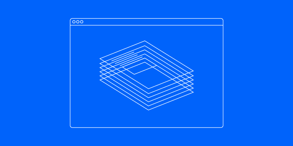
Layers are faster than ever

Rewriting the Layers and Pages gave both panels over-the-top performance we’ve all been waiting for. They also shipped with the most frequently requested features. Eventually, we merged both panels into one section for easier access.

Layers shipped with a number of improvements, making them work up to 20 times faster than they used to. For instance, if scrolling to the end of the panel took 15 seconds before, it now takes 10 seconds.

[videojs_video url=”https://www.uxpin.com/studio/wp-content/uploads/2019/10/Layers_release_Changelog_800x600_v1.mp4″ controls=”false” autoplay=”true” loop=”true” muted=”true”]

Pages rebuilt from the ground up

As for Pages, you’ll notice a significant difference in the way you manage them now from reordering, to deleting, through duplicating several pages at once. Also, switching between Pages and Design System Libraries now happens from the bottom bar.

[videojs_video url=”https://www.uxpin.com/studio/wp-content/uploads/2019/11/BP_pages.mp4″ controls=”false” autoplay=”true” loop=”true” muted=”true”]

Hide the UI

Apart from all the above, we’ve also made it possible to toggle the entire UXPin UI with a single shortcut. So if you ever felt like viewing your design without the surrounding panels, just hit Cmd \ on Mac and Ctrl \ on Windows to hide them in the blink of an eye.

[videojs_video url=”https://www.uxpin.com/studio/wp-content/uploads/2019/11/BP_zen-mode.mp4″ controls=”false” autoplay=”true” loop=”true” muted=”true”]

Bye Symbols, hello Components

Components were the runner up on the list of the most frequently requested features. Back in July we said so long Symbols and welcomed Components. The new way of editing the Master Component to (almost) unlimited overrides make your design workflow a much more streamlined, enjoyable, and time-saving one. Read all about Components in the tutorial.

[videojs_video url=”https://www.uxpin.com/studio/wp-content/uploads/2019/11/MasterSymbol_Vid_PromoRelease_TW.mp4″ controls=”false” autoplay=”true” loop=”true” muted=”true”]

Sketch import

If Components were the runner-up, then Sketch import was without a doubt on top of the list of requests. Thanks to it, you can simply drag and drop your files right into UXPin and on any computer, with or without Sketch. Then, you just pick up where you left off and edit every single layer of your design. We like to compare it to “breathing new life into your designs, taking them from static artboards to beautifully interactive prototypes with ease”. See how it exactly works in the Sketch import tutorial.

[videojs_video url=”https://www.uxpin.com/studio/wp-content/uploads/2019/07/Sketch_import.mp4″ controls=”false” autoplay=”true” loop=”true” muted=”true”]

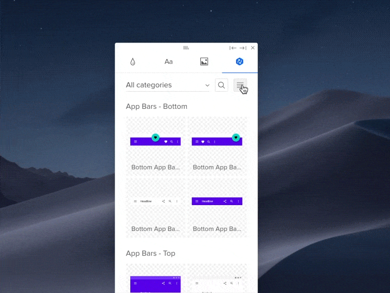
Tell the story of your design with User Flows

User flows can take many various forms, depending on the type of website or app you are building. Thanks to User Flows with ready-to-use components, you can now quickly create rich, perfectly styled flows and tell the story of your prototype fast.

[videojs_video url=”https://www.uxpin.com/studio/wp-content/uploads/2019/11/UserFlows_DesignSystem_800x600_1.mp4″ controls=”false” autoplay=”true” loop=”true” muted=”true”]

Video and Audio

With the Video and Audio elements available in the Quick Tools menu, you can enrich prototypes with interactive videos and use sound for better guidance. See for yourself  how it works.

[videojs_video url=”https://www.uxpin.com/studio/wp-content/uploads/2019/11/MediaComponent_TW_800x600.mp4″ controls=”false” autoplay=”true” loop=”true” muted=”true”]

A staggering amount of 200+ fixes and improvements

In the meantime, we’ve managed to smash and add over 200 fixes and improvements. Here are the top ones:

Fonts

  • [fixed] Fonts didn’t load when component overrode the font-family property in a child element.
  • [fixed] Missing fonts modal was visible when you used missing fonts on deleted elements.
  • [fixed] Missing font toast would show on an empty canvas.
  • [fixed] Issue with recognizing local fonts on Windows.
  • The Comfortaa and Oswald fonts looked different in UXPin than in the Google fonts preview.
  • [improved] We will try to match local fonts that are not installed on the computer with Google Fonts and replace them if available.

Guides

  • [improvement] Guides snapping sensitivity based on zoom.
  • [improvement] Reduced the possibility of accidentally moving a guide when resizing the element.
  • [fixed] Switching between pages, breakpoints or Component (Master) edit mode on zoom level different than 100% resulted in misplaced guides.

Zoom

  • [fixed] Canvas was not rendered correctly on very high zoom levels when you moved panned the canvas with space and drag.
  • [fixed] Canvas position was not kept on page switch especially on low zoom levels.
  • [fixed] The Canvas would disappear when you used the Fit All shortcut to see your entire design.
  • [fixed] Visible rulers when zooming in/out.
  • [fixed] Polygon looked weird when you changed the number of vertices at a higher zoom level.
  • [fixed] Guides created on a zoom level other than 100% displayed the wrong positions.
  • [fixed] Zoom didn’t center to elements that were off-canvas.

SVG elements

  • [fixed] In some cases, you couldn’t drag and drop SVG assets on the canvas.
  • Issues with downloading some SVG files from the Spec mode.

Pen tool

  • [improved] Zooming in or out while drawing a path.
  • [improved] Possibility to cut away lines from closed shapes.

Components

  • [fixed] Pressing Delete in a button inside a Component broke the Component. When you pressed Space you could also see the cursor to jump and skip letters.
  • [fixed] You could drag and drop images while editing Component Instances.
  • [fixed] The breakpoints bar was visible and the canvas was jumping when you edited the Master Component.
  • [fixed] Undoing deleted Components did not restore nested Components.
  • [fixed] Data about nested components was lost when cutting the last available instance of the component and pasting it.

Properties Panel

  • Clicking through the padding and radius inputs would crash the Properties Panel.
  • You couldn’t use TAB to move to the height input after changing the value in the width input (with lock enabled).
  • Values for position and size couldn’t be pasted with copy-and-paste shortcuts into their inputs in the Properties panel.

States

  • Nested states changed calculations – should result in 100% consistency in state changes between editor and preview.
  • Elements would rotate incorrectly when switching between States.

Layers

  • Ungrouping elements removed interaction indicators.
  • Cropped groups did not duplicate on the canvas when using the Power Duplicate.

Iterations

  • Moving a prototype between projects sometimes removed all iterations.
  • Missing Variables in the previously created iterations.

Spec mode

  • Properties of the base state would show in the Spec mode for all states within a symbol.

Desktop App

  • [fixed] Added compatibility with macOS Catalina.
  • [fixed] user was log out every time after quitting desktop app.

Other

  • [fixed] Sometimes, it was impossible to delete interactions from a copied element.
  • [fixed] When added on canvas, elements weren’t visible in dropdown while the Interaction was still open.
  • [improved] Added new options to the context menu.
  • [improved] Batch ungroup.
  • [improved] Faster thumbnails in Design System Library generation.
  • [improved] Resizing from the canvas ignores lock.
  • [improved] What’s New has been moved to Help in the bottom right panel of the Editor.
  • [improved] With the release of Video and Audio elements, we added 4 new options to customize the player: Autoplay, Controls, Loop, and Mute. Also, there are 3 new interactions: Play, Pause, and Stop.
  • [improved] New Rename shortcut. Press Cmd/Ctrl + R for a selected element and change its name in the Top bar.

What’s next?

Since we don’t plan to slow down, here’s what you can expect in the next releases after UXPin 2.0:

  • Improvements to Interactions and States
  • Baseline and column grid
  • New color picker
  • Pages overview
  • Hiding pages from preview
  • UXPin projects import

New Pages Panel and UI Changes

After improving Layers last month, we’re excited to launch the improved Pages panel and a reorganized Top Bar. While Pages come with a set of features and performance improvements, the new Top Bar has now more space and keeps related things together.

Pages and Layers in one panel

Up until now, Layers and Pages were two separate sections in Quick Tools. From now on, you can access both in the left corner of the bottom bar with a single click.

[videojs_video url=”https://www.uxpin.com/studio/wp-content/uploads/2019/11/BP_pages.mp4″ controls=”false” autoplay=”true” loop=”true” muted=”true”]

You can collapse the Pages panel by dragging the horizontal line that separates Layers from Pages all the way up or double-clicking on it. When the panel is collapsed, a down arrow will appear next to your current page name. Clicking the arrow icon expands the Sitemap, where you can quickly switch between pages. So if you’re dealing with a large project with plenty of pages, you’re going to love this one! Read more about it in Docs.

A whole new context menu 

Right-clicking on a page name in the panel opens the new contextual menu with a full set of features for the page you’ve selected – add a page, delete, open in a new tab, duplicate and rename. To rename a page even faster, double-click on a page name in the panel and start typing.

Delightful experience and better performance

Another great way to show how much we’ve improved the performance of pages is to compare adding, reordering and duplicating pages before and after the changes. 

To add a new page right below your current page, just right-click on the page name and choose Add Page. This adds a new page immediately below your current page and opens it. Previously, adding new pages was possible only from the top of the Pages panel. Plus, you always had to name the page before it was sent through the network and appeared on the list.

You’ll also notice a big difference when you reorder your page by dragging and dropping them on top of each other. Before the change, you’d have to wait before the pages get grouped. Now, it happens in the blink of an eye.

When it comes to duplicating pages, we’ve made it work a lot faster than before. You can now duplicate multiple pages at once. Gone are the days when you had to do it separately for each. Better still, if a page has child pages, duplicating it will copy the entire tree at once.

On top of that, there are two new ways of selecting multiple pages. Shift-click selects the first page, last page and all pages in between, whereas Cmd-clicking allows you to pick selected pages.

Hide the entire UI

If you want to view your design without the UI, you can now toggle the visibility of the entire UXPin UI by using the Cmd \ shortcut (Ctrl \ on Windows).

[videojs_video url=”https://www.uxpin.com/studio/wp-content/uploads/2019/11/BP_zen-mode.mp4″ controls=”false” autoplay=”true” loop=”true” muted=”true”]

Reorganized Top Bar

Just as mentioned in the headline, with this update our Top Bar has been a bit reorganized. We’ve shuffled things around a bit by putting together options that are related. Here’s what’s changed:

  • You can now access Prototype Actions in the middle of the Top Bar. That’s where you can create a new iteration of your prototype, export and rename it. The name of the iteration you’re currently editing shows in the rectangle next to Prototype Actions. Click it to access the list with all your iterations where you can retrieve them, delete or rename iterations with a double click.
  • Documentation and Design modes are now on the left side of the bar.
  • From now on, when working on the same prototype with your team, you will see their avatars in the Top Bar – just like in Google Docs. See more on Docs.
  • And if you’re looking for Accessibility Features, they are now in the bottom right corner of UXPin.

Improved Guides, Pencil Tool, and Adding Images in Bulk

While constantly working on more improvements, we wanted to take some time to share with you some other exciting product updates that are taking place. Upgrades to Guides, the Pencil Tool, and adding images in bulk are what has been shipped this time.

Guides just got smarter

Smart guides and guides are one of those features that should be barely noticeable if they work properly. So we’ve decided to make them smarter with this update! You can now remove all guides at once or choose to remove only the horizontal or vertical guides. Just right-click anywhere on the canvas and select one of the options from the context menu. So you’ve got more time to spend on things that actually matter! Read more on Docs.

[videojs_video url=”https://www.uxpin.com/studio/wp-content/uploads/2019/11/RemovingGuides_changelog_800x600_v3.mp4″ controls=”false” autoplay=”true” loop=”true” muted=”true”]

Better still, you can also check the distance from a selected element to a guide. Just hold Alt and hover over that guide. Plus, guides now snap to elements and canvas edges!

Now a word on smart guides. Often when you want to be more precise, you’ll use keyboard arrows to move elements. From now on, smart guides also show when you move or resize elements with keyboard arrows. Find out more about it on Docs.

Add images in bulk

You can now add multiple images at once and choose exactly where you want to place each of them. Click anywhere on the canvas to add an image with its original size or click-and-drag to define the size. If you selected more images, you will also see how many images you have left to place on the canvas. See exactly how it works on Docs.

[videojs_video url=”https://www.uxpin.com/studio/wp-content/uploads/2019/11/NewAddingImages_ChangelogSM_v2_800x600_1.mp4″ controls=”false” autoplay=”true” loop=”true” muted=”true”]

Draw any shape with the Pencil Tool

With the recently introduced Pencil Tool, drawing shapes and quickly sketching ideas feels like a breeze. You can draw any shapes freehand and it’s great for quickly sketching and jotting down rough ideas. Then, fine-tune them the way you want. Plus, everything gets magically smoothed out once you’re done drawing as UXPin simplifies the path. Read the tutorial on Docs to find out more.

[videojs_video url=”https://www.uxpin.com/studio/wp-content/uploads/2019/11/PencilTool-Changelog-800×600.mp4″ controls=”false” autoplay=”true” loop=”true” muted=”true”]

Overhauled View Settings for easier access

With UXPin 2.0 on the horizon, we continue to improve the overall experience in the app. This update includes overhauled view settings jam-packed with all-new and useful options. Let’s take a look at what has changed.

Switch the theme between Light, Dark or Auto

We moved our view settings to the bottom right corner of the app and added some new options. That way, you can now access all the important settings easier with less clicking around. You can also read about it in our view settings tutorial.

In the Theme section, you will see a new “Auto” setting. It works with Chrome 76 or Safari 12.1 or later on devices updated at least to macOS Mojave. Select “Auto” and UXPin will match your OS system settings. The workbench color follows the color of your theme but you can still switch it to transparent with the Transparent Workbench toggle. We’ve said goodbye to the Canvas pattern option where you could switch between dotted or grid. Also, Integrations are now available only from the Settings’ menu on the Dashboard.

[videojs_video url=”https://www.uxpin.com/studio/wp-content/uploads/2019/10/NewMenu_800x600_changelog_v2.mp4″ controls=”false” autoplay=”true” loop=”true” muted=”true”]

New toggles for rulers, pixel grid, and hotspots

Next, knowing that not everyone uses rulers on a daily basis, we have added the possibility to show or hide them in the view settings. Toggling interaction indicators is now possible only with the toggle and not the Alt I shortcut like before. Working on large, complex prototypes often means a busy canvas with plenty of hotspots. That, in turn, can make it less clear. Luckily, you can now toggle them on and off.

Last but not least, you can now decide whether you want the pixel grid to show or not. Once you select the checkbox, it shows at zoom levels of 800% and higher.

What’s New in August & September

It’s been a busy two months for us at UXPin, but we’re not slowing down at all. While working on our next improvements and features as part of UXPin 2.0, we wanted to take some time to share some just as important updates with you – precise Zoom, Layers that work better than ever, and happier snapping with overhauled Guides – just to name a few.

Introducing up to 20X faster Layers

We’ve rebuilt Layers making them up to 20X faster. Apart from being speedier, they also come with the context menu and the possibility to filter layers and setting a color for each layer. You can also expand Components like groups in the Layers panel, toggle visibility and lock each element. On top of that, we’ve added two new shortcuts for the sake of less clicking and faster workflow. You can collapse all groups at once with Alt Cmd L. And reverse the order of layers order with Alt Cmd R. This is especially useful when you want to change the order of inputs on your prototype and how they focus on pressing tab.

[videojs_video url=”https://www.uxpin.com/studio/wp-content/uploads/2019/10/Layers_release_Changelog_800x600_v1.mp4″ controls=”false” autoplay=”true” loop=”true” muted=”true”]

Smoothly zoom in from high-level

Apart from all the improvements that we have already described in our post about the Zoom, we have extended the zoom levels from 2% to 25600% for you to zoom in smoothly from high-level.

Also, the pixel grid is now a thing. It shows at zoom levels from 800% and up and allows you to get every pixel just right. When placing or moving objects, they will snap to the grid. This prevents misaligned pixel errors when exporting elements. Last but not least, with the new shortcut, finding a selected layer just got faster! You can now center to selected elements using the Shift 3 shortcut.

[videojs_video url=”https://www.uxpin.com/studio/wp-content/uploads/2019/10/Zoom_Changelog_800x600_v3.mp4″ controls=”false” autoplay=”true” loop=”true” muted=”true”]

New shapes and an expandable menu

We’ve simplified the Quick Tools menu by rearranging elements and adding new ones to it. We’ve made it easier to work and find what you need faster with less clicking around. With all the frequently used Shapes in one place and ready-to-use components under Forms, using Quick Tools feel like a breeze. That also includes Libraries, such as Bootstrap and Foundation being moved to Design System Libraries under UXPin Libraries. Read more about our improved Quick Tools.

[videojs_video url=”https://www.uxpin.com/studio/wp-content/uploads/2019/09/1_QuickTools-1.mp4″ controls=”false” autoplay=”true” loop=”true” muted=”true”]

Power Duplicate

This is your new best friend if you’re looking to save time, and we call it Power Duplicate. Select an element and hold Alt. Then, drag the blue handle in any direction duplicating the selection as many times as you need. And the best news is that it works with data filling elements with refreshed content. Find out more in our Power Duplicate tutorial.

[videojs_video url=”https://www.uxpin.com/studio/wp-content/uploads/2019/10/Power_Duplicate.mp4″ controls=”false” autoplay=”true” loop=”true” muted=”true”]

Happier snapping with overhauled guides

Smart guides and guides are one of those features that should be hardly noticeable as you design. That’s why we’ve totally overhauled their behavior. Smart guides are more visible and show when you move or resize elements with keyboard arrows. That way, it’s even easier to position elements exactly where you want. When it comes to guides, you can now check the distance from a selected element to a guide – just hold Alt and hover over that guide. Finally, guides now snap to elements and canvas edges.

What’s improved

  • When you move elements, distance values now show in small pink rectangles perfectly centered between elements, making them more visible than before.
  • You can now remove guides on both axes, x and y.
  • The default icon is now the cog icon. Also, the icons section remembers the recently selected icon library.
  • Selecting layers in the Layers panel with Shift pressed selects all layers in between.
  • We simplified the look of the Typography section in the Properties Panel. Additional options are now available after you open More Options.

What’s fixed

Zoom

  • Fixed a bug where you could see rulers when zooming in/out.
  • Polygon looked weird when you changed the number of vertices at a higher zoom level.
  • Guides created on a zoom level other than 100% displayed the wrong positions.

Canvas

  • The Canvas would move to a random place when you zoomed out.
  • The Canvas would disappear when you used the Fit All shortcut to see your entire design.

Components

  • Pressing Delete in a button inside a Component broke the Component. When you pressed Space you could also see the cursor to jump and skip letters.
  • Fixed a bug where you could drag and drop images while editing Component Instances.
  • The breakpoints bar was visible when you edited the Master Component.

Properties Panel

  • Clicking through the padding and radius inputs would crash the Properties Panel.
  • You couldn’t use TAB to move to the height input after changing the value in the width input (with lock enabled).

States

  • Nested states changed calculations – should result in 100% consistency in state changes between editor and preview.

Layers

  • Ungrouping elements removed interaction indicators.

Iterations

  • Moving a prototype between projects sometimes removed all iterations.

The Strikingly Precise Zoom

When you work in one tool every day, little things can impact your workflow a lot. “Only making the overall UI creation process smooth and painless is what kept us successful so far. This is what our loyal clients care for”, that’s what our CEO, Marcin Treder wrote in his recent article Where’s Your UX Now? Behind the Scenes of UXPin 2.0.

And that’s why we’re committed to improving the UXPin experience and making it as enjoyable as possible for everyone. We’re taking it one day at a time, working on the little things that matter before the official launch of UXPin 2.0 on November 19th on Product Hunt. Before that, we’ll be sharing with you all the exciting updates. Today, we want to focus on our zoom which we’ve recently improved to be more precise and work in a lot more predictable way

Zoom mode to make things easier

[videojs_video url=”https://www.uxpin.com/studio/wp-content/uploads/2019/09/UXPin2-0_ZOOM_1c.mp4″ controls=”false” autoplay=”true” loop=”true” muted=”true”]

One of the most exciting parts of the zoom is what we call the Zoom mode. Hold Z to enter that mode and click to zoom in or press Alt and click to zoom out. Or, keep the “Z” button down and select an area you want to fit the viewport to.

Zoom centers on cursor for striking precision

[videojs_video url=”https://www.uxpin.com/studio/wp-content/uploads/2019/09/UXPin2-0_ZOOM_2b.mp4″ controls=”false” autoplay=”true” loop=”true” muted=”true”]

Before the changes, zooming simply wouldn’t focus your working area on the cursor. As you can imagine or remember, this required panning around the canvas to get where you want to be. It’s a tiny thing, but it’s annoying to have to zoom, then scroll to get to where you want to zoom in on. Now, zooming in with the mouse scroll or the trackpad focuses on where your cursor is. And it works the same when you zoom in and out in the zoom mode.

Extended zoom levels, pixel grid and more

You can now view your design at extended zoom levels from 2% to 25600%. Also, with the newly added pixel grid, it’s easier than ever to get every pixel just right. The pixel grid is available at zoom levels from 800% and higher.

[videojs_video url=”https://www.uxpin.com/studio/wp-content/uploads/2019/10/Pixel_grid.mp4″ controls=”false” autoplay=”true” loop=”true” muted=”true”]

Other options include the Zoom In and Zoom Out to adjust the zoom at pre-determined increments: 2, 3, 5, 10, 25, 33, 50, 75, 100, 200, 300, 400, 500, 600, 700, 800, 900, 1000, 1200, 1600, 3200, 6400, 12800, 25600. Then, you can zoom the canvas to a specific percentage, 50%, 100%, and 200%. Fit to All enables you to see the entire design and Fit to Selection zooms to the currently selected element.

UXPin offers completely new zoom options with a variety of solutions.

And last but not least, checking Zoom to Selection checkbox at the bottom of the dropdown menu will center the selected elements on the viewport when zooming.

As you can see we are hard at work to make the experience of using UXPin as friendly and as streamlined as possible. Zoom, as well as a steady stream of other improvements, all fall under the banner of UXPin 2.0, the initiative where we focus on you. If you want to learn more, leave your email and we will keep you up to date.

We protect your data with care – just as described in Privacy Policy.

Better Quick Tools are here – more intuitive and faster than ever

Over the past months, our dev team has been focused on small but impactful usiability improvements that all add up to the UXPin 2.0 initiative. Long story short, we’re bringing UX back. This translates to us working hard on implementing as much of those improvements as possible to make your work in our tool more efficient. 

Among many other changes, we’ve done a lot of work to improve the left-hand toolbar, which we call Quick Tools, by rearranging elements and adding new ones to it. Once you start using it, you’ll see that it’s a lot more intuitive and just overall more natural to get used to. See what changes we made to our ever-improving editor.

New Shapes and an expandable menu

To make life easier for all of us, we’ve put the shapes which you probably use most often under one, expandable menu – Shapes. When you open it, you’ll see two new shapes, Polygon and Star. You can read all about it, in this tutorial.

[videojs_video url=”https://www.uxpin.com/studio/wp-content/uploads/2019/09/1_QuickTools-1.mp4″ controls=”false” autoplay=”true” loop=”true” muted=”true”]

Box and Rectangle – alike but very different

When it comes to the difference between Box and Rectangle, there’s more to it than meets the eye. To avoid any confusion, let’s get right to explaining what sets them apart. As with most things, the devil is in the details. It’s possible to add text to the Box, but since the Rectangle is a vector shape, you can customize by dragging the vector points or adding new ones.

[videojs_video url=”https://www.uxpin.com/studio/wp-content/uploads/2019/09/2_BoxVSRectangle.mp4″ controls=”false” autoplay=”true” loop=”true” muted=”true”]

Libraries are in Design System Libraries

Libraries, such as Bootstrap and Foundation are now in Design System Libraries under UXPin Libraries along with Material Design, iOS and User Flows. Previously, you could access them from More elements which we removed.

[videojs_video url=”https://www.uxpin.com/studio/wp-content/uploads/2019/09/3_DSL-3.mp4″ controls=”false” autoplay=”true” loop=”true” muted=”true”]

Easier and smooth access to elements

We’ve made it easier to work and to find what you need faster with less clicking around. With all the frequently used Shapes in one place and ready-to-use components under Forms, using them should all feel faster and smoother.

All this and even more improvements are coming to UXPin 2.0. Leave your email to keep up to date with all the little fixes we have for you.

We protect your data with care – just as described in Privacy Policy.

Changelog: What’s New in July | UXPin

We’ve got some really exciting updates to share with you! From welcoming Components, to the new text, and an array of awesome improvements to the editor, this surely was a busy and exciting month for us. Read on!

Hello Components!

We’ve had a lot of requests for this one, in July we said so long to Symbols and welcomed Components. They are more intuitive and way more powerful! From now on, you can style every Instance individually the way you want by editing all their properties. Or, when editing the Master Component, you can update all Instances at once. Read more about Components in this post.

New text element

July was also the time for a major overhaul for our text! We replaced the old text element with the new one which has an array of new possibilities, such as the new auto size, vertical align, paragraph spacing and an improved auto line height. All typography lovers out there, this one’s for you: we’re very excited to say that you can now enable ligatures, fractions, as well as subscript and superscript!

New Text elements in UXPin

Enhancements

  • The possibility to edit the names of variables has been disabled, as it was breaking all previously created interactions that use this variable. However, we look forward to enabling this back in the future.
  • We’ve unified the way you add elements from the Quick Tools menu. From now on, when you click on an icon or use the shortcut, you can either draw an element on the canvas to define its size or click to place it.
  • The Edit Master and Break options are now available in the Properties panel after you select an Instance.
  • Now, the names of Components update across the library, the Master Component and the preview in the Properties panel.
  • The resize handles are now bigger. To make it even easier to resize, you can now grab any edge to resize an element.
  • We removed auto numbering layer names of new elements.

Fixed

  • Grid disappeared after switching between pages.
  • Locked elements couldn’t be selected in the Spec mode.
  • Various performance fixes and memory leaks removed.
  • Sometimes, deleting interactions from a copied element was impossible.

What’s New in June

Over the last month, we’ve smashed a pretty decent amount of bugs and made some more performance improvements based on customer feedback. Then, we relaunched our Product Tribes community. And yes, we released the Sketch import, which is something that we have been working on for a long, long time! Here’s a round-up of what we released in June.

The Sketch import is here

The possibility to edit Sketch files in UXPin was definitely the most frequently requested feature of the last few months. And we proudly made it happen in June! With the new Sketch import, you can simply drag and drop your files right into UXPin and on any computer, with or without Sketch. Then, you just pick up where you left off and edit every single layer of your design. We like to compare it to “breathing new life into your designs, taking them from static artboards to beautifully interactive prototypes with ease”. See how it exactly works in our tutorial.

Import Sketch files straight into UXPin

Product Tribes relaunch

Also in June, we relaunched Product Tribes – our growing Slack community of 10,000 designers, PMs, developers, tech writers and researchers from all around the world. That’s where they can share their experiences, exchange insights, give advice and discuss trending topics. If you haven’t already, join Product Tribes today and follow us on Twitter!

On Product Tribes, we also introduced our monthly Ask Me Anything (AMA) sessions with professionals from the field of UX. The very first one was with Ramses Cabello who is an Interaction Designer at Gan Integrity, and the second with Tanner Christensen, a Product Designer at Lyft. You can read both AMA transcripts on our Medium.

Fixed

  • Values for position and size couldn’t be pasted with copy-and-paste shortcuts into their inputs in the Properties panel.
  • Missing Variables in the previously created iterations.
  • When added on canvas, elements weren’t visible in dropdown while the Interaction was still open.
  • Elements would rotate incorrectly when switching between States.
  • Properties of the base state would show in the Spec mode for all states within a symbol.
  • Issues with downloading some SVG files from the Spec mode.
  • The Comfortaa and Oswald fonts looked different in UXPin than in the Google fonts preview.
  • Missing Font and Style in the Typography section for a single selected text element for custom proxy configuration.
  • When a Symbol was pasted into another Symbol, its position on Preview wouldn’t match the position from the canvas.
  • Issues with deleting elements that were inside a Symbol.

Unleashing the Full Potential of Components in UXPin

We love listening to customer feedback, collecting it and acting upon it! Today, we say so long to Symbols and introduce Components to UXPin. From the ground up, they are more intuitive, powerful, and a lot easier to learn. Read all about Components in our tutorial.

From the new way of editing the Master Component to (almost) unlimited overrides, the changes that we have implemented this time will make your prototyping time spent inside of UXPin a much more streamlined, enjoyable, and time-saving one. 

At UXPin, we believe that design tools should encourage your creative work, let you design and prototype faster as well as help you maintain consistency across the entire project. Our goal was to make Components much easier to get started with and, at the same time, very flexible so they support even the most complex use cases.

Let’s Separate the Instance from the Master, Shall We?

Every Component has two parts, the Master Component, and the Instance. You basically start by creating a Component from a selection of elements that will make it up. You can then copy it – each and every copy on the prototype is called an Instance.

Overriding Instances

When it comes to Instances, they give you lots of freedom in editing elements inside them. However, there are a few things which you can’t do. And these include changing the position and size for elements inside Instances, copying and pasting new elements into them, as well as changing the layer order. Also, you can’t delete nested elements, group and ungroup elements or move them between groups. It’s worth mentioning here that trying to delete an element inside an Instance will hide it, not delete it

Instances in UXPin symbols

Editing the Master

Instances are reflections of their Master Component. So any changes you make to the Master Component are propagated to its Instance. You’re probably wondering by now: “Since changes to the Master Component are reflected in the Instance, what happens if I change the instance and then edit the Master? Will these changes disappear? Heck no, not at all! Any change you’ve already made to an Instance will remain even if you edit the Master.

How to edit master with UXPin symbols

You can, of course, reset overrides back to the original properties of the Master Component. You can do this either for the entire Instance or reset selected properties for an element inside it
Previously when you edited any Symbol instance, the changes would have propagated to all other Instances. The only exception was if you’ve changed one of the following:

  • text
  • image
  • visibility of the element
  • active state

Since some properties were treated as overrides and some not, we’ve noticed that this approach was confusing to our users. They didn’t know when their changes will impact all instances and when only one.

Join the world's best designers who use UXPin.

Sign up for a free trial.

The Whole New Sketch Import: Drop Them All

Before we dive into the details, let us make one thing clear: it’s been a long road with this one. Over the last few months, we’ve received the same request many times – to edit Sketch files in UXPin. So we rolled up our sleeves to make it happen. Today we can finally introduce you to the Sketch import that lets you bring Sketch files right into UXPin and turn them into interactive prototypes. See how it works.

It works for everyone

Since there’s no need to download Sketch to make it work, anyone on the team can open a file on any computer, Windows or Mac. So don’t go looking for a Sketch for Windows alternative anymore.

Start from Sketch, finish in UXPin

We know the drill – some designers simply prefer to use the Sketch app and then drop their files to UXPin for its prototyping or collaborative benefits. Whatever the case may be, with features like comments, spec mode, documentation, user roles, approval process, and status updates, remote teams can collaborate, communicate and perform more efficiently.

The switch is as easy as it gets

If you’ve been using Sketch for quite a while now, we wouldn’t even dare to ask you to recreate all that work from scratch. That’s why the Sketch import is smooth and reliable, making it possible to drop a file right into UXPin, open it, and edit every single layer with all its bits and pieces with some limitations.

And that’s literally how it works. The striking power of the Sketch import lies in the ability to edit everything after import. Thanks to that, right after you upload all your pages and artboards nice and neat, you can turn them into a fully interactive prototype in a matter of minutes.

What’s New in May

From UXPin Docs to the new Video and Sound elements, to Smart Grid, May was packed with lots of updates that make UXPin great and pave the way for even more stuff coming up soon, all designed to improve your experience. Here’s a rundown of our May highlights:

Smart Grid

With Smart Grid, rearranging and adjusting the spacing between elements feels like a breeze. In the top right corner, you’ll see the Distribute on grid control – it spreads elements evenly apart. Then, adjust the spacing and arrangement in a selection with a drag. You’ll see that it also comes in handy when checking the distance between elements. For more read our tutorial.

UXPin SaaS for pride week 2019

Video and Sound

You can now use Video and Sound elements in your prototypes. Build the mood, enrich them with interactive videos, and use sound for better guidance. Speaking of sounds, as Google released sounds for Material Design, we’ve included them all in the Material Design library inside UXPin. See how to use videos and sounds.

video and sound in UXPin desing tool

UXPin Docs

We’ve given our knowledge base a fresh look, reworked the content and made it easier to navigate so that you can find answers to all your questions faster than before. We’re continually updating and expanding Docs with content and new articles so that it’s easier for everyone to master UXPin. Visit Docs.

UXPin Dosc new knowledge center


User Flows Library

You can now quickly create rich, perfectly styled User Flows with ready-to-use components. It’s ideal for presentations as well as documentation, allowing you to tell the story of your prototype fast. Available in Design System Libraries.

user flow systems in UXPin


Enhancements

  • What’s New has been moved to Help in the bottom right panel of the Editor.
  • We will try to match local fonts that are not installed on the computer with Google Fonts and replace them if available.
  • With the release of Video and Audio elements, there are 4 new options to customize the player: Autoplay, Controls, Loop, and Mute. Also, there are 3 new interactions: Play, Pause, and Stop.
  • You can now add shadows to Symbols.
  • New Rename shortcut. Press Cmd/Ctrl + R for a selected element and change its name in the Top bar.

Fixed

  • Numerous performance fixes and memory leaks removed.

UXPin Tips and Tricks You Need to Know – Part 2

When learning UXPin, it’s good to keep in mind one thing: the devil’s in the details. You get the hang of the basics fast but mastering it is an entirely different story. So if you want to work faster and smarter than anyone else, check out these tips and workarounds. They will fit right into your day-to-day workflow, saving you tons of second that turn into minutes, if not hours.

1. Change opacity with shortcuts

You can quickly change the opacity of selected elements using numbers on your keyboard. Hit 2 to get 20%, 3 to get 30%, and so on. Hitting 0 will give you 100%. But if it’s already 100%, then 0 will drop it to 0%.

opacity tips and tricks UXPin

2. Pan canvas

Holding Space and dragging will pan canvas. This comes especially handy for quick navigation around the canvas when looking at the design from up-close.

Pancanvas tips and tricks UXPin

3. Zoom to fit and Zoom to selection

Speedup your workflow radically by using these zoom shortcuts, and quickly go from detail to bird view. As shown, Shift + 2 zooms to the selected element while Shift + 1 scales and positions your view to show the entire design. This also gets useful when you want to go to an element selected in the Layers panel without the need to endlessly scroll through the canvas.

How to zoom to

4. Select within selection

Things can get tricky when there are several elements that overlap and you only want to select one — typically you end up grabbing other elements along the way. To solve this problem, hold Cmd/Ctrl when making your selection. It works like a lasso and only scoops up the elements that are entirely contained in the selected area.

Select image tips and tricks

5. Resize with keys

You probably know that you can nudge an element pixel by pixel with arrow keys. But did you know that you can also adjust its size using the same arrows but with Cmd/Ctrl pressed? And if you hold Shift, it will resize by 10px.

resize with keys UXPin

6. Paste image and text

Pasting any text from your clipboard right into UXPin will create a text field. This works for images too!

Paste image tips and tricks design

7. Input Math

Use math in any field with numbers. You can add, subtract, divide, and multiply.

Meet UXPin Docs, Our New Knowledge Base

Truth be told, we’ve been waiting for this day for so long! Today, we’d like to welcome you to UXPin Docs, our newly redesigned and simplified knowledge base.

We’ve given it a fresh look, reworked the content and made it easier to navigate so that you can find answers to all your questions faster than before.

We’re also constantly updating UXPin Docs with content and new articles for you to master UXPin in no time.

What’s New in April

April is over, and so far we can call it the busiest and most exciting month of the year. It brought the latest iOS and Material Design libraries along with Live collaboration, the new list view, and more. Gather round and take a look back on the big stuff we’ve released over the last few weeks.

The latest iOS and Material Design

To speed up your workflow, from now on the latest interactive iOS and Material Design libraries are built right into UXPin as UXPin Libraries in Design System Libraries. They feature all common user interface controls such as buttons, navigation bars, input fields as well as colors, text styles, and icons. They’re both 100% complainant and in line with specifications by Apple’s Human Interface and Google’s Material Design Standards, fully editable for you to adjust them easily to your needs and work insanely fast..

New Libraries Material iOS UXPin

Collaboration and list view in Design System Libraries

Since designing is all about collaboration, from now on adding and updating elements happens automatically, as well as managing libraries and changing permissions across them when working with other designers. Also, you can switch between the grid and the new list view if you want longer element names to be fully displayed.

Ready-to-use UXPin Documents

In UXPin, you can do much more than prototype! We’ve just given our UXPin Documents editor a facelift. Check it out for templates, such as Persona, Project Canvas or Business Model Canvas and use them in your next project.

UX Docs UXPin knowledge base

Introducing UXPin Community on Spectrum

Just recently, we broke the news about our presence on Spectrum. UXPin Community is the long-awaited place where you can talk to our team, exchange tips to hone your UXPin skills, share your thoughts and make feature requests. On top of that, our customer support, product, and development teams are there to answer your questions. If you haven’t already, join us now!

Power tips

They’re here! You can now quickly check our Power Tips when working in the Editor. You’ll find them in the video tutorials panel in the bottom right corner. The list of tips is already getting longer!

UX power tips

Enhancements

  • All-new keyboard shortcuts for aligning elements.
  • Aligning elements to right or bottom with auto canvas size aligns them to the edge of the canvas, not to the bottom-most or right-most element.
  • We’ve updated the Libraries list by removing the outdated ones.

Fixed

  • Various fixes that reduce the UXPin Editor memory usage.