Basic Design Elements and Principles of Design: A Complete Guide [2026]
Good design isn’t about years of practice or thousands of hours in graphic editors. The beauty of the craft is that it’s accessible to anyone who understands its fundamental building blocks: the basic design elements and the principles that govern how they work together.
Centuries of work with paintings, typography, and graphics have distilled a set of vital rules that guide designers to this day — from print layout to modern UI/UX design. In this guide, we’ll explore each element and principle with practical examples, so you can create better products regardless of your experience level.
Key takeaways:
- The basic design elements are lines, shapes, color, and typography — the raw building blocks of every visual composition.
- Design principles — unity, contrast, balance, hierarchy, rhythm, white space, and variety — govern how elements relate to each other.
- These elements and principles are timeless; they apply equally to print, web, and modern UI/UX design.
- Mastering these fundamentals helps designers create more effective prototypes and user interfaces.
Apply these principles in practice with UXPin — an end-to-end design tool for interactive prototyping. Test not just the visual design, but interactions, states, and user flows. Try UXPin for free.

What Is Design?
Before diving into elements and principles, it’s worth clarifying what design actually is. We often assume design has a decorative function — making things look pretty and appealing. But its purpose is far more pragmatic.
Design isn’t art per se. While there’s overlap, the primary purpose of design is to solve problems. A design’s end goal is to find an innovative, functional solution; visual beauty is important but secondary to that goal.
Design is the arrangement of visual elements that aims to solve a real-world problem. As designs become more complex, they evoke feelings that form experiences. Fundamentally, design helps us shape the world we live in and influences how we perceive reality — from the layout of a city to the interface of a mobile app.
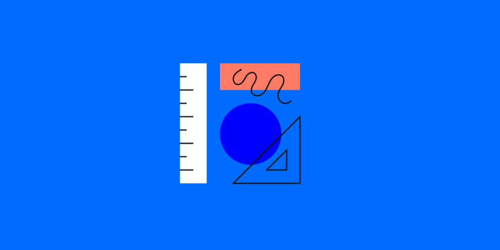
Basic Design Elements
Every visual composition — whether a painting, a poster, or a mobile UI — is built from four foundational elements. Understanding these building blocks is the first step toward effective design.
Lines
Lines are the most fundamental and versatile elements of design. They have a vast spectrum of functions: we use them to separate and organize space, outline and contour objects, emphasize certain elements, draw attention, and create movement.
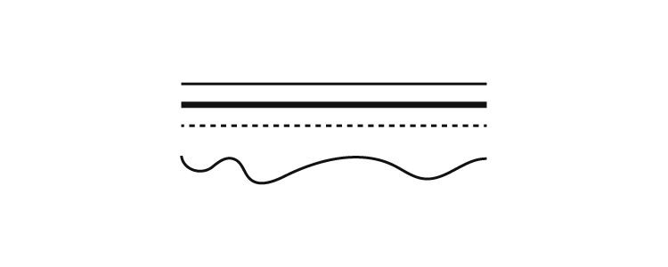
Because lines are fundamentally simple, we can curve and combine them to create rich meaning through different shapes and patterns. Lines can be thin or thick, horizontal, vertical, or diagonal, curved or zigzagged, dashed or dotted — and each variation conveys different meaning and emotion.
In UI design, lines appear everywhere: as dividers between content sections, as borders around input fields, as underlines on active navigation tabs, and as the strokes that form icons. Thoughtful line use is what separates a clean, professional interface from a cluttered one.
Shapes
Everything is made of shapes which, in turn, are made of lines. We can deconstruct the visual world into a series of basic geometric and organic forms.
Human cognition has a powerful relationship with shapes. Their effect on our psyche is partly due to our evolutionary background — some shapes instill comfort, others make us cautious. Rounder shapes like circles and ovals are generally associated with safety and harmony. Pointier shapes, on the other hand, signal danger and command attention.
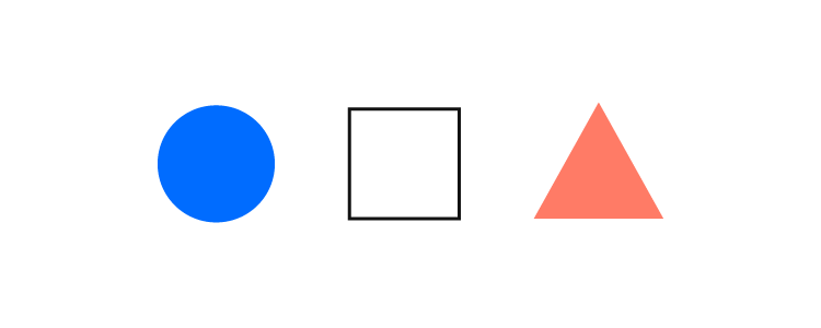
Here’s how common shapes are perceived in design:
- Squares and rectangles — convey stability, reliability, and order. They’re the backbone of most UI layouts (cards, buttons, input fields).
- Triangles — associated with power, energy, and action. Often used in play buttons, directional arrows, and warning icons.
- Circles and ovals — associated with harmony, completeness, and continuity. Common in avatars, progress indicators, and logos.
- Spirals — associated with growth, evolution, and natural processes.
Color
Colors are electromagnetic radiation at different frequencies — yet they have a powerful effect on the human mind. It’s important to note that color perception is partly subjective, influenced by cultural, religious, geographical, and personal factors.
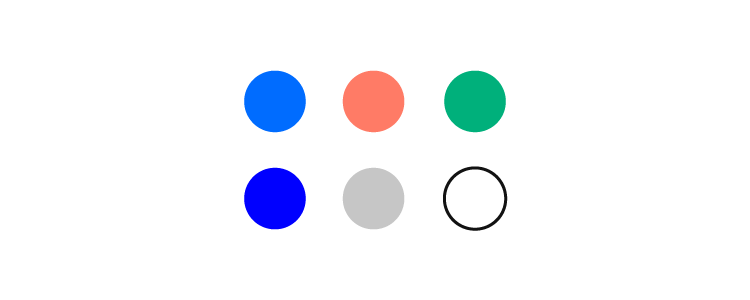
Broad color groups affect most people in predictable ways:
- Warm colors (red, yellow, orange) typically evoke emotions ranging from warmth and energy to urgency and aggression.
- Cool colors (blue, green, purple) can instill feelings ranging from calm and trust to sadness and detachment.
The most commonly used colors in modern digital design:
- Blue — extremely popular in web design and digital interfaces. It’s the predominant color on the web’s most trafficked sites and conveys trust and reliability.
- Red — has a clear function: pushing users toward action. This is why it’s widely used in calls to action, error states, and notifications.
- Yellow — can be perceived as cheerful or cautionary, depending on tone and context.
- Green — associated with nature, success, and affirmation. Widely used in success messages, confirmation buttons, and environmental branding.
In design systems, color is formalized through design tokens — named color values (like primary-500 or error-100) that ensure consistency across every screen and component. Tools like UXPin Merge let designers work with these exact production tokens, so the colors in prototypes match the final product precisely.
Typography

Fonts are multifaceted. They communicate meaning through words and a mood through their characteristics — size, weight, kerning, letter-spacing, and line-height.
When we speak, we use rhythm, pitch, tone, and gestures to convey how we feel. Typography has its own set of characteristics that modulate the feelings a text evokes. We use typographic differences to establish visual hierarchy and distinguish between types of information in a design.
Larger, heavier fonts are typically used for headlines. They set the tone and entice the reader with a glimpse of the content below. Given that headlines should be kept short, the fonts used for them can afford more personality. Body text should be simpler and more legible.
Choosing the right typeface
Your choice of typeface should be guided by three factors: the message, the medium, and the audience. Start with minimal diversity and gradually introduce the smallest amount of typographic contrast necessary to guide a person through the information hierarchy.
Excessive complexity makes designs illegible. Too little contrast makes them dull. Your goal is to find the golden mean between consistency and emphasis.
The Central Principles of Design
Now that we’ve covered the basic elements, let’s look at the principles that govern how those elements relate to each other within a composition.
These principles serve different purposes. Contrast, repetition, and rhythm help draw attention to specific elements. Balance and variety are essential for creating designs that appeal to our senses. All of these principles are tightly interconnected — your goal as a designer is to achieve their harmonious coexistence.
You don’t need to incorporate every principle in every design. However, applying at least a few will guide you toward a more coherent and effective end product.
Unity
Unity is the overarching quality that makes a design feel complete and coherent. There are two kinds: conceptual unity and visual unity.
Conceptual unity is critical during wireframing. It’s about combining information for the user’s comfort and ensuring they can accomplish goals with minimal friction.
Visual unity has to do with how things look. The idea is to ensure harmonious use of elements, colors, shapes, and sizes. Equally important design elements should share visual characteristics, and a unified design establishes consistency and a clear visual hierarchy.
Design systems are, in essence, formalized unity. When your entire product uses the same component library with consistent spacing, color tokens, and typography scales, visual and conceptual unity happen by default.
Contrast and Similarity
Designers use contrast and similarity to guide attention. Similarity creates relationships between elements. According to the Gestalt principles, we tend to group things together based on their appearance — we perceive similar shapes, colors, or sizes as belonging together.
Contrast, on the other hand, makes things stand out. Our brains are hardwired to notice visual outliers — elements that differ from their surroundings. In a deliberate design, contrast signals importance.
Common ways to create contrast:
- Texture — rough vs. smooth surfaces
- Shapes — organic vs. geometric, rounded vs. sharp edges
- Colors — differences in warmth, hue, and intensity
- Scale and size — large elements next to small ones
Balance
Balance creates a sense of stability and composure — it just “feels right.” Designers use several types of balance: symmetrical, asymmetrical, mosaic, and radial. Each has its own subtypes and applications.
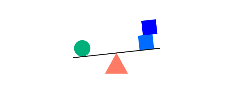
A lack of balance can misguide users, create disorientation, or trigger visual discomfort. An unbalanced composition creates unnecessary friction, causing information to go unnoticed.
Hierarchy and Emphasis
Hierarchy ensures users process information in the right order. Its purpose is to structure elements rationally, allowing users to reach their goals efficiently.
Hierarchy can be established through:
- Size — larger elements are noticed first and perceived as more important
- Color — brighter or more saturated colors stand out against paler ones
- Contrast — contrasting elements are more captivating
- Alignment — misaligned elements draw more attention than aligned ones
- Repetition — similar features signal that elements are related
- Proximity — elements placed close together appear related
- White space — isolated elements draw more attention
- Texture — complex textures draw more attention than simple ones
Too many accents create a chaotic, frustrating experience. Too few make a design seem dull. Effective hierarchy finds the balance between the two.
Rhythm and Flow
Compositional flow determines how the eye moves through a design: where it looks first, where it goes next, where it pauses, and how long it stays.
Interaction Layouts
Several established reading patterns help designers create coherent layouts:

- The Gutenberg diagram — applies to cultures that read left to right. Reading gravity moves attention from the top-left corner toward the lower-right corner, with the other two corners (called fallow areas) receiving less attention.

- The F-pattern — widely used for text-heavy digital interfaces. Eye movement starts at the top-left and moves right, then scans down with shorter horizontal sweeps. Because modern users skim, the lower lines vary in length, creating an F-shaped pattern.

- The Z-pattern — the eye sweeps from top-left to top-right, makes a diagonal transition to bottom-left, and finishes at bottom-right. Common in landing pages and marketing layouts where content is less dense.
Note that these patterns apply mostly to text-heavy designs. Once you add various graphical elements, the patterns may be overridden by visual hierarchy and emphasis cues.
Compositional Flow
When a layout doesn’t follow the standard reading patterns above, designers use directional cues to guide users:
- Repetition of elements
- Rhythm and pacing
- Implied action and movement
- Diagonal and gestural lines
- Directional lines and arrows
- Perspective and depth
- Subject matter of visual elements
- Gradation (gradual transitions in color, size, or shape)
Rhythm and Repetition
Without repetition, there is no rhythm. Our brains are hardwired to seek patterns and similarities. In design, rhythm provides predictability and flow.
Three types of rhythm:
- Regular — elements and spacing are consistent and predictable (like items in a grid layout).
- Flowing — similar to regular rhythm but without strict uniformity. The pattern feels organic and natural.
- Progressive — continuous change in shape, color, or size represents progression or evolution (like steps in a progress indicator).
White Space
White space isn’t necessarily white — it’s the empty area surrounding and separating design elements. It can be any color, texture, or pattern. White space is one of the most important and often underused design tools.
It’s a vital component for enhancing legibility and reducing cognitive fatigue and friction between the user and your design.
White space has become especially important in modern digital design as designers have moved away from the cluttered interfaces of earlier decades. Compare any early web portal’s cramped layout with Apple’s current homepage — the difference in readability, focus, and perceived quality is dramatic.
Why use white space?
- Directs attention — isolated elements draw the eye, helping establish visual hierarchy and guide users to key content.
- Increases interaction — well-spaced elements are easier to notice and act on, improving conversion and usability.
- Reduces cognitive load — generous spacing prevents visual fatigue and makes interfaces feel calmer and more professional.
- Improves legibility — adequate spacing between lines, paragraphs, and sections makes text significantly easier to read.
Variety
Variety arouses visual interest and prevents designs from becoming monotonous. Designers use it to counteract excessive unity — when things are too uniform and bland, users lose engagement.
Ways to introduce variety:
- Lines — varying weight, angle, or length
- Shapes — changing shape type (organic vs. geometric), size, color, or orientation
- Colors — diversity in hue, value, or saturation
- Values — varying lightness or darkness
- Textures — mixing rough and smooth surfaces
Applying Design Elements and Principles in Prototyping
On the surface, design trends come and go. But the underlying elements and principles are timeless — they apply as much to a 2026 mobile app as they did to a Renaissance painting.
The key insight is that these principles form a system. Improving variety might affect balance. Making a design too unified might make it dull. The craft lies in understanding the interplay and finding the right balance for each project.
Modern design tools make it easier to apply these principles. With UXPin Merge, designers work with real, production-grade components from libraries like MUI or shadcn/ui that already encode many of these principles — consistent spacing, harmonious color tokens, typographic hierarchy, and balanced layouts are built into the components themselves.
For even faster exploration, UXPin Forge generates layouts from text descriptions using your production component library. Describe a layout — its structure, emphasis, and flow — and Forge produces a working prototype. Because output is constrained to your design system’s components, the fundamental design principles are maintained automatically.
Create prototypes that are as interactive as the final product. No code required. Try UXPin for free.
Frequently Asked Questions About Design Elements and Principles
What are the basic elements of design?
The basic elements of design are lines, shapes, color, and typography. Lines organize space and draw attention. Shapes create meaning through geometric and organic forms. Color evokes emotions and guides user focus. Typography communicates information through words while conveying mood through font characteristics like weight, size, and spacing.
What are the principles of design?
The core principles of design include unity, contrast, similarity, balance, hierarchy, emphasis, rhythm, repetition, white space, and variety. These principles govern how basic design elements relate to each other and work together to create effective, coherent visual compositions.
What is the difference between design elements and design principles?
Design elements are the building blocks — the raw visual components like lines, shapes, colors, and type. Design principles are the rules that govern how those elements are arranged and relate to each other within a composition. Elements are the what; principles are the how.
Why is white space important in design?
White space (also called negative space) reduces cognitive fatigue, improves legibility, directs attention to key elements, and establishes visual hierarchy. It doesn’t have to be literally white — it’s simply the empty area around and between design elements. Effective use of white space is one of the clearest markers of professional, polished design.
How do design elements apply to UI and UX design?
In UI/UX design, elements and principles are applied through component design, layout systems, color palettes, typography scales, and interaction patterns. Design systems formalize these decisions into reusable components. Tools like UXPin let designers apply these principles while prototyping with real, interactive components — ensuring visual design decisions translate directly to production code.
What are the F-pattern and Z-pattern reading layouts?
The F-pattern describes how users scan text-heavy pages — reading across the top, then scanning down the left side with shorter horizontal sweeps, forming an F shape. The Z-pattern applies to pages with less text — the eye moves from top-left to top-right, diagonally to bottom-left, then across to bottom-right. Understanding these patterns helps designers place important elements where users naturally look.


