Generate production-ready React UIs: use GPT-5.2 to create MUI components and prototype with UXPin Merge for synced design systems.
How to build UX using GPT-5.2 + MUI – Use UXPin Merge!

Generate production-ready React UIs: use GPT-5.2 to create MUI components and prototype with UXPin Merge for synced design systems.

Combine Claude Haiku 4.5 and UXPin Merge to generate production-ready UI components from your design system and speed prototyping.
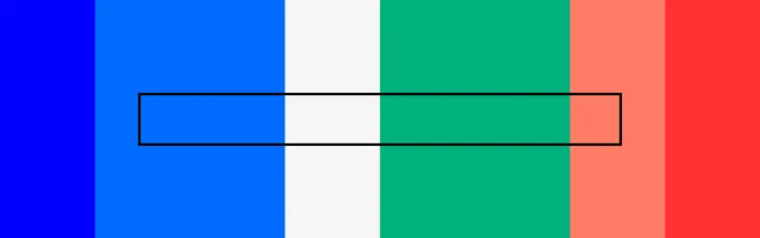
A color palette is a curated set of colors used consistently across a product’s user interface. Choosing the right palette isn’t just about aesthetics — it affects usability, accessibility, brand perception, and conversion rates. A well-chosen palette guides the user’s eye, establishes visual hierarchy, and reinforces brand identity on every screen. This guide walks you
(…)UXPin is a product design platform used by the best designers on the planet. Let your team easily design, collaborate, and present from low-fidelity wireframes to fully-interactive prototypes.
Start your free trial
Many programming languages use packages to build and scale websites, software, and other digital products. These packages allow engineers to extend a project’s functionality without writing and maintaining additional code. This article will explain these terms from a designer’s perspective, so you get a basic understanding of how packages work and why engineers use them.
Product design is the process of creating a digital product’s interface, interactions, and overall experience — from initial research through prototyping, testing, and iteration. It sits at the intersection of user needs, business goals, and technical feasibility. Great product design is why some apps feel effortless while others frustrate you within 30 seconds. It’s not
(…)
A tooltip is a small UI element that displays contextual information when a user hovers over, focuses on, or taps a trigger element. Tooltips provide on-demand clarification — they surface the right information at the right moment without cluttering the interface. When designed well, tooltips reduce confusion, speed up task completion, and improve discoverability. When
(…)
A Minimum Viable Product (MVP) is the simplest version of your product that delivers enough value to attract early users and generate real-world feedback. The goal is not perfection — it is validated learning. You ship the smallest thing that solves a genuine problem, measure how people respond, and iterate from there. This guide covers
(…)
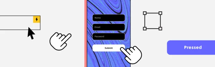
Interaction design is one of the most critical facets of user experience design. It determines how a digital product responds to every user action — a tap, a scroll, a swipe — making the interface feel alive, intuitive, and human. Key takeaways: Interaction design (IxD) focuses on behavior and response — what happens when a
(…)
UI mockups are a critical milestone in the design process. They are where ideas first come to life with real color, typography, and content — bridging the gap between abstract wireframes and interactive prototypes. Key takeaways: A UI mockup is a high-fidelity, static visual representation of how a product’s interface will look. Mockups sit between
(…)
Mobile devices account for roughly 60 % of all web traffic worldwide, and global app downloads surpassed 250 billion in 2025. Getting your mobile UI design right is no longer optional — it is the baseline expectation for every digital product team. Key takeaways: Mobile UI is the visual and interactive layer of a mobile
(…)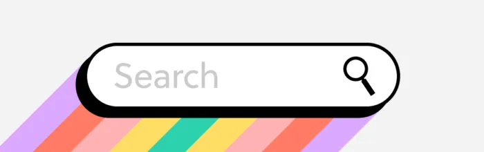
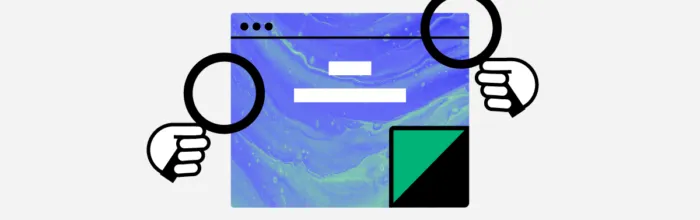
Where basic search returns a flat list of results, advanced search gives users the tools to refine, filter, and zero in on exactly what they need. When done well, it transforms a frustrating needle-in-a-haystack experience into one that feels fast, precise, and empowering. Advanced search is especially critical for products with large content sets —
(…)
React powers some of the most sophisticated web applications on the planet — but its default client-side rendering model can create serious blind spots for search engines. If your React site is not properly optimized, Googlebot may see a blank page where your content should be. The good news: React and great SEO are not
(…)
A prototype is an early model or simulation of a product used to test and validate ideas before committing to full-scale development. Prototypes range from simple paper sketches to fully interactive digital models that behave like the finished product. They help teams gather user feedback, identify usability issues, and refine design concepts — ensuring the
(…)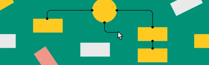
Website structure is the way a site’s pages, content, and navigation are organized and connected to each other. A well-planned structure helps visitors find information quickly, builds trust through a professional presentation, and enables search engines to crawl and index your content effectively. According to research on web credibility, 94% of first impressions are design-related.
UX design principles are the foundational guidelines that help product teams create intuitive, usable, and satisfying digital experiences. Whether you’re designing a mobile app, a SaaS dashboard, or an enterprise platform, applying these principles ensures every decision stays centered on real user needs. This guide covers 16 essential UX design principles — from user-centricity and
(…)