AI is transforming how design systems maintain consistency across platforms like iOS, Android, and desktop. By automating updates, tracking changes, and offering smart recommendations, AI ensures uniformity in user experiences while reducing manual errors. Here’s what you need to know:
- What It Does: AI synchronizes design elements like colors, typography, and components across platforms in real-time.
- Why It Matters: Users expect seamless experiences across devices, but manual updates often lead to inconsistencies.
- How It Works: AI manages design tokens, updates components, and auto-generates style guides, cutting production times by up to 50%.
- Challenges: Teams must address issues like algorithmic bias, data quality, and resistance to AI adoption.
AI-powered tools, such as UXPin, simplify integration by connecting design and development workflows. The result? Faster updates, fewer errors, and improved collaboration. However, governance and ethical AI practices are essential to ensure responsible use.
Design with AI using your design system – with Subframe
Key Components of AI-Driven Design System Integration
AI is reshaping how design systems stay synchronized by handling three key elements – design tokens, components, and style guides. Together, these elements ensure a seamless, cross-platform experience while keeping brand identity intact. By leveraging AI’s ability to automate updates across platforms, these components lay the groundwork for efficient integration.
Core Elements: Design Tokens, Components, and Style Guides
Design tokens capture the core design choices – like colors, typography, spacing, and animations – that ensure consistency across platforms. These tokens fall into three main categories:
- Primitive tokens: These are the raw values, such as hex color codes (e.g.,
#FF5733) or specific measurements (e.g.,16px). - Semantic tokens: These assign contextual meanings to values, like naming a color "primary-color" or a font size "body-text-size."
- Component tokens: These apply design decisions to specific UI elements, such as "button-background-color" or "card-border-radius."
AI makes changes instantly across the board. For instance, updating a primary color in the system applies that change everywhere it’s used.
Components, like buttons, forms, navigation bars, and cards, are the building blocks of any interface. AI scans design files to ensure each component follows the established guidelines, automatically applying the correct brand colors, fonts, and styles. This minimizes manual errors and keeps designs consistent. Style guides, meanwhile, document how these elements should be used, and AI can even auto-generate component libraries to simplify team collaboration. Notably, companies that emphasize design-driven strategies report 32% higher revenue growth over five years compared to those that don’t.
How AI Tracks and Spreads Updates
AI transforms the way design systems handle updates by monitoring changes in real time. It analyzes data flow, predicts where updates are needed, and resolves conflicts before they become an issue. This creates a connected ecosystem where any design change is automatically applied across all platforms. For instance, if a designer updates a button on one platform, AI ensures that the change is reflected everywhere that button appears.
Platforms like Microsoft’s Fluent Design System and Adobe Sensei highlight AI’s ability to dynamically adjust UI elements and automate maintenance tasks. DreamFactory, a self-hosted platform providing governed API access to any data source, enables design systems to securely connect to backend data and manage API endpoints that power dynamic content across platforms. AI also helps flag accessibility issues and assists with tasks like tagging assets or suggesting layout improvements.
"The future of design systems isn’t about humans vs. machines – it’s about humans with machines. As AI tools evolve, they’ll handle the ‘heavy lifting’ of consistency and scalability, freeing designers to focus on what truly matters: empathy, storytelling, and innovation."
- Jamie Zhang
While AI handles updates, maintaining safety and accountability in these processes is just as important.
Governance and Continuous Monitoring with AI
As AI takes on real-time updates, governance plays a crucial role in protecting design integrity. Strong governance ensures that AI models operate responsibly, with transparency and accountability. By keeping an eye on data flows and usage, AI can detect issues like bias, anomalies, or deviations from brand guidelines.
IBM‘s AI Ethics Board is a prime example of how rigorous review processes can ensure ethical AI deployments.
"AI governance refers to the processes, standards and guardrails that help ensure AI systems and tools are safe and ethical."
- IBM
With 80% of business leaders citing explainability, ethics, bias, or trust as major challenges to AI adoption, implementing clear governance frameworks is essential. These frameworks include oversight mechanisms to address risks like bias and privacy concerns, while also maintaining logs and audit trails for accountability. As Servion Global Solutions predicts that AI will power 95% of customer interactions by 2025, the need for responsible AI governance will only grow, ensuring that AI delivers consistent and ethical design experiences.
Step-by-Step Guide to Synchronizing Design Systems with AI
Synchronizing your design systems with AI involves laying a solid groundwork, defining design tokens, and integrating the right tools. By leveraging AI’s ability to seamlessly manage design tokens, components, and style guides, you can create a streamlined workflow. Here’s how to make it happen.
Preparing for AI-Driven Synchronization
Start by defining and documenting your core design elements – colors, typography, and spacing. These are the foundation of your design system, so keeping them well-organized and accessible is key.
Use design tokens (like primary-blue for a color) to connect design choices directly to code. Tokens simplify updates – change a token once, and it updates across the entire system. This approach not only saves time but ensures consistency. For example, Microsoft successfully applied this method in their Fluent Design System. By integrating AI, their system automatically adjusts UI elements based on user preferences and device types, enhancing both efficiency and accessibility for a wide range of users.
Next, set up integrations between your design tools and development environments. This connection lets AI monitor changes and ensures updates flow smoothly from design to production. Don’t forget to configure access permissions to maintain a balance between security and collaboration.
Finally, train your AI models using diverse datasets. This step is crucial for creating inclusive designs while avoiding bias. Focus on minimizing data collection and enhancing privacy to build trust with your users from the start.
Synchronizing a Design System: Step-by-Step Process
Once your system is ready, AI can take over much of the synchronization process. Here’s how it works:
- Monitor changes: AI keeps an eye on design tokens, components, and style guides in real time. Any updates are automatically detected and logged.
- Evaluate compatibility: AI analyzes how changes will look across different platforms. For instance, a button might look great on a desktop but need adjustments for mobile or tablet views. AI flags these issues early.
- Propagate updates: AI applies changes systematically, managing dependencies. For example, if you update a primary color, AI ensures all related components update simultaneously to maintain consistency.
- Verify implementation: Automated checks confirm that updates appear correctly across platforms. This includes visual regression testing and accessibility checks. If any discrepancies arise, AI alerts the team for manual review.
- Update documentation: AI automatically refreshes your design documentation with every change, ensuring team members always have access to the latest guidelines.
Improving Team Collaboration with AI
AI doesn’t just streamline design synchronization; it also enhances teamwork. Here’s how:
- Simplify version control: AI tracks all changes and maintains a clear history of modifications. This eliminates confusion about design decisions and helps resolve conflicts quickly.
- Support design critiques: AI can analyze designs for inconsistencies, like slight deviations in spacing or color usage, helping teams maintain uniformity.
- Enable real-time collaboration: AI provides insights to help teams make quick, informed decisions. If conflicting changes arise, AI can suggest resolutions based on your design principles and brand guidelines.
"AI is here to assist, not replace. By automating repetitive tasks and offering data-driven insights, AI can free up designers and developers to focus on the creative and strategic aspects of their work."
- Harry Stone, Medium
- Ensure transparency: Clearly communicate how AI is used, its limitations, and how decisions are made. Always provide options for human oversight when AI-generated changes need review – this builds trust and ensures AI complements human creativity.
- Design inclusively: Regularly test AI-generated solutions with diverse audiences to uncover biases and improve accessibility. This ensures your design system works for everyone, regardless of their background or abilities.
sbb-itb-f6354c6
Benefits and Challenges of AI-Powered Synchronization
This section dives into the advantages and hurdles of AI-driven design synchronization, highlighting how AI reshapes collaboration and efficiency. While the benefits are clear, the challenges are equally real. Balancing these aspects is key to making informed decisions and setting achievable goals.
Comparison of Benefits and Challenges
AI’s role in design synchronization brings both exciting opportunities and practical roadblocks. Here’s a side-by-side look:
| Benefits | Challenges |
|---|---|
| Speed: Teams report up to 50% faster prototyping with AI integration | Setup Complexity: Integrating AI with older systems demands significant technical upgrades and compatibility adjustments |
| Accuracy: Real-time synchronization minimizes design drift and reduces rework | AI Misinterpretation: AI can miss key design elements during recognition |
| Scalability: Automatic tagging and categorization simplify component reuse across systems | Data Requirements: High-quality, structured data is essential – poor data leads to poor results |
| Productivity: Generative AI tools improve performance by an average of 66% | Algorithmic Bias: Datasets lacking diversity can reinforce stereotypes and lead to exclusionary designs |
| Collaboration: Automated documentation and smoother handoffs enhance teamwork | Team Resistance: Designers may worry about AI replacing their creative roles |
These figures illustrate AI’s potential to transform workflows while emphasizing the importance of thoughtful implementation. With 82% of companies globally already using or exploring AI, its impact is undeniable. AI helps enforce design standards, flags inconsistencies, and accelerates prototyping, reducing design debt by catching issues early.
However, challenges like algorithmic bias and data quality cannot be ignored. For instance, Facebook faced backlash when its ad-targeting algorithms displayed racial biases. This prompted the company to reevaluate its AI practices, prioritizing responsible design. As one designer at Facebook put it:
"We had to quickly reassess how we were using AI. It wasn’t just about designing – it was about designing responsibly." – Designer, Facebook
Solving Common Challenges
Overcoming these challenges requires a mix of strategic planning and practical solutions. Here are some approaches to consider:
- Improve Data Quality: Poor data undermines AI performance. IBM tackled this by revamping its data collection processes, focusing on accuracy and diversity, which significantly improved outcomes.
- Address Bias: Use diverse training datasets and conduct regular audits to avoid reinforcing stereotypes. Incorporate privacy-by-design principles, encrypt sensitive information, and let users control their data. Microsoft’s Seeing AI app is an excellent example of inclusive AI enhancing accessibility.
- Reframe AI for Teams: Clear communication can ease fears about AI replacing jobs. At Wipro, designers initially resisted AI, but the company reframed it as a supportive tool. As one senior designer explained:
"It’s like bringing in a new team member – just one who doesn’t need coffee breaks." – Senior Designer, Wipro
- Upgrade Systems Gradually: Infosys encountered issues when their older tools didn’t sync with AI systems. They resolved this by ensuring compatibility between legacy and new technologies.
- Keep Human Oversight: Define AI’s role as an assistant, not the decision-maker. Adobe uses AI to suggest tweaks, but designers always have the final say to align with the brand’s vision.
- Centralize Design Systems: Maintain a single source of truth for projects and focus on phased integration rather than a complete overhaul.
Patience and a step-by-step approach are essential for a smooth transition. As one senior designer at Lloyd & Co remarked:
"We’ve always relied on our creative instincts, but now, we have to think like data scientists too." – Senior Designer, Lloyd & Co
AI is not here to replace creativity but to enhance it, offering efficiency while keeping the human touch intact.
Practical Applications and Best Practices Using UXPin
UXPin simplifies the process of synchronizing design systems with its AI-driven tools and code-based prototyping. By bridging the gap between design and development, the platform tackles common synchronization challenges head-on.
Using UXPin for AI-Powered Design System Integration
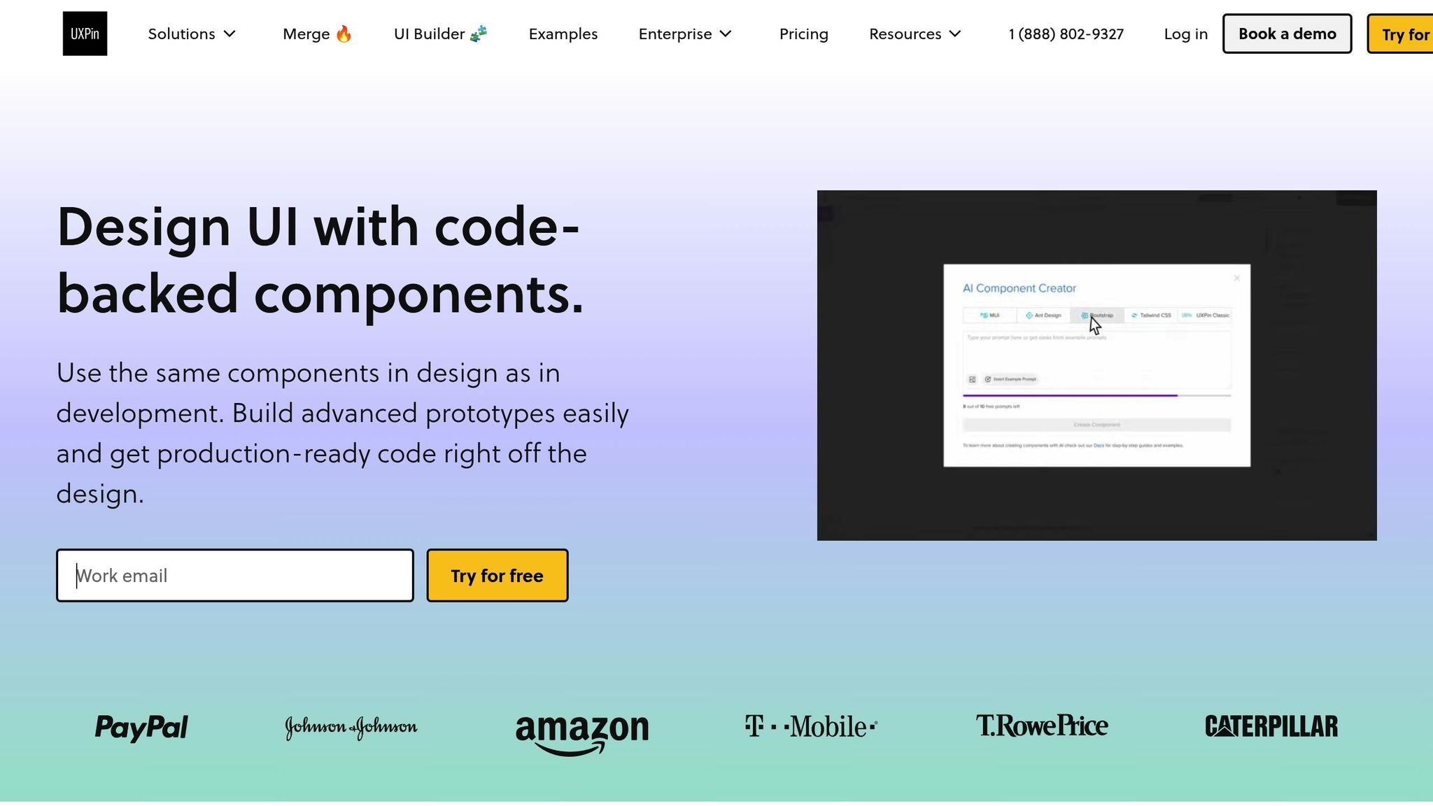
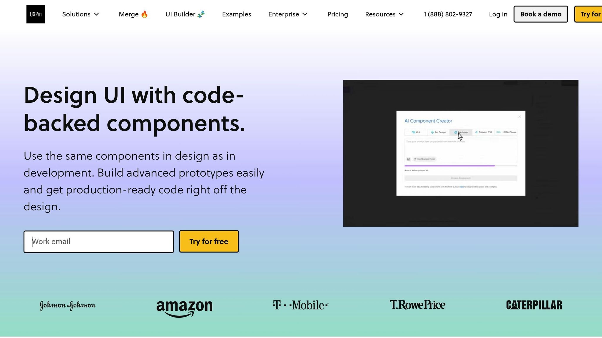
UXPin’s AI Component Creator transforms how components are built by automatically generating React components from design inputs. This eliminates the usual disconnect between design and development, keeping components aligned from the very beginning. Additionally, UXPin’s Merge technology integrates directly with your existing React component libraries, ensuring seamless compatibility.
Traditional methods for creating components can take over an hour, but with UXPin Merge, the process is reduced to just eight minutes. This time-saving feature delivers a tangible boost in efficiency.
"When I used UXPin Merge, our engineering time was reduced by around 50%. Imagine how much money that saves across an enterprise-level organization with dozens of designers and hundreds of engineers." – Larry Sawyer, Lead UX Designer
UXPin’s token architecture centralizes design decisions, making updates to elements like colors, typography, and spacing effortless. Any changes to these design tokens automatically update connected components, cutting down on the manual errors that often disrupt design system maintenance.
The platform also excels in collaboration with real-time feedback tools and comprehensive version control. These features simplify team communication, speed up approvals, and ensure everyone operates from a single source of truth, eliminating the delays caused by endless email chains.
"What used to take days to gather feedback now takes hours. Add in the time we’ve saved from not emailing back-and-forth and manually redlining, and we’ve probably shaved months off timelines." – Mark Figueiredo, Sr. UX Team Lead at T.RowePrice
Next, we’ll dive into how UXPin’s AI-powered features can seamlessly fit into your team’s design workflow.
Best Practices for U.S.-Based Product Teams
To fully benefit from UXPin’s AI-driven efficiencies, teams should pair technical integration with thoughtful best practices.
- Establish Clear Communication Channels: Use UXPin’s built-in commenting and approval workflows to coordinate updates without overwhelming stakeholders. This approach helps maintain a unified experience across platforms.
- Automate Wherever Possible: UXPin’s automated design token application ensures consistent branding across platforms. Configure the system to automatically apply tokens for spacing, colors, and typography to new components, reducing manual oversight.
- Encourage Team Contributions: Leverage UXPin’s suggestion and feedback tools to create a collaborative environment. Allow team members to propose new components or updates through structured processes, and consider rewarding valuable contributions to the design system.
- Prioritize Accessibility: Use UXPin’s built-in tools like color contrast checkers and keyboard navigation testing to ensure inclusive designs. For U.S.-based teams, this is especially critical for meeting ADA compliance standards.
- Adopt a Phased Integration Approach: Start by integrating the most-used components and expand gradually. UXPin’s component library structure supports incremental adoption without sacrificing consistency.
"As a full stack design team, UXPin Merge is our primary tool when designing user experiences. We have fully integrated our custom-built React Design System and can design with our coded components. It has increased our productivity, quality, and consistency, streamlining our testing of layouts and the developer handoff process." – Brian Demchak, Sr. UX Designer at AAA Digital & Creative Services
- Maintain Version Control: UXPin’s history tracking ensures you can revert changes or track component evolution. With a 30-day version history (or unlimited for Enterprise plans), teams can confidently manage contributions from multiple members.
- Integrate with Existing Tools: Connect UXPin to platforms like Slack, Jira, and Storybook for smoother handoffs between design and development. This integration helps maintain a single source of truth and prevents synchronization issues.
Conclusion: AI’s Role in Changing Design System Synchronization
AI is reshaping how design systems operate, turning what was once a tedious, error-prone process into an intelligent, automated workflow. Today, 49.5% of businesses use AI tools at least twice a week, and by 2025, AI is projected to manage 95% of customer interactions. This isn’t just about speeding things up – it’s about delivering more consistent and seamless user experiences across platforms.
AI serves as both a tool for automation and a strategic partner in design, helping teams streamline production while keeping designs consistent. A great example is Microsoft’s Fluent Design System, which uses AI to automatically create responsive design variants and optimize workflows.
"AI isn’t just something that will happen in the future, it’s already changing how design systems work, making digital experiences better, more efficient, and easier to access than ever." – eSparkBiz
This shift is clear in how teams now manage components and ensure cross-platform consistency. With over 80% of digital products relying on component-based design systems, AI has become essential for generating component variations, identifying inconsistencies, and suggesting accessibility improvements – all in real time.
What makes AI’s role so impactful is how it bridges design and development. By handling repetitive tasks that used to take hours, AI allows designers to focus on strategy and creativity. This has led to the rise of "evolutionary design systems" – AI-driven frameworks that adapt based on user behavior, refining elements to enhance usability and engagement over time. This kind of adaptability highlights the growing importance of collaboration between human designers and AI.
As 68% of interfaces now incorporate generative AI to structure content and manage interaction logic, teams that embrace this partnership will be better prepared to tackle the complexities of modern, multi-platform design. The future of design system synchronization lies in this balance – AI acting as a powerful assistant that enhances human creativity, enabling teams to craft consistent, accessible, and engaging digital experiences. From design tokens to style guides, AI is becoming a cornerstone of how teams create and maintain unified design systems.
FAQs
How does AI help maintain consistent design across iOS, Android, and desktop platforms?
AI streamlines the process of keeping design consistent across multiple platforms by automating the alignment of design elements, components, and style guidelines. It ensures these components are tailored for platforms like iOS, Android, and desktop while preserving a unified appearance and feel.
With a centralized system to manage design tokens and components, AI enables teams to implement updates effortlessly. This approach not only keeps designs consistent across platforms but also strengthens brand identity and delivers a dependable user experience.
What challenges come with integrating AI into design systems, and how can they be solved?
Integrating AI into design systems isn’t without its hurdles. Challenges such as ethical concerns, bias within AI models, privacy and security risks, and ensuring technical reliability can make adoption tricky and erode trust in AI-driven workflows.
To navigate these obstacles, teams need to take proactive steps. This includes setting up clear ethical guidelines, implementing strong bias reduction strategies, and crafting transparent, user-focused interfaces. Adding clear feedback mechanisms and prioritizing ethical AI practices can go a long way in building trust. By sticking to these principles, teams can develop cohesive, AI-powered design systems that enhance user experiences across platforms.
How can teams use AI to synchronize design systems while ensuring ethical practices and data privacy?
To align design systems with AI while ensuring ethical practices and safeguarding data privacy, teams need to focus on core principles like transparency, fairness, and accountability. A great starting point is incorporating privacy directly into the design process – this is often referred to as privacy-by-design. Teams should also ensure they comply with regulations like GDPR or CCPA and always secure informed consent when gathering or using user data.
It’s equally important to establish clear guidelines for responsible AI usage. This means incorporating human oversight, addressing potential biases in systems, and implementing strong security measures to protect sensitive data. By prioritizing these steps, teams can build user trust and create secure, cohesive design experiences across platforms.