Custom Styles: Use CSS to style Elements in UXPin

UXPin elements are getting a lot more customizable. If you know CSS, you can make it happen.

Custom Styles allow you to quickly style elements in UXPin using CSS. Whether you want to use your existing CSS or if you want to add new effects like text-transform properties, shadows, or blur effects, we’ve got you covered.

Applying custom styles with CSS

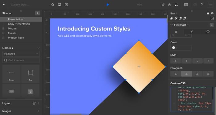
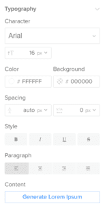
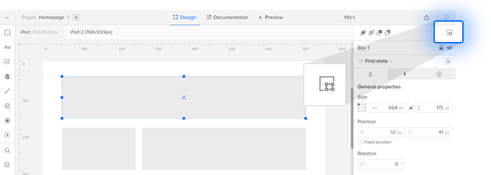
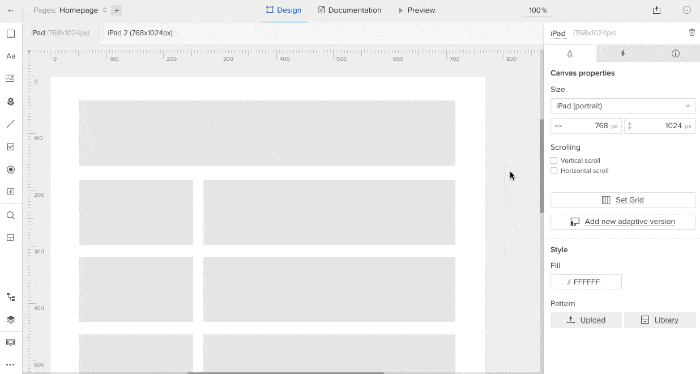
From box fills to navigation links, many UXPin elements have their own custom features in the Editor’s “properties” panel. But we wanted to give code-savvy designers more control over the look and feel of many visual properties. Here’s how it works:

  • Select an element.
  • Click to the aptly-named “custom styles” section of the Editor’s property panel.
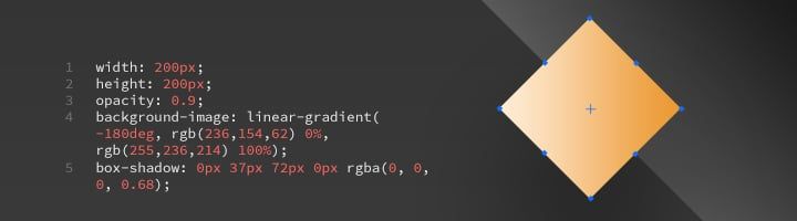
  • Add your CSS properties, such as font, color, border, and padding.

Properties at your fingertips

What can you change? Turns out, quite a bit. The editable properties include:

  • background
  • background-attachment
  • background-clip
  • background-color
  • background-image
  • background-origin
  • background-position
  • background-repeat
  • background-size
  • border
  • border-bottom
  • border-bottom-color
  • border-bottom-left-radius
  • border-bottom-right-radius
  • border-bottom-style
  • border-bottom-width
  • border-color
  • border-image
  • border-image-outset
  • border-image-repeat
  • border-image-slice
  • border-image-source
  • border-image-width
  • border-left
  • border-left-color
  • border-left-style
  • border-left-width
  • border-radius
  • border-right
  • border-right-color
  • border-right-style
  • border-right-width
  • border-style
  • border-top
  • border-top-color
  • border-top-left-radius
  • border-top-right-radius
  • border-top-style
  • border-top-width
  • border-width
  • color
  • opacity
  • height
  • width
  • font-size
  • font-size-adjust
  • font-stretch
  • font-style
  • font-variant
  • font-weight
  • padding
  • padding-bottom
  • padding-left
  • padding-right
  • padding-top
  • direction
  • tab-size
  • text-align
  • text-align-last
  • text-decoration
  • text-decoration-color
  • text-decoration-line
  • text-decoration-style
  • text-indent
  • text-justify
  • text-overflow
  • text-shadow
  • text-transform
  • line-height
  • vertical-align
  • letter-spacing
  • word-spacing
  • white-space
  • word-break
  • word-wrap
  • box-shadow
  • filter


Whew. That’s a lot of possibilities.

Going forward

Designers need more power to customize the look of design elements in UXPin while matching what’s possible in web browsers. CSS is the obvious choice. Now they have it with Custom Styles: tailor any UXPin element with CSS.

Join the world's best designers who use UXPin.

Sign up for a free trial.

Time For Collaboration: Working With (Very) Remote Teams

We have an ongoing challenge. With more than half of the UXPin team in Poland and the rest in California, communication issues were only a matter of time — or rather, time zones.

It pops up in meetings. And in scheduling company events. And in clarifying who’s responsible for what. To solve this daily problem we’ve had to develop strategies for communicating across both time zones and cultures.

Based in California, Vice President of Product Sunita Reddy has had ample experience working with our Polish developers. We asked her how she tackles communication challenges across the Atlantic.

Describe your role in UXPin.

I provide product leadership for UXPin, which includes balancing long term product strategy & vision with execution. Prioritizing the roadmap and coming up with marketable product updates. Making sure that the processes are well defined to build a predictable agile model for software development. Help build a quality product with high CSAT that helps drive UXPin’s growth strategy.

What did you do before UXPin?

I ran a company called ChiQasa, a visual commerce company with customer base in Southeast Asia. We had a team of 20 with two dev offices in India and product management in Mountain View, California. Before that I was head of mobile product and engineering @Accellion with a dev teams in Singapore and Palo Alto. I have led remote teams multiple times in my career.

How involved are you with day-to-day operations in the Polish office?

Very involved. I keep in touch with all the product owners and designers on a daily basis and sync with our VP Projects & CTO multiple times a week. I attend every sprint demo and sit in on some sprint retros.

What tools do you use to communicate with the team?

Slack, Zoom, email, phone calls. Sometimes I send a written message, then we talk about it on the call so that nothing gets lost in translation.

What communication problems have you and your team overcome?

One of the biggest issues coming into UXPin was lack of structure. We have created a structure that works in the product org. They know what I am optimizing for in our product team and I get notified. One of the challenges we have overcome is spoken English. If I don’t understand them on the phone, I ask the team to send me something ahead of time so that I can follow along. Many times when they write stuff down, it becomes contextual and then easy to understand.

What would you like to improve with coordinating with your team?

Be more organized and more proactive, open up more — not just with me, but rest of the team so that we can solve problems fast. Think through solutions more before presenting.

What did you learn about your team on your first trip to Poland?

I was nervous going to Poland because I did not know what to expect. People were courteous and polite but reserved. So the conversations were way too structured. I had to break the walls, start conversations (take the first step) understand their emotions, likes and dislikes to eventually have water cooler conversations on Slack.

What do you miss about working with people in person?

I have a ton of water-cooler conversations with folks on Slack. But I do miss having a nerdy conversation or solving a super-technical problems with our developers, as they do not open up much about microservices or security across the entire platform or bringing Kubernetes vs. Mesos.

What advice would you offer a manager dealing with teams in another part of the world?

Be super organized. Communicate the process you expect them to follow and over communicate. Get to know people so that you can care, mentor and work with the entire person as opposed to a Persona on Slack. Use the channels that work for the teams. No one channel is right. If you have introverts on the team give them short questions so that they can open up. Make it a comfortable and safe virtual environment for them to express themselves.

Styleguide: All Your Prototype Assets in One Place

We’re pleased to announce a new addition to our popular new Spec Mode feature: Style Guide.

Style guide colors and typography

Styleguide allows UXPin users to download properties for color, typography, and image assets to their computers. From there they can open the text files — or copy/paste the code — into their code editor of choice.

Need images and fonts? No problem. Bitmaps are also part of the download, as are SVGs of UXPin’s built-in elements.

Style guide image assets

You can access the new styleguide feature in the top left corner of a preview window. Enter Spec Mode and look for the “View styleguide” link.

Where to find the style guide link

In addition to viewing individual elements’ specifications in Spec Mode, downloading an entire set of assets gives developers a boost when building local components in, say, GitHub. Soon designers and developers will be closer than ever, making your team’s workflow faster and more efficient. See it in action!

Keep the Design Conversation Going With Trello and UXPin

Trello, the popular workflow and project management app, is a great way to stay on top of both tasks and conversations. But it’s not ideal for leaving feedback on web and app prototypes. Meanwhile UXPin lets stakeholders leave specific notes on prototypes, plus code and use-case notes for developers.

Luckily using Trello and UXPin is as simple as copy/paste. Here’s a great strategy to use Trello and UXPin together.

1. Make a card for each of your project’s goals.

We start with goals to keep each prototype on track. Without goals, we can’t gauge a prototype’s success — we’re designing in a vacuum.

Trello goals

2. Add a live prototype link to the first comment.

Copy the live profile’s URL from your browser window. Recipients of the URL can view and comment on the prototype, even if they don’t have a UXPin account.

Links to UXPin prototypes in Trello cards

3. In the cards’ descriptions, ask stakeholders for feedback.

We recommend asking specific questions based on the goals. “What do you think?” is good, but questions like “We want to accomplish X, how can we improve?” gives commenters guidance on what to watch for. Specific questions also underscore at what level of fidelity the prototype is; if you want feedback on the concept, not the colors, for example, then “Does the user flow work?” keeps people on track.

4. Set a deadline for giving feedback. Upon reaching that deadline, move it to a “conversation” list.

Designers iterate their work over time. Keeping a list of prototypes to discuss is a grew way to separate old versions from feedback in progress. The key is to set a deadline: give people, say, a week to comment, then move on. That often inspires people to avoid procrastinating while keeping the project from stagnating.

5. Take action

Next time your team meets to discuss the project, you’ll have everyone’s feedback in a central place — UXPin — organized by its status in Trello lists. All this keeps your team in the same conversation, complete with hi-fi visuals on which people can leave specific comments.

Tips and best practice

While there are many ways to use Trello and UXPin in tandem, we’ve discovered several techniques to make the process work especially well.

Think in terms of flows, not pages. How will users get from here to there? What compels them to move along a certain path?

Ask for specific feedback. Beyond “what do you think?”, seek an angle. For example: “we’re going for X which will benefit the Y goal. Do you think this prototype fits the bill? If not, what would improve it?”

Remember that prototypes adapt. Changes made to UXPin projects take effect immediately, so keep in mind that iterations — like design conversations — evolve over time.

Trello provides the process. UXPin provides the on-point feedback. Together they’re a great team for collaborative teamwork.

Say Hello to Spec Mode and Our New, Improved Sketch Integration

UX designers who focus on UX are doing their job. Non-designers who express their ideas visually are trying to communicate. With UXPin, anyone can get their product ideas across with a few clicks. But it’s not enough to hand visuals over and hope for the best. Developers need collaboration too.

That’s why we’re pleased to bring you Spec Mode: a new way to get properties from elements in UXPin. No longer must developers pour over bland text documents; they can see exactly what they’re looking for and, with a click, get its colors, typography dimensions, use cases, sample code, and more.

This new tool eliminates time-consuming redlining of mockups, enabling a smoother handoff between designer and developer.

Spec mode

Spec Mode, available for trial and enterprise users while previewing a prototype, displays the design’s major colors as hex values; dimensions and the space between them; and copy/paste the results into your code editor of choice.

When combined with UXPin prototyping, Spec Mode transforms static designs into interactive documentation. By consolidating code and design standards in one place, we create a “single source of truth” that doesn’t just show developers how a product should look — it helps them understand how the product should feel and behave. It all happens without the need for 50-page requirements documents or multiple designs to reference.

How it Works

The process is simple.

Drag-and-drop SketchApp files directly into UXPin for prototyping, or prototype with the editor. Then auto-generate design specs. Attach metadata to any element (more code snippets, use cases etc.) and never worry about them again — they’re permanently attached.

Benefits of Spec Mode include:

  • Eliminating guesswork and busywork. Designers no longer waste time annotating mockups. Developers no longer waste time hunting for elements’ properties (hex values, etc.) or assets, nor will they need to guess on placement of elements. It’s all auto-generated.
  • Development matches design. Spec Mode brings automatic clarity to designs being handed off to developers. Because metadata permanently attaches to elements, developers see everything in context — no need to switch back and forth between documentation and multiple designs.
  • Faster product development. Improved efficiency between designers and developers allows organizations to release better products more quickly.

This closes the gap between design and implementation. Organizations can now scale product development much easier than before while meeting important deadlines.

Design Systems

Spec Mode is a great way to help your team create an entire project design system. A “design system” is a collection of patterns, components, and guidelines to create unified UI. It’s a visual and interactive language that design teams use to keep their app or website on-message, easy to learn, and easy to deploy. When everyone has access to the same elements — and the same code snippets — they can quickly snap together interfaces when developing the final or beta product for live testing.

Design systems are not new, but they are growing more popular as companies embrace design as business solutions, not visual surfaces. Brad Frost’s Atomic Design principles gave us a high-profile example of thinking from the inside out with reusable components that create more flexible reusable components. And while not everyone agrees with his naming convention, designers are starting to incorporate the ideas into their work.

Take a simple search form. Better yet, take its individual HTML elements like the input field, submit button, label, and <form>…</form> tags. Each is a separate component that comprises a functional whole. Take any one of those away, and users can’t search.

Each of those vital parts can have its own CSS. That CSS applies to each submit button, input field, label, and <form> element throughout the project. When done well, designers and developers alike can reference that code from the design system documentation — and even copy/paste it into their work verbatim.

That’s where Spec Mode enters the picture. Spec Mode is a repository of code we designed specifically to create entire reusable design systems.

Adding design system tools is one of the most ambitious projects that UXPin has taken on, so we’re separating it into multiple small projects starting today, with Spec Mode.

Not a UXPin user? Don’t neglect your dev team — get a free trial to try Spec Mode for yourself.

Join the world's best designers who use UXPin.

Sign up for a free trial.

Stakeholders Can Now Request Changes Before Their Final Approval

Sometimes improving UXPin means helpful new features. Other times is calls for performance improvements under the hood. We’re pleased to say that recently, users started benefiting from both.

Design teams can hold stakeholders accountable for final approvals with a new feature in UXPin. But sometimes they want to leave their thoughts before giving a stamp of approval — or disapproval.

As of today, Enterprise UXPin users can comment on a design and ask for changes or make suggestions before giving their final OK. This lets them contribute to the conversation beyond a binary “yes/no” note, helping teams get closer to a design everyone can rally around.

Comments for a rejected design

In other news, UXPin’s preview feature got a minor speed boost thanks to some innovative development.

  • Spare cache: APIs are a key method to transferring data to and from UXPin’s servers. Often, that’s the same data repeatedly. We started storing frequently-used information locally, reducing latency overall. The result? Faster page loads — up to twice as quick in certain circumstances.
  • Anticipation: Caching had another benefit: UXPin can now pre-load pages in users’ browsers, making transitions between views snappier than ever.
  • Sub-standard memory: We discovered that our PubSub servers, which receive information from users’ browsers, were resetting as their memory filled up. A few tweaks raised the limit while lowering the memory requirements, resulting in fewer resets per hour.

Sometimes noticeable new features improve user experience. Sometimes the changes are more subtle. We work on both every week to improve performance so design teams can focus on their work.

Join the world's best designers who use UXPin.

Sign up for a free trial.

Google Fonts Come to UXPin

You asked. We listened. Google Fonts have come to UXPin.

Typography is described as the “voice” of text, but with tens of thousands — if not more — of type families on the market, constraining oneself to a few dozen isn’t always easy.

Many web developers look to Google Fonts to boost their online designs. Now you can choose from both libraries to make your UXPin prototypes more closely match the finished products. Through our new Typography panel — plus a new modal window — you can manage dozens of type families. All of the available Google Fonts are a few clicks away.

The new typography panel

So what’s new?

  • A wider range: Choose from the collection of Google fonts for your designs.
  • This is heavy: Choose both type family and specific weight, like extra bold or light, in the new Typography panel on the right side of the Editor.
  • Liberate your library: Don’t need all of the standard fonts? Prune back your default font list in the new Font Management modal window.
  • Spaced out: Control tracking, or the average space between characters in a block of text.

The typography panel lets you search by font name. You can browse by source — Google or standard web fonts — and apply them to one or more text boxes in your prototypes.

What if you open a team member’s project that doesn’t have one of your fonts? You’ll get an alert message, but don’t fret. The text will load with its appropriate font, and you can use it — within the project at hand.

With the new panel and a ton of new fonts, you can better customize and standardize your UI in UXPin. See it for yourself!

Join the world's best designers who use UXPin.

Sign up for a free trial.

New in UXPin: Our Redesigned Dashboard

When we launched the new UXPin Editor in June 2016, our goal was speeding up design and collaboration on individual projects.

But the entire design process is also critical to success. Today, we’re thrilled to announce the new and improved UXPin Dashboard: your design workflow that just flows.

We’ve completed updated and changed our dashboard so that it’s easier for you and your team to better manage your design projects.

Let’s see what’s new.

Keep Everything Organized and Everyone Informed

Project folders contain many prototypes, wireframes, and mockups.

Project groups let you organize those folders into meaningful collections to keep your Dashboard tidy. When you need to move a project, just drag and drop it into place.

image01

New dashboard in UXPin

Keep your workspace tightly organized with project groups.

You’ll also be able to keep everyone up-to-date with our project status feature. Let your team know in what part of the design process a project is at.

image02

You can even integrate with Slack to make sure everyone knows about the latest changes.

Users Have Roles and Permissions

Chances are, not everyone on your team needs to work on every project.

To keep people on the right projects — and avoid cognitive overload — we’ve revamped your tools to control permissions.

image00

Who can edit what? It’s completely in your control.

Going Forward

It’s organized. It’s easier to use.

The new Dashboard provides a wealth of new features, plus many subtle refinements, to help you know where your projects stand and who’s working on what. That way you and your team are never in the dark.

Over the next few days, we’ll be adding more and more of our users to the new Dashboard. 

In the meantime, login to your account to see the changes. Or sign up for a free trial below to start better managing your projects.

Join the world's best designers who use UXPin.

Sign up for a free trial.

User Guide Index

Topics in alphabetical order

Adaptive breakpoints

Advanced Animations

Commenting

Dashboard

Documentation, editing

Documentation, viewing

Editor, customizing panels

Editor, customizing UI

Editor, options bar

Editor, toolbar

Elements, groups

Elements, layers

Elements, searching

Elements

Export, plugins

Exports, plugins

Image browser

Import images

Interaction triggers

Interactions, common

Interactions, motion types

Interactions

Iterations

Layout grid

Multistate elements, creating

Multistate elements, editing

Multistate elements, interactions

Pages, linking

Previewing

Project folders, activity

Project folders, testing

Project folders

Projects, sharing

Prototypes, creating

Prototypes, exporting

Prototypes, sharing

Prototypes

Sitemap, hierarchy

Sitemap, page options

Sitemap

Spec mode, editing

Spec mode, viewing

Team members, adding

Team members, adding

Team members, managing

Team roles

Team-level features

Toolbar

Tour of the Interface


Get a free trial

Ask a question


User Guides: Smart Elements | UXPin

Smart elements (SEs) are groups that change across an entire site when you edit the original. You can use these to save repetitive work by creating elements you’ll use everywhere in a given project.

In web dev terms this is analogous to a server-side include. In design terms this is a time-saver.

Consider website footers. When building with a multi-page website whose pages end with the same content, building one as a smart element keeps you from having to rebuild it each time — and change each copy every time the footer changes.

Creating smart elements

Building your own smart elements is straightforward: select one or more elements you want to use many places in your project, then right-click and select “Create Smart Element.” Alternatively you can type opt/alt-S, or click the “convert to Smart Element” icon in the upper right corner of the editor.

Creating a smart element

Once created, the smart element will appear in the Smart Elements panel on the left side of the editor. From here you can drag as many copies as necessary into your project.

Editing smart elements

Change one, change them all. This is the promise that smart elements bring, and doing so is easy: edit one instance, and the other instances of that smart element will follow suit.

Double-click any smart element to enter “edit” mode, indicated by a blue bar at the top of the editor. Make any changes you please, add or remove items, and tweak interactions within the SE. Then click “back to prototype” at the top of the editor, and you’re done. Every copy of the smart elements will change automatically.

Editing a smart element

You can also rename, edit and delete smart elements by hovering over their thumbnail to reveal more options.

Smart elements and interactions

Any item inside a smart element can contain interactions — as can the smart element itself. This is a great way to make slight variations in how copies of the same smart element behave. For example, you can use this to make a standard call to action whose link changes depending which page it’s on. Likewise, on a sales page with many products, the same “buy now” button can take users to different product detail pages.

To make an instance of a smart element interactive, click on it like you would any other element or group, then select “new interaction” from the right-hand panel.

Managing smart elements

Smart elements get their own panel on the left side of the editor. Open the “Libraries” panel to find it.

Accessing smart elements

They’re organized into account elements (those available in every project) and project elements (only usable in the current prototype).

Like other elements, click and drag a smart element into your canvas to use it in your project.

Multistate Elements

Multistate Elements (MSEs) are sets of items, like boxes, buttons, and images, that change between configurations upon interaction.

Creating a MSE makes copies of the selected elements. You can move, resize, recolor, or otherwise change the copies per state. For example, two configurations — states — may each show a different icon. Clicking the element could flip between the states.

This is a multistate element

Creating MSEs

To create a MSE, select one or more items and add a new state in the right side of the editor.

By default, everything has a first state. It’s adding a second state that creates the MSE.

Creating a multistate element

Editing MSEs

Upon creating a MSE, double-clicking it will enter “edit” mode. You know you’re there when you see a purple drop-down menu at the top of the Editor that lets you view different states.

Where to choose a state

It’s important to note that elements in different states are copies of the original items you selected for the MSE, which means you can edit their properties freely per state. When viewing a particular state, you can move elements within that state, change their styles like color and opacity, hide them altogether, or give them interactions. To leave “edit” mode, click outside of the MSE — either on another element or the canvas.

Interactions: Next, Previous & Set State

By themselves, MSEs don’t do anything. They need an interaction to make them change states. You have three actions available: Next, Previous and Set State. “Next” advances the currently visible state, much like advancing a slide in a presentation. When a MSE reaches the last state, and an interaction says “next,” then the MSE will show its first state. Thus a MSE with only two states will toggle between them with a “next” action.“Previous” does the opposite of Next, moving the MSE one step back through its states. “Set State” will let you specify which step the MSE will show.

For example, if a MSE have four states — say, “Favorite,” “Unfavorite,” “Default,” and “Disabled” — a button could have the MSE reveal the “Disabled” state, even if it was previously “Unfavorite.” Any trigger, like click (tap) or hover, can activate an action.

The difference between MSEs and simply showing or hiding elements with basic interactions is that MSEs can animate between states. Specifically, they can fade, spin, or slide from the top, left, right, or bottom.

MSEs can animate between states

Practical Examples

What are MSEs best at? Anything that requires sets of elements to change on demand.

  • Toggling icons, as seen above
  • Modal windows that appear or disappear
  • Revealing more information about an item
  • Showing groups, like optional form elements, on demand
  • Image carousels
  • Changing text in buttons on click or hover

Related resources

Ask a question


Importing Assets

Static mockups are fine for presentations, but to really test a product you need interactions and links between higher-fidelity mockups.

UXPin lets you import Sketch and Photoshop files with free plugins for each app. Doing so lets you make prototypes that demonstrate not just how an app should work, but also how it should feel.

Getting the plugins

Look at the bottom left corner of the dashboard for a link to get the plugins, or under your profile icon in the upper right corner.

Where are integrations?

Double-clicking either plugin on a Mac will install it into the appropriate program.

On Windows, the plugin supports Photoshop CC 2014 and later. Once you unzip the downloaded file, copy the ‘UXPinExport’ folder into “Plug-ins/Generator/” in your Photoshop folder. Then restart Photoshop.

Using the plugins

Mac or Windows, when you open your design in Photoshop, the export option will be available under the “File > Generate” menu. In Sketch, look for “Export to UXPin” under the Plugins menu. Once you do, you’ll obtain a *.uxpin file which you can upload to any UXPin project folder.

You can then add interactions to any raster layer. At the time of this writing, text imported from Photoshop and Sketch are not editable, so plan accordingly.

Adding images

If you’d rather import assets into existing prototypes, then you can import files from your computer. Importing image files into UXPin is a matter of dragging and dropping the file from your computer to the canvas. Each image appears as its own layer, and you can import several at once.

Uploading an image

UXPin supports JPGs, PNGs, GIFs (animated or not), and SVGs.

The image browser

UXPin remembers recent images you added to UXPin in any project, making them easy to access for all of your prototypes in a given project. Look in the left-hand panel for “Images” to see your recently imported files.

The image library

Importing from Sketch

The Sketch plugin lets you create projects from artboards that you can update later. Upon changing and re-exporting an artboard to UXPin, the changes will take effect. Except for elements you delete in Sketch, UXPin retains interactions imported from the popular illustration app.

After installing the plugin, select an artboard and go to Plugins > UXPin > Export selected artboards. From there you can choose a project folder and either add the artboard to an existing project, or create a new project.

Exporting from Sketch

Related resources

Ask a question


Basic Interactions

Actions are the methods by which users interact with your prototype. That is, they do something when users click, swipe, or hover over them.

Basic interactions let you show, hide, move, and manipulate other elements on a page. They differ from advanced animations in that each action affects only one other element (or link) in one step. If you need a quick effect, basic interactions are the way to go.

Every interaction has at least three parts.

  • Action: the change that occurs
  • Element: which item on the canvas is acted upon
  • Trigger: what the user does to kick off the interaction

A few others, like “set step,” “toggle,” and “move to”, have additional options like step, animation type, and distance, respectively.

Basic interactions panel

From buttons to boxes to images to groups, you can make any element in UXPin interactive. And any element can have more than one interaction. For example, a button can change color on hover, and take users to another page on click. A few simple interactions can make most any element change basic properties to give the user more information, as when a button darkens on hover to indicate that it’s clickable.

Actions

When users trigger an interaction, an action affects one or more elements on the canvas. For example, on hover (the trigger), a button may turn brighter (a color action).

The actions are:

  • Show, Hide, and Toggle
  • Go to page and Go to URL
  • Scroll to element
  • Move to and move by
  • Opacity and Color
  • Size and Rotate
  • Advanced animation
  • Bring to front
  • Send to back
  • Set state
  • Previous and Next state
  • Disable and enable form elements
  • Check and uncheck form elements
  • Focus on a form field

Element

The element is an item that changes when actions are triggered. Although any element or group can take an action, different kinds of elements can accept different actions. For example, an interaction can change a box’s color, but not a group’s. By the same token, the “next state” action only affects multistate elements. Learn more about special element interactions.

Triggers

When the user interacts with an element, they cause an action to begin. These are standard interactions, like clicking or hovering, that are common to human/computer interfaces. The triggers in UXPin are:

  • Click (tap)
  • Double click (double tap)
  • Right click
  • Hover
  • Mouse in and out
  • Swipe up, down, left, and right
  • Touch and hold
  • Hold release
  • On focus
  • On blur

Common Actions

Simple interactions can make a big difference in how users react to interfaces. And there are plenty you can do with them. For example:

  • Make a button change on hover to indicate that it’s clickable.
  • Make a search box appear on demand.
  • Send users to a real landing page when they fill out a simulated form.
  • Make a modal window group appear when users click a login button.
  • Take users to the top of a scrolling view on click.
  • Reveal text information when users hover over an image thumbnail.
  • Make a drop-down menu appear when users’ cursors enter a tab.
  • Take users to a new page or view when they double-click an app icon.
  • Hide unnecessary form fields is users click a certain radio button.

Related resources

Ask a question


Pages, Views and Navigation

Pages are individual designs that, when linked together, form a cohesive mockup. More than making distinct screens for sites and apps, you can use the sitemap to organize your work.

Managing pages in the sitemap

Pages can be created, nested, duplicated, and renamed in the Sitemap, a menu that contains a hierarchy of pages/views. You’ll find the Sitemap in the upper left corner of the editor.

Sitemap overview

To create a new page, click “new page” in the Sitemap. UXPin will immediately prompt you to give the page a name, then add the new page to the end of the Sitemap.

Page options: renaming, duplicating and deleting

Common functions appear when you hover over each page, turning it blue, in the Sitemap. You can rename a page by clicking its pencil icon, duplicate it by clicking the double-page icon, and permanently remove it by clicking the trashcan icon.

You can edit pages in the Sitemap

Build a hierarchy of nested pages

To keep your pages organized, you can drag and drop them into a hierarchy or logical structure for your reference. Push a page one level below another by dragging it into another page’s name. Remove a sub-page from its parent by dragging it out.

Nesting pages

Hierarchies do not affect links between pages, so you can rearrange pages at any time for your reference.

Linking pages

Any element in UXPin can become a clickable link to other pages. To make one so, click an element, and add a new interaction — the “lightning bolt” tab in the right-hand panel. Links are the default interactive type. Next, choose a page, then click “add,” and you’re done.

Adding a link

Copy/paste between pages

If you need to transfer certain elements from one page to another, you can do the obvious: copy them from one source and paste them in another.

Select the elements you want to copy, type cmd-C (Mac) or ctrl-C (Windows). Then choose another page and type cmd-V (Mac) or ctrl-V (Windows) to create the copy.

Of course, you can also use symbols to re-purpose elements for consistency’s sake.

Adaptive breakpoints

To practice responsive web design, each page can have a series of breakpoints in which you can change the page’s layout for differently-sized devices.

Making an adaptive version

Creating a new adaptive version will give each page its own new version — there’s no need to add, say, a wide website view for each page manually. And they’re not necessarily fixed. If you want to adjust a breakpoint after creating it, then edit “Canvas Properties” on the right when no elements are selected.

References

Ask a question


Previewing and Collaborating

Building prototypes is one thing. Refining them is another. Feedback is essential to turning good ideas into great products, and UXPin offers several ways to collect input from your team.

Preview mode lets you — or anyone — test your prototype and its interactions, including links between pages or views. They can also leave comments on specific points of the design, reply to comments, and mark them as completed tasks.

Switch from the editor to preview by clicking the appropriate button at the top of the editor. You’ll get a new tab that lets you access comments, interactions, documentation, and spec mode.

Where the preview button is

Many options fill the top-most bar, including the ability to switch between breakpoints; zoom in and out; reveal elements with interactions; and switch between the various preview modes (comment, simulate, spec, and documentation). An orange dot next to “documentation” indicates that it does, in fact, have notes to read.

Preview top bar diagram

“Other options” includes:

  • Return to the editor (if you have permission)
  • Return to your dashboard
  • Start a live presentation
  • Log out

Commenting

Anyone with the URL to a prototype’s live preview can add comments — even if they don’t have a UXPin account. That makes preview mode ideal for working with stakeholders who don’t need to design themselves, like outside clients.

To add comments, click to comment mode at the top of the preview window. The prototype will gain a pulsing grey border. Next, click anywhere in the canvas to add a comment at that point. You can choose to notify people assigned to the prototype, assign them to people as a to-do item, or simply leave a note for your team to review at their leisure. Deadlines permitting, of course.

Adding a comment

Red (public) or purple (team only) dots denote comments that you can click to view. Clicking one not only reveals the comment, but also the option to mark it as completed.

Viewing specifications

Spec mode lets you get specific information about elements in your design. Redlining shows you the space between disparate elements, as well as the canvas, as you hover over them. You can also click on elements to get distances between them and their neighbors. Clicking on elements with attached code snippets, which designers can add in the editor, reveals a “specification” tab on the right. Click that tab to see its ideal code in HTML, CSS, JavaScript, or other programming language. Spec mode doesn’t write code on your behalf, enabling you to keep your own codebase and writing style intact.

Viewing spec mode

Viewing documentation

Documentation allows you to share best use case information per element with your team. To see elements’ notes, click “documentation” at the top of the preview window. Selecting an orange dot in the right column will indicate to which element it refers by turning blue. On the other hand, clicking an element in the canvas will indicate to which comment it refers.

Documentation supports Markdown-like note. You can create headers, or make text bold or italic, by highlighting it to reveal the options. Type shift-return to add a new line within the same comment; type return by itself to create a new note.

Viewing documentation

Sharing

At the top right of the editor you’ll find the Share icon. This button brings up the appropriately-named Sharing panel which, as you might expect, provides different ways to send the prototype to your team for review.

Where to find the share icon

The Sharing panel gives you the project’s live URL to copy into your medium of choice, like Slack or other instant message service. You can also email the URL to anyone or, in the case of testing mobile app prototypes, send the URL as a SMS code. Anyone with the URL can view and interact with the prototype, even if they don’t have a UXPin account.

The sharing panel has several different ways that you can share your prototype

Exporting

The Sharing panel includes an Export tab that lets you save a prototype for offline viewing as interactive HTML, a PDF, or a series of PNGs.

Related resources

Ask a question