Jerry Cao is a content strategist at UXPin where he gets to put his overly active imagination to paper every day. In a past life, he developed content strategies for clients at Brafton and worked in traditional advertising at DDB San Francisco. In his spare time he enjoys playing electric guitar, watching foreign horror films, and expanding his knowledge of random facts. Follow him on Twitter.
At Autodesk, the design teams are as global as the company’s customer base. The $2.5 billion software giant is powered by 7,700 employees across seven continents.
In the Tel Aviv office, Uri Ashano serves as the senior UX manager for AutoCAD 360, the mobile application of the company’s flagship product. Ashano and his team of five (two UX designers, two visual designers, and one researcher) collaborate closely with Autodesk’s San Francisco headquarters to practice user-centered design within an Agile process.
As Ashano explains, the company sees itself as a knowledge house, not just a software provider. All designers train and work with the Luma Innovation Institute, which teaches 36 different methods for user-centered design. The design process Ashano and team follow each time they get new feature requests illuminates the power of collaborative design, especially in the discovery stage.
Research the Problem
The Tel Aviv team’s process begins when they get a request from the larger AutoCAD 360 team for a new feature.
The request usually presents itself as a user scenario such as: “An architect needs an AutoCAD drawing at his job site. He’s bringing along an iPad (or other tablet) and wants to view his drawings, modify, and annotate. Afterwards, he wants to share the updates with colleagues.”
In response, the team first opens a new project in Slack to start investigating the problem the feature aims to solve. This initial research consists of interviewing local architecture firms, reviewing customer support tickets for ideas, and reviewing online data in MixPanel. The team also consults data from the greater Autodesk’s research, mostly around multiplatform use of AutoCAD and the flows related to these products.
“We always examine incoming requests from a user-centric mind-set,” Ashano explains. “We pull out the low-hanging fruit and then focus on the riskier elements that we can go after. These user stories are always our starting point to design.”
Deeper Discovery
Once a vision for the feature(s) emerge, the team moves quickly into the discovery mode. This period of design is one of the most intense and collaborative for the team. As Ashano says, “We don’t want to lose any creative minds in the process.”
Rather than sending designers off with specific projects, Ashano engages all team members together to explore ideas. By exploring these ideas in half- or full-day workshops, the team collectively decides which are worth actually moving forward with. “Working together, we can get 20 great ideas in 20 minutes,” Ashano says. “Our collaborative brainstorming is far more effective than if we sent designers off to think on their own.”
Using bull’s-eye diagrams, pains vs. gains charts, and impact vs. feasibility matrices, the team starts to map out customer needs and prioritize ideas. As the ideas populate the different diagrams and charts, team members (including product managers and developers) also add smiley or sad faces next to the concepts.
Ashano notes that the earlier they can embed developers and product managers in the decision-making process, the better. In fact, this is why the teams are also physically located near each other, sharing meeting spaces and much time together.
From the team’s work with Luma Institute, they also use up to 10 other brainstorming methods, such as affinity maps and eyeball diagrams. At this point in the process, sketching remains minimal with all the focus on idea generation through sticky notes.
Only when there is firm agreement on the overall feature set will a designer start to sketch in greater detail. And, following the Agile UX process, the team will leave the stage of deep discovery with epics, user stories, and a backlog that they can revisit for more ideas.
Designing the Solutions
Once the rough feature sets are decided, the team holds a formal kickoff. From there, long brainstorms are replaced by focused daily stand-ups that involve only people essential to the work being done.
Once the team members divide to conquer their specific tasks, the group starts designing collaboratively with early wireframes and user flows for each user story. To speed up the process for his team, Ashano created templates to easily show the flow between five to six screens at a time.
As the designers start mapping out their flows, the developers will also be wrapping up their technical research. To consolidate their knowledge, the AutoCAD 360 product team now creates a lightweight PRD that focuses on guidelines over prescriptions. The technical details are contained in Dropbox and Zeplin links, while the interactive details are reflected in the links to the user flows.
“Annotating our user flows is very useful because it lets us get great feedback even in the early stages of conceptual design,” he says. “Everyone can go in — including developers and product managers–-and see how things are created in real time. Also, since it is extremely hard to create mockups that show the behavior of an iPad, annotations are very helpful for our multi-device storytelling.”
For feedback on the PRD and early concepts, the Tel Aviv team will also share their user flows with the larger AutoCAD 360 team in the U.S., Singapore, and Germany. As the Tel Aviv team iterates their wireframes into higher fidelity mockups, they will also hold remote design reviews within the platform.
Problem Solving With Prototypes
For most designs, the AutoCAD 360 team iterates wireframes into static hi-fi mockups and then directly to code. In the interest of time, the team only creates prototypes for new interaction models or potentially problematic flows (like ones with multiple transitions).
The fidelity of the prototype depends on the design question. For example, Ashano’s team will create lo-fi prototypes if they’re testing a totally new interaction model. On the other hand, they’ll create a hi-fi prototype if they’re testing branding or different color palettes.
For usability testing, the AutoCAD 360 team generally tests with 5 to 10 people. Since Ashano and his team’s work focuses on specific features within an existing product, the prototyping, testing, and iterating process continues until the system feels refined and complete.
Once a prototype is ready for development, the team will update the PRD again with mentions of any major changes to the interaction models and any links to new prototypes. As the developers build out the feature, the design team revisits the epics, user stories, and backlog for their next sprint.
Conclusion
Autodesk’s Tel Aviv team shows us that enterprise design doesn’t need to be bogged down by poor communication and mountains of documentation. Here are the big takeaways:
Validate feature requests with early qualitative research (reviewing support tickets and user interviews) and quantitative research in analytics tools and surveys.
Dedicate time up front for discovery and ideation with half- to full-day workshops aimed at defining the rough feature set.
Treat documentation as a knowledge portal rather than a paper trail by linking out to further details.
Prioritize prototyping for the most difficult interaction models.
Until today, we’ve only invited webinar attendees to our exclusive Slack community known as Product Tribes.
We started with simple question: how might we improve cross-functional knowledge across product teams? Since we all use and love Slack, Product Tribes was born. Fast forward a month and we are now over 1000 designers, developers, and PMs.
The community has channels dedicated to discussing leadership, Lean/Agile processes, front-end development, product management, user research, and everything UX and UI related. People give advice, ask questions, and share useful resources for all things product, UX, and development.
Members include folks from hundreds of startups, agencies, and organizations like:
Accenture
Allianz
Anthropologie
Autotrader
Bloomberg
Bottomline Technologies
Capital One
Citrix
Clorox
Concur
Core Logic
Dell EMC
eHarmony
Emirates
Groupon
Hewlett Packard
IBM
Infusionsoft
Ingram Micro
Lexmark
Monsanto
Phillips
PriceWaterhouse Cooper
SAP
Staples
T. Rowe Price
Transperfect
Unilever
VM Ware
White House Digital Team
Yahoo
The community continues to grow each day, so we’re excited for the future. To maintain the quality of membership and discussion, we review every application. If you’re an experienced member of a product team, we’d love for you to join us.
As a UXPin education partner, the Interaction Design Foundation provides one of the most robust collections of online courses and free encyclopedias.
Since the UXPin audience gets 25% off their first year of membership, we decided to take a look inside some of their courses and materials. For full transparency, we don’t earn any affiliate revenue from the discount – we just wanted to share a useful resource for working designers.
Who is the IDF?
Founded in 2002, the Interaction Design Foundation is a nonprofit educational institution based based in Denmark. Their founders are Mads Soegaard and Rikke Friis Dam, who both hail from an education background.
Their executive board features well-known design leaders like Don Norman, Bill Buxton, and Irene Au (one of our advisors as well). Individual designers also manage chapters of the IDF by continent and country.
Their goal is to democratize UX education with open-source academic courses taught by experienced practitioners and university professors.
In short, they’re both an online community of designers and an online course provider.
What do they offer?
The IDF hosts 4 full-length encyclopedias and 30+ self-paced courses. The encyclopedias are free for everyone. Paying members ($112.50 for first year for UXPin audience) can take as many courses as they’d like.
Encyclopedias
Given their length and academic feel, it’d be inaccurate to call these ebooks or even guides. The 4 encyclopedias offered by the IDF are true full-length publications. The encyclopedias also feature video interviews (in some cases, they’ve flown out on location to meet the experts).
As someone who’s worked on quite a few 150+ page ebooks at UXPin, even I was impressed by the depth of the material and author expertise. Their Encyclopedia of Interaction Design (2nd edition) clocks in at over 4,000+ pages with 100+ designer authors.
The best part is that they’re available for free online or in PDF format.
Given that many successful designers are self-taught, I can see these open-source textbooks as a great resource for staying updated. They are a bit theoretical, but it certainly doesn’t hurt to supplement mileage with knowledge.
The courses are categorized for beginners, intermediate, and advanced users. Each course is self-paced and offered in regular intervals. I found enrollment to be pretty straightforward – choose the course you want, book it, then get a calendar reminder for when it starts.
In my case, I enrolled in a beginner-level HCI class to get a feel for the pacing and material, but you can see they also offer focused advanced courses.
How do the ecourses work?
After setting my information in the initial course onboarding, I was ready to dive into the materials for the Beginner’s HCI Course.
Each of the 9 lessons breaks down into sub-lessons, which include a video followed by a quick question. I thought the instructor Alan Dix (well-known HCI expert and author) was quite clear and passionate in explaining the sub-lessons.
At the end of each lesson, you’re presented with an opportunity to participate in a group discussion with peers. You can also join a local IDF group for in-person study sessions and networking. In my case, I found a local chapter for the San Francisco region.
It’s definitely a nice touch that helps to eliminate the overwhelming feeling of tackling a course all by yourself.
To earn a certificate of completion, you need to score at least 70% on all the questions in the course.
While I’m still far from completing the course, first impressions are that it’s well-structured and comfortably paced. In a few weeks time, I could probably finish the course by chipping away at it for 15-30 minutes per day. Because each sub-lesson is bite-sized, you also feel a small sense of accomplishment even if you just spent a few minutes on the material. From a design standpoint, the progress bar at the top helps to incentivize you to spend just a bit more time per day.
The 3M Health Care Business Group follows a strict UX design process that allows for complexity—but isn’t overly complex.
With $30 billion in revenue and 90,000 employees worldwide, 3M has built a thriving business over the past 100-plus years on one core principle: applying science in collaborative ways to improve people’s lives.
That principle is paramount to the work of the 3M Health Care Business Group’s UX team. Projects include physical products such as smart inhalers and digital products ranging from enterprise medical coding software to internal sales tools.
“Our design approach is to regularly connect with colleagues in other disciplines like marketing and R&D as strategic partners,” says Andy Vitale, lead interaction designer at 3M Health Care. “When our UX and business teams work together with clear vision and goals, we find greater success through a shared commitment to authenticity.”
Vitale’s team currently supports six different divisions of the Health Care Business Group at 3M; Health Information Systems (e.g. billing and hospital quality of care), Critical and Chronic Care, Food Safety, and Drug Delivery Systems, Infection Prevention, and Oral Care (dental and orthodontic).
His small team tackles a big list of projects, supporting both new products and long-established brands.
In a complex space where large companies struggle with scaling UX methodologies, 3M stands in stark contrast to engineering-driven enterprise. The product development process reflects one of the most mature UX models we’ve seen to date.
Due in part to the strong design culture built in the past few years since Chief Design Officer Eric Quint joined the organization, 3M Design follows a disciplined UX process rooted in co-design and customer validation.
“Show, don’t tell” is a philosophy that drives all the design work you see below.
Design at 3M Health Care
Team structure
Vitale’s six-person UX team for 3M Health Care covers the following disciplines:
Interaction Design
User Research
UX Strategy
Information Architecture
Visual & UI Design
Content Strategy
Front-End UX Development
Each team member’s skillset is T-shaped. While they may specialize in certain disciplines, each person can also help cover other areas as needed.
Initial research
At 3M, product and feature solutions can come from multiple sources, including business, technical or design teams. The 3M Health Care Design Officer also meets with the division leadership to prioritize projects based on resourcing, current status, and expected impact.
Once a project starts, the first step for the UX team is to review any existing research for context around the design problem. Stakeholders provide the following information to designers on an ongoing basis:
Market research: Information around the market landscape and how existing or future 3M solutions could fit.
Industry insights research: Information specific to the business division that identifies opportunities.
Voice of customer research: Any initial user research conducted by the business.
By reviewing the three sources of research, the design team better understands the current status of the project and the desired target users. The information also provides talking points for stakeholder interviews and helps uncover points of validation for future field visits with customers.
Stakeholder interviews
After reviewing the existing research, Vitale’s team prepares a short discussion guide for stakeholder interviews. The stakeholder interviews help the team understand business requirements. They also inform the first draft of the design brief.
Stakeholder interviews are usually conducted on an individual basis, lasting between 45 minutes to 60 minutes per session. Occasionally, the team might conduct department interviews instead (e.g. two to three marketing people in one interview), but they don’t hold cross-departmental group stakeholder interviews.
The 1:1 format allows Vitale’s team to thoroughly explore each person’s subject matter expertise and vision of success for the project. If more information is required, the designers are free to schedule follow-up interviews.
With a clearer picture of business requirements, the UX team conducts a customer journey mapping workshop to plot out the user’s perspective before, during, and after service:
Emotions: Any moments of satisfaction, anticipation, and frustration.
Touchpoints: Every step of the journey that the user interacts with the company
Channels: Where interactions occur (e.g. online, mobile app, etc.).
Moments of Truth: Any particular touchpoints or actions that generate lasting frustration or satisfaction.
The designers typically map the journey out on a large board, while stakeholders add their thoughts with Post-it notes next to each step. Together, the team then discusses all of the potential roadblocks and opportunities.
“We try to build the customer journey collaboratively before we get too far ahead of ourselves,” Vitale explains. “Before we talk to customers, we want to make sure we’re all on the same page internally as far as understanding the problem and opportunity.”
After the first half-day “all-hands” customer journey mapping workshop, the design team will then follow up with two-hour sessions as needed. Once the whole exercise is complete, the UX team sends a summary email prioritizing the project goals and any newly revealed constraints.
For efficiency, Vitale recommends first sending out a clear agenda with timeboxes for each part of the workshop.
Following the customer journey mapping, the UX team conducts on-site field research, which could last up to several days with multiple users at different organizations.
Because Vitale’s team designs enterprise products, they speak with the end-users, managers, and software purchasers. The goal of the on-site visits is to validate all the insights generated so far in the initial research analysis and customer journey mapping.
“Empathy mapping is a critical part of our work,” Vitale explains. “From the beginning, we’re doing customer field visits to observe our users in their natural habitats. We’ve found bringing customers in for interviews wasn’t enough–we need to be where they live and work to truly understand their issues. And we don’t want to just hear their pain points, we want to hear their needs and desires.”
During onsite visits, the team gathers customers together for conversations about their needs and solutions based on a prepared discussion guide. Vitale’s team typically stay onsite for a few days, with hour-long group discussions and many 1:1 observations (30 to 60 minutes) of individuals at work.
“We like to observe our users doing their normal tasks,” Vitale says. “They tend to get comfortable with us looking over their shoulder. It’s just so important to understand the reasoning behind what they do rather than just their steps.”
At the end of each day, all of the designers will sort their notes into a shared template. The designated research lead then sorts through the data to remove duplicates and identify patterns.
Building user personas
Once the team returns to their office at 3M, they transform the new information into personas for user groups.
These personas are shared with the business team. The team will also update the design brief to reflect new user requirements uncovered in the field visits. “By looking at these personas together as a design team, we can see the overlaps in needs between different user groups,” Vitale says. “From there we can begin sketching solutions around the initial hypotheses and core features.”
Once the design team has finished more refined sketches of the feature ideas, they present the concepts to key internal stakeholders. All the consolidated research is available to everyone in a cloud folder.
The design brief
The research ultimately feeds into the formal design brief.
While the first draft is created after the stakeholder interviews, the design brief takes final shape after the field research. The design brief puts everyone on the same page and references:
Business needs explored through stakeholder interviews
User needs validated through field research
Overall UX principles based on brand guidelines and sketching
Project timeline
Once all internal stakeholders agree to the brief, the team dives into more detail.
Feature prioritization
With involvement from the developers, the UX team prioritizes all features based on feasibility and how much they align with the goals of the design brief.
A spreadsheet acts as an early product roadmap by breaking down features by category, owner, and schedule. The team also includes tabs for technical, UX, and business notes.
To visualize requirements for stakeholders and developers, the UX team also creates atomic models (in Illustrator) mapping out page flows and taxonomies. Since the models will evolve, the team doesn’t want to overwhelm stakeholders with a complex tree of 50 to 60 features across the whole system. Instead, designers only share high-level interactions between 10 and 12 core feature sets.
Once the team finishes their work, they hold a 2-hour workshop for stakeholder feedback on the following items:
Spreadsheet of prioritized features
Relationships between feature sets outlined in atomic models
User research and market research supporting the above decisions
Priorities may shift, so designers need to be ready. “Storytelling is one of our greatest strengths as designers,” Vitale says. “By explaining how each feature impacts the user along touchpoints of the customer journey map, we create a common reference point for stakeholders. They start to see how their decisions impact the user, and identify the path to the right solution.”
User-validated design sprints
The next step: design sprints. The first sprints address high-impact features.
Before they start, the team reaches out to a core group of users (typically eight to 12 people) to schedule testing.
3M Health Care’s UX team then follows an alternating one- to two-week sprint cycle of design and user testing for feedback and validation. Starting with low-fidelity prototypes, the design team increases the fidelity as their concepts begin to solidify, and the users become more comfortable with the design sprint process.
Design at 3M Health Care
“We usually build and test prototypes within that 40- to 80-hour duration. We understand our user’s time is valuable and appreciate that they are willing to spend time working with us,” Vitale says.
The overall length of the project varies widely depending on whether the project is an update to an existing product or an entirely new offering.
The design and testing cycles typically happen in a “rinse and repeat” format before they move into development. To keep everyone on track, the whole team also participates in daily standups.
For the sake of efficiency, the 3M Health Care team tests users remotely and through satisfaction surveys. Along the way, they communicate regularly with their core business team and adjust the design and technical requirements as needed.
Despite the different project lengths and scopes, the commitment to customer testing and team collaboration helps define the final design.
“Our basic methodology is always the same: we put the right people in the room, work together to solve problems, and make sure the customer’s voice is heard,” Vitale explains. “The results are increased customer satisfaction and ultimately, a real seat at the table for UX to impact the organization.”
Conclusion
3M Health Care’s structured process shows how enterprise companies can practice collaborative design amid complexity:
Check every design problem against initial research before diving into a full kickoff.
Validate existing research with on-site customer interviews.
Involve stakeholders in co-design sessions to sketch out ideas, but empower designers to make the key decisions.
Align the larger team to a formal design brief informed by market and user research.
Adjust design sprint length based on iteration stage.
Alternate each design sprint with a usability testing sprint.
Slack is on a mission to simplify how teams communicate—a philosophy echoed in the company’s own design process.
The company, which has more than 400 employees, has a rare internal resource: a huge, pool of employees to user test with. Since all employees across the company dogfood Slack every day for eight hours or more a day, the Slack design team enjoys unprecedented access to feedback from users who have an intimate knowledge of the product. As a result, Slack’s design process mirrors the open communication that the company was created to foster.
From vague problem to product brief
Diogenes Brito, product designer and engineer at Slack’s San Francisco headquarters, explains that most product ideas and feature requests start as “a vaguely defined problem statement” driven either by customer support tickets, feedback within Slack’s product channels and social media, or the company’s own product teams.
As one of the first steps in solidifying the project, the product manager and designer meet together to record ideas in one place.
This initial document is a product brief that, as Diogenes says, is “really about the spirit of the project, seeking to define the core goal and the nuances of the problem” so everyone has the right context for the follow-up kickoff meeting. The brief is in fact a living document that will evolve throughout the entire process.
Indeed, while the core of the brief will stay the same once project details are finalized, the brief becomes a focal point for design reviews and serves as an artifact of all that was done once the project is complete. It will even be used as the core asset for final review.
The brief not only consolidates ideas in one place, but also gathers constraints.
Questions covered in the brief include:
What does the team care about the most?
What is in the scope, and what isn’t?
What does success look like, and how will we measure that?
“The brief is not prescriptive but more about asking the right questions so we can explore in the right way, knowing the boundaries of the problem,” Diogenes explains.
The kickoff
Once the brief is ready, the lead designer and product manager will hold a kickoff with the larger team. At this point, some preliminary ideas may be covered (and the designer may have completed some exploration with rough mock-ups or wireframes to act as a visual aid).
Diogenes Brito
Regardless, at the kickoff, the team always reviews the entirety of the brief to ensure everyone fully understands the project and can share their core ideas and concerns.
The kickoff helps everyone understand the design problems and goals, while also discussing any burning ideas. The kickoff is not meant as a free-form brainstorming session.
Pair design
Once the kickoff finishes, designers and developers begin their exploration and specification in tandem, checking in with each other informally throughout the process in Slack.
What is formalized is that designers always work in pairs, with one acting as the lead designer. Diogenes compares the relationship to the tennis stars Serena and Venus Williams in a doubles match, noting they are both amazing but one person is usually leading and serving.
Diogenes Brito
“Pair design gives you a partner in crime to help you explore ideas more,” Diogenes explains. “It’s two people with similar or complementary skills riffing off each other. Plus when you have two people, it helps you get unstuck faster when you hit a roadblock.”
Both designers work on different design problems, but regularly brainstorm concepts and cross-pollinate ideas. Other team members may also involve themselves with the pair for consensus building and informal brainstorming, but the team prefers impromptu activities to formally scheduled workshops.
While the designers are exploring concepts, the developers are also exploring relevant parts of the code base and overall technical constraints. Once the two groups feel confident about their understanding of constraints, the whole team will hold a “post-kickoff” to review product and technical requirements.
Following the post-kickoff, design critiques happen twice a week. When a designer feels ready, she shows her work for feedback from the larger product team. While the larger team may offer feedback to the design pair, the “lead” designer remains the clear point of contact with the product manager.
This point person remains in place all the way through final design review, which includes product leadership and CEO Stewart Butterfield.
Freedom in design tools
Instead of following strict protocol, Slack designers alternate between sketching and low- and high-fidelity prototypes when designing, using the right tool for the problem at hand.
“The big thing for us is not whether we do a wireframe, a mockup, or high-fidelity prototypes,” Diogenes explains. “It’s about thinking about the question and using the best tool to arrive at the answer with the least amount of work.”
Diogenes Brito
For example, when Diogenes was working on a new auto-complete feature, he created a number of low-fidelity prototypes to answer questions around the core interaction model. But when he encountered tricky micro-interactions, he would build working prototypes in code to finalize the details.
“Sometimes we can go right to design from sketching because we know our product so well.” he says. “We use whatever tools we are the fastest in–-and that varies from paper, Keynote, HTML, to a collaborative design platform depending on the project.”
Dogfooding & usability testing
At Slack, usability testing is not usually a separate item in the design process. Instead, user testing is ongoing because of their massive internal user base.
For example when the team decided to add voice calls, they designed and then released the feature internally, rolling it out very slowly in-house and then to an external beta before eventually to the whole user base.
“We use our intuition,” Diogenes explains. “But it is finely tuned because we all use the product for hours every day. User feedback is also regularly trickling in from outside of the company, and everyone serves weekly support shifts to better empathize with customers.”
Indeed, within the walls of Slack HQ in San Francisco, the design team can test different user scenarios with its own departments. Each department acts as a microcosm of the larger customer base.
For example, designers can learn more about how to improve Slack for finance teams by observing and gathering feedback from its own finance department.
In addition to dogfooding, they also regularly prioritize a steady stream of feedback as it trickles into their customer support Slack channel. That said, when they do embark on brand-new features or new audiences—such as international or enterprise-sized teams—the design team will conduct generative field research and more traditional moderated user testing to expand their knowledge.
“Our company is like a 24/7 lab for us,” Diogenes adds. “And because we are all in the product all the time, no issues can just get swept under the rug.”
Sprint to the finish
Once design is complete, the team moves to a development sprint model. Nonetheless, sprints remain flexible in case unforeseen challenges appear. By the time the product team reaches the sprint stage, most design work is done and the designers focus on offering support and quality control.
Aside from constantly communicating via Slack, the team also holds standups in their channels or in-person as needed.
“Transparency is key to our product and our culture,” Diogenes says. “These same core values inform our design process, making it truly organic and effective. And because we use Slack every day ourselves, new ideas keep coming every day—that’s a serious competitive advantage.”
Takeaways
Slack’s organic design process shows that structured design isn’t the option for startups and enterprises. Flexible processes for concept exploration paired with structured development can deliver successful products, so long as regular research and testing validates the progress.
In closing, we offer the following takeaways:
In a product brief, don’t prescribe the solution. Focus more on describing the context around the problem and suggestions for various strategies.
After the initial product kickoff, allow the team freedom to explore concepts and discover constraints. Merge development and UX insights by then holding a post-kickoff review to formalize constraints.
If your team structure allows, consider pair design for richer idea generation and faster problem solving.
If your company’s employees are similar to your target users, regularly dogfood the product for guerilla research. Internal feedback and testing builds a solid foundation of usability knowledge that you can expand through further field research.
A project 6 months in the making finally released yesterday.
The Guide to UX Leadership by Dave Malouf offers straightforward advice for the 4 pillars of design leadership: understanding contexts, evangelizing design, developing teams, and crafting UX strategy.
Each chapter cites examples and offers lessons learned from 15 years of UX leadership at Hewlett Packard Enterprise, Rackspace, Motorola, and Intralinks.
Compact yet packed with insights, the 72-page guide is tailored for senior designers and current design leaders. The guide explains:
How to influence the culture and politics of product development.
Not every company needs to build complex personas.
After all, the reality of Agile timelines dictates that we focus on the 20% of effort that produces 80% of insights. Not to mention, the process of involving your team in learning from users is far more valuable than the document itself.
A user persona is a tool to help create an ideal, reliable and realistic representation of a specific target audience. The persona is an important part of understanding potential visitors (and customers) by adding a real-world element.
When to Use Lean Personas
Lean personas are recommended in the following scenarios:
Limited resources — Personas require time and effort to research and build. If you’re a smaller company working on a budget, lean personas that are informed by existing analytics, web research, and user interviews still provide plenty of insight.
Rapid product development — In an ideal world, every product timeline would include ample time for user research. We know that’s not always the case in Agile processes, so even a few quick personas are better than nothing at all.
Lenient stakeholders — If your stakeholders don’t demand multiple rounds of approval and review, a lean persona should suffice. Capture the important behavioral and psychological details, then spend more time on the design and iteration.
Creating personas is a lot like sculpture : present only as much as your team needs to think about the problem, then remove the rest.
Lean User Research Options
Lean personas tend to be built more from qualitative data rather than quantitative, since quantitative data may require more effort to collect and interpret.
Anyone can conduct user interviews and supplement with some online research, but it takes knowledge and money to track user behavior metrics.
Patrick Neeman gives practical tips for persona research on a budget.
For starters, if you’re working on a commissioned project, ask the client for customer details. Sometimes the client already conducted their own market research, which you can build into the persona. For example, you might think that your design app is intended for any designer in the world when the client knows it’s only for in-house design teams from the United States.
But you may not be that lucky, so be prepared to do the research yourself. If you don’t have the resources to conduct full-scale user interviews, there’s nothing wrong with guerilla user research . Neeman explained a couple of clever tactics that worked for him.
Quick UX User Research Tips
Conduct online research — When Neeman was working on a local government website in Alaska, he didn’t have the resources to fly a team out for user research. By using Wikipedia, he revealed that Anchorage is a college town, travel is driven by the oil economy, and other insights. He then validated the information by remotely interviewing stakeholders and residents.
Validate with co-workers — Whether it’s budget or confidentiality concerns, sometimes you can’t interview outside people. In that case, build some quick personas based on web research (and any existing analytics), then validate them with coworkers who match the profile. Interestingly enough, some large companies like Apple use this approach .
Check out competitors — For an e-commerce project, Neeman took a deep dive into competitors with similar audiences. He deduced usability best practices, content strategies, and even developed design questions (and subsequent user scenarios) without speaking with any users. The end result? Millions more in revenue.
All of the above tactics help keep your personas more rooted in reality. Of course, when possible, we always recommend interviewing users.
Conducting Quick User Interviews
The tried-and-true method for understanding your users (and therefore, building accurate personas), the user interview is one of the most cost-efficient methods of qualitative research. Aside from any scheduling back-and-forth, it might take an afternoon (at most) to develop your list of questions, and sometimes 30 minutes per interview is enough to generate actionable results.
Now when it comes to how many people to interview, the answers vary. The minimum for accurate results is 5 users . A common range is 5-30 , but that of course depends on your product, timeline, data, and design process.
For example, when UXPin first moved to the United States around 2013 to build our web app, we conducted over 50 user interviews. We talked to everyone ranging from designer friends who freelanced full-time, to well-known design experts like Brandon Schauer of Adaptive Path. We wrote up an informal test script, then spoke with each person for anywhere from 30 minutes over coffee to 2 hours in our own apartments.
Because our goal was product discovery, we wanted as much data as possible to inform our personas. Now that we’ve fleshed out our personas, we interview 15-20 people per major iteration to ensure our understanding is still current.
Don’t obsess over the location of user interviews. Nothing affects the quality of the research more than the questions. We’ve compiled this list of generic questions based on this thorough research from the Open Personas Project and our own experiences.
User Research Questions
Can you describe how you spend a typical day or week?
Which activities do you spend the most time on?
What is/are your worst pain point(s)?
What would an ideal day or week be like? What would you be doing?
What are the differences between that ideal day/week and the real world?
Can you tell me how you use [product]?
What does [product] allow you to accomplish that you otherwise couldn’t?
Where does it fall short? What doesn’t it do (or do well) that you need it to? What would an ideal experience with [product] be like?
Have you used other [products] to do that in the past? What were they?
Which [product] is better? Which one is the best? Why?
What do you usually do when you’re searching/shopping/evaluating for similar products?
What kind of [reports/documentation] do you create?
Whom do you need feedback from to generate those [reports/documentation]? What insights or data do they offer you?
What roles (coworker, PM, manager, developer, etc.) do the people who receive your [reports/documentation] play?
What part of [the job] do you most enjoy? What do you least enjoy?
How do you know when you are doing [the job] well?
What are your goals? What are your ambitions?
Is anything making it difficult for you to accomplish your goals? If so, please describe them for us.
Keep your questions open-ended to encourage the interviewees to elaborate, giving you more workable results.
Considering that this type should be distinctly simple, it’s helpful to pay attention to a few aspects over others.
Justin Smith, UX Architect for Cartoon Network, recommends adding only enough details so that you can understand the user’s mindset, desires, and tasks. Within the Lean UX methodology, these quick personas are known as “proto-personas”.
UX Persona Fields
Name & Photo — If you like, you can give them a nickname based on their behavior, such as “Sam the Searcher.” A realistic photo also helps, but a quick doodle for a first draft is acceptable.
Job Title — Surveys can be very helpful for capturing this data. For example, Buffer conducted a survey which showed a large percentage of users are small business owners. They then used this information to create a specific “SMB” persona. Make sure to include the role and the company.
Goals/Needs — Get deep into the psychology of your persona so you know why they make their decisions. What are their fears? What are their goals? Rely on your user research and any available metrics.
Behaviors & Beliefs — Make sure the details are relevant: for instance, John the First-Time Car Buyer is so embarrassed by his lack of knowledge of automobiles that he would never ask his friends for help.
Characteristics (Attributes) — To determine the categories of attribution (like Risk Tolerance or Education), look back on the user interviews and identify patterns between users. Once you’ve created the categories, plot the users and start combining similar people into personas. For example, “Greg” shown above could be a combination of Jimmy and Steve, who are real people with the same spectrums of tech-savviness, education, etc.
Usually, you can divide your desired user base into two segments: the primary and secondary segments. Your main segment are the users you can’t do without (like our UX manager lean persona below that we use on the UXPin product team).
Your secondary segment is more like a bonus — these are the people that you’d like to have as users, but they aren’t always necessary.
Lean Persona Templates
When it comes time to create the actual persona document, you don’t need to start from an empty canvas. There’s plenty of existing templates for all levels of detail.
Fake Crow — In an effort to appeal to startups, the L.A.-based creative agency offers a free downloadable template for simple persona creation.
Pichler Consulting — A great, no-BS persona template from Agile product management consultant Roman Pichler.
UXPin — We offer lean persona templates inside our collaborative design platform.
UserForge — A cloud-based persona and usability testing tool with free plans. This tool supports lean and in-depth personas.
Combining our 3 greatest resources on responsive design into a single download, the Futureproof Responsive Web Design Bundle features over 180 pages of responsive design advice, available for free.
These e-books skip the theory and go straight to actionable advice, drawing on examples from top companies like Hulu, Virgin America, The Guardian, Uber, The Atlantic, and Mint.
The first e-book, Content Wireframing for Responsive Design, is written by Tom Green, author of several best-selling books on Flash and professor of interactive multimedia at Toronto’s Humber Institute of Technology and Advanced Learning. This book covers:
A comparison of different methods and tools for wireframing
A step-by-step guide to content wireframing, including sections on creating a content inventory and establishing visual hierarchy
Applying the mobile-first approach
Modifying the content wireframing process for more responsive layouts
A case study to illustrate the lessons
The second e-book, Responsive Web Design Best Practices, gives an all-inclusive list of the best techniques for responsive design. Spanning 8 chapters and 127 pages, this e-book explains:
Why responsive design is so effective
Tutorials written by responsive designers for immediate application
Best practices for responsive navigation, typography, and images
How to handle the technical aspects of responsive design
The mobile-first workflow
Case studies and examples from top companies
Last, Responsive & Adaptive Web Design discusses the two most important design methods for a mobile-dominant web, with topics like:
Why M-Dot sites aren’t sustainable
The differences between responsive and adaptive design, and when to use each
Why a mobile-first approach is synonymous with a content-first approach
How to design continuous and complementary UX
4 case studies of companies that master multi-device experiences
A cloud-based project management system, Liquidplanner needed to help users create dashboards more quickly.
The old process required creating dashboards, and all the widgets within, completely from scratch. Since more dashboard use correlated with higher customer engagement and lifetime value, the product team set out to create a new dashboard template feature.
The team’s goal was creating a “one-click solution” where the user could create a useful dashboard right away without any configuration.
In four months, LiquidPlanner shipped a new dashboard template feature, impressed their most valuable customers, and saw significant adoption rates and business results.
Before getting into the actual process, let’s examine the user groups and project goals.
1. Primary Personas
LiquidPlanner serves three primary user groups:
Product Managers — The champions of the product, the people that “live and breathe LiquidPlanner.” These decision-makers ensure the team uses the product to track time, collaborate, and use the features that help them.
Functional Manager — The other decision-makers, such as a UX Manager, that hold sway over the team and keeps them accountable.
Frontline Contributors — People who use the product the most. These project contributors may not have chosen LiquidPlanner themselves, but they use it every day for their projects.
2. Project Goals
The following quantitative and qualitative goals would define project success for the dashboard template feature:
Increase usage of dashboards within 30 days of release. Using Heap to track in-app events, they discovered the friction in creating dashboards was holding the whole product.
Grant immediate access to project critical information. It wasn’t just about quality, it was about speed. LiquidPlanner needed to streamline access to data.
Finish the project in 3 months. Starting in Jan. 2016, the launch was set for early April, giving the team a compressed timeline to craft the right solution.
Stage One: Discovery & Concepting
(early Jan 2016)
Before the actual legwork started, the PM team gathered for a brainstorming/sketching session. The lead program manager, UX manager, and UX designer Edward Nguyen were all present.
Examining in-app patterns from Heap, the team categorized the most commonly-created dashboards:
Project Dashboards
Team Dashboards
Portfolio Dashboards.
From there, they sketched out their ideas on the whiteboard. These mostly involved user flow charts, drawing out the pace of the experience screen by screen. The user flows formed the foundation that would eventually grow into the perfect solution for the dashboard problem.
Stage Two: Creating & Testing Mid-Fidelity Flows
(early Jan 2016)
Immediately following the whiteboard session, Edward used Adobe Illustrator to create mid-fidelity versions of the white board sketches. These mid-fi flows become the key to the intermediary stage of internal testing before hi-fi prototyping and testing with users.
For initial, early-stage feedback, Edward showed the mid-fi user flows to 5-10 coworkers outside of the product team. He administered these casual tests individually, explaining the problem and collecting feedback on the proposed redesign for the dashboard creation process..
The informal testing also gave him a chance to answer his own personal questions and concerns. Ultimately, the tests proved successful: the absence of bad feedback is still good feedback.
Stage Three: Hi-fi Prototyping
(mid-Jan – Feb 2016)
Building on the mid-fidelity user flows and internal feedback, the team was ready to create a functioning version of their design.
1. Creation
A wireframe or user flow shows how the product might work. A prototype is how it works.
Since the goal of creating a prototype is to test your design decisions, the first step was outlining desired insights in a usability testing plan. This document prioritized test goals for the most important user actions:
Validate that people know how to create a new dashboard.
Validate the 3 default testing templates are useful options (Project, Portfolio, Team)
Validate that created dashboards are discoverable from within the project.
Determine what default widgets are most useful in a dashboard template.
The usability testing plan also included sections such as the test script and a list of user tasks (i.e., “Can you make a project dashboard from the Project template for Project A?”).
At this stage, the team then did some data mining to inventory and tally which widgets to include in which templates. This made the first prototypes closer to the final product.
Hi-fi prototype of the first screen in the flow for creating a dashboard template.
When it came time to build the actual, interactive prototypes, Edward used UXPin “because it helps us simulate real-world customer scenarios.” In his own words, “It’s powerful and simple enough to let me quickly create and test complex interaction models. I can prototype on Monday, test it Tuesday and Wednesday, and show results on Thursday.”
Since the new design needed to be intuitive without confusing current users, Edward actually chose a left-handed tabbed format versus the multi-step process the team initially sketched. He realized the choice was simpler for his team to implement while also benefiting users.
Designers wouldn’t need to create playful icons, developers wouldn’t need to build a multi-step wizard, and users could select their dashboard type faster with fewer steps.
As Edward demonstrates, while designers don’t need to know how to code, they should always understand the technical implications of their design.
2. Usability Testing & Iteration
The team conducted remote, moderated usability tests with 14 people through Join.me.
Edward moderated the testing sessions, while another team member observed and took notes. They tested two main scenarios: creating a dashboard, and finding an existing dashboard in the project.
Test results were quickly iterated into the following version, which was then likewise tested and the results reiterated, until the team came up with the proven, ideal design.
“A user even mistook one of my hi-fi prototypes as the real deal, telling me to thank our dev team.” said Edward.
Hi-fi prototype users believed was already fully developed.
Usability testing revealed the design worked well as a system:
Users found the tabbed layout easy to use and understand when creating dashboards from templates.
Users mentioned the default testing templates were useful and matched their needs.
While most users found the default widgets useful, some mentioned how they’d prefer different widgets due to personal preferences. For example, some users didn’t find the “Remaining Work” linechart widget useful. Others wanted the ability to save their customizations to the templates.
Users did experience some difficulty in accessing a dashboard once created.
Edward spent considerable time with the program manager to map out the patterns of feedback to consolidate insights. It’s a skill in itself to separate one-off, outlier comments from generally-applicable and actionable feedback.
To improve findability of newly-created dashboards, Edward decided to increase negative space around the “View Project Dashboard” label inside their details panel view.
Further improvements, such as the ability to save widget edits, were earmarked for later testing, since they were fell outside the scope of the MVP.
Stage Four: Development and Live Launch
Feb – April 2016
Following the Agile process, development sprints immediately followed the design sprints.
Even as Edward’s team was still testing prototypes, developers were already building the validated iterations. “The collaborative hi-fi prototypes and testing insights gave our developers enough confidence to implement our design decisions directly in code,” Edward said.
Communication within the team improved with daily standups, where Edward reported any new usability testing insights to developers.
Because the new feature tested well, LiquidPlanner launched the dashboard template feature live to users without beta testing.While the team runs beta tests for larger features, they needed to get the feature out the door since dashboard creation was so difficult before.
Thanks to efficient hi-fi prototyping and close collaboration, the team launched the new feature on April 9, 2016 on schedule and within scope. The initial results are promising:
Of the 17,000 dashboards ever created in LiquidPlanner, 1700 (10%) were created 2 weeks after launch.
The template feature is responsible for 75% of new dashboards created in the app.
A majority of large enterprise customers already use and enjoy the new feature, as it facilitates their large, complex projects.
“I was blown away by the numbers,” said Edward. “It was great to see that something I worked on was this popular with users.”
Takeaways
Based on LiquidPlanner’s success, keep in mind these learnings for your own product design process:
Don’t get overambitious on redesign projects. The new design needs to feel consistent enough for old users while also appealing to new users. To achieve this delicate balance, keep everything as simple as possible.
For the sake of efficiency, going straight from sketches to user flows and hi-fi prototyping is fine as long as you test thoroughly. For an existing product, hi-fi prototypes carry less risk since visual design standards are already validated.
On a compressed timeline, make sure designers work one sprint ahead of developers.
Maintain scope discipline in your MVP. As Edward did with a “Save Widget Edits” feature, don’t be afraid to table new ideas discovered during testing for after launch.
With detailed hi-fi prototypes and close collaboration, developers can implement changes in code with less risk of misinterpretation.
HubSpot’s home page is visited by more than 4 million users per month, serving 18,000+ companies across 90+ countries.
Their home page is the lynchpin for the company’s entire online ecosystem. So when the company grew massively from a private company to a multi-product, public global organization, a homepage redesign was in order.
And it needed to happen quickly, in time for a grand release of a whole new product line at HubSpot’s annual industry event, INBOUND, just 1.5 months from the project kickoff.
UX Designer Austin Knight led the project, supported by a team of three (visual designer, developer and marketing manager). Outside the immediate team, Knight also worked with six others for product positioning, copywriting, and technical development.
This is the story of how a designer applied the focused research, collaboration and unwavering customer focus of Lean UX to deliver bottom-line results on a tight schedule.
The HubSpot project began right when Knight was introducing the more iterative, Lean UX approach to his team. Created by Jeff Gothelf, Lean UX aligns business strategy with lightweight design process through constant “learning loops” (build – measure – learn).
In this case, the first step of this work was to dive into analytics and user research to quickly validate assumptions.
Analytics & Heat Mapping
Unlike some processes where a marketing analyst might provide the design team with web data insights, Knight dove right into the data himself. Massive amounts of data were available in HubSpot, Google Analytics and Mixpanel. The main challenge was sorting through the data to reveal meaningful patterns.
Knight discovered a significant number of users exhibited the following behaviors:
Moving straight from the homepage to pricing (pre-disqualifying themselves from the product benefits)
Moving straight from the homepage to an FAQ (signalling they weren’t finding the answers to their questions)
Moving straight from the homepage to site search (usually searching for product queries, meaning they weren’t quickly getting the information they needed).
It was clear that, despite being in-depth, the home page lacked critical information that decreased conversion.
Knight also examined heat maps and scroll maps conducted with 25,000 users each, supplying 467,308 unique data points. Ranging from several years back to the present time, the maps helped Knight further understand where disengagement was happening, including discovering that only 25 percent of users would scroll on the homepage.
Session Recording
Finally, user session recordings acted as hybrid quantitative/qualitative research.
Since the recordings were live, anonymous, and undetected, the results were fairly reliable since they represented user behavior in a natural environment.
Session recordings ran continuously throughout the whole design project, providing a stream of data to validate user interviews and usability tests.
Qualitative Research
While quantitative research helps you see the “what”, it doesn’t always reveal the “why”. To dive into motivations behind behavior and UX requirements, designers need to interview users and stakeholders.
1. Customer Interviews
Because 10% of the HubSpot homepage traffic consisted of HubSpot customers logging in or searching for resources, the redesign could not neglect such a valuable user group.
Knight interviewed customers not just to validate the other sources of data, but also as a basis for determining how the new homepage could deliver dynamic content to specific segments.
By developing a rigorous user interview process and tying questions to outcomes, he gathered highly focused feedback.
2. Stakeholder Interviews
Since this project would literally change the digital face of HubSpot, Knight also interviewed executive leadership and product, marketing, sales, and customer support teams.
He then cross-referenced the results with feedback from user interviews, support call transcripts, unsolicited HubSpot redesigns, tweets, emails, and even conversations that Knight had with attendees at his own speaking events.
“Data-inspired, human-centered design – that’s what we do,” Knight said. “Designers need to interpret data on their own and objectively justify their design decisions whenever possible. We work in an industry where designers are becoming increasingly empowered by quantitative and qualitative data. As such, we generally don’t make decisions based on opinion or what someone ‘likes’. There has to be more to it. The true magic of today’s designer is in how they can interpret implicit and explicit data, and thoughtfully transform that information into design solutions.”
Multivariate Testing of Small Tweaks
Finally, based on all the initial research, Knight was soon able to quickly design a few incremental changes for validation with multivariate tests.
The tests helped qualify or disqualify specific design elements, which would then influence the entire team’s strategic decisions as they moved to the full homepage redesign.
Step Two: Building a Living Design
As explained in The Project Guide to Enterprise Product Design, Knight followed a structured process of “starting broad, testing, learning, iterating, and narrowing in on the optimal solution with each round”.
Lo-Fi Prototyping
Once the team decided on three major variations, they created lo-fi prototypes and added fidelity as needed to present to stakeholders for feedback. Once a major direction was selected, Knight remained in the lo-fi stage for multiple iterations before moving on to visual design.
In fact, the lo-fi prototypes bear a striking resemblance to the final product, given all the time spent gathering feedback and direction from users at this critical juncture.
“We tested with users throughout, from testing paper prototypes to working with our wireframes and on to visual design,” Knight said. “The voice of the customer was present throughout the process. As a designer, this extra voice in your ear is critical. It doesn’t make all the decisions for you, but it helps you find your direction.”
Mockups
During the visual design stage, Knight worked closely with his visual designer.
It’s also important to note that Knight was already discussing the design with his developer at each step of the process. While they wouldn’t begin coding extensively until the hi-fi prototyping, they all worked on interactions throughout, ensuring the entire team was on the same page.
The team created a modern aesthetic with bold colors, HD imagery, and an atypical grid structure. This grid structure was inspired by the need for the new homepage to represent a “living design”. The grid-based, modular structure scales well across devices, content could be easily changed or moved and key sections could be updated with content inspired by stakeholder and user suggestions.
Another interesting element of the atypical grid structure was the photo framing.
The team took a very unique set of photos intended to fit perfectly into the structure, allowing the off-hover state to show an out-of-focus section of a photo that would expand out into the right grid element on-hover, revealing the full photo and additional information.
The photo treatment became a distinctive design element and interaction that greatly increased user engagement. The team also developed dynamic content personalized to the user, which was revealed as a major opportunity in early customer interviews.
Finally, since 16% of HubSpot users access the site via mobile and more than 19% of the U.S. population has specific accessibility needs, compatibility and accessibility elements were critical to the design and accounted for in every step of the process, including the code.
As with all other aspects of the project, the mobile and desktop versions were iterated on together on a parallel path.
Step Three: Coding and Testing
The next step was building a clean code, using the company’s own CMS.
Knight, his visual designer, and his developer worked hand-in-hand to ensure the code was compatible across all devices, QA testing their prototypes on a regular basis.
The team tested the site across devices and resolutions in multiple versions of Chrome, Safari, Firefox, Internet Explorer, Edge, Opera, and Yandex. The team used BrowserStack to emulate the site on real devices and since they knew they percentage of their users on each platform, they were able to prioritize fixes according to audience size and criticality.
Step Four: Constant Testing and Iteration
The new site went live, as planned, on stage at INBOUND, premiering as the new products and features it was built to support were announced by the company’s co-founders. The launch was a huge success.
As Lean UX practitioners, however, the core team couldn’t just rest on their laurels.
The team cross-referenced live site data in Google Analytics and HubSpot, paying close attention to the following metrics:
Conversion rate
Submission rate
Drop-off rate
Goal completion
Navigation summary (origin page and destination page)
Specific search Queries.
The team only examined vanity metrics like bounce rate and time on page to create context for the core KPIs mentioned above.
To continue optimizing the design, the team ran more heat mapping tests (25,000 users in multiple sessions) and more usability tests.
Result: Data-Informed UX Success
This was the first project that Knight and team completed using the full Lean UX process, combining data and form together to deliver quick business outcomes. And because the resulting site is as collaborative and flexible as the process itself, iterations can be made easily and often, keeping the design fresh and responsive to whatever the user needs and business goals might arise.
While we can’t dive into all the numbers due to NDA, we can reveal the following post-launch business results:
Increased engagement in critical CTAs
Increased engagement with navigational elements
Increased trial signups
Less reported stress among the product team
HubSpot is now a firm believer in the Lean UX approach: “Our team was efficient and collaborated well,” Knight said. “Users were involved throughout the entire process. And as a result, we produced something impactful that we all could really be proud of.”
Responsive design is now the industry standard for web design. But it wasn’t always that way.
Today, we’ll take a quick trip through time to 2014. We’ll dive deep into the design and launch of the world’s first responsive airline site. You’ll see every detail and decision that lead to one of the most influential web projects in the past couple years. The best practices still ring true today.
Alaska Airlines chose to partner with Work & Co, a new company of fewer than a dozen people at the time. The results of their collaboration?
Bottom-line results and awards for the first ever responsive airline website, and explosive growth for Work & Co, now a team of more than 100 who still work with Alaska Airlines.
We spoke with Felipe Memoria, Work & Co’s Founding Partner, about one of the agency’s most popular projects. This is the story of how collaborative design helped push Alaska Airlines to a successful IPO.
Ongoing: Designing for the Extremes
During all stages of the project, one clear goal guided everything: sell more tickets.
“The beautiful part of the entire process is that we were able to focus on the one thing that mattered the most – not just from a business standpoint but from a user standpoint,” said Felipe Memoria, Founding Partner of the agency.
Rather than designing based on edge cases and all the flows associated with them, the Work & Co team, working collaboratively with the Alaska Airlines team, focused on one core use case: a single traveler buying a round-trip ticket. The team decided that if they could get the process right for this one use case, they would have a solid baseline to start from.
In addition, in contrast to the movement towards “mobile-first” design, the entire Alaska Airlines project was dictated by an “extremes-first” approach. Rather than starting with the smallest viewport and then scaling up to the desktop, the team worked with extremes – designing mobile and desktop views simultaneously – and then converging towards the in-between viewports.
Step 1: Setting One Clear Goal
The project was intended to move Alaska Airlines from having a website to a digital platform that could respond to modern travel needs and behaviors. Based on an analysis of their website and revenue, Work & Co recommended that they prioritize rethinking their booking experience in order to improve conversion rates, repeat visits and mobile engagements.
“Really, when you think about it, an airline booking flow is just one big form,” Memoria said. “So we set out to create something different–not just a better form, but one that was actually enjoyable to use. Thinking about our project in this holistic way let us start designing immediately.”
Step Two: Collaborative Concepting
Throughout the process, the project was defined by a collaborative, multi-disciplinary approach.
Work & Co built its agency around this very concept, where everyone has particular strengths but can also serve different roles on the team. For example, someone might be an analytics master, but they might also be a great project manager. In fact, Work & Co has no account managers at all–everyone has technical skills and the soft skills needed to manage projects and client expectations.
Over the course of the Alaska Airlines project, three product strategists, three designers, and four developers collaborated directly with C-level stakeholders at Alaska Airlines. Beyond just close collaboration with the immediate clients, the team also brought in other critical parts of the organization, such as legal and operations, into the design process. This helped ensure that ideas could be implemented and sustained successfully.
The concepting phase was spent entirely on solving the one core scenario of a single traveler booking a round trip. For two weeks, three designers with different backgrounds worked on this one issue, which is in stark contrast to a typical project’s division of labor. One designer, for example, was a classic UI designer who thought in terms of grids and colors. Another was more of a new generation of hybrid designer/developer who could build prototypes.
“Getting more heads thinking about concepting made a huge difference to our project,” Memoria said. “It gives us a higher chance to design something far superior. There is no reason to focus on tangential use cases–by testing and iterating just on the main experience, we can come up with something more pure.”
The team would only formally check in once a day. Sometimes they might switch off on designs to help solve roadblocks. The team actually worked in a meeting room at Alaska Airlines headquarters, with Memoria moving his family from New York to the San Francisco Bay Area to be physically present and immersed with the client.
Because they were all travelers and Alaska Airlines customers, they were able to quickly draw from existing customer research provided by the client. The team had noticed in the collective research that booking a flight was really all anyone wanted to do, so they had further validation that they were solving the right problem.
After just two weeks of focused workshops and co-design, the team was ready to present their design strategy to executive stakeholders.
For the first design review, the team presented two rough wireframes, one static mock-up, and one detailed prototype.
At the end of the day, the Work & Co designers, developers, and the client came together around the design they felt had the most promise to create the simplest, most powerful experience possible.
Single Scroll Experience
Much to the team’s surprise, it was the lowest-fidelity wireframe of them all that captured the heart of their work: the overall flow of a smooth scroll, one linear motion for the entire purchasing and checkout process. While the wireframe lacked fidelity, it showcased the essence of the flow and top-to-bottom motion that the entire site would be built around.
Memoria adds: “We were able to put our ideas together and pull from them this big insight that informed everything we did from then on.”
Contextual Choices
By all focusing on the one flow at hand, they identified the key insight that would make the Alaska Airlines website unique. Because the airline flew a select number of cities, there was no need for huge, confusing pull-down menus. Instead, the site used geolocation to deliver a handful of contextually relevant routes (with an added option to browse all cities).
“One golden UX rule is that the more you expose things, the more likely users are to see and click on them,” said Memoria. “By exposing travel options right away on the Alaska Airlines site, we were able to usher in a whole new type of responsive navigation. We were able to change the paradigm of a funnel flow, and make it easy to scroll through without endless back buttons and refreshes.”
Delightfully Consistent Tone
From a visual standpoint, the team used cheeky illustrations instead of stock photos of cityscapes. The decision aligned perfectly with Alaska’s fun brand.
For example, destinations were represented by icons instead of dots on a map.
To match the lighthearted visual tone, the team carefully crafted casual microcopy to deliver conversational feedback to users.
For example, when selecting a departure and arrival date, the following messages overlay at the top of the screen.
After selecting departure date
After selecting arrival date
Bridging the Offline Gap
To ensure a consistent customer experience even after using the site, the team also considered the experience of printing a boarding pass. After all, an easily lost or unusable printed boarding pass would certainly contradict the expectations set by the new website.
Based on user research (and their own experiences), the team carefully designed a 4-quadrant boarding pass to fit easily inside a back pocket. This design has since set a new standard for printed boarding passes.
To improve overall user comprehension, the team followed the UX best practice of chunking out content.
For example, to make the interface even more stimulating and usable, the team designed the calendar as an entire view, saving additional user input requirements for later down the flow.
“We were inspired by the simplicity of effective PowerPoint presentations,” said Memoria. “Just like how seeing just one point per slide makes it easier to understand a presentation, isolating each part of the form made it clearer and easier to digest.”
In the end, the booking flow took the team about 6 weeks of iteration to arrive at one cohesive multi-device design system. Over the course of that time, they continued to collaborate, testing coded prototypes in four user testing sessions with a total of 100 people.
Step Four: Development
Perhaps the biggest challenge the team faced was the technology behind the solution. Given that this was the first ever fully responsive airline website in 2014, careful and collaborative implementation was required to bring the design to life.
“We could not have produced this website if we weren’t working with developers every single step of the way,” Memoria said. “Because our technology team was involved from the beginning, they understood what was required to make this work in real-life. Together, we had to ensure our concepts could actually work when confronted with cases that were exceptions rather than the norm. But hard is good, and working in parallel, we came up with an original and effective responsive site.”
As explained in a Forrester case study, the team followed a carefully phased beta rollout:
Step 1 – Dogfooding the design and testing with a small batch of friends outside the company.
Step 2 – Testing the design with a small segment of loyal Alaska customers.
Step 3 – Testing the design with more Alaska customers, members of the media, and selected business thought leaders.
Not only did a phased testing schedule help build momentum for the new design, it also helped the team adapt to edge-cases and any functionality gaps.
After iterating the new design based on beta insights, the reinvented AlaskaAir.com was released. Two quarters later, Alaska Airlines announced its IPO.
The redesigned site exceeded performance goals in the following areas:
More than 10% increase in conversion rate.
More than 20% decrease in web-related support calls.
At 2 seconds, it remains the fastest loading airline website.
Continuing the Gold Standard
The website ultimately became the inspiration for many more Alaska Airlines projects both online and off, from billboards in Times Square to their look and feel in airports.
In the years since, the site itself has won rave reviews, UX design awards and most of all, has delivered bottom-line ROI for the company.
The Work & Co Alaska Airlines project is a great example of the outcomes resulting from:
An extremes-first approach, where design for the smallest mobile and largest desktop viewports at the same time and let the rest flow in.
One team that is closely collaborating, between designers, developers, and clients.
Laser focus on designing for one high-value user scenario (buying a single-seat, round-trip ticket).
If you enjoyed this post, download the free e-book Real-Life UX Processes. The guide explains the secret sauce behind the products of companies like Slack, Autodesk, 3M, and others.
They question everything. They’re aware of biases. They validate assumptions through triangulation. They think in terms of screens and systems.
As a designer, you oftentimes face situations in which a coworker (or even fellow designer) enthusiastically explains a business problem that needs solving.
Before jumping on board, your first instinct must be to question the problem. Skepticism needs to drive design, otherwise we become victim to our own excitement.
As Head of UX at Envato, Chris asks his team these questions before every project. Let’s examine how to use each question to reveal dangerous assumptions and knowledge gaps.
1. What do we know we know?
You want to discuss anything that will influence your decisions in the project. For example, lessons learned from previous projects, existing user research insights, even opinions held by certain stakeholders.
The first question also helps you reveal assumptions disguised as facts. When someone says something they believe to be true, ask them for supporting evidence.
Let’s say you’re tasked with redesigning an analytics platform. Trial-to-signup conversions have plummeted. Something needs to change.
A product manager might say “Customers with the highest lifetime value buy our analytics platform because we offer the most customizability for reporting ”. That statement is a fact only if you can verify against prior user research and feedback. Otherwise, you must consider it an assumption.
Keep a running tally of assumptions vs. facts. Mention every assumption as an answer to the second question below.
2. What do we know we don’t know?
Now you reveal even more assumptions.
At this point, a marketer might say “I’m not sure if our competitor’s aggressive ad retargeting of our trial users is stealing away our on-the-fence users”. You would list the response as an assumption in the format of “Competitive ad retargeting might be stealing market share”.
It’s also worth discussing the consequences if your assumptions are proven wrong. For instance, if you later discover that your most valuable customers aren’t buying your platform for its customizable reporting, how will that impact the project?
The goal here is to identify the risk behind your assumptions.
As you can tell, our above assumption carries a high degree of risk. If you dive into redesign and learn after the first round of usability testing that a reworked reporting feature makes no difference, your team just wasted untold hours and dollars.
As you start seeing the different risks behind assumptions, you start to naturally prioritize the questions that initial user research will seek to answer.
Research should reveal most answers, but some might be unanswerable (e.g. determining the effectiveness of a competitor’s retargeting ad). In those cases, at least you’ve pushed that risk to the surface where stakeholders can evaluate early in the process (e.g. proceed with the project, or push to backlog).
3. What do we actually know, but think we don’t?
The answers to this question might naturally arise as other people chime in to the previous questions.
For example, a marketer might answer question #2 with “I’m not sure if people churn due to cost or frustration”, and your user researcher might explain a series of usability reports that points to frustration.
Nonetheless, it’s worth revisiting all the answers you’ve categorized as assumptions. Ask the team if they worked on similar projects in the past, and if they revealed any insights regarding the assumptions. You don’t want any facts miscategorized as assumptions since you’ll later waste time researching previously validated information.
4. What are the unknown unknowns?
This questions sounds strange, but pay close attention.
Have we failed to discover anything so far that could completely ruin the project? What haven’t we thought about yet?
When you ask this question, you’re turning the grey zone of “unknown unknowns” into illuminated “known unknowns” that your team can prioritize based on risk.
For example, the question might prompt a developer to say “Well, now that you bring it up, we actually found out three weeks ago during load testing that our reporting feature can lag by up to 4.5s for data sets exceeding 100 rows”.
That information might be an “unknown unknown” for everyone outside of the development team, but you’ve now added it to everyone’s list of assumptions to test.
You’ve now revealed that the team needs to also test that “We might be losing customers due to slight performance issues with our current reporting feature”. In this case, the solution might not even require any front-end design work.
5. What does success really look like?
“A smooth product experience” doesn’t cut it. You need to write down S.M.A.R.T goals.
Specific
Measurable
Actionable
Relevant
Trackable
Here’s an excellent example of a S.M.A.R.T. goal in our hypothetical UX project:
“Success is achieved when our trial-to-signup conversion rate increases from 2% to 2.50% without affecting churn”.
As you start validating assumptions through user research, you might make the goals increasingly specific as you start to hone in on a solution. If you discover, for instance, that a buggy checkout process is mostly affecting sales completion, you might add a secondary goal that “Success is achieved when our checkout completion rate increases from 45 to 75%”.
Reveal constraints from every corner
Questioning the problem helps us decide if we should design a solution. Formalizing our constraints helps us decide how we should design the solution.
All product design faces these constraints:
Timing – In today’s world of Lean and Agile, every company wants to ship good products quickly. Find out if you need to release your MVP by a non-negotiable date (e.g. a global tech conference your company spent $58,000 sponsoring)
Technology – How well can the development team write the code so your system’s response time feels instant? Do your servers support enough bandwidth to feed data quickly in real-time? Does the location of your data centers affect quality of experience in high-revenue regions?
Medium – What do users already expect from your type of product? What current mental models and UI patterns does your product need for consistency?
Budget – How much money is the company setting aside for the project, and how much could they stretch in case unforeseen delays or challenges appear? “Wobbler” features might emerge (e.g. features that are just slightly out-of-scope), so it helps to see if any financial cushion is available.
After your questioning exercise, conduct thorough stakeholder interviews so you can further reveal any hidden constraints as early as possible.
People don’t visit websites for the design – they want content.
As explained in Web UI Patterns 2016 Vol. 1, design is just a means of presenting content in the most intuitive and useful manner. In this piece, we’ll explore examples, best practices, and common scenarios for 12 successful web layout patterns. We’ll also talk about what design problems these website design patterns solve for in terms of user experience with examples from well-known brands.
Use UXPin to design a website your users love. Advanced features like auto layout, expressions, states, and variables make your design fast and super interactive. UXPin is an end-to-end design solution that you can try for free. Sign up for a trial and build your website.
Build advanced prototypes
Design better products with States, Variables, Auto Layout and more.
Browsing is a large part of site interaction, but displaying the details for each item would clutter the screen.
Solution
Cards allow sites to present a heavy dose of content in a digestible manner. As we explain in our Web Design Book of Trends 2015–2015, cards are popping out everywhere lately, and this pattern’s success is directly related to its usefulness.
Cards act as containers for clickable information: bite-sized previews to help users find the content they want. The style of the cards varies with each site, but most contain an image and description, and sometimes individual functions, such as Facebook’s Like or Twitter’s Retweet.
Moreover, cards work well with responsive design. Since each card is self-sufficient, their placement can be rearranged to fit any screen size.
For sites with a lot of content, cards offer a lot:
Intuitive — don’t require instructions.
Advantageous for responsive design — since each card is self-sufficient, their placement can be rearranged to fit any screen size.
Shareable — easy to share only specific content on social media.
Versatile — can be used with a wide range of site styles
Tips
Make the entire card clickable, not just certain portions. Fitts’s Law, described in Interaction Design Best Practices, states that this makes user interaction more likely.
Focus each card around one central concept, and no more. Otherwise, that defeats the purpose.
Keep smaller screens in mind when selecting images. You may need to crop them differently for different devices.
Don’t get too complex. Cards work best when they’re simple, in what they show and how. Basic typography and minimal description helps browsing.
Content-heavy sites want to display all primary items with equal hierarchy.
Solution
A grid structure makes browsing easier. Cards are almost always laid out in a grid format, of one kind or another. Grids offer more options for browsing than simple list views, which makes this style space-effective.
Grids can vary in size, spacing, and the number of columns. Sites like Huffington Post stagger their options to avoid that “straight-laced” feel, while YouTube plays up the strict organization, with straight rows and grouped into categories (“Recommended,” specific channels, etc.).
Tips
Pay attention to white space (or lack-there-of, as with Diply) because it influences how users browse. Ample space is slower, but with more attention placed on each item. Minimal space is faster, but risks some content slipping through the cracks.
Consistency is important, especially when designing for different devices. Make sure your layout stays recognizable at different responsive breakpoints.
Get started with a basic 12-column grid with tools like 960js.
A site has a lot of regularly-updated content in multiple categories.
Solution
Magazines had this problem long before websites, and the format they evolved remains viable. The alternating sizes of columns, cards, and/or headlines breaks up the monotony of the grid, while still showcasing a variety of content.
The magazine layout changes up how content is displayed. The left side of the screen might be dominated by a grid of cards, while the right side might have a list of text links.
Take BuzzFeed, for example: the first column is featured content, with a detailed description next to the picture. The middle is timely content, with a brief description under the picture; and the last column is what’s trending, numbered pictures with no description. Pay attention to their typography — text colors and sizes vary to show usability and create a visual hierarchy.
Tips
Like print magazines, this format emphasizes images. As with TIME, WebMD, and WIRED, there is usually one dominant feature image on the screen to draw focus before users scan the smaller, secondary images.
One of the characteristics of this style is a vertical menu on either side (or horizontal menu).
A site wants a minimalist approach when presenting data.
Solution
The container-free format takes minimalism to the next level, stripping away all unnecessary visuals and breaking away from the conventions of other sites. Rather than clear-cut divisions, this pattern format relies on visuals, grouping, and common sense to show relationships.
Historically, web design has relied on linear and highly structured layouts to present information. This works well, but with more options available today, designers can experiment “outside of the box.” This style appeals to agency (Public-Library), portfolio, and fashion sites (Cienne NY), which all value appearing modern and avant-garde.
Designing without containers puts more power back to the content itself. However, extra care must be given to the visual hierarchy. This risky pattern is only as effective as the people designing it.
Often the face of minimalism, Apple disregards containers for its site. Links are all textual (no buttons), and a clever visual design explains which content relates to what.
Tips
Typography is vital to designing without containers. Size, typeface weight, and color all communicate meaning in place of blunt dividers. Apple uses large text for the title, smaller text for the secondary description, and blue text for links out.
To prevent confusion, make most elements clickable. If the user is confused about an element, they will likely click on it first to test interactivity.Content-heavy sites have difficulty with this format, although AOL shows that it’s possible (although not always ideal).
A site has two main pieces of content that are equally important.
Solution
The split-screen layout is the logical and trendy way to give two contrasting elements equal consideration.
The split-screen is a choice for displaying two central elements simultaneously or — as the Adidas example shows — pit them against each other. This is a good choice whenever you don’t know which of two elements to feature prominently: do both.
Split screens are perfect for when the site offers two drastically different variations, such as the genders in 62 Models. Users make their selection right from the start, so the site doesn’t waste time showing both options needlessly. Split screens also give the opportunity to feature two calls-to-action, as with Peugeot.
The style has since grown to become purely aesthetic. Most common is having text on one half of the page, and a header image filling the other, as with Lauren Wickware Design. Both sides are two aspects of the same concept.
Tips
The split-screen is ideal for contrast. As designer Patrick McNeil suggests, play up the duality with opposing characteristics, such as opposite colors, different text sizes, the nature of the image, etc.
Retain a single, unified navigation menu — ideally at the top, where it’s clear that it applies to both sides.
Split-screen designs do not expand well with as content grows, so do not apply them to content-heavy layouts.
Multi-page navigation system is too convoluted or unnecessary.
Solution
Modern web development has paved the way for single-page sites and web apps. Both technological advancements and the prominence of mobile browsing (in which single-page apps are more useful) gave rise to this pattern, which is restructuring how the web works.
Using AJAX, single-page web apps load asynchronously and are able to combine multiple actions into one page. This pattern is also popular for non-app sites, which section off their home page to serve the needs of individual pages.
Gmail, for example, allows email reading, composing, and chatting on the same page, and even organizes emails into separate categories, which mimics a multi-page site. Spotify, too, multitasks by allowing the user to play music while they browse additional music, uninterrupted by loading pages.
Tips
Generate unique URLs for each viewpoint, like Gmail or Twitter. Because content is loaded dynamically using JavaScript, URLs require special attention. Unique URLs also enable use of the browser’s Back button.
Use sticky navigation to reduce disorientation, even if only a header menu.
Apply the scrolling techniques from Chapter 4 of Web UI Patterns 2016 (Vol.1) to properly deal with scrolling issues.
Users are having difficulty browsing text-heavy sites.
Solution
If there is a lot of content — especially text — users will respond better with the F pattern layout, which mimics the way people scan naturally.
The Nielsen Norman Group explains how eye-tracking studies revealed that users (in left-to-right reading cultures) typically scan heavy blocks of content in a pattern that looks like the letter F or E. Our eyes are trained to start at the top-right corner, scan horizontally, then drop down to the next line and do the same until we find something of interest.
For example, if the user is scanning a blog entry, they will look at the first line of a paragraph for keywords or to gage the meaning, and if it’s not what they want, they’ll drop down to the next paragraph.
When there’s a lot of content, the F pattern organizes it into horizontal rows, one on top of the other. This creates pathways for the users’ eyes to go where they would normally, and gives the designer more control over what gets seen.
Yelp uses perfectly aligned vertical columns to give the users a starting point. When they find an interesting topic (or picture), their eyes scan horizontally for more information. If the item in the vertical column doesn’t interest them, they go down until they find one that does.
Tips
Place the most important content like CTAs at the left and right sides, where the user begins and ends their horizontal search. This momentary pause as they drop down gives them a little extra time to consider.
Start new paragraphs with enticing keywords. Additionally, try highlighting keywords within text, since that’s what users are looking for anyway.
The first two rows are the most important. Users may leave the site if they don’t find what they want there.
Use the right-side column to display relevant, but unrelated content, or as a search tool. This area is seen, but is regarded as outside the scanning process.
A site has a specific agenda or call-to-action that users are not interacting with.
Solution
Like the F pattern, the Z pattern layout mimics natural user scanning methods. However the Z pattern is better suited for sites with a singular goal and less content.
The Z pattern is effective at directing user attention to specific points by using well-placed visuals, text, and CTAs. While the F pattern is better for browsing heavy content, the Z pattern guides users through more open pages.
The user (in left-to-right reading cultures) again starts in the top-left corner. Instead of dropping down directly, however, their eyes wander a bit in the middle, then start again at the bottom or near bottom left corner. You can encourage this pattern by placing a telling image in the center (TripAdvisor), or by alternating text and images to create a zigzag.
Tips
Place CTAs on the right side, at the end of the line: user will slightly pause at the end before moving down.
Place your most important CTAs in the upper right corner, since the top line is the most visible.
The Z pattern can be repeated over and over on the same page, so that the user developers a rhythm that keeps them there.
A site includes many recurring visual patterns that must be organized clearly.
Solution
A visual phenomenon occurring in nature, symmetry is generally regarded as beautiful and creates a sense of order and structure, even trust.
Because they are visually pleasing, symmetrical images are more likely to create an emotional connection with users, which improves their enjoyment of the site, how they identify the brand, and how well they recognize the site later.
Tips
Balance is not necessarily symmetrical. These are two different, though related, concepts. For more on visual balance, read this Smashing Magazine article.
From its fine arts background, symmetry adds an air of elegance and sophistication to a site’s appearance.
Approximate symmetry retains most of the benefits of symmetry, but with a little added vitality. It is created by adding slight asymmetrical aspects to an otherwise symmetrical image. The result is a more stimulating visual, though it loses a small amount of structure.
The slight visual disruption, however, can work to your benefit.
Tips
To grab more attention, place important lines of text, images, or calls to action in areas that break up the symmetry.
A little goes a long way; even altering a symmetrical image slightly produces visual tension. Likewise, you can create asymmetry by just placing a sidebar in an otherwise balanced design. Add your disruptive elements carefully, otherwise you risk complete visual clutter.
A site wants to draw attention to a central point and motivate immediate action.
Solution
Radial symmetry creates balance in a circle around a central point. While difficult to apply, when done well this creates a beautiful aesthetic that attracts attention to the center, typically to the company’s name, logo, and surrounding links.
Radial symmetry is also good for showing motion. Circular patterns in general encourage users to continually move their focus around to a natural end.
Tips
Radial symmetry is a good way to stand out while looking good, since it’s not as common as the other types.
Centralize your most important elements, and keep the secondary ones near the edges.
When placing many links around the center of attention, do not complete the loop. For example, notice how Wikipedia leaves the top and bottom of the circle unoccupied. The space creates breathing room for the eye to explore links on both sides.
Specific feature content must stand out immediately without disrupting visual flow.
Solution
Asymmetry creates tension and dynamism — not practical for every site, but worthwhile if you want a livelier site that clearly shows points of focus.
When used properly, asymmetry can create active space, which means it makes white space more lively. Asymmetrical elements cause the eye to move more rapidly, even across emptiness, which makes the site itself appear more energetic.
However, this style is difficult to apply. Misplaced asymmetry can lead to confusion in the visual hierarchy, or just plain ugliness.
Tips
The use of colors highlights the jarring effects of asymmetry. Both HSBC and Honda use patches of red to push and pull the user’s sight.
To create a slight asymmetric yet organized layout, balance the text on one side with images on the opposing side.
Objects with sharp edges (e.g., a triangle) add more visual weight to an area, which offsets the opposing area. Use these objects carefully since they can quickly unbalance the design.
Use Website Design Patterns in UXPin
If you found this post useful, check out the full-length e-book Web UI Patterns 2016 Volume 1. The guide explains 140+ examples for 38 useful user interface design patterns.
Ready to design websites with UI patterns you’ve just discovered? Try UXPin. It’s an end-to-end design app for UX and UI designers who want to use one tool throughout the full design process, from wireframe up to high-fidelity prototype that works like a product. Sign up for a free trial.
The drag-and-drop functionality is a preferred method of organization for most users: it’s intuitive because it’s based on reality, and often something user try instinctually when first using a UI.
Drag-and-drop provides a level of direct manipulation that other methods can’t match. While it’s more organic with the gesture controls of mobile, it has already become ingrained on desktop sites as the most effective way to rearrange items in a list, or move documents from one place to another.
Tips
Give some visual indication that drag-and-drop is available. This could be something obvious like Google Drive’s large notification, or it could be more inconspicuous, such as changing the colors of the window’s borders.
For responsive web apps, the drag-and-drop action in the desktop version helps create a snappier design and strengthens consistency across mobile devices.
Inappropriate content gets in the way of user task flows.
Solution
Let users report inappropriate content (or other users) for administrator review and removal. Inappropriate content could mean a variety of things:
Obscene content, whether images or text
Offensive, insulting, or bigoted content
Content that is mislabelled, misplaced, or categorized incorrectly
Spam and solicitations
Violations of site policy
Copyrighted work
Descriptions/solicitation of illegal acts
This pattern takes the pressure off you to regulate every piece of content that comes through your site, and gives the users themselves some authority, which they appreciate.
Tips
The option to flag or report is essential for sites with user-generated content, but it doesn’t have to be stand out. Having a small flag icon in the corner (Pinterest), or even tucking the option in a pull-out menu (Tumblr) are acceptable.
If the questionable content was posted directly on the user’s page, the action of flagging/reporting can also double as removing it, saving them an extra steps.
Displaying controls for each piece of content clutters the screen.
Solution
Hide the controls until they’re needed. Discoverable controls (a.k.a., hover or hidden controls) are one of the most useful UI patterns, and widely adopted. They are so popular, in fact, that if users are confused, they will now hover over questionable items expecting something to appear.
Discoverable controls are an effective space-saver without sacrificing user functions.
This pattern also makes the controls more comprehensive, especially together with the card grid (a common pairing). Discoverable controls make it clear which card the controls apply to. Universal controls can get confusing with multiple posts, so having the controls appear within the post itself clears this up.
Tips
A practical necessity for the cards layout, when the user is able to interact in multiple ways with each card. Controls reveal themselves upon hover for desktop and tap for mobile.
Avoid using discoverable controls for essential actions, as they’re always a chance they’ll go undiscovered. As a rule of thumb, ask yourself if users can still enjoy the interface without these controls — if so, it’s safe to hide them.
Move the extra options to a second menu. Overflow menus are a smaller, more manageable alternative to slideouts.
Overflow menus present all the secondary options that aren’t necessary and keep them hidden unless they’re needed. These could hide links (like the extra page links in AOL’s grid icon) showcase controls, as with Spotify or more detailed features (like the advanced search in Behance).
In fact, Behance demonstrates the ideal use of the overflow menu: detailed search is a useful but not primary feature, and so can be hidden from the main screen.
Tips
Animating the appearance of an overflow menu, such as sliding out, adds weight to it and reinforces the connection with the triggering element.
Treat overflow menus as slideouts, but smaller. The same rules apply to both, such as only including secondary content and using recognizable icons.
Certain contextual controls clutter the screen view.
Solution
A specific kind of hidden controls similar to overflow menus, context menus offer contextual controls, specific to certain types of content. These are typically activated by right-clicking.
The controls within context menus change depending on the content.
Tips
Use common tasks for the site so that the user does not have to return to the toolbar every time they wish to use them.
As a default, CRUD (create, read, update, delete) functions work well
Some controls don’t need to be displayed at the same time, and clutter the screen.
Solution
Morphing controls save screen space and make a more logical interface. The most obvious example, from YouTube and almost every video site, is the play button that becomes a pause button — the play and pause functions never need to be displayed simultaneously.
This pattern works great for usability, as related but opposing functions are located in the same space, which matches how the user perceives and therefore search for the actions.
Tips
This works well with undo functions, such as Pinterest’s Like and Unlike.
Be consistent with both functions’ appearances, i.e., don’t change the font or text size.
Eliminate extra steps by allowing users to edit, delete, or add content in the same mode. Essentially, the less steps the user takes, the better, so this pattern is about increasing efficiency.
Twitter users can drag photos into the tweet without opening the Media menu, and Wunderlist users can edit the names of their tasks by simply clicking on them.
Asana, though, handles this pattern the best. Without opening a new menu or switching screens, the user can add a new task, edit an existing task’s name or details, assign a task to a project, change the task’s privacy settings, comment on the task, unfollow it, or reorganize the order of tasks.
Tips
To see where in your UI you can implement direct manipulation, try listing out the steps of a given task and analyzing them for redundancies. For example, to send an email, a user might click the new email button, click in the content menu, and start typing. A shortcut would be to have the user already in the content menu after clicking the new email button, saving them an extra step.
The user is unsure about how different text formats will appear.
Solution
A WYSIWYG text editor shows the users precisely how their text will look when finished, eliminating all the confusion about different formats and superseding markdown formatting, preview modes, or HTML code.
Just like the direct manipulation pattern above, WYSIWYG text editors save steps and time. Seeing the final product as they write it combines steps, which is why this pattern is implemented in almost all blogging and email platforms.
Tips
Don’t neglect fonts — if your site uses a specific font, have that as the default.
Use this pattern for sites in which users will spend time scrutinizing content (e.g. portfolio template sites, blogs, etc.)
Thought processes, behavioral patterns, the predictability of experiences — these are subjects of study in both psychology and UX design.
Understanding psychology directly improves how well you design, but how can that help short of getting a Masters? Read these 14 design psychology articles for a crash course in designing for the human mind.
If one person can teach about web psychology, it’s Liraz Margalit, PhD, and resident psychologist at a website optimization firm. Her feature covers the basics, including stress responses, instincts, and the expectation of perceived control.
If there was every any doubt, this piece proves the deep link between psychology and UX design, not to mention to one of many peculiarities of the mind. More than dwelling on the science, Ivana McConell also offers some good workarounds to a bad experience.
Ximena Vengoechea and Nir Eyal team up to explain the right and the wrong way to design notifications, and their role in developing habit loops to ensure a user’s repeated and continual patronage.
As a UX designer, you’re in charge of your user’s behavior, for better or worse. Nadine Kintscher explains how designers can influence and guide what they user does, including tips on motivation mapping and identifying triggers.
Psychology isn’t just about how we think, speak, and act — it’s also how we see. Learn some science about human eyesight and viewing patterns, and more importantly how to apply them to UX design.
A fascinating read for everyone, but professionally applicable for UX practitioners, Steven Bradley’s piece dissects the greater meanings behind everyday shapes.
Closure experiences, with definitive beginnings and endings, can have a great effect on the user’s mind, but in experience and reflection. Joe Macleod describes the relevant psychology behind closure experiences, and solid tactics for making the most of them.
This piece shines a light on dark patterns, UI patterns that rely on deception or misleading the user to influence their behavior. Harry Brignull discusses them in-depth and with an open-mind, at times even defending them, and compares them with honest alternatives.
As part of an ongoing series, the UserTesting team studies individual psychology principles and their applications in UX design. The entry on the Principle of Least Effort complements Steve Krug’s Don’t Make Me Think, explaining why we prefer faster, automatic responses to calculated analysis, and its implication on UX design.
Another entry to the UserTesting series, this article covers what users pay attention to and why. Using scientific backing, the piece describes topics like inattentional blindness, compromised attention spans, and what causes items to become background noise.
Just as the title suggests, the article gives 5 practical interaction design techniques based in psychology — ranging from empathy tips to shortcuts for establishing emotional connections, to — plus the best practices for applying them.
What are high converting sites doing that you’re not? Peter Boyle brings psychology to CRO, spelling out concepts like the decoy effect, the pleasure principle, the Law of Prägnanz, Hick’s Law, and mental models.
A broad discussion of psychology in web design, but nevertheless full of actionable techniques any designer can use, Stephen Moyer’s article is a good place to start for beginners. He talks a little on a lot, covering the deeper meanings in colors, imagery, and typefaces.
Every color — even every shade — creates predictable emotional responses in the viewer, even if subtle. Learn the 12 most common colors and their implications on web design, including screenshot examples from real sites for each one.
This package contains three of our most popular ebooks on psychology applied to design (Interaction Design Best Practices Volume I & Volume II, Consistency in UI Design), with over 250 pages and 60 real examples analyzed.
We use cookies to improve performance and enhance your experience. By using our website you agree to our use of cookies in accordance with our cookie policy.

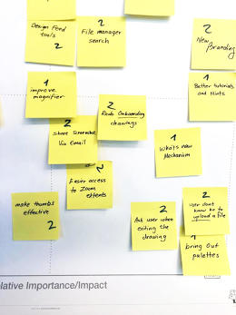


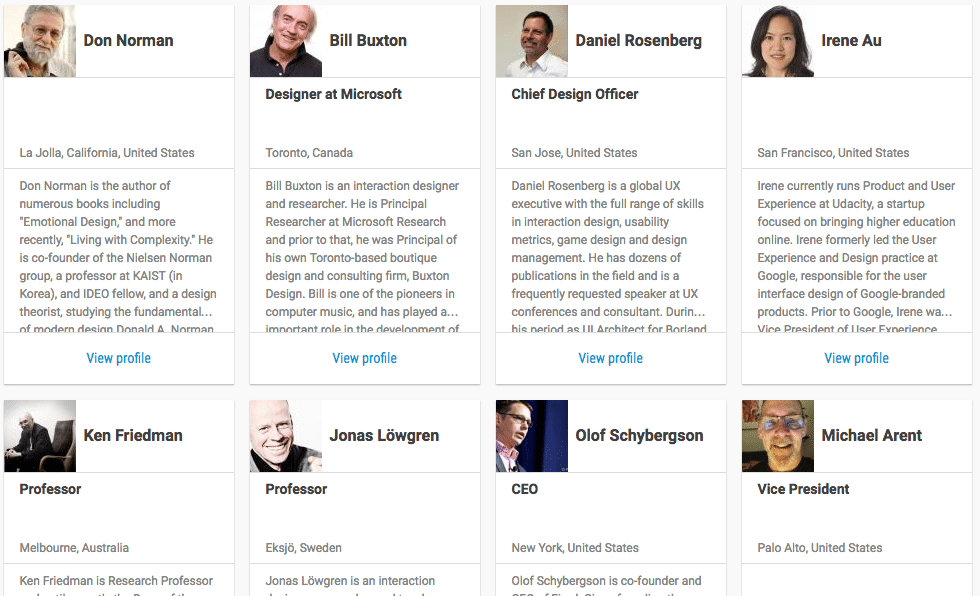
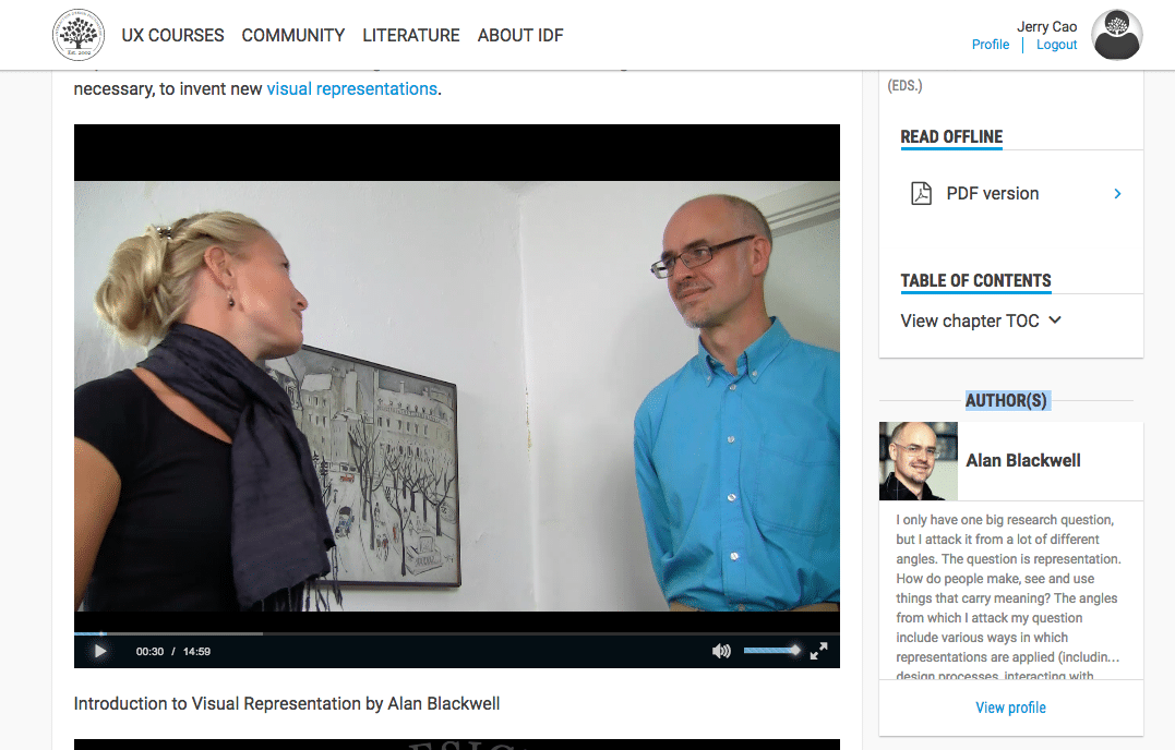
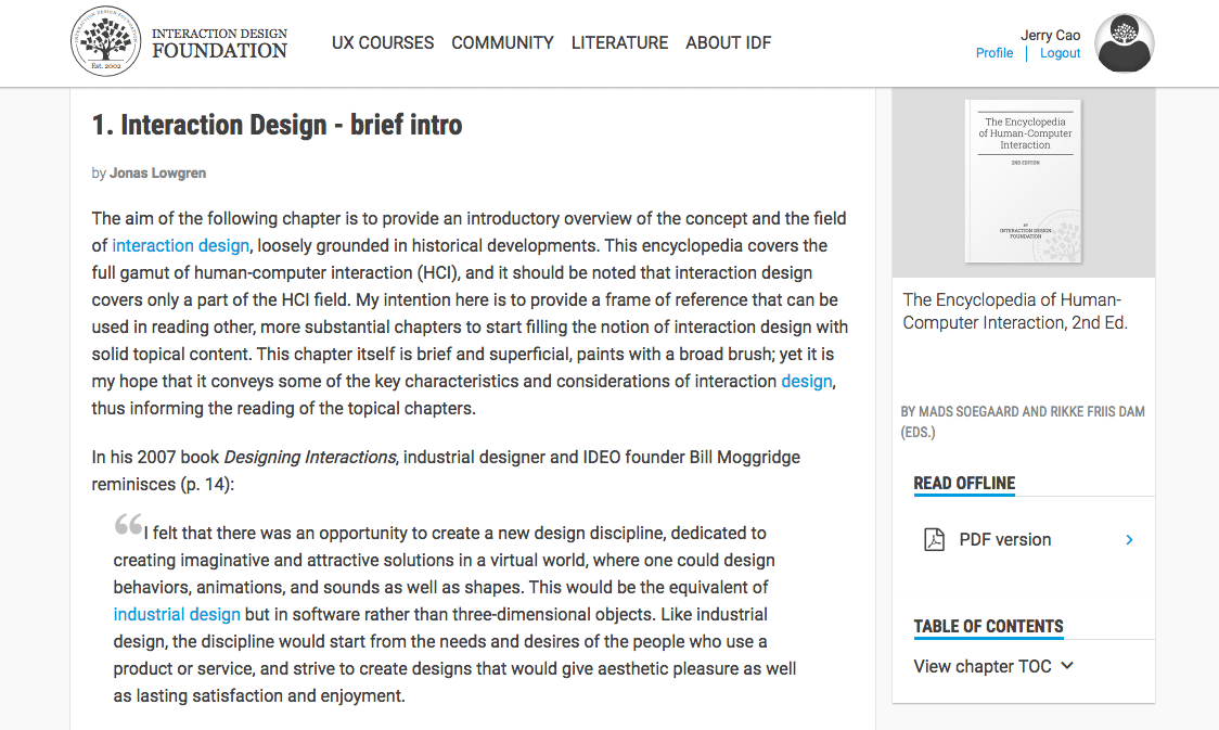
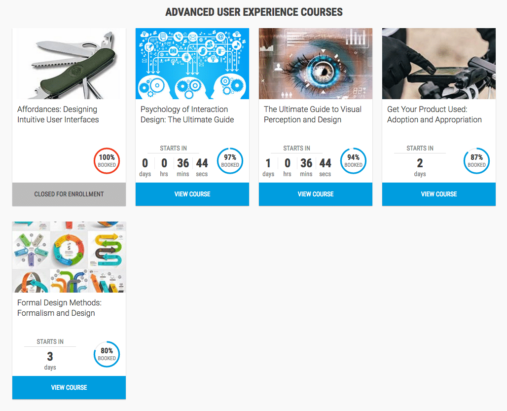
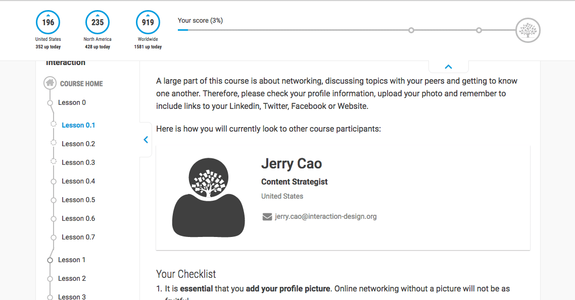
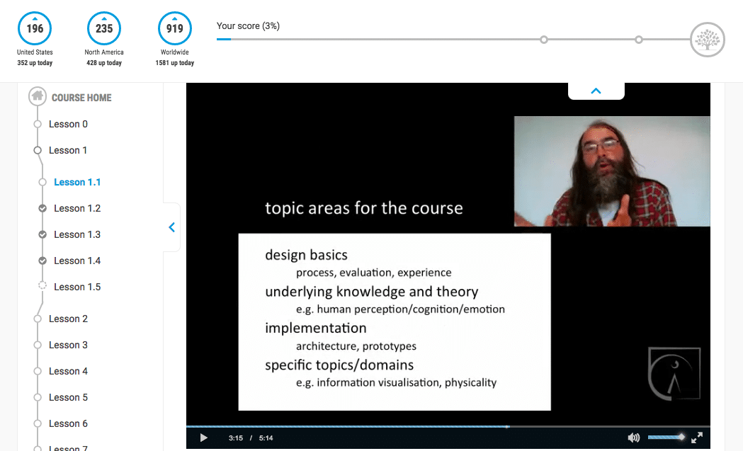
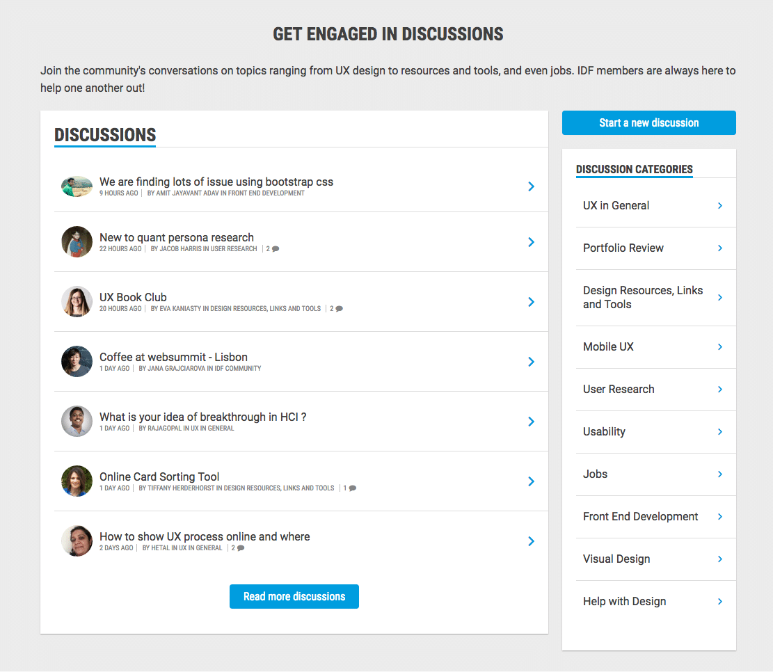
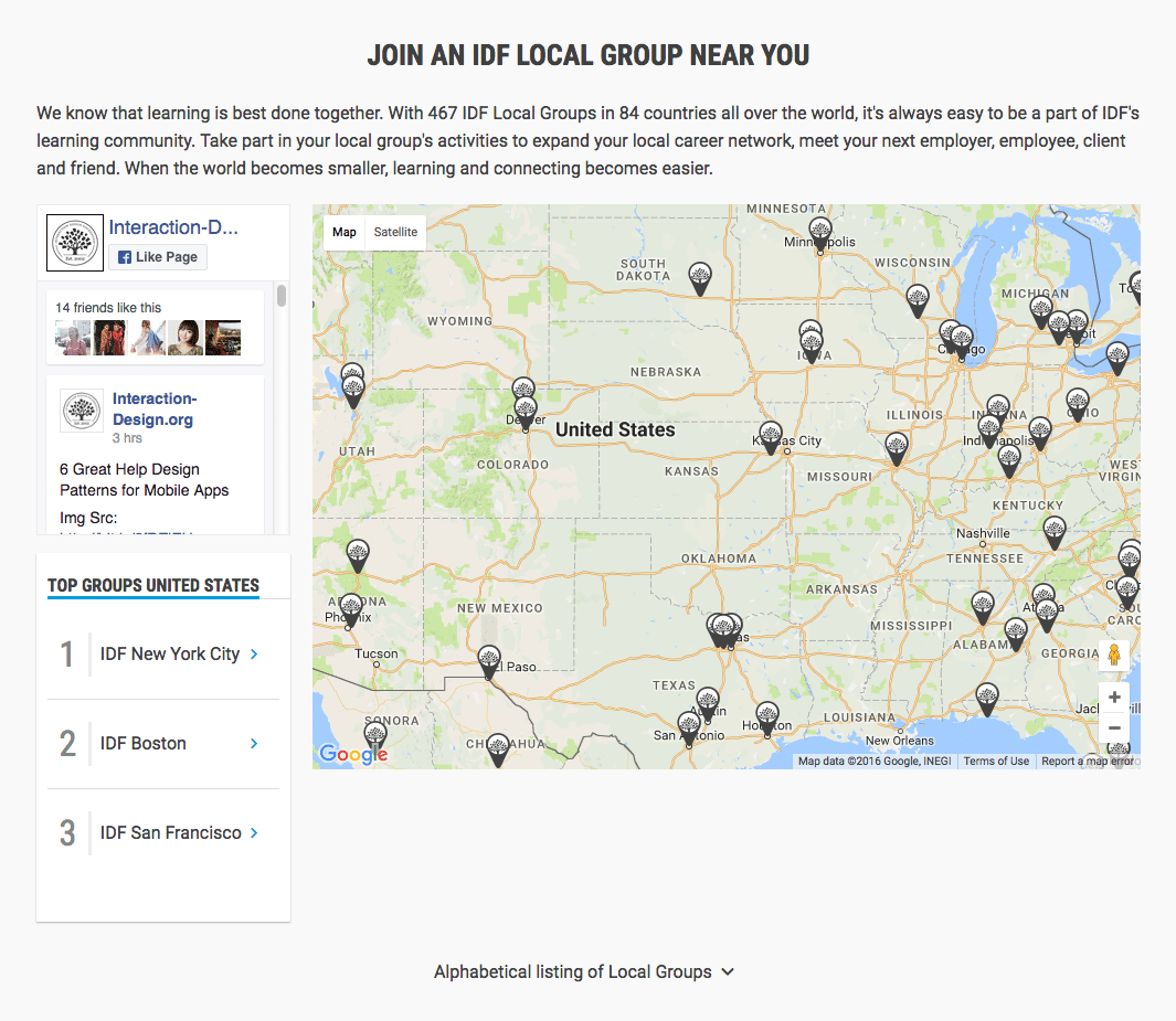
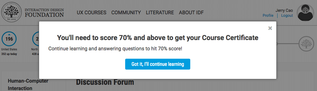


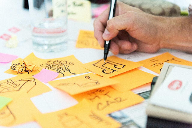


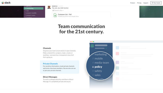


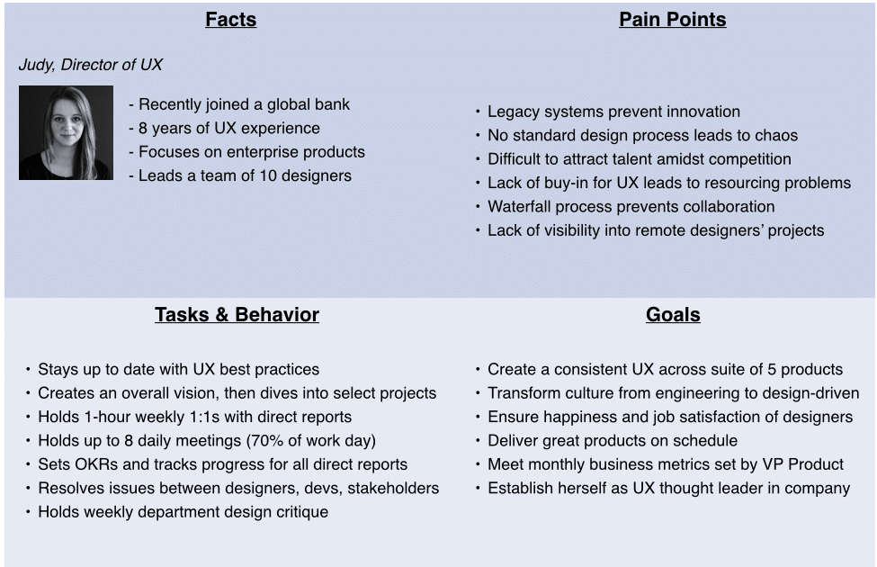
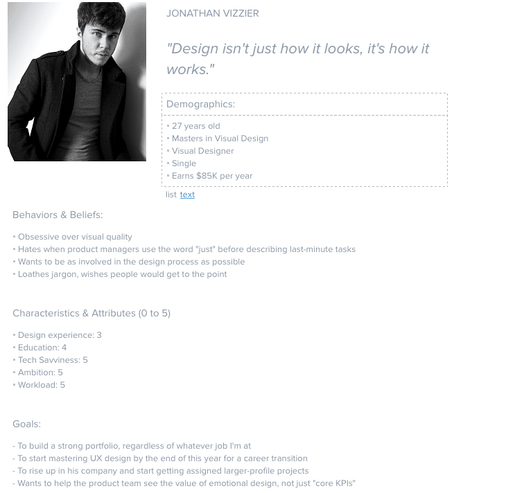
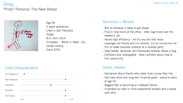


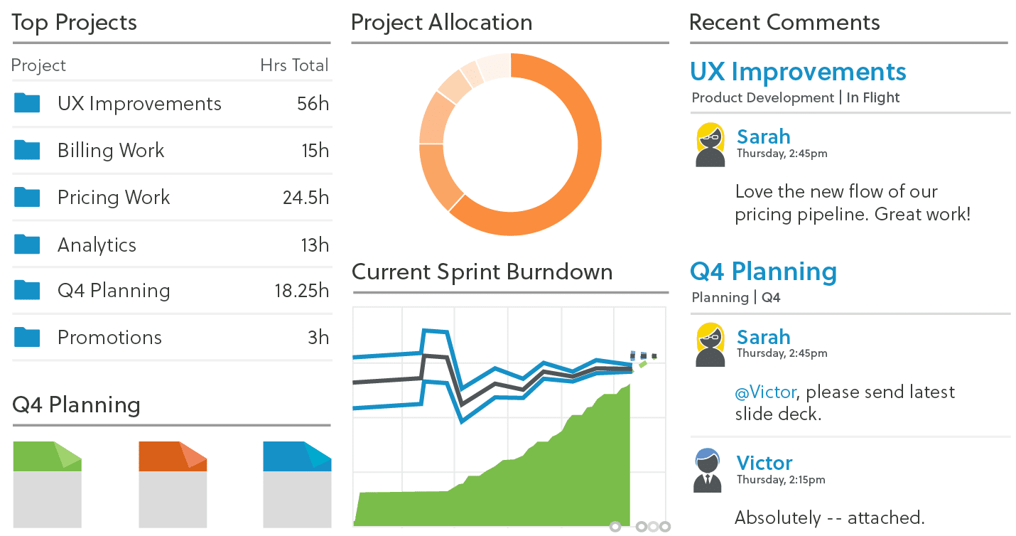
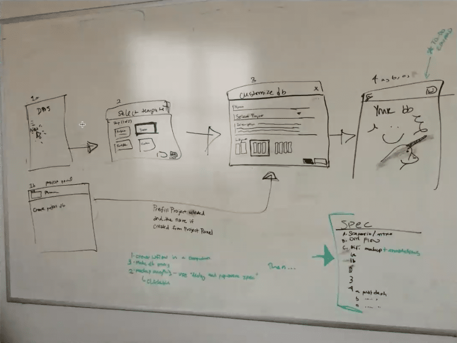
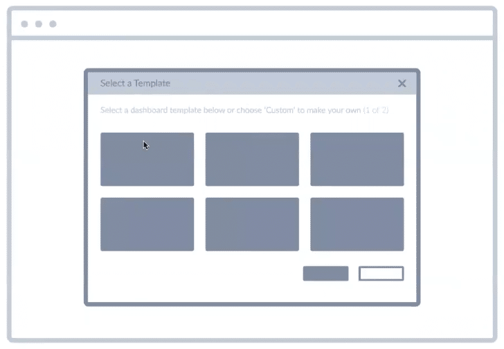
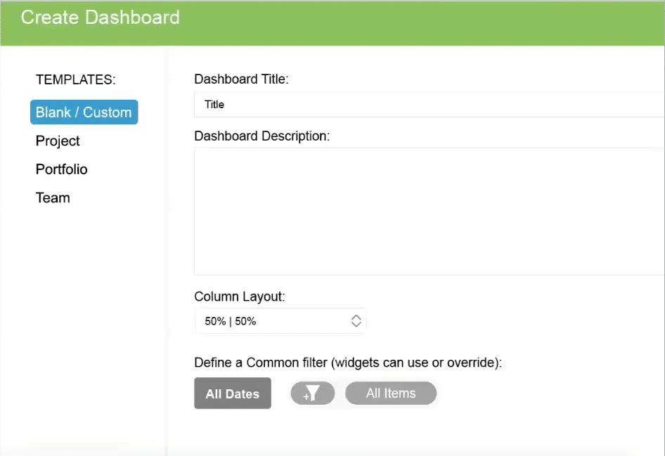
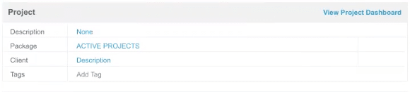


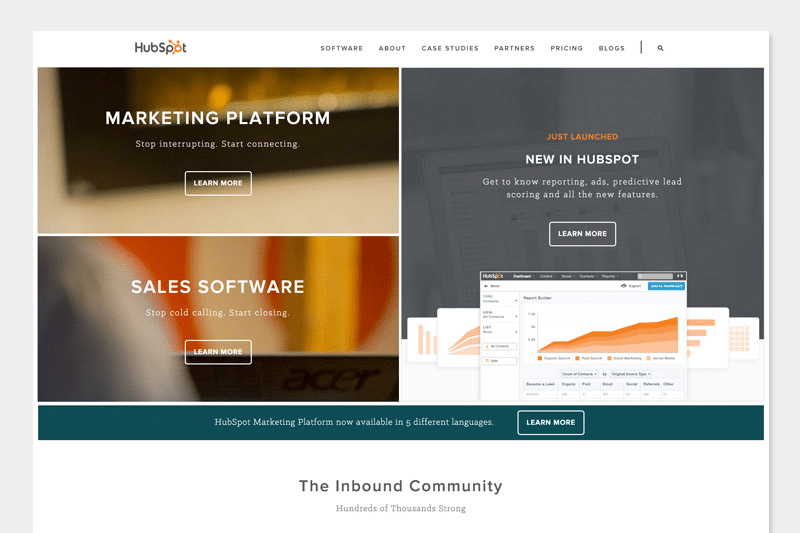
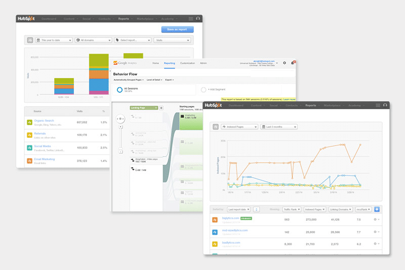
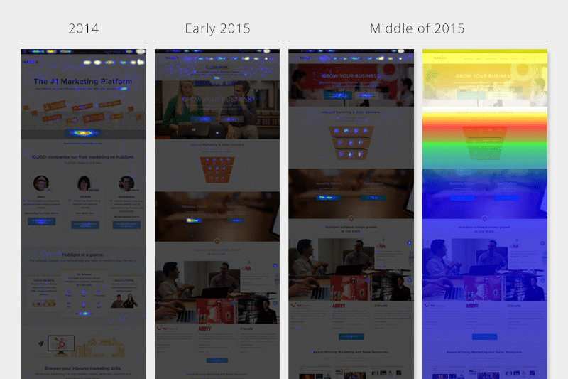
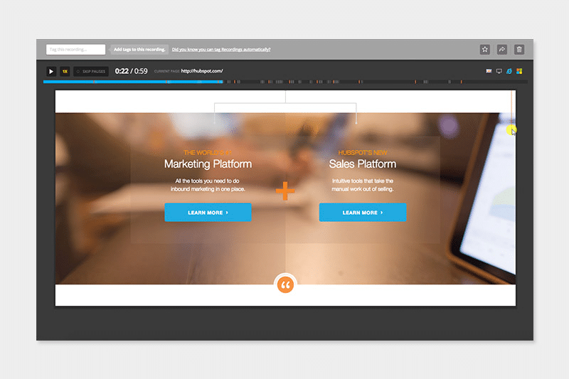
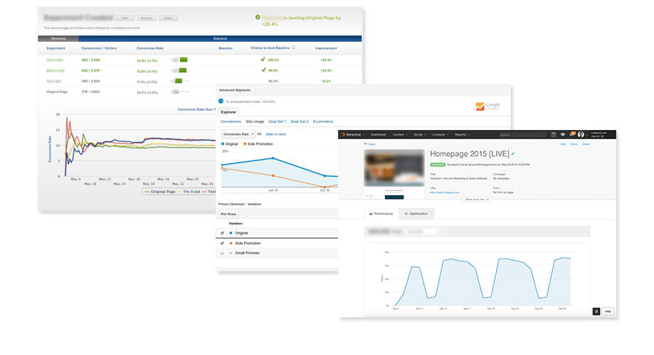
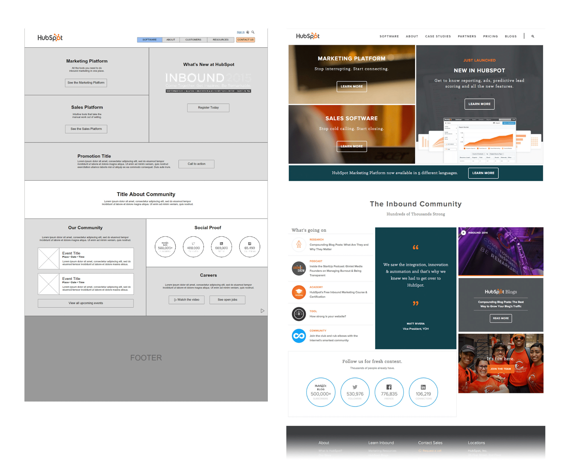
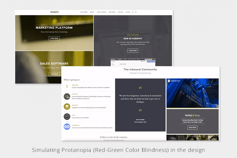
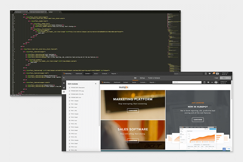
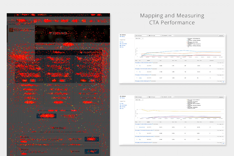

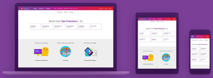

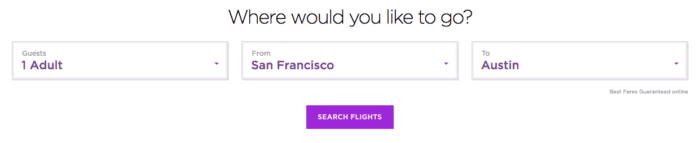
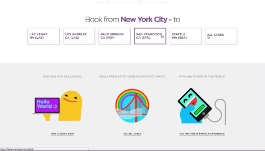
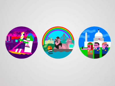
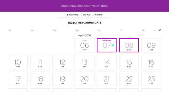
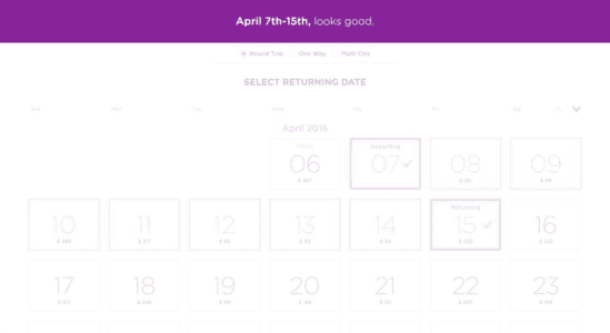
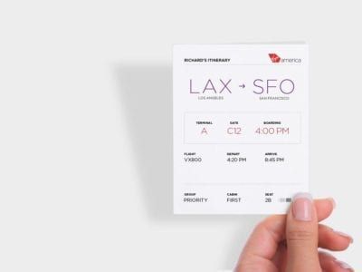
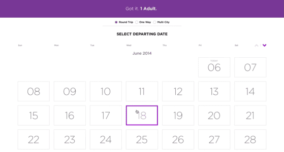

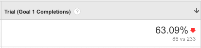
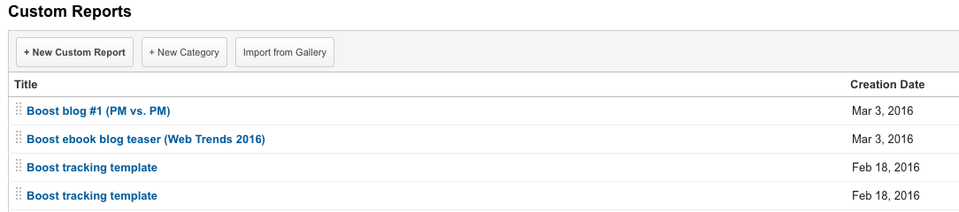

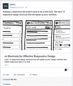


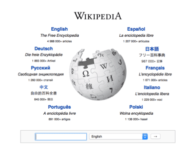


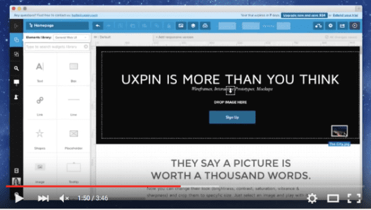
