Design systems advice from Dan Mall.
On Design Systems: Dan Mall of Superfriendly

Design systems advice from Dan Mall.

Get insights from Intuit’s Head of Design Systems.

Insights from a designer for Salesforce Lightning.
UXPin is a product design platform used by the best designers on the planet. Let your team easily design, collaborate, and present from low-fidelity wireframes to fully-interactive prototypes.
Start your free trial
Design systems are products that enforce consistency while expediting development. But the default patterns don’t always cover every case — so they must adapt.

Like any project that involves UX, design systems must solve people’s pain points, like being able to find the right widget under deadline pressure. Here’s how it works.
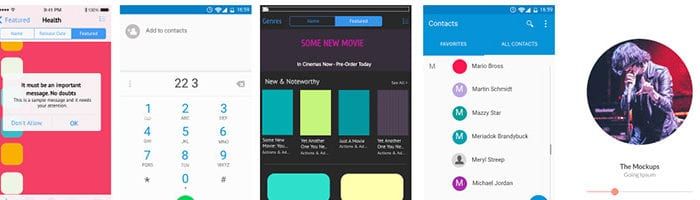
Especially in hi-fi prototypes where the nuance between “save” and “submit” is fuzzy at best, you should customize buttons to fit your meaning.

Documentation may sound like a chore, but it’s a vital part of creating a design system. And it doesn’t have to be a monotonous time-sink. Refer to these notes as you write yours.

Not all radio buttons are created equally. Some have custom looks and styles. Here’s one approach to creating your own radio buttons in UXPin.

Drop-down lists that appear on hover are a great way to hide options until they’re needed. A handy technique to make them work in UXPin: group ’em twice.

Design systems do more than provide visual and interactive style guides to which teams should adhere. They also make their contents easy to find. After all, UX doesn’t just apply to non-designers.

Although UXPin doesn’t export code, it has a customizable grid that’s analogous to those found in popular CSS frameworks. Here’s how it works.
UXPin has basic shapes like boxes, arrows, and circles — the basic elements. It also has whole sets you can use as starting points for your design systems.
Learn how to create effective style guides that result in solid UI design.