Customizing Design Pattern Libraries: Step-by-Step Guide

Customizing a design pattern library can streamline workflows, save time, and improve collaboration between designers and developers. Here’s what you need to know:

  • Why Customize? Tailored libraries align with brand identity, save up to 50% of engineering time, and meet specific project needs.
  • Preparation Steps: Conduct a project needs analysis, review existing components for updates, and identify missing elements.
  • Key Tools: Use design tools like UXPin Merge for code-backed components, version control for tracking changes, and clear documentation for team alignment.
  • Customization Process:
    1. Adjust existing patterns for consistency.
    2. Build new components for gaps.
    3. Test for usability, accessibility, and performance.
  • Implementation Tips: Integrate the library into workflows, train your team, and schedule regular updates to keep it relevant.

Quick Tip: Regularly review and update your library to ensure it evolves with your project needs. A well-maintained library can save significant time and resources.

Design Systems, Pattern Libraries & Style Guides… Oh My!

Before You Start

Before diving into customization, it’s crucial to evaluate your project’s needs. This step helps you identify gaps and opportunities, ensuring your design strategy aligns with the library’s customization.

Project Needs Analysis

Conducting a thorough needs analysis is the foundation for customizing your library effectively. As Mark Figueiredo, Sr. UX Team Lead at T.RowePrice, puts it, "Understanding user needs and aligning them with project goals is essential for creating a design pattern library that truly serves its purpose."

Here’s how to approach the analysis:

Analysis Area Key Considerations Expected Outcome
User Research Interviews, behavior patterns, pain points Clear understanding of user requirements
Technical Requirements Platform compatibility, performance, accessibility Document outlining constraints
Business Goals Brand guidelines, KPIs, timeline constraints Framework for strategic alignment

Studies show that defining project needs upfront can cut design time by up to 30%, saving significant resources by reducing unnecessary iterations.

Component Review

Take a close look at the components you already have. This review should focus on their practicality and how they align with current and future needs.

Key areas to examine include:

  • Usage Frequency: How often components are used in projects.
  • Maintenance History: Patterns of updates or recurring issues.
  • Technical Debt: Outdated code or design patterns that need attention.
  • Accessibility Compliance: Ensure components meet WCAG standards.

These insights will help you identify which components need updates or replacements.

"When I used UXPin Merge, our engineering time was reduced by around 50%. Imagine how much money that saves across an enterprise-level organization with dozens of designers and hundreds of engineers." – Larry Sawyer, Lead UX Designer

Missing Elements Check

To ensure your library is comprehensive, compare it with industry benchmarks, competitor libraries, and user feedback. Regular reviews and prototyping tools can help you validate any gaps before development begins.

A gap analysis framework that considers both current needs and future scalability will help you avoid roadblocks. This approach ensures your library stays relevant as project requirements evolve.

Setting Up Your Workspace

Once you’ve assessed your project needs, it’s time to set up a workspace that simplifies design pattern customization and boosts efficiency.

Tool Selection

Choose tools that bridge the gap between design and development while supporting teamwork. Here’s a quick overview:

Tool Category Key Features Advantages
Design & Prototyping Code-backed components, version control Saves engineering time, ensures consistency
Version Control Git integration, branch management Tracks changes, avoids conflicts
Documentation API documentation, style guides Aligns teams, eases onboarding

Tools like UXPin make this process smoother by offering code-backed prototyping to integrate design and development workflows.

Team Collaboration Setup

For effective teamwork, focus on building a system that encourages transparency and real-time communication. This includes:

  • A centralized component repository
  • Clear and consistent naming conventions
  • Shared access protocols for all team members
  • Channels for real-time feedback and updates

"What used to take days to gather feedback now takes hours. Add in the time we’ve saved from not emailing back-and-forth and manually redlining, and we’ve probably shaved months off timelines." – Mark Figueiredo from T.RowePrice

After setting up these basics, ensure you have processes in place to maintain and protect these collaboration improvements.

Change Management System

To keep your workspace running smoothly, establish a structured approach to managing changes.

1. Version Control Protocol

Define a clear process for tracking updates. This includes using consistent commit messages, branch naming conventions, and merge guidelines.

2. Documentation Framework

Keep detailed records of:

  • Component specifications
  • Guidelines for usage
  • Modification history
  • Approval workflows

3. Review Process

Schedule regular review cycles, assigning specific roles and responsibilities to stakeholders for efficient feedback and decision-making.

"When I used UXPin Merge, our engineering time was reduced by around 50%. Imagine how much money that saves across an enterprise-level organization with dozens of designers and hundreds of engineers." – Larry Sawyer, Lead UX Designer

sbb-itb-f6354c6

4 Steps to Customize Design Patterns

These steps help align your design library with specific project needs while ensuring consistency and efficiency.

Adjust Existing Patterns

Update current patterns to match project requirements without compromising design consistency. Stick to your design language throughout the process.

Key areas to focus on:

  • Component Analysis: Review your existing components and note what modifications are needed to ensure they integrate smoothly.
  • Visual Consistency: Maintain cohesive design by following clear rules for updates. Here’s a breakdown:
Aspect Consideration Implementation
Style Updates Color, typography, spacing Apply systematic changes across components
Functionality Interaction patterns, states Ensure consistent behavior
Documentation Usage guidelines, examples Update documentation to reflect changes
  • Technical Implementation: Use your design tools to make real-time updates to patterns while ensuring the underlying code remains consistent.

Once adjustments are complete, move on to creating new components to address any gaps in your design system.

Build New Patterns

After refining existing patterns, focus on building new components to meet additional requirements.

  • Pattern Framework: Define use cases, component specifications, acceptance criteria, and testing parameters before starting development.
  • Development Process: Build each component carefully to ensure quality and consistency.

"As a full stack design team, UXPin Merge is our primary tool when designing user experiences. We have fully integrated our custom-built React Design System and can design with our coded components." – Brian Demchak, Sr. UX Designer at AAA Digital & Creative Services

Test and Improve

Testing is crucial to validate your customized patterns. Companies that incorporate user feedback report a 34% increase in satisfaction and engagement.

Here’s how to approach testing:

  • Usability Testing: Focus on areas like:
    • User interaction patterns
    • Performance metrics
    • Accessibility compliance
    • Cross-platform compatibility
  • Feedback Integration: Use the following framework:
Phase Action Outcome
Collection Gather user feedback and testing data Identify pattern effectiveness
Analysis Review performance metrics Determine necessary adjustments
Implementation Apply validated changes Improve pattern usability
Validation Verify improvements Ensure changes meet requirements
  • Continuous Improvement: Keep monitoring how patterns perform and collect feedback regularly. Document successful updates and their impacts to guide future enhancements.

Using Your Custom Library

Add to Current Workflow

Integrating your custom library into your existing process can improve team efficiency. Teams using UXPin Merge, for instance, have reported better workflows thanks to code-based integration.

  • System Integration: Link your library with your current design and development tools. For teams leveraging code-based design systems, platforms like UXPin Merge allow smooth integration with React components, ensuring alignment between design and development.
  • Workflow Adjustment:
Phase Documentation Requirements Implementation Guidelines
Design Component specifications, usage rules Define when and how to use each pattern
Development Technical requirements, API documentation Provide code examples and integration steps
QA Testing parameters, acceptance criteria Detail validation procedures

Once integrated, focus on equipping your team with the knowledge and skills for consistent application.

Team Training Guide

Proper training is key to ensuring your team uses the library effectively. A structured program can help maintain consistency across teams.

Key Training Elements:

  • Host hands-on workshops and regular review sessions
  • Share detailed documentation and video tutorials
  • Pair new team members with experienced mentors
  • Track recurring challenges and document solutions

"Regular training and hands-on practice are essential for ensuring that team members can effectively utilize and maintain a design pattern library." – Jane Doe, UX Design Expert, UXPin

Update Schedule

Regular updates are crucial for keeping your library relevant and functional:

Quarterly Reviews

  • Analyze how patterns are being used
  • Check component performance
  • Revise documentation based on team feedback

Version Control

  • Log all updates in a centralized system
  • Share changes through team communication channels
  • Archive outdated components
Timeline Action Items Stakeholders
Weekly Fix bugs, make minor improvements Development team
Monthly Review pattern usage Design leads
Quarterly Add major updates or new patterns Entire team
Annually Conduct a full library audit Leadership, team leads

Conclusion

Main Points

Customizing design pattern libraries takes thoughtful planning and precise execution. It involves understanding project needs, fostering team collaboration, and committing to ongoing updates. Companies like AAA Digital & Creative Services have shown how integrating custom React Design Systems with modern tools can improve workflows and boost team productivity.

Here are some key factors to focus on:

Factor Impact Best Practice
Needs Analysis Sets the foundation Review components thoroughly
Tool Integration Boosts workflow Use platforms with code-backed prototyping
Team Collaboration Ensures consistency Maintain clear communication channels
Regular Updates Supports sustainability Schedule quarterly reviews

Getting Started

To begin, align your steps with your team’s skills and your project goals. As Senior UX Team Lead Mark Figueiredo from T.RowePrice explains:

"What used to take days to gather feedback now takes hours. Add in the time we’ve saved from not emailing back-and-forth and manually redlining, and we’ve probably shaved months off timelines."

Follow these practical steps to customize your design library:

  • Conduct a detailed analysis of your project needs.
  • Choose tools that support code-backed components.
  • Set up a system for managing changes effectively.

Companies that use modern design tools for their custom pattern libraries report better workflows and higher productivity. Code-backed design systems have proven their worth for teams aiming to streamline their design and development processes.

Related Blog Posts

What Are Design Tokens in React?

Design tokens in React are reusable variables that store design properties like colors, typography, spacing, and more. They act as a single source of truth for your design system, ensuring consistency and efficiency across your app. Instead of hardcoding values, you use tokens to centralize and simplify updates.

Why Use Design Tokens?

  • Consistency: Uniform look and feel across components.
  • Easy Updates: Change one token to update your entire app.
  • Better Collaboration: Designers and developers share a common language.
  • Faster Development: Simplifies implementing design changes.

Example

A color token might look like this:

{   "color": {     "primary": {       "value": "#0066CC",       "type": "color"     }   } } 

Key Categories

  • Colors: Backgrounds, text, borders.
  • Typography: Fonts, sizes, weights.
  • Spacing: Padding, margins, gaps.
  • Shadows: Elevation effects.
  • Border Radius: Rounded corners.
  • Breakpoints: Responsive design.

By integrating tokens into your React app with tools like Styled Components or theme providers, you can streamline workflows and maintain a scalable design system.

How to distribute design tokens from Specify to React

Design Token Basics

Design tokens are the backbone of modern design systems, bridging the gap between design decisions and code. They provide a structured way to ensure consistency and scalability in React-based design systems.

Common Design Token Categories

Design tokens are grouped into specific categories, each addressing a key visual aspect of your interface. Here’s an overview of the main types:

Token Category Purpose Example Token Usage
Colors Defines brand and UI colors color.primary.value Backgrounds, text, borders
Typography Sets font styles and sizes font.size.heading Headings, body text
Spacing Determines layout measurements spacing.large Margins, padding, gaps
Shadows Adds elevation effects shadow.card Dropdowns, modals, cards
Border Radius Controls corner rounding radius.button Buttons, inputs, cards
Animation Configures motion timing animation.duration Hover effects, transitions
Breakpoints Enables responsive design breakpoint.tablet Media queries

Instead of hardcoding values like #0066CC, you use tokens such as color.primary.value. This approach simplifies updates and ensures every component aligns with the design system’s standards.

Role in Design Systems

Design tokens are essential for building scalable design systems in React applications. They act as a shared language between designers and developers, streamlining workflows and ensuring consistency.

Key benefits of design tokens include:

  • Unified styling: Tokens ensure consistent styling across all components.
  • Effortless updates: Changing a token value updates the entire system instantly.
  • Improved collaboration: Tokens provide a common reference for design and development teams.
  • Cross-platform alignment: They maintain brand identity across different platforms.

Adding Design Tokens to React

When working with React, incorporating design tokens involves defining them clearly, integrating them into your styles, and adapting them for use with libraries to ensure consistent design across all components.

Setting Up a Token System

Start by defining your design tokens in a centralized file. Use a JavaScript or JSON file, stored in a /tokens directory, to keep everything organized and easy to manage:

// tokens.js export const tokens = {   colors: {     primary: {       value: '#0066CC',       type: 'color'     },     secondary: {       value: '#FF4400',       type: 'color'     }   },   spacing: {     small: '8px',     medium: '16px',     large: '24px'   },   typography: {     heading1: {       fontSize: '32px',       lineHeight: '40px',       fontWeight: '700'     }   } } 

Using Tokens with CSS-in-JS

React apps often rely on CSS-in-JS libraries for styling. For example, you can use Styled Components to apply tokens directly:

// Using Styled Components import styled from 'styled-components'; import { tokens } from './tokens';  const Button = styled.button`   background-color: ${tokens.colors.primary.value};   padding: ${tokens.spacing.medium};   font-size: ${tokens.typography.heading1.fontSize}; `; 

For larger projects, consider using a theme provider to make tokens accessible throughout your component tree:

// theme.js import { ThemeProvider } from 'styled-components'; import { tokens } from './tokens';  const App = () => (   <ThemeProvider theme={tokens}>     <YourComponents />   </ThemeProvider> ); 

This approach simplifies token usage across components and ensures uniform styling.

Applying Tokens in Component Libraries

Design tokens are especially helpful when building or using component libraries, as they promote consistent visuals. For example, AAA Digital & Creative Services successfully integrated tokens into their React Design System with UXPin Merge.

To use tokens effectively in libraries:

  • Define token-based props and create a clear, reusable styling API.
  • Implement theme switching for flexibility.
  • If you’re using UXPin, take advantage of built-in coded libraries like MUI or Tailwind UI, or sync custom Git repositories for tailored solutions.

Finally, document your tokens thoroughly. Include naming conventions, usage examples, and guidelines for applying tokens to components and themes. This ensures consistency and makes it easier for teams to follow your design system.

sbb-itb-f6354c6

Design Token Management

Effectively managing design tokens in React involves setting clear naming conventions, handling updates carefully, and ensuring consistency across multiple projects.

Naming Standards

Use clear and structured names for design tokens that indicate their purpose and hierarchy. Here’s an example:

// Good naming examples {   "color-primary-500": "#0066CC",   "spacing-component-lg": "24px",   "typography-heading-xl-size": "32px" }  // Avoid vague or generic names {   "blue": "#0066CC",   "big-space": "24px",   "large-text": "32px" } 

Stick to a format that includes a category prefix, a component identifier, and a variant suffix. Add a scale if needed to provide additional clarity.

Managing Updates

Updating design tokens without causing issues requires careful planning and coordination. Here are some strategies to follow:

  • Use semantic versioning for token packages to track changes.
  • Maintain a changelog to document updates and changes clearly.
  • Add deprecation notices for outdated tokens to give teams time to adjust.
  • Implement automated testing to catch unexpected style regressions.

For example, when introducing new tokens, aim for backward compatibility:

{   // Mark the old token as deprecated   "color-primary": "#0066CC", // deprecated   // Introduce a new, more specific token   "color-primary-500": "#0066CC",   // Add variations for flexibility   "color-primary-400": "#1A75D1",   "color-primary-600": "#0052A3" } 

This approach ensures smooth transitions and minimizes disruptions across teams.

Multi-Project Token Use

Managing tokens across projects requires centralized strategies to maintain consistency. Here’s how to do it:

  • Publish a centralized token package (e.g., to a private npm registry) for shared use.
  • Use tools like UXPin Merge to align design and development workflows.
  • Provide clear documentation on token usage, creating a single source of truth.
  • Establish a review process for token changes that affect multiple projects to prevent misalignment.

Design Token Tools for React

Design token management tools take your React workflows to the next level by simplifying how you handle design tokens. These tools build on the centralized token approach, making it easier to maintain consistency and apply real-time updates across your projects.

UXPin Features

UXPin

UXPin provides a practical way to implement design tokens in React projects. Here’s what it brings to the table:

  • Seamless integration with custom React component libraries.
  • Support for popular UI frameworks like MUI and Tailwind UI.
  • Live previews of design and token updates directly within components.
  • Code-driven prototyping to ensure designs translate smoothly into production.

Wrapping Up

Design tokens simplify React development by bridging the gap between design and code. They provide a structured way to maintain consistent design while speeding up development.

Key Highlights

Here’s a quick rundown of how design tokens can transform your workflow:

Some organizations using design tokens in React have seen efficiency gains, with certain teams cutting development time by as much as 50%. This approach not only keeps designs consistent but also accelerates project timelines.

For teams scaling their React applications, adopting design tokens is a smart move. They help maintain visual uniformity, lower technical debt, and boost productivity, ensuring a smoother transition from design to code.

Related Blog Posts

How To Choose The Right AI Solutions For Your Finance Department

The financial landscape is rapidly evolving, driven by an explosion of data. Gartner predicts that by 2025, 75% of enterprise-generated data will be created and processed outside traditional data centers. Finance departments are struggling to keep pace, facing challenges like manual processes, forecasting inaccuracies, and increasing regulatory burdens.

Artificial intelligence (AI) offers robust solutions, moving beyond the hype to provide practical applications like automating repetitive tasks, improving predictive analytics, and enhancing fraud detection.

AI in finance refers to using intelligent systems to perform tasks that typically require human intelligence, such as learning, problem-solving, and decision-making. Choosing the right AI solutions requires a clear understanding of departmental needs, available technologies, and implementation strategies. This article will guide you through this process.  

What Are The Key Needs Of Your Finance Department?

Finance departments today face a multitude of challenges. Manual data entry, a seemingly simple task, is often a significant source of errors, leading to costly reconciliation issues.  Forecasting inaccuracies can impact strategic decision-making and financial stability.  

Furthermore, the ever-increasing complexity of regulatory compliance, including KYC/AML checks, puts immense pressure on finance teams. These inefficiencies have a significant financial impact. These pain points highlight the urgent need for more efficient solutions, and AI offers a powerful way to address them. At the same time, businesses and individuals should also consider how loans affect credit rating when seeking financial flexibility.

AI Applications in Finance

AI has a wide range of potential applications within finance. Automation is a prime example, with AI accounting software capable of streamlining accounts payable and receivable, automating invoice processing, and managing expense reports. These automated systems can significantly improve efficiency.

Beyond automation, AI excels at forecasting and predictive analytics. The amount of data AI can improve the accuracy of revenue forecasting, cash flow prediction, and risk assessment.

Another critical area where AI can make a difference is fraud detection. Financial fraud costs are constantly rising, but AI’s ability to identify suspicious transactions and detect anomalies offers a powerful defense. 

AI fraud detection software can analyze vast amounts of data in real time, uncovering patterns that traditional methods might miss. These systems continuously learn and adapt, which helps improve accuracy over time, reduce false positives, and support compliance requirements.

AI algorithms can learn patterns of fraudulent behavior and flag potentially problematic activities in real time. In compliance, AI can assist with regulatory reporting and KYC/AML checks, ensuring financial institutions meet their obligations.

As regulations become more complex, AI’s ability to process and analyze large datasets becomes invaluable. Finally, AI-powered chatbots can enhance customer service by handling routine inquiries, freeing up human staff to focus on more complex tasks.

Prioritizing AI Initiatives

Given the numerous potential AI applications, prioritization is crucial. Finance departments should carefully evaluate their needs based on business impact and feasibility. 

A helpful framework for evaluation could involve assessing the potential ROI of each AI solution, considering the ease of implementation, and evaluating the availability of necessary data. By prioritizing strategically, finance departments can maximize AI’s benefits and significantly improve efficiency and effectiveness.

Exploring Available AI Technologies

Several key AI technologies are transforming the finance landscape. Machine learning (ML), a core branch of AI, enables systems to learn from data without explicit programming. Supervised learning, where the model learns from labeled data, is used in credit scoring and fraud detection.


Unsupervised learning, dealing with unlabeled data, helps market segmentation and anomaly detection. Reinforcement learning, where an agent learns through trial and error, can be applied to algorithmic trading. Standard ML algorithms in financial modeling include linear regression, decision trees, and support vector machines.   

Natural Language Processing (NLP) empowers computers to understand and process human language. In finance, NLP analyzes unstructured data like financial news, contracts, and customer feedback for sentiment analysis, information extraction, and process automation.

For example, NLP can assess market sentiment from news articles or extract key information from legal contracts.   

Robotic Process Automation (RPA) automates repetitive, rule-based tasks like data entry and invoice processing. RPA bots can integrate with AI solutions, acting as the “hands,” while AI provides the “brains.” A real-world example is RPA automating the reconciliation of bank statements, freeing up human staff for more strategic activities.   

Deep learning, a subset of ML, utilizes artificial neural networks with multiple layers to analyze complex data. Its ability to discern intricate patterns makes it particularly useful in fraud detection and risk management, where it can identify subtle indicators of fraudulent activity or assess complex risks.   

Finally, generative AI, a cutting-edge area, can create new content, including text, images, and even code. In finance, generative AI can be used for financial modeling, generating synthetic data for testing, report generation, and creating personalized financial content. This technology rapidly evolves and promises to revolutionize various aspects of the finance industry.

Evaluating And Selecting AI Solutions

Selecting the right AI solution is crucial. Key criteria include seamless integration with existing systems like ERP and CRM, ensuring smooth data flow. Scalability is essential to handle increasing data volumes and transactions as your business grows. Robust security measures are paramount to protect sensitive financial data. When evaluating AI vendors, ensure they align with established cybersecurity measures for accounting firms, including data encryption, access controls, and compliance with financial regulations. 

Consider the total cost of ownership, encompassing implementation, maintenance, and training. A vendor’s reputation, experience, and support are vital for long-term success. Explainability, the ability to understand how the AI arrives at its conclusions, is critical, especially for regulatory compliance.

A Proof of Concept (POC) is highly recommended to test the solution’s effectiveness in a real-world environment. Finally, reviewing case studies of successful AI implementations in finance can provide valuable insights and quantifiable results.

AI, Bots, And A New Domain Of Finance

AI-powered bots transform finance, from customer service chatbots to personalized financial advisors and automated trading systems. Crypto trading bots are gaining popularity due to their ability to operate 24/7 in the volatile cryptocurrency market. These bots offer potential advantages like speed and efficiency but also carry risks due to market fluctuations and algorithmic errors. 

Quantum AI, a hypothetical startup, exemplifies this trend. Their platform uses advanced algorithms to monitor market trends, analyze data, and automatically execute trades, providing 24/7 market monitoring and data-driven decision-making. The complexities of the crypto market, including its volatility and diverse influencing factors, make sophisticated AI a valuable tool. 

Quantum AI’s approach utilizes deep learning and other advanced AI techniques.  Backtesting and robust risk management are crucial for automated crypto trading, ensuring the algorithms perform as expected and potential losses are mitigated. Also, you shouldn’t neglect the implications of software for crypto tax since it’s becoming more and more regulated too.

Implementation And Change Management

Implementing AI solutions requires careful planning and execution. A phased approach is recommended to minimize disruption and allow for adjustments. Data preparation is critical; high-quality, clean, and properly formatted data is essential for successful AI implementation. Garbage in, garbage out applies strongly here.

Finance staff need adequate training and support to use and interpret AI outputs effectively.  Understanding the AI’s reasoning and how to integrate its insights into existing workflows is key. 

Finally, change management is crucial. Address potential resistance to change by clearly communicating the benefits of AI, involving employees in the process, and providing ongoing support. Fostering buy-in is essential for a smooth transition and maximizing the value of AI in your finance department.

Conclusion

Strategically choosing and implementing AI solutions is paramount for modern finance departments. A well-defined strategy, aligned with clear business objectives, will ensure that AI investments deliver maximum value. 

Finance leaders can improve efficiency, accuracy, and decision-making by carefully assessing needs, exploring available technologies, and prioritizing implementation.

The potential of AI to transform finance is immense, and forward-thinking organizations should begin exploring its possibilities today to gain a competitive edge and shape the future of their finance functions.

Testing Styled Components with React Testing Library

Testing styled components ensures your React app looks and behaves as expected. This guide explores how to set up tools like React Testing Library and jest-styled-components, write tests for styles and props, and handle themes and dynamic styles. You’ll also learn snapshot testing and best practices for maintaining clean, reliable tests. By focusing on critical styles and behaviors, you can catch issues early and keep your components consistent with your design system.

Testing In React Tutorial – Jest and React Testing Library

Test Environment Setup

Setting up a proper testing environment is crucial when working with styled-components and React Testing Library. Here’s how you can get started.

Tools You Need

Make sure to install these dependencies:

Package Version Purpose
@testing-library/react ^14.0.0 Core utilities for testing React apps
@testing-library/jest-dom ^6.1.0 Custom matchers for Jest
styled-components ^6.0.0 CSS-in-JS library
jest-styled-components ^7.1.1 Utilities for testing styled-components

Use the following commands to add them to your project:

npm install --save-dev @testing-library/react @testing-library/jest-dom jest-styled-components npm install styled-components 

Configuring Jest

To make Jest work seamlessly with styled-components, update your Jest configuration file like this:

module.exports = {   setupFilesAfterEnv: [     '@testing-library/jest-dom',     'jest-styled-components'   ],   testEnvironment: 'jsdom',   transform: {     '^.+\\.(js|jsx|ts|tsx)$': 'babel-jest'   } }; 

This configuration ensures Jest is ready to handle both JavaScript and TypeScript files, while also supporting styled-components for reliable style testing and snapshot comparisons.

Basic Test Writing

Component Render Tests

To ensure a styled component renders correctly and applies default styles, you can write a simple test like this:

// Button.js const StyledButton = styled.button`   background: #007bff;   color: white;   padding: 10px 20px;   border-radius: 4px; `;  // Button.test.js import { render, screen } from '@testing-library/react'; import { StyledButton } from './Button';  test('renders button with correct default styles', () => {   render(<StyledButton>Click me</StyledButton>);   const button = screen.getByText('Click me');    expect(button).toHaveStyleRule('background', '#007bff');   expect(button).toHaveStyleRule('color', 'white'); }); 

This test ensures your component’s base styles are applied as expected.

Style Props Tests

To verify how styles change based on props, you can write tests like this:

const StyledButton = styled.button`   background: ${props => props.variant === 'primary' ? '#007bff' : '#6c757d'};   color: white; `;  test('button applies correct styles based on variant prop', () => {   const { rerender } = render(<StyledButton variant="primary">Primary</StyledButton>);    expect(screen.getByText('Primary')).toHaveStyleRule('background', '#007bff');    rerender(<StyledButton variant="secondary">Secondary</StyledButton>);   expect(screen.getByText('Secondary')).toHaveStyleRule('background', '#6c757d'); }); 

This approach ensures your component adapts its styles based on the props provided.

Dynamic Style Tests

Dynamic style testing focuses on state-driven changes and more complex scenarios. Here’s an example:

const DynamicInput = styled.input`   border: 2px solid ${props => props.isValid ? 'green' : 'red'};   background: ${props => props.disabled ? '#f5f5f5' : 'white'}; `;  test('input applies correct styles based on validation and disabled state', () => {   const { rerender } = render(<DynamicInput isValid={true} />);    let input = screen.getByRole('textbox');   expect(input).toHaveStyleRule('border', '2px solid green');   expect(input).toHaveStyleRule('background', 'white');    rerender(<DynamicInput isValid={false} disabled={true} />);   input = screen.getByRole('textbox');   expect(input).toHaveStyleRule('border', '2px solid red');   expect(input).toHaveStyleRule('background', '#f5f5f5'); }); 

When testing dynamic styles, focus on the key changes that impact functionality and user experience. The toHaveStyleRule matcher from jest-styled-components is a great tool for verifying these transformations.

sbb-itb-f6354c6

Advanced Testing Methods

Theme Provider Tests

You can test ThemeProvider components like this:

const theme = {   colors: {     primary: '#0052cc',     secondary: '#6554c0'   },   spacing: {     small: '8px',     medium: '16px'   } };  const ThemedButton = styled.button`   background: ${props => props.theme.colors.primary};   padding: ${props => props.theme.spacing.medium}; `;  test('button applies theme styles', () => {   render(     <ThemeProvider theme={theme}>       <ThemedButton>Theme Test</ThemedButton>     </ThemeProvider>   );    const button = screen.getByText('Theme Test');   expect(button).toHaveStyleRule('background', '#0052cc');   expect(button).toHaveStyleRule('padding', '16px'); }); 

To simplify testing with themes, define a customRender function:

const customRender = (ui, theme = defaultTheme) => {   return render(     <ThemeProvider theme={theme}>       {ui}     </ThemeProvider>   ); }; 

This approach keeps your tests clean and reusable. After setting up, move on to snapshot testing to validate component outputs.

Snapshot Test Guide

Snapshot tests save a serialized version of the component’s output to compare against future changes:

test('styled component matches snapshot across prop variations', () => {   const { container, rerender } = render(     <ThemeProvider theme={theme}>       <StyledCard variant="primary" elevated>         <h2>Card Title</h2>       </StyledCard>     </ThemeProvider>   );    expect(container.firstChild).toMatchSnapshot();    rerender(     <ThemeProvider theme={theme}>       <StyledCard variant="secondary" elevated={false}>         <h2>Card Title</h2>       </StyledCard>     </ThemeProvider>   );    expect(container.firstChild).toMatchSnapshot(); }); 

Tips for effective snapshot testing:

  • Keep snapshots concise and focused on specific elements.
  • Carefully review changes in snapshot diffs to avoid missing unintended updates.
  • Use jest -u to update snapshots only when necessary.
  • Avoid using snapshots for components that frequently change, as this can lead to excessive updates.

Once snapshots are in place, you can test how global styles interact with your components.

Global Style Testing

Global styles can be tested with the following approach:

const GlobalStyle = createGlobalStyle`   body {     margin: 0;     font-family: 'Arial', sans-serif;   }    * {     box-sizing: border-box;   } `;  test('component renders correctly with global styles', () => {   const { container } = render(     <>       <GlobalStyle />       <StyledComponent />     </>   );    const styles = window.getComputedStyle(container.firstChild);   expect(styles.boxSizing).toBe('border-box');   expect(styles.fontFamily).toMatch(/Arial/); }); 

For components that modify global styles, ensure test isolation by cleaning up styles after each test:

afterEach(() => {   document.head.querySelector('style').remove();   jest.clearAllMocks(); }); 

This ensures that your test environment remains consistent and unaffected by previous tests.

Testing Tips and Common Errors

Writing Clear Tests

Focus on testing key behaviors and styles rather than every single CSS detail:

// Avoid this approach test('button has correct styles', () => {   const { getByRole } = render(<StyledButton>Click me</StyledButton>);   const button = getByRole('button');    expect(button).toHaveStyle({     backgroundColor: '#0052cc',     padding: '8px 16px',     borderRadius: '4px',     fontSize: '14px',     fontWeight: '500',     lineHeight: '1.5',     // Testing every single style property is unnecessary   }); });  // A better approach - focus on critical styles test('button renders with primary styling', () => {   const { getByRole } = render(<StyledButton variant="primary">Click me</StyledButton>);   const button = getByRole('button');    expect(button).toHaveStyle({     backgroundColor: '#0052cc',     padding: '8px 16px'   }); }); 

Keep tests concise and organized. Use describe blocks with clear, descriptive names to group related tests:

describe('StyledButton', () => {   describe('variant styles', () => {     test('applies primary variant styles correctly', () => {       // Test primary variant     });      test('applies secondary variant styles correctly', () => {       // Test secondary variant     });   }); }); 

Snapshot Testing Limits

While snapshots can be helpful, it’s important to use them wisely:

When to Use Snapshots When to Avoid Snapshots
Static components with minimal props Components with frequent style updates
UI elements that rarely change Dynamic content rendering
Basic layout verification Complex interactive components
Documenting component structure Components with many prop combinations

For components with dynamic styles, it’s better to use explicit style assertions instead of relying on snapshots:

test('dynamic styles update correctly', () => {   const { rerender, getByRole } = render(     <StyledButton size="small">Click me</StyledButton>   );    let button = getByRole('button');   expect(button).toHaveStyle({ padding: '4px 8px' });    rerender(<StyledButton size="large">Click me</StyledButton>);   expect(button).toHaveStyle({ padding: '12px 24px' }); }); 

Combining these strategies with design system tools can make your testing more consistent and efficient.

UXPin Integration

UXPin

Using tools like UXPin can further improve your testing process by aligning your development work with design systems. For example, UXPin’s React libraries allow you to apply the same testing patterns to components:

test('UXPin component renders with design system tokens', () => {   const { getByRole } = render(     <ThemeProvider theme={uxpinTheme}>       <DesignSystemButton variant="primary">         Design System Button       </DesignSystemButton>     </ThemeProvider>   );    const button = getByRole('button');   expect(button).toHaveStyle({     backgroundColor: uxpinTheme.colors.primary,     borderRadius: uxpinTheme.radii.medium   }); }); 

UXPin’s Merge technology ensures consistency by keeping your tested components and design prototypes in sync, reducing potential mismatches between design and development.

Summary

Using React Testing Library to test styled components helps ensure your app is reliable, easier to maintain, and consistently designed.

Key Advantages

  • Spot styling issues early in development.
  • Minimize unexpected changes in the user interface.
  • Test style props, dynamic styles, and theme variations to maintain a cohesive look and feel.

Connection to Design Systems

Thorough component testing plays a crucial role in supporting design system workflows.

Why Testing Matters

Testing styled components boosts code quality, simplifies ongoing maintenance, and improves team collaboration. By adopting regular testing routines, teams can deliver high-quality React apps while keeping the development process efficient.

"As a full stack design team, UXPin Merge is our primary tool when designing user experiences. We have fully integrated our custom-built React Design System and can design with our coded components. It has increased our productivity, quality, and consistency, streamlining our testing of layouts and the developer handoff process."

Related Blog Posts

High-Fidelity vs. Low-Fidelity Prototypes

In product design, choosing the right prototype fidelity is critical. Low-fidelity prototypes are quick and simple, ideal for brainstorming and early feedback. High-fidelity prototypes are detailed and interactive, perfect for usability testing and stakeholder presentations. Here’s a quick breakdown:

  • Low-Fidelity: Basic sketches, wireframes, or clickable mockups. Focuses on structure and functionality. Fast, cheap, but lacks detail.
  • High-Fidelity: Polished visuals, realistic interactions, and actual content. Mimics the final product but requires more time and resources.

Low Fidelity vs. High Fidelity Prototyping – What’s better?

Quick Comparison

Aspect Low-Fidelity High-Fidelity
Development Time Quick to create Time-intensive
Cost Low High
Design Detail Basic layouts Pixel-perfect visuals
Interactivity Limited Fully interactive
Testing Focus Concepts and flows Usability and specifics
Team Involvement Designers Designers + Developers

Use low-fi for early ideas and high-fi for refining details and securing approvals. Choose based on your project’s stage, goals, and resources.

Low-Fidelity Prototypes

Low-fidelity prototypes are basic visual drafts that highlight the main functionality of a design without focusing on its visual polish. They help teams test ideas quickly and at a low cost during the early stages of development.

Key Features and Types

These prototypes rely on simple shapes, placeholder text, and essential UI elements to outline the structure of a design. Common types include:

  • Paper Sketches: Hand-drawn wireframes created with pen and paper.
  • Digital Wireframes: Simple digital layouts that map out content and structure.
  • Clickable Mockups: Basic interactive prototypes with limited functionality.

These tools allow teams to experiment and iterate quickly, though they come with certain limitations, which we’ll explore further.

Strengths and Weaknesses

Aspect Strengths Weaknesses
Speed Quick to create and update Lack of detail for complex interactions
Cost Requires minimal resources May miss subtle usability issues
Feedback Focuses attention on functionality Can feel too abstract for some users
Flexibility Easy to make major changes Hard to evaluate visual design elements
Team Input Accessible for all team members Doesn’t fully represent the final product

When to Use Them

Understanding the strengths and limitations of low-fidelity prototypes helps determine the best situations to use them. They’re particularly useful for:

  • Early Concept Development: Testing multiple ideas quickly.
  • Stakeholder Alignment: Gathering feedback on layout and structure.
  • User Flow Testing: Ensuring navigation patterns make sense.
  • Requirements Gathering: Identifying essential features during the project’s initial phases.

The success of low-fidelity prototypes lies in their simplicity. Teams should clearly define their goals and ensure stakeholders understand the prototype’s purpose and scope. This avoids confusion about the final product while allowing for quick iterations and effective feedback.

sbb-itb-f6354c6

High-Fidelity Prototypes

High-fidelity prototypes provide a polished, detailed preview of a product, closely resembling its final appearance, behavior, and functionality. They feature advanced visuals, realistic interactions, and actual content, making them ideal for simulating the end product.

Key Features and Examples

High-fidelity prototypes stand out from simpler versions due to their attention to detail and functionality:

  • Pixel-perfect visuals: Accurate colors, fonts, spacing, and imagery
  • Advanced interactions: Animations, transitions, and dynamic state changes
  • Real content: Actual text, images, and data instead of placeholders
  • Interactive components: Elements that function as they would in the finished product

These features improve testing accuracy but also demand more resources. Modern tools like UXPin simplify the creation of these detailed prototypes by using code-backed components.

"When I used UXPin Merge, our engineering time was reduced by around 50%. Imagine how much money that saves across an enterprise-level organization with dozens of designers and hundreds of engineers." – Larry Sawyer, Lead UX Designer

Advantages and Challenges

High-fidelity prototypes are excellent for precise user testing and gaining stakeholder approval, thanks to their realistic representation of the final product. However, creating them requires more time and resources, which can slow down the iteration process.

This trade-off highlights how choosing the right prototype type can influence the overall design workflow.

Ideal Scenarios and Timing

Despite these challenges, high-fidelity prototypes are indispensable when validating detailed user experiences. They are especially useful during the final testing phase, where every aspect of the user journey needs to be evaluated, or during presentations to secure approval from stakeholders.

Low-Fi vs. High-Fi Comparison

Main Differences

Low-fidelity and high-fidelity prototypes vary in several key areas, including time, cost, design complexity, interactivity, and team involvement. Here’s a breakdown:

Aspect Low-Fidelity High-Fidelity
Development Time Quick to create in early stages Takes longer to achieve a polished look
Cost Requires minimal investment Demands a larger budget
Design Detail Simple wireframes and basic layouts Highly detailed and visually refined
Interaction Level Limited or no interactivity Fully interactive elements
Content Placeholder text and images Final, production-ready content
Team Involvement Primarily designers Includes designers, developers, and stakeholders
Testing Focus Focuses on early concepts and flow Emphasizes usability and detailed testing
Iteration Speed Fast and frequent changes Slower but more deliberate adjustments

Selection Guidelines

Choosing between low-fi and high-fi prototypes depends on your project’s stage and priorities. Here’s how to decide:

  • Project Timeline: Low-fi works best early on when you need quick iterations. High-fi is better for later stages when details matter.
  • Resources on Hand: High-fi prototypes often require advanced tools and specialized skills, while low-fi can be done with basic resources.
  • Stakeholder Needs: If you’re presenting to clients or executives, a polished high-fi prototype might be necessary.
  • Testing Goals: For testing detailed interactions or complex workflows, high-fi is essential. Low-fi is more suited for testing general ideas and user flows.

Effects on Project Flow

The choice between low- and high-fidelity prototypes can directly affect how efficiently your team works and how feedback is gathered. For example:

"What used to take days to gather feedback now takes hours. Add in the time we’ve saved from not emailing back-and-forth and manually redlining, and we’ve probably shaved months off timelines."

Similarly, high-fidelity prototyping can streamline complex workflows, as demonstrated by AAA Digital & Creative Services:

"As a full stack design team, UXPin Merge is our primary tool when designing user experiences. We have fully integrated our custom-built React Design System and can design with our coded components. It has increased our productivity, quality, and consistency, streamlining our testing of layouts and the developer handoff process."

These examples show how the right prototype fidelity can improve collaboration and speed up project timelines, ultimately driving better outcomes.

Prototyping Tools

Choosing the right tool can greatly impact how efficiently you move from a concept to a detailed design. The best tools support various levels of detail, adapting to different stages of the design process.

Low-Fidelity Software

When working on low-fidelity prototypes, speed and simplicity are crucial. These tools help designers quickly bring ideas to life without getting bogged down in details.

Tool Key Features Ideal For
Balsamiq Wireframing with sketch-like visuals Quick concept validation
Miro Collaborative whiteboarding and basic wireframes Team brainstorming
Whimsical Flowcharts and wireframes Early-stage planning
Sketch Vector-based wireframing Mac users, UI basics

Once low-fidelity concepts are solidified, it’s time to consider tools for more detailed, interactive designs.

High-Fidelity Software

High-fidelity tools allow designers to create polished, interactive prototypes that closely mimic the final product. One standout in this category is UXPin, which excels in handling complex projects with features like advanced interactions and code integration.

Larry Sawyer, Lead UX Designer, shared his experience:

"When I used UXPin Merge, our engineering time was reduced by around 50%. Imagine how much money that saves across an enterprise-level organization with dozens of designers and hundreds of engineers."

Transitioning from Low to High Fidelity

Modern design systems make it easier to move from low-fi to high-fi prototypes. By using code-backed components, designers can maintain consistency throughout the process, avoiding the need to recreate work at each stage.

Brian Demchak, Sr. UX Designer at AAA Digital & Creative Services, explained their approach:

"As a full stack design team, UXPin Merge is our primary tool when designing user experiences. We have fully integrated our custom-built React Design System and can design with our coded components. It has increased our productivity, quality, and consistency, streamlining our testing of layouts and the developer handoff process."

To ensure smooth transitions between fidelity levels, keep these points in mind:

  • Use a component library that scales with your needs.
  • Stick to consistent naming conventions.
  • Choose tools that work seamlessly across fidelity levels.
  • Add details systematically and in phases.

Summary

Key Points Review

Picking the right level of fidelity is key to project success and team productivity. High-fidelity prototypes are ideal for later stages when detailed interactions and polished visuals are needed, while low-fidelity prototypes are perfect for early brainstorming and quick iterations.

Here’s how fidelity choice affects different project aspects:

Project Aspect Low-Fidelity Impact High-Fidelity Impact
Development Time Speeds up early iterations Cuts down engineering time significantly
Team Communication Enables quick feedback cycles Provides clear, detailed specs for devs
Resource Investment Keeps initial costs low Requires more resources but offers precision
Stakeholder Alignment Validates early concepts Secures approval for detailed designs

These considerations are essential when deciding on the right prototyping tool.

Tool Selection Tips

Look for tools that make it easy to switch between fidelity levels. Design Leader David Snodgrass emphasizes the value of advanced interaction features:

"Been a fan. The deeper interactions, the removal of artboard clutter creates a better focus on interaction rather than single screen visual interaction, a real and true UX platform that also eliminates so many handoff headaches."

Key factors to consider when choosing a tool:

  • Component Libraries: Tools with built-in libraries or Git integration save time.
  • Advanced Interactions: Features like variables and conditional logic for dynamic designs.
  • Team Collaboration: Tools that simplify communication between designers and developers.
  • Code Integration: Options for generating production-ready code.

For example, AAA Digital & Creative Services saw a boost in productivity and quality by using code-backed components, which streamlined their workflow and ensured consistency across their projects.

Related Blog Posts

How Design Pattern Libraries Improve Team Collaboration

Design pattern libraries simplify teamwork between designers and developers by providing a shared resource of reusable UI elements. They address common challenges like communication gaps, technical feasibility issues, and workflow inefficiencies. Key benefits include:

  • Faster Development: Pre-built components can reduce engineering time by up to 50%.
  • Improved Communication: A shared design language reduces misunderstandings and speeds up decision-making.
  • Consistent Design: Ensures uniformity across projects, minimizing bugs and inconsistencies.
  • Efficient Handoffs: Detailed documentation streamlines the transition from design to development.

To the Pattern Lab! Collaboration Using Modular Design Principles

Understanding Design Pattern Libraries

Design pattern libraries are a centralized resource that help streamline collaboration between design and development teams. These libraries house reusable UI elements, ensuring consistency and efficiency in both design and development processes.

Core Elements of Pattern Libraries

Pattern libraries are built on three key components that work together to create a unified design system:

Component Type Purpose Key Features
UI Kits Visual Components Buttons, forms, icons, typography
Style Guides Brand Standards Colors, spacing, visual hierarchy
Component Libraries Functional Elements Interactive elements, code, documentation

These components ensure a standardized approach to product development. A strong example is IBM’s Carbon Design System, which supports a wide range of products while maintaining consistency across their vast portfolio.

"Even the most complicated, sophisticated things are defined by a small number of composable patterns."
– Christopher Alexander

Let’s take a closer look at how these elements improve team communication.

Solving Team Communication Problems

Pattern libraries establish a shared design language, bridging the gap between designers and developers. According to research from Figma, using design systems can improve design efficiency by 34%. Organizations like AAA Digital & Creative Services have also reported major workflow enhancements.

"As a full stack design team, UXPin Merge is our primary tool when designing user experiences. We have fully integrated our custom-built React Design System and can design with our coded components. It has increased our productivity, quality, and consistency, streamlining our testing of layouts and the developer handoff process."
– Brian Demchak, Sr. UX Designer at AAA Digital & Creative Services

The UK Government Digital Service (GDS) provides another great example. Their GOV.UK design system ensures accessibility and usability across various government services by offering clear, well-documented patterns that both designers and developers can rely on.

Some key advantages of using pattern libraries for team communication include:

  • Reduced Ambiguity: Thorough documentation eliminates confusion during implementation.
  • Faster Decision Making: Pre-approved patterns cut down on debates over basic design elements.
  • Streamlined Handoffs: Developers can quickly implement designs with detailed, ready-to-use components, minimizing back-and-forth discussions.
sbb-itb-f6354c6

Pattern Libraries’ Impact on Team Performance

Pattern libraries can change how designers and developers work together by improving both productivity and quality. Here’s how they make a difference:

Better Team Communication

Pattern libraries give designers and developers a shared language, breaking down communication barriers that often slow things down. This is especially helpful for larger organizations managing complex design systems. Teams that use pattern libraries report improved alignment and smoother workflows. With everyone on the same page, conversations are clearer, and development moves faster.

Speeding Up Design and Development

By offering ready-to-use components, pattern libraries save time and streamline the development process. The benefits are clear:

Area Improvement
Engineering Time Cuts time by about 50%
Design Implementation Immediate access to pre-built components
Quality Assurance Less testing needed thanks to pre-validated elements
Developer Handoff Simplified with thorough documentation

With repetitive tasks out of the way, developers can focus on building and testing instead of revisiting design decisions already addressed during component creation.

Maintaining Design Standards

Pattern libraries help ensure consistent design across projects and teams. They act as a central guide for current and future work, making sure that:

  • Components look and function the same, no matter who builds them.
  • Bugs and inconsistencies are reduced thanks to pre-tested elements.
  • New components can easily fit alongside existing ones.

Design Leader David Snodgrass highlights this benefit:

"Been a fan. The deeper interactions, the removal of artboard clutter creates a better focus on interaction rather than single screen visual interaction, a real and true UX platform that also eliminates so many handoff headaches."
– David Snodgrass, Design Leader

Creating and Managing Pattern Libraries

Building and maintaining a pattern library requires thoughtful planning and ongoing care to remain useful and relevant.

Steps to Set Up a Pattern Library

Start by auditing your current design elements. Document existing patterns, identify inconsistencies, and create a baseline for your library.

  1. Organizing Your Library

Choose a categorization system that works for your team. For example, Brad Frost’s Atomic Design is a popular option. As Frost explains:

"Atomic design is not rigid dogma. Ultimately, whatever taxonomy you choose should help your organization communicate more effectively in crafting a UI Design System".

  1. Setting Documentation Standards

Each component in your library should include:

  • Clear usage guidelines
  • Required and optional elements
  • Interaction details
  • Code snippets
  • Accessibility considerations
  • Behavior across different devices

Once your library is established, keeping it updated is key to ensuring it remains effective.

Maintaining Your Pattern Library

Regular reviews and updates are necessary to keep the library relevant. Assign a dedicated manager to oversee these updates. This person ensures the library stays organized and prevents it from becoming outdated.

Here are some tips for maintenance:

  • Schedule routine component reviews
  • Use version control systems like SemVer to track changes
  • Maintain a DesignOps kanban board to manage updates
  • Create a dedicated communication channel for library-related announcements
  • Publish detailed release notes for any updates or changes

Tools for Managing Pattern Libraries

Several tools can streamline the process of managing pattern libraries. Below is a comparison of popular options:

Tool Key Features Best For
UXPin Code-backed prototyping, React libraries, AI tools Teams needing tight integration between design and development
Figma Team library, real-time collaboration, component sharing Design-focused teams prioritizing visual collaboration
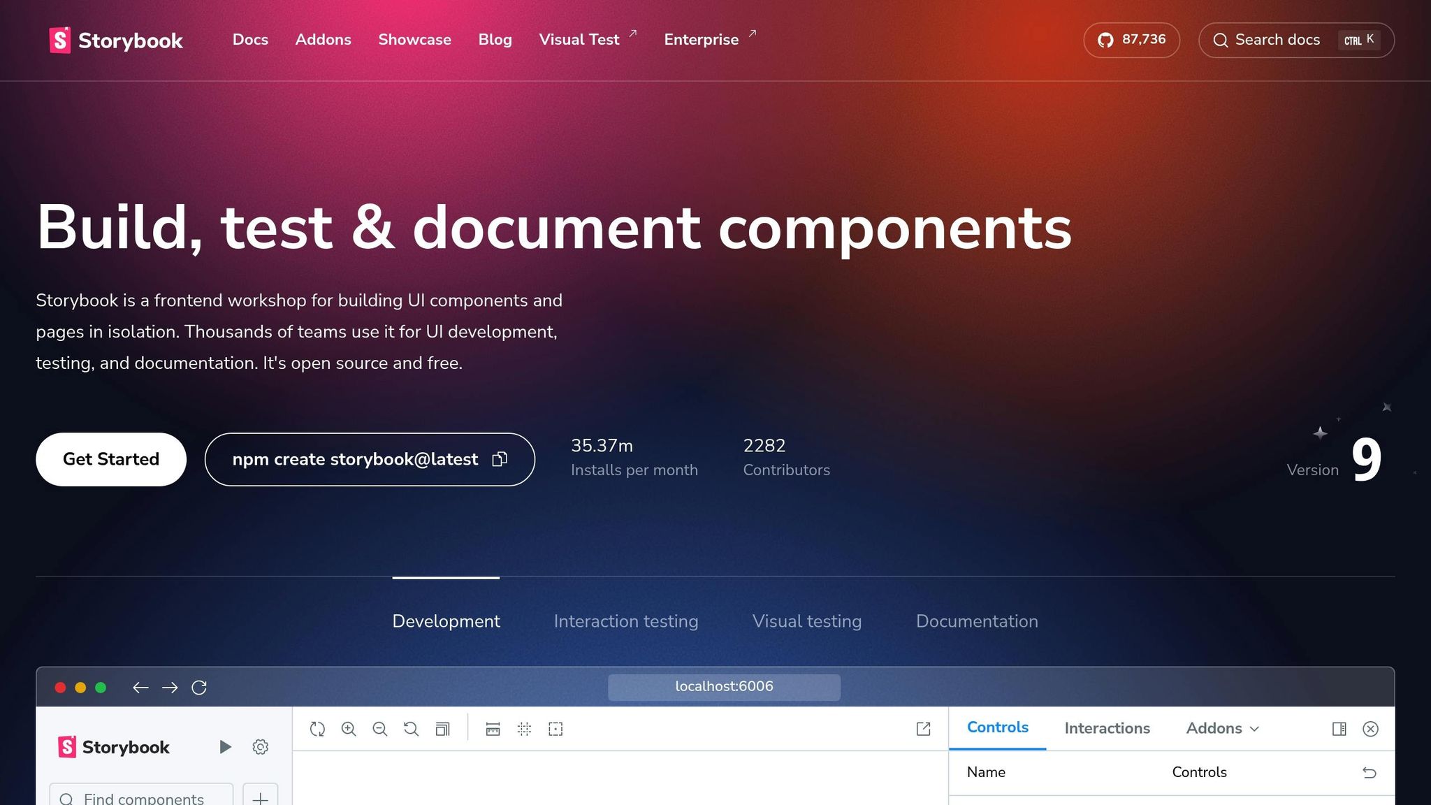
Storybook Component documentation, interactive testing Development teams building component libraries

When choosing a tool, focus on features that align with your team’s workflow. Look for capabilities like:

  • Real-time collaboration
  • Version control
  • Integration with your current tools
  • Design-to-code workflows
  • Comprehensive component documentation

Conclusion: Pattern Libraries for Better Teamwork

Pattern libraries are powerful tools that help design and development teams work together more effectively. Many organizations have reported increased efficiency and resource savings after adopting them. These libraries reshape how teams collaborate, making workflows smoother and more unified.

Industry leaders like IBM (with their Carbon Design System), Atlassian’s ADG, and Shopify’s Polaris showcase how pattern libraries can align design and development efforts seamlessly.

Brian Demchak, Sr. UX Designer at AAA Digital & Creative Services, shares his experience:

"As a full stack design team, UXPin Merge is our primary tool when designing user experiences. We have fully integrated our custom-built React Design System and can design with our coded components. It has increased our productivity, quality, and consistency, streamlining our testing of layouts and the developer handoff process".

Pattern libraries also double as educational resources, ensuring consistency across products and platforms.

John Gall, a systems theorist, offers a reminder of why starting simple is key:

"A complex system that works is invariably found to have evolved from a simple system that worked. The inverse proposition also appears to be true: a complex system designed from scratch never works and cannot be made to work. You have to start over, beginning with a simple system."

The key to success lies in starting small and expanding as the team’s needs grow. By addressing miscommunication and inconsistencies, pattern libraries create a foundation for better teamwork. When implemented thoughtfully, they not only improve workflows but also bring design and development teams closer together with shared goals and practices.

Related Blog Posts

Design Systems vs Style Guides: Key Differences

Design systems and style guides both help ensure consistency in design, but they serve different purposes:

  • Design Systems: Comprehensive frameworks for managing design across products. They include reusable components, interaction patterns, and code-based documentation, making them ideal for large, scalable projects.
  • Style Guides: Focus on maintaining visual and editorial brand consistency. They include rules for logos, typography, colors, and tone, making them suitable for smaller teams or branding-focused projects.

Quick Comparison

Feature Design Systems Style Guides
Purpose Manage large-scale design Ensure brand consistency
Scope Full product design Visual and editorial standards
Components Interactive UI patterns, code Static design elements
Updates Regular and iterative Occasional brand refreshes
Team Usage Designers, developers, product teams Designers, content teams
Scale Enterprise-level Brand-level

In short, design systems are best for large, complex projects, while style guides work well for smaller teams or focused branding efforts. Use both together for maximum consistency and scalability.

Design Systems vs. Style Guides

Design Systems Explained

Design systems offer a flexible framework that supports scalable design, building on the foundational concepts we’ve discussed.

Main Elements

A design system is made up of components that streamline design and development. Key elements include design tokens (basic style values like colors, typography, and spacing), component libraries (ready-to-use UI elements), and detailed documentation.

These systems are typically structured in layers:

Layer Purpose Key Elements
Foundations Basic building blocks Typography, color palette, spacing
Tokens Variables Brand colors, font sizes, animations
Core Systems Fundamental patterns Grid systems, accessibility rules
Components Reusable elements Buttons, forms, navigation items

Why Use a Design System?

Design systems can increase productivity by 34% and improve team collaboration.

"A design system is a living, complete set of standards intended to manage design at scale using reusable components and patterns."

By creating a unified design language, these systems make it easier for teams to work together. Consistency is especially important for brand perception – studies show that 75% of users evaluate a company’s credibility based on its design.

Real-World Examples

Google Material Design is a standout example of a design system that offers more than just basic styling. It includes detailed guidelines for elevation, responsive layouts, motion interactions, and accessible color schemes.

Atlassian Design System is another great example, showing how a design system can adapt to multiple products. Used in tools like Jira, Confluence, and Trello, it balances consistency with product-specific customization.

"By understanding the needs of every team, I’m able to not only save time and increase efficiency, but also leverage different perspectives to craft new solutions." – Phillip Fernandez, UX Designer, The Marketing Store

This system ensures intuitive interfaces across Atlassian’s products, reduces development time, and maintains brand consistency.

Design systems remove ambiguity, speed up development, and deliver consistent user experiences. Next, we’ll dive into how style guides complement these systems.

Style Guides Explained

While design systems focus on technical and interactive elements, style guides are all about maintaining consistent visual and verbal branding across every communication channel.

Purpose and Goals

Style guides act as the go-to resource for ensuring a brand’s communication reflects its identity and values. They outline both visual and content-related guidelines to keep everything aligned.

Here are the main areas a style guide typically covers:

Area Purpose Key Elements
Visual Standards Ensures brand recognition Logo, color codes, typography
Editorial Guidelines Maintains content consistency Voice, tone, grammar rules
Brand Elements Protects brand identity Mission statement, core values

Style Guide Categories

Style guides generally fall into two types, each catering to different communication aspects:

  • Editorial Style Guides: These focus on written communication and include:
    • Voice and tone rules
    • Grammar and writing preferences
    • Formatting standards for content
  • Visual Style Guides: These define design standards, such as:

"A style guide is a document that maps out the way you communicate with your audience. From grammar and punctuation to voice and tone."

  • Caoimhe Gaskin, Lead Content Strategist

Style Guide Advantages

Leading brands showcase the power of consistent style guides. For instance, Airbnb‘s guide helps create a simple and welcoming brand image; MailChimp‘s guide ensures a friendly and accessible tone for small businesses; and monday.com maintains a cohesive presence across all platforms.

Some key benefits of using a style guide include:

Advantage Impact Business Value
Brand Recognition Consistent visual identity Builds customer trust
Content Quality Standardized communication Reduces errors and inconsistencies
Team Efficiency Clear, actionable guidelines Speeds up content creation
Brand Integrity Unified messaging Strengthens market position

Style guides work hand-in-hand with design systems, creating a strong foundation for consistent and effective brand communication.

sbb-itb-f6354c6

Design Systems vs Style Guides: Main Differences

Coverage and Depth

Design systems act as frameworks that guide the creation of consistent digital products. In contrast, style guides focus more narrowly on visual and editorial standards.

Aspect Design Systems Style Guides
Primary Focus Full product development Visual and editorial alignment
Components UI patterns, code, documentation Colors, typography, tone
Team Usage Designers, developers, product teams Designers, content teams
Implementation Functional, interactive elements Static rules and guidelines
Maintenance Regular updates and improvements Occasional brand updates

This broader approach naturally includes detailed UI components, which we’ll cover next.

UI Components and Patterns

Design systems define both the look and functionality of UI elements. For example, Atlassian’s design system provides detailed instructions for interactive elements like buttons, covering:

  • State changes (hover, active, disabled)
  • Accessibility features
  • Code implementation details
  • Usage instructions

Style guides, on the other hand, focus on the visual design of UI elements without addressing technical or behavioral aspects.

Documentation Methods

Design systems use dynamic, code-based documentation that evolves over time. Style guides, however, rely on static references:

  • Interactive, code-driven documentation
  • Frequent updates
  • Real-world implementation examples
  • Cross-referenced components for consistency

This adaptive documentation reflects the forward-thinking nature of design systems.

Growth and Changes

As discussed, design systems are built to evolve with the product and technology.

"Ultimately design systems are an umbrella within which style guides are contained."

While design systems require ongoing updates, style guides are typically revised during major rebranding efforts.

Side-by-Side Comparison

Feature Design Systems Style Guides
Purpose Manage large-scale design Ensure brand consistency
Scope Full product design Visual and editorial standards
Components Interactive UI patterns, code Static design elements
Updates Regular and iterative Occasional brand refreshes
Team Focus Cross-functional teams Design and content teams
Documentation Dynamic, code-based Static references
Scale Enterprise-level Brand-level
Implementation Code-driven components Visual-only references

"Design systems are a set of standards (like Google’s Material Design or IBM’s Carbon Design System) needed to manage design at scale. Style guides (like content or visual style guides) are just one piece in a design system."
– Kelley Gordon

Choosing Between Systems and Guides

Decision Points

The choice between a design system and a style guide depends on the scale of your project and the maturity of your organization. Here’s a quick comparison to help you decide:

Factor Best for Design Systems Best for Style Guides
Team Size Large teams with multiple designers and developers Small design teams
Project Scale Enterprise projects with multiple products Single product or campaign
Maturity Level Established organizations Startups or early-stage businesses
Resources Ample time and budget Limited time and budget
Platform Coverage Cross-platform projects Focused on a single platform

When to Use Design Systems

Design systems shine in large, complex projects where consistency and scalability are key. They’re a great fit for:

  • Enterprise Companies: Managing several digital products across various platforms.
  • Cross-functional Teams: Perfect for teams where designers, developers, and product managers work together frequently.
  • Growth-Oriented Products: Ideal for businesses planning to expand or manage multiple product lines.

When to Use Style Guides

Style guides are a simpler alternative, suited for smaller teams or projects with a narrow focus. Consider a style guide if:

  • You’re a Small Team: Limited design resources make style guides easier to manage.
  • Brand Consistency Is Key: Focused on maintaining a cohesive visual identity.
  • The Scope Is Narrow: Single-product companies or short-term campaigns benefit most.
  • Resources Are Tight: Perfect when time and budget are constrained.

Using Both Tools Together

Start with a style guide to define your brand’s visual elements. As your organization grows, evolve it into a design system by adding component documentation, interaction patterns, and code snippets. Keep both up to date with regular reviews, cross-team collaboration, and periodic training sessions to ensure alignment across your teams.

Conclusion

Summary Points

Design systems and style guides serve different but complementary purposes in digital product development. Design systems offer frameworks with reusable components and patterns, making them well-suited for managing design at scale – especially in larger organizations. On the other hand, style guides focus on maintaining brand identity, making them a better fit for smaller teams or companies with a single product.

The key distinction lies in their focus: style guides ensure consistent brand visuals and messaging, while design systems provide a shared language that includes interactive UI elements. These tools address the evolving needs of modern product ecosystems, as highlighted earlier.

Industry Direction

The design world is shifting, reshaping how frameworks like design systems are used. Rapid advancements, such as AI-driven tools, are automating workflows and even generating UI components on a large scale. This evolution emphasizes collaboration over rigid systems.

Oscar Gonzalez explains this shift:

"The future of design systems isn’t in perfecting our components or creating amazing documentation. Instead, it lies in creating environments where teams can effectively solve user problems together, guided by shared principles and protocols rather than rigid rules."

Samer S Tallauze adds:

"The future of design systems will be dynamic, intelligent, and inclusive. By embracing AI, adaptability, immersive technologies, and ethical design, organizations can create digital experiences that are scalable, user-friendly, and forward-thinking. Staying ahead of these innovations will be key to ensuring relevance and impact in the years ahead."

Emerging trends like AR/VR integration, ethical design practices, code-driven token systems, and open-source development are shaping the future. While style guides remain crucial for maintaining brand consistency, design systems are growing into advanced platforms designed to keep pace with new technologies and changing user expectations.

Related Blog Posts

Ultimate Guide to Time Management for Designers

Time management is a game-changer for designers juggling creativity, deadlines, and client expectations. This guide breaks down practical strategies to help you stay productive while avoiding burnout. Here’s what you’ll learn:

  • Track your time: Spot inefficiencies and improve your workflow with tools like Toggl.
  • Time-blocking: Schedule focused “maker time” for creative tasks and separate it from admin work.
  • Pomodoro Technique: Tackle tasks in short, timed bursts to stay focused.
  • Address time wasters: Avoid unnecessary meetings, email overload, and multitasking.
  • Leverage tools: Apps like UXPin and Clockify streamline your process.
  • Balance creativity and deadlines: Protect your energy for personal projects and new ideas.

Quick Takeaways:

  • Best work hours: Use your peak energy period (usually mornings) for complex design tasks.
  • Task batching: Group similar tasks to reduce mental strain.
  • Break creative blocks: Take walks, change environments, or set constraints to spark ideas.

Start small: turn off notifications, use the Pomodoro method, and track your time. These steps will help you meet deadlines, stay organized, and deliver high-quality work without sacrificing your well-being.

Time Management for Designers: How To Manage Your Time & Get More Done

How Designers Use Their Time

Knowing how you spend your time can help you manage it more effectively. Did you know that product developers lose up to one-third of their year on non-design tasks? This makes it essential to analyze your daily workflow and find ways to work smarter.

Track Your Daily Work

Keeping track of your daily activities can help you spot patterns and areas where you’re losing time. Instead of relying on basic spreadsheets, consider using advanced task management tools. These tools often include features like automation and real-time collaboration, which can save you time and effort.

Here’s what a good tracking system should cover:

  • Write down task descriptions and set priorities
  • Record how much time you spend on each activity
  • Use tags or categories to organize projects
  • Note interruptions or blockers that slow you down
  • Create visual reports to analyze patterns

Common Time Wasters in Design Work

Research shows that designers spend about 60% of their online work time on non-work-related activities. Let’s break down some common productivity killers and how to deal with them:

Time Waster Impact Solution
Unnecessary Meetings Interrupts creative flow Schedule meetings outside design hours
Email Overload Causes constant context shifts Set specific times for email; turn off alerts
Multitasking Slows work and lowers quality Focus on one task at a time
Disorganization Wastes time searching for files Create a clear file structure
Social Media Distracts from work Use website blockers during focused work

By addressing these issues, designers can make better use of their most productive hours.

“When multitasking, you’re slowing down your work progress.” – TimeCamp

Best Hours for Design Work

Studies suggest that creativity tends to peak in the morning, with focus and energy levels tapering off as the day progresses. To get the most out of your time:

  1. Find Your Peak Performance Period (PPP)
    Spend a week tracking your energy and focus levels to figure out your best 3–5 hour window for deep work.
  2. Plan Your Day Around Your PPP
    Use these high-energy hours for complex design tasks. Save simpler, administrative tasks for later when your energy dips.

“Working in the morning, as soon as I get up, has been one of the biggest improvements I’ve made to overcoming creative block.” – Tom Kenny

  1. Start with a Morning Routine
    End your day by planning tomorrow’s priorities. This eliminates decision fatigue, so you can dive straight into important tasks the next morning.

Time Management Methods for Designers

Once you know your peak performance hours, it’s time to use strategies that help you stay focused and get more done.

Using Pomodoro for Design Tasks

The Pomodoro Technique is a structured way to tackle design work by breaking it into timed intervals. It’s especially helpful for designers who struggle to stay focused on complex tasks.

You can tweak the traditional Pomodoro method to match the difficulty of your tasks:

Task Type Recommended Pomodoro Length Break Duration Best For
Complex Design Work 50 minutes 10 minutes UI/UX architecture, wireframing
Medium Complexity 25 minutes 5 minutes Asset creation, feedback reviews
Light Tasks 15 minutes 3 minutes Minor adjustments, file organization

“The Pomodoro Technique is a time management strategy where you work in cycles of intense focus and short breaks.” – Christopher Nguyen

Keep a nearby “emergency task list” to jot down urgent ideas without breaking your focus. This way, you can stay in the zone without worrying about forgetting something important.

Schedule Design Work in Blocks

Pair Pomodoro cycles with time blocking to protect your creative flow. Time blocking means setting aside specific periods for different activities, which is a game changer for deep design work.

“A 40 hour time-blocked work week, I estimate, produces the same amount of output as a 60+ hour work week pursued without structure.” – Cal Newport

Here’s how to organize your day with time blocking:

1. Morning Design Sprint

Use your most creative hours for tough design tasks. Block out 2-3 hours of uninterrupted time for detailed work on challenging projects.

2. Communication Windows

Set fixed times for client calls or team discussions. This ensures you stay focused during your design sessions while still being available when needed.

3. Buffer Zones

Leave 15-30 minute gaps between major tasks. These can handle unexpected issues or give you extra time for creative ideas that pop up.

Group Similar Design Tasks

Batching similar tasks together can cut down on the mental strain of switching between different types of work. For designers, this method can improve productivity and keep creativity flowing.

Task Category Examples Recommended Timing
Creative Work UI design, illustrations, animations Morning/peak hours
Review Tasks Client feedback, QA checks, revisions Mid-day
Administrative File organization, asset preparation, documentation Late afternoon

“Task batching is the technique of grouping similar tasks together and knocking them out in dedicated blocks of time. This approach doesn’t just cut down on the chaos; it significantly amps up your focus and productivity.” – Katie Johnson, Worxbee

To make task batching work for you, group activities that need the same tools or mindset. For instance, handle all prototyping tasks in one go, or batch feedback reviews together. This reduces the mental effort of switching contexts and keeps your creative rhythm steady throughout the day.

sbb-itb-f6354c6

Time-Saving Tools for Designers

Efficient time management is crucial for designers, and these tools can help simplify your workflow and boost productivity.

UXPin: Code-Based Prototyping

UXPin: Code-Based Prototyping

UXPin makes prototyping easier by combining code-backed designs with real-time collaboration. Its AI Component Creator, powered by ChatGPT, lets you quickly create layouts using libraries like MUI and Tailwind UI.

“When I used UXPin Merge, our engineering time was reduced by around 50%. Imagine how much money that saves across an enterprise-level organization with dozens of designers and hundreds of engineers.” – Larry Sawyer, Lead UX Designer

“What used to take days to gather feedback now takes hours. Add in the time we’ve saved from not emailing back-and-forth and manually redlining, and we’ve probably shaved months off timelines.” – Mark Figueiredo, Senior UX Team Lead

Time and Project Management Apps

Time tracking tools are essential for managing workloads and ensuring accurate billing. Here’s a quick comparison of some top-rated options:

Tool Best For Key Features Rating
Toggl Track Web/UX designers Intuitive timer, 100+ integrations, detailed analytics 4.7/5 (Capterra)
Harvest Graphic designers Easy invoicing, expense tracking 4.6/5 (GetApp)
Hubstaff Design teams Workforce management, automated payroll 4.6/5 (Capterra)

“The best part about Toggl Track is the accurate, project-based time tracking and the actionable insights you can get from them. It has directly impacted the decisions we make on which projects to take on. It’s also helped us win bigger deals.” – Darrell K., CEO | Founder

Schedule Planning Tools

For task management and scheduling, precise planning tools can complement your workflow. Clockify is a favorite among design teams, offering features such as:

  • Project-based time tracking
  • Detailed reporting
  • Team scheduling tools
  • Integrated invoicing

Clockify holds a 4.7-star rating on Capterra, with users highlighting its scheduling features and affordability. For teams needing advanced monitoring, it includes GPS tracking and screenshot tools, while privacy-conscious teams might prefer Toggl Track’s focus on data privacy.

To find the best fit, start with free trials. Many platforms, like Hubstaff and Harvest, also provide free plans for individuals or small teams. These tools work well with time-blocking and task batching strategies, helping you make the most of your design time.

Meeting Deadlines While Staying Fresh

Set Aside Time for New Ideas

Creative work thrives on focus. During your most productive hours, turn off notifications and carve out uninterrupted time to brainstorm and generate ideas.

“If you ask people when and where they have those aha moments, they’re usually not at work… They’re taking a walk, driving in the car or taking a shower.” – Steven Smith, PhD, who studies creativity at Texas A&M University

Break Through Design Blocks

Feeling stuck in your creative process? It’s often linked to perfectionism or self-criticism.

“Neuroscience shows us that when we get caught up in perfectionism and self-criticism our minds stop wandering… However, when we relax and allow our minds to freely wonder, we’re more likely to hit upon new combinations and new insights.” – Gerard Puccio, PhD, specialist in creativity studies at Buffalo State University

Here are some practical ways to overcome creative blocks:

Strategy Purpose Implementation
Mental Breaks Encourage fresh ideas Take 15-minute walks every 2 hours
Environment Change Boost inspiration Work near natural elements or switch locations
Constraint Setting Spark innovation Set specific time limits for brainstorming

Balancing the need for creative breakthroughs with meeting deadlines helps you stay productive and inspired.

Mix Client and Personal Work

“If you do good work for good clients, it will lead to other good work for other good clients. If you do bad work for bad clients, it will lead to other bad work for bad clients.” – Michael Bierut

To maintain creativity and avoid burnout, clearly separate client work from personal projects:

  • Dedicate specific days or time blocks for personal projects.
  • Keep client tasks distinct from your personal creative goals.
  • Use personal projects as a playground for trying new techniques.
  • Schedule client work during your peak energy hours.

This approach not only preserves your creative energy but also aligns with effective time management strategies, ensuring both client satisfaction and personal growth.

Conclusion: Start Using These Methods Today

You don’t need to completely overhaul your workflow to manage your time better as a designer. Small, consistent changes can make a big difference.

“The bad news is time flies. The good news is you’re the pilot.” – Michael Altshuler

Here’s a simple plan to get started:

Time Frame Action Expected Outcome
First Week Turn off notifications during focused work periods Fewer interruptions, better focus
Week 2-3 Use 25-minute Pomodoro sessions Boosted productivity with regular breaks
Month 1 Schedule design tasks on your calendar Improved organization and deadline tracking

These steps help you create a solid foundation for managing deadlines and staying productive. To make the most of your time:

  • Break large projects into smaller tasks: This makes overwhelming challenges easier to tackle.
  • Set boundaries: Define your working hours and response times to protect your personal time.

“It takes time to change your habits or adopt new ones. So instead of pressuring yourself to completely change your ways overnight, try starting small for the best possible results.” – Robert Mayer, UX Planet

Pick one method – like time-blocking or the Pomodoro technique – and start combining creative work with smart time management today.

Related Blog Posts

Low-Fidelity Prototypes: Role in Design Documentation

Low-fidelity prototypes are simple, quick-to-create sketches that focus on structure and functionality rather than visual details. They are essential for early-stage design, helping teams test ideas, spot usability issues, and save time and costs. Key benefits include:

  • Fast Creation: Can be made in minutes, requiring basic skills.
  • Early Problem Detection: Identify usability flaws before heavy investment.
  • Collaboration: Encourage teamwork and clear communication without distractions.
  • Flexibility: Easy to revise and update as ideas evolve.
  • Documentation: Serve as records of design decisions and user flows.

Quick Comparison

Aspect Low-Fidelity Prototypes High-Fidelity Prototypes
Creation Time Minutes to hours Days to weeks
Skills Needed Basic sketching Advanced design tools
Focus Core functionality Detailed specifications
Revision Speed Immediate changes Slower revision cycles

Low-fidelity prototypes are ideal for brainstorming, early feedback, and keeping design aligned with project goals. They simplify workflows, reduce costs, and improve collaboration across teams.

Building Low-Fidelity Wireframes and Prototypes

Core Elements of Low-Fidelity Prototypes

Low-fidelity prototypes play a crucial role in early design stages, helping teams document and refine ideas quickly and effectively.

Quick Creation Process

These prototypes are designed for speed, allowing teams to test and document multiple concepts without getting bogged down in details.

"Creating low-fidelity prototypes is an essential step in the design process that allows designers to quickly and efficiently explore ideas." – Marek Pałys, Startup House

Here’s how they compare to high-fidelity prototypes:

Aspect Low-Fidelity High-Fidelity
Creation Time Minutes to hours Days to weeks
Required Skills Basic sketching Advanced design tools
Focus Core functionality Detailed specifications
Iteration Speed Immediate changes Extended revision cycles

This streamlined approach enables teams to test core ideas almost instantly, paving the way for functional testing.

Basic Function Testing

Low-fidelity prototypes help teams examine essential user flows without worrying about visual details. They highlight primary user journeys and uncover usability problems early, steering feedback toward the most critical aspects of the design.

By focusing on functionality over aesthetics, these prototypes also make it easier to refine designs as feedback rolls in.

Easy Design Changes

One of the biggest advantages of low-fidelity prototypes is how easily they adapt to evolving ideas. They allow teams to keep documentation up-to-date as concepts evolve.

For example, Method‘s paper wireframe kit, a finalist in the Figma Community Awards, has been embraced by over 20,000 designers. This highlights the popularity of tools that make quick adjustments possible.

"It’s easy to make changes and test new iterations; anyone can produce them, and they encourage design thinking since the prototypes are clearly not finalized." – ProtoPie

Frequent revisions ensure that every iteration, decision, and piece of feedback is captured, making it simple to explore multiple design options without losing momentum.

Design Documentation Uses

Low-fidelity prototypes are excellent tools for documenting and streamlining collaboration during the design process. They help teams communicate better, gather feedback faster, and keep track of key decisions.

Team Communication Tools

Low-fidelity prototypes make it easier for teams to focus on core functionality and communicate ideas clearly. Their simplicity encourages discussions that stay on track without getting bogged down by unnecessary details.

For example, Illustrate Digital used low-fidelity prototypes during Golley Slater’s website rebuild to achieve the following:

Communication Aspect Impact
User Journey Visualization Helped plan clear navigation paths
Focus Management Minimized distractions from visuals

This clarity simplifies team communication and ensures smoother stakeholder reviews.

Stakeholder Review Process

Using low-fidelity prototypes also makes it easier to gather feedback from stakeholders. Their rough, unfinished look encourages stakeholders to focus on functionality and core ideas rather than nitpicking polished designs.

"What used to take days to gather feedback now takes hours. Add in the time we’ve saved from not emailing back-and-forth and manually redlining, and we’ve probably shaved months off timelines."

The marketing team at GFA World used these prototypes to validate user experience designs early on. This approach allowed for quick iterations without driving up design and development costs.

Design Decision Records

Low-fidelity prototypes act as a record of how designs evolve over time. They help teams document decisions and refer back to them during later stages of development. These prototypes are useful for:

  • Testing initial concepts
  • Mapping out user flows
  • Capturing stakeholder feedback
  • Tracking solutions to design challenges

Adding detailed notes to these prototypes can make them even more effective. Notes can explain why specific decisions were made and link them to project requirements. This kind of documentation improves transparency and supports ongoing design improvements.

sbb-itb-f6354c6

Workflow Improvements

Low-fidelity prototypes make design workflows more efficient by speeding up iterations and cutting development costs. Their simple and straightforward nature makes them ideal for team collaboration. Here’s how they help:

Faster Idea Generation

Low-fidelity prototypes help teams brainstorm and test ideas quickly. Their rough, sketch-like style encourages experimentation and refinement. Some key benefits include:

  • Quick Testing: Teams can evaluate several concepts in hours instead of days.
  • Flexibility: It’s easy to scrap ideas that don’t work.
  • Focused Feedback: Discussions stay centered on core functionality.
  • Real-Time Changes: Adjustments can be made immediately during reviews.

This fast-paced ideation helps avoid expensive changes down the line.

Early Cost Prevention

Using low-fidelity prototypes early in the process helps spot problems before they become costly. They also allow for quick updates based on user input. Advantages include:

  • Spot Usability Issues Early: Catch potential problems before heavy investment.
  • Quick Revisions: Incorporate user feedback without delays.
  • Lower Risk: Avoid the pitfalls of early-stage design errors.

By catching issues early, teams can save money and set the stage for smoother collaboration.

Cross-Team Work Methods

Low-fidelity prototypes are great for communicating ideas across teams, from designers to developers and other stakeholders. To improve teamwork:

  • Involve developers early to get technical input.
  • Add clear notes to explain key features.
  • Share prototypes with all teams to ensure alignment on design goals.

Studies show that team members are more comfortable giving feedback on rough sketches than polished designs. This encourages honest, constructive input during early development stages.

Tools like UXPin make this process even easier. Their platform allows teams to create and share interactive, low-fidelity prototypes, supporting fast iterations and effective feedback, all while keeping the process simple and collaborative.

Documentation Guidelines

Capturing details about low-fidelity prototypes is key to keeping teams aligned and tracking design progress. Here’s how to document these prototypes effectively:

Adding Clear Notes

Annotations make it easier for team members to understand how a prototype works. Be sure to:

  • Clearly mark interactive elements so their purpose is obvious.
  • Describe expected behaviors for each feature.
  • Highlight user flow connections to show how screens or steps link together.
  • Document assumptions and constraints to set clear expectations.

If you’re using tools like UXPin, use their built-in features to attach notes directly to specific elements. This keeps everything organized and accessible for discussions and updates.

Connecting to Project Needs

It’s not just about clarity – each part of the prototype should tie back to the project’s goals. Make sure your documentation connects prototype elements to:

Element Purpose Example Connection
User Stories Matches prototype features to user needs "As a user, I need to quickly find my saved items."
Technical Requirements Identifies constraints for implementation API limitations, performance targets
Business Goals Aligns features with strategic priorities Increase user engagement metrics

By linking these elements, you ensure the prototype stays aligned with both user and business objectives.

Managing Changes

Prototypes evolve, and documenting those changes helps the team stay on the same page. Keep it simple and focused by:

  • Version Control: Log every change along with why it was made and any feedback that influenced it.
  • Feedback Integration: Organize feedback, prioritizing recurring themes over one-off comments.
  • Update Communication: Regularly share updates with stakeholders to keep everyone informed about adjustments.

The goal is to capture the key details that explain how the design has changed over time and why certain decisions were made. This clarity helps the entire team move forward confidently.

Conclusion

Low-fidelity prototypes play a key role in design documentation and team workflows. Studies show that designers using low-fidelity prototypes cut revision time in half compared to those who skip early testing. These prototypes not only save time but also improve collaboration across teams.

Mark Figueiredo, Senior UX Team Lead at T. Rowe Price, shared:

"What used to take days to gather feedback now takes hours. Add in the time we’ve saved from not emailing back-and-forth and manually redlining, and we’ve probably shaved months off timelines"

This highlights how low-fidelity prototypes simplify processes and speed up real-world design tasks. Their straightforward format encourages open discussions and better decision-making, acting as a bridge for communication between team members.

Additionally, research shows these prototypes are effective for spotting usability issues and providing accurate ease-of-use feedback. By catching problems early, teams can avoid expensive revisions and launch products faster. The combination of time savings, collaboration, and usability makes low-fidelity prototypes a key part of efficient design workflows.

Related Blog Posts

Component-Based Design: Complete Implementation Guide

Component-based design is a method of breaking down user interfaces into reusable, self-contained parts called components. This approach improves consistency, efficiency, and scalability in digital product development. Major companies like Atlassian, Airbnb, and Salesforce have adopted this method to save time and enhance productivity.

Key Takeaways:

  • Reusable Components: Build once, use everywhere for consistent design.
  • Atomic Design: Organize components into five levels: Atoms, Molecules, Organisms, Templates, and Pages.
  • Design Tokens: Use tokens (e.g., color.primary.500) for consistent styling across platforms.
  • Component Libraries: Plan, document, and test components to boost efficiency by up to 50%.

Quick Facts:

  • Airbnb reduced design-to-development handoff time by 35%.
  • Consistent interfaces improve task completion rates by 39%.
  • Companies using component libraries report a 30-50% boost in efficiency.

This guide covers everything from building component libraries to scaling them, testing designs, and using tools like React, Storybook, and design-to-code workflows. Ready to streamline your design process? Let’s dive in.

Atomic Design: What is it and why is it important in 2024?

Key Concepts of Component-Based Design

Component-based design changes the game for digital product development by breaking interfaces into smaller, reusable parts. This method helps teams work more efficiently and ensures products can grow and adapt over time.

How Modular Design Works

Modular design splits user interfaces into separate, reusable parts called components. A great example is Material-UI‘s button component. It can work by itself or alongside other components, all while keeping a consistent look and function.

Key aspects of modular design include:

  • Building components that function on their own
  • Defining clear relationships between components
  • Maintaining consistent styles and behaviors
  • Simplifying updates across the entire product

This approach creates a strong foundation for structured systems like Atomic Design.

Using Atomic Design

Brad Frost’s Atomic Design method organizes components into five levels, making even the most complex design systems easier to handle.

Level Description Common Examples
Atoms Basic UI elements Buttons, inputs, labels
Molecules Small groups of elements Search bars, form fields
Organisms Larger UI sections Navigation headers, product cards
Templates Page layouts Article layouts, product pages
Pages Specific instances Home page, contact page

Airbnb’s Design Language System (DLS) is a real-world example of Atomic Design at work. By adopting these principles, Airbnb cut design-to-development handoff time by 35% and improved design consistency by 20% across their platform. Michael Fouquet, Airbnb’s Design Systems Lead, helped create over 200 reusable components, showcasing how scalable this approach can be.

Design Tokens Explained

After organizing components, design tokens ensure consistent styling throughout the system. These tokens act as the building blocks for design values, like colors, spacing, and typography.

Why use design tokens?

  • Fewer Errors: Companies see up to 40% fewer style-related bugs after adopting design tokens.
  • Faster Updates: A single token update can change styles globally.
  • Improved Collaboration: Designers and developers share a unified language for design elements.

For instance, instead of hardcoding a color like #007bff, teams use tokens like color.primary.500. This makes it easier to update themes and maintain consistency across platforms.

Creating Component Libraries

Building component libraries requires careful planning and attention to detail. By using modular components and design tokens, these libraries transform into scalable systems. Companies with well-maintained component libraries often see a 30-50% boost in design and development efficiency. A well-structured library also ensures smooth integration with larger systems.

Planning Your Components

Start by conducting a UI audit to spot patterns and eliminate redundancies. This step helps you establish a clear hierarchy for components and focus on what needs to be developed first.

When planning your components, keep these key factors in mind:

  • States and Variants: Define how components behave in different scenarios (e.g., default, hover, active, disabled).
  • Naming Conventions: Stick to consistent patterns like Category-ComponentName-Variant.
  • Props and Properties: Identify configurable options to make components flexible for various use cases.
  • Documentation: Clearly outline usage guidelines and technical details.

For inspiration, take a look at Microsoft’s Fluent Design System. It showcases how effective planning can ensure consistency across platforms.

Adding Components to Design Systems

Integrating components into your design system requires a structured approach. Salesforce’s Lightning Design System is a great example of how to do this effectively.

Integration Phase Key Activities Expected Outcome
Documentation Usage guidelines, code examples Clear implementation path
Review Process Design critiques, accessibility checks Quality assurance
Version Control Git-based management, changelog Organized updates
Distribution Storybook integration, package publishing Easy access for teams

Testing Component Designs

Thorough testing ensures your components work well across different contexts. After integration, rigorous testing confirms their reliability. Uber’s Base Web system is a great example – they use a detailed testing process that includes:

  • Checking visual consistency across devices.
  • Verifying functional behavior in all states.
  • Ensuring accessibility compliance.
  • Measuring performance impact.
  • Testing cross-browser compatibility.

This approach helped Uber reduce time-to-market by 30%. They rely on tools like Storybook for isolated component testing, allowing teams to interact with components without needing a full application setup.

For accessibility, tools like Axe or WAVE can help ensure your components meet WCAG standards.

If you’re working on a large-scale library, automated testing is a must. Atlassian’s Design System team, for instance, achieved 90% test coverage with automated visual regression testing, cutting down on manual QA time significantly.

sbb-itb-f6354c6

From Design to Code

Transforming design concepts into functional code requires a structured approach that connects design and development. Data shows that teams using organized design-to-code workflows can cut UI component development time by 40%. This phase builds on earlier discussions about component design principles and dives into practical techniques for building and integrating these components.

Building React Components

React dominates the world of component-based development, with 74% of developers incorporating it into their projects. The focus here is on creating modular, reusable components that align with your design specs.

Here’s an example of how teams effectively structure React components:

import React from 'react'; import { tokens } from './tokens';  const Button = ({ label, onClick, variant = 'primary' }) => {   return (     <button       className={`button ${variant}`}       onClick={onClick}       style={{         backgroundColor: tokens.colors[variant],         padding: `${tokens.spacing.small} ${tokens.spacing.medium}`,       }}     >       {label}     </button>   ); };  export default Button; 

Design-Code Tools and Methods

Once your React components are ready, modern tools can simplify the design-to-code process and improve collaboration. UXPin Merge, for example, lets designers work directly with code components, reducing the usual friction during handoffs.

Tool Primary Use Case Key Benefit
UXPin Merge Code-backed prototyping Use real React components
Storybook Component documentation Interactive testing environment
Zeplin Design handoff Automated style guide generation

These tools help teams align better, ensuring designers and developers are on the same page regarding component behavior and styling.

Making Components Work Everywhere

To ensure your components function consistently across platforms, focus on compatibility and responsiveness. Cross-platform components should adapt to different devices while maintaining their core functionality.

For responsive design, consider practices like this:

import styled from 'styled-components';  const ResponsiveCard = styled.div`   display: flex;   padding: 1rem;    @media (max-width: 768px) {     flex-direction: column;     padding: 0.5rem;   } `; 

When targeting mobile platforms, React Native is a great choice. It allows you to use the same component library while tailoring components for platform-specific needs. This approach ensures consistency without sacrificing performance or user experience.

Growing Your Component System

As your design system evolves, scaling component libraries becomes essential to meet growing demands. A well-managed approach ensures your system stays efficient and cohesive. In fact, 69% of companies report improved collaboration between designers and developers through structured component management.

Large-Scale Component Management

Managing large-scale component libraries requires a structured approach, especially for organizations with multiple teams. Take Airbnb’s Design Language System (DLS) as an example. It enabled the company to scale from 10 to 100 product teams, ensuring design consistency while cutting feature development time by 30%.

Here’s a breakdown of strategies for managing large component libraries:

Management Aspect Implementation Strategy Key Benefit
Centralization Use a monorepo as a single source of truth Easier version control
Documentation Automate with tools like Storybook Better knowledge sharing
Performance Monitor with tools like Lighthouse Improved load times
Compliance Perform automated checks with SonarQube Consistent code quality

By centralizing resources, automating documentation, and keeping performance and compliance in check, you can scale your system without losing efficiency.

Updates and Version Control

Keeping your component library up to date is just as important as building it. Netflix’s "Nirvana" platform is a great example of how large-scale organizations handle dependencies effectively.

Here are some strategies to manage updates and versions:

  • Semantic versioning: Clearly communicate updates and changes.
  • Feature flags: Gradually roll out updates to minimize risks.
  • Changelogs: Maintain detailed records of changes for easy reference.
  • Automated testing: Run regression tests to catch potential issues early.

Material-UI’s strategy also stands out. They provide detailed migration guides and automated codemods for major updates, helping teams switch versions smoothly while ensuring backward compatibility.

AI Tools for Components

AI is reshaping how teams design and maintain component libraries. The BBC’s Global Experience Language (GEL) system demonstrates how AI can assist with tasks like component creation and accessibility testing.

Here are a few ways AI tools are being used effectively:

Tool Category Purpose Example
Generation Automating component code GitHub Copilot suggestions
Accessibility Running automated tests Deque’s axe-core ML checks
Optimization Analyzing performance Adobe Sensei integration

Figma’s AI-powered Auto Layout and variant features also make it easier to create consistent components. Meanwhile, Microsoft’s AI for Accessibility program is working on tools to identify and fix accessibility issues automatically.

While AI can handle repetitive tasks, it’s crucial to maintain human oversight. Regular audits ensure AI-generated components align with your design standards and meet quality expectations.

Next Steps

Start your journey by taking inspiration from strategies like Airbnb’s Design Language System, which cut inconsistencies by 35% and sped up time-to-market by 30%.

Begin with a detailed audit of your design elements. This will help you identify reusable components and plan your component library effectively.

Set up the right tools to support your workflow. For design, consider options like Figma or Sketch. For development, tools like Storybook are great, and for version control, Abstract or Git can streamline collaboration. If you’re starting fresh, UXPin’s Merge allows you to connect design and code directly.

Define your design tokens early on. These include key elements like color palettes, typography, spacing, and variations for each component. Documenting these ensures clarity and consistency.

Test your component library with a pilot project. This step will help you refine workflows and troubleshoot any issues before scaling up.

Hold bi-weekly cross-functional reviews. These meetings are essential for discussing updates, resolving challenges, and ensuring alignment across teams.

Put governance processes in place. This means creating clear guidelines, setting up review checklists, automating tests, and scheduling regular audits to keep everything running smoothly.

Incorporate AI tools to speed up component creation, explore variations, and improve performance. However, ensure human oversight to maintain quality and relevance.

Track your progress using metrics like development speed, design consistency, code reusability, and team productivity. These will give you a clear picture of how your system is evolving.

Follow these steps to build a strong component system before diving into additional best practices.

FAQs

Here are answers to some common questions about component-based design.

How do you convert Figma designs into React components?

Figma

Turning Figma designs into React components involves several steps:

  • Analyze the design: Start by reviewing the component structure and hierarchy in Figma.
  • Build React components: Create a React component structure that mirrors the Figma layout.
  • Apply styles: Use tools like CSS-in-JS or styled-components to implement the design’s styles.
  • Add functionality: Incorporate interactivity and state management as needed.
  • Ensure responsiveness: Optimize the components for different screen sizes and performance.

Tools like Visual Copilot can simplify parts of this process by generating code directly from Figma layers and allowing for easy adjustments, including animations.

How is a component library different from a design system?

A component library is essentially a collection of reusable UI elements – like buttons, typography, and color palettes – designed to maintain visual consistency. A design system goes further, combining these UI elements with guidelines, standards, and detailed documentation. This added layer of structure helps streamline workflows. For instance, companies that adopt design systems often see reduced design and development time thanks to standardized practices.

What is a component library?

A component library is a central repository of reusable UI elements that promotes consistency across projects. According to a recent survey, 69% of companies using structured component libraries report better collaboration between designers and developers. The best libraries include clear documentation for each component and are regularly updated to stay compatible with current development practices.

Related Blog Posts

5 Methods for Testing Interactive Prototypes

Interactive prototypes help refine designs before development, saving time and resources. Here are five effective ways to test them:

  1. In-Person User Testing: Observe users directly for detailed feedback on usability.
  2. Self-Guided User Testing: Conduct remote testing at scale using tools like Maze or UserTesting.
  3. Split Testing UI Elements: Compare design variations (e.g., buttons, layouts) to optimize performance.
  4. User Behavior Analytics: Track metrics like navigation paths and task completion rates to understand user actions.
  5. Accessibility Testing: Ensure your design meets WCAG standards for inclusivity.

Quick Comparison of Testing Methods

Method Cost Insights Type Best For
In-Person Testing High Qualitative Complex interactions
Self-Guided Testing Low Broad, qualitative Large-scale feedback
Split Testing Moderate Quantitative UI optimization
Behavior Analytics High Quantitative Identifying user behavior trends
Accessibility Testing Moderate Compliance-focused Inclusive design

Start with in-person testing for critical flows, then expand with remote methods and analytics for broader insights. Accessibility testing ensures inclusivity throughout the process.

Easy Usability Testing Guide with Example (Remote & In Person)

1. In-Person User Testing

In-person user testing is one of the best ways to evaluate interactive prototypes. It delivers immediate, detailed feedback on how users engage with your design. This method involves observing participants directly in a controlled setting, capturing both what they say and how they behave.

What makes in-person testing so effective? It uncovers subtle usability issues that other methods might miss.

Here’s how to run successful in-person testing sessions:

  • Set Up a Structured Environment: Use a controlled space equipped with tools like screen recording software (e.g., Camtasia or OBS Studio).
  • Encourage Think-Aloud Protocols: Ask participants to verbalize their thoughts as they interact with your prototype. This helps you understand their reasoning.
  • Gather Multiple Data Points: Combine qualitative observations with metrics like task completion rates, error counts, navigation patterns, and first-click accuracy.

Research suggests that testing with just 5 participants can uncover 85% of UX problems.

Here’s a quick guide on what to focus on during testing:

Metric Type What to Track Why It Matters
Performance Task completion time, error rates Pinpoints usability challenges
Behavioral Navigation paths, hesitation points Highlights areas of user confusion
Emotional Facial expressions, verbal feedback Gauges user satisfaction

When moderating, keep a neutral tone to avoid influencing participants. Always record sessions (with consent) so your team can review and analyze the findings together.

While in-person testing requires more time and resources than remote methods, it’s especially helpful for uncovering insights in complex interactions or physical products. For simpler prototypes, remote testing may be a better fit – more on that in the next section.

2. Self-Guided User Testing

For projects that need to reach a larger audience, self-guided testing can be an effective complement to in-person methods. This approach allows you to observe how real users interact with your design in their natural environments.

Self-guided sessions are generally shorter, lasting about 15-30 minutes compared to the 45-60 minutes typical for moderated tests. Tools like Lookback.io, UserTesting, and Maze provide features that make self-guided testing easier and more effective:

Feature Purpose Benefit
Screen Recording Tracks user interactions Helps analyze navigation patterns
Heatmap Generation Maps click activity Highlights popular interface elements
Task Analysis Monitors task completion Evaluates prototype performance
Survey Integration Gathers user feedback Collects insights and suggestions

To get the best results, ensure your instructions are clear and actionable. For example, instead of saying "explore the interface", guide users with specific tasks like "find and add a new contact to your address book."

Tips for Crafting Effective Tasks:

  • Break down complex workflows into smaller, manageable steps.
  • Use scenarios that mirror real-world use cases.
  • Add attention checks and mix qualitative and quantitative data collection.

When reviewing the results, focus on identifying trends across multiple users rather than individual responses. Tools like UsabilityHub and Hotjar can help visualize user behavior through heatmaps and session recordings, making it easier to pinpoint areas of confusion or friction.

"Self-guided testing captures user behavior in realistic settings, potentially leading to more authentic insights than controlled laboratory environments."

While this method has clear advantages, it does come with some trade-offs. For instance, you can’t ask follow-up questions during the session. To address this, include open-ended questions in your surveys and encourage users to provide detailed feedback. Additionally, using screen and webcam recordings can help you better understand user reactions and behaviors.

3. Split Testing UI Elements

Split testing takes behavioral data and uses it to refine design decisions. This approach involves creating different versions of specific interface elements to see which one works better with real users.

A study by Invesp found that 77% of companies use A/B testing to improve their digital interfaces. This shows how effective the method can be for enhancing user experience.

When running split tests for prototypes, focus on elements that have a direct impact on user behavior:

UI Element Variables Measures
CTA Buttons Color, size, placement Click-through rate
Forms Field arrangement, validation Completion rate
Navigation Menu structure, labels Time on task
Content Layout Visual hierarchy, spacing Engagement time
Typography Font styles, sizing Readability scores

For example, Spotify improved premium conversions by 46% during their checkout flow prototyping by testing different button designs.

To get accurate results, keep these key testing guidelines in mind:

  • Aim for 95% statistical significance
  • Keep test conditions consistent for all variants
  • Combine quantitative metrics with qualitative insights

Platforms like Optimizely, VWO, and Google Optimize make it easier to set up and manage split tests. These tools offer detailed analytics to track how users interact with your prototypes. This data works hand-in-hand with behavioral insights (covered in the next section).

When reviewing test outcomes, don’t just focus on the numbers. Consider how the changes might influence overall user satisfaction and task efficiency over time.

sbb-itb-f6354c6

4. User Behavior Analytics

Split testing shows which options users prefer, but user behavior analytics digs deeper to uncover why those choices work. By tracking real user interactions, you can confirm or challenge your design assumptions. With 74% of companies using these tools, it’s worth focusing on these four key metrics:

  • Engagement time: How long users stay active on specific parts of your prototype.
  • Click-through rates: The percentage of users who interact with clickable elements.
  • Navigation paths: The routes users take through your design.
  • Task completion rates: How often users successfully complete specific tasks.

How to Use Analytics in Prototypes

To make the most of user behavior analytics, follow these steps:

  • Embed tracking tools directly: Use platforms like Fullstory or Hotjar within your prototype to monitor user interactions.
  • Focus on critical actions: Track events tied to your testing goals, such as button clicks or form submissions.
  • Compare behavioral data with patterns: Combine metrics with qualitative insights. For instance, if users spend a lot of time on a task but make repeated clicks, it might signal a confusing interface.

These insights go beyond the numbers from split testing by explaining the why behind user actions. Pair this data with feedback from earlier methods to get a well-rounded view of your design’s effectiveness.

5. Testing for Accessibility

Accessibility testing is essential – about 26% of U.S. adults live with some form of disability. Unlike split testing for user preferences (see Section 3), accessibility testing focuses on ensuring that everyone can use your product, regardless of their abilities.

Key Testing Areas

The WCAG 2.1 guidelines outline four main areas to focus on:

  • Visual Accessibility: Use tools like Stark or Color Oracle to check color contrast ratios. Aim for at least a 4.5:1 contrast ratio for standard text. Also, make sure your text remains clear and readable when zoomed up to 200%.
  • Keyboard Navigation: Ensure your interface works without a mouse. Test tab order, focus indicators, and interactive elements like dropdown menus to confirm they’re easy to navigate.
  • Screen Reader Compatibility: Use screen readers like NVDA (for Windows) or VoiceOver (for Mac) to verify that all content is accessible. Pay close attention to form labels, error messages, and dynamic content like state changes.
  • Motion and Animation: Include controls to pause or disable animations. Keep animation durations under five seconds to avoid triggering discomfort for users with vestibular disorders.

Making Accessibility Testing Work

The UK GOV.UK platform managed to cut accessibility issues by 40% by combining automated and manual testing. Here’s how you can approach it:

  • Start with automated tools like WAVE or Lighthouse for a quick overview of potential issues.
  • Follow up with manual testing using detailed accessibility checklists.
  • Involve users with disabilities in your testing process to gain direct feedback.
  • Document all findings and map them to WCAG criteria for a structured approach.

Common Accessibility Problems

Here’s a quick reference table for common accessibility issues and how to test for them:

Issue Type Testing Method Success Criteria
Color Contrast Automated tools Minimum 4.5:1 contrast ratio
Keyboard Access Manual testing All functions fully operable
Screen Reader NVDA/VoiceOver Accurate content announcement
Touch Targets Manual measurement Minimum size of 44x44px

Testing Methods Comparison

When planning prototype evaluations, teams should weigh the key factors of each method discussed earlier. Each testing approach offers specific strengths depending on the situation.

Cost and Resource Considerations

Testing Method Initial Setup Cost Scalability Typical Sample Size
In-Person User Testing High Low Varies
Self-Guided Testing Low High Varies
Split Testing Moderate High Varies
User Behavior Analytics High High Varies
Accessibility Testing Moderate High Varies

Types of Insights

  • In-Person Testing: Delivers detailed, qualitative feedback through direct user observation.
  • Self-Guided Testing: Offers broader reach but provides less detailed insights.
  • User Behavior Analytics: Focuses on quantitative patterns, such as user behavior and drop-offs.
  • Accessibility Testing: Targets compliance with inclusive design principles.

Matching Methods to Goals

  • UI Optimization: Split testing is ideal for refining specific interface elements.
  • Behavior Analysis: Analytics help identify trends and pinpoint areas where users disengage.
  • Inclusivity: Accessibility testing ensures design meets diverse user needs and standards.

Suggested Implementation Steps

  • Start with in-person testing to validate critical user flows.
  • Expand findings with remote testing for broader coverage.
  • Use analytics to track ongoing performance and behavior trends.
  • Regularly conduct accessibility testing to maintain inclusivity.

This phased approach, inspired by Airbnb’s strategy, balances usability improvements with resource efficiency while addressing inclusivity requirements. It allows teams to gather comprehensive insights without overextending their resources.

Conclusion

By using the five methods discussed – ranging from direct observation to automated analytics – teams can develop prototypes that are both efficient and user-friendly. For instance, structured testing can cut development time by up to 50% by identifying issues early and refining designs before full-scale development.

Best Practices for Integration

To get the best results, combine different methods to play to their strengths. Begin with in-person testing to refine essential user flows, then use remote testing to validate with a larger audience. This hybrid approach mirrors Airbnb’s proven strategy. Add analytics to monitor performance over time, and ensure accessibility checks are part of every phase of development.

Resource and Time Considerations

Testing Method Resources Needed Timeframe
In-Person Testing High Immediate
Self-Guided Testing Medium 1-2 weeks
Split Testing Medium 2-4 weeks
Behavior Analytics High Ongoing
Accessibility Testing Medium 1-2 weeks

New Trends to Watch

AI-driven testing tools and advanced analytics are changing how prototypes are evaluated. These tools analyze user behavior patterns more thoroughly and provide automated insights, making the evaluation process smarter and faster.

Making the Most of Your Resources

Focus on key user journeys, balance qualitative insights with data-driven metrics, and ensure accessibility remains a priority throughout the development process. This approach ensures a well-rounded and efficient prototype evaluation.

FAQs

How do you test a prototype?

You can test prototypes using the following methods:

  • Observe users directly: Watch how users interact with your prototype to identify usability issues (see Section 1).
  • Conduct remote testing: Gather feedback from users who test your prototype remotely (see Section 2).
  • Compare UI variants: Test different design versions to see which performs better (see Section 3).
  • Analyze interaction data: Use tools to assess how users navigate and interact with your prototype (see Section 4).
  • Verify accessibility: Ensure your design is usable for people with varying abilities (see Section 5).

Using a mix of these techniques provides broader insights into your prototype’s performance and usability.

What is a user testing tool?

User testing tools help evaluate prototypes by offering features like:

Feature Purpose
Session Recording Tracks user interactions for review.
Task Guides Helps structure and guide testing tasks.
Analytics Measures usability and performance metrics.
Remote Access Enables feedback collection from users worldwide.

When choosing a tool, consider the complexity of your prototype and the type of feedback you need.

Related Blog Posts

Solving Common Design System Implementation Challenges

Struggling with design system challenges? Here’s how to fix them:

  • Team Alignment Issues: Improve communication between designers and developers with clear metrics, cross-functional roles, and structured decision-making models like IBM’s governance system.
  • Platform Consistency: Use design tokens and multi-framework support (e.g., Microsoft Fluent) to ensure designs work seamlessly across devices and platforms.
  • Scaling Problems: Manage growth with component quality tiers (e.g., Experimental, Beta, Stable), semantic versioning, and regular audits to prevent clutter and outdated elements.

Key Stats and Solutions:

By focusing on communication, consistency, and scalability, you can create a design system that saves time, improves quality, and scales effectively.

Building Versatile Design System for Enterprises – Prerequisites, Planning and Execution

Key Design System Implementation Problems

UXPin’s data highlights three major challenges in design system implementation: communication breakdowns between teams, inconsistencies across platforms, and difficulties in managing system growth.

Even with the advantages design systems offer, 69% of teams face adoption challenges, and 60% struggle with consistency issues.

Team Communication Gaps

Lack of communication between teams often leads to serious problems. When designers and developers operate separately, it results in mismatched goals and inconsistent use of components. Developers may waste time deciphering unclear specifications, and mismatched tools can cause endless back-and-forth between teams. This issue is especially common in large organizations where silos are more pronounced.

Platform Consistency Issues

Ensuring design consistency across platforms can be tricky. Here are common challenges and their impacts:

Platform Challenge Impact
Responsive Design Components may fail on different screens
Performance Variations Load times differ across devices
Accessibility Standards Compliance varies between platforms

Growth Management Difficulties

As design systems grow, keeping them organized becomes a challenge. Issues like component sprawl, version mismatches, and outdated documentation can disrupt workflows. Teams that succeed in managing growth often rely on strict governance practices and automated tools to maintain order.

Key strategies for managing growth include setting clear rules for phasing out unused components, tracking component usage through analytics, and keeping documentation centralized and up to date. These practices help prevent fragmentation while allowing the system to evolve alongside product demands.

Addressing these challenges is essential for improving team collaboration, ensuring cross-platform consistency, and maintaining scalable design systems.

How to Fix Team Communication Gaps

Poor communication between design and development teams can derail the implementation of a design system. McKinsey research shows that teams with strong leadership backing are 2.3 times more likely to collaborate effectively across functions. Here’s how to address these communication issues.

Setting Team Performance Metrics

Focus on tracking these key metrics:

Metric Purpose Impact
Time to Consistent Component Tracks how quickly components are implemented Highlights delays in the design-to-development workflow
Design System Efficiency Score Measures how well the system functions overall Uber improved efficiency by 30% in 6 months using this metric
Component Adoption Rate Monitors how widely the system is used across projects Pinpoints obstacles to adoption

Cross-Team Representatives

Spotify uses a "T-shaped" skill model, where team members combine deep expertise in their own field with a broad understanding of others. This approach breaks down barriers between design and development, encouraging better collaboration and shared knowledge.

Clear Decision-Making Structure

IBM’s Carbon Design System employs a structured, three-tier decision-making process to minimize confusion and speed up approvals:

  1. Core Team Decisions
    Major changes to the system’s architecture and principles are managed by a governance committee, which includes representatives from design, development, and product teams.
  2. Collaborative Decisions
    Updates that impact multiple teams require input from all stakeholders. Tools like Figma’s branching feature help streamline proposals and reviews.
  3. Community Contributions
    Smaller changes can be suggested by any team member through a standardized process, ensuring everyone has a voice while maintaining quality.

Teams that use collaborative design-to-code tools with clear feedback channels report 35% better productivity and 28% fewer instances of miscommunication.

These strategies create a strong foundation for addressing platform consistency challenges, which we’ll dive into next.

Making Designs Work Across Platforms

Creating designs that function well across various platforms involves addressing challenges with solutions that blend standardization and flexibility. A great starting point is using atomic design elements.

Design Token System

Design tokens help unify visual properties across platforms. Several major companies have seen measurable benefits from implementing them:

Company Results
Airbnb 50% faster handoffs using token workflows
Adobe 35% efficiency improvement via token hierarchy

These benefits directly tackle the consistency issues mentioned earlier in the Key Problems section.

To implement tokens effectively, it’s important to establish a clear hierarchy:

  • Global tokens: Define brand-wide visual properties.
  • Alias tokens: Provide context-specific variations.
  • Component tokens: Focus on attributes for specific UI elements.

Multi-Framework Support

Microsoft’s Fluent Design System is a great example of maintaining core design principles while optimizing for specific platforms. Their documentation outlines when to use platform-specific patterns without undermining the overall system.

By combining core component logic with framework-specific wrappers, Fluent supports React, Angular, Vue, and vanilla JavaScript. This approach ensures consistent functionality while leveraging the unique strengths of each framework.

Auto-Updated Documentation

Accurate and up-to-date documentation is key to keeping teams aligned. Shopify’s Polaris design system demonstrates how automated documentation can streamline this process. Their method integrates:

  • Component Code Integration
  • Version Control
  • Cross-Platform Guidelines

With a single source of truth, platform-specific details are automatically generated, ensuring all teams stay on the same page. This aligns with the growth strategies mentioned earlier.

sbb-itb-f6354c6

Improving Design-to-Code Process

Automated documentation helps keep teams aligned, but the real challenge lies in turning designs into code efficiently. This step can be tricky, but modern tools now make it possible to cut development cycles in half.

Tools for Design-Code Sync

To keep designs and code in sync, specialized tools can bridge the gap between design files and development workflows. Here are a couple of popular options:

Tool Key Feature
Zeplin Generates style guides
Framer Builds interactive prototypes

Ensuring Code Standards

To preserve the integrity of your design system, automated checks are essential during the development process.

1. Pre-commit Validation

Automated checks before committing code can catch issues early, such as:

2. Continuous Integration Checks

Ongoing testing ensures issues are identified quickly. This includes:

  • Accessibility tests using tools like axe-core
  • Visual regression testing
  • Verifying component functionality

High-Quality Prototypes

Teams that use detailed, high-fidelity prototypes see a 75% boost in first-time approval rates. These prototypes should include:

  • Interactive elements and real data integration
  • Performance benchmarks for evaluation
  • Documentation on cross-platform behavior

These steps lay the groundwork for tackling scaling challenges in the next phase.

Growing Your Design System

Scaling a design system takes thoughtful planning to ensure quality isn’t compromised. According to UXPin data, 60% of teams struggle with this balance. The strategies below tackle common challenges like component overload and version mismatches.

Managing Component Updates

Using semantic versioning can help keep component updates organized and predictable. This approach minimizes version mismatches and ensures smooth transitions when changes occur.

Version Changes Example Use
Major (1.0.0) Breaking changes Overhauling a component’s API
Minor (0.1.0) New features Adding optional properties
Patch (0.0.1) Bug fixes Fixing alignment issues

Tracking Component Usage

Tracking how components are used helps guide improvements based on real data. For example, Shopify’s Polaris design system team used this method to boost consistency across their system by 30% in just six months.

Defining Component Quality Levels

Establishing clear quality levels for components can prevent clutter and support organized growth:

  • Experimental: For prototypes needing user feedback
  • Beta: Production-ready but under observation
  • Stable: Fully vetted and actively maintained

Regular audits can pinpoint outdated or unnecessary components, ensuring the system stays streamlined and effective.

Using UXPin for Design Systems

UXPin

UXPin offers tools designed to tackle common challenges in implementing design systems, focusing on code integration, AI-driven features, and advanced testing. These tools are particularly useful for ensuring consistency across platforms and managing scalability.

Code Component Integration

With UXPin Merge, you can sync your design environment directly with Git repositories. This allows for the real-time use of production-ready React components and automates the generation of specifications.

AI Component Generation

UXPin’s AI tools simplify the process of creating components while keeping your design system consistent. The AI Component Creator can cut design time by up to 70%. It generates accessibility-compliant components, style variations, and design-code outputs that align with your existing patterns.

For example, a financial services company used this feature to create standardized transaction components for their banking platform, cutting development time by 40%.

Advanced Prototype Testing

UXPin’s advanced testing features make it easy to validate components in realistic scenarios. Using conditional logic, you can simulate real-world interactions and ensure your design system meets the required standards.

Testing options include:

  • State management
  • Data-driven interactions
  • Multi-step user journeys
  • Cross-platform verification

These features help reinforce documentation standards and ensure your design system performs as expected in real-world applications.

Conclusion: Steps to Better Design Systems

Creating a strong design system means tackling three main challenges: aligning your team, ensuring consistency across platforms, and scaling effectively. These steps have shown to boost consistency by 70% and speed up shipping times by 30% in successful examples.

Here’s how to approach each challenge:

Team Alignment and Communication

Clear communication is key. Frameworks like IBM’s three-tier governance model help reduce handoff issues between design and development while encouraging shared responsibility. Use measurable metrics to track your team’s progress and the system’s impact.

Technical Implementation

Focus on creating components that work across multiple frameworks, as seen in Microsoft’s Fluent design system. Tools like UXPin Merge can speed up development by letting designers work directly with production-ready components.

Growth Management

Introduce a tiered quality structure for your components to maintain clarity:

Quality Level Description Review Process
Stable Ready for production use Requires full documentation
Deprecated Planned for removal Needs a migration plan

For teams looking to put these ideas into practice, the UXPin tools covered earlier in Section 7 provide a solid foundation. Testing components in real-world scenarios will also help ensure your system performs as expected.

Related Blog Posts

AI in UI Design: Current Tools and Applications

AI is transforming UI design by automating repetitive tasks, speeding up workflows, and enhancing team collaboration. Tools like Figma, Adobe Firefly, and UXPin are helping designers save time and improve efficiency. For example, Figma users report 40% faster prototype creation, while Adobe Firefly boosts productivity by 73% through AI-generated assets. However, challenges like AI bias, integration issues, and maintaining creativity remain. Key takeaways:

  • Top Tools: Figma (text-to-design, layer organization), Adobe Firefly (vector graphics, textures), UXPin (developer handoffs, AI suggestions).
  • Benefits: Faster wireframes, automated prototypes, and improved collaboration.
  • Limitations: AI bias, tool integration problems, and over-reliance on automation.
  • Future Trends: Emotion-based interfaces, advanced 3D design, and automated design systems.

AI is a powerful ally for designers, but human creativity remains essential. Combining AI speed with strategic thinking is the way forward.

Exploring Adobe Firefly – An AI Tool for UI Design

Adobe Firefly

Top AI Design Tools

AI is transforming design workflows, making processes faster and more efficient. Here’s how some of the top tools are changing the game:

Figma AI Features

Figma

Figma’s AI tools simplify prototyping by turning text into layouts and managing components intelligently. For example, OneSignal‘s team cut project timelines by 15% by using features like automated layer organization and visual search to maintain design consistency.

Here’s what Figma offers:

  • Text-to-design conversion: Quickly create UI layouts from written input.
  • Automated layer organization: Rename and organize layers without manual effort.
  • Component duplication: Context-aware duplication for faster design iterations.
  • Visual search: Find matching components with ease.

These tools streamline layout creation and improve team collaboration.

Adobe Firefly for UI Elements

Adobe Firefly focuses on creating design assets with AI, making it a go-to for generating visuals efficiently.

Key features include:

  • Generative vector graphics and 3D textures: Create assets from text prompts.
  • Pattern recoloring: Quickly adjust patterns to fit your design needs.
  • Background creation: Produce custom backgrounds instantly.

UXPin Merge Features

UXPin

While Figma and Adobe emphasize visual design, UXPin stands out by bridging the gap between design and development.

UXPin Merge offers features that make prototypes development-ready and integrate seamlessly with coding workflows. It even suggests improvements for component libraries based on context.

Feature Benefit
React component integration Speeds up handoffs to developers
AI component suggestions Enhances system consistency
Framework libraries Adapts easily to team needs

These tools collectively push design processes to new levels of efficiency and precision.

AI in Design Processes

AI tools are now speeding up key stages of the design process, making workflows smoother and more efficient.

Faster Wireframes and Prototypes

Tools like Uizard can convert sketches into wireframes, cutting concepting time by 40-60%. This allows teams to explore more design ideas without sacrificing quality.

"The Figma AI-assisted layout generator transformed our workflow completely. We went from spending 2 weeks on initial wireframing to just 3 days for our major app redesign. This allowed us to explore 75% more design variations, ultimately leading to a 22% increase in user engagement after launch." – Emily Chen, Senior Product Designer at Airbnb

AI-Generated Design Assets

Creating visual elements has become much quicker with AI. For example, Adobe Firefly’s Text to Texture feature reduces texture creation time by 55%, ensuring designs stay consistent with brand guidelines.

Asset Type Time Saved Key Benefit
Textures 55% Brand-aligned variations
Color Palettes 75% AI-powered harmony matching
Icons & Illustrations 60% Cross-platform consistency

Team Collaboration with AI

AI is also changing how teams work together. Tools like FigJam AI use sentiment analysis to sort through stakeholder feedback and prioritize actionable items. Adobe case studies show this has cut review cycles by 35%.

These AI-driven workflows bring several advantages:

  • Faster testing of design variations
  • Consistency across projects
  • Simplified feedback handling
  • Less reliance on manual tasks

While these improvements are game-changing, designers still need to account for AI’s current limitations.

sbb-itb-f6354c6

AI Design Tool Limitations

AI design tools bring plenty of benefits, but they also come with challenges that designers need to navigate. A UXPin survey found that 62% of designers encounter issues when integrating AI tools into their workflows.

AI Output Bias

AI-generated designs often mirror the biases present in their training data. For example, the AI Now Institute reports that 80% of AI professors are men, which can shape how AI tools interpret and create design elements. These biases show up in various forms:

Bias Type Impact Mitigation Strategy
Gender Representation Stereotypical imagery and color choices Use diverse datasets
Cultural Context Western-centric design patterns Implement bias detection tools
Accessibility Limited focus on diverse user needs Perform accessibility audits

"Our team discovered that diverse review panels improved our AI outputs’ cultural sensitivity by 45%." – Dr. Sarah Chen, Head of AI Ethics at UXPin

Tool Integration Problems

AI tools often struggle to integrate smoothly with existing design systems, leading to workflow disruptions. Deloitte research shows that while AI can automate up to 30% of design tasks, compatibility issues can significantly reduce its effectiveness.

Some common integration hurdles include:

  • File Format Conflicts: AI tools often lack consistent export options for traditional design software.
  • Inconsistent Component Styling: AI-generated elements may not align with established design systems.
  • Version Control Issues: Tracking changes across AI and non-AI tools can be challenging.

Human vs AI Design Roles

Gartner predicts that 50% of companies will face uniformity in design caused by AI by 2025. This underscores the importance of keeping humans involved in creative decisions.

The best results come from blending AI’s speed with human insight:

Task Type AI Role Human Role
Layout Generation Create initial options Refine and tailor strategically
Color Schemes Suggest palettes Align with brand and emotions
Component Design Rapid prototyping Optimize for user experience
Design Decisions Provide data-driven insights Apply context and creativity

Conclusion: Next Steps in AI Design

As designers work around the limitations of AI discussed earlier, adopting it thoughtfully is key to staying ahead in the field.

Key Takeaways for Designers

AI is fundamentally changing design workflows. For example, Adobe Firefly has already generated 18 billion assets worldwide. With the UX/UI design market expected to reach $50 billion by 2027, integrating AI tools is becoming more important than ever.

Design Area Current AI Impact Future Possibilities
Workflow Optimization Automates 30% of tasks Enables advanced 3D interface creation
Team Collaboration Smart duplication and naming Automated adaptation to design systems
User Experience Basic personalization Interfaces that respond to user moods

What’s Coming in AI Design

The next generation of AI tools will significantly change how designers work. For instance, Adobe’s Creative Cloud team expects advanced 3D interface creation to become mainstream by late 2025, allowing designers to build immersive experiences without needing deep technical skills.

Here are a few features to watch out for:

  • Emotion-Based Interfaces: AI is advancing to create interfaces that adapt to users’ emotions using facial recognition and biometric data.
  • Improved Natural Language Processing: Tools like UXPin’s AI Component Creator are pushing boundaries, enabling seamless text-to-design conversions. Imagine turning a client brief directly into a prototype.
  • Automated Design Systems: Future AI tools will align with brand guidelines automatically, saving time and ensuring consistency.

As AI takes on more technical tasks, designers should prioritize honing their strategic thinking and creative problem-solving skills. This shift underscores the importance of collaboration between humans and AI to drive innovation in design.

FAQs

As the use of AI in design grows, these questions often come up:

What are the top AI tools for UI design?

Some standout tools for 2025 include Galileo AI for turning text into wireframes and Uizard for recognizing sketches. These tools are reshaping the early stages of design. For instance, Uizard can cut design time by up to 70% by transforming hand-drawn sketches into digital wireframes.

Here’s a quick breakdown of popular tools and their strengths:

  • Galileo AI: Converts text descriptions into detailed wireframes.
  • Uizard: Excellent for quick prototyping and sketch-to-digital transformations.
  • Adobe Firefly: Focused on generating and editing design assets.
  • UXPin: Helps streamline workflows between design and development.

Can AI create UI designs?

Yes, today’s AI tools can generate UI designs based on text prompts. For example, Galileo AI produces editable, high-quality wireframes by applying design principles and aligning with brand guidelines.

However, while AI can handle many tasks efficiently, human input is still essential. To get the best results, designers should:

  • Treat AI-generated designs as starting points.
  • Refine designs using their own expertise.
  • Test with users to ensure functionality and appeal.

The key is combining AI’s speed with human creativity to deliver polished, effective designs.

Related Blog Posts

How to Turn Your Passion into Profit: A Step-by-Step Guide to Affiliate Marketing as a Side Hustle

In today’s fast-paced digital world, affiliate marketing has emerged as one of the most accessible and lucrative ways to earn extra income—whether you’re looking to supplement your primary job or build a full-fledged online business. With minimal upfront costs, flexible hours, and endless opportunities, affiliate marketing empowers you to monetize your skills, interests, and platforms. From promoting CRM software like Teamgate to selling products on Amazon or diving into high-reward niches like casino affiliates, there’s no shortage of ways to turn your passion into profit.

In this comprehensive guide, we’ll walk you through everything you need to know about succeeding in affiliate marketing as a side hustle. You’ll learn how to identify profitable niches, leverage top affiliate programs, scale your efforts, and avoid common pitfalls—all while building a sustainable income stream.

What is Affiliate Marketing? And Why Should You Care?

Affiliate marketing is essentially performance-based marketing where you promote someone else’s product or service and earn a commission for every sale, lead, or action generated through your unique referral link. Think of yourself as a matchmaker—you connect businesses with potential customers, and you get paid for making those connections happen.

Here’s why affiliate marketing is such a game-changer:

No Product Creation Required: You don’t need to design, manufacture, or manage inventory.

Low Barrier to Entry: All you need is a laptop, internet access, and a willingness to learn.

Scalability: Start small and grow your efforts as you gain experience and see results.

Flexibility: Work from anywhere, anytime, and on your own terms.

For many people, affiliate marketing starts as a side hustle but evolves into a full-time career. The key is to approach it strategically and stay consistent. Let’s dive into some of the most lucrative niches and programs you can explore.

1. Promoting High-Ticket Items: The Power of CRM Software

If you’re passionate about helping businesses succeed, promoting CRM software can be an incredibly rewarding niche. Platforms like Teamgate offer robust affiliate programs that allow marketers to earn generous commissions by referring companies to their solutions.

Why Promote CRMs?

High Commissions: Since CRMs are high-ticket items, commissions can range from 20% to 30% per sale.

Recurring Revenue: Many CRM users remain loyal to the platform, ensuring steady, long-term earnings for affiliates.

Targeted Audience: Small-to-medium enterprises (SMEs) and startups are always looking for tools to streamline operations.

How to Succeed in CRM Affiliate Marketing:

Focus on Pain Points: Create content around common challenges like lead management, sales pipeline tracking, or customer retention. For example, write a blog post titled “The Top 5 Reasons Why Your Startup Needs a CRM (and How Teamgate Can Help).”

Leverage Email Campaigns:Build an email list of entrepreneurs and send targeted campaigns showcasing how Teamgate solves specific problems.

Use Case Studies: Share real-world examples of businesses that have benefited from using Teamgate to add credibility to your promotions.

By positioning yourself as an authority in business tools, you’ll not only drive conversions but also build trust with your audience.

2. Tapping into E-commerce Giants: The Amazon Associates Program

If you’re new to affiliate marketing, Amazon Associates is one of the easiest and most beginner-friendly programs to start with. With millions of products across virtually every category, you’re bound to find something relevant to promote, regardless of your niche.

Why Choose Amazon Affiliates?

Massive Inventory: From electronics to books, kitchen gadgets to fitness equipment, Amazon has it all.

Trust Factor: People already shop on Amazon, so converting clicks into sales is easier.

Quick Setup: Signing up takes minutes, and you can start sharing affiliate links immediately.

Strategies for Success:

Niche Down: Instead of promoting random products, focus on a specific niche. For example, if you’re passionate about home decor, review stylish furniture, lighting, or organizational tools.

Create Visual Content: Use YouTube, TikTok, or Instagram to create unboxing videos, tutorials, or honest reviews. Visual content performs exceptionally well on social media.

Optimize for SEO: Write detailed blog posts targeting long-tail keywords like “best budget standing desk under $200” or “top-rated air fryers for beginners.” When readers click your affiliate link and make a purchase, you earn a commission.

Pro Tip: Consistency is key. Regularly update your content and experiment with different formats to see what resonates best with your audience.

3. Exploring High-Reward Niches: Casino Affiliates

One of the most lucrative—but often overlooked—niches in affiliate marketing is online casinos. For those looking to make money as a casino affiliate, online gambling platforms offer generous commissions to affiliates who bring in new players, making it a highly profitable option for those willing to navigate its complexities.

Why Consider Casino Affiliates?

If you’re exploring ways to make money as a casino affiliate, this niche offers several compelling advantages:  

High Commissions: Many programs offer revenue-sharing models, where you earn a percentage of player losses over time. Some even provide upfront payments for each referred customer, giving you immediate returns while you work to make money as a casino affiliate.

Growing Market: The global online gambling market is projected to reach $92.9 billion by 2023, offering immense growth potential. As more people turn to online gaming, there’s never been a better time to make money as a casino affiliate.  

Engaged Users: Gamblers tend to spend significant amounts of time and money on casino sites, increasing your earning potential. This high engagement translates into more opportunities to make money as a casino affiliate.  

Tips for Getting Started:

To successfully make money as a casino affiliate, follow these key strategies:  

Choose Reputable Programs: Partner with licensed and secure casinos like Betway, LeoVegas, or 888casino. Avoid working with shady operators to protect your reputation and ensure long-term success as you work to make money as a casino affiliate.  

Educate Your Audience: Create content around responsible gambling practices, game strategies, or casino reviews. This builds credibility and attracts users genuinely interested in gaming, which is essential if you want to make money as a casino affiliate.  

Leverage Social Media: Platforms like Instagram, Facebook, and TikTok are ideal for reaching younger audiences. Share engaging visuals, testimonials, or live streams showcasing gameplay. By building a strong social media presence, you can effectively make money as a casino affiliate while growing your brand.  

Important Note: Always prioritize transparency and compliance with local laws to avoid legal issues.

4. Building a Winning Affiliate Marketing Strategy

To maximize your earnings as an affiliate marketer, you need a solid strategy. Here’s how to approach it

  1. Identify Your Niche. Your niche determines the type of products you’ll promote and the audience you’ll target. Choose something you’re passionate about or knowledgeable in—it makes creating content much easier.
  2. Build a Platform. Whether it’s a blog, YouTube channel, podcast, or social media profile, having a platform gives you a home base to share content and engage with your audience. Invest in quality design and user experience; tools like UXPin can help you craft visually appealing websites that keep visitors engaged.
  3. Drive Traffic. Traffic is the lifeblood of affiliate marketing. Use a mix of organic methods (SEO, content creation) and paid advertising (Google Ads, Facebook Ads) to attract visitors. Collaborating with influencers in your niche can also boost visibility.
  4. Track Performance. Use analytics tools to monitor which strategies are working. Track metrics like click-through rates (CTR), conversion rates, and earnings per click (EPC). Adjust your approach based on data-driven insights.

5. Overcoming Common Challenges

Like any side hustle, affiliate marketing comes with its own set of challenges. Here’s how to overcome them:

Building Trust: Audiences are wary of overly promotional content. Be transparent about your affiliations and focus on delivering value first.

Staying Consistent: Success doesn’t happen overnight. Stick to a regular posting schedule and continuously refine your strategies.

Avoiding Scams: Not all affiliate programs are legitimate. Research thoroughly before joining any program and read reviews from other affiliates.

6. Scaling Your Efforts

Once you’ve established a steady stream of income, consider scaling your affiliate marketing efforts:

Expand Your Reach: Branch out into new niches or launch additional websites targeting different audiences.

Automate Processes: Use automation tools to handle repetitive tasks like email campaigns or social media scheduling.

Hire Help: Outsource content creation, graphic design, or ad management to free up time for strategic planning.

Final Thoughts: Turning Your Side Hustle into a Full-Time Business

Affiliate marketing is more than just a way to earn extra cash—it’s a gateway to financial independence and entrepreneurial freedom. By leveraging programs like Teamgate’s CRM affiliate program, Amazon Associates, or casino partnerships, you can tap into diverse income streams while building valuable skills in digital marketing.

Success in affiliate marketing requires patience, persistence, and a willingness to adapt. Start small, stay consistent, and scale strategically. With dedication and the right approach, you can turn your passion into profit and achieve your financial goals—all while maintaining the flexibility that comes with working online.

So, what are you waiting for? Pick a niche, sign up for an affiliate program, and start building your empire today!

UI Component Library Checklist: Essential Elements

Want to build a UI component library that saves time, reduces inconsistencies, and ensures accessibility? Here’s what you need to know upfront:

  • Key Components: Buttons, grids, modals, and more – all designed with accessibility (WCAG 2.2 AA) and scalability in mind.
  • Design Standards: Use consistent typography, color tokens, and responsive breakpoints to create visually aligned components.
  • Accessibility: Implement ARIA roles, proper contrast ratios, and screen reader compatibility for inclusive designs.
  • Version Control: Use semantic versioning (SemVer) to manage updates and track changes.
  • Testing: Cover accessibility, visual regression, and component behavior with tools like axe-core, Percy, and Jest.
  • Integration: Sync with design tools (like Figma or UXPin) and use CSS variables for dynamic theming.

Accessibility Flavored React Components Make your Design System Delicious

Must-Have UI Components

These essential components tackle the inconsistency issues mentioned earlier while meeting the scalability needs discussed later. Nearly all modern applications (98%) rely on these fundamental elements.

Buttons and Input Controls

When designing buttons and input controls, focus on features like:

  • Text fields with built-in validation
  • Dropdown menus that support single and multi-select options
  • Checkboxes and radio groups for selecting from multiple options
  • Toggle switches for binary choices
  • Search bars with autocomplete for better usability

MUI Base sets a strong example here with its WCAG-compliant focus ring implementations, ensuring clear visual feedback across all devices.

Page Layout Components

A strong layout system is non-negotiable. Material UI‘s Grid system is a standout, offering breakpoint-based responsiveness. To maintain uniformity, use an 8px base unit for spacing. This approach ensures consistent layouts and smooth multi-device experiences, as outlined in the design standards.

Key layout components include:

  • Responsive grid systems for adaptable designs
  • Flex containers for arranging dynamic content
  • Card components with consistent spacing guidelines
  • Data tables equipped with sorting, pagination, and accessibility features

These elements form the backbone of a reliable and scalable UI framework.

User Status Components

Status components are crucial for providing feedback and guiding users. Focus on:

  • Modal dialogs with full keyboard navigation
  • Toast notifications using aria-live regions for accessibility
  • Progress indicators to show loading states
  • Error banners with high contrast for visibility
  • Empty state placeholders to handle data views gracefully

Radzen‘s WCAG-compliant solutions are a great reference, featuring 48px minimum touch targets to ensure usability on any device. These components are vital for creating accessible and user-friendly interfaces.

Design Standards

Expanding on the core components mentioned earlier, these guidelines focus on achieving both visual consistency and technical reliability. Angular Material, for example, uses CSS variables for primary, accent, and warning colors, making it easier to manage themes without complicated CSS overrides.

Color and Typography Rules

Use CSS variables for colors and typography to meet WCAG 4.5:1 contrast ratios. Consistent typography scales help avoid layout issues, which affect 78% of design teams. Establish a clear hierarchy with relative units for better readability and structure:

Element Type Size (rem) Usage Context
Page Titles 2.5 Main headers
Card Headers 1.75 Section titles
Body Text 1 Regular content

Pair heading and body fonts with consistent line heights to maintain a balanced look. Tools like Figma Style Libraries can ensure design and development stay aligned. These tokenized systems also address accessibility needs, which are covered in later sections.

Component States

Every component should define six key interactive states. MUI Base offers a strong example by using :focus-visible pseudo-classes to manage focus rings. The essential states include:

  • Default: The component’s standard appearance.
  • Hover: Visual feedback for mouse interaction.
  • Active: Indicates a pressed or selected state.
  • Focus: Highlights keyboard navigation.
  • Disabled: Shows the component is unavailable.
  • Error: Signals invalid input or a problem.

To enhance user experience, keep hover state transitions smooth with a duration of 300ms.

Multi-Device Support

Modern component libraries need to work effortlessly across different devices. CoreUI demonstrates this well with adaptive grid layouts that shift from vertical stacks on mobile to horizontal arrangements on desktops.

Responsive Breakpoints:

Breakpoint Width
Mobile 320px
Tablet 768px
Desktop 1024px

These breakpoints align with the grid systems discussed in Must-Have Components. Use CSS container queries for more flexible, component-specific adjustments. Additionally, CSS clamp() can help achieve fluid scaling for typography and spacing across various screen sizes.

sbb-itb-f6354c6

Accessibility Standards

Along with maintaining a consistent visual design, accessibility standards ensure components work effectively for everyone. This approach not only supports usability but also addresses the previously mentioned 25% reduction in maintenance costs. By adhering to these standards, components can be reused across different projects while reducing legal risks – both critical for the long-term success of any component library.

Creating accessible component libraries requires careful attention to navigation and technical details.

Use WAI-ARIA 1.2 patterns to enable smooth keyboard navigation, such as arrow key menu movement and activating elements with the Enter key. Focus management should rely on semantic HTML elements, as seen in Angular Material.

Keyboard Action Expected Behavior
Tab Key Moves between interactive elements
Arrow Keys Navigates within a component
Enter/Space Activates the current element
Escape Closes or cancels the action

Technical Requirements

Ensure compatibility with assistive technologies by implementing ARIA roles and attributes. For example, CoreUI for Vue uses a .visually-hidden CSS class to hide decorative elements while maintaining accessibility.

Key technical practices include:

  1. ARIA Roles and Attributes: Use role="dialog" and aria-modal="true" for modals. Add aria-invalid and aria-describedby to form fields to indicate error states.
  2. Contrast Standards: Adhere to WCAG 2.1 AA guidelines, ensuring a 4.5:1 contrast ratio for regular text and 3:1 for larger text. Automated tools can check contrast levels during the build process.
  3. Screen Reader Compatibility: Incorporate semantic HTML and proper ARIA labels. While MUI Base emphasizes accessibility, it also notes that a component library alone can’t guarantee full application compliance.

Testing with screen readers like NVDA and JAWS helps confirm consistent behavior across platforms.

Additionally, component documentation should include an accessibility section with implementation examples. Angular Material sets a strong example by offering keyboard interaction diagrams and detailed ARIA role guidelines for each component.

Growth and Tool Integration

Once quality controls are in place, the next step is to focus on building scalable infrastructure. This can be achieved by addressing three key areas: version control, theming, and design tool integration. Tools like Turborepo simplify cross-project updates while ensuring dependencies remain intact.

Version Control

Version control is more than just using Git. Implementing semantic versioning (SemVer) helps teams systematically track updates and breaking changes. For example, MUI Base uses SemVer alongside component-specific changelogs.

Version Type When to Use Example Change
Major (1.0.0) For breaking changes Prop API restructure
Minor (0.1.0) For new features Adding new variants
Patch (0.0.1) For bug fixes Fixing style issues

This structured approach ensures workflows stay aligned and avoids the confusion caused by untracked changes.

Theme System

A strong theme system is essential for supporting multiple brands while adhering to accessibility standards. By combining CSS custom properties with design tokens, teams can create a foundation for dynamic and adaptable styling. For instance, MUI Base uses a provider pattern to manage themes:

const theme = {   colors: {     primary: 'var(--primary-color, #1976d2)',     secondary: 'var(--secondary-color, #dc004e)'   } } 

Using CSS variables allows for runtime theme switching while maintaining WCAG contrast ratios. Teams can create presets that override base variables without affecting component functionality. This approach ensures scalability across multiple brands while keeping accessibility intact.

Design Software Setup

For component libraries, syncing code with design tools is crucial to maintain consistency. Integrations like UXPin’s Merge allow designers to work directly with production-ready components in their design environment. This bridges the gap between design and development, supporting the 60% reduction in inconsistencies mentioned earlier.

Key integration practices include:

  • Synchronizing tokens via Style Dictionary
  • Updating components through Storybook
  • Using Figma Dev Mode annotations to reflect code props

Quality Control

Expanding on version control and theme systems discussed earlier, maintaining consistent quality is key as libraries grow. This ensures components remain reliable at scale.

Automated Tests

Use a multi-layered testing approach to cover every aspect of your components. Key types include visual regression, accessibility, unit, and integration tests:

Test Type Tool Focus Areas
Visual Regression Percy/Chromatic Looks of components, responsive design
Accessibility axe-core WCAG compliance, ARIA attributes
Unit Testing Jest Component behavior
Integration Testing Cypress Interactions between components

For example, Atlassian’s team identifies around 15 visual regressions weekly before production. These tests also ensure adherence to accessibility standards discussed earlier.

Component Updates

Updating components effectively requires a clear and structured strategy. Semantic versioning paired with deprecation notices provides transparency and eases transitions:

// Example of a deprecation notice if (process.env.NODE_ENV !== 'production') {   console.warn(     'ButtonLegacy will be removed in version 2.0.0. ' +     'Please migrate to the Button component.'   ); } 

This approach minimizes disruption while encouraging teams to adopt updated components.

Usage Tracking

Tracking metrics helps teams assess component performance and adoption. Focus on:

  • Adoption rates: Aim for at least 80% usage of core components.
  • Customization levels: Flag components when customizations exceed 15%.
  • Error monitoring: Use tools like Sentry to track issues.
  • Documentation metrics: Measure engagement with guides and examples.

Monitoring customization levels helps prevent workflow misalignment, as noted earlier. Integrating error tracking into your CI/CD pipeline ensures problems are identified and resolved early, keeping quality consistent across versions.

Conclusion

UI component libraries can achieve over 70% component reuse and maintain full WCAG compliance by following this checklist. This structured approach has been shown to reduce inconsistencies by 60% and cut maintenance costs by 25%, as noted earlier.

When applying this checklist, focus on measurable results like documentation engagement (over 2 minutes per page) and style consistency (less than 5% variance). These metrics can be tracked using the quality controls discussed earlier. A versioned rollout strategy has also proven critical for ensuring steady growth.

Related Blog Posts