Andrew is the CEO of UXPin, leading its product vision for design-to-code workflows used by product and engineering teams worldwide. He writes about responsive design, design systems, and prototyping with real components to help teams ship consistent, performant interfaces faster.
Building React applications is exciting, but version mismatches or outdated APIs can throw a wrench in your workflow. That’s where a reliable compatibility analysis tool comes in handy. Developers often face challenges when upgrading React or integrating popular libraries like Redux or Material-UI, only to discover subtle breaking changes or deprecated features. These hiccups can delay projects and frustrate teams, especially when documentation feels like a maze. Similarly, if your React app needs to connect with backend services or databases, ensuring your frontend integrates seamlessly with your data layer is equally critical—tools like DreamFactory can help you provide governed API access to any data source, so your components talk to the right endpoints without compatibility headaches.
Why Compatibility Matters
Ensuring your components align with the latest React updates isn’t just about avoiding errors—it’s about future-proofing your codebase. A quick scan can reveal hidden issues, from outdated Hooks usage to conflicts with third-party dependencies. By addressing these early, you save hours of debugging and keep your app running smoothly across environments. Tools designed for this purpose simplify the process, offering clear insights and actionable steps without the guesswork.
A Smarter Way to Code
Imagine having a resource that not only flags potential pitfalls but also points you to the right fixes with ease. Whether you’re maintaining a small project or a complex application, staying proactive about component health is key. With the right support, you can focus on crafting great user experiences instead of wrestling with technical debt.
FAQs
What exactly does this compatibility checker look for in my React code?
Great question! Our tool digs into your React components to spot issues like deprecated APIs (think old lifecycle methods), version-specific quirks, or breaking changes in newer React releases. It also checks how your code plays with popular libraries like Redux or Material-UI. You’ll get a breakdown of anything that might trip you up, plus tips to fix it. Basically, we’re helping you catch problems before they turn into bugs down the line.
Can I use this tool for large projects with multiple components?
Absolutely, we’ve got you covered. Whether you’re working on a single component or a sprawling app, you can input individual snippets or connect a GitHub repo for a full scan. The tool processes everything and delivers a comprehensive report. Just keep in mind that larger projects might take a bit longer to analyze, but we’ll break down the results into manageable chunks so you’re not overwhelmed.
How do I know the suggestions will work for my specific setup?
We get that every project is unique, and that’s why our tool doesn’t just spit out generic advice. It looks at your code’s context—things like the React version you’re targeting and the libraries you’re using—and tailors recommendations accordingly. Plus, we link directly to official React documentation and community resources for deeper dives. If something feels off, you can always tweak the suggestions to fit your needs. We’re here to guide, not dictate!
Forms can feel frustrating when they overwhelm you with irrelevant fields or confusing layouts. Context-aware fields solve this problem by dynamically adjusting to your inputs, device, or situation. They simplify forms, reduce errors, and make the process faster by showing only what’s necessary. Think of a tax form that hides business-specific fields if you select "Individual" or a phone number field that formats automatically based on your country.
Key Takeaways:
Fewer Errors: Real-time validation and formatting ensure accuracy (e.g., phone numbers or ZIP codes).
Accessibility: Easier for users with disabilities through tailored guidance and reduced mental effort.
Faster Completion: Only relevant fields are shown, cutting down on unnecessary steps.
Better Experience: Forms feel intuitive and personalized, not generic or overwhelming.
Why does this matter? Because smarter forms mean happier users and higher completion rates – up to 25% more, according to research. Whether you’re designing for mobile or desktop, context-aware fields are a simple way to improve usability and accessibility while reducing frustration.
Using Autocomplete for Optimal Form UX – Designer vs. Developer #24
Core Principles and Benefits of Context-Aware Fields
Context-aware fields work on a few essential principles that make them stand out in improving user experience. By understanding these principles, designers can craft forms that feel intuitive and responsive instead of rigid and overwhelming.
Dynamic Adaptation Based on User Input
At the heart of context-aware fields is real-time responsiveness. These fields actively adjust based on user input, creating a flow that feels more like a conversation than a static form.
For instance, when a user selects "Business" instead of "Personal", the form automatically updates to show business-related fields while hiding irrelevant personal ones – without any interruptions.
Another example is progressive disclosure, where information is revealed step by step. Imagine a shipping form that starts by asking for the country, then expands to show state options, followed by city fields, and finally delivery preferences based on the user’s location. This method keeps the form simple and prevents users from feeling overwhelmed.
Context-aware fields go beyond just showing or hiding sections. They can adjust field formats, validation rules, and input methods based on the situation. For example, they might automatically change phone number formats depending on the country or switch currency symbols based on the user’s location. This dynamic functionality ensures smoother interactions and increased accuracy.
Key Benefits of Context-Aware Fields
The advantages of context-aware fields are clear – they significantly improve the user experience in several ways. By reducing the mental effort required to fill out forms, they can boost completion rates by 15–25%. Users only see what’s relevant, eliminating the need to figure out which fields apply to them.
These fields also encourage faster completion times and greater accuracy. Real-time validation catches errors as they happen, sparing users the frustration of fixing mistakes after submission. This immediate feedback loop keeps the process smooth and frustration-free.
Additionally, context-aware fields lead to higher completion rates because they remove unnecessary obstacles. A more personalized experience makes users feel understood, not like they’re just filling out a generic form. When forms adapt logically to previous inputs, they feel like helpful tools rather than tedious chores.
Static Fields vs. Context-Aware Fields
The benefits of context-aware fields become even more apparent when compared to static fields:
Aspect
Static Fields
Context-Aware Fields
User Experience
Offers the same experience to everyone
Adjusts to individual needs for a tailored experience
Cognitive Load
High – users must figure out which fields are relevant
Low – only relevant fields are shown
Error Rates
Higher due to confusion over formats
Lower thanks to real-time validation
Completion Time
Longer because of unnecessary fields
Shorter with streamlined processes
Accessibility
Can overwhelm users, especially those with disabilities
Simplifies navigation with contextual guidance
Mobile Usability
Poor – too many fields clutter small screens
Excellent – progressive disclosure fits mobile layouts perfectly
The difference is especially noticeable in complex forms. Take an insurance application: a static version might overwhelm users with dozens of fields covering every possible scenario. In contrast, a context-aware form reveals only the fields relevant to the user’s specific policy and coverage needs.
This adaptive approach turns forms into helpful guides, making it easier for users to complete them while ensuring only the necessary information is collected. It’s a win for both the user and the organization.
Design Patterns for Context-Aware Fields
These patterns elevate the context-aware approach, offering seamless and user-friendly experiences. By leveraging these strategies, user interactions become more intuitive and tailored to specific needs.
Conditional Field Display
At its core, conditional field display is about showing users only what they need, when they need it. Fields appear or disappear based on user selections, keeping interfaces clean and reducing mental effort.
Take, for example, a checkout form. When users select "I have a promotional code", the promo code field instantly appears below. This keeps the form tidy while giving users the options they need at the right moment.
Nested conditionals add another layer to this functionality. Imagine a travel booking form: selecting "International" unveils a dropdown for country options. Choosing a specific country might then reveal visa requirements, followed by passport information fields. Each step builds on the last, guiding users through a logical flow.
Similarly, field grouping enhances clarity by organizing related conditional fields together. For instance, selecting "Business Account" instead of "Personal Account" might display a section with fields for company name, tax ID, and business address. Grouping related inputs helps users understand how the information fits together.
To make this process even smoother, transitions matter. Subtle animations can ease the appearance of new fields, preventing abrupt changes that might confuse users.
While conditional fields streamline forms, auto-completion takes it a step further by reducing typing effort.
Auto-Completion and Predictive Input
Auto-completion simplifies data entry by turning tedious typing into quick, guided selections. This approach works particularly well for fields with predefined datasets, such as addresses, product categories, or company names.
A common example is address auto-completion. As users type a street address, suggestions from postal databases appear in real-time. This not only speeds up the process but also minimizes errors, ensuring accurate deliveries and fewer customer service issues.
Smart suggestions take it up a notch by adapting to user behavior and context. For instance, a job application form might suggest job titles based on the industry selected earlier. Similarly, an expense report could suggest vendors based on the chosen category.
Progressive refinement is another key feature. Start typing "New", and options like "New York", "New Orleans", and "Newcastle" appear. With each additional character, the list narrows, making it easier to find the right option – especially for large datasets where exact spellings might not be obvious.
Timing is everything here. Displaying suggestions after 2–3 characters strikes a balance between being helpful and overwhelming. Additionally, these suggestions should be keyboard-friendly, allowing users to navigate and select options without needing a mouse.
Dynamic Validation and Real-Time Feedback
Dynamic validation ensures errors are caught and corrected as they happen, saving users from the frustration of fixing mistakes after submission. This approach not only reduces errors but also builds user confidence.
Availability checking is a great example. For fields like usernames or email addresses, users receive instant feedback. Instead of discovering that "john.smith@company.com" is taken after submission, they see a green checkmark or a red X as soon as they finish typing.
Strength indicators are another useful tool, especially for password fields. A strength meter updates dynamically as users add characters, numbers, or symbols, encouraging stronger passwords while clarifying requirements.
Cross-field validation ensures that related fields make sense together. For instance, if a ZIP code doesn’t match the selected state, the form can flag the mismatch immediately. Similarly, end dates can be validated against start dates to prevent impossible timelines.
The key is to provide helpful, contextual feedback. Instead of vague messages like "Invalid format", a phone number field might display "Use this format: (555) 123-4567", paired with an example to guide users.
Visual cues are essential for effective validation. Color coding (red for errors, yellow for warnings, green for success) combined with clear messaging helps users identify and resolve issues quickly. Icons can be helpful too, but they shouldn’t be the sole indicator – accessibility considerations require multiple forms of feedback.
UXPin makes it possible to create prototypes using real React components, enabling the design of context-aware fields. Unlike static mockups from traditional design tools, UXPin allows designers to build interactive prototypes that behave just like the final product.
Using UXPin for Interactive Prototyping
With UXPin, prototyping goes beyond static visuals by incorporating real React components capable of handling complex logic and state management.
The platform includes popular React libraries like MUI, Tailwind UI, and Ant Design, which come pre-loaded with form components designed for interactive experiences. For example, MUI’s Autocomplete component provides built-in filtering, keyboard navigation, and customizable suggestion rendering – perfect for predictive input fields.
Teams can also take advantage of custom component libraries by importing their own React components into UXPin through npm integration or Storybook sync. This means you can prototype using the exact components your development team has already built, such as an address lookup tool or a dynamic validation system, ensuring accuracy and consistency.
UXPin’s AI Component Creator adds another layer of efficiency. By simply describing a component in natural language – like "a phone number input that formats as the user types and validates international formats" – the AI generates a working React component ready for use in your prototype.
Additionally, real-time collaboration enables developers to review prototypes early, ensuring technical feasibility before moving into development.
Using Conditional Logic and Reusable Components
UXPin excels at creating dynamic field interactions with tools for implementing conditional logic. Designers can leverage variables, expressions, and conditional statements to replicate programming logic without writing code.
Variables store user inputs and track form states.
Expressions handle real-time calculations and validations, such as determining delivery dates based on shipping methods and ZIP codes.
Reusable components save time by allowing you to standardize elements like an auto-completing address input across multiple prototypes.
For added flexibility, UXPin supports component variants. A single form field can include multiple states – default, error, success, or loading – as well as different sizes or interaction patterns. Designers can switch between these variants based on user actions or form states, creating more realistic prototypes.
The Patterns feature (available with Company and Enterprise plans) takes reusability further by saving entire form sections or interaction flows. For instance, a complete checkout flow with context-aware fields can be stored as a pattern, making it easy to reuse and adapt for different projects.
Testing for Accessibility and Usability
Dynamic, context-aware fields can introduce accessibility challenges, but UXPin provides tools to ensure inclusivity and usability.
The platform’s accessibility checker evaluates prototypes against WCAG guidelines, identifying issues like poor color contrast, keyboard navigation problems, or screen reader incompatibilities. This is especially critical for dynamic forms, where content updates might confuse assistive technologies if not handled correctly.
For example, keyboard navigation testing helps ensure logical tab order and focus management when fields appear or disappear conditionally. Similarly, ARIA announcements notify screen readers about dynamic content changes, keeping users informed.
UXPin also supports user testing features, allowing you to share interactive prototypes with users who rely on assistive technologies. Observing how they navigate dynamic forms can reveal potential issues early, preventing them from reaching production.
The platform’s version history (30 days for Company plans, unlimited for Enterprise) tracks accessibility improvements, helping teams document changes and avoid regressions in future iterations.
Real-time collaboration plays a role here too, enabling accessibility specialists to review prototypes and leave comments on specific interactions or states. This creates a clear record of accessibility requirements for developers to follow during implementation.
Finally, integration with tools like Storybook ensures that accessibility considerations from the prototype phase are carried through to development. When developers bring UXPin components into their workflow, the inclusive patterns and behaviors designed in the prototype are preserved.
Best Practices and Common Pitfalls
Building effective context-aware fields is all about finding the sweet spot between sophistication and simplicity. The goal is to improve user experience without adding unnecessary hurdles. By following proven guidelines and steering clear of common mistakes, you can ensure your forms are intuitive and user-friendly.
Guidelines for Better Context-Aware Fields
Stick to the essentials. When it comes to context-aware fields, less is more. Research from 2021, which analyzed 40,000 landing pages, found that conversion rates dropped by about one-sixth when forms asked for extra details like phone numbers or birth dates. Only ask for information that’s absolutely necessary, and wherever possible, infer or delay non-critical data collection.
Use visuals to communicate. Did you know that 20% of the brain is dedicated to processing visual information? That’s why visual cues like icons, color changes, or formatting are far more effective than lengthy instructions. For instance, a green checkmark next to a valid email address instantly signals success – no need for a line of text saying, "Email format is correct."
Clearly label required and optional fields. If only optional fields are labeled, users often leave required ones incomplete – 32% of them, to be exact. Use an asterisk (*) for required fields and add "(optional)" next to others. This clarity is even more important for context-aware fields, where requirements might shift based on user inputs.
Think mobile-first. Since context-aware fields often involve dynamic interactions, designing for mobile is critical. Start with mobile constraints – like smaller screens and touch-based navigation – and then adapt for larger devices. This ensures the form works seamlessly, no matter the device.
Keep instructions visible. Users often need to refer back to guidance, especially when fields change dynamically. Avoid hints that disappear after interaction. Persistent, clear instructions can reduce confusion and improve the overall experience.
Provide real-time feedback, but time it right. Inline validation is great for catching errors early, but don’t validate on every keystroke – it’s distracting. Instead, validate after users finish typing. For more complex checks, like password strength, use progress indicators that update as users meet requirements instead of error messages that highlight what’s missing.
Group related fields logically. When new fields appear, place them close to the trigger action. For example, if selecting "Other" in a dropdown reveals a manual input field, position it directly below the dropdown – not at the bottom of the form.
By following these guidelines, you can avoid many of the headaches that come with poorly designed forms. But even the best intentions can lead to pitfalls, so here’s what to watch out for.
Common Mistakes to Avoid
Over-complicating the logic. One of the biggest traps is designing overly complex conditional relationships. If users can’t figure out why fields appear or disappear, your form ends up causing confusion instead of simplifying the process.
Skipping accessibility considerations. Dynamic changes can disrupt screen readers and keyboard navigation if not handled properly. Accessibility isn’t something to tack on later – it needs to be part of the initial design. Use ARIA announcements to inform users of changes and manage focus carefully when fields change dynamically. And don’t rely solely on automated tools – test with real assistive technologies.
Failing to explain dynamic changes. If fields pop in or out or change requirements without explanation, users are left guessing. Always make it clear why a field has appeared or why its behavior has changed.
Overlooking form abandonment triggers. A 2018 study found that form length was the second most common reason for abandonment (27%), just behind security concerns (29%). Context-aware fields can reduce form length by hiding irrelevant options, but they can also backfire if they make the form feel unpredictable. Use analytics to track drop-off points and refine your logic.
Inconsistent behavior across devices. What works on a desktop – like expanding fields triggered by mouse hover – may fail on touch devices. Similarly, smooth desktop animations might feel clunky on mobile. Test your forms across various devices and input methods to ensure they perform consistently.
Overloading users with validation messages. Real-time feedback is helpful, but too much too soon can overwhelm users. Validate only after users finish their input to avoid interrupting their flow.
Making incorrect assumptions about user intent. Predictive logic can be helpful, but it’s not foolproof. For example, auto-filling a state based on a ZIP code is convenient – unless it’s wrong. Always provide users with an easy way to override automated selections.
Ignoring edge cases. Dynamic forms need to handle unexpected scenarios gracefully – whether it’s invalid inputs, network hiccups, or browser quirks. Have fallback options in place so users can still complete their tasks, even when something goes wrong.
Conclusion
Context-aware fields are transforming user input by making forms smarter, more accessible, and easier to navigate. By shifting from static designs to dynamic, responsive interfaces, these fields help reduce form abandonment, improve data accuracy, and create experiences that are more inclusive for users with varying needs and contexts.
However, designing these fields requires a delicate balance. The best context-aware fields are practically invisible – they work behind the scenes to anticipate user needs and guide them naturally through complex processes. Whether it’s conditional logic that reveals only relevant fields, predictive input that speeds up data entry, or real-time validation that prevents errors, the goal is always the same: to make the user’s journey smooth, intuitive, and frustration-free.
Tools like UXPin simplify the process of implementing and testing these advanced interactions. Designers can prototype dynamic field behaviors, real-time validation, and responsive adjustments, ensuring usability and accessibility are prioritized from the start. This reduces the risk of issues during development and helps create a polished user experience.
Investing in context-aware design doesn’t just boost conversion rates; it also builds trust with users, reduces support requests, and elevates your product from functional to exceptional. As user expectations grow, these fields are no longer optional – they’re becoming a key part of modern, user-focused design.
When users finish a form and feel like the process was seamless and intuitive, you’ve successfully combined intelligent automation with a human-centered approach. That’s the hallmark of great design.
FAQs
How do context-aware fields make digital experiences more accessible for users with disabilities?
Context-aware fields enhance accessibility by adjusting to users’ specific needs and surroundings in real time. For instance, they can modify interface layouts or deliver contextual prompts that align with a user’s preferences or abilities, making interactions more intuitive.
This personalized approach simplifies navigation, breaking down barriers and promoting greater independence for individuals with disabilities. By focusing on inclusivity, context-aware fields help ensure that digital tools and platforms are usable and engaging for everyone.
How can I use context-aware fields to make forms easier for users?
To create more user-friendly forms with context-aware fields, aim to streamline the process by displaying only the fields or instructions that are relevant to what the user is doing at that moment. Start by giving clear instructions upfront to set expectations, and include subtle aids like tooltips or inline help to provide extra details when needed.
Make sure form fields adjust dynamically based on factors like the user’s role, location, or specific task. This keeps the form feeling tailored and eliminates unnecessary distractions. By reducing visual clutter and simplifying the experience, users can complete forms more quickly and with less frustration.
How does UXPin make it easier to design context-aware fields?
UXPin makes designing context-aware fields a breeze by enabling you to create prototypes that respond dynamically to user actions and inputs. With tools like expressions and AI-powered features, you can build interactive forms that adapt in real time to the user’s needs and context.
Using UXPin’s reusable components and advanced interaction capabilities, designers can simplify their workflows while crafting more tailored and intuitive user experiences. This approach allows for easier testing and fine-tuning of context-aware designs before moving into development.
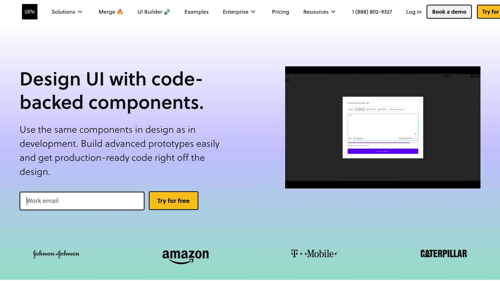
UXPin is a design and prototyping platform that connects design and development, with accessibility at its core. Unlike many traditional tools, UXPin lets teams create code-backed prototypes using real React component libraries, ensuring accessibility is part of the design from the start – not an afterthought.
Accessibility Features
UXPin’s focus on accessibility begins with its React component libraries, which include WCAG-compliant options like Material-UI (MUI), Ant Design, and Tailwind UI. These libraries come equipped with essential accessibility features such as ARIA roles, keyboard navigation support, and screen reader compatibility.
This setup allows teams to evaluate prototypes for accessibility early on, testing interactions and navigation before moving into development.
AI-Driven Capabilities
UXPin’s AI Component Creator, available in the Merge AI plan, generates React components based on design specifications while adhering to accessibility best practices. The AI ensures semantic HTML structure and recommends ARIA attributes and roles during the creation process.
Additionally, UXPin’s AI tools provide design suggestions to maintain consistency across component libraries. When new components are added, the AI proposes accessibility-friendly patterns based on existing ones, helping teams uphold accessibility standards throughout their design system. These AI-driven features integrate smoothly with development workflows for streamlined testing.
Integration with React Ecosystem
UXPin simplifies the handoff between design and development with its deep integrations. For example, the platform’s Storybookintegration (available in Company and Enterprise plans) allows teams to import existing component libraries, complete with built-in accessibility features, directly into UXPin. This makes it possible to test accessibility at the prototype stage using the exact components intended for production.
The npm integration further enhances this workflow by syncing custom React component libraries with UXPin. Any accessibility updates made to components are automatically reflected in the design tool, creating a feedback loop that keeps accessibility improvements flowing seamlessly between design and development.
Prototyping and Development Made Accessible
UXPin’s code-backed prototyping ensures that prototypes behave just like the final application – accessibility features included. This means screen reader users can interact with UXPin prototypes using their assistive technology, enabling practical accessibility testing before development begins.
Advanced prototyping tools like conditional logic and interaction settings allow designers to simulate accessibility scenarios, such as managing focus within modal dialogs or enabling keyboard navigation across complex interfaces. By addressing potential accessibility issues during the design phase, teams can avoid costly fixes later on.
With pricing starting at $6/month for the Essentials plan and going up to $39/month for the Merge AI plan (which includes the AI Component Creator), UXPin offers solutions for a range of budgets. For organizations with stricter compliance needs, the Enterprise plan includes additional security and accessibility compliance features.
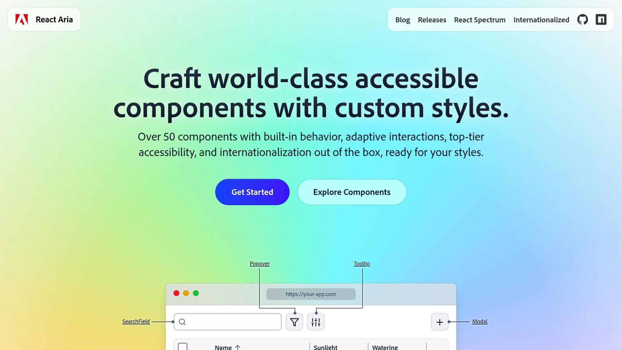
React Aria is a headless library of React components and hooks designed to create accessible user interfaces. It gives developers complete control over the design while ensuring compliance with WCAG standards. By focusing on accessibility without dictating styles, React Aria is perfect for developers who value functionality and behavior over predefined aesthetics.
Accessibility Features
React Aria simplifies the implementation of accessibility by automating WAI-ARIA features through behavior hooks. These hooks handle state management, focus control, keyboard interactions, and screen reader compatibility. The library supports advanced tasks like accessible drag-and-drop functionality, keyboard-based multi-selection in data tables, and built-in form validation with error messaging. Each component is optimized for seamless interaction across mouse, touch, keyboard, and screen readers.
Integration with React Ecosystem
React Aria integrates smoothly with any design framework, whether you prefer CSS modules, styled-components, Tailwind CSS, or traditional CSS. The library offers three levels of integration to suit different development needs:
High-level components: Ideal for rapid development with built-in DOM structures.
Customizable patterns: Use React contexts to tailor components to your design requirements.
Low-level hooks: Provide complete control over component behavior for fully custom implementations.
The library’s architecture separates state management, behavior logic, and rendering. This modular approach allows teams to reuse accessibility logic across projects, even when visual designs vary significantly. It’s a flexible solution that ensures accessibility remains consistent across different design systems.
Ease of Prototyping and Development
React Aria supports internationalization in over 30 languages, offering built-in formatting for dates, numbers, and text direction. This makes it a natural fit for global applications, simplifying the process of creating accessible interfaces from the start. The library’s behavior hooks manage complex tasks like state transitions, keyboard events, and focus handling, saving development time and reducing the risk of accessibility issues.
For teams working on intricate data interfaces, React Aria provides specialized tools, such as table column resizing, sortable headers, and accessible data grid navigation. These features eliminate the need for extensive custom development, allowing developers to focus on building robust application logic.
After diving into UXPin and React Aria, let’s shift gears and look at Cursor AI, a tool specifically designed to make accessibility in coding more seamless.
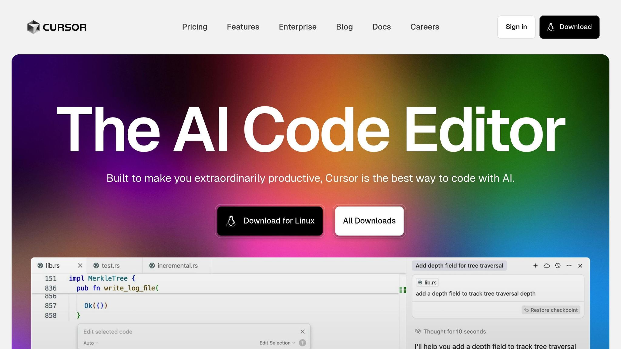
Cursor AI is an AI-driven code editor built on the foundation of Visual Studio Code. Its primary goal? To assist developers in crafting accessible React components. By analyzing your code in real time, it uses artificial intelligence to offer smart suggestions that enhance accessibility throughout the development process.
With natural language prompts, Cursor AI can generate React code that aligns with accessibility best practices. It takes care of important details like adding proper ARIA attributes, managing focus, and integrating effortlessly with frameworks such as Next.js and Create React App. This ensures that accessibility stays front and center across all your projects.
What makes Cursor AI even more helpful is its ability to provide contextual feedback and update multiple files simultaneously. This not only ensures consistency in accessibility but also minimizes the need for tedious manual reviews, making development smoother and faster.
4. HopeAI
HopeAI steps away from the usual code editor experience, offering a fresh perspective on React development with its focus on a composable architecture. This AI-powered assistant is designed to simplify the process of generating, building, testing, and releasing reusable React components, making component creation more efficient.
AI-Driven Capabilities
HopeAI uses artificial intelligence to craft components that emphasize reusability and maintain consistency throughout your codebase. One standout feature is its ability to automatically generate detailed documentation for every component it creates, saving developers valuable time.
What truly makes HopeAI unique is its structured approach to component creation. Each component suggestion comes with built-in automated testing, which helps catch common coding errors early. This not only reduces the need for manual testing but also ensures components align with accessible design principles, enhancing the overall quality of the code.
Integration with React Ecosystem
HopeAI works seamlessly with the Bit Platform, creating a smooth workflow for developing and distributing components. This integration allows teams to share and reuse components across projects, maintaining consistent functionality and design. By focusing on eliminating code duplication and following modern development practices, HopeAI makes managing large React applications far more efficient.
Simplifying Prototyping and Development
One of HopeAI’s most practical features is its ability to provide instant component previews alongside the generated code. Developers can see how components perform in various contexts without having to jump between tools or environments.
On top of that, the platform automatically produces detailed documentation for each component. This significantly cuts down on the time spent writing documentation manually, leaving developers free to concentrate on building new features and improving their projects.
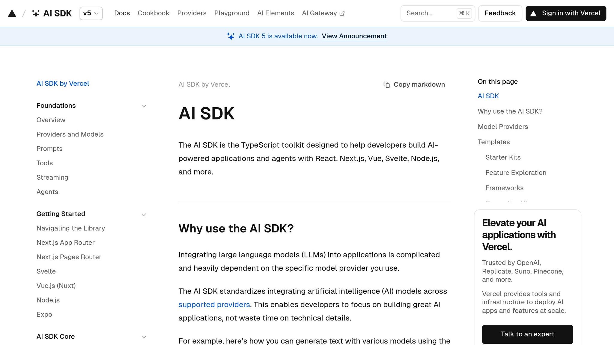
AI SDK simplifies the creation of conversational AI interfaces with a focus on accessibility. This toolkit equips developers with ready-to-use components designed to make chat experiences inclusive and user-friendly. From initial design to final deployment, accessibility remains a core principle.
Accessibility Features
AI SDK’s "Accessibility First" design philosophy ensures that every component is interactive, easy to use, and accessible. Key features include:
Full keyboard navigation for seamless interaction.
Proper ARIA attributes to enhance screen reader compatibility.
One standout example is the Response component, which renders Markdown generated by large language models. This component is explicitly "Built with accessibility in mind for all users". These accessibility features are fully integrated into modern React workflows.
Integration with React Ecosystem
AI SDK offers a robust set of React components tailored for AI chat interfaces. It uses modern React patterns to provide flexible and composable solutions for various applications. Key highlights include:
Built-in TypeScript support for enhanced development workflows.
Integration of the Response component via the @ai-sdk/react useChat hook.
Theme support for light and dark modes, enabling components to align with different design systems and user preferences.
With these features, AI SDK streamlines the development of accessible and adaptable conversational AI experiences.
Bolt takes AI-assisted accessibility in React development to the next level. This tool is designed to create accessible React components by combining modern web standards with established best practices.
AI-Powered Features
Bolt uses AI to understand what developers aim to achieve, generating React components that align with accessibility standards. These include ARIA labels, semantic HTML, and keyboard navigation. It also analyzes existing code to suggest accessibility improvements, making the process less time-consuming.
Seamless React Integration
Bolt fits right into the React ecosystem. It works with popular workflows, supports modern features like hooks and the context API, and generates TypeScript type definitions to ensure consistency. Plus, it’s compatible with frameworks like Next.js, Gatsby, and Create React App, making it highly versatile.
Faster Prototyping and Development
With Bolt, developers can speed up prototyping by turning design sketches or brief descriptions into functional, accessible components. Its user-friendly interface gives developers full control over styling, logic, and behavior, ensuring seamless integration with existing design systems.
Tool Comparison Table
Overview: UXPin simplifies the process of creating design-to-code prototypes while ensuring accessibility for React components.
UXPin offers an easy-to-use platform that bridges the gap between design and development, making workflows more efficient. It integrates smoothly with widely-used development tools, helping teams uphold accessibility standards. Pricing starts at $6 per editor per month for smaller teams and goes up to $119 per editor per month for larger organizations that require advanced features like extended version history and team management. This summary emphasizes UXPin’s capabilities, setting the stage for the final insights in the article.
Conclusion
AI tools are transforming the way developers tackle accessibility in React component development. These tools provide automated documentation, instant visual feedback on design accessibility, and AI-driven methods to evaluate theming and color choices. This ensures that designs align with visual accessibility standards right from the start. They also seamlessly integrate brand guidelines with accessibility standards, while still allowing room for creative flexibility. Additionally, features like accessible color systems are specifically designed to support inclusivity.
Platforms like UXPin highlight how these advancements are shaping the industry. By merging design with accessibility, UXPin simplifies workflows, ensures compliance, and delivers cost-effective solutions that make advanced accessibility tools accessible to teams of any size. Through automation, real-time feedback, and intelligent constraints, AI is making accessible development both efficient and intuitive.
FAQs
How do AI tools like UXPin help ensure React components meet WCAG accessibility standards?
AI tools such as UXPin make it easier to ensure React components align with WCAG accessibility standards by embedding automated accessibility checks into the design and prototyping workflow. These capabilities include features like contrast checkers to verify color contrast ratios, real-time testing for keyboard navigation, and support for ARIA attributes and screen reader functionality.
By catching and resolving accessibility issues early in the development process, UXPin helps teams stay WCAG-compliant while promoting a more inclusive user experience right from the beginning.
What are the advantages of using AI tools to ensure accessibility when designing React components?
How AI Tools Enhance Accessibility in React Component Design
AI tools bring a lot to the table when it comes to building accessible React components right from the design stage. They help pinpoint and fix accessibility issues early on, ensuring your application is more inclusive from the get-go. By automatically checking things like semantic HTML, ARIA attributes, and focus management, these tools reduce the chances of mistakes slipping through the cracks.
Beyond error-checking, AI tools also take care of repetitive tasks, speeding up workflows and giving developers more time to focus on creating a seamless user experience. The outcome? A more efficient design-to-development process and React applications that are easier for everyone to use. For teams managing APIs and data access across multiple backend systems, solutions like DreamFactory provide governed API access to enterprise data sources, complementing these accessibility-focused development practices with robust data integration and security.
How can AI tools like Cursor AI and Bolt enhance accessibility in React workflows, and are they easy to integrate?
Using AI Tools to Boost Accessibility in React Workflows
AI tools like Cursor AI and Bolt AI can play a significant role in making React applications more accessible. Take Cursor AI, for instance – it evaluates React components and offers suggestions to enhance accessibility. This includes improving keyboard navigation, adding proper ARIA attributes, and ensuring fallback options are in place. These features are crucial for building interfaces that everyone can use.
On the other hand, Bolt AI speeds up the creation of accessible React components by turning text prompts into functional components, all while following accessibility best practices. By automating critical tasks and fine-tuning accessibility features, these tools make it easier to design React components that are more inclusive and user-friendly.
Reusable React components streamline prototyping by offering pre-built, interactive UI elements that save time and ensure consistency. These components combine functionality, styling, and behavior, allowing designers and developers to create high-fidelity prototypes that closely mimic the final product. Platforms like UXPin Merge simplify this process by integrating React libraries directly into design workflows, enabling seamless collaboration between teams.
Key Takeaways:
What They Are: Modular, self-contained UI elements that can be reused across projects.
Why They Matter: Reduce repetitive work, maintain design consistency, and simplify updates.
Best Practices: Follow the single responsibility principle, use composition over inheritance, and prioritize accessibility.
Key Principles for Designing Reusable React Components
Building reusable React components requires careful planning and adherence to certain principles. These guidelines ensure components are easy to understand, adaptable, and durable – qualities that are especially important in fast-moving workflows like prototyping.
Single Responsibility Principle
A component should focus on doing one thing well. For instance, a button component should handle click events, manage its visual states (like hover or disabled), and display text or icons. It shouldn’t also be responsible for form validation or managing complex business logic – that’s the job of other components.
Keeping components focused makes them easier to debug, test, and reuse. When a teammate picks up your code, they should immediately grasp what a component does without wading through unnecessary complexity.
This principle also streamlines testing. A component with a limited scope requires fewer test cases and is less prone to breaking when other parts of the system evolve. In a prototyping environment, where requirements often shift, this simplicity becomes even more valuable.
Composition Over Inheritance
Instead of relying on inheritance to create complex hierarchies, design components to work together through composition. This approach uses props and children to combine simple components into more sophisticated ones.
For example, a card component can be built by combining smaller components like a header, a content area, and a button. This is far more manageable than cramming all that functionality into a single, bloated component.
Composition makes components more flexible. You can reuse the same button component in a card, a modal, or anywhere else in your app, ensuring consistent behavior and appearance across your prototype.
React’s children prop is especially useful here. It allows you to create wrapper components that can hold any type of content. For instance, a modal component using children can display anything from forms to images, making it incredibly versatile.
Customizability and Maintainability
Reusable components should be easy to customize without requiring direct changes to the code. This means exposing the right props for likely variations – like color, size, or text – while providing sensible defaults for everything else. A properly designed component works out of the box but also offers flexibility when needed.
To keep components simple and maintainable, only expose props that are necessary. For example, instead of a generic type prop, use more descriptive ones like variant for styling or size for dimensions. Clear naming conventions and concise documentation further enhance maintainability, making it easier for others to use your components effectively.
Think ahead when designing your components. Use CSS custom properties for styling that might need adjustments, and structure your logic to allow for future features without major rewrites. This is especially critical in prototyping, where requirements tend to change frequently.
Sometimes, it’s better to create multiple specialized components rather than overloading a single one. For instance, a basic button and an icon button can be separate components instead of merging them into one overly complex solution. This approach keeps your codebase cleaner and easier to manage.
Checklist for Creating Reusable React Components
Building reusable React components takes a thoughtful and structured approach. Here’s a step-by-step guide to ensure your components are reliable, maintainable, and easy to use across different scenarios.
Define the Component’s Purpose
Start by clearly identifying what the component is supposed to do. Ask yourself: What specific UI problem does this component address? A well-defined purpose keeps your design focused and avoids unnecessary complexity.
Follow the "three-times rule": if a UI element appears at least three times or is inherently complex, it’s a good candidate for reusability. This helps you prioritize creating reusable components without overcomplicating simple elements.
Separate business logic from UI logic – this keeps the component focused and easier to test. For example, a card component should focus on layout and presentation, while any data-fetching logic should live elsewhere. If you’re working with multiple data sources or integrations, platforms like DreamFactory can provide governed API access to any data source, allowing your components to remain clean and decoupled from backend specifics.
Think modular. Instead of creating one massive component, break it down into smaller, focused pieces. For instance, a card component might consist of subcomponents like a header, content area, and footer. This approach makes your components easier to mix, match, and maintain.
Finally, document the component’s purpose in one clear sentence. For example: "This component displays user profile information, including an avatar, name, and status indicator." This clarity not only guides your design but also helps your team quickly understand the component’s role.
Use Props to Enable Flexibility
Props are the key to making components adaptable without needing frequent code changes. They allow you to customize behavior and appearance while keeping the core structure intact.
Start with required props for the component’s essential functionality. For instance, a button component might require children for the label and onClick for the action.
Add optional props for variations. For example, a button could offer props like variant, size, and disabled for styling and behavior tweaks.
Use clear and descriptive prop names. For instance, use variant instead of something vague like type. This ensures your components are self-explanatory and easy to use.
Set default values for optional props to provide a functional baseline. For example, a button component should have default settings for its size and style, so users don’t need to specify everything for basic usage.
Leverage prop validation with PropTypes or TypeScript. This helps catch errors early, especially in fast-paced prototyping environments. Clear error messages can save developers time by making issues easier to diagnose.
Design props to work consistently across your components. For instance, if one component uses a color prop, ensure it behaves the same way in other components. This consistency simplifies learning and makes your library more intuitive.
Ensure Accessibility and Usability
Accessibility should never be an afterthought – it’s essential for creating inclusive, user-friendly components that work for everyone.
Add ARIA attributes where needed. For example, a custom dropdown should include attributes like role="combobox", aria-expanded for its state, and aria-labelledby to associate it with a label. These attributes help screen readers and other assistive tools understand your component.
Implement keyboard navigation for all interactive elements. Users should be able to navigate and interact using just a keyboard. Test components to ensure buttons can be activated with Enter or Space, and lists can be navigated with arrow keys.
Use semantic HTML elements as your foundation. Native elements like <button>, <input>, and <select> come with built-in accessibility features and expected behaviors. Avoid reinventing the wheel with <div> elements.
Ensure color contrast meets accessibility standards. Don’t rely solely on color to convey meaning – use text or icons alongside color cues for error states or other key information.
Test with assistive technologies. Tools like screen readers and voice control software can reveal usability issues you might miss during visual testing. Even basic tests with your device’s built-in screen reader can provide valuable insights.
Handle focus management carefully. For example, when a modal opens, focus should shift to the modal, and when it closes, focus should return to the element that triggered it. These details enhance the user experience and make your components feel polished.
sbb-itb-f6354c6
Managing Reusable Components in Prototyping Projects
After creating solid reusable React components, the next challenge is keeping them organized, up-to-date, and accessible across your prototyping projects. Poor management can lead to maintenance headaches, but a well-thought-out strategy can streamline workflows and minimize errors.
Organize Components into Libraries
To make the most of your components, structure them in a way that encourages reuse. A centralized component library is key to maintaining consistency and improving team collaboration. With a single source of truth, everyone can find what they need without wasting time.
Start by grouping components by their function rather than by project. For example, create categories like "Form Elements", "Navigation", "Data Display", and "Feedback." This functional categorization makes it easier for developers to locate the right component for specific tasks.
Establish a clear folder structure. Within your library, separate directories for components, utilities, and documentation can keep things tidy. Each component should live in its own folder, containing the main component file, styles, tests, and a story file for documentation purposes.
Speaking of documentation, ensure every component includes usage examples and guidelines. This might include details about when to use the component, its available props, and common implementation patterns. Comprehensive documentation is a lifesaver for team members working with components they didn’t create.
For common use cases, consider adding pre-configured component variants. For instance, instead of expecting developers to remember prop combinations for buttons, provide options like "PrimaryButton", "SecondaryButton", and "DangerButton." These variants reduce guesswork and help maintain consistency across projects.
Finally, apply clear naming and versioning standards to make updates more manageable.
Version Control and Naming Conventions
Consistency in naming and versioning is crucial for avoiding confusion and ensuring smooth updates.
Use semantic versioning (semver) for your component library. This system breaks versions into major, minor, and patch updates. Major updates signal breaking changes, minor updates introduce new features, and patch updates fix bugs. This approach helps teams understand the scope of changes and plan accordingly.
Adopt clear naming conventions for components, props, and files. Component names should follow PascalCase (e.g., "UserProfileCard") for clarity, while props should use camelCase (e.g., "isDisabled") to describe their function. Avoid using abbreviations that might confuse others – clarity is key.
For version control, use branch prefixes like "feature/" or "bugfix/" to describe the purpose of a branch. This small step keeps your repository organized and easy to navigate.
Maintain a changelog to document all updates, including new components, fixes, or breaking changes. A well-kept changelog provides a clear history of the library’s evolution and makes troubleshooting easier when issues arise.
To catch potential issues early, incorporate automated testing into your CI/CD pipeline. Visual regression testing is particularly useful for component libraries, as it can detect unintended styling changes that might not be caught by standard code-based tests.
With these systems in place, you’re ready to integrate your components into UXPin for a seamless design-to-development workflow.
UXPin simplifies prototyping by allowing direct integration with your React component library via npm or Storybook. This integration ensures that designers and developers work with the same components, closing the gap between design and production.
To get started, import your component library into UXPin using npm or Storybook sync. This setup ensures that updates to your codebase are reflected in your UXPin prototypes, keeping everything in sync.
Leverage UXPin’s Merge technology to bring your React components into the design environment. With Merge, designers can work with fully functional components that include real interactions, state management, and data handling. This creates prototypes that closely mimic the final product, making user testing and stakeholder feedback more accurate.
UXPin’s collaboration tools, such as comments, version history, and real-time updates, help keep everyone aligned. These features reduce miscommunication and ensure that design and development stay on the same page.
Finally, configure UXPin component properties to mirror React props. This alignment makes prototypes behave like the final product and simplifies the handoff to developers, as the prop structure is already defined.
Pros and Cons of Reusable React Components
Reusable React components can be game-changers in prototyping, offering a mix of benefits and challenges. Understanding both sides of the equation is crucial to determine when and how to implement them effectively.
Weighing the Benefits and Drawbacks
Deciding whether to invest in reusable components depends on factors like project scope, deadlines, and team dynamics. While they bring notable advantages, they also introduce complexities that require careful planning.
Benefit
Impact on Development
Drawback
Challenge Description
Reduced Development Time
Speeds up feature delivery by eliminating repetitive coding
Initial Setup Overhead
Requires significant upfront planning and well-thought-out architecture
Code Consistency
Ensures a uniform UI and user experience across the prototype
Over-generalization
Components may become overly complex when trying to handle too many scenarios
Easier Maintenance
Updates in one place automatically reflect across the prototype
Tight Coupling
Components might rely too heavily on specific data structures or business logic
Improved Scalability
Facilitates growth without a massive increase in code
Excessive Abstraction
Over-engineered components can be harder to debug and maintain
Enhanced Readability
Simplifies complex code, promoting collaboration
Prop Overload
Too many configuration options can make components confusing to use
Easier Testing & Debugging
Modular units are simpler to test and troubleshoot
Accessibility Oversight
Generic implementations may neglect specific accessibility requirements
Breaking Down the Key Points
"Reusable components are essential for building efficient, scalable, and maintainable React applications. They reduce development time, improve consistency, and make your codebase cleaner and easier to work with." – React Masters
Reusable components shine in large projects. By reusing existing elements, developers save time and speed up development cycles. These time savings grow as the component library expands, creating a ripple effect of efficiency.
Consistency is another major advantage. Beyond just visual uniformity, reusable components standardize behavior and interactions, making the application more intuitive for users and reducing the cognitive load on developers.
A mature component library also supports scalability and simplifies maintenance. Updates made to a single component can automatically propagate across the project. Testing becomes more efficient, as modular components are easier to isolate and validate.
"6 times would be more than enough for me to think about making it a common component. You’d probably also have an easier time testing it if it’s a reusable component." – TheBrightman
However, challenges like over-abstraction can’t be ignored. Creating overly generic components can lead to complexity, making them harder to use and maintain. Striking the right balance – keeping components flexible without overcomplicating them – is crucial.
Lastly, accessibility must be prioritized from the start. Generic designs often risk overlooking specific accessibility needs, which can lead to additional rework later. By addressing these considerations early, teams can maximize the benefits of reusable components while minimizing the drawbacks.
Conclusion: Building Consistent and Scalable Prototypes
Reusable React components transform prototyping into a strategic process, focusing on efficiency rather than repetitive tasks. By following core practices like maintaining a single responsibility for each component and leveraging version control, teams can create workflows that are both effective and easy to maintain.
Beyond saving time, reusable components foster better collaboration between designers and developers by creating a shared framework. This alignment becomes especially important when prototypes need to adapt quickly or when multiple contributors are involved in the same project.
UXPin Merge simplifies this collaboration by bridging the gap between design and development. Its integration with popular open-source libraries such as MUI, Ant Design, and Bootstrap allows for immediate prototyping. Plus, with the ability to work directly with real code components, UXPin ensures that "what you design is what you build".
The platform also introduces AI-powered component generation, enabling teams to create functional Tailwind CSS components from simple text prompts. These quick iterations pave the way for smoother transitions to development.
Another standout feature of UXPin is how it eliminates handoff delays. Designers can share preview links that include ready-to-use JSX code, dependencies, and functions. As UXPin puts it, "You’re essentially skipping the translation phase between design and development, which is a huge win, especially for smaller teams".
FAQs
How do reusable React components improve collaboration between designers and developers during prototyping?
Reusable React components serve as modular building blocks that bridge the gap between designers and developers. Designers can leverage these components to craft interactive, realistic prototypes, while developers can seamlessly implement and reuse them across multiple projects. This shared library not only ensures uniformity but also minimizes miscommunication and accelerates the development process.
By incorporating reusable components, teams can stay aligned on design standards and functionality. This alignment simplifies iteration, maintains consistency across the project, and enhances collaboration between design and development teams, ultimately saving time and streamlining workflows.
What challenges might arise when building reusable React components, and how can they be solved?
Creating reusable React components can be tricky. You might run into problems like over-engineering or struggling to predict how the component will be used in the future. If a component is too generic, it can become a headache to maintain. On the flip side, if it’s too specific, it might not adapt well to different needs.
The best way to tackle this is by focusing on modularity. Design each component with one clear job in mind. This keeps things simple, avoids unnecessary complexity, and makes the component easier to reuse. Also, steer clear of adding side effects within components – this helps keep them predictable and reliable.
Another key step? Write clear documentation. When your team knows exactly how a component works and how to use it, it saves everyone time and ensures consistency. Tools like design systems or component libraries can also help. They make scaling easier and keep your workflow running smoothly.
How does UXPin Merge simplify using React components in prototypes, and what are the key benefits?
UXPin Merge simplifies the process of bringing React components into prototypes by letting designers import production-ready components straight into the design workspace. This approach helps maintain alignment between design and development while preserving the actual functionality of the components.
With Merge, teams can work more efficiently, minimize mistakes, and enhance collaboration between designers and developers. The real-time sync with code repositories ensures prototypes stay current, making the handoff from design to development smoother and quicker.
UX isn’t just about attractive design; it’s also about usability. And SEO isn’t only about search engines; it’s also about users.
This is where the two overlap. And after reading this guide, you’ll see that SEO and UX testing are actually more connected than you think.
When done well, your user experience can become your biggest opportunity for helping your website rank higher in search results. You just need to know what to look out for and what is still relevant.
These are just a few UX testing hacks that can improve your SEO:
Check how well your content follows best practices.
Test whether your website is easy to navigate.
Evaluate mobile responsiveness.
Track your page loading speed.
Check your core web vitals.
UX and SEO: What’s the Connection?
There is a deep link between UX and SEO, so you need both to make your site attractive to users and search engines. But why can UX make or break your search engine optimization? Well, there are a couple of reasons:
User Satisfaction
If you get the UX right, it will lead to overall satisfaction because people will enjoy using your website, which means they’re going to want to:
Hang around more.
Check out more pages and products/services you have.
Engage with your content, sign up for something, or download what you offer.
In the world of SEO, all that translates into metrics (high avg. time on page, low bounce rate, etc.). So, the search engines will see all of that as a sign that your content must be really valuable and high-quality.
As a result, they will boost you higher in the search results. See how that works to improve your visibility?
Online Performance
Let’s face it: no one wants to deal with a website that takes ages to load. In fact, it’s a widely known fact that pages that rank on the first page of Google search results are those that load in less than three seconds.
After all, UX is all about making a website perform well, not just look nice. So, if your site’s speed is slow and the overall experience isn’t smooth, it will affect your Google Core Web Vitals score, which directly impacts rankings.
Appealing Site Structure and Intuitive Navigation
Navigation is really important for a great experience. If it’s hard to find something on your site, most people simply won’t bother. They’d rather leave and find some simpler solution.
If enough users do this, your bounce rate increases and Google notices it. So, this is another place where your UX can seriously affect your SEO.
A site that has a logical site structure and the menus that are easy to find usually encourages people to check out more content. But it doesn’t stop there. It’s also easier for the search engine crawlers to find your new content and index it faster, which is a win for your optimization.
Accessibility and SEO
UX is about creating websites accessible to everyone. This includes making it possible for people with disabilities to navigate through your pages. So, if your website helps screen readers access the content, it will both influence your user experience and SEO in a good way.
This is also why the optimization practices include adding alt text to images, meta tags, etc.
It’s a factor that’s often overlooked, but in reality, it improves the impression of your site and signals quality to search engines. This is why One Base Media recommends that businesses prioritize UX, no matter what type of SEO they are doing.
Okay, now that you know how UX affects SEO, the next best thing is to learn how to make sure you are doing things right.
There are way too many web design and SEO mistakes that can tank your rankings. So, to avoid getting lost, here are our best hacks for you:
1. Check How Well Your Content Follows Best Practices
One of the least technical things you have to test is your content.
You want to make sure that it’s original, valuable, and easy to read so that people are encouraged to stay longer on your site, leave comments, and generally engage more. To make this happen, you need to:
Keep your sentences and paragraphs short. No one wants to read the wall of text.
Use headings to organize your content. Use bullet points and lists to make it skimmable.
Add high-quality images, charts, and diagrams that help readers understand the points you’re trying to make.
Write your content in conversational, everyday language. Your users likely don’t want to grab a dictionary when reading your posts.
Use links to help people move to other related posts. Make sure that the anchor text is descriptive and fits naturally with the rest of your text, including links placed on relevant sites.
Get backlinks from credible sources. It’s even more helpful to use .edu and .gov backlinks as these have the most impact on your SEO.
2. Test Whether Your Website Is Easy to Navigate
If you ever conduct any user experience testing, you’ll have to check how people move around your site. Ideally, you want to learn how they interact with it and if they can find what they want easily without going back and forth.
Your ultimate goal should be to make that navigation as intuitive as possible, but every UI/UX designer knows that it’s definitely easier said than done, especially for complex websites.
So, how can you test and improve your navigation?
One of the easy yet effective improvements is checking your domain. You might think that it has nothing to do with the navigation, but in reality, often it’s the first “contact” people get with your site. So, if your domain is easy to type in the search bar, navigating to your page is already faster. And of course, your domain choice is huge for SEO.
Make sure to keep your menu simple, short, and straight to the point. Resist the temptation to sound too creative when naming things. Your website has to be functional above all.
Avoid creating way too many categories that have sub-categories that are also categorized to infinity… You get the picture.
Use a logical page structure and links to help people get around more easily. Clean site architecture is extremely important for your rankings.
You might have heard that most of the traffic comes from people using their mobile phones. But did you know that 48% of users online take a site that is not mobile-friendly as a sign that the business does not care? Another 57% wouldn’t recommend that company to others.
But it’s not just people either. Google uses a mobile-first indexing for its rankings. See how this links UX and SEO metrics?
That’s exactly why you need to verify if your site is mobile-friendly. If it’s not, here’s what you can do in addition to fixing the page load speed and navigation structure:
Make the buttons big enough for people to click on from small screens.
Use a responsive design so your site adjusts automatically to every screen size. This will have a great impact on your SEO.
Tweak your content and edit it with mobile users in mind. This means shorter paragraphs, plenty of white space, etc.
Ditch the unnecessary pop-ups to make it possible for people to easily close the ones you do decide to use.
4. Track Your Page Load Time (Constantly)
We’ve already touched on the loading speed several times in this guide. But it is for a very good reason. Everyone hates to wait (and believe it or not, Google, too). So, your page load speed is something you have to test all the time. Literally.
Well, how do you do this? Thankfully, it’s quite easy. You can simply use Google’s PageSpeed Insights. It’s a native, free tool, so there are really no excuses.
If your score isn’t looking good, you will need to:
Compress every image so that they take up less space and upload more quickly (or use plugins that do this for you)
Make sure you’re using a hosting provider that is fast.
Minify your code to make it load even faster. This means you have to remove every unnecessary line of CSS, JavaScript, and HTML, and take out unnecessary spaces and symbols. Often, your CMS can do this automatically.
Alternatively, you can find free tools on the internet or use ChatGPT and simply copy-paste your code to take care of it.
Core Web Vitals are actually high-priority metrics to look out for when you’re doing your UX testing for SEO. Why? Because Google uses this to judge your website performance and rankings as a result.
So, you want to track it all the time and improve it when needed. You can use the same PageSpeed Insights tool for this.
As for the easiest fixes here, you can consider the following:
Use a CDN network (in several servers) to make sure that users are getting their content delivered to them from the closest server.
Reduce the amount of JavaScript on your page.
Use fewer plugins when possible.
Avoid heavy animation that not only affects your layout but can also affect your speed. Things like chat widgets, expanding banners, and so on.
And of course, check your online performance regularly so you can spot issues early and fix them on time.
Conclusion
There are many ways in which user experience can affect your SEO rankings. So, ignoring this is simply impossible, especially after reading this article.
But by simply following the tips shared today, you will not only improve your position in search results but also build a reputation and the trust of your visitors. So, it’s definitely worth trying.
AI is transforming how design teams collaborate with developers by automating the handoff process. This reduces errors, saves time, and ensures better alignment between design and code. Key benefits include:
Automating repetitive tasks: AI extracts design details, generates code snippets, and flags inconsistencies.
Improved communication: AI summarizes changes, provides real-time updates, and ensures teams stay aligned.
Context-aware mapping: AI understands design intent, translating it into precise, development-ready components.
Efficiency gains: Teams report saving up to 75 days of engineering time within six months.
With tools like UXPin, Figma integrations, and Storybook, AI simplifies workflows, boosts productivity, and helps teams deliver polished products faster.
Go from Figma to Production at AI Speed | Build Faster with MCP and Claude | AI in Action – EP07
Problems in Manual Developer Handoff Workflows
Before diving into how AI can improve handoff workflows, it’s important to look at the flaws in manual processes. Manual developer handoffs often slow down product development, creating inefficiencies that sap team productivity. Instead of facilitating a seamless transition, these workflows can become bottlenecks, delaying timelines and dampening team morale.
Manual Asset Export and Communication Problems
One of the biggest headaches in manual handoffs is miscommunication and inconsistency during asset transfers. Designers often need to manually export assets and share specifications, but this process leaves plenty of room for error. Since designers and developers tend to focus on different priorities, key details can easily get lost.
Tight deadlines only make things worse. When teams are under pressure, designs and documentation are often incomplete. This means developers don’t always get the full picture of why certain design choices were made or what customer pain points they address. Ben Nadel points out that, in such cases, developers are left to make educated guesses without a full understanding of the design context.
This lack of clarity can result in products that look correct on the surface but function in ways that deviate from the original intent. And to add to the frustration, many developers find design tools difficult to navigate. Daniel Vaughn, Senior Platform Engineer at NextEra Mobility, captures this well:
Most developers I’ve known don’t feel very comfortable navigating design tools.
Version Control and Design Consistency Problems
Beyond asset transfers, maintaining design consistency is another major challenge. Manual workflows often rely on outdated methods like file transfers and verbal communication, making effective version control nearly impossible. Developers frequently end up working from old files or incomplete specs, leading to implementations that don’t align with the intended design.
Inconsistent designs can confuse developers and hurt the final product. Vaughn highlights how manual processes blur the “source of truth” by mixing experimental drafts with finalized designs. Missing screens, outdated logic, or incomplete documentation force developers to fill in the gaps, often compromising the user experience.
The problem doesn’t stop at individual files – it extends to the entire design system. Donnie D’Amato, founder and chief architect at Design Systems House, emphasizes the complexity of managing multiple UI states:
We’re talking about the tokens that I’m using to compose these things and all the different types of states that we need to consider. And that’s not just hover and active. We’re talking about things like empty states or first-time user experience stuff. All the different considerations need to be accounted for.
When these considerations aren’t properly documented, developers are left guessing, leading to inconsistencies across the product.
Impact on Team Collaboration and Productivity
The ripple effects of manual handoff problems are felt across entire teams. Poor communication is a significant culprit, contributing to 63% of failed sprints in distributed teams. On the flip side, teams with strong documentation practices complete sprints 45% more often. This highlights how manual processes create unnecessary friction that impacts overall productivity.
Another issue is the disconnect developers feel when they’re excluded from the design process. D’Amato captures this sentiment:
Sometimes, I feel that we’re left out. As developers, we don’t know the entire story about where this design came from.
This lack of context forces developers to rely on guesswork, leading to more revisions and back-and-forth communication. It’s a frustrating cycle that lowers morale and slows progress.
The challenges are even greater for remote teams. Remote engineering teams accumulate technical debt 45% faster than co-located teams. Manual handoffs amplify this problem by creating additional communication barriers and reducing clarity around technical requirements.
Martin Fowler, Chief Scientist at ThoughtWorks, sums it up well:
The success of distributed engineering teams depends less on tools and more on deliberately designed processes and communication patterns.
These inefficiencies highlight the need for better solutions. Without addressing these workflow challenges, small setbacks can snowball into major delays, creating friction between design and development teams and slowing down the entire product development process. AI offers a way to tackle these issues head-on, transforming how teams work together.
How AI Changes Developer Handoff Automation
AI is reshaping how developer handoff workflows operate by tackling the inefficiencies and miscommunication that often plague manual processes. By bridging the gap between design and development, AI-powered tools simplify workflows and save time. Teams leveraging AI for handoff automation report saving 41 days of engineering time within the first five months, increasing to 75 days by the sixth month.
Automating Repetitive Handoff Tasks
One of AI’s biggest contributions is its ability to handle repetitive tasks that are prone to errors and consume valuable time. These tools analyze design files, extract key details like color codes, typography, spacing, and component properties, and generate detailed specifications – all without manual input.
Beyond just specifications, AI can generate code snippets directly from design elements. It even predicts potential implementation issues and flags inconsistencies in the design. Thanks to these efficiencies, teams experience a 19% faster cycle from commit to production, allowing designers and developers to focus on more strategic, creative tasks.
Amir Behbehani, VP of Engineering at a Fortune 500 company, captures this shift perfectly:
AI isn’t making our developers faster typists – it’s shifting them from carpenters to architects. But only if we redesign our processes to match.
For instance, Meta‘s testing framework used AI to create 9,000 test mutations, achieving a 73% acceptance rate. This shows how AI can handle large-scale repetitive tasks while maintaining high-quality standards, something that would be challenging to achieve manually.
AI-Driven Context-Aware Mapping
Traditional handoff tools often treat design elements as isolated pieces, but AI introduces a new level of contextual understanding. This context-aware mapping allows AI to interpret design intent and translate it into development-ready components, ensuring the original vision is preserved.
By eliminating guesswork, AI translates design intent into precise code structures, addressing a major challenge: 48% of developers encounter knowledge silos at least once a week. This contextual awareness helps bridge gaps in communication and ensures consistency across the design system.
AI also recognizes patterns and relationships across a product’s entire design, instead of seeing each screen or component as a separate entity. This means developers gain a clear understanding of how all elements interact within the broader system, not just individual assets.
Real-Time Updates and Notifications
AI addresses the common issue of outdated design information by enabling real-time syncing of changes. Whenever designers update a file, AI detects the changes and notifies the relevant team members.
But it doesn’t stop at notifications. AI evaluates the scope of these changes and identifies their impact on the development process. For example, if a button style used across multiple screens is updated, AI flags all instances and alerts developers to the broader implications.
Several tools showcase this real-time capability in action. For instance:
Figma integrated with Locofy and Anima: Converts designs into production-ready React or HTML code with minimal manual effort.
Penpot AI: Automatically generates responsive layouts from Figma designs, adapting them for various screen sizes and devices.
Storybook with Chromatic: Uses AI for visual regression testing, ensuring that updates don’t unintentionally alter component appearances. It also syncs design tokens, so changes in Storybook reflect automatically in the development environment.
Roman, a designer at Eleken, highlights how this transformation simplifies the process:
I don’t need to think of how to handoff design to a developer, I simply share a link. Guys pick up the design for implementation right there. If the correction is minor guys leave a comment about it directly in Figma and it’s super convenient and time-efficient… What I love the most is that I don’t need to write any additional documentation with specifications. Developers get everything they need automatically in Figma.
AI also plays a role in content creation during the handoff process. It can generate microcopy, saving time for designers and content teams alike. Automated design QA powered by AI catches issues early, preventing them from spilling over into development. When developers need code snippets, AI offers suggestions, removing bottlenecks between teams.
These advancements create a shared platform where design specs, code snippets, and feedback flow effortlessly between team members. This seamless integration reduces errors and promotes transparent, continuous collaboration across the board.
sbb-itb-f6354c6
Code-Backed Tools in AI-Powered Handoff
Code-backed design tools are reshaping how designers and developers work together. Unlike traditional tools that produce static mockups, these platforms use real code components to create prototypes, bridging the gap between design ideas and development execution. When enhanced with AI, these tools transform the handoff process into a smooth, efficient workflow. This shift opens the door for AI to refine collaboration at every stage of the process.
Benefits of Code-Backed Prototyping
Prototyping with code-backed tools ensures design precision by delivering components that are ready for production. By using actual code components, designers provide developers with prototypes that behave exactly as they will in the final product. This tackles a major issue: UI development can account for over 60% of total development time and costs.
The difference becomes evident when comparing traditional handoffs to code-backed methods. Static mockups often leave room for misinterpretation, while code-backed prototypes deliver exact components, styles, and interactions. This eliminates guesswork for developers and ensures consistency between design and implementation.
Take UXPin’s AI Component Creator, for example. It creates production-ready UI components from popular libraries like MUI, Ant Design, Tailwind UI, and React-Bootstrap, making it easy for developers to integrate them directly into the codebase. This means designers and developers work with the same components, reducing translation errors and saving time.
The time savings are significant. Developers receiving code-backed prototypes can focus on business logic and functionality instead of recreating UI elements. This streamlined process accelerates the journey from concept to production while keeping the design intact.
Better Collaboration with AI Features
AI-powered tools in code-backed systems act as a common language for designers and developers. They understand the creative intent behind designs and the technical constraints of development, offering intelligent suggestions to bridge the gap between the two.
For example, developers using GitHub Copilot reported completing tasks 55% faster on average. These efficiency gains apply to design-to-code workflows too, where AI supports both designers and developers in their roles.
In addition, developers are using tools to help you save time, such as zoom ai note taker that can help you take automated notes during Zoom calls using artificial intelligence so you can get a brief summary of the meeting.
AI tools also improve collaboration by automating documentation. They capture design decisions and implementation details, ensuring everyone stays on the same page. If a designer updates a component, AI can automatically generate updated specs and notify the team of the changes. Platforms like DreamFactory further enhance this by providing governed API access to any data source, enabling seamless integration of design specs and development data across enterprise systems.
“The real value of AI tools in design-to-code handoffs isn’t just speed or automation. It’s about unlocking better collaboration.”
AI further enhances productivity by maintaining consistency across projects. It remembers design systems and suggests appropriate components, flagging inconsistencies before they become issues. This ensures that teams stick to established standards and avoid costly errors.
The feedback loop between design and development becomes more efficient with AI. Instead of back-and-forth emails or meetings about feasibility, AI provides instant feedback on design decisions, suggesting alternatives that align with both design goals and development needs.
Continuous Improvements Through AI Integration
AI integration allows design updates without disrupting workflows. Traditional handoff processes often falter when designs change mid-development, leading to delays and miscommunication. AI-powered tools, however, adapt to changes seamlessly, ensuring smoother updates and collaboration.
Generative AI tools have been shown to save 10–15% of development time. Over time, these savings increase as AI learns team preferences and automates repetitive tasks.
Hewlett Packard Enterprise (HPE) offers a real-world example of this. They used an AI assistant to automate code reviews for a large software project. The AI, trained on HPE’s coding standards and past reviews, flagged missing documentation, potential errors, and style inconsistencies. This allowed developers to address issues before human reviews, speeding up the process and improving code quality.
This approach can be applied to design handoffs as well. AI can analyze past projects to identify recurring issues and flag similar patterns early. For instance, if a specific design element has caused problems before, AI can suggest alternatives during the design phase, preventing costly revisions later.
The continuous learning aspect of AI tools makes them more effective over time. As they handle more projects and observe team workflows, they gain a deeper understanding of team preferences, coding standards, and design patterns. This results in more accurate suggestions and fewer obstacles during handoffs.
AI also enables proactive problem-solving. Instead of waiting for issues to arise during development, AI can analyze designs in advance, predict potential challenges, and recommend solutions. This allows teams to address issues early, when adjustments are easier and less disruptive.
Case Study: Automating Handoff with AI-Powered UXPin
UXPin demonstrates how AI can revolutionize the traditionally tedious handoff process between design and development. By combining code-backed prototypes with advanced AI features, UXPin simplifies collaboration and ensures seamless alignment between teams.
UXPin’s AI-Driven Features for Handoff
At the heart of UXPin’s automation capabilities is its AI Component Creator, a tool that transforms simple text prompts into production-ready UI components. This feature supports popular frameworks and enables designers to create intricate components in seconds, cutting out the repetitive back-and-forth typically required between design and development teams.
Another standout feature is Merge, which integrates open-source libraries like MUI v5, Ant Design, and Tailwind directly into the design workflow. This integration ensures that designs are functional and ready for development from the start.
UXPin also automates the creation of design specs, CSS code, and style guides, saving teams countless hours of manual documentation work. Developers can access JSX code, dependencies, and functions for every component directly within the design environment, streamlining the entire handoff process.
“With UXPin, all of your team’s designs and prototypes are enriched with automatically generated specifications in one tool. No plug-ins, no third-party handoff apps.”
The platform further supports collaboration with modes like Preview, Comment, Spec, and Documentation, helping teams communicate effectively while minimizing errors and speeding up workflows.
Cutting Errors and Boosting Efficiency
By starting with code-backed components, UXPin ensures that prototypes behave exactly like the final product. For example, its Merge feature reduced front-end build time by 40% for a fintech dashboard project, allowing developers to concentrate on more complex tasks.
The AI Component Creator also helps teams adhere to best practices and accessibility standards. It can instantly generate commonly used UI elements – like FAQ sections or contact forms – complete with proper structure and functionality. Integration with Stackblitz simplifies code export and deployment, making the process even smoother.
Transforming Design and Development Collaboration
The real-world impact of UXPin is clear. In early 2024, a mental wellness startup used UXPin’s AI tools to create a high-fidelity MVP demo in just 48 hours. By leveraging UXPin Merge’s production-ready components, the team was able to align design and development seamlessly.
UXPin’s approach significantly boosts productivity by combining features like the AI Component Creator, direct code export, and open-source component libraries. Teams can use pre-designed layouts and contextual documentation to speed up product launches, fostering better communication and reducing misunderstandings between designers and developers.
“Automate the work that your team doesn’t need to be wasting their time on. Allow them to use their creativity for real game-changing tasks.”
The Future of AI in Developer Handoff Automation
AI is revolutionizing how teams collaborate, and developer handoff automation is no exception. With rapid advancements, these processes are becoming more streamlined, setting the stage for a broader transformation in product development workflows. Let’s dive into the trends shaping this space.
Current Trends in AI for Developer Handoff
AI is becoming a core part of development tools, reshaping traditional workflows. According to data, 76% of developers are either already using AI or planning to integrate it into their processes. This growing adoption is driving innovations like AI-native IDEs and the Model Context Protocol (MCP), which are reimagining the development loop entirely.
AI agents are also making their mark. These tools can now observe application behavior, functioning much like assistive technologies. Developers are increasingly working alongside these agents in asynchronous workflows, where tasks are handled in the background, and progress is reported upon completion.
Version control is undergoing a transformation as well. AI-native Git shifts the focus from traditional line-by-line changes to how the output behaves. Similarly, AI-generated project scaffolds are replacing rigid templates, allowing developers to create custom setups based on simple descriptions. Handoff documentation is evolving too, moving from static formats to dynamic, interactive systems that cater to both human teams and AI agents.
Impact on Design and Development Efficiency
AI is already delivering measurable efficiency gains. Companies using AI tools report 3–5× faster feature delivery. This speed boost is particularly noticeable during the prototyping phase. As Reddit‘s Chief Product Officer, Pali Bhat, explains:
New feature definition, prototyping, and testing are all happening in parallel and faster than ever before. Our teams can now dream up an idea one day and have a functional prototype the next. It’s that fast.
While only 23% of developers currently report that AI tools improve code quality, this number is expected to rise as AI becomes better at understanding project context and maintaining consistency in handoff processes. Gartner predicts that by 2028, 75% of enterprise software engineers will use AI coding assistants, signaling a shift from basic automation to tools that enhance decision-making.
These efficiency gains go beyond the handoff stage, influencing the entire product development lifecycle.
AI’s Growing Role in Product Development
AI’s influence is extending across product development, thanks to advancements like multimodal AI, which integrates text with images, video, audio, and code. This allows for more precise translation of design intent into development requirements.
The “shift left” approach is another emerging trend, where AI addresses risks, compliance, and accessibility earlier in the development process. On this topic, Reddit’s Pali Bhat notes:
The greatest value will occur when we can remove the bottlenecks and ensure our products are compliant and high-quality from the get-go. We are already doing that with accessibility, where we ensure that it is ‘built in’ from the start of the PDLC rather than bolting it on after the fact.
Dynamic AI interfaces are also replacing static dashboards. These conversational systems adapt to user intent, driving toolchain consolidation. As Bhat explains:
An excess of point solutions fragments the developer experience. Engineering teams can only effectively use a certain number of tools as part of their core workflow. Integration will become more crucial, and we will see toolchain consolidation over time.
By 2025, organizations will move from experimenting with AI to fully leveraging its potential. Handoff automation will evolve from simple task execution to intelligent workflows that anticipate team needs and project requirements.
As Microsoft’s VP of Office AI, Ritcha Ranjan, puts it:
AI is changing the product development life cycle by shifting human effort toward areas where we add the most value – those requiring deeper reasoning and problem solving. Traditionally, engineers follow a process: scoping requirements, determining system integration, shaping the solution, writing code, testing, reviewing with peers, and refining the design. Today, AI accelerates code writing and testing. As the technology evolves, it will begin tackling more complex aspects of the process, but advancements will be limited to textural chains of thought to emulate human reasoning. These advances will continue shifting engineers’ focus to areas requiring deeper reasoning.
FAQs
How does AI enhance collaboration between design and development teams during the handoff process?
AI plays a key role in improving collaboration between design and development teams by streamlining the handoff process and making communication more effective. It takes care of repetitive tasks, creates precise design documentation, and converts designs into formats that developers can easily work with. This helps minimize confusion and cuts down on delays.
When AI is integrated into workflows, teams gain access to real-time updates, maintain consistency, and stay aligned on project objectives. This leads to a smoother transition from design to development, saving time while boosting the overall quality of the final product.
What challenges do manual developer handoffs present, and how does AI help resolve them?
Manual developer handoffs are notorious for causing delays, miscommunication, and errors. These hiccups can derail project timelines and compromise the quality of the final product. The root of the problem often lies in inconsistent documentation, unclear communication, and the inevitable human errors that creep in when design specifications are handed off to development teams.
AI-powered tools offer a way to tackle these pain points head-on. By automating repetitive tasks, they help maintain design accuracy and foster smoother collaboration between teams. The result? Fewer errors, faster workflows, and a more seamless connection between designers and developers. While their effectiveness hinges on factors like the quality of input data and proper setup, these tools hold strong promise for reshaping how teams collaborate during the handoff process.
How does UXPin’s AI Component Creator improve the accuracy and efficiency of design-to-code workflows?
UXPin’s AI Component Creator simplifies the design-to-code process by automatically turning your designs into accurate, code-ready components. This eliminates much of the manual coding effort, reduces potential errors, and speeds up the handoff between design and development.
With the power of AI, teams can maintain better alignment between design and development, boosting efficiency and saving valuable time. This smooth workflow lets developers concentrate on perfecting functionality instead of converting design files into code.
Interactive prototyping with React components transforms static designs into functional models that closely resemble final products. This approach bridges design and development, streamlining workflows and reducing costly revisions. Here’s why it works:
React’s component-based architecture: Creates reusable UI elements that integrate appearance and behavior.
Realistic prototypes: Simulate user interactions and transitions for better validation and collaboration.
Direct alignment with production code: Prototypes built with React components ensure smoother handoffs to developers.
To get started, you’ll need tools like Node.js, Vite, and a code editor like Visual Studio Code. Organize your project with type-based, feature-based, or hybrid structures depending on the project size and team. Tools like UXPin enhance the process by enabling designers to use real React components, offering advanced interactivity and seamless updates.
Improved long-term consistency and maintainability.
React prototypes aren’t just concepts – they’re a bridge to production-ready code.
Turn Design into React Code | From prototype to Full website in no time
Setting Up a React Prototyping Environment
Creating a React prototyping environment requires the right tools and a solid structure. A well-prepared setup not only speeds up development but also ensures your prototypes are production-ready when the time comes.
Prerequisites for React Prototyping
Before you start, there are a few essential tools and dependencies you’ll need. Node.js is the JavaScript runtime environment that powers your development, while npm or Yarn serve as package managers to handle dependency installation. These form the backbone of any React project.
Choose a code editor that supports React well. Visual Studio Code is a popular choice, thanks to its integrated terminal, Git support, and a wide range of React-specific extensions.
When it comes to project scaffolding, Vite has become the go-to tool, surpassing the now-outdated Create React App. Vite offers faster server start-up, better hot module reloading, and more efficient bundling, making it a great fit for the iterative nature of prototyping.
For more complex prototypes, additional tools can make your life easier:
State management libraries like Redux or MobX to handle data flows.
Once your tools are ready, organizing your project is key to keeping things manageable. React doesn’t enforce a specific structure, so it’s up to you to choose one that matches your project’s needs. There are three main ways to organize your React code: type-based, feature-based, and hybrid structures.
Type-based structure: Groups files by type, such as components, hooks, or utilities. This method works well for smaller projects (fewer than 50 components) and teams of 1–5 developers. It’s a simple approach that’s ideal for prototypes or quick setups.
Feature-based structure: Organizes code by functionality, like user management or product listings. This is a great choice for larger projects with multiple teams or for applications that require long-term scalability. It fits well with projects exceeding 50,000 lines of code.
Hybrid structure: Combines both approaches, balancing feature isolation with shared resources. It’s a middle ground that works best for midsize projects (5,000–50,000 lines of code) and teams of 5–20 developers.
To improve your workflow, consider these tips:
Use absolute imports with jsconfig.json or tsconfig.json to simplify import paths.
Set up barrel files (e.g., index.js) to streamline exports.
Group related files – like components, styles, and tests – together to minimize context switching.
Stick to consistent naming conventions, like kebab-case, and limit folder nesting to 3–4 levels to keep things manageable.
Feature
Type-Based
Feature-Based
Hybrid
Project Size
Small
Large
Medium
Team Size
1–5
20+
5–20
Scalability
Low
High
Medium
Best Use Cases
Prototypes, small apps
Enterprise apps
Mid-size apps
With a structured project setup, tools like UXPin can further streamline the prototyping process, ensuring a smooth transition from design to development.
Once your environment and project structure are in place, UXPin can enhance your prototyping process by bridging the gap between design and development. This tool allows designers and developers to work with the same React components, creating realistic, high-fidelity prototypes that behave just like the final product.
One standout feature is UXPin’s AI Component Creator, which generates React components directly from natural language descriptions. This cuts down on manual coding, letting teams refine and customize components as needed.
UXPin also supports advanced interactions, like conditional logic and state management, to simulate real user flows. This means your prototypes can mimic actual functionality, giving stakeholders a clear preview of the end product.
To keep everything aligned, UXPin integrates seamlessly with tools like Storybook and npm. Any updates to your codebase automatically sync with your prototypes, ensuring consistency throughout the development process and reducing manual updates. This integration makes UXPin a powerful addition to your React prototyping toolkit.
Building Interactive Prototypes with React Components
Once your environment is ready, you can dive into building your prototype. The secret to a successful React prototype lies in a modular approach – breaking your interface into smaller, manageable parts, building them step by step, and then layering in the interactions that make your design functional.
Breaking Down UI into Components
The first step in creating a React prototype is breaking your user interface into a hierarchy of reusable components. This method ensures that each piece has a clear role and can be developed, tested, and updated independently.
Start by identifying the major sections of your interface – think headers, sidebars, main content areas, and footers. Then, divide these sections into smaller, more focused components. For example, if a section feels too complex, split it into simpler pieces, each with a single responsibility.
Take a searchable product listing page as an example. A top-level component, like FilterableProductTable, might manage the entire interface. Within it, you could have a SearchBar for user input, a ProductTable for displaying results, ProductCategoryRow components for section headings, and individual ProductRow components for each product. Each component should focus on one specific task.
When deciding how to structure your components, think about UI segments that can be reused. Common patterns like buttons, cards, form fields, and navigation elements can often be abstracted into reusable components with customizable properties. To keep things organized, use consistent naming conventions for your components, props, and event handlers. This not only improves readability but also simplifies collaboration with your team. Additionally, plan how data will flow between parent and child components before diving into the code.
Once you’ve mapped out your components, start by building a static prototype to establish the application’s structure.
Creating and Testing a Static Version
Before adding interactivity, focus on building a static version of your prototype. This step allows you to work on the layout and structure without worrying about dynamic behaviors – essentially creating a solid foundation for your app.
Begin by setting up the basic structure of your components. For example, if you’re using a tool like Vite, a simple Header component might look like this:
Develop each component as a static element, using props to test different scenarios, such as long product names or missing images. This process is crucial for ensuring that your layout works well and that each component displays data as expected. For instance, a static ProductCard component should clearly present product details without handling features like cart management or data fetching.
A solid static prototype makes it easier to introduce interactive elements later. Once you’re confident in the layout, you can move on to adding dynamic behavior.
Adding Interactivity to Components
With the static version in place, it’s time to make your prototype interactive. This is where React’s state and event handling come into play.
Use the useState Hook to give components memory, allowing them to store and update information as users interact with them. For instance, in an image gallery, you could use useState to track which image is currently displayed or whether a description is visible.
To handle user actions, attach event handlers to JSX elements. For example, when a user clicks a "Next" button, the event handler updates the state, triggering React to re-render the component with the updated information. Keep in mind that React schedules state updates for the next render cycle, so changes won’t appear instantly.
When working with state, always create new copies of objects or arrays to ensure the UI updates correctly. For example, a ProductCard component might receive an addToCart function as a prop instead of managing cart logic itself. This keeps the component focused on displaying product details and maintains its single responsibility.
sbb-itb-f6354c6
Adding Advanced Features to Prototypes
Once you’ve nailed down basic interactivity, it’s time to take your React prototypes to the next level. Adding advanced features like animations, conditional logic, and realistic user flows can make your prototypes feel much closer to fully functioning applications. Let’s break down how you can bring these elements into your designs.
Implementing Advanced Interactions
Animations and transitions can breathe life into your prototypes, giving them a polished, professional feel. Tools like React Spring and Framer Motion make it easy to craft engaging animations. React Spring, for instance, uses physics-based motion to create smooth, natural interactions, while Framer Motion specializes in micro-interactions that provide immediate feedback to users. Picture a button that changes size and color when clicked or a seamless page transition that guides users through your design.
When adding animations, keep them intentional. They should serve a purpose, whether it’s highlighting a feature or providing feedback. For example, a shopping cart icon could give a subtle bounce when an item is added, or a search bar might expand smoothly when clicked to signal its functionality. Timing matters too – quick animations (200–300 ms) are great for small interactions, while longer ones (500–800 ms) work better for bigger transitions like moving between pages. Don’t forget accessibility; always provide options to reduce motion for users who prefer simpler animations.
Next, let’s look at how conditional logic can make your prototypes even smarter.
Simulating User Flows with Conditional Logic
Conditional logic takes your prototypes from static to dynamic by making them respond to user behavior. By using variables and conditional interactions, you can create designs that adapt to user input or specific scenarios. For example, in an e-commerce prototype, the cart’s status could determine whether the user sees a "Continue Shopping" button or a "Proceed to Checkout" option. Similarly, a logged-in user might have access to different navigation options than a guest.
In React, state variables are key to implementing this kind of dynamic behavior. They can track everything from form progress to user preferences. Imagine a news app prototype that remembers what categories a user prefers and adjusts the homepage content accordingly. For more complex flows, like onboarding, conditional logic can customize the experience – offering extra guidance for beginners while streamlining steps for seasoned users. To keep everything running smoothly, document your variables and logic clearly. This not only helps maintain consistency but also makes collaboration easier during handoffs.
Using UXPin for Advanced Prototyping Features
To tie it all together, tools like UXPin can help you integrate advanced features seamlessly. UXPin combines design precision with real code behavior, working with popular React libraries like Material-UI, Ant Design, and Tailwind CSS. This ensures that animations, transitions, and conditional logic in your prototype align closely with the final product. Plus, UXPin’s code-backed platform can speed up rendering by 40%.
UXPin also excels at handling conditional logic. You can set up variables to track user actions, create expressions to determine what content appears, and design interactions that adapt dynamically. This is especially useful during stakeholder presentations or user testing, where demonstrating realistic workflows is crucial.
As your prototypes grow more complex, performance optimization becomes essential. UXPin’s ability to integrate with real code ensures that your advanced features not only look good but also function smoothly during testing and reviews.
Testing, Iterating, and Handoff in Prototyping
Creating advanced React prototypes involves more than just building a functional model – it’s about testing, refining, and ensuring a smooth transition into production. This phase determines whether your prototype becomes a successful product or gets stuck in endless revisions.
User Testing Interactive Prototypes
Testing your React prototype with real users can uncover insights that internal reviews often miss. The goal is to engage your target audience and ask clear, focused questions that validate your design choices.
Instead of vague instructions like "explore the app", give users specific tasks that mirror real-world goals, such as "Find and customize a product" or "Complete the checkout process." This approach helps you observe how users naturally interact with your interface and identify any friction points.
Set clear expectations from the start. Use introductory messages to explain the prototype’s purpose, and provide pre-task prompts to guide participants without leading them to specific answers. After completing tasks, ask open-ended questions to encourage honest feedback about their experience.
Focus on recurring issues – like confusing UI elements or common pain points – that multiple participants encounter. Prioritize these problems based on their impact on user satisfaction and task completion. Patterns across different user groups can also highlight features that work well for experienced users but confuse newcomers. Structured feedback methods, such as the "I Like, I Wish, What If" framework, can help you systematically capture strengths, areas for improvement, and innovative ideas.
These insights guide targeted refinements and set the stage for a seamless handoff to development.
Efficient Iteration on Prototypes
User feedback is the foundation for improving your prototype. Iteration transforms a functional design into a polished product, but it’s important to approach changes strategically rather than making random updates.
"There’s no one perfect user-interface design, and you can’t get good usability by simply shipping your one best idea. You have to try (and test) multiple design ideas." – Therese Fessenden, Nielsen Norman Group
Start by categorizing feedback into themes and levels of impact. Separate critical issues that block users from completing tasks from minor annoyances that affect overall satisfaction. Address the most pressing problems first, while scheduling less urgent fixes for later iterations.
Collaborate with your team to brainstorm solutions before diving into changes. A fresh perspective can lead to better approaches, and sometimes the obvious fix isn’t the best one. Once updates are made, validate them through additional testing methods like A/B testing, targeted usability sessions, or quick feedback rounds with a small group of users.
Even testing with just five users can uncover up to 85% of usability issues.
"Stay humble but also confident. You’ve talked to customers, built intuition, so go build the prototype and ship the V1. Then be humble by listening to feedback and iterating." – Tomer London, Co-Founder at Gusto
Smooth Handoff to Development
Once your prototype has been refined through testing and iteration, the next step is ensuring a smooth transition to development. Since React prototypes are built with components that align with production code, this process can be significantly simplified.
Start by organizing your component library with clear naming conventions and detailed documentation. Each component should include information about its purpose, props, and expected behavior. Highlight reusable components and make design files easily accessible. Centralizing product instructions and interaction details in one location helps developers avoid confusion and reduces back-and-forth communication.
Code-backed prototypes act as a clear guide for interactions, component states, and element behaviors, minimizing misinterpretations during implementation. For teams managing large amounts of data or complex backend integrations, platforms like DreamFactory can provide secure, governed API access to enterprise data sources, ensuring your prototype’s backend is properly structured for the development team.
A handoff checklist can further streamline the process. Include details such as:
Be sure to document any conditional logic, dynamic behaviors, and associated variables or states. The more thorough your documentation, the easier the development process will be.
Finally, schedule regular check-ins with the development team. Brief walkthroughs of the prototype allow you to address questions early and ensure the final product aligns with your design vision. This collaborative approach helps turn your interactive prototype into a user-friendly, production-ready product.
Conclusion and Key Takeaways
Interactive prototyping with React components has reshaped how design and development teams collaborate. By using a component-based approach, designers and developers can create reusable building blocks that streamline workflows from the initial prototype to the final product. According to the Design Tools Survey from UXTools.co, the use of React for prototyping soared from 21% to 47% between 2019 and 2020, highlighting its growing popularity.
React’s declarative syntax and Virtual DOM allow for quick iteration cycles while enabling prototypes to handle real user interactions and data. Unlike static mockups, React prototypes can simulate dynamic user flows and behaviors, offering a more accurate representation of how a real application will function. This dynamic nature ensures that prototypes are not just conceptual but practical, forming a direct bridge to production code.
One of React’s standout advantages is its ability to transition prototypes directly into production. This eliminates the traditional design-to-development handoff, where developers often need to interpret static designs and recreate functionalities from scratch. Instead, prototype components can serve as the foundation for the final product, reducing development time and ensuring the design intent remains intact.
Platforms like UXPin take these benefits a step further. With built-in React libraries such as MUI and Tailwind UI, along with tools like the AI Component Creator, UXPin enables teams to build advanced prototypes without requiring deep coding expertise. This approach simplifies the process for designers and developers alike, fostering a more integrated workflow.
Beyond individual projects, React prototyping helps establish a shared language between design and development teams. This shared framework promotes better collaboration and leads to more cohesive design systems and predictable development timelines. For organizations, this means smoother processes and stronger alignment across teams.
FAQs
How do React components enhance the design-to-development workflow in prototyping?
React components simplify the journey from design to development by seamlessly connecting prototypes with production-ready code. They give designers and developers access to dynamic, interactive elements that mimic real application behavior, ensuring designs are both accurate and consistent.
When teams use React components during prototyping, they can test functionality early, spot potential problems, and improve collaboration. This method minimizes miscommunication, accelerates implementation, and ensures a smoother transition between design and development.
What are the benefits of organizing React projects by features instead of file types?
Organizing React projects around features can make your codebase more structured and easier to work with. By keeping all the components, styles, and tests for a specific feature in one folder, you create a system that’s easier to navigate and maintain. This setup also helps minimize unnecessary dependencies and makes the development process more efficient. It’s particularly useful for larger applications or teams, where maintaining a clear separation of concerns is essential.
On the other hand, structuring by file types – like putting all components, styles, and tests in separate folders – can lead to confusion as the project expands. This approach often makes it harder to locate or update files because related pieces of functionality are scattered across the codebase. A feature-based structure solves this problem by keeping everything for a feature in one place, making it easier to refactor and iterate quickly.
How does UXPin’s AI Component Creator simplify prototyping for teams without advanced coding skills?
UXPin’s AI Component Creator simplifies prototyping for teams with little to no coding experience. It can automatically turn images, text prompts, or existing design elements into fully functional, code-supported UI components. This means less time spent on manual coding and more time for teams to focus on creativity and teamwork.
The tool empowers non-technical team members to actively participate in creating interactive prototypes, which helps streamline workflows and boosts overall productivity. It’s an effective way to connect design and development efforts while ensuring polished, high-quality results.
AI is transforming how design tokens are managed, saving time and reducing errors. By combining AI with cloud platforms, teams can centralize design tokens, automate updates, and improve collaboration. Here’s how it works:
What are Design Tokens? They are reusable data files that define design elements like colors, fonts, and spacing, ensuring consistency across platforms.
Why Use AI? AI automates token creation, predicts patterns, and enforces uniformity, cutting manual work by up to 50%.
Cloud Benefits: Cloud platforms centralize tokens, enable real-time updates, and support distributed teams.
Key Takeaways
AI simplifies token management by automating repetitive tasks.
Cloud-based systems ensure instant updates and better collaboration.
Teams can reduce errors and save time while scaling design systems.
Atomic Design, Tokens, AI and the Future of Design Systems with Brad Frost, Ep28
Prerequisites for Automating Design Tokens in the Cloud
To fully embrace the potential of AI-driven automation for design tokens, it’s essential to establish a solid foundation. Here’s what you’ll need to get started.
Required Tools and Platforms
Automating design tokens involves three critical components: a design platform, AI tools, and cloud storage. Each plays a key role in extracting, processing, and distributing design tokens effectively.
Design Platforms: These serve as the starting point. Platforms like UXPin offer AI-driven tools and reusable UI components, ensuring structured token extraction. With code-backed prototypes, you can rely on consistent and accurate data.
AI Tools: These handle the heavy lifting. For instance, Style Dictionary is a build system that converts JSON-based design tokens into style variables across platforms. You can also integrate component properties into your workflow to allow for bulk template edits and custom styling.
Cloud Storage and Repositories: Cloud-based solutions help keep everything synchronized. Git-based platforms are excellent for version control, while cloud storage services handle larger assets. Look for options with APIs to ensure smooth integration, such as DreamFactory, which provides governed API access to any data source for seamless backend integration.
Setting Up Cloud Infrastructure
AI-driven design token workflows demand more than just basic cloud storage. You’ll need scalable computing resources, reliable data storage, strong networking capabilities, and robust security measures. This is especially important given the intensive computing demands of AI.
Training and fine-tuning AI models require substantial resources. In fact, computing needs for AI have grown exponentially – by millions of times – over the last five years. To manage these demands:
Start small with pilot projects to test your infrastructure and refine your requirements.
Build modular systems that can evolve as your needs grow.
Consider hybrid setups that combine on-premises and cloud resources for added flexibility.
Cloud services can reduce upfront costs and make scaling easier compared to on-premises solutions. Using infrastructure as code ensures consistency and simplifies management.
The financial commitment can be substantial, but proper planning makes it worthwhile. According to Flexential‘s State of AI Infrastructure report, 70% of businesses now allocate at least 10% of their IT budgets to AI-related initiatives. However, 35% of organizations have abandoned AI projects due to budget constraints, highlighting the importance of careful preparation.
Partnering with vendors and consultants who specialize in AI infrastructure can also make a big difference. For example, in 2025, Yotta Data Services partnered with NVIDIA to launch the Shakti Cloud Platform in India. This collaboration provided access to advanced GPU resources by integrating NVIDIA AI Enterprise software with open-source tools.
With scalable and secure cloud infrastructure in place, you’ll be ready to configure your workflows.
Configuring Initial Workflows
Once your tools and infrastructure are set up, it’s time to evaluate your workflows. Identify repetitive, time-consuming tasks and set measurable goals for automation, such as reducing processing time or eliminating manual data entry. These objectives will guide your implementation and help track success.
Develop an integration strategy to connect AI tools with your existing systems. Focus on API compatibility, standardized data formats, and robust security measures.
AI workflow automation combines technologies like machine learning, natural language processing, robotic process automation, and predictive analytics. Unlike traditional automation tools that rely on rule-based triggers, AI can handle unstructured data, analyze intent, and make decisions in real time.
Train your team on both the technical aspects and the mindset shifts required for AI integration. It’s crucial for team members to understand how these tools will transform their day-to-day tasks.
Finally, use analytics tools to monitor key performance indicators like token generation speed, error rates, and team adoption rates. Regular reviews and user feedback will help you refine and improve your automated processes over time.
According to S&P Global, 18% of organizations have already integrated generative AI into their workflows. By starting with a strong foundation, your organization can join their ranks and avoid common pitfalls.
Step-by-Step Guide to Automating Design Tokens
With your infrastructure ready to go, it’s time to create an automated workflow for design tokens. This approach simplifies design consistency across platforms by replacing manual processes with efficient, AI-driven operations.
Extracting Design Tokens Using AI
AI tools can analyze design files from platforms like Figma or Sketch and automatically generate design tokens for elements such as colors, fonts, and spacing. This eliminates the need for tedious manual cataloging. These tools can even assign intuitive semantic names like “primary-action” or “success-state” to tokens. Beyond just extraction, AI can detect token changes and automate updates to repositories and pipeline triggers. Tools such as Style Dictionary and AI-enhanced Figma plugins make token management smoother. However, human oversight is crucial to ensure the results align with brand standards.
Once tokens are extracted, the next step is to standardize them for consistent use across platforms.
Standardizing Tokens for Cross-Platform Use
To ensure tokens work across iOS, Android, web, and other platforms, they need to be converted into technology-neutral formats, often JSON. AI-powered tools can handle this transformation, converting design-specific values – like Figma’s color codes – into formats such as hex, RGB, or HSL. Typography settings can also be adjusted into platform-specific font families, weights, and sizes.
This process includes organizing tokens into hierarchies, separating base values (like specific color codes) from semantic tokens (like “primary button background”). Establishing a structured naming convention ensures AI tools can apply patterns consistently to new tokens.
Automating Testing and Validation
After standardization, it’s essential to verify the accuracy of the tokens through automated testing. This goes beyond checking if files compile correctly. AI testing tools can generate test cases, update scripts automatically, and even predict potential issues. Visual AI adds another layer by validating user interfaces across devices and screen sizes. For instance, AI testing can reduce QA time by over 80% while significantly boosting regression detection.
Metric
Before AI-Testing
After AI-Testing
Improvement
QA Hours per Sprint
16
3
–81%
Pre-Merge Regression Detection
20%
95%
+75pp
Time per PR Visual Check
15 min manually
4 min automated
–73%
Production Visual Incidents/mo
2
0
–100%
AI tools can also be trained to ignore minor pixel differences caused by anti-aliasing or font rendering, focusing instead on meaningful changes like layout shifts or color mismatches. By integrating these tools into your CI/CD pipeline, you can receive immediate feedback with every code push, avoiding delays from manual testing. Given that 81% of software teams now use AI in their testing workflows, finding the right tool for your specific needs is vital.
Building Multi-Platform Outputs
Once tokens are standardized, they need to be adapted to the formats required by different platforms. This means converting JSON tokens into outputs like CSS variables for web, Swift constants for iOS, and XML resources for Android. Modern build tools can generate these outputs simultaneously, ensuring consistency across environments. AI can further customize these outputs to meet the unique requirements of each platform.
Additionally, AI can generate style guides that showcase token appearances, usage instructions, and recommended combinations. These guides are automatically updated with every change, keeping documentation current and useful.
Distributing Design Tokens to Teams
Distribution is where automation truly shines. Design tokens can be shared via package managers like NPM, through CDNs, or via APIs. Each method can be tailored to meet the specific needs of different teams. Using a CI/CD pipeline ensures that tokens are thoroughly tested and error-free before being distributed. Tools like Git enable version control, making it easy to track changes, collaborate, and roll back updates if needed.
Automation not only saves time but also reduces errors and improves scalability. For example, leveraging the Figma API can further streamline workflows, ensuring all teams receive synchronized, error-free updates without delays.
Using AI-Powered Tools for Design Token Automation
Modern design platforms are reshaping how teams manage design tokens, thanks to the integration of AI capabilities into their workflows. These advancements minimize manual work and enhance consistency during the crucial design-to-development handoff. Let’s take a closer look at how UXPin utilizes AI to streamline design token automation.
UXPin builds on automation to simplify token management through its code-backed prototyping system and integrated token tools. It allows designers to import tokens effortlessly via copy-paste or by linking to JSON files and CDNs. With plans to support tokens for colors, fonts, spacing, and animations, UXPin is enhancing its automation capabilities. The platform is also preparing to integrate with popular token management tools, enabling teams to maintain their current workflows while benefiting from AI-driven automation.
A standout feature of UXPin is its Merge technology, which effectively bridges the gap between design and code. Larry Sawyer highlighted the impact of this technology:
“When I used UXPin Merge, our engineering time was reduced by around 50%. Imagine how much money that saves across an enterprise-level organization with dozens of designers and hundreds of engineers.”
This efficiency translates into quicker token implementation and fewer errors during handoffs. Another notable tool is UXPin’s AI Component Creator, which generates React components directly from design tokens, ensuring alignment between design and development.
Mark Figueiredo, Sr. UX Team Lead at T. Rowe Price, shared his experience:
“What used to take days to gather feedback now takes hours. Add in the time we’ve saved from not emailing back-and-forth and manually redlining, and we’ve probably shaved months off timelines.”
In addition to its built-in AI features, UXPin enhances scalability and validation by integrating with leading cloud-based AI services.
Integrating with Cloud AI Services
UXPin extends its capabilities by supporting integration with external cloud AI services, further refining token workflows. These integrations bring automation and validation to the forefront, ensuring design tokens are consistent and scalable. Cloud platforms offer AI-powered features that analyze and validate tokens, creating robust pipelines for quality assurance. This approach not only improves accuracy but also fosters collaboration across distributed teams, making the design-to-development process seamless and efficient.
sbb-itb-f6354c6
Pros and Cons of Cloud-Native AI Token Automation
Cloud-native AI token automation simplifies workflows and reduces errors, but it also comes with its own set of challenges. While the advantages are clear, implementing AI in the cloud requires careful planning to address potential hurdles.
Key Benefits of Automation
One of the biggest perks of automation is how much time it saves. Tasks that used to take days can now be completed in minutes, revolutionizing how design iterations are handled. By removing manual processes, AI automation ensures consistency across design systems, which becomes increasingly critical as teams and projects grow. This efficiency allows teams to focus on more creative and impactful tasks. As Romina Kavcic puts it:
“The highest-performing teams don’t manually transfer design decisions into code. They automate it.”
Another advantage is scalability. Automation supports the growth of design systems, with mid-sized teams often seeing a return on investment (ROI) of over 300% within two years. Additionally, cloud-native environments eliminate the need for hefty upfront investments, offering a flexible pay-as-you-go model for resource usage.
Common Challenges and Solutions
Despite its benefits, cloud-native AI token automation isn’t without obstacles. Here are some common challenges and ways to tackle them:
Data Privacy and Security: AI systems handle sensitive information, making security a top priority. Strong encryption for data both in transit and at rest, paired with regular security audits and a ransomware-proof backup solution, can reduce breach risks by up to 64%. Adopting AI-specific compliance frameworks has also been shown to improve audit outcomes by 71% .
High Implementation Costs: Setting up AI in the cloud requires significant investment in both infrastructure and expertise. However, using pay-as-you-go cloud services can help offset these initial costs. Beyond initial setup expenses, organizations must also carefully evaluate cloud models pricing structures to avoid unexpected usage fees as workloads scale.
Technical Complexity and Skills Gaps: A lack of professionals skilled in both AI and cloud computing can create bottlenecks. This can be addressed through targeted training programs and forming strategic partnerships.
Legacy System Integration: Many older systems aren’t compatible with modern AI tools. Incremental integration strategies and middleware solutions can help bridge this gap while minimizing disruptions.
Scalability and Performance Concerns: As data volumes grow, AI solutions must be built with scalability in mind. Well-designed architectures can adapt to changing workloads while maintaining performance.
Comparison Table of Pros and Cons
Here’s a quick look at the pros and cons of cloud-native AI token automation:
Aspect
Benefits
Challenges
Time Efficiency
Changes deploy in minutes instead of days
Initial setup may take over 18 months for AI-native systems
Cost Impact
ROI exceeds 300% within two years
High initial costs for infrastructure and expertise
Error Management
Reduces manual errors
80% of enterprise AI projects fail due to poor architecture
Resource Allocation
Optimized cloud resource usage
May require up to 15x more computation power
Team Productivity
Frees up time for high-value tasks
Complexity demands specialized skills and training
Security
64% fewer breaches with strong frameworks
Data privacy requires robust encryption and compliance
Performance
2–5x improvements in latency and throughput
Legacy systems may struggle with compatibility
Scalability
Grows without proportional effort
Requires careful planning for large-scale data handling
The decision to adopt cloud-native AI token automation depends on your team’s needs and long-term objectives. While the challenges are real, the potential benefits – when approached strategically – can lead to more efficient and scalable design systems.
Conclusion
Automating design tokens with AI in cloud environments is changing the game for design workflows, introducing opportunities that manual processes simply can’t match.
With well-structured token systems, teams can cut design and development time by an impressive 30–50%. By 2026, it’s projected that 80% of organizations will have generative AI in production – an enormous leap from under 5% in 2023. These numbers highlight not just efficiency improvements but also the ability to shift focus toward more creative and impactful work.
The benefits go beyond just saving time. AI takes on the tedious tasks that often slow creative teams down – like spotting unauthorized color usage, identifying typography issues, and ensuring consistent spacing across platforms. This allows designers to concentrate on what truly matters: solving user challenges and crafting meaningful experiences. As the IDEO U Team aptly puts it:
“AI is your creative assistant, not your replacement. The magic happens when human intuition meets machine efficiency.”
On top of these creative advantages, cloud-native environments bring added benefits like scalability and seamless collaboration. These setups support rapid deployment and ensure that even if one service fails, your entire design system remains intact.
Moving forward, success will depend on a thoughtful approach. Use AI to handle repetitive tasks and ensure compliance, while keeping human creativity at the core. Machine learning can also play a role in analyzing user behavior and tailoring experiences. This blend of AI and human ingenuity is key to optimizing design token workflows in cloud-native environments.
“At MobiLab we only build things once, then we automate.”
This forward-thinking approach sets apart high-performing teams from those stuck in manual processes. The time to embrace these tools is now.
FAQs
How does AI help maintain accurate and consistent design tokens across platforms?
AI takes the guesswork out of managing design tokens by centralizing their control and ensuring they’re applied consistently across all platforms. It automates the detection and correction of inconsistencies, making it easier for teams to maintain a seamless design system without extra effort.
By simplifying workflows and cutting down on manual updates, AI keeps design tokens in sync, delivering a cohesive look and feel across devices and environments. This approach not only saves valuable time but also boosts the quality and dependability of your design system.
What should I consider when setting up cloud infrastructure for AI-powered design token automation?
Setting Up Cloud Infrastructure for AI-Driven Design Token Automation
When setting up cloud infrastructure for AI-driven design token automation, the first step is to establish clear goals. These goals will act as your roadmap, ensuring the setup aligns with your specific needs and workflows. Selecting the right AI tools is equally important – choose ones that integrate seamlessly with your processes.
To handle growth and demand, make sure your infrastructure supports scalability. Features like auto-scaling and distributed processing can help your system adapt to varying workloads. At the same time, prioritize strong security measures to safeguard sensitive data and maintain trust. Regular monitoring is another must-have, as it ensures your AI tools are performing at their best.
Using infrastructure as code (IaC) can simplify deployment and ongoing management, reducing manual effort and the chance of errors. Finally, a high-availability setup is key for reliability, especially in cloud-native environments. Following these steps will provide a solid, efficient foundation for automating design tokens with AI.
What are the best strategies for integrating AI automation into legacy design workflows?
Integrating AI automation into older design workflows can seem like a tall order, but with the right strategy, it’s entirely doable. One effective method is to use middleware or API wrappers. These tools act as bridges, allowing outdated systems to communicate smoothly with modern AI technologies. The best part? They let you exchange data efficiently without needing to completely replace your existing setup.
For a more manageable transition, think about incremental modernization. Instead of overhauling everything at once, focus on upgrading key components step by step. This approach minimizes disruptions and keeps risks in check. At the same time, prioritize compatibility and security by aligning updates with current standards and best practices. By taking these measured steps, organizations can fine-tune their workflows and make the most of what AI automation has to offer.
Dynamic input masking helps users enter data in a specific format, such as phone numbers or dates, while reducing errors. React simplifies this process with reusable components and libraries like react-input-mask and @react-input/mask. These tools allow developers to create flexible input fields that adjust in real time based on user input, improving both usability and data consistency.
Key points:
Input masking formats data as users type (e.g., (555) 123-4567 for phone numbers).
React libraries like react-input-mask and @react-input/mask offer components and hooks for easy integration.
Dynamic masking adapts formats based on input length or context (e.g., switching between U.S. and international phone numbers).
Accessibility and performance are crucial, with features like ARIA attributes and optimized rendering improving user experience.
Testing for edge cases, such as paste events or autofill, ensures reliability across devices.
React’s component-based structure makes it a powerful tool for creating dynamic input masks, improving form usability and ensuring consistent data formatting.
When it comes to input masking in React, several libraries have carved out their niche. react-input-mask leads the pack with an impressive 585,065 weekly downloads and 2.3k stars on GitHub. Known for its focus on user experience, it supports older browsers like IE8+ and uses a simple mask string approach with predefined format characters. This makes it a solid choice for developers, whether you’re just starting out or have years of experience.
Another strong option is @react-input/mask, which sees 191,760 weekly downloads. What sets it apart is its dual offering – a component and a hook – giving you more control over masking. For instance, it can dynamically adjust masks, like substituting country codes while entering phone numbers, based on user input patterns.
For those dealing with complex scenarios, React Text Mask is a versatile tool. It handles a variety of data types and offers dynamic and regex-based techniques for advanced validation. This makes it a go-to for developers tackling intricate masking requirements.
If your project involves number formatting, react-number-format is a standout. It specializes in handling currencies, percentages, and other numerical inputs with built-in validation. This makes it especially useful for U.S.-based applications, such as those handling dollar amounts, taxes, or financial data.
For a lightweight and performance-optimized solution, Maska is worth considering. It supports dynamic masking and allows for highly customizable patterns, all while keeping things efficient and straightforward.
Library Comparison for Dynamic Masking
Here’s a quick breakdown of how these libraries stack up when it comes to dynamic masking and other key features:
Each library comes with its own strengths and trade-offs. react-input-mask is reliable and well-supported by its community but doesn’t support dynamic masking. On the other hand, @react-input/mask strikes a balance between ease of use and dynamic functionality, making it a great choice for applications like phone number inputs that need to adapt to different formats.
For lightweight and dynamic needs, Maska is an excellent option, though its smaller community might mean fewer resources for troubleshooting. Meanwhile, react-maskedinput offers extensive customization but can be more resource-intensive and complex to implement.
How to Choose the Right Library
Selecting the right library depends on your project’s specific needs. If your application requires dynamic mask formats – like switching between U.S. (XXX) XXX-XXXX and international phone numbers or handling varied credit card patterns – prioritize libraries with strong dynamic masking support.
Accessibility should also be a key consideration. For example, Syncfusion React Input Mask boasts a 4.5/5 rating from over 700 reviews on platforms like Capterra, G2, and GetApp. Look for libraries that integrate seamlessly with screen readers and maintain proper ARIA attributes to ensure compatibility with assistive devices.
Performance is another critical factor, especially as your application scales. Test input masks across various devices and platforms to confirm cross-platform compatibility. Lightweight options like Maska are ideal for performance-conscious projects, while more complex libraries like react-maskedinput may require additional resources for advanced scenarios.
Regular expression support is essential for validating specific data patterns. This is particularly useful for U.S.-based applications that need to handle Social Security numbers, ZIP codes, or state-specific formats. Regex capabilities provide the flexibility to enforce custom validation rules.
Finally, consider your development team and timeline. Libraries like react-input-mask offer extensive documentation and a large community, making them ideal for teams seeking quick implementation and reliable support. For projects with unique requirements, the advanced customization options in react-maskedinput might be worth the extra effort despite its steeper learning curve.
To future-proof your application, encapsulate mask logic within reusable components or hooks. This approach keeps your code organized and allows for easier library swaps if your requirements evolve over time.
Step-by-Step Guide: Building Dynamic Input Masks in React
Setting Up Your React Project
Start by creating a new React project using the following command:
npx create-react-app input-masking
This will set up the necessary files and structure for your project. Next, install an input masking library to handle the masking logic:
npm install react-input-mask --save npm i @react-input/mask
Once installed, you can import the library into your component. For example, to use react-input-mask, add this line at the top of your file:
import InputMask from 'react-input-mask';
The @react-input/mask package offers two options for implementation: the InputMask component and the useMask hook, giving you flexibility based on your needs.
If you’d rather load the library via a CDN, you can include it with this script tag:
With the setup complete, you’re ready to build reusable components tailored for different input scenarios.
Creating Reusable Input Mask Components
Reusable components in React allow you to keep your code modular and flexible. By passing props for the mask, input value, and onChange handler, you can create components that handle various input formats while maintaining consistent masking logic.
For example, to handle U.S. phone numbers, you can build a component that applies the standard format: (XXX) XXX-XXXX. This ensures consistency and simplifies reuse across your application.
For currency inputs, the react-number-format library is a great choice. It automatically formats numbers with dollar signs, comma separators for thousands, and precise decimal placement.
Date inputs, such as those requiring the MM/DD/YYYY format, can use a mask like 99/99/9999. Adding custom validation ensures that users enter valid months and days.
To enhance the user experience, make sure your components maintain the cursor position and handle edge cases like null or empty inputs. Use an onChange handler to update the state while preserving proper cursor placement, and display a placeholder mask when the input is empty.
Dynamic Mask Switching and Validation
Dynamic masking takes your components to the next level by allowing them to adapt in real time based on user input. This approach uses conditional logic to determine which mask to apply, making your components more flexible.
For instance, a dynamic mask function could switch between different formats based on input length. A practical example is a function that applies a CPF mask (999.999.999-99) for inputs with fewer than 12 digits and a CNPJ mask (99.999.999/9999-99) for longer inputs. This is particularly useful in scenarios where the required format changes depending on the data.
Another example is a phone number input that adjusts between 10-digit and 11-digit formats as the user types. By using a maskBuilder function, you can dynamically switch patterns to match the input length.
Time inputs, like those using the hh:mm format, also benefit from dynamic masking. Here’s an example implementation:
The beforeMaskedValueChange event from react-input-mask gives you control to tweak the mask just before the input updates, enabling real-time validation.
Finally, test these components on real devices to ensure consistent behavior across platforms. Pay attention to how autofill and paste events interact with your masks. By leveraging the formatChars prop, you can define custom masking characters using regular expressions, offering precise control over valid input values. This approach ensures your components are both functional and user-friendly.
Advanced Techniques and Best Practices
Complex Masking Scenarios
When working with U.S. input formats, advanced masking techniques are often necessary to handle specific requirements. For example, Social Security Numbers (SSNs) follow the XXX-XX-XXXX format and require strict validation to ensure accuracy. Certain rules – like disallowing ‘000’ or ‘666’ as the first three digits – must be enforced.
Here’s how to implement dynamic masking for SSNs with validation:
Similarly, U.S. ZIP codes, which can be 5 or 9 digits (e.g., 12345 or 12345-6789), require a flexible approach. You can dynamically adjust the mask based on the input length:
For product codes, which often vary in length and format (e.g., UPCs with 12 digits or SKUs like ABC-123-XYZ), creating a dynamic masking function that adapts to different patterns is crucial. These flexible solutions ensure your forms can handle diverse input types while maintaining reliability.
Accessibility and Performance Optimization
Accessibility is non-negotiable. Nearly 39% of users rely on assistive technologies like screen readers. To enhance usability, use attributes like aria-describedby to link input fields with descriptive helper text. This ensures that users understand the expected format:
const AccessiblePhoneMask = ({ value, onChange, id }) => { return ( <div> <label htmlFor={id}>Phone Number</label> <InputMask id={id} mask="(999) 999-9999" value={value} onChange={onChange} aria-describedby={`${id}-help`} aria-label="Phone number in format (123) 456-7890" /> <div id={`${id}-help`} className="sr-only"> Enter your 10-digit phone number </div> </div> ); };
Performance is equally vital, especially in forms with multiple masked inputs. Faster load times can significantly boost conversion rates – a site loading in just 1 second has a conversion rate three times higher than one loading in 5 seconds. To optimize performance:
State Management: Manage state locally within individual components to reduce unnecessary re-renders.
Memoization: Use React.memo, useMemo, and useCallback to cache complex mask calculations:
"Most people don’t like being told they are wrong – especially when they aren’t. Users therefore naturally find it very frustrating and (quite understandably) feel unfairly reprimanded when a site claims they’ve made a mistake before they’ve had a chance to enter a valid input." – Christian Holst, Usability Expert, Baymard Institute
For incomplete inputs, provide helpful indicators rather than blocking the user. For example, if a phone number field contains (555) 123-, show a subtle prompt to complete the input instead of throwing an error. Similarly, handle empty values gracefully by clearing the mask while keeping the placeholder visible:
Testing is key – verify edge case handling across browsers and devices, including mobile keyboards and voice input. These advanced practices, combined with dynamic masking strategies, create a seamless and reliable input experience.
React.js Tutorial to Mask your Input Fields With Validation in JSX Using react-input-mask Library
UXPin bridges the gap between design and development by enabling interactive prototypes that mimic the behavior of the final product. This dynamic capability ensures smoother integration within UXPin’s environment.
Prototyping Dynamic Input Masks in UXPin
To set up dynamic input masking in UXPin, start by importing your React components via UXPin Merge. This feature allows you to pull your React components directly into prototypes, ensuring that input masks align perfectly with production code. When building data-intensive applications, consider integrating DreamFactory, which provides governed API access to any data source, enabling seamless backend integration and data management for complex form applications.
Begin by creating a new project in UXPin and linking your component library. If you’re using popular libraries like react-input-mask – which boasts over 1.5 million weekly downloads as of mid-2024 – these components integrate effortlessly. Drag your React input components onto the canvas and tweak their properties as needed.
For instance, imagine you’re prototyping a checkout form. You can include dynamic input fields that adjust to various formats in real time. As users type, the mask shifts from a generic 9999 9999 9999 9999 pattern to specific formats like American Express (9999 999999 99999) or Discover (9999 9999 9999 9999). This real-time validation gives stakeholders a genuine sense of the user experience.
The true potential of UXPin becomes clear when testing more complex scenarios. Take a phone number field, for example, that needs to handle both U.S. and international formats. In UXPin, you can prototype a dropdown menu that dynamically updates the input mask based on the user’s country selection. If "United States" is chosen, the mask becomes (999) 999-9999. Selecting "United Kingdom" switches it to +44 9999 999999. This level of interactivity is a standout feature of UXPin.
You can also test edge cases like paste events, autofill, and error validations directly within the prototype. These interactions feel authentic because they rely on the same React logic that will eventually power the final product.
By leveraging React’s dynamic masking capabilities, UXPin prototypes offer real-time validation and responsiveness. This approach not only mirrors production behavior but also streamlines the entire workflow from design to code.
Benefits of Code-Backed Prototypes
The advantages of these dynamic prototyping techniques go far beyond aesthetics. UXPin’s code-backed prototypes can reduce design-to-development cycles by up to 30%, as real component logic validates input behavior early in the process.
Traditional prototyping methods often create a misleading sense of readiness. Designers craft polished mockups, only for developers to uncover challenges during implementation that require reworking designs. With UXPin, these issues come to light during the prototyping phase. For example, if a specific input mask causes performance hiccups or accessibility concerns, these problems are identified while adjustments are still easy to make.
The design-to-code workflow becomes seamless because there’s no need for interpretation. The same React components used in prototypes serve as the foundation for production code. If a designer updates the validation logic for a ZIP code field in UXPin, that change is instantly reflected in the component library. Developers don’t have to guess or translate design specs – they’re working with the actual implementation.
User testing also becomes more meaningful. Instead of asking participants to imagine how an input field might behave, they interact with a functional prototype. This allows you to observe how users respond to dynamic mask changes, whether they understand error messages, and if the input patterns feel intuitive. The feedback gathered directly informs both design and development.
Accessibility testing is naturally embedded within this workflow. By using actual React components with proper ARIA attributes and keyboard navigation, you can validate accessibility during prototyping instead of addressing it later. Features like screen reader compatibility, keyboard navigation, and focus management are tested before production begins.
The collaborative benefits extend across teams. Product managers can experience complex input behaviors firsthand, leading to better-informed decisions about features. QA teams can start planning test cases based on actual component behavior rather than written descriptions. Even marketing teams can create more accurate product demos using prototypes that reflect the final user experience.
This method is especially effective for complex masking scenarios involving multiple interdependent fields. For example, in a shipping form, the ZIP code format might change based on the selected country, and the state field could dynamically populate based on the ZIP code. With UXPin, you can prototype this entire chain of interactions, complete with error handling and edge cases. Stakeholders get a clear view of the complete user journey, enabling smarter decisions about the final implementation.
Conclusion and Key Takeaways
Dynamic input masking in UXPin offers a practical way to reduce transcription errors and simplify data entry tasks. The process revolves around three main steps: selecting an appropriate React library, defining mask patterns, and building reusable components to handle edge cases effectively.
By enforcing predefined formats, input masks ensure data accuracy and consistency while improving user experience through real-time feedback. This immediate guidance on expected input formats minimizes errors and creates a smoother, more intuitive interaction for users.
To maintain performance as your application scales, consider using tools like PureComponent or memoization to avoid unnecessary re-renders. Encapsulating mask logic into reusable components or hooks further enhances efficiency.
UXPin’s code-backed prototyping, powered by UXPin Merge, facilitates the early validation of input mask behavior through React components. This approach allows teams to test and refine masking logic during the design phase, preventing issues from surfacing during development. The same components used in prototypes can transition seamlessly into production, bridging the gap between design and development.
This workflow benefits the entire product team. Designers can experiment with complex masking scenarios and realistic user interactions, developers gain validated component logic, and stakeholders experience authentic user flows before development begins. This collaborative approach ensures a smooth transition from design to production.
Achieving success with dynamic input masking requires a focus on precision, accessibility, and comprehensive testing across devices. By addressing these elements from the outset, you can create forms that are user-friendly, error-resistant, and ready to meet the needs of diverse audiences.
FAQs
What are the benefits of using dynamic input masks in React applications?
Dynamic input masks make filling out forms easier by providing real-time guidance as users type. They help ensure data is entered in the correct format, reducing confusion and making form submissions more accurate.
These masks also promote data consistency by enforcing specific input patterns. This minimizes errors and standardizes how information – like phone numbers, dates, or credit card numbers – is entered across your application.
What are the main differences between React libraries for input masking, and how can I pick the best one for my project?
React input masking libraries come with different features and levels of flexibility. react-input-mask is a great pick for straightforward tasks like formatting phone numbers or ZIP codes. It’s easy to use but doesn’t offer much room for customization. On the other hand, react-text-mask is perfect for more intricate needs. It supports dynamic masking and works well with a variety of data types, making it suitable for more complex scenarios. Lastly, there’s react-maskedinput, which is lightweight and adaptable but hasn’t seen much active maintenance lately, which might be a concern for long-term projects.
When deciding which library to use, think about your project’s specific needs. For simple, fixed formats, react-input-mask will do the job. If you’re working with more dynamic or complex inputs, react-text-mask is the better choice.
How can I make dynamic input masks in React accessible and optimized for performance?
Accessibility
To make your input masks usable for everyone, it’s important to provide clear instructions for users. Incorporate non-visual cues, such as ARIA attributes, to assist individuals relying on screen readers or other assistive technologies. Additionally, ensure support for alternative input methods like keyboard navigation, so users can interact with your input masks without needing a mouse or touch interface.
Performance Optimization
Efficient performance is key. Start by minimizing unnecessary re-renders through proper management of component state. Opt for lightweight and efficient masking libraries to keep the implementation fast and smooth. Also, pay close attention to how your input masks handle large datasets or complex interactions – introducing delays or lag can frustrate users and degrade the overall experience.
React components are the backbone of modern cross-platform design systems. They help create consistent, reusable UI elements for web, iOS, and Android platforms, saving time and ensuring a unified user experience. Here’s what you need to know:
Cross-platform design systems centralize reusable components, patterns, and guidelines to maintain consistency across platforms while meeting platform-specific needs.
React’s component-based architecture allows for modular, reusable pieces of UI that simplify updates and improve scalability.
Challenges include achieving native-like performance, maintaining consistent UI/UX across platforms, and handling platform-specific quirks.
Key practices include structuring components for reuse, using design tokens for consistency, and ensuring clear documentation and APIs.
Performance optimization techniques like memoization, lazy loading, and list virtualization keep components efficient across platforms.
Theming and customization rely on global themes with platform-specific overrides, ensuring flexibility without compromising design integrity.
Tools like UXPin bridge the gap between design and development by enabling teams to work with real React components during the design process.
Building Cross-Platform Component Libraries for Web and Native with React – Perttu Lähteenlahtii
Building Reusable React Components for Multiple Platforms
Creating React components that work seamlessly across multiple platforms requires careful planning and a solid architectural foundation. The goal is to design components that maintain consistent behavior and appearance while being flexible enough to adapt to different environments. This section dives into structuring components, ensuring consistency with design tokens, and the importance of clear documentation and APIs to maximize reusability.
How to Structure Components for Code Reuse
The backbone of reusable React components lies in separating business logic from the UI elements. This approach not only improves code quality but also simplifies maintenance when supporting multiple platforms. By isolating the core functionality from platform-specific rendering, you can reuse components without having to rewrite them for each environment.
One effective strategy is leveraging custom hooks to encapsulate logic. For example, instead of duplicating functionality across components, you can create a custom hook like usePasswordToggler.js to handle password visibility toggles. This hook can then be reused in various components, such as Login and Registration pages.
Another useful technique is employing wrapper components to abstract third-party APIs. Wrappers ensure consistent behavior across your app while shielding the rest of your codebase from changes in external libraries. That said, it’s important to avoid overcomplicating the architecture – simplicity is key.
Organizing your files in a component-centric structure also promotes reuse. For instance, you can group a custom input component’s logic, styles, tests, and assets into a single folder. This organization not only makes components easier to find but also simplifies updates and testing.
Lastly, aim to build portable, self-contained components with minimal dependencies. Using props to pass data between components keeps them flexible and easy to refactor. Combined with a well-thought-out structure, this approach ensures your components remain adaptable.
With a solid structure in place, the next step is ensuring consistency through design tokens.
Using Design Tokens for Consistency
Design tokens act as the building blocks of your design system, defining key properties like colors, typography, and spacing. They serve as a single source of truth for design decisions, bridging the gap between design and development.
"Design tokens are the visual design atoms of the design system – specifically, they are named entities that store visual design attributes. We use them in place of hard-coded values (such as hex values for color or pixel values for spacing) in order to maintain a scalable and consistent visual system for UI development." – Salesforce’s Design System team
By centralizing design properties, tokens allow for quick, system-wide updates. For instance, implementing dark mode or white-label themes becomes much simpler – updating a single token propagates changes across the entire system.
To avoid redundancy and token proliferation, establish a clear ownership model and decision-making process. Phased migration strategies can help integrate tokens into existing codebases without disrupting workflows. Additionally, syncing tokens between design tools and development environments ensures a seamless and consistent experience.
Once your components are structured and visually consistent, clear documentation and API standards are essential for widespread adoption.
Documentation and API Standards
For reusable components to succeed, clear documentation and consistent APIs are non-negotiable. Developers should be able to quickly understand how a component works, its purpose, and how to implement it effectively.
Good documentation includes:
A component’s purpose and supported props
Usage examples
Notes on platform-specific considerations
Providing real-world examples can also help developers see how to implement components in practical scenarios.
Consistent naming conventions across components reduce the learning curve and make it easier for teams to collaborate. Clear guidelines for organizing code, naming props, and structuring components are particularly important for teams working across different technologies.
Testability is another critical factor. Designing components with testing in mind minimizes bugs and ensures reliability across platforms. Tools like TypeScript can catch errors early, while default props and prop types add an extra layer of validation. Additionally, integrating a linter and adhering to its rules helps maintain code quality and consistency as your component library grows.
Theming and Customization in Cross-Platform React Systems
Creating a consistent yet adaptable design across platforms is a balancing act. The goal is to allow for brand-specific customizations and platform adjustments while preserving the core design principles that tie everything together.
Building Global Themes with Platform-Specific Adjustments
To effectively manage theming across platforms, start by using design tokens. These tokens act as a bridge between abstract design concepts and platform-specific implementations, enabling you to tweak themes by simply reassigning token values.
The first step is to audit your current design styles. Take inventory of every design property used across your products and platforms. Once you have a clear understanding, create a token architecture with a consistent naming structure that works universally across platforms.
Research shows that most design systems today cater to multiple platforms, often using React as the backbone. In fact, 52% of systems support React, with 42% supporting iOS and 35% supporting Android. This highlights the importance of a versatile theming system.
From your audit, define core token sets that represent your design values. Then, use tools like Style Dictionary, Specify, or Tokens Studio to generate platform-specific outputs from these core tokens. This process ensures that your global theme can be tailored to meet the unique requirements of each platform without duplicating effort.
By creating platform-specific overrides, you can adapt your global theme to align with individual platform needs while maintaining consistency. This approach eliminates the need for separate design systems and strengthens the uniformity of your components.
Customizing Without Breaking the System
Once you have a solid global theme, the next step is to introduce customizations without disrupting the overall design integrity. The key is to maintain flexibility while safeguarding the system’s core structure.
For instance, using a ThemeProvider allows you to load tenant-specific themes dynamically. This ensures that each tenant gets the correct theme, with all components styled consistently using the appropriate variables and colors.
Focus on building reusable components. By extracting stateful logic into custom hooks, you can separate appearance from functionality. This makes it easier to adjust styles without interfering with the underlying logic.
A utility-first CSS approach, such as Tailwind CSS, can also simplify customization. Predefined classes ensure that any changes remain within the constraints of your design system, minimizing the risk of breaking the visual hierarchy.
Additionally, pre-built component libraries provide a safeguard against inconsistent customizations. These libraries come with components that already adhere to your design standards, allowing for necessary variations while reducing the chance of errors.
Navigating Platform-Specific Challenges
Each platform has its own quirks – different interaction patterns, accessibility needs, and design preferences. Instead of resisting these differences, embrace them as opportunities to enhance user experiences.
React Native offers tools like the Platform module and platform-specific file extensions (.ios.js and .android.js) to handle these variations. The Platform module detects the app’s platform, enabling conditional logic, while file extensions allow React Native to automatically select the right implementation.
"Multi-platform React development is not about writing code once and running it everywhere unchanged. It’s about intelligently sharing business logic while creating platform-appropriate user experiences that feel native and performant on each target platform." – Kushal Shah
Web platforms often involve mouse and keyboard interactions, larger screens, stable network connections, and fewer memory constraints. Mobile platforms, on the other hand, prioritize touch-based interactions, smaller screens, fluctuating network conditions, and tight memory management.
To address these differences, your theming system should allow for platform-specific adjustments without requiring separate codebases. Use tools like Platform.select() and Platform.OS to conditionally apply styles. When differences are substantial, create platform-specific files to handle unique requirements . Regular testing on both iOS and Android devices is essential, as is optimizing your UI for various screen sizes using responsive design principles.
Many companies have successfully tackled these challenges by adopting strategies that balance shared functionality with platform-specific UI elements. The aim is to ensure consistency across platforms while adapting to individual constraints. By following these practices, you can maintain your product’s core identity and deliver a seamless user experience across all platforms.
Performance Optimization for Cross-Platform React Components
When working with cross-platform React components, keeping them fast and efficient is essential. Performance issues can snowball when components are used across multiple platforms like web, mobile, and desktop. A sluggish component on one platform can create headaches everywhere else. The key to avoiding this is identifying problem areas early and applying strategies that improve performance across the board. Let’s dive into common challenges and effective solutions.
Common Performance Problems
One of the biggest culprits in performance issues is unnecessary re-renders. This happens when components update even though neither their props nor state have changed in a meaningful way. It’s especially problematic in design systems, where a single component might appear on multiple screens.
Another issue is large bundle sizes, which slow down load times and can negatively affect user experience, SEO, and even conversion rates. Including heavy dependencies or unused code in your design system components means every platform that imports them will suffer.
Inefficient state updates are another frequent problem. This is particularly true when using React’s Context API without proper optimization, as it can slow down the entire component tree.
Even the Virtual DOM, which is designed to improve performance, can become a bottleneck. Components that frequently update large lists or complex nested structures – like tables or dashboards – can overwhelm the diffing algorithm, causing noticeable slowdowns.
Techniques for Better Performance
Here are some tried-and-true techniques to tackle these challenges:
Memoization: Tools like React.memo, useMemo, and useCallback can help prevent unnecessary re-renders by caching values and functions.
Code Splitting: Use React.lazy and Suspense to load components only when needed. For example:
List Virtualization: For components dealing with large datasets, libraries like react-window, react-virtualized, or react-virtuoso are invaluable. They ensure only the visible items are rendered, improving performance. For example:
Throttling and Debouncing: These techniques limit how often functions execute in response to rapid events like scrolling, resizing, or typing in search inputs.
useTransition Hook: This allows state updates to happen without blocking the user interface, which is particularly helpful on devices with varying processing power.
Avoid Inline Functions and Styles: Inline arrow functions and CSS within render methods create new instances on every render. Instead, define event handlers inside components and use external stylesheets.
Testing and Monitoring Performance
To ensure your optimizations are effective, use tools like React DevTools and React Profiler to analyze component performance. For platform-specific insights, tools like Xcode Instruments (iOS) and Android Profiler are excellent options.
Real user monitoring (RUM) tools and automated testing platforms can catch issues before they become major problems. Services like BrowserStack and Firebase Test Lab are great for testing across different operating systems and devices.
Set up alerts for critical metrics like render times, error rates, and API response times to detect performance regressions early.
For React Native apps, tools like Flipper provide real-time performance monitoring, while BugSnag tracks crashes and UI freezes in production. Additionally, the react-native-bundle-visualizer can identify oversized dependencies that might need trimming.
sbb-itb-f6354c6
Managing Cross-Platform Design Systems
To ensure long-term success, managing a cross-platform design system requires more than just building reusable components. It demands consistent oversight, efficient processes for updates, and a focus on collaboration. As your system grows, keeping everything aligned – both in quality and consistency – becomes increasingly challenging.
Setting Up Governance Models
Governance acts as the backbone of a consistent design system. It sets clear rules about decision-making, contributions, and the standards everyone needs to follow.
"Governance is a framework for clarifying roles, responsibilities, and authority over decisions. Having that clarity ensures that decisions for the design system streamline decision-making." – Michelle Chin, Design Advocate at zeroheight
Start by forming a governance team that includes representatives from key areas like design, development, and product management. This team will oversee strategic decisions, manage the roadmap, and ensure the system aligns with your organization’s goals and brand identity.
Create clear contribution guidelines. These should explain how team members can propose changes, submit new components, or report issues. Include details about coding standards, design principles, review processes, and approval workflows. Keep these guidelines accessible and update them regularly.
A federated model can help balance contributions across teams while maintaining consistency. In this model, teams can contribute independently but must adhere to foundational standards and document their decisions thoroughly. To keep everyone on the same page, offer training sessions and feedback loops for contributors. Remember, governance isn’t static – it should adapt as your organization and design system evolve.
Once governance is in place, the next challenge is ensuring all platforms stay aligned.
Keeping Platforms in Sync
One of the toughest aspects of managing a cross-platform design system is preventing platforms from drifting apart. When inconsistencies arise, they can confuse developers and lead to disjointed user experiences.
Semantic versioning is a great way to communicate changes across platforms. The Major.Minor.Patch format provides clarity on the scope of updates. Teams that use semantic versioning often report fewer support requests and higher satisfaction among both developers and users.
Maintaining detailed changelogs for each platform is another essential practice. Changelogs keep everyone informed about updates and the reasons behind them, fostering transparency and trust. In fact, about 70% of software teams feel more confident in their releases when they follow a structured update framework.
Allow platforms to release updates on their own schedules, but ensure system-wide communication remains transparent. Regular sync meetings across platforms can help identify potential conflicts early, before they become major issues.
Where possible, use a shared codebase to minimize redundancy and streamline maintenance. This approach reduces the risk of divergence and makes updates easier to apply consistently. If technical constraints require divergence, document the reasoning thoroughly and establish clear guidelines for when it’s acceptable.
Finally, prioritize open communication among team members. Regular cross-platform reviews can catch inconsistencies early and keep everyone aligned on upcoming changes.
When platforms are synchronized effectively, rolling out updates and managing deprecations becomes much smoother.
Managing Updates and Deprecations
Rolling out updates while avoiding workflow disruptions takes careful planning and clear communication. Poorly managed updates can frustrate developers and lead to broken implementations.
Adopt a predictable release schedule and use CI/CD pipelines to automate testing and deployment. Teams using CI/CD often deploy updates 46 times more frequently while maintaining higher reliability. A steady release cadence also improves adoption rates and reduces integration issues, especially when ample testing time is built in.
Listen to user feedback to guide updates and improvements. Creating channels for developers to report issues or request features can significantly enhance satisfaction – feedback-driven updates often see a 20–30% increase in approval.
Automate repetitive tasks like tagging releases and updating version numbers to reduce errors and improve efficiency. In 2024, 75% of developers reported faster project turnaround times using automated version management, with 90% feeling more confident thanks to easy rollback options.
Document design decisions before coding begins. This ensures thoughtful choices about when platforms should converge or diverge, reducing the risk of breaking changes. Pair designers and developers during the update process to address implementation details collaboratively. As one team at Lyft explained:
"We design and build in parallel so any discussions on details that come up during implementation (and there are usually many) get addressed and considered together." – Linzi Berry, Kathy Ma, Sam Soffes at Lyft
When deprecating components, provide clear migration paths and give teams plenty of notice. Updates that incorporate user feedback tend to see higher satisfaction ratings – about 70% of such updates lead to better user experiences. By involving users in the deprecation process, you can address their needs and ensure a smoother transition.
Using UXPin for Cross-Platform React Design Systems
When working on cross-platform design systems with React components, one major hurdle is bridging the gap between design and development. Traditional design tools often generate static mockups that fail to capture how components function in real-world applications. This disconnect can lead to miscommunication, rework, and delays. UXPin tackles this issue by letting designers and developers work with real React components throughout the design process.
UXPin prototypes are rendered using HTML, which ensures that designs reflect the actual behavior of components. This eliminates guesswork when translating designs into code, especially for projects spanning multiple platforms that demand consistency. This foundation sets the stage for UXPin’s powerful prototyping capabilities.
Prototyping with Code-Backed React Components
One standout feature of UXPin is Merge, which allows teams to integrate their React component libraries directly into the design tool. Designers can then work with the exact same components developers will use in production, ensuring a seamless match between design and final implementation.
Take PayPal, for example. In 2019, they cut prototype creation time from over an hour to just 8 minutes using UXPin Merge, all while achieving production-level fidelity.
This approach is particularly useful for multi-platform projects. Instead of building separate mockups for web, mobile, and desktop, teams can prototype with responsive React components that automatically adjust to different screen sizes and contexts. These components behave just as they would in the finished product, complete with animations, state changes, and interactivity.
UXPin also provides access to production-ready React libraries like MUI, Tailwind UI, and Ant Design, giving teams a head start with pre-tested components. For those building custom design systems, the platform integrates with Storybook and npm, making it easy to import and manage tailored component libraries.
Improving Design-to-Code Workflows
UXPin’s AI Component Creator simplifies the creation of new React components. Designers can describe the functionality they need, and the AI generates reusable, customizable React code that adheres to best practices.
In 2022, TeamPassword synced its custom MUI React library with UXPin Merge, significantly reducing prototype build times and minimizing design inconsistencies. For applications that require secure data access across multiple platforms, DreamFactory provides a self-hosted API management solution that enables governed access to data sources, seamlessly integrating with the backend infrastructure supporting these cross-platform systems.
Beyond component libraries, UXPin connects with tools like Slack and Jira, streamlining communication and handoffs between design and development teams. The platform also features version history tracking, so teams can document changes, roll back updates, and maintain consistency across platforms.
With UXPin’s Patterns feature, teams can create reusable combinations of components and layouts. These patterns can be shared across teams working on different platforms, ensuring that common elements like navigation bars, forms, and data displays remain consistent while adapting to platform-specific needs. This efficiency strengthens collaboration and keeps design systems unified.
Better Collaboration and Governance
Cross-platform design systems thrive on collaboration between designers, developers, and stakeholders. UXPin supports real-time collaboration, enabling team members to work on prototypes simultaneously and provide feedback directly within the design tool.
By using the same React components across the board, UXPin eliminates the back-and-forth that typically slows down projects. When everyone works from the same foundation, there’s no confusion about how elements should look or function. This streamlined collaboration is particularly effective for tackling the challenges of cross-platform integration.
UXPin also prioritizes accessibility. Teams can use built-in accessibility checking tools and screen reader testing to ensure their components meet compliance standards across devices and assistive technologies.
For enterprise teams, UXPin offers advanced security features and unlimited version history, which support governance by providing detailed audit trails and protecting sensitive design work. The stakeholder approval workflows integrate with existing processes, allowing design system maintainers to review and approve changes before they’re implemented. This ensures quality and consistency while keeping projects on track.
Conclusion
React components have reshaped the way cross-platform applications are built, seamlessly uniting web, mobile, and desktop environments. By implementing design systems, organizations can slash design and development time by up to 50%. Meanwhile, teams leveraging frameworks like React Native report cutting development costs by around 30% compared to creating separate native apps.
The secret to achieving this lies in focusing on simple, reusable components. Whether you’re designing a basic button or a more intricate feature, this principle should guide every step of the process.
Performance optimization techniques like memoization and lazy loading can make a massive difference. For example, these strategies have been shown to reduce load times by up to 30%, improve user retention by as much as 30%, and, in some cases, cut e-commerce page load times by 40%, which led to a 15% boost in engagement.
On the technical side, practices like automated testing and thorough documentation play a pivotal role in reducing bugs by 40% and speeding up onboarding by the same margin. Isolating components further lowers bugs by 30% and enhances reusability by up to 60%. Together, these improvements lay the groundwork for leveraging advanced tools that streamline workflows.
Modern platforms, such as UXPin, take this efficiency to the next level by integrating design and development. By allowing teams to design with real React components and offering AI-powered component creation, tools like these ensure consistency while accelerating the development process.
To build a successful system, start small – focus on foundational components like buttons and typography. Gradually expand, creating modular and well-documented elements that work across platforms and reflect your brand identity. With up to 60% of code being reusable across platforms, a thoughtfully constructed React-based system delivers substantial long-term benefits for your entire product ecosystem.
FAQs
How do React components ensure a consistent user experience across platforms like web, iOS, and Android?
React components play a key role in delivering a seamless user experience across different platforms. They achieve this by utilizing design systems, shared design tokens, and component libraries. These tools ensure that UI elements look and behave consistently, no matter the platform or device.
With reusable components and tailored platform-specific adjustments, developers can strike a balance between maintaining a unified design and meeting the distinct needs of each platform. This method not only elevates the user experience but also streamlines the development process, making it more efficient and adaptable for growth.
How can you enhance the performance of React components in a cross-platform design system?
To improve the performance of React components within a cross-platform design system, you’ll want to focus on a few key strategies. Start by minimizing unnecessary DOM updates and using techniques like memoization to optimize rendering. Building responsive components that adjust fluidly to different device requirements is also crucial for creating a seamless user experience. Incorporating code-splitting and lazy loading ensures that components load quickly without bogging down the system.
Another important aspect is leveraging tools that allow for smooth integration of React components. This can simplify workflows and enhance performance across platforms. Finally, emphasize reusability and maintainability to create components that are not only efficient but also easy to adapt and customize.
How does UXPin help connect design and development when using React components in cross-platform systems?
UXPin makes it easier for design and development teams to work together by offering a direct way to import React component libraries using its npm integration. This feature lets designers build interactive prototypes powered by actual code, mimicking the behavior of the final product. The result? Smoother collaboration and fewer misunderstandings.
Since these prototypes use real React components, they’re not just functional – they’re also reusable. Developers can take advantage of production-ready code, cutting down on redundant work. This efficient workflow connects design and development seamlessly, saving time and boosting productivity for projects that span multiple platforms.
The Vue 3 Composition API is a game-changer for building prototypes. It simplifies how developers manage component logic, making it easier to create reusable, maintainable, and scalable code. Here’s why it’s worth your attention:
Cleaner Code Organization: Group related logic and state into composables instead of scattering them across data, methods, and computed.
Faster Prototyping: Developers report up to 45% faster development cycles and a 30% reduction in boilerplate code.
TypeScript Compatibility: Better type inference and workflow integration make it ideal for modern projects.
Improved Performance: Applications see a 30% reduction in refactoring time and smoother reactivity handling.
Reusable Logic: Use composables for tasks like form validation, animations, or API calls, making your code modular and maintainable.
Incorporating tools like UXPin for code-backed prototyping can further streamline collaboration between designers and developers. With Vue 3, you can build prototypes that are not only functional but also production-ready.
The rest of the article explores advanced patterns, state management strategies, and best practices for leveraging the Composition API effectively.
How to Use the Vue 3 Composition API for Global State Management (without Vuex)
Reactivity and State Management Fundamentals
Vue 3’s Composition API offers tools that make managing reactive state straightforward and efficient. It automatically updates your UI when data changes, which is incredibly useful for building prototypes that respond smoothly to user interactions.
Managing Local State with ref() and reactive()
Using ref() for Flexible State Management
The ref() function is a versatile way to manage state, supporting various data types like strings, numbers, booleans, and objects. It creates a reactive object with a .value property, which you use to access or update the data. This explicit syntax ensures clarity when working with reactive states.
The reactive() function is designed for handling objects, arrays, and collections. Unlike ref(), it allows direct access to properties without needing .value, making it more intuitive for complex data structures.
"Due to inherent limitations, ref() is recommended as the primary API for declaring reactive state."
This advice underlines why ref() is often preferred, especially in prototypes where flexibility is crucial for experimenting with different data structures or sharing reactive values between components.
Organizing State Effectively
For better organization, you can group multiple ref variables inside a reactive object. This approach combines the structured management of reactive() with the clarity of ref().
Vue’s computed properties and watchers are essential tools for managing derived state and responding to data changes.
Computed Properties for Derived State
Computed properties are perfect for creating values derived from reactive data. They automatically cache results and only recalculate when dependencies change. This makes them ideal for tasks like filtering data or calculating totals.
Watchers are used to trigger actions, such as API calls, when reactive data changes. They are particularly useful for handling side effects and asynchronous tasks.
Composables allow you to encapsulate reusable stateful logic. By isolating logic into functions, you can keep your prototype code modular and maintainable.
Creating Effective Composables
A good composable focuses on a single responsibility. It typically includes the primary state, supportive state (like loading or error indicators), and methods to manage these states. For example, a mouse tracking composable uses ref and event listeners to track cursor movement independently for each component that uses it.
import { ref, onMounted, onUnmounted } from 'vue' export function useMouse() { const x = ref(0) const y = ref(0) function update(event) { x.value = event.pageX y.value = event.pageY } onMounted(() => window.addEventListener('mousemove', update)) onUnmounted(() => window.removeEventListener('mousemove', update)) return { x, y } }
Advanced Vue 3 Prototyping Patterns
Creating advanced prototypes with Vue 3 involves using sophisticated patterns that go beyond basic reactivity. These techniques are crucial for building interactive, high-performance prototypes that can handle intricate user scenarios and grow alongside your project. Below, we’ll dive into custom composables and methods for managing complex user interactions.
Building Custom Composables for Complex Logic
Custom composables are a game-changer when it comes to managing complex logic and state. The goal is to design composables that encapsulate specific functionality while remaining flexible for different scenarios.
For example, a data-fetching composable can manage loading states, error handling, and success responses all in one place:
Composable nesting is another useful technique. By combining smaller, focused composables, you can create more complex functionality. For instance, a form validation composable might build on a simpler field validation utility:
Vue Storefront’s team demonstrated that extracting complex logic into composables makes code easier to maintain and test. This modular approach also ensures that each component using a composable gets its own isolated state, preventing cross-component interference.
Handling Complex User Interactions
Managing dynamic user interactions is another key aspect of advanced prototyping. Modern interfaces often involve drag-and-drop, multi-step workflows, or dynamic forms. Vue 3’s Composition API is well-suited for handling these scenarios.
For drag-and-drop functionality, you can combine Vue’s reactivity with native HTML drag-and-drop APIs. Here’s an example of a composable to manage drag state and interactions:
For multi-step workflows, you need to carefully manage state to track progress, validate inputs, and navigate between steps. A composable can help simplify this process:
These strategies allow you to manage intricate user interactions while keeping your codebase clean and maintainable. By leveraging Vue 3’s flexibility, you can create prototypes that feel seamless and intuitive, even when dealing with complex functionality.
Vue 3 Prototypes in Team Workflows
Vue 3’s modular design makes it a great fit for team workflows, especially when prototypes are integrated to ensure seamless transitions from design to code. The Composition API’s modular structure naturally supports collaboration, but success hinges on having clear processes and the right tools to bridge design and development.
Code-backed prototyping simplifies the journey from design to production by enabling designers to work directly with code components. This approach ensures that designs stay aligned with the actual production code.
"Code-backed UI design is changing the way designers and developers work together. Tools like UXPin Merge are leading the charge by making it easy to integrate real code components into your design process."
UXPin
UXPin’s code-backed prototyping allows designers to use React components within their design environment, creating highly interactive prototypes with real code. While UXPin Merge focuses on React, Vue 3 teams can adopt a similar strategy by building custom component wrappers or leveraging UXPin’s libraries.
In this workflow, developers create Vue 3 components, and designers replicate their behavior in UXPin. This results in a unified component library that ensures design and development stay in sync. Both the prototype and the final product share the same interaction patterns and visual consistency, streamlining handoffs and reducing miscommunication.
A study highlighted that code-to-design workflows using UXPin Merge are over six times faster than traditional image-based methods. This efficiency comes from minimizing the back-and-forth that often arises when designs don’t account for technical constraints.
Teams can start by using UXPin’s pre-loaded libraries to build interactive prototypes and then gradually incorporate custom components that reflect their Vue 3 implementations. Designers can toggle between component variants, adjust properties, and better grasp the technical limitations of Vue 3 logic. This integration fosters stronger collaboration between designers and developers.
Team Collaboration Best Practices
Once prototypes align with production standards, effective collaboration becomes even more important. The flexibility of the Composition API is a major advantage, but maintaining consistency is key to avoiding fragmented workflows.
Establish clear coding standards. Agree on naming conventions for composables, component structures, and state management. Using the <script setup> syntax consistently makes components cleaner and easier for everyone to understand.
Ensure design consistency. Define patterns for prop definitions, event handling, and composable creation so that contributors can work together smoothly.
Conduct regular code reviews. These reviews catch errors early, enforce standards, and encourage knowledge sharing within the team.
Document thoroughly. As prototypes grow more complex, document composables, component APIs, and patterns to help current and future team members.
Use automated testing. While prototypes don’t need production-level testing, basic unit tests for composables and integration tests for user flows can catch regressions early.
Adopt version control best practices. Use branching strategies that allow for parallel development while keeping the main branch stable. Feature branches are ideal for experimenting with new components or interactions.
Leverage real-time collaboration tools. Regular sync meetings, shared documentation, and collaborative design reviews ensure that everyone remains aligned on goals and implementation details.
sbb-itb-f6354c6
Best Practices and Common Pitfalls
Creating effective prototypes with Vue 3’s Composition API requires knowing not just the best practices but also the potential missteps. While the Composition API offers a lot of flexibility, that same flexibility can lead to disorganized, hard-to-maintain code if not approached thoughtfully. Below, we’ll dive into strategies for keeping your prototypes clean and scalable, as well as common mistakes to avoid.
Organizing Prototypes for Growth and Maintenance
To ensure your Vue 3 prototypes remain easy to manage as they grow, focus on logical organization rather than rigid file structures. By structuring your code around specific concerns and using composables for reusable logic, you can create a foundation that’s both scalable and manageable.
Component Structure Tips
Keep your components focused and concise. If the <script> section of a component becomes too long, consider breaking it into smaller, more manageable components. Within each component, organize your setup function by placing refs at the top, followed by related code grouped logically. For example, group refs, computed properties, and methods based on their functionality. This approach makes it easier for others on your team to follow and update the code later.
File Organization Suggestions
A predictable folder structure can make a world of difference. Use dedicated folders for api, composables, constants, layouts, router, services, store, views, and components. Centralize API calls in an api folder, and include an index.js file for setting up Axios and handling interceptors.
State Management and Configuration
Pinia is a great choice for managing state, as it separates functional state from composition logic. For environment-specific settings, use multiple .env files tailored for local, staging, and production environments. This approach simplifies API integration across different setups. You can also implement variable-based theming with CSS variables to easily toggle between light and dark modes or other themes.
Common Mistakes and How to Fix Them
Even experienced developers can stumble over the Composition API’s new patterns. Understanding common pitfalls can save you from headaches and ensure your prototypes are more reliable.
Reactivity Missteps
One frequent issue is misusing reactivity primitives. Use reactive for objects, arrays, maps, and sets, and ref for strings, numbers, and booleans. A common mistake is using reactive for primitive values, which can disrupt reactivity. Also, avoid destructuring reactive objects directly, as this breaks their reactive connection. Instead, either access properties directly or use toRefs() to maintain reactivity. And don’t forget: .value is required when accessing ref values in JavaScript, but not in templates (except for nested refs).
Component Definition Errors
When using <script setup>, always declare emitted events using defineEmits. Developers sometimes mistakenly try to use Options API properties like name within <script setup>, which isn’t supported. For such properties, use a separate <script> tag to declare name, inheritAttrs, and custom options.
Lifecycle and Async Logic
Ensure that data fetching and event listener setup occur inside lifecycle hooks within the setup function. Placing these operations elsewhere can lead to memory leaks or unexpected behavior. For async components, use defineAsyncComponent instead of handling async logic manually. This ensures proper loading states and error handling.
Template Issues
Vue 3 supports fragments, so there’s no need for unnecessary wrapper elements in templates. Using outdated lifecycle event names is another common mistake. Additionally, neglecting to consult Vue’s updated official documentation can result in wasted debugging time.
Options API vs. Composition API Comparison
Deciding between the Options API and Composition API depends on your project’s needs, team experience, and long-term goals. Both have their strengths, as outlined below:
Feature
Composition API
Options API
Best for
Medium to complex, multi-featured components requiring higher reusability
Small and simple, single-feature components requiring low reusability
Learning curve
Steep
Shallow
Code organization
Group by features
Group by options
Bundle size
Smaller
Bigger
TypeScript support
Yes (better)
Yes
Flexibility
More
Less
Reusability approach
Composables
Mixins
When to Choose the Composition API
The Composition API is a strong choice for larger, more complex projects. Its modular approach simplifies code organization and enhances reusability. It’s also better suited for projects using TypeScript, as it offers more robust type inference. Additionally, the Composition API works well with advanced JavaScript features like async/await and third-party libraries, often resulting in smaller, more efficient bundles.
When the Options API Makes Sense
For smaller projects or teams new to Vue, the Options API is a simpler, more approachable choice. It’s ideal for quick prototypes or small components and provides a clear, declarative structure that many developers find intuitive. If you’re just starting with Vue.js, the Options API can be a great entry point.
Making the Right Choice
Ultimately, your decision should align with your project’s size and complexity. For prototypes that may evolve into full-scale applications, the Composition API often pays off despite its steeper learning curve. If you’re working with TypeScript, it’s generally the better option. However, both APIs are fully supported in Vue 3, so understanding their trade-offs will help you make the best choice for your specific needs.
Conclusion: Vue 3 Composition API for Better Prototypes
The Vue 3 Composition API is reshaping how prototypes are built, offering noticeable advantages that extend well beyond the initial development phase. For instance, 66% of developers have reported easier handling of complex components, along with a 30% reduction in time spent on refactoring tasks.
One of the standout features is the modularity enabled by composables, which significantly improves team collaboration. By breaking functionality into reusable, self-contained functions, teams can work more efficiently and with fewer conflicts. Real-world examples include companies like Shopify, Twitter Lite, and YNAB, which have seen tangible improvements: a 20% drop in bundle sizes, a 35% decrease in JavaScript footprint on mobile, and a 15% boost in developer productivity, respectively.
The API’s seamless integration with TypeScript is another game-changer. This integration not only minimizes bugs but also speeds up development. Applications using this approach have shown up to a 40% improvement in key performance metrics and a 20% reduction in memory usage. Additionally, development teams report a 25% increase in productivity and a 50% cut in onboarding time for new team members.
These technical improvements naturally lead to better collaboration. UXPin, for example, benefits from the Composition API’s modular and component-focused design. This approach allows for the creation of well-organized, reusable components that align perfectly with the fast-paced, iterative nature of modern product development.
FAQs
How does the Vue 3 Composition API simplify prototyping and improve development compared to Vue 2?
The Vue 3 Composition API and Prototyping
The Vue 3 Composition API simplifies the prototyping process by offering a more modular and streamlined structure. This approach makes it easier to manage complex interactions and application state. Unlike the Options API in Vue 2, the Composition API lets developers group related logic together, leading to cleaner, more organized code that’s easier to reuse and maintain.
This structure is especially helpful during prototyping, where rapid iterations and managing dynamic features are crucial. On top of that, the Composition API delivers improved performance and scalability, making it possible to create prototypes that feel much closer to fully-functional, production-level applications.
What are the best practices for managing state with the Vue 3 Composition API?
To manage state effectively with Vue 3’s Composition API, using composable functions can be a game-changer. These functions help you organize and encapsulate state logic, making your code more modular and easier to reuse across your application.
For more complex or larger projects, Pinia offers a modern and streamlined state management solution tailored for Vue 3. It provides a simpler and more intuitive API compared to Vuex, which is why it’s quickly becoming a favorite among developers.
By combining the flexibility of composable functions with tools like Pinia, you can build a state management system that’s clean, efficient, and perfectly aligned with Vue 3’s design principles.
How can teams use Vue 3 prototypes to improve collaboration and streamline their workflows?
Teams working with Vue 3 can take advantage of the Composition API to build modular and maintainable code, which is perfect for creating dynamic and interactive prototypes. This method not only strengthens the prototypes but also makes them easier to refine, helping bridge the gap between design and development.
For smoother workflows, integrating tools that support interactive, code-driven prototyping can make a big difference. Platforms like UXPin enable designers and developers to work together effortlessly by using reusable components and advanced interactions. This approach promotes clearer communication, speeds up iterations, and boosts overall team efficiency.
Design system documentation is critical for ensuring that teams work efficiently and consistently. But many teams face challenges that hinder its effectiveness. Here’s a quick breakdown of common issues and how to address them:
Disorganized structure: Poorly structured documentation wastes time and causes confusion. Centralize information, use clear navigation, and update regularly.
Missing or outdated content: Incomplete or old guidelines lead to inconsistencies. Assign ownership, review documentation during sprints, and use version control tools to keep it current.
Unclear language: Vague or inconsistent terms cause miscommunication. Use a glossary, standardize terminology, and provide specific, actionable instructions.
Lack of examples: Without clear examples, teams struggle to implement components correctly. Include code snippets, visuals, and edge case scenarios.
Ignoring developer and accessibility needs: Skipping technical details or accessibility guidelines slows development and excludes users. Include API references, accessibility standards, and interactive prototypes.
Strong documentation bridges the gap between design and development, improves workflows, and ensures consistent user experiences. Focus on clarity, organization, and collaboration to make it a reliable resource for your team.
Coding Design Systems – ep13 – Documenting design system, with Gaël Poupard
Poor Structure and Organization
When design system documentation lacks proper structure, teams often find themselves wasting valuable time searching for information. A disorganized setup disrupts workflows at every stage of product development.
How Poor Organization Affects Teams
Disorganized documentation slows progress and weakens the cohesion of a design system. Scattered information or poorly designed navigation can leave team members frustrated, struggling to locate what they need when they need it.
"Poor organization and structure within a design system can lead to a mess of confusion and lack of coordination, hesitation to share ideas and slow making amongst teams and members."
The consequences are far-reaching. For instance, 68% of product teams cite inefficiencies in design-to-development workflows as a result of poor design system adoption. On top of that, silos and inefficiencies can cost companies up to 350 hours annually. When team members can’t easily access component specs or usage guidelines, they often resort to creating makeshift solutions. This not only wastes time but also risks introducing inconsistencies into the design system. In many cases, developers may even recreate components from scratch, leading to variations that fragment the overall design language.
To avoid these pitfalls, documentation must be structured to meet the needs of all team members effectively.
How to Structure Documentation Properly
The foundation of effective documentation lies in centralization. A design system cannot succeed if its details are scattered or incomplete. By consolidating all information into a single, easily accessible location, teams can establish a reliable source of truth.
Ryan Tinsley, Staff Product Designer at eBay, emphasizes this point:
"We’ve seen teams level up their work dramatically by referencing our documentation."
Ryan Tinsley
To ensure usability, documentation should be structured around how teams actually work. Navigation systems should cater to the unique needs of designers, developers, and product managers, while content should be organized into logical hierarchies. Consistent templates and clear contribution guidelines help maintain uniformity across the documentation.
Keeping documentation up to date is equally important. Implementing update processes like semantic versioning and detailed changelogs ensures that the system remains relevant and valuable. Regular reviews provide opportunities to refine the structure and address any gaps.
Tools such as UXPin can simplify this process by centralizing and organizing documentation. These platforms allow teams to collaborate more efficiently and maintain consistency across projects, ensuring everyone stays on the same page.
Missing or Outdated Content
When documentation is incomplete or outdated, it can seriously undermine the effectiveness of a design system. Missing details or obsolete information can shake team confidence and, over time, even lead to the system being abandoned.
Problems with Missing Documentation
When key details are absent, teams are often left guessing, which can lead to inconsistent implementations and a fragmented user experience.
A lack of proper documentation has been cited as a major reason why design systems fail. Without clear information about components, usage guidelines, and implementation steps, teams might resort to improvisation – completely defeating the purpose of having a standardized system in the first place.
Outdated documentation isn’t any better. Teams might unknowingly follow old guidelines, introducing inconsistencies that can be just as harmful as having no documentation. This issue doesn’t just affect individual projects. Developers may end up recreating components unnecessarily, wasting time and effort, while fragmenting the design language. Meanwhile, designers might rely on outdated patterns or design tokens, creating visual inconsistencies that confuse users and weaken the brand’s identity.
Another critical gap is the absence of accessibility guidelines. Without clear instructions for inclusive design, teams risk creating barriers for users with disabilities. Beyond alienating users, this can expose organizations to legal and reputational risks.
To address these issues, systematic updates and clearly assigned responsibilities are essential.
Keeping Content Current
Keeping documentation up-to-date requires a structured approach that fits seamlessly into existing workflows. Treating documentation maintenance as a shared responsibility ensures it doesn’t become an afterthought.
One effective strategy is incorporating regular documentation reviews into sprint ceremonies. These reviews help ensure that documentation reflects the latest changes, preventing the buildup of "documentation debt".
Version control tools like GitHub and automation tools such as Style Dictionary can also help keep documentation synced with code updates. These tools streamline the process, ensuring that as the system evolves, the documentation evolves alongside it.
Clear and current documentation serves as a single source of truth, promoting alignment across teams. Assigning ownership to specific team members for different sections and establishing workflows that trigger updates when components change can help maintain reliability. Tools like UXPin simplify this process by automatically updating design specifications to match the latest component states.
User feedback is another valuable resource. A simple, one-question survey can help identify gaps or outdated content, offering actionable insights for improvement.
Unclear or Inconsistent Language
When design system documentation uses vague or inconsistent terms, it can create significant hurdles for teams trying to implement the system effectively. While language issues might seem minor, they can derail projects and undermine confidence in the system.
Problems with Unclear Language
Ambiguity in documentation often leads to misunderstandings during development. Vague terms like "use sparingly" or "avoid when possible" are open to interpretation, which can result in inconsistent implementations. For example, one team might interpret "use sparingly" as once per page, while another might think it means once per project.
Inconsistent terminology is another common issue. Referring to the same component as a "button", "CTA", or "action element" confuses teams and wastes time. In fact, this kind of inconsistency can increase miscommunication by 25%. When every group relies on its own terminology, even simple discussions can turn into lengthy clarification sessions.
Under tight deadlines, teams may skip seeking clarification and make quick assumptions about unclear guidelines. These rushed decisions often lead to implementations that deviate from the design system’s standards. Over time, such inconsistencies can pile up, eroding trust in the system. In some cases, teams might even abandon the system altogether, opting to create their own interpretations instead.
To address these challenges, it’s crucial to establish clear and consistent language guidelines.
Setting Language Standards
Clear language standards can streamline communication and ensure everyone is on the same page. As Afiya Smith, Design Manager at Epic Games, explains:
"Good documentation serves its purpose… What do you want this documentation to do? Who is it for? How are they going to use it?"
A glossary is a great starting point. By defining component names and standardizing terminology, teams can avoid confusion. When designers, developers, and product managers all use the same terms for elements like spacing, colors, and interactions, collaboration becomes much smoother.
Content standards are equally important. These guidelines provide a structured approach to organizing and managing documentation, including rules for content design and editorial processes. When followed, these standards ensure that all documentation feels cohesive and aligns with the design system’s goals.
Ambiguity should be replaced with clear, objective guidance. For instance, instead of saying "use this component sparingly", documentation could specify: "Use this component for primary actions only, with a maximum of one per page section." This level of detail eliminates guesswork and ensures consistent implementation.
Workshops can also play a key role in reinforcing language standards. By bringing together stakeholders from various teams, these sessions help everyone understand the terminology and why consistency matters.
Visual aids are another powerful tool. Research shows that pairing terms with visual examples can boost understanding by as much as 89%. Including visuals alongside terminology helps teams grasp both the language and the concepts more effectively.
For language standards to succeed, they must be easy to access and actionable. Teams should be able to quickly reference clear guidelines and see concrete examples of correct usage. This ensures that everyone can implement the design system consistently and with confidence.
sbb-itb-f6354c6
Missing Practical Examples and Guidance
Practical examples are just as important as organizational structure and timely updates when it comes to maintaining a design system’s usability and effectiveness. Without clear, real-world examples, teams are left guessing how to implement components, which can lead to inconsistencies and inefficiencies.
Why Practical Examples Matter
Examples rooted in real-world scenarios bridge the gap between theory and application. They show teams exactly how components behave in specific situations, making it easier to implement them confidently and consistently. These examples not only clarify how components work but also promote uniformity across projects.
Practical examples do more than demonstrate functionality – they highlight the rationale behind design choices. For instance, documenting a button component in various states – like loading, disabled, or paired with icons – gives designers and developers the context they need to make informed decisions. This reduces unnecessary back-and-forth communication and speeds up development timelines.
Edge cases are equally essential because they reveal potential weaknesses in the system. For example, in Amazon‘s early days, users could order negative quantities, leading to significant financial losses. Addressing edge cases, such as handling long text strings, empty states, or unusual data formats, ensures that components are robust and error-resistant. These scenarios act as stress tests, helping teams build more resilient products and avoid costly mistakes.
Interactive prototypes take this a step further. By including functional examples in documentation, teams can test interactions, observe how components respond to user input, and fine-tune performance. This hands-on approach not only reduces implementation errors but also boosts confidence in the system.
Adding Code and Visual Examples
Practical guidance becomes even more effective when paired with tangible examples like code snippets and visuals. Code snippets connect design intent directly to implementation. Developers benefit from seeing exactly how to integrate components, complete with proper syntax, required parameters, and configuration options. Ready-to-use, copy-paste code examples eliminate guesswork and ensure consistency across teams.
Visual examples complement the technical details by providing a full context. Screenshots and real interface snapshots demonstrate how components should look and behave in different scenarios – whether it’s on various screen sizes, with different content lengths, or in unique interaction states. Seeing components rendered with real content (instead of placeholders) leads to better design decisions and fewer surprises during development.
Including edge case scenarios in documentation also strengthens testing strategies. Techniques like boundary value analysis and equivalence partitioning can help teams identify issues before they reach users. Calendar-related examples, such as EA’s racing game that failed on Leap Day 2024 or the infamous Y2K problem, highlight how overlooking edge cases can cause major disruptions. Accessibility considerations should also be a priority, showing how components work with screen readers, keyboard navigation, and other assistive tools.
Interactive prototypes, especially those built with production-ready React components, allow teams to explore real behaviors and test edge cases directly. By incorporating these prototypes into documentation, teams can identify potential issues early, reducing costly revisions later.
The goal is to make examples as actionable and specific as possible. Vague guidance leaves room for interpretation, while clear scenarios with predictable outcomes build trust in the system. When teams can rely on concrete examples to guide their work, they’re more likely to implement components consistently and with confidence across projects.
Ignoring Developer and Accessibility Requirements
When design system documentation focuses only on visual guidelines, it risks leaving out crucial developer details and accessibility standards. This creates significant obstacles, from implementation delays to products that fail to meet the needs of all users, including those relying on assistive technologies.
Documentation for Developers
A design system isn’t just about aesthetics – it needs to work seamlessly for developers, too. Developers require more than just visual mockups. They need clear API references and integration guides to implement systems without unnecessary guesswork. Without these resources, developers may end up reverse-engineering code, leading to wasted time, increased bugs, and miscommunication across teams.
The ripple effects of poor developer documentation can be costly. Without technical clarity, teams may face code conflicts, misaligned workflows, and higher error rates. Comprehensive documentation bridges these gaps, ensuring smoother collaboration and consistent results.
Good documentation also enhances reusability and helps onboard new team members faster. For instance, new hires can quickly learn how to use pre-built components and layout patterns, cutting down onboarding time significantly.
The business impact is clear: one enterprise reported a 15% faster time-to-market after implementing a well-documented design system, saving over $2 million annually in operational costs. This shows that investing in developer-focused documentation is not just practical – it’s profitable.
Just as technical documentation supports developers, accessibility guidelines are critical to ensuring inclusivity from the start.
Including Accessibility Standards
Overlooking accessibility in design system documentation leads to barriers and delays. In fact, 67% of accessibility issues stem from design flaws. With over 1.3 billion people worldwide – about 1 in 6 – experiencing functional limitations, accessibility isn’t optional; it’s essential.
Accessibility needs to be baked into the design process. Documentation should provide actionable, detailed guidelines to ensure a seamless user experience for everyone, not just the majority. Accessibility isn’t just the responsibility of one team – it’s a shared commitment. However, without clear documentation, team members may not fully understand their roles in creating accessible products.
Effective accessibility documentation should include practical steps that teams can apply immediately. For example, validating designs with diverse users – including those with visual, auditory, motor, or cognitive disabilities – is crucial. Documentation should also offer guidance on how to conduct this validation effectively.
Some organizations are already setting examples. Pinterest’s Gestalt integrates accessibility checklists directly into Figma, helping designers incorporate accessibility practices from the start. Similarly, the USWDS team uses a spreadsheet to track compliance levels, test statuses, and common failures for all design system components.
When accessibility is prioritized early on, teams avoid the need for retrofitting fixes later. Accessibility isn’t a one-time task – it’s an ongoing process that includes regular audits, user testing, and continuous improvement. For example, the USWDS aims to meet WCAG 2.1 AA standards, going beyond legal requirements to create more inclusive experiences.
Tools like UXPin also help teams integrate accessibility into their workflows. With features for creating interactive prototypes testable with assistive technologies, teams can address accessibility requirements during the design phase rather than scrambling to fix issues during development.
Lastly, design system documentation should highlight known component issues, suggest practical alternatives, and guide teams in making informed decisions. This ensures that accessibility considerations are central to the process, not an afterthought. By embedding accessibility into documentation and workflows, teams can create products that truly serve everyone.
Conclusion
Avoiding common documentation pitfalls can completely change the way teams collaborate. When guides are well-organized, up-to-date, clear, and inclusive, they bridge the gap between a design’s vision and its practical implementation. The result? Improved productivity and smoother workflows.
Here’s a striking statistic: 68% of product teams report inefficiencies in design-to-development processes due to poor documentation adoption. But systems with strong documentation – like Blade, which increased productivity for 80% of its users – show how impactful this can be. Ryan Tinsley, Staff Product Designer at eBay, puts it perfectly:
"We’ve seen teams level up their work dramatically by referencing our documentation."
Good documentation does more than just explain components – it standardizes them, speeds up onboarding, and eliminates redundant work. Tailoring content for different roles, like designers, engineers, and product managers, creates a shared language. This common understanding minimizes back-and-forth communication and accelerates decision-making.
To make documentation a core part of your workflow, integrate it into every release. Treat it as a living toolkit that evolves with your process. Since different team members need different types of information, success relies on understanding and addressing these unique needs. Focus on structure, keep content updated, use consistent language, and include practical examples to ensure your design system benefits everyone.
Tools like UXPin can simplify this process by allowing teams to create interactive UI components, document design systems, and manage updates – all in one place. With UXPin Merge, designers and engineers work with the same fully functional UI elements. As Nick Elliott explains, this creates "a single source of truth where designers and engineers are using the same design system components". Such alignment ensures documentation stays consistent with actual implementation.
Ultimately, investing in tools and processes to keep documentation current enhances adoption and consistency. Clear, inclusive documentation helps teams collaborate better, leading to stronger, more cohesive user experiences.
FAQs
What are the best practices for keeping design system documentation organized and user-friendly?
To keep design system documentation well-organized and user-friendly, start with a structured layout. Break it down into essential sections such as Overview, Foundations (like colors and typography), Components, and Patterns. Each section should provide clear explanations, visual examples, and practical usage tips.
Consistency plays a key role – stick to a uniform format for presenting design guidelines, technical details, and accessibility requirements. Make it a habit to review and update the documentation regularly so it stays accurate and useful. By balancing structure with a bit of flexibility, your documentation can adapt seamlessly to your team’s changing needs.
How can I ensure my design system documentation stays accurate and relevant?
To keep your design system documentation up-to-date and useful, set up a routine review process to ensure the content reflects any changes in your designs. Incorporating version control systems can help you track updates and keep everything consistent. Automating workflows to align documentation with design updates is another smart way to save time and minimize mistakes.
It’s also important to collect feedback from users and team members to spot outdated content or missing details. Organizing your documentation into clear sections – like foundations, components, and patterns – can make it much easier to manage and update. By following these steps, your documentation will stay a dependable resource for your team.
Why should design system documentation include practical examples and accessibility guidelines?
Including practical examples in design system documentation helps teams grasp design principles more effectively, ensuring consistent application across projects. These examples show how components work in real-world scenarios, making it easier to avoid confusion and mistakes during implementation.
Adding accessibility guidelines is another key aspect. It ensures digital products are usable for people with disabilities, creating a more inclusive experience for all users. Plus, accessibility practices help organizations comply with legal standards and broaden their audience, making them a crucial part of any well-rounded design system.
React components can make your website more accessible for users relying on screen readers. By using semantic HTML, ARIA attributes, and proper focus management, React allows developers to create interfaces that are easier for everyone to navigate. Here’s a quick summary of how React improves accessibility:
Semantic HTML: React encourages using elements like <article> or <button> to provide clear structure for assistive technologies.
Reusable Components: Accessible designs can be applied consistently across your app.
ARIA Support: React supports ARIA attributes like aria-label and aria-expanded for better screen reader compatibility.
Focus Management: Tools like useRef and libraries like focus-trap-react help manage focus in dynamic content like modals and dropdowns.
Keyboard Navigation: Ensures users can interact with your app without relying on a mouse.
Breaking The Silence: Screen Readers and React Apps – Almero Steyn
Building Accessibility with Semantic HTML in React
Using semantic HTML elements like <article> or <nav> gives better context to both users and assistive technologies, improving accessibility and usability.
When creating React components in UXPin, focus on integrating semantic patterns. This approach helps build accessible component libraries that maintain structural integrity from design through development.
The key is to ensure the HTML structure aligns with the meaning of the content, rather than just its visual appearance. By prioritizing semantics over purely aesthetic considerations, React components can become more inclusive and functional for everyone.
Improving Accessibility with ARIA Roles and Attributes
Semantic HTML lays a strong foundation for accessibility, but sometimes complex React components need extra help to work seamlessly with assistive technologies. That’s where WAI-ARIA (Web Accessibility Initiative – Accessible Rich Internet Applications) steps in. ARIA provides a way to enhance screen reader compatibility when native HTML alone isn’t enough.
Introduction to ARIA in React
ARIA acts as a bridge between standard HTML and assistive technologies, adding extra context to elements. By using ARIA attributes, you can clarify the purpose and behavior of your React components, making them easier for screen readers to interpret.
ARIA includes roles (to define an element’s purpose), states (to show dynamic properties), and properties (for labels and descriptions). React fully supports all aria-* attributes in JSX, making it straightforward to integrate ARIA into your components. However, it’s important to remember that ARIA is meant to supplement semantic HTML, not replace it.
Practical Examples of ARIA Usage
Let’s look at some examples of how ARIA can enhance accessibility in React applications. ARIA attributes are especially helpful when additional context is needed for elements that might otherwise be unclear.
For instance, a button with an SVG icon might need an aria-label to describe its function:
If you’re working with expandable sections, the aria-expanded attribute can indicate whether the section is open or closed:
<button aria-expanded={isOpen} aria-controls="menu-content" onClick={toggleMenu} > Menu </button>
For dropdowns, you can combine aria-haspopup, aria-controls, and aria-expanded to communicate its purpose, the element it controls, and its current state.
React’s event handling also supports accessibility. Using onBlur and onFocus, you can manage visibility for both mouse and keyboard users while keeping screen readers updated about state changes.
When elements need more explanation beyond their label, aria-describedby can link them to additional text. This provides extra context without replacing visible labels.
Balancing ARIA and Native HTML
While ARIA is a great tool, native HTML should always be your first choice for accessibility. Use ARIA only when native elements can’t meet your needs. For example:
Prefer <button> over a <div> with role="button".
Use <nav> instead of a <div> with role="navigation".
Stick to <input type="checkbox"> instead of a <div> with role="checkbox".
If you use ARIA to create custom controls, remember that you’ll need to handle features like keyboard accessibility yourself. For instance, adding role="button" to a <div> doesn’t make it keyboard-friendly – you’ll need to include attributes like tabindex="0" and implement the necessary keyboard interactions.
It’s also crucial to avoid redundant ARIA usage. For example, don’t use aria-label on elements that already have visible labels, as this can cause screen readers to ignore the visible text. Instead, use aria-labelledby to reference existing labels or aria-describedby for extra context.
ARIA shines when you’re building custom interactive elements that lack native HTML equivalents, such as data visualizations, sliders, or multi-panel interfaces. In these cases, ARIA ensures that assistive technologies can navigate and interpret your designs effectively.
Setting Up Keyboard Navigation and Focus Management
Keyboard navigation is a cornerstone of accessible React applications, ensuring that users who rely on keyboards – whether due to motor disabilities, screen readers, or a preference for shortcuts – can interact seamlessly with your interface. Without proper focus management, these users may find themselves lost or stuck within your app, which can lead to a frustrating experience.
Making Components Keyboard Accessible
To make your React components keyboard-friendly, start by using semantic HTML elements. Built-in elements like buttons, links, and form controls already handle key events like Enter and Space, so they’re naturally accessible. This approach not only simplifies your code but also ensures a consistent user experience.
However, there are situations where non-interactive elements need to be focusable. In these cases, the tabIndex attribute becomes your best friend. Use it carefully:
tabIndex="-1": Makes an element focusable programmatically without adding it to the tab order.
Avoid positive tabIndex values: These can disrupt the natural flow of navigation, creating confusion for users.
Here’s an example of a custom button component that handles keyboard events:
React’s useRef and useEffect hooks are invaluable for managing focus. With useRef, you can target specific DOM elements, while useEffect ensures focus behaves predictably when components mount or update. This is particularly useful for dynamic UIs, which we’ll dive into next.
Managing Focus in Dynamic Content
Dynamic content, like modals, dropdowns, and expandable sections, requires thoughtful focus management. When a modal opens, for instance, the focus should shift to a logical element inside the modal – such as the close button or the first interactive element. When the modal closes, focus should return to where the user was before.
The focus-trap-react library can help enforce these patterns. It keeps users confined to the intended part of the UI, preventing them from tabbing out of areas like modal dialogs.
For single-page applications (SPAs), focus management is even more critical. When users navigate between routes, resetting focus to a consistent starting point helps screen readers announce content changes effectively. This ensures smooth and predictable navigation.
Best Practices for Focus Indicators
Focus indicators are essential for helping users track their position within the interface. While custom designs often replace the browser’s default focus outline, it’s crucial to provide alternatives with good contrast and clear boundaries.
When testing keyboard navigation, use Tab to move forward, Shift+Tab to move backward, and Enter or Space to activate elements. For more complex widgets like menus or carousels, arrow keys should handle navigation within the widget. As Deque University explains:
"In short, when it comes to widgets, the ARIA keyboard pattern should be this: users can tab to the widget, then use arrow keys within the widget."
Focus management also comes into play during error handling. For example, when a form validation fails, shift focus to the first field with an error and provide clear error messages. This helps users quickly identify and address issues, improving usability for everyone.
sbb-itb-f6354c6
Testing React Components for Screen Reader Accessibility
Ensuring your React components work seamlessly with screen readers involves a mix of hands-on testing with assistive technologies and automated tools. This approach helps identify both technical issues and usability challenges that real users might face.
Screen Reader Testing Methods
To truly understand how your components perform, test them using the same screen readers your users rely on. According to user surveys, JAWS leads the market with a 53.7% share, followed by NVDA at 30.7%, and VoiceOver at 6.5%. Each screen reader has its quirks, which can shape how users experience your app.
NVDA, often paired with Firefox, is a great place to start. It’s free, open-source, and widely used, accounting for over 30% of global screen reader usage. You can download it from NV Access and learn its basic commands like Insert + Space to toggle between browse and focus modes, H to jump through headings, and Tab to navigate interactive elements.
For macOS users, VoiceOver comes pre-installed and works smoothly with Safari. Activate it with Command + F5, then use Control + Option + Arrow Keys to move around. Its rotor feature (Control + Option + U) provides quick access to headings, links, and form controls, making it a handy tool for checking component structure.
JAWS, though requiring a license, offers advanced customization options. When testing, focus on how your components are announced. For example, ensure dropdowns clearly communicate their expanded state and that loading indicators provide meaningful updates. Also, pay attention to the reading order – screen readers follow the DOM structure, not the visual layout. A visually logical arrangement might confuse users if the DOM order is inconsistent.
For guidance on keyboard navigation, refer to the earlier section on focus management. While manual testing is crucial, automated tools can complement your efforts by catching many accessibility issues quickly.
Automated Accessibility Testing Tools
After manual testing, automated tools can help identify accessibility problems efficiently. While they can’t catch everything – typically only 20–40% of potential issues – they are invaluable for regular checks. Using multiple tools is essential, as each has unique strengths and might flag different errors or false positives.
axe DevTools: A versatile tool that integrates easily into workflows. Use its browser extension for quick checks or incorporate axe-core into your Jest tests. For example, Dzmitry Ihnatovich demonstrated this setup in October 2024:
import { axe, toHaveNoViolations } from 'jest-axe'; import React from 'react'; import { render } from '@testing-library/react'; expect.extend(toHaveNoViolations); test('should have no accessibility violations', async () => { const { container } = render(<MyComponent />); const results = await axe(container); expect(results).toHaveNoViolations(); });
Lighthouse: Built into Chrome DevTools, Lighthouse provides accessibility scores alongside performance metrics. It uses axe-core under the hood but presents results in a beginner-friendly format with actionable recommendations.
eslint-plugin-jsx-a11y: This plugin flags accessibility issues directly in your code editor, such as missing alt text or improper ARIA usage. Adding it to your ESLint setup ensures you catch problems as you code.
Pa11y: Ideal for command-line testing and CI/CD integration, Pa11y can analyze multiple pages at once and generate detailed reports.
WAVE: A browser extension that highlights accessibility issues directly on the page. It’s especially helpful for developers who are still learning accessibility principles.
Combining manual and automated testing ensures your React components are accessible to a diverse audience.
Comparison of Testing Tools
Different tools are better suited for different scenarios. Here’s a quick breakdown to help you choose:
For React-specific workflows, pairing eslint-plugin-jsx-a11y with axe-core in your test suite is a powerful combination. This setup allows you to catch problems during development and prevent regressions through automated checks.
"Accessibility ensures that: Users with visual impairments can navigate your site using screen readers. People with motor impairments can use your site through keyboard navigation or assistive technologies. Those with cognitive impairments have a clear, easy-to-understand interface. Everyone, regardless of disability, can have an equitable user experience".
The ultimate goal isn’t to perfect every tool’s score but to ensure your React components provide a reliable, inclusive experience for all users. By integrating these testing strategies, you can consistently prioritize accessibility throughout your development process.
Conclusion and Key Takeaways
Creating accessible React components is about more than just meeting technical requirements – it’s about crafting digital experiences that everyone can engage with. By prioritizing accessibility, you ensure that no user is left out, while also improving the overall quality of your designs. Here’s a recap of the core principles to keep in mind.
Summary of Best Practices for Accessibility
The backbone of accessibility lies in semantic HTML and ARIA roles, which provide clear structure and context for screen readers. These tools help communicate complex interactions and dynamic content changes effectively, ensuring users with assistive technologies can navigate your site.
Keyboard navigation and focus management are equally critical. Every interactive element should be usable without a mouse. When content updates dynamically, managing focus logically ensures smooth, intuitive navigation for all users.
Visual cues should go beyond color alone. Incorporate additional indicators like text labels, patterns, or icons to ensure information is accessible to users with visual impairments.
Testing is essential for catching accessibility issues. Automated tools like axe can detect 57% of accessibility problems, but manual testing with screen readers is vital for a complete picture. Each screen reader behaves differently, so combining automated and manual methods provides better coverage.
Building an Accessibility-First Mindset
The real game-changer happens when accessibility becomes part of your workflow from the very beginning. Designs that ignore accessibility create barriers, while inclusive designs invite everyone to participate.
An accessibility-first approach means incorporating inclusive design principles from the start, getting content finalized early, and testing accessibility throughout development. This proactive strategy saves time and effort compared to fixing issues later on.
Accessible design doesn’t just benefit users with disabilities – it also improves usability, supports SEO, and ensures compliance. Don Norman captures this perfectly:
"Accessibility is about making it easier for everyone".
With tools like UXPin’s code-backed prototyping, you can design with real React components that maintain their accessibility properties from prototype to production. This ensures that semantic structure, ARIA attributes, and keyboard navigation are preserved throughout the process.
While following the W3C’s Web Content Accessibility Guidelines (WCAG) provides a strong technical foundation, the real impact comes when accessibility becomes a natural part of your design process. Test thoroughly with keyboard navigation and screen readers, and remember – web technologies are inherently accessible. Your role as a designer is to protect and enhance that accessibility.
FAQs
How can I make my React components more accessible to screen readers without overusing ARIA attributes?
To make your React components more accessible for screen readers, start by emphasizing semantic HTML and a well-organized content structure. Using native elements like <button>, <input>, <header>, and <nav> is key since they naturally support assistive technologies and improve usability.
Another important step is managing focus effectively. With React, you can use tools like ref and the focus() method to maintain a logical focus order, especially during dynamic content changes. This approach minimizes the need for ARIA roles, keeping your components simpler and more intuitive.
Finally, always test your components with keyboard navigation and screen readers to uncover and fix accessibility issues. While ARIA attributes can be helpful, they should complement – not replace – good HTML practices. By following these steps, you can build React components that are functional and accessible to everyone.
How can I ensure proper focus and keyboard navigation in dynamic React components like modals and dropdowns?
Best Practices for Focus and Keyboard Navigation in React Components
When working with dynamic React components, maintaining proper focus and keyboard navigation is essential for accessibility and usability. Here are some key practices to follow:
Implement a focus trap: Ensure the user’s focus remains within the active component (like a modal) to prevent accidental navigation to background elements.
Automatically focus the first interactive element: When the component opens, set focus on the first actionable element, such as a button or input field.
Hide background content from screen readers: Temporarily remove background elements from screen reader access to avoid confusion and create a smoother experience.
For more control, you can programmatically manage focus using JavaScript and set appropriate ARIA attributes to assist screen reader users. To simplify focus management, consider using libraries like react-focus-on or focus-trap-react. These tools can help you handle focus transitions effectively and create a more intuitive interface.
What are the best ways to test the accessibility of React components using both manual and automated methods?
To make sure your React components are accessible, it’s essential to combine manual testing with automated tools. Automated tools like axe-core or react-axe can quickly spot common accessibility problems, such as missing ARIA attributes or poor color contrast.
However, automated tools can only do so much. That’s where manual testing comes in. By simulating real user interactions – like navigating with a keyboard, managing focus, and testing screen reader functionality – you can catch issues that automation might overlook. These might include problems with logical reading order or missing focus indicators. Using both approaches together provides a more complete assessment of your components’ accessibility.
AI is transforming how web designs turn into responsive code. Here’s the gist:
Responsive code export creates layouts that adjust automatically to different screen sizes, ensuring a smooth user experience across devices.
AI tools automate this process, generating clean, efficient code in minutes instead of days. They also detect bugs, optimize layouts, and suggest fixes.
Free AI-powered tools make these advanced features accessible to small teams, freelancers, and students, removing cost barriers and promoting faster workflows.
Key Features:
Clean, structured code: AI tools produce semantic HTML and CSS that follow best practices.
While AI speeds up workflows and reduces costs, it may produce code that lacks context or requires additional testing. The future promises even smarter tools capable of understanding design intent and delivering tailored solutions.
AI is reshaping web development, making responsive, high-quality websites achievable for everyone.
Key AI Features in Free Responsive Code Export Tools
Modern AI-powered tools are reshaping how designers and developers approach responsive code export, making the process faster, smarter, and more efficient. These features are at the heart of today’s workflows, helping to create interfaces that adapt seamlessly across devices.
AI-Generated Clean and Readable Code
One standout feature of AI tools is their ability to produce well-structured, easy-to-read code. These systems generate semantic HTML and neatly organized CSS that adhere to industry best practices, making it easier for developers to understand and refine.
“AI code refers to code generated by artificial intelligence, often powered by large language models (LLMs). These sophisticated programs can write their own code, translate between programming languages, auto-generate documentation, and even surface relevant snippets in a snap.” – CodeSubmit Team
Deep learning models take this a step further by understanding the meaning behind code and spotting potential issues early. By analyzing massive codebases, these systems uncover patterns and suggest improvements, ensuring the output is both functional and optimized for long-term maintenance.
The more specific the instructions, the better the results. For example, asking for “a three-column grid that collapses to a single column on mobile devices” produces far more accurate results than a vague request like “a responsive layout”.
AI tools can also refine existing code. They can diagnose bugs based on plain language descriptions and propose fixes. For instance, if a developer mentions that a function “sometimes returns None unexpectedly”, the AI can pinpoint the problem and offer a version that handles edge cases explicitly.
Automatic Layout Adjustments
Beyond generating clean code, AI plays a critical role in refining layouts to ensure they look great on any device. Algorithms analyze design elements and automatically adjust layouts for different screen sizes, which is crucial given that 96.2% of global users accessed the internet via mobile phones in the second quarter of 2024.
These systems consider factors like content hierarchy, spacing, and typography to create layouts that balance readability and user engagement. They dynamically reorganize elements based on their importance, ensuring a polished appearance across devices.
Some AI tools even take user preferences into account. By asking about the purpose of the site or specific design goals, they can generate professional-looking layouts tailored to various devices. This includes optimizing grids, spacing, and typography without requiring manual input.
Additionally, AI can generate custom CSS for different screen sizes, significantly reducing the need for coding by hand. In some cases, these systems adapt layouts in real time, such as enhancing mobile responsiveness during periods of peak traffic.
Text-Based UI Creation
Natural Language Processing (NLP) has opened up new possibilities for creating responsive interfaces. Designers can now use simple text commands to generate layouts and connect them directly to automated code generation tools, saving time and effort.
Take Framer AI as an example. It allows users to create fully functional websites with natural language prompts. Instead of manually arranging elements, a designer might type, “Create a landing page with a CTA button and a hero image”, and the AI delivers an interactive web page that matches the description. This approach makes prototyping faster and more intuitive.
An agentic website builder takes this a step further by generating a full production-ready website from a business description, complete with pages, structure, and responsive layouts.
By translating text descriptions into design patterns, these tools enable teams to experiment with different ideas simply by tweaking their commands. This not only speeds up the design process but also boosts collaboration and creativity.
Together, these AI-driven features make responsive code export more accessible, accurate, and efficient. With the AI market projected to grow from $244 billion in 2025 to over $800 billion by 2030, the capabilities of these tools will only continue to expand.
How AI Improves Design-to-Code Workflows
The traditional design-to-code process often involves tedious manual work, consuming hours of effort to translate designs into functional code. AI is changing the game by automating many of these tasks, making workflows between design and development teams much more efficient. In fact, AI-powered automation can reduce UI implementation time by an impressive 30%-50%. This improved process not only speeds up handoffs but also enhances component matching and enables continuous refinement of code.
“If you are in the middle of evaluating AI strategies to boost developer productivity for your organization, you are not alone. I haven’t spoken to another CTO who isn’t knee deep in the same search for the right AI strategy.” – Steve Sewell, Co-founder & CEO, Builder.io
AI’s strength lies in its ability to convert designs into pixel-perfect code. By removing much of the manual guesswork, it helps developers move through cycles faster and with greater precision. Let’s dive into how AI enhances workflows through component matching, real-time feedback, and support for multiple development frameworks.
Component Matching for Consistency
One standout feature of AI is its ability to recognize patterns in design elements and map them to existing code components. This ensures that common UI patterns remain consistent across projects, cutting down on repetitive coding tasks. When AI identifies similar design patterns, it can automatically reuse existing components, maintaining alignment with the current codebase.
To fully leverage this capability, teams need to prepare by mapping design system components to their corresponding code components. This ensures that the AI can accurately interpret and apply these mappings.
Beyond pattern recognition, AI also enforces coding standards. It flags inconsistencies in style and formatting, ensuring that the entire team adheres to the same guidelines. Additionally, it can recommend the most efficient approaches for writing new code.
Real-Time Feedback and Changes
Modern AI tools take collaboration to the next level by offering continuous feedback during development. These tools can generate code dynamically in response to changes, often maintaining a tree structure of components for quick updates. For instance, if a layout is adjusted, the AI can immediately reflect those changes in the code, eliminating the usual back-and-forth between designers and developers.
AI also acts as a smart assistant, identifying vulnerabilities or bugs as developers work. Think of it as an intelligent pair programmer, suggesting fixes and offering best practices based on historical project data. Some advanced tools even include chat-based prompts and live previews, allowing developers to tweak generated code using simple, natural language commands.
Support for Multiple Frameworks
AI doesn’t just stop at real-time updates – it also supports a variety of development frameworks. Whether it’s React, Angular, Vue, or Flutter, AI tools can generate consistent, high-quality code across multiple platforms. This flexibility means teams can choose the frameworks that best meet their technical needs without being tied to a single ecosystem.
Some platforms go even further, supporting a wide range of technologies like HTML/CSS, Tailwind, React, Vue, iOS, Android, and Flutter. Others focus on specific frameworks like React and Vue. AI tools also allow developers to tailor the generated code to meet team-specific standards and preferences, ensuring that the final output aligns with both design intent and coding guidelines.
Benefits and Drawbacks of AI-Powered Responsive Code Export
Using AI for responsive design-to-code workflows offers a mix of advantages and challenges. While it can significantly boost productivity and streamline processes, it also introduces certain risks that teams must carefully manage.
Advantages of AI-Powered Code Export
AI-driven code generation has the potential to save time and reduce errors. By automating repetitive tasks and creating boilerplate code, it enhances developer efficiency. Studies show that teams can achieve productivity gains of 20-30% when using AI for tasks like code refactoring. Additionally, development timelines can be shortened by up to 30%, making AI a valuable tool for meeting tight deadlines.
“AI code generation is changing how developers approach their work. Modern code completion AI tools like GitHub Copilot and ChatGPT offer faster development cycles, improved productivity, and the ability to automate repetitive tasks.” – Legit Security
AI also improves error detection, identifying bugs 50% faster than traditional methods. It automates syntax checks and ensures consistency by following standardized coding patterns and best practices. These features not only reduce the time spent on code reviews but also help maintain a uniform coding style across teams.
Challenges of AI-Powered Code Export
Despite its benefits, relying on AI for code generation comes with its own set of complications. One major concern is the loss of developer control. The code produced by AI might not align with a developer’s vision or preferences, potentially leading to issues with long-term maintainability. Additionally, prioritizing speed over quality can result in buggy code that requires extensive review and testing.
AI tools also lack adaptability for diverse or evolving requirements, which can limit their usefulness in complex projects. This rigidity often shifts more work into the testing and deployment stages, increasing the overall burden on teams. Moreover, generated code may lack context, leading to potential misalignment with project goals.
Comparison Table: Pros and Cons
Here’s a side-by-side look at the benefits and drawbacks of AI-powered code export:
Benefits
Drawbacks
20-30% productivity gains in code refactoring
Loss of developer control
50% faster bug detection compared to traditional methods
Buggy code when prioritizing quantity over quality
30% reduction in development time
Increased burden on code reviews and testing
Automates routine tasks like debugging and code generation
Limited flexibility for diverse or changing requirements
Consistent coding patterns adhering to best practices
Missing context in generated code
Real-time error detection and suggested fixes
Unexpected outages from buggy code
Reduces code review time via automated syntax checks
Misalignment with developer vision and preferences
The Future of AI in Software Development
The adoption of AI in software engineering is expected to grow rapidly. Gartner predicts that by 2028, 75% of enterprise software engineers will use AI-assisted coding tools, compared to less than 10% in early 2023. The market for Software Development AI is projected to reach $602.4 million by 2026, with an annual growth rate of 20.9%.
To maximize the benefits of AI while minimizing its risks, teams should establish clear guidelines for how AI-generated code is used. Employing tools that allow for gradual code deployment and automatic rollback can also help mitigate potential issues. Ultimately, the key lies in striking a balance between AI assistance and human oversight, ensuring that the code aligns with project goals and adheres to established standards.
UXPin provides a clear example of how AI can bridge the gap between design and development, particularly when it comes to responsive code export. By addressing common workflow challenges, UXPin showcases how AI-driven tools can simplify and enhance the design-to-code process. This case study highlights how these features are applied to create more efficient, design-driven development workflows.
AI Component Creator for Code-Backed Prototypes
One standout feature of UXPin is its AI Component Creator, which automates the generation of Tailwind CSS components based on simple text prompts. This eliminates the need for manual coding, allowing designers to instantly integrate responsive, functional UI components directly into their prototypes.
As noted in UXPin’s March 6, 2024 release, using the AI Component Creator alongside other platform tools can boost productivity by up to three times.
“Using UXPin Merge, you’re not drawing a design, you’re creating a UI with pre-built coded components – small building blocks that you can drag around the layout and… auto-generate the code straight off the design.”
By interpreting text inputs, the AI Component Creator ensures that the generated components align with established design patterns and coding standards. This results in output that is not only functional but also consistent with modern web development practices.
UXPin enhances its functionality by supporting four widely used open-source component libraries: MUIv5, React Bootstrap, Ant Design, and Tailwind CSS. These libraries allow teams to work with pre-built components while retaining the flexibility to customize as needed. This integration speeds up layout creation by as much as 8.6 times compared to traditional vector-based design tools.
The collaboration between the AI Component Creator and these libraries enables teams to craft custom components that seamlessly integrate with existing design systems, offering a significant boost in efficiency.
Streamlined Design-to-Code Workflow
One of the most frustrating aspects of web development is often the handoff between design and development. UXPin tackles this issue head-on with a design-to-code workflow that minimizes friction. Designers can export responsive prototypes directly into a live development environment, like StackBlitz, with just one click.
To accommodate various team sizes and needs, UXPin offers multiple pricing tiers. These range from a free plan for basic prototyping to enterprise-level options with advanced features. Notably, the Merge AI plan, priced at $39 per editor per month, is tailored for teams looking to leverage AI-powered prototyping tools.
Future of AI in Responsive Code Export
The landscape of AI-powered code export is evolving quickly, promising to reshape how design and development teams work together. With advancements in natural language processing (NLP) and computer vision, AI tools are becoming more adept at understanding design goals and delivering tailored solutions. These developments build on the existing benefits of AI, opening doors to new possibilities in design-to-code workflows.
Better AI Understanding of Design Intent
AI is improving its ability to interpret what designers envision. Thanks to advancements in NLP and computer vision, tools are becoming more intuitive, allowing designers to use verbal instructions and enabling AI to recognize objects in images. This means AI can now suggest edits or enhancements automatically, making the design process more seamless.
In the near future, AI will analyze design systems to identify inconsistencies and suggest updates. For instance, tools like AI Co-creation (COAi™) are already making strides by using GPT4+ technology within Figma plugins to generate user interface designs based on text prompts. Beyond that, AI can assess user behavior to propose data-driven user flows and potential use cases, moving from simple code generation to creating optimized user journeys.
AI also has the potential to refine content by analyzing feedback and engagement data, ensuring that branding remains consistent. Additionally, it can process information from sources like social media, fashion events, and consumer trends to predict what’s next in design, helping teams make informed decisions.
More Customization and Automation
Future AI-driven tools will allow for even more precise customization of code. These tools will be capable of generating intricate design elements, including advanced animations and micro-interactions, all while keeping accessibility in mind. Moreover, they are expected to expand compatibility with a broader range of platforms and frameworks, ensuring smooth integration with popular technologies like React, Vue, and Angular.
AI will also streamline team communication and automate repetitive coding tasks, allowing developers to focus on more creative and strategic work. Integration of AI into design software will enable real-time code generation as designs are being created, effectively eliminating the traditional handoff process.
For teams looking to embrace these advancements, a gradual adoption of AI tools and regular assessments of their impact will be crucial.
Conclusion: AI’s Impact on Free Responsive Code Export
AI has transformed the way responsive code is exported, removing many of the traditional hurdles that once made web development expensive and time-consuming. By automating repetitive tasks and generating clean, semantic code, AI has drastically shortened design-to-code timelines – by up to 80%. This shift not only saves time but also enhances the overall quality and accessibility of the resulting code.
Efficiency and Accessibility
One of AI’s standout contributions is its ability to streamline workflows. For example, it can cut the time needed to identify and fix accessibility issues by a factor of 10. By automatically generating semantic HTML, AI ensures websites meet accessibility standards, addressing common problems like low color contrast or missing alt text. This makes the web more inclusive for users with disabilities, a critical step toward universal access.
Collaboration Benefits
AI has also revolutionized team collaboration. Tools powered by AI can reduce the design-to-development handoff from weeks to mere hours. This enables real-time collaboration between designers and developers, fostering a more seamless workflow. As Emily Johnson, a product manager, shared:
“We reduced our design-to-development handoff time from weeks to hours. This tool is a game-changer for our team.” – Emily Johnson, Product Manager
These advancements not only save time but also improve team dynamics, creating more opportunities for innovation and efficiency.
Key Takeaways
AI’s influence on responsive code export extends beyond speed. It boosts developer productivity by as much as 45%, with even a modest 25% increase in AI adoption correlating with a 2.1% productivity gain. Unlike traditional coding, where quality often depends on individual skill levels, AI ensures consistent, high-quality code generation. This standardization minimizes errors and guarantees performance optimization across projects.
The cost savings are another major advantage. Startups, freelancers, and small teams now have access to professional-grade tools that were once out of reach. This democratization allows anyone, regardless of coding expertise, to build responsive, accessible websites.
The rapid evolution of AI tools is another exciting development. The number of unique large language models used in AI applications has grown by 92% in recent quarters, signaling even greater potential for future advancements in free responsive code export.
As one senior engineer put it:
“AI hasn’t replaced my decision-making, but it’s given me superpowers when it comes to implementation.” – Tom, Senior Engineer
Looking ahead, AI is poised to deepen its role as a bridge between design and development. By understanding both creative intent and technical requirements, AI is shaping the future of web development – making high-quality, accessible websites achievable for all.
FAQs
How does AI help create responsive code that is accessible and meets industry standards?
How AI Improves Responsive Code Generation
AI plays a key role in making responsive code more accessible by spotting and fixing accessibility issues automatically. It works in real-time, analyzing designs and code to suggest updates like using proper semantic HTML, ensuring color contrasts meet accessibility guidelines, and assigning accurate ARIA roles.
This means developers can rely on AI to help build inclusive digital experiences that work smoothly with assistive technologies. Not only does this reduce the likelihood of errors, but it also saves valuable development time, resulting in a final product that’s both easy to use and accessible for everyone.
What challenges might arise when using AI for exporting responsive code, and how can they be addressed?
Using AI to generate responsive code comes with its own set of hurdles. One major concern is algorithmic bias, which can result in code that is either inaccurate or inefficient. Another challenge lies in integrating AI-generated code with older legacy systems. This can lead to compatibility problems or even create security vulnerabilities.
To tackle these issues, it’s crucial to train AI models on datasets that are diverse and well-represented to reduce bias. Equally important is for developers to rigorously test the AI-generated code within their existing systems, or leverage DreamFactory‘s governed API access capabilities to safely integrate generated code with existing databases and services. This helps uncover and fix any potential problems before the code is fully implemented. With a thoughtful approach and thorough testing, these challenges can be managed effectively, paving the way for a more seamless design-to-code process.
How can small teams and freelancers use AI tools to create responsive websites without breaking the bank?
Small teams and freelancers have a lot to gain from AI-powered tools when it comes to building responsive websites quickly and on a budget. These tools take the complexity out of creating clean, responsive code in formats like HTML, CSS, and JavaScript, meaning you don’t need to be a coding expert to get the job done.
With free or affordable AI-driven platforms, developers can simplify their workflows and concentrate on designing polished, professional websites – all without breaking the bank. For those working with smaller budgets, these tools provide an efficient way to achieve high-quality results, making them a practical solution for independent professionals and small teams alike.
Onboarding microinteractions are small design elements that respond to user actions, like animated buttons or instant feedback on forms. They might seem minor, but they play a crucial role in creating a smooth, welcoming first experience for users. Here’s what you need to know:
Core Components: Every microinteraction consists of a trigger (what starts it), rules (what happens next), feedback (response to the action), and loops/modes (managing ongoing behavior).
Why They Matter: They reduce friction, provide real-time feedback, and help users navigate tasks more easily. For example, progress bars or tooltips can guide users through complex processes.
Key Design Tips:
Keep it simple and focused on one task at a time.
Provide immediate, clear feedback, like green checkmarks or red warnings.
Use motion and animation sparingly to guide attention without overwhelming users.
Ensure accessibility by offering options to reduce motion.
Key Principles for Designing Onboarding Microinteractions
Designing effective onboarding microinteractions requires a thoughtful approach. These microinteractions should help users navigate your product seamlessly, without unnecessary distractions.
Focus on Simplicity and Clarity
The best microinteractions are often the simplest. When users are exploring your product for the first time, they need interactions that are clear and easy to understand, reducing the mental effort required to engage.
Dan Saffer, author of "Microinteractions: Designing with Details," captures this idea well:
"Microinteractions are an exercise in restraint, in doing as much as possible with as little as possible. Embrace constraints by focusing on one task per microinteraction. Mies van der Rohe’s mantra of ‘less is more’ should be the microinteraction designer’s mantra as well."
Each microinteraction should have a single, clear purpose. Trying to pack multiple goals into one interaction often leads to confusion. Instead, break down tasks into smaller, focused moments. A great example is YouTube’s like and dislike buttons – they allow users to interact with content in a straightforward and intuitive way.
Familiar interaction patterns are especially important during onboarding. For instance, Google’s search auto-complete feature provides real-time suggestions as users type. This behavior feels natural because it builds on patterns users have already encountered.
Overcomplicating microinteractions during onboarding can overwhelm users who are still learning the basics of your product. By keeping things simple and focused, you create a smoother path for users to engage with your product. This foundation sets the stage for the next principle: providing timely and meaningful feedback.
Provide Immediate and Contextual Feedback
The timing and relevance of feedback are critical to a successful onboarding experience. In fact, 94% of web designers believe that a well-designed interface builds user trust. Immediate feedback plays a key role in fostering that trust.
Real-time validation helps users avoid frustration. For example, password strength meters and email format checks guide users as they input information, addressing potential issues before submission. This reduces cognitive load by eliminating the need to remember and fix multiple errors later.
Feedback should also match the specific task at hand. During profile setup, for instance, microinteractions should focus solely on guiding the user through that process. Visual cues like green checkmarks for success or red warnings with actionable suggestions make outcomes instantly clear.
Loading indicators are another essential element. Progress bars and spinners inform users about wait times, helping to manage expectations and reduce drop-off rates. When feedback is both timely and relevant, motion and animation can further enhance the onboarding flow.
Use Motion and Animation Carefully
Motion, when used thoughtfully, can be a powerful tool in onboarding. It helps guide attention, communicates system responses, and clarifies actions – all without overwhelming the user.
For animations to be effective, they should be subtle and purposeful. A duration of 200–300ms works best, as it’s long enough for users to notice while still feeling responsive. Incorporating easing and acceleration into animations can mimic natural movement, making them feel more intuitive. Animations that start slow, speed up, and then slow down again tend to feel smoother than linear movements.
A great example of using motion effectively is RememBear‘s sign-in process. When a user enters the wrong password, the bear mascot turns red, and when it’s correct, the bear turns green. This playful animation not only lightens the mood but also clearly communicates system feedback.
However, accessibility should always be a priority. Some users experience motion sensitivity or vestibular disorders, making animations uncomfortable or even disorienting. Always provide an option to reduce or disable motion, ensuring that your onboarding process is inclusive.
Every animation should serve a purpose – whether it’s highlighting a state change, drawing attention, or providing feedback. Avoid overly decorative animations that might confuse or distract users. It’s also essential to test animations with real users, as what feels smooth to your design team might be overwhelming to someone new to your product.
Step-by-Step Guide to Designing Onboarding Microinteractions
Creating onboarding microinteractions that are simple, purposeful, and provide immediate feedback can dramatically improve how users engage with your product. Here’s a structured approach to help you design them effectively.
Identify Key Onboarding Moments
Start by mapping the user journey to find the points where microinteractions can make the biggest difference. Break the onboarding process into phases, focusing on moments where users might feel lost or unsure about their next step.
In the early stages, prioritize introducing core features and offering contextual tips that showcase your product’s value. As users move forward, shift to reinforcing learned behaviors and providing positive feedback to encourage continued engagement.
"Micro-interactions were created with the purpose of guiding customers through any obstacles they might encounter while using a service or product. The goal was to allow customers to become more product-savvy through subtle reassurance and feedback." – New Target – The Digital Agency
Pinpoint areas where users commonly drop off or face challenges. These friction points are perfect opportunities for microinteractions. Examples include completing forms, discovering features, finishing tasks, or navigating through different sections.
For instance, Attention Insight, a Userpilot customer, identified their onboarding checklist as a critical area for improvement. By adding progress bars to their checklists, they boosted their activation rate by 47% within six months. The progress bar helped users understand what to expect and motivated them to complete the checklist.
Similarly, Grammarly uses small flashing icons, or "hotspots", during onboarding to highlight specific features exactly when users need them. This approach ensures users discover functionality at the right time.
Once you’ve mapped these moments, outline the specific microinteractions needed to address them.
Define Triggers, Rules, and Feedback
Design your microinteractions by focusing on their four key components: trigger, rule, feedback, and loops/modes. Tailor each element to the onboarding moments you’ve identified, ensuring they are clear and purposeful.
Simplicity is key here. Each component should have a clear role in improving the user experience. For example:
HubSpot‘s chatbot uses a "typing" indicator to show the system is processing a request, setting clear expectations during wait times .
Simplenote provides immediate feedback with its password error microinteraction, alerting users as soon as an issue arises.
Mailchimp incorporates celebratory GIFs to reward users for completing significant actions, offering a fun and encouraging experience .
Once your microinteraction structure is ready, bring it to life. Tools like UXPin allow you to build interactive prototypes that mimic the final product, leading to more accurate testing results. If you’re building web or mobile applications that need to integrate with backend systems, DreamFactory is a self-hosted platform providing governed API access to any data source for enterprise apps and local LLMs, ensuring your onboarding prototypes can test realistic data flows.
To speed up the process, leverage UXPin’s pre-built React component libraries, such as MUI, Tailwind UI, or Ant Design. These libraries include standard microinteractions that ensure consistency in your design.
For custom interactions, UXPin’s advanced features let you create complex animations and state changes without needing to code. You can define triggers, set animation durations, and even use conditional logic to respond to user actions.
Additionally, the AI Component Creator can generate a starting point for new interaction patterns based on your description, which you can then refine further.
Collaborate with your team using UXPin’s real-time feedback and version history tools. These features allow you to gather input from stakeholders and track changes efficiently. Early and frequent user testing with interactive prototypes ensures you gather meaningful feedback on the flow and timing of your microinteractions.
Iterate Based on Feedback
User feedback is invaluable for improving microinteractions. Designers often have assumptions that don’t align with actual user experiences, so validating and refining based on real insights is crucial.
Gather both quantitative and qualitative data. Metrics like completion rates, task durations, and drop-off points can highlight areas for improvement. Pair this data with insights from user interviews and usability tests for a fuller picture.
Accessibility is another critical consideration. Some users may find animations distracting or disorienting, so include options to reduce motion and test your designs with assistive technologies.
For example, Talana uses context-sensitive tooltips triggered by user behavior and feedback. By monitoring user interactions, they fine-tune the timing, content, and placement of these tooltips to maximize their impact.
Focus on making small, incremental changes instead of overhauling everything at once. Adjusting timing, visual feedback, or trigger sensitivity can lead to significant improvements. Document your successes and failures to build a knowledge base for future designs.
sbb-itb-f6354c6
Common Mistakes in Onboarding Microinteraction Design
Designers often stumble upon challenges that can disrupt the effectiveness of onboarding microinteractions. Being aware of these common missteps is crucial for crafting a smooth and enjoyable user experience.
Overloading Users with Too Many Interactions
A frequent error is cramming the onboarding flow with an excessive number of microinteractions. Instead of helping users, this approach can overwhelm and confuse them. Microinteractions should enhance the primary task, not distract or clutter the experience.
"Pop-up error alerts are the tool of the lazy. If an error does occur, the microinteraction should do everything in its power to fix it first."
To keep things balanced, focus on the essentials – like form validation, progress indicators, and feature discovery. Use animations sparingly to highlight key moments rather than overloading users with flashy effects. Also, keep in mind that heavy animations can slow down the interface, especially on mobile devices. Opt for lightweight CSS animations instead of resource-heavy JavaScript libraries, and always test the onboarding flow across various devices to ensure smooth performance.
Inconsistent Design Patterns
Another pitfall to watch out for is inconsistency. When microinteractions behave unpredictably – such as similar actions triggering different responses or animation timings varying throughout the onboarding process – it can confuse users and erode their trust. A consistent design creates a sense of familiarity and makes the interface easier to learn.
"Consistency is the most fragile design principle that influences user trust and familiarity with your UI design or product."
Take Gmail‘s swipe-to-delete feature as an example – it offers a seamless and uniform experience throughout the app. To achieve this level of consistency, rely on style guides, design systems, and pattern libraries. These tools help document interaction standards and ensure that similar actions always yield predictable outcomes.
Neglecting Feedback and Testing
Even the best design ideas can fall flat without proper validation. Assumptions about what works may lead to clever but confusing interactions. Regular user testing and gathering feedback are critical steps to identify problem areas and refine the experience.
Accessibility should also be a priority. For some users, animations might be distracting, or they may need keyboard navigation to interact with the interface. Testing for accessibility ensures that your microinteractions are inclusive and functional for everyone, without repeating past mistakes or overlooking key user needs.
Effective microinteractions can transform onboarding from a frustrating process into a smooth, confidence-boosting journey.
Key Takeaways
Let’s revisit some of the essential points. The heart of successful onboarding microinteractions lies in keeping things simple and purposeful. Each microinteraction should serve a clear function – whether it’s offering feedback, guiding users through tasks, or celebrating milestones. As Nick Babich explains:
"Micro-interactions are subtle moments centered around accomplishing a single task"
This focused approach helps avoid overwhelming users and keeps the experience manageable.
Immediate, contextual feedback is another cornerstone. Users need to see the results of their actions instantly, whether they’re completing a form successfully or encountering an error. This kind of responsiveness not only builds trust but also reduces the mental effort required to navigate the interface, making it feel intuitive and reliable.
Adding a personal touch can elevate the onboarding experience even further. Microinteractions that adjust to user behavior or preferences make the process feel more relevant and engaging, as demonstrated in earlier examples.
Consistency is equally important. Users should be able to predict how interactions will behave, which minimizes the learning curve and fosters familiarity. This consistency goes beyond visual elements – it includes timing, animation styles, and feedback mechanisms. Additionally, designing with accessibility in mind from the start ensures that your onboarding experience is inclusive, accommodating needs like keyboard navigation and support for users with visual impairments.
Next Steps
Here’s how to turn these insights into action. Start by mapping out your current onboarding process to pinpoint areas where microinteractions could make a difference, particularly in spots where users often struggle or lose interest.
Use tools like UXPin to prototype and test your ideas early. These tools let you create interactive prototypes backed by real code, making it easier to test your concepts with actual users. This step ensures your microinteractions enhance the user experience rather than complicate it. Keep testing and refining based on user feedback, and track metrics like activation rates, time-to-value, and satisfaction scores to gauge success.
Begin with the basics and expand thoughtfully. Focus first on critical areas like form validation, progress indicators, and error messages. Once you’ve nailed these, you can explore more advanced features like gamification or personalized touches. This gradual approach prevents users from feeling overwhelmed while laying a strong foundation for more sophisticated interactions down the line.
Ultimately, the goal is to create microinteractions that feel natural, helpful, and aligned with user goals. When done right, they subtly guide users toward success while seamlessly blending into the overall design. These small moments can have a big impact on user engagement and satisfaction.
FAQs
How do onboarding microinteractions enhance user engagement and satisfaction?
Onboarding microinteractions play a key role in boosting user engagement and satisfaction by making the onboarding process smoother, more enjoyable, and easier to navigate. These tiny, intentional animations or feedback cues help users complete tasks, clarify steps, and minimize any potential confusion.
By adding moments of delight – like gentle animations or uplifting messages – microinteractions create a more personal and emotional connection with users. They make the product feel approachable, build trust, and inspire users to explore and get comfortable with the platform.
What mistakes should I avoid when designing onboarding microinteractions?
When creating onboarding microinteractions, keep things straightforward. Users should instantly grasp what an interaction does without needing to figure it out. Overcomplicating the process can lead to confusion, which is the last thing you want during onboarding.
Another pitfall to avoid is neglecting clear and timely feedback. For instance, when a user completes an action, there should be a visual or auditory signal to confirm it – like a checkmark appearing or a subtle sound. This kind of feedback reassures users and keeps them engaged.
Also, be cautious with animations and effects. While they can make the interface more engaging, overdoing it can overwhelm users and distract from the onboarding goals. Instead, aim for microinteractions that are thoughtful, subtle, and easy to follow. This approach keeps the experience smooth and helps users navigate the process with ease.
How can designers make onboarding microinteractions accessible for all users?
To make onboarding microinteractions accessible, designers should aim for simplicity and clarity. Flashy or overly complex animations can be distracting or overwhelming, so it’s better to stick with subtle, intentional interactions that enhance the user experience without adding unnecessary friction.
Use clear visual cues and include text alternatives for any visual feedback to ensure accessibility for users with cognitive or visual impairments. Additionally, all interactive elements should be fully keyboard-navigable, and high-contrast color schemes should be applied to assist users with visual challenges.
Focusing on inclusivity and following accessibility guidelines allows designers to craft microinteractions that work well for everyone.
We use cookies to improve performance and enhance your experience. By using our website you agree to our use of cookies in accordance with our cookie policy.