UI Design for Developers – Beginner’s Guide and Tips
Understanding user interface design principles, user experience, and user-friendly design is a strategic advantage for engineers. They can anticipate potential issues and ensure they solve these to avoid debt, redesigns, and friction with design teams. This advantage means product development teams can ship high-quality products faster, with fewer errors, at lower costs.
Key takeaways:
- Developers should acquaint themselves with UI terms such as visual hierarchy, consistency, contrast, alignment, proximity, etc. that will make them more sensible to good UI.
- They may also benefit from understanding rules of typography, color, grid systems, and more.
- If we were to advise on UI for developers, we would mention that it’s vital for them to understand steps of UX design process and various frameworks that can be used to create user-centered designs.
UXPin Merge is a developer-friendly design tool for designing layouts using code components from a design system repository. Visit our Merge page for more details and how to request access.

The Importance of User Experience and UI Consistency for Developers
Developers may want to focus primarily on the technical aspects of their work. However, it is crucial to understand that the user experience and user interface consistency are integral to a digital product’s success.
One of the most significant consequences of poor UX is the accumulation of UX or technical debt. When development teams prioritize short-term gains, such as rapid deployment, over long-term considerations, such as usability and maintainability, accumulated technical debt leads to increased maintenance costs, reduced development velocity, and an overall decline in product quality.
User-friendly products are vital for user satisfaction, engagement, and retention. A well-designed user interface that caters to users’ needs and expectations can make the difference between retention and abandonment. By understanding and implementing good UI design principles, developers can create products that are not only visually appealing but also intuitive and efficient to use.
When programmers understand UI design principles and user experience, they can collaborate and communicate with design teams more effectively. This mutual understanding fosters a more cohesive and efficient product development process, ensuring design and development goals are aligned.
Fundamental Product Design Principles for Developers
- Hierarchy refers to the arrangement of design elements in order of importance, guiding the user’s attention through the interface. For example, using larger fonts for headings and smaller fonts for body text helps users easily distinguish between different sections.
- Contrast involves using different colors, sizes, or shapes to distinguish between elements and make them stand out. For instance, using a bold color for call-to-action buttons helps them stand out against the background and attract users’ attention.
- Consistency means maintaining a uniform look and feel across your interface, including colors, fonts, and design elements. For example, using the same button style and color throughout your application ensures a cohesive and predictable user experience.
- Alignment refers to the placement of elements relative to each other or a common baseline, creating a sense of order and visual harmony. For example, vertically aligning form labels and input fields makes the form appear organized and easy to read.
- Proximity is the principle of grouping related elements to establish a relationship. For example, placing a label directly above or beside its corresponding input field helps users understand which label belongs to which field.
- Balance involves distributing elements evenly in your layout, using symmetry or asymmetry to create visual stability. For example, a two-column layout with equal column widths and similar amounts of content creates a balanced and visually appealing interface.
- Usability and accessibility focus on making your interface easy to use and understand, while accessibility ensures that people with disabilities can access and interact with your product. For example, providing clear navigation, descriptive labels, and adhering to color contrast standards can improve both usability and accessibility.
Key UI Design Terms and Concepts
Typography
Typography is a crucial aspect of UI design that involves selecting and organizing typefaces, sizes, and spacing to create a visually appealing and easily readable interface.
For frontend developers, understanding typography means considering factors such as font choice, hierarchy, and legibility to ensure that the text is visually appealing, effectively communicates the content, and supports the overall user experience.
Color palettes and theory
Color theory is the study of how colors interact and influence one another and the emotions and perceptions they evoke. In UI design, color helps guide users’ attention, convey information, and create a cohesive visual experience.
Frontend developers should understand the basics of color theory, such as the color wheel, color harmony, and color psychology, to create visually appealing interfaces that support the desired user experience.
Design process stages
A UX design process is an iterative step-by-step methodology UX teams use to complete projects. These steps vary depending on the product and organization:
- Discovery: In this stage, designers and developers gather information about project requirements, user needs, and business goals.
- Define: After gathering insights, the team defines the project’s scope, objectives, and user personas.
- Ideation: In this creative phase, designers brainstorm and explore multiple design concepts and ideas.
- Design: Designers create detailed mockups and prototypes of the user interface based on the chosen concept.
- Prototype: Designers build high-fidelity prototypes that look and function like the final product.
- Test: Design teams test prototypes with end-users and stakeholders to iterate on feedback and enhance designs.
- Design Handoff: Designers deliver wireframes, mockups, prototypes, documentation, and assets to engineers for development.
- UX audit: Design teams evaluate the release to ensure it meets design specifications and doesn’t introduce usability issues.
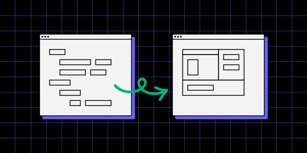
Grid systems
Grid systems provide a structured layout for organizing design elements consistently and logically. They help maintain alignment, balance, and proportion across an interface.
Frontend developers can leverage grid systems to develop well-structured layouts that are easy to navigate, create balance, and use screen real estate efficiently, ultimately enhancing the user experience.
Responsive design
Responsive design ensures interfaces adapt to different screen sizes and devices automatically, providing users with an optimal viewing and interaction experience.
While most frontend developers are well aware of responsive design techniques, such as fluid grids, flexible images, and media queries, it’s essential to understand how these concepts impact usability and accessibility to ensure user interfaces support all users.
User flows and navigation
User flows describe the steps users take to complete a task or achieve a goal within an interface. Effective user flows, and navigation structures guide users through these steps with ease and efficiency.
Frontend developers must understand and implement clear and intuitive navigation systems, considering factors like information architecture, breadcrumbs, and menu design, to ensure a seamless and enjoyable user experience.
Design patterns and components
Design patterns are reusable solutions to common UI design challenges, while components are the building blocks of an interface, such as buttons, input fields, and cards.
Frontend developers should be familiar with standard design patterns and the usability cases these UI elements solve. This comprehension will help devs know the correct UI patterns to apply when solving usability issues.
UX metrics in UI design
UX metrics are measurable values that help assess the effectiveness and quality of a user interface. Common UX metrics include quantitative measures, such as page load times, click-through rates, and task completion times, as well as qualitative measures, like user satisfaction and perceived ease of use.
Frontend developers must understand and track relevant UX metrics to make data-driven design decisions and continually optimize and improve the user experience.
Making Informed Design Decisions
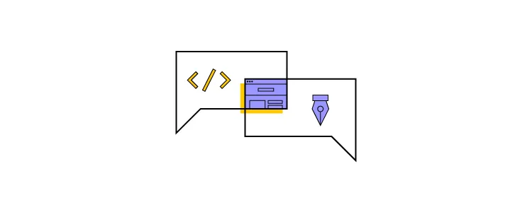
Importance of collaboration between designers and developers
Effective collaboration between designers and developers is crucial for creating successful user interfaces. This partnership streamlines the design handoff process, ensuring that both parties clearly understand the project’s goals and requirements.
For example, a close collaboration can create an interface where the designer’s vision is accurately translated into code, resulting in a seamless user experience that meets aesthetic and functional expectations.
Understanding the design feedback loop
The design feedback loop is an iterative process that involves implementing design changes, gathering user feedback, and making further refinements based on that feedback.
For example, after implementing a new feature, developers can request user feedback through surveys or usability testing from design teams and make necessary UI adjustments, resulting in a more user-centered design.
Balancing aesthetics and functionality
Striking the right balance between aesthetics and functionality is crucial for creating a successful user interface. While visually appealing designs make a positive impression and enhance brand perception, they should not compromise usability or accessibility.
For example, a visually stunning website with unconventional navigation elements may initially impress users, but if it’s not intuitive, they will leave the site frustrated by the poor user experience.
Improving UI consistency with design systems
Design systems help improve UI consistency by providing standardized guidelines, components, and patterns. Developers can leverage a design system to ensure their user interfaces maintain a coherent visual design language and adhere to established best practices, leading to a more efficient development process and a better user experience. For instance, using Adalo‘s no-code app builder paired with a well-structured design system allows teams to rapidly prototype and publish database-driven apps across platforms while maintaining visual consistency.
For instance, a design system can prevent inconsistencies in button styles or navigation elements through reusable code, making it easier for users to understand and interact with the interface while streamlining developer workflows.
Try UXPin Merge

UXPin Merge is a collaborative design tool that makes high-fidelity prototyping and testing accessible to design teams and frontend developers.
Unlike image-based tools like Figma, Sketch, or Adobe XD, UXPin is a code-based design tool. Every component on the canvas is powered by HTML, CSS, and Javascript on the back-end, creating a more accurate environment for digital product design while providing familiarity for devs.
TeamPassword’s two-person developer team uses UXPin Merge to prototype and test user interfaces before shipping releases. Before, the team would prototype and test in code or simply ship releases to save time, resulting in UI inconsistencies and usability issues–not ideal when managing company passwords!
TeamPassword adopted a custom version of the open-source MUI design system which helped solve most foundational UI design principles, including accessibility. This foundational usability enables the team to prototype, test, and ship releases faster, with significantly better consistency and quality.
TeamPassword’s developers have complete control over their React UI library, patterns, templates, and layouts, which sync from the design system’s repository to UXPin Merge. Any changes they make to the repo automatically sync to UXPin.
Streamline your product development and create interactive layouts fast. Visit our Merge page for more details and how to request access.


