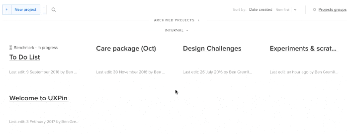
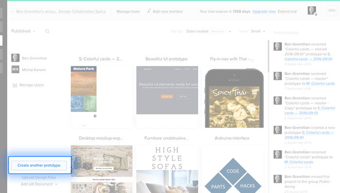
A blank canvas can be an intimidating place to start. Luckily, many tools, menus, and widgets accompany UXPin’s canvas, turning you into an efficient design powerhouse.
The Editor is your tool to create wireframes, mockups, and prototypes. It includes tools, element libraries, and a working canvas upon which to construct great mockups.
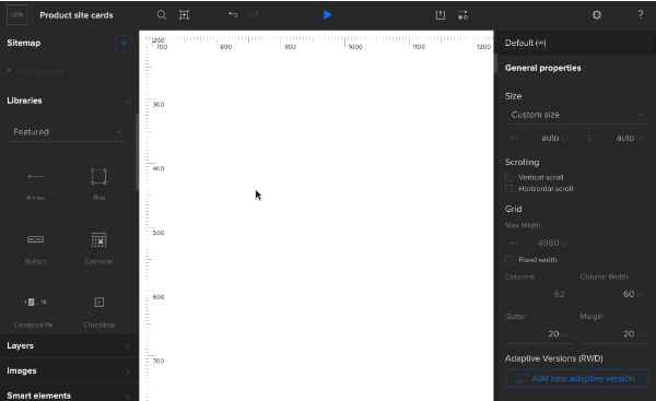
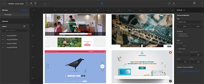
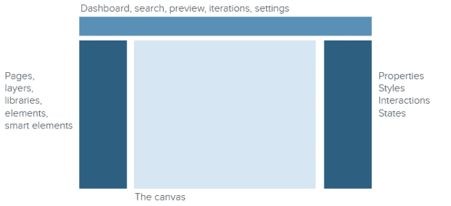
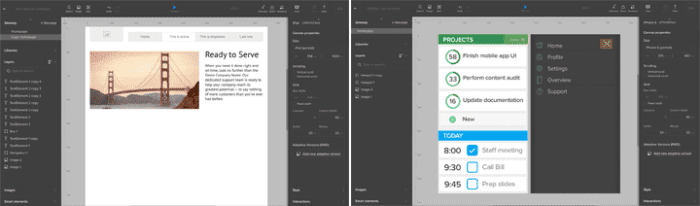
Tour of the interface
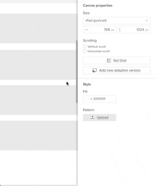
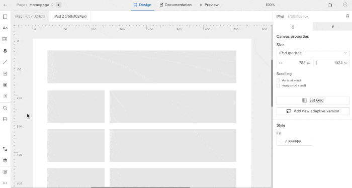
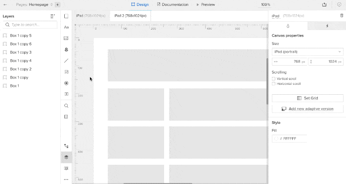
The editor is organized into distinct areas: Toolbars, elements, canvas and breakpoints, and layers.
Customize the interface to your liking
Look under the View Options menu to customize your interface to better suit your workflow and screen space.
From here you can:
- Reveal or hide the side bars
- Make panels appear on demand
- Switch between the interface’s light and dark modes
- Enable or disable element snapping
- Enable or disable “smart” snapping between objects
- Change the workbench (off-canvas area) color
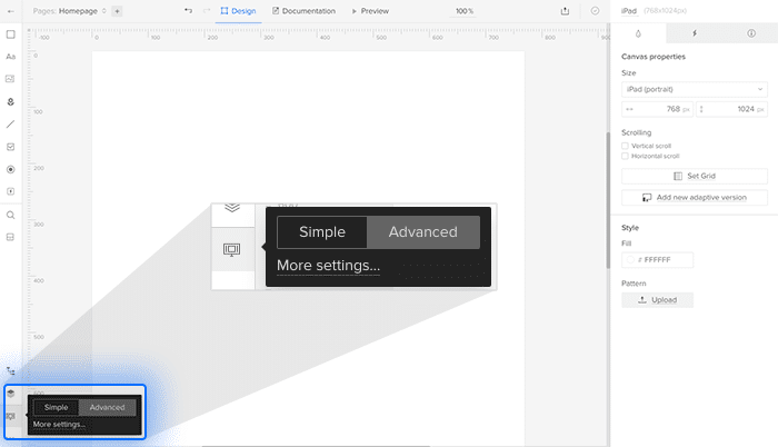
“Advanced” mode lets you add code specifications per element (see below) and work with multistate elements; “simple” mode hides these features to de-clutter the interface.
Managing libraries
UXPin’s hundreds of design elements are organized into “libraries.” If you don’t need every element in your work, you can control which elements are available to use and search for by clicking the “libraries” button on the right, then clicking “manage libraries” at the bottom of the library-select list.
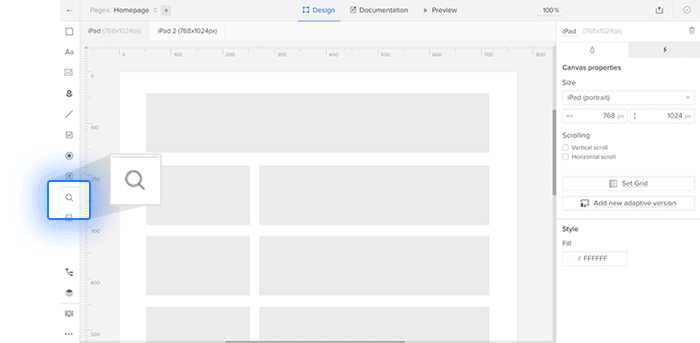
Searching for elements
Type cmd-F (Mac) or ctrl-F (Windows) to call forth UXPin’s search panel. Elements appear as soon as you type two or more letters. From there you can drag any element onto the canvas. Search remembers the last few elements you used, making them conveniently available for reuse.
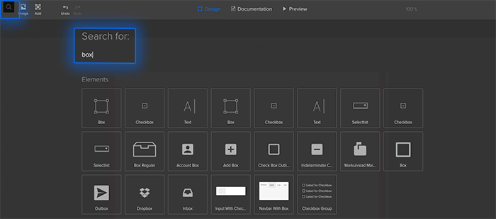
To choose an element for your work, drag it from the search results into your canvas.
The search feature looks for elements in your active element libraries (see the next section).
Editing elements
The right-hand panel is context-sensitive, meaning it changes depending on which element you’ve selected — if any. For example, choosing a box element will let you control its color, border, corner radius, typography, custom CSS, and more.
Learn more about working with elements.
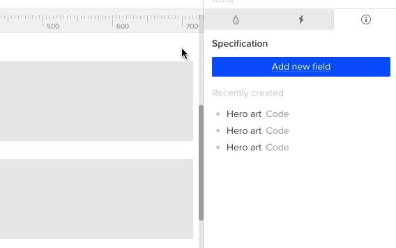
Specifications
Sometimes we want to reuse standard code snippets that make future updates easy. To keep everyone — including developers — from inventing non-standard code, you can assign code and comments to specific elements. To add “specifications,” first make sure you’re using the advanced editor view located in the bottom left corner of the editor. Then select an element and click the “i” tab on the right-hand panel. Choose code, then a language, and add your snippet to the field provided.
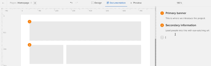
Documentation
You can assign use-case notes to each element in a design with the Documentation feature. Click “Documentation” at the top of the Editor to enter commenting mode. Entering notes on the right, which support Markdown-like editing, produces a “target” icon. Click that icon, then an element, to assign the note. Numbered orange markers indicate which notes belong to which elements; a blue marker indicates the one you’ve selected.
Type shift-return to add a new line to the current note, or just a plain return to create a new note.
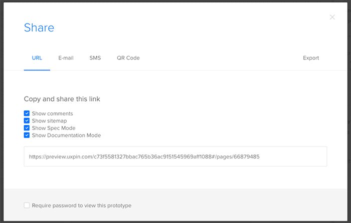
Share with your team
You have many options to share your prototype and get direct feedback from your team. Anyone with the “collaborate” URL can test interactions and leave comments on your work, even if they don’t have the live link.
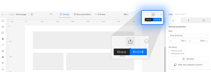
Sharing options include the ability to share the prototype by email, SMS, Slack, and even QR code. Here you can also find the “export” options, which include saving as HTML/CSS/JS files, PDFs or a set of PNGs.
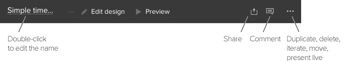
Iterations
Iterations are “snapshots” or saved states of your project to which you can revert if you want to undo a series of changes after closing your browser tab. Each iteration has a unique live preview URL and its own set of comments, letting you start anew as you respond to team feedback.
To create an iteration or view old ones, look for “Iterations” in the “more actions” menu (lower right corner of the Editor). Each iteration has several options: you can preview it to see its comments, for example, or “roll back” to that version to continue your work.
Viewing live
Creating interactions the first step; testing them is the second. You can test your mockups and prototypes live when you press the “preview” button at the top center of the Editor’s toolbar.
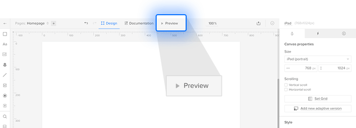
This presents your work in a new tab, simulating a real website or app.
Related resources
- Tutorial: How to Make Expanding Buttons in UXPin
- Tutorial: How to Make a Select List Interactive in UXPin
- Tutorial: Hide the Right Functions With Custom Drop-down Lists
- Ebook: The Guide to Interactive Wireframing
- Article: Beware Sloppy Shortcuts — Use Design Systems to Keep Code on Track
- Get a free trial


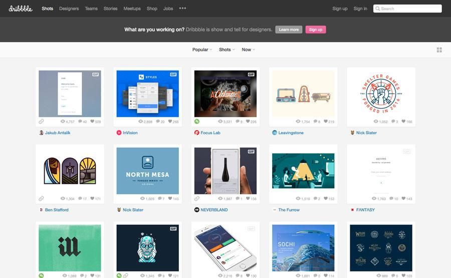


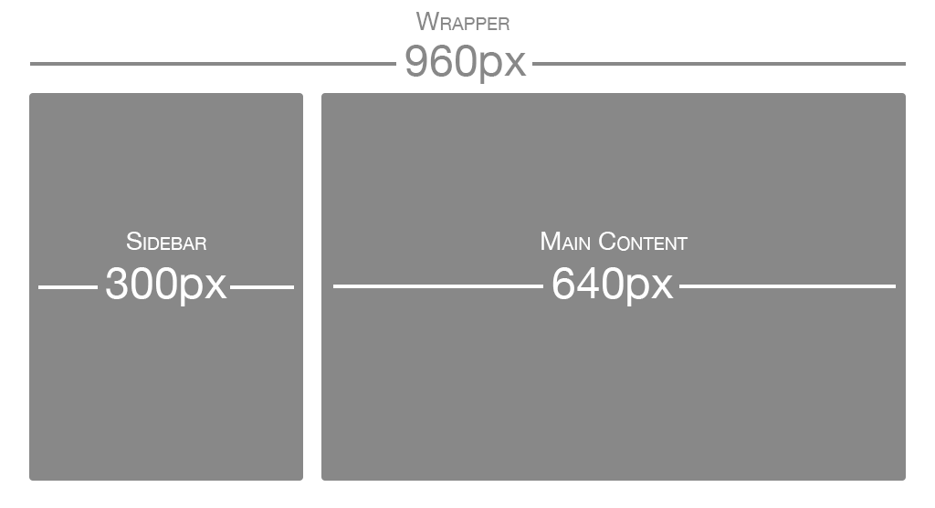
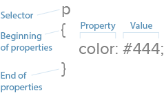
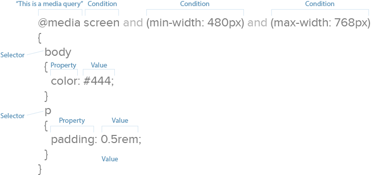


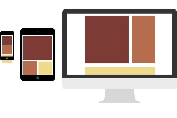
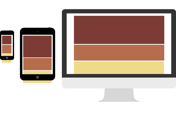
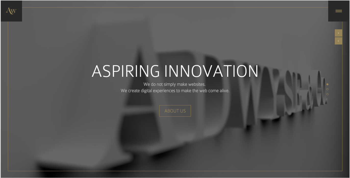
 Smartphone and tablet-sized viewports see a typical stacked layout, and the design grows more complex with wider browsers by rearranging content with a specific plan. This requires designers to consider each breakpoint range as if it were an independent design, but works well for visual-heavy sites like portfolios, agency sites, and photo galleries.
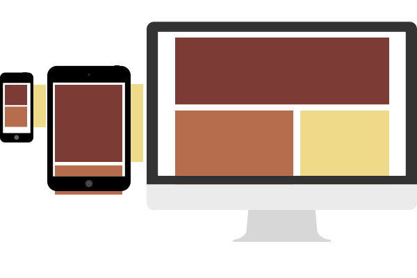
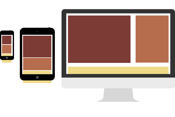