Design faux pas happen. But that doesn’t stop us from enjoying looking at some of the biggest problems and wondering who on earth thought that was a good idea. Bad product design is rampant and it can be pretty interesting to watch the car wreck from a distance.
The real problem starts when bad product design destroys products (Google Wave, Macintosh TV…), or whole companies (OQO). Let’s check out the top 10 worst product designs of all time. There’s an important lesson in each and every one of them. Have fun!
10. Motorola ROKR w/ iTunes (2004)
Author: Matt Ray. File licensed under Creative Commons Attribution-Share Alike 2.0 Generic
Way back in 2004, Apple decided to jump into the smartphone market with the Motorola ROKR. Motorola integrated the iTunes player into the operating system. The idea was a sound one, but the actual execution was a disaster. The interface was poorly designed. You could only save a limited number of songs. The end result was a total crash in sales once the iPod nano came out and Motorola no longer used iTunes with their next iteration of the phone.
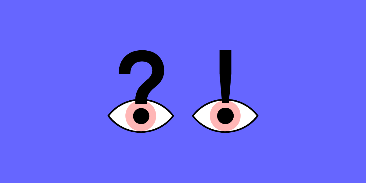
HTML line spacing — the vertical space between two lines of text within a paragraph — isn’t the most exciting thing in the UX design world, but it matters more than you think. This styling element involves Experience Strategy and Interaction Design — two of the four UX design quadrants used to create an incredible user experience. But it goes much deeper than that.
Here’s a quick lowdown on HMTL line spacing:
It has the power to make a text more or less readable. Line-height has an enormous impact on readability, and if users can’t read content, they’re going to hit the ‘back’ button or exit the app.
It’s super-important for accessibility, and with ever-increasing legal standards and requirements that govern this practice, you need to use the correct spacing or risk alienating users.
Good line spacing makes or breaks the success of a website or app. It’s that simple.
In this guide, deep dive into HTML line spacing and discover how to get it right.
How does HTML line spacing make a design more readable?
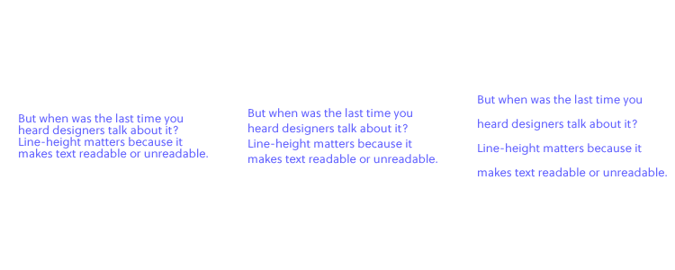
Line spacing isn’t a font thing. It’s a UX design thing. But when was the last time you heard designers talk about it? Line height matters because it makes text readable or unreadable.
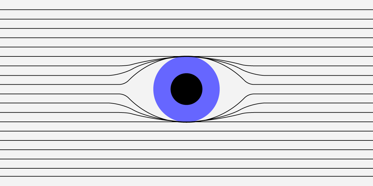
If line spacing is too large, there’s too much white space. The text looks awkward.
If line spacing is too small, letters appear all squished together. The text looks awkward.
Most UX designers learn line spacing of 130-150 per cent is best for readability (1.3-1.5), with 140 per cent (1.4) the golden ratio, but that formula won’t benefit all users. Your client might have a style guide with a line spacing requirement that ranges anywhere from 120 per cent to 200 per cent, but someone might have written the style guide decades ago, long before anyone considered web accessibility. Consider changing the status quo if it improves readability. (More on accessibility in the next section.)
Unfortunately, there’s no magic number that designers agree on, so it’s all down to trial and error on CSS. Some calculators claim to work out the perfect line spacing and font size, like this one, but as a designer, you’ll make the final decision. Use a design tool like UXPin, which lets you experiment with line and character spacing before you go live. World-famous UX designers use it for a reason, so why not join us with a free trial?
Accessibility is a big deal in UX design right now, and rightly so. A good designer designs products that provide meaningful experiences to all users, including people with disabilities. Over 60 million adults in the United States alone have some kind of disability. That’s around one in four of the population. Still, few UX designers consider their requirements when creating prototypes and products. This needs to change. Now.
The World Wide Web Consortium (W3C), the international community that develops accessibility standards for the web, says:
Line spacing should be at least a space-and-a-half within paragraphs. So around 150 percent or 1.5 times the font size.
Spacing following paragraphs should be at least two times the font size.
Spacing between letters should be at least 0.12 times the font size.
Spacing between words should be at least 0.16 times the font size.
These are just guidelines, not laws, and the W3C can’t make UX designers do anything, but accessible design principles provide a moral obligation for design teams. Some people with disabilities still can’t engage with websites and apps for years, and the shift towards more accessible design all starts with UX designers like you. So be the change you want to see in the world.
HTML line spacing makes or breaks UX design
HMTL line spacing might not be noticeable to users (unless it’s really bad), but this subtle style element drives the success of your prototypes and completed designs. Discuss this issue with your team at the start of a UX design project and consider the client’s brief, style guide or design system, demographic, and all the other design elements you plan to implement. Nothing’s set in stone: You can always adjust line spacing later on.
Always consider other typography elements. Font size, text length, and character spacing are all linked to line height, and it’s your job to get these components correct. As a general rule:
Larger fonts look better with less line spacing. Especially headers.
Smaller text sizes work best with larger line-heights.
Wider paragraphs work best with more spacing.
So do longer paragraphs.
A recent eye-tracking experiment saw 104 people read text on Wikipedia, where the researchers changed the line spacing of the text from 0.8 to 1.8 to measure readability and comprehension. The results? Line spacing at the two extremes, 0.8 and 1.8, impaired readability, suggesting text-heavy websites should use more conservative spacing. Adjusting your spacing to somewhere toward the middle of this range proves the most successful. Again, there’s an argument for line spacing of around 1.3-1.5, but it depends on context.
Summary
While there’s no golden ratio for HTML line spacing, consider readability, accessibility, and overall aesthetics when incorporating text into your next prototype. Few UX designers think about this styling element, so you’ll be on the front lines of a design revolution. Discover the perfect line and character spacing on UXPin, the No.1 UI design and prototyping tool that turbocharges typography and streamlines styling. Try it for free.
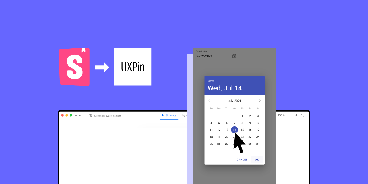
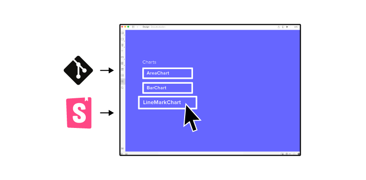
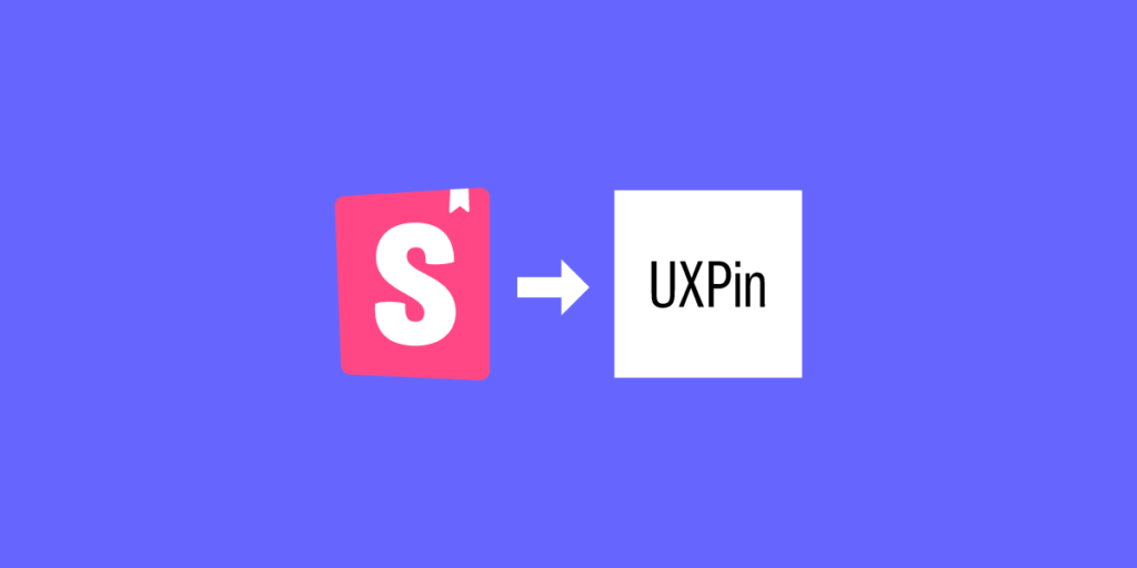
Just a few weeks ago, we wrote about our game-changing Storybook integration, which helps designers and developers break the silos and improve the UI consistency by using code components when building prototypes. Based on our Merge technology, the integration lets you harvest the power of code, use it to build advanced prototypes faster and massively reduces the complexity of the handoff process. The bottom line is, both designers and devs get to build products with the same components.
Now, we’ve decided to go one step further – today, we’re enabling Storybook integration on trial. Check us on Product Hunt!
Why product teams need the real single source of truth
The single source of truth in product development is this one place that stores all the documentation and elements needed to design and build products. In the ideal world, it’s easily shared, is always up to date and is used by everyone involved in the process. We all know how things end up – messy, scattered and siloed.
Design systems were supposed to solve the problem of disorganized information across product teams. Now, we know that this solution is a great first step to systematize UI and documentation but won’t completely remove the disconnect between design and development.
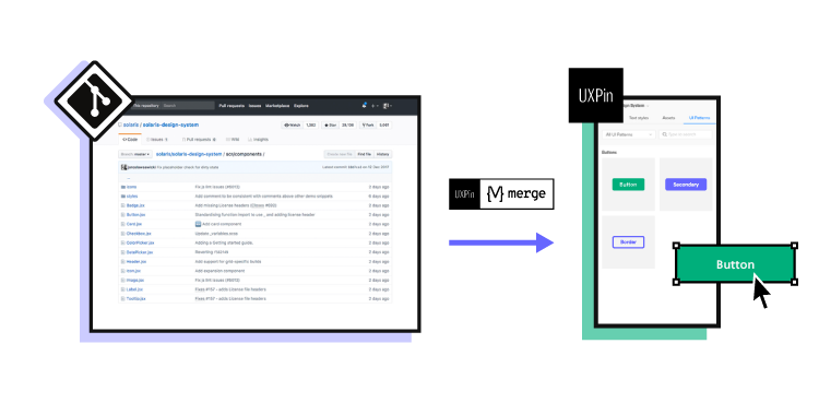
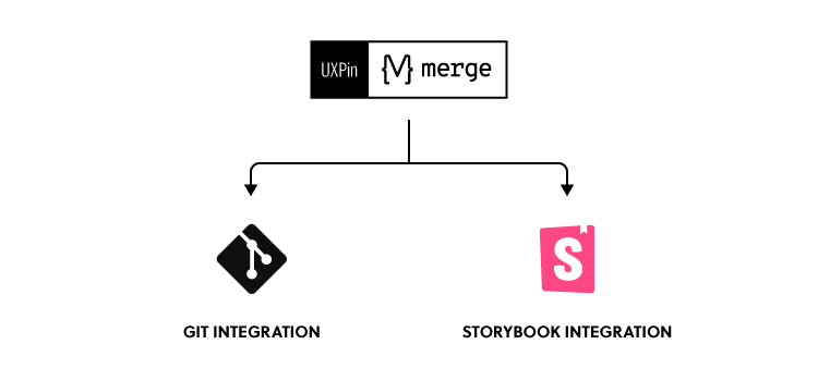
The revolution is the Merge technology, which allows product teams to leverage dev tools such as Git repos or Storybook to improve their DesignOps processes and maintain parity between design and code. As a result, designers and developers can all use the same UI elements, documentation, and code from one source.
Imagine taking all the production-ready, code-based, fully interactive components from the dev library and just dragging and dropping them on the canvas to use them in the design editor. Here’s why this is so exciting:
Don’t ever ask again, “Where’s that component?”
Just like with the puzzle pieces scattered around, it takes a lot of time to find and match the right product development collaterals. It’s a real challenge to keep the components and documentation up to date. But with a centralized place to store all the information, you won’t need to search for the right version of the component or its code.
When you bring UI elements from the developers’ library to a design editor, you only need to maintain them in one place, and for designers, the libraries sync automatically.
Use the same technology as devs
The gap between what designers have created and what developers have built usually boils down to one thing – everyone used different technologies to do their work. Design tools are typically powered by vectors or pixels, whereas apps and websites are powered by specific programming languages and frameworks.
The vector or pixel-based approach is extremely limited and represents just a simple visualization of the end product. For example, when you want to add some advanced interactions to a prototype – it’s not always possible, because neither vectors nor pixels can work with variables, conditional logic or even simple input fields. However, when developers use code in UI components, those blockers disappear.
If you could prototype with code-powered technology, where design has its reflection in code, you and developers would speak the same unified language. So, instead of creating the UI elements in two different environments, you can remove the product drift by using the exact same one. What’s important, you could enjoy the complex built-in interactivity that works great already on the design stage.
10x designer
When designing a product, you need to explain to developers what exactly should happen when a user clicks this or that. You can choose to build either lo-fi prototypes to start the development process faster but sacrifice some details which you’ll need to catch up later or build hi-fi prototypes that, with all the interactions, explain the product behavior better. Building advanced prototypes takes a lot of time and usually getting the details right, ends up with a lengthy conversation in comments about interactions and the prototype’s functionalities.
This is not an efficient workflow from a design operations point of view. But if you decide to use the coded UI components in the design editor, you critically speed up the entire design process.
When working with the elements that are fully interactive and in line with all production standards the design outcome you produce is way over 10x of what it takes to build a prototype in a conventional way. The time you save can be spent on other important things like user testing.
User testing perk: prototypes behave just like the end product
How can you test a prototype when all the UI parts aren’t fully interactive? User testing isn’t reliable enough when a user can’t click through a project on their own without a lot of handholding. Describing what will happen after clicking an accordion or hovering over the menu won’t give the same feedback quality as showing it.
When all the drifts are gone, and the code-powered prototype works exactly like the end product, you can support your research team with a fully immersive experience for their usability tests.
Design with code – try Storybook integration
Storybook is this one place where developers can build and store the UI components. It’s also a great tool to test the elements and prepare clear documentation. Storybook supports a lot of frameworks, including the most popular ones like React, Angular, and Vue.
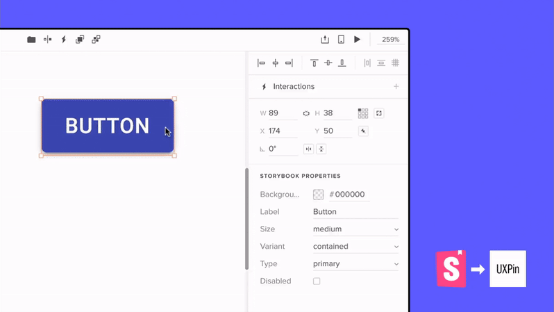
UXPin and Storybook Integration
Storybook is one of two integrations (Git repo is the first one) that use Merge technology to sync coded components with our design tool, UXPin. The entire integration with Storybook takes around 1 minute, and lets you design with code components right away!
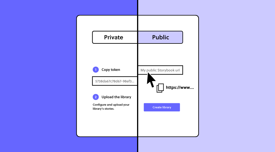
Private or public?
Your Storybook library can be either private (hosted on your server with access for only chosen users) or public where people who know the URL can access it freely. As our integration supports both types, it doesn’t matter which one you use.
With public libraries, the process is as easy as copying and pasting the Storybook’s URL. With a private one, your developer needs to run just two simple commands. All is explained here. On trial, you can play with public libraries only. If you want to test a private one, go for a guided tour.
If you want to use public libraries of other companies, you will enjoy all these open source Storybook examples.
Freedom of designing with code
The synced components are coded, which gives you the freedom to change the properties, inputs, and styles inside the UXPin editor without the developer’s help. This gives you the power to build prototypes that are always in line with the production standards. The constraints embedded in code guides you, making sure there is no miss-match in styles.
Empower non-designers for better DesignOps
Designing with code can redefine how we structure DesignOps processes. PayPal is a great example of how transforming the design phase in product development empowered people with other roles than designers to visualize their ideas with code components in UXPin. Erica from PayPal and her team use Merge Git integration, but you can achieve the same results using Storybook.
It’s straightforward as non-designers just have to drag and drop the components on the canvas and play with the controls if needed. Then, with a design draft, UI professionals can take over by finishing off the projects and focusing on usability.
Taste the power of code
Sign up and give it a try with a built-in Material UI library with components coming straight from Storybook or sync a new library yourself. Feel the power of code and see how the whole product team can benefit from using the single source of truth!
Design thinking is a collaborative, iterative process that, over time, delivers design solutions based on human feedback. The concept combines the problem-solving basis of design with empathy for the end-user. Design thinking tools are used to facilitate this evolutionary process.
Before we take a close look at some of the best design thinking tools on the market, let’s examine the different phases of the process involved.
The five phases of design thinking
Empathize
Get to the heart of the problem you’re trying to solve. Talk to your customers and observe their interactions with your software. Where are the issues?
Define
Once you have gathered the relevant information by observing and talking, you can set about defining the core problem concisely.
Ideate
This phase of the design thinking process involves the generation of ideas. How can you solve the problem you defined? Are there creative and collaborative approaches that might solve the problem?
Prototype
You’ve fully understood the problem at hand, you’ve created a definition of the issue, and you’ve devised a few ideas on how to proceed. Now it’s time to make those ideas a reality. A scaled-down version of the software or service allows you to assess how it works in a practical setting.
Test
The final product must be tested stringently to ensure it solves the problem you defined at the beginning of the process. Usability testing may uncover further problems that require solutions.
Design thinking tools to empathize
Empathizing involves gathering feedback from your customers on the problems they face when using the product. There are two excellent tools that facilitate this communication.
This user-friendly software allows you to gather feedback via forms and questionnaires. You can integrate the platform with services such as Google Sheet to speed up the gathering of information. And a selection of intuitive customization options helps to keep the user engaged — giving you the in-depth responses your design thinking project needs.
Speaking to all of your customers in person probably won’t be practical. Video conferencing software Join.me simplifies and streamlines video calls to ensure a seamless experience. A comprehensive list of functions includes the ability to share your screen. You can also organize invitations and record your calls for future use. Claim a unique URL, and share it with all your invitees. Access to Join.me is available via mobile, phone, VoIP, and desktop.
Design thinking tools to define
You know there’s a problem, but what exactly is it? And how do you communicate to your collaborators? Here are two design thinking tools that might help.
Smaply is a user-friendly platform that allows you to manage and map the customer experience. Create a customer journey, and share it in the form of maps or personas. An intuitive journey mapping tool identifies so-called “pain points” and “moments of truth” within the customer journey. Interactions are visible to everyone involved in the project, so everyone gains an understanding of what customers are thinking.
MakeMyPersona is an intuitive service that helps you to structure customer data in a simple, accessible way. Answer the questions asked during the set-up phase, and build your personas from scratch. Answers, and the personas they create, can be shared in Microsoft Word format via email. This tool is relatively simple, but it’s useful for beginners working on relatively simple projects.
Design thinking tools to ideate
Ideate collaboratively to identify the heart of the problem with two functional tools.
Think of Stormboard as a digital way to brainstorm using virtual sticky notes. You can create templates for different ideas and allow collaborators to rate them — or add a few of their own. There are several reporting options available, so you can condense your main findings in a way that’s easy to assess. Organizing and prioritizing ideas from various contributors is easy with this intuitive software.
Coggle is an online tool designed to help people create and share mind maps. Users can take and share notes, plan ideas, collaborate on thought processes, and manage brainstorming sessions. Coggle also allows users to drag and drop images, text, and annotations — creating a highly visual collaboration on the screen.
Design thinking tools for prototyping
Once you know what you need to create, the only way to move forward is to design a prototype for testing. Use one of these two design thinking tools to make your ideas a reality.
UXPin is a design online tool that simplifies the design process. From wireframing to prototyping, users can build interactive elements, code components, conditional interactions, and variables to turn a great idea into a working design. And through a collaborative approach, users can turn that prototype into a finished product. A sleek, easy-to-navigate interface brings every imaginable design element together.
Connecting design and engineering in a seamless way, UXPin makes up for a lot of tools to let you design at scale.
Design thinking tools for testing
You have a working prototype. The only way to ensure it can deliver as a finished product is to test it.
UserTesting is one of the world’s most popular and respected testing applications. Select users based on what you’re testing and your ideal personas. And set a wide range of metrics to ensure the problems you’ve identified are addressed. This advanced software tracks everything the testers do while interacting with your prototypes. Then use the data to ascertain how people navigate your software and perform the various tasks you ask them to complete.
Hotjar is a comprehensive analytics tool that makes gathering feedback exceptionally easy. The system collects data based on your chosen metrics. You get to see where people click, how they navigate, how they complete tasks, and how they interact with the functions you choose. And at the end of the testing process, you’re given instant feedback. Hotjar makes identifying potential problems with prototype software a quick and simple process.
Improve your design thinking process with UXPin
Design thinking is a highly collaborative, visual process that involves a wide range of components and skills. Bringing these elements together is both complex and time-consuming. But with a design thinking tool such as UXPin at your disposal, turning ideas into user-friendly interfaces has never been easier. For a free, no-obligation trial of the UXPin app, sign up for your free account.
Your company website is more than a collection of related pages. It’s a dynamic place where two online entities meet and interact: the business behind the site and the visitor who lands there in search of information, services to use, or products to buy. What happens in that meeting place is a product of both UX (User Experience) and UI (User Interface)–two different, but overlapping, fields of website design and development. A good user interface leads to a quality user experience. Insights from a site’s user experience can inform interface design, which leads to a quality experience that engages visitors and keeps them coming back.
It’s possible for a company’s product, service, or profile to be so compelling that it overcomes bad design–including multiple inconveniences to visitors. But leading developers point out that good UI design makes it easy for users to engage not just with the website itself, but also with the brand behind it.
Not sure how to test your advanced designs to see how well they function? Join UXPin Merge so you can generate lifelike prototypes with real data and interactions.
What makes good UX/UI design?
The key to good UI and UX design lies in their names: the needs and experiences of site users guide the design of all the components of a website. Interface design aims to create an outstanding experience. Visitors’ actual experience as they engage with those design elements reveals whether the interface is as user-friendly as developers think.
Designing user interfaces for ease of use and enjoyment starts with a keen understanding of a website’s visitors and what they need. Successful UI design begins with a deep understanding of the site’s target audience and its behaviors.
That includes considering how people use the site and what they expect to find there. Good UI design includes the physical aspects of using the site—motions such as swiping and tapping with fingers on mobile devices, or clicking and dragging with a mouse on a desktop or laptop. It’s also essential to give users clear guidelines on how to use the site and make the content as interesting and accessible as possible.
Each website has its own goals. Its content targets the wants and needs of a specific audience. But good UI and UX design principles apply to websites of all kinds. Here’s a rundown of five essential UI/UX design principles aimed at making a visitor’s experience the best it can be.
Be creative—but predictable
You want your site to be eye-catching, engaging, and full of entertaining and informative content. That means taking risks and trying new things. But it’s also important to give visitors familiar structures to help them navigate the site without confusion or distraction.
Essential navigation tools should follow standard formats. Buttons, menus, and other tools should look and behave in the same way they do on millions of other websites. Visitors need to perform basic functions without thinking about where those tools are, or what they look like. Essential information should also be front and center on the homepage, without requiring visitors to dig for it through layers of pages and links.
A site that’s heavily loaded with interactive features such as slideshows and carousels can interfere with a user’s goals for visiting the site. Research on visitor behavior reveals that as they watch each slide in a carousel, users are likely to forget the previous slides they viewed.
Use a code-based tool that creates a common language between designers and developers
Designers typically have to rely on developers to turn their creative visions into functional products. Unfortunately, designers can’t always determine the amount of work that goes into adding certain interactions. You might have an amazing idea, but the development team could send it back to you, slightly shocked that you even asked.
A code-based design tool like UXPin powered by Merge technology creates a common language that breaks down barriers between designers and developers. When you create a design with UXPin Merge, the tool uses the same code components that are stored in your devs’ library (Git or Storybook), all keeping full interactivity while prototyping. That’s why you can take your designs to another level. The code provides you with more interaction opportunities than any design tool can.
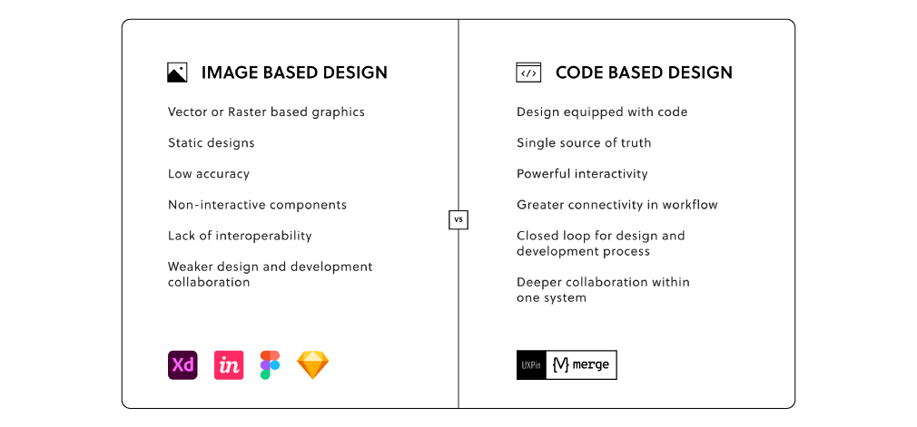
It’s time for design teams to switch from image-based to code-based tools. Code-based design streamlines the prototyping and development phases to get your product to market sooner. It also gives developers more power to tweak your designs to meet the needs of specific operating systems and devices.
If you doubt the power of code-based design, request access to UXPin Merge to see how much easier cross-team collaboration becomes.
Aim for maximum accessibility
Good UX/UI design targets the needs of a clearly defined audience, but that audience can still be pretty diverse. To be as broadly accessible as possible, a user-centered design must aim for maximum readability and ease of use for everyone. For example, navigation tools and other actionable elements need sufficient space between icons, links, and buttons to avoid tapping or clicking the wrong one.
Accessibility also includes giving users clear instructions on what to do on the site and telling them what will happen if they do or don’t take specific actions. As an example, buttons should be clearly labeled for the desired outcomes, such as signing up for a newsletter, buying now, or deleting information. Additional text can also warn users about unintended outcomes, such as leaving the main site or permanently removing data.
Be inclusive
Inclusivity is an essential aspect of accessibility. Even if you’ve established the site’s target demographic, other users may be stopping by as well–and good UX design will anticipate their specific needs. Inclusive interfaces should accommodate people with disabilities by providing alternative options such as large fonts and high contrast text, and including audio content and navigation tools that are easy to find and manipulate on both mobile and desktop devices.
UXPin and Piotr Źrołka, CEO and accessibility expert at Kinaole, recently hosted a webinar that shows how much easier inclusive design becomes when you follow a few simple guidelines within UXPin Merge.
Build a design system for creativity and control
If you rely on a style guide to ensure consistency across your digital products, your teams are probably wasting a lot of time. Take the effort to convert your static style guides into dynamic design systems that contain all of your brand’s authorized design components, including features, color schemes, and language.
Design systems keep lead designers in control while giving others flexibility to create innovative products and features. Your design system might include all the components that designers and developers can use, but it also provides nearly unlimited opportunities for them to mix and match features to build new products.
As a result, you get advanced designs that still conform to your brand identity.
Join UXPin Merge and watch users become more engaged
It takes less than three seconds for a visitor to abandon a website–and many never return. User-centred design anticipates obstacles and works to eliminate them, with simple, clean interfaces that lead visitors to the information they need and points them toward the decisions you want them to make.
The principles of good UX and UI design work together to make the meeting place that is your website as welcoming as possible for any visitor who stops by. See how UXPin’s Merge blends design and engineering for better and faster site development.
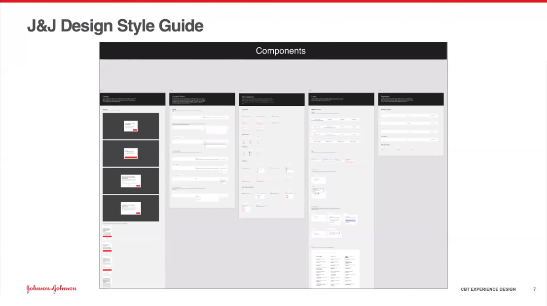
When Ben Shectman came to Johnson & Johnson as a Certified Design Leader, he found useful tools for establishing visual and verbal guidelines across digital design projects.
Unfortunately, the guides came as PDFs that made it challenging for designers to follow the established rules. Whenever uncertain, they would have to confirm their design choices by browsing a lengthy PDF document.
The PDF documents also made it difficult to keep everyone informed of design updates. If someone had an outdated version, they wouldn’t know how to follow the correct guidelines.
Shectman decided to undertake a project that would make designing easier for everyone. He and a small design team turned the PDF guides into an interactive design system. Although migrating from a static style guide to an interactive design system took about six months of work, it has resulted in faster product development for internal and client-facing tools.
With UXPin, Shectman and his team built atomic UI components that they could use to create larger elements, templates, and pages. Instead of starting each design from scratch, they could pull from a Git repository that serves as their single source of truth. When they update the design system, the changes occur globally. That way, no one gets left with an outdated version.
The ongoing process of maintaining a design system
Designers at Johnson & Johnson typically work in two-week sprints. During this time, product development runs parallel to product design.
When designers feel that they need a new component for a project, they can submit a request to add the idea. Johnson & Johnson has a very small design team, so it’s possible for them to move forward with their work before receiving approval. If the new component seems applicable to other projects, it can get added to the design system.
Getting developers involved in the design process
A lead developer attends meetings to provide feedback. This gives the design and development teams opportunities to share their ideas and concerns. For example, a lead developer might recommend taking a different approach because the current plan will put significant strain on the development team.
Frequent meetings keep everyone focused on a common goal that offers aesthetic appeal and excellent functionality.
At the end of each design sprint, the entire development team meets with the designers to talk about moving the project forward toward a finalized product.
The meeting provides an opportunity for harvesting new ideas that might get added to the design system. As products, services, and technologies evolve, the design system must change to accommodate emerging needs. Not all of the new concepts get added to the design system. Those that stand out as critical new approaches, however, can be included easily.
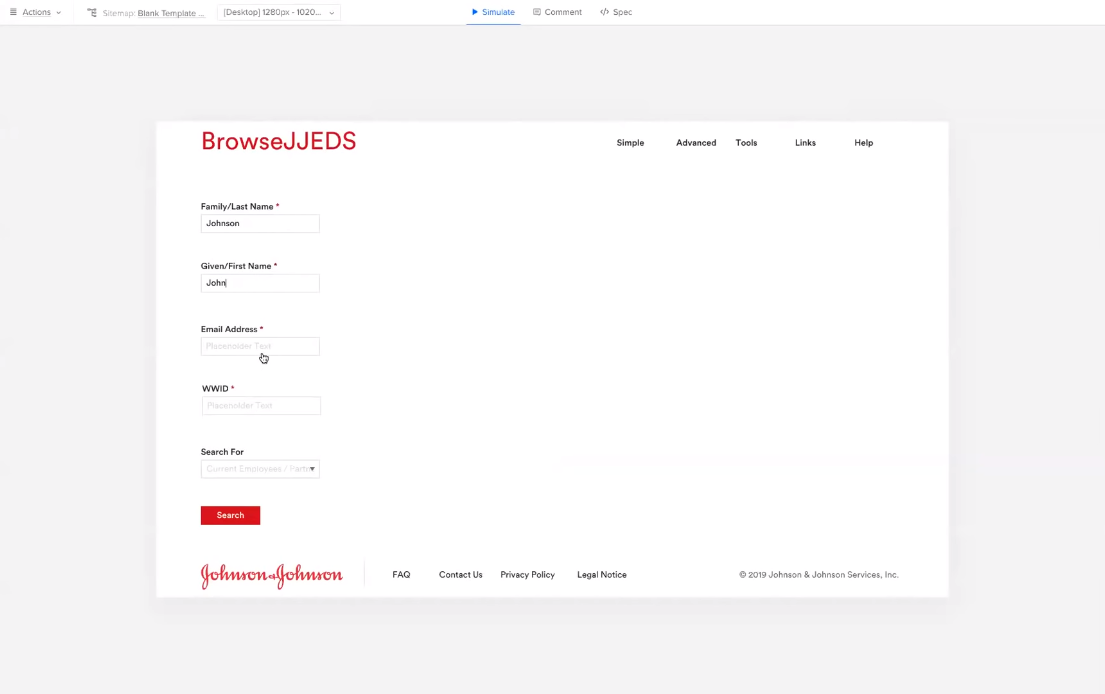
A demonstration of UXPin in action
About halfway through the webinar with Johnson & Johnson, designer Gil Gerard Austria provides a demonstration of how the team uses UXPin and their in-house design system to turn old, static forms into interactive, code-based designs that they can test as prototypes.
The demonstration shows the power of reusing components and testing fully functional prototypes. Gil completes his hi-fi design in less than 10 minutes. The result has a more pleasing look and functions better than the previous version.
What You Will Learn
Johnson & Johnson’s approach to XD the design uses the Six-I strategy (Immersion, Insights, Ideate, Iterate, Implement, Improve) that focuses on building human-centred products [6:01].
Ben Shectman describes the process he and his team followed while turning Johnson & Johnson’s static design guidelines into a dynamic design system [9:10].
“Part of the reason we within the corporate business technology experience design team chose UXPin as our preferred prototyping tool of choice is because… we focus on applications that J&J’s workforce uses to get their jobs done… These transactions tend to be much more data-driven. Much more form-driven.” [10:04].
The first step of creating the design system was taking content from earlier static guidelines and translating them into interactive, shareable pages [12:14].
The design team created instructional videos to help employees use the JNJ design system [14:24].
Translating a style guide into reusable components through atomic design [15:15].
Gill Austria demonstrates turning a style guide into components of atomic design [17:49].
Gill Austria offers a step-by-step demonstration of using UXPin and J&J’s design system to update an old tool [32:17].
Sage Young demonstrates the benefits of code-based design with UXPin [55:45].
These 404 page examples show how designers can turn a simple computing error into a branded user experience (UX).
The earliest models of personal computers had 64k RAM or less. Programmers needed to keep things simple. They developed a classification system for program functions. Input errors got assigned to class 400.
There are four class 400 input errors.
400 Bad Request. The input is in the wrong syntax.
401 Unauthorized. The user cannot access without a username and password.
403 Forbidden. The user doesn’t have permission to access the file.
404 Not Found. The user entered or linked to a URL that doesn’t exist.
In the old days, users had to type in the exact URL. For example, If you wanted to visit Yahoo Finance, you had to type in the full URL address: http://www.finance.yahoo.com
If you “fat-fingered” the keyboard while entering the URL, you’d get an error code 400 or 404.
Nowadays, browsers let you enter an abbreviated address like www.finance.yahoo.com or even finance.yahoo.com. In fact, if you enter the full address in the search bar with the syntax in the example above, the browser will redirect you.
Why? Because it’s an old syntax using HTTP. The updated site is a more secure URL using HTTPS. The latest browsers automatically make the correction.
The 404 error is now a landing page where you can encourage users to continue using your website. Your 404 page design should keep the user from leaving.
Some elements you’d use might be:
Hyperlinks to the home page and other useful pages.
A search bar.
Graphic elements that reflect the site’s brand.
A brief message to the user in the brand voice.
In these 404 page examples, we’ll look at how different brands use these UX elements.
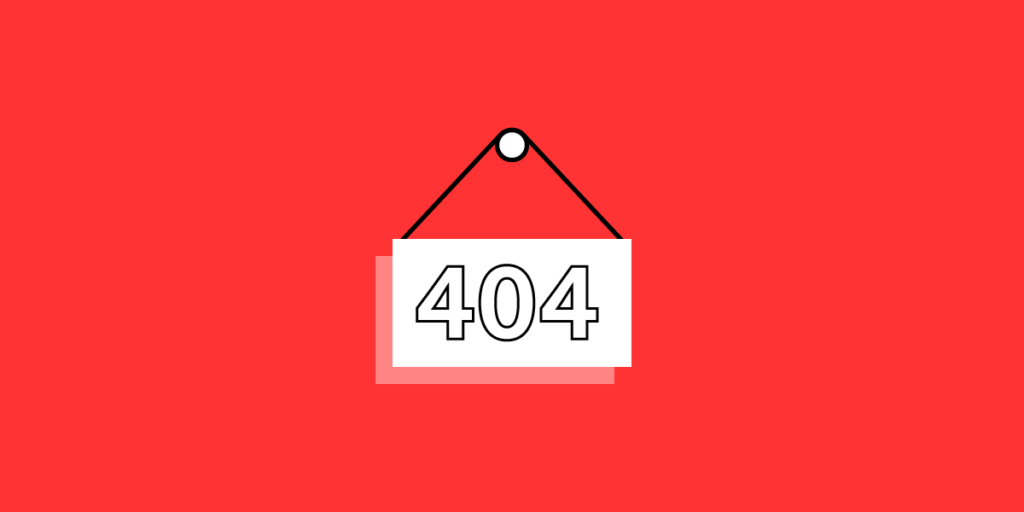
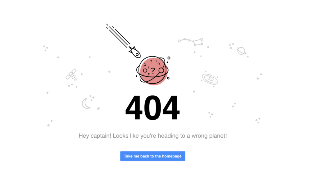
404 page examples: homepage link
UXPin
We’ll look at our own 404 page first.
As you can see, we like simplicity. We have lots of white space around outer-space-themed graphics. The message is simple, “Hey, Captain! Looks like you’re heading to a wrong planet!”
We include a call-to-action (CTA) button that takes the user back to the home page.
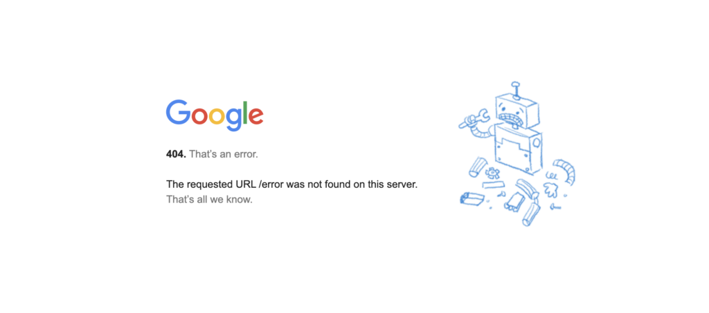
Google
Google’s 404 page is also very simple and has lots of white space.
“The requested URL was not found on this server. That’s all we know.”
The broken-robot graphic reflects their high-tech brand. There’s no CTA, and you only discover that the Google logo is a link back to the home page if you mouseover.
A lot of UX writers will tell you that leaving out a CTA is a big no-no, and in most cases it is. Remember, you want visitors to keep using your site.
Google is an exception because they know their visitors will always come back.
404 page examples: useful page links
Angi
Formerly HomeAdvisor, this home services contractor site has a lot of links to other useful pages.
The message to the user is straightforward:
“Yikes, this is awkward…
“The page you’re looking for appears to have been moved, deleted, or doesn’t exist. We apologize for the inconveniences.”
The CTA is a list of links to suggested pages.
In the header, you also have links to home service types and blog posts.
The footer has links to find services in major metropolitan areas like New York, Chicago, Los Angeles, and Dallas. Other useful links are in the footer as well.
Angi keeps everything “above the fold.” That is, you don’t have to scroll to get to any of the links.
Starbucks
In Starbuck’s 404 the image of a coffee ring where there used to be a cup stands as a metaphor for a page that’s not there.
It offers an explanation of what might have gone wrong and some suggestions about what to do next.
It has a link where visitors can report broken links.
Glassdoor.com
Taking look at Glassdoor’s 404 page, the popular jobs board suggests several actions.
Search for jobs.
Read employee reviews of companies.
View employee salaries.
See interview questions and answers.
Look up rankings of best places to work.
404 page examples: graphics focused
eBay
A photo of a child wearing a winter coat with the hood pulled over his eyes is the focal point of eBay’s 404 page.
“We looked everywhere.”
“Looks like this page is missing. If you still need help, visit our help pages.”
Below is a CTA button taking the visitor to eBay’s home page.
The bottom of the page contains a scroll box with trending deals.
Lego
When you land on this 404 page, you see Emmet from The Lego Movie. He’s quoted as saying, “Everything is still awesome.”
404 page examples: rotating elements
Amazon.com
Amazon’s 404 page features the search bar at the top the message suggests a search or clicking the homepage link. It has a photo of one of the “dogs of Amazon.” It links to an Amazon news page about Amazon’s dog-friendly workplace.
If you refresh the page, an image of a different Amazon dog appears. Refresh several times and you’ll see many random dog photos. We don’t know how many they have for the 404 page, but more than 7,000 dogs “work” for Amazon.
Marvel Comics
Like Amazon, Marvel rotates multiple versions of its 404 page. They show images from the Marvel Comics universe with messages like:
“Protocol missing… Exiting program…”
“Hydra is currently attacking this page!”
“$#&%, you just broke something! Just kidding.”
“Not even the eye of Nuatu sees your request.”
“Hydra has stolen this page from the S.H.I.E.L.D. database!”
IMDB
Another rotating 404 page from the International Movie Database (IMDB). They stay on brand and offer familiarity to their fans by offering up movie quotes.
“Webpages? Where we’re going we don’t need webpages.” – Dr. Emmett Brown, Back to the Future.
“Someday we’ll find it… the website connection.” – Kermit the Frog, The Muppet Movie.
“Surely, you can’t be serious.” “I am serious. And don’t call me Shirley.” –Ted Striker and Rummack, Airplane.
“What we’ve got here… is a failure to communicate.” – Captain, Cool Hand Luke.
“Page not found? INCONCEIVABLE!” – Vizzini, The Princess Bride.
“I’ve got a feeling we’re not in Kansas anymore.” – Dorothy, The Wizard of Oz.
Prototype Your 404 Page in UXPin
UXPin is a full-stack UX/UI design program that gives you the tools to take any project from concept to product launch in a single app.
When designing a 404 page, you can share with collaborators and stakeholders in real-time straight from the platform. They can add their comments to make iterations smoother, instead of lots of back-and-forth emails. Start your free trial today.
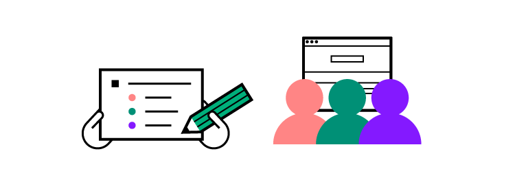
The humble design proposal is, perhaps, the most crucial text a UX/UI designer will ever write. This document outlines your specific approach to the client’s design brief — what you plan to do and how you plan to do it. If successful, your proposal will become part of the contract you sign with the client. It all starts with the first word you type.
Many designers struggle with proposals, and for good reason. What should you say? How should you say it? It’s tough. This guide tells you how to create an incredible proposal that lands you your next design job. So read on for more and check out UXPin’s blog for further insights for designers like you.
Join world-class UX designers and create advanced prototypes using UXPin, an end-to-end design tool that will help you create fully interactive prototypes without dev’s help. Try UXPin for free.
Build advanced prototypes
Design better products with States, Variables, Auto Layout and more.
What Is a Design Proposal?
A design proposal is a document you send to clients (and sometimes stakeholders) that sets out your ideas for a specific design project. It’s not a resume. Or a cover letter. And each proposal should be unique to the project you are applying for. Prospective clients typically ask several designers to submit proposals at once and then compare these documents to determine the best person (or team) for the job.
Some clients might receive hundreds of proposals from designers, so you need yours to stand out from the crowd and not end up in the Trash folder.
What to include in your design proposal
There’s no set list of rules for what to include in your document, but here are some of the most common things you’ll find in design proposals:
Your approach to the project. How will you prototype? How will you design? How will you meet the client’s needs (as outlined in the brief)?
A brief bio. Your design history. Your credentials. Your skills. List the most important stuff. Sell yourself.
Contact information. Don’t forget your phone number, email address, and a link to your website.
Timeline. How long will it take you to complete the project? Are you working alone? Or with a team?
Software/equipment. What tools will you use?
Deliverables. How will you deliver the project?
Testimonials from clients you have worked for
Pro-tip: Include your design budget in the proposal. It’s up to you. Some designers discuss financials later.
Your design proposal doesn’t have to be lengthy. Perhaps a page or two. You need just the right information to capture the client’s attention and convince everyone you are the right person for the project. You can detail the whats, whens, and hows of the project in your user research plan.
You could land a dream design job with one document
Introduce awkward topics like payments and deadlines
Use your design skills when creating your proposal (see below)
How to create a design proposal for UX/UI projects
Here are the most important things to consider when creating a design proposal for UX/UI projects.
Adapt your tone and style to the client
As a designer, you know how to engage with different audiences and demographics, so think of the proposal through this same paradigm. Research the company and choose the right language and style based on its values and culture.
Still not sure about how to approach the proposal? Discuss it with the rest of your design team and figure out the most appropriate solution.
Think about design all the time
Few designers pay attention to design when creating proposals and consider this document another formality. Take a fresh approach and view your proposal as an innovative way to showcase your design flair.
Think about the fonts, images, logos, color schemes, shapes, contrast, and other design and graphical elements to include in your proposal. Don’t clutter the document, but include elements that highlight your value as a designer.
Prove your worth
There’s no space in your proposal to be modest. Clients want you to get straight to the point: Tell the world why you’re the best designer for the project. If you have the right skills, list them.
If you won an award for your last project, talk about it. In an ever-competitive UX design marketplace, prove your worth. It might feel uncomfortable, but you could land the biggest and best job of your career.
Write Your Design Proposal Now
Spend some time on your proposal because it could change your career. Clients want to see your experience, motivations, and ideas in one document, and with competition so fierce, you need to write a document that demands attention.
Impress clients even more by coupling your proposal with a user research plan that details the specifics of the design project. UXPin has user research plan templates that speed up the process.
Access templates for the most important documents in design with UXPin, the design and prototyping tool for UX/UI professionals worldwide. Start your free trial.
When any new leader walks into an enterprise with more than a century of history—as Johnson & Johnson does—they know they must adapt to some of the existing processes. Improvements in technology, however, have made it necessary for all corporate designers to turn processes into even more efficient methods. If you start a new job tomorrow, you might find that you need to turn old style guides into design systems. Ultimately, these new systems make life easier for you, your design team, and other employees.
Ben Shectman, a UX design expert with decades of management experience, found himself in that situation. He became the Experience Design Expert Service Leader at Johnson & Johnson in 2019. The company had two style guides that UX designers used for language and graphics. Unfortunately, the style guides were only available as PDF files. It was clear to Shectman that he needed to adopt design systems and move away from the PDF style guides.
Table of Contents
Design systems offer a single source of truth
Atomic-based design systems improve workflows
Create design systems for developers and designers
PDF and print style guides present a considerable problem: you can never know whether you have updated all of them to meet the enterprise’s current standards. You can hold as many meetings as humanly possible, but an outdated style guide will manage to sit in someone’s desk drawer, just waiting to make your life more difficult a year or two from now.
Design systems offer a single source of truth that exists in a digital format you control. Some companies get by fine using established design systems like Material Design, Carbon, or Fluent Design System. A robust, multinational corporation like Johnson & Johnson, however, needs a unique design system built from the ground up.
You maintain complete control over your design system, build it in a design tool such as UXPin, have the components coded and stored in a Git repository. When you make an update, everyone who accesses it will only experience the new version. You never have to worry about outdated copies because you control the source for the company’s digital products.
Design systems based on atomic design processes improve workflows
Shectman decided to build the J&J interactive design system with atomic design. Atomic design serves J&J well because it lets designers break down features and designs into their most basic components (called “atoms”). Using UXPin, anyone in the company can potentially access the approved components and create new tools that comply with J&J’s guide.
In reality, Johnson & Johnson’s design team makes its internal products. The team even created a process that makes it easier for Shectman to approve new components and add them to the design system.
Regardless of who actually builds a prototype, the atomic design improves workflows by providing all of the approved components. From there, you just choose the components you need and adjust them to meet the project’s goal.
Create design systems for developers and designers
Johnson & Johnson’s design team meets with developers regularly to gain insight into their approach to building products. Getting developers involved makes it easier for designers to avoid concepts that don’t function well when put into code.
Building an interactive design system is a great start to improve design consistency. You can go one step further and try out a new technology called Merge. It makes it even easier for enterprise users to bring designers and developers together. The all-in-one designing and prototyping app powered by code, allows you to bring components from developers’ libraries (from Git repository or Storybook) and use them in your designs. These components keep all the interactivity and are still production-ready, which saves a lot of handoff troubles. It speeds up building digital products; both the design and development process.
Everyone also benefits from Merge’s ability to make prototypes that function like finalized products. Whatever you design with Merge technology, will work exactly the same after the development team completes the project.
Try UXPin Merge
Shectman and members of his design team offer a deeper look into their process in this webinar. It includes a demonstration of a J&J designer using their interactive design system to transform an outdated tool into a new version with better functionality and aesthetic appeal. Go beyond a design system and bring UI code components to the UXPin editor. Make it easier for designers and developers to create prototypes from approved components in a design system. Request access to UXPin Merge so you can speed up your product development process and make it smoother.
These testimonial page examples will show you how to offer social proof of a product’s benefits.
In other words, when you design a page that shows visitors the wonderful ways the product or service helped other customers, they’re more likely to believe that it can help them too.
“Above the fold” is the part of the testimonial page the visitor sees without having to scroll down. Many UX designers choose to have only one featured testimonial above the fold.
The three most common testimonial types are:
Customer quotes
Videos
Case studies
Your customer quotes are more credible if you include the customer’s name and where they live. Both first and last names offer the most credibility. But many customers might have privacy concerns. You should have at least a first name and a location. If the customer lives in a small town or rural area, you can name the nearest metro area to protect their privacy. Privacy isn’t as great a concern in business-to-business (B2B) testimonials. Business owners and corporate execs are already visible on public records. To strengthen the credibility of a B2B testimonial, include both first and last name, their job title, and company name. Add the customer’s face to the testimonial. Place a photo or drawing next to customer quotes. Have the customer tell their story in a video.
Be specific. It’s not enough to have someone saying something generic like, “I really like this product.” A testimonial has a lot more credibility when it tells how the product is life-changing. “I used to dread preparing the sales tax deposits, but now I get them done in half the time,” is much better.
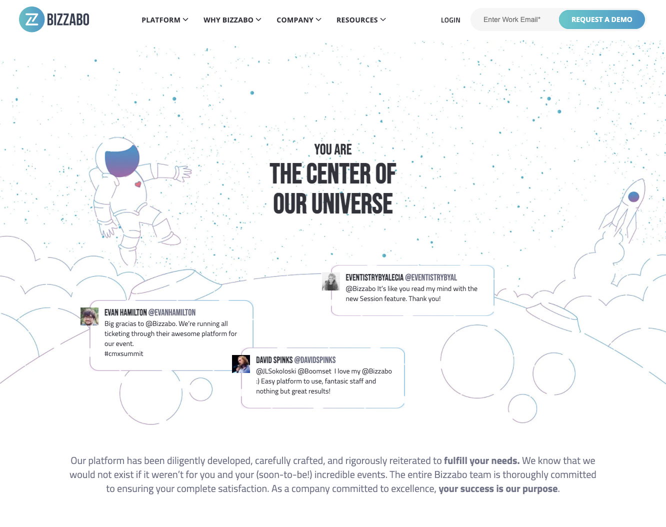
The testimonial page for the leading corporate event planning company features outer-space-themed graphics. Lots of white space surrounds the headline: “You are the center of our universe.” The layout helps draw your attention to three featured customer quotes.
Below the quotes is a paragraph promising Bizzabo’s commitment to its customers.
Below the Fold
Scroll down and you’ll see Bizzabo’s Captera rating of 5/5. A call to action (CTA) button encourages you to read more about their customer-centric approach.
Keep Scrolling
Next, there’s a grid of case study links. This section features case studies from Sapphire Ventures, DataRobot, ServiceTitan, and more.
Further down, you’ll find a short video testimonial from CoinDesk. Above the embedded video, the heading quotes the operations manager.
The last section is a CTA to enter your work email and request a demo.
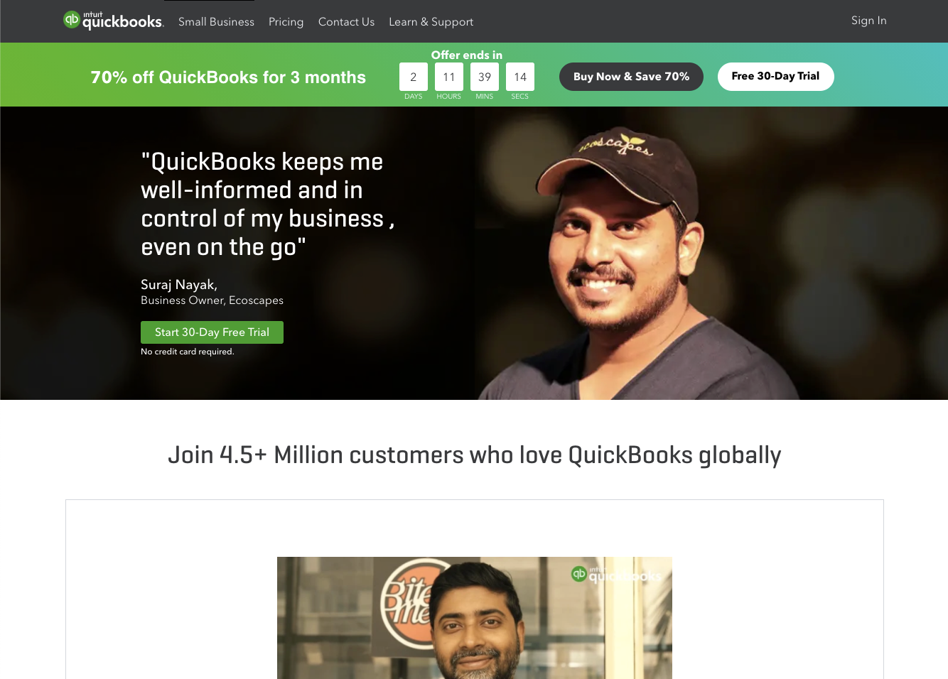
This leading accounting software from Intuit has a featured quote on its testimonials page. It includes a photo of the owner of Ecoscapes, Suraj Nayak.
Underneath there’s a CTA button to start a free trial.
Below the Fold
Next, you’ll see a preview image for a customer video. Click on the preview and a YouTube video plays.
A horizontal scroll bar below lets you see two more videos.
Keep Scrolling
Below that there’s a section with more customer photos and their quotes. All of the personalities shown have titles such as “Founder,” “Business Owner,” and “Co-Founder.” This reveals Quickbooks’ target market of small businesses.
The last element before the footer is a CTA for those who keep books on Excel or Google Sheets to switch to QuickBooks with a free trial.
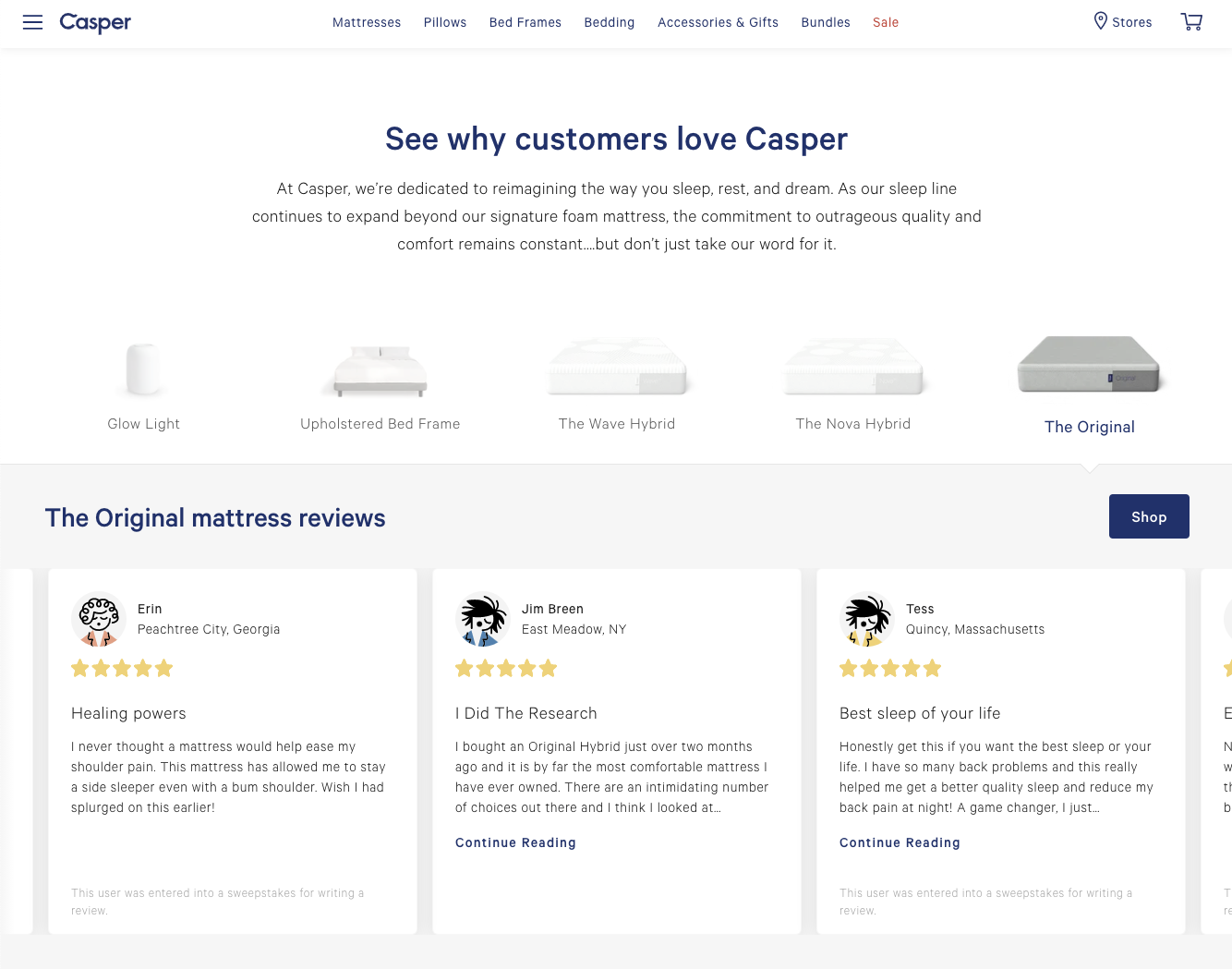
When you land on the testimonial page for this manufacturer of mattresses and pillows, the heading reads, “See why customers love Casper.”
A paragraph states Casper’s commitment to “outrageous quality.”
Beneath the paragraph, there are some featured products. Then there’s the heading for the reviews, but to read them you have to go…
Below the Fold
The page has customer reviews that cite only the first name and location of the reviewer. They are in boxes that you can scroll through horizontally.
Most of the reviews have a note at the bottom of the box that reveals that the customer was entered into sweepstakes for writing a review.
Keep Scrolling
Next, Casper touts its accomplishments of being named among Time magazine’s best inventions of 2015, its Google Reviews average rating of 4 ¾ stars, and a quote from Architectural Digest, “The perfect mattress according to science.”
Down further you’ll find quotes from articles on Casper from Fast Company and Good Housekeeping with links to the articles.
As a full-stack UX/UI design software provider, it’s fitting that we include our testimonial page among the examples.
Above the Fold
Here we feature T. Rowe Price, an investment company that streamlined its UX design process with UXPin Studio.
The headline is simple: “T. Rowe Price Adopts and Scales Agile UX in the Enterprise.”
Below the headline, we have a call to action (CTA) button linked to the case study page.
Below the Fold
Scroll down and you’ll see the grid of other satisfied customers and links to their case studies.
PayPal
HBO
BlazeMeter
Sumologic
LiquidPlanner
LookThink
Sapient
Keep Scrolling
In the last section, we have quotes from satisfied UXPin users.
Larry Sawyer, PayPal
Andrew Roberts, Citrix
Markus Knight, Adidas AG
Tracy Dendy, HBO
Resources
New to UXPin? Learning is easy. Check out our video tutorials on YouTube. Learn UX design. We have a wealth of ebooks covering virtually every UX/UI design subject. Best of all, they cost you nothing. Start using UXPin with a free trial and see the benefits of end-to-end project management.
You’ve heard about human-centered design. It’s one of the most omnipresent design philosophies in UX/UI. But what about user-centered design (UCD)? These two terms sound similar, but there are differences between them, and you should consider both principles when designing future prototypes. In short:
Human-centered design (HCD) considers the psychological/emotional preferences of users that engage with UX/UI designs.
UCD takes a less emotional approach and focuses on the situational/environmental factors that influence the way users interact with designs.
In this post, learn why UCD is such a valuable design principle and why you should always consider it for future projects.
What is user-centered design?
It’s critical to establish the differences between user-centered design and human-centered design as these concepts confuse some designers. While HCD considers a user’s emotional and psychological characteristics in a UX/UI design context, UCD is more tangible, focusing on specific situational traits that influence how a user perceives and engages with a design.
A designer that adopts the HCD approach considers a user’s emotional response to a prototype or product through the paradigm of UX/UI design — how a user responds, behaves, and feels on an emotional level.
A designer that adopts the UCD approach considers more tangible concepts such as a user’s age, social status, and education, and how these factors influence the user’s response to a prototype or product. There’s still psychology behind UCD, but the approach is less emotional and more situational/environmental than HCD.
There are similarities between UCD and HCD. Both philosophies involve processes that put users at the center of product design and development. In both scenarios, designers recognize user’s pain points and how the product (or the design/prototype) solves these problems. Designers might switch between UCD and HCD depending on the circumstance or design brief or use both methods.
How user-centered design works
UCD requires more research than HDC, which involves a lot of guesswork. With UCD, you center designs around the situational and environmental contexts users find themselves in, so you’ll need plenty of data to execute this design philosophy properly.
Start with UXPin, which gathers feedback from users about your designs as early as the wireframing stage. Use this feedback to influence your UX/UI designs and create better prototypes and products based on user requirements and the problems they need to be solved. The world’s best designers already use UXPin, so why not join us with this free trial?
Then research demographics on other platforms. Designers collect a broad range of data from disparate sources to understand the situational factors that influence design perception. These sources include:
Census data
Social media pages
Beta testing
Surveys
Online forums
Telephone calls
Interviews
Analytical programs that provide designers with real-time user insights
The purpose of data collection isn’t to build a database about users but identify trends that affect perceptions toward UX/UI design. For example, monitoring social media tells designers how users in different locations (say, New York City vs. London) respond to a particular product. If social users in London perceive a design differently from those in New York, designers might want to tweak the product for an international audience. In this context, situational factors (specifically, location) influence how users respond to design. There’s a lot of generalization involved in UCD, but it’s a design philosophy that proves incredibly useful.
Surveys are another data collection method for identifying situational or environmental factors that drive design perceptions. Take age, for example. A designer might want to gauge prototype responses from a group of 18–24-year-olds and compare the results with a group of 25–35-year-olds. The older cohort could have different opinions about the product than the younger cohort, so the designer might have to make adjustments to the product if trying to appeal to both demographics. Designers typically use several feedback methods to determine audience reactions toward prototypes, and the process might take many months.
Benefits of user-centered design for UX/UI designers
There are multiple benefits of UCD because you get to understand your target audience better. This approach can have the following effects:
Save time
You spend less time prototyping when you know what targeted users want (and don’t want) from design. You learn user pain points and bespoke requirements just by testing and measuring key demographics.
Increased interest in your design
Users in specific contexts are more likely to invest in your prototype or design if it fulfills their needs or requirements. However, you need contextual insights to satisfy user needs.
More investment
When more users are interested in your design, you attract more investment opportunities and overall interest in your product.
Longer-lasting benefits
Once you understand audiences and target markets, you can move users through your design and development life cycles and, eventually, increase sales of your product when it gets to market. In the future, you prototype less and spend more time designing innovations that fulfill user needs.
Summary
It’s important to differentiate between user-centered and human-centered design for consistency. But once you’ve mastered the basics of UCD, incorporate this approach into your design philosophy and create products and prototypes based on situational and environmental contexts. UCD can be difficult at first, so a digital tool like UXPin proves invaluable. Use it to gather feedback from users during the design process for exceptional insights. You’ll learn more about your target audiences and waste less time creating prototypes that don’t work.
Generate user insights during the design process with UXPin, the design and prototyping tool for UX/UI designers everywhere. Start your free trial.
Like a lot of companies, Johnson & Johnson once relied on a style guide to make sure designers used approved language and components. Style guides can still help brands enhance their UX, but they don’t always match the needs of larger companies. Newer technology also makes it possible for smaller enterprises to move from style guides to design systems.
During an April 2021 webinar, J&J Experience Design Expert Service Leader Ben Shectman talks about how he and his team used the corporation’s existing style guides to build an interactive design system. It’s a lesson in how adopting the right process and software can make a design department more effective and efficient.
Why you need a design system instead of a style guide
For years, Johnson & Johnson had used style guides saved as PDF files. The disadvantages of static style guides were obvious to an experienced UX designer who knew the benefits of interactive design systems.
Some of the benefits you gain when you transform style guides into design systems include:
Creating a place that stores all the standardized versions of components.
Adding consistency to products that help users know what to expect when they encounter new features.
Controlling the design components that employees can access and add to their prototypes.
Establishing guardrails that make it impossible—or at least extremely difficult—for anyone to add unapproved features.
Improving efficiency by providing components that designers can drag and drop into their work.
With a design system, the person in charge gains more control over product design and development. Meanwhile, the jobs of designers and developers become easier as designers used standardized and approved components in their work.
Moving from style guides to design systems with atomic design
Ben Shectman and his team chose to convert J&J’s style guides into a design system using atomic design. Atomic design works well for large corporations like Johnson & Johnson. Benefits of atomic design include:
Letting designers mix and match components to build new products.
Relying on consistent, predefined pieces that maintain consistency throughout products.
Updating existing designs doesn’t require nearly as much effort.
When using atomic design to build design systems, you get to focus on five layers of complexity:
Atoms—the most basic, essential elements that get used to make everything else.
Molecules—more complex structures built from multiple atoms.
Organisms—the result of combining molecules (examples include search fields and navbars).
Templates—a controlled environment where designers can place organisms.
Pages—the final product that shows designers whether their approaches yielded the results they expected.
All of these levels of complexity serve essential roles, but most design managers focus on giving their teams templates.
Create templates for designers, developers, and other employees
Ideally, your design system should include as many templates as possible to fill potential user needs. Designers should be able to open the appropriate template and drag organisms into it. Depending on the template, the organisms might snap into specific places based on their functions.
For an example of how valuable templates are, watch J&J designer Gil Gerard Austria use one to transform an old employee search tool into a design that matches the company’s preferences and provides excellent functionality.
Build your interactive design system with UXPin
UXPin makes it easier than ever for you to go from outdated style guides to interactive design systems. The team at J&J chose UXPin in part because it helps in creating an interactive design system that shows all clickable components and helps a lot in user testing.
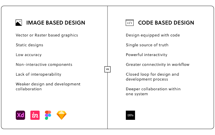
The interactive design system solves numerous problems often caused by image-based design, such as inaccuracy, static designs that don’t respond to interactions, and the number of back-and-forths with developers before establishing how exactly each component should look and behave.
Take your design system to the next level
If you want to keep the consistency of your components with the end product, reduce the number of designer-developer back and forths, and eliminate the handoff drift, you should choose to design with code components.
Our Merge technology allows designers to use UI code components that developers already created and are stored in the coded design systems. This gives an ultimate single source of truth for the whole product teams, as designers use production-ready components in the designs that later on developers just search for in their libraries to build the product. Besides, the imported components are fully interactive, which means that the prototype will look and behave just like the end product!
Reading about the benefits of design systems and code-based design doesn’t always communicate how much more effective tools like UXPin Merge work. Experience the advantages yourself by requesting access to UXPin Merge.
Static style guides have a role to play in keeping digital products on brand. When it comes to actually designing products, though, interactive design systems make it much easier for professionals to create products that meet project goals.
Where style guides can succeed
Style guides have been around for much longer than anyone creating new designs today. They play essential roles in everything from choosing the right font for a newspaper to telling academics how to cite their sources.
Style guides have fallen out of favor — they’re in the process, at least — but they offer essential information that you can use to create interactive components and design systems.
If you take a new job leading a design team, you’ll be glad that the company already has a style guide for you to follow. Without one, you have to start from the very beginning. Considering that it took the design team at Johnson & Johnson about six months to turn their static style guide into an interactive design system, you don’t want to undertake the task of starting from scratch.
The failures of static style guides
All design teams need guidelines that help them build products that conform to expectations. Static style guides, however, fail to meet today’s real-world needs in several ways.
Static style guides cannot evolve
A static style guide never really changes. You can release a new version, but you cannot update the one you have already made. That’s the unfortunate fate of all static things.
What happens when you update the style guide to reflect changes in the company’s branding? Can you replace every copy of the old guide saved on computers throughout your organization?
You can try to collect every old version and replace them with updated copies, but someone will inevitably keep and use the outdated one. There isn’t much that you can do about it.
Static style guides only offer limited guidance
It might sound obvious that a style guide only offers guidance. What else should you expect from a style guide except to guide your designs? The challenges will become more evident in the design systems section below.
If you have used a static style guide, you have probably found yourself trying to compare your design to the image in a style guide. A good guide will tell you the distance between each line of text, but that doesn’t mean it will look exactly how it does on your screen.
Static images also can’t show you how a feature should function. Does a menu drop down when you click a button, or does it open off to the side?
You can follow to the best of your ability, but the guidance only goes so far before you find yourself making decisions without an authoritative source.
Why interactive design systems work better
Interactive design systems solve all of the problems mentioned above.
Evolution is the nature of interactive design systems
Critically, interactive design systems give you a single source of truth for designers that you can update when needed. Design leaders commonly use design tools to give their teams access to design systems. When you update the design system, the changes happen globally. They don’t just apply to your copy. Everyone who views the design system will see the changes you made. In UXPin they will even get notified if some components are out of sync, and will give you a chance to update it fast.
Interactive design systems offer drag-and-drop functionality
With an interactive design system, no one has to worry that they aren’t following guidelines correctly. Instead, they can use drag-and-drop functionality to place components into their design environments. Of course, they can make adjustments — such as fixing spaces or adding new text — but the components are pixel-perfect.
Start with UXPin to make interactive design systems you control
Regardless, you get an elegant, code-powered way to design and prototype products. If you want to tear down the wall that keeps designers and developers separated, try our editor with a boost of Merge-technology that powers two integrations: with Git repositories and Storybook. Now, you can connect UXPin to the places where your developers store production-ready components and import them to our libraries. It allows you to design with interactive components by just drag and dropping them on the canvas. The future is now as you can build high-fidelity prototypes in minutes and relieve the pain of a troublesome handoff.
Request access to Merge today to see how much easier managing your interactive design system becomes when you have a code-based tool on your side.
Lead designers need to make sure they keep their team members on the right path. Managers have tried several methods to reach this goal, including pattern libraries and style guides. While those options have a place to play within some organizations, they don’t always provide the single source of truth that you need to optimize design efficiency and avoid mistakes.
Optimize your design process by bridging the gap between design and development. Design prototypes 10x faster by using a ready-made, interactive components that you share with engineers. Learn how UXPin Merge allows you to build prototypes with a single source of truth that ensures design-product consistency and collaboration. Discover UXPin Merge.
Reach a new level of prototyping
Design with interactive components coming from your team’s design system.
Today’s design and prototyping tools tend to rely on design systems as a single source of truth. The design system should include everything that employees involved in product development need to conform to the company’s brand identity and align with all expectations.
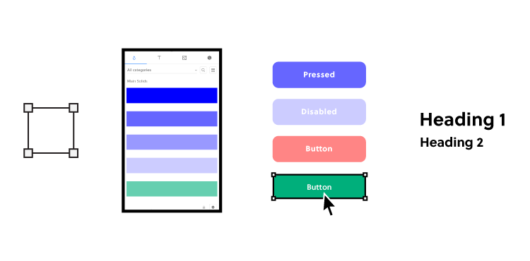
When using a design system as your single source of truth, you will likely establish approved:
Color palettes
Type scales
Icons
Buttons
Forms
Sliders
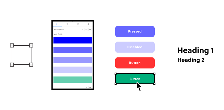
Keep in mind that you can use a pre-existing design system or create a unique one for your team’s products. Building a new design system takes time, so a lot of smaller design groups decide to use options like Material Design, which already gives you a library of attractive, functional components that you can add to designs easily.
While you can save time and energy using one of these as your single source of truth, you lose a little control over your aesthetic. Plus, a lot of designers already use these design systems. You might find that developing an independent, single source of truth helps your brand stand out from the crowd.
Why you need a single source of truth (more than you probably know)
Establishing a single source of truth gives you benefits way beyond controlling what components, icons, and color schemes your designers use. Depending on how you approach your design system and the tools you choose, you can make work much easier for everyone on your team.
You provide everything designers need to build products
In a very loose way, this is something that you already expect static style guides to do. When someone has a question about what color to use for the homepage’s background, they can consult the style guide. When someone isn’t sure how far apart to place lines of text, a style guide provides the answer. However, if you want teams to reuse some elements that are already in-line with the company standards, then an interactive design system comes in handy.
You can decide to go one step further by linking designers’ single source of truth and developers’. Bring fully interactive and developed components to your design editor so that you can prototype with the production-ready components right away. Then you get a library of approved components that they can drag and drop into their design environment.
If someone needs to build a new app that lets employees request days off, they can find the appropriate interactive elements, drop it into the design environment, and tweak individual fields to meet their goal. Most of the work has already been done because someone has created reusable components that serve frequent needs.
It also removes all the inconsistencies in the handoff process. As both designers and developers use the same components, there’s no way that those can be off in the prototype. Using the ultimate single source of truth for product teams will cut down not only the designing time, but also the development process as the reusable components are already coded.
No one ever has an outdated design system
If you’re old enough, think back to the time that everyone relied on printed style guides. A good style guide would tell you just about everything you could ever need to know while designing a new digital product.
Even when companies started to digitize style guides, they usually turned them into PDF files.
Digital style guides seem great until you have a better option. After all, you don’t have to print pages and pages of instructions anymore. You can just send a single document to everyone via email. Easy!
Except that something always goes wrong. Last year’s style guide doesn’t necessarily conform to this year’s standards. Even last month’s style guide might not conform.
When everyone has a static document that tells them what to do, they may end up using the wrong edition. It’s a challenging situation that always seems to happen.
With a design system, though, no one ever has an outdated guide. When you update the library, everyone who accesses it from that moment on sees the change because you keep the library in a centralized location that you control. You can build one in UXPin and keep everybody up to date.
If you integrate your design tool with developers’ Git Repository or Storybook where the ready components are, you literally have one source of truth. When developers change elements, your design library and the projects get automatically updated. Also, the designs are code-powered so everything will synchronize and display exactly the same as in your devs’ libraries or repositories. There’s no need to worry about components, colors, typography and more being off.
A single source of truth saves everyone time
Making a design system that serves as your single source of truth will certainly save your designers some time because they don’t need to consult style guides or knock on your door to ask questions.
But if you really want to drastically cut down the time of design and development phases, you should consider syncing your design editor with developers’ repositories and libraries. PayPal compared designing with interactive code components vs. pixel-based components, and the first method turned out to be over 6 times faster! Several companies use code-approach to improve their product design, development models. Learn how PayPal took advantage of UXPin Merge’s code-based design to streamline development with a small design team.
UXPin Merge makes every step easier
Don’t waste your energy and time with static style guides and design software that isn’t code-powered. UXPin powered by Merge technology gives you a better option that helps you create a single source of truth, give your designers the interactive and production-ready components they need to work efficiently and save time when your prototype reaches developers. Learn more about UXPin Merge.
There are many ways for product teams to achieve greater efficiency and consistency in the design handoff.
At UXPin, we believe that smooth communication between designers and developers is one of the most important factors in setting up an efficient and scalable DesignOps process for your business. In the ideal world, both designers and devs should speak a common language when building digital products together.
With our new release of Storybook integration rooted in Merge technology, we believe we are getting one step closer to reaching this goal.
The challenge behind design consistency
Designing products with vector or pixel-based tools leads to endless inconsistencies during the design implementation. If you’ve heard it somewhere it’s because many design thought leaders like Nathan Gitter, or UXPin’s own founder, Marcin Treder have been echoing this statement for years.
The drift between design and the end product often boils down to one problem. The technology behind design tools to display the UI elements and what devs use to build the product for end-users is just completely different tech. What most designers do, is merely paint a picture with a visual representation of a digital product.
Think what would happen if instead of drawing text input with a rectangle and adding some text to it on a separate layer, designers could use a native input component where they could type something in. Or how about using an interactive component of a radio button that changes states, instead of drawing circles that mimic those buttons?
Some design tools (like UXPin) give you the code-based components as your building blocks. They look and behave the same way both in the design editor and as an end-product. It doesn’t require you to know how to code – it just gives you some common vocabulary to work better with devs. Great, but why stop there?
As your company and product grow, you end up with different UI patterns, elements, and typography that are standardized by Design System and organized in your devs’ Git Repo – the ultimate source of all the shiny, finalized components that went through tons of revisions. All full of interactions and states.
Now imagine taking those code components from your devs repo and using them to build new parts of your product. Wouldn’t that just make sense?
The code components as a common language
Some time ago UXPin came up with a revolutionary technology called Merge. It does exactly what we’ve just described: it allows you to plug into any Git repo with UI components and bring them to the UXPin design editor. The outcome of this integration has blown us away. Some of the biggest tech giants, like PayPal, adapted Merge technology and built the whole design process with its help.
PayPal measured that Merge sped up their design process over 6 times, and allowed them to remove product drift during the handoff to the absolute minimum. It really helped designers and devs speak one language. Whatever designer used in their prototype to build UI – the dev already had it in their repo as the same component.
As we kept talking with other companies, we realized how many of them face the same problems. That’s why we’ve decided to expand the Merge technology in two ways and bring more comprehensive design innovations to the market.
The first thing we have been working on is adding more frameworks to the existing Git integration. The second one was finding an alternative source of components developed by UI engineers. Something that would allow for a faster setup and supported a wider range of frameworks. The integration with Storybook seemed like a natural choice here.
What is Storybook
If you haven’t heard of Storybook, it’s about time. This great tool helps developers build UI components and pages in isolation. It simplifies testing and preparing on-point documentation. If devs or UI engineers want to turn a design Style Guide or a Design System into organized coded components, Storybook is a perfect place for that.
Firstly, you need access to Merge technology in your UXPin account. If you haven’t requested it yet, you can do it here.
Then, just copy the link of the Storybook that you want to use (e.g. Audi’s), go to the UXPin editor and add the new library by pasting the link in the “Import Storybook components” box.
Yes, it’s that simple! Now you can design with the exact same components right away and play with all interactions on Preview.
If you want to get to know more about the integration, see our Docs.
Benefits of the integration
Build advanced UI fast
With Storybook integration, you can build high-fidelity prototypes fast just by dragging and dropping code components on the canvas. They are fully interactive and behave just like an end product. On top of that, you can still add UXPin’s interactions to glue different UI patterns together into a truly immersive experience for user testing and show your team how the product should look. The whole process is extremely fast.
Besides speed, you also improve the design consistency. The Storybook components are in line with your production standards, so you don’t have to spend time matching the right colors, fonts, or rebuilding parts of the UI.
Manage only one library
There’s no need to take care of the UXPin and Storybook libraries separately. The components are in sync all the time, so whenever your Story (Storybook component) is changed, your designs and library in UXPin get automatically updated. These are the same code-powered components as in the Storybook library, so whatever works there, will work in UXPin.
Handoff revolution
All those back and forths between designers and developers cost time and money. By using a single source of truth, you can remove the silos and speed up your product development process. There’s no place for handoff drift with design or interaction inconsistencies. When the prototype is finished, the developer just needs to find the components that designers used, in their Storybook. That’s it! Developing a product where you already have the code for design is much faster and clearer.
Build prototypes that behave like real products and cut down your product development process. Request access for our Storybook integration, integrate with your library in under 1 minute, and get ready to design with code!
We use cookies to improve performance and enhance your experience. By using our website you agree to our use of cookies in accordance with our cookie policy.