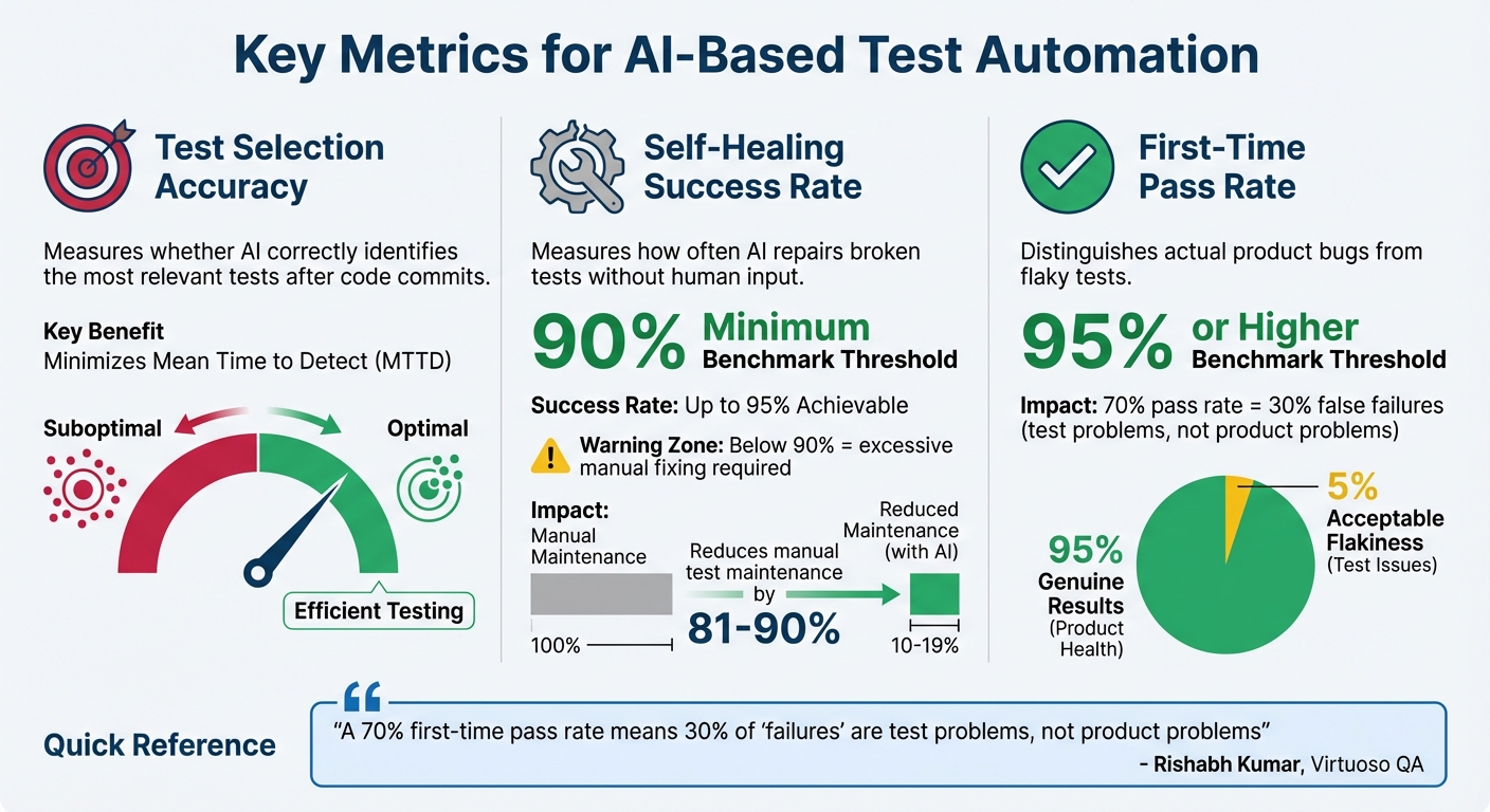
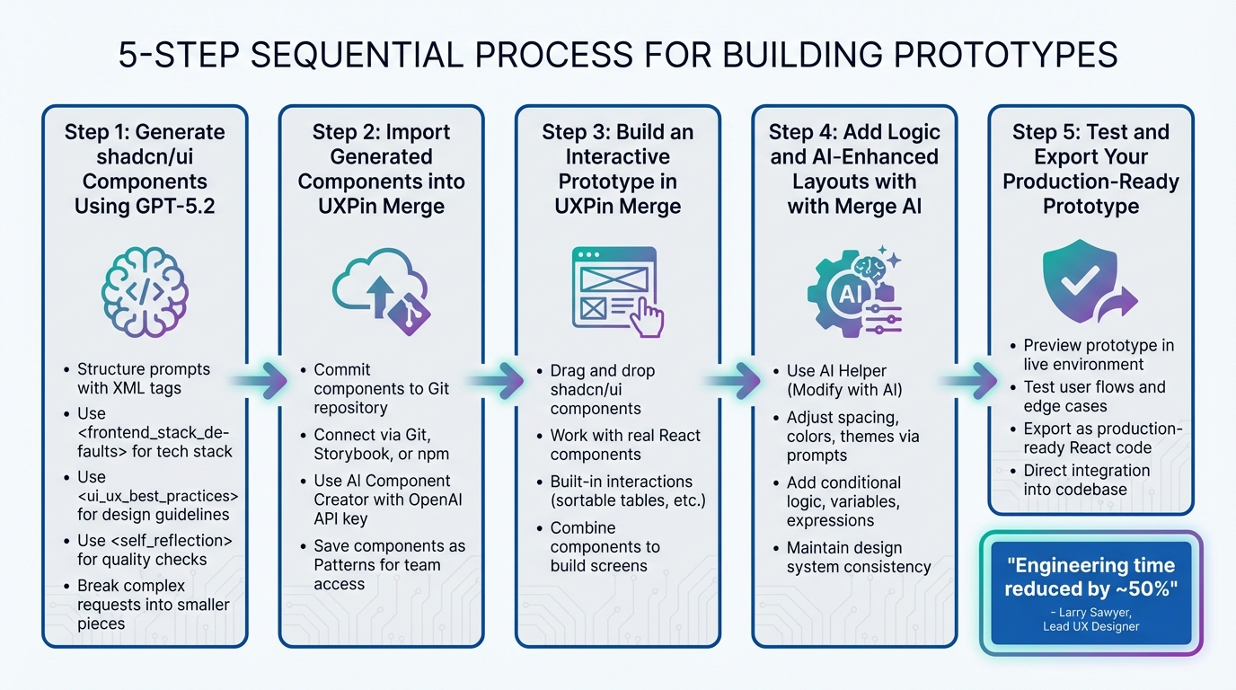
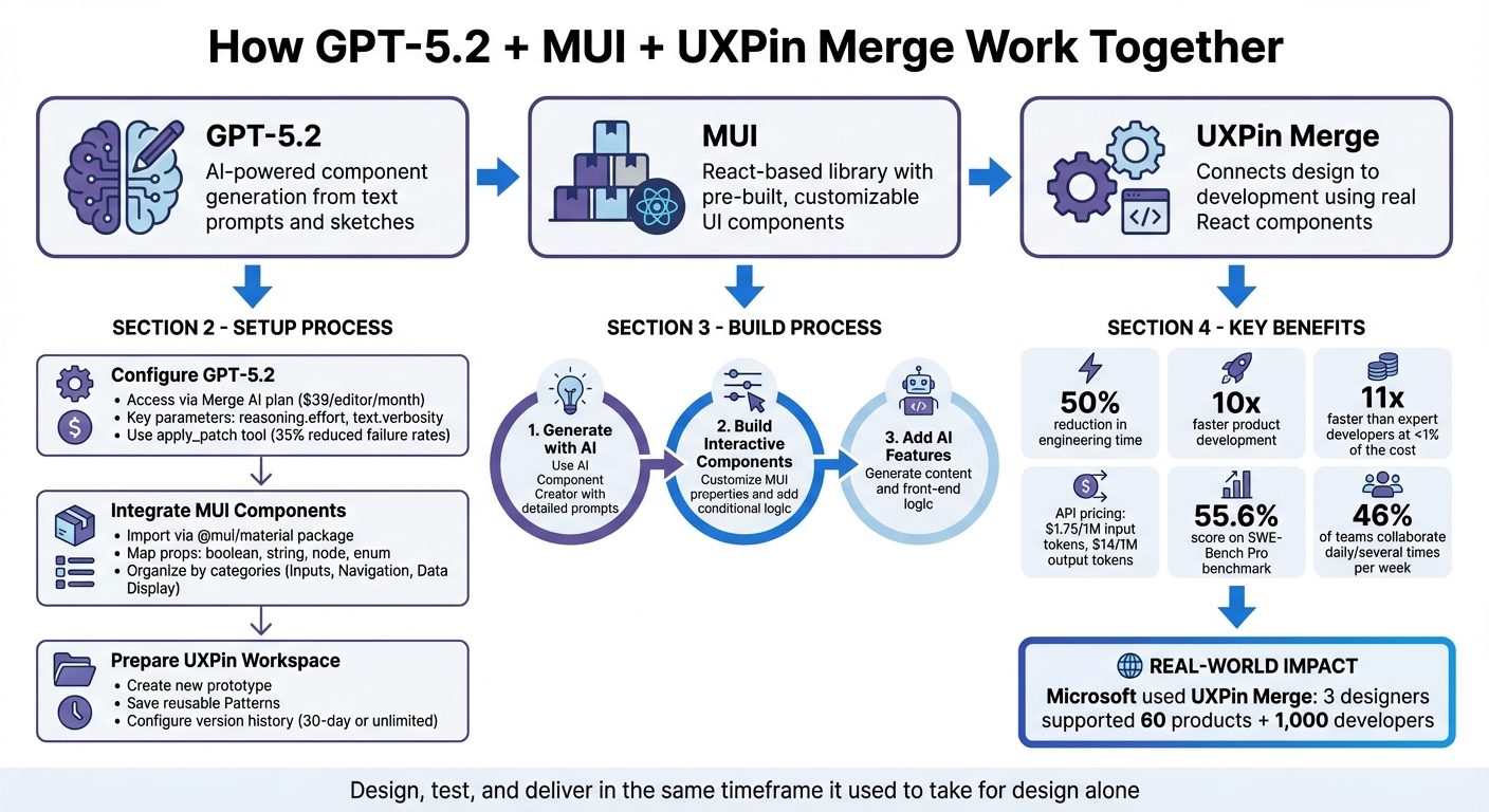
Prototyping with GPT-5.2 and Ant Design in UXPin Merge streamlines design-to-development workflows. Here’s how it works:
- GPT-5.2: Generates and refines components using natural language prompts like “create a testimonial section with three cards.”
- Ant Design: Offers a React-based UI library with pre-built components for scalable enterprise applications.
- UXPin Merge: Connects design and development by allowing designers to prototype with production-ready React components.
Key Benefits:
- Build production-ready prototypes directly in UXPin Merge.
- Save time by eliminating the gap between design and development.
- Use AI to automate repetitive tasks and ensure consistency.
Quick Setup:
- Ant Design: Pre-integrated into UXPin Merge; just select it in the Design System Libraries tab.
- GPT-5.2: Access through AI Component Creator to generate components with plain English prompts.
This workflow reduces engineering time by up to 50% and accelerates prototyping by 8.6x. Start by connecting your design system, crafting detailed prompts, and leveraging AI to create functional layouts ready for deployment.

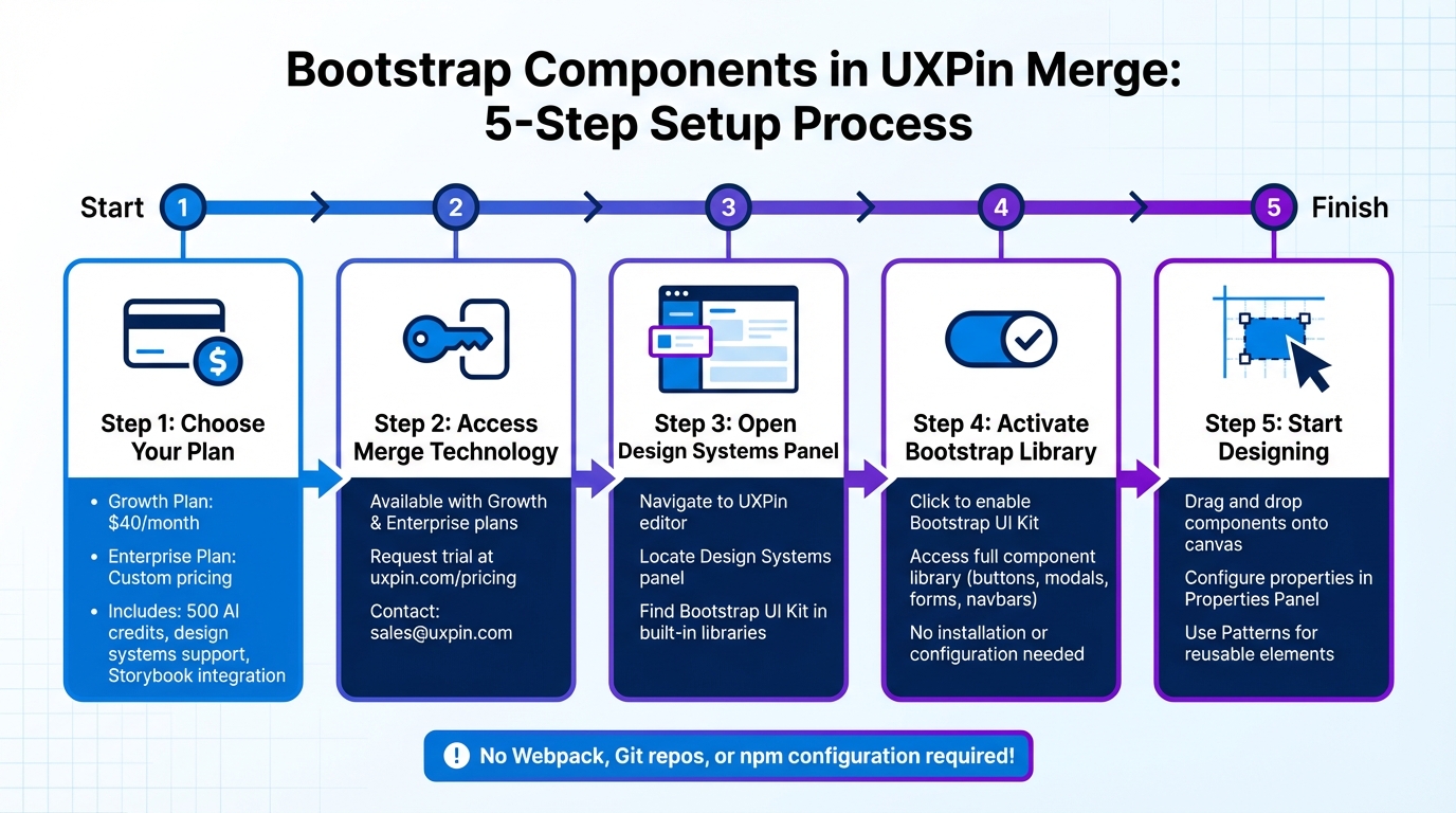
How to Set Up GPT-5.2 and Ant Design in UXPin Merge Workflow
From Prompt to Interactive Prototype in under 90 Seconds
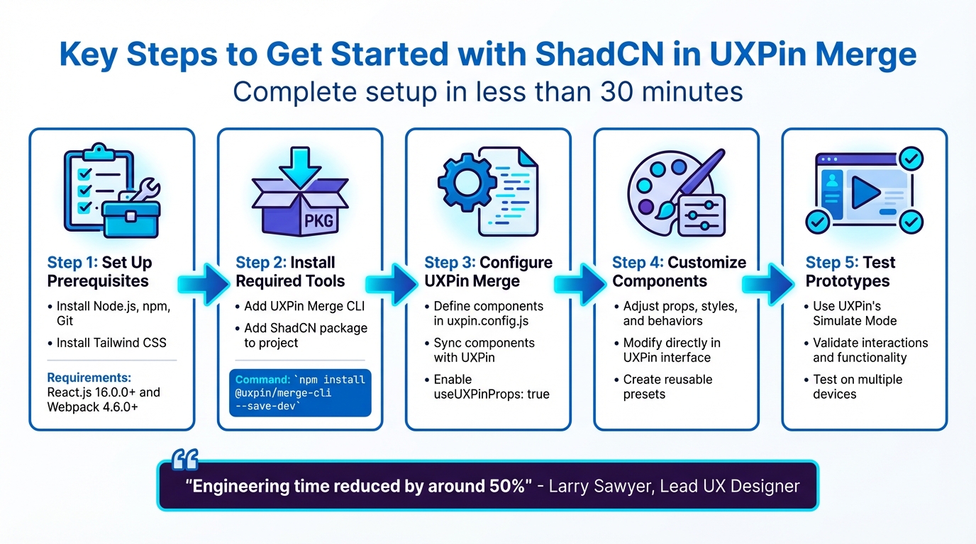
Setting Up Your Workspace
Getting started with Ant Design and GPT-5.2 in UXPin Merge is straightforward. UXPin Merge offers native integration with Ant Design, so there’s no need for manual imports or separate AI subscriptions.
If you’re working with custom component libraries, you can use the npm integration method. Let’s walk through how to set up your workspace and gain immediate access to Ant Design and GPT-5.2.
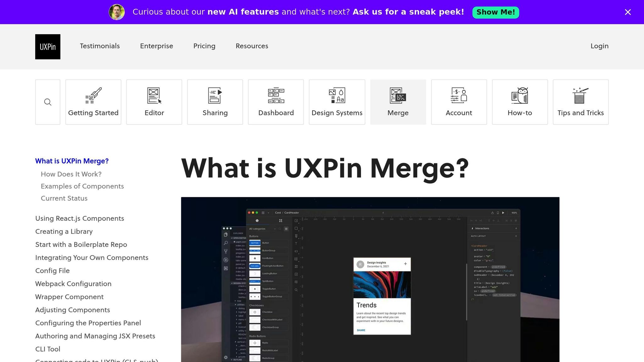
Adding Ant Design to UXPin Merge
Since Ant Design is already integrated into UXPin Merge, you can start using it right away. Simply open your project, go to the Design System Libraries tab, and select Ant Design from the available options.
For teams using a custom Ant Design fork or specific npm packages, the process is just as simple. Head to the Design System Libraries tab, click New Library, and choose Import React Components. Enter antd as the package name and specify the asset path antd/dist/antd.css for styling. Then, use the Merge Component Manager to add individual components like Button or DatePicker. Just make sure to follow CamelCase naming conventions (e.g., DatePicker instead of Date Picker) as outlined in the Ant Design Component API.
Once you’ve added your components, click "Publish Library Changes" to finalize them. This step is essential before you can edit properties or add controls in the UXPin Properties Panel.
With Ant Design configured, you’re ready to enable GPT-5.2 for seamless component creation.
Activating GPT-5.2 in UXPin Merge

After setting up Ant Design, GPT-5.2 takes your design process to the next level by turning your ideas into functional components – all within the same platform.
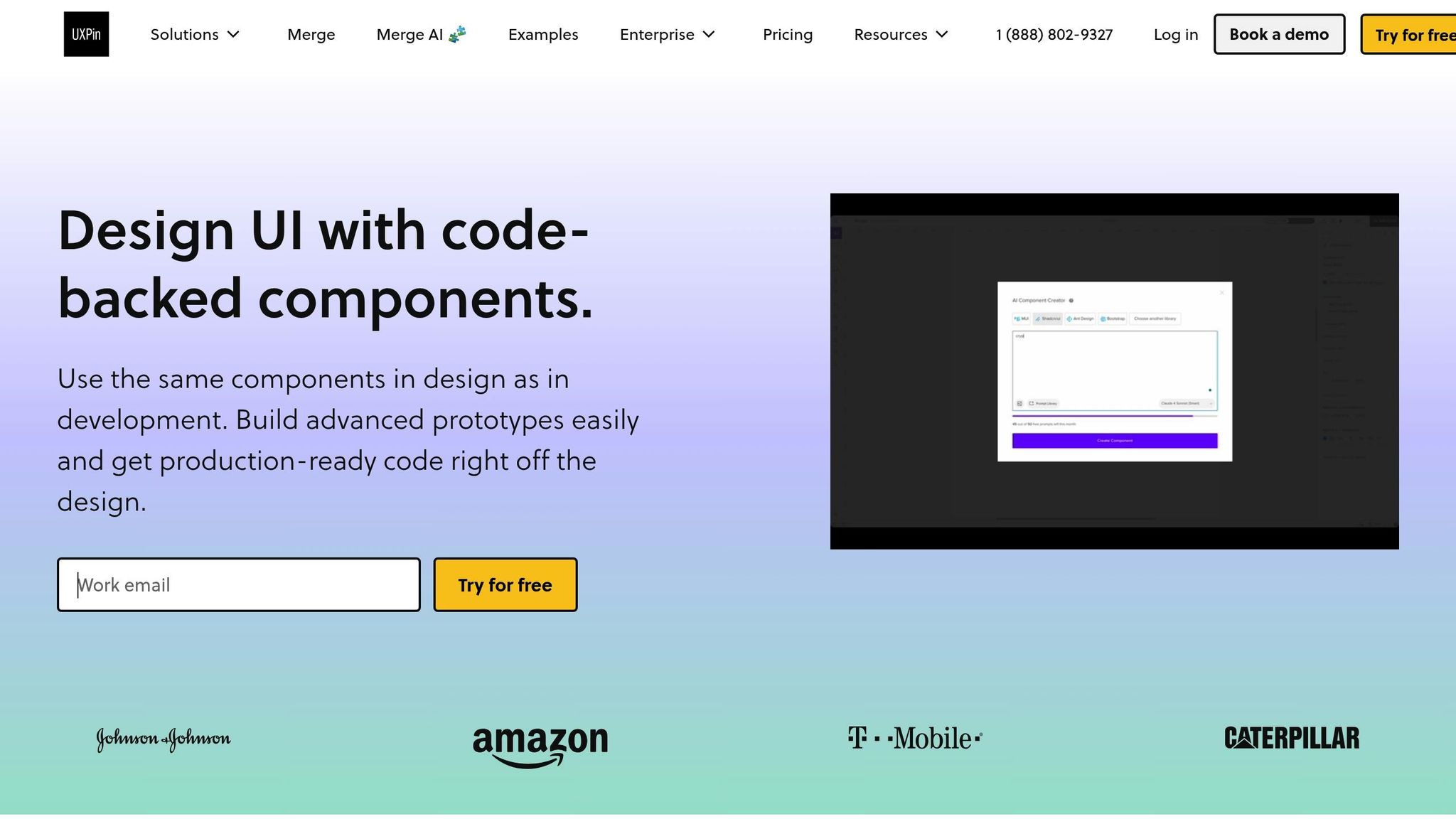
GPT-5.2 is available through UXPin’s AI Component Creator, which is built right into the editor. Once you’ve selected Ant Design as your design system library, the AI tool is ready to use.
To generate components, open the AI Component Creator from UXPin’s editor. You can describe your needs in plain English, such as "create a testimonial section with three cards", and the AI will build it using Ant Design components. Best of all, this feature is included with your UXPin plan – no need for a separate ChatGPT or Claude subscription.
After the AI generates a component, you can fine-tune it using the properties panel, adjusting details like size, color, and states.
For more advanced customization, use @uxpin/merge-cli version 3.4.3 or newer and update your uxpin.config.js file with settings: { useUXPinProps: true }.
Building Prototypes with GPT-5.2 and Ant Design
With your workspace prepared, it’s time to dive into building prototypes. By combining your requirements, GPT-5.2’s component generation capabilities, and a touch of refinement, you can create interactive designs efficiently. Here’s how to get started, including tips on generating components with natural language prompts.
Using GPT-5.2 Prompts to Generate Components
To begin, open the AI Component Creator from the Quick Tools panel in the UXPin editor. Set Ant Design as your global library to ensure the components generated by GPT-5.2 align perfectly with your design system.
You can create components in two ways:
- Natural language prompts: Simply describe what you need in plain English. For instance, you could type: "Create an input field with a blue border when focused and a bold label ‘Email’ positioned above it." GPT-5.2 will generate the component using Ant Design React code.
- Image or sketch uploads: Upload a visual reference, and the tool will map it to the closest Ant Design components. For layouts that combine logic, visuals, and text, include those specifics directly in your prompt.
In December 2025, UXPin introduced Merge AI 2.0, which integrated advanced language models to empower teams at companies like Amazon, T. Rowe Price, and the American Automobile Association to generate and refine UI layouts using their unique design system building blocks.
Once your components are generated, you can further refine them using the AI Helper.
Editing Components and Maintaining Consistency
Instead of starting over each time you need adjustments, use the AI Helper (Modify with AI) to tweak components. Select a component and click the purple "Modify with AI" icon. Then, describe your desired changes in straightforward terms, such as "make this denser," "tighten table columns," or "swap primary to tertiary button variants."
This method ensures your components stay consistent with your Ant Design system. The AI understands the structure and properties of each component, so even specific changes – like "change border to 2px solid blue" – are quick and accurate. Once you’re satisfied with a component, save it as a Pattern for future use.
Adding Interactivity and Logic
Ant Design components in UXPin Merge come with built-in interactive properties. Hover states, animations, and basic interactions are functional right out of the box because they’re powered by React code. For more advanced interactivity, include specific functional requirements in your initial GPT-5.2 prompt. This ensures the generated components include the necessary logic from the start.
If adjustments to interactivity are needed later, the AI Helper can handle changes to alignment, padding, or state-based behaviors with ease. Because these components are code-backed, they can accurately replicate user experiences, including conditional logic and state changes. This approach enables high-fidelity testing before development even begins. In fact, teams using this workflow have reported building functional layouts up to 8.6x faster compared to traditional methods.
sbb-itb-f6354c6
Best Practices for GPT-5.2 and Ant Design Prototyping
To get the most out of GPT-5.2 and Ant Design, focus on clear communication, efficient library organization, and seamless teamwork. The gap between a quick prototype and a production-ready design often hinges on these factors. By refining how you interact with the AI, structure your components, and collaborate with your team, you can streamline the entire prototyping process.
Writing Clear GPT-5.2 Prompts
Be specific. Instead of a vague request like "create a button", provide detailed instructions such as: "Design a primary button with a 16px font size, bold text, and a 2px solid blue border." GPT-5.2 thrives on precise prompts that include elements like color, typography, and spacing.
Break down complex components into smaller parts rather than tackling a full dashboard in one go. This modular prompting gives you better control and improves the accuracy of the generated elements.
Adjust verbosity levels – low, medium, or high – based on how intricate your task is. For example, high verbosity works well for detailed workflows, while low verbosity suits simpler elements.
When working with Ant Design, stick to the official API’s naming conventions. For instance, specify button variants like primary, ghost, or dashed, and use CamelCase for components like DatePicker. This ensures the AI generates components that integrate seamlessly without needing manual corrections.
If you’re uploading images or sketches, opt for detailed mockups instead of rough wireframes. The AI interprets clear visual references more effectively, recognizing typography, colors, and spacing with higher accuracy.
Making the Most of Ant Design Components
Ant Design is known for its consistent, enterprise-grade components. To maintain that consistency, save polished components as Patterns once you’ve fine-tuned them with the AI Helper. This creates a reusable library, speeding up future projects and keeping your team aligned.
For multi-step workflows, like a login or checkout process, frame your prompts around the entire task flow. For example: "Design a login flow using Ant Design Input and Button components, with form input validation states." GPT-5.2 handles these comprehensive instructions more effectively than fragmented requests.
"When I used UXPin Merge, our engineering time was reduced by around 50%."
- Larry Sawyer, Lead UX Designer
Beyond refining components, fostering collaboration can significantly improve project efficiency.
Improving Team Collaboration
Skip the back-and-forth of handoffs by sharing interactive Merge previews. These links replace static mockups and documentation, giving developers direct access to JSX code, component dependencies, and functions. Everything they need to implement the design is ready to copy-paste into the codebase.
This shared workspace ensures designers and developers are always on the same page, using identical components and avoiding the usual translation errors that slow down projects.
For teams managing large design systems, providing GPT-5.2 with a knowledge index or a structured map of your component library can make a big difference. This helps the AI quickly retrieve the right components and follow your system’s rules, reducing generation time and minimizing revisions. From the first draft to deployment, everyone stays aligned and efficient.
Conclusion
Integrating GPT-5.2 and Ant Design into your prototyping workflow has the potential to reshape how enterprise teams approach design. Instead of relying on visual mockups that developers must later recreate, this combination allows you to work directly with production-ready code from the start. GPT-5.2 excels in handling complex, multi-step design workflows, achieving 70.9% expert-level performance. Paired with Ant Design’s comprehensive components and UXPin Merge’s code-based canvas, this setup eliminates common development roadblocks.
Key Takeaways for DesignOps Teams
DesignOps teams have reported cutting engineering time by 50% while supporting over 60 products with just three designers. This efficiency stems from a unified system where designers and developers share the same components, all managed through GitHub version control. This eliminates the need for redrawing elements or creating handoff documents that quickly become outdated. Developers receive auto-generated JSX and production-ready React code that can be implemented immediately.
GPT-5.2’s 400,000-token context window and 98% accuracy in retrieving long-context information make it a powerful tool for maintaining design consistency across complex, multi-page prototypes. For DesignOps teams managing large-scale systems, this AI-driven workflow goes beyond basic rule-following – it intelligently executes tasks, from generating components to ensuring brand consistency across extensive projects. The result is a more efficient process that bridges the gap between prototypes and production.
Getting Started with UXPin Merge
Getting started is simple. UXPin Merge comes with Ant Design fully integrated – no extra imports or AI subscriptions required. Plans begin at $29/month (200 AI credits), with the Growth plan at $40/month (500 AI credits and advanced models). Enterprise options include custom onboarding and Git integration.
To put this into action, connect your design system, craft specific prompts, and let GPT-5.2 create code-backed layouts tailored to your production needs. With this approach, prototyping and deployment become a seamless process, as every component is already developer-approved and tested. For more details, visit uxpin.com/pricing or reach out to sales@uxpin.com for custom Enterprise solutions.
FAQs
How does GPT-5.2 enhance prototyping with UXPin Merge and Ant Design?
GPT-5.2 takes prototyping in UXPin Merge to the next level by transforming simple text prompts or sketches into fully functional React components. Whether you’re building complete UI layouts, crafting Ant Design elements, or fine-tuning components, this tool handles it all through natural-language commands – eliminating the need for manual coding or static mockups.
Thanks to its integration with Ant Design’s library, the AI can deliver interactive prototypes in less than 90 seconds. Every component is automatically aligned with your design system, ensuring it meets your team’s standards for consistency and quality. This efficient workflow allows teams to iterate quickly, test ideas with realistic interactions, and close the gap between design and development, significantly reducing both time and effort.
How can I integrate Ant Design with UXPin Merge to create prototypes?
To bring Ant Design into UXPin Merge, here’s what you need to do:
- Open the Merge tab in UXPin and begin the Add Library process.
- Give your library a name. This is how it will show up in your UXPin Libraries list.
- Enter the npm package name for Ant Design (
antd) and choose the version you want to use (e.g., Latest or a specific version like5.2.0). - Add any necessary dependencies, such as
@ant-design/icons, and specify their versions. - If required, include external assets like CSS or font files by adding their URLs.
- Save the library to sync Ant Design components into UXPin.
Once you’ve completed these steps, Ant Design components will behave just like real React components, letting you build fully interactive, code-driven prototypes directly in UXPin Merge.
How can I maintain consistency with AI-generated components in my prototypes?
To maintain consistency when integrating AI-generated components, start by linking the AI to your Ant Design-based design system in UXPin Merge. Establish clear guidelines for your component library, including naming conventions, props, styling tokens, and interaction patterns. These rules will guide the AI, ensuring all generated components align seamlessly with your design framework. Since the library syncs through npm, Git, or Storybook, any updates made by developers are automatically reflected in the design editor, keeping everyone on the same page.
Once components are generated, validate them against Ant Design’s specifications to ensure correct props, spacing, and color usage. Leverage UXPin’s version control to lock approved components, allowing the AI to reuse these pre-vetted elements instead of generating unnecessary duplicates. Think of the AI as a tool for quick prototyping – validate, collect feedback, and refine before finalizing components for your team.
By working directly with live React components from Ant Design, you eliminate the inefficiencies of traditional handoffs. This ensures prototypes not only look but also function like the final product, keeping them consistent, scalable, and production-ready.