Designing for Context: How to Adapt UX Patterns to Different Niches ( +Examples)

Investing in user experience design offers tremendous ROI. Data suggest that every dollar spent on UX brings in up to $100 in profit. Furthermore, multiple studies have shown that a website’s UX design directly influences visitors’ brand perception, purchase intent, and even their likelihood of becoming loyal customers.

But while there’s plenty of exceptional UX design advice out there, business owners (and designers alike) regularly overlook the importance of context.

Ultimately, design choices that work in one niche might not be as successful in another. And even more, some settings simply require designers to make unconventional choices to avoid a complete disruption of the sales funnel.

So, what goes into the process of designing for context? And is there a way to adapt typical UX patterns to different niches?

This guide covers some of the most common UX patterns and how they might have to change when targeting different audience segments or attempting to penetrate different industries or markets.

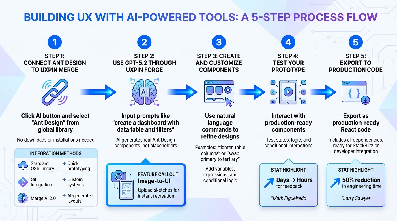
Need a reliable method to test out and verify UX design choices? UXpin allows you to build advanced prototypes, test their effectiveness, and receive production-ready code that you can easily copy into your projects. Try it for free.

Immediate Value Positioning vs. Progressive Disclosure

One of the most common pieces of UX design advice out there is to make your brand’s value immediately clear — even to first-time web visitors. And, at its core, this rule isn’t a bad idea.

After all, web user behavior analyses clearly show that website visitors form brand opinions within 50 milliseconds of landing on a webpage. More importantly, these opinions directly influence purchase intent, price sensitivity, and even brand perception.

Knowing this, it’s only natural that (most) brands should aim to communicate clear and attractive value within as short a timeframe as possible.

Goodles does it beautifully with the copy at the top of its homepage, where it describes the precise, unique value its product brings to the table (especially compared to more traditional choices in its vertical).

Screenshot 2026 05 01 at 12.01.30 pm

Source:goodles.com

But what happens in complex, highly technical niches? Although a UX design strategy that focuses on immediate value positioning may seem like the right choice, it might just be the wrong step. Why?

Well, in some situations, leading with your solution’s purpose and benefits may not register as relevant to the people you’re trying to convert into customers. And that could cause your audience to ignore your messaging altogether (or, worse yet, conclude that your brand doesn’t offer a solution to their pain points).

Think about the concept from the perspective of a highly complex niche.

For instance, if you check out Mesothelioma.net, you’ll find that this business offers services that help customers overcome an incredibly intricate pain point.

And, sure, the website’s UX design and layout could lead with the types of services the business offers. But the simple fact is that Mesothelioma.net’s target audience has a wide variety of needs. Some are just looking for health advice. Others need support accessing treatments and therapies. And some are looking to claim compensation or assistance, or even apply for financial aid. So, instead of leading with the types of assistance it provides, Mesothelioma.net uses a website layout that relies on progressive disclosure. This allows visitors to scan the content at their own pace, stopping at sections that are relevant to their needs and skipping the ones that aren’t — all without feeling overwhelmed by a ton of new information about a health issue they’re still trying to come to terms with.

Screenshot 2026 05 01 at 12.02.22 pm

Source: mesothelioma.net

Niche-Specific Trust Signals

Social proof is an irreplaceable element of great UX design. And, considering how important it is to buyers — both B2C and B2B — that’s not much of a surprise. But the one aspect of UX where designers go wrong when incorporating trust-building elements into website design is highlighting the wrong social proof formats for their niche.

Yes, non-complex niches, like ecommerce, will do more than great with standard social proof formats, including user ratings and typical reviews.

If you check out Cadence, you’ll notice that it is precisely this type of trust signal that it emphasizes in the hero section of its homepage, knowing full well that an average product rating of 4.9 (from more than 9,000 reviews) is more than sufficient to convince its audience about the quality and value of its offer.

Screenshot 2026 05 01 at 12.03.19 pm
Source:
keepyourcadence.com

But what about niche businesses? Can they achieve the same positive outcomes from traditional trust signals as mainstream brands?

Not necessarily. Yes, they may somewhat benefit from displaying ratings and reviews. Nevertheless, to convince their ideal customers of the quality and effectiveness of their solutions, they would need to adjust the social proof (and the entire user experience, for that matter) to better align with their prospects’ unique needs.

In these cases, certificates, industry-specific quality awards, and niche media mentions could be the key UX design elements that drive trust. Jackson Hole based firm Freeburg Law, for example, operates in a highly sensitive industry, offering its services to highly vulnerable clients. So, instead of just relying on customer feedback to build its credibility, this brand goes into sufficient detail about the number of clients it has served, the sums it managed to claim as damages for its customers, as well as all of the organizations and associations it’s part of.

Yes, at first glance, the number and variety of these trust signals may seem like overkill. But considering that people hiring a lawyer usually want to get the most qualified professional to handle their case, it quickly becomes evident that the UX design is, actually, entirely user-centric.

Screenshot 2026 05 01 at 12.03.53 pm

Source: tetonattorney.com

Minimalism vs. Breadth of Information

UX design advice often emphasizes the benefits of minimalist layouts and design directions. In fact, if you look at web user behavior research, you’ll find that web users prefer simple and familiar designs. It comes as no surprise that many brands prioritize simplicity and negative space in their digital presences.

After all, a layout like that used by Everytable is clean, hyper-focused, and visually pleasing. Additionally, it’s more than effective at communicating the value the business offers — even to consumer segments that might not be fully familiar with the benefits of meal delivery services.

Screenshot 2026 05 01 at 12.04.27 pm

Source: everytable.com

But what happens in contexts where generalized marketing messaging simply cannot be sufficient to convince web visitors of the quality or effectiveness of your offer? Should you still prioritize minimalism? Or is it acceptable to go into (much) more detail for the sake of product comprehension?

Well, in many niche industries — especially when selling innovative products or targeting expert consumer segments, the breadth of information is simply a necessary aspect of user-friendliness.

Yes, it may make your website look busy. And it may even seem overwhelming to non-expert web visitors looking for simple solutions to their pain points. But if you’re creating a digital space that appeals to your ideal customers, those details genuinely could make the difference between prospects entering your sales funnel as opposed to leaving your site to search for a better solution to their needs.

With this in mind, it comes as no surprise that niche businesses — like Engain — permit themselves to err on the side of complexity to ensure they’re supporting product understanding. If you check out this brand’s homepage, you’ll notice that it’s filled with tons of data and information.

And even though that may seem excessive, the reason is actually very simple. Engain offers a highly specialized, unique service that entirely depends on its prospects’ understanding of how Reddit and AI-powered search work together. So, by educating web visitors about how these two channels affect organic web traffic, Engain creates an opportunity to introduce its service as a relevant solution, automatically elevating its target audience’s purchase intent via the mediating power of product understanding.

Screenshot 2026 05 01 at 12.05.00 pm

Source: engain.io

Lead-Generation Principles

When it comes to nudging web visitors toward a conversion, most advice focuses on making the process as appealing, safe, and simple as possible. And if you consider how shoppers decide to go through with their purchases in the first place, this makes perfect sense.

Ultimately, cart abandonment data shows that consumers don’t want to jump through hoops to complete a purchase. Nor are they willing to provide sensitive personal or financial information when shopping with businesses they’re not entirely convinced are 100% trustworthy.

This is one of the reasons UX and UI design advice often emphasizes simplifying lead-generation forms as a way to boost conversion rates.

But is this approach always correct? Even in specific niches? Not necessarily.

Although simplicity in lead-gen forms does offer benefits. For instance, HubSpot found that conversion rates significantly decrease as the number of form fields increases. Nevertheless, some contexts could still benefit from a more detailed approach.

After all, niche industries regularly rely on highly personalized sales cycles to accomplish real conversion results. And the only way to facilitate these is to collect sufficient information about potential customers’ needs and preferences, so that your sales team can provide them with the customer experience and unique approach they seek.

For instance, check out how Braze implements this UX approach in its online presence. Instead of optimizing its lead-generation forms for simplicity and speed, this business opts to go the complex route. Yes, at first glance, it may seem like Braze is asking for too much information. But if you consider that it serves a large user base across a variety of niches, it becomes clear that all additional contextual questions allow the brand to optimize the customer experience through personalized offers, onboarding journeys, retention campaigns, and content marketing efforts.

Screenshot 2026 05 01 at 12.05.33 pm

Source: braze.com

UX Principles That Stay the Same, Regardless of Context

As you can see, there are several strategies you can use to adapt common UX patterns to specific niches and customer segments. But what about those user experience principles that remain the same, regardless of context?

Though it may not seem like it, some UX rules are simply not meant to be broken.

Search and Navigation Complexity

Allowing potential customers to quickly find what they need on your website is key to convincing them that your offer aligns with their demands. That’s why navigation menus and search functions are such a crucial element of UX.

Ultimately, these need ot be simple, user-centric, and highly predictable. Breadcrumb navigation, for instance, gives web users the ability to always know where they are on your website (and how to cycle back to a previous page). And detailed search filters — like the ones used by Business for Sale on their Melbourne page — can provide your web visitors with tools, which help them discover viable products faster, shortening the sales cycle and boosting their chances of converting.

Screenshot 2026 05 01 at 12.06.19 pm

Source: businessforsale.com.au

Emotional Appeal

Emotional decision-making is most commonly associated with B2C contexts. Still, you shouldn’t underestimate the impact of your web visitors’ feelings, even when targeting professional buyers.

In some niches, customer pain points can be a true source of frustration. And it is precisely that negative feeling that will drive your audience toward researching (and investing in) potential solutions.

So, use your site’s design to address these emotions and show that you offer a viable solution. The best way to do this is with high-quality, user-centric content — like SellerMetrics does on their Amazon Advertising Management Services page. That way, you can improve website engagement and conversion rates and make the entire buying process feel more natural and intuitive to your niche audience.

Screenshot 2026 05 01 at 12.07.02 pm

Source: sellermetrics.app

Content Readability and Scannability

Finally, when it comes to UX principles common to all niches, it’s worth mentioning content organization.

Ultimately, most internet users are more likely to scan and skim webpages rather than read them word-for-word. And many people want an easy method to gauge whether a brand’s offer aligns with their needs, which is something that complex language and layouts might prevent.

So, for a user-friendly website that works across multiple niches, always prioritize readability and scannability. Sure, you can employ complex or niche-specific jargon if those match your ideal customers’ expertise levels. But it’s still important to adhere to basic scanning patterns, so that your web visitors have an enjoyable brand experience that can easily translate into product comprehension and conversion.

Final Thoughts

Great UX design is always highly customer-conscious. After all, optimizing user experience is only possible if you have an in-depth understanding of your ideal customers’ wants, needs, and preferences in the first place.

So, as you explore strategies that can help you adapt UX patterns to different niches, always prioritize data-based design decisions. The tips covered in this guide are an excellent starting point to ensure the outcomes you’re after. Nevertheless, don’t underestimate the importance of user testing, especially when building complex applications or systems that need to integrate with backend infrastructure. DreamFactory provides a self-hosted platform that offers governed API access to any data source, allowing teams to test their UX designs with real data integration scenarios in mind.

UXPin can help with the final aspect of UX design by helping you create ready-to-test prototypes, so that you can get reliable user feedback and verify your design choices in whichever context you need.

How to build UX using GPT-5.1 + Bootstrap – Use UXPin Merge!

UXPin Merge simplifies the design-to-development process by letting designers work directly with production-ready components. When paired with Bootstrap‘s responsive UI framework and GPT-5.1‘s AI-driven code generation, teams can create accurate, interactive prototypes faster while reducing handoff issues. Here’s how it works:

  • UXPin Merge: Designers use the same code components as developers, ensuring consistency and eliminating static mockups.
  • Bootstrap Integration: Pre-built, responsive components speed up prototyping and maintain uniformity across designs.
  • GPT-5.1 AI: Generates Bootstrap-compatible code for layouts, forms, and navigation, saving time and ensuring precision.
UXPin Merge with Bootstrap and GPT-5.1: Performance Benefits and Statistics

UXPin Merge with Bootstrap and GPT-5.1: Performance Benefits and Statistics

Setting Up UXPin Merge with Bootstrap

UXPin Merge

Why Use Bootstrap in UXPin Merge

UXPin

Bootstrap offers ready-to-use, responsive components that make prototyping faster and maintain consistency across designs. By integrating Bootstrap with UXPin Merge, you work directly with code-based elements, which simplifies the design-to-development process. This integration cuts out guesswork and reduces the need for revisions.

The benefits are clear: Bootstrap’s grid system adapts seamlessly to various screen sizes, its standardized patterns ensure uniformity, and its popularity among developers helps avoid miscommunication. This setup minimizes bottlenecks, allowing teams to focus on solving user challenges and improving the overall experience instead of creating components from scratch.

With documented workflows and a well-defined component library, you maintain brand standards while speeding up iteration cycles.

Connecting Bootstrap Libraries to UXPin Merge

UXPin has built-in support for Bootstrap, so you can begin using its components immediately without any extra setup. When creating a new Merge project in UXPin, Bootstrap is one of the preloaded design libraries available.

Here’s how it works: Log into UXPin, start a new project, and select "Design with Merge components." From the available library options, choose Bootstrap. Once selected, the components will sync directly to your canvas, allowing you to drag and drop elements like buttons, navbars, and forms into your design.

If your team uses a customized version of Bootstrap (for example, one tailored to your organization’s needs), you’ll need to manually import it. This involves adding the react-bootstrap and bootstrap packages through UXPin’s npm integration. Don’t forget to include the path to Bootstrap’s CSS file (bootstrap/dist/css/bootstrap.min.css). The Merge Component Manager will be your go-to tool here, enabling you to import components and define which React props should appear in UXPin’s Properties Panel.

Customizing Bootstrap Components in UXPin

Once Bootstrap components are added to your design, you can tweak them to align with your brand’s identity. The Properties Panel in UXPin allows you to adjust aspects like colors, spacing, typography, and sizes – all without needing to write code. For instance, you can switch a button’s style from Primary to Secondary, resize it, or update its label text using simple visual controls.

The Merge Component Manager also lets you map React props to UXPin controls, making it possible to override CSS variables and create reusable component variants. After customizing components, save them in a shared library so your entire team has access to the approved versions.

To maintain consistency, teams should establish clear guidelines for customization. Document which Bootstrap elements can be altered and which should remain unchanged. A RACI framework can help clarify who is responsible for approving changes. Store this documentation in a central location, like Notion or Confluence, to ensure everyone stays aligned. This also helps when Bootstrap updates its library, as your team will know exactly which adjustments need to be carried over.

With your components now tailored to your brand, you’re ready to streamline your workflow and take advantage of the efficiency UXPin Merge provides.

Using GPT-5.1 for AI-Assisted Design in UXPin

GPT-5.1

How GPT-5.1 Speeds Up Design Work

GPT-5.1 takes UXPin’s design capabilities to the next level, building on the integration of Bootstrap in UXPin Merge to make your workflow faster and more efficient. It automates layout creation through UXPin’s Forge, generating production-ready components that are fully compliant with Bootstrap. Thanks to its deep system awareness, the AI ensures that all elements align with your design system and adhere to both Bootstrap’s structure and your team’s standards.

The gpt-5.1-codex-mini variant is particularly suited for front-end development and interactive UI tasks. With a 272,000-token context length, it can process large design files and extensive Bootstrap documentation without losing track of details. This means it can handle everything from complex, multi-step layouts to quick component requests in seconds, offering a highly adaptable response depth.

Forge allows you to upload wireframes, design comps, or UI screenshots directly. Using multimodal reasoning, GPT-5.1 analyzes these visual inputs and generates corresponding Bootstrap code. This simplifies the transition from ideas to functional designs, letting teams focus on solving user challenges rather than manual coding. The combination of speed and precision makes it possible to generate fully compliant Bootstrap components quickly and efficiently.

Generating Bootstrap-Compatible Components with GPT-5.1

To generate components, open Forge in UXPin and describe what you need – whether it’s a navigation bar, card layout, or an entire dashboard. The AI pulls from your Bootstrap library to create components that are already tested and approved. GPT-5.1’s stricter internal constraints ensure it maintains consistent argument structures, a major improvement over earlier versions.

"GPT 5.1 applies stricter internal constraints and maintains argument structure far more consistently." – Ali Farhat, Founder, Scalevise

Enhanced function calling in GPT-5.1 acts like a typed interface, minimizing the schema drift issues that affected versions 4.1 and 5.0. For large design token sets or structured data, you can use TOON representation, which reduces input tokens by up to 60%. The AI also features improved error-handling, automatically fixing malformed JSON or incomplete code during iterations.

Refining AI-Generated Designs

While GPT-5.1 streamlines the design process, reviewing the AI-generated components is essential to ensure they meet usability and production standards. Start by verifying that the layout adheres to accessibility guidelines, checking for proper color contrast, keyboard navigation, and screen reader compatibility. Test the responsiveness of components across various breakpoints to ensure they adapt well on mobile, tablet, and desktop screens.

If the AI’s output doesn’t perfectly match your brand, use the Properties Panel to tweak spacing, typography, and colors. GPT-5.1 can assist here too – describe the issue in plain language, and the model will adjust the code accordingly. Keep track of recurring adjustments to refine prompts over time, which will help improve the AI’s output quality for future projects.

Building Responsive Prototypes in UXPin Merge

Creating Responsive Designs with Bootstrap Components

Bootstrap’s 12-column grid system is designed to adapt seamlessly across mobile, tablet, and desktop screens. With UXPin Merge, you can work directly with production-ready Bootstrap components, eliminating the need to recreate them manually. Simply select grid components, assign responsive column classes (like col-md-6), and test your designs across breakpoints to ensure they behave as they would in production.

The key here is code-backed responsiveness. Bootstrap’s containers, rows, and columns in UXPin work exactly as they do in a live environment. For example, a three-column layout for desktops will automatically stack into a single column on mobile without extra configuration. By testing your prototypes across different breakpoints, you can catch layout issues early in the design process.

Take Revolut as an example. In Q1 2024, this fintech company used UXPin Merge with Bootstrap to prototype their mobile banking app. The results were impressive: responsive bugs dropped by 65% – from 23 to just 8 per sprint – over a three-month period. Led by UX Lead Maria Gonzalez, the team imported Bootstrap 5 grid and utility classes, added conditional logic for transaction flows, and shaved two weeks off their development cycles.

Once you’ve nailed your responsive layouts, you can take things further by adding interactivity with dynamic variables.

Adding Conditional Logic and Variables

One of UXPin Merge’s standout features is its ability to create dynamic interactions without requiring any coding. Variables let you capture user input or state changes, which can then trigger updates in the design. For instance, you can prototype a form that displays error messages for empty fields or configure navigation menus to adjust based on screen size.

Set up variables like {isMobile} or {isLoggedIn}, define the rules that control when elements appear or change, and test these interactions with your team before moving to development. This approach bridges the gap between static mockups and functional applications, allowing stakeholders to experience interactive flows during the design phase.

In June 2023, Shopify used UXPin Merge with Bootstrap components to prototype checkout flows. Their team of 12 designers and developers collaborated in real-time, achieving 78% fidelity between the prototype and production code. By cutting iteration time from four weeks to two, they also saw a 25% boost in mobile conversion rates during testing.

These dynamic interactions lay the foundation for smooth collaboration across teams.

Collaborating Across Teams with Merge Prototypes

Once your prototype includes dynamic interactions, it becomes a unified reference point for both designers and developers. Unlike static design files, Merge prototypes incorporate responsive behaviors, conditional logic, and interactive states that developers can directly implement. This shared resource minimizes miscommunication and ensures everyone is working from the same interactive specification.

"When I used UXPin Merge, our engineering time was reduced by around 50%. Imagine how much money that saves across an enterprise-level organization with dozens of designers and hundreds of engineers." – Larry Sawyer, Lead UX Designer

Teams can easily share prototypes via UXPin links, which automatically sync to any code updates. Establishing a clear workflow is essential: designers create the initial prototype, developers review it for feasibility, stakeholders provide feedback, designers iterate, and final approval happens before handoff. To keep everyone aligned, use a RACI framework (Responsible, Accountable, Consulted, Informed) to clarify roles and responsibilities.

Deploying and Iterating Production-Ready Designs

Exporting Code-Ready Prototypes for Development

Once interactive prototypes are ready, the focus shifts to deploying production-ready designs. UXPin Merge simplifies this process by eliminating the need for a traditional design handoff. Instead of exporting static assets like CSS or images, Merge allows designers to work directly with production-ready components. For example, when using Bootstrap components in Merge, designers and developers share the same React components stored in the Git repository. Through Merge’s Spec mode, developers can view and copy the actual JSX code for each component, seamlessly integrating it into their codebase. This approach to managing your backend API and component architecture can be further enhanced by using DreamFactory, a self-hosted platform that provides governed API access to any data source, enabling secure and efficient integration of your production systems.

"With Merge, designers and developers can work with the same assets and objects on either side. Designers can use production code to design experiences even if they don’t know how to code, and developers can optimize and refine without disrupting the design layer." – CMS Critic Staff

Setting up this workflow is straightforward. By configuring an authentication token in your CI/CD environment – using tools like CircleCI, Travis CI, or GitHub Actions – coded components are automatically pushed to the UXPin Design Editor with every commit. This ensures that everyone on the team stays aligned and up-to-date.

Iterating Designs Based on Feedback

The Merge process also streamlines iteration by enabling automated synchronization. Any updates made in the Git repository appear instantly in the UXPin editor, creating a smooth feedback loop. Designers can test scenarios with real production data and interactivity, while stakeholders review fully functional, high-fidelity prototypes instead of static visuals.

"Whenever something changes on your production servers, it automatically synchronizes with the components. Designers are always up-to-date." – CMS Critic Staff

Integration with GitHub makes it easy to manage different versions of the design system and coordinate releases. For teams handling multiple iterations, there’s flexibility to use either direct Git integration or a setup that allows designers to make specific adjustments without impacting the production repository. This continuous feedback process strengthens alignment across teams and ensures the design system remains cohesive.

Maintaining a Centralized Design System

A centralized design system in UXPin Merge acts as the single source of truth, reducing design drift and ensuring consistency across projects. UXPin Merge includes pre-built, Bootstrap-compatible libraries that teams can customize to match their brand guidelines – no need to start from scratch. Updates made by one team, whether for accessibility improvements or performance enhancements, are automatically reflected across all projects. This ensures every component remains consistent and up-to-date, supporting an efficient and unified workflow.

UXPin Merge Tutorial: Generating Code From the Design (5/5)

Conclusion

Bringing together GPT-5.1, Bootstrap, and UXPin Merge reshapes how teams approach design and development. This integrated workflow accelerates design processes by 30–50% and delivers prototypes that are ready for production right out of the box.

To highlight the advantages: UXPin has found that Merge users enjoy prototyping speeds up to three times faster and experience a 70% drop in development handoff issues. Combining Bootstrap’s 80% mobile responsiveness with GPT-5.1’s ability to double the speed of component ideation enhances the overall UX workflow, increasing efficiency by as much as 60%.

With UXPin Merge, teams can export clean, Bootstrap-compatible code that includes embedded variables and logic, effectively bridging the gap between design and development. This capability ensures that designs are consistent and scalable for production. Unlike standard AI tools, GPT-5.1 understands Bootstrap semantics in context, generating semantic HTML components that integrate smoothly into UXPin Merge. This makes it possible for designers, even those without advanced coding skills, to create accessible and maintainable user interfaces.

Ready to revolutionize your workflow? Start a free trial of UXPin Merge today and create production-ready prototypes in just hours. Visit uxpin.com/pricing to explore plans that suit your team’s needs.

FAQs

Do I need to know React to use Bootstrap in UXPin Merge?

You don’t need to be familiar with React to use Bootstrap in UXPin Merge. With UXPin Merge, you can work directly with real code-based components, such as Bootstrap, without diving into React. It even allows you to generate UI components using GPT models and seamlessly import them into UXPin Merge for prototyping. This approach simplifies your workflow and reduces the reliance on manual coding skills.

How do I use my team’s customized Bootstrap in UXPin Merge?

To incorporate your customized Bootstrap into UXPin Merge, take advantage of UXPin’s npm integration. Start by importing your custom Bootstrap library using either the react-bootstrap package or your own repository. After importing, you can tailor these components to reflect your design tokens and branding. This ensures the components are not only responsive but also ready for seamless prototyping and development workflows.

How can I check accessibility and responsiveness in AI-generated Bootstrap UIs?

When working on AI-generated Bootstrap UIs in UXPin, it’s essential to prioritize accessibility and responsiveness. Here’s how you can achieve that:

  • Check Semantic HTML and ARIA Roles: Make sure the HTML structure is logical and includes proper ARIA roles to meet accessibility standards.
  • Leverage Bootstrap’s Built-in Features: Bootstrap offers accessible and responsive components. Use them as intended to maintain usability across devices.
  • Test Responsiveness: Resize your browser window or use UXPin’s device simulation tools to confirm the UI adapts well to different screen sizes.
  • Validate Accessibility: Use accessibility testing tools or simulate assistive technologies to identify and fix any issues. Adjust ARIA roles as needed to ensure compliance.

By following these steps, you can create UIs that are both user-friendly and inclusive.

Related Blog Posts

How to build UX using GPT-5.1 + Ant Design – Use UXPin Merge!

Want to speed up your design-to-development workflow? Here’s how combining GPT-5.1, Ant Design, and UXPin Merge can help.

This approach lets you create prototypes using production-ready components, eliminating the need for developers to rebuild designs from scratch. Here’s the process in a nutshell:

  • GPT-5.1 generates layouts based on simple prompts, using Ant Design’s pre-built UI components.
  • Ant Design ensures consistency with its library of tested, reusable UI elements like buttons, forms, and tables.
  • UXPin Merge connects everything, allowing designers to work directly with the same code developers use.

UXPin Merge Tutorial: Generating Code From the Design (5/5)

UXPin Merge

For a deeper dive, follow our design with code tutorial to master these workflows.

Getting Started: Prerequisites and Setup

This setup connects AI design tools with production-ready components, creating a streamlined foundation for UX development. Setting up your environment to integrate GPT-5.1, Ant Design, and UXPin Merge typically takes 15–30 minutes. Follow the steps below to get everything ready.

Setting Up Ant Design Components in UXPin Merge

Ant Design

UXPin comes with Ant Design already integrated, so there’s no need to manually import files or maintain separate libraries. Simply open the UXPin Design Editor and access the built-in Ant Design library from the component panel. You’ll find all the essentials – buttons, forms, tables, navigation elements, and more – ready to use right away.

If your team relies on a custom library instead of the default Ant Design setup, you’ll need to connect it through your Git repository. Start by cloning the uxpin-merge/ant-merge repository to incorporate your custom components. Update the uxpin.config.js file to map your components and their properties. This configuration ensures UXPin recognizes your components and handles them correctly in the design environment. Use yarn or npm to install dependencies from your package.json, aligning your environment with production.

For Windows users, setting up the Windows Subsystem for Linux (WSL) is essential for using Merge CLI tools effectively. After configuring WSL, validate your components in the Merge Dev Environment Editor to catch any issues before rolling them out to your team. This step ensures that only functional components make their way into your workflow.

Accessing GPT-5.1 Through UXPin Forge

UXPin Forge, the platform’s built-in AI assistant, provides access to GPT-5.1. You don’t need a separate subscription to ChatGPT or Claude – Forge is included with your UXPin plan. Simply click the Forge icon or open the prompt panel from the canvas interface to get started.

Forge uses GPT-5.1 to generate layouts while adhering strictly to your approved Ant Design components. This means the AI won’t create random elements or suggest patterns outside your design system. The ant-merge framework links real-code components to the editor, giving GPT-5.1 a structured library to draw from. For example, when you ask Forge to build a dashboard or form, it uses actual React components instead of placeholders.

Your UXPin subscription tier determines the number of AI credits available each month. The Core plan includes 200 credits, Growth offers 500, and Enterprise plans provide custom credit limits tailored to your team. Each AI-generated layout consumes credits based on its complexity. Once GPT-5.1 is activated, configure your workspace to ensure smooth collaboration across your team.

Configuring Your Workspace for Team Collaboration

To enable seamless teamwork, set up permissions, shared libraries, and automated synchronization. Start by creating a named library in the UXPin Design Editor to store your Ant Design components. Use the "select team members" option to control who can access or modify specific component sets, ensuring your design system stays intact.

For automated updates, generate an authentication token in UXPin and add it to your CI/CD environment variables (e.g., CircleCI, Travis CI, GitLab, or Bitbucket). This setup allows production code changes to sync automatically with your design components. Choose between Clean Integration, which directly connects to your Git repository, or Wrapped Integration, which offers flexibility for modifying components to suit design needs.

"All design or experience-based decisions are now shared across both sides of the fence, allowing for more frictionless collaboration between engineers and designers." – CMS Critic Staff

Finally, use UXPin Merge to set up version control coordination through GitHub. This ensures your design system remains a single source of truth, eliminating the need to juggle separate UI kits and codebases. Organize your repository so that each component resides in its own directory with an export default, ensuring smooth integration.

Building UX with AI and Ant Design in UXPin Merge

3-Step Workflow: Building UX with GPT-5.1, Ant Design, and UXPin Merge

3-Step Workflow: Building UX with GPT-5.1, Ant Design, and UXPin Merge

After setting up your workspace, you can dive into creating user experiences by combining GPT-5.1’s layout generation capabilities with Ant Design’s ready-to-use components. This process unfolds in three key stages: generating initial layouts with AI, refining them in the canvas, and adding realistic interactions that mimic the final product. This workflow takes you smoothly from setup to a polished prototype.

Step 1: Generate Initial Layouts with GPT-5.1 Prompts

Start by using GPT-5.1 and Ant Design to create the foundation of your prototype. Open the Forge panel in UXPin and describe the interface you’re aiming for. For example, you could prompt Forge with: "Create a dashboard with a data table, sidebar, and action buttons." In response, GPT-5.1 will assemble layouts using Ant Design components like Table, Sider, and Button – all sourced from your approved library.

This approach ensures that the AI sticks to production-ready components. For example, if you’re designing an e-commerce checkout flow, the AI will use Ant Design’s Form and Input components rather than creating custom patterns. This adherence to your design system means the AI output is both practical and aligned with your development standards.

Think of the generated layout as a starting point, not the final product. Forge helps you kick off your design process quickly – up to 8.6x faster prototyping – but the real magic happens in the refinement phase.

Step 2: Customize and Refine Designs in UXPin Canvas

Once you have the base layout, it’s time to tailor it to your project’s specific needs. Use the Controls tab in UXPin to tweak component properties without touching any code. For instance, you can edit button labels, adjust form field settings, or modify table columns directly in the editor. Every change you make updates the underlying JSX code automatically, ensuring your adjustments are reflected in the technical implementation.

Need to rearrange the layout? No problem. You can drag and drop components from the Ant Design library or reposition existing elements. For example, if Forge places a navigation menu at the top but your design requires a sidebar, just move the Menu component and adjust its orientation. Use Spec mode to inspect the JSX code and confirm that your visual changes align with the technical requirements for deployment.

Before diving into customizations, check the exposed properties of components. Designers can only modify properties defined in the Git repository. This ensures what you see in the canvas matches what developers will ship, maintaining consistency between design and code.

Step 3: Add Interactions and Prototype with Real Code

With UXPin Merge, you can incorporate interactions using the same React components that will be used in production. Map interactive elements in all-exported-props.js to enable states like loading, disabled, or error conditions – all directly within the editor. For example, you can configure a Button to display a loading spinner when clicked or set a Form field to show validation errors based on user input.

To match your brand’s style, use the uxpin.config.js file to inject custom CSS or theme providers. This ensures Ant Design components reflect your branding while sticking to the Single Source of Truth principle. The result? Prototypes that look and function just like the final product.

When your interactions are ready, test the prototype directly in UXPin or export it to developer environments like Stackblitz with a single click. The exported design includes all the logic, states, and styles from your Ant Design library, so developers won’t need to rebuild anything from scratch. To avoid discrepancies, keep your package.json and repository files updated with the latest Ant Design version. This ensures a seamless handoff between design and development.

Best Practices for Scalable and Efficient UX Design

After crafting your initial prototypes, it’s important to follow key practices that ensure your UX design process stays consistent and efficient.

Aligning Design and Development with a Single Source of Truth

One of the toughest parts of UX design isn’t just creating visually appealing interfaces – it’s making sure the designs align with what developers actually build. UXPin Merge bridges this gap by linking your design canvas directly to the same Ant Design components developers use in production. This means the UX you create in UXPin is always in sync with the production environment. By working from the same React code library, teams can maintain consistent designs across the board.

To streamline updates, manage custom styles and component properties centrally using the uxpin.config.js file. Whether it’s a developer tweaking a button’s style or a designer adjusting a form field, these changes are instantly reflected for the entire team. This setup creates a unified design environment that mirrors production exactly.

For efficient handoff, use Spec Mode to export production-ready code. With components already built for production, there’s no need for a translation layer between the designer’s vision and the developer’s implementation.

Using AI Responsibly Within System Constraints

While tools like GPT-5.1 can speed up layout generation, working without clear guidelines can lead to inconsistent results. To keep AI-generated outputs within technical limits, provide specific instructions tied to Ant Design patterns. For instance, instead of requesting "a modern dashboard", try something like "a dashboard using Ant Design’s Table, Sider, and Card components with our standard spacing tokens."

Start with UXPin’s pre-built layouts from open-source libraries before using AI for customizations. Think of GPT-5.1 as an assistant that works within your rules, not as a substitute for thoughtful design. The AI Component Creator uses pre-integrated code components, ensuring that complex sections, like FAQ areas or contact forms, remain consistent with your approved design system.

By setting clear constraints, you can harness AI effectively while staying true to your design principles.

Improving Collaboration Across Teams

A strong design system is just the foundation – effective collaboration between designers and developers is what keeps everything running smoothly. Since these teams often have different workflows and terminology, UXPin Merge provides a shared language by using the same Ant Design components powered by React code. This shifts conversations from "Can you build this?" to "How should we configure this?" – reducing misunderstandings and speeding up decisions.

To maintain control, configure workspace roles so only authorized team members can modify components, while still allowing others to provide feedback. For teams on the Growth plan or higher, Storybook integration adds another layer of clarity by documenting component behavior and usage guidelines.

Regular design system reviews, where both designers and developers review updates to the Ant Design library together, can further strengthen collaboration. Whether it’s a new component or an update to an existing one, these reviews ensure everyone understands the changes and their impact – keeping the entire team aligned and in sync.

Troubleshooting and Overcoming Common Challenges

Once you’ve set up your components and started prototyping, you’ll likely encounter a few hiccups along the way. This section dives into some common challenges and how to tackle them effectively.

Debugging Issues with Ant Design Component Integration

If your components aren’t rendering properly, the first step is to check your configuration files. Start with your uxpin.config.js file – this file dictates how custom styles and properties are applied to your components. If you’ve recently transitioned from another framework, like Tailwind, make sure to clean out any conflicting configurations in your postcss.config.js file.

Missing components like Avatar, Badge, or Ribbon? They might not be registered. Update the all-exported-props.js file, which acts as your component registry. If a component isn’t listed here, it won’t appear in the Merge editor. Add the missing components to this file and re-sync your library to fix the issue.

For rendering errors, use Spec Mode to inspect the production-ready code. You can also click "Copy to Stackblitz" to isolate the problematic component in a clean development environment. This allows you to debug without interference from other parts of your design. Once the issue is resolved, ensure that AI-generated layouts follow your team’s development standards.

Ensuring AI-Generated Designs Meet Development Standards

While GPT-5.1 can quickly generate layouts, they might not always align with your team’s coding standards. The key is to be specific in your prompts. Instead of requesting "a dashboard", try something like, "a dashboard using Ant Design’s Table, Sider, and Card components with 16px spacing tokens." This approach helps keep AI outputs within your technical guidelines.

Always double-check generated layouts in Spec Mode to confirm the code is accurate. If there are inconsistencies, adjust your prompt or make tweaks directly in the canvas. With UXPin Forge, pre-integrated components ensure that AI outputs stay within your defined constraints.

For teams using custom versions of Ant Design, setting up automated testing can save time and prevent errors. For example, the ant-design/x repository runs over 2,500 workflow tests to maintain component quality. Adopting a similar approach can help catch issues before they reach production.

Resolving Team Workflow Misalignments

One common source of frustration is when designers and developers work with different versions of the same components. UXPin Merge addresses this by connecting directly to your Git repository, ensuring everyone uses the same assets. If designers struggle to customize components, it’s often due to missing props in the React code. Developers should expose adjustable properties – like labels, colors, and sizes – to give designers the flexibility they need.

Oscar Jite-Orimiono, a UX writer with expertise in design systems, explains:

"A code-to-design system provides a single source of truth for designers and developers. Everyone has to work with the same components".

This shared foundation eliminates the back-and-forth that often slows teams down. PayPal, for instance, reported in February 2025 that switching to a code-to-design workflow with UXPin Merge sped up their design and development process by over six times compared to traditional image-based tools. The secret? Both teams worked from the same React components, reducing translation errors and rework.

To avoid workflow misalignments, schedule regular design system reviews. These sessions allow designers and developers to jointly review component updates, ensuring everyone stays on the same page. Use GitHub for version control and coordinate releases so both teams always reference the latest component versions.

Conclusion

Key Benefits of Combining AI, Design Systems, and Real Code

Bringing together GPT-5.1, Ant Design, and UXPin Merge bridges the gap between design and development. By using production-ready components, designers and developers work from the same foundation – there’s no need to convert static mockups into code. Every design is built with real HTML, CSS, and JavaScript, so prototypes function just like the final product, complete with features like form validation, state management, and data sorting.

This approach creates a unified workflow by automatically syncing updates from Git repositories to the design environment. As a result, designers always have access to the most up-to-date components.

With 69% of companies already using design systems, UXPin Merge helps teams maintain consistency and speed up development by integrating directly with their repositories.

"UXPin is on a mission to enable the best user experiences by merging design and engineering into one world of better, faster product development."

The result? Faster deployment, fewer errors during handoffs, and prototypes that seamlessly translate into production code. Designers can use React components to build fully functional, code-ready prototypes, while developers save time by avoiding the need to recreate designs from scratch.

Next Steps for Implementing This Workflow

If you’re ready to adopt this streamlined workflow, here’s how to get started. Begin by setting up a Clean Integration between UXPin Merge and your Git repository. Ensure your React components include well-defined properties (props), allowing designers to adjust labels, colors, and sizes directly in UXPin. Use GitHub for version control to manage design system updates and keep both teams in sync.

For those new to this process, start with a small set of core Ant Design components. Experiment with GPT-5.1 to generate initial layouts and gradually expand your component library as you refine your AI prompts to align with your team’s standards. To explore pricing options, visit uxpin.com/pricing, and learn more about AI integration at uxpin.com/forge.

FAQs

What do I need in my Git repo to use a custom Ant Design library with Merge?

To work with a custom Ant Design library in UXPin Merge, start by making sure your Git repository includes the Ant Design components as dependencies. You can install the Ant Design package using either npm or yarn. Once installed, integrate your custom components into your codebase. This setup allows UXPin Merge to sync and use your custom Ant Design components seamlessly.

How do AI credits work in UXPin Forge with GPT-5.1?

AI credits in UXPin Forge with GPT-5.1 are consumed based on the number of tokens processed. This includes both the input text you provide and the output generated by the system. Each request deducts credits depending on how many tokens are used.

If you connect your own OpenAI API key, you can also access GPT-5.1. The cost will depend on OpenAI’s pricing for the model, which often offers lower rates when using your own API key.

How do I ensure AI-generated layouts align with our design system and coding standards?

To make sure AI-generated layouts align seamlessly with your design system and coding standards, consider using UXPin Merge with Ant Design. Merge bridges the gap between design and development by connecting AI-generated designs directly to your codebase. It syncs with real, production-ready React components, ensuring everything stays consistent.

With this setup, you can fine-tune layouts generated by GPT-5.1 using design tokens and component configurations, keeping everything in line with your established design system. This approach not only keeps your prototypes consistent but also minimizes the disconnect between design and implementation.

Related Blog Posts

Claude Design vs Figma vs UXPin: Three Architectures, Three Outcomes

Three design tools. Three completely different architectures. Three different answers to the question: what does a designer’s output actually become?

Claude Design launched on April 17, 2026. Figma’s stock dropped 7% the same day. The conversation immediately became about which tool wins. That’s the wrong question.

The right question is: what does each tool’s architecture make possible — and what does it make impossible? Because the architecture determines the output, and the output determines who benefits.

This is a side-by-side comparison of Claude Design, Figma, and UXPin for teams evaluating how AI fits into their design workflow. We build UXPin, so we’re not neutral. But the architectural differences are factual, and we’ll let them speak for themselves.

Three architectures, explained simply

Claude Design: prompt → approximation

Claude Design is a conversational visual creation tool inside Claude.ai. You describe what you need, the AI generates it on a live canvas. Prototypes, pitch decks, landing pages, marketing materials.

It can read your codebase and design files to extract visual patterns — colours, typography, spacing — and apply them to everything it generates. You refine through conversation, inline comments, and custom sliders. Export to Canva, PDF, PPTX, HTML, or hand off to Claude Code.

The key architectural decision: Claude Design generates new elements styled to match your brand. It does not place your actual components. The AI interprets your codebase and approximates the visual patterns. This is useful for speed. It also means drift from your design system is inevitable on complex projects.

Figma: design → specification

Figma is the industry standard for collaborative visual design. Designers create on a vector canvas, build component libraries, define design tokens, and share interactive prototypes. Teams align, explore, and make decisions together in real-time.

Figma’s AI features generate vectors. The recent OpenAI Codex integration lets agents read Figma’s visual layer data and generate code from it. Code to Canvas converts working code back into editable Figma frames.

The key architectural decision: Figma’s canvas renders vectors that represent components. Not the components themselves. No matter how sophisticated the component library, the output is visual specifications that developers interpret and rebuild. Figma documents your design system. It does not render it.

UXPin: components → production code

UXPin’s canvas renders real production code. Your React component library syncs from Git or Storybook directly into the design editor. When you place a Button on the canvas, it’s your actual Button component — same props, same variants, same states, same behaviour.

Forge, UXPin’s AI assistant, generates and iterates using these real components. After generation, you switch to professional design tools on the same canvas for refinement. Manual edits don’t consume AI credits.

The key architectural decision: the canvas IS the code. What designers see is what developers deploy. The export is production-ready JSX referencing your actual component library. There is no handoff gap because there is nothing to interpret.

Claude Design approximates your design system. Figma documents it. UXPin renders the real thing.

How they compare across five dimensions

  1. What does the AI generate with?

Claude Design: Generates new elements styled to match visual patterns extracted from your codebase. No actual component props, variants, or states. Users report design system drift — wrong fonts, incorrect colours, inconsistent spacing — because the AI is approximating, not constrained.

Figma: Figma’s AI features (Make) generate vectors. The Codex integration generates code by interpreting visual layer data. Neither uses your actual production components. The AI generates to Figma’s own conventions, not your component library’s API.

UXPin: Forge generates by placing real components from your synced library. It can only use components that exist in your library. Off-brand output is structurally impossible. The AI is constrained to your design system, not trying to match it.

  1. What happens after AI generates?

Claude Design: You refine through conversation, inline comments, and sliders. Every interaction routes through the AI model and consumes tokens. Users report burning through weekly limits in 2–6 hours. Fine-grained adjustments like spacing and colour changes cost credits. This is what we call prompt lock-in — the AI is the only way to interact with your own design.

Figma: Full professional design suite. Layout tools, component overrides, auto-layout, constraints, variant exploration, prototyping, design tokens. No AI cost for manual refinement. Figma’s post-generation design tools are the industry benchmark. The limitation is that you’re refining vectors, not code-backed components.

UXPin: Professional design tools on the same canvas, operating on the same code-backed components Forge placed. Layout manipulation, prop adjustment through visual controls, state exploration, responsive breakpoints, interaction design. No tokens consumed. AI for the scaffold, design tools for the craft.

  1. What do developers receive?

Claude Design: Exports to Canva, PDF, PPTX, HTML, or a handoff bundle to Claude Code. Claude Code interprets the design intent and generates new code. The output is code generated from a visual — a translation step, not a direct export.

Figma: Design specs, CSS properties, asset exports, and visual annotations via Dev Mode. Developers inspect the design and rebuild it using their own component library. The Codex integration can generate code from Figma frames, but it’s interpreting visual data, not reading component APIs. Specs to interpret. Code to rebuild.

UXPin: Production-ready JSX referencing your actual component library. Real imports, real props, real state management. Developers copy it and integrate directly. Nothing to interpret, nothing to rebuild.

Here’s real export output from UXPin:

import Button from ‘@mui/material/Button’;import Card from ‘@mui/material/Card’;import TextField from ‘@mui/material/TextField’;import Typography from ‘@mui/material/Typography’;

<Card > <CardContent> <Typography variant=”h5″>Create Account</Typography> <TextField label=”Full Name” variant=”outlined” fullWidth /> <TextField label=”Email Address” type=”email” fullWidth /> <Button variant=”contained” fullWidth>Sign Up</Button> </CardContent></Card>

  1. How is the design system governed?

Claude Design: Reads your codebase to build a design system that’s applied to generated output. The system is extracted from your code, not synced from it. If your codebase has outdated patterns, conflicting styles, or legacy code, the AI inherits all of it. Several users reported spending more time correcting the AI’s design system interpretation than building from scratch.

Figma: Component libraries, design tokens, and shared styles provide documentation-level governance. Designers are expected to use the library, but nothing structurally prevents them from going off-brand. Governance is advisory — a guideline to follow, not a constraint to enforce.

UXPin: The component library IS the design system. Designers can only use components that exist in the synced production library. Design System Guidelines let teams define additional rules that constrain all AI output. Governance is structural — going off-brand requires going outside the tool, not just ignoring a guideline.

  1. Who is each tool actually for?

Claude Design: Founders, product managers, and marketers who need quick visuals without a design tool. Solo developers and small teams building from scratch. Anyone who needs a pitch deck, mockup, or landing page concept in minutes. The audience that was never going to open Figma.

Figma: Design teams of all sizes. Figma’s collaboration, plugin ecosystem, and community make it the default for teams where design is a shared, iterative process. Strongest for exploration, alignment, and divergent thinking. Weakest at the design-to-code boundary.

UXPin: Enterprise teams with custom design systems who need what’s designed to be what ships. Teams where design system governance, production code output, and elimination of the design-to-dev rebuild matter more than visual exploration.

Side-by-side comparison

Dimension Claude Design Figma UXPin + Forge
Canvas renders AI-generated visuals Vectors Real production code
Design system Extracted from codebase (approximation) Component libraries (documentation) Synced via Git (actual components)
AI generates New elements styled to match Vectors (Make) / code from vectors (Codex) Your real components with real props
Manual refinement AI-routed, costs tokens Full design suite, no AI cost Full design suite, no AI cost
DS governance Extracted patterns (fragile) Guidelines + libraries (advisory) Production components + rules (enforced)
Developer output Handoff to Claude Code (interpretation) Specs + CSS (rebuild required) Production-ready JSX (direct integration)
DS drift risk High — approximation drifts Medium — humans can go off-brand None — structurally impossible
Collaboration Single-player (org sharing available) Industry-leading multiplayer Real-time collaboration
Plugin ecosystem Claude Code and growing ecosystem Massive — thousands of plugins Growing — Merge integrations
AI models Opus 4.7 (Anthropic only) Codex (OpenAI) GPT + Claude, bring your own key
Ideal user Non-designers needing fast visuals Design teams — any size Enterprise DS teams shipping production UI


The real divide: what does your design output become?

The fundamental question behind this comparison isn’t which tool has better AI. It’s what happens to the output.

If your design output becomes a reference for developers to interpret — a spec, a mockup, a visual to rebuild — then Figma or Claude Design are both valid starting points. One offers professional design tools and collaboration. The other offers speed and accessibility for non-designers. Both produce something a developer looks at and reconstructs.

If your design output needs to BE the code — production-ready, referencing your real component library, deployable without interpretation — then the architecture must start from real components. That’s what UXPin’s canvas does. The design IS the code. There’s nothing to interpret because there’s nothing to translate.

This isn’t about which tool is “better.” It’s about what your team needs the output to become. That determines which architecture serves you.

When to use each tool

Use Claude Design when:

  • You need a pitch deck, mockup, or landing page concept and don’t have a designer
  • You’re exploring ideas early and production-readiness doesn’t matter yet
  • You don’t have an existing design system or component library
  • Speed to first visual matters more than precision or brand consistency
  • You’re a solo developer or small team building from scratch

Use Figma when:

  • Your team needs to explore, diverge, and align on direction together
  • Collaboration across design, product, and stakeholders is the priority
  • You need a rich plugin ecosystem and community resources
  • Your workflow already centres on Figma and the switching cost isn’t justified
  • You’re comfortable with the designer-to-developer handoff as it exists today

Use UXPin with Forge when:

  • Your team has a custom React component library synced via Git or Storybook
  • Design system governance is a requirement, not a preference
  • You need production-ready JSX output that developers ship directly
  • The design-to-dev rebuild is costing you measurable engineering time
  • AI needs to be constrained to your real components, not generating its own

Use multiple tools when:

Many teams already do. Claude Design for fast visual concepts and stakeholder decks. Figma for collaborative exploration and team alignment. UXPin for production design with real components and shippable code output. They’re not competing for the same step in the workflow — they’re competing for different steps.

What the Claude Design launch actually means for the market

Claude Design didn’t kill Figma. It didn’t kill UXPin. It killed the tools whose only value was wrapping an AI model in a design interface.

When Anthropic decides your vertical is interesting enough to ship a product, any tool whose moat was “we put Claude behind a nice UI” has a problem. The AI provider will always be better at their own model. The tools that survive are the ones with value that exists independent of which model powers the AI.

Figma’s value is collaboration, ecosystem, and community. Claude Design can’t replicate 12 years of plugins, templates, and team workflows.

UXPin’s value is the component architecture. Git sync, real component rendering, production code output. That existed before AI. Forge (the AI) makes it faster. The model is interchangeable — we already support both GPT and Claude. The architecture isn’t. For teams that need to integrate design output with backend systems and data sources, tools like DreamFactory — a self-hosted platform providing governed API access to any data source — can complement production-ready design code by ensuring the underlying data layer is secure and properly managed.

Claude Design’s value is the model itself — Opus 4.7’s vision capabilities and Anthropic’s massive distribution. That’s a strong position, but it means the product is the model. If a competitor ships a better model, the product changes.

The question isn’t which tool wins. It’s what each tool’s value is built on — and whether that foundation holds as AI models continue to improve.

Frequently asked questions

What is the difference between Claude Design, Figma, and UXPin?

Claude Design reads your codebase and generates visuals styled to match your brand. Figma provides a vector-based design canvas with component libraries and collaboration tools. UXPin syncs your actual React component library via Git and renders real production components on the canvas. Each tool uses a fundamentally different architecture that determines what it can output.

Which tool is best for enterprise design system teams?

UXPin is purpose-built for enterprise design system teams. It syncs production React components via Git, constrains AI output to the real component library, provides professional design tools for refinement without token cost, and exports production-ready JSX. Figma is strong for collaboration and exploration. Claude Design is best for quick visuals without an existing design system.

Can Claude Design replace Figma?

Not for most teams. Claude Design excels at generating quick visuals from prompts, but lacks Figma’s collaboration features, plugin ecosystem, component management, and precision design tools. Claude Design is better understood as a tool for people who were never going to use Figma — founders, PMs, and marketers who need fast visual output.

Does Figma use real production components?

No. Figma renders vector graphics that visually represent components. Even with component libraries and the Codex integration, the canvas output is visual layer data that developers must interpret and rebuild in code. Figma documents your design system. It does not render it.

What does each tool actually output for developers?

Claude Design exports to Canva, PDF, PPTX, HTML, or hands off to Claude Code for code generation. Figma exports design specs, CSS properties, and visual assets that developers interpret. UXPin exports production-ready JSX referencing your actual component library with real imports, props, and state management.

See the difference for yourself

The comparison table helps. But the fastest way to understand the distinction is to try it. Generate a dashboard in Claude Design. Design the same dashboard in Figma. Then generate it in UXPin Forge with your component library. Compare what each tool produces and what developers can do with the output.

Try Forge free: uxpin.com/forge

See how Merge syncs your components: uxpin.com/merge

Book a demo with your design system: uxpin.com/enterprise

Read our Claude Design deep-dive: uxpin.com/studio/blog/claude-design-vs-uxpin-forge/

How to build UX using GPT-5.1 + shadcn/ui – Use UXPin Merge!

Want to simplify your design-to-development process? Combine GPT-5.1, shadcn/ui, and UXPin Merge to create production-ready React components directly from your design workspace. This approach eliminates the inefficiencies of traditional design handoffs and ensures your designs are aligned with development standards from the start. Here’s how it works:

  • GPT-5.1 generates React code using libraries like shadcn/ui, Tailwind CSS, and Lucide React.
  • shadcn/ui provides customizable React components styled with Tailwind CSS and Radix UI primitives.
  • UXPin Merge integrates these components into the design process, allowing designers to work with real code.

Key Steps:

  1. Set up your environment: Ensure Node.js, Yarn, and UXPin Merge are configured with shadcn/ui components.
  2. Generate layouts: Use GPT-5.1 to create layouts in UXPin Canvas with prompts tailored to your design system.
  3. Refine designs: Adjust and test components directly in UXPin using Merge and Forge tools.
  4. Sync to production: Export designs without rebuilding, as they are already production-ready React components.

This workflow bridges the gap between design and development, saving time and reducing inconsistencies. Ready to streamline your UX process? Let’s dive in.

4-Step Workflow for Building UX with GPT-5.1, shadcn/ui, and UXPin Merge

4-Step Workflow for Building UX with GPT-5.1, shadcn/ui, and UXPin Merge

UXPin Merge Tutorial: Intro (1/5)

UXPin Merge

What You Need to Get Started

To dive into building UX with GPT-5.1 and shadcn/ui, you’ll first need to set up your development environment and ensure the necessary tools are ready within UXPin. Fortunately, UXPin natively integrates both GPT-5.1 and shadcn/ui, so there’s no need for manual imports or external AI services.

Make sure you have the following:

Since shadcn/ui components are built using React, Radix UI primitives, and Tailwind CSS, having these configurations in place is essential. Detailed setup instructions follow in the next sections.

Setting Up shadcn/ui in UXPin Merge

shadcn/ui

With UXPin’s native integration of shadcn/ui, you can start using these components directly from the UXPin canvas – no need for manual imports. If you’re working with the pre-integrated library, you can jump straight into designing.

For those creating a custom component library or syncing their own shadcn/ui setup, you’ll need to push your components to UXPin using your unique library token. Use the following commands to sync your custom library:

yarn install npx uxpin-merge --disable-tunneling npx uxpin-merge push --token <UXPin library token> [--branch <branch name>] 

Since shadcn/ui components are React-based and stored in your repository, you can fully customize them before syncing. Just make sure your tailwind.config.js file includes the shadcn/ui safelist to retain all necessary styles.

Enabling GPT-5.1 Through UXPin Forge

GPT-5.1

You can activate GPT-5.1 directly within the UXPin canvas using Forge, eliminating the need for a separate AI subscription. The AI generates React code with import paths aligned to your project setup.

Your access to AI features depends on your UXPin pricing plan:

  • Core Plan: Includes 200 AI credits per month.
  • Growth Plan: Offers 500 AI credits and access to advanced AI models.

For detailed pricing information, check out UXPin Pricing.

Preparing Your Design System

To ensure a smooth workflow, organize your design system so all shadcn/ui components are approved, backed by code, and synced. Forge relies on the components available in your system, so double-check that all essential UI elements are included and that your Tailwind configuration supports the necessary design tokens.

How to Build UX with GPT-5.1 and shadcn/ui

Once your setup is ready, you can start creating user experiences by combining AI-generated layouts with production-ready components. This process involves crafting precise prompts, refining layouts with real components, and testing interactions – all within a unified workspace. The journey begins with generating initial layouts using GPT-5.1.

Step 1: Create Initial Layouts with GPT-5.1

Launch Forge directly on the UXPin canvas and describe your feature with as much detail as possible. For instance, you could provide a prompt like:

"Design a mobile checkout flow for a fitness app aimed at Gen Z users, incorporating Apple Pay and a progress indicator."

GPT-5.1 will respond by generating React code using only shadcn/ui components synced with your design system. It ensures layouts adhere to your brand standards by prioritizing CSS variables like --background, --primary, and --border. To maintain consistency, use token-first prompting. For example, you might instruct GPT-5.1 to pull colors from globals.css and stick to them throughout the task. You can also specify visual styles for UI assets, such as:

  • Icons: "minimal, geometric, consistent stroke width"
  • Illustrations: "3D-isometric, clean edges, pastel colors"

"GPT-5.1, our newest flagship model, is designed to balance intelligence and speed for a variety of agentic and coding tasks."
– Samarth Madduru, GPT-5.1 Prompting Guide

Once your layout is generated, move on to refining it with shadcn/ui components in Step 2.

Step 2: Edit and Adjust Components with shadcn/ui

After GPT-5.1 creates the initial layout, use the Merge canvas to fine-tune it by dragging and dropping shadcn/ui components. These are real React components built with Radix UI and styled with Tailwind CSS, making them ready for production. To maintain consistency, establish a baseline for your design system, which is especially helpful when working with a team.

If further customization is required, you can use a Theme Generator to adjust primary colors and export the corresponding CSS variables.

"Our company selected shadcn as our primary design library… Its comprehensive variable system has significantly improved our efforts around branding and accessibility."
– Ryan Almoneda, UX Designer, BlackDuck

Additionally, you can leverage pre-built Pro Blocks to quickly assemble entire pages.

Step 3: Build Interactive Prototypes with Forge

Forge allows you to add and test interactions that mimic real-world behavior, such as error handling, dark mode toggling, and cart updates. Since these prototypes use the same components that will eventually go into production, testing at this stage can reveal performance and accessibility issues early on.

"Design-to-code only gets better when intent survives the handoff."
– Matt Wierzbicki, Product Designer

Forge can also generate multiple components at once, making it easier to create complex interfaces like multi-step forms. You can then refine these flows based on feedback from user testing.

Tips for Using GPT-5.1 and shadcn/ui Effectively

When combining GPT-5.1 with shadcn/ui, ensuring consistency and reliability across teams is crucial. AI-powered design tools work best when clear roles and boundaries are established upfront. By defining these parameters early, you can avoid "design drift", where inconsistent decisions lead to mismatched screens and features.

Keeping Designs Consistent Across Teams

A lack of clarity in core design decisions often leads to inconsistency. To avoid this, establish design system standards for typography, spacing, visual density, and corner radii before you start building. This isn’t just about making things look good – it’s about creating a shared framework that both GPT-5.1 and your team can use.

A Theme Generator can serve as your single source of truth for color roles and dark mode behavior. Export these settings as CSS to ensure uniformity across your project. For instance, Michał Wigda’s team at PagePro implemented a structured onboarding process for shadcn/ui, cutting onboarding time from weeks to just one day.

"Consistency stops depending on memory. It becomes the default."
– Matt Wierzbicki, Product Designer

Reusing pre-built structures doesn’t just save time – it keeps your design language intact. When using GPT-5.1, provide system-aware instructions that reference your design system variables and component structures. This reduces the chances of the AI making assumptions or deviating from your standards.

Once you’ve locked in consistency, the focus shifts to ensuring AI outputs align with these predefined standards.

Using AI Responsibly in Design

GPT-5.1 generates patterns based on historical data, which means it may favor older, widely-used references over newer updates. It doesn’t automatically validate commands or check for deprecated features unless you explicitly instruct it to. Additionally, because GPT-5.1 has a knowledge cutoff, it might not be aware of the latest updates to libraries or frameworks.

"Frequency bias > recency: Even with a knowledge cutoff… older, frequently cited package names can still dominate completions unless I’m asked to check current docs or the registry."
OpenAI Developer Community

To avoid relying on outdated or incorrect information, always verify AI outputs manually before implementation. Ask GPT-5.1 to include source links, official documentation, and the date of the information it provides. Set rules for the AI to confirm package or CLI versions before making recommendations. As a final check, run commands like npx [package]@latest --help to ensure accuracy before executing any AI-generated suggestions.

Moving from Prototype to Production

Streamline the transition from prototype to production by eliminating unnecessary rework. With DreamFactory providing governed API access to your backend data sources and UXPin Merge handling your frontend components, the entire data-to-UI pipeline becomes seamless and production-ready.

Exporting Designs to Production

shadcn/ui uses a flat-file distribution system, meaning its React components are embedded directly into your project’s source code rather than being managed as an external npm package. To work with shadcn/ui, your build chain must include Tailwind CSS directives in your global.css. Make sure these directives are present, and ensure your Tailwind and PostCSS configurations align with your design system. Matching these configurations is essential to maintain consistency across your project.

"Shadcn/UI works from your source code not from npm package once code is generated. This own component library model provides flexibility but demands careful build configuration." – DevUnionX

shadcn/ui is designed to be AI-compatible, enabling AI models to interpret its code structure. However, human oversight is still critical. Research shows that 96% of developers don’t fully trust AI-generated code to be error-free, and only 48% consistently review such code before committing it. Always manually validate components to ensure they include necessary sub-components like DialogTitle and DialogDescription. Check that responsive prefixes (e.g., md:, lg:) and ARIA labels are applied correctly. Using CVA for managing variants is also recommended, particularly for supporting features like dark mode.

Once your components are verified for production, shift your attention to fostering alignment between design and development teams.

Coordinating Design and Development Teams

As production requirements take shape, seamless collaboration between designers and developers becomes increasingly important. This collaboration should start well before page design begins. Agreeing on key elements – like typography, spacing, visual density, and color roles – early on prevents misalignment and reduces the cost of reworking repeated UI components.

"A lot of handoff problems are not really handoff problems. They are translation problems. Design says one thing. Code interprets it another way." – Matt Wierzbicki, Product Designer

Use your Theme Generator settings to align on these foundational elements. When incorporating AI into development workflows, ensure that instructions reference your specific design system variables to avoid inconsistencies. Additionally, utilizing CLI-installable blocks or templates can help maintain a consistent code structure throughout the design-to-production pipeline.

Conclusion

By integrating GPT-5.1, shadcn/ui, and UXPin Merge, the design-to-development workflow takes a major leap forward, letting you move from concept to production faster than ever. Unlike traditional workflows that demand manual rebuilding, this approach uses real React components that plug directly into your codebase. The AI handles the repetitive assembly, giving you more time to focus on designing exceptional user experiences.

"AI should create interfaces you can actually ship – not just pretty pictures." – UXPin

This method removes the usual friction between design and development teams. The result? Faster deployment cycles, consistent product designs, and design systems that are actually utilized – cutting out translation layers, miscommunication, and unnecessary rework.

"The gap between design and development is shrinking thanks to tools like UXPin Merge that helps you design with React components, enabling a smooth transition from prototype to production." – UXPin

With these streamlined processes, your prototypes are production-ready from the start, saving time and effort across the board.

Interested in bringing AI-powered, code-backed design to your team? Check out uxpin.com/pricing for UXPin Merge plans starting at $29/month, or reach out to sales@uxpin.com for Enterprise solutions that include custom component library integration.

FAQs

What should I put in my prompt so GPT-5.1 uses my design tokens?

To make sure GPT-5.1 works seamlessly with your design tokens, provide explicit instructions in your prompt that reference your design system or specific tokens. Clearly mention your design tokens or style variables, so GPT-5.1 can generate components or layouts that align with your established design guidelines. This method ensures consistency and helps AI-generated elements match your custom styles effectively.

How do I keep Tailwind styles from disappearing when syncing to UXPin Merge?

To keep Tailwind styles intact when syncing with UXPin Merge, make sure your Tailwind CSS setup is properly configured and active. When importing components created with shadcn/ui into UXPin Merge, ensure the Tailwind classes are preserved. The key to smooth synchronization lies in maintaining your Tailwind configuration and confirming that the imported components carry all the required styles.

How do teams review and trust AI-generated React before shipping?

Teams make sure AI-generated React code is dependable by performing thorough, line-by-line reviews. This process helps identify logical mistakes, potential safety risks, or unusual interactions within the code. Some developers are still wary of fully trusting AI-generated outputs, which highlights the importance of having strict review procedures in place. These steps are essential for maintaining both code quality and safety before the code is deployed.

Related Blog Posts

How to build UX using GPT-5.1 + MUI – Use UXPin Merge!

Design faster and more accurately with GPT-5.1, MUI, and UXPin Merge. These tools let you create UX prototypes using production-ready React components, eliminating the need to rebuild designs from scratch. Here’s how they work together:

  • MUI: Provides a library of pre-built, React-based components.
  • GPT-5.1: Generates layouts using MUI components, ensuring consistency and accessibility.
  • UXPin Merge: Connects your design canvas directly to your codebase, allowing you to design with real, functional components.

This approach reduces engineering time, speeds up feedback cycles, and ensures alignment between design and development. Whether you’re building complex dashboards or managing a design system, this workflow simplifies the process.

Key Steps:

  1. Sync MUI components with UXPin Merge via Git, npm, or Storybook.
  2. Use GPT-5.1 to generate layouts aligned with your design tokens.
  3. Test and refine prototypes with real interactions using UXPin.
  4. Export production-ready React code directly from your designs.

With these tools, you can streamline your workflow, improve quality, and deliver production-ready designs faster.

UXPin Merge Tutorial: Generating Code From the Design (5/5)

UXPin Merge

Prerequisites for Using GPT-5.1 and MUI in UXPin Merge

MUI

Before diving into UX design and prototyping with GPT-5.1 and MUI in UXPin Merge, make sure you have everything set up properly. Thanks to UXPin’s built-in Forge AI, there’s no need for external AI subscriptions – it all runs seamlessly within the UXPin editor.

Here’s what you’ll need:

  • A UXPin account with Merge access.
  • A GitHub, GitLab, or Bitbucket account to host your MUI library.
  • A Node.js environment with Yarn or NPM installed.
  • MUI listed as a dependency in your package.json file.
  • Permissions to run CLI commands, like npx uxpin-merge.

If you’re using UXPin’s built-in MUI library, simply select MUI from the available React libraries in the editor, and you’re good to go. For custom MUI integrations, you’ll also need a uxpin.config.js file in your project’s root directory to specify which components should be imported into UXPin.

Once your environment is ready, you can move on to integrating MUI components with UXPin Merge.

How UXPin Merge Integrates with MUI

With the setup completed, let’s look at how UXPin Merge connects your MUI components directly from your repository.

UXPin Merge syncs fully functional React components from your Git repository straight into the UXPin editor. This ensures that the components you design with are identical to the ones your developers use, including interactions and data handling. Essentially, you’re working with the actual React code, not a simplified version or visual mockup.

The integration supports a variety of MUI components, such as Accordion, Alert, Button, Card, Grid, and Typography. To start using these, run yarn install in your MUI-Merge repository to ensure all dependencies are installed. Then, launch the Merge test environment with either npx uxpin-merge --disable-tunneling or yarn run uxpin:test to preview your components before fully integrating them.

Preparing Your Design System for GPT-5.1

Once your components are synced, it’s time to organize your design system for optimal AI-generated results.

For Forge AI to work effectively, your design system needs to be well-structured. Make sure to define design tokens, constraints, and patterns in your uxpin.config.js file so that AI-generated outputs align with your brand guidelines. This might include adding wrappers or themes, such as MUI’s ThemeProvider, to maintain consistency across all components.

To keep track of progress, create a COMPONENT-STATUS.md file. Use it to label MUI components as "Completed", "In Progress", or "Experimental." This ensures Forge AI pulls only from stable components when generating layouts. The better organized your design system is, the more accurate and production-ready the AI outputs will be.

How to Build UX with GPT-5.1, MUI, and UXPin Merge

5-Step Workflow for Building UX with GPT-5.1, MUI, and UXPin Merge

5-Step Workflow for Building UX with GPT-5.1, MUI, and UXPin Merge

Here’s a step-by-step guide to creating production-ready UX designs using GPT-5.1, MUI, and UXPin Merge.

Step 1: Connect MUI Components to UXPin Merge

To start, you’ll need to integrate MUI components with UXPin Merge. Choose from these four methods:

  • Built-in MUI Library: Use UXPin’s preloaded MUI library to prototype immediately. It includes over 90 interactive components based on Material Design principles.
  • Git Integration: Sync your Git repository (GitHub, GitLab, or Bitbucket) with UXPin Merge to ensure changes in your code are reflected in the design canvas.
  • npm Integration: Import MUI as an npm package, allowing designers to manage UI properties independently.
  • Storybook Integration: Link MUI components hosted in Storybook directly to UXPin Merge.

Once integrated, test your setup using one of these commands:

yarn run uxpin:test 

or

npx uxpin-merge --disable-tunneling 

This ensures your MUI components work as expected.

"We synced our Microsoft Fluent design system with UXPin’s design editor via Merge technology. It was so efficient that our 3 designers were able to support 60 internal products and over 1,000 developers."

  • Erica Rider, UX Architect and Design Leader

Step 2: Write GPT-5.1 Prompts Using Design Tokens

Next, use design tokens to structure your GPT-5.1 prompts. Replace hard-coded color values with CSS variables and semantic tokens (e.g., --color-interactive-hover instead of --blue-500). For typography, maintain consistency by specifying a scaling ratio (e.g., 1.25 for a Major Third) and a base spacing unit (e.g., 4px or 8px).

GPT-5.1 performs best with clear, detailed prompts. Use XML-style tags like <design_system_enforcement> or <output_verbosity_spec> to guide the model’s output and ensure it aligns with your design system. Structured prompts help you get precise, production-ready MUI components.

Step 3: Generate MUI Components with Forge AI

In UXPin Merge, Forge AI simplifies creating code-backed layouts. Use the AI Component Creator to generate MUI tables, forms, or workflows based on detailed prompts that include your design tokens and component variations.

For simpler elements like buttons or inputs, you can use the none reasoning mode for quicker responses without additional explanations. Forge AI ensures that all generated layouts follow your design system, producing outputs that are ready for development. If adjustments are needed, refine the results with follow-up prompts.

Step 4: Import AI-Generated Components into UXPin

Once Forge AI generates your components, save them directly to the UXPin design canvas. These code-backed components align perfectly with production-ready React components. If you’re using a custom MUI library synced via Git, make sure your repository is updated so the AI-generated components reflect the latest design system version.

Supported components include Accordion, Alert, App Bar, Button, Card, Checkbox, Dialog, Grid, Menu, Select, and Typography. Developers can test these components locally using the uxpin:test command.

With your components imported, you’re ready to add interactions to simulate real-world behavior.

Step 5: Add Interactions and Test Your Prototypes

Now, bring your prototypes to life by incorporating variables and conditional interactions alongside expressions. This allows you to simulate real product behavior, such as testing how MUI Dialogs or Accordions respond to user inputs. Because the components are code-backed, your prototypes will reflect high-fidelity interactions, closely mirroring production functionality. DreamFactory, a self-hosted platform providing governed API access to any data source, can be integrated with these prototypes to connect enterprise applications with backend systems, ensuring that your high-fidelity designs can interact with real data and services. UXPin Merge even lets you export production-ready React code – complete with dependencies – directly from the design.

With these steps, you can create dynamic, production-ready UX designs that streamline the development process.

Best Practices for GPT-5.1 and MUI in UXPin Merge

To get the most out of GPT-5.1 and MUI in UXPin Merge, you need a focused approach to both prompting and managing components. These methods help you create production-ready designs quickly while ensuring consistency across your project.

Writing Better GPT-5.1 Prompts for Enterprise Design Systems

Building on the integration steps, follow these practices to maintain design accuracy and efficiency.

Use constraint-based prompting to make sure GPT-5.1 adheres to your design system’s rules. Tags like <design_system_enforcement> can enforce design tokens, while <output_verbosity_spec> helps control the length of generated code. This approach ensures the model uses your design tokens instead of random hex codes, making the output more aligned with your system.

Optimize output verbosity by tailoring the complexity of the model’s reasoning to the task. For simple edits, set the reasoning mode to none for faster results. For more intricate layouts, like multi-step forms or data tables, allow higher reasoning effort to ensure logical completeness.

Define a clear persona to match the technical depth of your design system. For example, you might set the model’s role as a "senior pair-programmer" or "design system architect." Always provide detailed context – such as the feature goal, target platform (e.g., web/MUI), and any business constraints – before requesting a component. To prevent incomplete outputs, use <solution_persistence> instructions, ensuring you receive fully functional code instead of partial snippets.

Here are some techniques to refine your GPT-5.1 prompts:

Prompting Technique Purpose in UXPin Merge Example Instruction
Constraint Tags Enforce design system rules <design_system_enforcement>
Tokens-First Maintain theme alignment "Use Tailwind/CSS utilities wired to tokens."
Verbosity Control Adjust code snippet length <output_verbosity_spec>
Reasoning Mode Balance speed and accuracy Set reasoning_effort to none for simple UI.

Maintaining Consistency with MUI Components in UXPin Merge

Check component readiness by reviewing the COMPONENT-STATUS.md file in the MUI-Merge repository. This ensures the MUI components you plan to use – such as Accordion, Dialog, or Table – are fully supported and ready for integration. Always test generated components in your local environment to confirm they work as expected before adding them to your design system.

Standardize configurations using the [uxpin.config.js](https://www.uxpin.com/docs/merge/config-file/) file to ensure that MUI components and Material Icons render consistently. This setup aligns AI-generated outputs with your design tokens and configurations. Since components imported via Merge are identical to their production counterparts, any manual adjustments in the editor will behave exactly like the final product. This unified approach eliminates gaps between design and development, keeping your team aligned and efficient. By following these steps, you can seamlessly integrate AI-generated components with your production-ready MUI elements.

Troubleshooting Common Problems

Even with a properly configured setup, working with GPT-5.1 and MUI in UXPin Merge may present some challenges. These issues typically fall into two main categories: AI outputs that don’t align with your design system and errors with component integration that prevent MUI elements from rendering as expected.

Fixing Issues with GPT-5.1 Outputs

If GPT-5.1 generates layouts that don’t match your design system, the problem often lies in insufficient reasoning effort or unclear prompt constraints. For example, if you receive incomplete component code or components that fail to follow your design tokens, try increasing the reasoning_effort setting. This adjustment is particularly useful for complex layouts like multi-step forms or data tables. Avoid setting the reasoning effort to none for intricate designs, as this can reduce the model’s ability to maintain logical consistency. If adjusting these settings doesn’t resolve the problem, it may be time to investigate component integration issues in UXPin Merge.

Resolving Component Integration Issues in UXPin Merge

When MUI components fail to render, the first step is to confirm their compatibility. Some MUI components are still under development and may be marked as "In Progress" (e.g., Auto Complete, Stepper) or "Experimental" (e.g., Pagination, DatePicker), which can lead to rendering problems. Always check the status of components in the COMPONENT-STATUS.md file. Only components listed as "Completed" – such as Accordion, Alert, Button, Card, Checkbox, Grid, Select, and TextField – are guaranteed to function properly.

If Material Icons are not displaying, ensure your uxpin.config.js file references the correct package. Additionally, verify that your .npmrc file is correctly configured to point to the UXPin package registry.

For components like Drawer, avoid setting fixed width and height values. Allowing UXPin to manage layout dynamically can prevent rendering issues. If you experience connection errors during the integration process, disable tunneling by running npx uxpin-merge --disable-tunneling. This can help stabilize the link between your local environment and UXPin. To catch rendering issues early, consider launching a test environment with the command yarn run uxpin:test before pushing changes to your production design system.

Lastly, ensure you’re using the latest version of the merge-cli, as specified in your package.json, to maintain compatibility with newer MUI updates. Missing configurations in .babelrc or webpack.config.js – such as Babel or JSX settings – can also prevent MUI components from compiling correctly in the UXPin Merge environment. Addressing these common pitfalls will help keep your design system aligned with production code and functioning smoothly.

Conclusion

Bringing together GPT-5.1, MUI, and UXPin Merge streamlines the entire design-to-development process. By using production-ready React components, teams can ensure that designs match the final development output. This unified approach eliminates the common pitfalls of design–dev misalignment and reduces the need for lengthy handoffs.

The boost in efficiency is undeniable. Industry leaders have shared how UXPin Merge significantly reduces feedback cycles and engineering hours.

This system doesn’t just speed up workflows – it also automates updates. Thanks to automatic synchronization between your Git repository and the UXPin editor, any changes to MUI components are immediately reflected in your design files. GPT-5.1 enhances this process by generating detailed layouts using design tokens and pre-approved components, saving time on repetitive tasks. The result? Prototypes that are not only visually accurate but also feature real interactions, form validation, and data handling – all ready for testing before production coding begins. These advancements allow enterprise teams to scale their design efforts more efficiently.

For organizations managing intricate UX workflows, this method delivers the consistency and scalability required to oversee multiple products and platforms effectively. In fact, a survey of 3,157 companies revealed that 69% are either using or developing a React design system to maintain cohesion. This workflow ensures that your UXPin Merge process aligns every prototype with production standards, making it a practical solution for complex enterprise needs.

FAQs

Do I need a separate AI subscription to use GPT-5.1 in UXPin?

The provided information doesn’t specify if a separate AI subscription is necessary to access GPT-5.1 in UXPin. For accurate details, it’s best to consult UXPin’s official documentation or reach out to their support team.

What’s the easiest way to connect MUI to UXPin Merge?

The easiest way to link MUI with UXPin Merge is by using the interactive MUI library specifically designed for UXPin Merge. Simply log in to UXPin, add the MUI library to your project, and begin designing with pre-built React components.

For a more advanced setup, you can sync React components directly from your Git repositories. To do this, install the MUI library through a package manager, package the components, and ensure they stay aligned with your developers’ codebase.

Why aren’t some MUI components rendering in UXPin Merge?

Some MUI components might not display as expected in UXPin Merge because of problems caused by global CSS overrides. These overrides often function correctly in development but can lead to inconsistent rendering in production environments. To ensure consistent behavior, it’s better to rely on MUI’s built-in style customization methods rather than using global CSS.

Related Blog Posts

How to build UX using GPT-5.2 + Custom Design Systems – Use UXPin Merge!

Want to streamline your UX process? Pairing GPT-5.2 with UXPin Merge lets you turn design specs into production-ready prototypes – fast and without errors. Here’s how it works:

  • GPT-5.2: Handles 400,000 tokens, generates layouts, and ensures designs stay consistent with your brand’s design system.
  • UXPin Merge: Links your design system to live React or Web Components, so prototypes are built with real, production-ready code.
  • Key Benefits: Speed up workflows by 10×, reduce engineering time by 50%, and ensure design-to-code accuracy.

By combining AI-driven layouts with code-backed components, you eliminate the disconnect between design and development. This system ensures designs meet enterprise standards while cutting time-to-deployment by up to 50%.

How to Start:

  1. Connect your design system to UXPin Merge.
  2. Configure GPT-5.2 to use your approved components.
  3. Generate layouts with AI and refine them directly in UXPin.
  4. Use live prototypes for immediate developer handoff.

This approach is perfect for scaling UX across large teams while maintaining consistency and reducing design debt. Ready to transform your UX workflow? Let’s dive in.

4-Step GPT-5.2 and UXPin Merge Integration Workflow for Enterprise UX Design

4-Step GPT-5.2 and UXPin Merge Integration Workflow for Enterprise UX Design

UXPin Merge AI: Smarter UI Generation That Follows Your Design System

UXPin Merge

Step 1: Set Up Your Design Environment

To integrate GPT-5.2 with UXPin Merge, start by connecting your design system to the UXPin canvas. The process ensures that AI-generated designs stick to your approved components. After setting up, link your component library and configure GPT-5.2 to align with your design standards.

Connect Your Component Library to UXPin Merge

UXPin

You can use pre-integrated libraries like MUI, Ant Design, Bootstrap, or ShadCN for quick design workflows. Alternatively, connect a custom Git repository to import React or Web Components. This setup allows for real-time syncing between design and development.

For custom libraries, directly link your Git repository to UXPin Merge. Once connected, your components become accessible in the design editor for both manual design and AI-assisted creation. Any updates to your component library automatically sync with UXPin, ensuring that designers and developers stay on the same page.

Configure GPT-5.2 with Your Design System

GPT-5.2 uses its advanced context capabilities to understand your project’s structure and conventions. To configure it, use UXPin Forge, the AI assistant built into the UXPin canvas. Forge ensures that the AI works exclusively with your approved components – whether they come from pre-integrated libraries or your custom repository.

There’s no need for external AI accounts; everything runs directly within UXPin. Simply provide Forge with your design requirements, and it will generate layouts using only the components pre-approved by your development team.

Step 2: Design UI with GPT-5.2 and UXPin Merge

Once your design environment is set up, you can start building user interfaces that align perfectly with your development standards. GPT-5.2 integrates seamlessly with UXPin Forge, an AI assistant embedded directly into the design canvas, to generate layouts using your connected component library. This workflow bridges the gap between design intent and code-accurate prototypes, making it easier to transform ideas into functional layouts.

Generate AI-Driven UI Layouts in UXPin

To begin, open Forge within the UXPin canvas and type a specific, detailed prompt. For example, instead of saying, "create a dashboard", try something like, "Generate a login form using Tailwind components, mobile-responsive, with dark mode variant and form validation states."

Forge exclusively uses components from your connected library – whether it’s MUI, Ant Design, Bootstrap, ShadCN, or a custom repository. Within seconds, it produces a responsive layout that adheres to your design standards. Unlike generic AI tools that create random wireframes, Forge ensures every suggestion is based on components your team has already vetted and approved.

Before generating layouts, clarify your objectives. For instance, if you’re designing a checkout flow, specify your goals – such as "reduce form abandonment by 15%." This helps the AI prioritize patterns and components that align with both user needs and business outcomes.

Refine Components for Production

Once you have your initial layout, refine it to match production standards. UXPin Merge’s props panel allows you to adjust variables and experiment with different states. You can fine-tune design tokens like colors, spacing, and typography to ensure everything stays on-brand. Since you’re working with code-backed components, all adjustments reflect how the design will behave in production.

Test various states – hover, focus, error, disabled – to confirm the design behaves as expected. Validate the layout against your brand guidelines by reviewing typography scales, color palettes, and visual hierarchy. Keep iterating to enhance usability, ensuring every tweak mirrors real-world functionality.

Track metrics like time-to-first-design, revision frequency, and component reuse rates to evaluate the AI’s performance. This data helps refine future AI-generated outputs, making the process even more efficient over time.

Step 3: Simplify Design-to-Development Handoff

Traditional design handoffs often slow things down. Static designs lead to endless clarifications and back-and-forths. UXPin Merge eliminates these bottlenecks by providing both designers and developers with a shared source of truth – the same code-backed components that are used in production. This setup makes it easy to create live, production-ready prototypes without the usual friction.

Create Live Prototypes with Real Code

With UXPin Merge, you’re not just designing – you’re building live prototypes using React code. Developers can inspect these prototypes and directly copy the JSX code for deployment. Unlike traditional design handoff processes that require manual data integration work, DreamFactory can accelerate the backend data access layer, ensuring your prototypes connect seamlessly to enterprise data sources through governed APIs.

"What used to take days to gather feedback now takes hours. Add in the time we’ve saved from not emailing back-and-forth and manually redlining, and we’ve probably shaved months off timelines."

That’s how Mark Figueiredo, Sr. UX Team Lead at T. Rowe Price, described the immediate benefits. This method ensures faster feedback loops and keeps everyone aligned.

These prototypes aren’t just static click-throughs – they include fully functional, interactive elements built with real code. Developers get a working blueprint that shows exactly how the UI behaves, complete with dependencies and properties. And with a one-click export feature, you can send designs to tools like StackBlitz for instant testing.

This approach sets the stage for consistent, code-backed components throughout the entire workflow.

Maintain Consistency with Code-Backed Components

To bridge the gap between design and development, every component in UXPin Merge adheres to production standards. Designers and developers use the exact same components, eliminating misalignment. What you design is what gets built. UXPin Merge integrates directly with Git component repositories or built-in libraries like MUI, Ant Design, and Bootstrap. So, whether it’s a button, form field, or navigation element, everything matches production standards from the start.

"We have fully integrated our custom-built React Design System and can design with our coded components."

Brian Demchak, Sr. UX Designer at AAA Digital & Creative Services, shared how this integration transformed their process. By ensuring components are production-ready, teams can skip manual documentation and avoid relying on third-party handoff tools. UXPin Merge automatically generates design specs, CSS, and style guides.

This streamlined approach also speeds up feedback cycles. Instead of waiting days for developers to interpret static designs, teams can iterate in just hours.

Step 4: Scale UX for Enterprise Teams

Enterprise teams often grapple with a major challenge: keeping design consistent across a vast array of products and a large number of designers. Fragmented workflows can lead to duplicated efforts and mounting design debt. UXPin Merge tackles this issue head-on by linking your entire organization to a single, code-backed design system. When paired with GPT-5.2, the AI ensures consistency by generating uniform variants from your centralized system, eliminating rogue patterns and maintaining alignment.

Centralize Design Systems Across Products

With UXPin Merge, components are synced directly from Git repositories, Storybook, or built-in libraries like MUI and Ant Design, creating a single source of truth for all products. Thanks to real-time synchronization, any updates in Git are instantly reflected in UXPin. This means designers across teams always work with the same, production-ready components – no version mismatches, no guesswork.

The impact? Enterprise teams have reported a 40% faster component reuse rate when using Merge alongside AI-driven design. For example, a Fortune 500 fintech company centralized its React-based design system across 12 web and mobile products. This move cut their design debt by 60%, enabling smooth collaboration across teams.

Once a unified system is in place, maintaining governance becomes the next critical step.

Manage Governance and Auditability with Merge

To uphold design standards, UXPin Merge includes built-in governance and audit tools. Features like role-based access controls (RBAC), approval workflows, and audit logs ensure that only authorized component owners can approve updates before they’re implemented. GPT-5.2 enhances this process by flagging inconsistencies in real time – whether it’s spacing, colors, or design tokens – and generating detailed governance reports.

Every action – whether it’s an edit, sync, or prototype interaction – is logged in immutable audit trails. These can be exported as CSV or PDF files, with AI contributions clearly labeled as "AI-assisted generations", including their prompts and outputs. This level of detail supports compliance with regulations like SOC 2, reducing compliance risks by 50%.

Key metrics to track for success include:

  • Component reuse rate of 80% or higher
  • Design-to-code fidelity of 95% or more
  • Time-to-deployment cut by 30% to 50%
  • Variant creation time reduced by 40% in six months

Conclusion

GPT-5.2 and UXPin Merge are reshaping how enterprise UX design is approached. Together, they offer three standout benefits: speed, consistency, and scalability. With this integration, designers can create intricate UI elements using natural language prompts while refining them with production-ready components.

One of the standout benefits is consistency. Since UXPin Merge uses the same React components for both design and development, there’s no gap between what’s designed and what’s delivered. This alignment between design and development reduces feedback loops and shortens project timelines.

When it comes to scalability, the advantages are clear. By exporting production-ready JSX code, this system significantly reduces engineering time and eliminates the usual friction during handoffs.

The foundation of this workflow is further strengthened by the architecture of GPT-5.2. As Adam Mico, GenAI Leader, puts it:

"The result isn’t just faster. It’s stronger architecture, more efficient performance, and GPTs that remain stable as models evolve."

This means your AI-driven design system stays reliable, even as the underlying AI models are updated.

These tools give enterprise teams the power to transform their UX workflows. Sync your component library with UXPin Merge, configure GPT-5.2 with your design tokens, and accelerate your team’s productivity while maintaining governance and design system best practices at an enterprise level.

FAQs

What do I need to connect my design system to UXPin Merge?

To link your design system with UXPin Merge, you’ll need an active UXPin account with Merge functionality, which starts at $29 per month. If you’d like, you can also connect custom component libraries through Git or npm. For OpenAI or Ant Design integrations, there’s no extra setup needed – they’re already pre-configured for your convenience.

How do I make GPT-5.2 use only our approved components and tokens?

To make sure GPT-5.2 sticks to your design system, configure it to use only your approved components and tokens during generation. You can integrate your custom component libraries through Git or npm using UXPin Merge. This setup ensures that the AI references your predefined components and tokens, enabling it to generate JSX code that aligns perfectly with your design system. The result? Consistent, code-backed UI designs without the need for manual tweaks.

How do teams govern and audit AI-generated UI in UXPin?

Teams manage and review AI-generated user interfaces in UXPin through real-time consistency checks and validation driven by AI within design systems. This process ensures that designs stay aligned with code and adhere to established standards. AI automates these checks, simplifying the process and minimizing errors.

Key tools like design tokens, metadata, and linters play an essential role in structured validation. They help reduce technical debt and make audits more efficient by verifying that designs remain consistent with the design system.

Related Blog Posts

How to build UX using GPT-5.2 + Bootstrap – Use UXPin Merge!

Want to create UX designs that are ready for development from day one? Combining GPT-5.2, Bootstrap, and UXPin Merge makes it possible. This workflow allows you to design with real, production-ready components while leveraging AI to ensure consistency with your design system. Here’s how it works:

This combination eliminates the need for developers to recreate designs, speeding up the process and ensuring accuracy. Whether you’re building prototypes, refining layouts, or deploying designs, this workflow keeps your team aligned and efficient.

Let’s explore how to set up and use these tools for a smooth, code-ready design process.

GPT-5.2, Bootstrap, and UXPin Merge Workflow for Production-Ready UX Design

GPT-5.2, Bootstrap, and UXPin Merge Workflow for Production-Ready UX Design

UXPin Merge Tutorial: Intro (1/5)

UXPin Merge

What You Need Before Starting

Before diving into building UX designs with GPT-5.2, Bootstrap, and UXPin Merge, there are a few essential steps to get everything set up. Since UXPin already includes Bootstrap, you won’t need to import it unless you’re working with a custom component library. Let’s break it down.

Getting Access to UXPin and Forge AI

UXPin

First, you’ll need a UXPin account with Merge capabilities enabled. If you’re on the Growth plan (starting at $40/month), you’ll have access to advanced AI models, 500 AI credits per month, and pre-built coded libraries like Bootstrap. For larger teams, the Enterprise plan offers additional perks, like custom AI credit limits and Git integration for managing custom component libraries.

Forge AI is integrated directly into UXPin, so you won’t need an OpenAI account or API key to use GPT-5.2. Simply start prompting right from the UXPin canvas. If you prefer external use, GPT-5.2 is accessible through OpenAI‘s API or the Codex CLI. Use the following command to get started:

codex -m gpt-5.2 

The GPT-5.2 model features a massive 400,000-token context window and a 128,000-token output capacity. This allows it to handle large-scale tasks like processing entire documentation sets or codebases in one go. For API access, pricing is $1.75 per million input tokens and $14.00 per million output tokens for the standard version.

Adding Bootstrap to Your Project

Bootstrap

If you’re using UXPin’s native Bootstrap library, you’re good to go – no installation required. But if you’re integrating a custom React Bootstrap library via npm, you’ll need to install both react-bootstrap and bootstrap packages. Afterward, add the path to Bootstrap’s CSS file (bootstrap/dist/css/bootstrap.min.css) in the Merge Component Manager to ensure proper styling for your components.

Once that’s done, configure your component libraries and design tokens to keep your design environment synchronized and consistent.

Working with Component Libraries and Design Tokens

With your account set up and Bootstrap ready, the next step is standardizing components for seamless integration. Component libraries and design tokens play a crucial role in maintaining consistency in UXPin Merge. When using Bootstrap’s pre-built components, you’re designing with the same code that developers will later implement.

The Merge Component Manager is your go-to tool for importing UI elements and mapping their React props to the UXPin Properties Panel. Use lowercase names for React props, import only the properties you need, and then publish your library. After publishing, click "Refresh Library" to update the canvas with the latest changes.

For accurate property mapping, refer to the React Bootstrap API documentation. This ensures that both designers and developers work from a unified source, streamlining collaboration across teams.

How to Connect Bootstrap with UXPin Merge

UXPin Merge comes with Bootstrap already integrated, allowing you to dive straight into designing. The connection happens through the Merge Component Manager, which links Bootstrap’s React props directly to the UXPin Properties Panel. This setup ensures what designers see in UXPin matches what developers will implement in production.

Adding Bootstrap Components to UXPin Canvas

Start by opening UXPin and navigating to the Merge tab. If you’re using the built-in Bootstrap library, just drag components like buttons, navbars, or cards onto your canvas. These components mirror production-ready code, making the handoff process seamless.

For custom libraries, you’ll need to import them through the Merge Component Manager. Choose "Import React Components with npm integration" and include both the react-bootstrap and bootstrap packages. Don’t forget to specify the CSS path bootstrap/dist/css/bootstrap.min.css to ensure the components render properly.

When importing components, stick to the category names used in the React Bootstrap documentation. This consistency helps both designers and developers work from the same reference point. To keep the Properties Panel clean and user-friendly, limit the imported properties and variants to only those you need. Also, use lowercase for property names (e.g., children instead of Children) to align with React conventions and avoid potential syncing issues.

Once your components are configured, click "Publish Changes" in the Component Manager. Then, hit "Refresh Library" on the UXPin canvas to view the updates. These steps ensure your Bootstrap components are fully integrated and ready for detailed customization.

Customizing Bootstrap Components in UXPin Merge

After adding components to your canvas, you can fine-tune them to match your design tokens. Since the imported components are production-ready, any adjustments you make will stay consistent with development standards. Use the Properties Panel to modify components based on your project’s needs.

To override default classes, use the className prop – for instance, replace btn-primary with btn-brand. For broader control, design tokens are incredibly useful. Variables like --primary-color: #007bff ensure consistency across your project while streamlining updates.

The States panel allows you to define interactive behaviors without writing code. You can create component variants in UXPin Merge, tweaking the Bootstrap defaults while keeping the original code intact. By mapping React props according to the Bootstrap API, you ensure smooth communication between design and development teams, making the process efficient and aligned.

Using GPT-5.2 for AI-Driven UX Design in UXPin Merge

With its integration into UXPin Merge, GPT-5.2 takes UX design to a whole new level by generating layouts using production-ready components. This AI-powered tool, known as Forge AI, works directly on the design canvas and ensures that all suggestions are limited to components from your chosen library – whether it’s Bootstrap or a custom system.

In December 2025, UXPin introduced Merge AI 2.0, shifting its focus from static visuals to shippable UI by grounding outputs in real React components. This update brought features like the AI Helper for iterative design refinement and extended support for multiple libraries. Enterprise teams, including those at Amazon, AAA, and T. Rowe Price, began leveraging custom library integration to ensure that their UI strictly adhered to internal design systems and tokens.

Generating Design Ideas with Forge AI

To get started, select your component library using the global library selector in UXPin. When working with Bootstrap, for example, the AI generates layouts exclusively using Bootstrap components that align with production code. This ensures that every design suggestion is ready for development without additional approvals.

The Prompt Library offers pre-built prompts for common design patterns, such as dashboards, sign-up forms, or navigation sections, saving you the time and effort of crafting prompts manually. For proprietary design systems, the Custom Library AI (available in Merge Enterprise) connects directly to your Git repository, allowing GPT-5.2 to access your unique components and design tokens.

Another standout feature is the image-to-layout tool, which analyzes screenshots or sketches and converts them into designs aligned with your component library. This makes it easy to transform rough ideas into polished, on-brand layouts.

Once you’ve generated your initial ideas, you can refine and transform them into UX design patterns for future projects.

Creating Reusable Patterns with AI

GPT-5.2’s 400,000-token context window allows you to input entire design systems, ensuring that the AI-generated patterns remain consistent with your brand’s look and feel. Since the model’s knowledge extends up to August 31, 2025, it incorporates the latest Bootstrap updates and modern web framework practices.

The AI Helper lets you refine designs on the fly. For instance, you can adjust spacing, swap component variants, or tweak layouts without starting from scratch. Simple commands like "make this denser" can fine-tune existing components while preserving their consistency. This iterative process ensures that designs stay cohesive while evolving into reusable patterns.

"AI should create interfaces you can actually ship – not just pretty pictures." – UXPin

To make scaling easier, you can document prompts and transcripts used to create specific UI patterns. This ensures the design logic can be audited or replicated later. When you find a successful pattern – like a card layout or a form structure – you can remix it by reusing previous prompts, ensuring consistency across multiple projects.

For more complex layouts, GPT-5.2’s Thinking mode is a game-changer. It reduces error rates by 50% when understanding software interfaces, making it especially effective for intricate Bootstrap designs that require careful planning of component hierarchies. By enabling this mode, the AI takes extra time to reason about geometry and relationships, producing cleaner, more accurate code for sophisticated designs.

Building, Testing, and Deploying Your UX Designs

Once GPT-5.2 generates consistent layouts, the next step is turning those designs into interactive prototypes. With UXPin Merge, you can work with code-backed components – not just static visuals. This means your Bootstrap prototypes aren’t just images; they’re fully interactive, clickable, and ready for user testing. Since Merge pulls components directly from your production library, what you design is exactly what developers will implement.

Building Prototypes with Production-Ready Components

UXPin Merge bridges the gap between design and code. By adding Bootstrap components to your canvas, you’re using the same React or Web components that exist in production. This guarantees your prototype matches the final product exactly. Unlike traditional design tools, where developers need to recreate everything, Adalo and other no-code builders offer similar benefits for app development, but Merge prototypes come with built-in interactivity – dropdowns open, forms validate, and buttons respond automatically.

You can integrate Bootstrap components into UXPin through Git repositories, Storybook, or npm packages. Once connected, the components behave just like they would in a live environment. This level of functional fidelity speeds up feedback cycles and eliminates the need for complex manual prototyping. After assembling your interactive prototypes, test and refine them to ensure they meet your project goals.

Testing and Refining AI-Generated Designs

Testing layouts generated by AI is simple with UXPin Merge. Use Preview Mode to interact with your designs and ensure their functionality and responsiveness align with your requirements. To check that the code meets development standards, switch to Spec Mode before handing it off. If you need to see how components function in a real development environment, export them directly to StackBlitz from UXPin.

"It works as simple as Google Translator and you don’t need to double-check anything. Your design IS code!" – UXPin

Using Merge libraries is 8.6x faster than traditional vector-based design tools. If you’re missing any UI elements, the AI Component Creator can instantly generate components like FAQ sections or interactive contact forms.

Deploying Production-Ready Designs from UXPin Merge

Once testing confirms everything works as intended, it’s time to deploy. Since your prototypes are built with production-ready components, developers don’t have to recreate anything. They can access the JSX code, dependencies, and functions for each component directly from the prototype’s preview link. This eliminates redundant work and streamlines the handoff process.

"With UXPin Merge, developers can access the actual JSX code, dependencies, and functions for every component in your design." – UXPin

To deploy, simply share the UXPin preview link with your development team. Developers can use Spec Mode to copy the JSX code and paste it directly into the production codebase. Ensure the developer environment includes the required libraries, like Bootstrap, to match the dependencies used in UXPin Merge. For advanced integration, developers can use Copy to StackBlitz to seamlessly move designs into their workflow without extra documentation.

Conclusion

Bringing together GPT-5.2, Bootstrap, and UXPin Merge creates a streamlined workflow where design logic from AI meets production-ready code for developers. GPT-5.2 acts as a smart collaborator, capable of generating intricate design patterns and resolving alignment issues between design tokens and Bootstrap components seamlessly. Bootstrap, with its standardized and scalable UI library, ensures consistent design elements, while UXPin Merge bridges the gap by allowing real code components to be directly manipulated on the canvas. This combination significantly boosts design efficiency.

The results speak for themselves. GPT-5.2 Thinking reduces error rates by nearly 50% in software interface tasks. Its extended context capabilities and enhanced vision ensure it handles modern frameworks with precision.

The real game-changer? It eliminates the traditional design-to-development gap. Since prototypes are built using production-ready Bootstrap components, developers can directly access the code, dependencies, and functions through the preview link. This means no need for rebuilds, no design inconsistencies, and smooth handoffs.

To maximize this workflow, connect your custom Bootstrap library to UXPin Merge via Git repositories, Storybook, or npm packages. Use GPT-5.2 to craft reusable patterns and component logic, then integrate them into your design system. Finally, Forge AI enables you to create layouts exclusively with your approved design components.

This approach accelerates projects from concept to production in days rather than months, ensuring design and development teams stay in sync at every stage. Every design decision transitions smoothly into high-quality, deployable code, keeping your workflow efficient and aligned.

FAQs

How do I keep GPT-5.2 outputs limited to Bootstrap components?

To make sure GPT-5.2 creates only Bootstrap components, you need to craft your prompts with a clear focus on Bootstrap’s UI elements. Be specific about the components you want, such as buttons, modals, or cards, and emphasize adherence to Bootstrap’s structure. Use API parameters to request well-structured, component-specific code outputs.

Additionally, integrate Bootstrap’s CSS and JS files into your project. This ensures that the generated code aligns visually and functionally with the Bootstrap framework. Providing clear, detailed instructions in your prompts will help maintain consistency with Bootstrap’s design and coding standards.

What’s the best way to map React props to UXPin’s Properties Panel?

The easiest way to connect React props to UXPin’s Properties Panel is by leveraging UXPin Merge’s sync features. These tools automatically link the properties from your React components to the Properties Panel, making the process smooth and straightforward. Once you integrate your React components with UXPin Merge, their props will appear in the panel, allowing you to edit them directly. This setup simplifies the design and prototyping workflow, saving time and ensuring everything stays aligned.

How can my devs reuse the exact JSX from a UXPin Merge prototype?

Developers can directly reuse the JSX from a UXPin Merge prototype by leveraging real code components integrated into the platform. UXPin Merge connects with production-ready React components through Git or npm, giving developers seamless access to the same JSX used in prototypes. This approach promotes consistency and simplifies development by ensuring the same components are utilized in both design and code.

Related Blog Posts

How to build UX using GPT-5.2 + Ant Design – Use UXPin Merge!

Combining GPT-5.2, Ant Design, and UXPin Merge simplifies UX design by bridging the gap between designers and developers. Here’s how it works:

  • GPT-5.2 generates layouts using real, functional React components.
  • Ant Design ensures consistent, scalable enterprise-level UI elements.
  • UXPin Merge syncs prototypes directly with production code, eliminating the need for manual handoffs.

This workflow skips static mockups, reduces engineering time by up to 50%, and speeds up feedback cycles. By using production-ready components from the start, teams can create, refine, and test designs faster, all while maintaining alignment with their design system. The result? Faster product delivery with fewer errors.

UXPin Merge Tutorial: Generating Code From the Design (5/5)

UXPin Merge

What You Need to Get Started

To create AI-powered UX designs using this workflow, you’ll need three key components: a UXPin account with Merge capability, access to Ant Design components, and GPT-5.2 via UXPin Forge. If you already have a UXPin account, these features are included – no extra subscriptions or imports required.

This workflow skips static mockups entirely. Instead, it uses production-ready code components right from the start. The AI generates layouts with the same React components developers use in production. As Brian Demchak, Sr. UX Designer at AAA Digital & Creative Services, explains:

"UXPin Merge is our primary tool when designing user experiences… It has increased our productivity, quality, and consistency."

Here’s a breakdown of the essential elements you’ll need.

What Is UXPin Merge?

UXPin

UXPin Merge bridges the gap between design and development by connecting your design canvas to production-ready code components. Instead of dealing with placeholders or mockups that need to be rebuilt later, you can design with actual React components – such as buttons, tables, and forms – that are ready for deployment.

Ant Design is already integrated into UXPin, so you can easily select it from the built-in React libraries in the editor. If your team uses a custom component library, you can sync it by connecting your Git repository. This direct connection ensures that what you prototype is exactly what gets implemented, eliminating the need for translation between design and development. For teams managing complex backend integrations and data pipelines, DreamFactory provides a self-hosted platform that governs API access to any data source, making it easy to connect your design prototypes with enterprise data systems and backend services.

What GPT-5.2 Can Do

GPT-5.2

GPT-5.2 powers UXPin Forge, the AI assistant built into the platform, and it’s included at no extra cost. This AI generates layouts using your selected component library. For instance, if you ask it to "create a data table with filters", it uses Ant Design’s actual table component instead of creating a placeholder.

This approach ensures that every AI-generated element is functional, tested, and ready for development. You can also refine designs without starting from scratch. For example, you can tweak elements with commands like "make this denser" or "change the primary color to tertiary."

GPT-5.2 is designed to produce more reliable outputs. It reduces hallucinations by 30% compared to earlier versions and achieves a 70.9% win or tie rate against industry professionals on knowledge-based tasks. This means fewer manual corrections and a smoother UX workflow.

How to Set Up Ant Design

Ant Design

Setting up Ant Design in UXPin is simple. Just select it from the built-in React libraries in the editor – there’s no need for downloads or installations.

Once selected, the AI Helper (Forge) automatically uses Ant Design components to generate layouts. You can also take advantage of the UXPin Prompt Library, which provides pre-optimized prompts for common design elements like navigation bars, dashboards, and forms. Have a sketch or a screenshot? Upload it directly, and the AI will analyze the structure and recreate it using Ant Design components with the Image-to-UI feature.

This setup ensures your entire team works from the same component library, maintaining consistent design elements across the board. No more mismatched buttons or spacing issues between designers and developers.

How to Build UX Using GPT-5.2, Ant Design, and UXPin Merge

5-Step Workflow for Building UX with GPT-5.2, Ant Design, and UXPin Merge

5-Step Workflow for Building UX with GPT-5.2, Ant Design, and UXPin Merge

Here’s how you can create AI-powered, code-ready UX designs step by step. By connecting your component library, leveraging AI for layout generation, refining designs, testing prototypes, and exporting production-ready code, this workflow eliminates the traditional back-and-forth between designers and developers.

Step 1: Connect Ant Design to UXPin Merge

Begin by linking Ant Design to UXPin Merge. In the UXPin editor, click the AI button and select "Ant Design" from the global library. This allows you to start designing with real, functional components instantly.

For teams using custom component libraries, the Enterprise plan offers the "Custom Library AI" feature, which lets you connect your Git repository.

Integration Method Best For Key Requirement
Standard OSS Library Quick prototyping with default Ant Design elements Select "Ant Design" in UXPin library settings
Git Integration (Merge Enterprise) Teams with custom Ant Design systems Git repository and uxpin.config.js
Merge AI 2.0 AI-generated layouts using Ant Design Use the AI Helper/Prompt Library within UXPin

Once Ant Design is connected, you’re ready to generate layouts using GPT-5.2 through UXPin Forge.

Step 2: Use GPT-5.2 Through UXPin Forge

UXPin Forge

With the integration set up, use UXPin Forge to generate layouts using GPT-5.2. For example, input a prompt like "create a dashboard with a data table and filters", and the AI will build it using Ant Design components – not placeholders or static visuals.

The AI adheres to your design system’s rules. As UXPin highlights, "Merge AI generates with real components (MUI/Shadcn/Ant/React Bootstrap or yours)". You can also leverage the Image-to-UI feature by uploading a sketch or screenshot, which the AI will recreate with Ant Design components.

To make this even easier, the UXPin Prompt Library offers pre-designed prompts for common UI patterns like navigation bars, dashboards, and forms. Once the layout is generated, you can further refine it.

Step 3: Create and Customize Components

After generating a layout, you can tweak it using natural language commands. For example, instead of manually adjusting spacing or colors, simply type "tighten table columns" or "swap primary to tertiary", and the AI will update the design accordingly. This ensures your work stays aligned with your design system.

Additionally, you can incorporate variables, expressions, and conditional logic to simulate real-world user interactions. For instance, when building a form, validation states can be added to trigger error messages for invalid inputs. This makes your prototype behave like the final product, rather than just a static representation.

This approach delivers a functional first draft that you can refine further, saving time on repetitive tasks and allowing you to focus on improving the user experience.

Step 4: Test Your Prototype

Once your design is ready, test it using production-ready components. Interact with your prototype to confirm that states, logic, and interactions function as intended.

Add conditional interactions to simulate more complex user flows. For example, clicking a button could trigger different outcomes based on user input. This level of detail provides stakeholders with a realistic preview of the final product.

Mark Figueiredo, Sr. UX Team Lead at T. Rowe Price, shared:

"What used to take days to gather feedback now takes hours. Add in the time we’ve saved from not emailing back-and-forth and manually redlining, and we’ve probably shaved months off timelines."

Step 5: Export to Production Code

Once you’ve validated your prototype, export it as production-ready React code. The exported code includes all necessary dependencies and can be opened in environments like StackBlitz or passed directly to developers for integration.

Larry Sawyer, Lead UX Designer, emphasized:

"When I used UXPin Merge, our engineering time was reduced by around 50%. Imagine how much money that saves across an enterprise-level organization with dozens of designers and hundreds of engineers."

This streamlined process eliminates the need for manual redlining, spec documents, or endless email chains. The design is the code, and the code is the design – a seamless handoff from design to development.

Best Practices for AI-Enhanced UX Workflows

To fully harness the potential of GPT-5.2 and UXPin Merge, think of AI as your design collaborator, not a replacement. It’s about striking a balance: keeping control over your design system while letting AI handle the repetitive, time-consuming tasks. Here’s how to make it work.

Stay Consistent with Your Design System

When you link Ant Design – or your own custom library – to UXPin Forge, the AI generates layouts using real, production-ready components rather than static mockups. This ensures that every button, table, and form field aligns perfectly with your existing codebase. Many organizations use custom libraries with AI to maintain system governance. By basing AI outputs on your component library, you automatically integrate accessibility standards and design rules. As UXPin emphasizes:

"AI should create interfaces you can actually ship – not just pretty pictures."

This approach guarantees consistency and reliability in AI-assisted design workflows.

Test and Validate Regularly

Once your design system is consistent, testing becomes essential. Ensure that interactions, states, and logic work as expected. Test user flows, check conditional interactions, and verify that validation states trigger correctly. Because your prototypes use real components, they behave like the final product, making it easier to spot and fix issues early. Regular testing not only improves the accuracy of your designs but also fine-tunes how the AI interprets your prompts.

Use UXPin Forge for Ongoing Improvements

When a layout needs adjustments, there’s no need to start over. The AI Helper in UXPin Forge allows you to refine existing designs with simple commands like "make this denser" or "swap primary to tertiary." The AI updates coded components in place, preserving your previous work. For enterprise teams, connecting a Git repository enables further customization with organization-specific building blocks and design tokens.

"This is the bridge to ‘AI that stays inside your design system’."

Conclusion

Combining production-ready components with AI-driven design bridges the long-standing gap between design and development. Tools like GPT-5.2, Ant Design, and UXPin Merge simplify workflows, reducing manual coding efforts by 70% and shrinking prototype-to-code timelines from weeks to just days. This approach directly tackles the challenges of siloed teams and inconsistent handoffs, ensuring a smoother transition from design to development. By using AI exclusively with production-ready components, the need for translation between design and development is eliminated.

These efficiencies enable teams to deliver scalable, enterprise-level solutions. UXPin Merge, for instance, centralizes version control and allows for component reuse, which supports growth without creating workflow bottlenecks. Teams have reported 40–70% faster time-to-market and a 30% drop in bugs thanks to consistent code exports. Some industry leaders have even achieved up to a 50% reduction in engineering time.

This workflow doesn’t just save time – it generates measurable returns. Companies leveraging AI-assisted design systems have managed to scale up to 10 or more projects per month while increasing user satisfaction scores by 25%. The result is an AI-powered pipeline that accelerates time-to-market and drives revenue growth.

FAQs

How do I keep GPT-5.2 outputs aligned with my design system?

Integrating GPT-5.2 with UXPin Merge is a smart way to maintain design consistency. This setup ensures that AI-generated layouts automatically adhere to your design standards by leveraging predefined component libraries, such as Ant Design.

You can take it further by connecting custom libraries through Git or npm, allowing GPT-5.2 to produce outputs that align perfectly with your design tokens, styles, and components. This seamless connection keeps everything on-brand and cohesive.

Can I use my own Ant Design-based components from Git in UXPin Merge?

Yes, you can integrate Ant Design-based components into UXPin Merge using Git. UXPin Merge allows you to connect custom component libraries through Git or npm, enabling the use of production-ready React components directly from your repositories. This means you can effortlessly bring your Ant Design components into UXPin Merge, streamlining your design and development process.

What should I validate before exporting a prototype to React code?

Before exporting, double-check that your prototype meets all project requirements and stays consistent with your design system. Test for responsiveness, interactions, and functionality directly in UXPin Merge. Make sure every component connects to its production-ready counterpart, and verify that layouts, properties, and interactions work as expected. This process helps ensure the exported code aligns perfectly with your design, reducing the need for revisions later.

Related Blog Posts

How to build UX using GPT-5.2 + shadcn/ui – Use UXPin Merge!

Streamline your UX design process with GPT-5.2, shadcn/ui, and UXPin Merge. These tools enable designers to work with real React components, refine designs using AI, and create production-ready prototypes without starting from scratch. Here’s how they work together:

  • GPT-5.2: Generates layouts from wireframes or prompts, reducing design errors by 50% and handling complex design logic with its 400,000-token context window.
  • shadcn/ui: A React component system built on Radix UI, offering accessible, customizable components that live in your codebase.
  • UXPin Merge: Integrates directly with your Git repository, allowing designers to use production-ready components for seamless handoffs to developers.

This approach eliminates inefficiencies in the design-to-development workflow, ensuring that prototypes are not just visually accurate but fully functional and ready for deployment. By combining AI-driven design with a component-driven system, teams achieve faster, more accurate results while maintaining alignment across design and development.

Key Benefits:

  • Reduce design-to-code inconsistencies
  • Leverage AI to refine designs with natural language commands
  • Use production-ready components for scalable, modular design systems

Ready to evolve your UX workflow? Dive into the details below.

UXPin Merge AI: Smarter UI Generation That Follows Your Design System

UXPin Merge

Setting Up Your Environment

Setting Up UXPin Merge with shadcn/ui: Complete Integration Workflow

Setting Up UXPin Merge with shadcn/ui: Complete Integration Workflow

To get started with GPT-5.2, shadcn/ui, and UXPin Merge, you’ll need a specific tech stack and configuration. The setup requires Next.js with TypeScript, Tailwind CSS, and Zustand for state management. The shadcn/ui components are built on Radix UI primitives, which are designed to provide accessibility right out of the box.

What sets shadcn/ui apart from traditional component libraries is that it resides directly in your repository. As Vaibhav Gupta puts it:

"If you approach shadcn UI as a system instead of a library, it will outperform most traditional UI frameworks – both in developer experience and production stability."

This structure ensures a seamless integration with UXPin Merge as you proceed.

Tech Stack Requirements

Here’s what you’ll need for your setup:

  • Node.js (version 8 or higher)
  • Either npm or yarn
  • Tailwind CSS configured with CSS variables

To support multi-theme designs, define design tokens in your Tailwind configuration (e.g., --brand, --radius-md). This method makes it easier to create white-label products without the need for a full rebuild.

For better scalability, organize your components into folders based on their purpose: raw components, modified versions, and compositional elements. Use abstractions like a custom AppButton component to handle global behaviors, analytics, or loading states.

Connecting Your Codebase to UXPin Merge

The connection between your codebase and UXPin Merge is managed through the uxpin-merge CLI tool. This tool syncs your local React components with UXPin’s design editor. Start by running:

yarn install 

to ensure all dependencies are ready. Then, activate Experimental Mode with:

npx uxpin-merge --disable-tunneling 

To push your components into UXPin, follow these steps:

  1. Create a new library in the UXPin dashboard by selecting "Import React components".
  2. Copy the generated access token.
  3. Deploy your components using:
npx uxpin-merge push --token <your-token> 

If your team works across multiple branches, you can use the --branch <branch_name> flag to sync specific versions of your development work. For real-time updates, integrate your UXPin authentication token into your CI/CD pipeline. Tools like GitHub Actions or CircleCI can automatically push changes whenever code is committed.

Finally, configure shadcn/ui to ensure your components render correctly within UXPin Merge.

Configuring shadcn/ui in Merge

shadcn/ui

Once your environment is ready, you’ll need to adapt shadcn/ui for UXPin Merge. This involves setting up two configuration files: uxpin.config.js and uxpin.webpack.config.js. These files determine which components are available in UXPin and how they’re organized.

To prevent Tailwind from purging necessary styles during the build, extend the safelist in your tailwind.config.js to include shadcn/ui’s dynamic classes.

The shadcn-merge repository provides a boilerplate for integration and reflects ongoing updates to maintain compatibility. Each component directory should include a single component with an export default statement to ensure proper compilation.

When syncing components, UXPin offers two methods:

  • Clean Integration: A direct Git connection that enforces strict code standards.
  • Wrapped Integration: Uses Higher-Order Components for more flexibility.

Most teams prefer starting with Wrapped Integration for its adaptability and transition to Clean Integration as their design systems evolve.

Using GPT-5.2 in UXPin Merge

GPT-5.2

Once you’ve set up your environment and configured components, GPT-5.2 takes center stage in refining your design with AI-driven precision. When given clear, detailed prompts, GPT-5.2 excels at generating components that meet your specifications. However, it’s important to note that vague prompts won’t yield the desired results – this model thrives on clarity. When using Forge AI within UXPin Merge, the quality of the generated components is directly tied to how well you structure your requests.

Writing Prompts for Production-Ready Outputs

The best prompts follow this structure: Context → Task → Constraints → Output. Start by explaining the user scenario and the purpose of the component you need. Then, detail the task – whether it’s a login form, navigation menu, or dashboard card. After that, define your constraints, such as which shadcn/ui components are allowed, specific Tailwind tokens to use, or elements that should be excluded.

Without clear restrictions, GPT-5.2 might introduce unintended styles or elements. To avoid this, use labeled containers like <DESIGN_SYSTEM> and <CONSTRAINTS> to organize complex requirements. For example, you can specify “tokens-only colors” and prohibit creating new UI elements outside your existing library.

A key strategy is the "Perfection Loop". In this approach, you instruct GPT-5.2 to create an internal rubric for an ideal response, evaluate its own output, and refine it until it meets your standards. This self-review process helps catch inconsistencies early, ensuring higher-quality results before transitioning to Forge AI.

Using Forge AI in UXPin Merge

Forge AI, seamlessly integrated into UXPin, generates components that align perfectly with your design system. Unlike other AI tools that might produce generic wireframes, Forge ensures that only approved production components – like those from shadcn/ui, MUI, Ant Design, or your custom library – are used.

No separate ChatGPT or Claude account is required. You can simply prompt directly within the UXPin canvas. Forge will then map your request to the right components, handle any missing dependencies, and download the necessary assets automatically.

As shadcn, the creator of shadcn/ui, stated:

"This is the ultimate Figma kit for shadcn/ui. If I were to build a Figma kit, this is what I would’ve built."

Ryan Almoneda, a UX Designer at BlackDuck, shared:

"Our company selected shadcn as our primary design library… Its comprehensive variable system has significantly improved our efforts around branding and accessibility."

This integration ensures that AI-generated components align with your design tokens and Tailwind CSS settings, eliminating the typical design-to-code inconsistencies that often require extra developer time. These tools help you strike a balance between speed and accuracy in your design workflow.

Balancing Speed and Accuracy

With precise prompts and effective component mapping, GPT-5.2’s reasoning_effort parameter allows you to control the balance between speed and detail. This parameter ranges from none (fast, minimal deliberation) to xhigh (thorough, highly detailed reasoning). For quick layout iterations, use none or minimal. For more complex components, like those requiring accessibility features, opt for medium or high.

If your request is straightforward, GPT-5.2 may automatically switch to a faster, less resource-intensive model, which can sometimes result in lower-quality outputs. To encourage deeper reasoning, include phrases like "Think carefully about this" or "Think deeply" in your prompt.

OpenAI reported that incorporating prior reasoning steps into follow-up requests improved the Tau-Bench Retail score from 73.9% to 78.2%. For ongoing UX workflows in UXPin Merge, this means you can maintain context across tasks while reducing token usage, keeping your sessions efficient and accurate at the same time.

Building Component-Driven Workflows

By combining GPT-5.2 and shadcn/ui with UXPin Merge, you can streamline workflows through a component-driven approach. Instead of designing isolated screens, this method focuses on creating modular, reusable systems. The components are treated as source code, integrated directly into your codebase, ensuring scalability and efficiency.

Designing with Unified Tokens and Patterns

At the heart of any component-driven system are design tokens. These tokens, which define elements like color, typography, and spacing, should be set up as CSS variables in the :root layer – for example, --radius-md or --brand. These tokens can then map directly to your Tailwind configuration. This setup not only supports multi-theme functionality but also ensures that global style updates ripple across your design system instantly.

To keep your system structured, organize components into three layers:

  • UI: The raw shadcn components.
  • Primitives: Slightly customized components aligned with your brand.
  • Blocks: Fully composed sections such as pricing tables or dashboard cards.

This layered approach avoids unnecessary styling and keeps component APIs clean and predictable. As Vaibhav Gupta puts it:

"Shadcn UI isn’t ‘just another component library.’ It’s a component system built on Radix UI + Tailwind CSS, designed for teams that care about ownership, performance, and long-term scalability."

Instead of directly using raw components like Button in your layouts, create product-aware abstractions such as AppButton. These abstractions allow you to centralize global behaviors like analytics tracking, role-based permissions, or loading states. This structure not only simplifies maintenance but also aligns with accessibility best practices.

Using shadcn/ui for Accessibility

Shadcn/ui, built on Radix UI primitives, ensures accessibility right out of the box. Features like keyboard navigation, screen reader compatibility, and focus management are standard. To maintain these features in UXPin Merge, stick to the asChild pattern and avoid overriding default focus styles.

When prototyping, prioritize CSS-based interactions (like Tailwind’s group-hover) over React state. This reduces JavaScript usage, keeping designs lightweight and ensuring accessibility features remain intact. This balance between performance and accessibility is key in a component-driven workflow.

Iterating Quickly with AI-Powered Prototyping

With a modular system in place, GPT-5.2 can speed up prototyping by fine-tuning components, interactions, and responsive designs – all while staying within the boundaries of your design system. Instead of designing screens from scratch, focus on assembling "Blocks" – pre-built sections that enhance consistency and accelerate delivery.

The shadcn/ui ecosystem in 2026 offers tools that further boost AI-powered workflows in UXPin Merge. Tools like Novel (AI-powered autocompletion for WYSIWYG editors), Plate (rich-text frameworks with AI capabilities), and Assistant UI (chat interfaces with multiple LLM integrations) integrate seamlessly with UXPin Merge. These tools enable rapid iteration on complex components directly within your design environment.

To ensure clarity and save time for future teams, document your component decisions in a README.md file within the components folder. Include details on why a component exists, when to use it, and when to avoid it. Additionally, limit component variants and handle layout logic through parent containers instead of embedding it within components. This keeps your system clean and predictable.

Scaling Design Systems with UXPin Merge

When scaling a design system to support multiple teams and products, centralization becomes essential. UXPin Merge simplifies this by connecting directly to your Git repository or Storybook, ensuring all designers work with the same production-ready components. This approach eliminates the risk of fragmentation caused by outdated or inconsistent design files.

The results speak for themselves. At Microsoft, just three designers managed 60 internal products and over 1,000 developers by integrating the Fluent design system with UXPin Merge. Erica Rider, a UX Architect, demonstrated that with the right tools and governance, it’s possible to scale operations without increasing headcount. Similarly, PayPal achieved seamless consistency between prototypes and final products using UXPin Merge, streamlining their development process. Centralized systems like these ensure consistency and effective management across large-scale design operations.

Governance and Role-Based Permissions

Scaling a design system also requires clear ownership and access control. A RACI matrix – outlining who is Responsible, Accountable, Consulted, and Informed – clarifies roles and streamlines decision-making. Assigning a Product Owner for the design system can further simplify approvals and reduce delays.

UXPin Merge supports role-based access control (RBAC), enabling tiered permissions. For example, junior designers might have view-only access, while senior team members handle edits and approvals. Contribution tiers can also guide teams on how to propose new components or patterns without disrupting the core system.

Automated validation gates are another key feature, rejecting non-compliant files before they reach production. Without such measures, design systems can experience "entropy", where up to 40% of UI components deviate from established standards. Automated governance tools can cut design review times by 60% and free up 20% to 30% of team capacity for more innovative work.

Maintaining Design System Consistency

Consistency across a design system relies on strong governance and enforceable design tokens. UXPin Merge takes this further by syncing with your Git repository and applying design tokens as binding rules. For instance, updating a token like --brand ensures that changes propagate instantly across all designs, eliminating manual updates and ensuring alignment between design and engineering.

To reduce friction during handoffs, align naming conventions across design tools and codebases. For example, ensure component names in Figma match those in your code. This minimizes errors and streamlines collaboration. Documenting the reasoning behind design decisions – such as why a specific color is used for destructive actions – helps maintain clarity and justifies exceptions.

"When I used UXPin Merge, our engineering time was reduced by around 50%. Imagine how much money that saves across an enterprise-level organization with dozens of designers and hundreds of engineers." – Larry Sawyer, Lead UX Designer

Using versioned registries with semantic versioning and deprecation schedules helps manage component updates effectively. With UXPin Merge’s Git integration, updates flow directly into the design environment, eliminating the need for manual imports.

Preventing Design Drift at Scale

Design drift occurs when small, unintended changes – like hardcoding values or duplicating components – add up, causing inconsistencies between the design system and production. UXPin Merge addresses this with Forge AI, which ensures AI-generated layouts use only approved components from your design system. This guarantees that every layout is pre-approved, tested, and ready for development.

For example, when designers request tables, forms, or dashboards, Forge AI automatically pulls from the connected design system, avoiding the generic wireframes often produced by other AI tools. This keeps designs aligned with your codebase.

Automated audits further enhance consistency by flagging WCAG violations or brand drift within your CI/CD pipeline. This proactive approach catches issues early, reducing costly rework. One telecom company, for instance, reduced compliance violations by 75% using governance dashboards. Automated workflows also save teams an average of two hours per week on accessibility and compliance checks.

"As a full stack design team, UXPin Merge is our primary tool when designing user experiences. We have fully integrated our custom-built React Design System and can design with our coded components. It has increased our productivity, quality, and consistency." – Brian Demchak, Sr. UX Designer, AAA Digital & Creative Services

Conclusion

Key Benefits of Using These Tools Together

By integrating GPT-5.2, shadcn/ui, and UXPin Merge, teams can skip the tedious process of converting static designs into production-ready code. Designers work directly with React components that are ready for deployment, eliminating manual translation efforts. This streamlined process has shown real impact – Larry Sawyer, Lead UX Designer, shared that his team cut engineering time by nearly 50% with UXPin Merge.

But it’s not just about speed. Automatic synchronization through CI/CD tools like GitHub Actions ensures design files are always aligned with the latest production code, avoiding the common issue of design drift. Additionally, GPT-5.2 has reduced error rates in software interface understanding by 50%, leading to AI-generated layouts that are more precise and require fewer revisions. Mark Figueiredo, Senior UX Team Lead at T. Rowe Price, highlighted a major time-saving benefit: feedback cycles that once took days now take just hours, significantly shortening project timelines.

Final Thoughts on Design-Driven Development

These tools aren’t just for small teams – they shine at the enterprise level too. Component-driven design is becoming a standard for scalable and efficient workflows, and with 69% of companies already adopting or developing design systems, the focus on bridging design and development has never been more critical.

UXPin Merge takes this to another level by ensuring components used in design are fully interactive and identical to those in production. This consistency allows teams managing multiple products or large-scale development projects to work more efficiently and cohesively.

"As a full stack design team, UXPin Merge is our primary tool when designing user experiences. We have fully integrated our custom-built React Design System and can design with our coded components. It has increased our productivity, quality, and consistency." – Brian Demchak, Sr. UX Designer, AAA Digital & Creative Services

Ready to eliminate workflow bottlenecks? Explore UXPin Merge and see how it can redefine your design-to-development process.

FAQs

What’s the fastest way to connect my Git repo to UXPin Merge?

The quickest method is to use the built-in Git integration available in your UXPin account. This tool lets you sync your custom component libraries directly with UXPin Merge, ensuring updates are smooth and everything stays consistent.

Here’s how to set it up:

  • Enable Git integration: Plans start at $29/month.
  • Connect your Git repository: Link it directly through UXPin.
  • Sync your components: Enjoy live updates and real-time collaboration with your team.

How do I keep shadcn/ui + Tailwind styles from breaking in Merge?

When working with shadcn/ui components and Tailwind styles in UXPin Merge, it’s important to handle customizations thoughtfully to avoid potential issues. Here are some practical tips:

  • Use Tailwind Utility Classes: Instead of modifying the core code of components, rely on Tailwind’s utility classes for styling. This approach keeps your changes clean and manageable.
  • Leverage shadcn/ui Theming Options: Take advantage of the theming features provided by shadcn/ui, such as CSS variables, to align components with your project’s design system.
  • Stay Updated with Tailwind v4: Keep an eye on updates to Tailwind CSS (version 4) to ensure your styles remain compatible and avoid conflicts.
  • Keep Customizations Modular: Organize your custom styles and changes in a modular way. This ensures your project remains stable and easier to maintain when updates are needed.

By following these practices, you can ensure your components are styled in a way that’s both scalable and reliable for your projects.

How can I make GPT-5.2 use only my approved components and tokens?

To make sure GPT-5.2 sticks to your approved components and tokens, it’s important to use clear and structured prompts. Start with a system-first approach, which prioritizes setting up the model’s framework before diving into tasks. By focusing on effective prompt engineering and providing detailed instructions, you can guide the model’s responses more precisely.

Additionally, implementing system design strategies specifically tailored for GPT-5.2 ensures that it stays aligned with your desired components and tokens throughout interactions. This approach helps maintain control and consistency in the model’s behavior.

Related Blog Posts

Why AI Design Tools That Ignore Your Design System Create More Problems Than They Solve

Your design system represents years of decisions. Hundreds of components. Documented props, variants, states, tokens, and usage guidelines. It’s the engineering artifact that keeps your product consistent across dozens of teams and hundreds of screens.

Then someone on your team tries an AI design tool. In thirty seconds, it generates a beautiful dashboard. Everyone’s impressed. Then someone looks closely.

The buttons don’t match. The spacing is off. The card component uses a shadow your system deprecated six months ago. The typography is close but not right. The loading state doesn’t exist. The entire layout needs to be rebuilt using your actual components before a developer can touch it.

The AI was fast. The cleanup is slow. And the net result is more work, not less.

This is the pattern playing out across every AI design tool that doesn’t connect to your component library. The generation is impressive. The aftermath is expensive.

What happens when AI ignores your design system

The problems show up in layers. The first layer is visible immediately. The deeper layers compound over weeks.

Layer 1: Visual drift

The AI generates something that looks approximately right. The colours are close. The spacing is similar. The components resemble yours. But “close” isn’t correct, and “resembles” isn’t compliant.

Designers who tested Claude Design this week reported wrong fonts, incorrect button colours, and inconsistent spacing within their first few sessions. One spent more time correcting the AI’s interpretation of their design system than it would have taken to build from scratch.

This isn’t a quality problem. It’s an architecture problem. When the AI reads your codebase and generates new elements styled to match, it’s approximating. Approximation drifts. The more complex your design system, the faster it drifts.

Layer 2: Component debt

Every time the AI generates a component that looks like yours but isn’t yours, it creates component debt. That generated button doesn’t have your loading state. That card doesn’t support your elevation tokens. That input doesn’t handle your validation patterns.

A developer receiving this output has two options: rebuild everything using the real components (negating the AI’s speed advantage), or ship the approximation and deal with inconsistency in production. Neither is good.

Teams with mature design systems have spent years eliminating this kind of debt. An AI tool that reintroduces it in thirty seconds is moving backwards, not forwards.

Layer 3: Governance erosion

Design systems work because they create constraints. Designers can’t use a component that doesn’t exist in the library. They can’t invent a new button variant without going through the contribution process. The system enforces consistency through structure, not willpower.

AI tools that generate outside the system bypass this entirely. The output looks professional. It seems on-brand. But it wasn’t built with your components, wasn’t reviewed against your guidelines, and doesn’t follow your contribution process. It’s off-system work that looks on-brand – which is actually worse than off-system work that looks obviously wrong, because it’s harder to catch.

The most dangerous design system violation isn’t the one that looks wrong. It’s the one that looks right but isn’t built with your components.

Why this keeps happening

The root cause is simple: most AI design tools don’t have a connection to your component library. They generate to their own conventions because they have no other option.

Tools that generate pixels

Figma, Sketch, and their AI features generate visual shapes on a vector canvas. The output references your component library visually but isn’t structurally connected to it. A designer can go off-brand because nothing physically prevents it. When AI is added to this model, it generates more pixels faster. The drift doesn’t get solved – it gets accelerated.

Tools that generate their own code

Lovable, Bolt, and v0 generate working code, but it’s their code – their component conventions, their styling approach, their opinions about how a button should work. For greenfield projects, this is fine. For teams with an existing design system, the output ignores everything you’ve built.

Tools that approximate from your codebase

Claude Design takes a different approach: it reads your codebase and extracts visual patterns. This is closer to the right idea, but it’s still approximation. The AI interprets your code and generates new elements styled to match. It doesn’t place your actual components with their real props and states. The gap between “styled to match” and “actually is” shows up as drift.

All three approaches share the same fundamental problem: the AI doesn’t know what your design system is. It either ignores it, mimics it, or approximates it. None of these is the same as using it.

What “using your design system” actually means

For an AI design tool to genuinely use your design system, three things need to be true:

  1. Direct connection to your component library

The AI needs access to your actual components synced from Git or Storybook, not uploaded as a file or read from a codebase. The difference matters: a synced library updates automatically when your components change. An uploaded file becomes stale the moment someone pushes a code update.

  1. Constrained generation

The AI should only be able to place components that exist in your library. Not generate new ones styled to match. Not create approximations. Your actual components with their real props, real variants, and real states.

This means the AI can’t hallucinate a component that doesn’t exist in your system. It can’t use the wrong button variant because only the variants you’ve defined are available. Off-brand output isn’t prevented by guidelines; it’s prevented by architecture.

  1. Production-ready output

The exported code should reference your actual component library. Not generic HTML. Not the tool’s own component structure. Your imports, your component names, your prop values.

Here’s what that looks like in practice – real export output from UXPin:

import Button from ‘@mui/material/Button’;import Card from ‘@mui/material/Card’;import TextField from ‘@mui/material/TextField’;import Typography from ‘@mui/material/Typography’;

<Card > <CardContent> <Typography variant=”h5″>Create Account</Typography> <TextField label=”Full Name” variant=”outlined” fullWidth /> <TextField label=”Email Address” type=”email” fullWidth /> <Button variant=”contained” fullWidth>Sign Up</Button> </CardContent></Card>

Real MUI imports. Real props. Working state management. A developer copies this and integrates it directly. Nothing to interpret, nothing to rebuild.

Reading a codebase gives you visuals that look like your product. Syncing a component library gives you the real thing.

The hidden cost: prompt lock-in

There’s a second problem with AI design tools that ignore your design system, and it compounds the first: prompt lock-in.

When the AI is the only way to interact with the generated output, every adjustment – spacing, colours, layout; requires another prompt. Another round-trip to the AI model. Another credit consumed.

Designers who tested Claude Design this week reported burning through weekly token limits in 2–6 hours. The community developed a mitigation strategy: use the most expensive model for the first prompt, then switch to cheaper models for edits. That this strategy is necessary tells you something about the cost model.

Adjusting spacing shouldn’t require an LLM. Tweaking a prop value shouldn’t cost credits. Exploring a variant shouldn’t burn through a weekly allocation. These are design tool tasks, not AI tasks.

The alternative is separating AI generation from manual refinement. Let the AI handle the scaffold – the initial layout, the component placement, the structural heavy lifting. Then give designers real design tools for the last mile. Same canvas, same components. No tokens burned on the work that requires human judgment.

AI should launch the creative process, not meter it.

What to ask when evaluating AI design tools

If your team has a design system and you’re evaluating AI design tools, these questions separate the tools that will help from the tools that will create cleanup work:

  • Does the AI connect to my component library directly? Via Git, Storybook, or a direct integration – not a file upload that becomes stale.
  • Is the AI constrained to my components? Can it only use what exists in my library, or can it generate new components that approximate mine?
  • What does the export look like? Does it reference my component imports, or does it generate its own code that a developer has to rebuild?
  • Do manual edits require AI credits? Can I adjust spacing, props, and layout with design tools, or does every interaction route through the model?
  • Does the design system sync automatically? When developers update components in the codebase, does the design tool reflect those changes without manual re-syncing?
  • Can the AI go off-brand? If I prompt for something that doesn’t exist in my system, does it invent a component or tell me the component doesn’t exist?

The last question is the most telling. An AI that invents components when your library doesn’t have one is generating to its own conventions. An AI that surfaces the gap is respecting your system.

The teams this matters most for

Not every team needs their AI design tool to connect to a production component library. For founders building MVPs, marketers creating landing pages, and PMs mocking up feature concepts, speed and visual quality matter more than component accuracy.

But for enterprise teams with mature design systems, the calculus is different:

  • If your design system has 100+ components with documented props, variants, and states – an AI that ignores them creates component debt faster than it creates value.
  • If you have governance requirements that mandate compliance with your component library – an AI that generates outside the system is a compliance risk, not a productivity tool.
  • If your engineering team spends significant time rebuilding designs from specs and mockups – an AI that generates more specs and mockups faster doesn’t solve the underlying problem. This is exactly where tools like Integrate.io can help: they bridge the gap between design systems and data pipelines by handling the backend integration and transformation work so developers can focus on implementation rather than manual data mapping.
  • If you measure design system adoption as a KPI – an AI that generates off-system work while looking on-brand makes your adoption metrics unreliable.

For these teams, the question isn’t whether AI design tools are useful. They clearly are. The question is whether the AI is working with your design system or around it.

The more you’ve invested in your design system, the more an AI tool that ignores it costs you. And the more an AI tool that uses it saves you.

Frequently asked questions

Why do AI design tools ignore design systems?

Most AI design tools generate to their own conventions because they lack a direct connection to your component library. They either generate pixels (like Figma’s AI), generate their own code (like Lovable and Bolt), or approximate your visual patterns by reading your codebase (like Claude Design). None of these approaches use your actual production components.

What is design system drift in AI design tools?

Design system drift occurs when AI-generated output deviates from your established component library. This includes wrong fonts, incorrect colours, inconsistent spacing, missing component variants, and generated components that don’t match your prop conventions. Drift happens because the AI is approximating your system rather than being constrained to it.

How can AI design tools respect an existing design system?

The AI must have a direct connection to your component library, typically through Git integration. When the AI can only place components that exist in your synced library, with their real props, variants, and states, off-brand output becomes structurally impossible rather than something you hope to avoid.

What is the difference between approximating and using a design system?

Approximating means the AI reads your codebase or uploaded files and generates new elements styled to match your visual patterns. Using means the AI places your actual production components with their real props, variants, and states. Approximation drifts over time. Constraint does not.

What is prompt lock-in in AI design tools?

Prompt lock-in occurs when the AI model is the only way to interact with your design. Every adjustment, including manual tweaks like spacing and colour changes, requires a round-trip to the AI and consumes credits. This makes refinement expensive and unpredictable, and removes the direct manipulation designers rely on.

See the difference

If your team has a design system, the fastest way to understand the distinction between an AI that approximates and an AI that’s constrained is to try both.

Generate a layout in any AI design tool. Then generate the same layout in UXPin Forge with your component library connected. Compare the output. Compare the export. Show both to a developer and ask which one they can ship.

Try Forge free: uxpin.com/forge

Connect your design system: uxpin.com/merge

Best Real-Time Design Collaboration Tools in 2026

Design teams in 2026 rarely work in the same room — or even the same timezone. Real-time design collaboration tools have become essential infrastructure, enabling designers, developers, and stakeholders to create, review, and iterate on interfaces simultaneously without version-control headaches or feedback delays.

This guide compares the leading real-time collaboration tools available today, explains the core features that matter most, and helps you choose the right tool for your team’s workflow.

Collaborate with real components, not just pixels

UXPin lets your whole team design, review, and iterate using production-ready React components — so what you see is what ships.

Try UXPin Free

Why Real-Time Collaboration Matters for Design Teams

The shift to distributed work exposed a critical weakness in the traditional design workflow: handoff delays. A designer creates a mockup, exports it, shares it in Slack, waits for comments, makes revisions, and re-shares. Each round trip costs hours — sometimes days.

Real-time collaboration eliminates most of that friction:

  • Instant feedback — Stakeholders comment and annotate while the designer works, cutting review cycles from days to minutes.
  • Fewer miscommunications — Seeing a design evolve live is clearer than reading a written description of changes.
  • Reduced version conflicts — Multi-user editing on a single source file prevents the “which version is latest?” problem.
  • Faster design-to-development handoff — When developers participate in the design session, questions are resolved in real time instead of becoming backlog tickets.

Core Features to Look For

Multi-User Editing

The baseline requirement: multiple team members can view and edit the same file simultaneously. Look for real-time cursor tracking, presence indicators, and low-latency syncing. The best tools let each user work independently within the same canvas without blocking others.

Commenting and Annotation

In-context comments anchored to specific design elements are far more useful than feedback in a separate Slack thread. Look for threaded replies, @mentions, resolution tracking, and the ability for developers or PMs to leave comments without needing a design-tool license.

Version History and Branching

Every collaboration tool should automatically save version history so the team can review changes, compare states, or roll back to an earlier version. Some tools also support branching — allowing designers to explore alternatives without affecting the main file.

Design-to-Code Workflow

The collaboration gap between design and engineering is where the most time is wasted. Tools that output production-quality code — or let designers work with production components directly — eliminate the “redline spec” handoff step entirely. This is a key differentiator for teams shipping at scale.

Integrations

Your collaboration tool should connect to the rest of your workflow — Slack for notifications, Jira or Linear for ticket linking, GitHub for development tracking, and your design system repository for component consistency.

Security and Access Controls

Enterprise teams need role-based permissions, SSO, SOC 2 compliance, and audit logs. Granular sharing controls (viewer vs. editor vs. commenter) prevent accidental changes while keeping stakeholders in the loop. For distributed teams accessing these tools from various networks, pairing them with a top-rated VPN adds an extra layer of encryption to protect sensitive design assets in transit.”

Top Real-Time Design Collaboration Tools Compared

UXPin

UXPin takes a fundamentally different approach to design collaboration: instead of collaborating on static vector files, teams work with real, code-backed components. Through Merge technology, designers drag and drop production React, Angular, or web components directly from the team’s codebase onto the canvas.

Key collaboration features:

  • Real-time multi-user editing with live cursors
  • In-context commenting and design reviews
  • Forge AI assistant generates and iterates on layouts using your production component library — collaborators see changes in real time
  • Production JSX output — developers get shippable code, not a spec document
  • Git integration keeps design components synchronized with the codebase
  • Built-in MUI, shadcn/ui, and Bootstrap component libraries for rapid prototyping
  • Enterprise security: SSO, SOC 2, role-based access, audit logs

Best for: Teams that want to close the gap between design and development. Particularly strong for organizations managing large design systems — PayPal, for example, uses UXPin to enable a 5-person UX team to support over 60 products and 1,000+ developers.

Pricing: Free plan available. Paid plans from $39/editor/month for Merge AI. See pricing details.

Figma

Figma pioneered browser-based real-time design collaboration and remains one of the most widely used tools in the industry. Its multiplayer editing, robust commenting system, and extensive plugin ecosystem make it a strong choice for teams focused on visual design.

Key collaboration features:

  • Real-time multiplayer editing (browser and desktop)
  • FigJam for brainstorming and whiteboarding
  • Dev Mode for developer handoff with code snippets
  • Extensive plugin marketplace
  • Branching and version history

Best for: Visual design teams that prioritize a large plugin ecosystem and community resources.

Adobe XD

Adobe XD offers real-time coediting within the Adobe Creative Cloud ecosystem. Its strength is seamless integration with Photoshop, Illustrator, and After Effects for teams already invested in Adobe’s tooling.

Key collaboration features:

  • Real-time coediting
  • Shared design specs and developer handoff
  • Creative Cloud Libraries for shared assets
  • Voice prototyping and auto-animate

Best for: Teams already using the Adobe Creative Cloud suite who want to keep their workflow within one ecosystem.

InVision

InVision focuses on the review and presentation side of collaboration. Its Freehand whiteboard and robust prototype-sharing tools make it useful for stakeholder reviews and early-stage ideation, though its design editing features are more limited than dedicated design tools.

Best for: Teams that need strong prototype-sharing and stakeholder presentation tools alongside their primary design tool.

Miro

Miro is a collaborative whiteboard platform rather than a design tool, but many design teams use it for workshops, user journey mapping, affinity diagramming, and design sprint facilitation. Its real-time collaboration and template library make it valuable for the ideation phase.

Best for: Cross-functional workshops, design sprints, and early-stage ideation before moving into a dedicated design tool.

Feature Comparison Table

Feature UXPin Figma Adobe XD InVision Miro
Real-time multi-user editing Limited
Code-backed components ✅ (Merge)
AI design assistant ✅ (Forge)
Production code output ✅ (JSX) Partial Partial
Design system integration ✅ (Git sync) ✅ (Libraries) ✅ (CC Libraries) ✅ (DSM) Limited
In-context commenting
Version history
SSO / Enterprise security
Free plan Limited Limited

How to Choose the Right Tool for Your Team

The “best” tool depends on where your team’s biggest collaboration friction lives:

  • If your bottleneck is design-to-dev handoff → Choose a tool that outputs production code or uses code-backed components. UXPin Merge eliminates the handoff gap entirely because designers work with the same components developers ship.
  • If your bottleneck is visual exploration → Choose a tool with a strong plugin ecosystem and flexible vector editing. Figma excels here.
  • If your bottleneck is stakeholder alignment → Choose a tool with excellent presentation and sharing features. InVision and Figma’s prototype-sharing both work well.
  • If you manage a large design system → Choose a tool that can ingest your component library from code. UXPin’s Git integration keeps design and code components permanently in sync.
  • If you need enterprise security → Verify SSO, SOC 2, audit logging, and data residency options. UXPin Enterprise, Figma Enterprise, and Miro Enterprise all offer these features.

Workflow Templates That Improve Team Collaboration

Beyond choosing the right tool, establishing workflow templates dramatically improves collaboration quality:

  • Design review template — Standardized flow for submitting designs, collecting feedback, and tracking approvals. Include who reviews, when, and what criteria they use.
  • Sprint design template — Pre-built canvas structure for each sprint cycle: problem statement, explorations, selected direction, final specs.
  • Handoff template — Checklist that ensures every design deliverable includes interaction notes, responsive behavior, edge cases, and accessibility requirements.
  • Component contribution template — Standardized process for proposing, reviewing, and adding new components to the design system.

Design with your production code — together

UXPin Merge + Forge lets your team collaborate in real time using actual React components. Prototypes are production-ready from day one.

Try UXPin Free

Frequently Asked Questions

What are the key benefits of real-time design collaboration tools?

Real-time design collaboration tools let multiple team members work on the same file simultaneously, eliminating version conflicts and reducing feedback cycles from days to minutes. They improve alignment between designers, developers, and stakeholders, and make it easier to catch issues early before they become expensive development problems.

How do real-time design tools help bridge the design-to-development gap?

Tools like UXPin Merge let designers work directly with production-coded components, so the design output is already in the language developers use. This eliminates the traditional handoff step — there is no spec document to misinterpret because the prototype is built with the same React components that ship to production.

What security features should I look for in a collaboration tool?

Enterprise teams should require SSO (SAML/OIDC), SOC 2 Type II compliance, role-based access controls (viewer/editor/admin), audit logging, and data encryption in transit and at rest. For regulated industries, verify data residency options and whether the vendor supports your compliance framework (HIPAA, GDPR, etc.).

Can designers and developers collaborate in the same tool?

Yes. Tools that support code-backed components (like UXPin with Merge) create a shared workspace where designers manipulate components visually and developers see production-ready code output. This means both roles work in the same environment using the same component library, which dramatically reduces miscommunication.

How do workflow templates improve design collaboration?

Workflow templates standardize recurring processes — design reviews, sprint handoffs, component contributions — so every team member follows the same steps. This reduces process ambiguity, speeds up onboarding for new team members, and ensures nothing falls through the cracks during fast-paced sprints.

Is UXPin suitable for enterprise teams?

Yes. UXPin Enterprise includes SSO, SOC 2 compliance, role-based access, audit logs, and dedicated support. Enterprise customers like PayPal use UXPin to support 60+ products with a 5-person UX team and over 1,000 developers, demonstrating that it scales to large, complex organizations.


How to Build Accessible Modals with Focus Traps (2026 Guide)

Modals are one of the most common UI patterns in web applications — and one of the easiest to get wrong from an accessibility standpoint. Without proper focus management, keyboard users get trapped outside the modal, screen reader users lose context, and your interface fails WCAG compliance.

This guide walks you through building fully accessible modals with focus traps, proper ARIA markup, and keyboard navigation. You will find working code examples in both vanilla JavaScript and React, plus testing strategies to verify everything works.

Quick Summary:

  • Focus traps keep keyboard focus locked inside the modal while it is open.
  • ARIA attributes (role="dialog", aria-modal="true", aria-labelledby, aria-describedby) give screen readers the context they need.
  • Keyboard navigation — Tab, Shift+Tab, and Escape must all work predictably within the modal.
  • Focus restoration — when the modal closes, focus returns to the element that triggered it.
  • Background inertia — content behind the modal must be hidden from assistive technology via aria-hidden="true" or the inert attribute.

Prototype accessible modals faster

UXPin lets you build interactive modal prototypes with real components and test keyboard navigation before writing production code.

Try UXPin Free

Accessibility Requirements for Modals

WCAG Standards That Apply

Accessible modals must satisfy several WCAG 2.2 AA success criteria:

  • 2.1.1 Keyboard — All modal functionality must be operable via keyboard alone.
  • 2.1.2 No Keyboard Trap — Users must be able to exit the modal using the keyboard (Escape key, close button).
  • 2.4.3 Focus Order — Focus sequence inside the modal must be logical and predictable.
  • 4.1.2 Name, Role, Value — The modal must expose its role and state to assistive technology via ARIA.
  • 1.3.1 Info and Relationships — The relationship between the modal title, description, and content must be programmatically determinable.

Required ARIA Roles and Attributes

Every accessible modal needs these ARIA attributes at minimum:

Attribute Purpose Example
role="dialog" Identifies the element as a dialog box <div role="dialog">
aria-modal="true" Tells assistive tech that content behind the modal is inert <div role="dialog" aria-modal="true">
aria-labelledby Points to the modal’s heading element for an accessible name aria-labelledby="modal-title"
aria-describedby Points to additional descriptive text (optional but recommended) aria-describedby="modal-desc"

For modals that require user action before proceeding (e.g., confirmation dialogs), use role="alertdialog" instead of role="dialog".

Keyboard Navigation Requirements

  • Tab / Shift+Tab — Cycles through focusable elements inside the modal. Focus must not leave the modal.
  • Escape — Closes the modal and returns focus to the trigger element.
  • Enter / Space — Activates buttons and interactive elements within the modal.

How Focus Traps Work

A focus trap detects when the user presses Tab on the last focusable element inside the modal and loops focus back to the first focusable element (and vice versa for Shift+Tab). This creates a closed loop of keyboard navigation within the modal boundary.

The implementation follows this pattern:

  1. When the modal opens, query all focusable elements inside it.
  2. Identify the first and last focusable elements.
  3. Add a keydown event listener that intercepts Tab and Shift+Tab.
  4. If Tab is pressed on the last element, redirect focus to the first element.
  5. If Shift+Tab is pressed on the first element, redirect focus to the last element.
  6. When the modal closes, remove the listener and restore focus to the trigger.

Focus Trap Implementation in Vanilla JavaScript

Here is a complete, production-ready focus trap implementation:

// Accessible modal with focus trap — vanilla JS
function openModal(triggerId, modalId) {
  const trigger = document.getElementById(triggerId);
  const modal = document.getElementById(modalId);
  const focusableSelectors = 'a[href], button:not([disabled]), textarea, input, select, [tabindex]:not([tabindex="-1"])';

  // Show modal
  modal.style.display = 'block';
  modal.setAttribute('aria-hidden', 'false');

  // Hide background from assistive tech
  document.getElementById('app-root').setAttribute('aria-hidden', 'true');

  // Query focusable elements
  const focusableElements = modal.querySelectorAll(focusableSelectors);
  const firstFocusable = focusableElements[0];
  const lastFocusable = focusableElements[focusableElements.length - 1];

  // Move focus into modal
  firstFocusable.focus();

  // Focus trap handler
  function trapFocus(e) {
    if (e.key === 'Escape') {
      closeModal();
      return;
    }
    if (e.key !== 'Tab') return;

    if (e.shiftKey) {
      if (document.activeElement === firstFocusable) {
        e.preventDefault();
        lastFocusable.focus();
      }
    } else {
      if (document.activeElement === lastFocusable) {
        e.preventDefault();
        firstFocusable.focus();
      }
    }
  }

  modal.addEventListener('keydown', trapFocus);

  function closeModal() {
    modal.style.display = 'none';
    modal.setAttribute('aria-hidden', 'true');
    document.getElementById('app-root').removeAttribute('aria-hidden');
    modal.removeEventListener('keydown', trapFocus);
    trigger.focus(); // Restore focus to trigger
  }

  // Close button
  modal.querySelector('[data-close]')?.addEventListener('click', closeModal);
  // Backdrop click (optional)
  modal.addEventListener('click', (e) => {
    if (e.target === modal) closeModal();
  });
}

HTML Structure for the Modal

<!-- Trigger -->
<button id="open-btn" onclick="openModal('open-btn', 'my-modal')">
  Open Settings
</button>

<!-- Modal -->
<div id="my-modal" role="dialog" aria-modal="true"
     aria-labelledby="modal-title" aria-describedby="modal-desc"
     aria-hidden="true" style="display:none;">
  <h2 id="modal-title">Settings</h2>
  <p id="modal-desc">Adjust your account preferences below.</p>
  <form>
    <label for="name">Display name</label>
    <input id="name" type="text" />
    <button type="submit">Save</button>
    <button type="button" data-close>Cancel</button>
  </form>
</div>

Focus Trap Implementation in React

In React, the same principles apply but you manage focus with useEffect and useRef:

import React, { useEffect, useRef, useCallback } from 'react';

function AccessibleModal({ isOpen, onClose, title, children }) {
  const modalRef = useRef(null);
  const triggerRef = useRef(null);

  const getFocusableElements = useCallback(() => {
    if (!modalRef.current) return [];
    return modalRef.current.querySelectorAll(
      'a[href], button:not([disabled]), textarea, input, select, [tabindex]:not([tabindex="-1"])'
    );
  }, []);

  useEffect(() => {
    if (!isOpen) return;

    // Store trigger element for focus restoration
    triggerRef.current = document.activeElement;

    const focusableElements = getFocusableElements();
    if (focusableElements.length > 0) {
      focusableElements[0].focus();
    }

    function handleKeyDown(e) {
      if (e.key === 'Escape') {
        onClose();
        return;
      }
      if (e.key !== 'Tab') return;

      const focusable = getFocusableElements();
      const first = focusable[0];
      const last = focusable[focusable.length - 1];

      if (e.shiftKey && document.activeElement === first) {
        e.preventDefault();
        last.focus();
      } else if (!e.shiftKey && document.activeElement === last) {
        e.preventDefault();
        first.focus();
      }
    }

    document.addEventListener('keydown', handleKeyDown);
    return () => {
      document.removeEventListener('keydown', handleKeyDown);
      triggerRef.current?.focus();
    };
  }, [isOpen, onClose, getFocusableElements]);

  if (!isOpen) return null;

  return (
    <div className="modal-backdrop" onClick={onClose}>
      <div ref={modalRef} role="dialog" aria-modal="true"
           aria-labelledby="modal-title"
           onClick={(e) => e.stopPropagation()}>
        <h2 id="modal-title">{title}</h2>
        {children}
        <button onClick={onClose}>Close</button>
      </div>
    </div>
  );
}

Tip: If your team uses a component library like MUI or shadcn/ui, their Dialog components include focus trap logic out of the box. You can prototype these directly in UXPin Merge using the production component and test keyboard navigation before writing integration code.

Using the HTML dialog Element

Modern browsers support the native <dialog> element, which provides built-in focus trapping when opened with .showModal():

<dialog id="native-modal">
  <h2>Confirm Action</h2>
  <p>Are you sure you want to proceed?</p>
  <button autofocus>Yes, continue</button>
  <button onclick="this.closest('dialog').close()">Cancel</button>
</dialog>

<script>
  document.getElementById('native-modal').showModal();
</script>

The <dialog> element automatically traps focus, handles Escape to close, and applies the correct ARIA role. It also provides a ::backdrop pseudo-element for dimming background content. For new projects, this is the recommended approach. For complex modals or older browser support, use the custom implementations above.

Improving Modal Accessibility

Make Custom Elements Focusable

If your modal contains custom interactive elements (e.g., a styled <div> acting as a button), add tabindex="0" and an appropriate ARIA role:

<div role="button" tabindex="0" aria-label="Close modal"
     onkeydown="if(event.key==='Enter'||event.key===' ') closeModal()">
  ✕
</div>

Add Visible Focus Indicators

Never remove the default focus outline without providing an alternative. Use a high-contrast focus ring that meets WCAG 2.2’s 2.4.13 Focus Appearance requirements:

:focus-visible {
  outline: 3px solid #1a73e8;
  outline-offset: 2px;
  border-radius: 3px;
}

Use the inert Attribute for Background Content

The inert attribute (now supported in all major browsers) disables interaction and hides content from assistive technology in a single declaration:

// When modal opens
document.getElementById('app-root').inert = true;

// When modal closes
document.getElementById('app-root').inert = false;

This replaces the older pattern of setting aria-hidden="true" on background content, handling tabindex, and disabling pointer events separately.

Testing and Validating Focus Traps

Manual Keyboard Testing

  1. Open the modal using keyboard only (Enter or Space on the trigger).
  2. Confirm focus moves into the modal immediately.
  3. Tab through all interactive elements — verify focus loops from last to first.
  4. Shift+Tab from the first element — verify focus loops to the last.
  5. Press Escape — confirm the modal closes and focus returns to the trigger.
  6. Test with a screen reader (NVDA, VoiceOver, or JAWS) to verify announcements.

Automated Testing Tools

  • axe DevTools — Browser extension that detects missing ARIA attributes and focus management issues.
  • Lighthouse Accessibility Audit — Built into Chrome DevTools; catches common modal accessibility violations.
  • jest-axe / @testing-library/jest-dom — Unit-level accessibility assertions for React components.
  • Playwright / Cypress — End-to-end tests that simulate Tab/Shift+Tab sequences and verify focus position.

Common Issues and Fixes

Issue Cause Fix
Focus escapes modal Dynamic content adds new focusable elements after trap initializes Re-query focusable elements on content change or use a MutationObserver
Screen reader reads background content Background not marked as inert Apply inert attribute or aria-hidden="true" to background wrapper
Focus does not return on close Trigger reference lost Store trigger ref before opening modal; restore on close
Escape key does not close modal Missing keydown listener on Escape Add Escape handler in the focus trap keydown listener
No visible focus indicator CSS resets remove outlines Add :focus-visible styles with high-contrast outline

Test modal interactions before you code

Build interactive modal prototypes in UXPin with real components — validate accessibility and keyboard flows before development begins.

Try UXPin Free

Key Takeaways

  • Every modal must trap focus, support Escape to close, and restore focus on dismissal.
  • Use role="dialog", aria-modal="true", aria-labelledby, and optionally aria-describedby.
  • The native <dialog> element with .showModal() handles most accessibility requirements automatically.
  • Use the inert attribute to disable background content instead of manually managing aria-hidden and tabindex.
  • Test with keyboard, screen readers, and automated tools like axe DevTools.
  • When using component libraries (MUI, shadcn/ui, Ant Design), leverage their built-in accessible Dialog components rather than building from scratch.

Frequently Asked Questions

What is a focus trap and why do modals need one?

A focus trap is a JavaScript mechanism that keeps keyboard focus contained within a specific area of the page — in this case, the modal. Without a focus trap, pressing Tab moves focus to elements behind the modal, making it impossible for keyboard-only users to interact with the modal content or close it reliably.

How do ARIA attributes make modals accessible to screen reader users?

role="dialog" tells screen readers the element is a dialog window. aria-modal="true" indicates that background content is inactive. aria-labelledby connects the modal to its heading so the screen reader announces the title when focus enters. aria-describedby provides additional context about the modal’s purpose.

Should I use the native HTML dialog element or build a custom modal?

For new projects, the native <dialog> element is recommended. When opened with .showModal(), it provides built-in focus trapping, Escape key handling, backdrop styling, and correct ARIA semantics. Use custom modals only when you need behavior the native element does not support or when targeting browsers that lack support.

What challenges arise when implementing focus traps in React?

React’s virtual DOM can cause timing issues — you need to wait for the component to mount before querying focusable elements. Dynamic content (lazy-loaded forms, async data) can change the set of focusable elements after the trap initializes. Solve this by querying focusable elements in the keydown handler rather than caching them on mount, or use a MutationObserver.

How do I test that my focus trap is working correctly?

Start with manual keyboard testing: Tab through all elements and verify focus loops correctly. Then test with screen readers (NVDA on Windows, VoiceOver on macOS) to confirm the modal is announced properly. Finally, add automated tests using axe DevTools for static analysis and Playwright or Cypress for end-to-end keyboard simulation.

Can I prototype accessible modals in UXPin before coding them?

Yes. With UXPin Merge, you can use production-ready modal components from libraries like MUI or shadcn/ui directly in the design tool. These components retain their built-in accessibility features — including focus traps and ARIA attributes — so you can test keyboard navigation and screen reader behavior during the design phase. Forge can also generate modal layouts using your component library for rapid iteration.


Claude Design vs UXPin Forge: What Enterprise Teams Need to Know

On April 17, 2026, Anthropic launched Claude Design. Figma’s stock dropped 7% the same day. The design community split into two camps: one declaring the end of design tools as we know them, the other dismissing it as overhyped AI slop.

Both camps are wrong. Claude Design is a genuinely useful tool that solves a real problem for a specific audience. It is also architecturally incapable of solving the problem enterprise design system teams face.

Understanding which problem you have determines which tool matters to you. This article breaks down the difference.

What Claude Design actually does

Claude Design is a conversational visual creation tool inside Claude.ai. You describe what you need in plain language, and Claude generates it on a live canvas. Prototypes, pitch decks, landing pages, one-pagers, marketing materials.

The tool can read your codebase and design files to extract visual patterns – colours, typography, spacing – and apply them to everything it generates. You refine through conversation, inline comments, direct edits, and custom sliders. When you’re done, you export to Canva, PDF, PPTX, HTML, or hand off to Claude Code for implementation.

It’s powered by Claude Opus 4.7 and available as a research preview for paid Claude subscribers.

For founders, product managers, and marketers who need to get from an idea to something visual quickly, Claude Design is excellent. It’s fast, the output is aesthetically strong, and it democratises visual creation for people who were never going to open Figma.

That’s genuine praise. We tested it ourselves over the weekend.

Three issues that show up in practice

After testing Claude Design and reading hundreds of reactions from designers, developers, and product teams, three consistent problems emerged.

It approximates your design system. It doesn’t use it.

Claude Design reads your codebase and extracts visual patterns. It generates new elements styled to match those patterns. That’s useful for quick visuals. But it’s fundamentally different from using your actual components.

When Claude Design generates a button, it creates something that looks like your button. It doesn’t place your actual Button component with its real props, real variants, and real states. There’s no loading state, no disabled variant, no destructive option – unless the AI happens to guess that those exist.

Multiple users reported design system drift during their first sessions: wrong fonts, incorrect button colours, inconsistent spacing. One designer spent more time fixing the AI’s mistakes than it would have taken to build from scratch.

This isn’t a bug. It’s the architecture. When the AI interprets your codebase rather than being constrained to your component library, drift is inevitable. The more complex your design system, the faster it drifts.

Reading a codebase gives you visuals that look like your product. Syncing a component library gives you the real thing.

Every interaction costs tokens – including manual edits.

Claude Design’s refinement tools (inline comments, direct edits, custom sliders) all route through the AI model. Every adjustment – including fine-grained tweaks to spacing, colour, and layout; all consumes credits.

Users on the Max plan reported burning through their weekly token limit in 2-6 hours of active use. Several were locked out after a single complex prompt consumed 25% of their weekly allocation. One user generated 7 PowerPoint slides and used 25% of their weekly tokens before any refinement.

The community quickly developed a mitigation strategy: use Opus 4.7 for the first prompt, switch to Sonnet for edits, and use Haiku for minor tweaks. That this strategy is necessary tells you something about the cost model.

This creates what we’d call prompt lock-in: the AI is the only way to interact with your own design. Adjusting spacing shouldn’t require a round-trip to an LLM. It shouldn’t cost credits. It should be a design tool.

The output still requires a handoff.

Claude Design exports to Canva, PDF, PPTX, HTML, or hands off to Claude Code. The Claude Code handoff is positioned as a closed loop, but it’s still a translation step. Claude Code receives a design intent bundle and generates code from it. That code is not your component library – it’s new code generated to approximate the design.

One UX designer put it directly: “I still need to actually finish building out the design system in code now.” After hours of design work in Claude Design, the production code still had to be written.

For personal projects and MVPs, this workflow is fine. For enterprise teams shipping with existing codebases and component libraries, it’s the same gap that has always existed between design and production – just with a faster starting point.

A fundamentally different architecture

UXPin takes a different approach at the foundation level. The design canvas renders real production code. Your React component library syncs from Git or Storybook directly into the editor. When you place a Button on the canvas, it’s your actual Button component – same props, same variants, same code your developers ship.

Forge, UXPin’s AI assistant, generates and iterates using these real components. It can’t drift from your design system because it can only use components that exist in your library. Off-brand output is structurally impossible.

Here’s what that looks like in practice. This is real export output from UXPin:

import Button from ‘@mui/material/Button’;import Card from ‘@mui/material/Card’;import TextField from ‘@mui/material/TextField’;import Typography from ‘@mui/material/Typography’;

<Card >     <CardContent>          <Typography variant=”h5″>Create Account</Typography>          <TextField label=”Full Name” variant=”outlined” fullWidth />          <TextField label=”Email Address” type=”email” fullWidth />          <Button variant=”contained” fullWidth>Sign Up</Button>     </CardContent></Card>

That’s not a spec. Not a screenshot with annotations. That’s production-ready React with real MUI imports, working state management, and event handlers. Developers copy it and ship it.

After Forge generates, you switch to professional design tools on the same canvas. Layout adjustments, prop tweaks, variant exploration, responsive breakpoints, interaction design – all on the same code-backed components. No tokens consumed. No AI round-trip. Just design tools.

AI handles the scaffold. Design tools handle the craft. No tokens burned on the last mile.

How they compare

Dimension Claude Design UXPin with Forge
Design system input Reads codebase, extracts visual patterns Syncs component library via Git – renders actual components
AI generates New elements styled to match Your actual components with real props
Design system drift Reported frequently – wrong fonts, colours, spacing Structurally impossible – can only use what exists in library
Manual refinement AI-routed – consumes tokens Professional design tools – no token cost
Token usage 2-6 hours to hit weekly limit on Max plan AI credits for generation only; manual edits are free
Code output Handoff to Claude Code for interpretation Production-ready JSX from your component library
Post-gen design tools Inline comments, sliders (AI-powered) Full professional design suite (non-AI)
AI models Opus 4.7 (single provider) GPT + Claude models, bring your own API key
Ideal for Quick mockups, decks, visuals for non-designers Enterprise teams shipping with real design systems

Who should use what

Use Claude Design if:

  • You don’t have an existing design system or component library
  • You need quick mockups, pitch decks, or marketing visuals
  • You’re a founder, PM, or marketer who needs something visual without a design tool
  • You’re exploring ideas and don’t need production-ready output
  • You’re a solo developer or two-person team building from scratch

Use UXPin with Forge if:

  • Your team has a custom React component library
  • Design system consistency and governance are requirements, not preferences
  • You need the AI output to be production-ready code, not a handoff bundle
  • Designers need real tools for refinement – not just a prompt box
  • You’re shipping production UI where what’s designed must be what’s deployed

Use both if:

  • Your team uses Claude Design for early exploration and stakeholder communication, then UXPin for production design with real components. They solve different parts of the workflow.

The real question Claude Design raises

Claude Design isn’t a threat to tools that generate with real components. It’s a threat to tools whose only value is the AI model underneath.

Anthropic is extending into every product category that runs on their model. If your tool’s entire value proposition is “prompt in, AI output out,” you’re building on infrastructure controlled by your biggest competitor. The AI model is their layer. They will always be better at it.

The tools that survive this shift are the ones with value that exists independent of which model powers the AI. UXPin’s value is the component architecture – the Git sync, the real component rendering, the production code output. That existed before AI. Forge makes it faster, but the moat is the component layer, not the model layer.

We already support both GPT and Claude models inside Forge. The model is interchangeable. The architecture isn’t.

The question isn’t whether AI labs will enter your vertical. It’s whether your value survives when they do.

What didn’t change

Amid all the noise about stock drops and designer replacement, a few things remain true:

AI generates the happy path. Every AI design tool produces clean, safe, slightly generic layouts. Error states, edge cases, empty states, loading sequences, accessibility considerations, the flow that handles the user who clicked the wrong thing twice – that’s still human judgment. AI gets you to 80%. The 20% where products succeed or fail is where design expertise lives.

Good enough just raised the bar. More AI tools producing more average work doesn’t commoditise great design. It makes great design more visible by contrast. When everyone has access to “good enough,” the teams that invest in craft stand out more, not less.

Design was never just the UI. As one designer put it: “If your workflow is ‘paste brief into Claude, accept output, ship it,’ you’re not designing – you’re gambling.” The real work is framing the right problem, validating with users, and collaborating across product and engineering. AI can’t prompt its way to that.

We named our AI tool Forge for a reason. A forge doesn’t replace the blacksmith – it gives them heat and speed. The craft still requires human judgment. Claude Design reinforces that truth, not undermines it.

Frequently asked questions

What is the difference between Claude Design and UXPin Forge?

Claude Design reads your codebase and generates visuals styled to match your brand. UXPin Forge syncs your actual React component library via Git and generates with the real production components. Claude Design approximates your design system. Forge is constrained to it.

Does Claude Design use your actual components?

No. Claude Design reads your codebase to extract visual patterns such as colours, typography, and spacing. It then generates new elements styled to match. It does not place your actual production components with their real props, variants, and states.

Why does Claude Design output drift from your design system?

Because it approximates rather than uses your components. Users report wrong fonts, incorrect button colours, and inconsistent spacing. This happens because the AI interprets your codebase rather than being constrained to your actual component library.

Do manual edits in Claude Design consume tokens?

Yes. Every interaction in Claude Design, including fine-grained adjustments like spacing and colour changes, requires a round-trip to the AI model and consumes credits. In UXPin, manual edits use standard design tools and do not consume AI credits.

Which tool is better for enterprise design system teams?

For enterprise teams with mature design systems, UXPin Forge is purpose-built. It syncs your production React component library, constrains AI output to your real components, provides professional design tools for refinement without token cost, and exports production-ready JSX. Claude Design is better suited for quick mockups, pitch decks, and visual exploration without an existing design system.

Can I use both tools?

Yes. Some teams use Claude Design for early exploration, stakeholder presentations, and quick visuals, then move to UXPin for production design with real components. They solve different parts of the workflow.

See the difference for yourself

The fastest way to understand the distinction is to try both. Generate a dashboard in Claude Design. Then generate the same dashboard in UXPin Forge with MUI, shadcn, Ant Design, or your own component library. Compare the output.

We’ll be publishing side-by-side comparisons over the coming weeks. Follow along.

Try Forge free: uxpin.com/forge

Learn more about Merge: uxpin.com/merge

Google Stitch AI Design Tool: Features, Updates & Alternatives (2026)

Google Stitch is Google’s AI-powered design tool built to help UI/UX designers, product teams, and developers generate, prototype, and iterate on user interfaces. Integrated into Google’s broader ecosystem — including Firebase Studio and Gemini AI — Stitch represents a significant bet on generative AI for design workflows.

This article covers Stitch’s current feature set, its latest updates, how it fits into the growing landscape of AI design tools, and what to consider when evaluating alternatives.

Key takeaways:

  • Google Stitch is an AI design tool that generates and iterates on UI/UX screens using generative AI powered by Gemini.
  • Key features include Annotate (visual feedback that AI implements), Theme management, and Interactive prototyping.
  • Stitch integrates with Firebase Studio for design-to-development handoff within Google’s ecosystem.
  • For teams that need AI output constrained to their own production design system, alternatives like UXPin Forge generate with real React components.

Build advanced prototypes

Design better products with States, Variables, Auto Layout and more.


Try UXPin

What Is Google Stitch?

Google Stitch is an AI-first design tool available at stitch.withgoogle.com. It uses Google’s Gemini AI models to generate UI screens from text prompts, refine them conversationally, and export results toward production via Firebase Studio.

Stitch is positioned for designers and product teams who want to move quickly from concept to interactive prototype without manually placing every element.

Google Stitch: Key Features

Annotate — Visual Feedback That AI Implements

The Annotate feature allows users to draw, circle, or write notes directly on generated UI screens. The annotated screenshot is passed to Gemini AI, which interprets the feedback and applies context-aware changes automatically. This creates a fast iteration loop for distributed teams where asynchronous feedback is common.

Theme Management

Stitch’s Theme feature provides a sidebar for managing global design tokens — including light/dark mode toggles, primary color palettes, corner radius settings, and font customization. Changes cascade across the entire interface, making it easier to maintain visual consistency.

Interactive Prototyping

The Interactive mode lets users storyboard UX flows with click targets, input fields, and page transitions. A “Describe” prompt lets designers specify how interactions should behave, and the AI generates the corresponding prototype logic.

Firebase Studio Integration

Stitch includes a Share/Export button that sends designs directly to Firebase Studio — Google’s cloud-based development environment. This creates a path from AI-generated design to deployable code within Google’s ecosystem.

Strengths and Limitations of Google Stitch

Strengths

  • Speed — Text-to-UI generation gets teams to a visual concept in seconds.
  • Google ecosystem integration — Firebase Studio export creates a clear path to production for Google-native teams.
  • Conversational iteration — Annotate and text prompts enable quick refinement without starting over.
  • Free to use — As of early 2026, Stitch is available at no cost.

Limitations

  • Generic output — Stitch generates UI from its own models, not from your team’s specific component library.
  • Limited design tooling — Professional layout controls and pixel-perfect adjustments are minimal.
  • Ecosystem lock-in — Firebase Studio export works well within Google’s stack; other targets face friction.
  • No component-level control — Designers can’t specify which exact components to use or enforce design system governance rules.

How Google Stitch Compares to Other AI Design Tools

Capability Google Stitch UXPin Forge Figma AI
AI generation method Text/image prompt → generic UI Text/image prompt → real React components from your DS Text prompt → Figma layers
Design system enforcement Theme-level only Full — uses production components + DS Guidelines Variable-level
Code output Firebase Studio export Production-ready JSX Dev mode annotations
Professional design tools Minimal Full (states, variables, auto layout, conditional logic) Full
Component libraries Built-in only Your own React/MUI/shadcn + built-in libraries Community files
Iteration model Annotate + text prompts Conversational, modifies in place Text prompts

The fundamental difference is in what the AI generates from. Stitch creates UI based on generic AI models. UXPin Forge generates using your team’s actual React component library — the same components developers use in production. This means AI output is inherently on-brand and produces exportable JSX.

Who Should Use Google Stitch?

Stitch is a good fit for:

  • Individual designers and small teams who want fast AI-generated UI concepts without overhead.
  • Google-native teams already using Firebase, GCP, and Material Design.
  • Early-stage exploration where speed matters more than design system fidelity.

Teams who need AI output that matches their production design system should also evaluate UXPin Forge and UXPin Merge. Enterprise organizations like PayPal use this approach to support 60+ products with a small UX team.

Try UXPin free to see the difference code-backed AI design makes.

Build advanced prototypes

Design better products with States, Variables, Auto Layout and more.


Try UXPin

Frequently Asked Questions About Google Stitch

What is Google Stitch?

Google Stitch is an AI-powered design tool that generates and iterates on UI screens using Google’s Gemini AI. It’s designed for UI/UX designers and product teams who want to rapidly prototype interfaces using text prompts, visual annotations, and interactive prototyping capabilities.

Is Google Stitch free?

As of early 2026, Google Stitch is available for free at stitch.withgoogle.com. Google has not announced pricing plans, though the tool is closely tied to the Firebase ecosystem.

How does Google Stitch compare to Figma?

Stitch is AI-first and focused on rapid UI generation, while Figma is a full-featured collaborative design tool. Stitch excels at speed-to-concept; Figma provides deeper design controls and a mature plugin ecosystem.

Can Google Stitch use my design system?

Stitch offers theme-level customization (colors, typography, corner radius, light/dark mode), but it does not use your team’s custom component library. For AI that generates from your actual production components, tools like UXPin Forge take that approach.

Does Google Stitch export code?

Stitch exports to Firebase Studio, Google’s cloud development environment. This provides a path to production within Google’s ecosystem but is not a direct code export like JSX or React code output.

What are the best alternatives to Google Stitch?

Alternatives include UXPin Forge (AI generation using production React components with JSX output), Figma with its AI features, and various AI prototyping tools. The best choice depends on whether you prioritize ecosystem integration, design system fidelity, or professional design tooling.