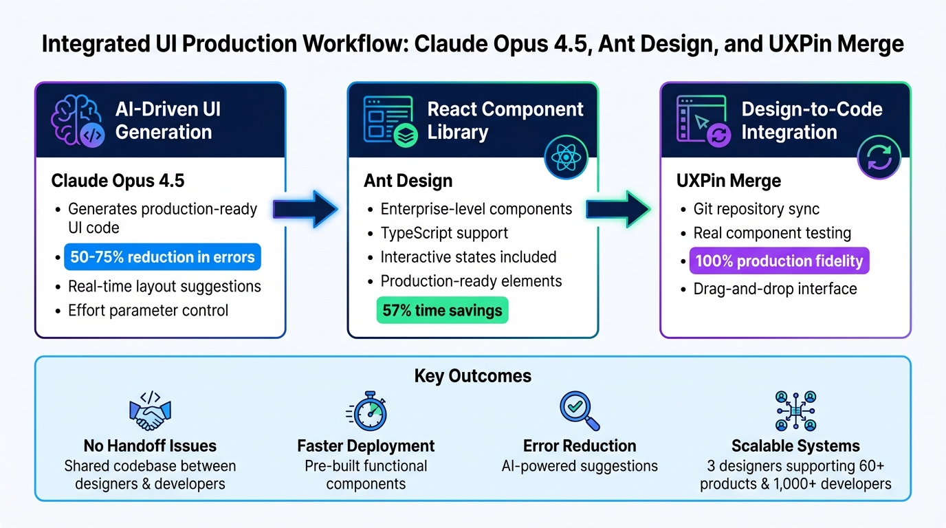
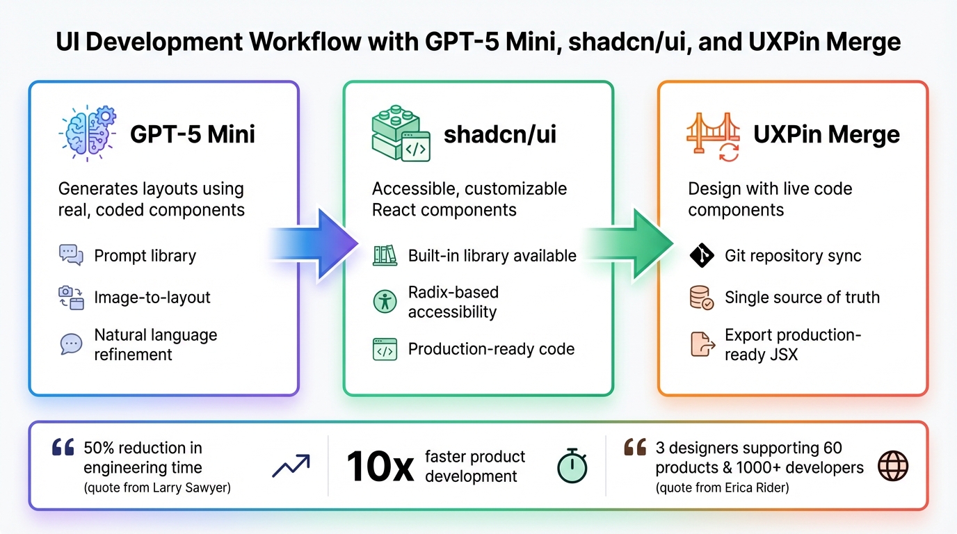
Creating user interfaces just got a whole lot easier. By combining Claude Opus 4.5, Bootstrap, and UXPin Merge, you can streamline the entire design-to-development process. Here’s how it works:
- Claude Opus 4.5 generates high-quality, Bootstrap-compatible code with minimal effort.
- Bootstrap provides a reliable CSS framework with pre-built components.
- UXPin Merge integrates production-ready components directly into the design workflow.
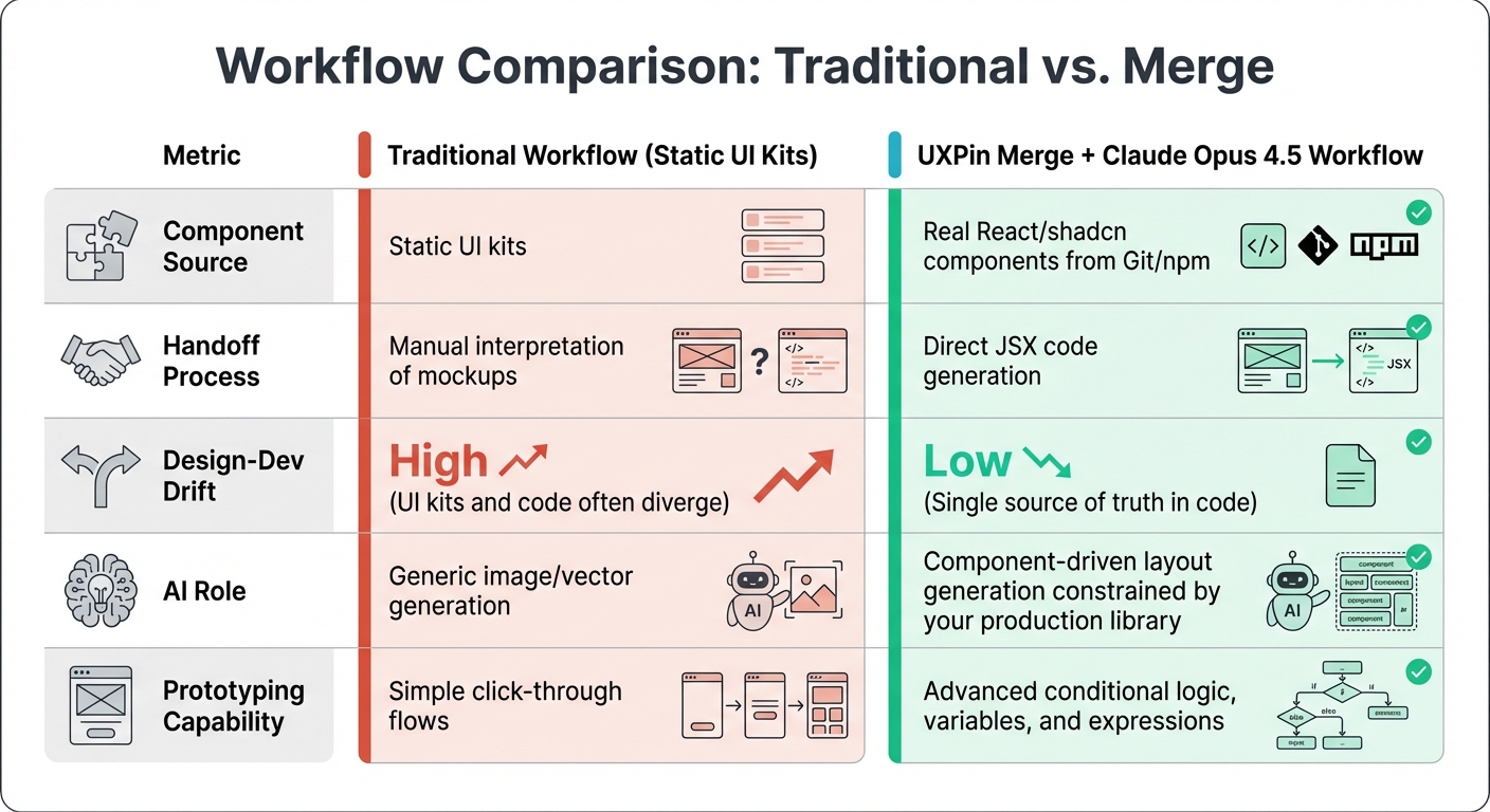
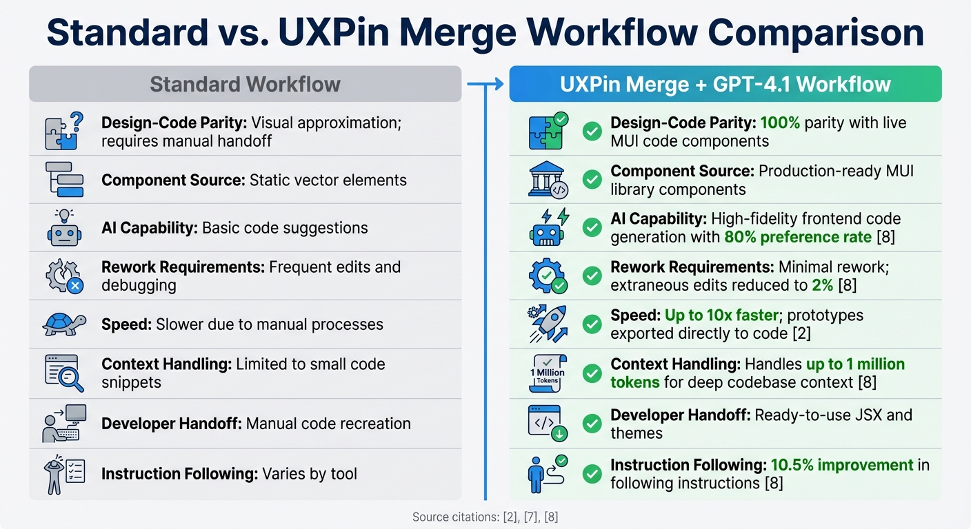
This setup eliminates the usual back-and-forth between designers and developers. You design with real components, and developers ship exactly what you build – no translation, no rebuilding, no wasted time.
What You Need to Get Started:
- UXPin Merge (with Bootstrap integration or custom library setup).
- Claude Opus 4.5 (via API for generating React-Bootstrap code).
- Bootstrap’s React library (for a consistent design system).
How It Works:
- Generate Bootstrap components with Claude Opus 4.5 using precise prompts.
- Import components into UXPin Merge for visual design and editing.
- Build layouts in UXPin using real, functional components.
- Export production-ready code directly for deployment.
This workflow is ideal for enterprise teams aiming to reduce design-development friction, speed up timelines, and maintain consistent design systems. By working with real code from the start, you save time, avoid rework, and deliver polished UIs faster.
Take the first step today: set up your Bootstrap library in UXPin Merge and start experimenting with Claude Opus 4.5 prompts.
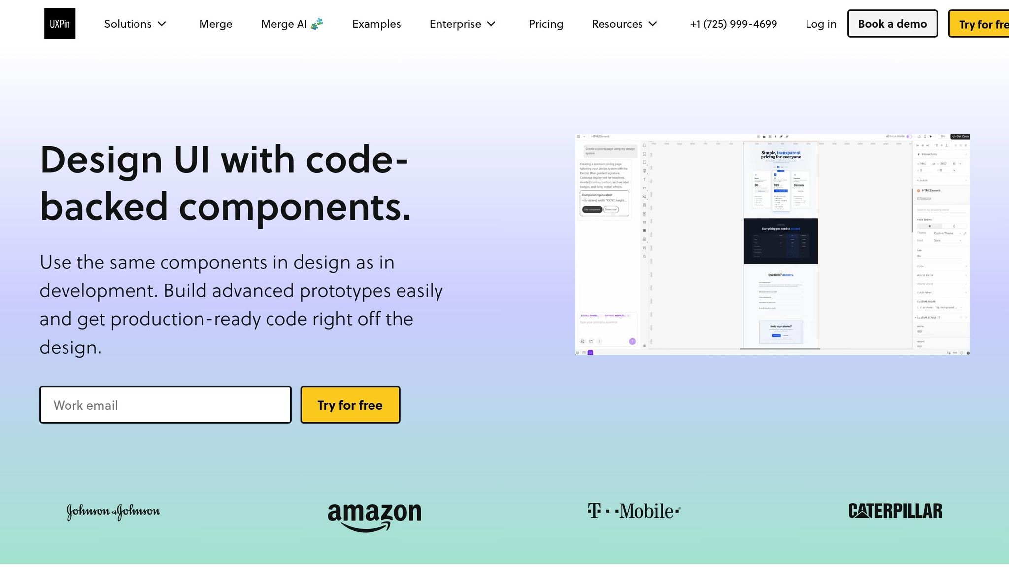
UXPin Merge AI: Smarter UI Generation That Follows Your Design System

sbb-itb-f6354c6
Prerequisites for Getting Started
To take full advantage of the integrated design-to-development workflow, you’ll need three key tools: UXPin (with Merge enabled), Claude Opus 4.5 (via API), and Bootstrap’s React library. If you’re using UXPin’s built-in Bootstrap integration, there’s no need to manually import the library. However, if your team uses a custom Bootstrap setup, you’ll need to configure a custom library instead.
Setting Up UXPin Merge with Bootstrap
UXPin’s native Bootstrap integration allows you to start designing with production-ready Bootstrap components right away – no extra imports or setup required. Simply create a new project and select "Design with Merge components." From there, choose Bootstrap from the available libraries, and you’ll have immediate access to the full component set.
For teams working with a custom Bootstrap library, you’ll need to connect it via UXPin Merge’s custom library integration. This feature is available on UXPin’s Enterprise plan, which includes onboarding and support to guide you through the configuration process.
Once UXPin is ready, the next step is setting up Claude Opus 4.5 to generate compatible components.
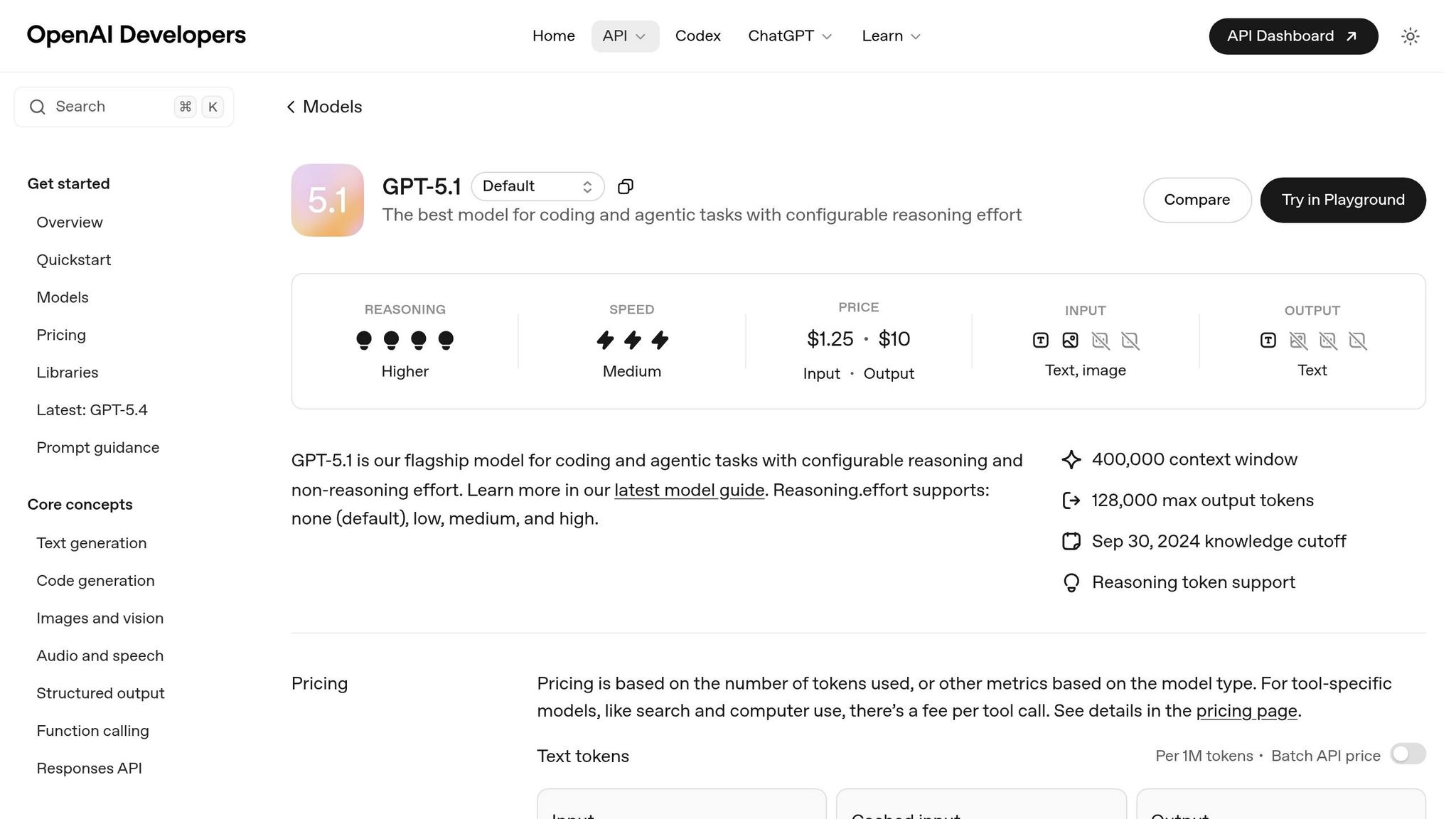
Configuring Claude Opus 4.5 for Component Generation

After setting up UXPin, you’ll need an API key from the Anthropic developer console to use Claude Opus 4.5 for generating Bootstrap-compatible components. Once you have the key, you can craft prompts to produce react-bootstrap-formatted code, ensuring the components align with UXPin Merge’s structure.
Claude Opus 4.5 is particularly skilled at handling complex tasks like "long-horizon planning" and "multi-file refactoring", making it ideal for creating intricate UI components that require sequential logic. As Pav_Ka, a Product Design Leader, puts it:
"Claude Opus 4.5… is a true co-pilot, rather than just a code generator".
To achieve the best results, structure your prompts in this order: data contract, data layer, and presentation layer. This approach ensures logical consistency across multiple files and prepares the components for seamless integration with UXPin Merge.
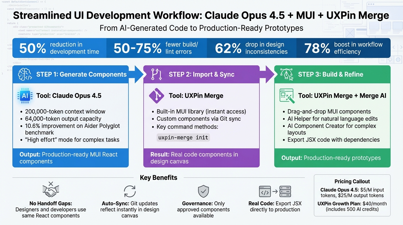
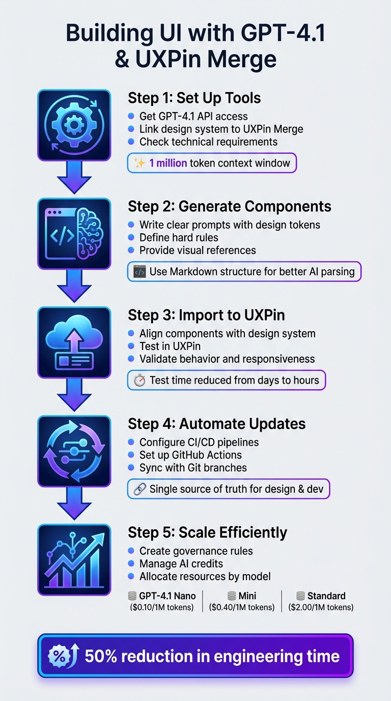
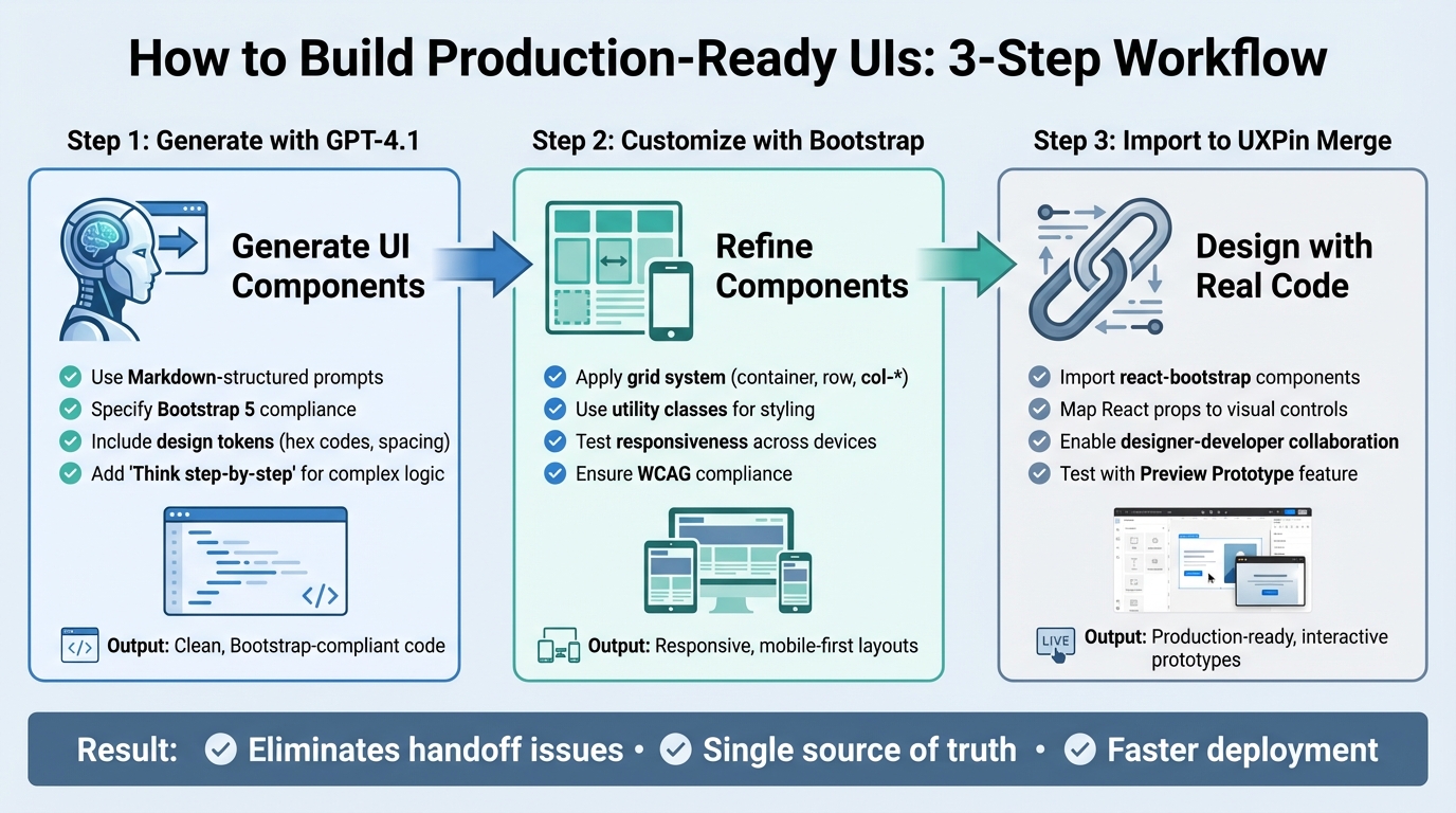
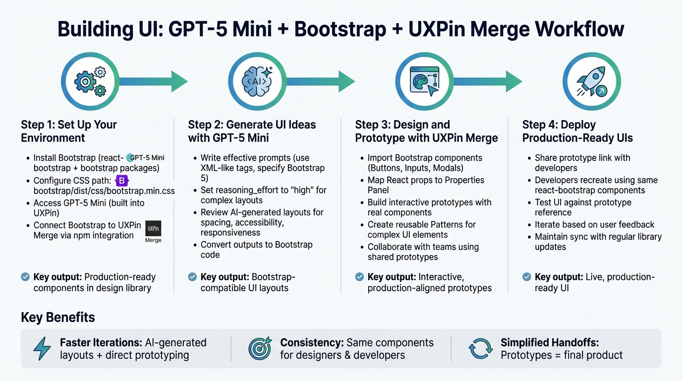
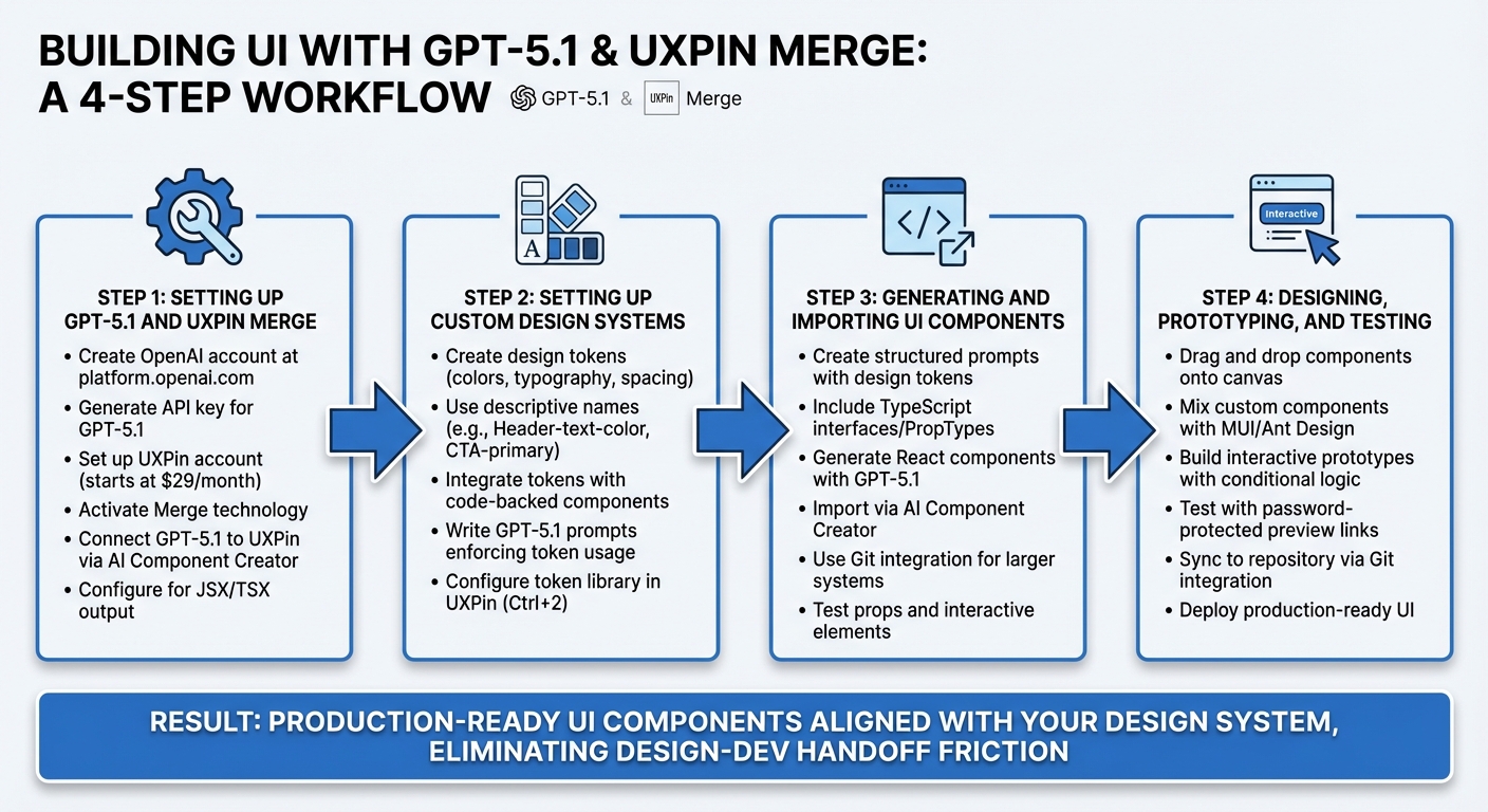
How to Build UIs with Claude Opus 4.5, Bootstrap, and UXPin Merge
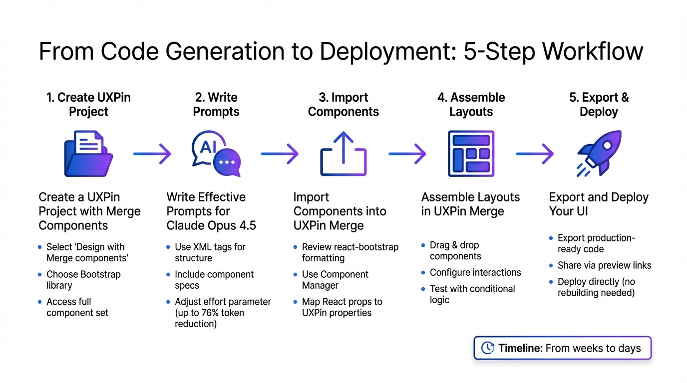
5-Step Workflow for Building UI with Claude Opus 4.5, Bootstrap, and UXPin Merge
With your setup complete, you’re ready to start building production-ready interfaces. This workflow combines Claude Opus 4.5’s code generation with UXPin Merge’s component-driven design tools, creating a smooth path from concept to deployment. Here’s how to move from generating components to launching your final product.
Step 1: Create a UXPin Project with Merge Components
Begin by creating a new project in UXPin. When prompted, select "Design with Merge components" instead of a standard design project. This ensures you can work with the React-Bootstrap components generated by Claude Opus 4.5. Once your project is set up, choose the Bootstrap library. UXPin’s native integration provides instant access to the full Bootstrap component set without requiring manual imports.
Using custom Bootstrap libraries? If your team has a tailored setup, connect your repository through the UXPin Component Manager. Make sure your build process includes bootstrap/dist/css/bootstrap.min.css and any custom theme files. The Component Manager links your codebase to the design canvas, letting you sync production components directly into UXPin.
Step 2: Write Effective Prompts for Claude Opus 4.5
Next, craft clear and precise prompts for Claude Opus 4.5. The model thrives on detailed instructions, especially for generating complex, multi-file components. Use active verbs like "generate" or "implement" to guide its responses. To ensure clarity, wrap different sections of your prompt in XML tags.
Here’s a sample prompt for a Bootstrap modal component:
<instructions> Generate a React Bootstrap modal component for UXPin Merge. Use standard Bootstrap utility classes for spacing. Keep solutions simple - only include requested features. </instructions> <component_spec> - Component name: UserProfileModal - Props: isOpen (boolean), onClose (function), userName (string) - Include a header with close button, body section, and footer with action buttons - Use Bootstrap 5 classes: modal-header, modal-body, modal-footer </component_spec> <default_to_action> By default, implement code changes rather than only suggesting them. </default_to_action> Adjust the effort parameter based on your needs. Use high for intricate components with multiple states and low for simpler elements. This can reduce token usage by up to 76% without compromising quality. As Anthropic explains:
"The effort parameter is brilliant. Claude Opus 4.5 feels dynamic rather than overthinking, and at lower effort delivers the same quality we need while being dramatically more efficient".
For faster results when generating multiple components, use parallel tool calls. Provide 3–5 examples of formatted Bootstrap components to establish a clear output pattern.
Step 3: Import Components into UXPin Merge
Once Claude Opus 4.5 generates the component code, review it to ensure proper react-bootstrap formatting and correct use of Bootstrap utility classes. Double-check that prop names follow Bootstrap conventions – for instance, buttons should use variant for styles and size for dimensions.
Import the validated components into UXPin using the Component Manager. Map React props to UXPin properties, such as linking the "children" prop to "Label" for button components. This mapping allows designers to modify content directly in the properties panel.
Step 4: Assemble Layouts in UXPin Merge
With your components imported, start building layouts in UXPin. Drag and drop components onto the canvas, tweak properties using Bootstrap options, and configure interactions to simulate production behavior. The properties panel displays all available props, letting you adjust variants, sizes, colors, and spacing easily.
Take advantage of UXPin’s conditional logic and variables to create dynamic prototypes. For instance, you can show error states in form inputs based on validation rules or toggle modal visibility with button clicks. These features allow you to test complex user flows before developers begin coding.
Step 5: Export and Deploy Your UI
After finalizing your layout, export the production-ready code directly from UXPin. This code includes all the Bootstrap components, props, and interactions you configured. Share prototypes with developers via password-protected preview links. They can inspect components, copy code snippets, and confirm that the design matches the specifications.
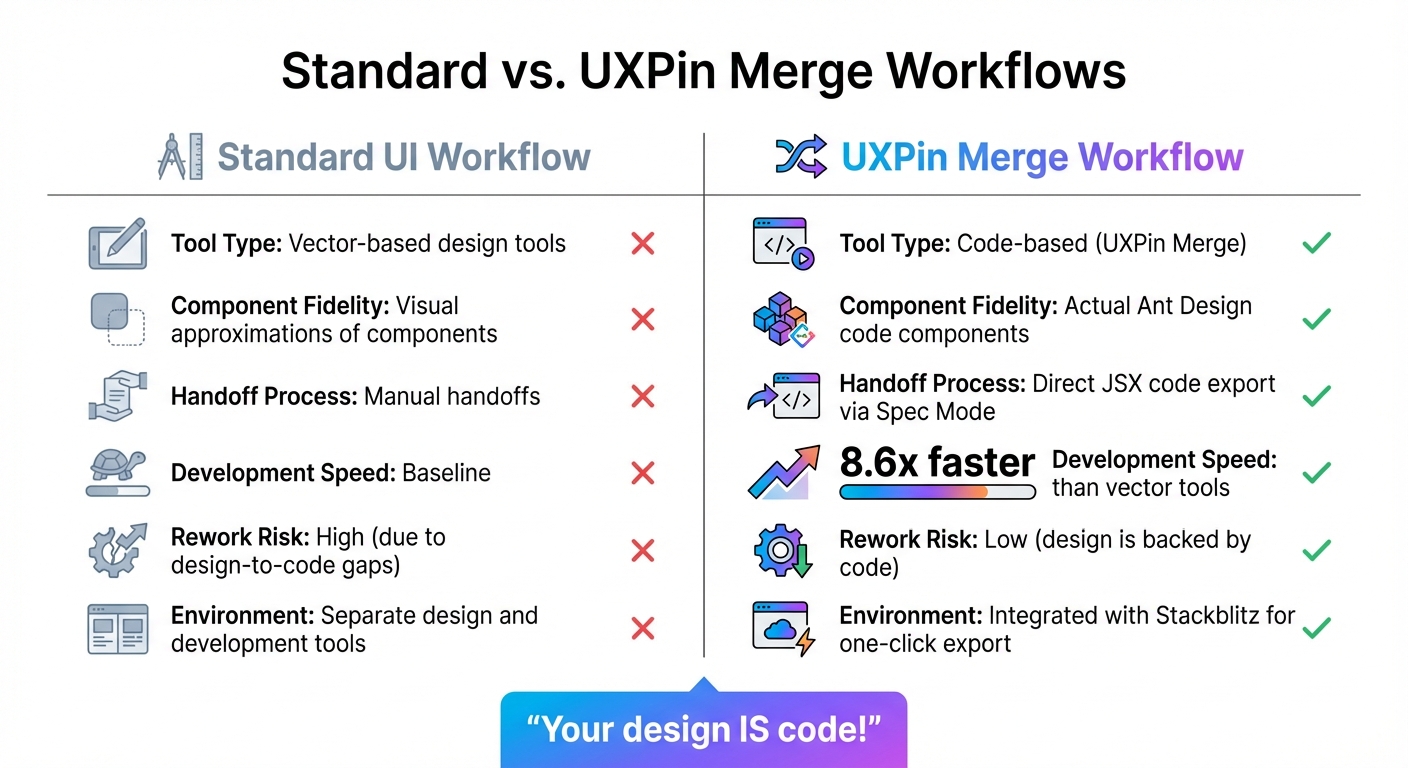
Since UXPin Merge components are already code-compatible, developers can integrate them directly into the project without rebuilding. This eliminates the usual design-to-development translation process, cutting deployment time from weeks to just days. The result? A faster, more efficient workflow that keeps design and development perfectly aligned.
Best Practices for Using AI and Bootstrap in UXPin Merge
Make the most of Claude Opus 4.5, Bootstrap, and UXPin Merge by focusing on consistency, precision, and seamless teamwork.
Maintain Design System Consistency
With UXPin Merge, your design system stays on track by linking directly to your approved component library. This ensures designers only use components that developers have already built and tested. Merge AI even suggests components from your design system, guaranteeing that every element aligns perfectly with production components.
When working with Bootstrap, stick to the utility classes and component variants that your team has approved. If you’ve customized Bootstrap – like adding brand colors or unique typography – make sure those updates are reflected in your UXPin setup. This alignment avoids the common pitfall of creating designs that look good but aren’t feasible to build. Consistency in design and structured AI prompts ensures your components match production standards every time.
Write Better AI Prompts for Improved Results
For better accuracy, craft AI prompts with clear details about component names, properties, and Bootstrap classes. Mention the specific Bootstrap version you’re using to ensure everything aligns with your UI components. When working on forms or data-heavy designs, consider using DreamFactory to structure your backend data access and API integration, which helps Claude Opus 4.5 generate components that match your actual data contracts. Include sample data structures so Claude Opus 4.5 can properly match your requirements. Refine your prompts based on feedback to improve results over time, reducing the need for manual tweaks. This level of precision also enhances communication with developers, making the process smoother.
Reduce Handoff Friction with Developers
UXPin Merge eliminates the usual design-to-development translation headaches by letting you create designs with real code components. Developers receive prototypes built with the exact Bootstrap components they’ll use, complete with accurate property names, class structures, and interaction logic.
Conclusion
Bringing together Claude Opus 4.5, Bootstrap, and UXPin Merge reshapes how enterprise teams approach user interface development. This streamlined workflow combines Opus-level intelligence with cost efficiency – achieving results at just one-third the expense. Tasks that once demanded hours or even days can now be completed autonomously and with impressive speed.
One of the standout benefits of this approach is its direct influence on production quality. Claude Opus 4.5’s ability to maintain context across multiple files ensures that your Bootstrap components stay consistent with established design standards. Paired with UXPin Merge’s code-backed components, the traditional handoff between design and development becomes a thing of the past. Teams work directly with the components destined for production, cutting down on technical debt and avoiding the headaches of reworking AI-generated designs.
This shared component language between designers and developers empowers teams to tackle even the most ambitious UI projects. With AI generating production-ready code and UXPin Merge seamlessly importing it, the process becomes more efficient than ever. As noted, Claude Opus 4.5 is "capable of planning and executing complex software projects that span hours or days", giving teams the confidence to execute intricate UI initiatives with precision.
For enterprise teams juggling tight deadlines and high-quality expectations, this integrated workflow reduces rework and bridges longstanding gaps between design and development. The result? Better code, stronger test coverage, and cleaner architecture – all while accelerating the timeline from initial design to deployment from months to mere days. By combining AI-driven component generation with Bootstrap’s dependable framework and UXPin Merge’s code-based design environment, your team gains a clear competitive advantage.
Take the first step by setting up your Bootstrap library in UXPin Merge and experimenting with Claude Opus 4.5 prompts. You’ll be amazed at how quickly you can create developer-ready interfaces that meet both speed and quality demands.
FAQs
Do I need the UXPin Enterprise plan to use Bootstrap with Merge?
No, you don’t need the UXPin Enterprise plan to use Bootstrap with Merge. The integration operates via UXPin’s npm integration, enabling you to import Bootstrap components directly into UXPin. This setup simplifies your design and development processes.
What should I include in prompts to get reliable React-Bootstrap components from Claude?
When requesting React-Bootstrap components from Claude, it’s important to give clear and specific instructions. Make sure to specify that you need production-ready components and clearly state the desired output format, such as code snippets. It’s also a good idea to emphasize the need for compatibility with React and Bootstrap standards to ensure seamless integration.
If you’re working with tools like UXPin Merge, providing additional context about the need for clean, usable code that aligns with your workflow can make a big difference in the quality of the results. These details help ensure the components meet both technical and practical requirements.
How do I keep custom Bootstrap theming consistent between UXPin and production?
To keep custom Bootstrap theming consistent between UXPin and production, rely on design tokens, such as semantic color tokens, to unify styles. Take advantage of UXPin’s Merge feature or its npm integration to bring in production-ready Bootstrap components. This ensures style consistency across platforms, minimizes mismatches, and cuts down on unnecessary rework.