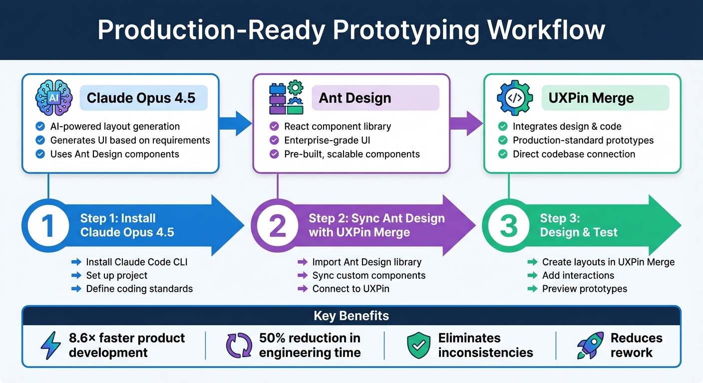
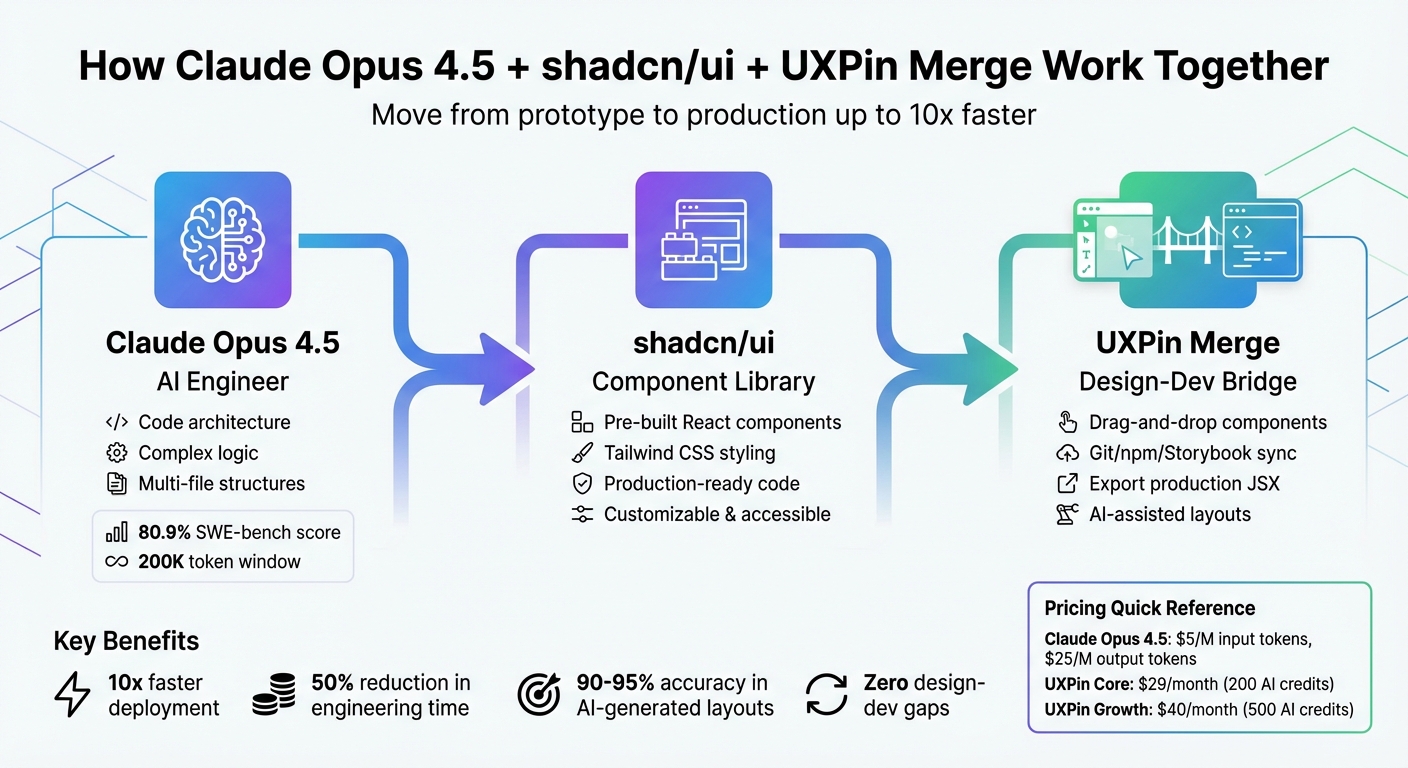
Prototyping just got a lot easier. Claude Haiku 4.5, MUI, and UXPin Merge work together to let you create production-ready designs directly from real code components. Here’s how it works:
- Claude Haiku 4.5: An AI tool that generates React layouts from text prompts or images, using MUI components.
- MUI: A library of React components based on Material Design principles, ready for use in production.
- UXPin Merge: A platform that integrates these tools, allowing designers to work with the same components developers use.
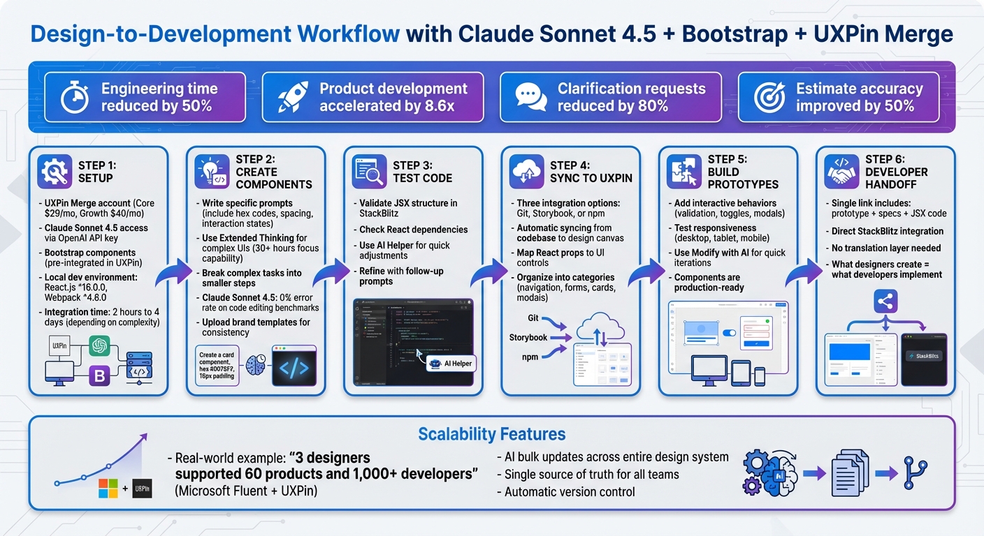
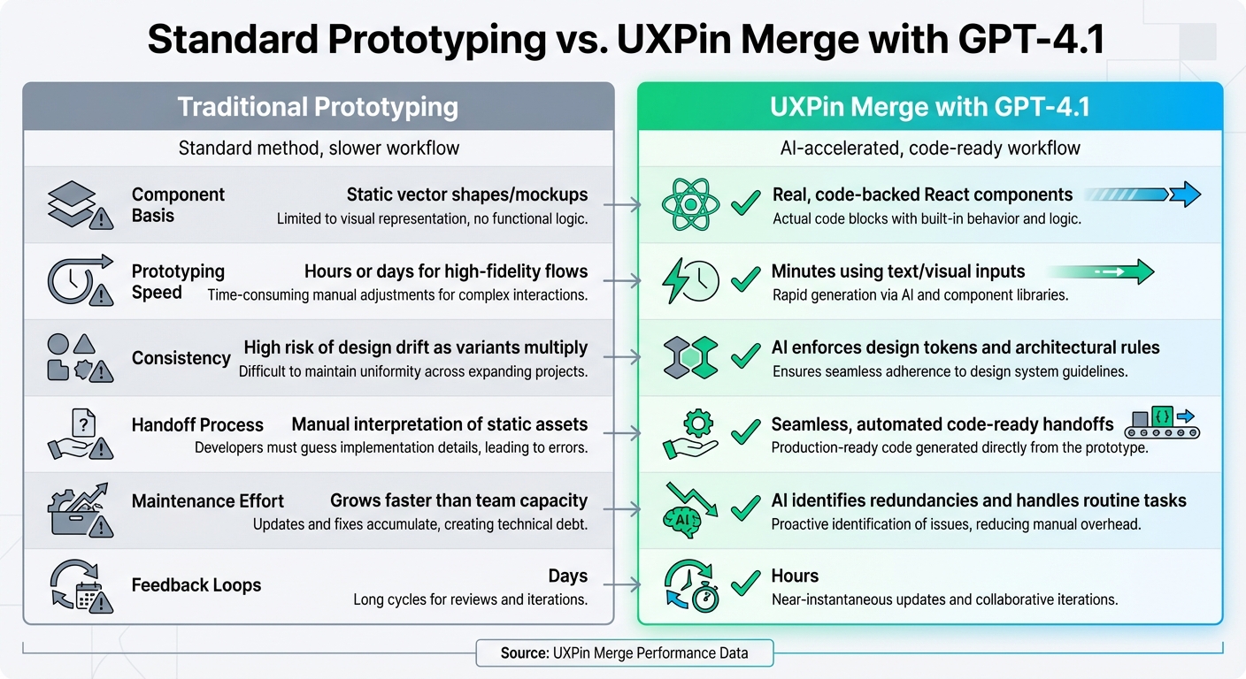
This workflow eliminates design-development gaps, speeds up product creation by 8.6x, and ensures designs are always aligned with code. You can create, test, and refine prototypes while maintaining consistency across teams. With AI-powered tools and code-backed components, you’re not just designing – you’re building interfaces developers can implement immediately.
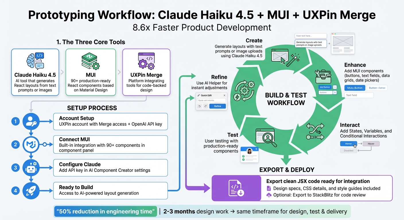
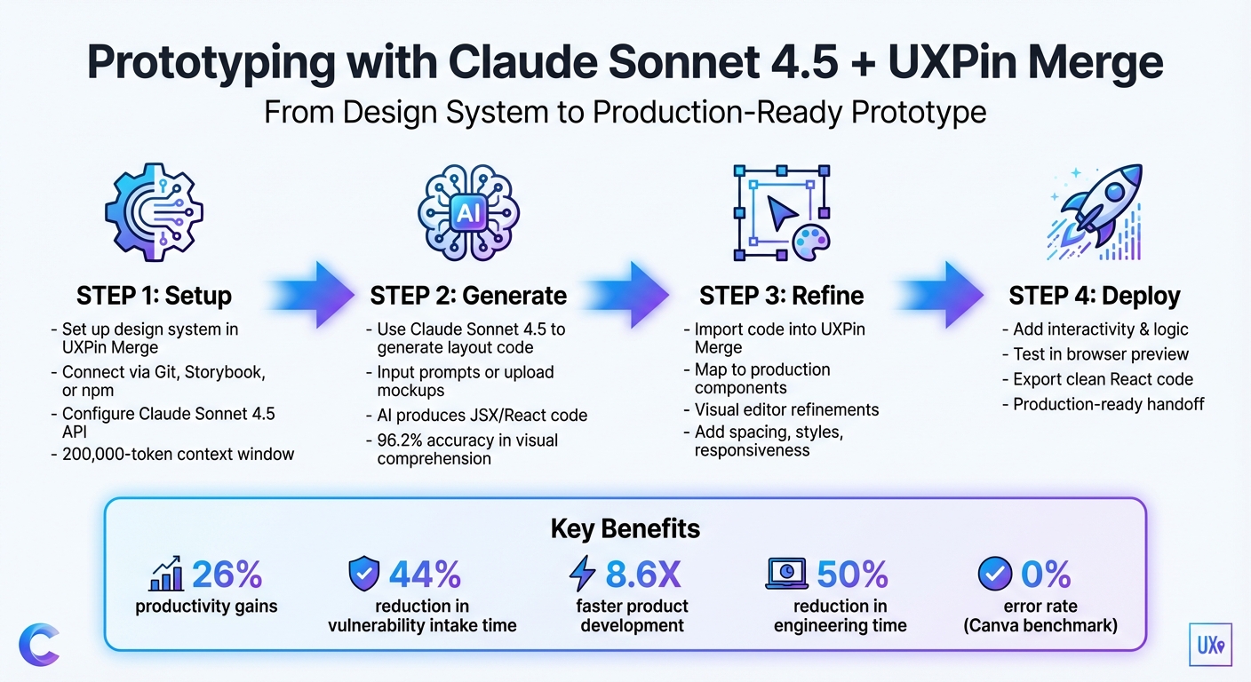
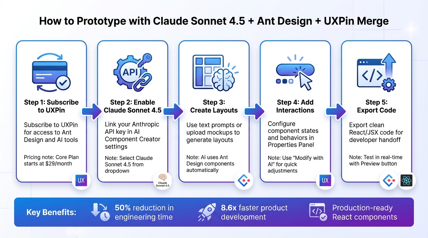
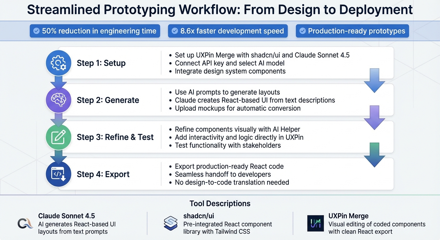
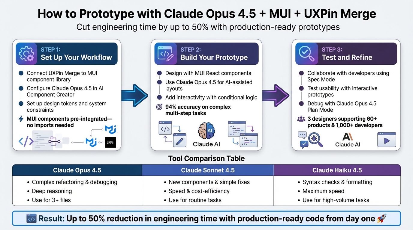
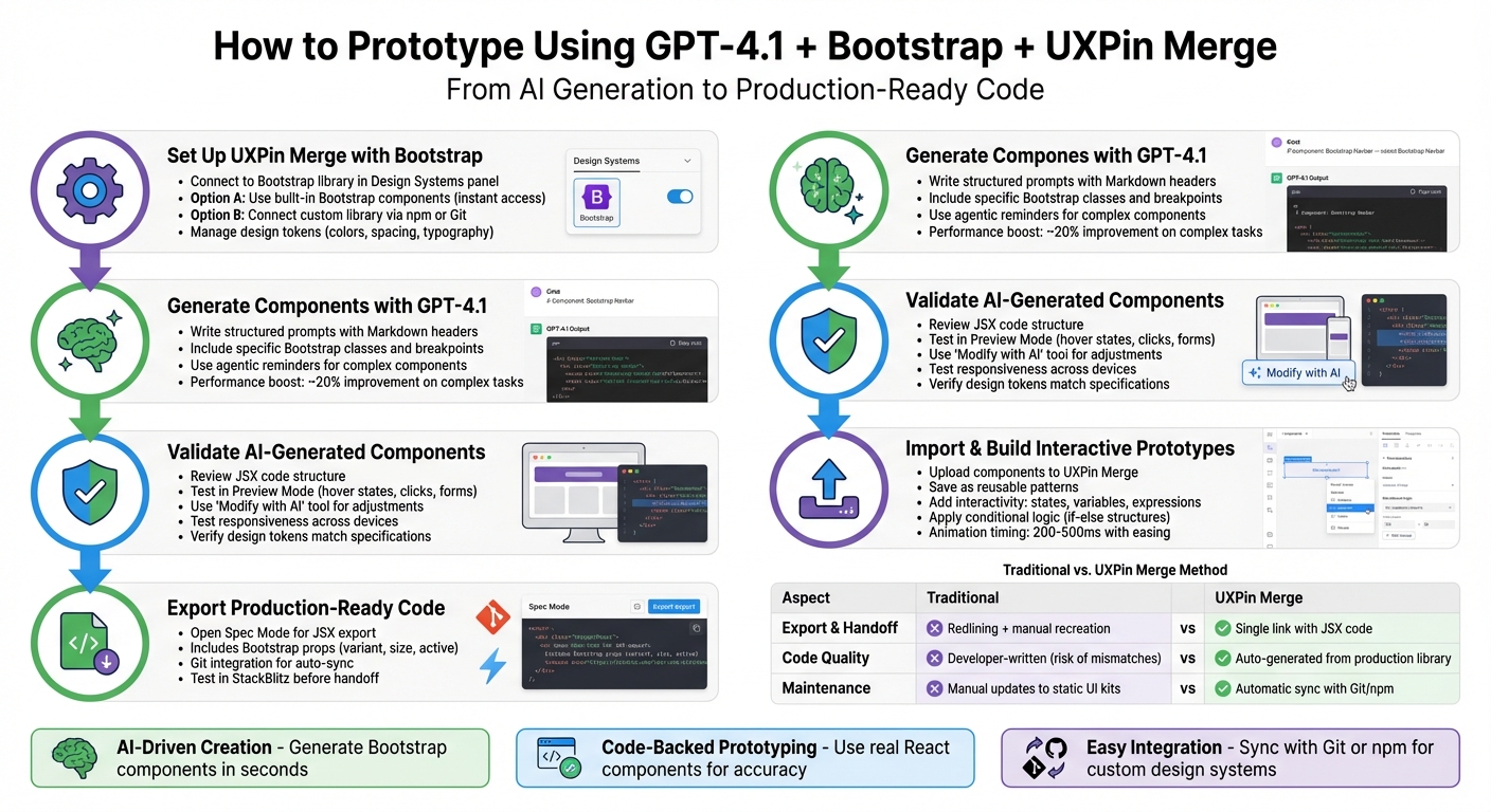
How to Prototype with Claude Haiku 4.5, MUI, and UXPin Merge: Complete Workflow
Design To React Code Components
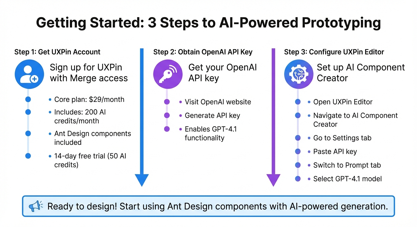
Prerequisites and Setup
Before diving into prototyping, make sure you have the necessary tools and accounts configured.
How UXPin Merge Works with MUI

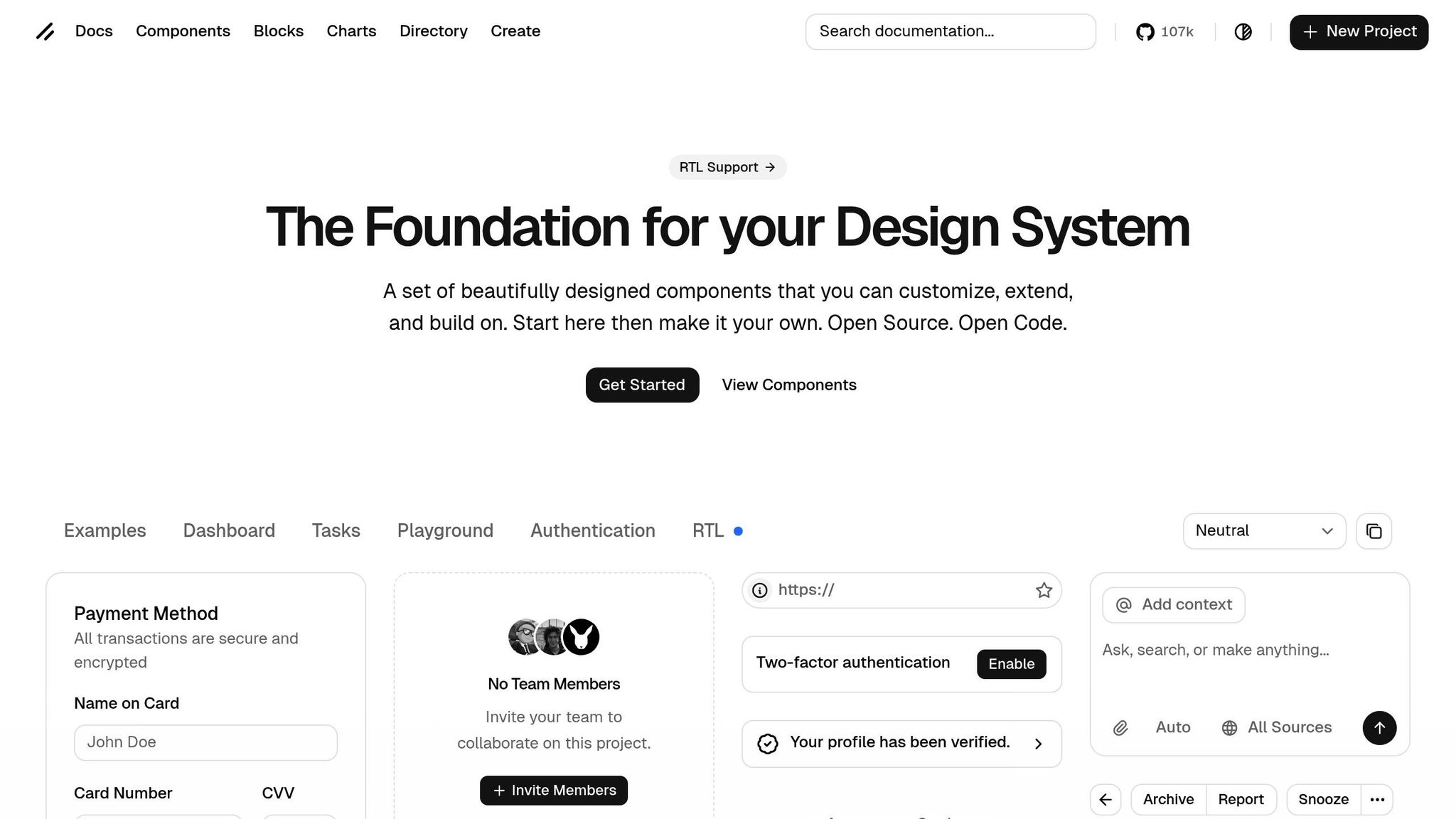
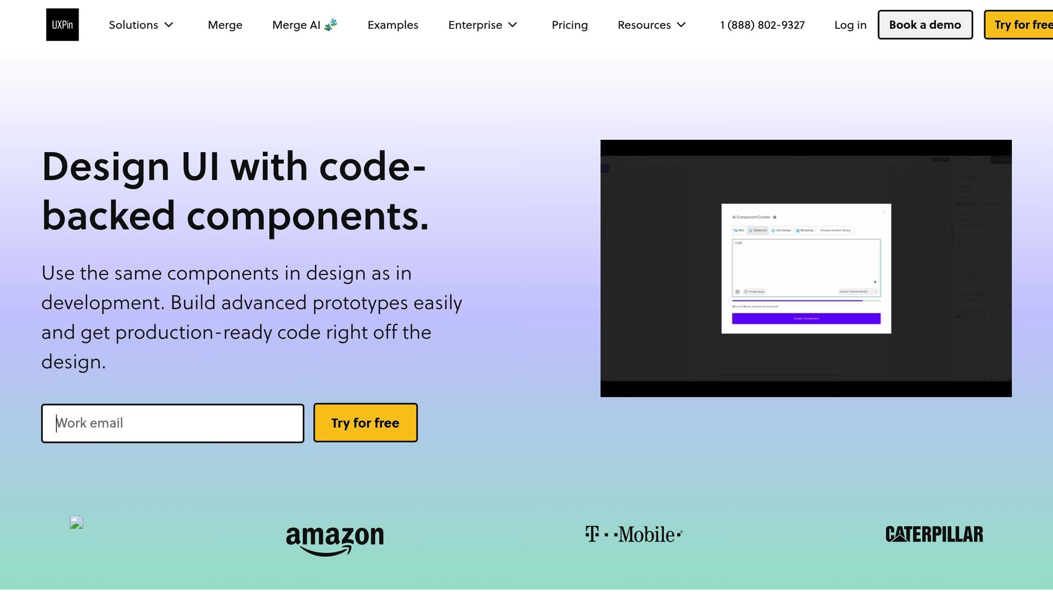
UXPin Merge integrates directly with MUI’s React component library, offering access to over 90 production-ready components right in the design canvas. These components are code-based, meaning when you drag something like a button onto your canvas, you’re working with the exact same production code that developers will use. This ensures design and development stay perfectly aligned.
As Tuğçe Ayteş shared, "I’m a designer but I hadn’t felt this close to coding and creating a real website". It’s a game-changer for bridging the gap between design and development. Once you’ve set up UXPin Merge, the next step is configuring Claude Haiku 4.5 to incorporate AI-driven components effortlessly.
Setting Up Claude Haiku 4.5 in UXPin
While UXPin Merge manages MUI components, Claude Haiku 4.5 takes things further by enabling AI-powered layout creation. This tool fuels UXPin’s AI Component Creator, turning simple text prompts into fully functional React layouts built with MUI components.
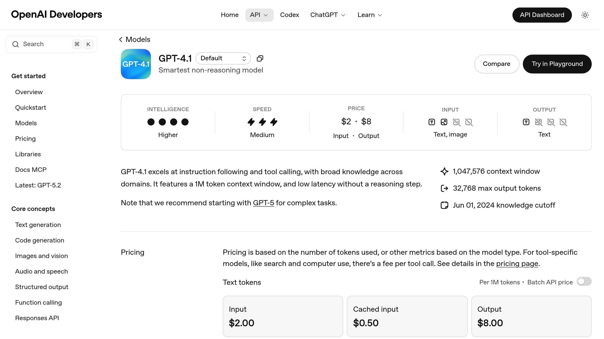
To get started, you’ll need an OpenAI API key. Head to the OpenAI website to generate one. Then, in the UXPin Editor, open the AI Component Creator from the Quick Tools panel. Go to the Settings tab, paste your API key, and select Claude Haiku 4.5 under the Prompt tab.
For best results, provide detailed input, such as specific label names or styles, to align with your design goals. You can also upload wireframes or mockups to the AI Component Creator, allowing it to build component structures directly from images.
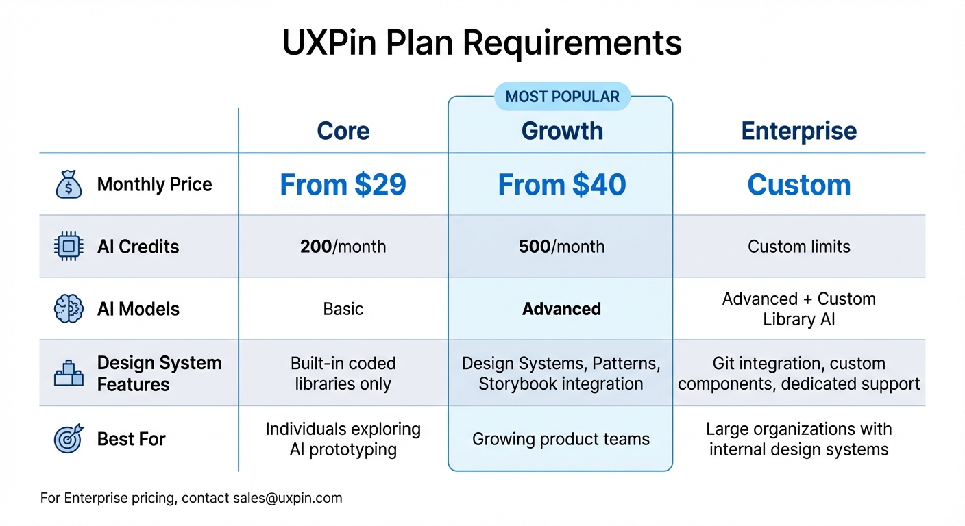
Required Tools and Account Setup
To begin, ensure you have the following:
- A UXPin account with Merge access
- An OpenAI API key
If your library includes additional assets like custom fonts or icons, use the "add more dependency package" option during the setup process. Once everything is configured, you’ll be ready to create AI-assisted layouts with MUI components.
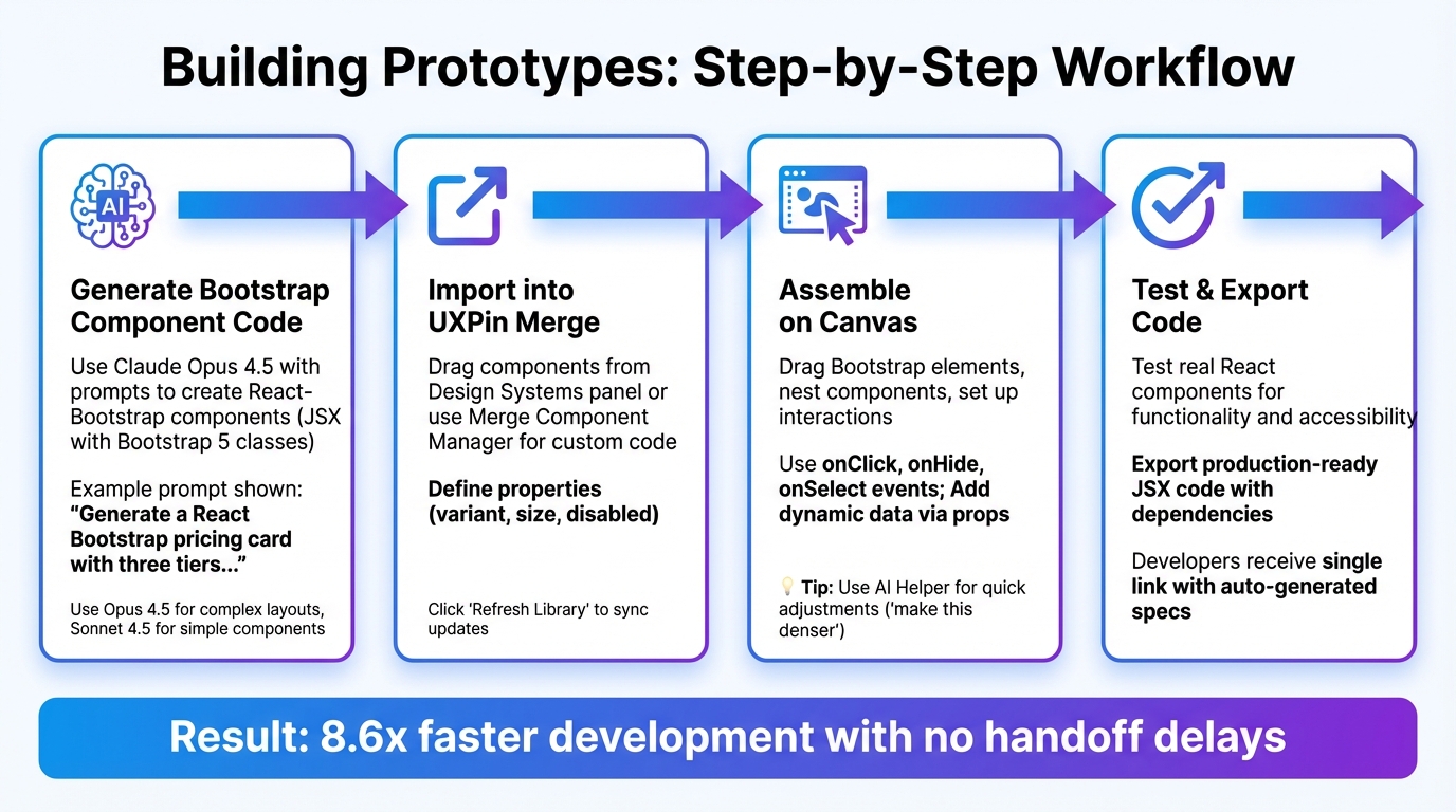
How to Build Prototypes with Claude Haiku 4.5 and MUI in UXPin Merge
Start creating prototypes by combining AI-generated layouts with production-ready MUI components for a streamlined, efficient design process.
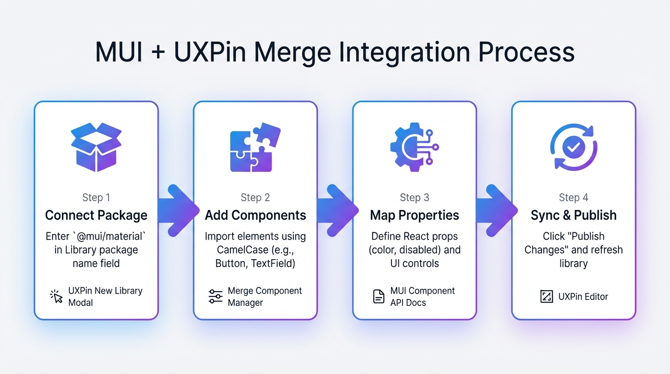
Connecting MUI to UXPin Merge
UXPin Merge offers built-in integration with MUI, so there’s no need to deal with manual imports or separate APIs. Just open the UXPin Editor, and the full MUI library is available in your component panel. This library includes over 90 components – such as buttons, text fields, data grids, and date pickers – crafted using the same React code your developers will deploy.
When you add an MUI Button to your canvas, you’re working directly with production-grade code. Properties like variant, color, and size match React props exactly, eliminating any translation issues between design and development. This direct connection ensures that what you design is exactly what gets delivered. This tight integration creates the perfect foundation for layout creation with Claude Haiku 4.5.
Creating Layouts with Claude Haiku 4.5
To begin, open the AI Component Creator from the Quick Tools panel and go to the Prompt tab. Ensure Claude Haiku 4.5 is selected in your settings. From here, you can generate layouts using either text prompts or image uploads.
If you’re using text prompts, be as specific as possible. For example: "Create a login form with an MUI TextField labeled ‘Email’ (bold, 16px, above the input) and a primary contained Button labeled ‘Sign In’ with 16px padding." Providing details like typography, spacing, and even hex codes will help the AI produce results that align closely with your vision.
Alternatively, upload a wireframe or mockup image. The AI will analyze it and generate a layout using MUI components. Once your layout is ready, click the purple "Modify with AI" icon to make refinements. For instance, you can select a button and type, "change variant to outlined," instead of manually adjusting it. After finalizing the layout, you can expand it further by adding more MUI components.
Using AI Layouts with MUI Components
Once your base layout is generated, you can elevate it by incorporating additional MUI components. Need a date picker for user input? Drag and drop it into your form. Want a data grid to display user data? Add it alongside your other elements. Each component retains its interactive, production-ready functionality, ensuring a seamless experience throughout.
This approach not only bridges the gap between design and development but also significantly speeds up the entire process. Teams that once spent months on design can now design, test, and deliver products within the same timeframe.
"It used to take us two to three months just to do the design. Now, with UXPin Merge, teams can design, test, and deliver products in the same timeframe." – Erica Rider, UX Architect and Design Leader
sbb-itb-f6354c6
Adding Interactions and Testing
Once your layout is ready, it’s time to make it interactive. Use States, Variables, and Conditional Interactions to simulate user behaviors. These tools let you create prototypes that mimic real interactions, like hover effects on buttons or form validation. Set up specific interactions to make your prototype feel alive and engaging.
Building Interactions in UXPin Merge
You can define interactive states – like hover, active, or focused – for your MUI components. For instance, you can configure an MUI TextField to show a blue border when focused or make a Button change color on hover. Variables allow you to simulate dynamic data, while Conditional Interactions help you replicate more complex user flows, such as form submissions or navigating between screens.
The AI Helper simplifies this process even further. Select a component, click the purple "Modify with AI" icon, and type instructions like "add a blue border when focused." The AI instantly updates the component based on your input. For more intricate interactions, keep your prompts short and precise to ensure the best results.
Testing and Improving Your Prototypes
Once your interactions are in place, test every component thoroughly to ensure smooth user flows. Prototypes created with production-ready MUI components provide a realistic feel during user testing, delivering actionable feedback from users and stakeholders.
When feedback rolls in, the AI Helper makes adjustments quick and easy. Just describe the changes you need – whether it’s tweaking spacing, adjusting styles, or changing text – and watch the updates happen instantly. This fast iteration process allows you to refine your prototypes during or right after feedback sessions. As Larry Sawyer, Lead UX Designer, noted:
"When I used UXPin Merge, our engineering time was reduced by around 50%."
For technical validation or collaboration with developers, you can export your prototypes directly to StackBlitz for seamless code review and handoff.
Finalizing and Exporting Prototypes
Maintaining Design and Code Consistency
UXPin Merge makes it easier to align design and development by using the exact same React components throughout the process. When you prototype with MUI components, you’re essentially working with production-ready code that performs the same way in both design and development environments.
This creates a single source of truth for your team. There’s no need for translation, guesswork, or rebuilding designs from scratch. As Erica Rider, UX Architect and Design Leader, puts it:
"It used to take us two to three months just to do the design. Now, with UXPin Merge, teams can design, test, and deliver products in the same timeframe."
With production-level interactivity built into the components, your prototypes reflect the final product with functional fidelity. This ensures fewer errors and eliminates redundant work during the transition to development.
Once your prototype is ready, you can export it for a smooth developer handoff.
Exporting Prototypes for Developers
After finalizing your prototype, you can export clean JSX code that’s ready for integration. Developers can directly copy this code and add it to the codebase without needing to recreate anything manually. The platform also generates design specs, CSS details, and style guides, giving developers instant access to everything they need.
Instead of handing over static design files that might be open to interpretation, you’re delivering ready-to-use JSX that aligns perfectly with your production design system. Developers can inspect the code, download specs, and implement designs without relying on extra plugins or file-sharing tools. For additional collaboration or technical validation, prototypes can also be exported to StackBlitz, making code reviews seamless and efficient.
Conclusion
Claude Haiku 4.5, MUI, and UXPin Merge reshape the prototyping process by enabling the use of production-ready React components that generate clean JSX for immediate integration. This approach removes the traditional gap between design and development, ensuring the entire team works from a single, unified source of truth. The result? A streamlined workflow that connects design and development like never before.
With product development speeds increasing by up to 8.6x, the impact is clear. As Allison Barkley puts it, "Being able to jump straight from design to having code ready is going to be a huge time-saver for our team". This workflow not only accelerates development but also redefines how teams approach efficiency.
The AI-powered tools enhance collaboration for both designers and developers. Designers can experiment with code-backed prototypes, while developers can validate decisions in real time – all while maintaining consistency within the design system. This means faster iterations without sacrificing quality.
By combining AI-driven layouts with MUI components in UXPin Merge, teams can create scalable design systems that ensure consistency across products. Prototypes built today serve as precise blueprints for production, bridging the gap between what gets designed and what gets shipped.
This marks a shift toward component-driven design, where speed, alignment, and code consistency are no longer competing goals – they’re integral to the process from the very beginning.
FAQs
Do I need to know React to use this workflow?
To work with this workflow, knowing React isn’t a must. You can easily prototype using production-ready MUI components in UXPin Merge, even if you don’t have coding experience. While certain steps involve React components, the primary focus is on syncing and utilizing these components with tools like Claude Haiku 4.5. Having some knowledge of React can be helpful, but it’s not essential for building prototypes.
How do I connect my MUI components to UXPin Merge?
To integrate MUI components with UXPin Merge, you’ll need to connect your MUI React component library through the npm integration process. Simply add the npm package name (like @mui/material) and specify the version you want directly in UXPin’s editor or the Merge tab. Once the setup is complete, you can design using fully interactive, production-ready components. This ensures your prototypes maintain both consistency and real-world functionality.
Can I export clean JSX developers can ship?
With UXPin Merge and advanced tools like Claude Opus 4.5 or GPT-5.1, you can produce production-ready JSX code that developers can use right away. These workflows enable you to build prototypes using actual, code-based components. This approach minimizes the need for manual handoffs or redlining, making the development process smoother and more efficient.