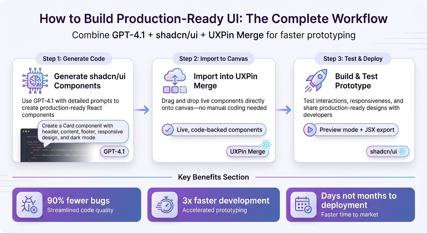
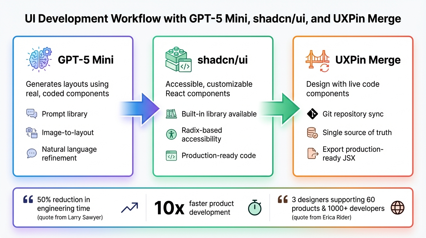
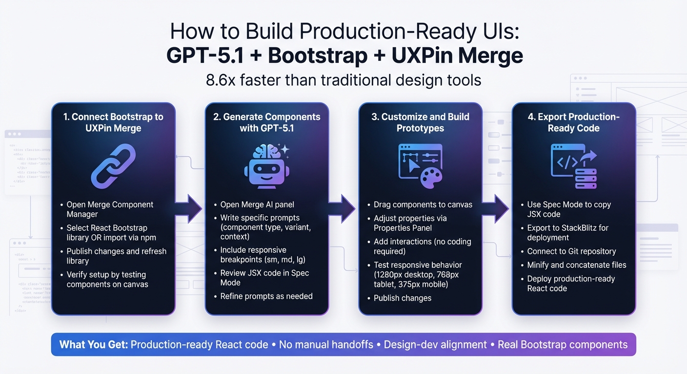
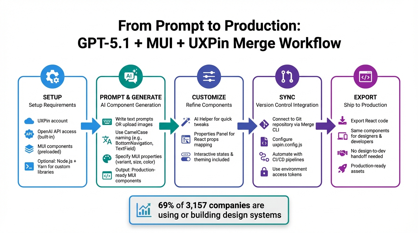
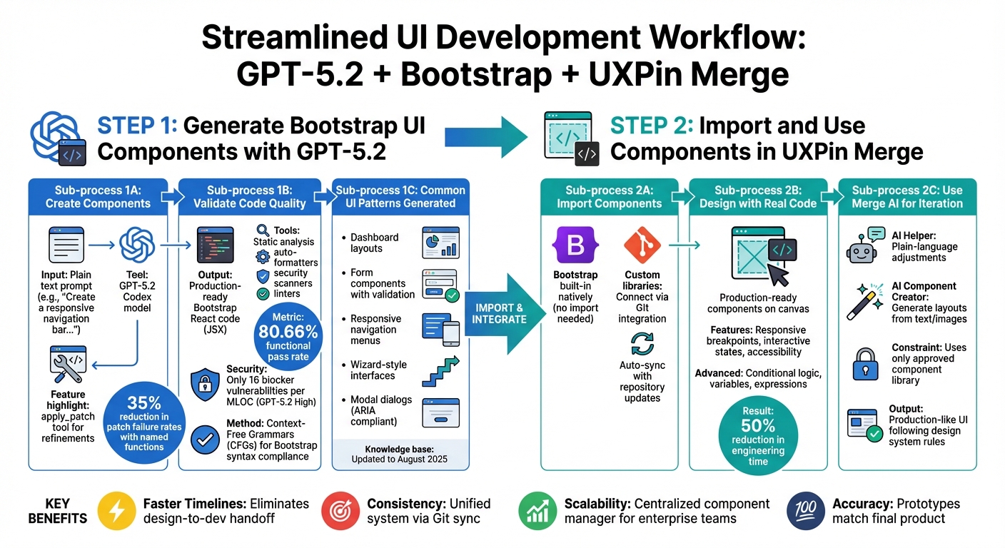
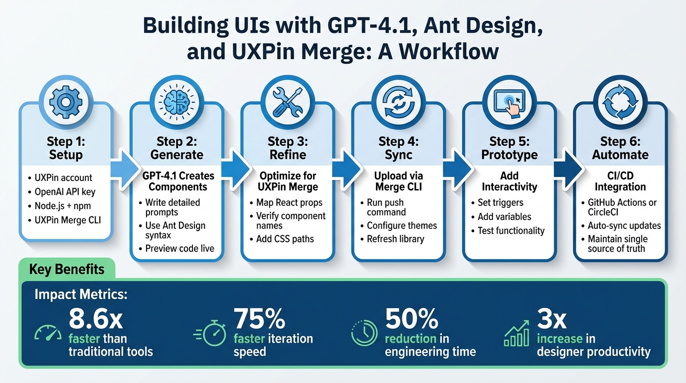
Tired of slow design-to-development workflows? With GPT-4.1, Ant Design, and UXPin Merge, you can skip the endless back-and-forth and build production-ready UIs faster. Here’s how it works:
- GPT-4.1 turns text prompts into code, like creating Ant Design components for forms or dashboards.
- Ant Design provides a pre-built React component library, perfect for enterprise-level projects.
- UXPin Merge syncs your code directly into a design tool, so prototypes are functional, not just static mockups.
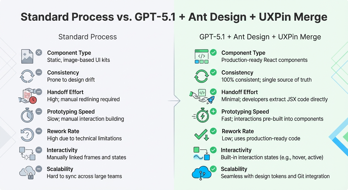
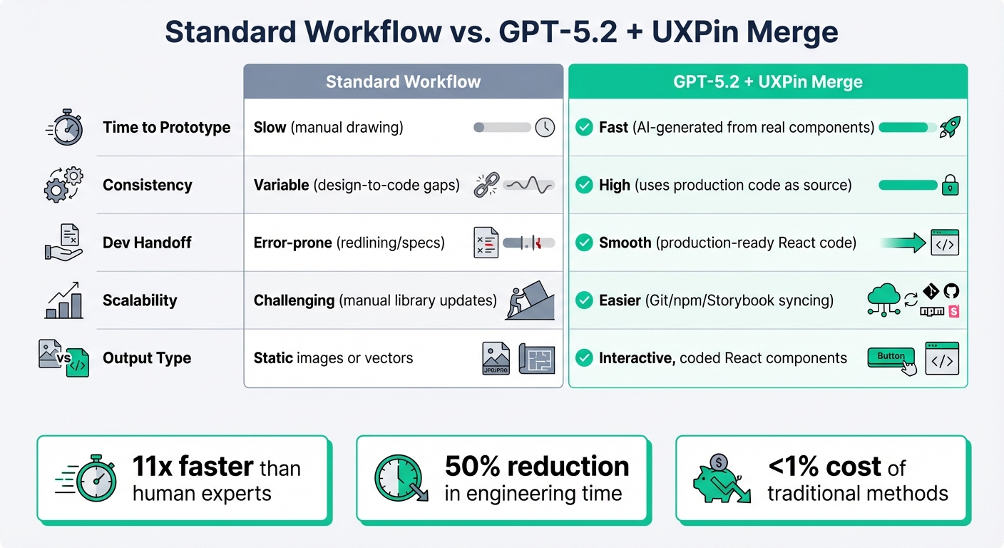
This design workflow with code components eliminates handoffs, reduces feedback loops, and ensures your designs match the final product. Teams have reported up to a 75% faster iteration speed and a 50% reduction in engineering time.
What you need to start:
Set up is simple: Use GPT-4.1 to generate Ant Design components, refine them, and sync directly into UXPin Merge. Add interactivity, validate functionality, and even automate updates with CI/CD pipelines for a streamlined workflow.
This method ensures your designs are always aligned with your codebase, saving time and avoiding inconsistencies.
GPT-4.1 and UXPin Merge Workflow: From Prompt to Production-Ready UI
UXPin Merge Product Demo

sbb-itb-f6354c6
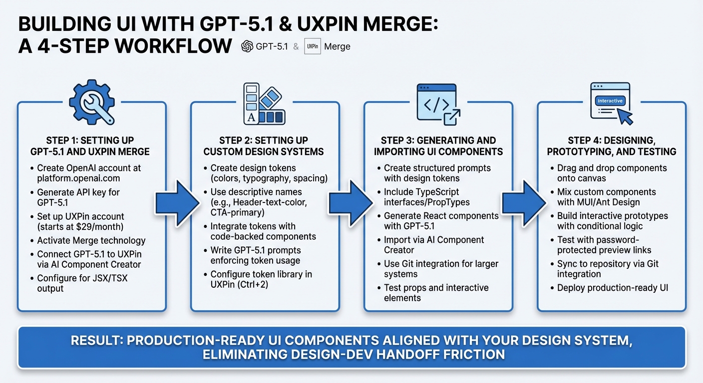
Prerequisites and Setup
To start building UIs with GPT-4.1 and Ant Design, you’ll need a few essentials: a UXPin account, an OpenAI API key, and Node.js. UXPin even offers a free trial, making it easy to explore code-powered design without commitment.
Required Tools and Resources
First, head over to uxpin.com and create an account. Once you’re in, you’ll find that Ant Design is already integrated into the platform – no need for any manual setup. The Ant Design library is conveniently available on the canvas, ready for use right out of the box.
Next, get your OpenAI API key. This is crucial for activating the AI Component Creator, a tool in UXPin’s "Quick Tools" bar that uses GPT models to generate components from simple text prompts. If you’re planning to work with custom components or your own design system, you’ll also need to install Node.js (and npm) on your machine. These are required for running the UXPin Merge CLI, which allows seamless integrating your own components with the design tool.
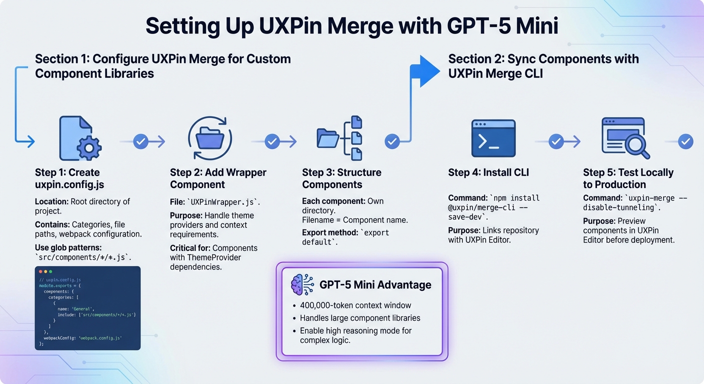
Setting Up UXPin Merge with Ant Design

Getting started is simple. Open a new prototype in UXPin, go to the "Design System Libraries" tab, and select Ant Design. The library comes pre-configured with production-ready components, so you can start designing immediately.
If you’re using a custom component library, you’ll need the UXPin Merge CLI. Install it by running:
npm install @uxpin/merge-cli Then, create a uxpin.config.js file in the root of your project to link your local codebase with UXPin. This setup ensures that any updates to your components automatically sync with the design tool. Developers can then use Spec Mode to grab production-ready React code or export designs directly to StackBlitz for further development.
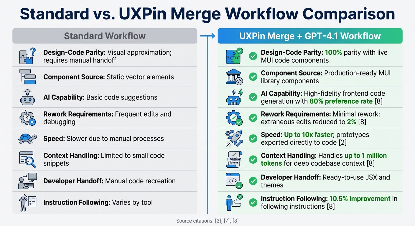
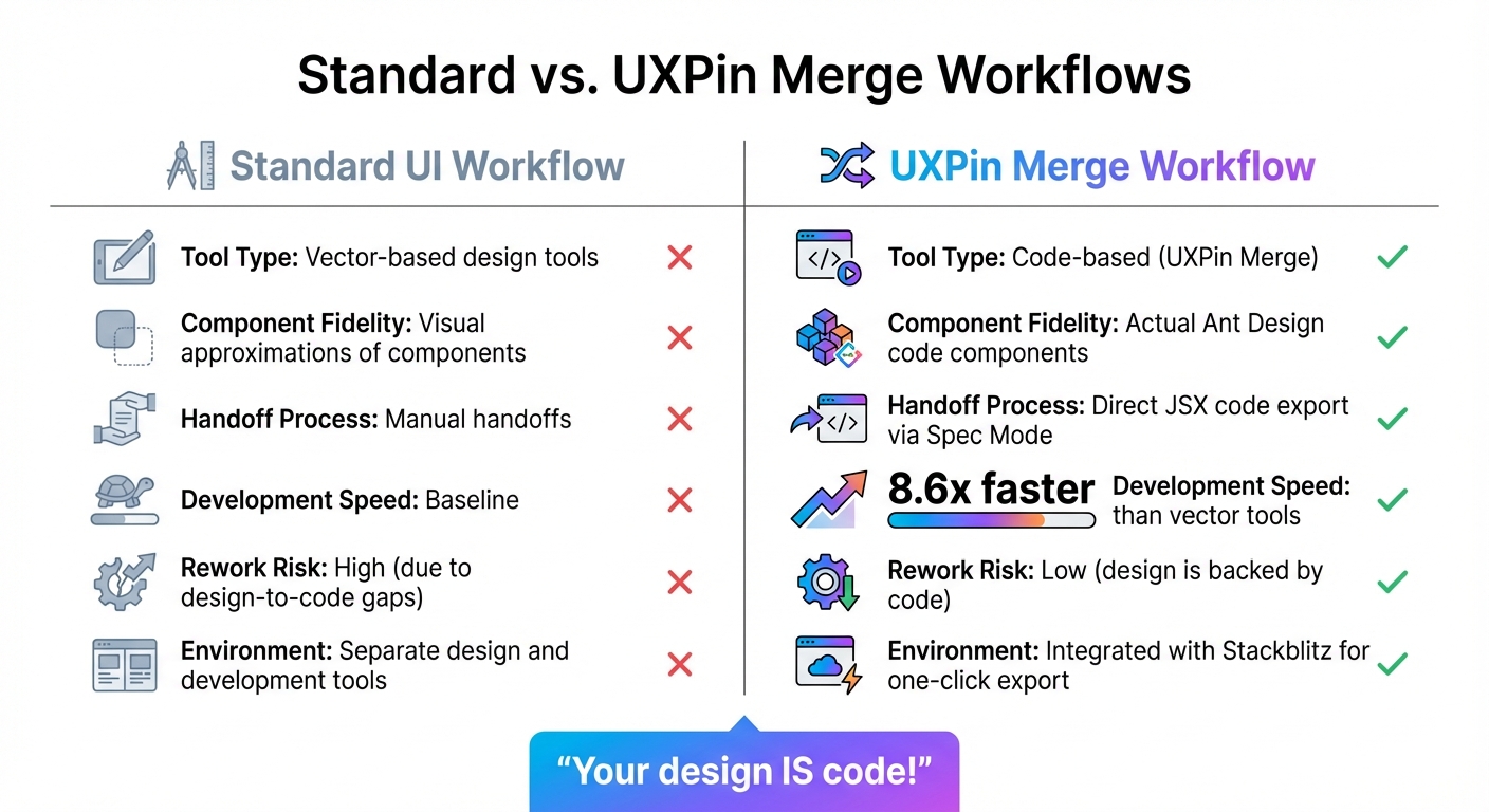
According to UXPin, using Merge libraries and AI can make UI design up to 8.6x faster than traditional vector-based tools.
This speed boost comes from removing the gap between design and code – what you create in UXPin is exactly what goes into production.
Using GPT-4.1 to Generate UI Components
Once your environment is set up, the next step is putting GPT-4.1 to work for generating UI components. This tool bridges the gap between design and code, making it easier to move from text prompts to production-ready components. By simplifying this process, GPT-4.1 eliminates the need for traditional handoffs, creating a faster and smoother workflow.
When it comes to generating Ant Design components, GPT-4.1 performs best with clear and detailed prompts. The quality of the output largely depends on how well you define your instructions.
Writing Effective Prompts for Ant Design Components
Think of writing prompts for GPT-4.1 like giving instructions to an experienced frontend developer. Be specific about your goals. For example, instead of saying, "make a button", try something like: "Create a user registration form using Ant Design with fields for email, password, and a primary submit button." This approach helps GPT-4.1 understand your intent and apply the correct design patterns.
To make your prompts even clearer, structure them using Markdown. Use headings to organize content and bold text to emphasize important details, such as "limit to one primary CTA above the fold."
If you’re unsure how to start, you can upload a screenshot of an existing Ant Design interface and ask GPT-4.1 to "Describe this screen." This can help you identify your visual preferences and guide the design of new components. Additionally, you can use constraint-based prompts to specify details like typography, colors, and layout. For example: "Use a 14px base font, 32px rounded corners, and Ant Design’s primary blue for all CTAs."
Here’s a quick table to help you structure your prompts effectively:
| Prompt Element | Purpose | Example |
|---|---|---|
| Platform | Defines technical constraints | "Web Dashboard" or "iOS mobile UI" |
| Component API | Ensures library compatibility | "Use Ant Design Button with type='primary'" |
| Visual Style | Sets the aesthetic tone | "Minimalist, soft shadows, 32px rounded corners" |
| Hierarchy | Organizes the layout | "## 1. Header, ## 2. Search Row" |
| Technical Specs | Facilitates integration | "Include CSS path: antd/dist/antd.css" |
With GPT-4.1, you can even preview the generated code live, allowing you to catch and correct issues early. After that, refine the components for seamless integration into UXPin Merge.
Refining GPT-4.1 Outputs for UXPin Merge
The raw code generated by GPT-4.1 may not be perfect for UXPin Merge right away. You’ll need to adjust elements like component names, property mappings, and CSS paths to match Ant Design’s documentation.
Start by verifying that the component names align with Ant Design’s naming conventions, which use CamelCase (e.g., DatePicker, not Date Picker). Similarly, ensure the props match Ant Design’s syntax, such as type, danger, or loading.
In UXPin’s Component Manager, manually map React props to the UXPin Properties Panel. For example:
- Use
enumfor properties with multiple variants (like primary, ghost, or dashed buttons) and set up a dropdown menu using "Property Control" asselect. - For boolean props like
disabledorloading, configure a checkbox control.
Don’t forget to include the CSS path antd/dist/antd.css. Without this, your components won’t render properly in UXPin. If GPT-4.1 doesn’t include it, you’ll need to add it manually.
Refinement is an iterative process. Use follow-up prompts to tweak components instead of starting from scratch. For instance, you can ask GPT-4.1 to "Add a loading state to the button" or "Reduce the UI size by 20%." This step-by-step approach saves time and ensures greater precision.
Once the component is polished, publish your changes in the Component Manager and refresh the library on the UXPin canvas. Developers can then access the JSX code, dependencies, and functions through preview links, creating a unified source of truth for both design and code.
"When I used UXPin Merge, our engineering time was reduced by around 50%. Imagine how much money that saves across an enterprise-level organization with dozens of designers and hundreds of engineers." – Larry Sawyer, Lead UX Designer
Adding and Syncing Components in UXPin Merge
Once you’ve refined your GPT-4.1-generated components, the next step is to upload them to UXPin Merge for seamless design collaboration. UXPin even includes trial kits for Ant Design, so you can start building immediately without any extra configuration. But if you’re working with a custom component library or need to sync updates, the UXPin Merge CLI is your go-to tool.
Uploading Components with UXPin Merge CLI
The Merge CLI simplifies the process of uploading your components to UXPin. First, install the CLI tool in your project directory using npm. Once installed, you’ll need to authenticate your session with an API key, which you can find in your UXPin account settings.
Next, configure the uxpin.config.js file. This file links your component directory and specifies which components to sync. After setup, run the push command. The CLI will bundle your components and upload them to UXPin’s servers.
Once the upload is complete, refresh the UXPin library panel. Your components will now appear alongside the preloaded Ant Design trial kit, ready for use. From here, you can enhance your components by integrating theme support using UXPinWrapper.js.
Setting Up UXPinWrapper.js for Theme Support
To enable custom themes for your Ant Design components, configure UXPinWrapper.js. This wrapper serves as a global container, applying theme settings, CSS imports, and context providers to all components in UXPin.
Start by importing antd/dist/antd.css along with your custom theme files. Then, wrap the components using Ant Design’s ConfigProvider. This ensures consistent theming across the board, maintaining uniform color tokens, typography, and spacing. Plus, it supports features like dark mode toggles and locale settings, giving your components a polished and adaptable appearance on the canvas.
Customizing and Prototyping AI-Generated UIs
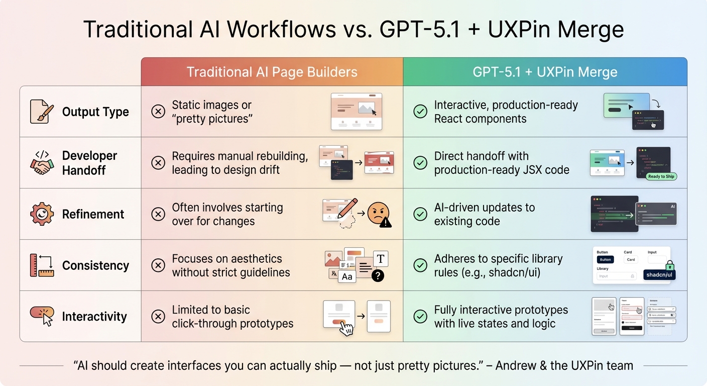
Once you’ve synced your GPT-4.1 components with UXPin, you can turn them into fully interactive prototypes that mimic real products. Unlike static mockups, these components, backed by actual code, respond to user actions, giving you a working model that feels just like the final application. This builds on the earlier seamless sync, taking your design process to the next level.
Adding Interactivity and Variables
With your components live in UXPin Merge, you can now add functionality to create prototypes that behave like finished products. UXPin allows you to incorporate interactions, variables, and conditions directly on the design canvas – no coding required. To get started, select your AI-generated component and open the Interactions panel. From there, set up triggers like "On Click" or "On Change" to define how your prototype reacts to user inputs.
For instance, if you’ve created a login form using GPT-4.1, you can implement form validation by combining variables and conditional logic. Capture user inputs from fields like email and password, then add conditions to verify the email includes an "@" symbol before enabling the next step. You can also set buttons to a "disabled" state until all fields meet the required criteria.
"UXPin lets you build prototypes with real interactions, states, and logic. Instead of static screens, you can design experiences that behave like real products, including conditional flows, variables, and dynamic content."
The properties panel simplifies switching between component variants, such as different sizes, colors, or states (e.g., hover or disabled), without duplicating elements. This ensures consistency with your design system while allowing you to test multiple scenarios effortlessly.
Creating Prototypes with Ant Design Components
Once you’ve added interactivity, you can take advantage of Ant Design’s built-in properties to refine your prototypes further. Since these are real React components, they come pre-equipped with interactive states. Buttons respond to hover and click events, form inputs validate automatically, and dropdown menus expand and collapse naturally – all without additional setup.
To create a multi-step prototype, link screens together using the interactions you’ve defined. For example, after validating a form, you can trigger a transition to a success screen. For more advanced functionality, you can dive into the underlying JSX code, dependencies, and functions. This approach ensures your prototype isn’t just a visual preview but a functional model of production-ready code.
You can also share preview links for direct code inspection and collaborative feedback. This process eliminates the friction of traditional handoffs, ensuring that the design you create is exactly what developers will build.
Automating Component Updates with CI/CD
Once you’ve synced GPT-4.1 components with UXPin Merge, the next step is keeping everything up to date as your codebase evolves. While manual syncing works for the initial setup, automating updates becomes critical as your team continues to refine components.
Configuring CI/CD Pipelines for Component Syncing
To streamline updates, integrate the UXPin Merge CLI into your CI/CD pipeline. This ensures your design library is updated automatically every time changes are merged into the main branch. For teams using GitHub, you can create a workflow file named sync-uxpin.yml in the .github/workflows directory. This file should be configured to execute the uxpin-merge push command once builds on the main branch are successfully completed.
For secure authentication, store your UXPin authentication token (UXPIN_AUTH_TOKEN) as an environment secret. Additionally, ensure your pipeline installs all necessary dependencies (like Ant Design and React) before running the sync command. This approach not only maintains version control but also ensures designers and developers are always aligned. This workflow is part of a larger design with code methodology that bridges the gap between disciplines.
From here, you’ll need to evaluate which CI/CD tool best suits your team’s workflow.
Comparing CI/CD Tools for Merge
When automating component syncing, both GitHub Actions and CircleCI are strong options, but they cater to different needs. GitHub Actions is ideal for teams already hosting their code on GitHub, as it integrates seamlessly and requires minimal setup. On the other hand, CircleCI offers advanced multi-stage build pipelines, which can be a better fit for teams with more intricate deployment needs or those working outside GitHub.
Here’s a quick comparison to help you decide:
| Feature | GitHub Actions | CircleCI |
|---|---|---|
| Setup Complexity | Simple; designed for GitHub repositories. | Moderate; requires additional webhook and permission setup. |
| Configuration File | .github/workflows/*.yml |
.circleci/config.yml |
| Secret Management | Uses "GitHub Secrets" for repo- or org-level security. | Supports "Environment Variables" or "Contexts" for shared secrets. |
| Best Use Case | Teams on GitHub seeking easy integration. | Teams needing complex, multi-stage pipelines or using non-GitHub platforms. |
Both tools can execute the Merge CLI to push updated components, so your choice depends on your infrastructure and how complex your workflow is. For most teams working with Ant Design and GPT-4.1 components, GitHub Actions provides a straightforward and efficient solution with minimal setup.
Best Practices for GPT-4.1 and UXPin Merge
After generating and syncing components, following these practices will help ensure your prompts and design adjustments consistently produce production-ready UIs. To get the best results from GPT-4.1 and UXPin Merge, it’s essential to have a clear approach for both crafting prompts and adhering to your design system. Creating a functional Ant Design component relies heavily on precise instructions and strict alignment with your design guidelines.
Writing Clear GPT-4.1 Prompts
Clarity is everything when working with GPT-4.1. Without explicit instructions, the model may misinterpret your intent. In April 2025, OpenAI researchers Noah MacCallum and Julian Lee showcased how GPT-4.1 achieved a 55% success rate on SWE-bench Verified by using a system prompt that emphasized "extensive planning before each function call" and "thorough reflection on outcomes." This method turned the model into more than just a chatbot – it became an autonomous agent capable of solving complex repository challenges without human input.
When crafting prompts for Ant Design components:
- Use Markdown to organize instructions (up to three levels: ##, ###, ####).
- Highlight critical constraints or attributes with bold text to emphasize top priorities.
- Specify the platform (e.g., "Web") and include precise details like "rounded corners", "soft shadow", or exact measurements such as "32px".
For more intricate layouts, ending your prompt with "think carefully step by step" can increase task success rates by 4%. If the model introduces errors, such as adding extra navigation items, follow up with a targeted prompt to address the mistake while preserving the rest of the layout. For lengthy prompts, repeat key instructions at both the beginning and end to improve adherence.
These strategies lay the groundwork for maintaining design consistency, which is equally important.
Maintaining Consistency with Design Systems
To minimize rework, ensure every AI-generated component aligns with your design system rules. UXPin Merge AI connects directly to your Git-based component library, ensuring components are production-ready and fully aligned with your design and code.
When refining AI-generated outputs, let the AI Helper handle adjustments instead of making manual changes. For example, you might prompt, "make this form more compact", and the AI will apply your design system’s specific spacing and sizing rules automatically. Starting with pre-built templates for dashboards or forms using real Ant Design components provides a consistent framework for the AI.
"When I used UXPin Merge, our engineering time was reduced by around 50%. Imagine how much money that saves across an enterprise-level organization with dozens of designers and hundreds of engineers." – Larry Sawyer, Lead UX Designer
To prevent design drift, keep your component library synced through the UXPin Merge CLI. This ensures that any updates made to your design system in the code repository are immediately reflected in the AI’s component library. By maintaining this single source of truth, you ensure that first drafts closely resemble the final product, reducing the need for revisions.
Wrapping It Up
GPT-4.1, Ant Design, and UXPin Merge streamline the entire process from concept to production-ready UI. Unlike traditional static mockups that require developers to rebuild designs, this workflow delivers production-ready React components straight to your codebase. The result? An impressive 8.6x speed boost and threefold increase in designer productivity.
The standout benefit here is removing the need for the rebuild loop. As UXPin explains, "If [AI] ignores your component library, someone pays the price later: devs rebuild it, design drifts from code, and velocity drops". By restricting GPT-4.1 to your Ant Design system, every layout it generates is built with components your developers already know and trust. This means no handoffs, no translation errors, and no wasted engineering hours re-creating designs.
The AI Helper also brings flexibility to the table. You can tweak spacing, swap out button styles, or adjust table columns without having to regenerate the entire screen. Combine this with UXPin Merge’s Git integration and CI/CD pipelines, and updates to your component library sync automatically with your design environment. This ensures your designs stay aligned with the latest standards and remain your single source of truth. It’s a game-changer for teams building advanced workflows for custom design systems.
For teams managing proprietary design systems, Merge Enterprise takes these advantages even further by extending support to custom component libraries. Whether you’re working with open-source tools or your own code, this workflow ensures accessibility features are embedded and your design standards are upheld.
"AI should create interfaces you can actually ship – not just pretty pictures".
This workflow transforms AI from a simple design assistant into a powerful production tool, ensuring that design and development work seamlessly together.
FAQs
Do I need UXPin Merge to use Ant Design in UXPin?
Yes, UXPin Merge is a must if you want to integrate and use Ant Design components within UXPin. Merge bridges the gap between design and development by allowing you to sync code components – like those from Ant Design – directly into UXPin. This creates a smooth, collaborative workflow for both designers and developers.
How do I ensure GPT-4.1 generates valid Ant Design React code?
To get GPT-4.1 to produce valid Ant Design React code, it’s all about crafting clear and precise prompts. Be specific about the components you need, their properties, and the overall structure. Providing context about Ant Design’s library is also crucial – it helps guide the model toward generating code that aligns with React and Ant Design standards.
Once you have the generated code, test and review it carefully. This ensures it functions as expected and adheres to best practices. If the output isn’t quite right, refine your prompts to include more detail or clarify your requirements. The more specific your instructions, the better the results.
How can I auto-sync Merge updates with GitHub Actions?
The information currently available does not outline specific steps or official guidance for setting up auto-syncing of Merge updates using GitHub Actions. At this time, no detailed instructions or resources for this process have been provided.