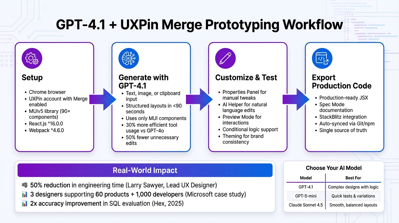
Prototyping is faster and more precise with GPT-4.1, Ant Design, and UXPin Merge. These tools allow you to create production-ready prototypes in minutes using React components. Here’s how it works:
- GPT-4.1 generates layouts based on text prompts, combining logic, visuals, and interactivity.
- Ant Design provides a library of React components with built-in functionality like validation, sorting, and responsive behavior.
- UXPin Merge integrates these components directly into your design, syncing with live code for seamless collaboration between designers and developers.
Key Benefits:
- Describe your needs (e.g., "Create a dashboard with filters"), and GPT-4.1 generates a layout instantly.
- Prototypes include real interactions and states, mirroring the final product.
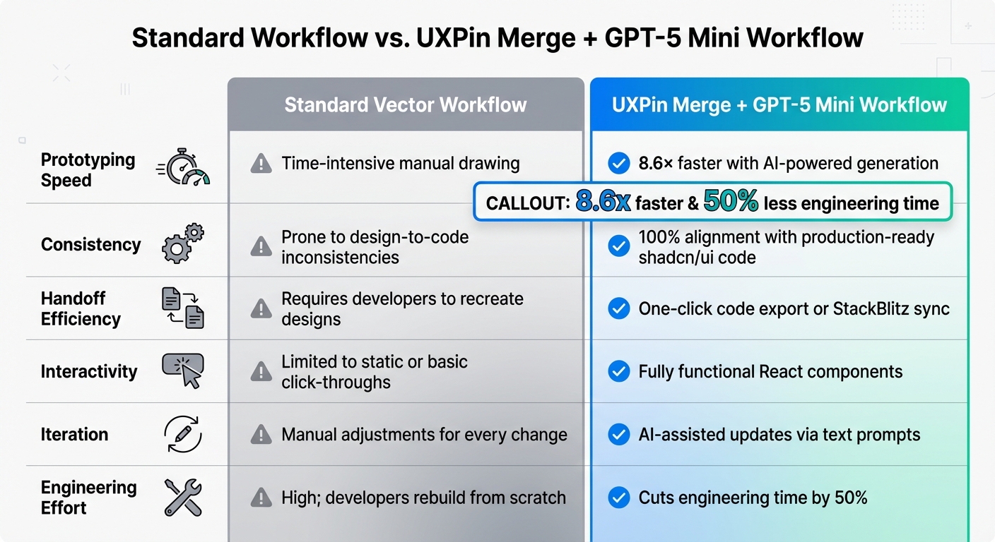
- Export production-ready React code, eliminating the need for developers to rebuild designs.
Getting Started:
- Sign up for a UXPin account (plans start at $29/month; free trial available).
- Obtain an OpenAI API key to enable GPT-4.1 functionality.
- Use the AI Component Creator in UXPin to craft detailed prompts and generate layouts.
By combining these tools, you can streamline workflows, reduce rework, and deliver functional prototypes that developers can use immediately.
UXPin Merge AI: Smarter UI Generation That Follows Your Design System
sbb-itb-f6354c6
What You Need to Get Started
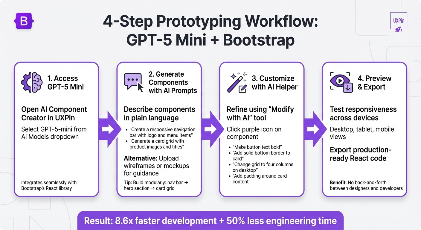
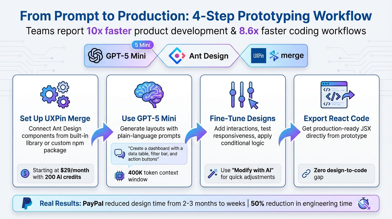
Getting Started with GPT-4.1, Ant Design, and UXPin Merge: 3-Step Setup Process
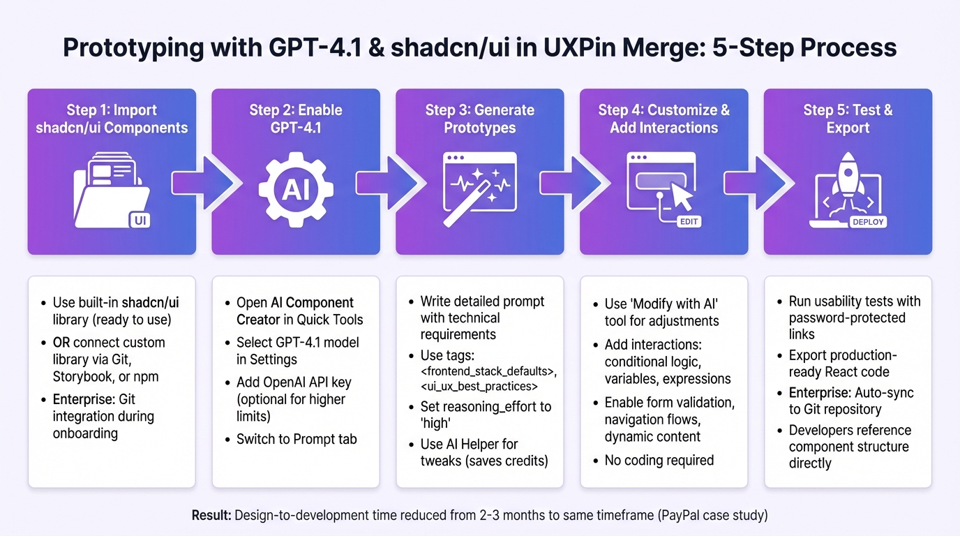
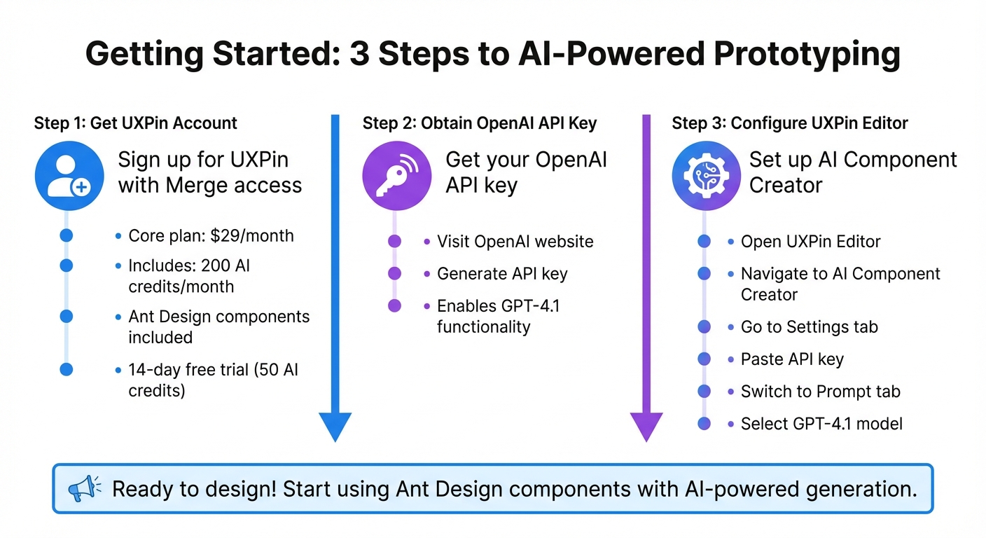
Before diving into prototype creation with GPT-4.1 and Ant Design, there are a few steps to set up your workspace.
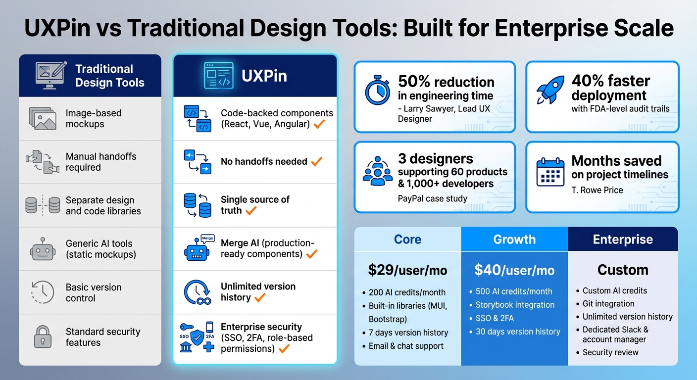
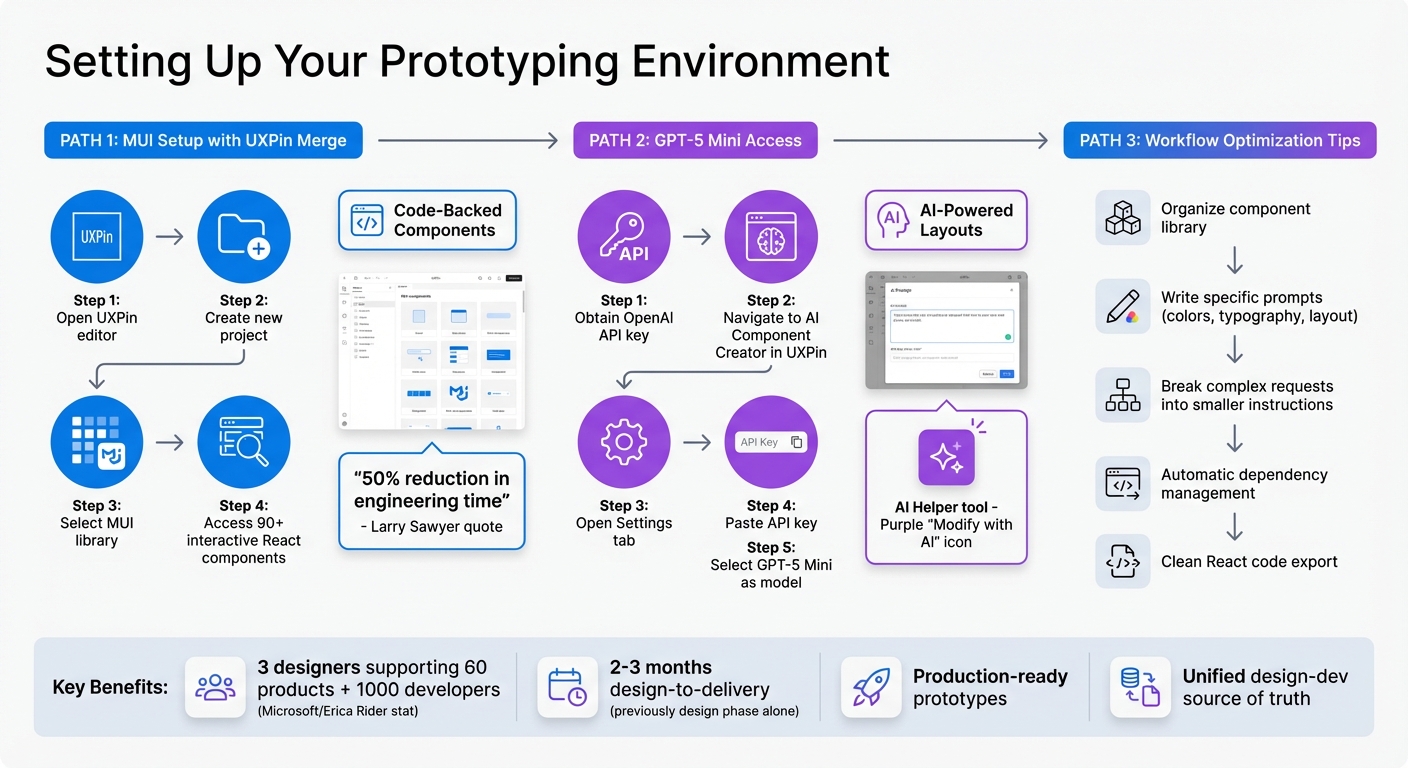
First, you’ll need a UXPin account with Merge access. The Core plan, starting at $29/month, includes Ant Design components, 200 AI credits per month, and access to GPT-4.1. For those needing more, Growth and Enterprise plans offer additional AI credits and advanced models. Not ready to commit? Try the 14-day free trial, which includes 50 AI credits to explore the workflow before subscribing.
Next, get an OpenAI API key from their website. This key enables GPT-4.1 functionality. Open the UXPin Editor, navigate to the AI Component Creator, go to Settings, and paste your API key. Then, switch to the Prompt tab and select GPT-4.1 from the list of available models.
Once these steps are complete, you’re ready to set up UXPin Merge and start designing.
Setting Up UXPin Merge
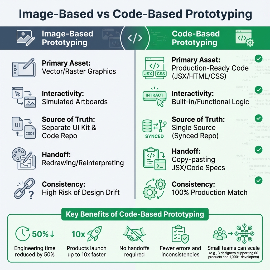
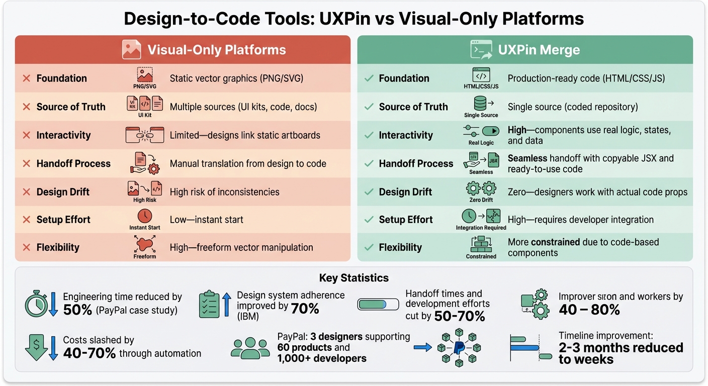
UXPin Merge runs directly in your browser through the UXPin Editor. Once your account is active and your API key is set, you can start using Ant Design components right away. Unlike static images, these are fully functional React components that behave exactly as they would in a live application.
To get started with Ant Design, open a new project in the UXPin Editor. The Ant Design library is integrated into the component panel, offering a variety of options like buttons, forms, tables, and navigation elements. Simply drag components onto your canvas or use GPT-4.1 to generate entire layouts based on text prompts. Since Ant Design is built into UXPin Merge, there’s no need to import libraries or manage npm packages unless you’re working with custom components.
Within the AI Component Creator (found in the Quick Tools panel), you’ll find two main tabs:
- Settings: Configure your API key and select your AI model.
- Prompt: Describe the components or layouts you want to build.
For complex designs that combine visual elements, logic, and text, GPT-4.1 is the recommended model. It handles structured layouts more effectively than simpler models like GPT-4o-mini, which is better suited for basic tasks.
Once GPT-4.1 is selected, you can use the AI Helper to modify existing components. Simply select an Ant Design component on your canvas, click the purple "Modify with AI" icon, and enter a prompt. This tool supports other React libraries too, like MUI, Bootstrap, and Tailwind.
Now that your workspace is ready, you can start exploring the vast array of Ant Design components.
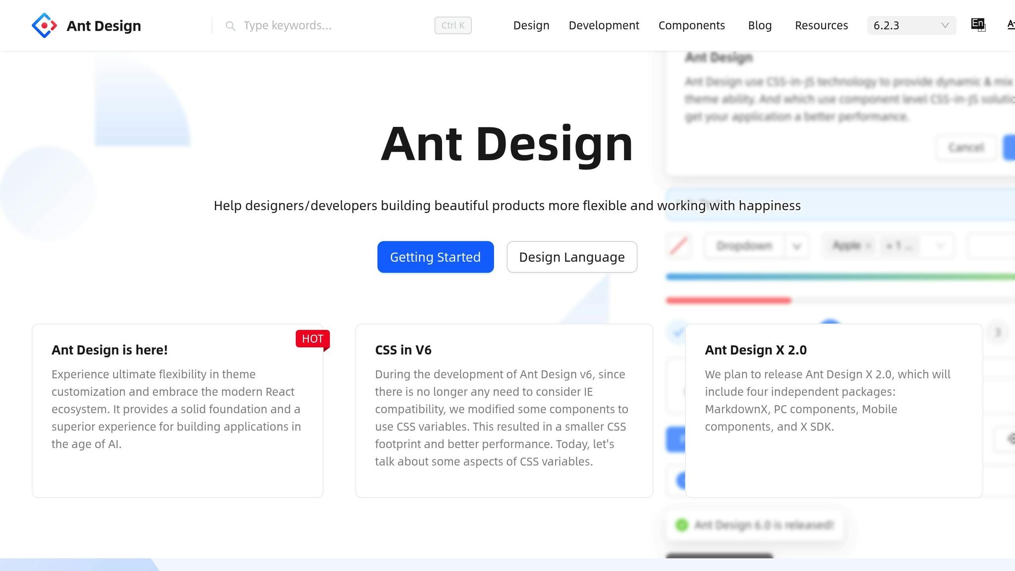
Understanding Ant Design Components
Ant Design, developed by Alibaba, is a React UI library with over 50 ready-to-use components tailored for enterprise applications. These include everything from buttons and inputs to advanced features like data tables and dashboards. In UXPin Merge, these components aren’t just visual placeholders – they’re the actual code your developers will use.
This approach eliminates the gap between design and development. When prototyping with Ant Design in UXPin Merge, you’re working with components that already include built-in interactions, states, and responsive behavior. For example, dropdown menus will open, forms will validate inputs, and data tables can sort and filter automatically – saving time during development.
Ant Design follows a consistent design system, ensuring a cohesive look across your prototypes. The library comes with a default theme that includes predefined colors, typography, spacing, and styles. You can further customize these components using UXPin settings or AI prompts.
As Larry Sawyer, Lead UX Designer, shared, "When I used UXPin Merge, our engineering time was reduced by around 50%".
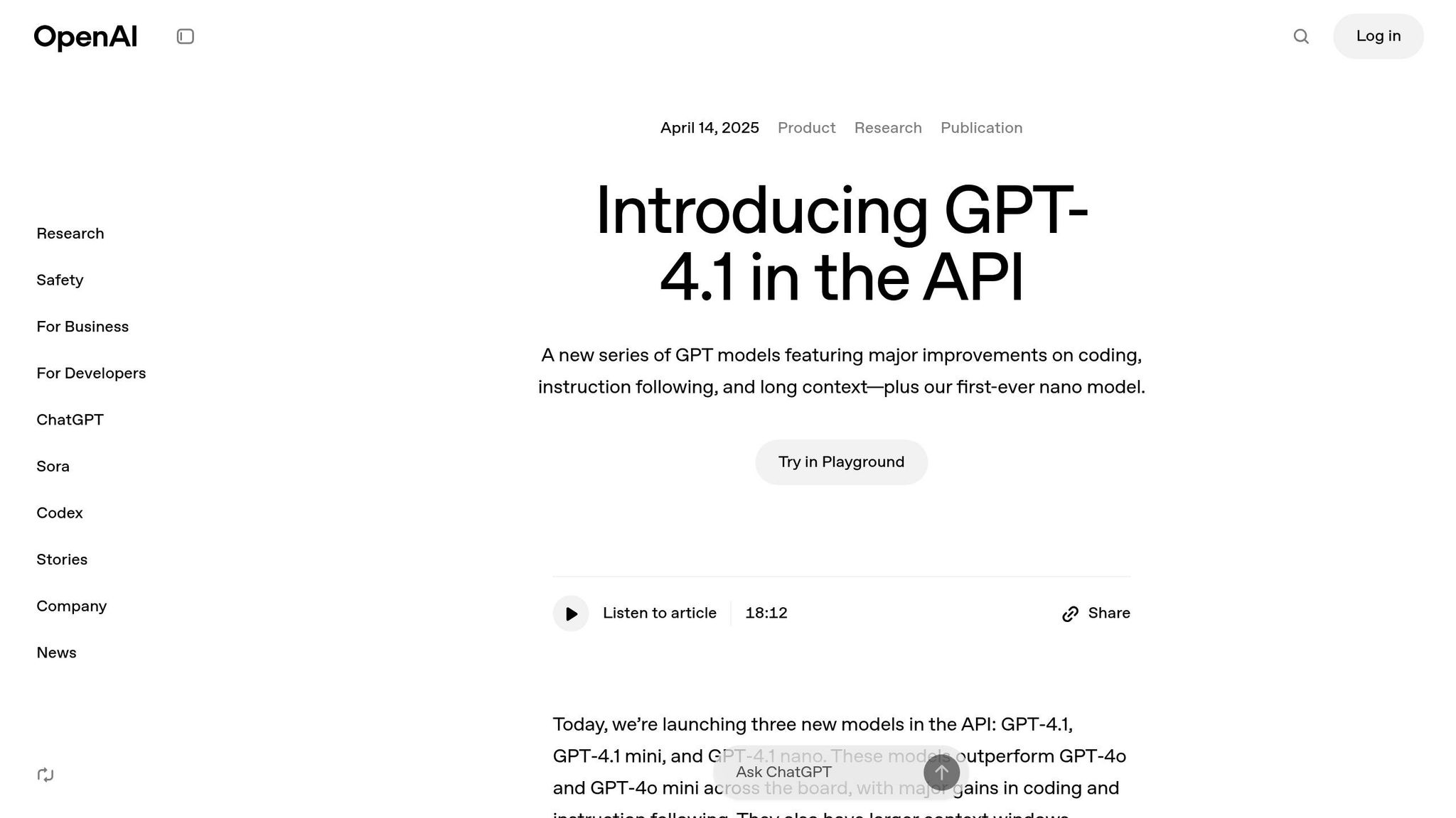
How GPT-4.1 Works in UXPin Merge

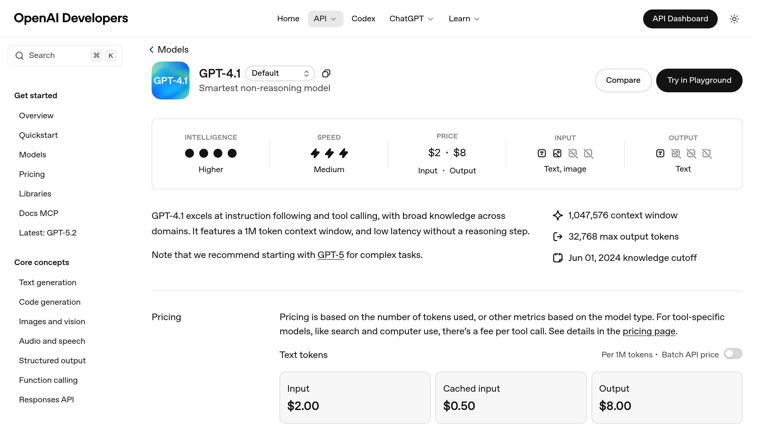
GPT-4.1 powers UXPin Merge’s component generation. Released by OpenAI on April 14, 2025, it features a 1 million token context window, making it ideal for handling complex prototyping tasks that require detailed instructions.
For example, if you prompt GPT-4.1 with "create a dashboard with a sortable data table and filters", it will generate a layout using Ant Design components. The AI doesn’t invent new UI patterns or random designs – it works within your design system’s guidelines. Every component it suggests is pre-approved, tested, and ready for production.
The AI understands how components relate to each other, as well as layout hierarchies and common UI patterns. Ask for a form, and it will include labels, input fields, validation states, and a submit button. Request a navigation bar, and it will structure menu items, dropdowns, and responsive elements. You can refine these outputs with follow-up prompts to adjust colors, spacing, typography, or other properties – all without writing code. This ensures that your prototypes closely match production-ready code, streamlining collaboration between design and development teams.
For the best results, use detailed prompts. Include specifics like hex color codes, font sizes, and padding. For example, asking for "an Ant Design card component with a 24px title in #262626, 16px body text in #595959, and 16px padding" will produce a more precise result than a vague request like "make a card."
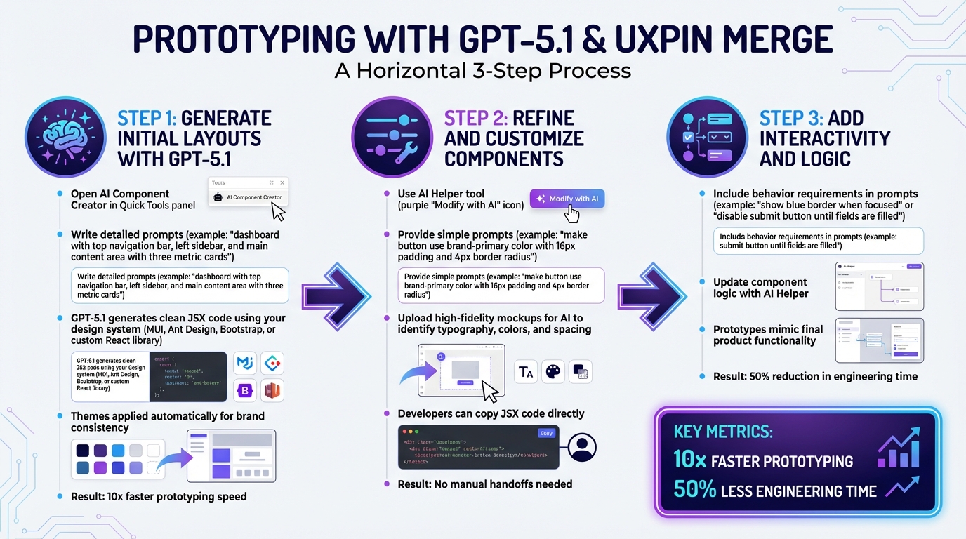
Using UXPin Merge to create functional layouts and generate code can reportedly speed up product development by 8.6 times.
As Donal Tobin remarked, "The AI component creator is a favorite!", highlighting the efficiency and accuracy GPT-4.1 brings to the design process.
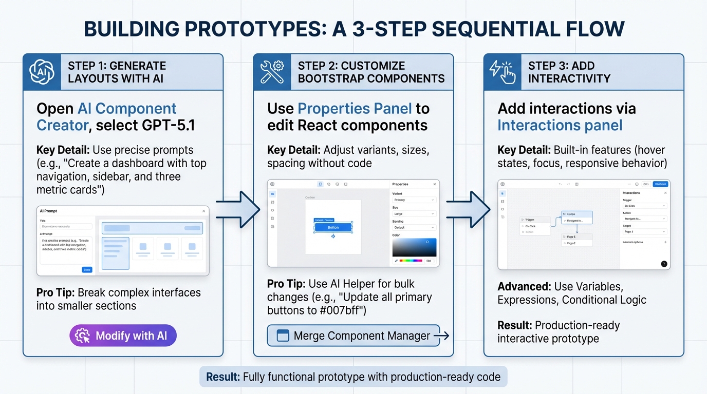
Generating Prototypes with GPT-4.1
Once your workspace is ready, you can dive into the AI Component Creator, craft a detailed prompt, and let GPT-4.1 generate a functional React prototype using Ant Design components. The AI creates a live, interactive prototype that includes built-in interactions and responsive behavior.
The secret to getting great results lies in writing clear and specific prompts. For example, instead of saying, "Create a login form", try something like:
"Create a login form using Ant Design components with email and password fields, validation states for both fields, and a primary submit button."
This level of detail ensures GPT-4.1 selects the right components from the Ant Design library.
Once the initial layout is generated, you can tweak it directly on the UXPin canvas. Use the property panel to adjust Ant Design-specific properties like "size", "type", or "status" without writing code. For more extensive changes, select the component, click the purple "Modify with AI" button, and provide a new prompt, such as:
"Change the button color to #1890ff and increase padding to 24px."
As Allison Barkley, Director of Operations at Baremetrics, shared: "Being able to jump straight from design to having code ready is going to be a huge time-saver for our team".
For immediate testing, you can open your prototype in StackBlitz, where you can view and edit the React code in real-time. This smooth workflow bridges the gap between concept and production-ready code.
Writing Clear AI Prompts for Ant Design
The accuracy of your prototype depends on how well you craft your prompts. GPT-4.1 performs best when you provide specific instructions that include component names, visual details, and layout structure. Always mention "Ant Design" in your prompt to ensure the AI uses the correct library.
A good prompt should include:
- Component type: Specify the exact component you need.
- Visual details: Include colors, sizes, and spacing.
- Functional requirements: Mention features like validation, sorting, or pagination.
For example, instead of saying "make a header", try:
"Create a dashboard header using Ant Design with a logo on the left, a navigation menu in the center featuring Home, Products, and Settings links, and a user avatar dropdown on the right. Use #001529 for the background and set the height to 64px."
This approach leaves little room for misinterpretation.
If you’re working on complex interfaces, break them into smaller sections. For instance, start with:
"Create an Ant Design card component for a product listing with an image placeholder, product title in 18px bold text, price in #52c41a, and an Add to Cart button."
Once the smaller components are ready, you can combine them into a full layout.
Refining your prompts is part of the process. If the output isn’t what you envisioned, add more details or adjust your instructions. These well-structured prompts are the foundation for generating accurate and functional layouts.
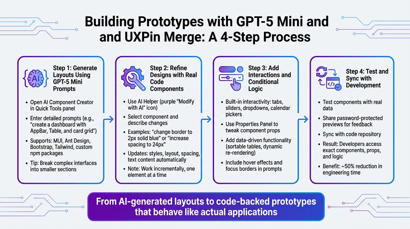
Creating Initial Layouts with AI
Start by defining the main structure of your prototype. Open the AI Component Creator, select GPT-4.1, and describe your layout in the prompt field. For example:
"Create a dashboard layout using Ant Design with a fixed sidebar navigation on the left (200px wide, #001529 background), a top header bar (64px height, #ffffff background), and a main content area with 24px padding."
GPT-4.1 will generate a layout using Ant Design components like Sider, Header, and Content, matching your specifications. These components are the same ones developers use in production, ensuring consistency. The sidebar will contain navigation items, the header will include space for branding and user controls, and the content area will be ready for additional elements.
Once the structure is in place, you can add functional sections. For example:
"Add an Ant Design table component with columns for Name, Email, Status, and Actions, including sortable headers and pagination displaying 10 rows per page."
The AI will insert a fully functional table with these features.
For forms, be explicit about the fields and their behavior:
"Create a user registration form using Ant Design with input fields for First Name, Last Name, Email (with email validation), Password (with a strength indicator), and a checkbox for Terms of Service. Include a primary Submit button and a secondary Cancel button."
The generated form will include proper labels, validation states, and the requested functionality.
You can also refine layouts using image-to-UI conversion. Upload a high-fidelity mockup to the AI Component Creator, and the AI will analyze the typography, colors, and spacing to generate an initial structure. You can then refine this structure further through text prompts.
This initial layout acts as the starting point for developing a fully interactive prototype.
Editing AI-Generated Prototypes
After generating your prototype, you can refine it directly on the canvas. Use the property panel for quick adjustments, or for more complex edits, click the purple "Modify with AI" button and describe the changes. For instance:
"Change this button to danger type, make it large, and update the text to Delete Account."
When working on multiple elements, it’s best to refine them one at a time. For example, to edit a form, you could start by prompting:
"Add helper text below the email field that says ‘We’ll never share your email.’"
Then move on to another field and request:
"Change the password field to include a visibility toggle icon."
Be patient during the refinement process. Avoid deselecting a component while the AI is processing a request, as this may cancel the operation. If the result isn’t quite right, adjust your prompt with more details and try again.
You can also make broader changes using prompts like:
"Align all form labels to the left, increase spacing between fields to 16px, and change the submit button background to #52c41a."
This iterative approach allows you to fine-tune the prototype until it meets your exact requirements.
Once your prototype is polished, you’ll be ready to move on to building fully interactive experiences.
Building Interactive Prototypes
Once your layout is ready, you can start adding interactions to make your prototype function like a real application. UXPin Merge offers tools like states, variables, expressions, and conditional logic, all of which integrate perfectly with Ant Design components. These features allow you to simulate hover effects, loading states, validation, and dynamic content – all without writing a single line of code.
| Feature | Function in UXPin Merge | Benefit for Ant Design Prototypes |
|---|---|---|
| States | Multiple variations for one element | Mimics hover, active, and loading states |
| Variables | Stores user input data | Enables personalized and dynamic experiences |
| Expressions | Logic-based functions | Handles complex calculations or behaviors |
| Conditional Logic | If-then/If-else triggers | Simulates application validation |
| Spec Mode | Developer inspection tool | Provides production-ready JSX for engineers |
For example, you can create a login form where the submit button stays disabled until both the email and password fields are filled. Using conditional logic, you can check whether the input fields contain values and trigger a state change to enable the button. This setup closely mirrors how the final product will behave, offering stakeholders a realistic preview.
Since UXPin prototypes use production-ready Ant Design React components, they behave just like the finished product. Interactive elements such as tabs, calendar pickers, and ripple effects work seamlessly without additional setup.
As Edward Nguyen, UX Architect, shared: "UXPin prototypes gave our developers enough confidence to build our designs straight in code. If we had to code every prototype and they didn’t test well, I can only imagine the waste of time and money".
Adding Interactions to Ant Design Components
To begin, select the component you want to make interactive. Open the Interactions panel on the right and click Add Interaction. You’ll find triggers like "On Click", "On Change", or "On Hover", paired with actions such as "Set Variable Value", "Toggle State", or "Navigate to Page."
For instance, to validate an email field, create a variable called emailValid and set its initial value to false. Add an interaction to the email input field with the trigger "On Change" and the action "Set Variable Value." Use an expression to check if the entered text matches an email format. If it does, update emailValid to true. Then, apply conditional logic to the submit button to keep it disabled unless emailValid is true.
You can also use states to show different versions of components. For example, when a button is clicked, change its state to "loading" to display a spinner and disable further clicks. This replicates the behavior of an application waiting for a server response.
For more advanced interactions, combine variables and expressions. Imagine a shopping cart where changing the product quantity updates a totalPrice variable in real time. You can display the updated total in a text field that adjusts dynamically as the user modifies the quantity. These kinds of interactions make your prototype feel like a functional product.
Testing Your Prototypes
After setting up interactions, click the Preview button in the top-right corner to test your prototype in full-screen mode. Use it as a user would – check that buttons respond, forms validate input, and dynamic content updates correctly. Since UXPin Merge uses code-backed components, you’re testing real Ant Design behavior, not just a visual mockup.
Plan your testing sessions with clear goals. For example:
- Use one session to focus on design details like spacing, colors, and alignment.
- Dedicate another session to ensure interactions work as expected, such as verifying that the loading state appears when a button is clicked or that error messages display when validation fails.
It’s also important to test with people outside your project team.
As RevPart suggests: "Be sure to test your prototype with those unfamiliar with the product – within or outside of your organization – to reap the benefits of those different ways of viewing and interacting with your product".
This fresh perspective helps uncover usability issues your team might miss.
Finally, use Spec Mode to bridge the gap between design and development. Developers can inspect your prototype, view JSX code for each component, and copy production-ready snippets directly into their codebase. This eliminates the need for lengthy handoff meetings and ensures your design is implemented accurately. These steps guarantee your prototype is as realistic and functional as possible, setting the stage for further refinement.
Tips for Using GPT-4.1 and Ant Design in UXPin Merge
Improving Design and Development Collaboration
When creating interactive prototypes, integrating code-backed components streamlines the collaboration between design and development. With Ant Design in UXPin Merge, developers can directly use production-ready JSX generated from the prototypes. This skips the traditional handoff process where designers create mockups that developers need to rebuild from scratch.
As UXPin explains: "Merge hands your devs something they recognize – and can ship".
To enhance this workflow, make use of Spec Mode. It allows quick inspection of component properties, spacing values, and JSX code. Sharing your prompts alongside Spec Mode insights ensures everyone stays on the same page. This level of transparency helps maintain alignment on the product vision across teams.
Once collaboration is running smoothly, the next step is ensuring design consistency.
Maintaining Consistency with Ant Design
Ant Design offers detailed guidelines for spacing, typography, and component behavior. Sticking to these standards ensures your prototypes work seamlessly across various screens and scenarios. When crafting prompts for GPT-4.1, be specific about Ant Design component names and properties to guarantee the AI selects the correct elements from the library.
For example, specifying details like "Ant Design Primary button with 16px padding" ensures precise results. UXPin’s Prompt Library is a helpful resource for accessing pre-written, optimized prompts tailored for Ant Design layouts. This reduces the need for manual adjustments and speeds up the design process.
Using AI Within Your Design System
To build on consistent design practices, integrating AI into your design system can further standardize your prototypes. GPT-4.1 performs best when it operates within clear design system guidelines. If your team uses a custom design system, the Custom Library AI feature in UXPin Merge Enterprise can be a game-changer. It connects to your Git repository, exposing your custom tokens and components to the AI. This ensures the AI generates layouts that align with your established standards.
As UXPin notes: "AI should create interfaces you can actually ship – not just pretty pictures".
When fine-tuning AI-generated layouts, leverage the AI Helper for iterative adjustments. Instead of starting from scratch, use commands like "make this denser" or "swap primary to tertiary" to refine designs efficiently. This approach saves time while ensuring consistency and adherence to your design system.
Conclusion
Integrating AI-powered design tools with production-ready components transforms your workflow into something faster, more cohesive, and dependable.
By leveraging GPT-4.1, Ant Design, and UXPin Merge, digital prototyping takes on a whole new dimension. Instead of relying on static mockups that require redevelopment, you’re using the exact same React components that will eventually ship to production. This not only removes typical design handoff bottlenecks but also guarantees complete alignment between design and the final product.
With GPT-4.1, you can create functional layouts from simple text prompts, while Ant Design provides components equipped with built-in states, interactions, and accessibility. This means you’re generating high-fidelity, code-backed prototypes that stakeholders can interact with and test right away.
Allison Barkley, Director of Operations, highlights: “The ability to jump straight from design to production-ready code significantly speeds up front-end development”.
This approach doesn’t just save time – it also brings teams together. UXPin keeps everyone on the same page by syncing library updates automatically, ensuring every team member works with the latest components. The result? Faster iteration cycles, fewer misunderstandings, and products that hit the market in days instead of months.
Whether you’re crafting your first prototype or scaling operations for a large organization, this workflow equips your team to deliver production-ready interfaces – helping you move efficiently from design to launch.
FAQs
What plan do I need to use GPT-4.1 with Ant Design in UXPin Merge?
To integrate GPT-4.1 with Ant Design in UXPin Merge, you’ll need a subscription plan that includes both Merge and AI features. These options are generally part of professional or enterprise-level plans. The plan must also provide access to the AI Component Creator, which allows you to create and fine-tune Ant Design components for your prototyping needs. A sign-up or active subscription is typically required to unlock these features.
How do I write prompts that reliably generate Ant Design layouts?
To create dependable Ant Design layouts using GPT-4.1 in UXPin, the key lies in crafting clear and detailed prompts. For instance, if you need a specific section, like a testimonial layout, your prompt should be something like: "Create a testimonial section with three cards."
But don’t stop there – add explicit details about the structure, functionality, and design. For example, specify if the cards should include an image, title, description, and call-to-action button. Mention any layout preferences, like spacing, alignment, or color schemes, to ensure the AI delivers results that align with your vision.
The more precise your instructions, the more consistent and accurate the layouts will be. This approach not only saves time but also simplifies the process of integrating Ant Design components into your UXPin workflow.
Can developers copy production-ready JSX from my UXPin prototypes?
Developers can directly extract production-ready JSX from UXPin prototypes when using UXPin Merge. This tool integrates coded React components with design prototypes, enabling the creation of precise, interactive mockups. These prototypes can then be exported as JSX, streamlining the handoff process and fostering smooth collaboration between design and development teams.