If you’re tired of the disconnect between design and development, this guide is for you. Combining Claude Haiku 4.5, shadcn/ui, and UXPin Merge creates a workflow where designers and developers work with the same components, cutting down on rework and misalignment. Here’s why these tools work so well together:
- Claude Haiku 4.5: AI-powered tool for generating UI layouts and React scaffolds quickly.
- shadcn/ui: A library of customizable, accessible React components styled with Tailwind CSS.
- UXPin Merge: Lets designers use real, production-ready React components directly in their design process.
By using these tools together, you can create faster, more accurate prototypes that align perfectly with production code. This approach eliminates the need for developers to rebuild designs from scratch and ensures consistency across the entire team.
What you’ll need to get started:
- A UXPin account with Merge enabled.
- Knowledge of React and Tailwind CSS.
- Access to Claude Haiku 4.5 via UXPin Forge.
Key benefits:
- Generate layouts 10× faster with Claude Haiku 4.5.
- Work with real, functional components from shadcn/ui in UXPin.
- Keep design and development perfectly aligned with UXPin Merge.
Ready to streamline your workflow? Let’s dive into the details.
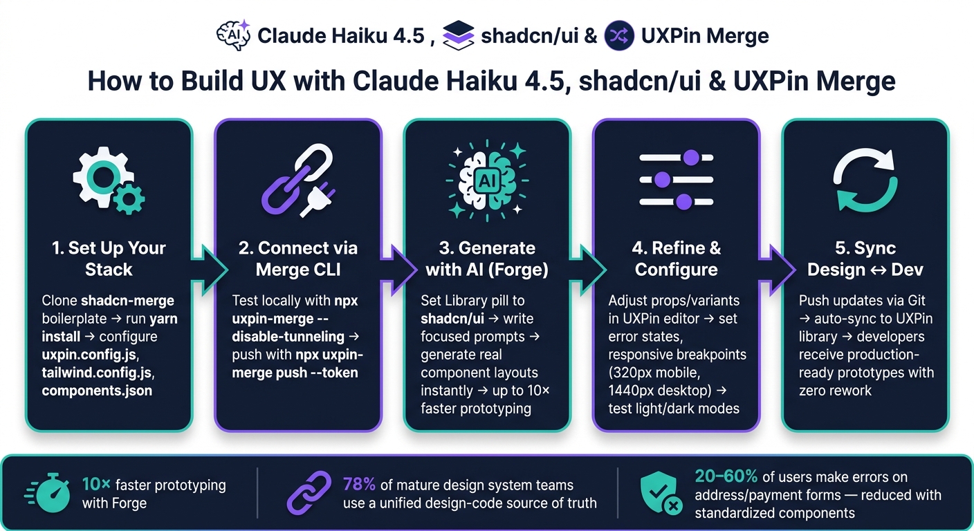
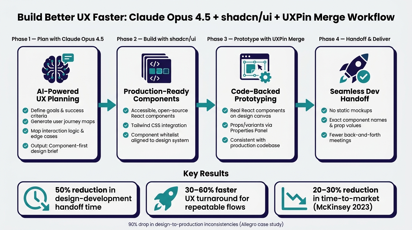
How to Build UX with Claude Haiku 4.5, shadcn/ui & UXPin Merge
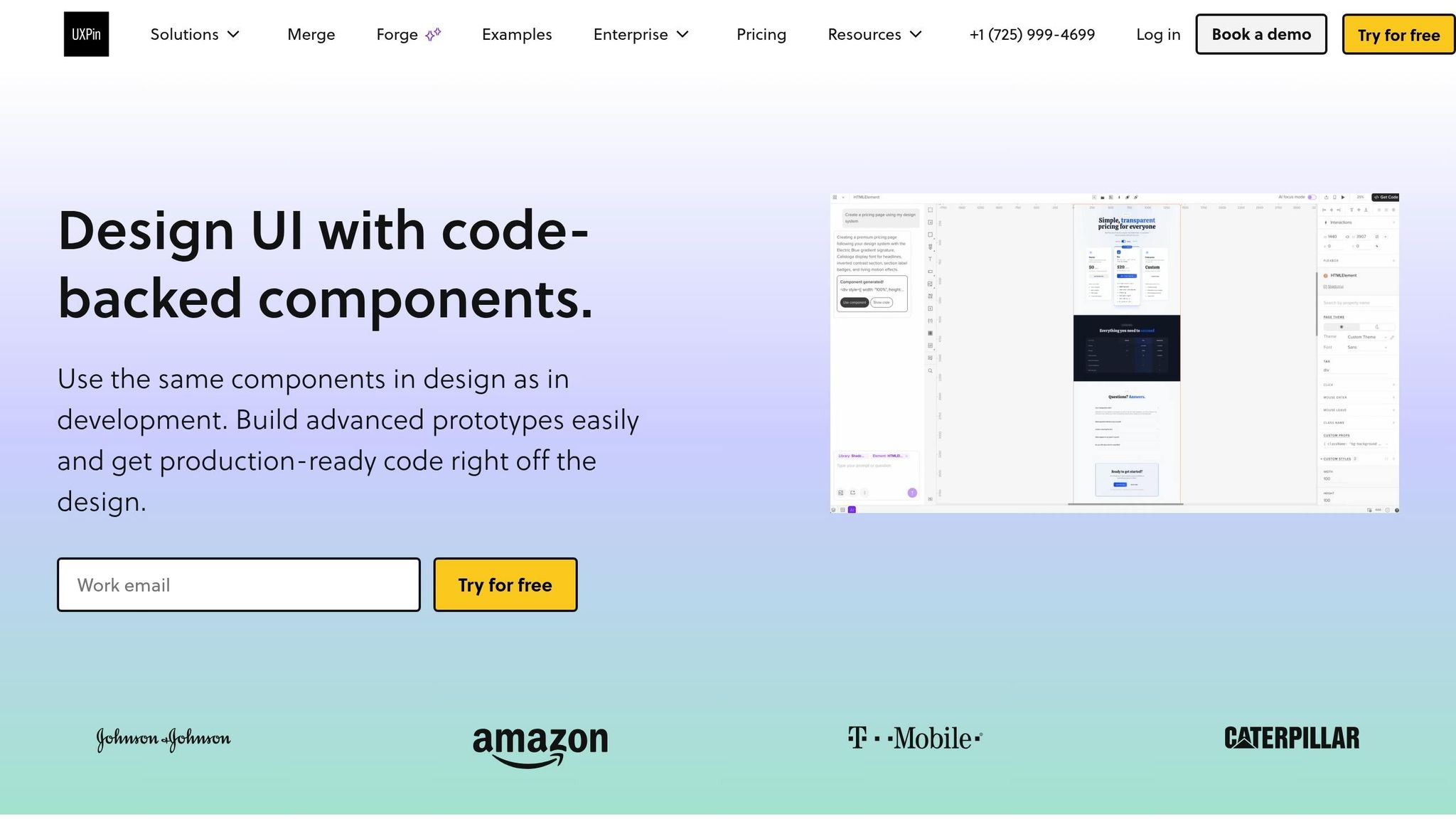
Setting Up shadcn/ui and UXPin Merge for Code-Backed Design

What is shadcn/ui and why does it work well with Merge?
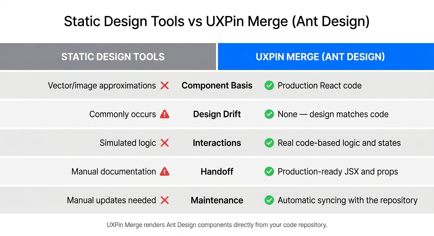
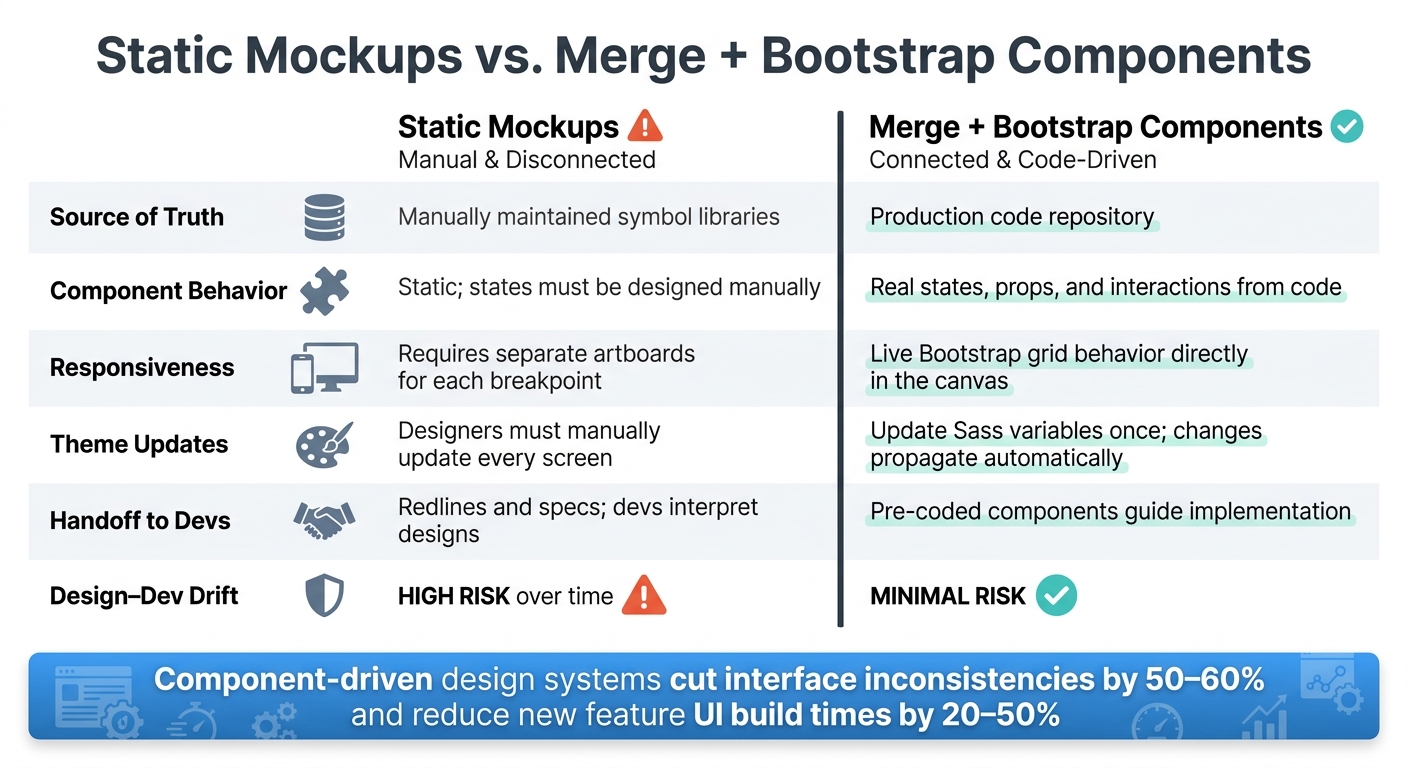
shadcn/ui is a collection of open-source React components built using Radix UI primitives and styled with Tailwind CSS. What makes shadcn/ui stand out is its approach to code ownership. Instead of relying on third-party dependencies, you copy the components directly into your project, giving you full control to modify and adapt them as needed.
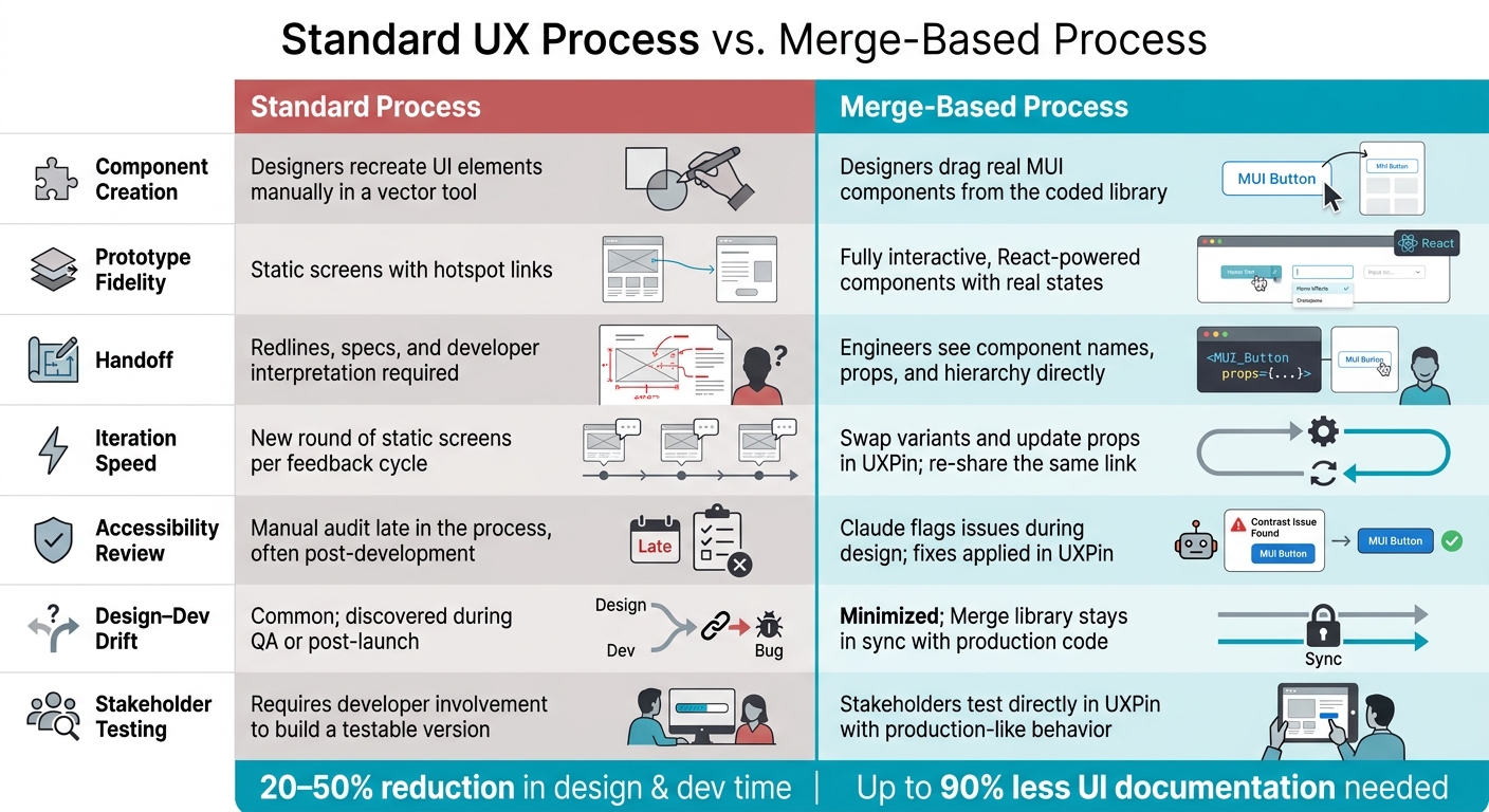
This level of ownership is a perfect match for UXPin Merge. It allows designers to work with real, functional components like Buttons, Dialogs, and Forms – the same ones developers use in production. This alignment bridges the gap between design and development, ensuring consistency throughout the process. By integrating shadcn/ui into your UXPin Merge setup, you can make the most of this synergy.
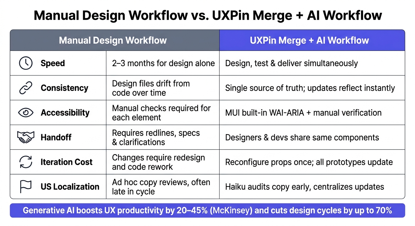
"It used to take us two to three months just to do the design. Now, with UXPin Merge, teams can design, test, and deliver products in the same timeframe." – Erica Rider, UX Architect and Design Leader
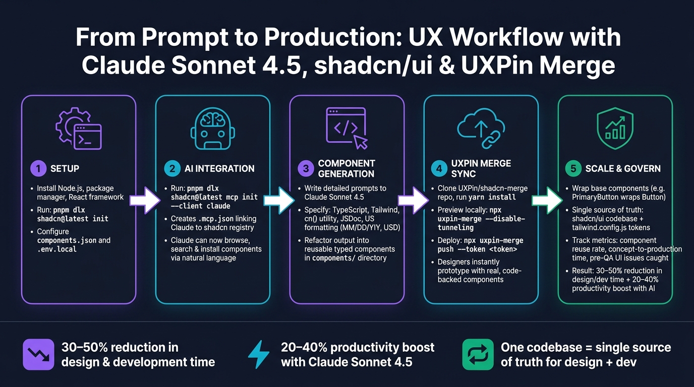
How to configure shadcn/ui in UXPin Merge

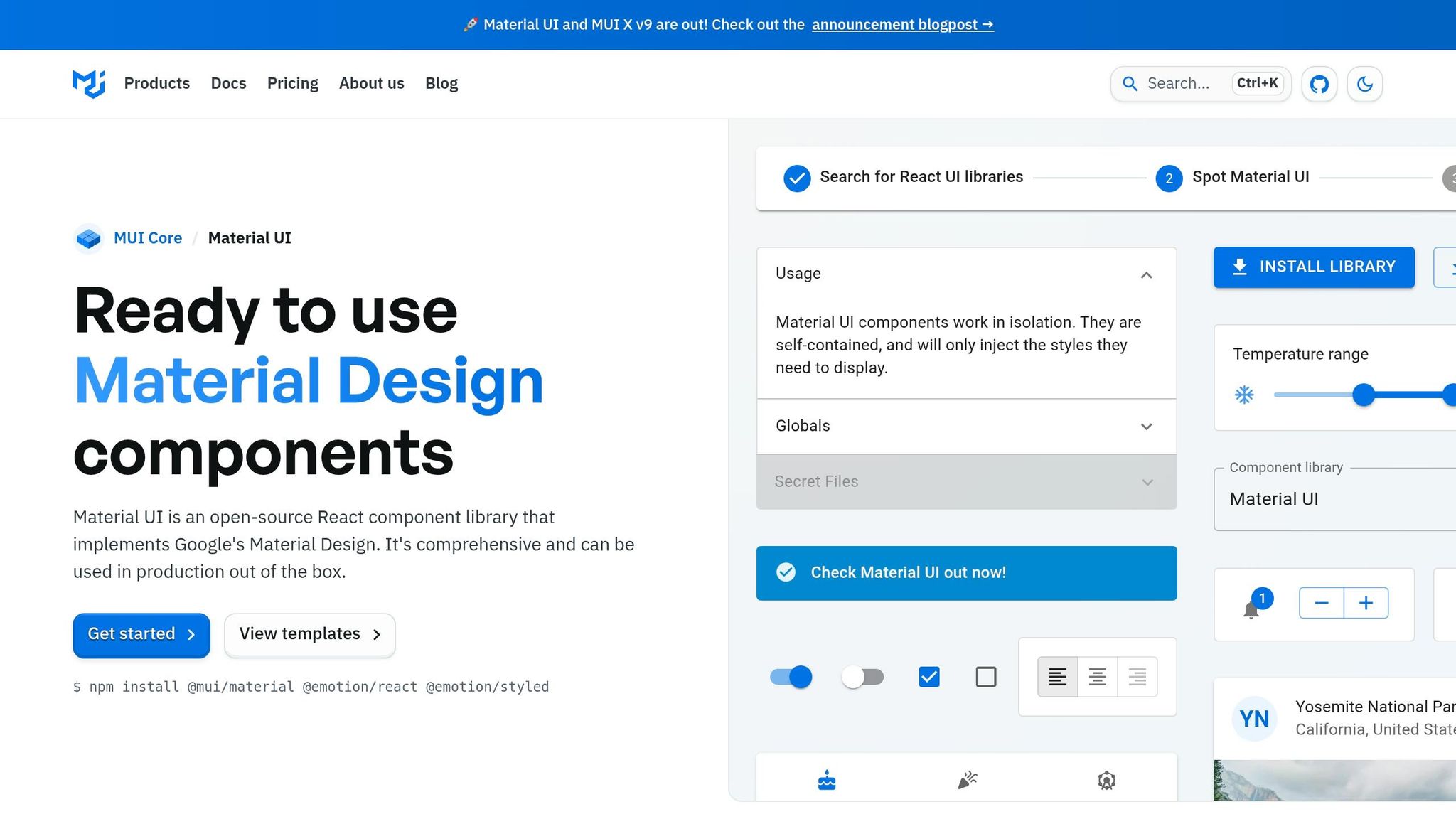
If you’re using UXPin’s built-in shadcn/ui library, you’re in luck – it’s already available in the UXPin editor for all paid plans. Simply open your project, locate the library, and start designing.
For teams working with a custom version of shadcn/ui that includes brand-specific components or tokens, you’ll need to connect it via the Merge CLI. Here’s how:
- Clone and install the boilerplate: Begin by cloning the boilerplate repository. Then, run
yarn installto set up Radix UI and Tailwind dependencies. - Configure your key files: Make sure these three files are properly set up:
[uxpin.config.js](https://www.uxpin.com/docs/merge/config-file/)to handle component exports.tailwind.config.jsfor styling configurations.components.jsonto manage paths and style settings.
- Test locally before pushing: Use
npx uxpin-merge --disable-tunnelingto test your setup in Experimental Mode. Confirm that Tailwind styles and Radix UI interactions work as expected. Once everything looks good, push your library usingnpx uxpin-merge push --token <your UXPin library token>. Add the--branchflag if you want to avoid overwriting the main library.
How to structure components for team-wide consistency
Once shadcn/ui is configured, organizing your components effectively is key to maintaining consistency across your team. A good approach is to group components into four categories: forms, navigation, layout, and feedback. This structure mirrors how designers think about building interfaces, making it easier for everyone – especially new team members – to find what they need.
To keep your design system unified, use a themes.js file to centralize fonts and global styles. Tailwind’s configuration should serve as the single source of truth for colors, spacing, and typography. When both designers and developers rely on the same settings, you eliminate the risk of design drift – where prototypes and production start to look mismatched. Centralized theme management also simplifies implementing light and dark modes without duplicating work or logic.
sbb-itb-f6354c6
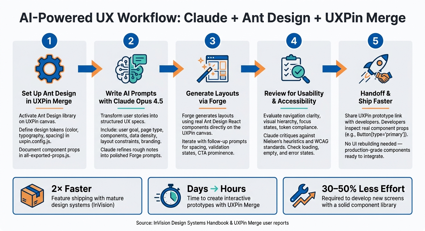
Using Claude Haiku 4.5 with Forge to Speed Up UX Design

How Claude Haiku 4.5 improves design workflows
By integrating shadcn/ui through Merge, you can leverage UXPin Forge to create complete layouts quickly. Forge, UXPin’s built-in AI assistant, works seamlessly with Claude Haiku 4.5, enabling you to generate layouts directly on the canvas using your actual shadcn/ui components.
With Claude Haiku 4.5, you can produce layouts almost instantly, allowing you to explore multiple design options within a single session. Just describe your requirements, and Forge will place the right components with accurate props. It also excels at maintaining context throughout your session, so follow-up prompts like "make the CTA primary and disable it until the form is valid" are applied directly to the existing layout – no need to start over.
According to UXPin, teams using Merge report up to 10× faster prototyping compared to building UI from scratch. Forge takes this efficiency even further by eliminating the manual assembly step, creating a smooth bridge between design and development.
Step-by-step: Generating UX with Forge and shadcn/ui
Here’s a straightforward guide to help you use Forge effectively with shadcn/ui:
- Set your library: In Forge, ensure the Library pill is set to your shadcn/ui Merge library. This ensures Claude Haiku 4.5 uses your code-backed components instead of generic placeholders.
- Start with a focused prompt: Tackle one section at a time. For example: "Generate a shipping address form using my shadcn/ui Input, Select, and Button components. Stack fields vertically on mobile, two columns on desktop."
- Refine with follow-ups: Once the layout is on the canvas, use specific prompts to tweak states and variants. For instance: "Apply the ‘outline’ variant to secondary actions and show an error state on the ZIP code field for invalid input."
- Check responsiveness: Ask Forge to optimize layouts for various breakpoints, e.g., "Adapt this for a 320px mobile screen and a 1,440px desktop."
- Polish and lock: Use Forge’s UX Review feature to evaluate clarity, hierarchy, and accessibility. Once satisfied, lock key components and document props for your development team.
Because Forge pulls components directly from your Merge-connected shadcn/ui library, the layouts it generates are ready for production right away.
How to prompt Claude for U.S.-specific UX patterns
To build efficient prototypes while adhering to U.S. UX standards, make your prompts as explicit as possible. Claude Haiku 4.5 reliably follows formatting rules when they’re clearly defined.
For instance, when designing a checkout or payment screen, you could use a prompt like: "Generate a U.S. e-commerce checkout page using my shadcn/ui components. Show prices in U.S. dollars with a leading dollar sign and two decimal places (e.g., $1,299.99). Use comma separators for thousands. Include separate line items for subtotal, estimated tax, and order total." Similarly, for address forms, you might say: "Use separate fields for street address, apartment/suite (optional), city, a U.S. state dropdown with two-letter abbreviations (CA, NY, TX), and a 5-digit ZIP code field. Use my Select component for the state field."
Here’s a quick reference table for common U.S. formatting needs:
| Formatting need | Prompt instruction to include |
|---|---|
| Currency | "Display amounts in USD with a $ prefix and two decimal places, e.g., $49.99" |
| Dates | "Use MM/DD/YYYY format, e.g., 06/02/2026" |
| Time | "Show times in 12-hour format with AM/PM, e.g., 3:30 PM" |
| Phone numbers | "Format phone numbers as (555) 555-1234" |
| Measurements | "Use imperial units: miles, feet, pounds, and Fahrenheit" |
Keeping a saved prompt library for recurring flows like checkout, sign-in, onboarding, and dashboards can save your team a lot of time while ensuring consistency across projects.
Building a Component-Driven UX Flow in UXPin Merge
Example UX Flow: A U.S. E-Commerce Checkout
Let’s walk through how Forge can streamline a U.S. e-commerce checkout flow. This process is one of the trickiest UX patterns to perfect, as it involves multiple steps, validation rules, and formatting standards that U.S. shoppers expect.
You can use Forge to generate the entire checkout sequence, covering key stages like the cart summary, shipping address, payment details, and order confirmation. Since your shadcn/ui library is integrated via Merge, every element Forge places – like Input, Select, Button, Card, or Separator – is the exact React component your developers will deploy. For instance, the cart summary should show properly formatted prices, including a subtotal, estimated tax, and the order total, all tailored for U.S. conventions.
The shipping form should include fields for a street address, an optional apartment or suite field, city, a state dropdown (Select) with two-letter abbreviations, and a 5-digit ZIP code field. For the payment step, you’ll need fields for the card number, expiration date (MM/YY), and CVV, all built using shadcn/ui’s Input. Add a Checkbox for saving card details and a primary Button labeled "Place Order." These components will behave as they would in production, with interactive states like hover, focus, and disabled. This example applies earlier principles to create a complete, cohesive flow.
Configuring Props, Variants, and Interactions
Once the layout is set, you can fine-tune component properties to create a polished, interactive experience. In the UXPin editor, you can adjust component props without writing any code. For example, you can switch a Button from the default to destructive variant, toggle an Input into an error state, or disable a field entirely. These adjustments use the same props the components accept in React.
For error handling, configure the ZIP code Input to display an error state with helper text like "Please enter a valid 5-digit ZIP code." To ensure responsive design, apply Tailwind utility classes to adjust the layout: a single-column stack for mobile (320px) and a two-column grid for desktop (1,440px). You can even test the entire flow in both light and dark modes using shadcn/ui’s built-in theme switching. This is particularly useful for teams building apps that adapt to user system preferences. These configurations enhance the consistency between design and development.
"It used to take us two to three months just to do the design. Now, with UXPin Merge, teams can design, test, and deliver products in the same timeframe." – Erica Rider, UX Architect and Design Leader
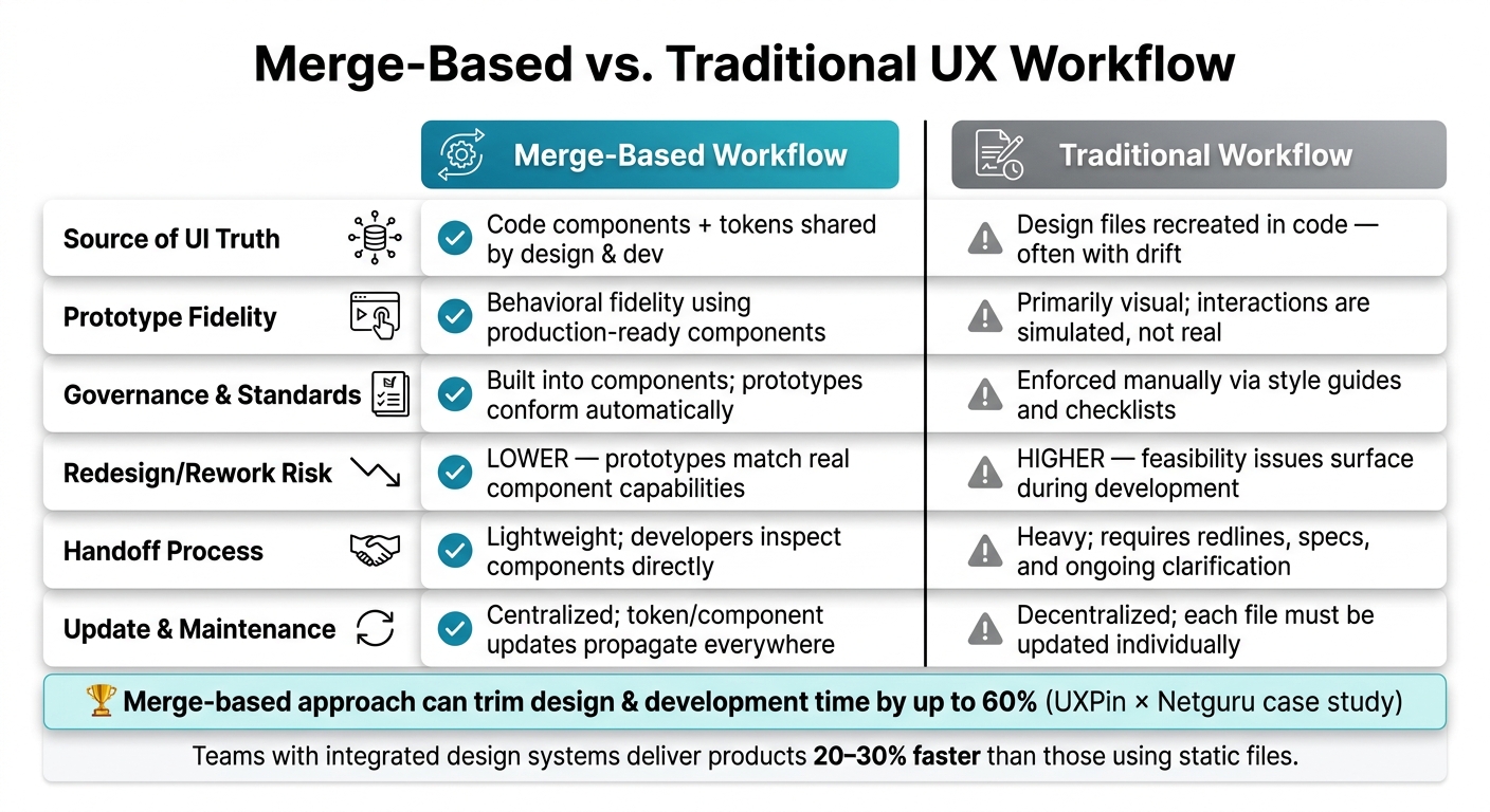
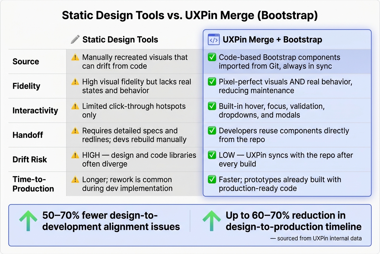
Keeping Design in Sync with Production Code
One of the standout advantages of UXPin Merge is how it keeps the design flow aligned with the actual production code. When developers update a shadcn/ui component in the Git repository and push it using npx uxpin-merge push --token <your-token>, the change automatically syncs to the UXPin library. This ensures designers always work with the latest version of every component, not an outdated snapshot.
This seamless sync eliminates one of the biggest challenges in design: the disconnect between what’s designed and what’s built. The uxpin.config.js and tailwind.config.js files control how components and styles appear in the editor, so any structural or styling updates made in the code are instantly visible to the design team. This creates a shared source of truth that both designers and developers can rely on throughout the product’s lifecycle.
Keeping Design and Development Aligned with Merge
How Merge keeps design and development in sync
Merge ensures that design and development work seamlessly together by automatically updating the UXPin library. The real strength of Merge lies in its ability to make every prototype an exact replica of a production component. When designers use real shadcn/ui components to build prototypes, developers instantly recognize every element – including its name, properties, and behavior. This eliminates the need for guesswork around spacing, interaction states, or variant logic because the prototype is the production component.
This approach resolves common handoff challenges like visual inconsistencies, missing interaction details, and mismatched component states. A 2022 UXPin resource on Merge highlighted that teams leveraging code-based design systems experience faster design-to-development cycles and fewer errors stemming from discrepancies between design files and coded components. Supporting this, the 2023 State of Design Systems report revealed that 78% of organizations with mature design systems maintain a unified source of truth that bridges design and code.
Best practices for managing a scalable design system
While Merge streamlines synchronization, maintaining a scalable design system is key for ensuring long-term consistency. A robust design system thrives on a well-documented, minimal set of components that are easy to maintain and consistently applied. As your shadcn/ui library expands within Merge, adopting a few practical strategies can help prevent fragmentation.
- Assign a cross-functional team to oversee updates. A small team, ideally one designer and one engineer, should handle component updates, additions, and deprecations. This ensures that every change in Merge is accurately reflected across the team.
- Use semantic versioning. Version your library, tag breaking changes, and communicate updates clearly so designers are aware of any shifts in a component’s API.
- Leverage design tokens. Incorporate tokens for color, spacing, typography, and border radius directly into your Tailwind configuration. This ensures all shadcn/ui components inherit these styles automatically. When a token is updated, connected components update across both design and production.
Tools like Claude Haiku 4.5 can also assist in maintaining your system. For instance, you can use it to generate component usage guidelines, suggest variant names, or flag inconsistencies between new components and existing patterns. While it’s a helpful starting point for governance, it’s not a substitute for thorough human oversight.
Building U.S. UX conventions into your design system
To further streamline workflows, you can embed U.S.-specific UX conventions directly into your components. Localization goes beyond translating text – it involves encoding proper field structures, formats, and validation rules into your shadcn/ui components, so designers don’t have to manage these manually.
Research on e-commerce forms reveals that 20–60% of users make errors on address and payment forms. Standardized, well-labeled components help reduce these mistakes and improve form completion rates. Below is a table of key U.S. conventions to include in your Merge library:
| Component | U.S. Convention |
|---|---|
| Address form | Street Address, optional Apt/Suite, City, State (2-letter abbreviation), ZIP Code (5 or 9 digits) |
| Date input | MM/DD/YYYY format, with input mask or helper text |
| Currency field | Dollar sign ($), two decimal places, thousands separator (e.g., $1,299.00) |
| Phone number | (XXX) XXX-XXXX format, with input mask |
| ZIP code validation | 5-digit ZIP required; optional 4-digit extension (ZIP+4) |
Conclusion: Building Scalable UX with Claude Haiku 4.5, shadcn/ui, and UXPin Merge
Key takeaways
Claude Haiku 4.5, shadcn/ui, and UXPin Merge work together to remove the usual roadblocks between design and development by using real, production-ready components. Designers can rely on the exact components that will appear in production, while developers receive prototypes that perfectly align with the codebase. With AI-powered Forge, layouts are created within the boundaries of your actual design system, preventing mismatched patterns or components that don’t exist. This seamless integration ensures that every design decision directly impacts production, effectively closing the gap between designers and developers.
By embedding U.S.-specific conventions directly into your shadcn/ui components, localization becomes a natural part of the design process. This approach not only speeds up the creation of new flows but also simplifies the handoff process, ensuring consistency and efficiency across the board.
These practices enable smooth integration and set your team up for success from the start.
Next steps to get started
Ready to streamline your design workflow? Start by cloning the shadcn-merge boilerplate repository. Run yarn install to set up the necessary configuration files, including uxpin.config.js and tailwind.config.js. Then, use npx uxpin-merge --disable-tunneling to launch Experimental Mode and preview how your shadcn/ui components behave on the canvas. Once you’re satisfied, sync your code-backed components to UXPin by running npx uxpin-merge push --token <your UXPin library token>. For teams working on updates, the --branch flag allows you to test new patterns without impacting your primary design system configuration.
Once everything is set up, open Forge in UXPin to start generating designs. There’s no need for a separate Claude account or additional AI subscriptions – Forge operates directly within the UXPin canvas, powered by Claude Haiku 4.5. To find a pricing plan that suits your team, visit uxpin.com/pricing.
UXPin Merge AI: Smarter UI Generation That Follows Your Design System
FAQs
What’s the best way to keep my shadcn/ui components synced between Git and UXPin Merge?
To keep your shadcn/ui components aligned between Git and UXPin Merge, leverage Git integration to ensure a unified source of truth. Make sure your components are backed by code in your repository, and use the Merge CLI to push updates.
Here’s the command to push your library using your authentication token:
npx uxpin-merge push --token <your-token> For a more streamlined process, you can automate updates by using CI/CD tools like GitHub Actions to trigger pushes whenever code changes are made.
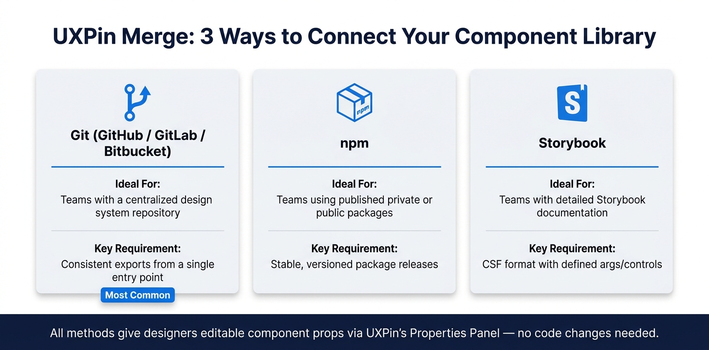
How do I get Forge to use my Merge library components instead of generic UI?
To integrate your custom Merge library components into UXPin Forge, start by syncing your repository or package with UXPin Merge. You can do this through Git, npm, or Storybook. Make sure your project includes a uxpin.config.js file in the root directory – this file specifies which components should be used. Once connected, Forge will automatically prioritize your verified, code-based components over standard UI elements when creating layouts.
How can I bake U.S. formats (USD, MM/DD/YYYY, (555) 555-1234) into my components?
To use U.S. formats in your components, take advantage of UXPin Merge’s code-backed React components. You can implement JavaScript internationalization tools like Intl.NumberFormat for handling currency, Intl.DateTimeFormat for formatting dates, and custom masks for phone numbers. When these components are synced using the Merge CLI, all the formatting logic remains functional. This setup allows you to configure and test these formats as adjustable props right within the UXPin properties panel.