Andrew is the CEO of UXPin, leading its product vision for design-to-code workflows used by product and engineering teams worldwide. He writes about responsive design, design systems, and prototyping with real components to help teams ship consistent, performant interfaces faster.
Ensure Inclusive Designs with an Accessibility Color Contrast Checker
Creating a website or app that everyone can use isn’t just a nice-to-have—it’s essential. Many designers overlook how color choices impact users with visual impairments, but meeting accessibility standards can make a huge difference. Tools that evaluate color pairings for WCAG compliance are game-changers for building inclusive digital experiences.
Why Contrast Matters in Design
Good contrast between text and background ensures readability for all users, including those with low vision or color blindness. The Web Content Accessibility Guidelines (WCAG) set clear benchmarks, like a minimum 4.5:1 ratio for standard text under AA level. Falling short can alienate users and even lead to compliance issues for businesses or public entities. Testing your palette with a reliable utility helps spot problems before they become barriers.
Beyond Compliance: Better User Experience
Accessible design isn’t just about ticking boxes. When you prioritize visibility, you’re crafting a better experience for everyone—think clearer buttons, readable menus, and intuitive interfaces. A quick check of your color scheme can reveal easy fixes that elevate your work. So, whether you’re tweaking a site or starting fresh, make inclusivity a core part of your process with the right resources at hand.
FAQs
What is a good color contrast ratio for accessibility?
A good contrast ratio depends on the context. For normal text, WCAG AA requires at least 4.5:1, while AAA bumps that up to 7:1. For large text or graphical elements, AA needs 3:1 and AAA needs 4.5:1. These ratios ensure that people with visual impairments can still read or interact with your content. Our tool breaks it down clearly so you don’t have to crunch the numbers yourself!
Why does color contrast matter for web design?
Color contrast is huge for making websites usable by everyone. Poor contrast can make text or buttons hard to see for folks with low vision, color blindness, or other impairments. Beyond that, it’s often a legal requirement for public-facing sites to meet accessibility standards like WCAG. Using a tool like this ensures your designs are inclusive and compliant without guesswork.
Can I trust the results of this contrast checker?
Absolutely! Our tool sticks strictly to WCAG formulas for calculating contrast ratios, so you’re getting accurate, reliable results. We test across different criteria—normal text, large text, and graphical elements—and provide pass/fail feedback for both AA and AAA levels. Plus, if a combo doesn’t work, we suggest alternative shades to help you nail accessibility.
Unlock Creativity with a UI Design Inspiration Tool
Designing a user interface that stands out can be tough, especially when you’re staring at a blank canvas. That’s where a smart design idea generator comes in handy. It’s not just about throwing random suggestions at you—it’s about tailoring concepts to your specific needs, whether you’re crafting a sleek e-commerce platform or a quirky gaming app. By factoring in your industry, preferred aesthetic, and color choices, this kind of tool helps you break through creative blocks with ease.
Why Custom UI Ideas Matter
Every project has unique demands. A healthcare app needs trust-building simplicity, while a gaming interface might call for bold, immersive visuals. Relying on generic templates won’t cut it if you want to leave a lasting impression. With a tool that personalizes design sparks, you’re not just saving time—you’re ensuring relevance. Imagine getting layout tips, typography pairings, and visual cues that actually match your goals. It’s like having a design mentor on speed dial, guiding you toward interfaces that resonate with your audience and elevate your work.
FAQs
How does the UI Design Inspiration Generator come up with ideas?
Great question! Our tool uses a curated database of design trends and patterns, built from real-world UI examples and expert insights. When you input parameters like industry or style, it matches those to relevant design elements—think layouts, fonts, or visual motifs. The result is a set of concepts that align with your needs, not just random guesses. It’s like having a design brainstorm buddy who’s always got fresh ideas up their sleeve.
Can I use these design concepts for commercial projects?
Absolutely, you can! The concepts from our generator are meant to inspire, so feel free to use them as a foundation for your commercial work. Just remember, these are starting points—add your unique touch to make them truly yours. If you’re pulling in specific elements like color combos or layouts, tweak them to fit your brand. We’re here to spark ideas, not to hand over finished designs.
What if the generated ideas don’t match my vision?
No worries at all! If the concepts don’t quite hit the mark, try adjusting your inputs—maybe switch up the style or color palette. Our tool thrives on specific details, so the more precise you are, the better the output. Still not feeling it? Run it again for a new batch of ideas. Think of this as a creative playground; experiment until something clicks for you.
Inamo, a leading platform for qualitative research, has unveiled a new version of its AI-powered research suite designed specifically for innovators in the Nordic region. Announced on January 6, 2026, the Nordic Edition of the Smart Launch Technology aims to streamline qualitative research for UI/UX agencies, freelancers, and startups in Sweden, Denmark, Norway, and Finland.
The new suite addresses the growing demand for AI-driven UX research in the Nordic market, where AI adoption in UX jumped by 32% year-over-year, and remote qualitative research projects increased by 41% between 2023 and 2024. The platform introduces several region-specific features to meet these trends, including culturally tailored recruitment and local language support.
Features Customized for the Nordics
Inamo’s Nordic Edition introduces tools optimized to meet the unique needs of the region. Key features include:
Nordic-Optimized Recruitment Engine: With access to a pool of over 50,000 pre-vetted participants from Nordic countries, the suite ensures culturally relevant feedback with an impressive 95% match accuracy.
AI Transcription in Local Languages: The platform offers real-time transcription and analysis in Swedish, Danish, Norwegian, and Finnish with a claimed accuracy of 98%, providing deeper insights into user behavior.
GDPR-Enhanced Unified Dashboard: Teams can manage moderated and unmoderated qualitative research, perform AI-powered thematic analysis, and generate export-ready reports within a single platform.
Flexible Pricing Plans: The platform caters to a broad range of users, from freelancers to larger teams. Pricing starts with a free Freelance plan for one project per month, scaling to €149/month for teams and €499/month for growth-oriented businesses.
Fredrik Mattsson, CEO of Inamo, emphasized the importance of the platform’s speed and depth for innovation leaders in the region. "In the Nordic innovation hubs, from Stockholm’s tech scene to Copenhagen’s design leaders, speed and depth win", Mattsson said. "Our Qualitative Research Intelligence turns complex user data into actionable stories, helping teams boost conversions by up to 400% as proven in top product launches."
sbb-itb-f6354c6
A Qualitative-First Approach for SMBs and Freelancers
Unlike many tools that focus heavily on quantitative insights, Inamo’s research suite prioritizes qualitative data, combining human expertise with AI to deliver actionable insights. The platform’s user-friendly design and focus on accessibility make it particularly valuable for small and medium-sized businesses (SMBs) and freelancers. Early adopters in Nordic UX agencies have reported faster deployment of projects and higher-quality insights.
The Nordic Edition is available immediately and can be explored with a 14-day free trial for interested users.
Inamo is an all-in-one qualitative research platform designed for UI/UX professionals, freelancers, and market research firms. With a strong focus on GDPR compliance and AI-powered capabilities, the company specializes in delivering deep user insights that cater to local contexts across the Nordics and beyond.
For more information, visit Inamo’s website or connect with their team.
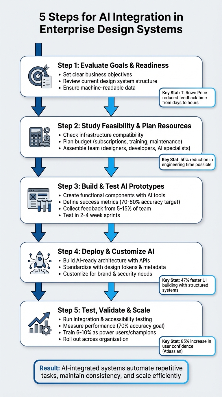
AI can revolutionize enterprise design systems by automating repetitive tasks, improving design consistency, and bridging gaps between design and development. Here’s how to get started:
Set Goals and Assess Readiness: Identify challenges like reducing manual work or improving team alignment. Ensure your design system is well-structured and machine-readable.
Plan Resources: Evaluate tool compatibility, infrastructure, and budget. Prepare for costs like subscriptions, training, and long-term maintenance.
Build Prototypes: Use AI tools to create functional components. Test for accuracy and efficiency while collecting team feedback.
Deploy AI: Standardize your system with clear rules, metadata, and APIs. Tailor AI outputs to match your brand and security needs.
Test and Scale: Validate AI-generated components, measure performance, and gradually roll out across teams with proper training and version control.
AI tools like UXPin Merge can create code-backed components, saving time and reducing errors. For example, Atlassian achieved a 70% accuracy rate in UI replication and improved team confidence by 85%. By following these steps, you can streamline workflows and maintain consistency as your organization grows.
5-Step Process for AI Integration in Enterprise Design Systems
Step 1: Evaluate Your Goals and Design System Readiness
Set Clear Business Objectives
Start by identifying the specific challenges your business is trying to address. Are you aiming to cut down on manual tasks? Accelerate workflows? Ensure design consistency across teams? Each of these goals may require a different AI strategy.
Take T. Rowe Price as an example. Under the guidance of Sr. UX Team Lead Mark Figueiredo, the company adopted code-backed prototyping to address delays in feedback loops. This change reduced feedback time from days to just hours, ultimately saving months on their project timelines.
Your goals should directly tie to measurable results. For instance, if faster time-to-market is your priority, AI can help by generating code-backed UI components from text prompts. If reducing costs is your focus, implementing code-backed design systems could cut engineering hours by up to 50%. These efficiencies can lead to substantial savings, especially when managing large teams of designers and engineers.
Once your objectives are clear, the next step is to evaluate whether your current design system is ready to support AI integration.
Review Your Current Design System
AI thrives on structured, machine-readable data.
Before diving into AI integration, it’s important to understand what is AI ready data and how it differs from loosely documented assets. Take a close look at your design system’s structure, naming conventions, and documentation quality. A well-organized system minimizes errors and maximizes AI’s potential.
Start with a UI inventory. Catalog all reusable components, colors, text styles, and patterns to pinpoint inconsistencies. AI tools often struggle with poorly organized systems – for example, when button variants have inconsistent names or when design tokens don’t align between design files and production code. Diana Wolosin, author of Building AI-Driven Design Systems, emphasizes:
“Design systems must evolve into structured data to be useful in machine learning workflows”.
A great example of preparation comes from Atlassian’s Design System team. In November 2025, under the leadership of Lead Design Technologist Lewis-Ethan Healey, they created 2,000 lines of custom instructions and converted their top-navigation options into JSON. This hybrid approach of templates and structured data enabled AI to replicate their design standards with about 70% accuracy in one attempt. Without such groundwork, AI might produce errors like referencing non-existent APIs or component names.
To make your system machine-readable, ensure each component includes metadata, such as props, states, variant logic, accessibility tags, and usage rationale. Additionally, review your documentation format. Modular, “atomic documentation” – small, context-rich units tied directly to components – works far better for AI than lengthy, monolithic guides.
AI that knows (and uses) your design system
Step 2: Study Feasibility and Plan Your Resources
Once your objectives are clear and your design system is in place, it’s time to assess your infrastructure and map out the resources needed for integrating AI effectively.
Check Infrastructure and Tool Compatibility
Before diving in, make sure your technical setup can handle AI integration. The foundation for success lies in three key areas: a unified data structure, API-first connectivity for real-time AI interactions, and a modular architecture built on microservices.
Select design tools that support code-backed components and AI-driven features. For instance, UXPin pairs well with React component libraries and offers AI-powered component creation through its Merge feature. Your team should also be comfortable working with tools like VSCode, Node.js, and frameworks such as React, JSX, and CSS libraries like Tailwind or MUI.
Plan Your Budget and Resources
Budgeting for AI integration involves more than just tool subscriptions. Factor in platform fees, API costs, staffing, training, and long-term maintenance.
For example, UXPin Merge and its AI Component Creator require subscriptions and API keys, which come with usage-based costs. You’ll also need to invest in a diverse team of designers, front-end developers, and AI specialists. Additionally, allocate time for training on topics like component-based design, design tokens, and setting up the development environment.
Organizations relying on separate design and code libraries should prepare for higher maintenance expenses, though full AI-code integration can significantly reduce these costs. Larry Sawyer, Lead UX Designer, highlighted this efficiency:
“When I used UXPin Merge, our engineering time was reduced by around 50%. Imagine how much money that saves across an enterprise-level organization with dozens of designers and hundreds of engineers”.
Start small with a pilot project. Conduct an audit of your UI to pinpoint components that could benefit from AI automation. Define your design tokens early to ensure consistent branding throughout the process.
Step 3: Build and Test AI Prototypes
This is where your planning takes shape. By building prototypes, you can bring AI concepts to life, test their functionality, and refine them for real-world application.
Create Prototypes with AI Features
Start by building prototypes that highlight AI capabilities aligned with your business goals. Use tools like UXPin’s AI Component Creator combined with React libraries such as MUI or Tailwind to create functional components. These prototypes should mimic real-world scenarios, not just serve as proof-of-concept models.
Focus on components that offer the most value when automated by AI – think buttons, forms, cards, or navigation elements. Generate multiple variations of these components, ensuring they adhere to your design tokens and branding guidelines. This process helps you evaluate how well AI-generated elements align with your design language and where manual adjustments might be needed. It’s worth noting that 25% of all new code is currently AI-generated, so your prototypes should explore how this trend could enhance efficiency in your workflow.
Define Success Metrics
Once your prototypes are ready, it’s time to measure their effectiveness.
Establish clear metrics to evaluate both the quality of AI-generated outputs and the overall impact on team efficiency. For quality, aim for 70–80% component accuracy on the first generation. This means the components created by AI should closely match your design system standards with minimal rework.
On the productivity side, benchmark your current design timelines over a four-week period. Then, set measurable goals like reducing design time by 40–60%, speeding up component creation by 75–85%, and cutting iteration cycles from 5–6 rounds to just 2–3 rounds. These benchmarks will help you determine whether integrating AI truly streamlines your processes.
Collect Stakeholder Feedback
Feedback is crucial for refining your prototypes and improving your AI integration.
Test your prototypes with 5–15% of your team, ensuring a mix of skill levels and roles rather than only involving advanced users. This diverse group will help uncover usability issues across different workflows. Gather input from designers on component quality and ease of customization, developers on code accuracy and integration, and business stakeholders on strategic alignment.
Conduct evaluations in 2–4 week sprints. Given how quickly AI technology evolves, shorter feedback cycles allow for faster adjustments. Use tools like Airtable, Google Analytics, or Mixpanel to track usage patterns, completion times, and accuracy rates. Document what’s working, what isn’t, and where manual intervention is still required. These insights will guide your deployment strategy in the next phase.
sbb-itb-f6354c6
Step 4: Deploy and Customize AI Integration
Integrating AI into your design system’s infrastructure is the next step to transform your prototypes into scalable, production-ready tools. After validating your prototypes, it’s time to embed these AI solutions into your enterprise environment.
Build an AI-Ready Architecture
For AI to work seamlessly with your design system, it needs structured, machine-readable data – not just visual libraries. This shift allows AI to better understand and interact with your system, enabling smoother machine learning workflows.
Start by creating a consistent framework with naming conventions, design tokens, and component behaviors that machines can easily interpret. Make these elements accessible through API endpoints. Your architecture should provide design tokens, component structures, and documentation via APIs or through the Model Context Protocol (MCP). MCP, a growing standard, allows AI agents to query your system directly instead of relying on static style guides.
This structured foundation builds upon earlier efforts to standardize design tokens and metadata. Each component should include detailed metadata that outlines design intent, such as states, props, accessibility requirements, and platform constraints. This level of detail helps minimize AI errors and confusion. As Pierre Bremell explains:
“If the structure of your system is not consistent and machine-readable, tools like Cursor will fail to understand it”.
The benefits of this approach are clear. For instance, developers working with structured systems like IBM’s Carbon Design System reported building UIs 47% faster compared to starting from scratch – even without AI assistance.
Adapt AI for Enterprise Needs
Once your architecture is AI-ready, the next step is to tailor the AI outputs to align with your enterprise’s unique brand and security requirements.
Generic AI outputs won’t meet the demands of enterprise-scale operations. Customize AI-generated components to adhere to your organization’s branding, design standards, and security protocols. Using open-source libraries such as MUI, Ant Design, or Tailwind can provide a solid starting point, ensuring the generated code follows industry practices.
Ensure AI generates components using your predefined enterprise themes instead of generic inline CSS. This approach maintains brand consistency across thousands of components and prevents style inconsistencies. Align design tokens across tools and production code to eliminate mismatches between AI outputs and your system.
Additionally, prioritize AI tools that avoid using your proprietary design data to train external models. To safeguard your system, implement version control and access management workflows. Use linting and anomaly detection tools to catch and address inconsistencies early, preventing them from spreading across your organization.
Step 5: Test, Validate, and Scale Your AI System
Once your AI-ready architecture is deployed, the next step is to thoroughly test and strategically scale your system. This ensures the AI integration operates smoothly and consistently across your organization before rolling it out fully.
Run Integration and User Testing
Testing AI features goes far beyond just checking if they work. Your testing process should include visual regression tests to catch unexpected layout changes, behavioral analysis to see how components react to user interactions, performance profiling to measure load times, and accessibility testing to ensure compliance with WCAG standards.
Incorporate these AI-driven tests directly into your CI/CD pipelines. This way, low-quality components can be flagged and blocked automatically with each code commit. Make sure to validate components across major browsers like Chrome, Firefox, Safari, and Edge to guarantee consistent rendering.
While AI can handle repetitive testing tasks efficiently, human oversight is still essential. Teams should review AI outputs, refine them as needed, and conduct regular fairness audits to ensure inclusivity in AI-generated components. Assign dedicated accessibility champions to oversee compliance and proper labeling. Once testing confirms that everything functions as expected, it’s time to measure performance and fine-tune the system.
Measure Performance and Iterate
Evaluate your AI tool’s performance against predefined metrics. Aim for around 70% design system accuracy on the first pass. To push accuracy higher, shift from open-ended prompts to structured JSON configurations. This approach can drastically reduce errors like logo misplacements or navigation inconsistencies.
Using hybrid templates – pre-coded components combined with AI-generated instructions – can also help minimize errors and improve output quality. Monitor how quickly your teams can create interfaces with AI assistance compared to manual methods, and assess the consistency of the generated components. If the results don’t meet your expectations, adjust configurations or provide additional training data to enhance accuracy. These performance insights will guide you in refining your system before scaling it across the organization.
Roll Out AI Across Your Organization
Scaling AI effectively requires careful planning and solid change management. A well-executed rollout can significantly boost confidence in AI tools. For instance, one initiative led to the creation of production-ready prototypes aligned with design systems, and 85% of participants reported increased confidence in using AI tools.
To support adoption, establish a champions program by training 6% to 10% of your users as power users. These individuals can offer one-on-one training sessions and host office hours to help their colleagues become comfortable with the tools. Set up granular permissions to control who can view and edit the design system, ensuring a single source of truth during the rollout. Use version control to track component changes, manage themes, and coordinate updates across products. Allow teams to develop new components for emerging use cases and contribute them back to the central library through version-controlled releases. This collaborative approach ensures your AI system continues to evolve and meet organizational needs.
Benefits of AI-Integrated Design Systems
Integrating AI into enterprise design systems isn’t just a trend – it’s a game-changer for efficiency, teamwork, and scalability. By weaving AI into the process, organizations are cutting down prototyping time from hours (or even days) to mere minutes. This speed boost allows teams to test and refine ideas faster than ever, keeping projects on track and innovation flowing.
AI also steps in to handle repetitive tasks that typically eat up valuable time. Think resizing components, generating design variants, or updating documentation – AI takes care of these so your team doesn’t have to. This automation addresses what’s often called the “Maintenance Paradox”, where the effort to maintain a system grows faster than the team’s ability to keep up. With AI, this workload becomes manageable, freeing up your team to focus on more strategic, creative work.
Another big win? AI creates a shared, machine-readable language between designers and developers. It keeps an eye on design changes and updates the codebase automatically, eliminating the need for manual handoffs. As Vishwas Gopinath from Builder.io puts it:
“The design system team’s job becomes more strategic. Instead of pushing updates through the pipeline, they define the language of the product while AI handles the housekeeping”.
AI-powered systems also grow with your organization. Unlike traditional systems, which can spiral into “design entropy” as new team members join, AI-integrated systems maintain order through standardized rules that machines can read and enforce. For example, Atlassian’s use of AI not only boosted user confidence but also made design system expertise more accessible across the company.
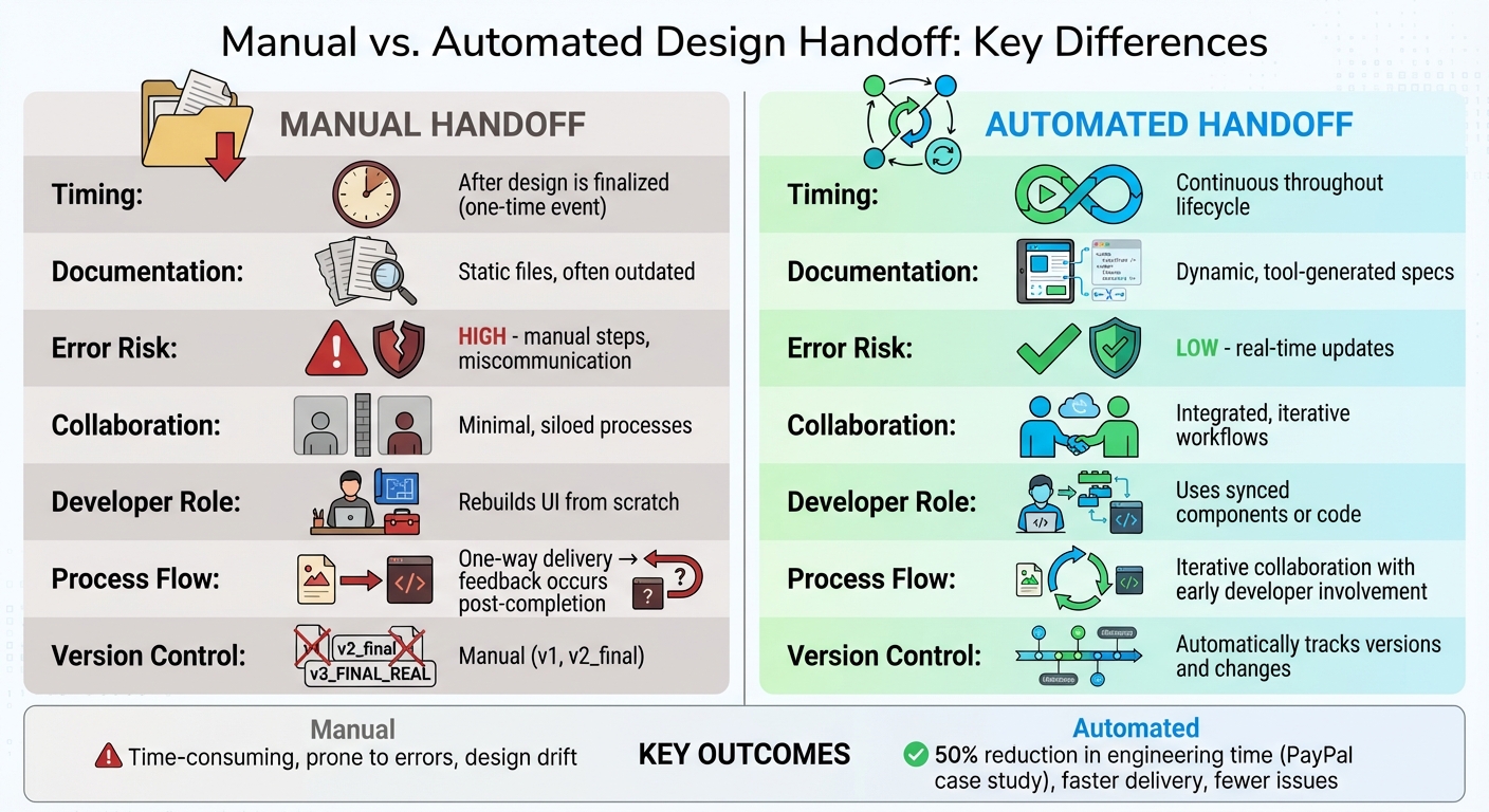
Before and After: Design Systems with AI
Here’s a snapshot of how AI transforms traditional design systems:
Metric/Feature
Traditional Design System
AI-Integrated Design System
Documentation
Often outdated; relies on manual updates
Automatically updated with AI-generated stories and examples
Prototyping Speed
Takes hours or days for high-fidelity flows
Achieved in minutes using visual inputs
Consistency
Suffers from “design drift” as variants multiply
AI enforces design tokens and architectural rules
Handoff Process
Requires manual interpretation of static assets
Seamless, automated code handoffs
Maintenance Effort
Grows faster than team capacity
AI identifies redundancies and handles routine tasks
Scalability
Becomes chaotic with new hires (“design entropy”)
Scales efficiently with machine-readable rules
AI-integrated design systems don’t just improve workflows – they redefine how teams collaborate, adapt, and grow. By automating the tedious parts and standardizing processes, AI allows design teams to focus on what they do best: creating meaningful, impactful designs.
Conclusion
Bringing AI into enterprise design systems calls for careful planning, thorough testing, and thoughtful scaling. This guide outlines five key steps to follow: begin by assessing your goals and the readiness of your system, then study feasibility and allocate resources. Next, focus on building and testing AI prototypes, deploy them with necessary customizations, and finally, validate and scale across your organization. Each phase builds on the previous one, ensuring AI integration is not only functional but also efficient and effective. These steps can lead to real gains in design consistency and operational efficiency.
For example, in November 2025, Atlassian reported a 70% accuracy rate in UI replication and an 85% increase in participant confidence after training nearly 1,000 product designers and managers.
However, without proper standards and execution, “design entropy” can take over – resulting in inconsistent patterns and overwhelming maintenance. AI acts as a safeguard against this chaos, enforcing rules, automating updates, and ensuring alignment across teams.
UXPin offers tools to simplify this process, combining code-backed prototyping with AI-driven design features. Its Merge AI functionality allows teams to work directly with real React components, producing prototypes that are ready for production. This approach eliminates manual handoffs and ensures your design system remains consistent as it scales.
FAQs
How does AI improve design consistency in enterprise design systems?
AI plays a key role in maintaining design consistency by serving as a virtual safety net for enterprise design systems. It works behind the scenes to automatically check components for correct token usage, proper naming conventions, and adherence to spacing rules. When it spots an issue, it flags it immediately and offers suggestions for fixes, cutting down on the manual work needed to keep everything consistent in large-scale projects.
Beyond that, AI can organize design guidelines into searchable knowledge bases, making it simple for teams to locate the right components or patterns when they need them. It can even generate UI elements that align perfectly with brand standards – covering colors, typography, and spacing – so every design stays true to the brand identity. These features allow enterprises to scale their efforts efficiently while delivering a seamless and unified user experience.
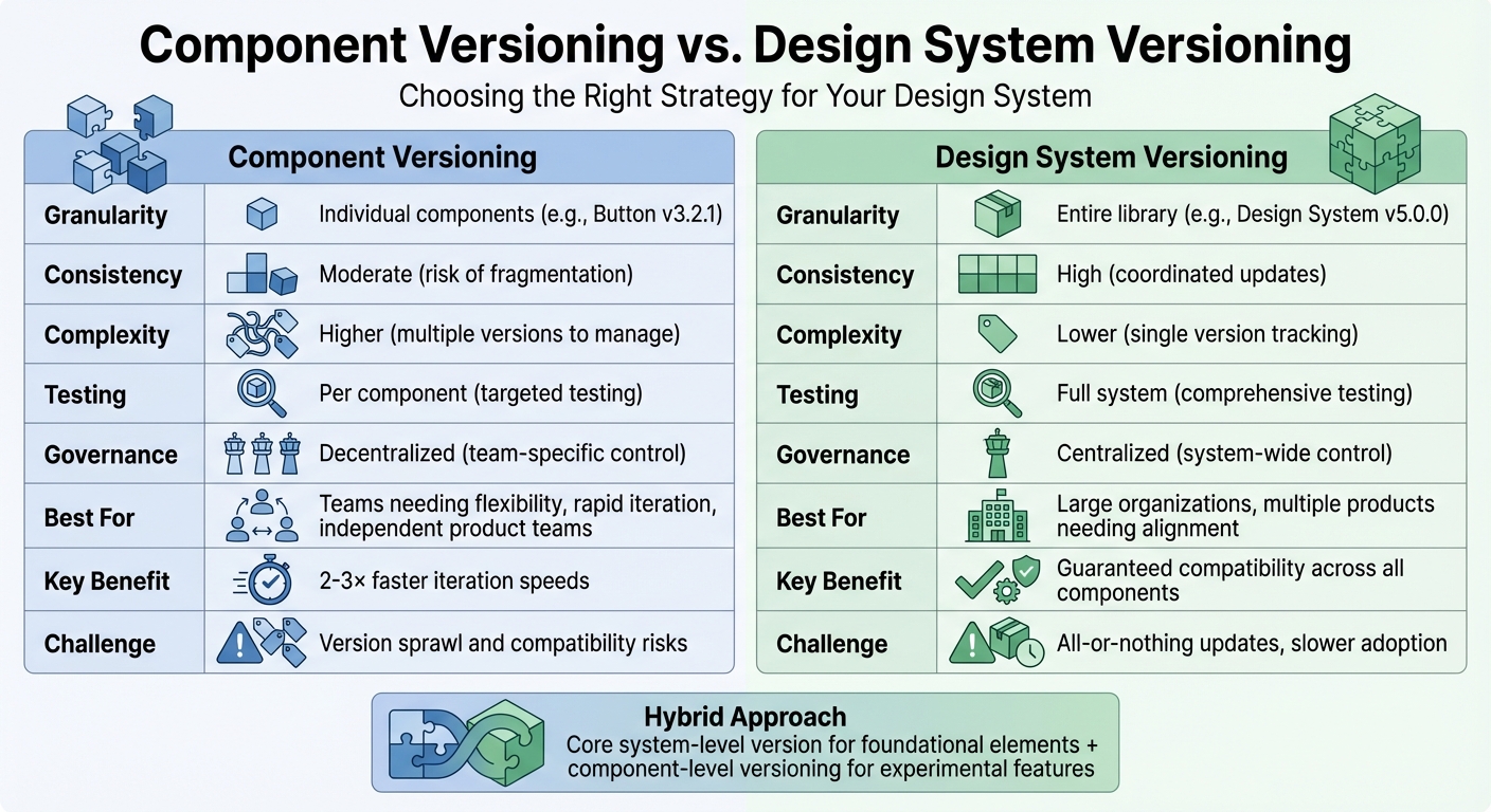
What should I focus on when preparing a design system for AI integration?
To get your design system ready for AI integration, start by focusing on clear governance and organized data management. Stick to consistent versioning methods, like semantic versioning, and keep detailed changelogs. This helps AI tools stay updated and interpret changes accurately. Standardizing naming conventions, token structures, and component behaviors is key to ensuring that AI can effectively work with your design system.
Make sure your design system is built to scale and AI-compatible by adopting flexible, data-driven workflows. Automate repetitive tasks, such as quality assurance, accessibility checks, and even code generation, to save time and improve efficiency. Leverage tools that support code-backed components and offer AI-powered features like automated backups and rollback options to simplify the process. Lastly, bring your teams together with shared objectives and establish clear metrics to track the success of AI implementation as your design system grows.
How can businesses evaluate the success of integrating AI into their design systems?
To gauge how well AI contributes to design systems, organizations should rely on measurable, actionable metrics that highlight improvements in efficiency and return on investment (ROI). Here are a few key areas to focus on:
Time-to-market: Track how quickly new UI features are launched before and after implementing AI. Many teams have reported cutting delivery times by 30–50%, which can make a huge difference in fast-paced industries.
Cost savings: Estimate the developer hours saved by using AI-generated components, then translate those hours into dollar amounts based on your team’s average hourly rate.
System stability: Keep an eye on metrics like the success of AI-driven versioning, the frequency of rollbacks, and quality assurance (QA) pass rates. A system with fewer rollbacks and higher QA success rates reflects greater reliability.
Additionally, gathering feedback from team members on aspects like speed, accuracy, and ease of use can provide deeper insights. Tools such as UXPin make this process easier by offering features to track component reuse, manage version control, and automate workflows. By consistently reviewing these metrics, businesses can clearly see how AI impacts efficiency, reduces costs, and strengthens the overall design system.
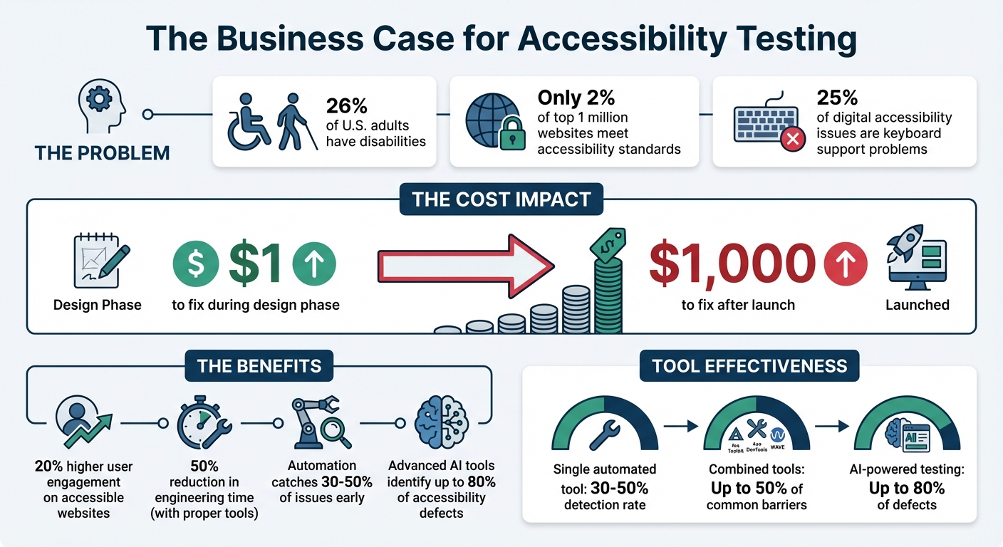
Accessibility testing ensures that digital products are usable for everyone, including the 26% of U.S. adults with disabilities. Yet, only 2% of the top 1 million websites meet accessibility standards, creating a gap that businesses can address. Fixing issues early saves money: $1 during design versus $1,000 after launch. Accessible websites also see 20% higher user engagement.
To make accessibility a priority in design-to-code workflows:
Manual Testing: Use screen readers (VoiceOver, NVDA) and keyboard navigation to ensure usability.
Checklists: Align WCAG 2.1 standards with team roles for structured reviews.
Collaborate: Use tools like UXPin Merge for code-backed prototypes, ensuring accessibility from design through development.
Combining automation, manual testing, and collaboration prevents costly fixes and improves usability for all users.
Accessibility Testing Statistics and Impact in Design-to-Code Processes
How Do You Make Accessibility Testing as Efficient as Possible | Axe-con 2024
Automating Accessibility Testing in the Workflow
Automated accessibility testing is a game-changer for identifying issues that manual reviews might overlook. By embedding these tools into your development workflow – from the initial coding phase to final deployment – you can streamline the process and catch problems earlier. While automation can’t identify every issue (it typically addresses 30–50% of accessibility concerns), it efficiently handles repetitive technical checks, saving your team valuable time and effort. This approach builds a bridge between technical evaluations and the broader design goals.
Overview of Automated Accessibility Testing Tools
Linters like eslint-plugin-jsx-a11y work directly in your code editor, flagging accessibility issues as you write. This ensures potential problems are addressed before they’re committed. Browser extensions such as Axe DevTools, WAVE, and Accessibility Insights analyze rendered pages, catching issues like missing alt attributes or poor color contrast. For CI/CD pipelines, tools like Pa11y CI and axe-core automatically test multiple pages, even blocking pull requests if they detect new accessibility regressions.
Using multiple tools together can improve detection rates. For example, combining Arc Toolkit, Axe DevTools, and WAVE can help identify up to 50% of common accessibility barriers. Additionally, component-driven testing tools like Storybook with the a11y addon allow developers to validate individual UI components before integrating them into larger applications.
By leveraging these tools, automation becomes a powerful ally in improving accessibility throughout the design-to-code journey.
Benefits of Integrating Automation into Design-to-Code Processes
Automation offers three standout benefits: speed, consistency, and early issue detection. Linters provide immediate feedback during the coding phase, while CI/CD tools act as a safety net, ensuring accessibility issues are caught before deployment.
"Automated accessibility testing is a fast and repeatable way to spot some accessibility issues. These tools can be integrated into development and deployment workflows." – Intelligence Community Design System
Instead of manually reviewing every page for basic issues like color contrast or missing form labels, automation handles these checks in seconds. This frees up your team to focus on more nuanced tasks that require human insight – like evaluating the quality of alt text or ensuring logical keyboard navigation. Advanced tools powered by AI and Intelligent Guided Testing can identify up to 80% of accessibility defects, drastically reducing the need for manual testing.
Conducting Manual Accessibility Testing
Automated tools are great for handling technical checks, but they can’t replace the human touch when it comes to ensuring real-world usability. For instance, while these tools can confirm the presence of alt text, they can’t judge whether it’s accurate or helpful. This is where manual testing steps in, especially since around 25% of all digital accessibility issues are related to keyboard support problems. Screen readers might announce page elements, but only a human tester can verify that the reading order is logical or that the content adds meaningful value. Unlike automated checks, manual testing ensures that user interactions feel intuitive and natural.
"Screen reader users are one of the primary beneficiaries of your accessibility efforts, so it makes sense to understand their needs." – WebAIM
Using Screen Readers for Accessibility Validation
Get familiar with popular screen readers like VoiceOver, NVDA, and JAWS. These tools transform a visual interface into a linear, text-based experience, helping you interact with content as a blind user would – relying solely on the source code order rather than the visual layout. This process can reveal problems like mispronounced words, confusing reading orders, or unclear alt text.
VoiceOver comes built into macOS and iOS, NVDA is a free option for Windows, and JAWS – though widely used – costs over $1,000. Windows users also have access to Narrator at no extra cost. When testing, focus on how users navigate between headings, landmarks, and link lists. Check that form labels provide clear context, even when hidden using attributes like aria-label. Also, confirm that focus returns to a logical element after closing modals or menus. If you’re testing on Safari, don’t forget to enable the "Press Tab to highlight each item on a webpage" option in its Advanced Settings.
"Listening to your web content rather than looking at it can be an ‘eye-opening’ experience… that takes sighted users out of their normal comfort zone." – WebAIM
Keyboard Navigation Testing
Building on screen reader testing, keyboard navigation is another critical area to examine. Try using your interface with only a keyboard – this approach quickly highlights any reliance on hover states or click events that could exclude users who depend on keyboards, screen readers, or voice recognition software.
As you test, ensure the focus indicator is always visible. Avoid using CSS rules like outline: none unless you provide an alternative that maintains visibility. Check that the tab order follows a logical sequence and remove any negative tabindex values from elements that should be accessible. Look out for focus traps by verifying users can navigate into and out of menus or modals without getting stuck. When a dialog box closes, make sure the focus returns to the element that triggered it, rather than jumping to the top of the page. Lastly, test "skip navigation" links to confirm they move focus directly to the main content area.
Key
Action
Tab
Moves focus forward to the next interactive element
Shift + Tab
Moves focus backward to the previous element
Arrow Keys
Cycles through related controls (radio buttons, sliders, menus)
Enter
Activates links and buttons
Spacebar
Toggles checkboxes, activates buttons, or scrolls down
Escape
Dismisses dialogs, menus, or dynamic content
sbb-itb-f6354c6
Setting Up Accessibility Checklists and Review Processes
Manual testing is great for catching details that automated tools might miss. But without a structured checklist, even critical issues can slip through the cracks. A well-thought-out checklist keeps your team on the same page and ensures every step of the design-to-code process is covered. Since WCAG 2.1 includes 78 criteria, your checklist should stay flexible and evolve alongside your workflow.
Creating an Accessibility Checklist
Start by aligning WCAG success criteria with specific team roles. For instance, assign designers to handle color contrast checks, developers to validate semantic HTML, and content creators to review alt text. This role-based approach not only clarifies responsibilities but also avoids redundant work.
Your checklist should cover key accessibility elements, such as:
Keyboard navigation
Text scaling up to 200%
Form labels
Logical heading structure
Contrast ratios meeting Level AA standards (4.5:1 for regular text)
Here’s a quick breakdown of WCAG levels and their corresponding requirements:
WCAG Level
Conformance Level
Key Requirements
Level A
Basic
Keyboard navigation, non-text alternatives, video captions, descriptive link labels.
Level AA
Acceptable
4.5:1 contrast ratio, form labels, logical heading structure, 200% text resizing.
Level AAA
Optimal
7:1 contrast ratio, 8th-grade reading level, sign language for media, no justified text.
Think of your checklist as a "living document." Regular updates are crucial, especially when team roles shift or recurring issues emerge. If accessibility problems continue to appear in production, it’s a sign your criteria need adjusting.
These checklists lay the groundwork for more thorough team reviews in the next phase.
Implementing Peer Reviews for Accessibility
Checklists are a great start, but peer reviews add another layer of quality control. Use commenting tools to flag accessibility concerns directly on designs or prototypes. Assign each comment to a team member and track its progress – whether it’s resolved or still pending.
For example, in 2022, T. Rowe Price streamlined their feedback process using UXPin’s collaborative tools. According to Sr. UX Team Lead Mark Figueiredo, feedback cycles that once took days were reduced to hours. This shift eliminated the need for manual redlining and endless email chains, potentially saving months on project timelines. Color-coded comments (e.g., green for resolved, purple for internal, and red for stakeholder feedback) helped keep reviews organized and efficient.
Cross-functional walkthroughs during the design-to-code handoff are also essential. Designers and developers should review final prototypes together, discussing project goals, interactions, and potential failure states to identify technical challenges early. Developers should then audit the implementation against the prototypes, ensuring proper use of ARIA attributes and semantic HTML.
For instance, AAA Digital & Creative Services enhanced their workflow in 2022 by integrating a custom-built React Design System with UXPin Merge. Sr. UX Designer Brian Demchak’s team used code-backed prototypes to simplify testing and handoffs, boosting productivity, quality, and consistency across projects.
Using UXPin for Accessibility in Prototyping
Code-backed prototypes are a game-changer when it comes to bridging the gap between design and development. They behave like real products, making it possible to test accessibility features before any production coding begins.
Using Code-Backed Prototypes to Test Accessibility
With UXPin Merge, you can design using production-ready React components from libraries like MUI, Ant Design, and Tailwind UI. These components come with built-in accessibility features like ARIA roles, keyboard navigation, and screen reader support. This means that when you’re prototyping, you’re testing the exact features that will eventually ship with your product.
UXPin prototypes enable real-time testing for screen reader users, allowing them to verify ARIA labels, roles, and live regions. The platform also includes tools like a real-time contrast checker and a color blindness simulator, ensuring your designs meet WCAG standards and remain visually clear.
The AI Component Creator simplifies the process by generating React components with semantic HTML and suggesting ARIA attributes. You can even test complex scenarios, such as managing focus in modals or navigating dropdowns with a keyboard, by using conditional logic and interaction settings.
Thanks to UXPin’s integration with tools like Storybook and npm, any accessibility updates made in your codebase automatically sync with your design tool. This integration creates a single source of truth, eliminating the risk of design-development misalignment and potential accessibility issues.
This streamlined approach not only improves testing but also lays the foundation for better collaboration across teams.
Improving Collaboration Between Designers and Developers
Strong prototype testing is just one part of the equation. Effective collaboration between designers and developers ensures accessibility remains a priority throughout the entire process.
UXPin’s automated handoff feature generates CSS, dimensions, and specifications, removing the need for time-consuming manual redlining. This minimizes miscommunication around accessibility details, such as focus states or contrast ratios. Designers can also leave contextual notes directly on the prototype, providing specific guidance on accessibility elements like ARIA labels, focus order, or keyboard shortcuts.
Developers and stakeholders can review and provide feedback on the prototype, making it easier to catch and address accessibility issues before development begins. When designers and developers work with the same components used in production, there’s less room for misunderstandings that could compromise accessibility compliance.
Feature
Benefit for Designers
Benefit for Developers
UXPin Merge
Design with interactive, accessible components
Receive designs aligned with production code constraints
Contrast Checker
Instantly verify WCAG compliance
Avoid rework caused by non-compliant color choices
Contextual Notes
Specify ARIA labels and focus order
Get clear instructions for implementing accessibility
Auto-Spec Generation
Eliminate manual redlining
Access auto-generated CSS and JSX props
Conclusion
Accessibility testing shouldn’t be treated as an afterthought or tacked on at the end of development. Instead, it must be integrated into every step of the process – from early prototyping all the way to final implementation. By addressing accessibility from the start, teams can identify and resolve issues before they become costly while ensuring a product that works for everyone.
The key to success lies in combining automated and manual testing methods. Automated tools are invaluable for quickly handling tasks like checking color contrast, spotting missing alt text, and flagging code-level issues at scale. On the other hand, manual testing steps in to evaluate the user experience – things like keyboard navigation and screen reader compatibility. Together, these methods create a comprehensive safety net that catches both technical errors and usability challenges, ultimately saving time and money.
To maintain consistency, shared processes and clear documentation are essential. When teams use standardized component libraries and tools like UXPin, they can test accessibility features – such as ARIA attributes and keyboard interactions – directly in code-backed prototypes. This proactive approach ensures accessibility is built into the design from the ground up, even before production code is written.
"When I used UXPin Merge, our engineering time was reduced by around 50%. Imagine how much money that saves across an enterprise-level organization with dozens of designers and hundreds of engineers." – Larry Sawyer, Lead UX Designer
FAQs
How do automated and manual accessibility testing work together?
Automated accessibility tools are excellent for spotting common issues like missing alt text, low color contrast, or ARIA misuse. They offer quick, repeatable scans that help catch these problems early, ensuring a baseline level of compliance. But here’s the catch: these tools can only identify around 30% of accessibility issues. They fall short when it comes to subjective elements, like judging whether an alt text description is meaningful or not.
This is where manual testing steps in. Human judgment is key to uncovering more complex issues – things like confusing focus order, misleading alt text, or poor logical flow. Manual testing involves real-world scenarios, keyboard navigation, and screen readers to tackle the nuanced challenges automated tools simply can’t address. With this hands-on approach, you can cover up to 95% of accessibility concerns.
By combining the strengths of both automated and manual testing, you get the best of both worlds: the speed and consistency of automated checks paired with the depth and context that only human evaluation can provide. Together, they ensure a thorough review process, helping teams design inclusive, user-friendly experiences while meeting both legal requirements and ethical responsibilities.
What are the benefits of using code-backed prototypes for accessibility testing?
Code-backed prototypes offer a practical, working version of the UI, making it possible to test accessibility during the early stages of development. Teams can use automated tools like Lighthouse, axe, or WAVE alongside manual checks – such as testing keyboard navigation, verifying screen reader compatibility, and analyzing color contrast – directly on the prototype. This proactive approach helps uncover and address accessibility issues before the final code is ready.
These prototypes also promote better collaboration between designers and developers. By working in a shared environment where design choices are directly reflected in functional code, developers can ensure accessibility tweaks integrate smoothly without disrupting implementation. This reduces errors and allows for quicker iterations.
Addressing accessibility barriers early in the process can save both time and money. Early testing minimizes the need for costly fixes after release and ensures adherence to standards like WCAG and ADA, leading to a product that is more inclusive and easier for everyone to use.
Why should accessibility testing be part of the design-to-code process from the start?
Starting accessibility testing early in the design and development process allows teams to catch and resolve potential issues before they become harder – and more expensive – to fix. This approach not only ensures compliance with standards like WCAG and Section 508 but also improves usability for everyone.
Building accessibility into the process from the start helps teams create more inclusive products, simplify workflows, and avoid the need for significant rework down the line. It also reflects a dedication to providing user-friendly, high-quality experiences for all.
React is fast by design, but optimizing rendering performance is key to maintaining a smooth user experience, especially in apps with complex components or large datasets. Frequent or unnecessary re-renders can slow down your UI and hurt metrics like Interaction to Next Paint (INP) and Total Blocking Time (TBT), which impacts both user satisfaction and SEO rankings.
Here’s what you need to know:
Key Issues: React re-renders components when state, props, or context change. Without optimizations, this can lead to sluggish performance, especially in apps with deeply nested components. Using code-backed components can help maintain consistency while managing these complex structures.
Optimization Tools:
React.memo: Prevents unnecessary re-renders by caching functional components.
React.PureComponent: Skips rendering for class components when props and state are unchanged.
useMemo & useCallback: Stabilize references and cache results of expensive computations.
React.lazy & Virtualization: Reduce initial load times and optimize large lists by rendering only visible items.
Quick Tip: Avoid overusing these techniques, as they can add complexity and overhead. Focus on optimizing components with measurable performance issues.
This guide breaks down these strategies to help you apply them effectively without unnecessary complexity.
The Ultimate React Performance Guide (Part 1): Stop Useless Re-Renders!
sbb-itb-f6354c6
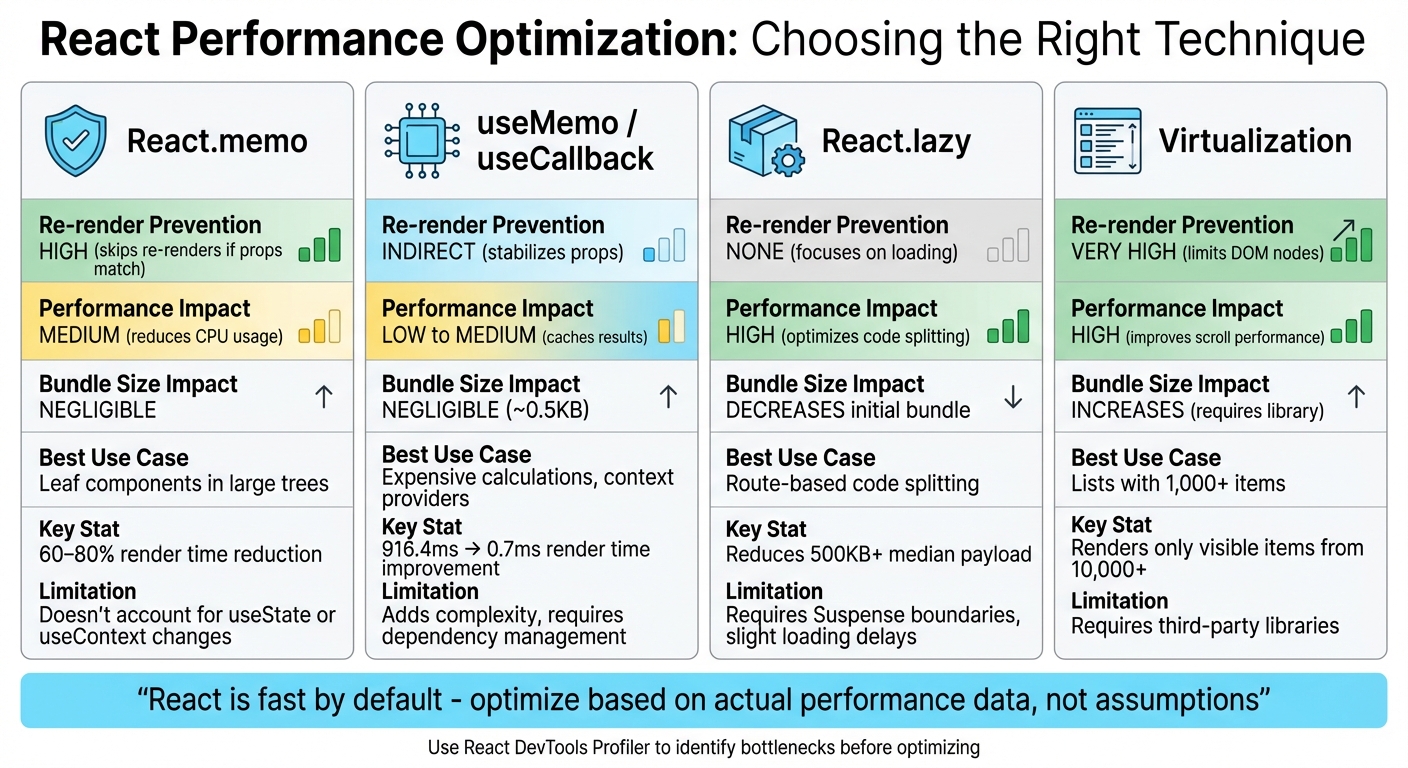
1. React.memo
React.memo is a higher-order component designed to optimize functional components by caching their last render. Typically, when a parent component re-renders, all its child components follow suit. With React.memo, React performs a shallow comparison of the component’s previous and current props using Object.is. If the props haven’t changed, the component skips re-rendering.
Re-render Prevention
While the shallow comparison used by React.memo is fast, it has limitations. For instance, Object.is({}, {}) evaluates to false, meaning inline objects, arrays, or arrow functions can disrupt memoization. To avoid this, wrap these values in useMemo or useCallback to ensure their references remain stable.
If you’re working with CMS data that includes volatile metadata like timestamps, you can pass a custom arePropsEqual(prevProps, nextProps) function as a second argument to React.memo. This lets you ignore specific changes. However, avoid deep equality checks on complex data structures – they can be slower than a re-render and may even freeze the UI.
These strategies help you leverage React.memo effectively, especially when aiming for measurable performance gains.
Performance Impact
In practical scenarios, React.memo can significantly reduce unnecessary renders. For example, in a dashboard managing over 1,000 tasks, it cut down re-renders from 50 per interaction to around 15–20. Profiling data shows that proper memoization can reduce render times by 60–80%.
That said, keep in mind that the prop comparison itself introduces a slight overhead. For components that already render in under 1ms, this overhead might outweigh the benefits. Use the React DevTools Profiler to identify bottlenecks and focus on optimizing heavy components like data tables, charts, virtualized lists, or complex Markdown editors. Avoid applying React.memo to lightweight components such as simple buttons or icons.
Bundle Size and Memory Usage
In terms of bundle size, the caching mechanism of React.memo adds about 0.1 KB (or up to 0.5 KB with full optimization). Memory usage is generally minimal and unlikely to impact most applications.
Scalability
Memoization is crucial for scaling applications that handle large datasets or complex component trees. In scenarios like dashboards, infinite-scroll lists, or data grids, effective use of React.memo ensures your application remains responsive.
"Mastering memoization moves you from ‘it works’ to ‘it scales’ – a hallmark of senior-level React development".
While future React versions (expected around late 2025) might automate some of these optimizations, for now, memoization remains an essential manual tool for improving performance.
2. React.PureComponent
React.PureComponent is a feature in React designed to optimize performance by automatically implementing shouldComponentUpdate() using a shallow comparison of props and state. When a component extends PureComponent instead of the standard Component, React evaluates its props and state. If no changes are detected, the rendering process for that component and its child subtree is completely skipped.
Re-render Prevention
The shallow comparison used by PureComponent checks primitives like strings, numbers, and booleans by their value. For objects and arrays, it compares their references. Here’s an example: if you modify an array using array.push() instead of creating a new array (e.g., with the spread operator), PureComponent won’t detect the change because the reference remains unchanged.
To ensure PureComponent works as intended, avoid defining inline objects, arrays, or functions directly in your JSX. These generate new references with each render and can lead to unnecessary re-renders. Instead, define static objects outside the render method or bind functions in the constructor.
"React.PureComponent’s shouldComponentUpdate() skips prop updates for the whole component subtree. Make sure all the children components are also ‘pure’." – React Legacy Documentation
Performance Impact
Using PureComponent can significantly reduce unnecessary renders, especially in complex lists, with potential reductions of 30–50%. However, there’s a tradeoff: the shallow comparison itself adds overhead. For components that update very frequently or consistently receive new props, this extra processing might outweigh the rendering cost.
Feature
React.Component
React.PureComponent
shouldComponentUpdate
Always returns true
Implements shallow comparison of props and state
Re-render Trigger
Always re-renders on update
Skips render if props and state are shallowly equal
Subtree Optimization
Re-renders entire child tree by default
Optimizes child subtree by skipping updates if props and state are shallowly equal
Scalability
PureComponent is particularly useful for components higher in the component tree, as it can prevent recursive re-renders across many child components. It works best with immutable data structures, where changes create new references. However, for deeply nested data, it may fail to detect changes if only nested properties are updated while the top-level reference remains unchanged.
For teams working on interactive prototypes or component libraries, adopting these React best practices can make rendering more efficient. Tools like UXPin can help developers and designers seamlessly incorporate such strategies into their workflows.
Note: With the rise of functional components, React now often favors React.memo for similar optimizations.
Next, we’ll dive into hooks like useMemo and useCallback to explore additional ways to improve rendering performance.
3. useMemo and useCallback
useMemo and useCallback are two React hooks designed to maintain referential stability across renders. In JavaScript, objects, arrays, and functions are compared by reference, not by value. This means that every re-render creates new references for these entities, which can sometimes lead to unnecessary child component re-renders. useMemo helps by caching the result of an expensive computation, while useCallback ensures that the same function reference is retained across renders. Essentially, you can think of useCallback as applying useMemo specifically to functions.
Re-render Prevention
These hooks shine when paired with React.memo. Without stable references from useMemo or useCallback, React.memo‘s shallow comparison won’t work effectively, resulting in redundant re-renders. For example, if you pass unstable references as props to memoized child components, the optimization breaks because those references change with every render.
Context Providers also benefit greatly from memoization. By wrapping the value object in useMemo, you can prevent all consumers from re-rendering whenever the parent of the provider re-renders. Similarly, custom hooks should leverage useCallback to ensure that returned functions maintain stable references. This approach is also useful for hooks like useEffect, where stable dependencies prevent unnecessary effect executions.
Performance Impact
The impact of useMemo on performance can be dramatic. For instance, in a text analysis component, it reduced render time from 916.4ms to just 0.7ms. Similarly, in dashboard components, it cut the number of re-renders from over 50 to just 2–5. These improvements are crucial because applications that respond in under 400ms tend to keep users engaged, while longer delays can lead to frustration and abandonment.
"useMemo is essentially like a lil’ cache, and the dependencies are the cache invalidation strategy." – Josh W. Comeau
That said, memoization isn’t free. React uses Object.is to shallowly compare dependencies on every render, and if your calculation takes less than 1ms, this comparison might actually cost more than recalculating. Before optimizing, use the React DevTools Profiler to identify real bottlenecks. As React’s documentation advises: "You should only rely on useMemo as a performance optimization. If your code doesn’t work without it, find the underlying problem and fix it first".
Bundle Size and Memory Usage
Combining useMemo, useCallback, and React.memo typically adds around 0.5KB to your bundle size. These hooks store cached values and function definitions in memory, so excessive use can increase memory usage, especially in resource-constrained environments. It’s also worth noting that React doesn’t guarantee cached values will persist indefinitely. For example, React may discard cached data to free up resources, especially if a component suspends during its initial mount.
Scalability
Before jumping into memoization, think about restructuring your state. Moving state to lower-level components can help prevent parent re-renders from affecting unrelated children. For applications with heavy CPU usage, consider offloading complex calculations to Web Workers to keep the main thread responsive. Use useMemo strategically for resource-intensive tasks like processing large datasets or performing complex array operations (e.g., filtering or sorting). Always include all reactive values – such as props, state, or variables – in the dependency array to avoid bugs caused by stale data.
UXPin’s design and prototyping platform is an example of how these optimization strategies can be effectively implemented. While these hooks can significantly improve performance, it’s essential to balance their benefits with their potential trade-offs, such as increased memory usage or added complexity.
4. React.lazy and Virtualization
React.lazy and virtualization tackle separate performance bottlenecks in React applications. While React.lazy focuses on breaking your code into smaller, on-demand chunks, virtualization ensures only the visible DOM nodes are rendered. This is a big deal when you consider that the median JavaScript payload for desktop users in 2024 exceeds 500 KB. Traditional loading methods require downloading the entire bundle upfront, which can significantly slow down your app.
Performance Impact
React.lazy uses dynamic imports to load components only when they’re actually needed, reducing the strain on your front end – especially in complex systems. On the other hand, virtualization shines when dealing with large lists. Rendering a non-virtualized list of, say, 10,000 items can take hundreds of milliseconds. Virtualization sidesteps this by rendering only the items visible in the viewport (and a few extra for smooth scrolling), keeping performance steady.
"Lazy loading is an optimization technique where the loading of an item is delayed until it’s absolutely required… saving bandwidth and precious computing resources." – Ryan Lucas, Head of Design, Retool
Both strategies fit neatly into broader performance optimization practices, complementing other techniques discussed earlier.
Bundle Size and Memory Usage
To make React.lazy work, you need to wrap it in a <Suspense> component, which provides a fallback UI while the component is loading. Virtualization, on the other hand, is a go-to solution for lists with more than 50 items, ensuring that performance remains smooth. These techniques align well with earlier strategies for managing complex component trees.
Scalability
To scale effectively, begin with route-based code splitting – users generally accept slight delays when transitioning between pages. However, avoid lazy loading components critical for the initial "above-the-fold" view, as this can hurt metrics like First Contentful Paint. For apps with frequently updated data, combining virtualization with React 18’s useTransition can keep your UI responsive, even during heavy re-renders. Always use unique identifiers (like IDs) as keys in virtualized lists to optimize React’s diffing process. Additionally, wrap lazy-loaded components in Error Boundaries to gracefully handle potential network issues.
A great example of these practices in action is UXPin. Their platform uses virtualization, memoization, and hooks to ensure smooth and responsive interactive prototypes. These strategies show how thoughtful performance enhancements can lead to a better user experience.
This section takes a closer look at the pros and cons of various React optimization techniques. By understanding these trade-offs, you can make informed decisions about which approach best suits your app’s performance needs. The analysis covers performance improvements, resource costs, and ideal scenarios for each method.
React.memo is a great tool for avoiding unnecessary re-renders in functional components. It works by comparing props and skips rendering when they haven’t changed. However, it doesn’t account for state changes triggered by hooks like useState or useContext. On the plus side, it adds almost no extra weight to your bundle and fits well with modern React practices.
useMemo and useCallback shine when it comes to stabilizing references in computationally heavy operations. For instance, tests showed useMemo could cut render times from 916.4ms to just 0.7ms. That said, these hooks can add complexity and require careful dependency management. As Sarvesh SP points out:
"React is already fast at DOM updates through its diffing algorithm. The expensive part is the JavaScript execution during re-renders".
While these hooks help reduce JavaScript overhead, overusing them can lead to unnecessary complexity.
React.lazy focuses on shrinking your initial bundle size, which can speed up startup times. However, it requires wrapping components in Suspense boundaries, which can introduce slight delays when loading components. Similarly, virtualization boosts performance for large lists by rendering only the visible items at any given time. The downside is that it typically requires third-party libraries, which add to your bundle size.
Technique
Prevention
Impact
Bundle Size Impact
Best Use Case
React.memo
High (skips re-renders if props match)
Medium (reduces CPU usage)
Negligible
Leaf components in large trees
useMemo / useCallback
Indirect (stabilizes props)
Low to Medium (caches results)
Negligible
Expensive calculations, context providers
React.lazy
None (focuses on loading)
High (optimizes code splitting)
Decreases initial bundle
Route-based code splitting
Virtualization
Very High (limits DOM nodes)
High (improves scroll performance)
Increases (requires library)
Lists with 1,000+ items
The React team offers a word of caution:
"You should only rely on useMemo as a performance optimization. If your code doesn’t work without it, find the underlying problem and fix it first".
Before diving into any optimization, take time to profile your app using React DevTools. Premature optimizations like unnecessary memoization can complicate your code without delivering meaningful benefits.
Conclusion
Choose optimization techniques based on what your app truly needs. During the prototyping phase, React’s default speed is more than sufficient, so focus on keeping your code clean and easy to modify. This allows for smoother iterations on design and functionality. As React Express explains:
"React is fast by default, only slowing down in extreme cases, so we generally skip using memo until we notice sluggish behavior in our app."
For production, let performance data guide your decisions. Tools like the React DevTools Profiler can help pinpoint actual bottlenecks before adding unnecessary complexity. Techniques such as React.memo are ideal for pure components that frequently re-render with stable props. Similarly, useMemo and useCallback are useful for stabilizing references or caching resource-heavy calculations. This data-driven mindset creates a natural progression from prototyping to production.
In design workflows, tools like UXPin (https://uxpin.com) simplify the process by using code-backed React components. This ensures your prototypes mirror actual performance from the start. Larry Sawyer, Lead UX Designer, shared his experience:
"When I used UXPin Merge, our engineering time was reduced by around 50%."
FAQs
How can I identify React components that need performance optimization?
To pinpoint which React components might be slowing down your app, take advantage of the Profiler tool in React DevTools. This tool tracks how long components take to render and how frequently they re-render. Pay close attention to components with either high render frequency or long render times, particularly those handling heavy computations or rendering large lists without proper virtualization.
After identifying bottlenecks, you can explore optimization techniques like memoization with tools such as React.memo, useMemo, or useCallback. Additionally, avoid passing inline functions or objects as props, as these create new references with every render, potentially impacting performance. Lastly, always validate your optimizations in a production build to ensure you’re working with accurate performance metrics.
What are the pros and cons of using React.memo for performance optimization?
React.memo can boost performance by stopping a component from re-rendering if its props stay the same. This is particularly handy for components that are resource-intensive to render or get updated frequently.
That said, there are some trade-offs to consider. React.memo uses a shallow comparison to check props, which introduces some processing overhead. If your component has simple props, the performance gains might be negligible. On the other hand, for complex objects, you might need to write custom comparison logic, adding complexity to your code. Also, if the React Compiler already applies built-in optimizations, React.memo might not add much value. It’s best to use it selectively, focusing on cases where it genuinely improves rendering efficiency.
When should I use useMemo and useCallback in React?
When working on optimizing performance in React, useMemo can be a game-changer. It helps you cache the results of resource-intensive calculations or derived values, ensuring React doesn’t waste time recalculating them during every render.
On the other hand, useCallback is perfect for keeping function references stable between renders. This is especially useful when passing functions as props to child components, as it prevents unnecessary re-renders caused by constantly changing references.
Both hooks are incredibly useful for boosting rendering efficiency, particularly in apps with complex structures where performance matters.
Keyboard navigation testing ensures websites work smoothly for users relying solely on keyboards, including those with disabilities and power users who prefer shortcuts. This process is vital for accessibility, aligning with WCAG 2.1 guidelines, and preventing legal risks. Here’s what to focus on:
Benefits: Improved user experience, compliance with accessibility laws (e.g., ADA), and broader audience reach.
Testing involves navigating entirely with the keyboard, ensuring every element is accessible and functional. Start early in the design phase using tools like UXPin to catch and address issues efficiently.
Keyboard Navigation Deep Dive | Accessible Web Webinar
Why Test Keyboard Navigation
Keyboard Accessibility Statistics and Impact
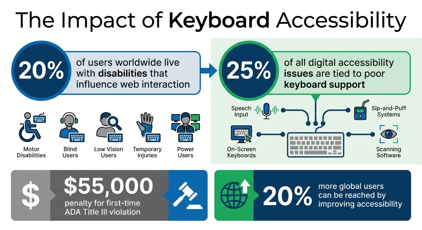
Testing keyboard navigation is essential to ensure your digital product is accessible to everyone. Around 20% of users worldwide live with disabilities that influence how they interact with the web. This includes individuals with motor disabilities who may struggle with precise mouse control, blind users who rely on keyboard commands paired with screen readers, and those with low vision who find it challenging to track a small mouse pointer.
Keyboard accessibility isn’t just for users with permanent disabilities. It also supports individuals with temporary injuries and benefits power users who prefer keyboard shortcuts for faster navigation. Moreover, keyboard accessibility is the backbone of many assistive technologies, like speech input software, sip-and-puff systems, on-screen keyboards, and scanning software. Without proper keyboard support, these tools simply don’t function.
A staggering 25% of all digital accessibility issues are tied to poor keyboard support. By addressing keyboard navigation problems, you tackle a significant portion of accessibility barriers. Plus, improving accessibility can help you reach 20% more global users. Beyond the numbers, it’s simply the right thing to do.
This understanding aligns with the WCAG 2.1 criteria for keyboard accessibility, which provide clear standards for testing and implementation.
The WCAG 2.1 guidelines outline specific requirements to ensure keyboard accessibility. These criteria help you focus on what to test and why it matters:
WCAG 2.1 Criterion
Level
Description
2.1.1 Keyboard
A
All functionality must be operable through a keyboard interface without requiring specific timings for keystrokes.
2.1.2 No Keyboard Trap
A
If focus can be moved to a component using a keyboard, it must also be possible to move focus away using the keyboard alone.
2.4.7 Focus Visible
AA
Any keyboard-operable user interface must include a visible indicator showing where the keyboard focus is located.
2.1.4 Character Key Shortcuts
A
If a keyboard shortcut uses only letters, punctuation, numbers, or symbols, users must have the option to turn it off or remap it.
The W3C summarizes the intent of these criteria: "The intent of this success criterion is to ensure that, wherever possible, content can be operated through a keyboard or keyboard interface.". Meeting Level A standards is the bare minimum for accessibility, while Level AA compliance is often required under accessibility laws and policies.
These guidelines not only ensure inclusivity but also offer measurable benefits for users and businesses alike.
Benefits for Users and Businesses
For users, keyboard navigation can mean the difference between accessing your product or being excluded entirely. As TestParty states, "Keyboard accessibility is non-negotiable for website accessibility. A site that works only with a mouse effectively excludes users who cannot use a mouse."
For businesses, prioritizing keyboard accessibility has clear advantages. It helps you comply with regulations like ADA Title III and Section 508, avoiding hefty penalties that can start at $55,000 for a first-time violation. Additionally, accessible websites tend to perform better in search engine rankings due to their structured and navigable design.
Investing in keyboard accessibility builds trust with users and reflects your brand’s commitment to inclusivity. When your product works seamlessly for everyone, it not only creates a better user experience but also opens the door to a broader market.
Setting Up Your Testing Environment
Before diving into testing, it’s essential to configure your tools and workspace to reflect how keyboard-only users interact with your product. This preparation helps uncover subtle navigation issues that might otherwise go unnoticed.
Tools and Accessibility Features
Your testing toolkit should include a mix of screen readers and browser tools. For screen readers, consider options like VoiceOver (built into macOS/iOS), JAWS (Windows), or NVDA (Windows). These tools let you hear how keyboard interactions translate into audio feedback, providing insight into the experience of blind users.
Additionally, make use of your browser’s developer tools. These are invaluable for inspecting focus styles and testing content accessibility at high zoom levels – aim for a magnification range of 300–500%. This will help ensure that your design remains functional and easy to navigate when enlarged.
For a more guided approach, try Microsoft’s Accessibility Insights, which offers walkthroughs to identify common keyboard navigation challenges. If you’re using macOS, make sure to enable full keyboard access. You can do this by going to Safari Preferences > Advanced and checking the box for "Press Tab to highlight each item on a webpage".
If you need to test keyboard-only interactions but don’t have a physical keyboard handy, virtual keyboards can come to the rescue. On macOS, access the Accessibility Keyboard by pressing Option + Command + F5. On Windows, you can use the On-Screen Keyboard by pressing Win + CTRL + O. These tools are especially helpful for recording sessions or demonstrating issues to your team.
Disabling the Mouse for Testing
To create an authentic keyboard-only testing environment, you’ll need to eliminate mouse usage. If possible, unplug your mouse or move it out of reach. For wireless devices, simply turn off the trackpad.
Start testing by activating the browser’s address bar to set the initial focus. Then, remove your hand from the mouse entirely. Use the Tab key to navigate through interactive elements on the page. This approach mirrors the experience of keyboard-only users who rely solely on the keyboard when mouse functionality isn’t an option.
As you test, ensure that every interactive element is accessible and operable using just the keyboard. This step is crucial for identifying and addressing navigation issues.
Step-by-Step Keyboard Navigation Testing
It’s time to dive into systematic testing to confirm that every keyboard interaction works smoothly. Here’s how to approach it step by step.
Testing Tab and Shift+Tab Navigation
Start at the top of the page. Use Tab to move forward through interactive elements like links, buttons, and form fields. Use Shift + Tab to move backward.
The first thing you should encounter is ideally a "skip to main content" link. This allows users to bypass repetitive navigation menus, making the page more accessible. As you navigate, ensure the focus follows a logical order – header, main navigation, content area, and footer. Only interactive elements should receive focus; things like plain text or decorative elements should be skipped.
Be on the lookout for keyboard traps – situations where you can enter a section but can’t leave it using standard keys. As the DWP Accessibility Manual puts it, "It is only a trap if there is no obvious way out". Lastly, make sure focus indicators meet accessibility standards with a minimum contrast ratio of 3:1.
This step ensures that navigation is intuitive and accessible. Next, test how interactive elements respond to activation keys.
Testing Activation Keys
Now, check how activation keys behave for each interactive element. For example:
Links should activate with Enter.
Buttons should respond to both Enter and Spacebar.
Checkboxes should toggle states with the Spacebar.
Here’s a quick reference:
Interactive Element
Primary Activation Key
Secondary Key
Link
Enter
N/A
Button
Enter
Spacebar
Checkbox
Spacebar
N/A
Radio Button
Spacebar
Arrow Keys (to navigate)
Select (Dropdown)
Spacebar (to expand)
Enter (to select)
For elements with custom ARIA roles, like role="button", make sure they respond to both Enter and Spacebar, as browsers don’t natively support these roles.
Next, focus on how arrow keys function within composite widgets.
Testing Arrow Key Interactions
While Tab moves focus between components, arrow keys are used to navigate within composite widgets. For instance, in a radio button group, you should be able to tab into the group and then use arrow keys to change the selection. This behavior extends to menus, tab lists, and sliders.
For dropdowns, test the following sequence: use the Spacebar to expand the list, arrow keys to navigate options, and Enter to make a selection. If your interface includes more complex widgets like carousels, ensure the arrow keys function as expected according to ARIA guidelines.
Once this is complete, move on to testing how modals and pop-ups behave with the keyboard.
Testing Escape Key and Modal Handling
Press Escape to close modals, dropdown menus, or pop-ups. When these elements close, the focus should return to the element that triggered them. While a modal is open, use Tab to confirm that focus remains trapped within the modal instead of jumping to background content. Make sure all modal controls are accessible and that the Escape key reliably closes the modal and returns focus to the trigger.
Finally, verify how well focus indicators perform across all interactions.
Testing Focus Indicators
Every interactive element should clearly show a visual indicator – like an outline or highlight – when it receives focus. Review your CSS to ensure you’re not using rules like outline: none, as this can severely impact accessibility.
If you’ve created custom focus styles, double-check that they maintain a contrast ratio of at least 3:1 against the background and are consistently visible. The W3C emphasizes that subtle visual changes can cause users to lose track of focus, making navigation difficult. Test these indicators at higher zoom levels (e.g., 300–500%) to ensure they remain effective when content is magnified.
sbb-itb-f6354c6
Common Issues and How to Fix Them
Even with careful planning, keyboard accessibility issues can still sneak in. Spotting and addressing these common problems can save you time while ensuring a smoother browsing experience for everyone.
Logical Tab Order Issues
When the visual layout of a page doesn’t align with its underlying HTML structure, keyboard focus can jump unpredictably. This often happens when CSS techniques like Flexbox, Grid, or absolute positioning rearrange elements visually but leave the DOM structure unchanged. To fix this, make sure your HTML follows a logical reading order – typically left-to-right and top-to-bottom – so users encounter elements in the expected sequence.
Another common issue comes from using positive tabindex values (1 or higher). As TestParty warns, "Positive tabindex values create maintenance nightmares and typically result in confusing focus order as pages change". Instead, rely on semantic HTML elements like <button>, <a>, and <input>, which are naturally focusable and follow the DOM order. For custom elements, use tabindex="0" to include them in the tab order or tabindex="-1" for elements that should only receive focus programmatically, such as modals or error messages.
It’s also essential to manage focus after user actions. For instance, when a modal is closed or an item is deleted, ensure the focus moves to a logical starting point rather than resetting to the top of the page.
Finally, verify that focus indicators are visible, which ties into the next issue: missing or inadequate focus styles.
Missing or Inadequate Focus Indicators
A frequent problem is the removal of default browser focus indicators – often through :focus { outline: none; } – to achieve a cleaner design. However, this can leave keyboard users unsure of where they are on the page. The fix is straightforward: don’t remove the outline unless you replace it with a clear, custom focus style.
Use the :focus-visible pseudo-class to show focus indicators only when users navigate with a keyboard. Make these indicators at least 2 pixels thick, with an offset of at least 2 pixels, and ensure a contrast ratio of at least 3:1 against the background. You can also use background color changes, underlines, or a mix of techniques to create a distinct and accessible focus state.
Beyond visual cues, ensure users can move freely through the interface, which leads us to keyboard traps and navigation loops.
Keyboard Traps and Navigation Loops
Keyboard traps occur when users enter a section – like a modal or widget – but can’t leave it using standard keys. As the DWP Accessibility Manual puts it, "It is only a trap if there is no obvious way out". To prevent this, ensure the Escape key always dismisses dynamic elements like popups, menus, and dialogs. When a modal closes, programmatically return focus to the element that triggered it to maintain a logical flow.
If an element is removed from the DOM, move focus to the next logical item or its parent container to avoid defaulting to the body. To ensure everything works as expected, test your page by navigating with only the Tab and Shift+Tab keys. This will confirm that users can enter and exit all interactive components without any roadblocks.
UXPin makes it easier to tackle accessibility early in the design process. By incorporating UXPin prototypes during the initial stages, you can validate keyboard navigation flows efficiently and with minimal expense. This approach ensures accessibility is a priority from the start, not an afterthought.
Simulating Accessibility Features in UXPin
When building prototypes in UXPin, use its React-based libraries like MUI, Tailwind UI, or Ant Design. These libraries ensure interactive elements in your prototype mimic how they’ll behave in production. UXPin’s event system allows you to map keyboard behaviors effectively: assign Enter or Space to buttons, use Arrow keys for menu navigation, and bind Esc to close modals while returning focus to the trigger element.
Once your prototype is ready, switch to preview mode and navigate exclusively with the keyboard. Use Tab, Shift+Tab, Enter, Arrow keys, and Escape to test interactions. Pay close attention to focus indicators on interactive components, ensuring they appear consistently and follow a logical sequence. For modals and overlays, confirm that focus shifts into the dialog when it opens and returns to the trigger element when it closes. This prevents users from losing their place in the interface.
These simulation techniques provide real-time insights into how well your prototype handles keyboard interactions.
Benefits of Early Testing in Prototypes
Catching keyboard navigation issues during the prototyping phase saves time and money. With UXPin, you can adjust focus order, key bindings, and component behaviors using intuitive drag-and-drop settings – bypassing the need for extensive code changes. Common problems like illogical tabbing sequences, missing focus indicators, or inaccessible custom components can be resolved before they become embedded in the final product.
"When I used UXPin Merge, our engineering time was reduced by around 50%. Imagine how much money that saves across an enterprise-level organization with dozens of designers and hundreds of engineers." – Larry Sawyer, Lead UX Designer
Conclusion
Testing for keyboard navigation is a crucial step in ensuring your digital products are accessible to all users. Poor keyboard support is a common barrier, affecting individuals with motor disabilities, screen reader users, and even power users who prefer navigating without a mouse. If this step is overlooked, you risk creating issues like keyboard traps, confusing tab orders, and missing focus indicators, all of which can severely limit accessibility.
To get started, disconnect your mouse and test navigation using keys like Tab, Shift+Tab, Enter, Spacebar, and the Arrow keys. Make sure every interactive element can be accessed and operated with the keyboard. Focus on logical tab sequences and how modals are handled, as these are common trouble spots. As WebAIM emphasizes, "Keyboard accessibility is one of the most important aspects of web accessibility. Many users with motor disabilities rely on a keyboard". This hands-on testing approach complements automated tools by addressing real-world usability gaps.
While automated tools can identify many technical issues, manual testing remains essential for verifying logical navigation and ensuring focus indicators are clear and visible. Combining both methods provides a more thorough assessment, catching both technical and usability challenges.
For even better results, consider testing accessibility early in the design process. Starting during the prototyping phase, rather than waiting until development is complete, can save both time and resources. Tools like UXPin enable you to test keyboard interactions directly within prototypes built with production-ready React components from libraries like MUI and Tailwind UI. This allows you to validate tab orders, key bindings, and focus management early on, addressing potential issues before they become costly fixes. By integrating accessibility checks from the outset, you lay a stronger foundation for inclusive design throughout your project.
FAQs
How do I test keyboard navigation in digital products?
To evaluate keyboard navigation, begin by creating a keyboard-only setup. Adjust your browser and operating system settings to enable full keyboard navigation, and confirm the configuration using accessibility tools. Then, pinpoint all interactive elements – like links, buttons, form controls, and custom components – that should be accessible via the keyboard.
Use standard shortcuts to navigate: press Tab to move forward, Shift + Tab to go backward, Enter or Spacebar to activate elements, and arrow keys for navigating menus or widgets. Check for clear focus indicators, a logical tabbing sequence, and ensure there are no "keyboard traps" that prevent users from moving freely. Additionally, verify that focus management functions correctly, such as skip links being usable and focus shifting properly in modals or dialogs.
Prototyping tools, such as UXPin, are useful for testing and refining keyboard navigation early in the design phase. This approach helps identify and fix accessibility issues before development begins, ensuring your product works seamlessly for users who rely on keyboard navigation.
Why is keyboard navigation testing important for accessibility?
Keyboard navigation testing plays a key role in making digital products accessible to people with disabilities, such as motor impairments, limited hand mobility, or visual impairments. It ensures that essential features – like a logical tab order and visible focus indicators – work correctly, allowing users to navigate and interact with the interface smoothly.
By conducting these tests, you help create a more inclusive experience, enabling users who depend on keyboards or assistive technologies to use your product effectively and without assistance.
What should I check for when testing keyboard navigation?
When testing keyboard navigation, the goal is to make sure your site or app is accessible and easy to use for everyone. Start by verifying that all interactive elements – like links, buttons, form fields, and widgets – can receive a visible focus. This means there should be a clear indicator, like an outline or highlight, showing where the focus is. Without this, users relying on keyboards could lose track of their position.
Next, review the tab order. Pressing Tab should move the focus forward in a logical sequence, typically following the natural reading order. Shift + Tab should move the focus backward. If the focus skips elements or jumps around unexpectedly, it can make navigation confusing. Be on the lookout for keyboard traps too – situations where users get stuck in a component, such as a modal or dropdown, and can’t exit using Esc or Tab.
Make sure there are skip links or similar shortcuts to help users bypass repetitive content, like navigation menus. Also, confirm that all controls can be activated with the keyboard, such as using Enter or Space for buttons and arrow keys for menus. For hover-only interactions (like tooltips or dropdowns), ensure they work with the keyboard too. Additionally, when users close modals or dialogs, the focus should return to the element that triggered them.
By addressing these areas, you’ll help ensure your product meets WCAG 2.1.1 guidelines and U.S. accessibility standards, improving the experience for all users.
Real-time prototype-to-code with React bridges the gap between design and development by using production-ready React components directly in the design process. This approach ensures that prototypes generate actual HTML, CSS, and JavaScript, matching the behavior of the final product. Here’s why it matters and how it works:
Why React? React’s component-based structure allows designers and developers to work with the same components, reducing engineering time by up to 50%. Props and states ensure prototypes behave like the final product, improving accuracy during user testing.
Tools like UXPin: UXPin’s Merge technology connects React component libraries directly to the design tool. This setup eliminates manual handoffs, ensures consistency, and reduces feedback loops from days to hours.
Setup and Integration: You can sync components via npm, Git, or Storybook. Tools like Node.js, Webpack, and UXPin Merge CLI are essential to streamline the workflow.
Exporting Code: Designers can export production-ready JSX directly from prototypes, ensuring alignment with the development team’s codebase.
This workflow saves time, improves collaboration, and delivers prototypes that are ready for production with minimal adjustments.
UXPin Tools and Frameworks Requirements for React Integration
Creating Your UXPin Account
To get started, head over to UXPin, sign up, and choose a plan that fits your needs. Here are your options:
Free tier: Allows up to two prototypes.
Merge AI plan: Costs $39 per editor per month and includes AI-powered prototyping along with built-in React libraries.
Company plan: Priced at $119 per editor per month, this plan adds Storybook and npm integration, plus a 30-day version history.
Once you’ve selected your plan, you can jump right into the UXPin design editor. From there, you can explore the built-in React libraries or start setting up a custom component library tailored to your needs.
The next step involves configuring your React component library using UXPin’s Merge technology.
Setting Up a React Component Library
UXPin’s Merge technology gives you three options for syncing React components:
npm integration: This is the quickest way to get started, especially if you’re working with open-source libraries like MUI, Ant Design, or Tailwind UI. UXPin even provides pre-configured versions of these libraries, so you can dive into prototyping without waiting for developer assistance.
Git repository connection: Perfect for custom design systems, this option offers full version control and is exclusively for React.
Storybook integration: If your team already uses Storybook for documenting components, this path supports not just React but also Vue, Angular, and other frameworks.
Choose the method that aligns with your workflow and design system setup.
Required Tools and Frameworks
After setting up your component library, make sure your development environment meets these key requirements:
Node.js (v24 or later) and npm (v11.6.2 or later): These are essential for managing packages and running the Merge CLI.
UXPin Merge CLI: The latest version (3.5.0) connects your local component libraries to the UXPin editor.
uxpin.config.js: This configuration file manages library settings. To let designers tweak padding, margins, and colors without coding, include settings: { useUXPinProps: true } in the file. Note: You’ll need CLI version 3.4.3 or newer for this feature.
For Git integration, tools like Webpack and Babel are necessary for bundling and transpiling React components.
Here’s a quick breakdown of the tools and their purposes:
Tool/Framework
Purpose
Requirement Level
Node.js (v24+)
Runtime environment for CLI and scripts
Mandatory
npm (v11.6.2+)
Package management and dependency handling
Mandatory
UXPin Merge CLI
Syncing code components to UXPin Editor
Mandatory for custom libraries
Webpack & Babel
Bundling and transpiling React components
Mandatory for Git Integration
React
Core library for component development
Mandatory
Git
Version control and repository syncing
Required for Git Integration
Storybook
Component documentation and isolation
Optional (Alternative integration)
With these tools in place, you’ll be ready to seamlessly integrate your React components into UXPin and start designing with precision.
Building Interactive Prototypes with UXPin
Adding and Customizing React Components
Once your React component library is synced, you can start building prototypes by dragging components directly onto the canvas. UXPin supports popular built-in libraries like MUI (offering over 90 interactive components), Tailwind UI, Ant Design, and Bootstrap. If you’re working with a custom design system, your proprietary components will show up in the library panel after syncing through Git, Storybook, or npm.
What sets UXPin apart is that these prototypes aren’t just static designs. Since UXPin renders actual HTML, CSS, and JavaScript, your components come with their built-in interactivity – like ripple effects on buttons, sortable tables, and functional calendar pickers – right out of the box. You can tweak any component through the properties panel, adjusting React props such as text, colors, or data objects, all without writing a single line of code.
For large teams, this approach simplifies workflows. If a component you need isn’t in your library yet, the AI Component Creator can generate layouts with working code from natural language prompts using OpenAI or Claude models. Additionally, Tailwind CSS can be applied directly for quick layout adjustments.
Once your components are customized, the next step is defining their interactive behavior.
Creating Dynamic Interactions and Logic
The beauty of UXPin is that your components already behave like they would in the final product. For instance, when you drop a button or form field onto the canvas, it works as expected – no extra configuration needed. To build more advanced interactions, you can modify React props via the properties panel. A simple change to a prop can alter behaviors or styles programmed into the component’s code.
For nested components, the Layers Panel helps you manage hierarchy and rearrange child elements. Components adapt automatically to their CSS layout rules, like Flexbox. To gain even more control, enable settings: { useUXPinProps: true } in uxpin.config.js for additional CSS and attribute options.
UXPin also supports variables, conditional logic, and states, enabling you to simulate complex user flows. For example, data-driven components like sortable tables will re-render automatically when their data changes, giving stakeholders a realistic preview of how the interface will behave. This level of interactivity speeds up feedback loops and ensures designs are as close to the final product as possible.
After defining interactions, it’s time to validate your prototype’s functionality.
Testing and Validating Prototypes
Testing in UXPin starts with the Preview mode, where you can interact with your prototype just like a user would. You can click through flows, test form submissions, and confirm that conditional logic works as intended. Because UXPin uses the same code-backed components from your codebase, what you see in the prototype is exactly what developers will build.
For more detailed validation, you can export your prototype as HTML and host it on platforms like Netlify. This lets you use tools like FullStory to record user sessions, capturing "DVR-like" replays of interactions. Instead of relying solely on interview feedback, you can observe real user behavior – where they hesitate, what they click, and where they encounter issues.
Different testing scenarios call for different methods. Functional testing ensures interactive elements and states work correctly using UXPin’s Preview mode. Usability testing combines session recordings and user interviews to evaluate how users navigate and interact with the design. Compatibility testing checks performance across browsers and devices using tools like UXPin Mirror, while accessibility testing involves manual reviews to confirm keyboard navigation, screen reader support, and ARIA attributes.
"UXPin prototypes gave our developers enough confidence to build our designs straight in code. If we had to code every prototype and they didn’t test well, I can only imagine the waste of time and money."
Edward Nguyen, UX Architect.
Exporting React Code from Prototypes
How UXPin Generates React Code
UXPin takes a unique approach by working directly with actual React components rather than converting static visuals into code. It integrates seamlessly with components from your Git repository, Storybook, or npm package. When you tweak a component in UXPin – like adjusting a button’s color or toggling its state – you’re interacting with the component’s real propTypes. These changes instantly generate production-ready JSX.
What makes this process stand out is the single source of truth it provides. Since UXPin uses the same components as your development environment, the exported code matches your library exactly. There’s no need for translation or cleanup, reducing the risk of inconsistencies. In Spec Mode, developers can directly copy JSX along with its properties, dependencies, and interactions.
The platform also features AI Component Creator, which generates clean, production-ready code. Using models like OpenAI or Claude, it can transform text prompts into code-backed components. These components can then be exported just like manually designed prototypes, ensuring that design changes are tightly linked to real code updates.
Export Options and File Formats
UXPin supports multiple export options to fit different workflows. In Spec Mode, developers can copy JSX and CSS directly from the browser. For quick testing and debugging, exported code can be opened in StackBlitz, an online IDE that allows live previews and edits.
Export Method
Best For
Key Feature
Spec Mode
Quick Handoff
Copy/paste JSX and CSS directly from the browser
StackBlitz
Rapid Prototyping
Edit and preview code in a live online IDE
Git Integration
Enterprise Systems
Two-way sync with your production repository
npm Integration
Third-party Libraries
Import components from public or private packages
For teams using UXPin Merge, Git integration ensures the exported code remains fully synchronized with your version-controlled design system. The Direct Code Export option is also available, including all necessary dependencies and props, making it ideal for full project integration. These export methods work seamlessly within the broader UXPin ecosystem, ensuring your workflow stays efficient and consistent.
Once you’ve selected an export method, it’s important to confirm the code’s readiness for integration.
Reviewing and Improving Exported Code
Before integrating the exported code, it’s essential to review it for semantic accuracy, WCAG accessibility compliance, and performance. A good starting point is to test the workflow with a smaller pilot project, such as a single web page or app screen with a few subcomponents, before applying it on a larger scale.
Early collaboration with developers is key to aligning the exported code with your team’s codebase. This approach helps ensure a smooth transition from design to code. For teams managing extensive design systems, the efficiency gains can be significant. Erica Rider, UX Architect and Design Leader, shared:
"We synced our Microsoft Fluent design system with UXPin’s design editor via Merge technology. It was so efficient that our 3 designers were able to support 60 internal products and over 1,000 developers".
For additional validation, UXPin offers an Experimental Mode through its CLI. This feature allows developers to bundle components locally and preview how they’ll render in UXPin before sharing them with the design team. This extra step helps catch potential issues early, ensuring smoother integration into production workflows.
sbb-itb-f6354c6
Integrating Exported React Code into Your Project
Setting Up Your Development Environment
Before diving into the integration of UXPin code, it’s essential to prepare your development environment. Start by ensuring that Node.js, npm, and your preferred React framework – whether it’s Create React App, Next.js, or Vite – are properly installed. If you’re working on a Windows system, consider installing the Windows Subsystem for Linux (WSL) to use Linux-based command-line tools seamlessly. Additionally, double-check your Git integration settings to ensure smooth collaboration and version control.
Don’t forget to verify that your package.json file includes all the necessary dependencies that align with the components you’re planning to import. Once everything is in place, you’re ready to bring in and validate your UXPin components.
Importing and Testing the Components
With your exported code reviewed, the next step is to import the components into your project and test them right away. If you’re using Git integration, the components will sync directly with your repository, creating a single, reliable source of truth for both design and development teams.
UXPin components leverage React props to manage their behavior and styling, ensuring that your design system remains intact. If you encounter a component that requires additional props, you can enable the useUXPinProps: true setting in your uxpin.config.js file. This feature allows designers to apply custom CSS and attributes directly to the root element without changing the original source code.
Once everything is set up, run your development server to confirm that the components render as expected and function properly within your environment.
Keeping Components Up to Date
After verifying that everything works smoothly, focus on maintaining consistency over time. By automating updates through Git integration, any changes made to your component library will automatically reflect in UXPin. This approach ensures that designers always have access to the latest versions of components, eliminating the need for manual updates and reducing the risk of discrepancies between design and development.
Customizing and Optimizing Generated React Components
Refining Component Design and Behavior
To tailor React components for your project, make adjustments that align with your specific design needs. Use the useUXPinProps: true setting to tweak CSS attributes – like padding, margins, and borders – without touching the original source code. This makes customization faster and keeps your codebase clean.
For layout control, wrap your components in UXPin’s Flexbox Component. This allows you to easily manage alignment and responsiveness. Need more complex layouts? You can nest components, such as adding a CardFooter to a Card, to create designs that adhere to your guidelines while maintaining flexibility.
Improving Code Performance
Once your components look the way you want, shift your focus to performance. Start by using React.memo to memoize components and cut down on unnecessary re-renders. For example, memoizing a list component can reduce render times by 30-40%. Pair this with useCallback and useMemo hooks to handle computationally heavy tasks more efficiently.
For even better performance, consider code-splitting with React.lazy and Suspense to enable lazy loading. This approach ensures that only the code needed at a given moment gets loaded, improving load times. Also, enable React.StrictMode to catch potential issues early in the development process.
"When I used UXPin Merge, our engineering time was reduced by around 50%. Imagine how much money that saves across an enterprise-level organization with dozens of designers and hundreds of engineers."
Lead UX Designer Larry Sawyer.
Implementing Accessibility Best Practices
With performance in check, don’t overlook accessibility. Use Custom Props to add attributes like id or ARIA labels directly to your components. Wrapping your app in StrictMode can help you identify and fix accessibility issues early on. Additionally, validate component semantics to ensure they meet accessibility standards.
By focusing on accessibility from the start, you can ensure your components comply with WCAG guidelines before they go into production. Combining UXPin’s design-time tools with React’s runtime validation creates a strong foundation for accessibility that scales across your entire project.
These steps ensure your React components are not only optimized for performance but also ready for seamless integration into production workflows.
Conclusion
Integrating real-time prototype-to-code workflows with React and UXPin is transforming how digital products are developed. By leveraging code-backed components instead of static visuals, teams can establish a single source of truth, bridging the gap between design and development. This method speeds up the process, enabling teams to deliver functional prototypes in hours rather than days, significantly shortening the feedback loop .
The move from manual handoffs to automated code generation allows developers to pull production-ready JSX directly from prototypes. When UXPin syncs with design systems, teams can scale effortlessly – supporting numerous products and large development teams with fewer design resources. This is made possible by designers and developers working with the same React components, ensuring perfect alignment from prototype to production.
With the steps outlined earlier, the transition from design to production becomes straightforward. Start by setting up your React component library in UXPin, create interactive prototypes, and export production-ready code for development. Every component is optimized for performance and accessibility, ready to go from the start.
Adopt these practices today to streamline your workflow and take your prototypes seamlessly into production.
FAQs
How does UXPin Merge work with React components?
UXPin Merge brings React components from your code repository – whether it’s Git, Storybook, or an npm package – straight into the UXPin editor. This means your design system always stays aligned with the production code.
Here’s how it works: when a component is added via Merge, its JSX, props (or TypeScript interfaces), and CSS are imported. Designers can then drag these components onto the canvas, tweak their props through an easy-to-use interface, and see real interactions in action – all without touching a single line of code. What’s even better? Any changes made to the source code are automatically updated in the design, eliminating the risk of mismatches between design and development.
Merge also supports npm integration, making it simple for teams to upload React component libraries and use them instantly in UXPin. Whether your team uses plain CSS, Sass, or Styled Components, Merge adapts to your development workflow. By turning React components into the single source of truth, Merge ensures smooth, real-time collaboration between designers and developers.
What are the benefits of using real-time prototype-to-code workflows with React?
Real-time prototype-to-code workflows make it easier for designers and developers to work together by using the same React components for both prototyping and production. This approach bridges the typical design-to-code gap, ensuring that any updates made to the prototype are immediately reflected in the underlying code. The result? Fewer inconsistencies and smoother transitions between design and development.
These workflows also speed up the iteration process, allowing teams to prototype, test, and tweak user interfaces in minutes rather than days. Thanks to React’s component-based structure, designs stay aligned with the final codebase, which not only boosts consistency but also reduces the chances of errors. This means teams can roll out production-ready prototypes faster, with improved precision, leading to shorter timelines and streamlined processes.
How can I make my UXPin prototypes accessible and high-performing?
To make sure your UXPin prototypes are accessible, start by using real React components through UXPin Merge. These components come with built-in accessibility features like ARIA attributes, keyboard navigation, and semantic markup. This means your prototypes automatically inherit these features. To fine-tune accessibility, run an audit using tools like axe or Lighthouse on your UXPin preview link. Fix any issues by adjusting props in the Merge library or updating the source components. Any changes you make will instantly update across your prototype, keeping everything consistent.
For performance, UXPin Merge relies on production-ready components, which eliminates the need for rework and ensures your prototypes are optimized for the browser. To keep things running smoothly, streamline your component library by removing unnecessary imports, using functional components, and enabling lazy loading when needed. UXPin’s preview server takes care of bundling, reducing load times and providing a seamless experience, even on less powerful hardware. By following these steps, your prototypes will not only be accessible but also perform efficiently, offering a realistic preview of the final product.
When building workflow automation, you often face a choice between Integration SDKs and APIs. Both tools help systems communicate, but they work differently:
SDKs: Pre-packaged tools (libraries, methods, documentation) designed for specific platforms or languages. They simplify development but can be bulky and platform-dependent.
APIs: Universal interfaces that allow systems to exchange data. They offer flexibility and cross-platform compatibility but require more manual setup.
Quick Overview:
Use SDKs for faster development in specific environments (e.g., iOS, Android).
Use APIs for lightweight, cross-platform solutions.
Combine both for efficiency (SDKs for standard tasks, APIs for custom needs).
Quick Comparison:
Criteria
Integration SDK
API
Purpose
Simplifies platform-specific tasks
Enables system communication
Ease of Use
Pre-built methods, less manual work
Requires manual HTTP requests
Platform Support
Language/platform-specific
Platform-agnostic
Updates
Maintainer-dependent
Immediate access to new features
Performance
Includes optimizations like caching
Full control over performance tuning
Customization
Limited to provided methods
Highly customizable
Choosing the right tool depends on your project’s needs. SDKs save time for platform-specific development, while APIs offer flexibility across multiple systems. A hybrid approach often works best.
Integration SDKs vs APIs: Complete Feature Comparison Chart
Integration SDKs for Workflow Automation
How Integration SDKs Work
An integration SDK is essentially a toolkit that combines tools, libraries, and documentation into one package. Instead of manually crafting HTTP requests, developers can use ready-made methods like storage.upload() or payment.create(). This simplifies the process, letting developers focus on what their application does rather than worrying about the technical details behind the scenes.
To use an SDK, you install it through your dependency manager (such as npm, pip, or Gradle), initialize it, and call its pre-built methods. These methods take care of complex tasks like authentication, signing requests, retrying failed calls with exponential backoff, and managing rate limits – all without extra effort from the developer. Unlike APIs, which are designed to work across different environments, SDKs are tailored to specific programming languages (like Python or Java) or platforms (like iOS or Android). This platform-specific design streamlines integration and helps developers work faster and with fewer errors.
Benefits of Integration SDKs
Integration SDKs can speed up development by providing pre-built components that save developers from weeks of manual coding. Strongly typed interfaces reduce the likelihood of integration mistakes and ensure your application aligns with platform-specific standards. Plus, features like auto-completion, type hints, and inline documentation in your IDE make it easier to discover and use the SDK’s functionality without constantly referring to external guides.
As CJ Quines, Software Engineer at Stainless, explains:
“A well-designed SDK smooths over the rough edges inherent to programmatic API interaction, giving developers confidence in your product’s quality and maturity.”
This smoother experience doesn’t just make life easier – it creates more reliable, consistent applications. Developers don’t need to write custom error-handling code for every API call; the SDK takes care of that, ensuring predictable behavior across the board.
Limitations of Integration SDKs
Despite their advantages, SDKs aren’t without challenges. One common issue is their size – SDKs can increase your application’s footprint and may cause conflicts with other dependencies. Nishil Patel, CEO & Founder of BetterBugs, highlights this risk:
“Even the best SDKs have quirks, and small oversights can escalate into significant problems.”
Another drawback is version lag. SDKs often take time to catch up with updates to the underlying API, which can leave you waiting for new features. Their platform-specific nature can also complicate things if you’re building for multiple platforms like iOS, Android, and web – you might need to maintain separate implementations. Poor integration practices can lead to performance issues, such as slow load times, high latency, or even UI freezes if the SDK blocks the main thread with synchronous operations. Lastly, security concerns like hardcoded API keys or exposed sensitive data mean you need to thoroughly vet third-party SDKs before using them.
APIs for Workflow Automation
How APIs Support Automation
APIs act as the connectors between different software systems, enabling them to communicate and share data through standardized protocols – without needing to understand each other’s internal workings. They achieve this by exposing specific functionalities via endpoints, typically structured as URLs, which handle incoming requests and return data in a structured format.
When it comes to workflow automation, several architectural styles play a key role. REST leverages standard HTTP methods like GET, POST, PUT, and DELETE for resource-based interactions. GraphQL, on the other hand, allows clients to request only the exact data they need, reducing unnecessary bandwidth usage. For scenarios requiring low-latency communication, gRPC is often the go-to choice, particularly for internal microservices. Meanwhile, Webhooks stand out for enabling real-time automation by pushing data whenever specific events occur.
This flexibility, often referred to as “composability”, empowers developers to integrate best-in-class third-party services into sophisticated workflows. For example, you can combine Stripe for payment processing with Twilio for sending notifications, creating seamless, automated processes. This ability to mix and match services is a cornerstone of APIs’ importance in building modern, agile automation workflows.
The same composable approach applies to conversational experiences, where chatbots and voice agents rely on a voice API to connect speech recognition, text processing, and speech synthesis into one smooth, real-time interaction.
Advantages of APIs
APIs provide developers with precise control over various aspects of communication, including request timing, headers, error handling, and data transformation. One of their standout features is their loose coupling – a design principle that ensures one system can be updated internally without disrupting its connection to others, provided the API contract remains unchanged.
Another major strength of APIs is their cross-platform interoperability. A single API can support multiple programming languages – such as Java, PHP, and Python – and work seamlessly across platforms like iOS, Android, and Web. Compared to SDKs, APIs are lightweight, requiring just a few lines of code to execute, which minimizes their impact on application size. Additionally, developers gain immediate access to new or beta features through APIs, without waiting for SDK updates.
“APIs act as the bridges that allow different applications to communicate and share data, while SDKs provide developers with the toolkits they need to build upon these APIs efficiently.”
Challenges of APIs
While APIs offer flexibility, they also come with challenges. Direct integration involves manually handling HTTP requests, parsing responses, and managing complex authentication methods like OAuth, JWT, and API keys. Developers must also implement custom logic for retries, exponential backoff, and rate limiting to ensure that workflows remain reliable.
Security is another critical concern. Since developers are responsible for managing sensitive data tokens and ensuring secure implementation, any oversight can lead to vulnerabilities. This makes it essential for organizations to carefully vet API providers and enforce strict security practices. Debugging raw API integrations can also be a headache. Unlike SDKs, APIs lack conveniences like auto-completion, type hints, and inline documentation, which increases the likelihood of typos or missing parameters.
Version management adds yet another layer of complexity. APIs frequently undergo updates, including breaking changes and deprecations, requiring developers to monitor release notes and update their code to prevent workflow disruptions. Lastly, network latency can impact performance since APIs rely on HTTP/HTTPS calls over the internet. Workflow speed often depends on network conditions and the efficiency of request design, which contrasts with the more localized approach SDKs offer. These trade-offs highlight the balancing act involved in leveraging APIs for automation.
Key Differences Between SDKs and APIs
Comparison Dimensions
The main difference between SDKs and APIs lies in their roles: SDKs act as an abstraction layer, while APIs serve as an interface. As one Stack Overflow contributor aptly explained, “An API is an interface, whereas an SDK is an abstraction layer over the interface”. This distinction heavily influences how developers interact with these tools.
Development scope is another clear dividing line. SDKs offer a comprehensive toolkit, bundling compilers, debuggers, code samples, and documentation into one package. APIs, on the other hand, are more focused, providing connectivity and data exchange protocols like REST or GraphQL. For example, when building a design workflow in UXPin, an SDK might include pre-built methods for importing component libraries, while an API would provide raw endpoints to access design data, leaving you to handle parsing and integration.
SDKs also take care of low-level tasks automatically, whereas APIs require manual setup and configuration. SDKs are typically tailored to specific platforms, making them platform-dependent, while APIs are platform-agnostic and can work across multiple programming languages. This difference extends to updates and maintenance: SDKs often manage minor API changes behind the scenes but may lag in adopting new features. APIs, by contrast, give immediate access to new endpoints but require developers to handle updates manually.
Another key distinction lies in performance. SDKs often include built-in optimizations like connection pooling and caching, which simplify development but may limit flexibility. APIs provide full control over performance tuning, making them ideal for high-performance environments where customization is critical.
The table below captures these differences in a concise format.
Comparison Table
Dimension
Integration SDK
API (Direct Access)
Primary Purpose
Build applications/features for specific platforms
Enable communication between systems
Components
Libraries, debuggers, APIs, documentation
Interface specifications and protocols
Implementation
Pre-written methods (e.g., User.create())
Manual HTTP requests and JSON parsing
Security
Built-in authentication and encryption helpers
Manual token and header management
Performance
Includes batching and connection pooling
Full control over request/response timing
Maintenance
Updates managed by library maintainers
Manual updates required for API changes
Environment
Language/platform specific
Language/platform agnostic
Footprint
Larger due to bundled tools and dependencies
Minimal; requires only a few lines of code
Customization
Limited to methods exposed by the library
High; full control over headers and payloads
Scalability
Scales with your own infrastructure
Scales with the vendor’s infrastructure
sbb-itb-f6354c6
Choosing Between SDKs and APIs
When to Use an SDK
SDKs are your go-to for fast, platform-specific development. They’re especially useful for building native mobile apps that rely on device-specific features like cameras, GPS, or push notifications. By providing pre-built libraries and tools, SDKs can drastically cut down development time.
If your project involves sensitive data or requires local processing, SDKs are a smart choice. For example, in scenarios where data must remain within your infrastructure – such as air-gapped environments without internet access – SDKs allow you to process information locally. This not only boosts performance but also eliminates concerns around network latency.
SDKs also simplify complex workflows, like payment processing, by handling encryption, validation, and secure communication out of the box. For design tools like UXPin, an SDK might include ready-to-use methods for managing design tokens or importing component libraries, saving developers from writing extensive integration code.
However, if you’re aiming for lightweight, cross-platform functionality, APIs might be the better fit.
When to Use an API
APIs shine in scenarios where lightweight integrations and cross-platform compatibility are key. For instance, fetching specific data points – like weather updates or currency exchange rates – can be done efficiently with APIs, without the added overhead of an SDK. They’re also ideal for workflows that need to function uniformly across web, mobile, and backend systems, thanks to their unified communication logic.
Another big advantage of APIs is their immediacy. New features are accessible as soon as they’re deployed, whereas SDKs often require time for updates to be implemented and released. This makes APIs the best option for staying on the cutting edge without waiting for library updates.
Additionally, APIs help keep your codebase lean. Unlike SDKs, which can bring in numerous dependencies (and potential conflicts), APIs allow for direct calls that minimize bloat and make your integrations more manageable.
When to Combine SDKs and APIs
While SDKs and APIs each have their strengths, combining them can offer the best of both worlds. A hybrid approach allows you to use platform-specific SDKs for front-end development – leveraging native UI and device features – while relying on REST APIs for backend services and data integration.
This strategy works well for balancing efficiency and flexibility. SDKs can handle standard workflows, covering most of your needs (around 90% of common operations), while APIs can address edge cases, such as custom headers or beta features that the SDK doesn’t yet support. Teams can also use SDKs to create custom APIs, exposing specific functionalities to partners or internal teams. For example, UXPin might use an SDK internally to manage design components, while offering a REST API for external tools to trigger design exports or sync design tokens with development environments.
Conclusion
Summary
SDKs come packed with tools like libraries, authentication handlers, error management, and documentation, making them a go-to choice for speeding up platform-specific development. If you’re building native mobile apps or need to roll out features quickly without writing repetitive code, SDKs are your best friend.
APIs, on the other hand, provide a lean and flexible way for different components to communicate. They rely on standard protocols like REST or GraphQL, making them compatible with virtually any platform. Plus, with APIs, you gain instant access to new features as soon as they’re rolled out. This highlights a key distinction: APIs focus on communication interfaces, while SDKs provide an abstraction layer to simplify development.
Recent data emphasizes how vital these tools are in today’s digital landscape. Understanding their differences helps you choose the right approach for your project.
Making the Right Choice
When deciding, let your project’s specific needs guide you. SDKs are ideal for fast, platform-specific development – like creating iOS or Android apps with built-in security features such as automatic token refreshing. Meanwhile, APIs are better suited for cross-platform projects, offering consistency, fewer dependencies, and quick access to the latest features.
Sometimes, a mix of both works best. A hybrid approach lets you use SDKs for standard workflows while relying on APIs for edge cases or performance-critical tasks. For instance, tools like UXPin utilize SDKs to manage internal components but lean on REST APIs for external integrations. The trick is to align your integration strategy with your goals for workflow automation, security, and long-term maintainability.
SDK vs API
FAQs
What are the key benefits of using an SDK instead of an API?
Using an SDK can speed up development and streamline the process by offering a comprehensive toolkit that goes beyond the capabilities of a standard API. These toolkits often include pre-written code, libraries, detailed documentation, and platform-specific utilities like compilers or debuggers. With these resources, developers can quickly add features without the need to manually write extensive HTTP calls or tackle complex tasks like authentication and error handling from scratch.
SDKs also make onboarding smoother by handling many of the low-level technical details and providing language- or platform-specific integrations. Many SDKs come equipped with sample projects and debugging tools, allowing development teams to focus on building the core functionality of their application instead of dealing with infrastructure challenges. This approach not only speeds up implementation but also ensures consistent code quality and simplifies long-term maintenance.
What’s the difference between SDKs and APIs when it comes to platform compatibility?
SDKs are built for a specific platform and come equipped with tools like compilers, debuggers, and libraries that are tailored to a particular operating system, programming language, or hardware. This makes them perfect for building applications that run natively within that environment.
APIs, by contrast, lay out a set of rules for how software components interact. They are platform-independent, meaning they can work across different systems as long as the protocol (like HTTP) is supported. However, with APIs, developers often need to take on more of the integration work themselves.
To put it simply, SDKs offer platform-specific tools for native app development, while APIs provide cross-platform communication with added flexibility.
When should you use both SDKs and APIs in a project?
Using an SDK alongside an API can be a smart approach when you want the convenience of pre-built tools combined with the freedom to tailor specific functionalities. SDKs come with libraries, utilities, and documentation that make routine tasks like prototyping easier, ensure compatibility with platforms, and cut down on repetitive coding. Meanwhile, APIs give you the granular control needed for customization, performance tweaks, or integrating unique features.
This duo is particularly effective in multi-service workflows. For instance, you might rely on an SDK for something straightforward, like uploading files to a cloud storage service, while using APIs to connect with other platforms or implement custom logic. By blending the strengths of both, you can speed up development while still addressing edge cases or enhancing features beyond what the SDK alone offers.
Managing color consistency in a design system is crucial for usability, trust, and accessibility. When colors are inconsistent, users face confusion, accessibility suffers, and brand identity weakens. Here’s how to tackle it effectively:
Why It Matters: Consistent colors build trust, align expectations, and improve accessibility. For instance, red should signal errors, not mix with emphasis.
Challenges: Common issues include too many similar shades (color bloat), mismatched technical formats (HEX, RGB), unclear naming conventions, and accessibility oversights.
Solution: Use semantic color tokens – organizing colors by purpose (e.g., action-primary, not blue-500) – to streamline updates and ensure consistency across platforms.
Best Practices: Avoid ambiguous names, separate brand and functional colors, and ensure accessibility by meeting WCAG contrast standards (e.g., 4.5:1 for normal text).
In short, a structured approach to color management ensures clarity, accessibility, and a stronger brand presence.
Design Tokens for Dummies | A Complete Guide
Creating a Semantic Color Token System
Three-Layer Color Token System: Primitive, Semantic, and Component Tokens
Tame the chaos of inconsistent color usage with semantic color tokens – a method that organizes colors based on their purpose, not their appearance. Instead of naming a color something like blue-500 or #007AFF, you’d use names like action-primary or text-error. This approach establishes a shared language between designers and developers, making it easier to scale and maintain.
Understanding Color Tokens
Color tokens are layered to serve different roles. At the base, you have primitive tokens (also known as base or global tokens). These represent the raw color values, such as HEX or RGB codes like blue-500 or neutral-200. Think of these as the building blocks of your palette. Above them are semantic tokens, which describe the intent behind the color, such as background-surface-critical or text-subtle. These semantic tokens act as aliases that point to primitive values, creating a flexible and adaptable system.
This structure makes updates seamless. For instance, if you switch your primary brand color from purple-500 to green-600, you only need to update the primitive token. All linked semantic tokens, such as action-primary, will automatically reflect the change. This is especially helpful for teams managing multiple themes. A semantic token like background-surface can map to white in light mode and dark gray in dark mode, eliminating redundant code.
Token Type
Example
Purpose
Value
Primitive
blue-500
Defines a specific color in the palette
HEX/RGB
Semantic
action-primary
Describes intent (e.g., primary buttons)
Alias to Primitive
Component
button-bg-hover
Defines a specific state for a component
Alias to Semantic
"Color roles are designed to express your brand and support light and dark themes. They help ensure visual coherence without hardcoding." – Material Design 3
By using clear, functional names, you can fully leverage the power of semantic tokens while avoiding confusion.
Best Practices for Naming Conventions
Avoid value-based names. Labels like blue-100 or dark-red don’t convey a color’s purpose. Instead, use names like color-error-text or color-success-bg that clearly communicate intent. This eliminates guesswork for developers, ensuring they know exactly where and how to use a token.
For primitive tokens, adopt a numeric scale from 50 to 950. Typically, 500 represents the primary brand color, while lower numbers (50–400) are lighter tints, and higher numbers (600–950) are darker shades. This standardized range simplifies the process of selecting shades. You can also use half-steps like 50 or 950 to fine-tune contrasts, especially in dark mode.
Keep brand colors and functional colors separate. Brand tokens express your identity and evoke emotion, while functional tokens handle usability signals like errors, warnings, or success states. Mixing these can confuse users – for example, using the same shade of red for your brand and for error messages sends conflicting signals.
Building Scalable and Accessible Color Palettes
Creating Color Scales
To create a scalable color palette, you can use HSL adjustments to generate consistent tints and shades. Aim for scales with 10–15 steps (e.g., 100–1100) to cover a variety of needs like backgrounds, interactive states, and high-contrast text. In many systems, the 700 weight is often used as the base for primary UI elements because it typically meets the 4.5:1 contrast ratio required for accessibility on light backgrounds. Lighter tints (100–400) work well for backgrounds and subtle elements, while darker shades (600–950) are better suited for text and areas that need emphasis.
A great example of this approach is Lyft’s open-source tool, Colorbox. It uses algorithms based on hue, saturation, and brightness curves to create scalable and accessible color systems with mathematical precision. Another method is gradient mapping – creating a gradient between the darkest and lightest versions of your brand color and dividing it into 9–11 equal segments to ensure consistency.
For better organization, divide your palette into functional categories:
Primary: Your brand’s main colors.
Secondary: Complementary colors.
Neutrals: Grays for text and backgrounds.
Semantic: Colors for specific states like success, error, or warnings.
For instance, Atlassian‘s Design System uses a structured neutral palette (N0 to N900), assigning specific ranges for backgrounds (N0–N10), interactive elements (N20–N50), and typography (N500–N900). Thoughtfully crafted color scales like these help meet accessibility requirements while maintaining visual clarity.
Meeting Accessibility Standards
Accessibility is key when designing color palettes. According to WCAG 2.0 Level AA guidelines, normal text must have a contrast ratio of at least 4.5:1, while large text requires a minimum of 3:1. These standards ensure that digital interfaces remain usable for everyone, including the 4.5% of the population with some form of color blindness. Red-green color blindness, the most common type, affects about 8% of adult men and 0.5% of adult women.
"Color should only be used as progressive enhancement – if color is the only signal, that signal won’t get through as intended to everyone." – U.S. Web Design System (USWDS)
To ensure your colors meet these standards, use tools like the WebAIM Contrast Checker, Stark for Figma, or Color Oracle to simulate color blindness and validate your choices in real time. Documenting pre-approved color combinations in a contrast pairs matrix – such as "Primary Blue on White" – can help avoid inaccessible pairings in your designs.
It’s also important not to rely on color alone. Supplement your designs with icons, text labels, or patterns to assist users with color vision deficiencies. For example, an error state should include not just red coloring but also an error icon and descriptive text. A helpful practice is to design your UI hierarchy in grayscale first. If the layout and messaging aren’t clear without color, adding color won’t fix the problem.
UXPin simplifies the challenge of maintaining consistent colors across design and development by building on scalable, accessible color palettes.
Code-Backed Prototypes with UXPin
With UXPin’s code-backed prototyping, design colors seamlessly align with production by leveraging actual React components.
"With Merge, designers and engineers work on the same, fully functional UI elements and patterns in the exact same repository." – UXPin
In the "Get Code" mode, developers can see each token’s name and HEX value, which eliminates any confusion during handoff. For example, tokens like Background-primary-button provide clear references, ensuring smooth collaboration. This system fosters precise token management, making design-to-development workflows more efficient.
Using Design Tokens in UXPin
UXPin tackles common challenges like color inconsistencies and technical silos with its centralized token system. This system consolidates color properties into reusable design tokens.
These tokens support multiple formats, including HEX, RGB, and RGBA, ensuring compatibility across platforms. When a color update is needed, the Token Update modal allows users to compare the before-and-after states, ensuring changes are deliberate and well-controlled across projects. For those wanting to test new styles without altering the entire system, the "Detach token" feature lets you override an element with a specific HEX value.
Color tokens also integrate directly with UXPin Merge components through attributes like @uxpincontroltype color. This lets designers apply approved system tokens to coded elements via a color picker. By doing so, UXPin establishes a single source of truth, preventing "color drift" – a common issue when teams unintentionally use slightly different shades of a brand color.
Conclusion
Keeping colors consistent isn’t just about aesthetics – it builds trust, improves usability, and makes workflows more efficient. By using a centralized system with semantic tokens, you can cut through the clutter of redundant color values and establish a single source of truth that aligns designers and developers.
Adopting functional naming conventions and integrating design with code has made color management simpler and more reliable. This method saves time, minimizes mistakes, and ensures your brand remains consistent across every platform and interaction.
Tools like UXPin offer automated documentation, token management, and seamless code integration to maintain consistency. They help ensure that the colors defined in your design system are exactly what users see in the final product, eliminating any chance of "color drift."
FAQs
What are semantic color tokens, and how do they help maintain color consistency in design systems?
Semantic color tokens are variables in a design system that represent the function or purpose of a color, rather than its exact value (like HEX or RGB). For instance, instead of assigning a specific color code like #1E90FF to a button, you’d use a token such as color.primary or color.success. These tokens convey the intent behind the color – whether it’s for a primary action, a success message, or something else. What’s more, these tokens are linked to base colors, making it easy to adapt them to different themes, like light and dark modes.
This separation of purpose from value ensures uniform color application across components and platforms. If a brand decides to update its primary color, designers only need to adjust the base token. The entire system then updates automatically, saving time, reducing mistakes, and keeping elements like buttons, text, and icons aligned with the design’s overall intent. Tools like UXPin help teams define and apply these semantic color tokens directly into their design libraries, making updates seamless and ensuring consistency across the brand.
How can design systems maintain accessible and consistent color usage?
To ensure colors in your design remain accessible and consistent, it’s essential to establish a carefully curated palette that complies with WCAG AA or AAA contrast standards. This means selecting colors that provide adequate contrast for text, icons, and interactive elements, making content easier to perceive for users with low vision or color blindness. For instance, normal text should achieve a contrast ratio of at least 4.5:1, while larger text can meet a minimum ratio of 3:1.
Adopting color tokens instead of hard-coded color values is a smart way to maintain both consistency and accessibility. Think of tokens as a centralized reference for colors, such as color.textPrimary or color.bgSurface, which are pre-tested for contrast compliance. When a token is updated, the changes automatically apply to all related components, minimizing errors and ensuring accessibility across the board.
To make designs even more inclusive, consider offering both light and dark mode options, avoid using color alone to communicate critical information, and use clear, semantic naming for tokens to improve clarity and usability.
Platforms like UXPin’s Color Tokens feature simplify managing and auditing these color libraries directly within your design system. This allows teams to ensure compliance with accessibility guidelines while streamlining updates efficiently.
Why should brand and functional colors be kept separate in a design system?
Separating brand colors from functional colors is a smart way to maintain clarity and adaptability within a design system. Brand colors – like your primary, secondary, and accent shades – are all about representing your company’s identity. They create a consistent, recognizable look across everything from marketing materials to product interfaces. Keeping these colors distinct helps preserve their visual and emotional impact.
On the flip side, functional colors serve a completely different purpose. These are the hues used for things like error messages, success notifications, or data visualizations. They need to meet strict accessibility standards and stay consistent across all UI components. By keeping functional colors separate from brand colors, you make it easier to tweak these specific hues without accidentally affecting your brand’s overall look. This separation also streamlines workflows, letting designers and developers manage and update colors independently. The result? Smoother teamwork and better scalability for your products.
In practice, this approach clears up confusion, speeds up onboarding for new team members, and simplifies updates during brand refreshes or accessibility improvements. It’s a win-win for maintaining the strength of both your brand identity and your functional UI elements.
Design handoff is the process of transferring design details to developers. There are two main approaches: manual handoff and automated handoff. Manual handoff relies on static files, detailed documentation, and meetings, but it often leads to errors, delays, and miscommunication. Automated handoff, on the other hand, integrates design tools with real-time collaboration, enabling developers to access up-to-date specs, export assets, and even use production-ready components directly from design files.
Key Takeaways:
Manual handoff is time-consuming and prone to errors.
Automated handoff simplifies workflows, reduces mistakes, and improves collaboration.
Automated handoff offers a more efficient way to bridge the gap between design and development, helping teams deliver products faster and with fewer issues.
Manual handoff is essentially a one-way street where designers finalize their work, package it up, and pass it along to developers. This process relies heavily on static, non-interactive files like mockups, PDFs, locked design files, and detailed documentation. The documentation often includes manually added redlines that outline dimensions, spacing, and other specifications. Alongside these files, developers also receive separate folders filled with assets such as icons, fonts, and image exports. From there, developers must recreate everything in code – starting from scratch.
This method keeps design and development in separate silos, with minimal collaboration between the two. Take one e-commerce project as an example: the team spent an entire year producing a 150-page handoff document, only for the design to be outdated by the time it was ready for implementation.
This static, isolated process often leads to several recurring challenges.
Problems with Manual Handoff
Manual handoff is plagued by miscommunication and loss of context. Developers are often handed complex files without enough information about the design’s purpose or intent. Naturally, this leaves them with unanswered questions like, "Is this the final version?", "Am I working with the right file?", or "What’s changed since the last update?".
"What designers experienced is that they worked really hard to understand the user goals and to build a wonderful design that somehow, miraculously, also managed to get the client’s OK. Then – in their eyes – the developers would mess it all up." – Shamsi Brinn, UX Designer/Manager
"What developers experienced was that they would be handed this complicated artifact with little context, not enough specification, a looming deadline they had no control or say over, and an emphasis from the design team on pixel perfection which was the least of their worries." – Shamsi Brinn, UX Designer/Manager
On top of that, human error and outdated documentation make things worse. Since the process relies on manual steps like data entry, file sharing, and approvals, mistakes are inevitable. Teams often struggle with conflicting file versions scattered across emails or chat threads, making it hard to pinpoint which design is up-to-date. And as designs evolve, redlines and documentation quickly fall out of sync, leaving developers to work with outdated specs.
Another major issue is incomplete documentation. Designers often hand over screens but leave out crucial details, such as how components should behave in different states – like error messages, loading indicators, or success notifications. This forces developers to fill in the blanks, leading to "design drift." This happens when the final product deviates from the original design due to issues like browser rendering quirks, color inconsistencies, or technical limitations that weren’t accounted for during the design phase.
How to Hand-off UI Designs to Developers (Figma vs Zeplin)
Automated Design Handoff: A Modern Approach
Manual design handoffs can be a headache, but automated design handoff simplifies the process by embedding all the necessary details directly into design files.
What Is Automated Design Handoff?
Automated design handoff changes the game by automatically generating specs, assets, and interaction details right from design tools. Instead of spending hours manually documenting measurements or creating redlines, these details – like dimensions and spacing – are built into the design files themselves. Developers can inspect these details, export assets, and even preview interactions without needing separate documentation. Plus, since the design files update in real time, they become a living source of truth.
This method treats handoff as a continuous collaboration rather than a one-time transfer of files. Designers and developers work from the same interactive prototypes and shared design tokens, ensuring everyone is on the same page about how components should behave in different states. The result? The final product aligns with the original design vision, without the endless back-and-forth of "Did you mean this?"
Main Features of Automated Handoff
Automated handoff comes with features that eliminate tedious manual work. For example:
Auto-generated specs: CSS values, dimensions, and color codes are pulled directly from the design files, so developers don’t need to measure or guess.
Design system integration: Shared component libraries ensure consistency across projects, reducing the chance of visual mismatches.
Real-time collaboration: Teams can share prototypes and leave feedback directly within the tools, avoiding the need for extra meetings or app-switching.
Platforms like UXPin take this approach further by enabling workflows that connect design to code. Using code-backed components, designers can create interactive prototypes with libraries like MUI or Tailwind UI. This means what designers build is already production-ready code, eliminating the need to translate designs into vector graphics.
These features not only make the handoff process smoother but also encourage ongoing teamwork.
Collaboration and Iteration Benefits
With automated handoff, the relationship between designers and developers becomes iterative, not linear. Teams can share wireframes and prototypes early in the process, gathering feedback while designs are still flexible. This component-based workflow allows developers to start building parts of the product while designers continue refining other areas, keeping the project moving forward.
This approach also minimizes rework. Developers no longer have to guess about hover states, loading animations, or error messages – they can simply refer to the interactive prototype. AI-powered tools enhance this further by generating real-time specs and sending updates when designs change, ensuring everyone stays in sync without constant check-ins. By catching potential issues early, teams avoid costly mistakes and reduce the miscommunication that often leads to design drift.
sbb-itb-f6354c6
Manual vs. Automated Design Handoff: Key Differences
When comparing manual and automated design handoff, the differences in workflow, documentation, and error management become evident. The divide isn’t just about tools – it’s about how teams collaborate and share information. Manual handoff treats the transition from design to development as a one-time event, whereas automated handoff fosters an ongoing exchange. This fundamental shift leads to distinct variations in how processes are executed, how documentation is handled, and how teams work together.
Process and Timing
Manual handoff follows a one-and-done approach. Designers complete their work and pass it to developers in a single package. This linear process often delays feedback until it’s too late to make changes without reworking everything. In contrast, automated handoff integrates collaboration throughout the design lifecycle. Developers can review designs, ask questions, and flag technical challenges while the design is still being fine-tuned.
Feature
Manual Handoff
Automated Handoff
Timing
Happens after design is "final"
Continuous, throughout the lifecycle
Process Flow
One-way delivery; feedback occurs post-completion
Iterative collaboration with early developer involvement
Version Control
Manual (e.g., v1, v2_final)
Automatically tracks versions and changes
Developer Role
Manually builds UI from static files
Uses synced components or copies/pastes generated code
Artifacts and Documentation
Manual handoff depends on static files that quickly become outdated as designs evolve. Teams often scramble to locate the latest version, which can lead to confusion and delays.
Automated workflows replace static files with dynamic, tool-generated specifications. Developers can click on design elements to view CSS properties, export assets in the required resolution, and access centralized component libraries that stay synced with design files. For example, in March 2023, PayPal’s product teams adopted UXPin Merge, cutting the time to build a one-page interface from over an hour to under 10 minutes. Engineering time was reduced by about 50% as developers could directly copy JSX code instead of interpreting static images.
Accuracy and Error Risk
Manual handoff increases the likelihood of mistakes. A designer might forget to document a hover state, or a developer might misread a spacing measurement. These small errors can lead to "design drift", where the final product strays from the original intent.
Automated tools minimize these risks by relying on production-ready components as the single source of truth. When designers work with code-backed elements, developers receive specs that match what will appear in the browser. Real-time updates ensure everyone is aligned, reducing the need for clarification.
"Design specs are generated in the tool, helping to avoid misunderstandings. Thanks to that, designers and developers have a space to work together without friction."
This alignment not only improves accuracy but also enhances team efficiency and collaboration.
Efficiency and Collaboration
Manual handoff often creates bottlenecks. Designers and developers frequently wait on each other, and meetings are scheduled to clarify details that should have been documented upfront. This back-and-forth wastes time that could be better spent on actual development.
Automated handoff removes these hurdles with features like contextual comments, auto-generated documentation, and instant access to specifications. Developers can start building components while designers continue refining other areas. By working from live prototypes instead of static files, teams reduce repetitive questions and cut down on rework. This streamlined approach enables teams to focus more on progress and less on resolving misunderstandings.
How to Transition to Automated Handoff
Evaluating Your Current Workflow
If you’re still relying on manual handoff, it’s time to take a closer look at your workflow. Start by identifying signs of inefficiency, like "design drift", where the final product doesn’t match the original designs. Another warning sign is when developers spend more time converting mockups into HTML and CSS than tackling technical challenges.
Frequent calls between designers and developers to clarify hover states, animations, or spacing are another clue that your process is wasting valuable time. And if your design system has separate versions for designers and developers, you’re likely creating unnecessary friction and inconsistencies.
To pinpoint where things are going wrong, compare your current builds with prototypes and tally the discrepancies. Are there recurring issues with spacing, typography, or how components behave? These gaps often stem from manual processes. Automation can solve these problems by creating a single source of truth, reducing errors, miscommunication, and production delays.
Steps to Implement Automation
Once you’ve identified the problem areas, it’s time to bring in automation. Start by standardizing your naming conventions – something like BEM notation can help ensure that design layers align seamlessly with developer modules.
Then, test the waters with a small-scale project. Pick a tool that integrates well with your tech stack. For example, UXPin is great for teams working with React components because it allows designers to use code-backed elements that developers can immediately implement. Train a small group on the new process, gather their feedback, and fine-tune things before rolling it out across the entire team.
Make collaboration a priority during this transition. Set up regular review sessions where designers and developers can discuss updates and stay aligned. Incorporate your design system into the new tool so everyone is working from the same set of components. Finally, track your progress. Monitor metrics like handoff time, error rates, and developer productivity to gauge whether the new system is making a difference. If the numbers don’t show improvement, tweak your approach until they do.
Conclusion: Choosing the Right Handoff Method
Manual design handoff methods can bog teams down with outdated, error-prone processes. Deciding between manual and automated approaches comes down to how much your team values speed, precision, and seamless collaboration. Manual handoffs rely on static files and scattered documentation, often leading to delays caused by constant back-and-forth communication. On the other hand, automated handoffs provide a shared, code-backed workspace, reducing translation errors and keeping designs consistent.
The move away from rigid, one-time handoffs toward collaborative, iterative workflows is no longer just a trend – it’s becoming the norm for teams that want to deliver faster without sacrificing quality. By adopting this approach, handoff evolves into a continuous dialogue, keeping everyone aligned in real time. Tools offering features like embedded specs and auto-generated CSS free developers from tedious tasks, letting them focus on solving technical challenges instead of interpreting design files.
If your team spends more time converting mockups into code than building actual features, it might be time to rethink your workflow. Look for patterns of inconsistency – whether it’s in typography, spacing, or component behavior – that could be causing friction. Start small with a pilot project and measure outcomes like handoff time, error rates, and developer efficiency. If you see improvements, scale the process; if not, tweak and refine. The goal isn’t just to modernize – it’s to ensure your products stay true to your vision without adding extra work.
For teams looking to streamline their design-to-code process, automated handoff tools like UXPin offer an all-in-one solution with code-backed prototyping and real-time collaboration to keep everyone on the same page.
FAQs
What are the key advantages of automated design handoff compared to manual methods?
Automated design handoff simplifies the shift from design to development by automatically generating specs, CSS, and style guides straight from the design file. This removes the need for tedious manual documentation, cutting down on errors and ensuring everyone works with a single source of truth. It allows teams to dedicate more time to tackling creative challenges rather than repetitive, time-consuming tasks.
These tools give developers immediate access to ready-to-use code, live updates, and smoother collaboration, eliminating delays caused by constant back-and-forth communication. With AI-driven automation, the process becomes even faster, significantly reducing development time while ensuring the design and code remain perfectly aligned.
In short, automated handoff increases efficiency, strengthens teamwork, and speeds up product delivery, enabling teams to launch high-quality products faster with fewer costly revisions.
How does automated design handoff enhance teamwork between designers and developers?
Automated design handoff changes the game by creating a shared, real-time workspace where designers and developers can collaborate effortlessly. Gone are the days of juggling static files – automated tools keep specs, CSS, and style guides constantly updated and easily accessible to everyone. This approach cuts down on guesswork and helps avoid miscommunication.
By syncing designs, interactive elements, and code-based specs, developers can access production-ready assets directly, while designers get a clear view of how their creations translate into code. This smooth workflow removes the hassle of endless file exchanges, letting teams focus on creative problem-solving, speeding up delivery, and enhancing precision.
How can teams switch from manual to automated design handoff?
Switching from manual to automated design handoff can make your workflow faster, more precise, and much smoother for everyone involved. Start by setting up a shared design system. This system should include reusable UI components and consistent naming conventions. Think of it as the go-to resource for both designers and developers – a single, reliable source that keeps everyone on the same page and cuts down on repetitive tasks.
Next, consider using a tool like UXPin. It lets you sync production-ready components directly into your design workspace. This means designers can create interactive prototypes that are not just visually accurate but also backed by real code. These prototypes automatically generate specs and CSS, removing the need for time-consuming manual redlining. Plus, when you connect your design tools with development platforms, any updates happen in real time. This ensures that style guides and specifications are always current and accurate.
Lastly, don’t forget to train your team on the new workflow. Schedule regular check-ins to troubleshoot any issues and fine-tune the process as needed. By following these steps, you can replace the old, manual handoff approach with a streamlined workflow that minimizes errors and maximizes efficiency.
AI is transforming how design systems maintain consistency by automating tedious checks and aligning designs with code in real time. Here’s what you need to know:
Why It Matters: Consistency improves user trust, speeds up decision-making, and reduces design-related technical debt by 82%.
How AI Helps: AI detects design inconsistencies, performs real-time audits, and ensures accessibility compliance, saving time and effort.
Key Tools and Techniques: Design tokens, metadata, and AI-powered linters enable structured, machine-readable systems for efficient validation.
Workflow Integration: Platforms like UXPin streamline design-to-code workflows, ensuring seamless updates and reducing manual work.
Config 2025: Design systems in an AI first ecosystem with Bharat Batra & Noah Silverstein
Building Blocks for AI Consistency Checks
Design Token Hierarchy for AI-Driven Design Systems
AI can’t ensure consistency without machine-readable data. This is where design tokens come into play – they act as the foundation for AI to enforce rules effectively. Let’s dive into how this works in practice.
Core Components of Design Systems
Design tokens are the building blocks of AI-driven consistency. They represent the raw values – like colors, typography, and spacing – that define a brand’s visual identity. For example, a token named blue-500 provides a color value but lacks context. On the other hand, a token like color-interactive-primary gives AI the necessary context to make informed decisions about its usage.
The structure of these tokens is crucial. Here’s how it breaks down:
Primitive tokens: Store raw values, such as #FF5733 or 16px.
Semantic tokens: Add meaning, like primary-color or secondary-font.
Component tokens: Apply to specific UI elements, such as button-background-color.
This hierarchy allows AI to implement system-wide changes seamlessly.
"A design system is our foundation. When AI or new technologies come into play, we’re ready to scale because the groundwork is already there." – Joe Cahill, Creative Director, Unqork
Equally important is the format of your documentation. By storing guidelines in JSON, YAML, or Markdown, you make them machine-readable, enabling AI to sync updates across platforms efficiently. This creates a unified source of truth for both humans and AI.
Metadata for AI Consistency Checks
Metadata transforms tokens into actionable insights. While human designers can infer brand logic or business goals, AI requires explicit instructions. Metadata fields like primary_purpose, when_to_use, avoid_when, and semantic_role provide AI with the context it needs to apply tokens and components appropriately.
Accessibility is a prime example of how metadata improves AI functionality. AI-powered tools can use metadata to identify unauthorized color combinations, flag typography inconsistencies, and detect spacing errors in real time. These tools can even suggest approved alternatives instantly, stopping inconsistencies before they spread. As Marc Benioff, CEO of Salesforce, explains:
"AI’s true gold isn’t in the UI or model – they’re both commodities. What breathes life into AI is the data and metadata that describes the data to the model – just like oxygen for us."
Capturing the reasoning behind design decisions – not just the outcomes – enhances AI’s ability to conduct accurate quality checks. Given that design teams often spend over 40% of their time on manual system maintenance, structuring systems with AI in mind lets teams focus on innovation instead of micromanaging consistency. These foundational steps enable AI to conduct real-time design consistency checks effectively.
How AI Performs Consistency Checks
AI-driven consistency checks evaluate design files by comparing them against a set of predefined rules and tokens. These systems scan designs in real time, flagging components that deviate from established standards. By catching issues during the creation phase, rather than weeks later during quality assurance, AI provides immediate feedback that can save time and effort. This proactive approach opens the door to a wide range of practical applications.
Common Use Cases for AI Consistency Checks
One major use case is spotting off-system components. Integrated AI linters in design tools can identify unapproved elements, such as incorrect colors, typography mismatches, or spacing errors based on your design tokens. For instance, if a designer uses a color like #FF5734 instead of the approved token (e.g., color-interactive-primary), the system flags the issue and suggests the correct token.
Another critical application is ensuring accessibility compliance. AI tools can automatically detect color contrast issues, missing alt text, and improper heading structures by aligning designs with WCAG standards. Additionally, AI helps maintain cross-platform consistency by checking that components like buttons have a uniform appearance across frameworks like React and Swift. These examples highlight how AI tackles various challenges before diving into the technical tools behind it.
AI Techniques and Technologies
AI consistency checks rely heavily on rule-based validation. By centralizing design tokens – often managed in platforms like Style Dictionary – AI systems can validate designs against a single source of truth. This approach is particularly effective for straightforward issues, such as incorrect colors, spacing problems, or unapproved fonts.
Beyond rule-based methods, computer vision enhances these capabilities by analyzing visual layouts pixel by pixel. Tools like Applitools use visual AI to perform aesthetic regression testing, identifying even minor shifts in component appearance across different screen sizes. Similarly, tools like Percy detect layout changes and visual bugs within CI/CD pipelines, while open-source solutions like Resemble.js and BackstopJS offer cost-effective alternatives for visual comparisons.
Machine learning adds another layer of sophistication. These models learn patterns from your designs, gradually adapting to your team’s unique design language. As Matt Fichtner, Design Manager at Figma, puts it:
"Imagine AI that not only flags issues but also understands your design intent – making scaling best practices as simple as spell-check."
Over time, this adaptive learning improves the accuracy and usefulness of AI tools.
AI Integration in the Design-to-Code Workflow
Integrating AI into the design-to-code process ensures that consistency rules are upheld throughout development. During the design phase, AI monitors token usage and provides real-time feedback to prevent inconsistencies from creeping in. Wayne Sun, Product Designer at Figma, explains:
"Design systems stop being just about consistency; they start becoming vessels for creative identity."
In the implementation phase, AI checks that developers are using approved components correctly by comparing the rendered output with the original design specifications. This helps identify discrepancies between design files and production code. During the maintenance phase, AI continuously monitors for drift – instances where components begin to diverge from established standards. This ongoing oversight transforms design systems into dynamic frameworks that automatically pinpoint areas needing updates.
Implementing AI Consistency Checks in Your Workflow
Preparing Your Design System for AI
To make your design system compatible with AI, it needs to be machine-readable. Static images or PDFs won’t cut it – structured data formats are the way forward. Diana Wolosin, author of Building AI-Driven Design Systems, explains:
"Design systems must evolve into structured data to be useful in machine learning workflows".
Start by creating clear naming conventions and organizing components in a way that APIs or MCP servers can easily access them. Add metadata to each component, detailing its state, properties, accessibility features, and platform-specific constraints. Without this information, AI tools are forced to guess, which undermines the purpose of consistency checks.
Another key step is moving toward modular documentation. Instead of relying on long, traditional how-to guides, break your documentation into smaller, context-specific units linked directly to components. This approach makes it easier for both humans and AI to search and understand the system. A great example of this is Delivery Hero’s product team. In 2022, they created a reusable "No results" screen component within their Marshmallow design system. This effort cut front-end development time from 7.5 hours to just 3.25 hours – a 57% time savings.
Once your design system is machine-readable and well-documented, you’re ready to integrate AI tools into your processes.
Integrating AI Tools into Existing Processes
With an AI-ready design system in place, integration becomes much easier. For example, AI-powered linters can work directly within your design tools, flagging unauthorized colors or typography in real time as designers create. This ensures consistency during the design phase, rather than catching issues later during quality assurance.
Development teams can benefit from tools like visual regression testing software such as Chromatic or Percy. These tools compare rendered outputs against your design specifications, automatically identifying subtle discrepancies that might go unnoticed in manual reviews. By building real-time feedback loops into your workflow, teams can address inconsistencies as they arise, rather than scrambling to fix them during production.
Shopify’s Polaris Design System offers a great example of how this can work. In 2023, they implemented a gradual rollout strategy, allowing their distributed teams to adopt AI-driven features incrementally. This approach avoided disruptions while ensuring systematic improvements across their platform.
Balancing Automation with Human Oversight
While AI tools bring speed and efficiency, human oversight is still critical for handling edge cases and making strategic decisions. A tiered contribution model works well here: let automation handle minor updates while reserving major changes for review by a design council.
Regular cross-functional governance meetings are another important piece of the puzzle. These sessions bring together designers, developers, and product managers to review AI-generated updates, addressing technical and user experience challenges before changes go live. Wayne Sun, a Product Designer at Figma, illustrates this balance between automation and human input:
"Design systems open the door for product experiences that scale without losing their soul. Intuition becomes substance. Taste becomes repeatable".
Finally, your AI tools should include escalation paths for designers to propose exceptions when automated checks flag legitimate design decisions. This ensures that automation enhances workflows without becoming an obstacle, maintaining both flexibility and consistency.
UXPin bridges the gap between design and code by working directly with production code instead of relying on static mockups. Thanks to its Merge technology, designers can use actual React components from libraries like MUI, Shadcn, or custom repositories. This means every element in a prototype is a perfect reflection of the final product.
PayPal saw the impact of this approach when they adopted UXPin’s code-to-design workflow. Their team reported that it was over six times faster than traditional methods based on static images.
For enterprise teams, UXPin takes it a step further by enabling direct Git repository integration with Merge. This allows AI to generate and refine UI elements using your design tokens. The result? A unified source of truth where design decisions seamlessly align with the codebase, setting the stage for smarter component creation and validation.
AI Tools for Component Creation and Validation
Building on its code-driven foundation, UXPin leverages AI to simplify and enhance component creation. The AI Component Creator transforms static designs into functional, code-backed components. Instead of manually recreating layouts from screenshots or sketches, you can upload an image, and the AI reconstructs it using real components. For example, uploading a dashboard screenshot could prompt the AI to identify table structures and rebuild them with MUI Tables or Shadcn Buttons, turning static visuals into interactive prototypes.
The AI Helper (Merge AI 2.0) takes this process further by enabling natural language adjustments. With simple commands like "make this denser" or "switch primary buttons to tertiary", the system updates the underlying coded components without disrupting your work. This ensures every change aligns with your design vision while saving time and reducing errors. As UXPin aptly states:
"AI should create interfaces you can actually ship – not just pretty pictures".
This approach is especially useful for maintaining consistency in complex interfaces, where manual updates could be both tedious and prone to mistakes.
Design-to-Code Workflows with UXPin
UXPin doesn’t just stop at AI-driven tools – it also integrates design and code workflows to ensure consistency across projects. By linking design components, documentation, and live code, the platform minimizes design-code drift. When your design system uses centralized design tokens, bulk updates become effortless. For instance, changing a primary color once automatically updates it across all interfaces – no developer intervention needed.
Additionally, automated QA features catch deviations from design system standards in real time, cutting down on the lengthy manual audits usually required to spot inconsistencies. With version history, teams can safely experiment and roll back changes when needed. This combination of flexibility and safeguards allows teams to innovate confidently while maintaining consistency on a large scale.
Measuring and Improving AI-Driven Consistency
Key Metrics to Track Consistency
To gauge the effectiveness of AI-driven consistency checks, it’s essential to monitor the right metrics. Start by assessing the front-end development effort – this metric highlights the time your team saves when building components. For instance, tracking how long it takes to develop components can uncover efficiency improvements and reductions in design debt.
Another critical metric is component reuse rates across different projects. A higher reuse rate suggests that your design system is successfully standardizing components, making them easier to implement. Additionally, pay attention to design-code drift, which measures the gap between what designers envision and what developers implement. Features like real-time syncing can help bridge this gap, ensuring that the final product closely aligns with the original designs, from prototype to production.
Continuous Improvement Through Feedback Loops
Once you’ve validated performance through key metrics, the next step is to refine your system through continuous feedback. Regular, ongoing feedback helps fine-tune AI consistency checks. Schedule periodic reviews where designers and developers collaboratively analyze AI-generated reports. During these sessions, identify recurring patterns in the flagged inconsistencies – are specific components consistently problematic, or is the AI missing subtle design details?
Based on these findings, adjust your design tokens and metadata to enhance the AI’s accuracy. Keep in mind that the quality of your data directly impacts the AI’s performance. A clean, well-organized design system is essential for reliable results. By maintaining this feedback loop, your AI can evolve alongside your team’s needs and standards, ensuring it remains a valuable tool for maintaining consistency.
Conclusion
Final Thoughts on AI in Design Systems
AI is reshaping the way teams ensure design consistency by taking over repetitive tasks like checks and validations, while seamlessly aligning design intent with the final product. Throughout this guide, we’ve explored how structured systems provide the foundation for AI to enforce standards, cutting down on manual effort.
However, the human touch remains essential. AI might be great at spotting patterns and flagging inconsistencies, but it’s the designers and developers who bring the critical context and judgment needed for decision-making. Together, this partnership creates smoother workflows – AI handles the routine checks, freeing up your team to dive into the bigger, strategic aspects of design.
A great example of this synergy is UXPin. By combining code-backed components with AI-driven tools, it ensures consistency from the initial design phase all the way to implementation, minimizing the usual friction between design and development.
FAQs
How do design tokens enhance AI-driven consistency in design systems?
Design tokens are essentially reusable variables that define core visual elements like colors, typography, spacing, and shadows. By consolidating these attributes into a single source of truth, teams can make updates to a design element once and have those changes reflected across all components, screens, and platforms. This approach helps maintain consistency, even when several teams are working on the same product.
When AI is paired with a token-based system, it takes this efficiency to the next level. AI can recognize token updates and automatically apply those changes throughout the design system, cutting down on manual work and ensuring designs stay aligned across iOS, Android, and web platforms. It can even validate new designs against existing tokens, catch inconsistencies, and recommend adjustments, making it easier to keep every design iteration in sync with the brand.
How does metadata help AI maintain design consistency in design systems?
Metadata serves as a crucial building block for AI to effectively interpret and manage design systems. By tagging design elements with specific, machine-readable details – such as component type, purpose, design-token references, or version information – AI can accurately apply the appropriate styling or behavior throughout the system. For instance, it can differentiate between a primary button and a secondary one or confirm that a color token aligns with the brand’s palette.
This structured information also enables AI to perform real-time consistency checks. When a designer updates a token or renames a component, the metadata ensures those changes are reflected across the system while identifying any inconsistencies with design standards. Tools like UXPin take full advantage of metadata, offering features such as smart recommendations, automated style guide creation, and seamless alignment of UI elements across platforms. These capabilities help teams maintain consistency more efficiently and reliably.
How can AI be seamlessly integrated into design-to-code workflows?
To make AI a seamless part of your design-to-code workflow, start by ensuring design files are well-organized. This means including clear annotations for elements like spacing, colors, typography, and the purpose of each component. AI tools, such as UXPin’s AI-powered features, can then take these designs – or even static UI screenshots – and convert them into production-ready HTML, CSS, or React components that use actual code. By linking these components to a shared design system, any updates made in the design file automatically sync with the codebase, cutting out the need for manual adjustments.
For smooth implementation, integrate AI-generated components into a continuous integration process that includes automated checks for consistency, accessibility, and interactions. Designers can include detailed notes to account for edge cases, while developers refine and validate the AI’s output. This collaborative workflow ensures that AI acts as a tool to accelerate processes without compromising quality. By combining clear design inputs, AI-driven automation, and human oversight, teams can streamline their workflows, reduce turnaround times, and deliver polished products with greater consistency.
Component versioning and design system versioning are two key strategies for managing updates in design systems. Both approaches help teams maintain consistency, reduce errors, and streamline collaboration between design and development. But they serve different purposes and come with unique advantages and challenges.
Component versioning focuses on assigning version numbers to individual UI elements (e.g., Button v3.2.1). This allows for targeted updates, flexibility, and faster iteration but requires careful oversight to avoid version sprawl or compatibility issues.
Design system versioning applies a single version number to the entire library. This ensures consistency across products and simplifies updates but can be slower to implement and less flexible for individual teams.
Quick Comparison
Factor
Component Versioning
Design System Versioning
Granularity
Individual components
Entire library
Consistency
Moderate (risk of fragmentation)
High (coordinated updates)
Complexity
Higher (multiple versions)
Lower (single version tracking)
Testing
Per component
Full system testing
Governance
Decentralized
Centralized
Choosing the right strategy depends on your organization’s needs. For flexibility in updating specific components, component versioning works well. For ensuring consistency across teams and products, design system versioning is the better choice. A hybrid approach can balance both methods effectively.
Component Versioning vs Design System Versioning Comparison Chart
design systems wtf #23: How should we version design systems?
Component Versioning: How It Works and What to Expect
Building on the earlier definition of component versioning, let’s dive into how it operates, its advantages, and the challenges it presents.
How Component Versioning Works
At its core, component versioning assigns a unique version number to each UI element in a design system. For instance, a button might be at version 3.2.1, while a navigation component could sit at version 1.5.0. This follows the Semantic Versioning (SemVer) system, where:
Major updates introduce breaking changes.
Minor updates add features without breaking existing functionality.
Patch updates address bugs.
The process is supported by tools like package managers (e.g., npm or yarn) for dependency management, Git for tracking changes, and platforms like Storybook for maintaining version histories. This setup allows teams to mix and match different component versions, updating only what’s necessary while letting other parts of the system evolve. This flexibility is a cornerstone of efficient and stable development workflows.
Benefits of Component Versioning
One of the standout advantages is granular control, which allows teams to fix bugs or make updates without disrupting the entire system. For example, Twilio’s Paste design system empowers product teams to update specific components independently, ensuring that changes don’t ripple across unrelated applications. As a result, iteration cycles become much faster.
Another key benefit is team autonomy. Designers and developers can select the component versions that fit their project requirements. Atlassian, for example, provides detailed changelogs for each component, giving teams the transparency they need to plan updates without unnecessary risks. This approach minimizes the chance of system-wide disruptions and helps avoid breaking functionality. In fact, industry reports suggest that iteration speeds can increase by 2–3× with this method.
Drawbacks of Component Versioning
Despite its strengths, component versioning isn’t without challenges. Maintenance overhead is a significant concern. Managing multiple versions of each component requires extensive changelogs, clear deprecation schedules, and thorough documentation to ensure compatibility. Without careful planning, teams can face "version sprawl", where developers encounter an overwhelming number of variations – imagine finding 10 different button versions scattered across the codebase.
Another issue is compatibility risks. Mixing incompatible component versions can lead to inconsistencies. For instance, one product might use Button v1.2 with rounded corners, while another relies on Button v2.0 with sharp edges, creating a fragmented brand experience. Dependencies between components can also become problematic if APIs change subtly during minor updates. Atlassian has noted that beta components often accumulate long version histories, which can lead to fragmentation if teams fail to migrate to newer versions consistently. Without strict governance and automated checks for dependencies, a design system risks breaking apart, undermining its purpose of providing a unified framework.
Design System Versioning: How It Works and What to Expect
Expanding beyond the narrower focus of individual component versioning, design system versioning takes a broader approach. It introduces a unified method of managing updates, offering a different set of advantages and challenges that suit specific organizational needs and workflows.
How Design System Versioning Works
Design system versioning assigns a single version number to the entire design library, encompassing all components, tokens, and guidelines. For instance, when IBM’s Carbon Design System launched v11 in 2022, every element – buttons, tokens, guidelines – was updated as part of a cohesive package. This approach typically follows Semantic Versioning (SemVer) to label release types (e.g., major, minor, or patch updates).
The process revolves around centralized changelogs, which document every modification in one place, and thorough testing to ensure compatibility across the system. When a new version is released, all components, themes, and interactions are tested together. This ensures that everything – from navigation menus to form fields – works seamlessly within the same version. This coordinated approach eliminates guesswork for designers and developers, as they can trust that the elements are designed to function as a unified whole.
Benefits of Design System Versioning
One of the biggest advantages is consistency and guaranteed compatibility. By updating everything together, this method ensures a uniform brand experience across all products that rely on the same version. It prevents fragmentation, a common issue with component-by-component updates, and reduces the risk of mismatched elements causing functional or visual inconsistencies.
Another key benefit is simplified updates. Instead of juggling numerous individual component versions, teams can align with a single system version. Major releases often come with detailed migration guides, making the transition process smoother and more straightforward. This clarity helps teams stay aligned without getting bogged down in the complexities of piecemeal updates.
Drawbacks of Design System Versioning
However, there are trade-offs. One major challenge is the all-or-nothing update model. If a team needs a fix for just one component, they must adopt the entire system version that includes it. This can be cumbersome for teams that operate on different release schedules.
Another drawback is slower adoption of updates. Since updates require full migrations, teams may delay implementation to accommodate the time and effort needed for testing and transitioning their entire setup – even if only a few components are affected.
Lastly, this approach offers less flexibility for teams. Product teams can’t selectively update specific elements; they must either upgrade to the new version entirely or stick with their current one. For organizations with multiple independent teams working at varying speeds, this limitation can create bottlenecks and slow down progress.
Understanding these pros and cons can help organizations decide whether design system versioning aligns with their operational needs or if a more flexible, component-based approach might be a better fit.
sbb-itb-f6354c6
Component Versioning vs. Design System Versioning: Direct Comparison
Comparison Factors
Deciding between component versioning and system versioning depends on several important factors. Let’s break them down:
Granularity: Component versioning gives you precise control. You can update individual elements like Button v3.2.1 or Modal v1.4.0 without affecting the rest of the library. On the other hand, system versioning operates at a higher level, bundling everything under a single release, such as Design System v5.0.0.
Design Consistency: System versioning ensures a unified look and feel across products because all teams adopt the same package. This reduces the risk of visual or functional inconsistencies. With component versioning, there’s a higher chance of teams using different versions of the same component, which can lead to fragmentation unless strict guidelines and deprecation policies are in place.
Complexity and Testing: Component versioning means managing multiple versions at once, which can increase overhead but allows for targeted testing of individual elements. System versioning simplifies version tracking but requires comprehensive testing of the entire library before each release.
Governance: System-level versioning centralizes decision-making, with coordinated updates managed by a central team. In contrast, component-level versioning decentralizes control, giving individual teams more flexibility but requiring robust oversight to maintain cohesion.
Here’s a quick summary of the key differences:
Factor
Component Versioning
Design System Versioning
Granularity
High (individual components)
Low (entire library)
Consistency
Moderate (version mixing risk)
High (coordinated updates)
Complexity
High (multiple versions)
Moderate (simpler tracking)
Testing
Targeted (per component)
Comprehensive (full system)
Governance
Decentralized (team-specific)
Centralized (system-wide)
These factors should guide your decision based on your organization’s structure and the pace at which it operates.
When to Use Each Strategy
System versioning is a better fit for large organizations managing multiple products that need to stay visually and functionally aligned. Centralized governance ensures smoother communication and compatibility, making this approach ideal for companies that prioritize consistency across their design and development efforts.
Component versioning, on the other hand, works well for organizations where products adopt the design system at different speeds or in unique ways. Teams can make targeted updates or experiment with specific components without waiting for a full system release. This flexibility is especially useful for organizations with independent product teams or rapidly changing systems, as it allows for quicker iterations and incremental adoption.
Hybrid Approaches and Best Practices
A hybrid approach strikes a balance by combining the strengths of both strategies. For example, you can maintain a core system-level version for foundational elements like tokens and stable components, while allowing experimental or specialized components to follow their own versioning paths. This way, you get the consistency of a centralized system without sacrificing the agility to iterate quickly on new or high-priority components.
To keep versioning manageable, follow these best practices:
Clear Ownership and Governance: Define who approves major changes, how deprecations are communicated, and when older versions are retired.
Integrated Tools: Align versioning across design tools, code repositories, and documentation to ensure consistency. For example, UI kits, code packages, and guidelines should share the same versioning structure or mapping.
Gradual Rollouts: Test updates with a subset of products before a full release to monitor their impact and gather feedback.
Regular Reviews: Track metrics like upgrade adoption rates and defect occurrences to refine your versioning approach over time.
Tools like UXPin can simplify this process by syncing Git component repositories with design tools, ensuring everyone works from a single source of truth.
How to Implement Versioning in Component-Based Workflows
Aligning Design, Code, and Documentation
One of the toughest challenges with component versioning is keeping design files, codebases, and documentation in sync. When these elements drift apart, it leads to wasted time and inconsistencies. The solution? Establish a single source of truth that every team can rely on.
By syncing Git repositories with design tools, you can eliminate manual handoffs and ensure both teams are working from the same components. Mark Figueiredo, Sr. UX Team Lead at T.RowePrice, shared how this approach transformed their workflow:
"What used to take days to gather feedback now takes hours. Add in the time we’ve saved from not emailing back-and-forth and manually redlining, and we’ve probably shaved months off timelines."
Tools like UXPin take this a step further by allowing designers to work directly with production code. Whether you’re using custom React components or popular libraries like MUI, Tailwind UI, or Ant Design, UXPin Merge integrates these into the design environment. Brian Demchak, Sr. UX Designer at AAA Digital & Creative Services, highlighted the benefits of this integration:
"We have fully integrated our custom-built React Design System and can design with our coded components. It has increased our productivity, quality, and consistency, streamlining our testing of layouts and the developer handoff process."
This synchronization ensures that when a component is updated to version 2.0 in Git, designers automatically have access to the same version. Larry Sawyer, Lead UX Designer, quantified the impact of this approach:
"When I used UXPin Merge, our engineering time was reduced by around 50%. Imagine how much money that saves across an enterprise-level organization with dozens of designers and hundreds of engineers."
The next step in versioning is planning for changes while managing transitions smoothly.
Managing Breaking Changes and Migrations
Breaking changes are inevitable, but they don’t have to disrupt workflows if handled thoughtfully. Start by implementing Semantic Versioning (SemVer): major updates indicate breaking changes, minor updates add features, and patches fix bugs. This system makes it clear whether a migration is required.
When introducing breaking changes, avoid abrupt transitions. Instead, deprecate old versions gradually. Mark components as deprecated in both design libraries and code repositories, and provide clear warnings. Announce end-of-life (EOL) dates so teams can incorporate migrations into their schedules.
IBM’s Carbon Design System provides a great example. In 2023, they released major updates that bundled system-wide changes with detailed migration guides. This approach minimized errors and ensured consistency across their enterprise applications.
For a more flexible approach, Twilio’s Paste Design System allows teams to update individual components without overhauling entire codebases. By 2023, this granular versioning enabled faster iteration and reduced side effects, making it easier to respond to user feedback.
To simplify migrations, offer automated tools like codemods for code updates and migration guides for design assets. Document every breaking change in release notes, specifying affected components and providing step-by-step instructions. Before rolling out updates organization-wide, test them on a smaller scale to catch potential issues early.
Tracking and Improving Your Versioning Strategy
To refine your versioning process, track key metrics such as upgrade times (how quickly teams adopt new versions), consistency issues (mismatched versions across products), maintenance overhead (time spent managing versions), and adoption rates (percentage of teams using the latest versions).
Atlassian’s Design System adopted per-component SemVer by 2023, maintaining detailed histories that highlighted older components with extensive changelogs versus newer beta components. This transparency helped teams plan updates and reduced friction during collaboration.
Monitor metrics like time to feedback and engineering hours per sprint to identify whether your versioning strategy is streamlining workflows or creating delays. Regularly audit component dependencies to prevent migration conflicts, and survey designers and developers quarterly to uncover pain points that metrics might miss.
Establish a cross-functional working group to oversee versioning rules and governance. Host regular review meetings to prioritize updates and set a release cadence. Use shared roadmaps and RFC (request for comments) documents for major changes, and maintain a centralized changelog and status dashboard so everyone knows what’s current, deprecated, or upcoming.
Analyze adoption trends to identify components for retirement. If a version sees less than 5% adoption after six months, consider fast-tracking its deprecation. On the flip side, if adoption is slow, investigate whether migration complexity or unclear documentation is the cause and make adjustments. As your organization and products grow, your versioning strategy should evolve to keep pace.
Conclusion
Selecting a versioning strategy that aligns with your organization’s structure, goals, and level of maturity is crucial. For teams focused on updating specific elements, component-level versioning offers flexibility. On the other hand, design system versioning provides consistency and ensures coordinated rollouts – especially valuable for larger enterprises.
The sweet spot often lies in combining these strategies. Many advanced design systems adopt hybrid models, applying system-level versioning to foundational elements like tokens and primitives while allowing component-level updates for individual UI elements. This approach balances stability in core areas with the agility to make quick updates when needed. Such models allow organizations to adapt their approach as their needs evolve.
Centralized teams often benefit from synchronized releases and consistent quality assurance across the library. Meanwhile, distributed or multi-product teams gain flexibility with independent updates. As your organization grows, your versioning strategy should grow with it – starting with basic semantic versioning and advancing to more nuanced methods as adoption and complexity increase.
Modern tools can also simplify versioning workflows. For example, UXPin integrates Git repositories with the design environment, reducing inefficiencies and preventing version drift. This code-backed approach ensures alignment between design and development. Larry Sawyer, Lead UX Designer, shared his experience:
"When I used UXPin Merge, our engineering time was reduced by around 50%. Imagine the savings in time and resources across a large organization."
Whatever strategy you choose, the ultimate goal is to maintain a single source of truth between design and code. By tracking key metrics and establishing clear governance, you can ensure that design files, codebases, and documentation remain in sync. A well-executed versioning strategy doesn’t just support your workflow – it becomes a competitive edge.
FAQs
What’s the difference between versioning individual components and an entire design system?
Component versioning is all about handling updates to individual UI elements. This method makes it simpler to tweak or reuse specific components without disrupting the entire product. It’s a great way to stay flexible and tackle smaller, more focused changes.
On the flip side, design system versioning deals with tracking updates to the whole package – components, styles, and guidelines. This ensures everything stays consistent and aligned across teams and products, which is key to maintaining a cohesive design language.
In essence, component versioning focuses on fine-tuning the details, while design system versioning keeps the bigger picture in sync.
What are the benefits of using a hybrid approach to versioning?
A hybrid versioning approach blends the benefits of component-level and design system-level versioning. This strategy enables teams to make swift updates to individual components, speeding up iterations, while also ensuring the design system remains consistent and unified.
By striking a balance between adaptability and structure, this approach minimizes inconsistencies, enhances team collaboration, and simplifies workflows. It ensures that updates to specific components fit seamlessly within the larger design system, promoting a cohesive and efficient product development process.
What challenges can arise when managing component versioning?
Handling component versioning can be a bit of a balancing act. Teams often need to juggle multiple versions simultaneously while ensuring everything stays backward compatible. This requires meticulous planning to avoid introducing changes that could break existing workflows or interfere with other components.
On top of that, managing dependencies between components adds another layer of complexity. A change in one component can ripple through others, potentially causing unexpected issues. To keep things running smoothly, open communication and close collaboration between teams are absolutely critical. It’s the best way to prevent conflicts and maintain a smooth development process.
Stakeholder feedback loops save time, reduce rework, and improve collaboration. They provide a structured way to collect, act on, and communicate input from executives, product teams, and users. By setting clear goals, defining roles, and using the right tools, you can avoid fragmented communication and late-stage surprises.
Use centralized tools (like Slack, Jira, UXPin) to streamline communication and track feedback.
Regular updates and structured agendas keep stakeholders engaged and informed.
5-Step Stakeholder Feedback Loop Framework for Project Success
How Do Feedback Loops Improve Stakeholder Communication? – The Project Manager Toolkit
Defining Goals and Stakeholder Roles
Before diving into a feedback session, it’s essential to ask two key questions: Why are we collecting feedback, and who should provide it? Without clear answers, you risk ending up with scattered input that doesn’t move your project forward in a meaningful way.
Aligning Feedback Goals with Project Objectives
Every feedback activity should tie directly to a specific decision or potential risk. For example, during the discovery phase, your goal could be to confirm that a new onboarding process cuts time-to-task by 20%. In the design phase, you might focus on ensuring that features align with critical business metrics or identifying compliance risks. As launch approaches, the focus shifts to addressing adoption challenges and ensuring the release is ready.
Goals should be specific, measurable, and time-bound. Instead of asking for vague feedback on a dashboard, aim for something like: "Validate that executives can access Q4 revenue reports in under three clicks by December 31, 2025." Tie these goals to concrete KPIs – such as task completion rates, Net Promoter Scores (NPS), or roadmap confidence – and integrate them into your sprint schedule or quarterly plans.
Creating a straightforward feedback charter can help keep everyone on track. This document should outline your primary objectives (e.g., revenue growth, compliance, customer satisfaction), essential requirements (such as regulatory standards and accessibility), and trade-off rules (like prioritizing quality over delivery speed or managing within specific budget constraints). Reviewing this charter during feedback sessions helps avoid scope creep and keeps discussions focused on what truly matters.
Once your goals are clearly defined, the next step is to assign stakeholder roles to ensure that feedback contributions remain targeted and productive.
Mapping Stakeholders and Their Influence
With goals in place, it’s time to classify stakeholders based on their influence and interest. Stakeholders with both high influence and high interest – such as product leads who can block releases or executives controlling budgets – should be part of your "manage closely" group. Meanwhile, stakeholders with lower influence might only need updates or occasional input via surveys.
To stay organized, develop a stakeholder registry that captures key details about everyone involved. Assign clear roles to avoid redundant discussions or conflicting feedback. For example:
Feedback Owner: Synthesizes and organizes input.
Decision Maker: Approves or rejects proposed changes.
A RACI matrix (Responsible, Accountable, Consulted, Informed) can further clarify who does what, especially for major decisions involving UX, technical architecture, compliance, or budget allocation.
Using collaborative tools like UXPin can simplify this process. These tools centralize feedback, assign role-specific access, and allow comments to be tied directly to interactive prototypes. For each project milestone, identify which stakeholder groups are critical. For instance, discovery sessions might focus on end-users and business owners, while pre-launch reviews could include legal, security, and operations teams. Keep core feedback sessions limited to stakeholders who can block releases or represent key user segments, while keeping others informed through asynchronous updates and summary reports.
Organizations that approach stakeholder feedback systematically often see tangible benefits. For instance, companies that actively engage stakeholders report a 50% increase in employee satisfaction levels.
Setting Up Communication Channels
Once stakeholder roles are clearly defined, the next step is to establish dedicated communication channels to streamline feedback. Keeping these channels limited – ideally to just a few – helps centralize input and avoid confusion. Most effective teams stick to 2–3 core tools, each serving a distinct purpose, ensuring feedback remains focused and actionable without overwhelming stakeholders or losing track of critical decisions.
Choosing the Right Tools for Collaboration
Each tool should serve a specific purpose. For example:
Use a real-time messaging platform like Slack for quick updates, deadline reminders, and immediate clarifications.
Rely on a project tracking tool such as Jira for structured feedback, task management, and actionable tickets.
Incorporate an interactive prototyping platform like UXPin for design-specific feedback, allowing stakeholders to comment directly on flows and components.
This setup avoids "tool overload" and keeps everyone aligned. Platforms like UXPin make feedback more precise by enabling stakeholders to interact with realistic prototypes and annotate specific elements. Because UXPin uses code-backed components, what stakeholders review closely resembles the final product, minimizing miscommunication and last-minute surprises.
To ensure clarity, document which tool is used for what at the project kickoff. For instance, design reviews might happen in UXPin, decision tracking in Jira, and blockers flagged in Slack. Also, set clear response-time expectations: urgent Slack messages within 24 hours, standard Jira comments within 48 hours, and comprehensive design reviews within one week. Assign ownership for each channel – for example, a product manager overseeing Jira tickets and a design lead managing UXPin feedback – to maintain accountability and ensure nothing falls through the cracks.
With this structure in place, schedule regular checkpoints to keep feedback timely and actionable.
Setting Feedback Schedules and Milestones
Establishing a feedback schedule helps avoid last-minute surprises. Plan formal reviews at key milestones – 25%, 50%, and 75% completion – while supplementing them with shorter, weekly or biweekly check-ins. This ensures feedback is received early enough to influence the project’s direction.
25% milestone (discovery/concept phase): Align on goals, constraints, and initial concepts.
50% milestone (mid-fidelity): Focus on information architecture and core interaction patterns.
75% milestone (high-fidelity): Validate details like content, visual design, and edge cases before implementation.
This phased approach spreads stakeholder involvement across the project, ensuring feedback is relevant and actionable. For high-stakes initiatives, like new product launches, consider increasing review frequency to weekly and involving senior stakeholders at the 50% and 75% stages. For smaller updates, asynchronous reviews in UXPin combined with a standing weekly feedback session may suffice.
Document this cadence in your project plan, and be ready to adjust based on participation patterns or bottlenecks. When stakeholders know exactly when their input is needed and see their feedback acknowledged and acted upon, engagement improves, and the quality of feedback rises.
Collecting Actionable Feedback
Once you’ve established clear communication channels and schedules, the next step is collecting feedback that truly makes a difference. To refine design outcomes, feedback needs to be specific, constructive, and actionable. Vague comments like "This doesn’t feel right" only lead to confusion, leaving designers guessing about what stakeholders actually want. Instead, ensure every piece of feedback includes context, its potential impact, and a clear suggestion for improvement. A great way to achieve this is by moving from static screenshots to interactive prototypes during review sessions.
Facilitating Interactive Reviews
The way you conduct review sessions can make or break the quality of feedback you receive. Static images or slide decks tend to focus attention on superficial elements like colors or fonts. On the other hand, interactive prototypes encourage discussions about what really matters – user flows, behaviors, and real interactions.
With tools like UXPin, stakeholders can explore code-backed prototypes that mimic the final product. They’ll experience buttons, screen transitions, and even conditional logic as if they were using the finished design. This hands-on interaction generates more precise feedback. Instead of something generic like, "This button feels off", you’ll hear actionable input such as, "The hover effect on this button feels delayed – try adjusting the timing to 200ms."
To keep feedback sessions productive, use a structured 30-minute agenda:
5 minutes: Provide updates on progress.
10 minutes: Walk through the prototype.
10 minutes: Focus on key discussions.
5 minutes: Summarize action items.
Use screen-sharing to guide stakeholders through specific scenarios, and encourage feedback in the format: "I recommend X because Y." This method ensures feedback remains actionable and catches potential issues early – ideally at the 25%, 50%, and 75% progress milestones – before they escalate into costly revisions.
Once you’ve gathered feedback, standardizing its format helps streamline the process of addressing it.
Standardizing Feedback Formats
Even the most productive review sessions can result in scattered feedback if stakeholders use different methods to share their thoughts. One might send an email, another might leave a Slack message, and someone else might mention something casually during a meeting. This chaos can be avoided with standardized feedback templates, ensuring all input includes the same essential details.
A simple feedback form can include fields like:
Feedback Type (e.g., UI, UX, functionality, content)
Severity (high, medium, low)
Description
Suggested Action
Rationale
For instance, instead of vague comments like, "The navigation is confusing", you could receive: "Type: UX | Severity: High | Description: Users can’t find the account settings in the main menu | Action: Move ‘Settings’ to the top-level navigation | Rationale: 70% of users expect it there."
Centralize all feedback into a single repository, such as a project management board or a dedicated feedback hub, with tags for stakeholders, project phases, and priorities. This approach ensures nothing gets overlooked. One team that adopted this method reduced their triage time by 40% and built stronger stakeholder trust by tracking which changes were implemented and why. When feedback is organized and easily searchable, stakeholders feel confident that their input is driving meaningful decisions. In fact, organizations that act on structured feedback report up to a 50% increase in satisfaction compared to those that simply collect feedback without implementing changes.
sbb-itb-f6354c6
Prioritizing and Implementing Feedback
Collecting feedback is just the first step; the real challenge lies in deciding which suggestions to act on and when. Without a clear system to prioritize, teams can easily get overwhelmed by requests, waste time on low-impact changes, or miss critical input that could jeopardize the project. To avoid this, establish a structured approach that balances stakeholder needs with project constraints while keeping a transparent record of every change.
Sorting Feedback with Prioritization Models
Not all feedback carries the same weight. Some suggestions are essential, while others are nice-to-haves. The MoSCoW framework is a practical way to categorize feedback into four groups:
Must-have: Critical requirements that must be addressed.
Should-have: Important but not immediately necessary.
Could-have: Nice-to-have features, if time allows.
Won’t-have: Out of scope for the current iteration.
Holding quick, weekly triage meetings (around 15 minutes) can help teams review, tag, and assign feedback efficiently.
For a more quantitative approach, the RICE scoring model (Reach, Impact, Confidence, Effort) can help assess the value of feature requests. When disagreements arise among stakeholders, a weighted decision matrix can provide clarity. For instance, criteria like revenue impact (40%), feasibility (30%), and strategic alignment (30%) can objectively guide decisions.
Here’s an example: During a product redesign, a team used the MoSCoW method to sift through over 50 feedback items. They identified 10 Must-haves – critical UX fixes – that were implemented first, resulting in 30% faster user flows. Should-have items were tackled in a later phase. By tracking everything on a shared Notion board and providing weekly updates, the team achieved a 95% approval rate and secured repeat business. Companies that prioritize feedback in this way can see satisfaction rates climb by as much as 50% compared to those that simply collect input without acting on it.
Once feedback is prioritized, it’s crucial to document changes systematically to maintain transparency and trust with stakeholders.
Keeping Track of Changes and Version History
After prioritizing feedback and starting implementation, transparency becomes key. Stakeholders want to know how their input influenced the design, and your team benefits from a clear record of changes – what was updated, when, and why. Maintaining a central repository with version history is essential. This should include details like version numbers, dates, a summary of changes, linked feedback items, and the stakeholders involved.
Tools like UXPin simplify this process by enabling version history directly within prototypes. Teams can document revisions and tie them back to specific feedback. Mark Figueiredo, Sr. UX Team Lead at T. Rowe Price, highlights the efficiency gained:
"What used to take days to gather feedback now takes hours. Add in the time we’ve saved from not emailing back-and-forth and manually redlining, and we’ve probably shaved months off timelines".
When teams use shared, code-backed components for both design and development, tracking changes becomes effortless. No more searching through endless email chains or outdated files to figure out what shifted between versions.
Closing the Loop: Communicating Updates and Refining Processes
Once feedback has been collected and prioritized, the next step is to clearly demonstrate how it has influenced the design process. Ignoring feedback or failing to show results can erode trust with stakeholders. By "closing the loop" – explicitly showing how their input shaped decisions – you build trust, encourage ongoing engagement, and foster continued support. When stakeholders feel their voices are heard and see tangible results, they’re more likely to stay involved.
Sharing Progress and Final Outcomes
One effective way to keep everyone informed is by using a centralized dashboard. This dashboard should serve as the single source of truth, showcasing real-time project updates. Include details like completed actions, current progress, upcoming milestones (using MM/DD/YYYY for U.S. audiences), and links to the latest design versions. Instead of sharing static files, provide live project links so stakeholders always have access to the most up-to-date work.
When delivering updates, be specific. Highlight what changed, why it changed, who was responsible, and when it was completed. A "You said / We did" format works particularly well for this. For example:
Feedback Item #7: "Navigation menu simplified based on Marketing Team input – Completed on 12/15/2025, Impact: High."
If certain feedback cannot be implemented, acknowledge it openly and explain the reasons. This level of transparency prevents stakeholders from feeling ignored. Regular updates – such as weekly progress reports or milestone reviews at key points (e.g., 25%, 50%, 75% completion) – help align expectations and catch potential issues early. Tools like UXPin can simplify this process by centralizing version histories and prototypes, allowing stakeholders to easily see how their feedback has shaped the design without digging through endless email threads. This approach ties earlier feedback mapping efforts directly to visible outcomes.
Conducting Feedback Loop Retrospectives
After implementing feedback, it’s important to evaluate the process itself to ensure continuous improvement. Once the project is delivered, schedule a 30-minute retrospective with key stakeholders. Use this session to reflect on both the process and the final product. Ask questions like: What worked well? What caused delays? Were stakeholders engaged at the right times? Was the feedback clear and actionable? Did we close the loop in a timely manner?
Document the findings and outline specific ways to improve. For example, one team discovered that unclear escalation protocols slowed decision-making. By establishing a clear decision hierarchy and scheduling brief alignment meetings, they reduced conflicts by 30% in their next project cycle. Assign ownership and deadlines for each improvement, and schedule follow-up check-ins – such as quick, 15-minute weekly reviews – to ensure the changes are implemented. Transparency throughout this retrospective process reinforces trust and keeps the system running smoothly. Over time, this iterative approach transforms feedback loops into a continuously evolving and improving framework.
Conclusion
Well-structured stakeholder feedback loops are the backbone of faster delivery, improved quality, and better alignment with user needs. The gap between disorganized, ad hoc reviews and a structured feedback system is immense – it can save months on timelines, reduce redesigns, and foster stronger trust among stakeholders. As highlighted in this guide, clear communication is the key to eliminating inefficiencies that often derail traditional feedback processes.
A well-defined approach ensures feedback translates into meaningful design improvements. At its core, structured communication – with clear channels, set schedules, and defined expectations – minimizes confusion and avoids unnecessary rework. Pair this with actionable feedback that is specific, prioritized, and aligned to objectives, and teams can confidently make decisions that enhance quality. Closing the loop by showing stakeholders how their input influenced the final product further strengthens trust and builds a foundation for long-term collaboration.
Collaboration is where feedback transforms into a driving force for innovation. When designers, product managers, engineers, and business stakeholders come together in reviews, workshops, and prioritization sessions, they surface challenges early, resolve conflicts faster, and align on solutions that work across technical, commercial, and user dimensions. This collective effort consistently leads to better product outcomes and more satisfied teams.
To streamline the process, adopt a focused feedback rhythm and consider tools like UXPin to centralize insights. Platforms that support collaborative design and prototyping allow teams to collect feedback directly on interactive prototypes, maintain version control, and link design decisions to reusable components. This ensures stakeholders remain aligned and informed throughout the feedback cycle.
Think of feedback loops as living systems that evolve with each project. Perfection doesn’t happen overnight, but by refining tools, formats, and practices over time, teams can turn feedback loops into an ongoing design challenge – one that yields higher-quality results, smoother workflows, and stronger relationships with the people shaping your product’s success. By consistently applying these practices, stakeholder input becomes a powerful engine driving product excellence.
FAQs
How can I make sure stakeholder feedback supports project goals?
To make stakeholder feedback truly beneficial for your project, start by clearly outlining and sharing the project’s objectives right from the beginning. This ensures everyone understands the goals and can offer input that aligns with the desired outcomes.
Set clear guidelines for feedback to keep it focused and constructive. For example, ask stakeholders to concentrate on areas like usability, functionality, or how well the design supports business goals. Incorporating interactive prototypes can also be a game-changer, as they allow stakeholders to visualize the design and provide more practical, actionable suggestions.
Finally, schedule regular review sessions to keep everyone aligned and ensure that feedback remains relevant and aligned with the project’s objectives. This consistent communication helps keep the project moving in the right direction.
What are the best tools for managing stakeholder feedback effectively?
To handle stakeholder feedback effectively, leveraging tools that encourage collaboration and simplify workflows is key. Features such as interactive prototypes, advanced interactions, and reusable UI components make it easier for stakeholders to give precise, actionable input directly within the design process. This approach helps cut down on confusion and avoids unnecessary revisions.
Incorporating code-backed prototypes ensures that stakeholder feedback aligns closely with the final product, creating a stronger connection between design and development. This alignment makes the design-to-code transition much smoother. By using these tools, teams can establish efficient feedback loops, improve communication, and achieve better design results.
What’s the best way to prioritize and act on stakeholder feedback for better project outcomes?
To make stakeholder feedback a priority, start by sorting it into three groups: urgent, high-impact, and low-impact. Tackling high-impact feedback first is key since it can bring the most meaningful improvements. Approach changes in small, manageable steps, testing each one to confirm it aligns with your project’s objectives.
Interactive prototyping tools can be a game-changer here. They let stakeholders review and validate designs in real-time, cutting down on miscommunication. This way, feedback is seamlessly incorporated into the process, keeping the project on track and moving toward success.
AI personalization is reshaping SaaS UI design by tailoring user experiences based on behavior, preferences, and context. Here’s why it matters and how it’s being used:
Why It’s Important: Personalization improves user satisfaction, reduces churn, and drives revenue – boosting SaaS income by 10–15%.
How It Works: AI analyzes user data (clicks, session lengths, roles) to predict needs and customize interfaces in real time.
Key Examples: Netflix uses AI to recommend content and display tailored thumbnails, driving 80% of viewing hours. Aampe and Mojo CX use role-based dashboards to improve task efficiency by up to 50%.
Challenges: Privacy concerns, scalability issues, and onboarding hurdles require careful handling of data, responsive systems, and smart segmentation strategies.
Tools: Platforms like UXPin allow teams to prototype and test personalized UIs quickly, bridging the gap between design and development.
AI personalization not only enhances user experiences but also delivers measurable business outcomes. The future of SaaS lies in creating interfaces that work smarter by anticipating user needs.
Case Studies: SaaS Companies Using AI Personalization
Netflix has mastered the art of tailoring its user interface (UI) with AI. By leveraging techniques like collaborative filtering, content-based filtering, and contextual bandit algorithms, Netflix customizes how titles are ranked, thumbnails are displayed, and recommendation rows are ordered – all based on a user’s watch history, device, and viewing context[1]. A standout example? The same movie might display different thumbnails depending on what appeals most to each user. This level of personalization directly impacts how viewers engage with the platform.
The results speak for themselves. Over 80% of the hours streamed on Netflix come from personalized recommendations rather than manual searches or browsing. To keep improving, the company conducts thousands of A/B tests every year, tweaking elements like layout, artwork, and row organization. These tests measure how small changes affect key metrics like viewing time and user retention. According to internal estimates, this personalization strategy saves Netflix hundreds of millions of dollars annually by reducing subscriber churn. It’s a shining example of how AI-driven personalization can transform UI design in the SaaS world.
SaaS companies can take a page from Netflix’s playbook by implementing dynamic dashboards. Features like "Most used by your team" or "Continue where you left off" panels can create a more engaging and user-centric experience[1].
Challenges and Solutions in AI UI Personalization
Data Privacy and Security Issues
When personalization feels intrusive or unclear, users quickly lose trust. SaaS companies risk crossing the line when they collect excessive personal data, combine behavioral insights with identifiable information that could enable re-identification, or store training data in regions that violate local data residency laws. Tackling these challenges starts with privacy-by-design principles: collect only the data necessary for specific use cases, enforce role-based access controls for both analytics and model outputs, and ensure data encryption during transit and storage.
Adding just-in-time prompts that explain how data is used – like "We use your activity to prioritize your tools" – can make personalization feel transparent. Including clear toggles to opt out of personalization for sensitive areas gives users a sense of control[1]. Regularly auditing training data and models for bias, drift, and security gaps ensures compliance with regulations like GDPR and CCPA.
But privacy is just one piece of the puzzle. A responsive interface also depends on solving scalability issues.
Scalability and Algorithm Speed
Scaling a small personalization experiment into a full production system often reveals hidden bottlenecks. Common issues include high latency caused by complex model inferences during requests, database overload from processing large volumes of behavioral data, and the high cost of recomputing user segments or recommendations. These problems can manifest as slow-loading dashboards, inconsistent UI experiences across devices, or personalization that feels random and unhelpful.
A layered architecture can help maintain responsiveness. Many teams use batch processing for resource-heavy features, low-latency feature stores, and lightweight online models for real-time personalization at the point of interaction. Adding caching, asynchronous processing, and fallback layouts ensures response times stay under 200 milliseconds, even during peak traffic.
These solutions lay the groundwork for smoother onboarding and better user segmentation.
Onboarding and User Segmentation Strategies
The "cold start" problem – where there’s little to no data on new users – remains a major hurdle in delivering personalized experiences right away. Effective onboarding captures key details such as user role, team size, industry, and objectives, tailoring the initial UI to their needs. This could mean preconfigured dashboards, customized checklists, or "choose your path" workflows that not only guide users but also serve as valuable segmentation inputs[1].
Hybrid personalization enhances the user experience. Start with explicit segmentation (e.g., Admin vs. Individual Contributor, Free vs. Enterprise) and refine it with behavioral models that adapt based on usage patterns – like reordering features based on recent activity[1]. Progressive profiling, which gathers more user details gradually as they engage, avoids overwhelming new users with lengthy forms that could hurt activation rates. Clustering algorithms can also uncover "usage archetypes" that go beyond traditional segments, enabling more nuanced personalization without adding complexity for engineering teams[1].
The First Real Look at AI-as-UI in Marketing (And It’s Wild)
sbb-itb-f6354c6
Using Prototyping Tools for AI Personalization
Once you’ve tackled the challenges of data and scalability, the next step is to dive into prototyping AI personalization quickly and effectively.
Testing AI-driven personalization before committing to production code requires prototypes that can mimic dynamic behavior. UXPin makes this possible by enabling designers to work with production-ready React components – the same ones developers will use later on. This allows teams to prototype features like role-based dashboards, adaptive navigation, and personalized recommendations using real conditional logic, variables, and state management. No need for countless static mockups anymore.
UXPin’s AI Component Creator adds another layer of efficiency. Leveraging OpenAI or Claude models, it generates code-backed layouts from simple text prompts. For example, designers can create custom tables or forms in minutes and then wire these components to simulate different user states. A single userRole variable can transform an onboarding checklist into a power user menu, mirroring adaptive experiences like Netflix’s content rows or Aampe’s behavior-driven dashboard metrics – all without relying on backend systems.
"When I used UXPin Merge, our engineering time was reduced by around 50%", shared Larry Sawyer, Lead UX Designer.
UXPin also supports built-in React libraries like MUI, Tailwind UI, and Ant Design, enabling teams to design polished, consistent UI elements right from the start. This ensures that personalized features look and function seamlessly across user segments while allowing rapid iterations on AI-driven variations.
This streamlined prototyping approach eliminates guesswork, paving the way for smooth, error-free handoffs to development.
Connecting Design and Development Workflows
One of the biggest challenges in building AI-powered personalization is the disconnect between design prototypes and production code. When personalization logic is added during development, it often leads to costly rework of untested layouts. UXPin bridges this gap by allowing teams to export production-ready React code and design specs directly from prototypes. Developers receive exactly what designers created – components, props, and interactions – reducing errors and speeding up the integration of predictive analytics and behavior-based features.
"We have fully integrated our custom-built React Design System and can design with our coded components. It has increased our productivity, quality, and consistency, streamlining our testing of layouts and the developer handoff process", said Brian Demchak, Sr. UX Designer at AAA Digital & Creative Services.
This code-as-single-source-of-truth approach ensures that personalization rules, such as showing specific dashboard widgets based on subscription tier or recent activity, transfer seamlessly from prototype to production. Instead of wasting time redesigning static mockups or fixing AI behavior issues during development, teams can validate personalized experiences in real-time, gather feedback on actual behavior, and deliver faster with fewer surprises during handoffs.
Results and Metrics from AI Personalization
AI Personalization Impact: Key Metrics and Results from Netflix, Airbnb, and SaaS Platforms
Performance Metrics from Case Studies
AI-powered personalization has delivered impressive results across various platforms. For instance, Netflix’s recommendation system accounts for 80% of user viewing, while its personalized thumbnails enhance engagement by 10–30%. Similarly, Airbnb’s tailored search results and recommendations boosted conversion rates by over 15% in just six months, reduced bounce rates, and encouraged repeat bookings.
Platforms like Aampe and Mojo CX have used AI-driven role-based dashboards to cut task completion times by 20–50% by highlighting essential data and actions. Additionally, adapting user experiences to individual behaviors and preferences has been shown to increase retention and loyalty metrics by 5–15%.
These numbers highlight the tangible benefits of AI personalization and serve as benchmarks for companies aiming to implement similar strategies.
Lessons and Best Practices
The results above reveal several practical strategies for SaaS teams looking to maximize the potential of AI personalization. By addressing challenges like data privacy, scalability, and segmentation, teams can adopt a methodical approach that emphasizes starting small, measuring impact, and iterating based on insights.
Start Small and Measure Impact Begin with one or two high-impact areas, such as a recommendation row or a role-specific dashboard panel. Track key metrics like engagement, conversion, and retention, comparing them against a control group. Both Netflix and Airbnb initially focused on small-scale experiments – like personalized thumbnails or targeted search results – before expanding these features across their platforms.
Combine Data with User Feedback To understand not just the outcomes but also the reasons behind them, use a mix of quantitative and qualitative feedback. Analytics like click-through rates and session lengths can reveal patterns, but pairing these with in-app surveys or interviews provides deeper insights. Users frequently report benefits like reduced decision fatigue, smoother onboarding, and interfaces that feel tailored to their needs.
Define Clear Metrics and Iterate Set specific goals to measure the impact of personalization – such as trial-to-paid conversion rates, feature adoption, or time spent on tasks. Establish a baseline before implementing AI-driven changes, and use cohort analysis to separate short-term novelty effects from lasting impact. By segmenting results by user role or lifecycle stage, you can identify where personalization works best and adjust your strategy accordingly. Continuous iteration based on fresh data helps maintain relevance and avoid performance stagnation.
Conclusion: What’s Next for AI Personalization in SaaS UI Design
Examples from Netflix, Aampe, and Mojo CX highlight how AI personalization is reshaping user interactions in SaaS. The move from static interfaces to predictive, behavior-driven systems is already showing results. For instance, role-based dashboards have significantly reduced task completion times and improved conversion rates in the cases analyzed.
Looking ahead, the next 3–5 years will likely bring interfaces that adjust dynamically to user roles and expertise in real time. AI-powered design tools will recommend optimal layouts and components, while advanced simulation and UX testing will help identify and address friction points. This shift will move personalization beyond isolated features, creating intent-aware systems that adapt entire workflows seamlessly.
To make these adaptive interfaces a reality, rapid prototyping will remain essential. Tools like UXPin are set to play a pivotal role in this transformation. With features like interactive, logic-driven prototypes and code-backed components, design teams can test and refine personalized user flows. UXPin also supports defining variant states – such as "basic", "advanced", or "AI-suggested" – which developers can integrate into AI systems with minimal effort. Its AI Component Creator, for example, enables teams to generate UI layouts from text prompts using models like OpenAI or Claude, speeding up the design process and closing the gap between design and development.
However, challenges persist. Issues like data privacy, algorithmic bias, and performance limitations still need to be addressed. Teams that prioritize transparency, user consent, and continuous monitoring will build trust with their users. SaaS leaders must also form cross-functional AI teams and embrace a culture of rigorous A/B testing.
The future of SaaS UI design points toward co-pilot experiences, where AI doesn’t just adapt interfaces but actively collaborates with users to complete tasks. This approach transforms the interface into a shared workspace that bridges human and machine intelligence. Teams that start small, measure their progress, and refine their designs based on real user feedback will lead the way in this exciting transformation.
FAQs
How does AI-driven personalization improve the user experience in SaaS platforms?
AI-powered personalization takes the user experience in SaaS platforms to the next level by tailoring content, interfaces, and workflows to fit each user’s individual preferences and behaviors. The result? A more intuitive and engaging experience that helps users accomplish their tasks faster and with less effort.
By intelligently adapting the user interface to predict what a user might need next, AI minimizes mental effort and simplifies interactions. This doesn’t just make the platform easier to navigate – it boosts satisfaction, enhances productivity, and ensures a smoother overall experience.
What challenges can arise when integrating AI-driven personalization into SaaS UI design?
Implementing AI-driven personalization in SaaS UI design comes with its fair share of hurdles. One major concern is data privacy and security. When dealing with sensitive user information, it’s crucial to have strong safeguards in place – not just to comply with regulations but also to earn and maintain user trust.
Another challenge lies in the complexity of integrating AI systems into existing platforms and workflows. Making sure these systems work smoothly without disrupting performance often demands significant time, effort, and resources. At the same time, delivering personalized experiences requires a careful balance between consistency and usability. Even when tailored to individual preferences, the interface must remain intuitive and unified for every user.
Finally, there’s the issue of bias in AI algorithms. Without proper oversight, personalization efforts could lead to unfair or inaccurate outcomes. To prevent this, regular testing and fine-tuning are necessary to ensure the AI provides fair and effective results across the board.
How can SaaS companies ensure user data privacy when using AI for personalization?
SaaS companies can safeguard user data privacy while leveraging AI-driven personalization by implementing robust data governance strategies. This means taking steps like anonymizing sensitive information, obtaining clear and explicit user consent, and ensuring compliance with privacy regulations such as GDPR and CCPA.
Transparency is another key aspect. Companies should openly explain how they collect, store, and use user data. Conducting regular audits and updating privacy policies not only helps stay compliant but also strengthens user trust in the process.
We use cookies to improve performance and enhance your experience. By using our website you agree to our use of cookies in accordance with our cookie policy.