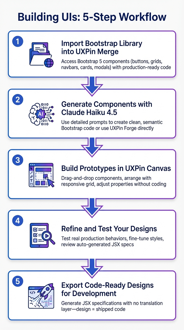
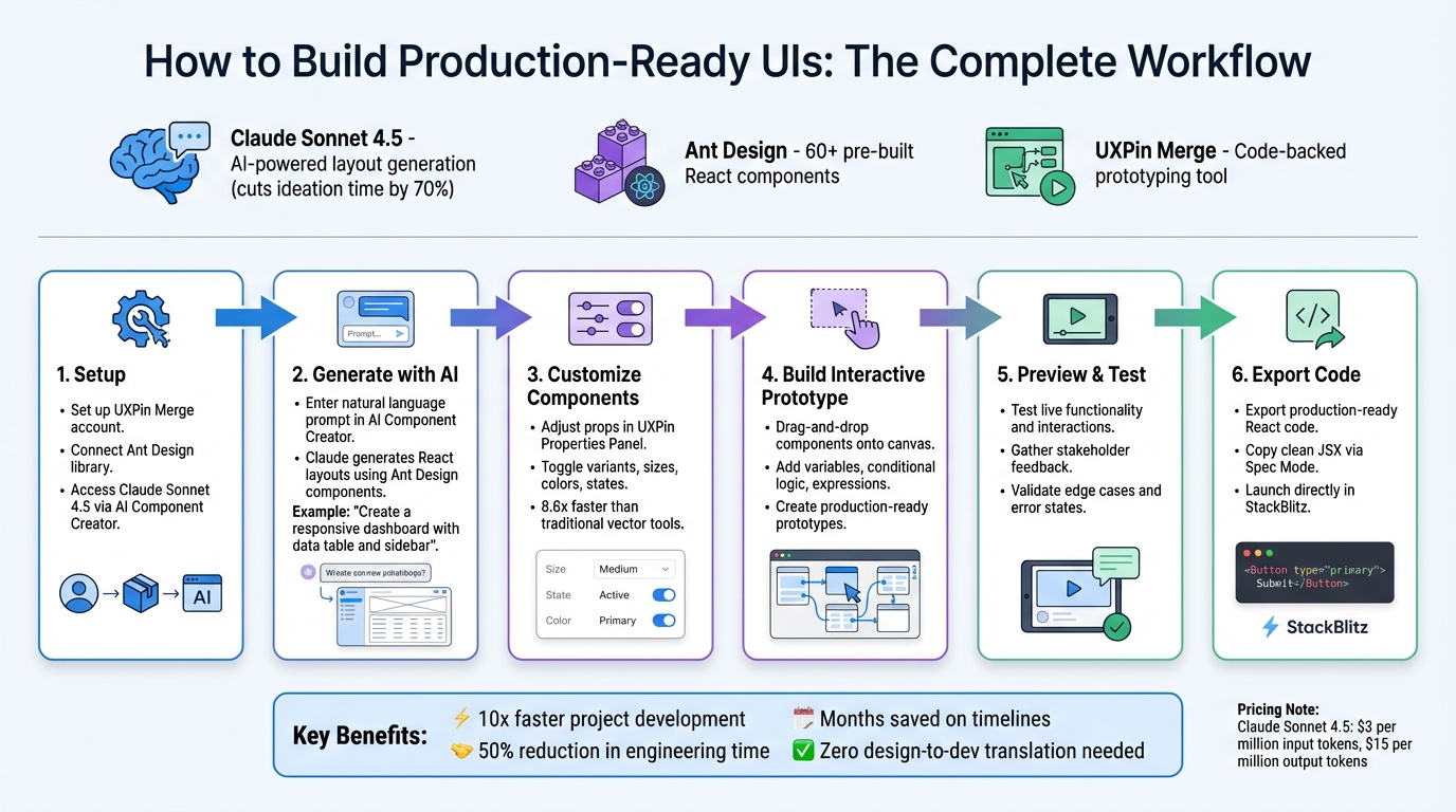
Want to bridge the gap between design and development? With GPT-5.2, MUI, and UXPin Merge, you can design user interfaces using real, production-ready React components. This approach eliminates errors, speeds up workflows, and ensures design consistency across teams.
Key Takeaways:
- GPT-5.2: Generates MUI components from text prompts, tailored to your design system.
- MUI: Offers over 90 tested React components aligned with Material Design.
- UXPin Merge: Lets you design with the same code components used in production, reducing handoff issues.
Why It Matters:
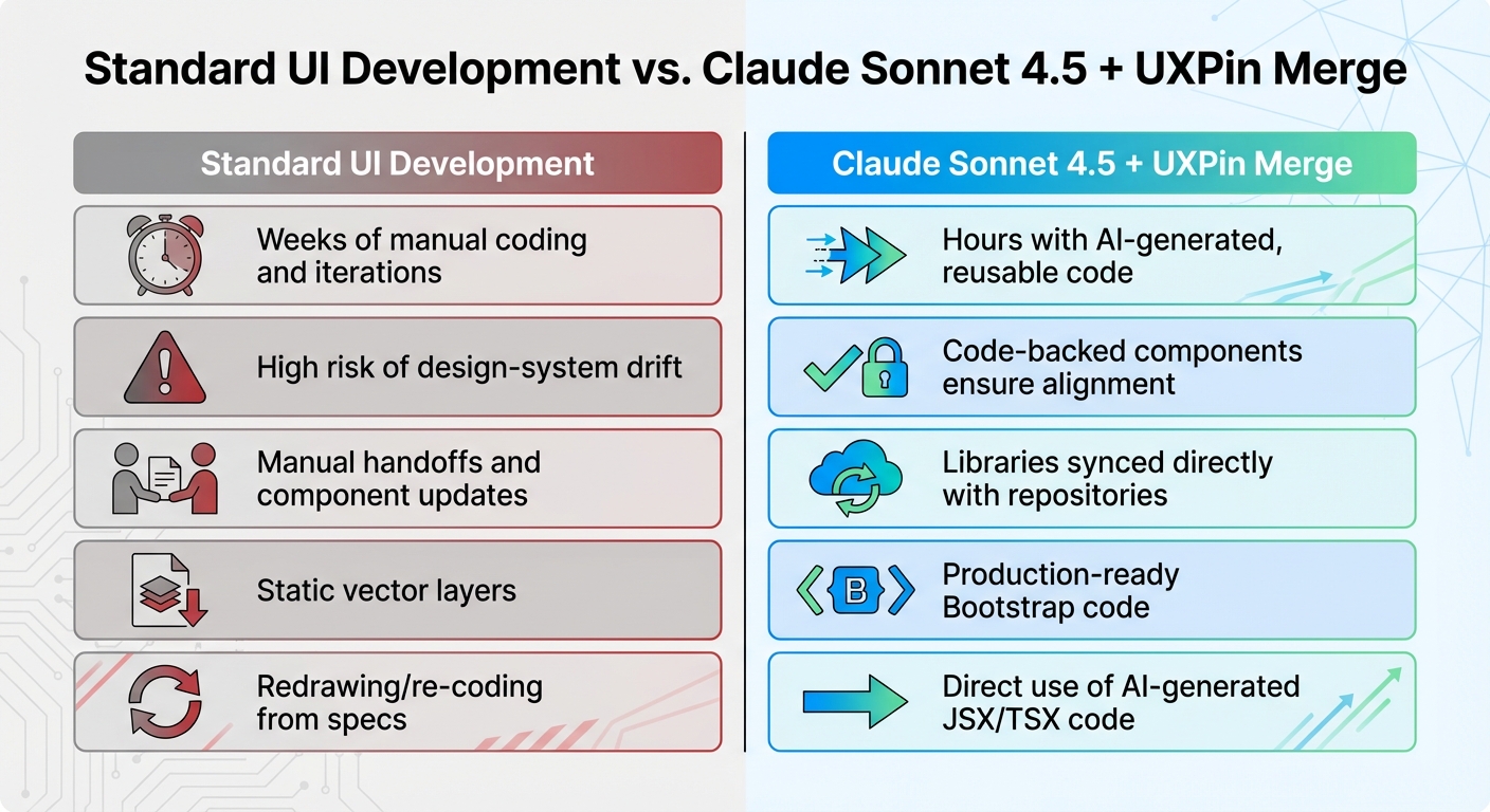
Traditional mockups often fail during development. By designing with real code components, you ensure alignment, save time, and reduce inconsistencies. This guide shows you how to integrate these tools into your workflow for faster, more accurate results.
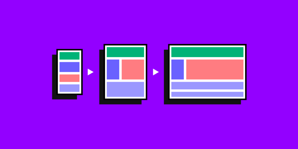
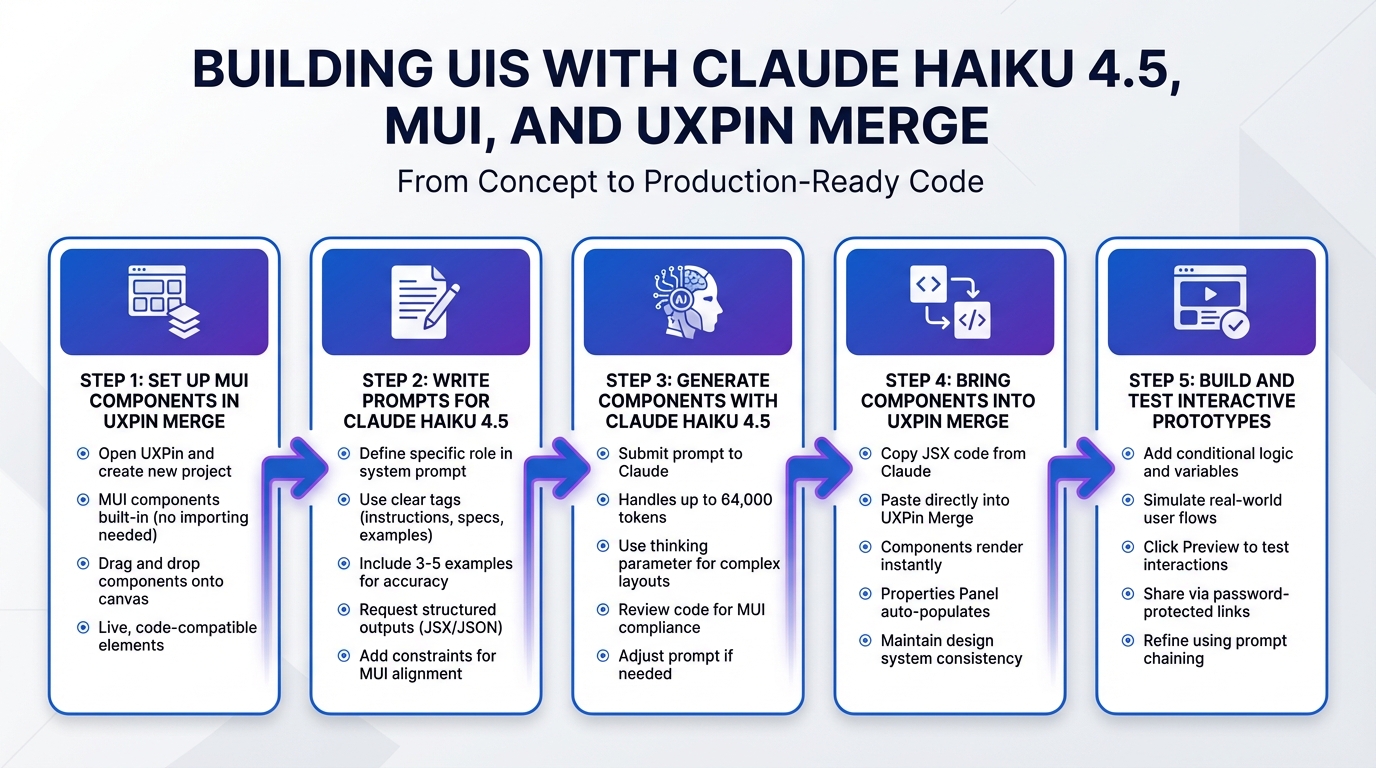
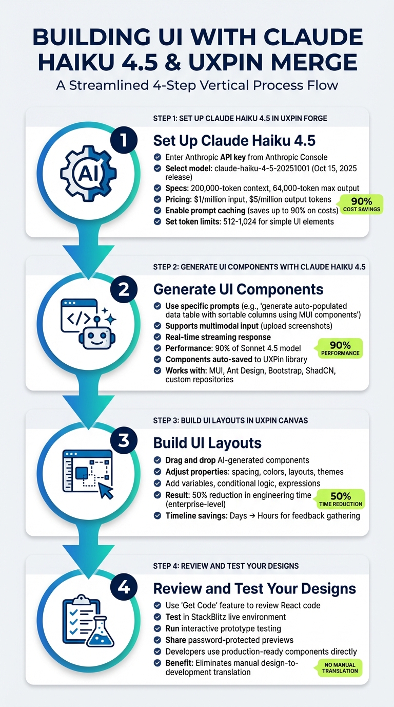
How GPT-5.2, MUI, and UXPin Merge Work Together in UX Design Workflow
UXPin Merge Tutorial: Exploring MUI Library (3/5)

sbb-itb-f6354c6
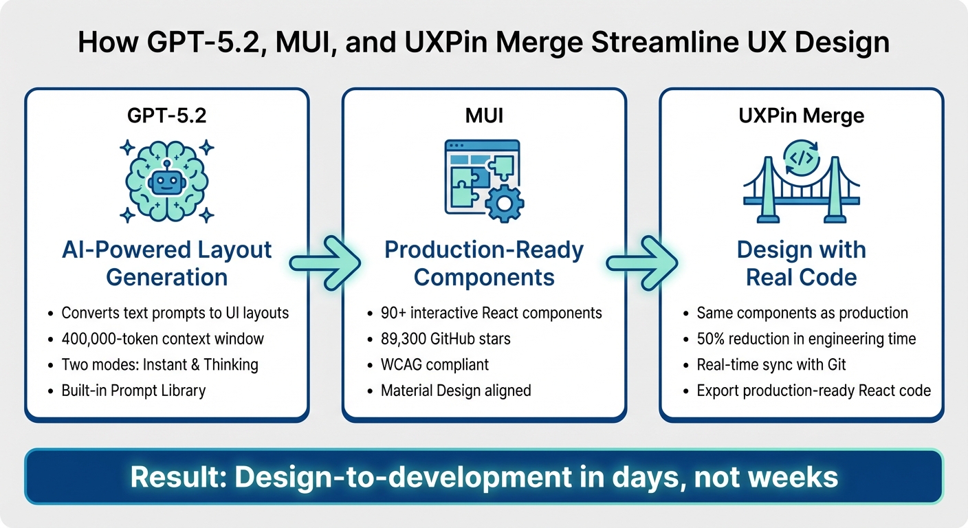
GPT-5.2, MUI, and UXPin Merge: How They Work Together
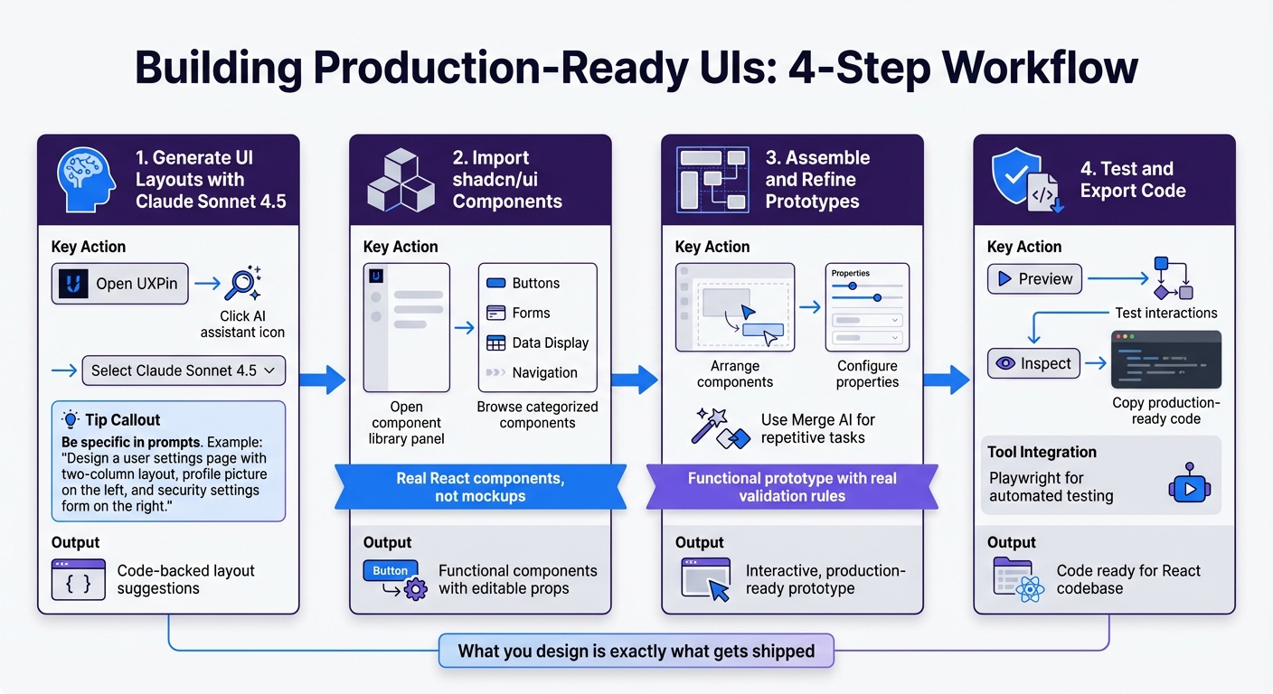
GPT-5.2 generates layouts from text prompts, MUI provides ready-to-use React components, and UXPin Merge bridges the gap between design and development by allowing you to design with real code components. Here’s a closer look at how these tools work together to streamline the design-to-development process.
What GPT-5.2 Brings to UX Design
UXPin’s Forge assistant, powered by GPT-5.2, turns text prompts into functional UI layouts using MUI components. For instance, if you request "create an admin dashboard with a data table and user stats", Forge delivers a layout made of real, production-ready components. Unlike generic tools that create basic wireframes, Forge outputs components that are ready for development.
The AI Helper feature makes it easy to tweak existing designs. You can describe changes like "add an admin-style to this table" or "reduce the spacing", and Forge updates the design instantly. Additionally, you can upload sketches or screenshots, and GPT-5.2 will rebuild them using MUI’s structure and semantics. A built-in Prompt Library provides pre-written, optimized prompts for MUI components, helping you kickstart projects quickly.
MUI: A Library of Production-Ready Components
MUI is a React component library featuring 90+ interactive components that adhere to Google’s Material Design guidelines. These include elements like data grids, form inputs, date pickers, and sortable tables – components already tested and ready for enterprise use. When you design with MUI in UXPin Merge, you’re using the same components developers rely on in production. This eliminates the need to translate static designs into code.
MUI ensures consistency and accessibility, with all components meeting WCAG compliance standards. It also supports theme customization and CSS utilities, making it easy to align with brand guidelines while maintaining reliability. With 89,300 GitHub stars, MUI is among the most trusted libraries in the React ecosystem.
"It used to take us two to three months just to do the design. Now, with UXPin Merge, teams can design, test, and deliver products in the same timeframe." – Erica Rider, UX Architect and Design Leader
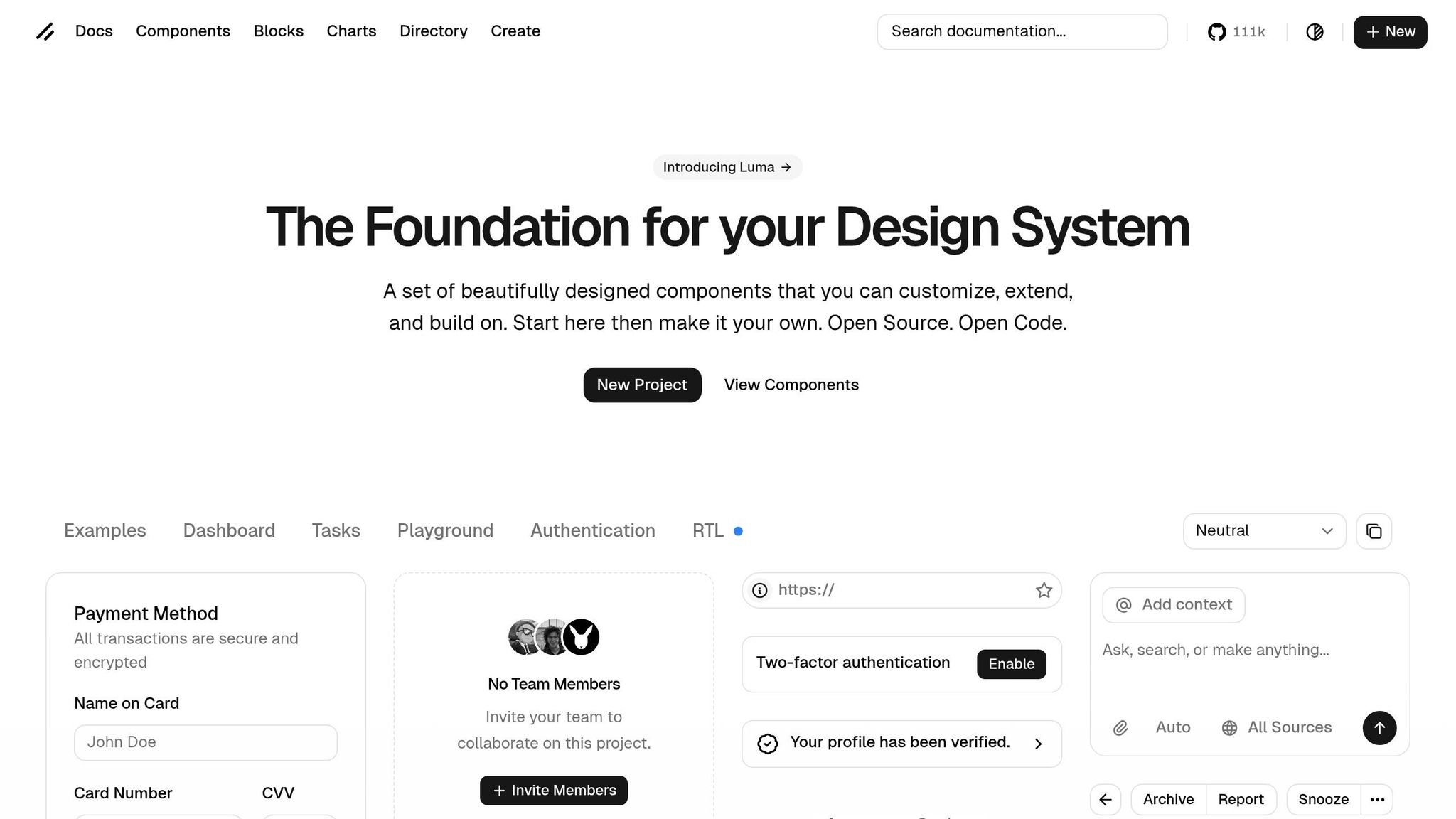
UXPin Merge: Designing with Real Code Components
UXPin Merge takes MUI components to the next level by allowing you to design directly with the same code elements developers use. Dragging an MUI button or data table onto the canvas means you’re working with the exact React component that will appear in the final product. This creates perfect alignment between design and development.
With Merge, you can also create advanced prototypes featuring conditional logic, variables, and data handling, making your designs function like the final product instead of static mockups. Developers can export fully functional React code directly from your designs or open it in tools like StackBlitz for immediate testing. This approach has been shown to cut engineering time by up to 50%.
"When I used UXPin Merge, our engineering time was reduced by around 50%. Imagine how much money that saves across an enterprise-level organization with dozens of designers and hundreds of engineers." – Larry Sawyer, Lead UX Designer
With these tools in place, you’re ready to set up your environment and start creating prototypes that bridge the gap between design and development seamlessly.
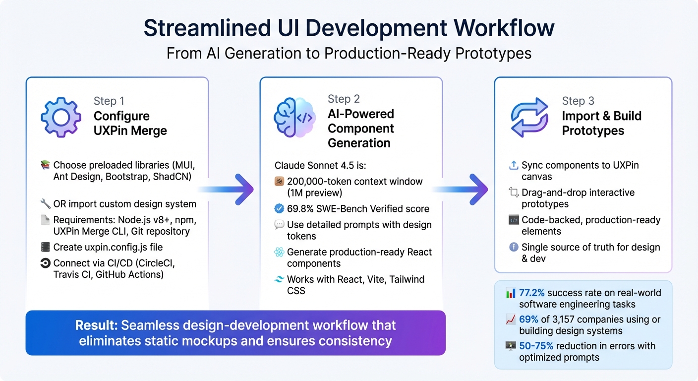
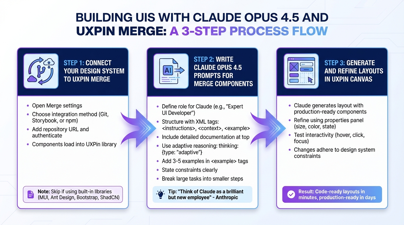
Setting Up Your Environment
Getting your setup right is the first step to seamlessly connecting design and production. Start by logging into UXPin Merge, opening the component panel, and selecting the MUI library.
How to Access MUI Components in UXPin Merge
To access interactive MUI components, simply choose the MUI library from the component panel. If you need a custom setup, you can import your own version of MUI through npm integration through Storybook. Here’s how:
- Fork the
uxpin-merge/storybook-material-uirepository. - Run
yarn installand thenyarn run build-storybook. - Deploy your Storybook using the following command:
npx uxpin-storybook-deployer -t TOKEN -s path/to/your/storybook.
For most teams, the pre-built MUI library in UXPin is enough, so additional configuration might not be necessary.
Configuring GPT-5.2 in UXPin
GPT-5.2 is integrated directly into UXPin via the Forge assistant. This model supports a 400,000-token context window and offers two modes: "instant" for quick tasks and "thinking" for handling complex UI architecture challenges. Keep an eye on your AI credit usage to ensure uninterrupted functionality.
Choosing the Right UXPin Plan
UXPin offers three pricing tiers, all of which include Merge technology:
- Core Plan: At $29/month, this plan is ideal for individuals or small teams and includes 200 AI credits.
- Growth Plan: Priced at $40/month, this option provides 500 AI credits along with design system features.
- Enterprise Solutions: For custom plans, contact sales@uxpin.com.
Once your environment is ready, you can start generating MUI components with GPT-5.2.
Generating MUI Components with GPT-5.2
With your environment configured, let’s explore how GPT-5.2, integrated into Forge, can help you create precise, design-system-compliant MUI components. By leveraging only pre-approved components, this setup ensures outputs are ready for production. Here’s how you can generate and refine MUI components effectively using GPT-5.2.
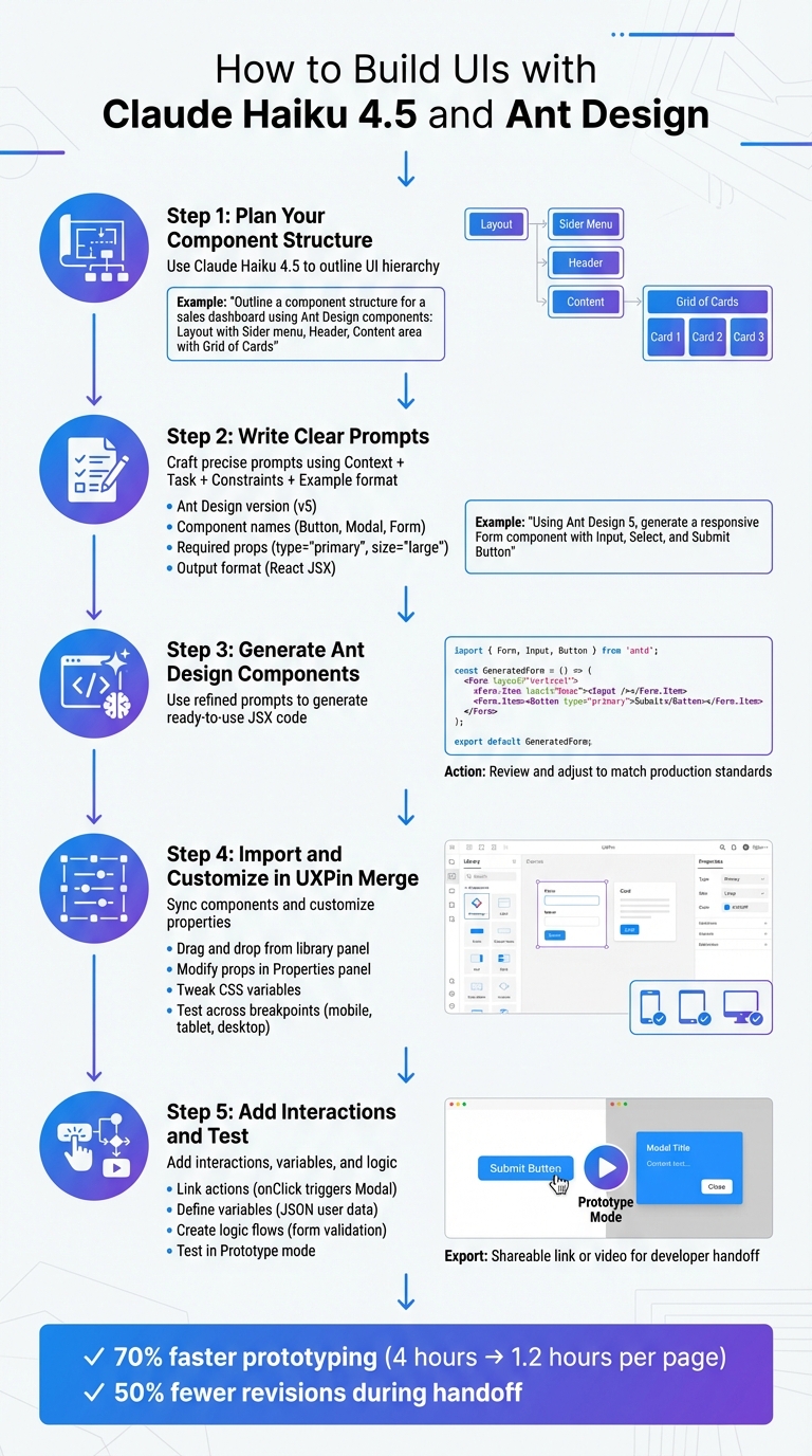
Writing Clear Prompts for AI-Generated Components
Crafting the right prompt is crucial. A good structure includes Context, Task, Constraints, and Output Format. This ensures the model understands exactly what you need.
For instance, instead of saying, "create a login form", try something more specific:
"Build a login form using MUI TextField and Button components. Use tokens from our design system only. Avoid extra shadows or custom colors. The form should include email and password fields, along with a submit button."
To make instructions clearer, use delimiters like ### or """ to separate text from code snippets. You can also guide the model by starting your output with a relevant code snippet, such as:
import { Button } from '@mui/material';
This helps set the tone for the correct coding approach.
If your requirements are vague, instruct GPT-5.2 to ask 1–3 clarifying questions instead of guessing. Additionally, specify constraints such as "limit to 5 bullets" for more concise outputs. Once you’ve defined your prompt, refine results for more complex designs through iteration.
Refining AI-Generated Designs
For more sophisticated UI tasks, switch to GPT-5.2 Thinking Mode in Forge. This mode is designed to handle intricate designs and unconventional UI challenges with greater precision.
“GPT-5.2 represents the biggest leap for GPT models in agentic coding since GPT-5… Early testers found it significantly stronger at front-end development and complex or unconventional UI work.”
- Jeff Wang, CEO, Windsurf
Thinking Mode significantly reduces error rates – by 50% – and achieves a 55.6% score on SWE-Bench Pro. Use iterative prompts to fine-tune your UI design step by step, ensuring each iteration gets closer to your ideal output.
Keeping AI Outputs Aligned with Your Design System
Forge enforces consistency by relying strictly on pre-approved components from your MUI library. To maintain this alignment, incorporate <design_and_scope_constraints> into your prompts. This ensures GPT-5.2 adheres to rules like using "tokens-only colors" and avoiding unapproved components.
For added reliability, include a <high_risk_self_check> step at the end of your prompt. This instructs GPT-5.2 to review its output for errors or unsupported elements before finalizing.
Building Interactive Prototypes in UXPin
After generating MUI components with GPT-5.2, the next step is to bring them to life with dynamic interactions. UXPin enables you to create prototypes that function like real applications, complete with conditional logic, dynamic data handling, and components that mimic production behavior. Let’s dive into how variables and logic can transform static components into dynamic, interactive experiences.
Adding Interactivity with Conditional Logic and Variables
UXPin’s variables allow you to store and transfer data across screens, simulating real-world application behavior. For example, you can capture a user’s name on one screen and display it on another.
To store user input, use the "Set Variable" action, which is triggered by a "Value Change" on an input field. UXPin also supports expressions for calculations, such as shopping cart totals or password strength checks, and for creating advanced validation rules.
With conditional logic (if-then-else), you can define rules-based actions. For instance, to implement form validation, you could create an if-else flow where the "if" condition checks if an input matches a regex pattern (like an email address). If the condition fails, the "else" action can reveal a hidden error message. Just make sure the "if" interaction is listed above the "else" interaction in the Interactions panel to ensure proper evaluation.
Prototyping with MUI Components
To take interactivity a step further, UXPin Merge uses code-backed MUI components that behave like real UI elements. This ensures your prototypes function exactly how they will in production, removing the guesswork that comes with static mockups. The MUI components you prototype with are the same ones developers use, creating a seamless single source of truth.
"What used to take days to gather feedback now takes hours. Add in the time we’ve saved from not emailing back-and-forth and manually redlining, and we’ve probably shaved months off timelines."
- Mark Figueiredo, Sr. UX Team Lead, T.RowePrice
Additionally, GPT-5.2 can help you generate code-backed layouts, like tables and forms, directly in UXPin using tailored prompts. For the best results, you can switch GPT-5.2 to its "Thinking" mode, which ensures strict TypeScript adherence and WCAG compliance for accessibility.
Testing and Validating Your Prototypes
UXPin prototypes are rendered using HTML, CSS, and JavaScript, making them nearly indistinguishable from the final product during testing. This high-fidelity approach allows for more accurate usability testing compared to static design tools.
With the "Preview and Share" feature, you can easily share browser-based prototype links with remote participants. For added security, you can enable password protection. UXPin also integrates with tools like Ethnio, allowing you to recruit real users via live "Intercepts" that target specific demographics, devices, or user behaviors.
Collaboration is streamlined with the "Comments" feature, where teams can leave feedback directly on the prototype. Slack integration further simplifies communication across design, product, and engineering teams.
"C-suite people and directors can give us stronger feedback about the ultimate direction because they experience the features and goals of these prototypes rather than just commenting about how these boxes don’t look like a text field."
- Erica Rider, Former UX Lead EPX at PayPal
To validate data-handling during testing, you can use UXPin variables to capture user inputs, such as names or dates, and display them later in the flow. This creates a realistic, interactive testing environment that mirrors actual application behavior.
Speeding Up Design-to-Development with UXPin Merge
UXPin Merge bridges the gap between design and development by using code-backed components. When you work with MUI components in UXPin, you’re designing with the exact same React components developers use in production. This ensures your prototype matches the final product perfectly.
This section dives into how features like real-time syncing, version control, and deployment workflows help reduce delays and improve collaboration between teams. To further streamline backend integration and API management, many teams pair UXPin with DreamFactory, a self-hosted platform providing governed API access to any data source, enabling seamless connections between your frontend prototypes and enterprise data systems.
Real-Time Sync Between Design and Code
By syncing a Git component repository directly with the UXPin editor, any updates to your design system automatically appear in both design and development environments. This means designers always work with the latest production components, while developers receive production-ready React code they can copy directly into their projects or open in tools like StackBlitz. This eliminates the need for manual redlining, back-and-forth emails, and potential miscommunication.
Version Control and Audit Trails
UXPin Merge offers a robust version control system, allowing teams to track every change while maintaining consistency with production standards. Shared libraries and component versioning make it possible to manage multiple iterations of a design system, ensuring design system governance requirements are met. Built-in audit trails further support compliance and transparency, which is especially vital for complex enterprise projects.
"We have fully integrated our custom-built React Design System and can design with our coded components. It has increased our productivity, quality, and consistency, streamlining our testing of layouts and the developer handoff process."
- Brian Demchak, Sr. UX Designer, AAA Digital & Creative Services
Deploying Designs from UXPin
Deployment becomes seamless with UXPin’s integration features. Real-time syncing and version control allow designs to update automatically across systems. From the UXPin editor, you can export production-ready code directly, removing the need for rebuilding. For teams using GPT-5.2 and MUI, AI-generated layouts can move effortlessly from concept to production, with tested, production-ready code delivered instantly.
Conclusion
Key Takeaways
Bringing together GPT-5.2, MUI, and UXPin Merge is changing how enterprise teams create user experiences. This combination lets you design with real production components – the exact React code your developers use – bridging the gap between design and development. GPT-5.2 speeds up layout creation, MUI delivers reliable components, and UXPin Merge keeps everything perfectly aligned with your codebase.
Here’s how it works: use AI to generate component logic, connect it to MUI components in UXPin, and produce production-ready designs without the usual design handoff headaches. Features like real-time syncing, version control, and audit trails ensure teams stay aligned while meeting governance standards. Tasks that once took weeks can now be completed in days.
Next Steps: Get Started Today
Want to simplify your design-to-development process? UXPin makes it easy with built-in MUI integration – no need to import files or manage external accounts. Just open the editor and start designing with real code components.
For AI-assisted prototyping, the Core plan starts at $29/month, offering basic AI tools and 200 AI credits. For more advanced needs, the Growth plan is available at $40/month, featuring enhanced AI models, 500 credits, and support for design systems. Enterprise teams requiring custom libraries and unlimited AI credits can reach out to sales@uxpin.com for personalized pricing.
Check out uxpin.com/pricing to compare plans and find the perfect fit for your team. To dive deeper into UXPin’s AI tools, visit uxpin.com/forge and see how they work seamlessly within your design system constraints.
FAQs
How do I connect my MUI setup to UXPin Merge?
To integrate your React components with UXPin Merge, follow these steps:
- Fork and clone the MUI + UXPin Merge repository.
- Install dependencies by running
yarn install. - Log in to your UXPin account.
- Start the Merge environment using the command
yarn run start.
If needed, you can also sync custom MUI components. This allows you to create prototypes that match your development components, making your workflow more efficient.
When should I use GPT-5.2 ‘Thinking’ mode vs ‘Instant’ mode?
GPT-5.2 provides two distinct modes to suit different tasks:
- ‘Thinking’ Mode: Ideal for tasks that demand deep reasoning, intricate problem-solving, or detailed analysis. This mode focuses on delivering accurate and thorough responses, making it perfect for complex challenges.
- ‘Instant’ Mode: Designed for quick, everyday tasks such as looking up information or following simple instructions. It prioritizes speed and efficiency, making it a more cost-effective option for straightforward needs.
For precision and depth, go with Thinking Mode. For speed and simplicity, Instant Mode gets the job done.
How do I keep AI-generated UIs compliant with my design system tokens?
Design tokens should serve as the single source of truth for all your visual properties – things like colors, typography, spacing, and shadows. By integrating these tokens directly into your development workflow, you ensure that any updates are automatically reflected across all UI components. This not only keeps your design consistent but also ensures it aligns seamlessly with your design system, making scaling much easier. Plus, using tools that support token-driven design can help enforce consistency and validate adherence across your application.


")
")
")
")