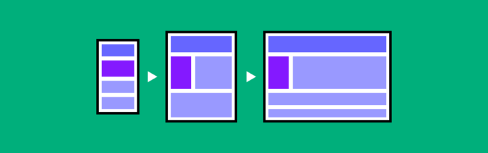
Create production-ready landing pages faster by combining AI copy, reusable UI components, and a design-to-code workflow.
How to build a landing page using GPT-5.1 + MUI – Use UXPin Merge!

Create production-ready landing pages faster by combining AI copy, reusable UI components, and a design-to-code workflow.
Learn how to design mobile-first with this step-by-step guide. Covers the approach, why it matters, examples from Google, Airbnb, and Spotify, plus a hands-on walkthrough for building responsive layouts.
UX requirements are the foundation every successful design project is built on. Skip them, and you’ll spend months designing the wrong thing. Invest in them upfront, and the entire product development cycle moves faster — fewer revision rounds, less stakeholder misalignment, and a product that actually solves user problems. This guide walks through what UX
(…)UXPin is a product design platform used by the best designers on the planet. Let your team easily design, collaborate, and present from low-fidelity wireframes to fully-interactive prototypes.
Start your free trial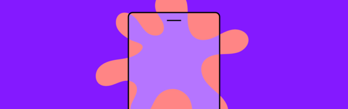
A splash screen is often the very first thing a user sees when opening your app. Research shows users form an opinion about a digital experience within 50 milliseconds — and the splash screen occupies a significant share of that critical first impression. Done well, a splash screen reinforces brand identity, reduces perceived load time,
(…)
An app’s color scheme does more than look good — it shapes how users feel, how quickly they complete tasks, and whether they trust your product. Research suggests that up to 90% of snap judgments about products are based on color alone, making your palette one of the most consequential design decisions you’ll make. This
(…)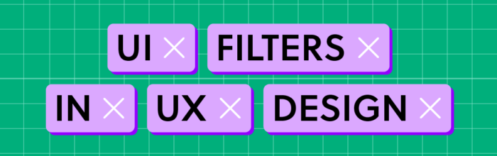
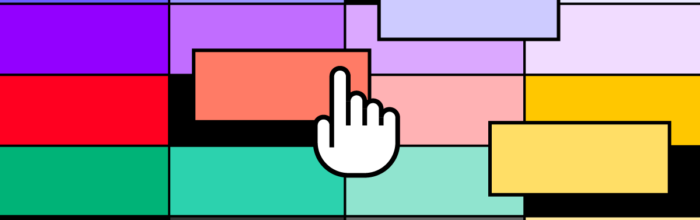
Filters are among the most impactful UI elements in any digital product. A well-designed filter system lets users cut through noise, find exactly what they need, and stay engaged longer — directly affecting conversion rates, user satisfaction, and retention. Yet filter design is deceptively complex. You need to balance simplicity with power, accommodate diverse mental
(…)
Map AI-generated copy into code-backed components to build production-ready landing pages faster and with less rework.

Create responsive landing pages using GPT-5.2 for copy, Bootstrap for layout, and UXPin Merge for production-ready prototypes.
Learn paper prototyping techniques for UX design. This 2026 guide covers when to use paper prototypes, step-by-step methods, testing tips, and how to transition sketches to digital tools like UXPin.
Master the 5 stages of design thinking — Empathize, Define, Ideate, Prototype, and Test. This 2026 guide covers each stage with practical techniques, examples, and tools for modern UX teams.
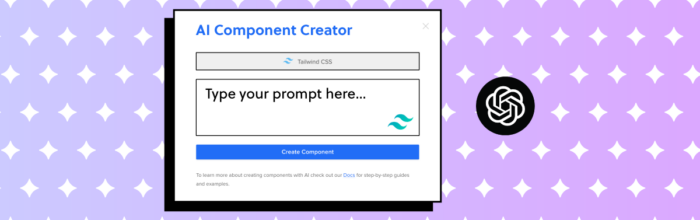
Learn how to use ChatGPT for UI design — from layout brainstorming and UX copy to code generation. Plus, discover how UXPin Forge generates production-ready UI from your real design system.
Next.js vs React — what’s the difference? This 2026 comparison covers rendering, routing, SEO, performance, and use cases so you can choose the right tool for your project.
Master the web design process with this 8-step guide. Covers goal-setting, research, wireframing, prototyping, content strategy, development, QA, and post-launch optimization for modern teams in 2026.

Use AI copy, reusable UI components, and Merge-based design-to-code to build responsive landing pages faster.

Create production-ready landing pages in 5–7 days using AI copy, shadcn/ui components, and UXPin Merge for seamless design-to-code.