Successful products are created by designers that know their users. Everyone else is designing in the dark.
But with all the possible user research methods available, how do you select the right user research techniques? Real-life UX projects don’t always provide enough time for the thorough research discussed in design theory.

Photo credit: “Research.” Neil Conway. Creative Commons.
In this post, we’ll explain the different categories of user research, then dive into practical methods applicable for everyday UX design.
We’ve included useful techniques and resources based on recommendations from our own UX team. We’ll focus on the tactics that offer the best insights for the time involved.
The 3 Categories of User Research
As explained in The Guide to Usability Testing, we can break up user research into three groups.
The user research and testing process isn’t always linear, however, so it’s quite common to mix up the order below based on your needs (e.g. you could start first with general usability testing for a redesign).
1. Preliminary User Research
As the name suggests, preliminary user research happens before the actual hands-on design. The goals of preliminary research are:
- Better deciding which user groups to target
- Understanding the preferences of the targeted user group (persona creation)
- Gauging the viability of your product in the market
- Revealing ways to increase the value of your product in the market (product definition)
Common preliminary research methods include: user interviews, surveys, and diary studies.
2. General Usability Testing
Once the design process starts, you can initiate general usability testing. At this stage, you’re exploring the structure and functionality of the design.
Card sorting and tree testing help you create the most intuitive information architecture and navigation pathways, while low-fidelity prototyping helps you test early versions of the design.
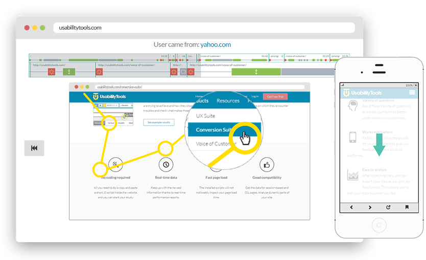
Photo credit: Usability Tools
You’re “thinking broad to get narrow” as users help you decide which content structures and interaction models are worth iterating, and which should be scrapped altogether.
3. Fine Tuning Usability
As the design process nears completion you can begin fine-tuning with additional usability testing.
More often than not, this stage tests the validity of decisions you already made.
For instance, you might A/B test two variations of the same prototype to verify if a CTA above or below the fold generates a higher signup conversion rate.
Different Approaches to User Research & Testing
1. Moderated vs. Unmoderated
Furthermore, the tests within each category can often be either moderated or unmoderated.
In general, unmoderated tests produce more natural results since participants use the product in their natural setting away from a lab setting. Unmoderated tests cost less and are easier to schedule.
However, if your product is either naturally complex (e.g. a stock analysis app for traders) or you’re still in a lo-fi prototyping stage (therefore more usability issues), a moderator helps to answer questions and keep users on track.
2. On-Site vs. Remote
You also occasionally have the choice to conduct the test on-site or remotely.
Remote testing is often beneficial for the same reasons as unmoderated tests: more natural user behavior. Moreover, remote tests are far easier to schedule, and allow multiple tests running at the same time. On-site tests are more suitable for highly confidential products.
3. What’s the Best Combination?
The best combination depends completely on your budget, location, and timelines.
In our experience redesigning UXPin, however, we found remote moderated usability tests were the best choice early in the design process.
Our UX researcher Ben Kim could observe user behaviors in real-time, then jot down notes and ideas as they popped up. For our lo-fi prototypes, the presence of a researcher also helped guide them back on track when they encountered early usability issues.
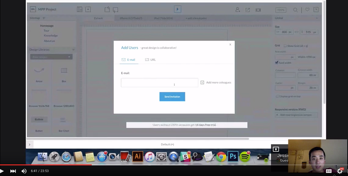
Photo credit: Testing our redesigned interface with designer Jessica Tiao of KissMetrics
Once we created a hi-fi prototype, we ran a combination of remote moderated and remote unmoderated usability tests. The hybrid approach allowed Ben to ask follow up questions if any critical usability issues arose in the moment, while also offering insights into natural use cases.
We did run a handful of moderated on-site usability tests (for lo-fi and hi-fi prototypes) since Silicon Valley is full of top designers, but we leaned on remote tests mostly due to ease of scheduling.
Fitting User Research into the Design Process
It’s never a bad time to conduct user research.
User research should be not book-ended at the start and finish of a design. In fact, early- and middle-stage testing can be the most beneficial — testing every major iteration of a design means the feedback can be integrated immediately when the insights are still fresh.
While design processes vary based on the project needs, a loose outline of fitting user research into the process might look like this:
- Preliminary User Research
- Persona Creation
- Product Definition
- Information Architecture
- IA Testing
- Wireframing
- Lo-fi Prototype Testing
- Mockups
- Hi-fi Prototype Testing
- Coding
Whatever your process, you should always test when moving from lo-fi to hi-fi prototypes.
Preliminary User Research
Let’s get into the details, with the most common types of tests, and their best practices. We’ll start with preliminary research.
1. User Interviews
One of the oldest and most reliable methods of user research, user interviews are a direct approach to getting inside your user’s head. There is a lot of flexibility in how you conduct them, for example, which questions you ask and where it’s held. Additionally, user interviews can be conducted any time throughout the process, on any topics.
Erika Hall wrote a great overview piece to interviewing, which includes sample questions. Whitney Hess provides additional tips and techniques, delving into how an interviewer should compose themselves.

Photo credit: “2014-04-30 17.09.22.” Nicholas Wang. Creative Commons.
2. Surveys
For a faster, user surveys require less involvement, at the cost of depth. These written questionnaires can be distributed widely online with tools like Surveymonkey, and answers can be quickly tallied for a mix of qualitative and quantitative data (if you’re using a numeric scale).
The downside of course, is that you must account for response bias.
You can start your user research with a survey, then follow up with select users to hold interviews for more in-depth questions.
Diane Loviglio goes into detail with wording and question order, and Dr. David Travis gives 20 tips.
3. Field Studies
Sometimes the best way to understand your users is to see them in their natural habitat. By some thought to be the best effective method of studying users, Field studies examine user behavior in their own environment and rely less on the user’s capability of explaining their actions.
Read Carolyn M. Brown’s complete how-to guide, and complement it with The Nielsen Norman Group’s tips and advice.
4. Diary Studies
Similar to field studies, a diary study draw on a text written by the user for data.
Supporters claim this is the best method for removing bias, although its success relies a great deal on the ability on the user.
The UserTesting blog gives an explanatory overview, and Eri on the Web explains some dos and don’ts.
General Usability Testing
1. Card Sorting
For early IA and navigation testing, few tests are better than card sorting. This test simply provides users with cards representing each relevant topic and/or page, and asks them to sort them in a way they find most logical. This is a direct approach to how the user intuitively views your content, and you can even leave some room for them to come up with their own labels.
Donna Spencer runs through the basics, including variations and the pros/cons, while William Hudson takes a more technical look.
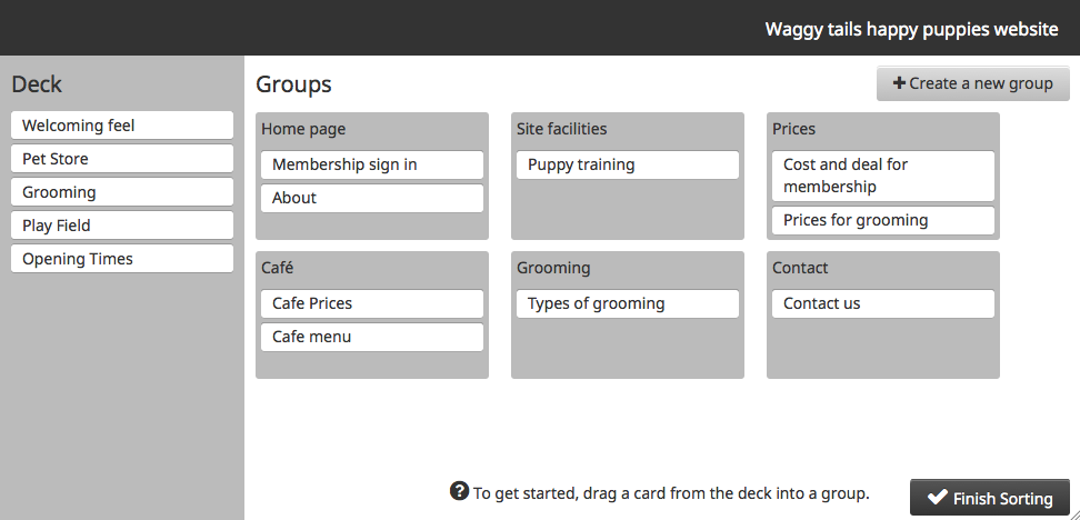
Photo credit: ConceptCodify
2. Tree Testing
Tree tests are like the sister test of card sorting: where card sorting tests from the top down, tree testing goes from the bottom up.
Users are given an outline of the IA and a task. For example, if you’re testing a food blog, your task might be “Find the an entree recipe for your dinner party next Saturday” Users simply go through the list of titles — not the actual site — and you monitor if they were successful, which route they took, any problems or backtracking they had, etc.
Martin Rosenmejer gives a thorough overview, and Jeff Sauro explains the details, including sample sizes of testers.
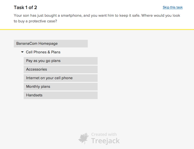
Photo credit: Optimal Workshop: Treejack
3. Prototype Usability Testing
We recommend testing your design ideas in action as early as possible. Before tackling more complicated issues like visuals, testing a lo-fi prototype will reveal any faults in the user flows.
You can also use tools like UserTesting to test your prototypes remotely in the comfort of the user’s home, gaining valuable insights into natural use cases. If you have absolutely no budget for usability testing, you can try running a guerrilla usability test with 5 users in your office.
Fine-tuning Usability Testing
1. A/B Testing
When you’re torn between two seemingly equal options, an A/B test will show which users naturally prefer.
This type of testing presents different users with two different variations of the same screen, and since it’s a controlled experiment, only one variable differs. This generates data on which of the two options (“A” or “B”) is more successful, whether at conversations, discoverability, navigation, etc.
Paras Chopra wrote an all-inclusive guide on the topic, and Robin Johnson came up with a list of 71 elements worth testing in this format.
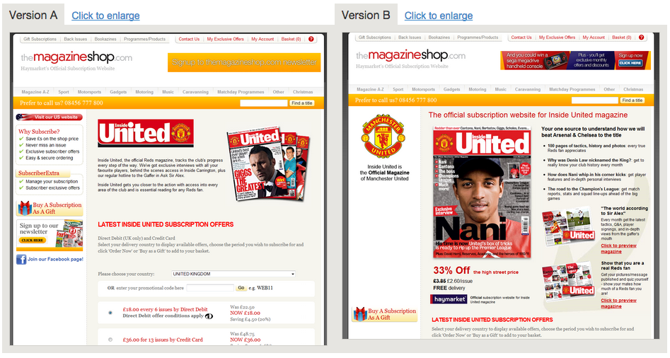
Photo credit: WhichTestWon
2. Click Testing (Screenshot Testing)
By tracking where users click most, click tests allow designers to test both the navigation and visual hierarchy at the same time.
You learn which site elements make the strongest first impression, and where the discrepancy lies between desired and actual user behavior. Click test results are oftentimes aggregated into a heatmap for quick visual understanding.
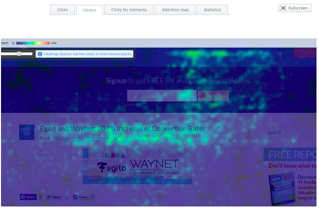
Usability experts Jeff Sauro, writing for MeasuringU, and Bartosz Mozyrko, for SpeckyBoy, explain their own advice on click testing.
Collaborative Usability Testing
If UX design is a team activity, then your usability testing also needs to involve other developers and product managers.
Before testing even begins, go through the team and collect any concerns or points of confusion. The marketing department will likely want to know different things than developement, so for open user tests like user interviews, make sure everyone’s questions are answered.
A concise test plan — like the one Tomer Sharon describes — can keep everyone informed about the test details, and makes an impressive deliverable to stakeholders.
For moderated tests (remote or on-site), you can even invite along team-members from other departments, so they can see and interact first-hand. Just make sure a clear leader is determined before the test starts, and try not to overwhelm the users with a large number of observers.
Alternatively you can live-stream tests in progress for all interested team-members, and host the video in a public folder. Moreover, observing team members can participate more through a collaborative Rainbow Spreadsheet, an activity described by Tomer Sharon for Smashing Magazine.
Photo credit: UXPin for Yelp design usability testing; based on model by Tomer Sharon
Last and most important, you want to share the results and their analysis with the entire team — it’s not just designers that can benefit from this knowledge.
For all testing documents, it helps to create a public shared folder, such as Google Drive, where all team-members can access what they need.
Additional Resources
To learn more practical advice, check out some of our favorite user research and usability testing resources.
Useful Usability Tools
- SurveyMonkey — Free survey tool that also aggregates results for fast analysis
- Optimal Workshop — Card Sorting, Tree Testing, and Click Testing
- Optimizely — A/B Testing, and data analysis
- Unbounce — A/B Testing, with feature of building quick landing pages for testing
- UserTesting — Professional research teams and managers offer assistance to your research needs
- UserZoom — An all-inclusive user research add, from recruitment to data analysis
- Usabilla — A useful usability testing tool for websites, emails, and apps
- UsabilityTools — A powerful visual analytics tool for click mapping, A/B testing, and conversion optimization.
- Userlytics — A testing aid that offers a variety of benefits, including video recordings of unmoderated prototype testing
- Lookback — App that enables opt-in recordings of real users interacting with your app.
Feature image credit: UserTesting