What is a Single Source of Truth, and Why Do You Need it?

What is a single source of truth

Lead designers need to make sure they keep their team members on the right path. Managers have tried several methods to reach this goal, including pattern libraries and style guides. While those options have a place to play within some organizations, they don’t always provide the single source of truth that you need to optimize design efficiency and avoid mistakes.

Optimize your design process by bridging the gap between design and development. Design prototypes 10x faster by using a ready-made, interactive components that you share with engineers. Learn how UXPin Merge allows you to build prototypes with a single source of truth that ensures design-product consistency and collaboration. Discover UXPin Merge.

Reach a new level of prototyping

Design with interactive components coming from your team’s design system.

Defining a single source of truth

Today’s design and prototyping tools tend to rely on design systems as a single source of truth. The design system should include everything that employees involved in product development need to conform to the company’s brand identity and align with all expectations.

When using a design system as your single source of truth, you will likely establish approved:

  • Color palettes
  • Type scales
  • Icons
  • Buttons
  • Forms
  • Sliders

Keep in mind that you can use a pre-existing design system or create a unique one for your team’s products. Building a new design system takes time, so a lot of smaller design groups decide to use options like Material Design, which already gives you a library of attractive, functional components that you can add to designs easily.

Other popular design systems include:

While you can save time and energy using one of these as your single source of truth, you lose a little control over your aesthetic. Plus, a lot of designers already use these design systems. You might find that developing an independent, single source of truth helps your brand stand out from the crowd.

If you decide to make a new design system, you can build it with atomic design. UXPin has a useful checklist that will help contribute to your atomic design system’s success. You should also consider reading Creating a Design System: The 100-Point Process Checklist (don’t worry. It’s free).

Why you need a single source of truth (more than you probably know)

Establishing a single source of truth gives you benefits way beyond controlling what components, icons, and color schemes your designers use. Depending on how you approach your design system and the tools you choose, you can make work much easier for everyone on your team. 

You provide everything designers need to build products

In a very loose way, this is something that you already expect static style guides to do. When someone has a question about what color to use for the homepage’s background, they can consult the style guide. When someone isn’t sure how far apart to place lines of text, a style guide provides the answer. However, if you want teams to reuse some elements that are already in-line with the company standards, then an interactive design system comes in handy. 

You can decide to go one step further by linking designers’ single source of truth and developers’. Bring fully interactive and developed components to your design editor so that you can prototype with the production-ready components right away. Then you get a library of approved components that they can drag and drop into their design environment.

If someone needs to build a new app that lets employees request days off, they can find the appropriate interactive elements, drop it into the design environment, and tweak individual fields to meet their goal. Most of the work has already been done because someone has created reusable components that serve frequent needs.

It also removes all the inconsistencies in the handoff process. As both designers and developers use the same components, there’s no way that those can be off in the prototype. Using the ultimate single source of truth for product teams will cut down not only the designing time, but also the development process as the reusable components are already coded. 

No one ever has an outdated design system

If you’re old enough, think back to the time that everyone relied on printed style guides. A good style guide would tell you just about everything you could ever need to know while designing a new digital product. 

Even when companies started to digitize style guides, they usually turned them into PDF files.

Digital style guides seem great until you have a better option. After all, you don’t have to print pages and pages of instructions anymore. You can just send a single document to everyone via email. Easy!

Except that something always goes wrong. Last year’s style guide doesn’t necessarily conform to this year’s standards. Even last month’s style guide might not conform. 

When everyone has a static document that tells them what to do, they may end up using the wrong edition. It’s a challenging situation that always seems to happen.

With a design system, though, no one ever has an outdated guide. When you update the library, everyone who accesses it from that moment on sees the change because you keep the library in a centralized location that you control. You can build one in UXPin and keep everybody up to date. 

If you integrate your design tool with developers’ Git Repository or Storybook where the ready components are, you literally have one source of truth. When developers change elements, your design library and the projects get automatically updated. Also, the designs are code-powered so everything will synchronize and display exactly the same as in your devs’ libraries or repositories. There’s no need to worry about components, colors, typography and more being off. 

A single source of truth saves everyone time

Making a design system that serves as your single source of truth will certainly save your designers some time because they don’t need to consult style guides or knock on your door to ask questions. 

But if you really want to drastically cut down the time of design and development phases, you should consider syncing your design editor with developers’ repositories and libraries. PayPal compared designing with interactive code components vs. pixel-based components, and the first method turned out to be over 6 times faster! Several companies use code-approach to improve their product design, development models. Learn how PayPal took advantage of UXPin Merge’s code-based design to streamline development with a small design team.

UXPin Merge makes every step easier

Don’t waste your energy and time with static style guides and design software that isn’t code-powered. UXPin powered by Merge technology gives you a better option that helps you create a single source of truth, give your designers the interactive and production-ready components they need to work efficiently and save time when your prototype reaches developers. Learn more about UXPin Merge.

UXPin and Storybook Integration is Here!

UXPin and StorybookIIntegration is Here

There are many ways for product teams to achieve greater efficiency and consistency in the design handoff. 

At UXPin, we believe that smooth communication between designers and developers is one of the most important factors in setting up an efficient and scalable DesignOps process for your business. In the ideal world, both designers and devs should speak a common language when building digital products together.

With our new release of Storybook integration rooted in Merge technology, we believe we are getting one step closer to reaching this goal.

The challenge behind design consistency

Designing products with vector or pixel-based tools leads to endless inconsistencies during the design implementation. If you’ve heard it somewhere it’s because many design thought leaders like Nathan Gitter, or UXPin’s own founder, Marcin Treder have been echoing this statement for years.

The drift between design and the end product often boils down to one problem. The technology behind design tools to display the UI elements and what devs use to build the product for end-users is just completely different tech. What most designers do, is merely paint a picture with a visual representation of a digital product.

Think what would happen if instead of drawing text input with a rectangle and adding some text to it on a separate layer, designers could use a native input component where they could type something in. Or how about using an interactive component of a radio button that changes states, instead of drawing circles that mimic those buttons? 

Some design tools (like UXPin) give you the code-based components as your building blocks. They look and behave the same way both in the design editor and as an end-product. It doesn’t require you to know how to code – it just gives you some common vocabulary to work better with devs. Great, but why stop there?

As your company and product grow, you end up with different UI patterns, elements, and typography that are standardized by Design System and organized in your devs’ Git Repo – the ultimate source of all the shiny, finalized components that went through tons of revisions. All full of interactions and states.

Now imagine taking those code components from your devs repo and using them to build new parts of your product. Wouldn’t that just make sense?

The code components as a common language

Some time ago UXPin came up with a revolutionary technology called Merge. It does exactly what we’ve just described: it allows you to plug into any Git repo with UI components and bring them to the UXPin design editor. The outcome of this integration has blown us away.  Some of the biggest tech giants, like PayPal, adapted Merge technology and built the whole design process with its help.

3 16

PayPal measured that Merge sped up their design process over 6 times, and allowed them to remove product drift during the handoff to the absolute minimum. It really helped designers and devs speak one language. Whatever designer used in their prototype to build UI – the dev already had it in their repo as the same component.

As we kept talking with other companies, we realized how many of them face the same problems. That’s why we’ve decided to expand the Merge technology in two ways and bring more comprehensive design innovations to the market.

Merge: git and storybook integration

The first thing we have been working on is adding more frameworks to the existing Git integration. The second one was finding an alternative source of components developed by UI engineers. Something that would allow for a faster setup and supported a wider range of frameworks. The integration with Storybook seemed like a natural choice here.

What is Storybook

If you haven’t heard of Storybook, it’s about time. This great tool helps developers build UI components and pages in isolation. It simplifies testing and preparing on-point documentation. If devs or UI engineers want to turn a design Style Guide or a Design System into organized coded components, Storybook is a perfect place for that. 

Storybook shared a list of really great examples of design systems and component libraries that are open to the public. All were built in Storybook, some of them by companies like: Audi, Shopify (Polaris), IBM (Carbon), or Airbnb (with date components). And yes, you can bring any of those libraries to UXPin and use those components in your prototypes.

How the integration works 

Firstly, you need access to Merge technology in your UXPin account. If you haven’t requested it yet, you can do it here

Then, just copy the link of the Storybook that you want to use (e.g. Audi’s), go to the UXPin editor and add the new library by pasting the link in the “Import Storybook components” box.

Yes, it’s that simple! Now you can design with the exact same components right away and play with all interactions on Preview. 

If you want to get to know more about the integration, see our Docs. 

Benefits of the integration  

Build advanced UI fast

With Storybook integration, you can build high-fidelity prototypes fast just by dragging and dropping code components on the canvas. They are fully interactive and behave just like an end product. On top of that, you can still add UXPin’s interactions to glue different UI patterns together into a truly immersive experience for user testing and show your team how the product should look. The whole process is extremely fast. 

Besides speed, you also improve the design consistency. The Storybook components are in line with your production standards, so you don’t have to spend time matching the right colors, fonts, or rebuilding parts of the UI.

Manage only one library 

There’s no need to take care of the UXPin and Storybook libraries separately. The components are in sync all the time, so whenever your Story (Storybook component) is changed, your designs and library in UXPin get automatically updated. These are the same code-powered components as in the Storybook library, so whatever works there, will work in UXPin. 

Handoff revolution

All those back and forths between designers and developers cost time and money. By using a single source of truth, you can remove the silos and speed up your product development process. There’s no place for handoff drift with design or interaction inconsistencies. When the prototype is finished, the developer just needs to find the components that designers used, in their Storybook. That’s it! Developing a product where you already have the code for design is much faster and clearer.  

15 Frameworks 

UXPin’s integration supports all 15 frameworks that Storybook does, so it doesn’t matter whether you work with React, Vue, or Angular –  the library imported to UXPin will work just fine. 

Try UXPin + Storybook integration with your team

Build prototypes that behave like real products and cut down your product development process. Request access for our Storybook integration, integrate with your library in under 1 minute, and get ready to design with code!

The Guide to Front-End Prototyping

The Guide to Front End Prototyping

Front-end prototyping is the making of a simulation of the final design. It’s a sample of how the final product will look and feel. This gives the design team something tangible so it can assess its functions, plus it helps uncover flaws.

Teams can test the prototype before investing time, money, and labor. Stakeholders can give feedback and approve the next phase.

Why front-end prototyping?

A prototype helps clarify the goals of the product and how to move to each phase in the project.

  • It gives stakeholders a first look at the design.
  • UX teams can test the feel of the product.
  • It shows the design’s states in the context of the product.
  • It helps reveal those pesky algorithms that output nonsense.

Front-end prototyping begins with the end

It’s easy to fall in love with all the bells and whistles in a design and forget that the goal is a good user experience (UX).

As a UX designer, it’s important to get inside the users’ heads. Get to know their pain points. What frustrates them? What are their goals and aspirations?

There are some useful UX marketing tools that let you “tell the story” about your target user.

  • User personas. These are fictional characters that represent your end user. You can have 1 to 3 personas for each product.
  • User stories. These are brief tales of your user personas using the design. They can help you avoid adding features that aren’t useful.
  • User scenarios. These help you connect your UX design with the personas and their goals.
  • Customer journey maps. By mapping out user behaviors and emotions before, during, and after can help you predict users’ needs before they are even aware of them.

Although these are fictional portrayals, they should represent real people and real events. In other words, you build them from what you learn from user research.

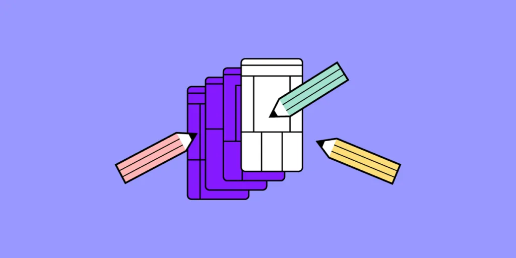
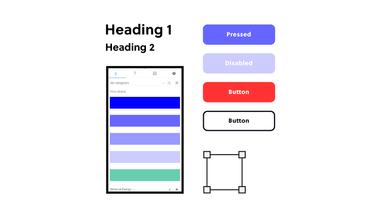
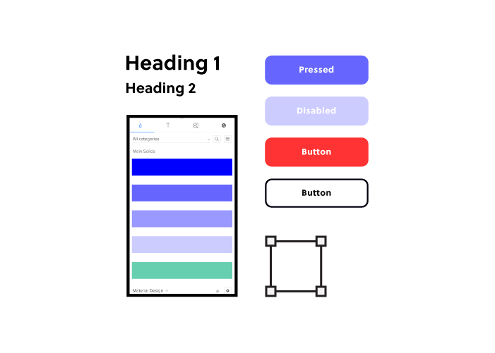
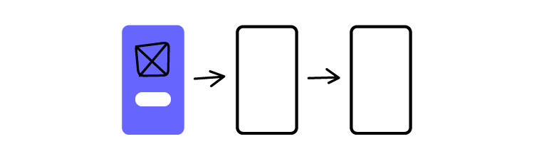
Static front-end prototyping

2 17

A front-end prototype could be almost anything. You could scribble it on a paper napkin, in a notebook, or on a whiteboard. You could create it in Photoshop or Illustrator. Static prototypes like these can show how the product will look, and they can show how the user interacts with it.

Suppose you’re designing a mobile website for a restaurant where customers can order carryout. You’ll need to design the prototype to show user interactions and screen states while placing an order.

  • Create account. The prototype should mimic the process of setting up the account. Suppose research shows that restaurants get more orders when users create the account at checkout. The prototype should simulate user input at the checkout.
  • Log in. Here the prototype would show the input fields. It also needs to show the response if the user enters incorrect info. It would also show the screen state if the user tries to log in when he or she hasn’t yet created an account.
  • Ordering. The prototype would have the menu categories (main dishes, sides, drinks, etc.) It would show how the site behaves when the user chooses a category. It should also show how the product appears on the screen when it’s selected from a category.
  • Checkout. Shows how the user enters payment information, saves it for future orders, etc.
  • Arrived for pickup. Simulates how the user announces their arrival at the restaurant. For example, if the restaurant has curbside service, the user can enter a parking space number.

But suppose the restaurant also wants to let customers reserve a table in the dining room. The prototype would show how it presents the options of order carryout and reserve a table.

A static prototype might present the product like this:

  • The home page. In this example, you can order carryout or reserve a table. The prototype shows the buttons taking them to the carryout page and the reservations page. Arrows or lines could join to drawings of those pages.
  • Carryout. Here it shows the layout of categories.
    • Main Dishes
    • Sides
    • Drinks
  • Reservations. Shows which tables are available.
    • Table
    • Booth
    • Patio
    • Bar
  • Checkout. Represents how the user completes a carryout order.
    • Login/Create Username and password if needed
    • Payment info
    • Confirm order
  • Arrival. This tells how the user alerts the restaurant staff.
    • Curbside parking space number
    • Arrived for reservation

You could arrange each of these like a flowchart so it communicates what each piece of the prototype does and how the product will look.

But it doesn’t allow user interaction.

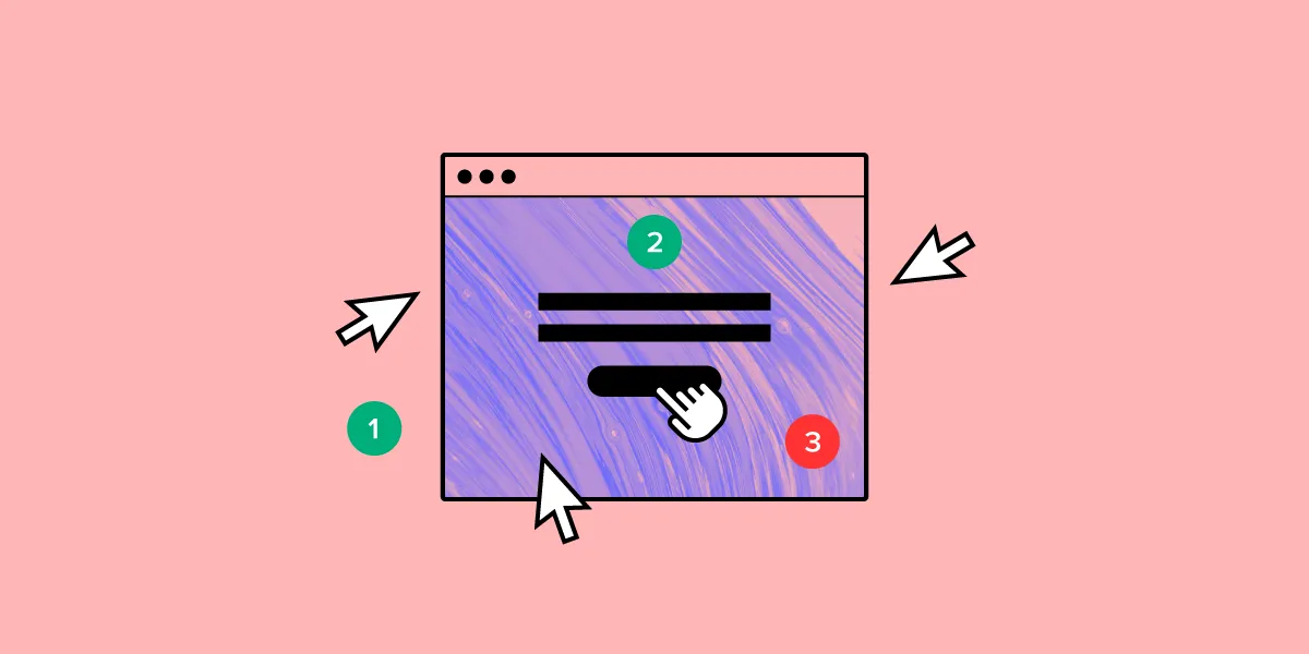
Interactive front-end prototyping

3

An interactive prototype is better because UX teams can get a feel for the design. With feedback from product testers, you can improve the prototype before moving to the next phase.

  • Home page. The interactive prototype lets you test the links by choosing carryout or reservations.
  • Carryout. Here you can see how the button and other graphics look. You can tap the button and judge if the design needs improvement.
  • Reservations. You can evaluate the UX of reserving a table. You can see how it shows which tables or booths are available, whether there are patio and bar tables available, and what times you can make the reservation.
  • Checkout. You can see whether the site makes it easy to enter and save payment info, save favorite orders, etc.
  • Arrival. Demonstrates how you let the restaurant staff know you’re there.

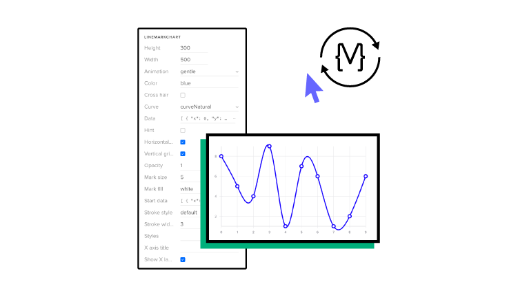
Front-end prototyping with code

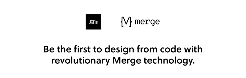
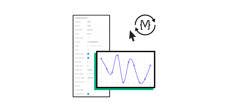
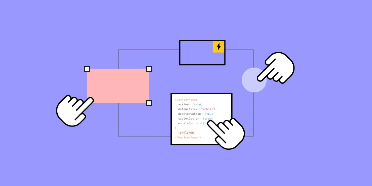
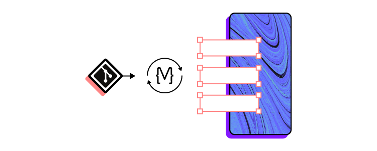
Using code in front-end prototyping is solves all your problems connect with static, vector-based design. Let’s say it’s the “real” front-end prototyping. With UXPin powered by Merge technology, you can import coded components for your prototype to the library in UXPin. This makes it much simpler when you move the project forward.

  • Designers don’t need coding expertise.
  • Engineers can work with design elements already coded.
  • Design ops teams can build prototypes that serve both designers and engineers from a single source.

Since you’re working directly with code, you won’t need to translate it later. That helps design editors avoid making complex codes that can be a nightmare to fix and remove the whole design-dev process. 

Merge not only makes your prototype functional but also lets you do that easily and fast, just by drag-and-dropping the component on the canvas. You don’t need to add any interactions unless you want to. Merge technology is the ultimate front-end prototyping as you just focus on UI, forgetting about the back-end with the production-ready components. 

It’s easy

You don’t have to reinvent the wheel. You can import coded React.js components from your Git repository like Github or Bitbucket to the UXPin design tool and make the most of what you already have. 

Try UXPin powered by Merge technology to start designing with code components and cut down your product’s time to market. 

6 Articles to Improve Your User Research

10 Useful UI Design Articles copy 2

User research can give you insight into what aspects of your design do and don’t work. Learning how to perform customer research, however, takes some time and instruction.

The following six articles should help you find effective ways to conduct user research that leads to better designs and higher adoption rates for your digital products.

Explore the lessons you learn from these articles by experimenting with UXPin’s designing and prototyping tool. Sign up now for a UXPin free trial with no credit card required.

1.How to Conduct User Experience Research Like a Professional (Career Foundry)

Career Foundry writer Raven L. Veal provides an in-depth article that will show you several ways to collect information from users. She starts by breaking down the differences between good and bad UX research, an essential step that will lead to better results as your skills improve.

1 15

The bulk of Veal’s article provides introductions to user experience research methods, including:

  • User groups
  • Usability testing
  • User interviews
  • Online surveys
  • User personas
  • User research analysis

Set aside 20 to 30 minutes to read this entire primer. Practically everyone will learn something valuable from it.

Additional reading: The UX Designer’s Guide to Lean User Personas

2.The Ultimate Guide to Doing Kickass Customer Interviews (User Interviews)

As a UX designer, you might not have much experience conducting interviews intended to gather specific information. You might not have spent any time interviewing other people in a professional way. Carrie Boyd’s “Ultimate Guide to Doing Kickass Customer Interviews” does just what the title says: teach you how to interview users for actionable information.

Boyd provides specific tips for different types of interviews. She writes sections about developing customer interviews that will help you decide whether:

  • Customers like your design.
  • Users enjoy your product’s new features.
  • Your target audience wants to buy your product.

After establishing the basics, she guides you through:

  • Prep work to do before the interview.
  • Conducting interviews.
  • Sharing information learned from interviews.
  • Taking action based on what you learned.

If you want to conduct interviews to connect with your users, go over Boyd’s guide to improve your process.

Sign up for a UXPin free trial to see how much your customer interviews influence your UX designs.

3. Usability Testing 101 (Nielsen Norman Group)

Nielsen Norman Group has decades of usability testing experience, so take your time learning as much as you can from this entry-level guide.

Although the article doesn’t get into the weeds of usability testing, it provides a surprising amount of information, including:

  • What you can learn from usability testing.
  • The core elements of usability testing.
  • Types of usability tests.
  • The cost of usability testing.

After the article, you will find a long list of helpful resources. Choose the ones that apply to your situation so you can pick up more tips about how to make the most of usability testing when improving your UX designs.

Additional reading: The Guide to Usability Testing

4.The different types of usability testing methods for your projects (hotjar)

Hotjar covers three types of usability testing and compares the pros and cons of how you can approach them. The usability testing options compared in the article include:

  • Moderated vs. unmoderated.
  • Remote vs. in-person.
  • Explorative vs. comparative.

You will also learn about guerrilla testing, session recordings, and other strategies that could improve your user testing and customer interviews.

5. A/B Testing: Optimizing The UX (Usability Geek)

A/B testing can help you choose the better of two UX designs. That sounds great until the time comes to perform A/B, and you realize you don’t know how to conduct a rigorous study that optimizes your UX.


2 16

Nicholas Farmen lays out the basics of A/B testing in an easy-to-follow language in this Usability Geek post. He covers topics like:

  • Writing a hypothesis.
  • Making a controlled test (Test A).
  • Making an altered test (Test B).
  • Comparing results.

The article offers preliminary advice, but it also serves as a teaser for Usability Geek’s online course, Conducting Usability Testing.

6. Creating a user research plan (with examples) (UXPin Blog)

This article from UXPin is perfect for anyone struggling to take a strategic approach to conduct user research. The advice gives you step-by-step instructions that include examples of how you can create and implement each step.

3 15

UXPin will show you how to establish:

  • A background that explains why you want to collect information from users.
  • Plan objectives that line up with your metrics and KPIs.
  • A UX research plan methodology that should get you the information you need.
  • Participant profiles that help you determine which users you want to recruit.
  • A research timeline that holds everyone involved accountable for meeting milestones.

If you have a general idea of what you want to get from your user research—but you don’t have a solid plan for how to get the right information from the correct users—you will learn important lessons from this article.

Try UXPin to build wonderful designs based on user research

UXPin gives you a collaborative workspace where you can create designs and generate prototypes. You can also make design systems that establish approved assets and guardrails for projects. If your user testing shows that you need to update your design system, you can do it easily from within the application. It will update everyone working on your project.

Experience UXPin’s features for free by signing up for a 14-day trial. It doesn’t cost anything, and you will get an opportunity to experience one of the world’s most robust cloud-based design platforms.

Improve Your UX Portfolio – Ask for a Review

Improve Your UX Portfolio – Ask for a Review

Landing a UX design job often depends on the quality of your portfolio. It’s such an essential part of the hiring process that companies like uxfolio specialize in solutions for making online portfolios.

No matter what tools you use to put your portfolio together, though, you only win jobs when you have excellent designs to show project managers. People care much more about the quality of your UX designs than the quality of your portfolio presentation—although, you can use the presentation as an example of your skills.

Unfortunately, it’s nearly impossible for you to take an objective look at your UX portfolio. Getting reviews should make it easier for you to identify the strengths and weaknesses in your portfolio. Once you have several perspectives, you can put together a selection of UX designs that display your skills and talent.

UXPin gives you an easy way to share works-in-progress and completed prototypes so you can get the feedback you need.

Create a free UXPin account so you can share your work through a preview with anyone and get reviews.

Share your UX designs and get feedback from others

share your feeedback in ux review

Sending someone a copy of your UX design portfolio doesn’t necessarily mean that you will get meaningful feedback. Even when the reviewer puts in a lot of effort to help you perfect your portfolio, you could end up with information that doesn’t help you very much.

Much of the difficulty comes from the ways that people communicate online. With most UX designs, prototypes, and portfolios, reviewers cannot place their opinions directly into the work. Instead, they send you an email or similar message that forces them to describe the feature they want to identify and how you can improve it.

In a visual medium, you need the ability to leave reviews directly on the design.

With UXPin, you can get more insightful UX portfolio reviews because mentors and colleagues can communicate with you in real-time within your workspace. Instead of writing something like, “I’m not sure that the blue icon you have near the upper right corner tells users what will happen when they click it,” they can place a comment near the icon that says, “This is a confusing icon. Try to make its function more obvious.”

You also get better UX portfolio reviews because you can share designs and fully functional prototypes. When your prototype review is based on real information and functional features, people can give you accurate advice without getting distracted by Lorem ipsum and fake data.

Recommended reading: How collaboration makes you a better designer

Use Spec Mode to implement brilliant design ideas

Sometimes, you need a more experienced person to show you how to improve your UX designs. UXPin Spec Mode gives them access to your design so they can make subtle changes that lead to dramatic results. Perhaps shifting a menu a little to the left creates a better balance that will appeal to users. Maybe you try to force too many features into a design, so you should consider adding drop-down menus to improve the UX.

You can even share your Spec Mode designs with developers to get portfolio reviews from people who turn static designs into digital products. You might learn that your UX design sets an unreasonable expectation for development teams. On the other hand, you might get praise from developers who appreciate your ability to generate CSS code from your work. UXPin makes the second part simple by automatically generating code from your graphics.

Start a free trial with UXPin so you can see the benefit of collaborating with reviewers in Spec Mode.

Recommended reading: Design trends 2021

Make fully functional prototypes that show off your concepts

3 11

You can’t get portfolio reviews with the deepest levels of insight until you can share fully functional prototypes. UXPin generates prototypes from your UX designs and lets you share them with your colleagues and mentors.

Ideally, you want to send prototypes that function so people can give you realistic feedback. A static design might look amazing. If you plan for it to become an interactive feature, though, you need your reviewers to experience how you expect it to function. Otherwise, you’re getting feedback on the wrong aspect of your work.

Yes, a brilliant design will help attract potential employers and project managers. A design feature that actually works as intended, though, will get much more attention and help you stand out from other applicants.

When you try to test a feature in your prototype, it might look like it functions fine. You’re expectation of what the feature should do, however, can cloud your judgment. An objective reviewer without any preconceived notions can approach the prototype’s features as a new user. If something doesn’t feel intuitive, they can point to opportunities for improvement.

Recommended reading: How to create clickable prototypes

Get started with UXPin to create and share your work

Sharing your UX portfolio with UXPin makes it simple for people to give you honest feedback that leads to a stronger representation of your abilities. Once you create a UXPin account, you can invite anyone to give you feedback, tweak your design, or iterate. The people giving you feedback do not need UXPin accounts. As long as you give them the correct link, they can contribute to your success.

Start your free UXPin trial today to create fully-functional UX prototypes that you can share with anyone. No matter where you are in your career, UXPin has a membership level that fits your needs and income.

How to Write the Best Product Briefs

How to Improve Your Product Design and Development Model copy 5

Writing a product brief helps everyone involved in the development process to understand what the product is and why it was created and as a result, it helps in creating a good product. This document provides an ultimate source of knowledge on the product, ensuring that everyone has the same level of understanding. By putting together a product brief, you avoid incorrect assumptions that could lead to design, development, and launch issues, solving problems before they appear and making it much easier for everyone to work together. So how can you write the best product brief for your team?

Sections to Include in Your Product Brief

A comprehensive product brief is well-organized and covers the most important aspects of your product. These sections let you flesh out the what’s and why’s of the product.

What are the Product’s Purpose and Goals?

Start by establishing the context for your product. You want people reading this document to have a strong understanding of the product’s background, the user problems it addresses, and how it helps your company meet objectives.

When you discuss user problems, you also want to define the demographic you’re targeting. You can further segment your potential customer base as needed. If you already have user personas, you’ll have an easy time covering this.

What does a successful product look like for your project? If possible, identify metrics that indicate whether you are on the right track.

What Features Does Your Product Have?

When you’re writing a product brief, the features section is likely to be the largest one in your document. You’re doing more than describing your feature wishlist. You want to keep the user experience in mind when you present each feature. What are the users getting out of this interaction? How do they feel when using that feature? Those are open questions you should ask before starting the product design stage. 

How do your features tie in with your product’s goals? What impact do they have on the user experience? Create a priority list of features if you need to cut any due to scope creep or scheduling problems. 

When is Your Product Ready for Testing and Release?

You need to establish the point where your product should move into beta testing and release. Otherwise, you could end up in a cycle of ever-increasing scope creep as you invest more time and resources than the product needs to reach a releasable state. 

Create clear release criteria when you write product briefs with product managers, as well as the development and design managers. Start with the product’s functionality. You can use the priority list from the features section to establish the must-have features.

Does the product’s usability support the use cases for your target demographics? How user-friendly is the product?

Is your product performing well enough to be released? How stable is it? Does it have the support in place required to run?

How Long Will It Take to Develop Your Product?

Schedules can shift drastically as your product scope changes, but you still want a general idea of the development time. Try to avoid setting a specific date for finishing up the project, as you can set your team up for failure with a hard deadline, the agile approach is always good but remember to not be too agile. 

You can create a rough estimate by first looking at any factors that could impact the project timing. For example, you may anticipate that the budget won’t allow you to get the product done early, or team members may have long vacations planned during the project. You can’t anticipate everything that may affect your timeline, but you do want to cover the easily identifiable factors.

Tips for Writing a Product Brief

how-to-write-briefs

The ideal product brief is unique for your product and the team working on it. However, when you’re writing a product brief, these tips and best practices can put you on the right path to creating an effective document.

Use broad strokes: You don’t need to detail every single thing about the product. Touch on the most important aspects of the product in each section, but think of the brief as a map rather than an instruction manual.

Consider all audiences using the product brief: If you fill the brief with highly technical jargon, what happens when non-technical team members look through it? They may not understand critical parts of the product and walk away with the wrong expectations and assumptions. Keep it clear and explain anything that might not make sense to all the readers.

Limit the length: It’s right there in the name – brief. Since you’re writing a product brief as a product overview, it needs to be easy to reference. A few pages should be enough to cover the main details without being so long that the document is useless.

Avoid covering how questions: Describing how to develop the product goes outside of the brief’s scope. You want to keep your focus on the what and the why. The nitty-gritty details are more appropriate for other product documents.

Add visualizations where appropriate: Images, charts, graphs, tables, and other visualizations allow you to emphasize key parts of the product brief.

Product Briefs are Not Static Documents

Writing a product brief is not a one-and-done process. You need to revisit the document whenever changes happen, so it always contains up-to-date information. For some products, you’ll need to add to the brief every day. For others, you might check in every week or month. Keep your team on track and ensure that you’re avoiding scope creep through these updates.

The topics you cover when writing a product brief are not set in stone. Some sections may not be as relevant to a particular product or your team’s collaboration. Don’t be afraid to experiment with your briefs to find the right mix of information that best serves your team and the product. It’s there to serve you and help the product succeed. Ready to move from your product brief to your prototype? Check out UXPin’s code-based design platform that delivers fully interactive prototypes.

Add GIFs to Your Prototypes to Build More Engaging Products

Prototypes more engaging with gifs

Adding movement to your landing pages plays a role in improving engagement and increasing conversions. The benefits of movement aren’t limited to your landing pages, though. People feel more engaged with digital products that include any type of movement, including video, interactions, and GIFs.

For many people, GIFs have become a fun way to respond to social media comments. Within the digital design world, though, GIFs play a notably more critical role. Whether you create web pages, smartphone apps, or other digital products, you will want to learn about the benefits of adding GIFs to your prototypes.

Recommended reading: Design Trends 2021

Benefits of adding GIFs to your prototypes

The most significant benefit that you can get from adding GIFs to your prototypes is that you improve user engagement. Most people prefer movement over static images. The moving image becomes even more engaging when users can interact with it. For example, scrolling down the screen might make a GIF of ocean waves move. 

Using GIFs in a web page or mobile prototype increases engagement, but the benefits don’t end there. Motion design combined with interactions can:

  • Improve a product’s functionality by displaying essential information users need to make decisions.
  • Encourage people to spend more time with your product, which can increase advertising revenues, sales, and authority.
  • Lead consumers down the sales funnel so they’re more likely to complete purchases.
  • Boost your brand recognition by making a lasting impression on users.

Why not use video to increase engagement?

Video can also increase engagement with users. In some instances, it makes sense for you to add a Quicktime MOV file to your design.

There are downsides to using video, though. For example:

  • It can take much more time for your creative team to make a video than a GIF.
  • You might need to spend a lot of money on cameras, editing, and personnel when making a high-quality video.
  • You might not reach consumers who have limited bandwidths or only access your product through mobile networks.

There are also some benefits to choosing GIFs. Many people find that they prefer GIFs because:

  • They have small file sizes that tend to suit the needs of more users.
  • The looping nature of GIFs can help emphasize a specific point.
  • Most designers can create attractive, effective GIFs quickly and inexpensively.

GIFs aren’t always the right choice, but they often work better than video when you want to keep your file sizes small and want to engage users with small amounts of information instead of long-form content.

Recommended reading: Create Clickable Prototypes

Add animated GIFs to your prototypes in UXPin

upload gif in uxpin

With UXPin you can easily add GIFs to your designs. You add GIFs by simply uploading them from your files or following the same steps you use to import other assets from software like Sketch.

Control states with interactions 

You also have a straightforward way to control states between interactions, giving another engagement boost. Controlling states with interactions means you can have an image change when a cursor hovers over it. For example, an app that helps people find hotel rooms could show a picture of the room but switch to information (price, size, amenities, etc.) when a mouse cursor hovers over the image.

You can also use interactions such as accordion menus that expand when someone clicks them or a carousel that swaps pictures every few seconds that someone remains on the page. All to make your prototype feel more real. 

Examples of digital products that engage users with GIFs

menu mercedes prototype
Source
google earth gif
Source
music app gif
Source

Try UXPin for better prototyping 

UXPin lets you add GIFs to your prototype long before you release your product. The interactive and engaging prototyping lets you experience your designs exactly as they will work after you release them. When you know your prototype works, you know that your product will work.

Try how easy and engaging it is with a UXPin 14-days trial – you won’t even need to add your card details to start using the tool. Sign up now. 

How to Create a Rapid Development Process for Digital Products: Lessons from PayPal

How to create a rapid development process for your digital products

Managers and efficiency experts have created several methodologies that promise to improve workflow. Some of the most popular ones include:

  • Agile
  • Waterfall
  • Scrum
  • Kanban
  • Spiral model

Each of these approaches has its pros and cons. Countless teams have benefited from Agile software development and the waterfall model.

PayPal’s design department, however, faced a problem that an existing methodology couldn’t solve. While most companies hire about one designer for every 10 developers, PayPal’s focus on improving UX meant that it had about three designers for every thousand developers. To make matters even more difficult, the designers had to work with more than 100 products.

designer to developer ratio

Erica Rider, UX design lead for developer tools at PayPal, and her team knew that they needed a better development process that would take them from initial idea to final product as quickly as possible.

Rider and her team called their new approach DesignOps 2.0. You can watch her entire presentation—which includes a UXPin demonstration from a PayPal product manager—on YouTube. The following article summarizes the most critical aspects of her rapid application development model.

Recommended reading: Agile vs. Scrum vs. Kanban: Which Project Management Methodology Is Right for Your Team?

Break down departmental silos that prevent rapid prototyping

First, PayPal’s design team knew that they needed to establish a new development methodology. This needed to break down departmental silos that added unnecessary steps to the development life cycle and prevented rapid prototyping.

The traditional product design and development approach relies on a product manager to write down ideas that designers turn into images. Developers use the images as guides to create attractive products with exceptional functionality. The process rarely works as planned, though, so the prototype delivered by the development team needs several stages of tweaking.

A new approach to rapid product development

DesignOps 2.0 takes a radically different approach by placing the product manager—or domain expert—and developer within a rapid collaboration user feedback and iterations process. Designers sit outside of that process. Instead of playing an intermediary role between domain experts and developers, they act as coaches that help domain experts reach their goals.

Once the product manager and design team members have working prototypes, they send their creations to the development teams to produce deliverables for end users. The approach uses less time because it lets the product manager build a basic prototype within a low-code design system instead of asking other people to interpret vague ideas.

Recommended reading: You Can Become a Code-Based Designer Without Learning Code

Create a code-based design system that anyone can use

No matter which development methods your teams prefer, it makes sense to create a code-based design system that serves as a single source of truth. UXPin Merge will allow you to keep components in sync with your Git repository. 

The design system and Merge technology  establish everything that project managers need to create prototypes with before sending their concepts to developers to begin the software development process.

Reduce development time by making components teams can reuse

By following the PayPal model, designers reduce development time. They do this by creating a library of everything that product managers can use. The designers create logos, buttons, color patterns, and other assets. Anyone trying to build a product can only pull from the design system.

reusable components

The key is to make components that teams and individuals can reuse. Ideally, this shouldn’t take a lot of effort because your brand probably wants common aesthetics and functionality between products. For example, it wouldn’t make sense for a time-tracking app to look completely different from a ticket app. 

They should offer common environments that make users feel comfortable. Also, designers have no reason to redo work when existing components fill the need already, as well as the developers. 

Use code-based design tools that create functional prototypes

UXPin Merge works well for PayPal’s design team because they can import and keep in sync coded components and use them in the UXPin editor. Thanks to that the components they use in the designs are almost production-ready. So both designers and developers get a common language that everyone understands.

Taking a code-based approach also makes it easier to build fully functional prototypes as the imported components are fully interactive and behave just as the final product! It’s a big time-saver as developers don’t need to leave this work to designers.

 Many prototypes only offer a simulation of how software projects will work. With UXPin, PayPal’s employees can use real data and interact with components to ensure they behave as expected. Instead of using lorem ipsum of fake data, product managers can import real information from JSON, Google Sheets, or CSV.

Improve communication between designers and product managers

Designers at PayPal spend a lot of time building the components that other people will use to build products. They do not, however, sit completely outside of development projects. They serve in mentorship roles by working with product managers before finalizing software projects.

Anyone making a product at PayPal can reach the design team by scheduling time during office hours or using the design Slack channel. The design team has also made more than 3.5 hours of video tutorials that address common issues.

When a product manager comes to the design team, nearly all the work has been done. Still, designers might need to correct some small errors or use their keen observation to spot inconsistencies that the average person wouldn’t see. The result is quick iterative design that leads to a working product much faster than traditional approaches can.

Recommended reading: Design Your Own Design Process Step by Step

Request access to UXPin Merge

UXPin Merge plays a crucial role in how Rider and her team built a better approach to product prototyping and development. Request access to UXPin Merge to learn more about how the app’s code-based design and prototyping features will benefit you.

design with code merge uxpin

How to Improve Your Product Design and Development Model: Lessons From PayPal

How to Improve Your Product Design and Development Model

The typical product modeling process takes an inefficient course that requires a lot of back and forth between departments. In the lifecycle of a traditional product design and development model:

  • A project manager has an idea that gets turned into a written description and sent to the design team
  • Designers have to interpret the project manager’s written instructions and turn them into images
  • The designers send their visual work to developers
  • Developers use their coding experience to recreate images and add functionality to features
  • The project manager reviews the product features made by the developers and requests revisions

The process repeats until the product finally achieves the product manager’s vision.

PayPal’s design team recognized the problems in these traditional methodologies. It created a more streamlined approach that met the company’s needs. Read on to learn more about how PayPal’s approach can offer you greater insight into improving your own processes.

Table of Contents

Move your product model process toward a code-based, systemic approach

It only takes a little insight to realize that the traditional product model process hurts business models and cuts into profitability. PayPal found a more efficient product developing an operating model that broke down silos between departments and gave developers and product managers more control over their work.

PayPal called their approach DesignOps 2.0. Designers created assets that everyone could use to build different products without straying from the aesthetics and features PayPal’s stakeholders expect. The code-based, systemic approach meant that they could often cut product design time in half.

Enable product managers and teams to do design

PayPal has an impressive team of designers willing to tackle exceptional challenges. As they saw the number of UX developers grow within the company, the small team of designers decided to adapt. They expanded the scope of what people outside the design team could do, to improve the overall process. You can follow some of their steps to improve your product design and development model.

Build a library of reusable templates, visual assets, and interactive components

PayPal’s design team built an original design system for everyone to use. To streamline things, you still need designers and developers in this process, but they don’t have to play such hands-on roles. The product manager doesn’t need to approach the design team to talk about wireframing the tool. Instead, the manager uses the design system to find an existing template. Designers don’t need to create unique logos, buttons, and other visual assets, either.

Build a design system that includes the templates, visual assets, and interactive components that managers need to make products without relying on designers and developers. For example, when a manager wants to add a digital tool that tracks defects, the person can open a template, make changes to reflect the tool’s goal, and test the prototype to make sure it functions as intended.

Recommended reading: 7 Best Reasons to Use React.js Components in Your Project

Establish significant guardrails to keep developers on track

Code-based design components need to give managers and developers some flexibility. Good product management, however, must prevent people from deviating too far from the company’s aesthetic and expected features. If a new IT product doesn’t function like similar products, it will confuse users.

Designers can keep everyone in line by establishing significant guardrails that do not let others stray too far from other tools in the company’s product portfolio.

Recommended reading: Design with Code

Make it easy for new product developers to schedule time with designers

PayPal’s design team has found that developers can finish more than 80 percent of product development work without their assistance. A product that gets used by a lot of employees or sent to customers, however, needs input from the design team. They have made it easy for developers and product managers to get the direction they need.

First, the team provides exceptional training tools that help non-designers do as much of the work as possible. Employees have access to more than three hours of training videos. They can also:

  • Access 60+ prototyping components
  • Schedule office hours to meet with a designer in person or virtually
  • Use a Slack channel to get feedback and instructions
  •  

In the end, the design team will go through full products before releasing them. The final step helps ensure accuracy and functionality. Changes rarely involve much additional work because the designers have set up their colleagues to succeed.

Recommended viewing: Watch Sandeep Yeole, a product manager at PayPal, build a product with UXPin Merge

Adopt UXPin Merge to streamline product development

UXPin Merge plays a critical role in the success of PayPal’s design team. Without UXPin Merge, the small department couldn’t build a design system full of code-based components that make it simple for product managers and developers to create products.

When you have all of your approved digital assets in front of you, you can make design changes within minutes or seconds. After some experience, employees outside of the design department could make their own products within less than an hour.

UXPin’s prototyping capabilities also make it easier and faster for PayPal to take full products to market. Prototypes in UXPin work just like completed products. The prototypes use real data, let testers interact with components, and perform like complex products. It’s always a good idea to test digital products for bugs, but prototypes in UXPin rarely need much tweaking.

You can discover the advantages of code-based design, effective design systems, and fully functional prototypes by requesting access to UXPin Merge. The tool has revolutionized the way that PayPal’s designers work. Imagine what it could do for you.

Your Prototype Videos Could Come With Big Benefits

The amount of online video has grown tremendously in recent years. In 2020, 239 million people viewed digital videos. Google Sites, which includes YouTube, had 205 million unique views in January 2021. 

video content in prototypes

Obviously, people enjoy video content. Many companies, however, do not add videos to their products until right before their release dates. It makes more sense to add videos to your prototypes, especially when you use a prototyping tool that works just like the final product.

When you know that your videos work well within your prototype, you can expect to reap several benefits when you release your product.

Video can increase your conversion rates

Practically any type of movement can increase conversions of landing pages. Recent landing page trends that increase conversions include adding background videos, intro videos, autoplay videos, and animated videos. Even animated page elements could give your conversation rate a boost.

Marketer extraordinaire Neil Patel says that viewers are 64 to 85 percent more likely to purchase products after they watch videos. Higher conversion rates make sense when you consider that video can:

  • Demonstrate a product’s use.
  • Show consumers how to use a product.
  • Grab a viewer’s attention to keep them interested for longer than text or static images.
  • Include compelling messages that pique the viewer’s interest.
  • Add to a brand’s personality.

A video can only increase conversions when it works well, though. By including video in your prototype, you can test every feature before releasing it to the world. 

Can viewers interact with the video? Do embedded buttons work? Can people enlarge and shrink the video? You can only answer these questions through testing. That either happens in the prototyping phase or right before you release your product. Testing the prototype will give you more opportunities to optimize performance and avoid unexpected delays.

Video improves user engagement

Video does more than convert website and app users. Videos can also double user engagement.

Improving user engagement, of course, often leads to more sales. Not all digital products make money through sales, though. By adding video to your app or website, you can keep people looking at the screen longer. That often means increased advertising revenue, better brand authority, and future willingness to interact with content.

Videos can boost your search engine ranking

Adding video content to a web page can improve your search engine ranking over time. When you increase engagement, keep people on your pages longer, and attract more visitors, search engines notice and reward you with higher rankings. 

video cotnent improves ranking

Video content can also appear directly on a search engine results page. When your video appears on the list of results, internet users are likely to watch it because it involves fewer steps than navigating to a website and reading text. People want to access the information they need as easily as possible. When you give them a simple way to watch a video, you will get their attention and earn their clicks.

Adding video to your prototypes

UXPin makes it easy for you to add videos to your designs. You can add video files saved on your computer or network. You can also add videos from YouTube and Vimeo. Accepted video files include:

  • MP4
  • Ogg
  • WebM

It’s great to preview your design with the added video before the product launch – just to show your team, stakeholders and developers how the final product should look and feel. Especially when you want to make the most of your design system, you can add approved videos there and add it to your design. 

Start making realistic prototypes with UXPin 

Videos in your products can improve conversations, engagement, and search engine positioning whereas adding them to prototypes can help you check that your product will work as planned thanks to testing that in a prototype. Don’t wait to implement your videos just before the launch, make sure you get them ready in your prototyping phase!

Get started with UXPin today to learn more about the benefits of creating prototypes that look so real!

Best Ways to Evaluate Your Design for Color Contrast

Improve Your Product Design and Development Model

Using a color contrast checker can make your designs more attractive and accessible to people with vision problems. Worldwide, about 300 million people have colorblindness. About 2.2 billion people have vision issues that could make it difficult for them to use your digital products.

Understanding the positive and negative effects of some color combinations will put you on the path to reaching more people with your web and app designs.

Build advanced prototypes

Design better products with States, Variables, Auto Layout and more.

Try UXPin

Why use color contrast in product UI?

A color contrast checker can make your digital products better in at least two important ways.

Follow WCAG 2 guidelines to make products more accessible

WCAG 2.1 (web content accessibility guidelines) and Success Criterion set rules you can follow to make your products more accessible to people with a broad range of vision impairments.

Using a background color that blends in with text color can make it impossible for some people to use your products. Colorblind people might also have difficulty seeing text and images when you select a color that they do not perceive as the larger population does.

Something as simple as picking a different color can help people recognize:

  • User interface components
  • Web page content
  • Navigational menus
  • Logos

A color picker that considers accessibility makes it much easier for you to create designs that more people can use. You can check your designs in our built-in color blindness simulator and contrast checker that comply with all the WCAG 2 guidelines. 

You can learn more about the topic by reading Things every designer needs to know about accessibility. It explains some of the ways you can help users by using large text and other features.

Reach a broader audience with color contrast

When you make your designs more accessible, more people can use your products. Ethically, you want to include as many people as possible because everyone deserves to enjoy using the same products. Financially, you want to include more people because it helps grow your business’s revenue.

Using color contrast attracts more users, which can lead to higher advertising revenues and more sales. It makes sense from ethical and business perspectives.

Recommended reading: New e-book: Web UI Design for the Human Eye (Colors, Space, Contrast)

Know the three WCAG levels

WCAG has three levels. Aim to reach the highest level so you can make your designs as accessible as possible.

The following explanations only cover vision-based accessibility. You will need to think about other features before you can reach people with other accessibility restrictions.

Level A (Beginner)

The presentation doesn’t rely exclusively on color.

Level AA (Intermediate)

The color contrast ratio between the text and background color is at least 4.5 to 1.

The color contrast ratio between user interface components, graphics, and nearby colors is at least 3 to 1.

Text can double in size without losing function or context.

Level AAA (Advanced)

The color contrast ratio between your text and background is at least 7 to 1.

Color contrast checker tools to explore

If you don’t have any visual impairments that prevent you from distinguishing colors, you probably can’t identify whether you reach the minimum contrast unless you use a color contrast checker. The following tools can help you choose colors that improve accessibility for more people.

Colour Contrast Analyser (CCA)

Colour Contrast Analyser is a free tool that you can download to your computer. Enter the hex code, CSS color format, or use the color picker tool to get your contrast ratio and determine whether you pass AA or AAA standards.

Built-In Contrast Checker 

See if your design tool has a built-in contrast checker to make it easier for you to evaluate the colors you used. At UXPin, you don’t need to search for plugins that will help you with that as it’s already there, in the editor. 

Colour Contrast Check

Colour Contrast Check makes it easy for you to know whether your design is WCAG 2 AA or WCAG AAA compliant. Enter the hex value of your background and foreground colors. The results will give your contrast ratio and a simple “yes” or “no” regarding compliance.

Accessible Color Generator

Accessible Color Generator lets you enter a color by hex code or a color palette. It will analyze your color and give you a contrasting color that meets AA or AAA guidelines for small, large, or normal text sizes.

Color Laboratory

The Color Laboratory tool lets you choose colors to see how they look next to each other. It will also augment the colors you select so you can see them the way someone with colorblindness would. It can give you quite a bit of insight into how colorblind people experience your products.

Color Safe

Color Safe generates color palettes based on WCAG guidelines. Choose a color, your text size, and font family to get a color palette that complies with WCAG standards.

APCA Contrast Calculator

The APCA Contrast Calculator is a tool that stands out for giving you a simple and full font matrix version of its tool. If you just want to know whether your text size and color contrasts meet APCA standards, you can use the simple version. If you want to include more variables, try the full font matrix version.

Ensure proper color contrast with UXPin 

UXPin lets you make prototypes that look and perform just like your final product. That way, you don’t have to worry about your color contrast changing between the prototyping and product release stages.

Try our 14-day trial to use the editor with a built-in contract checker and so much more! Sign up here. No credit card required! 

Make your remote UX workshop more effective with these key steps

It takes a lot of preparation and effort to create a remote UX workshop that keeps people engaged and teaches designers new skills. Considering that working remotely isn’t going away anytime soon, it makes sense that you learn how to make your remote workshop more effective.

Continue reading Make your remote UX workshop more effective with these key steps

UX Writing and UX Design: How to Bring Them Together

More often than not, product development starts with a UX designer making a wireframe or a UX writer working on the text.

The first step determines what happens after that. If your writers have wireframes full of lorem ipsum, they can try to create influential text for landing pages, blog posts, and other products. If your UX designers have text intended for the target audience, they need to find ways to incorporate those words into the overall product experience.

No matter which approach you take, product managers lose the opportunity for UX copy and UX design experts to collaborate to discover options that could dramatically improve functionality, usability, and accessibility.

The following strategies should help you break down the barriers between your writers and design team so they can develop better digital experiences that attract more users.

Recommended reading: 13 Ways to Make Your UI Writing Better

Make the product manager responsible for breaking down silos

Ultimately, the product manager needs to take responsibility for breaking down the silos that prevent UX copywriters and designers from collaborating. Management must take control of the process because creating a positive user experience depends on so many factors, including:

  • Microcopy that makes the user interface more intuitive.
  • User research that shows what types of messages and designs the target audience responds to.
  • Research from content strategists and marketers.
  • Designs and copy that lead users through the sales funnel.

Too many product managers seem to think that copy and design can exist independently of each other. In reality, you get better results when your text and designs work together to create a unique brand identity. For example, you don’t want edgy writing on a website with a boring design. The opposite is also true. A bold design deserves more than plain ux writing.

How to integrate UX writing into your design process

Of course, it isn’t fair to say make product managers in charge of bringing teams together without giving them tools for collaboration. You can’t count on expectations alone to break down silos. You need real tools and strategies that get results.

Bring all of your teams to brainstorming sessions

Brainstorming sessions shouldn’t happen behind closed doors that prevent team members from contributing ideas. While you don’t want the chaos of 25 people throwing out ideas at the same time, you do want the diverse ideas you get from inviting representatives from every department. If you hire freelancers, make sure you invite some of them, too. They can give you insight into how other companies handle the challenges you encounter.

Inviting members from every team means that you need input from:

  • Copywriters
  • Designers
  • Developers

Encourage people to collaborate with each other during the brainstorming sessions. These days, you might have some people working remotely, so make sure you choose video conferencing and collaboration apps that make it easier for them to contribute.

You can improve the effectiveness of your brainstorming session by:

  • Defining and communicating your goals a few days early so people can come prepared.
  • Keeping the time limit fairly short (between 20 and 30 minutes).
  • Encouraging everyone to explore their ideas without fear—while also interrupting bad ideas quickly so they don’t take up too much time.
  • Giving participants a way to submit ideas anonymously to help ensure that shy people contribute.
  • Recognizing that some brainstorming sessions don’t yield great results, so you may need to regroup later.

Encourage team members to learn about other jobs in product development

Do the members of your design team understand that excellent UX writing requires a keen understanding of behavioral and cognitive psychology? It’s not all about following grammatical rules and using fancy words. Often, good writers have to break the rules they know so they can reach their target audiences better. It’s a craft that requires a lot of practice and consideration.

Do your writers know that designers play an essential role in improving conversion rates? Their images, fonts, white spaces, and other design components have a significant influence over how people respond to everything from calls to action (CTAs) to informative blog posts. Designers even need to think about meeting the needs of people with disabilities. It’s a complex job that demands thoughtful experimentation.

Try pairing a writer and designer to work on a project. Even an hour or two working together could show the professionals how much they rely on each other to reach common goals.

Improve your digital products with UXPin and make UX writing easier! 

Since a software update in 2018, UXPin has been able to import real data instead of forcing designers to rely on lorem ipsum. The term “data” doesn’t have to refer to numbers, though. UXPin can import fields from JSON, CSV, and Google Sheets. That includes chunks of text created by your UX copywriters.

Using data sheets that can store human-readable content gives you several advantages. Some of the benefits include:

  • Keeping all of your product’s copy in one location.
  • Building a content strategy that converts readers without straying from the brand voice.
  • Scheduling when you plan to release social media posts.
  • Letting designers easily move content into their work without the negative influence of human error.

UXPin even has a spell check tool that adds a level of quality assurance to your product creation. The more opportunities you take to review text for minor spelling and grammatical issues, the more opportunities you create to make your product look professional and reliable.

Go with UXPin to improve your collaboration

UXPin is a design tool that makes it easy for your writers and designers to collaborate in real-time and to get rid of going back and forth with inefficient email communication. See how it works with a 14-days UXPin trial – all for free! 

Making It Easier for a Designer and Developer to Collaborate on Projects

The gap between designers and developers often slows workflows and makes it harder to bring products to market. Without strong collaboration between your design and development product teams, you will likely find that your company has to correct a lot of mistakes before you can finalize a product and release it to consumers.

You don’t have to tolerate the designer-developer gap. The following tips will bring them closer together, improve your process, and lead to better user experiences.

Recommended reading: Coding Designers and Design Collaboration with Developers – 2020 Design Trends with Joe Cahill

Create a design system that uses the same components for designers and developers

Creating a design system that uses the same components for designers and developers is the most important thing you can do to bridge the gap between teams. Your design system should provide everything that your people need during the designing and coding phases, including the product’s approved:

  • Typography
  • Colors
  • Icons
  • Photographs
  • GIFs
  • Sounds
  • Interactive elements

You can improve every step of production by using the same design system for your designers and developers so that they don’t waste time on deciding which font or color to use, and how to code this button and that form. Traditionally, companies struggle with this approach because they take an image-based approach to building products and you need to put a lot of effort to maintain the design system. After the design team finishes its work, developers need to find ways to make components functional. A code-based approach eliminates the gap by giving designers and developers access to a real single source of truth that can be reused anytime. 

See examples of design systems.

Ready with your design system?  Go one step further with UXPin Merge – the technology of coded components. It lets users import and keep in sync coded components from GIT repositories to the UXPin Editor. 

interactive code-based design

Imported components are 100% identical to the components used by developers during the development process. It means that components are going to look, feel and function (interactions, data) just like the real product experienced by the end-users and they are consistent with your design system and production-ready! It means that not only do you bridge the gap between design and development, but also cut down the time to market as it takes much less time to both design and code a digital product. 

Recommended reading: Why It’s Time for Designers to Switch From Image-Based to Code-Based Design

Improve communications between web designers and front-end developers

Your designer and development teams need easy ways to communicate with each other. Not too long ago, you had limited ways to improve communication between teams. You could have them share a workspace or add everyone to a social media group.

Today, you have ample tools to improve communication and collaboration, even when your team members work remotely. Some of your best options include applications like:

When you need a replacement for face-to-face conversations, you can use video conferencing apps like:

The easier communication becomes, the more likely your team members are to talk to each other. Give them the tools they need to stay in contact and build professional relationships. 

Invite designers and developers to product design brainstorming sessions

Teammates get left out of critical brainstorm sessions far too often. The project manager might think to invite the development team’s leader for insight into the challenges of adding certain features to a product.

Get more designers and developers involved in brainstorming sessions to build camaraderie, share ideas, and discover innovative concepts that you might have missed without everyone’s participation.

You can make your brainstorming sessions more successful by:

  • Choosing diverse participants with unique skills.
  • Establishing rules for your session and communicating those rules before participants gather.
  • Setting a timer so no one has to keep an eye on the time.
  • Following an orderly process when asking people to share their ideas (surprising someone will only make them nervous).
  • Writing down every idea without passing judgment. 
  • Scheduling a follow-up meeting later in the day or week so your facilitator can provide feedback and your group can discuss their favorite ideas.

As an extra benefit, getting more people involved in the initial steps of product development will show departments that everyone has something useful to offer regardless of the role they play within the company.

Encourage UX designers and web developers to learn about each other’s roles

Unless your UX designers and web developers spend a lot of time working together, they might not know much about the roles they play in product creation. Introducing your team to the basic terminology and types of work that other group performs could help bridge the communication gap in your design process.

That doesn’t mean everyone needs to share skill sets. They just need to know enough to communicate and grasp the nature of what other people contribute. 

Knowledge for your designers

Your web design team doesn’t need to learn how to code—although they might want to pick up some basic HTML skills—but they should know the popular tools used by developers. That includes programming languages like:

  • PHP
  • JavaScript
  • Java
  • CSS

Knowing about essential web development tools like JQuery should help your designers understand the amount of work involved in their requests. If nothing else, they should gain a deeper respect for the jobs developers do.

Knowledge for your front-end and back-end developers

Developers need a lot of technical knowledge and coding skills to turn designs into interactive components. Some of them might mistakenly believe that designers do less work than them. From an outsider’s perspective, it could seem that designers do little more than play with Adobe Photoshop.

Of course, designers also have extraordinary skills that contribute to product usability and popularity. Your coders should know that designers have years of experience:

  • Creating user interfaces that align with Web Content Accessibility Guidelines (WCAG).
  • Selecting typography that appeals to the product’s target market.
  • Following detailed style guides that make diverse visual elements feel like part of a larger whole.

When everyone understands their colleagues’ levels of expertise, you might see improved respect and teamwork across teams.

Recommended reading: You Can Become a Code-Based Designer Without Learning Code

Adopt UXPin Merge to bridge the gap between designers and developers

UXPin Merge gives you a unique, code-based approach to designing and prototyping your products. Bridge the gap between designers and developers by choosing a tool that already uses live code instead of image-based elements  and tap into the strength of a design system that applies equally to designers and developers.

Request access to UXPin Merge to experience the benefits of code-based design that encourages collaboration between your teams.