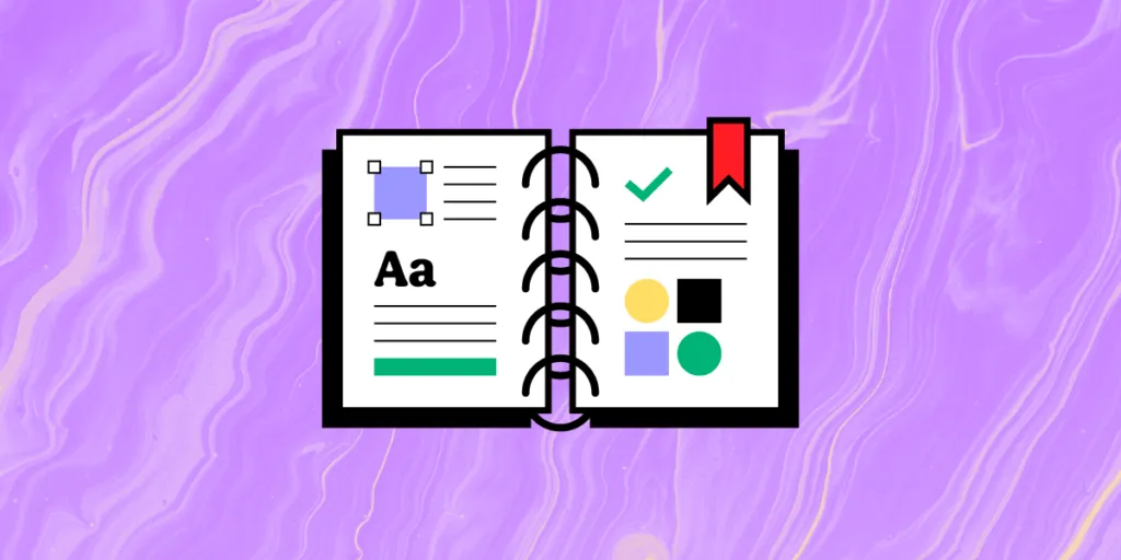
Design System Glossary – 34 Powerful Terms You Should Know
Design systems can be very confusing and complicated if you don’t fully understand the terminology associated with them. It’s important for designers and developers alike to be on the same page for the most effective communication efforts.
For this reason, we have comprised some key terms along with associated applications and examples to provide a clearer understanding of design systems.
List of Design System Definitions
- Design System
- Components
- Design System Principles
- Single Source of Truth
- Prototypes
- Component Library
- Material Design
- Usability
- Typography
- Icons
- Spacing
- Grids
- Style Guide
- UI Kit
- UI Patterns
- Properties
- Pilot
- Tokens and Variables
- Classes
- Binding
- Slots
- Events
- Framework
- Reference Site
- Design System Governance
- Design System Graveyard
- CSS Modules
- Storybook
- Design system maturity
- Atomic design
- Atom
- Molecule
- Organism
- Repository
- NPM Package
UXPin helps you build interactive prototypes and manage design systems like no other prototyping tool in the market. Build consistent interfaces 10x faster and speed up development that stays in line with your designs. Manage a complete library of interactive elements in UXPin Merge. Find out more about it.
Design System
Definition: A design system is a set of standards, best practices, components, and rules that define a design project’s approach to creating websites in a certain style or brand identity. A style guide, for example, is often included as part of the design system. A pattern library of samples and the real assets – fonts, images, CSS frameworks, JavaScript libraries, and so on – all components needed to complete the final product.
Application: Front-end developers and designers use these to replicate designs through pre designed components and elements. The elements can be repeated and reused, which saves teams a ton of extra time. By including guidelines within these systems, some entry-level designers may find them as useful educational references.
Examples: Google Material Design, Atlassian Design System, and other design system examples.
Related resources:
- Comprehensive guide on Creating a Design System
- eBook on building Design Systems quickly
- How to create a design system roadmap?
- Design Systems in UXPin
Components
Definition: Components are the building blocks of a design system. They can be small (e.g., buttons, icons) or large (e.g., navigation systems, carousels). A core aspect of components is that they’re designed to be as simple yet as flexible as possible so that they can be used in multiple instances.
Application: Companies use/reuse components to create patterns within their systems and to improve user experiences. Overall, components improve the quality and effectiveness of workflows. Many design systems will have component libraries that help designers and developers share UI elements that have interactivity and responsiveness build into them.
Examples: buttons, footer, carousel, etc.
Related resources:
- What is component-driven prototyping?
- MUI components
- Top 5 UI Components in Atomic Design
- Supercharging UI components in UXPin
- Creating UI components in UXPin
Design System Principles
Definition: A design system requires a governing model that acts as a set of rules. These are required to manage all components within a project. They might pertain to visual design (e.g., animation, colors, typeface) or refer to a more complicated aspect of a project, like the personality or style of the branding or writing.
Application: These act as guidance for decision-making processes through preset standards to be followed throughout a design system. They help keep design teams on track and moving in a consistent direction. Teams commonly follow them for advice on how to achieve goals. An effective foundation will provide a clear framework for the team’s ideal system.
Related resources:
Single Source of Truth
Definition: A single source of truth is a reference point between designers and developers that help them make their product consistent. Design systems, or particularly component libraries serve as a great single source of truth that product designers, product managers, and devlopers can use when building products.
Application: Teams that struggle with removing silos, front-end UI debt or misalignment can develop a single source of truth as the first attempt to bring the whole team closer. They start with building coded UI component library that they can share across the whole product development process.
Related resources:
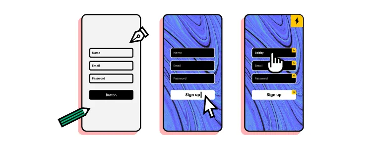
Prototypes
Definition: A prototype refers to a sample version of a product (or its specific aspect), used by designers to test the solution out before launch. It is used to test or de-risk ideas, simulate the final product, address any assumptions, and eliminate concerns towards any other elements of its conception quickly and inexpensively. This allows the designer/s to work on the project, making modifications or adjustments in direction on the end goal if necessary.
Application: Designers will commonly use prototypes to test their product and gain user feedback during an initial trial period prior to an official launch taking place. This helps them save money by testing the product for inefficiencies, which saves time and resources in the long run.
Examples: high-fidelity prototypes vs. low-fidelity prototypes, mockups
Related resources:
- eBook The Ultimate Guide to Prototyping
- What is a prototype? A guide to functional UI
- What can help you create interactive prototypes?
Component Library
Definition: A component library is a collection of UI components that can be reused across multiple projects. It typically includes code, documentation, and guidelines on how and when to use each component.
Application: Component libraries help ensure effective communication and collaboration between teams. They provide a quick access point for reference guides and stored, reusable components. Front-end developers can use these to help reduce cross-browser and cross-device incompatibility. In addition, component libraries eliminate the need to convert design to code, which lowers code duplication.
Examples: MUI component library, Ant Design component library, Bootstrap component library,
Related resources:
- Storybook frameworks you can use to build component libraries
- React component libraries to use
- PayPal’s prototyping process with components
Material Design
Definition: Material Design is a visual language that Google developed in 2014. It’s based on the principles of how materials exist and interact in the physical world. Many companies have since adopted Material Design as their design system of choice.
The language aids in the development of digital experiences for platforms like Android OS, iOS, Flutter, and websites. The structure makes the technique for creating components such as grid-based layouts, animations and transitions, padding, responsive compositions, dimensional depth effects, and more straightforward.
Application: Material Design is used by designers to optimize the user experience through 3D effects and lighting/animation features in GUIs. The approach helps eliminate confusion among users and provides consistency. For designs, it’s a key feature for animations and getting feedback on graphics.
Related resources:
- UXPin’s Material Design UI kit
- Motion and interactions in Material Design
- Rules of Material Design
- Material Design Library
Design Language
Definition: A design language is a set of rules, guidelines, and best practices that govern the design of a product. A strong design language will make a product more consistent, cohesive, and easy to use. It also defines the overall visual identity of a brand.
Application: Design language helps teams follow a specific set of rules and methodologies. It makes the design process run smoothly without inconsistencies or unnecessary confusion. By creating a set of standards to follow, users can feel more comfortable navigating designs that feel familiar to them.
Example: Apple’s human interface guidelines are a design language that governs the design of all their products.
Usability
Definition: Usability measures how easy it is for users to accomplish their goals when using a product. A product with good usability is tested through five criteria – learnability (i.e., a soft learning curve), efficiency, satisfaction (how satisfied users are after interacting with it), memorability, and the number of errors users make.
Application: Usability helps designers and developers measure how well they are adhering to the needs of their users. It is an approach that assesses the effectiveness, efficiency, and appropriateness of a system and helps to identify how easily users will be able to solve any potential problems on their own.
Related terms:
Typography
Definition: Typography refers to the practice of arranging type (letters and text) to ensure the copy is clear, aesthetically attractive, and supports the content and design. Variables within typography include font size and style, as well as spacing and the length of copy on a line and page.
Good typography should be invisible—the user should be able to focus on the content, not the typeface.
Application: Good typography carries a myriad of benefits for designers and developers. It is perhaps one of the most important elements of a design system and helps communicate things like tone, sentiment, and the overall message. Typography will typically be used to draw a reader in while providing legibility.
Related resources:
Icons
Definition: Icons are visual symbols that represent a concept, action, or object. They can be used to help users navigate a product or to provide additional information about a particular element on the screen.
Application: Designers use icons to help users quickly navigate through a system with graphical representations. Icons are a great tool because they help free up space for other things since they’re typically quite small. They’re also an ideal tool for marketing efforts to add visual appeal.
Examples: Material Design Icons
Related terms:
Spacing
Definition: Spacing is the use of empty space to separate elements on a page. Good spacing can make a product more legible and easier to use. Spacing can be implemented across all aspects of a product, from the margins and gutters to the spacing between lines of text.
Application: Clear and concise spacing helps developers and designers maintain an aesthetically pleasing atmosphere for users. Spacing is typically very deliberate in the way that it is placed throughout a system. It allows for things like optimal readability, consistency, and harmony across a design system.
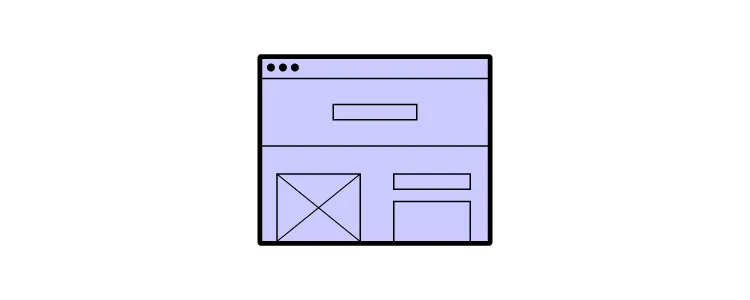
Grids
Definition: Grids are a system for organizing content on a page. They can be used to create structure and hierarchy or to divide a page into sections. Grids can be implemented in various ways, from simple columns to more complex multi-column layouts.
Application: Grids help designers develop a user-friendly system that’s low-cost and provides consistency across multiple devices. Grids are typically designed in one spot then reproduced in other areas of a design system. Overall, they’re a great tool for designers to use for organizing information and providing precision.
Style Guide
Definition: A style guide is a document that outlines the rules and guidelines for the design of a product. It includes information on typography, color, iconography, and more. A style guide is an essential tool for maintaining consistency across a product. It’s a must-have if you’re working on a design system.
Application: Style guides are generally used for entire teams to work together more cohesively. It allows designers, project managers, and developers to stay on the same page with project expectations. In addition, teams can utilize style guides to quickly transition new hires and get them up to speed with a particular project.
Examples: WIx Style Guide
Related resources
- Style guide vs. design system, etc.
- How to go from style guide to interactive design system
- Style Guides.io
UI Kit
Definition: A UI Kit is a collection of graphical user interface (GUI) elements that can be reused in digital products. A UI Kit typically includes buttons, icons, input fields, and other basic elements that can be used to build user interfaces.
UI kits usually come from companies or design teams who want to share their work with others. They can be a great starting point for new projects or a way to speed up the development of an existing project.
Application: Most commonly, UI kits have two primary uses, which include prototyping and mobile and website design. They’re especially useful for rapid prototyping where design functions are shared with developers, stakeholders and designers while a design is still in production. UI kits are especially useful for designers with no coding experience.
Examples: Apple UI Design Kit, Microsoft UWP
Related resources:
UI Patterns
Definition: Patterns are recurring solutions to common problems. They can be used to solve design challenges in a variety of ways, from layout to interaction. Within most design projects, patterns will be used to help with the structure and flow of the product.
Application: Patterns are commonly used for better consistency and for saving time by helping a team run more efficiently. By producing design patterns that are familiar to users, a team’s message and overall goal can be better focused on. Patterns make coming to decisions much easier due to the predictability that they bring.
Examples: color, font, navigation patterns, control patterns, interactions
Related resources:
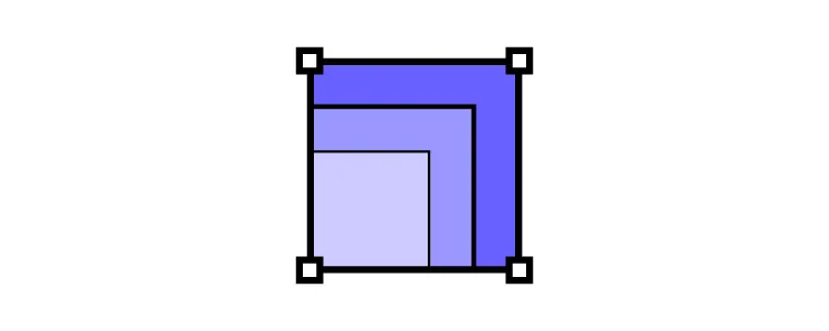
Properties
Definition: Properties are the characteristics of an element that define its appearance and behavior. In CSS, for example, properties include things like color, font size, and margin. In HTML, this could be used to make an element bold, italic, or a certain color.
Application: Some designers can find benefits from visual properties such as image-rendering, drop-shadows, border-radius cascading style sheets (CSS), or linear gradient to help improve design tasks. They might also use properties (like bold or italics) to emphasize a set of text, so users can quickly identify keywords.
Related resources:
Pilot
Definition: A pilot is a miniature, self-contained version of a larger project. Pilots are often used to test new ideas or approaches before investing in a full-scale implementation.
They can be a great way to get feedback on a design system before committing to a full rollout and will typically be used by a smaller team or group of users.
Application: A developer might put together a testing group for a new video game that has yet to be released. They will allow the group to offer feedback for the game and offer any helpful suggestions for improvements. Pilot projects are a great way to identify mistakes and mitigate risk prior to an official launch.
Tokens and Variables
Definition: Tokens and variables are used to store values that can be reused throughout a product. In CSS, for example, variables can be used to store colors, sizes, and spacing values. Tokens and variables can be a great way to maintain consistency across a product.
They can also make it easier to make changes to a product since you can update the values in one place and have those changes propagate throughout the solution.
Application: Tokens and variables are helpful for designers who are looking to make an update to their system or put together an entirely new project. They’re also helpful for maintaining future updates and managing a system that spreads across multiple platforms. For those using Material Design, tokens are optimal for features like dynamic color.
Related terms:
Classes
Definition: Classes are used to group elements together. HTML elements, for instance, can be grouped together by their class attribute. Classes can be used to create reusable components or to apply styles to multiple elements.
You could create a class for all of the buttons on your site. This would allow you to style all of the buttons in the same way and make it easy to update the styling if you want to change it in the future.
Application: By classifying certain elements on a site, designers can ensure that similar tasks are simplified in the future. This, in turn, saves time by making future updates quicker. In design software, designers can quickly group elements through a keyboard shortcut to optimize future processes.
Binding
Definition: Binding is the process of connecting an element to data. In HTML elements can be bound to data using the data-* attributes. This allows the element to display the data in a specific way.
Binding is a powerful way to create dynamic and interactive user interfaces. It can be used to build things like data tables, form controls, and charts.
Application: Binding is commonly useful by front-end developers to link components to variables. This can also be done by linking variables to components, which is also referred to as to-way-data-binding. Some developers will use binding techniques to link a user interface and the data that it shows. For enterprise applications requiring secure data access, platforms like DreamFactory provide governed API access to backend data sources, enabling developers to bind UI elements to enterprise data safely and reliably.
Related resources:
Slots
Definition: Slots are used to insert content into a component. They are a great way to reuse components and to make sure that your content is always up-to-date. Among others, by using slots you could create a slot for your site’s navigation and insert the latest links into it whenever the content is updated.
Application: Slot components help product designers by customizing certain components to save time with their designs. They help reduce the complexity of projects in order to make them more flexible. Many choose customized design system libraries with slot components, for example.
Related resources:
Events
Definition: Events are used to trigger actions in a product. HTML elements, for instance, can be given event attributes that will cause them to respond to user input. They are a powerful way to create interactive user interfaces and be used to trigger things like modals, forms, and navigation.
Application: Events have a variety of applications, such as marking the start and end of a visitor session, obtaining visitor profile data, and changing a visitor audience level. Many applications allow users to access an events summary via a system dashboard. This report can usually be filtered to show most relevant data.
Framework
Definition: A framework is a collection of code that can be reused to build software products. They can include aspects of a project like libraries, tools, and best practices.
Frameworks can be a great way to speed up the development of a product. They can also make it easier to maintain a product over time. They are helpful for both small projects and large enterprise applications.
Application: Teams will commonly use frameworks to facilitate an in-depth analysis of certain issues and come up with a plan of how to take prompt action. Frameworks are an important part of any design system because they allow users to identify new insights at any given point in a design process.
Related terms:
Reference Site
Definition: A reference site is a website that provides information about a specific topic. You can use it to learn about new technologies or to find solutions to common problems.
Reference sites can be a great way to get started with a new technology or to troubleshoot an issue. They can also be an excellent resource for finding more information about a topic.
When designing a product or service, most teams will develop a reference site to ensure that everyone is using the same terminology, components, and processes.
Application: Reference sites are usually the first touchpoint for someone looking for a specific design system. These are posted by teams to make important information accessible in one centralized location. These generally include a component library along with a set of guidelines.
Design System Governance
Definition: Design system governance is the process of managing and maintaining a design system. This includes things like setting up standards, creating documentation, and enforcing rules.
Application: Design system governance is important for preparing a system for change. It ensures that everyone is following the same standards. Governance is key to managing requests and keeping track of decisions. For this reason, many teams use it for better collaboration efforts and contributions.
Related resources:
Design System Graveyard
Definition: A design system graveyard is a collection of abandoned or outdated design systems. This can be a great resource for learning what not to do when creating a design system. When a design system is no longer being used or maintained, it is said to have been “put to rest” in the design system graveyard. This is usually because the product or service that it was created for has been discontinued or because the team has moved on to a new system.
Application: Designers and Developers can benefit from the design system graveyard by studying it and educating their teams on what not to do if they want to keep their system afloat. Some also find it effective to utilize the graveyard to construct alternative designs from abandoned data.
Examples: Gwern – Design Graveyard, 5 UX Designs That Died
CSS Modules
Definition: CSS Modules are CSS files which define, by default, animation and class names. By using CSS modules, you ensure that your CSS code is consistent across projects.
They are a great way to manage CSS in large projects. They can also be used to create reusable components that can be applied across multiple projects.
Application: CSS modules are commonly used to build element styles more granularly. They help developers write more legible, maintainable code and are ideal for situations where application styles are expanding. When they expand, the likelihood of two classes ending up with identical or similar names increases, so these modules help developers combat this issue.
Related terms:
Storybook
Storybook
Definition: Storybook is an open-sourced tool that can be used to develop and test UI components. It allows for the creation of isolated environments for each component. The software can be used to generate static documentation for a component library.
Storybook lets designers test out different variations of a component to see what works best. It also offers the ability to generate documentation for a design system.
Application: Storybook helps designers and developers collaborate more cohesively. It’s used to locate inconsistencies through connecting common tools that designers use with the different tools that developers use. For example, Storybook connects components of JavaScript with (e.g., React) with prototyping tools like UXPin. Even more, the platform allows for UI review and feedback to be in one centralized location.
Related terms:
- Storybook and UXPin Merge integration
- Storybook best practices
- Storybook examples
- Import components with Storybook
- Storybook Args
Design system maturity
Definition: Also known as a design system maturity model, this refers to the way to measure the progress of a design system. It can be used to track the development of a system and to identify areas that need improvement.
There are four stages of design system maturity: initial, foundational, comprehensive, and integrated. Each stage has its own challenges and characteristics. These include;
- Stage one – Style guides.
- Stage two – HTML & CSS.
- Stage three – Design & code components.
- Stage four – Fully integrated.
Application: Design system maturity models are commonly used by companies to help them follow a more cohesive, consistent system. Their effectiveness vastly outweighs traditional models; therefore, they reap more promising results. The models help teams handoff a design with ease knowing everyone is on the same page, and, for this reason, it is especially useful for designers and engineers alike.
Examples: Design System Maturity Model
Related resources:
- How Iress managed to increase their maturity?
- Checklist to track design system maturity
- UXPin Design System Maturity
Atomic design
Definition: Atomic Design is a design system methodology, which is based on the idea of modularity and reuse. Atomic Design is made up of five stages – atoms, molecules, organisms, templates, and pages.
Application: One of the best uses for atomic design is gaining the ability to seamlessly switch between abstract to concrete. It allows users to switch and see their interfaces broken down to their atomic elements. Furthermore, atomic design breaks down the process of combining those elements to reach a final experience.
Examples: Atomic Design Methodology, Andela – Atomic Design Principles
Related resources:
Atom
Definition: An atom is a design model that refers to the smallest unit of a system. In other words, it is the most basic building block. All atoms have the same structure and cannot be divided into smaller parts. Design-wise, this could refer to a simple component like a button or a form field.
Application: Atoms help designers and developers break down components into their smallest form (e.g., button). They can be matched with other components to form things like molecules or organisms (see below). They’re ideal for combining into molecules to make web pages.
Examples: buttons, inputs, labels
Molecule
Definition: A molecule is a design model that refers to a group of atoms that are bonded together. Molecules are slightly more complex than atoms but still considered basic building blocks. A step up from atoms, a molecule could be a button with an icon or a group of form fields.
Application: Molecules help teams build more complex structures out of existing atoms. For example, a profile molecule would be comprised of an avatar element and name label elements. Overall, molecules are great for bringing different elements together to form unique groupings.
Related resources:
Organism
Definition: An organism is a design model that refers to a group of molecules that are bonded together. Organisms are more complex than molecules but are still considered to be basic building blocks. An organism could consist of an element like a header, footer, or search form.
Application: The organism stage of atomic design helps take the process one step further from molecular level. It allows designers and developers to utilize it as a component that can be reused across numerous designs (although it is not yet a completed design).
Repository
Definition: A repository is a collection of code that is used to manage a design system. This can be used to store and share components, templates, and other assets. A repository can be hosted on a server, or it can be stored locally. Respectively a Design System Repository is a collection of code that can be used to manage a design system. It contains all of the assets needed to create and maintain a system.
UXPin is a web-based design collaboration tool. We’re pleased to share our knowledge here.
UXPin is a product design platform used by the best designers on the planet. Let your team easily design, collaborate, and present from low-fidelity wireframes to fully-interactive prototypes.
Start your free trialThese e-Books might interest you

Interaction Design Patterns
Design and reuse the most important interaction patterns in UI design.
Download ebook for free
Design Systems & DesignOps in the Enterprise
Spot opportunities and challenges for increasing the impact of design systems and DesignOps in enterprises.
Download ebook for free