Sustainable Web Design: Can You Lower Design’s Environmental Impact?

Sustainable web design is a growing movement as organizations look for every opportunity to reduce emissions and minimize their carbon footprint. If you follow responsive web design and mobile-first practices, you’re already on the way to reducing your environmental impact with greener digital products.

According to a March 2020 BBC article, Why your internet habits are not as clean as you think, the internet accounts for “3.7% of global greenhouse emissions.”–which includes devices, websites, apps, data centers, and all the supporting infrastructure.

This article looks at how designers, engineers, and businesses can do more to reduce emissions by making eco-friendly digital products and websites for their customers.

Create a greener UX workflow by reducing time-to-market with UXPin. PayPal used UXPin Merge to scale design and create massive efficiencies without adding more staff or resources. Find out more about this revolutionary code-based UX design technology and how to request access to UXPin Merge.

What is Sustainable Web Design?

Sustainable web design is the process of optimizing digital products and websites to reduce bandwidth and power consumption. Organizations must access several key emission-reducing strategies, including:

  • Design
  • Web Development
  • Content & Marketing
  • Hosting
  • Project Management
  • Business Operations

As you can see, sustainable web design extends beyond the design and development for a holistic impact assessment to reduce greenhouse gas emissions.

What Are the Benefits of a Sustainable Website?

Designing a sustainable website or digital product isn’t just beneficial for climate change; it also creates business value and reduces costs. One of the most significant savings is hosting.

Most hosting plans bill you for the amount of server space plus the number of monthly users or bandwidth. Reducing the size of your website saves server space while lowering bandwidth and requests. Companies that self-host require smaller data centers and save on energy bills.

Website performance also correlates to conversion increases, and page speed is one of Google’s rank factors.

So, businesses that optimize website and application performance benefit from cost savings and higher revenue, leading to a more sustainable business model.

How Do You Create a Sustainable Website?

Here are 12 sustainable web design tips that improve performance, save money, increase the user experience and reduce your website’s environmental impact.

1) Optimizing Visual Content & Lazy Loading

According to HTTP Archive, “Images are the most popular resource type on the web” and makeup 50% of the average web page size. WebP instead of JPEG or PNG can reduce file size by 25-35% while increasing page speed performance. Switching icons and logos to SVG format can also significantly reduce page weight. 

Designers should use WebM instead of MP4 and GIF for video content. WebM is smaller and optimized for the web.

loading

Lazing loading is another way designers can optimize image and video content. Instead of loading all of these resources simultaneously, the browser only loads what’s above the fold and then fetches additional images and thumbnails as the user scrolls.

2) CSS Sprites

CSS sprites is an old video game trick for loading multiple images with only one HTTP request. Instead of uploading each file individually, you stack the images vertically and combine them with a gutter between each one.

Developers use CSS to set the position and dimensions, hiding the rest of the stack, making it look like a single page image. CSS Tricks has an informative article about how to use CSS sprites, including package managers for automating the process.

3) Reducing Emails

According to a BBC article, “If every adult in the UK sent one less ‘thank you’ email, it could save 16,433 tonnes of carbon a year – the equivalent to taking 3,334 diesel cars off the road.”

Organizations should audit correspondence and eliminate wasteful emails. For example, how many emails does a customer receive when they complete a sale? Can you combine these into one?

According to marketing guru Neil Patel, marketers should purge email lists regularly. If you’re sending emails to inactive accounts or customers that don’t open or engage with your content, then you’re wasting money and adding unnecessary carbon emissions.

Also, consider whether it’s necessary to include images in your emails. A regular text email is 4g CO2, whereas an email with a photo is 50g CO2.

4) Optimizing Design Workflows

Optimizing design workflows can reduce rework, errors, and usability issues. These problems often put a strain on resources affecting departments beyond UX.

DesignOps can help organizations optimize UX workflows and create design efficiencies. Building a design system can also help reduce errors and time-to-market while improving the user experience with cleaner user interfaces that load faster.

5) Mobile-First Design

Mobile-friendly websites must be lighter to load faster on smartphones. So, adopting a mobile-first design strategy means designers create value for their users while saving the environment.

mobile screens

UXPin provides designers with predefined canvas sizes for web, iOS, and Android devices. Adaptive Versions allows designers to create multiple layouts for each viewport, like mobile, tablet, and desktop. Sign up for a free trial to experience mobile-first design with UXPin.

6) Minify HTML and CSS Resources

Minifying code removes unnecessary whitespace, reduces file sizes, and increases page speed. Developers can also combine resource files, so browsers have fewer requests.

There are loads of free tools for minifying HTML and CSS, including plugins for code editors and package managers. Minifying Javascript is a little more complicated, so leave this for a qualified developer to handle.

7) Choosing a Content Management System (CMS)

Choosing the right CMS can also significantly impact the size of your website and page speed. WordPress is often the most popular choice, but it’s bulky, outdated, and unnecessary for most websites.

Here are some lightweight alternatives for popular website use cases:

  • Ghost: A lightweight headless CMS designed for content creators, excellent for blogs, publications, and subscription websites.
  • Gatsby: Great for most websites, including eCommerce, single-page layouts, landing pages, web applications, portfolios, company websites, and much more.
  • Strapi: An open-source modern headless CMS alternative to WordPress. Build everything from one-page designs to eCommerce and complex mobile and web applications.

8) Hosting

According to the US Energy Efficiency & Renewable Energy Office, data centers account for 2% of US electricity usage. So, switching to a green web host provider can help reduce energy consumption. 

The Green Web Foundation has a hosting directory of 342 green hosting providers in 26 countries (figures correct as of December 2021). Green hosters use renewable energy like wind, solar, and hydro. In some circumstances, hosting providers generate more green power than they need, which they feed back into the grid.

You’ll be pleased to know that many big names, including AWS, A2 Hosting, Firebase Hosting, and Siteground, are listed as US-based green hosting providers.

9) Choose Fonts Wisely

Fonts are known to slow page speed, particularly custom, self-hosted fonts. Consider designing your website with one of 18 web-safe fonts compatible with all browsers–meaning the browser doesn’t need to download additional files.

text typing input

If you are using a custom font, make sure it’s in WOFF or WOFF2 format so browsers can read and download it. You’ll also need to include a web-safe font in your font stack, or the browser will load New Times Roman if it can’t process the WOFF file.

Developers can also use other tricks for custom fonts like pre-loading and CSS optimization.

Hierarchy and navigation play a crucial role in helping users find content and complete tasks quickly. Designers should prioritize essential navigation in the header (4-5 max) and secondary links in the footer.

Hierarchy helps users identify important content and complete tasks quicker. Visual hierarchy is also a crucial factor for user experience and website accessibility.

Teams should conduct regular website audits for broken internal and external links to ensure users never waste server requests with dead-end 404 errors. Use 301 redirects for internal links and find new resources for broken external links.

11) Use Fewer Web Pages

Every new page visit requires the browser to send a request to the server, which returns the page’s content and resources. The more page visits you have, the more work (and energy consumption) the server must do to serve content.

Designers should assess each project to determine how to reduce or consolidate pages. A single-page design is often enough for most portfolios, landing pages, corporate websites, local businesses, SaaS, and apps, to name a few.

Single-page designs are good for the environment and provide a better user experience for visitors on mobile devices who only have to scroll to find what they need.

12) Buy Refurbished Equipment

Businesses and designers should also consider buying refurbished equipment whenever possible. In an interview with Forbes, co-founder of UK-based Wholegrain Digital web design agency and author of Sustainable Web Design, Tom Greenwood points out that the lifetime carbon footprint of a 13″ MacBook Pro laptop is 185kg CO2, 80% of which is initial manufacture and transport.

So, buying refurbished equipment can significantly reduce your company’s carbon footprint. 

Design agencies Wholegrain Digital and Mightybytes partnered on sustainablewebdesign.org, which provides companies with strategies organizations can implement to deliver more sustainable web design projects. The website also has a carbon calculator which shows you how to calculate your digital emissions.

When you buy an old pc or mac, make sure to remove malware so you can use the computer safely. Doing so is pretty easy with virus removal and malware removal tools, so always buy used computers if you can.

Design Better User Experiences With UXPin

Building a sustainable website starts during the design process. UXPin’s code-based design tool lets designers create fully functioning prototypes to eliminate costly usability issues before the design handoff.

Sign up for a free trial to see how the world’s most advanced code-based design tool can optimize design workflows and enhance your website’s performance for a greener end-to-end design process.

Try MUI library in UXPin – Design Faster

What Is MUI and What Do You Need to Know About It

MUI is one of the top React component libraries that help front-end developers and designers create consistent user interfaces for their products. It contains a collection of ready-made building blocks that significantly speeds up prototyping. If you want to take the MUI for a test ride, you can try MUI Core 5 with UXPin Merge. Here’s how to do it. 

Build prorotypes with MUI kit right away. Sign up for UXPin’s trial.

Build advanced prototypes

Design better products with States, Variables, Auto Layout and more.

Try UXPin

UXPin Merge’s Revolution

UXPin with Merge technology allows teams to prototype faster, because it uses real code components with built-in interactions, states, and variables. Engineers can integrate a React-based library or Storybook with UXPin Merge. Then, designers create digital products with the exact building blocks that engineers developed, and if needed, they can introduce global changes to components’ look and feel.

Such designs are powerful. Not only do they look like a finished product – they behave like one. Which means that designers get higher quality feedback from usability tests, product teams get stakeholder’s buy-in, and the collaboration between design and development gets stronger. No more gaps between product team members in the process.

You can use your own React components in UXPin. But what if you don’t have enough resources to build your own component library right now? There’s a solution – try one of the fully-fleshed libraries that sync with UXPin.

Try Open-Source Libraries with UXPin Merge

Using pre-built libraries, such as MUI, added to UXPin editor thanks to Merge technology can advance prototyping even more. Developers can use a widely-accepted library that has been documented and tested. Designers, on the other hand, can rest assured that it follows best UI practices.

As for product teams, they can release products faster and scale effectively the design process with an improved developer’s hand-off stage.

Ready libraries include pre-built components, such as buttons, navigation bars, containers, text fields, but also colors, typography, spacing, and grid system which can be adjusted.

The most popular libraries are open source, such as Bootstrap or MUI.

That’s Why We Added MUI to UXPin Merge

MUI is one of the most popular React component libraries for building responsive products. It is based on Material Design – a well-respected Google’s specification for designing for the web. It contains tips about how different elements should be displayed on the screen.

The MUI creators took those guidelines and they created an open-source code UI library on top of them. Everyone who wants to follow Material UI best practices for creating user interfaces can use the MUI library and save their time. 

Benefits of Using MUI for Prototyping

As one of the largest libraries of UI components, icons, and styles, MUI offers tons of advantages for designers, developers, and product managers. It makes their jobs easier than before.

Here are 5 benefits of using MUI for design.

  • Based on real best design practices – It’s a UI library that was developed with the most widely accepted design guidelines at its core.
  • Accessible UI library – Since it follows Material Design guidelines, MUI has accessibility built into it, so your products can be used universally.
  • Customizable – You can adapt code components and slightly adjust them to your design.
  • Helps at optimizing design systems – Its efficiency makes it a great tool for implementing an accessible, mature design system at a fraction of time.
  • Well-documented – With a great, ready-to-help community comes heaps of documents you can access. They’re all written in a clear, easy-to-follow manner.

Creating prototypes based on MUI has many potential benefits for teams of any size. Since UXPin is a code-based prototyping tool, you can really leverage the power of MUI and get even more benefits of prototyping with code components – the kind that only code-powered prototyping tool can offer.

Code-powered Prototyping Gets You Even More

Aside from the benefits above, teams can achieve a greater efficiency of work using React-based code component libraries in a prototyping tool.

  • True functional fidelity – Because you design with real code components, you can test the actual experience that customers have when using your product.
  • Faster and risk-free delivery – Developers can ship products and features faster when the components are fully coded without compromising quality of work.
  • Design interactions you want – Oftentimes your interactions are not fully presenting what you had in mind when using vector-based tools; code-powered tools help you avoid that.

How it works

The MUI library gives you fully interactive  building blocks to design with right on trial. Sign up for a 14-day free trial and see how easy it is to design with code components in UXPin’s editor. It gives you plenty of time to explore the library’s components in UXPin.

How to access MUI on trial

  1. Create a trial account – MUI kit is available for 14 days.
  2. Open a new prototype from the UXPin Dashboard.
  3. Go to Design System Libraries in the Toolbar on the left.
  4. The MUI library is named “MUI 5” among other libraries.
  5. Drag and drop interactive components from the library and preview how they behave.
  6. View and copy the code in the Spec Mode.
  7. MUI will be available until your trial ends.

How to access MUI in UXPin Merge

To design with code components from MUI, you need access to UXPin Merge. If you’re a UXPin Merge user, sign in to your account and you’ll see MUI 5 as one of the libraries.

If you haven’t tried UXPin Merge yet, just request access to UXPin Merge and use the MUI Core v5 to build fully interactive user interfaces you can test with users or hand off to engineers. The development team can then use the code, and designers have building blocks ready to create a fully interactive UI for their products.

UXPin Merge integrates with Storybook and Git repository to bring a coded design system into UXPin. More on that in the blog post, Meet UXPin Merge.

Test UXPin Merge with MUI

The MUI library is one of the most popular React libraries for building interactive experiences for the web and digital devices. Design high-fidelity prototypes in a matter of minutes with MUI as your code component library. Developers, on the other hand, can use the code of the components you use to create the final product.
Try UXPin Merge with MUI and save time on designing fully functional prototypes.

Material Design UI: An Introduction to Features like Motion and Interactions

material design ui

Material Design is a comprehensive design library that both designers and developers can build mobile apps, websites, web applications, and other digital products. The documentation is excellent, with lots of information that’ll benefit even the most experienced of designers.

Google’s Material Design UI is one of the most popular and widely used design libraries in the world. If you use Google’s products (Gmail, Meet, Docs, etc.) or an Android device, you likely interact with Material Design UI daily.

Material Design is more than your average design library. It’s a masterclass for user experience design with excellent documentation, principles/best practices, and tutorials.

With Material Design built into UXPin’s design editor, you can get started building high-quality mockups and prototypes right away. No plugins. No importing files. Everything is ready to go. Sign up for a free trial and start building your next project using Material Design in UXPin.

What is Material Design?

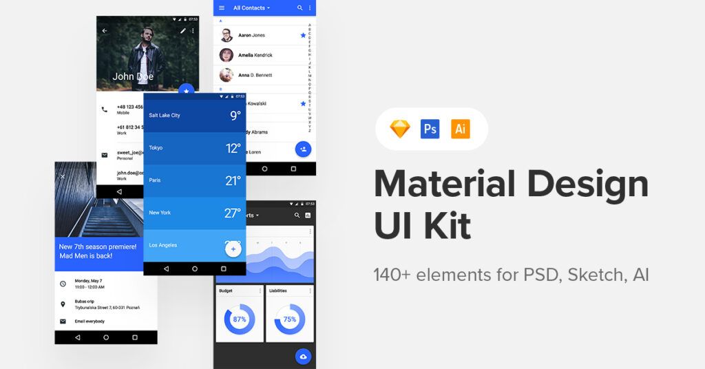
Material Design is a design library developed by Google, including UI components, icons, typography, and more. Google even includes guidelines and tutorials to help designers and developers get the most out of Material Design.

Google launched Material Design in 2014 at Google I/O Conference. The goal was to create a “tangible” design library based on ink and paper. “… unlike real paper, our digital material can expand and reform intelligently. Material has physical surfaces and edges. Seams and shadows provide meaning about what you can touch.” Matías DuarteGoogle’s Vice President of Design.

Material Design distinguishes itself through its focus on interaction as the core function within a design system. And that’s precisely why more designers are embracing Material Design.

Benefits of Material Design

One of the biggest advantages of Material Design is that you’re using a design library that Google’s UX designers have tested every element and component–saving you hundreds of hours of testing and iterations. 

Material is also familiar to billions of users, so most people can jump in and start using your product without learning a new design system – a massive benefit for design psychology and reducing cognitive load.

Another significant benefit of designing with Material Design is speed. Designers can drag and drop Material elements and components to build user interfaces again, saving you time starting from scratch.

Lastly, Material Design is open-source, which means you can customize the design library to match your brand and product requirements. The system is available for Android and iOS, allowing you to use one design library for both operating systems.

Most design tools require you to install Material as a plugin or extension. With UXPin, you get several popular design libraries, including Material Design, built into the editor. Just select the library you want to use and drag and drop components to start building. Easy! Sign up for a 14-day free trial to see how quickly you can design mockups and prototypes with UXPin.

Material Design Features

Material Design has tons of features to help you build just about any product you can imagine. We’re going to explore some of Material Design’s most notable features that help designers build user interfaces.
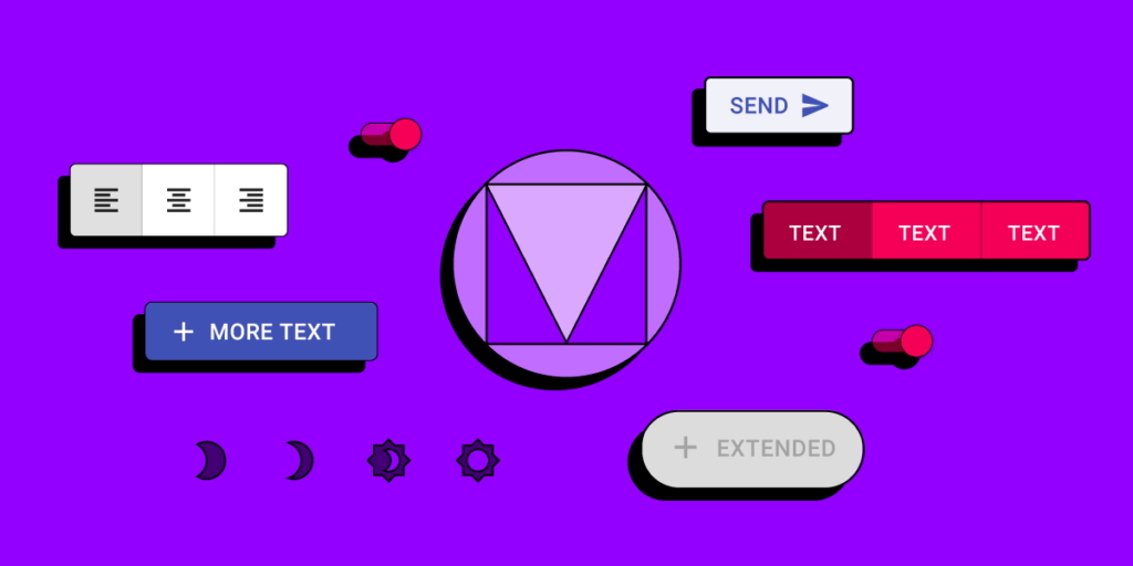
Components

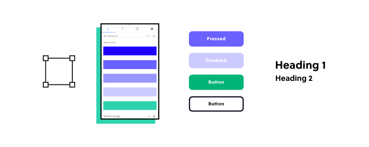
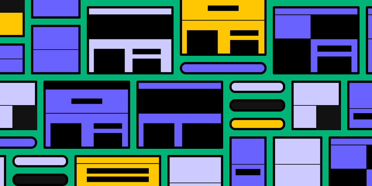
Material Design has a massive library of components and UI patterns across 17 categories, including buttons, app/navigation bars, menus, date pickers, cards, image lists, and more! 

Google has thought of every possible component you need and offer the flexibility to customize each one to suit your needs. For example, Material’s Bottom Navigation explains usage, anatomy, behavior, placement, states, and theming options so designers can customize every facet of the component.

UXPin’s editor allows you to easily resize Material Design’s UI components. When using the components, you can seamlessly adjust their size, alignment and spacing between the components in whatever way you like with an Auto Layout feature. You can also add Auto Layout to the material design component and push it back to your library in UXPin to keep its properties.

Additionally, Google provides developer implementation for every component so engineers can copy/paste the HTML and CSS starter code.

Material Components for the Web was designed specifically for websites and web apps. Developers can also find Material libraries for React, Vue, Angular, and more. However, it’s important to note that the Material Design team does not maintain these unofficial libraries.

Icons

Material Icons has more than 2,000 icons in five styles:

  • Outlined
  • Filled
  • Rounded
  • Sharp
  • Tow tone

You can download Material Icons for the web in SVG or PNG format or use code snippets for Android, iOS, and Flutter. You can also install the Material Icons stylesheet from GitHub directly to the header of your website project.

Typography

Typography is a crucial part of UI design and branding. Material Design’s default typefaces for Android are Roboto and Noto Sans. The latter supports more than 150 scripts and 800 languages, so you can easily translate your Material Design product while maintaining aesthetics and integrity–a massive plus for organizations with a global user-base.

Of course, you have the freedom to use Google’s vast library of fonts or install a custom font.

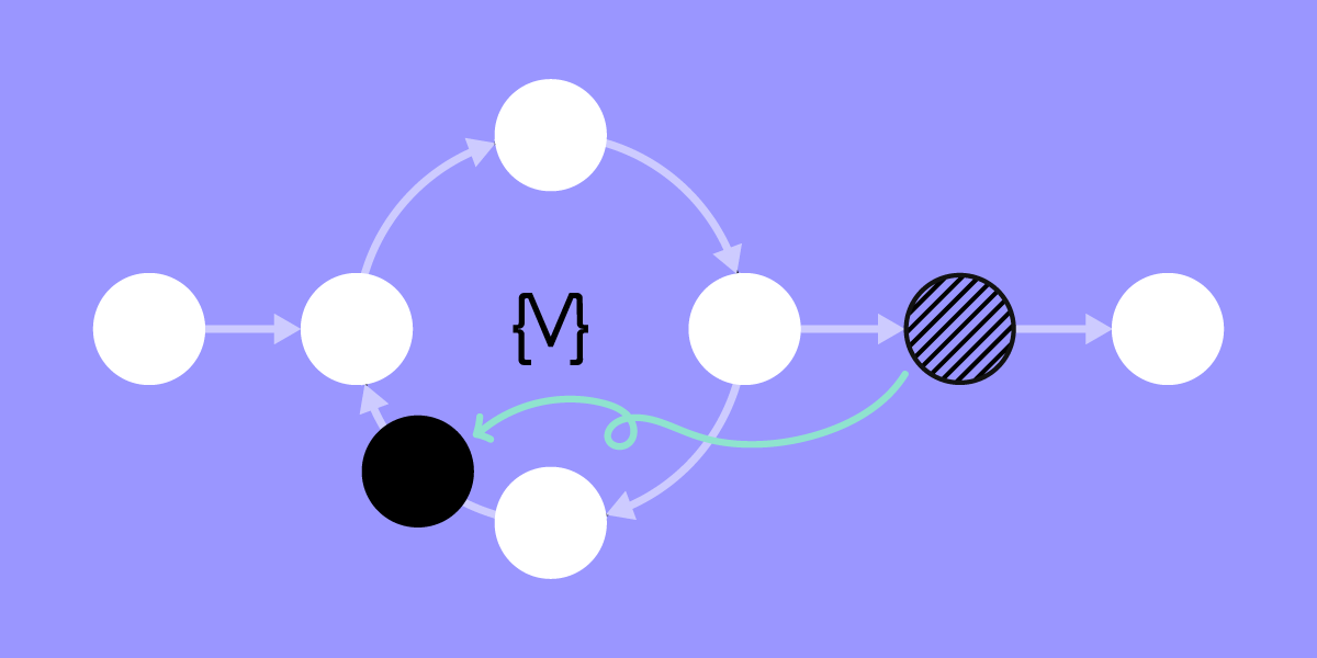
Material Design Motion & Interactions

Sometimes the smallest parts of the design are the most important. Microinteractions, those tiny parts from alarms to text messages to notifications of almost any kind, are vital in our everyday lives. 

Designing microinteractions in the roots of Material Design can help you understand the how and why of creating something your users want to interact with.

Microinteractions help in several ways:

  • Communicate clarity and system feedback
  • Provide guidance
  • Indicate or prevent errors
  • Encourage engagement and sharing
  • Enhance the branding experience

While microinteractions are everywhere, Material Design nails the concept, spelling out that any responsive interaction prods people to go deeper. While microinteractions can offer delight and surprise, the ultimate goal is to encourage users to explore further.

Material Design offers detailed guidelines for Motion and Interaction.

Motion

Motion is the UI animation that responds to user interactions. As Google puts it, “Motion helps make a UI expressive and easy to use.” Material Design outlines three principles for Motion:

  • Informative: Helps to inform users by highlighting relationships between elements, action availability, and action outcomes.
  • Focused: Shows users what’s essential without creating unnecessary distractions.
  • Expressive: Celebrates moments in user journeys, adds character to common interactions, and can express a brand’s style.

Material’s Motion documentation is a masterclass for UX designers which includes:

  • The motion system: a set of transition patterns that can help users understand and navigate an app.
  • Speed: How adjustments make transitions smooth and responsive.
  • Choreography: a coordinated motion sequence that holds the user’s focus while an interface adapts.
  • Customization: How to customize Motion to express your brand’s style.

Interaction

Material Design’s Interactions define the movement and animations triggered by user interaction.

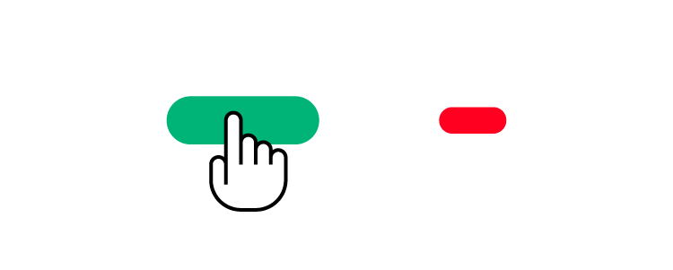
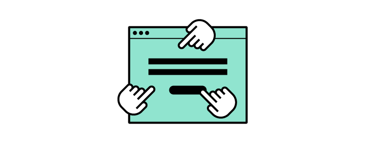
  • Gestures: let users interact with screen elements using touch.
  • Selection: how users indicate specific items they intend to take action on.
  • States: visual representations used to communicate the status of a component or interactive element.

Material Design takes a deep dive into how designers should use these interactions within each of these categories, including common errors or misuse.

For example, Material responds to gestures in real-time to express direct user control over touch interactions. A person’s touch should control how fast or slow an animation occurs to deliver an authentic user experience.
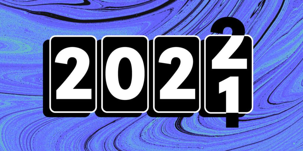
Material Design 3

In May 2021, Google announced the new and improved Material Design 3, which Google calls its “most expressive and adaptable design system yet.” Material Design 3 was first released on Android 12 and Google Pixel devices and will roll out to other technologies later in 2021.

Here are three new features in Material Design 3.
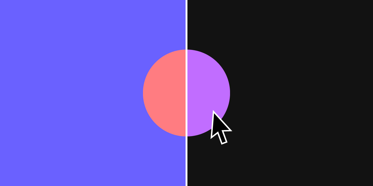
Dynamic Color

Dynamic color is a new feature for Material Design. The feature allows users to customize their visual experience through wallpaper selection and other customization settings.

Dynamic color is an algorithm that scans a user’s wallpaper to generate five tonal palettes of accent and neutral colors. The device then uses these colors for settings, menus, and Android applications.

Foldable Devices

Another Material Design 3 feature provides UI considerations for foldable devices. A notable UX addition is Postures, a screen configuration unique to foldable phones indicating when the device is folded or unfolded. Postures can extend to unfolded landscape and unfolded portrait, which each display a different screen size and aspect ratio.

Other foldable Material Design features include:

  • Reachability: What happens when users can’t reach parts of an unfolded device.
  • Center hinge: Hinges that create space between the screen’s fold and content.
  • Dividing the screen: Layouts for open foldable devices.

Design Tokens

Design tokens allow you to store style values such as color and fonts to be applied across designs, code, tools, and platforms. The goal is to help organizations streamline building, maintaining, and updating design systems. It’s a fantastic feature that ensures designers and engineers apply the same colors and fonts to avoid design drift.

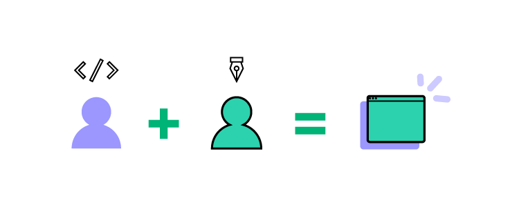
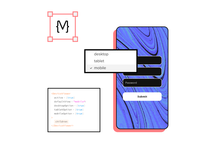
Avoid Design Drift With UXPin Merge

Another way you can avoid design drift is with UXPin Merge – and to a significantly higher degree than Material’s Design Tokens! Merge lets you sync UXPin’s design editor with your organization’s design system stored in a repository–either via Git or Storybook integrations.

Designers can use fully functioning code components to build new products and user interfaces. Developers can also set props that appear in UXPin’s properties panel so designers can manipulate and edit the components.

Find out more about UXPin Merge and how you can sign up to request access to this revolutionary technology.

Create Prototypes with Material Design

If you’d like to try building something with Material Design, sign up for a free UXPin trial and start building straight away! UXPin also has several other popular design libraries, including iOS, Bootstrap, Foundation, and User Flows. 

Design System Accessibility: Check What You Need to Know

An accessible design system makes it easier for designers to create products that don’t discriminate users with disabilities. Design a system that is accessible in the first place, test it with available tools, and audit it from time to time to ensure it fits the standards. Let’s see how.

Design system accessibility is the first step towards creating inclusive customer experiences for all users. Organizations must also recognize the business value of making accessible products and websites.

More than a billion people live with disabilities globallythat’s 15% of the world’s population. If your products don’t cater to people with disabilities, you’re handing a competitive advantage to your competition!

We’re going to explore how you can make your products more accessible by starting with a baseline – your design system. With an accessible design system, you can quickly scale accessibility to pages, interfaces, navigation, user flows, and other areas of your designs.

Managing a design system is a challenging, time-consuming task, but it doesn’t have to be! UXPin provides organizations with the tools and features to build and manage a design system. Sign up for a free trial to see how UXPin can save you time and streamline your UX workflows while creating better user experiences for your customers.

The Importance of Accessibility

There’s a misconception that users with disabilities make up a minority of online users. We tend to relate accessibility only to people with assistive technologies or visual impairments like color blindness. But design teams must also consider how people with cognitive disorders and dyslexia experience digital products.

According to the United States’ 2012 census, “56.7 million Americans (18.7% of the US population) have some type of disability, and out of this number, an estimated 38.3 million (12.6%) have a severe disability.”

How US citizens’ disabilities relate to technology:

  • 19.9 million (8.2%) have difficulty lifting or grasping, thus impacting their use of a mouse or keyboard.
  • 15.2 million (6.3%) have a cognitive, mental, or emotional impairment, affecting focus, absorbing content/instructions, and cognitive load.
  • 8.1 million (3.3%) have a vision impairment, requiring screen readers or magnifiers to view content. Visual impairments also include color blindness disabilities. 
  • 7.6 million (3.1%) have a hearing impairment, relying on transcripts and captions for video and audio.

Making digital experiences inclusive for all people is essential. However, when looking at the numbers above, organizations must also consider the business value people with disabilities offer.

Accessibility Improves User Experience

Making designs accessible benefits all users. A great example is a web page’s table of contents and headings (hierarchy) for articles and documentation.

These accessibility features allow users with screen readers to absorb content and find what they’re looking for quickly. Other users can use the same features to scan a page’s header tags or use the table of contents to move around the page with minimal scrolling.

How Design Systems Can Help With Accessibility

design system 1

When an organization builds accessibility into its design system, teams are free to develop product experiences knowing that designs are consistent and conform to web content accessibility guidelines (WCAG).

From a business perspective, design system accessibility saves time while increasing consistency, thus creating positive experiences for all users.

Making Components and UI Patterns Accessible

Organizations should treat design system components as the baseline for accessibility. This baseline includes colors, typography, spacing, sizing, and other component-based factors.

The goal is to take baseline accessibility decision-making away from designers so they can focus on design. Designers must still be aware of accessibility, but they’re not starting from scratch every time.

A Holistic Accessibility Approach

Design system accessibility is just the baseline towards making user interfaces accessible. Designers must still conduct accessibility tests on interfaces, navigation, and user flows.

Testing Accessible Design Systems

testing observing user behavior 2

Testing is critical to ensuring your design system is accessible. UX designers should always start by testing design system components using tools, followed by live tests with participants to confirm these results.

Tools to Test Design System Accessibility

Accessibility tools are excellent for testing design systems for visual impairments. UXPin’s built-in accessibility features allow UX designers to check color and contrast without leaving the design editor.

Our color contrast checker evaluates UI components against WCAG standards for AA and AAA levels. With the contrast checker activated, UXPin creates two lines on the color picker, so designers can identify where they need to be on the spectrum to meet either AA or AAA levels.

  • Level AA: requires a contrast ratio of at least 3:1 for text not smaller than 24px (18px if bolded) or 4.5:1 for text smaller than 24px.
  • Level AAA: requires a contrast ratio of at least 4.5:1 for text not smaller than 24px (18px if bolded) or 7:1 for text smaller than 24px.

Designers can also use UXPin’s color blindness simulator to experience user interfaces from this demographic’s perspective, including:

  • Red-green color blindness (Deuteranomaly, Deuteranopia, Protanomaly, Protanopia)
  • Blue-yellow color blindness (Tritanomaly, Tritanopia)
  • Complete color blindness (Achromatomaly, Achromatopsia)

Accessibility Testing With Participants

Once components pass accessibility tests using tools, designers must conduct live usability studies with relevant participants. For example, people with visual/hearing impairments, cognitive challenges, and those using assistive technologies.

Industry experts like Fable and Deque can facilitate testing to help companies find the right participants and conduct accessibility tests that produce meaningful, actionable results.

Auditing Design Systems for Accessibility

testing compare data

If you have never done a UX audit, we highly recommend completing this before moving on to solving accessibility issues! Conducting a UX audit will ensure you eliminate fundamental usability issues and design system inconsistencies. 

For example, many organizations discover that design system components have inconsistent color palettes because designers use the wrong hex codes. You’ll want a clean slate before you audit for accessibility, or you may end up doing double or unnecessary work.

Start your design system accessibility audit by listing every component, UI pattern, color, icon, asset, typeface, and other UI items. This way, you have a step-by-step checklist of everything you need to audit.

You can use this list to cross-reference the relevant Web Content Accessibility Guidelines. WCAG provides a helpful quick reference UX designers can use to audit their design systems. This reference includes guidance for WCAG 2.0 and WCAG 2.1.

Using Atomic Design Methodology for a Comprehensive Accessibility Audit

Following Brad Frost’s Atomic Design Methodology, consider breaking your design system down into atoms, molecules, and organisms so you can audit both the parts and wholes.

  • Atoms: The most basic building blocks that can’t be dismantled further. Like form labels, inputs, buttons, icons, and other singular building blocks.
  • Molecules: Simple UI components that function together. Like a search form with an input, label, and button.
  • Organisms: Groups of atoms and molecules that make up complex UI components. Like a standard website header with a logo, navigation links, and search form.

By breaking your design system down to its core, you can start with the basic building blocks and scale your accessibility audit to more complex UI components.

Non-Text Content 

Icons and other assets should help users with explicit alt text so screen readers can identify them correctly. WCAG provides designers with guidance on how to make Non-Text Content accessible.

Clear Labels, Alerts, and Messages

Messages, labels, and alerts must be helpful and provide context for users with assistive technologies.

For example, if you have multiple required fields on a form but you only have one error message saying “This field is required,” how will someone with a screen reader know which field you’re referring to? Each required field must have its own error message; “First name is required,” “Email is required,” and so on.

Designers must also use labels for every element and component so that screen readers can provide users with context and instructions. For example, you might label each element of a search form with an icon and input field as follows:

  • Search icon: label=”Begin search”
  • Input field: label=”Search query”

A screen reader knows what each element does so the user can interact with the UI component to search a product or website.

Summary

Creating an accessible design system promotes inclusivity and gives designers a baseline to scale accessibility to user flows, navigation, page layouts, and other areas quicker and easier.

Designers no longer have to worry about colors, typography, contrast, hierarchy, and other factors, because that work is already done! They only have to evaluate what happens when you combine these elements to design user interfaces and navigational flows.

Improving Design System Accessibility With UXPin

With Design Systems in UXPin, you can build and manage your organization’s design system all in one place-no plugins or addons required! Sync your design system to all teams and even set permissions to preserve consistency and integrity.

Sync your design system to all team members so designers only use colors, typography, assets, and UI patterns that conform to your organization’s accessibility standards.

Use descriptions to add documentation and guidelines (including accessibility instructions) for every UI component in your design system, so designers and developers are all on the same page.

Ready to start building more inclusive user experiences for your customers? Sign up for a free trial to discover how the world’s most advanced code-based design tool can revolutionize your organization’s product design.

7 Advanced Prototyping Features That Help You Build Better Prototypes

7 Advanced Prototyping Features

The quality and fidelity of your prototypes can significantly impact the design process and the final product. With advanced prototypes (that look and function like the final product), UX designers can get better results from usability testing and fix any issues before they get to the design handoff.

The problem? Most leading vector-based design tools don’t have the fidelity or functionality for designing prototypes that can accurately mimic the final product.

With the advent of code-based design tools, designers now have the ability to build advanced prototypes that look and function like the final product.

This article explores seven advanced prototyping features offered by code-based design tools and how they help designers build better prototypes for testing and sharing with stakeholders.

UXPin is leading the code-based design revolution. Sign up for a 14-day free trial and discover how advanced prototyping with UXPin can help you build better user experiences for your customers.

Build advanced prototypes

Design better products with States, Variables, Auto Layout and more.

Try UXPin

Auto Layout

Auto Layout is a helpful feature for designers to distribute, size, and align elements fast. Designers can make significant changes to a user interface layout simply by changing a few auto-layout properties.

Most design tools offer auto-layout, but with UXPin’s code-based tool, it’s a little more advanced.

UXPin’s Auto Layout works on Flexbox properties and principles – which means designers and developers speak the same language. This cohesion is most beneficial for design handoffs because engineers can simply copy/paste the CSS from UXPin as a starting point for development.

UXPin’s Auto Layout has five properties:

  • Direction: Set whether you want to order the auto-layout frame: vertically or horizontally.
  • Distribute: Choose different distributions of elements to set how you want them laid out along the cross axis.
  • Gap: You can set a fixed spacing between elements in the group with Auto Layout.
  • Wrap: Wrap the elements depending on the groups’ width or height.
  • Align: Align the elements along the main axis (defined by direction: vertical or horizontal) in the container.

Additionally, you can change other properties to the auto-layout group, including fill, border, padding, radius, and size. Designers can use Auto Layout for a single component or groups of components and elements.

UXPin Merge

UXPin’s proprietary Merge technology is revolutionizing UX design workflows while solving many DesignOps challenges. Merge allows designers to build products and interfaces using fully functioning code components hosted in a repository.

This exciting technology means that designers can build prototypes with the same components used in the final product. They can also change the component’s properties to match the new design.

You have two options for connecting Merge:

  1. Git integration for React components.
  2. Storybook integration for several other technologies, including Vue, Angular, Web Components, Ember, and more.

Any changes engineers make to code components in the repo will automatically sync to UXPin’s design editor. Designers also get a notification informing them of the new update–perfect for syncing the entire organization’s design system for a single source of truth!

Learn more about UXPin Merge and how you can request access.

Component-Driven Prototyping

Designers can create reusable components to save time and maintain consistency. You can also save components in your design system so that the entire organization can access the same parts.

UXPin Components comprise of two aspects:

  1. Master Component: Defines the component’s properties.
  2. Instance Component: Copies that mirror the Master.

Any changes you make to the Master will automatically sync to all of its Instances. Designers can override Instances if necessary. For example, you might want to change the background color for several Instances in a grid. You can also reset your overrides to revert to the Master.

If you make any changes to a Master Component, UXPin will display a notification in the Properties panel saying This Component is out of sync. The same message will appear if someone else in your organization has adjusted a design system component. UXPin gives you the option to push or pull component changes accordingly.

If you don’t want team members making changes to your design system, you can set Permissions in the Design System’s Dashboard.

UI States

States allow you to set different properties for an element or component based on user or system triggers. For example, a single button can have default, hover, active, and disables states, much like they would in the final product.

Your Base State is the element or component’s default. If you make changes to a Base State, UXPin will only adjust the properties common to all states–allowing you to make changes without updating each state individually. You can also Reset all changes to revert to the Base.

States are also useful for designing complex components like drop-down menus, accordions, carousels, and navigation, thus increasing the fidelity and functionality of your prototypes.

Variables

With vector-based prototypes, data input and validation are simply not possible. Participants and stakeholders have to “imagine” that they’ve entered their details in a signup form, or designers have to build a personalized prototype.

UXPin’s Variables allows you to capture user inputs and take actions using that information. For example, you can simulate an onboarding flow by capturing the user’s name and then using it for a personalized welcome on the next screen or display the details on their profile page.

With UXPin’s Variables, designers can create a dynamic, customized, immersive experience that changes depending on the user. Something vector-based design tools cannot do!

Expressions

Take your prototyping one step closer to a coded product using UXPin’s Expressions. This powerful feature lets you create Javascript-like programming, including form/password validation, updating a shopping cart, or modifying the text from a user input.

A great example is validating an email address. If the input doesn’t include the @ symbol, the prototype can display an error message telling the user to type a valid email address.

Designers can also use Expressions to create an authentic eCommerce checkout experience where the user can update their cart and calculate the actual value at checkout. If they delete something, the product will disappear, and the total will update accordingly. You can even capture their payment information and display it on the confirmation page before confirming the order!

Using Real Data

Another time-saving UXPin feature is the ability to use real data inside your prototypes. You can use your own data from JSON, CSV, or Google Sheets or use UXPin’s Fill with Data feature to populate fields with relevant dummy content and Unsplash images.

Google Sheets is probably the quickest and easiest way to get your own data into UXPin. Make sure your column heading matches the layer name, and UXPin will automatically populate the relevant fields. If you make changes to your data (JSON, CSV, or Google Sheets), you can Refresh Data, so the layers repopulate–extremely helpful for making quick changes during usability testing or presenting to stakeholders.

BONUS – Design Systems

As a bonus, we thought we’d give you a quick intro to UXPin’s Design Systems. You can create a design system from scratch or use one of several built-in design libraries to start building prototypes straight away.

Design systems (including those from Merge) appear in UXPin’s left navigation so designers can drag and drop the components they need to build prototypes. With a good design system, you can go from concept to high-fidelity prototype in no time at all!

The Importance of Advanced Prototyping

Building advanced prototypes is vital for designers to conduct quality tests to solve usability issues. Image-based design tools don’t offer the fidelity or functionality UX teams need to provide usability participants with prototypes that mirror the final product experience. 

The problem with these prototypes is that many usability issues end up in the final product resulting in costly errors and delays–often causing tension between designers and developers who don’t fully understand each other’s constraints.

Image-based design accentuates UX, product, and engineering silos because each team is working to overcome different challenges.

UXPin’s code-based editor renders HTML, CSS, and Javascript, which means designers work with advanced prototypes in a language engineers understand! Design handoffs run smoother because developers can visualize what the prototype is supposed to do, and they can copy/paste starter code to begin building the final product.

Summary

UX designers design code-based products, but they use vector-based tools for prototyping and testing. Without the same fidelity and functionality, how can you expect to achieve accurate testing?

Advanced prototyping starts with using the right tool for the job. Most leading design tools are excellent at designing vector graphics, but they’re poor at prototyping and meaningful usability testing.

With UXPin, designers can build fully functioning prototypes that accurately test the user experience and solve issues vector-based tools can’t.

Ready to experience advanced prototyping with UXPin? Sign up for a free trial and install one of our free App Examples that introduce designers to UXPin’s advanced prototyping features.

Join Our Free Webinar “Defending Your Design System”

1200x600 blogpost webinar 1

How do you create support for your design system?

Most designers agree that design systems provide a host of benefits, from ensuring design consistency to making design onboarding faster. It’s worth creating one for any project for sure. It’s relatively easy to show other designers the value of design systems, but how to convince stakeholders and co-workers who do not understand the ins-and-outs of design that a system is necessary?

We’re hosting a webinar with Carola Cassaro, who showed IKEA how to implement their design system. The webinar is called, Defending Your Design System, and Carola will share her tips on convincing non-designers of the design system’s value and getting stakeholders’ support for growing it.

Carola has over 10 years of experience leading the strategy, design, and delivery of digital products across retail, media, travel, and tech industries. She knows everything about establishing DesignOps practice at various companies who go through digital transformation or want to improve operations.

You’ll learn about :

  • How to find the right framework and vocabulary to communicate a design system’s impact.
  • Ways to convert more stakeholders (especially non-designers) into system evangelists.
  • Methods to secure the resources to further evolve and grow the system.

There will be a Q&A session at the end, so prepare your questions for Carola.

Date: January 18, 2022

Time: 9 AM PST / 6 PM CET

Register for the webinar here.

Design ROI – How to Calculate the Value of Design Investments?

ROI Design

Due to its subjective nature, UX design is not simple to quantify and measure. UX also indirectly affects other areas of the business, namely sales, marketing, support, and engineering. But, for UX design to succeed within an organization, design leadership must demonstrate the value of its design investments.

A 2016 report from Forrester, The Six Steps For Justifying Better UX, found that “…on average, for every dollar you spend on UX, there’s a 100X return!” So, design leaders need a way to identify and measure that ROI.

Forrester’s report also found that when companies used UX based on excellent design systems, their websites:

  • Converted 400% more consumers.
  • Improved the willingness of customers to recommend products by 16.6%.
  • Increased customer willingness to spend money by 14.4%.

Increasing conversions by 400% grab your attention?

It should! And it actually makes sense. UX design is about understanding users and fulfilling their needs. If your UX department maximizes value for users, then it makes sense that this would translate to higher conversions and profits.

Does your current design tool provide you with a comprehensive end-to-end solution to maximize value for your customers? UXPin is the world’s most advanced code-based user experience design tool. Take your prototyping and testing to the next level with UXPin’s enhanced fidelity and functionality. Sign up for a free trial today!

What is ROI of Design?

In business, ROI is a performance measurement usually presented as a percentage. It calculates the direct return relating to an investment – hence the acronym return on investment. 

You calculate ROI as follows:

ROI = (gain from investment – cost of investment) / cost of investment

While you measure the ROI of design similarly, it’s a little more complex than the standard measurement. You must financially separate:

  • The gain from UX.
  • The gain from all other efforts – for example, the development of new features.

One of the challenges when calculating these gains is that stakeholders might perceive these calculations as biased or that you’re cherry-picking the most favorable results. To overcome this, we’ll demonstrate how to calculate design ROI properly later in this article.

ROI of Design Examples

timer

Here are some ROI of design examples:

  • Increase sales/conversions
  • Reduced tech support calls
  • Customer loyalty
  • Customer satisfaction
  • Customer retention
  • Reduced time-to-market (how this impacts design & development)
  • Reduced rework or errors
  • Employee retention
  • Labor cost savings

Choosing a KPI

When talking about ROI, another acronym we often see is KPI (key performance indicators). KPI is also a performance measurement but relates to the benchmarks or milestones that track progress towards the desired goal.

Examples of KPIs include:

  • Profit
  • Cost
  • Time
  • Customer Lifetime Value (CLU)
  • Employee-Turnover Rate (ETR)
  • Employee productivity

How to Calculate ROI of Design Projects?

ROI of design calculations vary depending on what you’re trying to measure. In an informative webinar Aaron Powers, Principal Design Researcher at Athena Health, demonstrates how to Calculate UX ROI with Financial Models.

Aaron also shows how ROI of design calculations draw from different fields, including:

  • Finance: Textbook financial modeling, including complex formulas.
  • Decision Models: Textbook models for simulating & guiding decision making.
  • Marketing Analytics: Many similar goals in connecting user behavior to business results.
  • Machine Learning: Regression modeling can cut through the noise and build models between user behavior and business results.

These are not simple calculations, so for the financial modeling, you might want to use a website Human Factor that provides online UX ROI calculators, for:

  • Increased productivity
  • Reduced reliance on help desks
  • Increased conversion rate
  • Reduce costs on formal training
  • Decreased drop-off rate
  • Reduced learning curve

We also highly recommend the book Cost-Justifying Usability by Randolph Bias and Deborah Mayhew. The book looks at calculating how much of an investment you should fund. And how to sell usability to others.

3 Ways to Increase Design’s Business Value

Now that you have an idea for identifying and measuring design’s return on investment, here are three ways to increase the value of UX across the organization.

Implement Design System

One of the ways to increase design’s business value is by building a design system that serves your customers and the organization.

Building a design system takes time and requires a considerable investment of resources. So, you must prove its value. This calculation includes presenting the potential ROI and the KPIs for stakeholders to track the design system’s success–all of which we outline above!

design system library components

Here are some ways to present the benefits of a design system for your organization.

A comprehensive design system means design teams don’t have to start from scratch for every project. They can go to the design system and grab what they need to start building prototypes using approved:

  • Color schemes
  • Icons
  • UI patterns & components
  • Design system documentation
  • Assets (images, videos, logos, etc.)
  • Interactions

With a design system in place, the business can benefit from:

  • Faster time-to-market for new products and features
  • Fewer errors because designers all use the same building blocks
  • Easier onboarding
  • Better collaboration between teams and departments
  • Improved consistency resulting in a better customer experience

KPIs to Measure a Design System’s Value

Measuring the value of a design system is crucial to getting buy-in from designers and stakeholders. There are three important KPIs you’ll want to measure to track a design system’s performance over time:

  1. Team efficiencies – measure how long it takes teams to build a new product using the organization’s design system
  2. Speed to market – measure how long it takes teams to build and test prototypes
  3. Effect on code – measure how much code developers change with each release

You should first measure these metrics without a design system to get a baseline and then with a design system to calculate its impact.

Create Business Value with DesignOps

The primary goal of DesignOps is to optimize design workflows and find ways to reduce inefficiencies. So, it’s another way you can increase the design department’s business value.

Another function of DesignOps is to collaborate with other departments to create partnerships and maximize design’s impact across the business. The goal is to find quantitative data from other departments to trace back to DesignOps efficiencies.

So, not only does DesignOps create efficiencies and value, but it actively looks for examples of this inside and outside of design.

In an informative webinar hosted by UXPin, Patrizia Bertini, Associate Design Operations Director at Babylon, provides a framework for measuring DesignOps’ impact on design, business value, and the organization.

Use the Right Prototyping Tools

Creating design efficiencies is the best way to reduce costs and produce a higher ROI, which you can achieve by using the right UX tools. PayPal revolutionized its design and development process by switching to UXPin Merge–creating massive efficiencies and value in the process.

PayPal’s challenge was to scale UX without scaling the design department or hiring new designers. As Erica Rider, Senior Manager for UX – Developer tools and platform experience at PayPal, put it, “to scale design effectively, we had to include developers and product managers in the design process.”

By switching to UXPin Merge, PayPal empowered its product teams to build new products and features eight times faster than experienced UX designers using traditional vector-based design tools.

Merge helped PayPal:

  • Create a single source of truth between design and development
  • Significantly reduce time-to-market
  • Reduce errors
  • Increase product quality
  • Improve consistency and overall user experience
  • Empower non-designers to design, prototype, and test new products
  • Increase collaboration between UX, product teams, and development
  • Allow UX designers to focus on creating value through larger UX initiatives that impact the organization globally

How Does UXPin Merge Work to Create This Value?

Merge allows you to sync UXPin’s design editor to a repository hosting your organization’s design system. Because UXPin is a code-based design tool, these design system components have the same functionality and fidelity as those in the repository. 

Designers can use these code components to build fully functioning high fidelity prototypes that usability participants and stakeholders can interact with like they would using the final product.

Designers, product teams, and developers all use a single design system hosted in a repository (via Git or Storybook integrations). Any changes to the repo automatically sync back to UXPin’s editor and notify team members of the updates, thus creating a single source of truth. 

  • Using a single, code-based design system allows designers to quickly drag-and-drop components to build fully functioning prototypes for testing.
  • Usability participants can interact with the prototypes like they would the final product resulting in higher quality testing and meaningful feedback.
  • At design handoffs, engineers can copy/paste components from the repository and make slight JSX/CSS changes to build new products and features.
  • Quality assurance produces fewer errors because prototypes and the final product have the same fidelity and functionality–meaning less rework, reduced labor costs, fewer usability issues, and fewer support tickets.

Ready to optimize design with a tool that delivers significant value for the entire organization? Find out more about UXPin Merge and how to request access to this revolutionary technology.

Coding is Designing

Coding Design

Designers and developers collaborate for a common cause–to build products and experiences their customers want or need. Their shared purpose is to serve their users. 

To achieve this common purpose and collaborate effectively, designers and developers should understand the other’s discipline. Designers don’t have to become coders, but understanding the basics of code and its limitations is incredibly beneficial.

Just like an architect must understand building materials to design a structure, UX designers need foundational knowledge of front-end code like HTML, CSS, and a little bit of Javascript–the building blocks of product design!

UXPin is a code-based design tool bridging the gap between design and development. Sign up for a free trial to experience how code-based design can revolutionize your UX workflow, reduce time-to-market, and increase a shared understanding between designers and developers.

Benefits for Designers Knowing Code

Designers who learn code have nothing to lose and everything to gain. The benefits far outweigh the time it’ll take to put your head down and learn a new skill.

We took inspiration for these benefits from Vanessa Jaramillo, who writes about her experience of learning to code as a designer.

Vanessa sums up her experience at the end of the article, “A digital designer won’t need to use their coding skills every day, and we definitely don’t all need to be full-stack developers. But, having an understanding of the basics makes us more flexible when working within a multidisciplinary team.”

Better Collaboration With Developers

When designers have a fundamental understanding of code, they can communicate with developers significantly better. They’ll also earn developers’ respect, who in turn might make more of an effort to understand design.

Design handoffs are always sticky between designers, product teams, and engineers. Why? Because they speak different languages with different constraints. By learning to code, or at least the basics, designers can better understand code constraints and limitations, making it easier to solve problems collaboratively with engineers.

Understanding Development Limitations

When designers know how to code, it’s easier to understand the limitations and fix problems, especially during quality assurance (QA) after the handoff. For example, designers can use the browser’s developer tools to inspect an element’s HTML and CSS if something doesn’t look right in the browser.

Understanding technical limitations can also save designers significant time during the design process because they know what is and isn’t possible-avoiding design decisions that exceed technical constraints.

Improve Prototyping

Image-based design and prototyping tools don’t offer the fidelity or functionality of a coded product. Limiting the testing and problem-solving designers can do during the design process.

Designers who know HTML and CSS can build functioning prototypes that outperform image-based design tools. 

With a code-based design tool like UXPin, designers don’t need to code to build fully functioning prototypes that accurately replicate the final product. Sign up for a free trial to experience code-based design with UXPin today.

Increase Your Value

The tech industry is an exciting landscape with new roles and opportunities constantly emerging. By learning to code, UX designers can take on bigger roles, transition to new careers, and increase their value to prospective clients or employers.

Which Programming Languages Should Designers Learn?

Learning HTML (Hyper Text Markup Language) and CSS (Cascading Style Sheets) is a fantastic place to start for designers who want to learn code. You could describe HTML as the wireframe of the internet while the combination of HTML and CSS is the equivalent of a design mockup–except with greater degrees of fidelity and functionality.

Most of the properties panel in a design tool is CSS-sizing, color, spacing, typography, grids, shadows, etc. So, understanding the language will help you visualize and understand your designs in code. Plus, you can communicate better with devs.

In a code-based tool like UXPin, designers can use CSS instead of the panel to set properties for elements on the canvas. 

Designers usually stop at HTML and CSS because this is all you really need to build most mockups and prototypes. But Javascript will allow you to take things to the next level.

Beyond the Basics

Javascript is another excellent front-end language. It’s a little more challenging to learn but will allow you to enhance a basic HTML and CSS prototype significantly. This is why most front-end developers recommend designers learn HTML, CSS, and some Javascript.

Javascript is also beneficial because it is the foundation for many popular front-end frameworks like React, Vue, Angular, and others. Learning a front-end framework is significantly more challenging and time-consuming, so designers don’t need to go down this path unless they truly enjoy the coding experience.

How to Design in Code Without Learning Code

One of the primary reasons designers want to learn to code is to build better prototypes. The prototypes generated from most image-based design tools lack fidelity and functionality. Designers can’t test every aspect of the user experience, and errors invariably end up in the final product.

Designers need a design tool that generates HTML, CSS, and Javascript–which is precisely what UXPin does!

On the surface, UXPin works like any other design tool, but instead of generating vector graphics like other leading tools, UXPin renders HTML, CSS, and Javascript.

UXPin enhances prototype fidelity with states, code-based interactions, conditional formatting, variables, data capture and validation, functions, and more. The result? Your prototypes work exactly like the final product.

Taking Prototyping to the Next Level With Merge

You can take prototyping one step further with UXPin Merge–a technology that syncs code components from a repository to UXPin’s editor.

With UXPin Merge, designers are designing with code! The components look like any other vector-based element, except they have the same functionality and fidelity as those in your final product.

Designers can drag and drop design system code components to build fully functioning prototypes, limited only by the capabilities of your front-end framework!

Merge syncs directly to Git for React, or you can use our Storybook integration for other popular frameworks like Vue, Angular, Web Components, Ember, and more.

Find out more about Merge and how you can request access to this revolutionary technology.

Two Parts of the Same Team

UX designer Jenny Reeves wrote the second part of this article. She explores how design and development aren’t as different as you think and how developer experience can improve a design approach. 

First, let’s look at two development best practices and their design equivalent.

1) Create Modular Code to Increase Efficiency

Just like designers strive for component-based design, programmers apply reusable elements and efficient use of CSS. The lego-block methodology to development scales incredibly well (especially for complex products).

Consider this scenario: a client has a contact form and wants to add a feedback form. If the developer has already created a class for general forms, adding a new one is not that big of a deal. Since developers are innately thinking in this manner – they are inevitably aware of ideas in which different aspects of a user interface or application can be reused or re-appropriated in terms of functionality or UI.

2) Create Flexible Code for Scalability

Like designers build design languages that survive a growing product suite, developers seek to write code that doesn’t require complete re-writing for significant changes.

Much like a designer’s UI kit, a developer creates a code pattern library that is even more flexible in the long run.

Change one element, and the update occurs everywhere.

The modular approach is the same – it’s just expressed differently.

How Developer Logic Strengthens the Design Skillset

Of course, not all designers need to code. In today’s Agile teams, we should embrace the power of specialization.

That being said, code-savvy designers tend to understand technical implications better (especially useful for enterprise products). They also gain a more structured framework for problem-solving. I say that from personal experience as a developer turned designer.

Learning to code in grad school gave me a chance at an entry-level web development job, which led to programming roles, which finally grew into a UX career.

My development experience disciplines my design process like nothing else. Coding opens our eyes to new ways of thinking and unlocks hidden parts of the creative process. Thinking logically within coding parameters brings the design problem into focus.

For example, at the start of a recent project for a data analytics product, the only requirement I faced was to “reinvent our interface, inspire our company, and stand out in the marketplace.”

With such unclear requirements, I needed to blend design thinking and code thinking into three parts.

1) Identify the Situation as a Non-Traditional Exploration Exercise

First, I listened intently.

Is the client mainly concerned with the user interface? Not so, in this case.

Sure, their interface needed updating, but the deeper problem was presenting data in a meaningful way beyond icons and colors.

2) Reframe the Initial Thinking

As a developer, I’ve approached similar problems in the past by laying out a data model to support a richer experience.

I applied the same understanding to the client’s needs on this project.

When the client said they’d like to surface a specific piece of data on a particular screen, I understood it as so much more. They were essentially drawing a connection between the significance of this piece of data to the adjacent components.

Furthermore, I now understood that two specific pieces of data are more powerful together and was able to find opportunities to implement this type of “design relationship” throughout the application.

The client’s problem was much deeper than “we need a new design.”

  • To support such a complex product, they must prepare for a high degree of collaboration and flexibility.
  • Based on my past developer experience, I knew that the client would surface more data and capabilities as we went along. They were just preoccupied with too much work to communicate everything at once in a traditional “requirements gathering” stage.

So, I reframed my thinking: the entire design process must be treated as ongoing requirements gathering. Everyone needed to be flexible in their work, or the project would fall apart.

In short, Photoshop, Adobe XD, or Figma weren’t going to cut it!

3) Create a Sustainable Framework

This approach to segmenting the interface is code thinking at work.

When approaching an interface development project, developers usually start by creating a framework: in broad strokes, defining areas where smaller pieces will live and grouping these smaller pieces in a way that makes sense.

A developer’s job becomes complicated if this organization doesn’t exist before they start diving into the details (such as specific CSS implementation and smaller components).

Similarly, I first sketched a “UI framework” to designate some broad user goals for the design problem. We keep the look and feel consistent by outlining the general principles as we dive deeper into specific interactions.

When moving into the prototyping, I was able to dedicate the necessary time to perfecting the UI components since the overall vision was clear. Since the prototype elements were treated as modules, the transition from vision to detailed crafting was much easier.

Conclusion

Coding is an essential part of the design process, a launchpad to modular and scalable thinking, or a valuable design tool.

To ensure that code-thinking is part of the design process, consider the following:

  • Include a developer or two at different checkpoints during the project planning and design activities.
  • Collaborate with a developer about prototyping techniques that will benefit the project at hand.
  • Discuss a modular approach with the development team to understand how the bits and pieces of information can positively influence the design.

Design in Code With UXPin

Learning code is a valuable skill. 

But designing in code can significantly enhance your UX workflow, produce meaningful feedback from usability participants and stakeholders, increase prototype fidelity, and facilitate better collaboration with developers and other teams.

Sign up for a 14-day free trial to experience code-based design with UXPin. 

If you found this post helpful, get more advice in the free guide UX Design Process Best Practices

Design Workflow with Code Components – What Do You Need to Know?

Developing a design workflow that supports designers, developers, and the end-user is a challenge every organization must overcome. With the progression of DesignOps, design workflows have improved significantly, but there are still many challenges designers and engineers battle to get from concept to handoff.

Unfortunately, with popular image-based tools, it’s impossible to overcome some of the barriers between design and development. The most obvious being that designers work with vector graphics while developers use code. 

A seemingly impossible obstacle that UXPin and Merge technology has successfully overcome.

We’re going to explore the challenges of a standard design workflow and how Merge can enhance the design process by bridging the gap between design and development.

If you’re ready to dive straight in, you can find out more about UXPin Merge and how to sign up to request access.

Reach a new level of prototyping

Design with interactive components coming from your team’s design system.

The Standard Design Workflow

A standard UX design workflow follows roughly eight steps – for some organizations, it’s more, while for others, it might be less.

  1. Defining the business need
  2. Conducting research and gaining insights (research)
  3. Analyze research and ideate (research)
  4. Creating information architecture & user flows (design process)
  5. Lo-fi prototyping (design process)
  6. Hi-fi prototyping (design process)
  7. Testing (design process)
  8. Design handoff (develop and release product)

Within the design process, designers will follow an iterative process before they get to the final design handoff:

  • Design
  • Prototype
  • Test
  • Iterate

In short, the standard design process separates design and development until designers are ready to hand off their final mockups and prototypes.

The Challenges of a Standard Design Workflow

These are some common challenges organizations experience using a standard design workflow. This list is by no means exhaustive, but it highlights the disconnect between design and development.

  • Designers prototype and test ideas using image-based tools that lack fidelity and functionality, limiting what they can test and how participants interact with prototypes. Ultimately, many usability issues slip through the cracks into the final product.
  • Support and product teams attending to tickets from users regarding usability issues that image-based prototypes couldn’t expose during testing – potentially losing customers!
  • Designing a code-based digital product using image-based tools will invariably result in design drift. Even the best design teams using the most sophisticated image-based tools experience this. For example, if you can’t capture and validate user data during an onboarding flow, how can you thoroughly test it with participants to identify pain points?
  • As a result of design drift, designers and engineers spend countless hours reviewing work or explaining what interactions, components, animations, and other UI design elements are “supposed to do.”
  • Designers and engineers have to overcome different challenges and constraints. Designers have to make prototypes behave like code-based interfaces while engineers battle browsers, operating systems, and code constraints.
  • Designers and engineers have separate versions of the same design systems. DesignOps and DevOps waste time syncing versions rather than improving the product and user experience.

An Introduction to UI Code Components

design and development collaboration process product communication 1

Ok, so we’ve talked about the problems and challenges. Now let’s explore UXPin Merge’s solution, starting with an introduction to UI code components.

Integrating Your Preferred Front-End Framework

You can sync Merge using two methods:

  1. Git integration – React only
  2. Storybook integration – React, Vue, Angular, Web Components, Ember, and others (see Storybook’s website for the complete list)

Due to its component-based framework, React is the easiest library to integrate directly with UXPin, while Storybook acts as a fantastic intermediary for other popular technologies.

Single Source of Truth

The immediate benefit of syncing UXPin’s editor to a code repo is that designers and developers work with exactly the same design system, thus creating a single source of truth.

When developers change components in the repository, it automatically updates in UXPin. Additionally, UXPin notifies team members of the changes.

What Functionality do Code Components Have in UXPin?

UXPin is a code-based design tool. When you draw a rectangle on the canvas, UXPin renders HTML, CSS, and Javascript in the backend. The same rectangle on an image-based tool renders a PNG or SVG element.

The best example to compare fidelity is a date picker. A seemingly rudimentary UI component for engineers is impossible to recreate in an image-based design tool–without designing hundreds or thousands of frames. With UXPin Merge, you can sync a fully functioning date picker from a repo that users can interact with like they would in the final product.

So, when you sync code components to UXPin’s canvas, you’re essentially working with the exact same component that exists in the repository. Engineers can even create props that designers can manipulate using the properties panel in UXPin, or switch to JSX and edit the props directly.

Code Component Design Workflow

design and development collaboration process product 1

When they hear about Merge, designers often ask, do I have to learn code? The short answer, no. While there are some changes to how you edit a component, designing with UXPin Merge is fundamentally the same as using any image-based design tool, just much easier and faster!

A great example is how PayPal’s product teams (who had little or no experience with using design tools) build all of the company’s internal user interfaces using UXPin Merge. They simply drag-and-drop code components onto UXPin’s canvas to design new products. 

The product teams complete around 90% of the work, with UX designers finishing off the most challenging bits. A one-page user interface that takes an experienced designer over an hour to build takes PayPal’s product teams less than 10 minutes–with full fidelity and functionality!

“Product teams were able to create layouts with fixed margins and components, so everything looked and worked the way it was supposed to. Designers didn’t have to police anything or step in to design products.” Erica Rider, Senior Manager for UX – Developer Tools and Platform Experience at PayPal.

Designing With Code

Merge creates a drag-and-drop design environment where designers grab the elements and components from the organization’s design system to build interfaces.

Each component already has its size, colors, typography, content, interactions, animations, and states, so designers only focus on product design rather than the extra details that slow the design process.

Benefits of Designing With Code & Merge

uxpin merge component responsive 1

Designing in code means designers and developers deal with the same constraints and speak the same language. Here are some other key benefits of designing with a code-based tool like Merge.

  • Design consistency: The entire organization works with the same design system-a single source of truth–eliminating design drift and inconsistencies.
  • Maximizes design system usage: Teams have no choice but to use the organization’s design system to build products. Everyone must follow the company’s design system governance to make changes and updates.
  • High degree of fidelity & functionality: Prototypes have the same fidelity and functionality as the final product resulting in accurate usability testing and meaningful feedback from stakeholders.
  • Faster time-to-market:
    • Designers drag-and-drop components to design user interfaces fast. 
    • Less testing is required because designers work with thoroughly tested components. 
    • Design handoffs run smoother because engineers understand the prototypes and copy/paste JSX changes to build the final product quickly.

Image-based design systems require designers to add interactivity for every prototype they build, which is time-consuming and increases the potential for errors and design drift.

UXPin Merge prototypes feature fully interactive UI components, giving designers one less step in the design process and eliminating the margin for error. Additionally, Merge interactions are code-based, limited only by Javascript! Image-based tools have very limited fidelity and functionality in comparison.

UX designers, product teams, and developers work with the same components and constraints, facilitating better collaboration between departments while eliminating friction during design handoffs.

One of the most significant benefits is how Merge can save UX designers time to focus on increasing business value and improving the user experience. At PayPal, product teams do most of the work building the company’s internal products freeing UX designers to work on bigger UX goals.

“My design team spends 50% of their time supporting various product teams, and the other 50% is spent on larger UX initiatives that impact the organization globally.” Erica Rider, Senior Manager for UX – Developer tools and platform experience at PayPal

What does your long-term UX strategy look like? And what if your UX designers had more time to focus on achieving long-term goals much faster?

Getting Started With UXPin Merge

Engineers can read more about integrating Merge with your organization’s design system components in our documentation. The complete integration of a design system can take a little as two hours or up to four days.

Ready to get started with Merge?

Visit our Merge page to read more about the benefits of designing in code and how to request access to start the integration process. UXPin’s onboarding support team will guide you through the process to ensure your repo is set up correctly and syncs to our editor without any issues.

Top UX Design Blogs That Will Inspire You

Whether you’re an experienced UX designer or brand new to the industry, there’s always something to learn. And what better way to do that than reading free quality online design resources. Yes!

In this digital age of free information, quality UX design blogs can provide you with a lot of knowledge and help you get the lay of the land about the industry if you are willing to learn. But going through the myriad of blogs can be a time-consuming and frustrating process.

That’s why we created a list of top blogs to gain UX design knowledge from.

Try one of the most advanced design tools on the market: UXPin. It’s an end-to-end design tool that will make wireframing, prototyping, design handoff, and development of apps and websites a lot easier. Try it for free.

Build advanced prototypes

Design better products with States, Variables, Auto Layout and more.

Try UXPin

1. Career Foundry

Thinking about making a career out of UX? Career Foundry’s blog is worth a visit. Anything from basic design principles, guides and tutorials to breaking down the advanced aspects of a UX design process, this blog is your one-stop resource. Be it conducting UX and user research, usability, creating user personas, low and high-fidelity wireframes, or even top-notch prototypes on paper or with the help of industry-standard design tools, you will find everything there.

Also, if you’re passionate about human-computer interaction and want to learn how to create amazing user experiences, there’s no better place than this platform to learn it all. The advice you seek comes straight from industry experts and professional designers.

2. UX Planet

UX Planet offers anything you need to start your journey in graphic design and user experience, including career advice articles among standard stuff. In addition to this, they address every level of designers with their informative blog posts. Be it for experts, regulars or even absolute beginners.

4. UXPin

What about the exact blog you’re reading right now? UXPin’s blog covers everything that involves code-based design, UX process, and shares quite a few tips and tricks about creating high-fidelity prototyping. Aside from the regular articles, UXPin has an extensive library of ebooks that will level up your design skills, one of the recent ones is about DesignOps 101.

4. The Nielsen Norman Group

The Nielsen Norman Group is a highly respected UX design firm led by Don Norman and Jakob Nielsen, two well-known figures in the industry. The Nielsen Norman Group is the leading authority on user experience, and their articles provide a lot of useful information for newbies as well as food-for-thought for advanced UX designers.

You can find a clear explanation of the topics with no beating around the bush, great details about tools and techniques in UX design, and some advanced topics like accessibility, the role of human psychology in UX design, and more.

5. Smashing Magazine

It’s one of the recognized online publications for UX/UI designers and front-end engineers. It’s committed to sharing practical articles. They share best practices, tutorials, checklist and essays that will help anyone become better at creating digital experiences for the web.

6. UX Collective

UX Collective is one of the leading publications on Medium where you can read some really good opinion pieces by UX professionals regarding strategy which might challenge your way of thinking. It’s indeed a treasure trove of UX design knowledge that will contribute to your personal growth. The whole idea behind this blog is a simple one: delivering top-notch, relevant blog pieces to their readers.

7. The UX Blog

Yes, the name may be a bit generic, yet the content is anything but. The UX Blog is a Medium publication, bringing you the latest articles on UX research, user testing, ux strategy, design thinking. They even have their own podcast. You can learn more information about the podcast on their website.

8. Stackdiary

Stackdiary is run by professional developers, engineers, and web enthusiasts who are writing from their own experience. They are publishing quality articles that make web design and development easy to grasp. They want to help you find resources you need to become excellent at UX, UI design or web development.

A few of the most important reasons to follow UX design blogs are to learn stuff on a daily basis, keep up with industry trends and updates, and along the way, find inspiration for your next project. Why? This will facilitate fresh and innovative project ideas instead of stale, average work.

On the other side, quality blog posts like guides, step-by-step processes, or tutorial videos, often gain popularity and give people that are new to UX an exact roadmap to follow, so they don’t feel overwhelmed.

UX/UI design is a field that requires innovation because user behavior is ever-evolving. You can keep track of what’s new in the UX world by reading UX blogs. By making time to do that, you can improve your own skills and know what kinds of design trends you should incorporate into your future projects and thus design digital products that will solve existing user problems.

2. Improve and Learn More about User Experience

If you want to get started in UX Design, it’s important to get familiar with the design elements and theories. The best place to start is either learning from an experienced mentor, which means taking an introductory UX design course that costs money, or reading blog posts, tons of it!

3. Find Inspiration for Your Next Project

Just like any other profession, user experience design (UX design) is constantly growing and evolving. You need to keep up with trends, learn new techniques, and find inspiration for your work. If your mental blocks are holding you back from doing great work, reading UX articles can help you clear them away.

Use UX Design Blogs’ Tips in Practice

So, here it is, our list of the 7 most popular UX design blogs. They range from beginners to experts and provide a diverse and invaluable resource for designers and developers alike. On the other hand, if you’re interested in learning how to bridge the gap between developer and design teams and the tool behind it, you can try out UXPin for a free 14-day trial and practice your skills.

2021 Wrap-Up & New Year’s Announcements at UXPin

2021 Wrap Up

What will you remember about 2021? It was definitely an intense year for us at UXPin. We had a couple of exciting product updates, webinars, and articles. Let’s go through a few highlights of 2021 and see what is coming up next in the prototyping world.

Now it’s a good time to test UXPin and see how code-based prototyping streamlines your developer handoff, improves collaboration within product teams, and improves UX test quality. Sign up for a free trial and explore all the features.

The debate, “Should designers code?”, seemed to be unresolvable until technology like UXPin Merge appeared. Now, designers don’t need coding skills to leverage a code-based approach to design. They just need Merge.

UXPin Merge allows designers to use code components to design interactive prototypes. You can import coded components from Git and Storybook and use them to create prototypes in UXPin Merge.

What do you get when using Merge?

UXPin Merge is available upon request. 2022 will bring us even more exciting Merge-related news, so stay tuned. Request access to Merge right now.

Auto Layout is here

One of the greatest features of 2021 was UXPin’s Auto Layout feature. Now it takes you just a few seconds to adjust the size, placement and distribution of multiple elements at once. No need for adjusting them one by one, Auto Layout does it automatically.

Read more about it: Bringing Auto Layout to UXPin

UXPin’s Blog Highlights

Product news wasn’t the only thing that is worth mentioning here. 2021 was full of interesting content pieces. We’re close to publishing our thousandth article in the studio. That’s a lot, isn’t it? Let’s feature some of them, shall we?

Read Top 3 Articles

Recent Highlights on the Blog

  • ROI of DesignOps: All You Need to Know About Quantifying DesignOps’ Impact – DesignOps is one of the hottest topics in the design world. We invited Patrizia Bertini to tell us about measuring the efficiency and effectiveness of DesignOps in an organization. Use it to show the ROI of DesignOps.
  • Top 5 Prototyping Tools – A curated list of tools you should try for your next project. In that article, we also tell you more about the differences between UXPin and the rest of them. Highly recommended.

Aside from written content, we had a few inspiring sessions in 2021. For example, the webinar with Johnson & Johnson about Interactive Design Systems. Let’s watch it now.

Upcoming Events for 2022

We’re planning a lot of new things for 2022. We set a date for a new webinar in which Carola Cassaro from Work & Co tells us more about defending your design system. She helped IKEA and other companies implement their design system. Sign up today.

What other events would you like to see on your calendar? We have a ready-to-go conference list for 2022. Scroll through it to find a conference for you: Best Design Conferences You Can’t Miss in 2022.

That’s not everything. We don’t want to spoil the fun for you, so instead of listing all of them now, sign up for our newsletter and stay up to date with the things we want to share with you.

On our watchlist

There are two YouTube reviews of UXPin that we would like to feature here. Jesse Showalter reviewed UXPin’s advanced features that you may be interested in.

Ania Kubów, on the other hand, reviewed UXPin Merge and she filmed her video from a developer’s perspective. What was her opinion of the software?

https://www.youtube.com/watch?v=T9yGcmJi99M

Try UXPin today

Sign up for a free trial and see UXPin’s powerful features up close. Build prototypes that feel like a finished product with states, variables, interactions, and expressions. Get quality feedback and speed up your workflow. Try UXPin now.

A/B Testing in UX Design: When and Why It’s Worth It

A/B testing (split testing) is a quantitative method of finding the best performing version of CTA, copy, image, or any other variable. To start A/B testing, prepare two or more versions of a single element, randomly split your user group in two, and see which version performs better. Great tools for A/B testing are Unbounce, VWO, or Optimizely.

Designing a digital product brings about numerous dilemmas: which font reads best? What call-to-action copy converts more? The multitude of options to choose from can give designers a headache. Sure, following best practices and gut feelings is a good place to start, but it won’t take you far in a business setting, and bad design choices can negatively impact your revenue stream. So, what should you do? Base all your UX decisions on solid data. Where do you get them from? Use A/B testing. Continue reading to learn all about it.

What is A/B Testing?

An A/B test – also called split testing – is a simple experiment where users are shown two variants of a design (e.g. background image on a webpage, font size or CTA copy on a homepage, etc.) at random to find out which one performs better. The variant that makes the most users take the desired action (e.g. click the CTA button) is the winner and should be implemented, while the alternative should be discarded.

What can be tested using this method? Well, pretty much everything – from text or phrasing on buttons, through different sizes, colors, or shapes of buttons, to button or CTA placement on the page.

You can also test using different images in the project, compare using photography vs. illustration, test different tones of voice for the copy, as well as different form lengths, labels and placement, and so on.

Why is A/B Testing Important in UX?

As mentioned, A/B testing allows you to base your product design decisions on data rather than on an opinion or a guesswork. It both democratizes design and allows your users to participate in your decision-making. A/B testing can help you learn how small changes influence user behavior, decide which approach towards design to implement, and confirms that a new design is going in the right direction. Using A/B testing for different elements of your digital product will also improve the overall user experience over time, as well as increase your conversion.

Importantly, a good UX will make users stay on a website or in the app – or will make them visit it again – while bad UX will do the opposite. So, running A/B tests is a great way of conducting UX research while your product is live, and deciding what works and what doesn’t work for your target users. It’s a much more effective approach as it saves your time and resources spent on the expensive, environmental testing conducted before bringing a product to market.

How to Conduct A/B Testing Just Right

You need to base your A/B test on an educated guess – try to figure out what could be your target users’ pain point, i.e. what could be preventing them from taking a desired action. To conduct an A/B test you need to define a goal (e.g. I want my “Request a demo” page to generate more leads), formulate a solid hypothesis (e.g. I think that changing the CTA copy from “Contact us” to “Book demo” will engage our website visitors more and increase the number of leads), and two versions of a variable (e.g. Book demo and Contact us). The latter are called the altered test (test B, the variable), while the controlled test (test A) is what you compare your altered test against.

Create the two versions of a single variable and make your prototype ready to share for testing. Then monitor it to make sure the test is running correctly. For high-traffic websites, test the smallest change possible; for low-traffic websites you can go bigger and test e.g. two completely different versions of a web design.

Your test should run long enough to provide you with meaningful, statistically significant results. The bigger the sample size and the more information you collect, the more reliable your test results will be. Remember to only analyze the results of a completed A/B test and only implement the clear winner into your digital product. And what should you do with a “no difference” result? Well, be glad about it, as it proves that you can implement the design you prefer with no risk!

Remember: don’t be afraid to formulate different hypotheses and test them. In A/B testing there are no stupid questions! Just make sure you prioritize your tests according to what you know from your customer research.

A/B Testing Tools

There are a lot of tools dedicated to A/B testing out there. Among the most popular are:

  • Unbounce – a drag-and-drop landing page builder that allows you create and publish them without the need to use coding. It is an easy-to-use and fast tool for getting more conversions from your traffic.
  • VWO – the world’s leading web testing and conversion optimization platform. It allows you to conduct qualitative and quantitative user research, build an experimentation roadmap and run continuous experiments on your digital products.
  • Optimizely – an experimentation platform that helps build and run A/B tests on websites. The service allows you to create and run a variety of experiments for making design choices that will increase your conversion rates.

Stop Guessing, Start Testing!

As you can see, A/B testing is not brain surgery and you can get it started all by yourself. It will give you valuable data to base your UX decisions on – also when it proves that your design assumptions were wrong.

A/B testing is a powerful addition to any UX designer’s toolkit (check what UX design is). Using A/B testing on a regular, coherent basis with end-users in mind will incrementally make your digital product much more user-friendly. And that will have a very positive impact on your bottom line.

Try UXPin for Free

Ready to start designing your digital product in the UXPin prototyping tool? Get started with a 14-day free trial to experience its powerful features!

ROI of DesignOps: All You Need to Know About Quantifying DesignOps’ Impact

All You Need to Know About Quantifying DesignOps Impact

Quantifying the impact of DesignOps is crucial for managers to solve problems and get buy-in from stakeholders. But how do you measure DesignOps? And, how do you know which metrics and methodology to apply?

This article summarizes Patrizia Bertini’s webinar, Measuring DesignOps Impact, hosted by UXPin in December 2021. In it, Patrizia shares valuable insights about estimating the impact that DesignOps has on design, business value, and the organization.

“DesignOps is about transforming reality. This is why measuring the status quo, and the impact of every initiative is so critical. It’s critical for everyone, and it’s critical for the success of DesignOps practice.” Patrizia Bertini – Associate Design Operations Director at Babylon.

One of the keys to solving DesignOps inefficiencies is adopting the right tools. UXPin with Merge technology can help teams of any size scale DesignOps. Learn more about it here: UXPin Merge.

Why is it Important to Track DesignOps ROI?

According to Voucherclub’s 2020 study, a leading UK money-saving brand, the average UK office worker is only productive for 2 hours and 53 minutes per working day.

In a 2019 survey from Korn Ferry in the United States, 67% of respondents said they spend too much time in meetings/calls, with 34% saying they spend between 2-5 hours a day in meetings that don’t accomplish anything!

Now, think about the times you’ve had to pay design teams overtime to meet deadlines. If your designers were more productive, would you save money on overtime and missed deadlines?

Organizations don’t hire designers to complete admin work or sit in meetings – regardless whether those meetings are productive or not. Designers must do what they do best, design!

DesignOps is supposed to relieve these design-related inefficiencies to create more productive designers. The problem is that many inefficiencies are invisible but have tangible effects on design teams’ productivity.

Here are some examples of inefficiency cause and effect.

Causes:

  • Inconsistent end-to-end workflows
  • Poor cross-functional collaboration
  • Inconsistent tool usage
  • Inconsistent templates
  • Lack of processes
  • Poor engagement models

Effects:

  • Long working hours
  • High rate of rework
  • Delays
  • Poor outcome quality
  • High team churn
  • Low level of engagement

The only way to tell whether DesignOps is effective is by using KPIs and metrics. Stakeholders want to quantify the impact of DesignOps to measure the return on investment – for DesignOps and UX as a whole.

How to Pick the Right Metric to Measure DesignOps’ ROI?

All You Need to Know About Quantifying DesignOps Impact – 01

DesignOps managers use inward-facing metrics that measure the design team’s performance and behavior. These operational dimensions allow managers to assess the impact teams create through workflows, design processes, and project execution.

Define the Problem: Efficacy vs. Efficiency

search looking glass

When choosing how to measure DesignOps, it’s essential to recognize the difference between efficacy and efficiency, because you evaluate these differently.

Efficacy is about behavior – doing the right things. It produces qualitative results that are often subjective. Some efficacy example metrics include:

  • Empathy and ongoing user engagement
  • Ideation and experimentation cycle times
  • Composition of teams’ skills (skill matrix)
  • Design skills’ distribution
  • Perceived value of design by cross-functional partners
  • Designer satisfaction and retention

Efficiency, on the other hand, is measurable and quantifiable using numbers, percentages, and ratios. It’s about the processes and doing things correctly. You can set a baseline or status quo marker and measure DesignOps’ impact against that metric.

Some examples of measuring efficiency include:

  • Tools’ ROI (cost/engagement/adoption)
  • Testing and prototyping lead time (time)
  • Number and type of quality reviews
  • Team productivity (resources utilization)
  • End-to-end delivery time (time)

The key takeaway when defining the problem is that you’ll have qualitative and quantitative data for measuring DesignOps. Measuring efficiency is vital because it gives you a clear picture of cause and effect.

Define the Area for Improvement in 3 Steps

Defining the area for improvement in DesignOps is similar to following the design thinking process. Patrizia Bertini identifies the user and finding the areas for improvement with two triangles.

First, you need to know and define your main users. How is experiencing the biggest pain point? In the first triangle, you have:

  • Business
  • Design team
  • Design leader

When you identify a problem, you must recognize how it affects these three primary stakeholder groups. It’s a balancing act where DesignOps must find ways to satisfy all three!

The second step is defining the dimensions that matter. What aspects can you improve to affect efficiencies and improve performance? In your second triangle, you have:

  • Quality
  • Cost
  • Time

In the last step, you play impact where there are three possible areas of intervention for each user.

For example, the design team is unhappy because they spend too much time doing rework. The first step is to discover how much this rework time is costing the business. You learn that the rework rate is 28% which means every project costs a third more than it should! The result is extra work and churn.

Patrizia’s three-step methodology is an effective way for a DesignOps manager to identify a design problem and its impact on the business.

4 Considerations When Quantifying the Impact of DesignOps

In our free webinar, Measuring Design Impact, Patrizia Bertini shares four key takeaways DesOps managers must consider when quantifying the impact of DesignOps.

1) Every design team has inefficiencies

Acknowledging that there are invisible inefficiencies is the first step towards efficiency. A DesignOps manager must look for problems to solve, which means talking to designers and stakeholders.

2) Inefficiencies change constantly

Whenever you solve a problem, there is a cause and effect. Inefficiencies and efficiencies often propagate. As you solve a problem in one area, issues tend to pop up somewhere else. And vice versa, efficiencies propagate as you create more efficiencies.

DesignOps managers must Apply Systems Thinking to get a holistic view of design and thus be able to identify the propagation of efficiencies and inefficiencies as they arise.

3) Measure inefficiencies and define clear metrics

If you cannot measure the inefficiencies and the impact, you haven’t framed the problem properly yet.

It takes time. It’s about framing the problem correctly and identifying the metrics that will help you get the buy-in from stakeholders and prove the impact DesignOps has on the rest of the team.

4) DesignOps needs partnerships

DesignOps is cross-functional – you need partnerships to solve problems. Because of design’s cross-functional and collaborative nature, solving the design team’s inefficiencies will create efficiencies across the organization.

Use this domino effect to create partnerships and maximize design’s impact across the business. The goal is to find quantitative data from other departments that you can trace back to DesignOps efficiencies.

Summary

It’s crucial to measure the impact of the efficiencies DesignOps creates so that managers can present this value to stakeholders.

DesignOps managers must recognize the difference between efficacy and efficiency when identifying the problem because only the latter produces quantifiable data we can present to stakeholders as numbers, percentages, and ratios.

Lastly, DesignOps is about collaboration and finding partners to solve problems. A DesignOps manager must look beyond design team to formulate these partnerships and identify ways design creates efficiencies in other parts of the organization.

Further Reading

This article summarizes a few key points from UXPin’s webinar on Measuring DesignOps Impact with Patrizia Bertini, Associate Design Operations Director at Babylon. We encourage you to watch the 1-hour webinar where Patrizia shares her wealth of knowledge and actionable tips for DesignOps managers.

DesignOps 101

If you’re looking for more DesignOps knowledge and insights, you can also check out our free eBook, DesignOps 101: Guide to Design Operations. This free guide features six chapters, each written by DesignOps industry leaders. Topics include:

  1. What is DesignOps?
  2. The Importance of DesignOps
  3. The Impact of DesignOps
  4. How DesignOps Works
  5. How to Get Started With DesignOps in Your Company
  6. DesignOps Tools

DesignOps Pillar: How We Work Together

DesignOps leaders are responsible for team management, too. Get our eBook about building a stellar design team, setting up helpful rituals and long-lasting processes, hiring and onboarding new designers that we wrote in collaboration with DesignOps leaders at Salesforce, Visa, Dixa, Citrix, and Roche.

Learn more about this resource: DesignOps Pillar: How We Work Together.

UXPin is proud to provide this free content to help develop and evolve DesignOps practices. We welcome you to learn more about our revolutionary code-based technology Merge – a tool that solves many DesignOps challenges by bridging the gap between design and development. 

Tools for DesignOps Specialists

Tools for DesignOps specialists

While most of DesignOps focuses on theory and strategy, design and development tools are vital for implementing and optimizing processes and workflows.

We’re going to dive into DesignOps tools for everything from optimizing performance to managing projects, building your design team, and creating great user experiences for your customers.

Before we get started, did you know that a single design tool can solve many DesignOps challenges? 

UXPin Merge enables you to sync the editor with code components from a company repo (via Git or Storybook integrations) so designers can build fully functioning high-fidelity prototypes. Find out more about UXPin Merge and how you can request access to this revolutionary technology.

UXPin Merge–The Ultimate DesignOps Tool

Here are four ways UXPin Merge helps DesignOps:

  1. First, and most critically, UXPin Merge unifies design systems. Everyone (UX designers, product teams, developers) works with the same design system hosted in a company repository. DesignOps doesn’t have to worry about making sure each team and department works with the same elements and components because Merge syncs everything automatically.
  2. UXPin Merge ensures designers comply with organizational design standards. Every element and component is already fully coded, so designers and developers don’t have to go back and forth about what’s possible and what isn’t. Designers only have to drag-and-drop design system components to build new products and interfaces. After the design handoff, engineers can copy/paste any changes from UXPin and start developing the product without starting from scratch. Any changes to the design system sync back to UXPin’s design editor, so teams continuously work with the latest version.
  3. UXPin Merge saves an incredible amount of time and effort for DesignOps and DevOps. Without a tool like UXPin Merge, teams spend a lot of time ensuring everyone uses the same design system. With most development already complete, UXPin Merge also streamlines the design handoff process, making life easier for engineers.
  4. UXPin Merge empowers non-designers to build products. PayPal’s product teams (with very little UX knowledge) design fully functioning prototypes with Merge 8x faster than experienced designers using traditional vector-based design tools. This workflow frees UX designers to focus on solving user experience challenges rather than building and testing prototypes.

Optimizing Performance

Performance is a key indicator of a successful DesignOps strategy and team mentality. But how do you know if your team is operating at peak performance?

Level Up is a seven-question assessment that can help you answer that question. You can even benchmark against other similar-sized teams to gauge your organization’s performance.

Level Up produces a report which you can import to Excel or Sheets to evaluate areas for improvement.

Heather Phillips, former Design Manager at Designer Fund (now Design Director at Slack), developed the Level Up Framework from her experience of building and educating hundreds of design teams.

Tools for Project Management

Project management is an area where DesignOps can increase efficiency. You should look for a project management tool that’s easy for your team to use and works with current organizational processes and procedures.

If you aren’t using a project management tool, the goal is to find something that teams will actually use that integrates with current administrative tools and processes. 

Most project management tools offer a free trial, so take the time to test different options with your team(s). It’s important to find something that expedites workflows and scales as your company grows.

  • Trello: Famous for its kanban-style layout, Trello allows you to organize projects visually–giving you a holistic view of where you are at all times. Trello’s other notable features include task assignments, timelines, productivity metrics, calendars, and more.
  • Asana: One of the world’s most popular project management tools. The tool allows users to customize how they want to see projects and tasks with lists, timelines, or boards. You can also automate certain tasks to optimize common flows and processes.
  • Jira: A firm favorite for engineering teams for its ability to visualize releases and development-related integrations. The tool is part of the Atlassian suite, so Jira might make sense if your organization already uses Atlassian products. Jira is also great for planning, tracking, and running sprints.
  • Confluence: Another Atlassian product optimized for remote-team collaboration. Confluence is marketed as a “single source of truth” because organizations can create a knowledge base to keep everyone on the same page. You can also build a social intranet to foster inter-department communication, collaboration, and company culture.
  • Monday: Like Asana, Monday is a project management tool for building, running, and scaling team workflows. Monday’s simple and intuitive interface makes it easy to strategize, plan, execute, review and deliver projects consistently and on time.
  • Notion: A unique project management tool that allows you to create project road maps and wikis to outline guidelines and expectations. You can also set up multiple views for each project, including timeline, calendar, kanban, list, and more.

Tools for Team Building

People are an essential component of any design and development process. DesignOps must promote team building so that people work together towards a common goal that serves the business and its customers.

These team-building tools help develop team cohesion and boost morale while encouraging teams and stakeholders to buy into your DesignOps mindset and processes.

  • TriviaMaker: Host games in a virtual or online environment, including grid, list, trivia, or wheel. You can use TriviaMaker’s pre-made games or create your own to have fun and energize the team.
  • Pizzatime: Pizza parties are a firm favorite team-building exercise. Pizzatime allows you to host remote pizza parties by sending a slice to team members wherever they might be in the world.
  • Virtual Zoom Games: Find a comprehensive list of games and activities teams can play over a video call.
  • Game Word Generator: Word games are fun and encourage brainstorming and creative thinking–an essential skill for solving user experience challenges. Game Word Generator has simple word games for playing in-person or online.

UXPin – A Comprehensive DesignOps Design Tool

UXPin is more than a design tool. It helps promote collaboration and streamline many DesignOps processes. Here are a few key UXPin features that benefit DesignOps.

Design Collaboration

UXPin’s Comments feature allows designers to collaborate on projects from wireframing to design handoff no matter where they are in the world. Tag people and assign comments to team members to take action–they can even mark as resolved once complete.

You can also comment on previews so researchers can take notes directly on prototypes during usability testing, or stakeholders can share their thoughts and feedback.

Design Systems

Your organization’s design system is the heart of your product. UXPin makes it easy to manage and maintain your design system. Take your design workflow to the next level with UXPin Merge, allowing you to maintain a single source of truth across the organization.

User Experience

Design user experiences your customers will love! Capture user data using Variables and use that information to take action–like building a fully functioning signup and login sequence. Prototyping with UXPin gives you better results during usability testing so your UX team can solve issues before engineers develop the final product.

Accessibility

DesignOps must ensure that products are accessible for users with visual impairments. Designers often have to install plugins or export files to external tools to test for accessibility.

UXPin features a built-in contrast checker and color blindness simulator so that designers can test colors and interfaces inside the design editor. These built-in accessibility features ensure designers check their work without leaving UXPin, thus saving time and reducing accessibility issues.

Design Handoff

The design handoff is often the most tense and stressful part of the design process. UXPin automates mundane tasks like design specs, CSS, and style guides–minimizing the work designers have to do before handing off to engineers. 

You can also store assets and create written documentation inside UXPin, so developers don’t have to switch between cloud storage and word documents or PDFs–everything is in one place!

Looking Ahead

No matter the size of your organization, DesignOps can benefit your team immensely. An effective DesignOps strategy can promote collaboration, cohesion, consistency, and efficiency, not only for design but for the whole organization.

You’ve learned about DesignOps tools and how they can benefit design teams, but there’s a lot more to the DesOps methodology and thinking.

UXPin collaborated with six DesignOps leaders globally to create a free eBook: DesignOps 101: Guide to Design Operations. In the book, we cover the following topics:

  1. What is DesignOps?: Learn more about the roles and responsibilities of DesignOps specialists and how this discipline can resolve many design and business challenges.
  2. The Importance of DesignOps: See how DesignOps solve some issues, how to collaborate with your team better, and scale your design. Learn more about the needs of your team.
  3. Impact of DesignOps: A chapter written by Robin Klein Schiphorst – a DesignOps coach, explains how the discipline empowers designers and leaves you more time on what’s important.
  4. How DesignOps works: All about how to work together in the DesignOps mindset, harmonize, prioritize, and measure a team’s performance and capacity.
  5. How to get started with DesignOps in Your Company: Learn about implementing DesignOps in your team and organization. See what your roadmap and strategy should look like.
  6. DesignOps Tools (which we preview in this article): Discover tools that will help you optimize the performance of both design and product development teams. See which are suitable for project management and team-building.

Download your free copy to learn about the world of DesignOps and how to get started–no matter if you have 1 or 100 designers in your team!

How DesignOps Work – The Mindset of Design Operations

How DesignOps Works

You’re about to read a rewritten chapter of our ebook – DesignOps 101. Get the full ebook for free and learn even more about Design Operations. This excerpt is about adopting the right focus for starting with DesignOps.

Scale design operations with UXPin’s code-to-design solution. Bring your design system’s components to UXPin and create fully interactive prototypes that your devs can reflect 1-to-1. Discover UXPin Merge.

Reach a new level of prototyping

Design with interactive components coming from your team’s design system.

Key Things to Remember About How DesignOps Work

  1. There are three areas of DesignOps that focus on structure, process, and analysis.
  2. DesignOps mindset embraces those three areas and forms a methodology out of them.
  3. Getting into DesignOps may require a mindset shift on individual and team levels.
  4. The DesignOps mindset involves working together, harmony, defining priorities and success measurement.

The DesignOps mindset is essential for teams of any size – even for a freelance designer working alone. It helps create long-term processes and efficiencies that result in better, more consistent work.

DesignOps Mindset

Gus Correia of UX Collective wrote about the DesignOps mindset as follows: 

DesignOps is not a new design department. It’s ‘how’ interfaces between design, product, engineering are managed. Also DesignOps is about creating a culture of use centricity and agility over time. It puts design not as just another step along the way but as a continuous ritual of handovers and feedback.

The DesignOps mindset takes the same strategies and thinking for design projects and applies it to your company structure and work mentality. In Chapter 1, we looked at the Nielsen Norman Group’s definition of DesignOps in three main areas:

  1. How we work together: Organize teams, collaborate, and humanize environments and gatherings for more efficient work.
  2. How we get work done: Standardize processes, harmonize, so there’s a shared understanding of design intelligence, and prioritize projects.
  3. How our work creates impact: Measure work to create accountability, socialize as a tool to educate others on the value of design, and enable the use of design thinking and related activities.

The DesignOps mindset combines these three areas into one methodology, simplified as:

The DesignOps mindset helps us work together to get impactful things done.

This mindset is true for an individual as well as a team of multiple designers.

You apply the DesignOps mindset at the individual level when using common naming structures for files and folders. You know exactly where to look when you need to find something.

The DesignOps mindset uses standardized tools, templates, workflows, and processes and procedures for design-related tasks at the team level. Everyone follows the same process and protocols.

Airbnb’s DesignOps Mindset Shift

During Airbnb’s early stages, its Product Design Organization’s designers, product teams, and engineers worked closely. They all knew each other, and most of the org worked on the same floor.

As the Product Design Organization grew, new members brought new processes, workflows, and ideas. The cross-functional team structure meant designers were no longer together — access to information, design standards, collaboration, and design quality became serious issues.

What Airbnb needed was a new mindset. A DesignOps mindset!

Airbnb started by standardizing its Design Language System, a process that gave birth to Airbnb’s DesignOps. Next, the team set about answering several questions:

  • What are the criteria for disciplines that should be part of DesignOps?
  • How do we identify and define entirely new roles? e.g., Design Tools.
  • How do we avoid working in a silo and listen to our partners in Design and Engineering?
  • How do we socialize, build awareness, and define the interaction with this new team?
  • Education and adoption of new processes and tools are hard. Early and often is critical.
  • Most importantly, how do we measure success?

One thing that’s important to note is that DesignOps is never perfect. It’s about starting small and scaling. As Adrian Cleave, Director of DesignOps at Airbnb, says, “Of course it’s not as straightforward as it sounds, and not everything is running perfectly, but as long as we start to see small efficiencies compound, we know we’re moving in the right direction.”

Think about your organization and workflows. Is the start of a DesignOps mindset already there? Let’s take it a step further.

Work Together

In the Nielsen Norman Group model, team collaboration is the foundation of the DesignOps mindset — which isn’t a unique concept for organizations working with multiple teams.

Here is how it works: 

  • Teams work together to organize tasks, structure, roles—your company’s organization chart with names, roles, and job descriptions. Well-organized teams help ensure the success of people in their roles, assigning appropriate functions and team structures.
  • Teams create their processes, cultural norms, and communities. Meetings, the work environment, and even unwritten rules of governance for the organization incorporate this collaboration.
  • Teams humanize the overall experience. Unlike computers or algorithms that assign tasks and roles, the DesignOps human experience emphasizes hiring and retaining talent in the workplace while facilitating personal and team growth. The mindset focuses on people as the key element of operations.

Harmonize

While the Nielsen Norman Group model is the starting point for how DesignOps works, harmonizing is vital to define the mindset. When the design team harmonizes, it increases the potential for success and efficiency—the gold standard of productivity.

Here is what a harmonious workplace looks like with the right DesignOps mindset:

  • Standards for processes and tools that make work easier
  • Use of design systems
  • Managing assets consistently
  • Creating research hubs for data development and collection
  • Assuring balance of workflow and asset allocation

When all these things happen together, the workplace and design flow are harmonious and efficient. It’s easy to envision and conceptualize, but it’s challenging to put into practice. That’s where prioritization comes in, particularly in the beginning stages of supporting a DesignOps workspace.

Get the DesignOps 101 ebook and discover everything you need to know to start with design operations.

Prioritize

Correctly prioritizing DesignOps strategies will ensure you create the most impact. When a manages itself effectively, workflows operate smoothly.

Think about your last design project.

  • Was the workflow balanced between team members?
  • Was the allocated time enough to complete the work?
  • Did you have the right tools and resources to work effectively?

If you answered no to any of these questions, you begin to understand the value of DesignOps mindset prioritization. DesignOps is only effective when you have what you need at the right time to complete the job.

When you instill a DesignOps mindset in your roadmap, it becomes a standardized process for your team.

Measure Team Capacity

Change and goals are hard to accomplish without accurate metrics or KPIs. For DesignOps to be effective, you need to measure results, define goals with KPIs, and facilitate further development.

These KPIs and milestones can impact your team’s capacity and efficiency, as well as design quality and consistency.

Measurables for design teams could include:

  • A grading system or checklist that makes it clear when a project is complete
  • Scale for design quality to meet standards or project goals
  • Use of processes and systems during a path
  • Sharing notations of success stories with the team
  • Training hours for employees who learn new tools or systems
  • Project timelines from start to finish

By tracking these metrics, you can measure the effectiveness of your DesignOps mindset.

Is your DesignOps culture helping create better, more consistent work, or are people finding the new systems and processes challenging? Instilling culture with mindset before codifying DesignOps rules can make the process feel more natural.

Co-op Digital’s DIET

UK-based Co-op Digital’s DIET (Design Impact Evaluation Tactic) helps measure three key design stages:

  1. Strategy: When you first hear about the project
  2. Problem: Once you have completed your research
  3. Solution: When you have designed and tested

DIET allows DesignOps to track and identify problems in workflows. If you have multiple teams and projects, this scoring system can help pinpoint common designer pain points for DesignOps to take action. 

DIET is a perfect example of how DesignOps can influence a mindset change, prioritize problems, and measure the results. Like the design thinking process, DIET is iterative, where DesignOps identifies a problem, makes the necessary change, measures the results, and repeats the process.

DIET helps instill the DesignOps mindset because designers interact with the thinking and processes while providing feedback to DesOps managers daily.

DIET is a fantastic methodology for transparency. Teams and stakeholders can visualize design challenges and DesignOps’ impact in overcoming those issues.

Looking Ahead

Now it is time to start thinking about how DesignOps roles or functions could benefit and work within your company or organization. Integrating DesignOps with the right tools and resources can be highly beneficial.

As we saw with Airbnb, DesignOps is not an overnight solution. Nor is it ever perfect. It’s about starting small and taking incremental steps. DesignOps requires planning, budgeting, and process management — whether it’s a single person, team, or simply a mindset change.

If your designers already follow a design thinking process, then you’re already on the right track. DesignOps will help refine those processes and streamline workflows while improving collaboration, consistency, design quality, and the overall user experience.

Adapting the DesignOps Mindset With UXPin Merge

Your organization’s design system is at the core of quality, consistency, and user experience. As we saw with Airbnb, DesignOps’ first project was to standardize its Design Language System so that designers all worked with the same elements and components.

UXPin’s Merge technology can help organizations standardize design systems and ensure that every department and team member works with exactly the same version. Better yet, every component is a fully functioning replica of the final product!

Merge syncs UXPin’s editor with a repository containing your company’s design system. You can sync React components directly from a Git repo or use our Storybook integration for other technologies including, Vue, Angular, Web Components, Ember, and many more.

UXPin Merge creates a single source of truth for your organization. Find out more about UXPin Merge and how to access this revolutionary technology that’s changing how companies design user experiences.